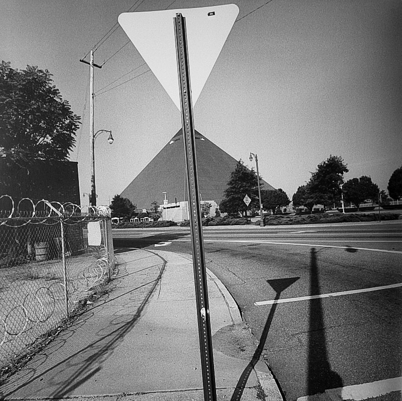
Photographers have to impose order, bring structure to what they photograph. It is inevitable. A photograph without structure is like a sentence without grammar—it is incomprehensible, even inconceivable.
– Stephen Shore

Photographs are composed of two main elements; visual and formal. This creates a sort of “grammar” within each image that can be used to convey and enhance meaning, often to do with beauty, but sometimes subverting from concepts of regular definitions of beauty. Whilst photography isn’t unique in most of its formal and visual elements, it strays from other art forms through elements of framing, time, focus, and flatness, something that cannot be achieved through methods such as painting.

As a group, we analysed this image by Alexander Rodchenko, referencing it to a guide on how to pick out different formal and visual elements. We picked out the rungs of the ladder as repetitive lines, and the side rails of it as leading lines. The boy, presumably a chimney sweep by his clothing, asserts a focal point in the centre of the image, and creates a sense of enigma by the low lighting on his face, although a facial expression can be made out. The use of monochrome, excluding the fact that the photograph was taken during an era where colour photography was rare and expensive, displays an dark and moody tone in combination with the low exposure. In addition to this, the image flips the idea of the rule of thirds on its head – quite literally – by featuring the wall of the building at the top of the photo, creating a sort of ‘reverse horizon’.

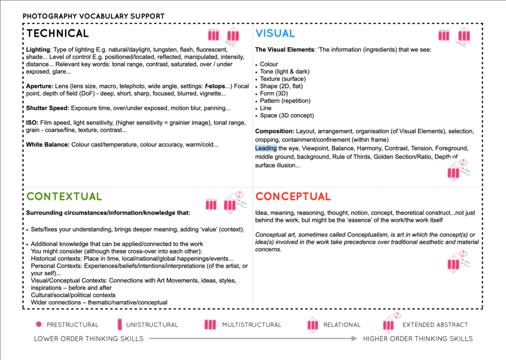
The formal and visual elements include:
Light: Which direction is the light coming from? How strong is the light/How thick are the shadows? Is the lighting natural/from studio lights?
Lines: Are there any structures that create outlines/lines in the image? Are the lines straight/curved/thick/thin? Are they parallel/perpendicular? Do they create a shape
Repetition: Are there any patterns in the image? Are they created by lines or shapes within the photo? Are there any reflections?
Texture: What kind of surface does it look like the subjects within the photograph have? Rough/smooth? How much depth is there in the composition/shapes?
Shape: What kind of shapes are present in the photo? What are they composed of? Do they create repetition within the image?
Tone: What mood does the colours within the image create? Are there darker/lighter tones dominating the image? Which areas are the brightest and darkest? Is there an equal level of light and dark?
Composition: How is the photograph staged? Is it organised? Does the order/angle create any shapes? Is the rule of thirds present?
Colour: What colours are present throughout the composition? Is the image monochrome or in colour? Do the colours suggest mood/danger/nature/love, etc.? Are they heavily saturated or muted?
