Formalism

What is Formalism?

Formalism is the Design, Composition and Lighting are dominant over Subject Matter. The photographer becomes a visual designer whenever a frame is captured. In camera cropping concentrates on the desired subject while eliminating everything else.
Formalist Photography

Photographers have to impose order, bring structure to what they photograph. It is inevitable. A photograph without structure is like a sentence without grammar—it is incomprehensible, even inconceivable.​

Stephen Shore

Visual Language/Elements of Photography

COLOUR – Looking for colour in an image is an important part of analysing an image. Colour can change the feel/mood of the photograph. Some questions we can ask when analysing ; Are the light and shadows more interesting than the colour? Is the colour interesting and powerful? What kind of mood does the photographer want to portray?
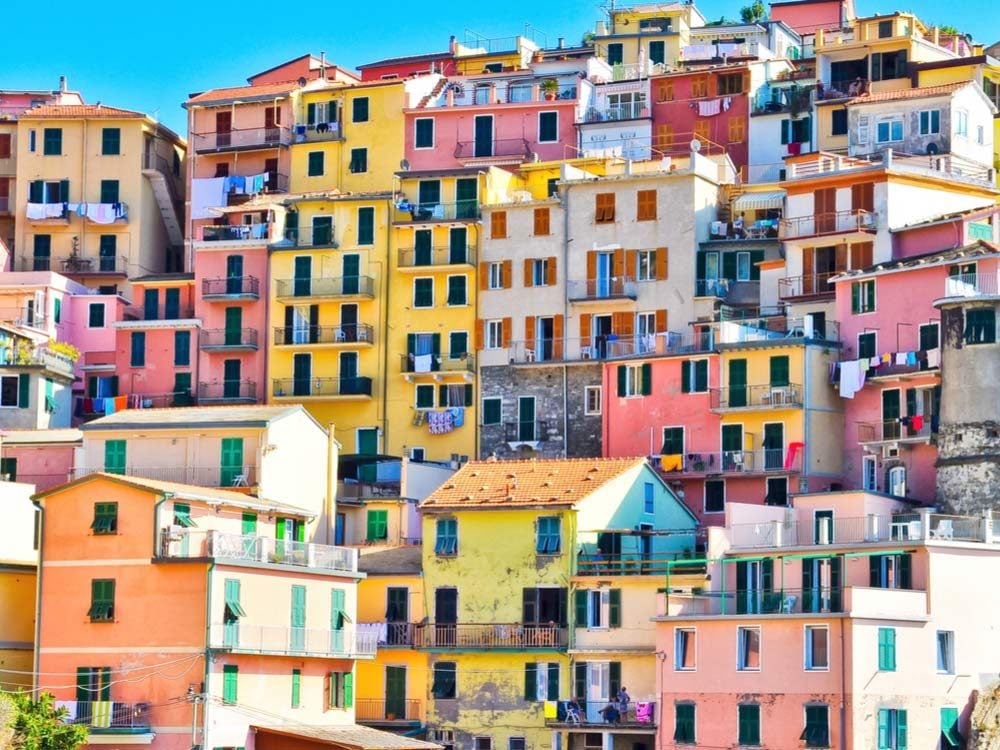
The Most Colourful Towns Around the World | Reader's Digest

TONE – refers to the levels of brightness in the photograph. The majority of nature photographs display a wide range of tones, from black or near black to white or near white. What are the different tones in photography?

30 Questions You Should Ask Before You Take a Photograph | B&H eXplora

TEXTURE – is the visual depiction of variations in the colour, shape, and depth of an object’s surface. Questions to ask; How does the texture impact the photograph? When shooting texture shots What is the most important thing?

How to Photograph Textures for Eye-Catching Images

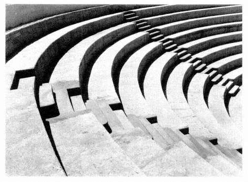
SHAPES – The two-dimensional appearance of objects as they’re captured by your camera. For instance, if you look at a photo of a ball, you’ll see its shape: a circle. They can also be use to draw emphasis to part of the frame. Shapes can create contrast between the subject and their environment. Questions to ask; What do shapes do for an image?

Spanish Modernity: Architecture & Photography - Curated by Iñaki Bergera |  LensCulture

FORM –  where light and shape collide to create images with depth and what I like to think of as touch-ability. Form makes an image lifelike, so the photo stands out, because the viewer feels that they can reach in and touch the person or object. Questions to ask; Describe the form in the photograph? How do shadows affect form?

Light Follows Form | International Center of Photography

PATTERN –  regularity within a scene. It’s elements of the scene that repeat themselves in a predictable way. Pattern can be found everywhere and is commonly seen within shapes, colours or textures. Patterns are found wherever strong graphic elements repeat themselves, for example, lines, geometric shapes, forms and colours. Questions to ask; What patterns or symmetry can you see?
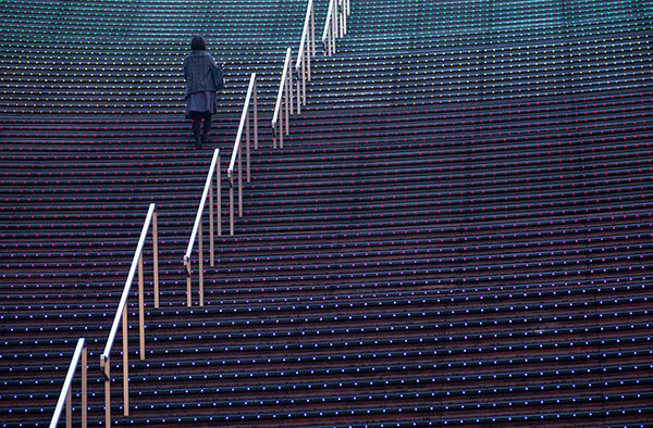
Patterns: 7 Tips For Using Patterns For Photos With Amazing Impact

Walker Evans

Walker Evans was an American photographer and photojournalist best known for his work for the Farm Security Administration documenting the effects of the Great Depression. Much of Evans’ work from the FSA period uses the large-format, 8×10-inch view camera.

Walker Evans, Beauties of the Common Tool | FOTOFORM

The lighting in this image is natural daylight. The light creates dark shadows, contrasting the black greys and whites. The texture in this image is created from the simplest items such as scissors and spade. The dark grey tones gives an ominous impression.

Darren Harvey-Regan

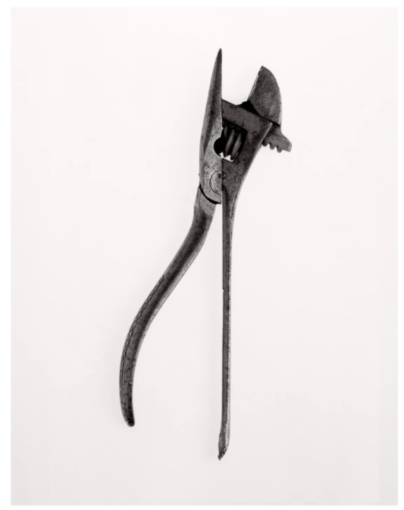
The Ravestijn Gallery presents the works of Darren Harvey-Regan, a photographer interested in the concept that photographs do not exist just to show things, but are physical things that become objects themselves. In 1955, Fortune magazine published, ‘Beauties of the Common Tool’, a portfolio by Walker Evans featuring pictures of ordinary hand-made tools, such as a ratchet wrench and a pair of scissors. Harvey-Regan first constructed a montage of Evans’s images to make new forms. He then sourced matching tools, cut them in half and re-joined various halves together, with the resulting physical objects being photographed to create his final work. The montaged tools become both beautiful and bizarre objects, in which a ratchet wrench is combined with a pair of pliers and a Mason’s trowel joined with a pair of scissors.

His images are very similar to Walker Evans, capturing the same tools on a white background, creating an abstract image.
Anaylising Formalism

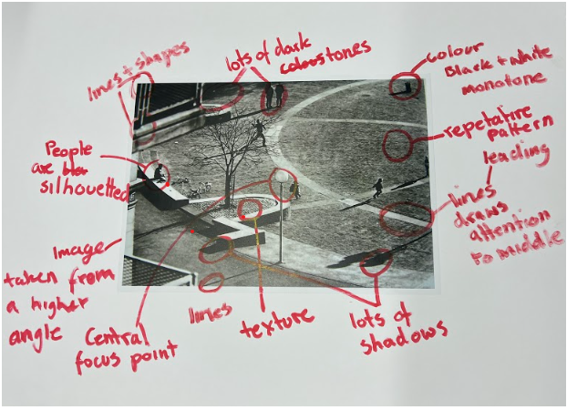
We annotated Peter Fraser’s, contemporary still life photography…

In small groups we took part and analysed an image using the Photography Vocabulary Support sheet, to help us annotate using more technical word to improve our language.

Formalism

Photographers have to impose order, bring structure to what they photograph. It is inevitable. A photograph without structure is like a sentence without grammar—it is incomprehensible, even inconceivable.
– Stephen Shore

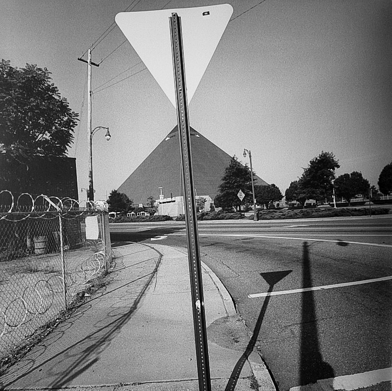
Memphis – Lee Friedlander, 2003

Photographs are composed of two main elements; visual and formal. This creates a sort of “grammar” within each image that can be used to convey and enhance meaning, often to do with beauty, but sometimes subverting from concepts of regular definitions of beauty. Whilst photography isn’t unique in most of its formal and visual elements, it strays from other art forms through elements of framing, time, focus, and flatness, something that cannot be achieved through methods such as painting.

Alexander Rodchenko | Fire Escape, 1925 (Printed later) | Artsy
Fire Escape – Alexander Rodchenko, 1927

As a group, we analysed this image by Alexander Rodchenko, referencing it to a guide on how to pick out different formal and visual elements. We picked out the rungs of the ladder as repetitive lines, and the side rails of it as leading lines. The boy, presumably a chimney sweep by his clothing, asserts a focal point in the centre of the image, and creates a sense of enigma by the low lighting on his face, although a facial expression can be made out. The use of monochrome, excluding the fact that the photograph was taken during an era where colour photography was rare and expensive, displays an dark and moody tone in combination with the low exposure. In addition to this, the image flips the idea of the rule of thirds on its head – quite literally – by featuring the wall of the building at the top of the photo, creating a sort of ‘reverse horizon’.

The reference guide we used to analyse the image.
The formal and visual elements include:

Light: Which direction is the light coming from? How strong is the light/How thick are the shadows? Is the lighting natural/from studio lights?

Lines: Are there any structures that create outlines/lines in the image? Are the lines straight/curved/thick/thin? Are they parallel/perpendicular? Do they create a shape

Repetition: Are there any patterns in the image? Are they created by lines or shapes within the photo? Are there any reflections?

Texture: What kind of surface does it look like the subjects within the photograph have? Rough/smooth? How much depth is there in the composition/shapes?

Shape: What kind of shapes are present in the photo? What are they composed of? Do they create repetition within the image?

Tone: What mood does the colours within the image create? Are there darker/lighter tones dominating the image? Which areas are the brightest and darkest? Is there an equal level of light and dark?

Composition: How is the photograph staged? Is it organised? Does the order/angle create any shapes? Is the rule of thirds present?

Colour: What colours are present throughout the composition? Is the image monochrome or in colour? Do the colours suggest mood/danger/nature/love, etc.? Are they heavily saturated or muted?

visual elements and formalism

The simplest way to describe formalism in photography would be that: The Design, Composition and Lighting are dominant over Subject Matter. The photographer becomes a visual designer whenever a frame is captured. In camera, cropping concentrates on the desired subject while eliminating everything else.

Formalist Photography

Photographers have to impose order, bring structure to what they photograph. It is inevitable. A photograph without structure is like a sentence without grammar—it is incomprehensible, even inconceivable.

— Stephen Shore

Examples of formal and visual elements are: line, shape, repetition, rhythm, balance. To capture a ‘perfect, beautiful’ photograph usually consists of (for example) making sure the camera is in focus and that the lighting and frame is ‘just right’. However, a vast variety of photographers think that sometimes not trying to think too hard about how you are photographing something and making ‘mistakes/breaking the rules’ creates a beautiful perfect photo too.

The Visual Elements

COLOUR- what colours can you see? monotone, bright, muted. Are there colours there are more popular then others? is the focal point obvious due to colour?

17 of the most colourful places in the world | Travel Nation

TONE- Tone refers to the levels of brightness in the photograph, from solid black to pure white. Shadows are dark tones; highlights are bright tones. 

Understanding Tonal Range in Photography

TEXTURE- is it smooth or ridged? The visual depiction of variations in the colour, shape, and depth of an object’s surface.

How to Photograph Texture

SHAPE- what shapes can you see? big areas small areas? The two-dimensional appearance of objects as your camera captures them. 

7 Ways to use Shapes & Colours in Photography - Through The Iris
for example, this photo has a repetition of circles in it.

FORM- when shape takes on three dimensions. Form is created by shadows and highlights on an object in the photograph.

Light Follows Form | International Center of Photography

PATTERN- is there any repetition? The same objects or shapes in the image. A regularity within a scene.

Lesson 1: Patterns and Repetition - WPW Photography (BURNS)

LINE- A line refers to anything that stretches between two points in your photo. So a line can be a fallen tree, a moving river, or even a slew of rocks leading off into the distance.

Using Lines to Improve Photographic Composition - The Photo Argus

We annotated Peter Fraser’s, contemporary still life photography

…To do this we used a table to pick out visual and formal elements:

Object studio shoot/formalism

Formalism

Formalism describes the critical position that the most important aspect of a work of art is its form – the way it is made and its purely visual aspects – rather than its narrative content or its relationship to the visible world.

Formal/visual elements

Light – how the light source, which can be natural or artificial, is positioned in relation to your subject.

Line – anything that stretches between two points in your photo. 

Repetition – using repeating shapes or a repetitive pattern inside the frame as part of the composition.

Shape – Shape is generally considered two-dimensional, while Form is three-dimensional.

Space – the direction the subject of the photograph is moving in, or even just looking in.

Texture – the visual depiction of variations in the color, shape, and depth of an object’s surface.

Value/ tone – the lightness or darkness of an object.

Colour – dominant colors are the warm colors, e.g. red, yellow, and orange, and cooler colors are the receding colors, e.g. blue, green and purple.

Composition – how a photographer arranges visual elements within their frame.

Picture

Analysis of an image taken by Alexander Rodchenko in 1925, ‘Fire Escape’

Examples

Technical

Lighting:

Type of lighting – Flash (two point lighting)

Technical

Lighting:

Type of lighting – Flash (two point lighting)

Aperture

Aperture is used to control the exposure (how much light is let in the camera) of an image. It controls the exposure by expanding and shrinking. The larger the hole, the more light is let in, meaning the image will have a small depth of field and be blurry. However, the smaller the hole, the less light is let in – resulting in a large depth of field and a sharp in focus image.

When using aperture it can be confusing because a small aperture actually means the aperture hole is wide, and vice versa for a large aperture. A large aperture means the aperture hole is narrow. This can be seen on the image below.

What Is Depth Of Field In Photography? The Ultimate Guide

Images taken with a wide aperture:

Aperture and F-Stop in Landscape Photography for Beginner...
The Beauty Of Large Aperture In Digital Photography

Images taken with a narrow aperture:

What is APERTURE? Understanding aperture in photography
Long Exposure Photography Without Filters? It's Easy! - CaptureLandscapes

My photos taken with different apertures:

This image shows the objects at the front to be slightly blurred and out of focus which suggests that this image was taken with f stop of 29 (f 29) and has a wide depth of field.
This image shows the objects at the front to be sharp and in focus whereas the background is slightly out of focus. This tell us that this image was taken with a f stop of 9 (f 9) and has a shallow depth of field.

When comparing these images as you can see how the aperture can affect how in focus the image is. The image on the left is all out of focus and blurry suggesting the image was take with a aperture of around f2.8. The middle image is also blurred and out of focus but less than the first image this suggests that the image was taken with a small aperture around f4. The final image is the one which is most in focus but was still taken with a small aperture of f5.6.

Formalism

Formalism is the visual aspects of a piece of work, and how it is formed rather then the meaning or connections it makes in the world.

The visual and formal elements consist of  line, shape, repetition, rhythm, balance, light, space etc. Formalist photography focuses on how the photo is structured; are the lines all travelling in the same direction? Are the shadows deeply contrasted or blended? What shape does the image have (3D/2D)?

Some examples of formalist photos:

Masha's blog: Task 2 - Art theory
Edward Weston | Cabbage Leaf (1931) | Artsy
On the Edge of America

Lines and light

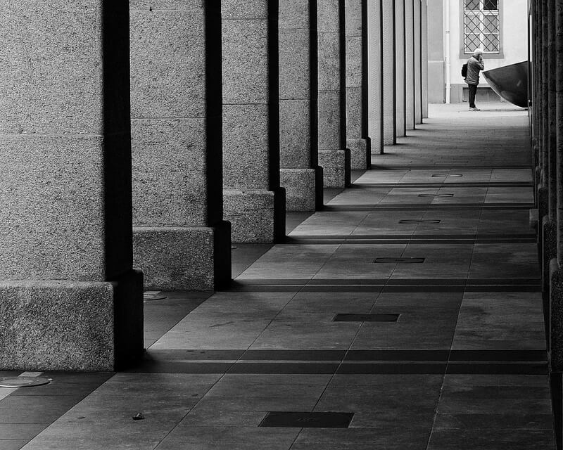
In all these photos there is a sense of the lines leading you in a certain direction (the leading lines direct your eyes naturally around the image). It could be sharp lines, like the first image, soft curved lines, like the second, or rounded lines, like the last. The shadows surrounding the lines can also tell you about the light. Whether it’s natural or studio lighting. If it’s natural, the placement of the shadow can give an idea of the time of day.

Repetition

There is also repetition of lines in these photos. Repetition is usually hidden, or shown clearly in some formalistic images. In the last image, the steps create a dramatic rhythm in the photo, going downwards. The repetition of shadows slowly gets smaller too, and gives the impression of something disappearing.

A8 Photo-1400 Portfolio on Behance

Texture

These photos hold great texture, as there are multiple patterns, curves and shapes within the objects that are being photographed. The first image’s texture is very geometric, and it looks like the texture would feel hard, and cold. However the texture in the second photo has a softer feel to it as the texture is less harsh and is bumpy.

I analysed an image to show the formalist elements in a famous image by Andre Kertesz of a street photo in Paris.

formalism

Formalism is the identification of a formal set of rules and order that photographers agree are imperative in the making of a photo. These consist of visual/artistic elements, such as lines/shape/form/repetition, and also the elements which are specific to photography as a medium, such as focus/frame/shutter speed. Knowing these key terms and how to use them allows us to equip them to analyse images taken by other artists and use a universal language to discuss them. When a photographer typically identifies a ‘mistake’ in their image it will refer to a misalignment in their ‘following of the rules’ –  e.g. out of focus, subject cropped, blur etc.

Looking at Threshold Concept #8 from Photo Pedagogy, we can see that the idea of this set of rules is becoming rather outdated as photography expands its capabilities as a medium.

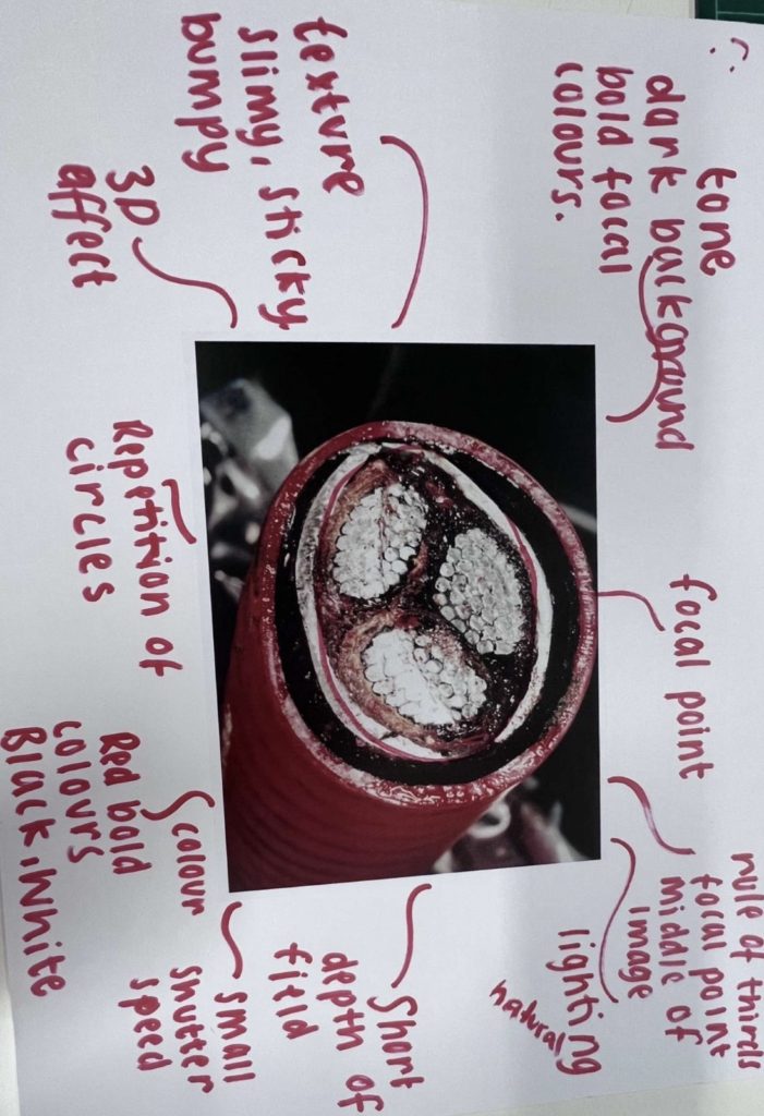
The above image shows where we have annotated an image based on the ‘photo literacy’ – outlining the shape, texture, depth, tone etc. This gives us as viewers more of a way into understanding the image at a greater depth and grants us the ability to explain it to others through the universal language we have established.

Formalist Photography
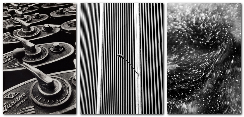
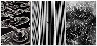
These three images all relate to and align with the formalist ideology.

What is photography


What is photography the art or practice of taking and processing photographs. However, what does photography mean to people who enjoy it and for the people who take photos for people to enjoy. David Campany wrote a book called “On photographs” he says in the book that “Photographs are often thought of as ways to hold things still, to calm the flux of a restless world. They allow us to gaze at fixed appearances, for pleasure or knowledge, or both” what this mean is that many people can enjoy photography in many ways like learning something from a photograph or just simply enjoying the photo someone has taken because of natural beauty, meaning behind the photo, or what the photo means to that person.  
Editing in photography is more common now then it was 50 years ago this is because of technology advances, however editing photos could be seen as a false art, a photo has been edited to look better than the real thing, however. When artist paint they can overdo things like make the sky bluer or paint a house smaller or bigger than the real thing so editing can be seen as the photographers view on what they want to show the world.  
 

Low-poly old camera 3D model - TurboSquid 1638850


Over the years photography has gotten increasingly better cameras have gotten better and smaller than cameras from 50 years ago however some photographers seem to like the aesthetic of older cameras then newer cameras. This is strange but also its understander because. Some people like holding on to the old thing which is completely normal but is industrial always developing and getting better and better when there’s a big portion of people that stick by old cameras.  


6 Tips for Breathtaking Nature Photography - 2022 - MasterClass


In photography there are different types of photographers some like taking pictures of nature, some like taking photos of people, some like taking pictures of citys or towns, and some like to take pictures of everything this is good because photographers can be more divers in there work, say if they started to not want to take pictures of nature they could start to take pictures of people they can take photos of mostly anything there mind comes to. So I guess this could be a reason why people love photography because it can be different everyday if you want it to be or it can be the same its up to the photographer. 

Still life

Still life photography is taking pictures of objects that are arranged in a way that gives it narrative, still life photography is based on the Latin ideology Memento Mori (remember death). experiencing still life photography gives opportunities to use lighting, composition, textures in your photography.

Vanitas is art showing the shortness of life the futility of pleasure, and the certainty of death. Best known of vanitas still life art.

Memento Mori is an artistic or symbolic trope acting as a reminder of the inevitability of death, Memento Mori originated in ancient Rome where slaves used to accompany generals in victory parades and whisper Memento Mori to remind them of their mortality.

Marion Buccella – finding balance

Still life art has existed since the 17th century to modern day, but in the 19th century, artists adopted still life photography.

Still-Life Painting in Northern Europe, 1600–1800 | Essay | The  Metropolitan Museum of Art | Heilbrunn Timeline of Art History

Richard Kuiper

Richard Kuiper is a still life photographer who uses luxury items and utensils to show off their wealth, for example he uses:  shells from the East Indies, priceless glassware from Venice, porcelain from China, silver and gold from Antwerp.

Richard Kuiper – Artist – Artist Blog
Richard Kuiper