Formalism
The simplest way to describe formalism in photography would be that: The Design, Composition and Lighting are dominant over Subject Matter. The photographer becomes a visual designer whenever a frame is captured. In camera cropping concentrates on the desired subject while eliminating everything else.
Photographers have to impose order, bring structure to what they photograph. It is inevitable. A photograph without structure is like a sentence without grammar—it is incomprehensible, even inconceivable.
— Stephen Shore
Examples of formal and visual elements are: line, shape, repetition, rhythm, balance. To capture a ‘perfect, beautiful’ photograph usually consists of (for example) making sure the camera is in focus and that the lighting and frame is ‘just right’. However, a vast variety of photographers think that sometimes not trying to think too hard about how you are photographing something and making ‘mistakes/breaking the rules’ creates a beautiful perfect photo too. For example not being in focus and having a blurred picture:

This image was taken by ‘Rolf Sach’ who creates several pictures which are blurred. This is a form of art even though it doesn’t abide to how a photograph should be taken.
Rolf Sachs’ blurred journey through the camera’s eye – BBC Culture
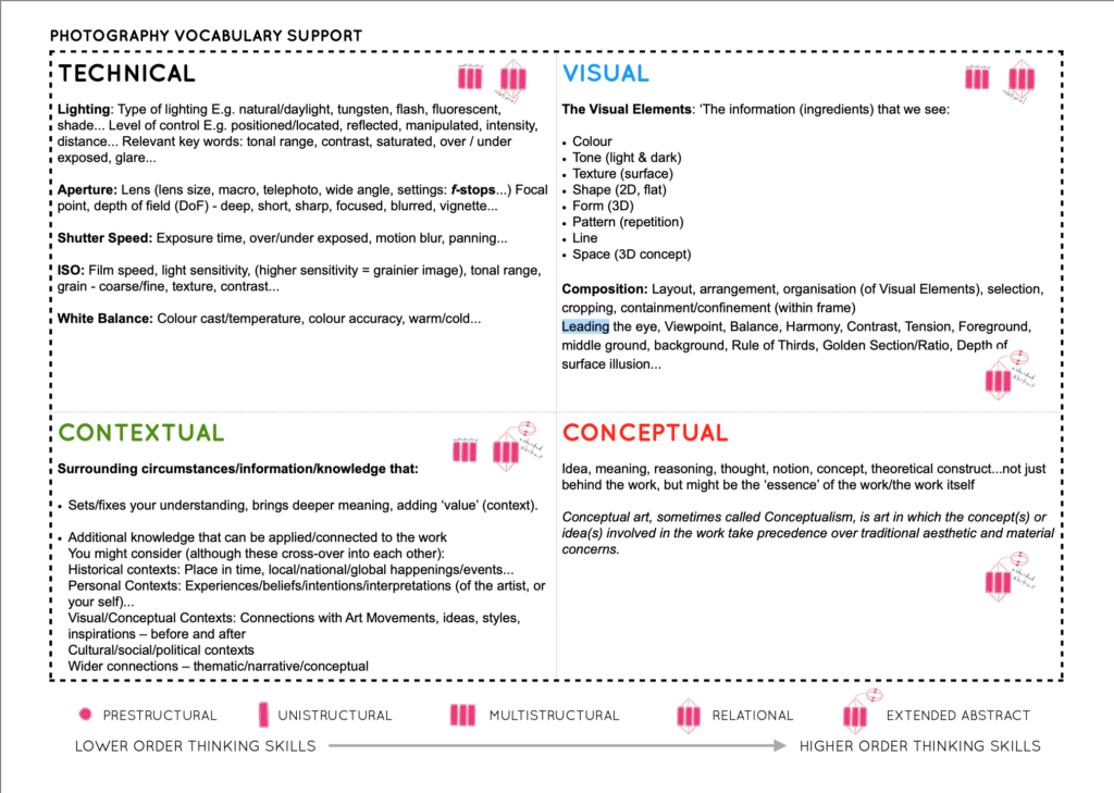
The formal/ visual elements:
Light: Which areas of the photograph are brightest? Are there any shadows? Does the photograph allow you to guess the time of day? Is the light natural or artificial? Harsh or soft? Reflected or direct? How does light fall across the objects in the photograph?
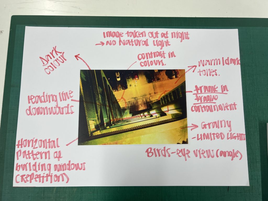
Line: Are there objects in the photograph that act as lines? Are they straight, curvy, thin, thick? Do the lines create direction in the photograph? Do they outline? Do the lines show movement or energy?
Repetition/Shape: Are there any objects, shapes or lines which repeat and create a rhythm or pattern? Do you see echoes or reflections within the image?
Space: Is there depth to the photograph or does it seem shallow? What creates this appearance? What is placed in the foreground, middle ground and background? Are there important negative (empty) spaces in addition to positive (solid) spaces?
Texture/ value tones: If you could touch the surface of the photograph how would it feel? How do the objects in the picture look like they would feel?
Is there a range of tones from dark to light? Where is the darkest part of the image? Where is the lightest? Are the tones in the photograph balanced or does the image tend towards darkness or lightness overall. How does this affect the mood or atmosphere?
Colour: What kind of colours can you see e.g. saturated, muted, complementary, primary? Is there a dominant colour? How would this image be different if it was in black and white? Does the use of colour help us understand the subject or does it work independently?
Composition: How have the various elements in the picture been arranged? Does the image seem balanced or unbalanced? Is it possible to superimpose geometrical shapes on the image to better understand the composition e.g. a pyramid? Has the photographer used the Rule of Thirds?

We annotated Rut Blees Luxembourg Night Photography. To do this we used a table to pick out visual and formal elements:

