formalism

Photos consist of visual and formal elements much the same as any art, however photos their own specific ‘grammar’ focusing on more technical photography exclusive elements- flatness, frame, focus, time, ect. Often when technical “mistakes’ are made in photography they are seen as art and then utilized. “formalism” focuses on the design, light and form over subject matter.

See the source image
Formalism, Aaron Haines

As seen is this photo by Aaron Haines it is not about the subject matter being the stairs, it is about how it is taken making it visually interesting. The stairs act as a repeating pattern down towards the stair well and framing it, making it the focal point of the image. Whilst the photo is monochrome, tonally the ground at the bottom the stairs is the darkest whilst the stairs are lighter creating contrast and further framing the stair well, it also helps create a sense of depth as we expect darker things to be further away.

The elements of formalism:

  • line- things in the photograph that act as lines. thick thin how do they lead our eye.
  • tone- is it light or dark, contrasting, monochrome.
  • reputation/ pattern- is there patterns or repeating visuals what do they do.
  • space- how is negative and the space with in the frame used.
  • shape- what shapes are created where do they lead your eye.
  • colour- how is colour used- complementary, analogous ect.
  • composition- how is the photograph set up where is everything how does it lead your eye.

Photo Analysis
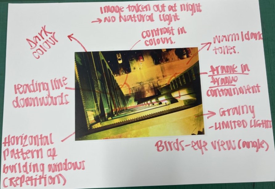
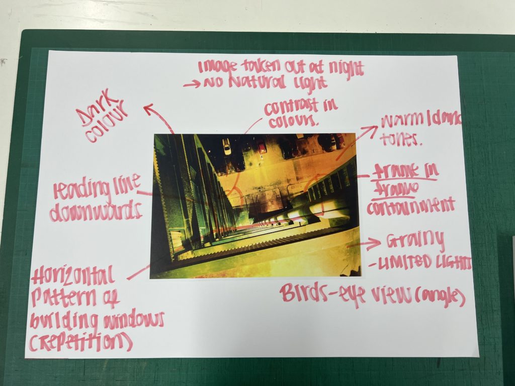
annotations of Rut Blees Luxembourg Night Photography

In these annotations we were picking out visual and formal elements. Based on this table focusing on visual:
Formalism

The simplest way to describe formalism in photography would be that: The Design, Composition and Lighting are dominant over Subject Matter. The photographer becomes a visual designer whenever a frame is captured. In camera cropping concentrates on the desired subject while eliminating everything else.

Photographers have to impose order, bring structure to what they photograph. It is inevitable. A photograph without structure is like a sentence without grammar—it is incomprehensible, even inconceivable.

— Stephen Shore

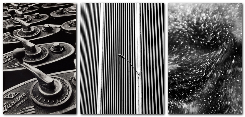
Examples of formal and visual elements are: line, shape, repetition, rhythm, balance. To capture a ‘perfect, beautiful’ photograph usually consists of (for example) making sure the camera is in focus and that the lighting and frame is ‘just right’. However, a vast variety of photographers think that sometimes not trying to think too hard about how you are photographing something and making ‘mistakes/breaking the rules’ creates a beautiful perfect photo too. For example not being in focus and having a blurred picture:

This image was taken by ‘Rolf Sach’ who creates several pictures which are blurred. This is a form of art even though it doesn’t abide to how a photograph should be taken.

Rolf Sachs’ blurred journey through the camera’s eye – BBC Culture

The formal/ visual elements:

Light: Which areas of the photograph are brightest? Are there any shadows? Does the photograph allow you to guess the time of day? Is the light natural or artificial? Harsh or soft? Reflected or direct? How does light fall across the objects in the photograph?

Line: Are there objects in the photograph that act as lines? Are they straight, curvy, thin, thick? Do the lines create direction in the photograph? Do they outline? Do the lines show movement or energy?

Repetition/Shape: Are there any objects, shapes or lines which repeat and create a rhythm or pattern? Do you see echoes or reflections within the image?

Space: Is there depth to the photograph or does it seem shallow? What creates this appearance? What is placed in the foreground, middle ground and background? Are there important negative (empty) spaces in addition to positive (solid) spaces? 

Texture/ value tones: If you could touch the surface of the photograph how would it feel? How do the objects in the picture look like they would feel?
Is there a range of tones from dark to light? Where is the darkest part of the image? Where is the lightest? Are the tones in the photograph balanced or does the image tend towards darkness or lightness overall. How does this affect the mood or atmosphere?

Colour: What kind of colours can you see e.g. saturated, muted, complementary, primary? Is there a dominant colour? How would this image be different if it was in black and white? Does the use of colour help us understand the subject or does it work independently?

Composition: How have the various elements in the picture been arranged? Does the image seem balanced or unbalanced? Is it possible to superimpose geometrical shapes on the image to better understand the composition e.g. a pyramid? Has the photographer used the Rule of Thirds?

We annotated Rut Blees Luxembourg Night Photography. To do this we used a table to pick out visual and formal elements:

FORMALISM

WHAT IS FORMALISM?

Formalism describes the critical position that the most important aspect of a work of art is its form – the way it is made and its purely visual aspects, such as line, shape, repetition, rhythm, and balance.

Formalist Photography
FORMALISM IN PHOTOGRAPHY

Photographs are ideological constructs, a different way of saying that they don’t simply show us what is ‘factual’ or ‘real’. However, on the other hand and argument could be that photo literacy in part depends on an understanding of the formal or visual elements, some of which are acquired from the visual arts.

WHAT IS PHOTO LITERACY?

Superficially, it might suggest an ability to “read” a photograph, to analyse its form and meanings. Photo Literacy is therefore a specific type of understanding that combines visual, linguistic, emotional and physical acuity.

This image has an empty alt attribute; its file name is IMAGE_ANALYSIS-MATRIX-1024x729.png
PHOTO LITERACY GUIDE

WHAT IS VISUAL LANGUAGE?

Visual language shown on a photography work implies a pictorial communication media in telling a story or a particular event.

Finding Refuge in a Visual Language - The New York Times
Grandpa and Grandma. 1979.Credit Sylvia Plachy

ARTIST REFERNCE

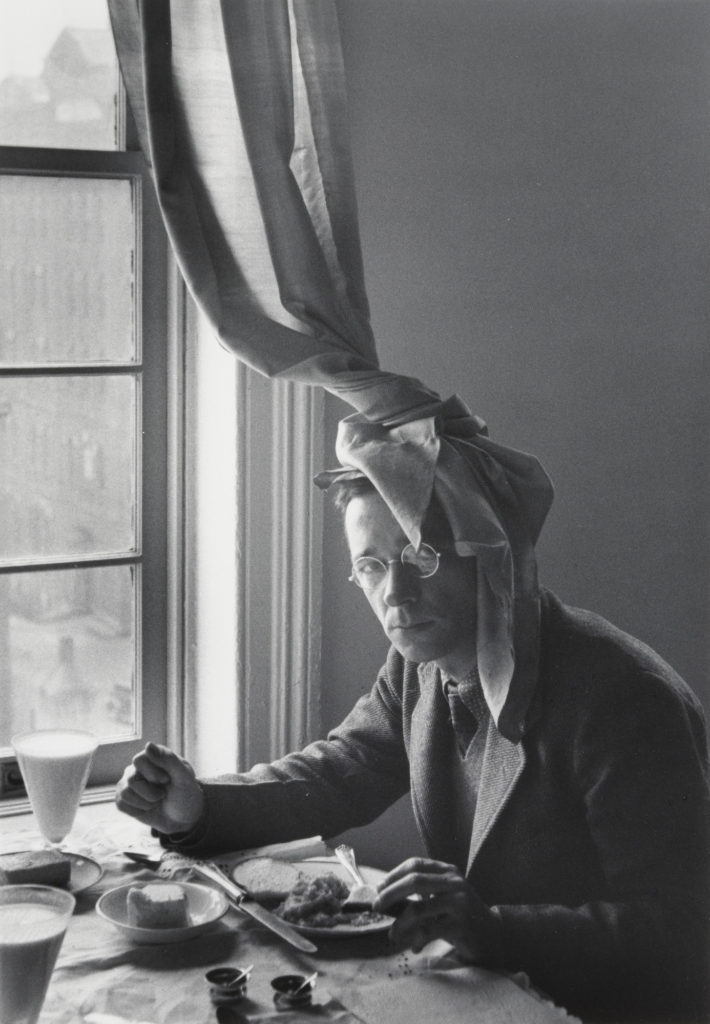
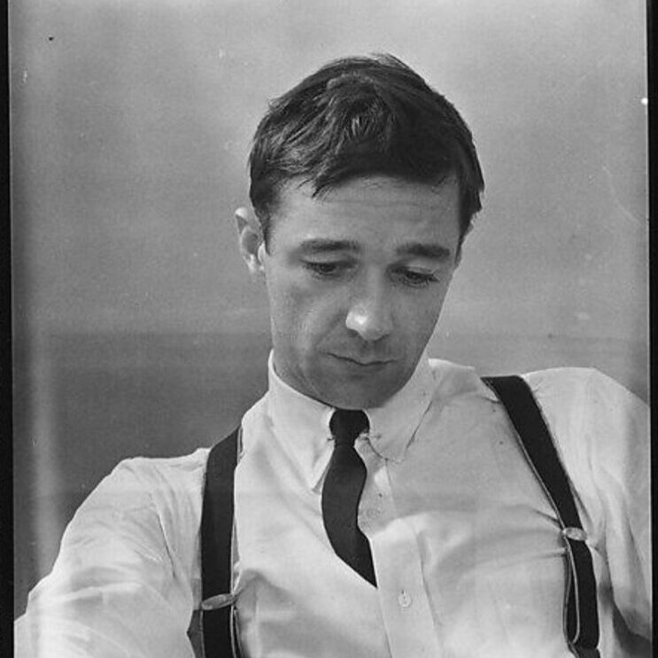
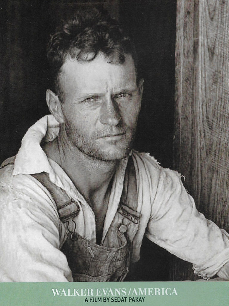
WALKER EVANS

Walker Evans began to photograph in the late 1920s, creating snapshots during a European trip. When he retuned to New York in 1930, he published his first image. During the Great Depression he started to photograph for the Resettlement Administration.

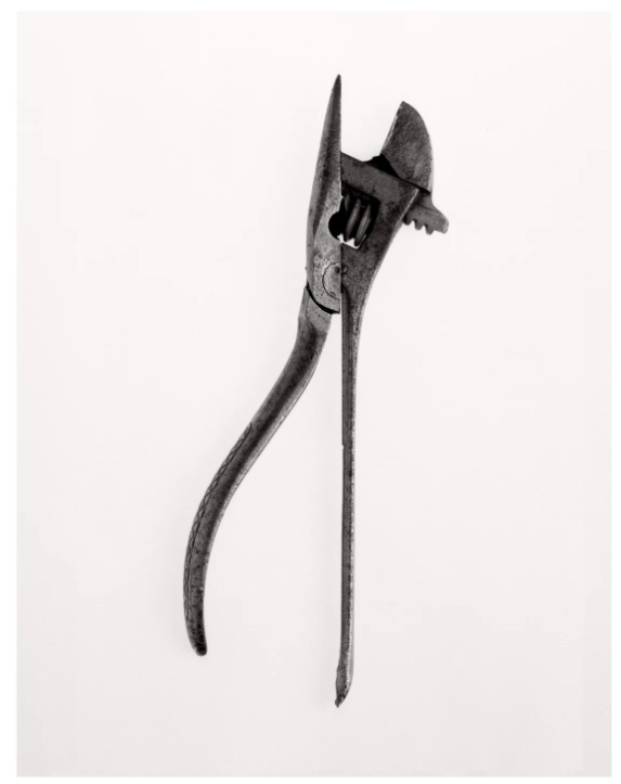
Walker Evans, Beauties of the Common Tool | FOTOFORM
Walker Evans – Beauties of the common tool – 1955

DARREN HARVEY-REGAN

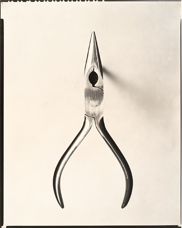
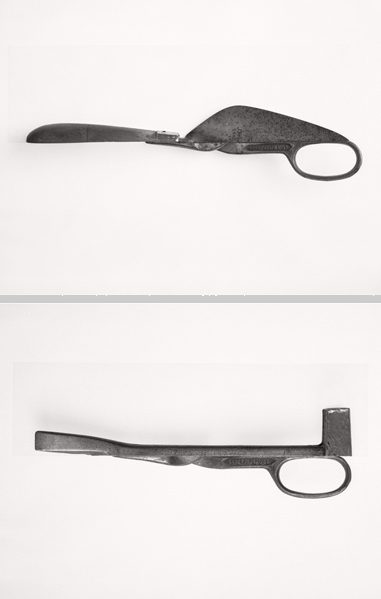
Harvey-Regan first constructed a montage of Evans’s images to make new forms of photography. He began to cut up various objects and putting them back together in a different form.

Darren Harvey-Regan, Beauties of the Common Tool, Rephrased II, 2013
Fibre-based handprint, mounted, wooden frame with museum glass

ANALYSE DIFFERENT ARTIST PHOTOGRAPHY

These are 2 different photography artist that have similar style in photography, however Darren Harvey-Reagan was inspired by Walker Evans’ work. Both images have a a basic layout of one simple object with a neutral background. The shape seems 2D however Evans slightly elevates his images to create a slight shadow. The photos are balance due to the objects being placed in the centre and the image having equal strong lighting. Harvey-Reagans work is slightly different and unique as he takes apart the objects photographing them differently or creating an un-usual object with the parts.

Studio lighting

Continuous lighting

This means not using flash; instead its having lights constantly lit compared to the flash being activated when taking the picture. When using continuous lighting you use a slow shutter speed for example 1 second. Usually the photograph will have shadows and the camera is set up on a tripod. When experimenting i used a product table for my objects with an infinity curve in the background. Continuous lighting is often referred as ‘low key’. This is an example:

Flash lighting

Flash lighting is the opposite of continuous lighting. It creates less shadows and needs a high shutter speed, when using flash lighting its more efficient to use a tripod to keep the camera in place and steady. This is known as high key.

The photo on the left shows constant lighting compared to the one on the right which uses flash lighting. There are less shadows and gives a clearer view compared to the one on the left.

artist studies

WALKER EVANS

Walker Evans was an American photographer and photojournalist well known for his work for the Farm Security Administration, documenting the effects of the Great Depression where he spent two months on a fixed-term photographic campaign in West Virginia and Pennsylvania. Much of Evans work from the FSA included photographing using a less developed camera. He said that his goal as a photographer was to make pictures that he took “literate, authoritative, transcendent”. Many of his works are still in the permanent collections of museums and have been the subject of retrospectives at such institutions as the Metropolitan Museum of Art or the George Eastman Museum.

In Evans later life he was a passionate reader and writer, and in 1945 became a staff writer at Time. Shortly afterward, he became a professor of photography on the faculty for graphic design at the Yale University School of Art. In one of his last photographic projects, Evan completed a black and white portfolio of the Brown Brothers Harriman for publication in “Partners in Banking”. This was published in 1968 to celebrate the private bank’s 150th anniversary. In 1973 Evans used the new Polaroid instant camera for his last piece of work, the company provided him with an unlimited supply of film, and the camera’s simple design made it much easier for the aged photographer to get the hang of it.

 Darren Harvey-Regan

Darren is a famous English photographer who’s work has appeared in exhibitions and publications internationally and is part of the permanent photography collection at the V & A Museum in London. Darren experimented with Blurring the boundaries between photography and sculpture. Armed with an MA from the Royal College of Art, and fascinated by the work of heavyweights such as Cy Twombly, John Baldessari and Bill Watterson, the sensitive and mature curation of his exhibitions is fundamental to the meaning of his work.

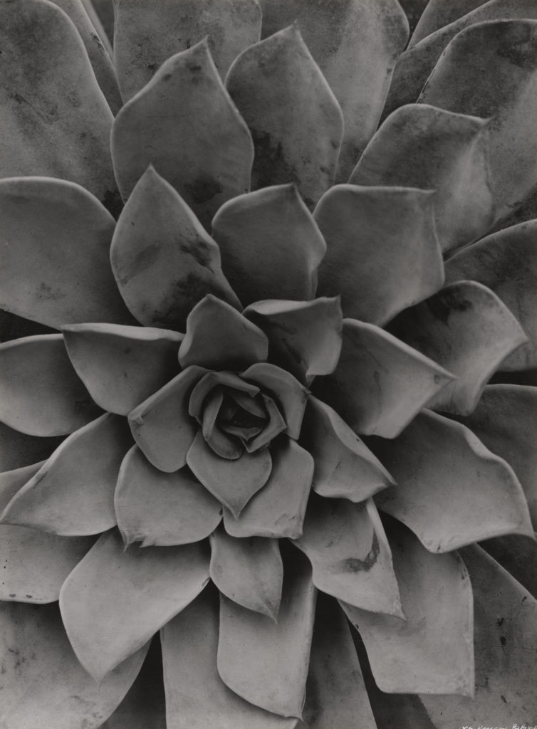
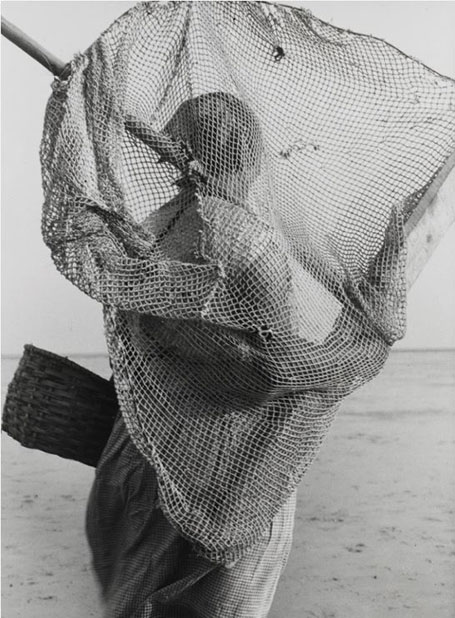
Albert Renger-Patzsch,

Renger-Patzsch was born in Würzburg Germany and began making photographs at age twelve. After military service in the First World War he studied chemistry at the in Dresden. In the early 1920s he worked as a press photographer for the Chicago Tribune before becoming a freelancer, in 1925 he published a book called the Das Chorgestühl von Kappenberg (The Choir Stalls of Cappenberg). And then soon later he had his first museum exhibition in Lübeck in 1927. His second book followed in 1928, This is his best known book and it is a collection of one hundred of his photographs in which natural forms, industrial subjects and mass-produced objects are presented with the clarity of scientific illustrations. During the 1930s Renger-Patzsch made photographs for industry and advertising. His archives were destroyed during the Second World War. Later In 1944 he moved to Wamel, Möhnesee, where he lived the rest of his life

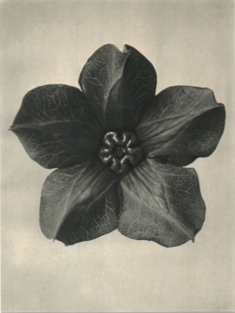
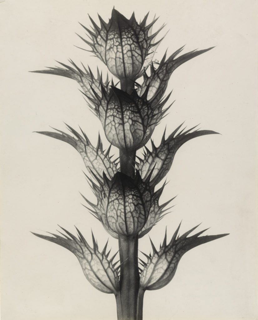
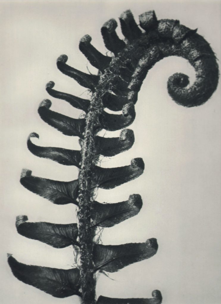
Karl Blossfeldt

Karl Blossfeldt was a German photographer and sculptor. He is best known for his close-up photographs of plants and living things, He was inspired, by nature and the ways in which plants grow. He believed that “the plant must be valued as a totally artistic and architectural structure.” Among his contacts at the Berlin Arts and Crafts School was Heinz Warneke. From 1923, he was professor at the United State Schools for Fine and Applied Art in Berlin.

Formalism and image ANALYSIS

Formalism

Formalism describes the position that the most important aspect of a work of art is its form (in other words the way it is made and it’s visual aspects) rather than its narrative content or its relationship to the visible world.

formal and visual elements

Light – how the light source, which can be natural or artificial, is positioned in relation to your subject.

Line – anything that stretches between two points in your photo. 

Repetition – using repeating shapes or a repetitive pattern inside the frame as part of the composition.

Shape – Shape is generally considered two-dimensional, while Form is three-dimensional.

Space – the direction the subject of the photograph is moving in, or even just looking in.

Texture – the visual depiction of variations in the color, shape, and depth of an object’s surface.

Value/ tone – the lightness or darkness of an object.

colour – dominant colors are the warm colors, e.g. red, yellow, and orange, and cooler colors are the receding colors, e.g. blue, green and purple.

Composition – how a photographer arranges visual elements within their frame.

These elements are often used to describe and analyse photos

Example

Here we are aple to see the image in the middle being analysed around the outside. Some points made were:

  • Lots of contrast
  • Darker tones
  • Repetition of circles
  • Curved lines
  • The center being the area of focus

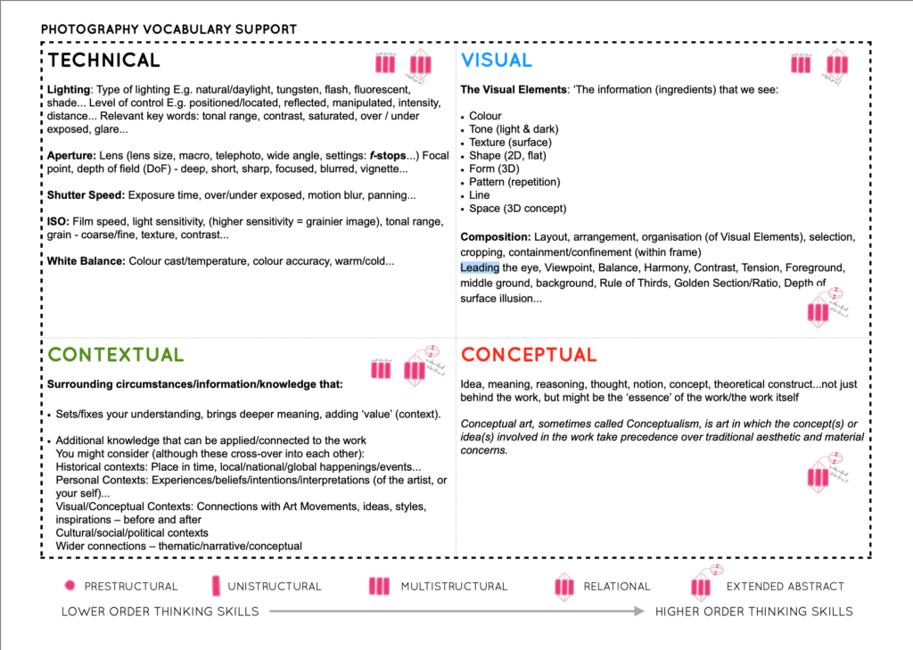
Some other analysis concepts can be fond on the sheet below.

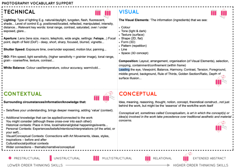
Technical includes; lighting, aperture, shutter speed, IOS and white balance. These are all things that are able to be adjusted by the photographer.

The visual area includes; colour, tone, texture, shape, form, pattern, line and space. These are all aspects that can be seen by the viewer.

Contextual includes; adding value or context as well a general knowledge about the image.

Conceptual includes; meaning, reasoning, thought, notion etc behind the work.