what is photography and its history

What is it:

Photography is writing with light, as well as going through the process of taking and developing or processing an image.

A few examples:

Artistic action by Yves Klein | Leap into the Void | The Metropolitan  Museum of Art
Harry Shrunk and Janos Kender, Leap into the void

In this image Shrunk and Kender have captured a man falling from a building or ‘leaping into the void’. The image is very intriguing as it makes you think what has made the man jump from the building. I think the image had quite a dark sense behind it which is what makes the image so catchy.

The Day Nobody Died — Broomberg & Chanarin
Broomberg and Chanarin, the press conference, June 9 2008

In this image by Broomberg and Chanarin it is unclear what the image is and is telling us, which allows for the viewer to make up their own background story of it. Once you do some research you will find out that the images is about war in Afghanistan. This allows the viewer to further read into the image discovering deeper meaning and back stories to the image.

camera obscura:

Camera obscura consists of a room with a box that has a tiny hole in one of the sides. Light will reflect from the natural world and will project an image from outside the box on to the opposite surface as shown in the image below.
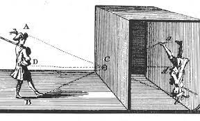
A Lesson on the Camera Obscura

This method of photography is still used in the modern world by some photographers all over the planet.

Nicephore Niepce:

Joseph Nicephore Niepce was the first person to make a permanent photographic image, and is commonly known to people for inventing photography. He invented the Niepce Heliograph in 1827, it was the process of the earliest photograph and was created with camera obscura. He was one of the most important figures in the photography industry and is still widely remembered to this day.
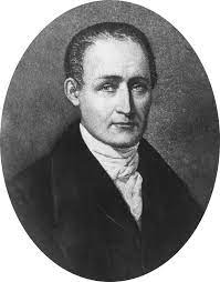
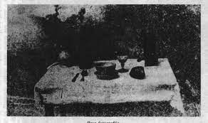
Nicephore Niepce | Biography, Inventions, Heliography, Contributions to  Photography, & Facts | Britannica
Joseph Nicéphore Niépce | Facebook

Louis Daguerre and daguerreotype:

Louis Daguerre was a French artist and photographer who helped develop photography with his invention of the eponymous daguerreotype process of photography which was the first practical process ever to be invented in 1839. Daguerre had an interest in lighting effects which is what brought his towards photography as he was a painter. He began by exploring with translucent paintings and different effects that were given off by light.
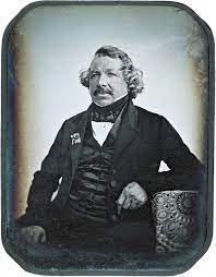
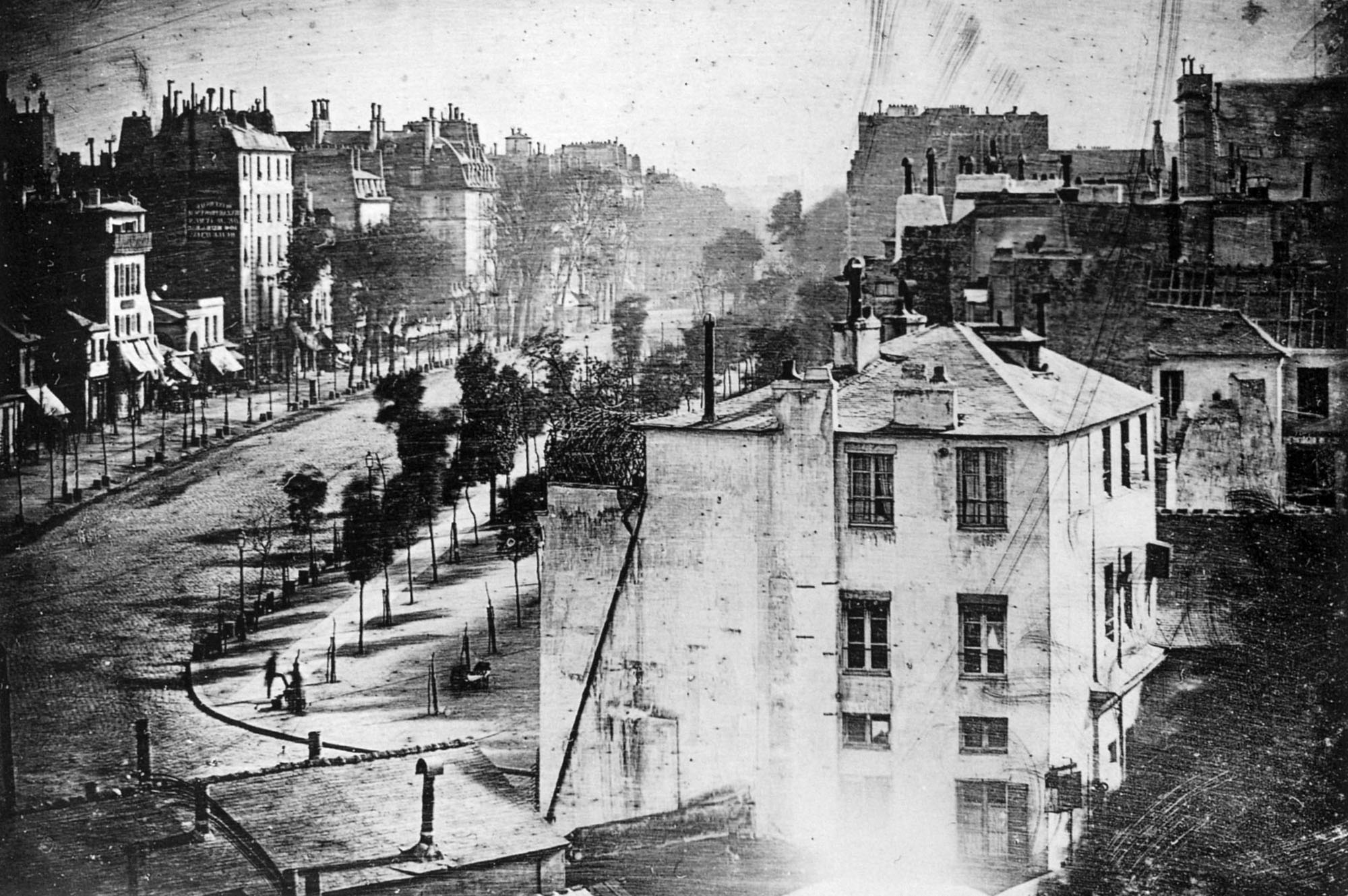
Louis Daguerre - Wikipedia
The Gift of the Daguerreotype - The Atlantic

Henry Fox Talbot:

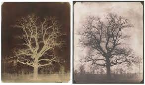
Henry Fox Talbot was famously known in 1841 for the development of the calotype, which was a further developed version of Deguerre’s daguerreotype. His process is where you have a sheet of silver chloride coated paper that was exposed to light in a camera obscura, the areas that were I the line of light then became darker in their tone and produced a negative image.
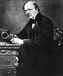
William Henry Fox Talbot | Biography, Invention, & Facts | Britannica
Invention of Photography - Fox Talbot | The British Library

Richard Maddox:

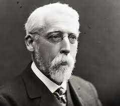
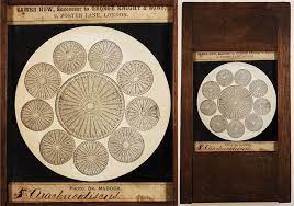
Richard Maddox was an English photographer and physician who invented the dry plate, a glass plate coated in gelatin. It was an improved type of photographic plate that was greatly developed in 1871, so much that a factory that made them was established. From his invention smaller hand held cameras were able to be made.
Pre Cinema History 🇨🇦 🏴󠁧󠁢󠁳󠁣󠁴󠁿 on Twitter: "1868 RICHARD LEACH  MADDOX (1816-1902) Maddox publishes a description of a Gelatin Dry-Plate  process of developing photographs. His work in developing this new method  becomes
Richard L. Maddox

George Eastman:

George Eastman was an American entrepreneur who introduced the kodak camera in 1888, which helped promote amateur photography, widely. He create the Kodak which is still used all over the world to this day.

Kodak (Brownie):

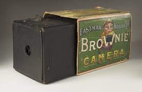
The Kodak was a series of cameras made by George Eastman in the 1900s. It consisted of a cardboard box with a simple camera and roll film inside, it was widely loved as it allows middle class people to take images of their own with the Kodak brownie dollar box. The camera had a single shutter speed and narrow apertures which allowed for a deep depth of field creating a simple image.
B is for... Brownie, the camera that democratised photography - National  Science and Media Museum blog

Digital Photography:

Digital photography uses a camera that contains many electronic photodetectors which produce an image from a lens. There are two types of digital images. Vector and raster.
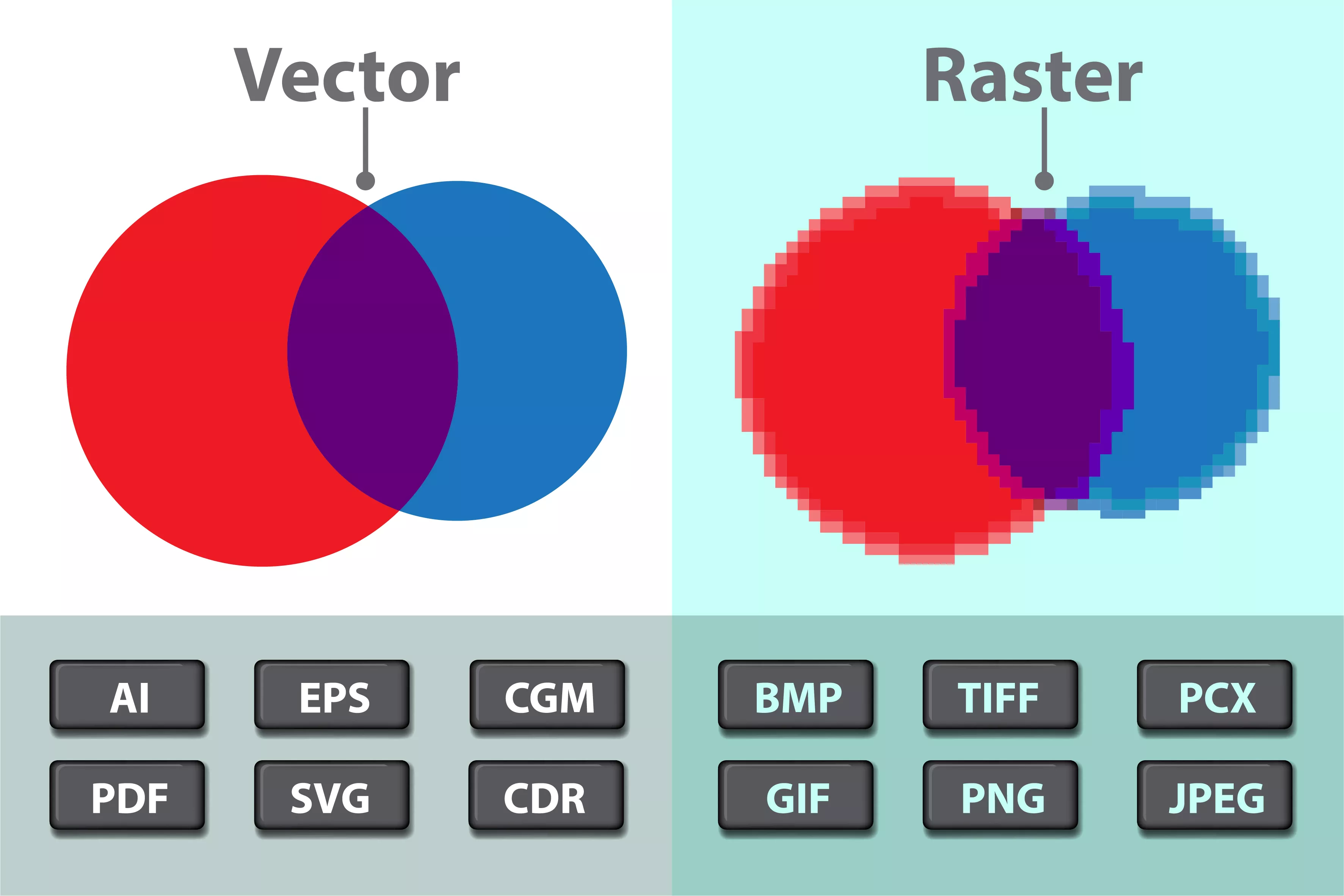
Which Graphic File Format is Best: Vector and Raster Images - Tell Your  Tale Marketing & Design

Vector:

Vector images are created by using a sequence of commands through a computer. It places lines and shapes to create the image. These images are either a graphic artists work, or a file and are saved as as a sequence of vector statements, compared to raster images they are very clear and sharp.
Vector Images and Royalty Free Vector Stock | Shutterstock

Raster:

Raster images are are images made up of hundreds of tiny pixels, laid out in coulombs and rows. Each pixels contains different information and a colour to make the image piece by piece that depends on the image and its angle.

Raster graphics - Simple English Wikipedia, the free encyclopedia

Ernest Baudoux:

Ernest Baudoux was a French born Jersey prolific photographer, and was from 1869 to 1887. He mainly focused on island houses and made a living as a portraitist as well as documenting the life of Jersey outdoors from 1870 to 1880. Many of his images that still exist are known as carbon printing, which means that images have a metallic-like finish. Baudoux was the first significant chronicler of the island life in images that was later taken over by Albert Smith.
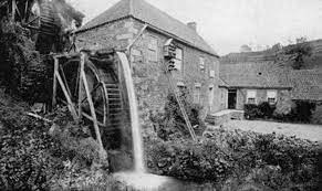
Photo Gallery
Vallee des Vaux - Jerripedia

David Campany’s book:

Campany’s book is focused on the quote ‘photographs confuse as mush as fascinate, conceal as much as reveal, distract as much as compel. They are unpredictable communicators’. His book contains 120 photographs from various photographers where by he explains the images history and meaning behind the image, as well as contextualising is with the visual culture.

When explaining his quote he says ‘If a photograph compels, if it holds our attention, it will be for more than one reason. The reasons may be unexpected, and even contradictory (mixed feelings are often the most compelling). When we are drawn to look at a photograph again and again, it is likely that our second or third response will not be quite the same as the first‘. This means images may have multiply different meaning that are only seen when we look deeper into image many times, ‘They cannot carry meanings in any straightforward way‘.

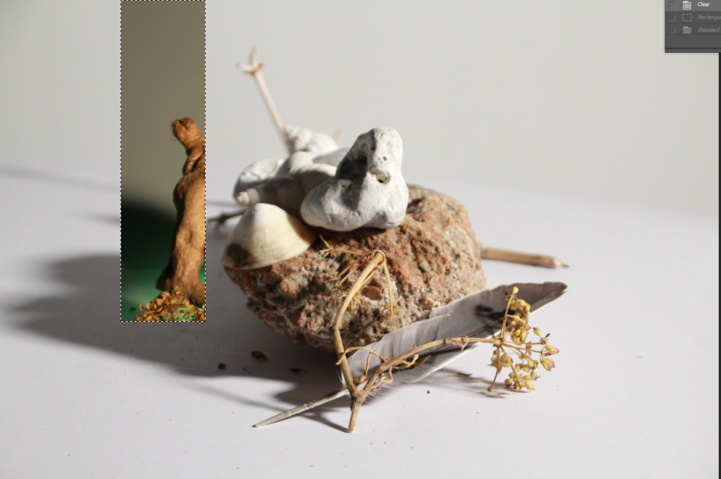
Photoshop

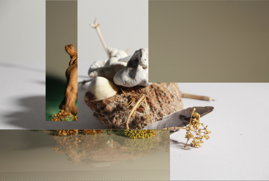
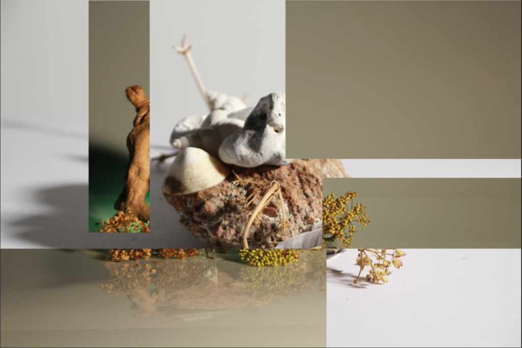
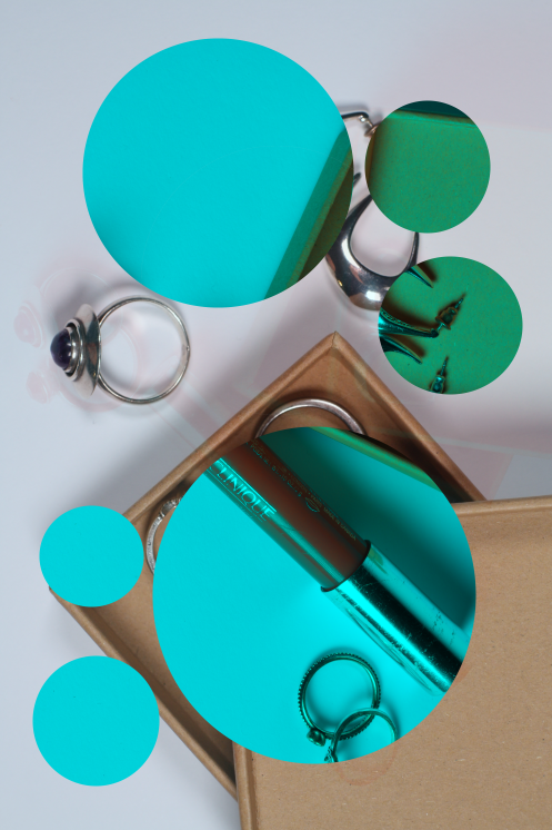
Experimenting with using the cut out tool on photoshop, using two of my images with different colours to create contrast.

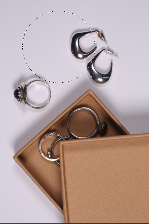
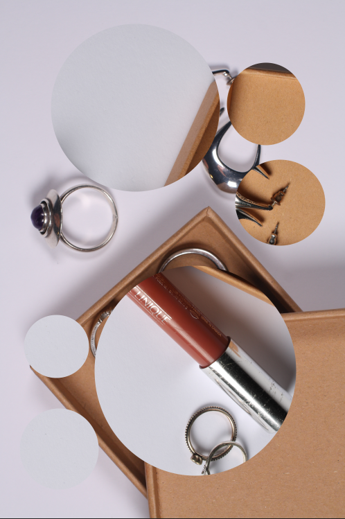
Using different shapes, circles adding colour to the image. Printing my images out then creating some photomontages.

Still life

Still life is a painting or drawing of an arrangement of objects, typically including fruit and flowers and objects contrasting with these in texture, such as bowls and glassware.

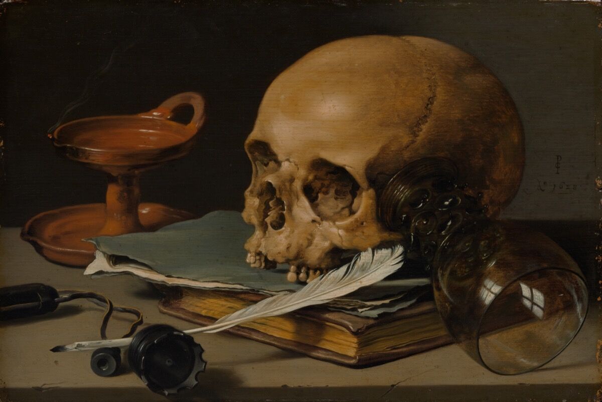
In the 17th century lots of paintings representing objects or “still life” began being well-known, usually made for the rich in Europe. These types of paintings were hyper realistic. They included objects which were carefully places and usually told a story, with a hidden meaning behind them, these are called vanitas. They often contained symbols of death and originated as a Dutch genre. this is called memento mori and it means an artistic or symbolic trope acting as a reminder of the inevitability of death. This could be by including skulls or objects that will eventually lose their purpose or “die”, e.g. flowers.

Pieter Claesz, Still Life with a Skull and a Writing Quill, 1628.  Courtesy of the Metropolitan Museum of Art.
Pieter Claesz, Still Life with a Skull and a Writing Quill, 1628. Courtesy of the Metropolitan Museum of Art.

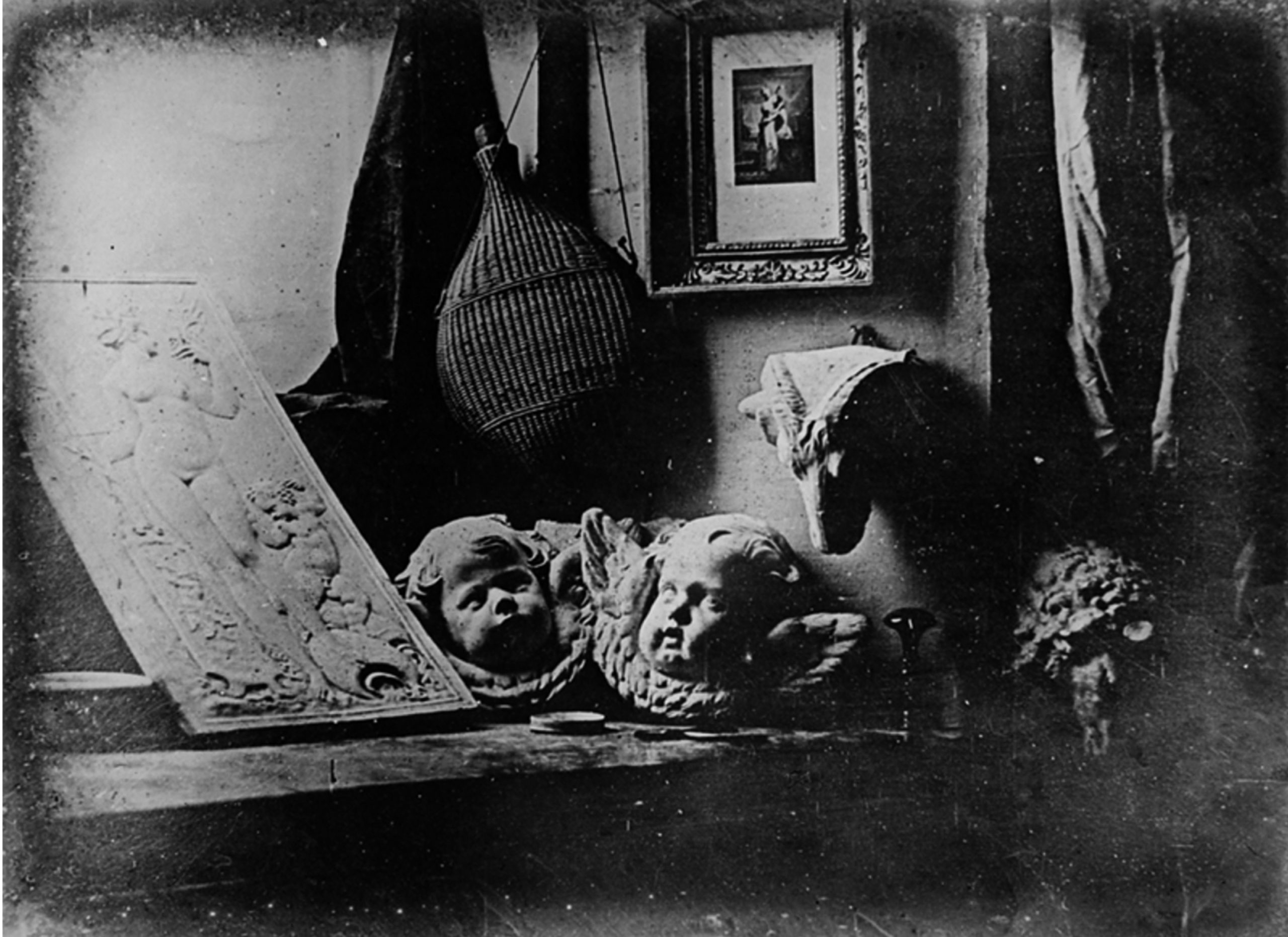
Still life featured prominently in the experiments of photography inventors Jacques-Louis-Mandé Daguerre and William Henry Fox Talbot. They did this in part, as the exceptionally long exposure times of their processes precluded the use of living models.

Louis-Jacques-Mandé Daguerre, The Artist’s Studio / Still Life with Plaster Casts, 1837, daguerreotype (photography), 6.5 inches by 8.5 inches (public domain)
Louis-Jacques-Mandé Daguerre, The Artist’s Studio / Still Life with Plaster Casts, 1837, daguerreotype (photography), 6.5 inches by 8.5 inches (public domain)

there are many photographers who challenge the idea of still life and take on the idea of photographing objects, or foods but adding a slight hint of modernism to their pictures.

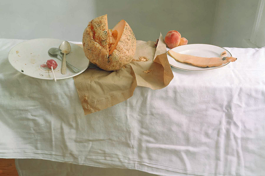
Laura Letinsky

Laura focuses on photographing food, or the consumption of food. Her vanitas are much more modern but follow the original style of still life. originally vanitas were photographed in order to tell a story but be attractive. She does the exact same thing, as she places the food/objects carefully in order to create an order of the food that has been eaten. at first glance the photographs don’t seem extraordinary as it is simply a photograph of some foods, but the background, the specific foods, their order and placement, everything challenges the idea of memento mori, where the foods resemble death, the end of the fruits life. These photographs specifically represent beauty in the everyday foods and challenges the viewer to cherish everyday objects especially food as its so crucial to them, to be grateful for it but also to notice or pay attention to tasks like eating, as within minutes a human causes chaos to the food, how a single person can have so much control and how much change they can change when it comes to the food form. She specifically photographs food that has already been consumed to show that the foods beauty is not destroyed it is just in a different shape and form. maybe she aims to do this so the viewer doesn’t feel as bad for eating or maybe she means the opposite, either way what she aims is to portray food in a different form but still make it beautiful.

What I found interesting about her work from others is the pastel like colours and the calmness she aims to capture with her photographs, contrasting with the things she is photographing, almost as if she is trying to say the chaos of the foods is not a chaos at all, all depending how you look at it. Her images are quite bright but not over exposed. She uses light diffused window lighting, where it is usually greyish/white, creating a few light shadows. The whole composition of the photograph is relaxing and pleasing to look at, like I said before, the way she captures the foods is beautiful and calm in contrast with what is going on in the photo. This is because often when photographers photograph disturbed scenery they would edit the picture in the way where it would dramatize this effect, making it dark or saturated, where it would create similar feelings as the object being photographed, however her photographs confuse as they are not edited that way at all .

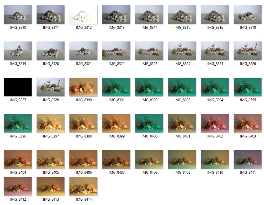
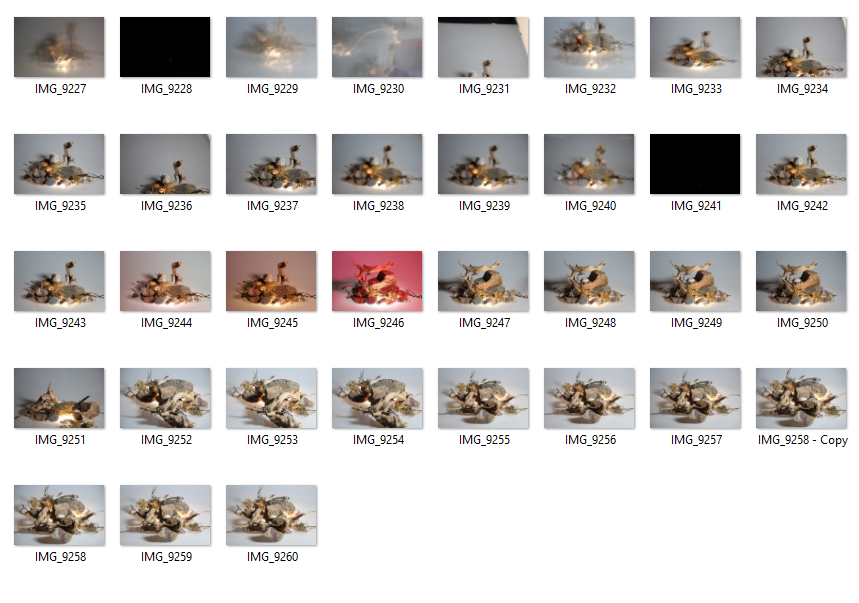
still life Photoshoot, edits and final images

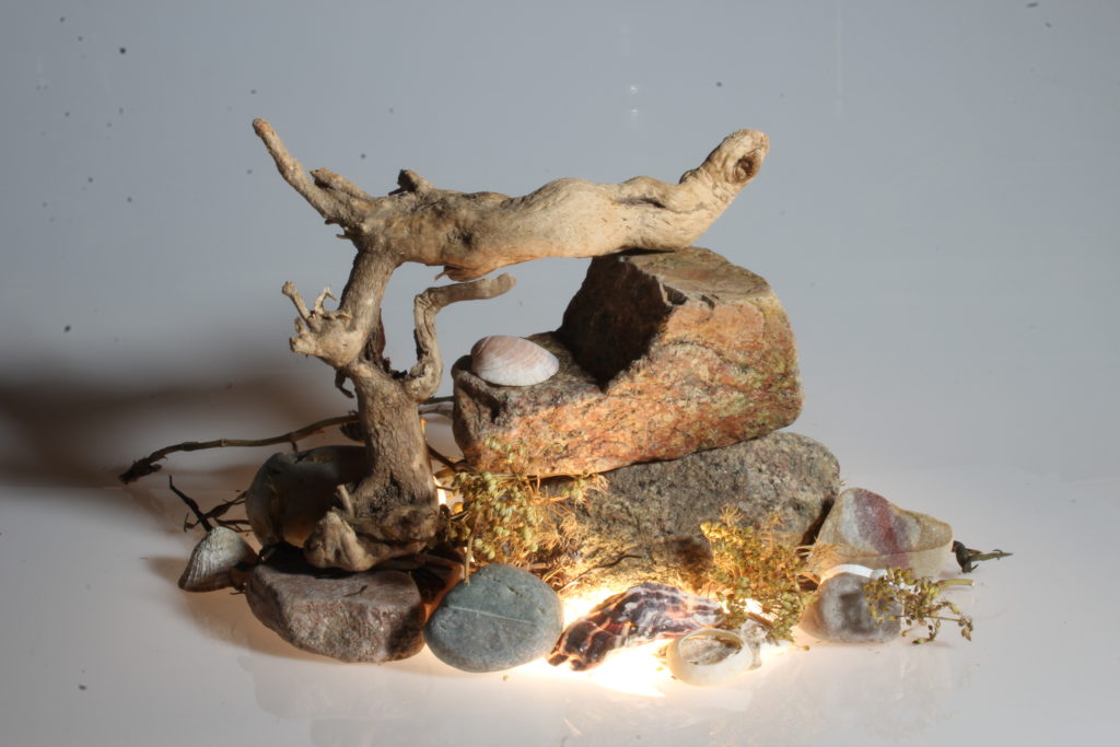
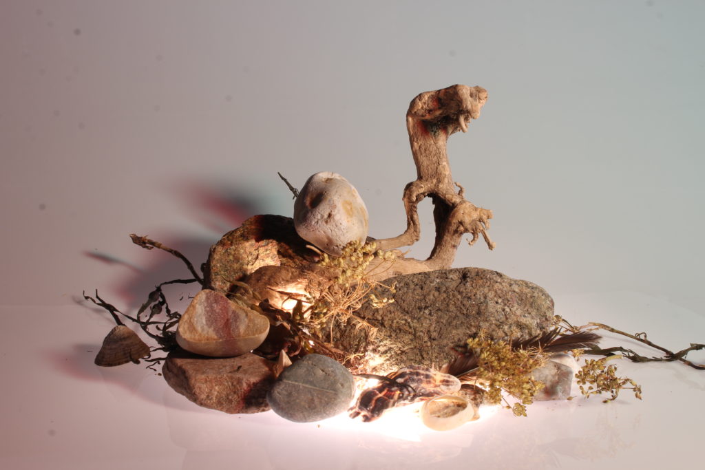
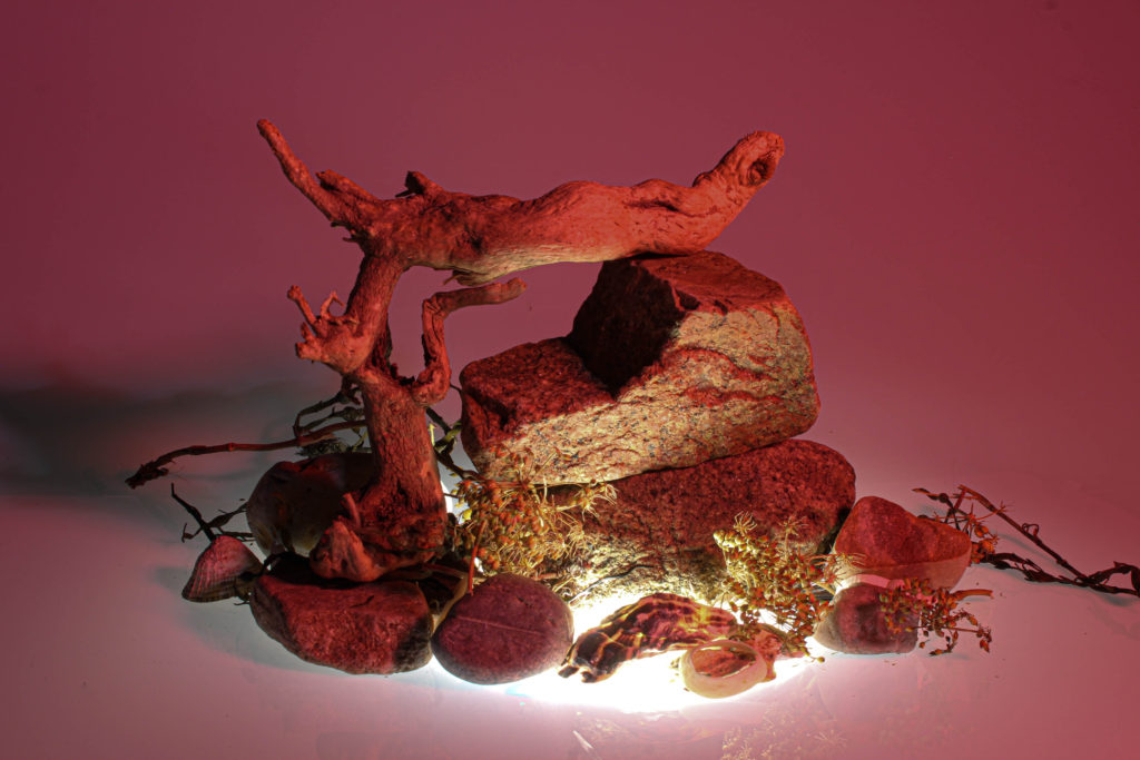
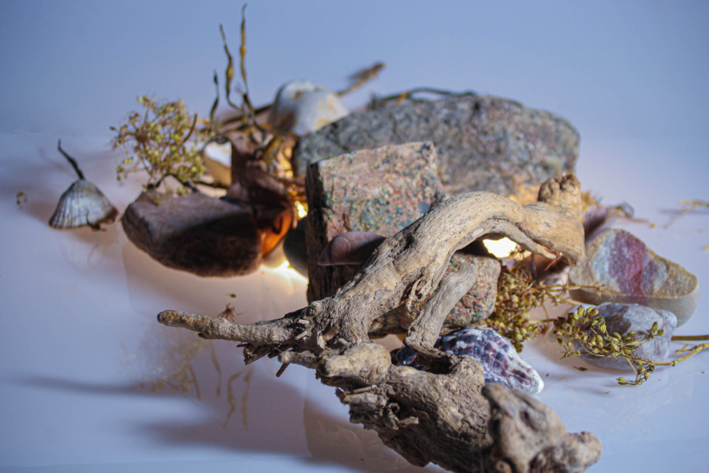
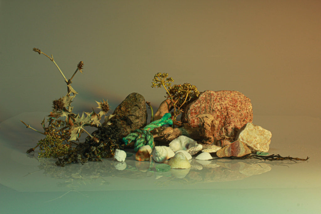
Except from adjusting the aperture after getting the camera setting right for the objects and lighting I have also rearranged some objects and used different coloured papers to put over the light so the images would also have interesting tones to them, this was so I could produce different photographs.

In a different blog post I have explained how through the photoshoot I have also experimented with different aperture and shutter speed.

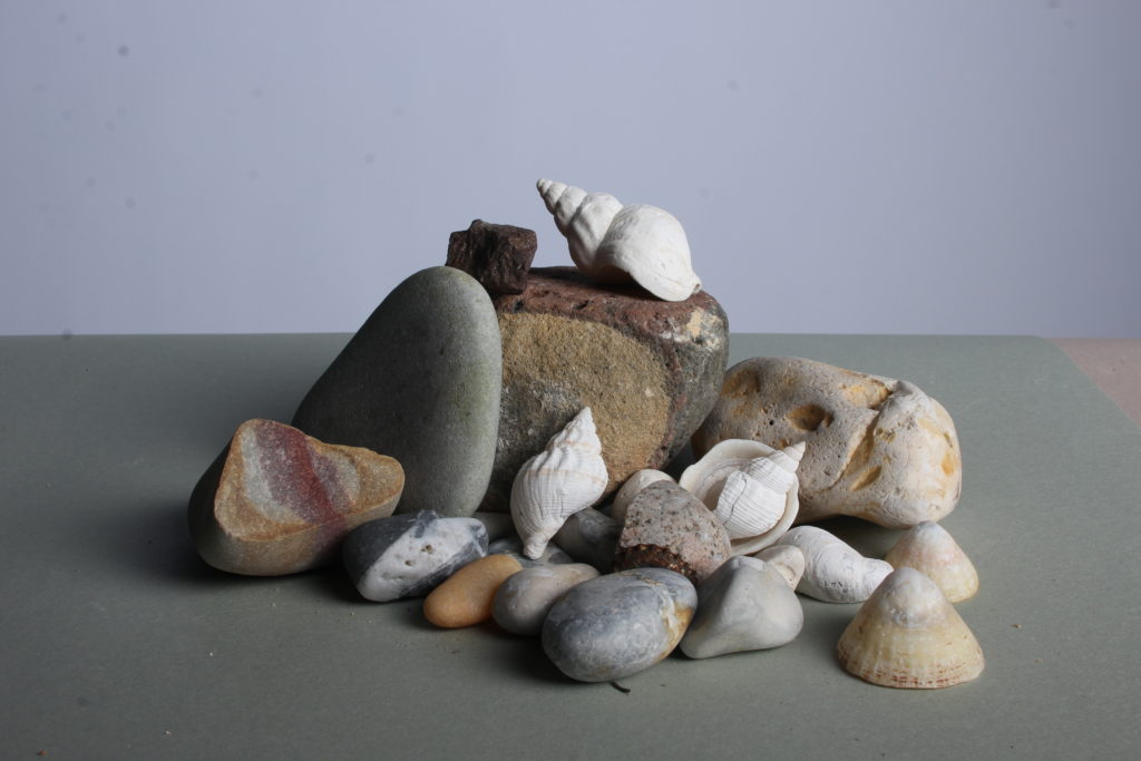
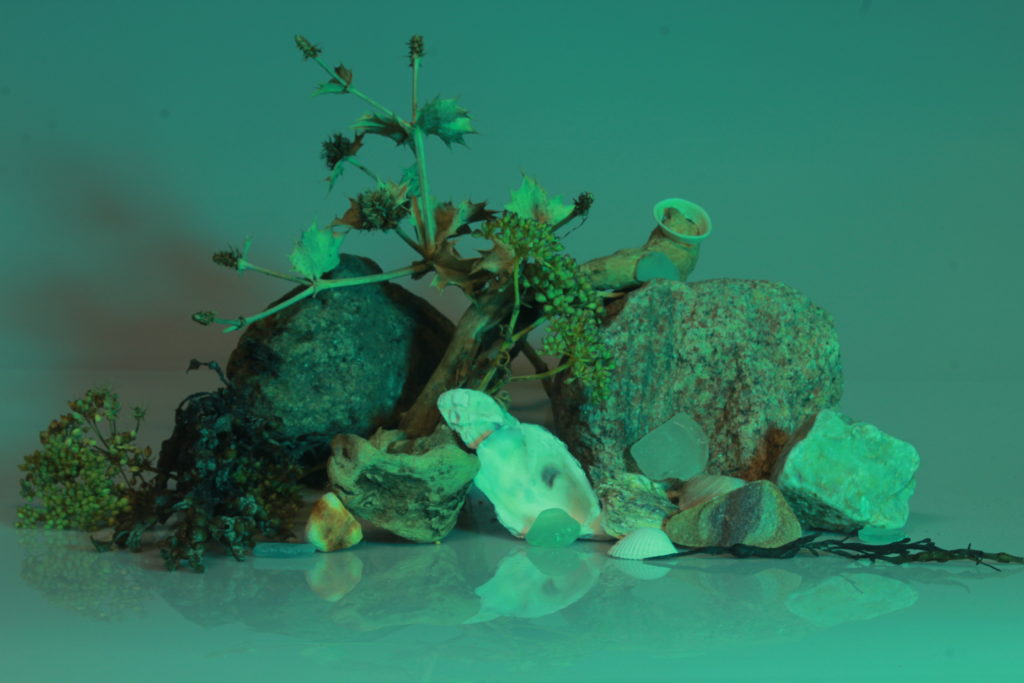
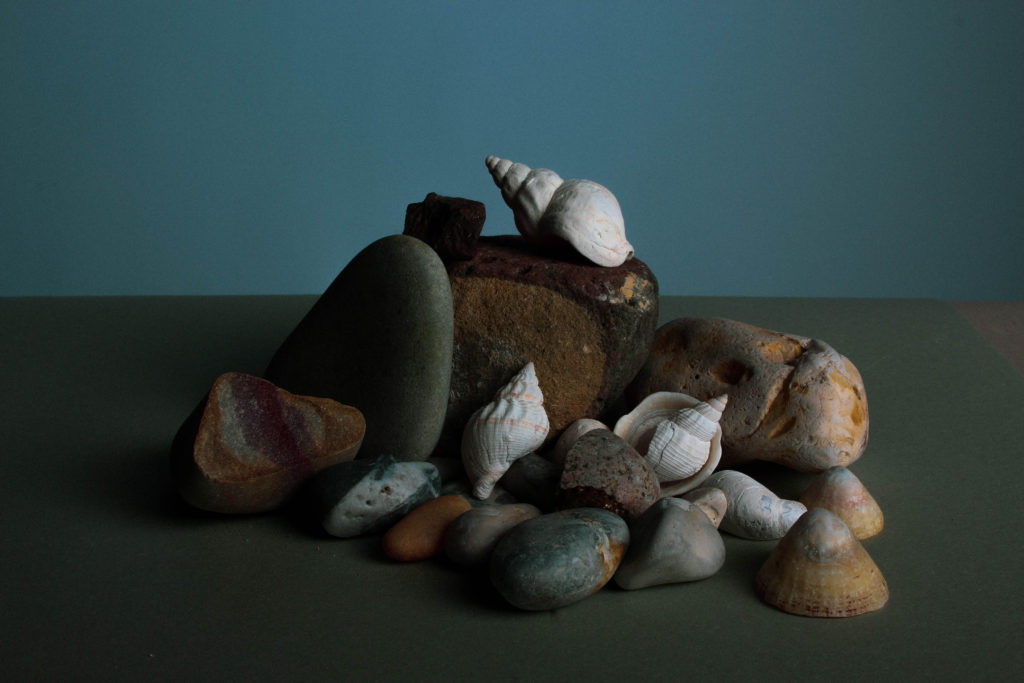
My favourite images from the photoshoots :

The images I have selected are “raw” images, meaning these photographs are not yet edited and are images of what the camera has seen them as.

Still Life Edits

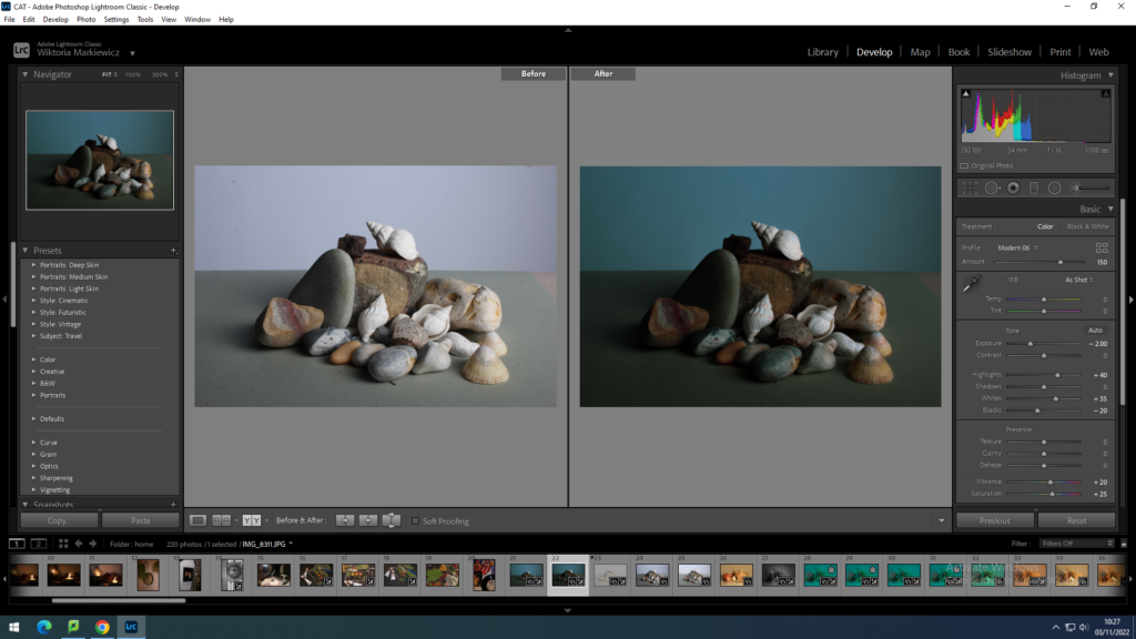
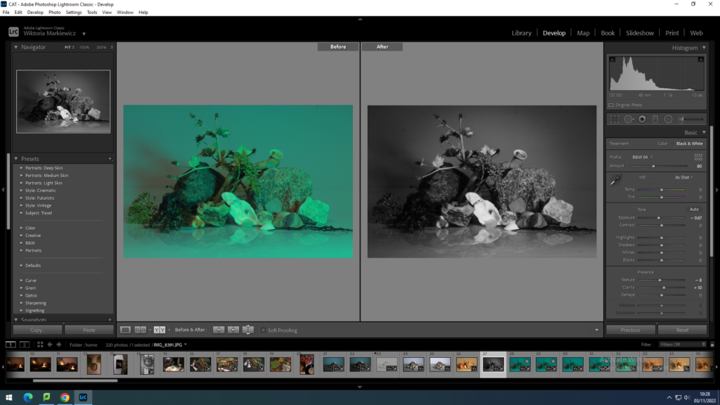
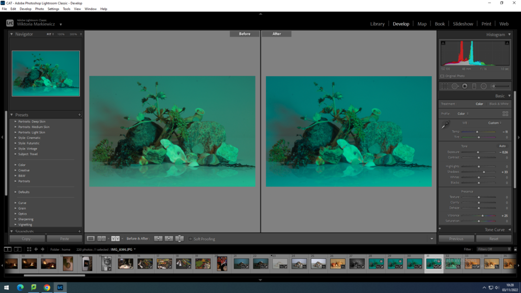
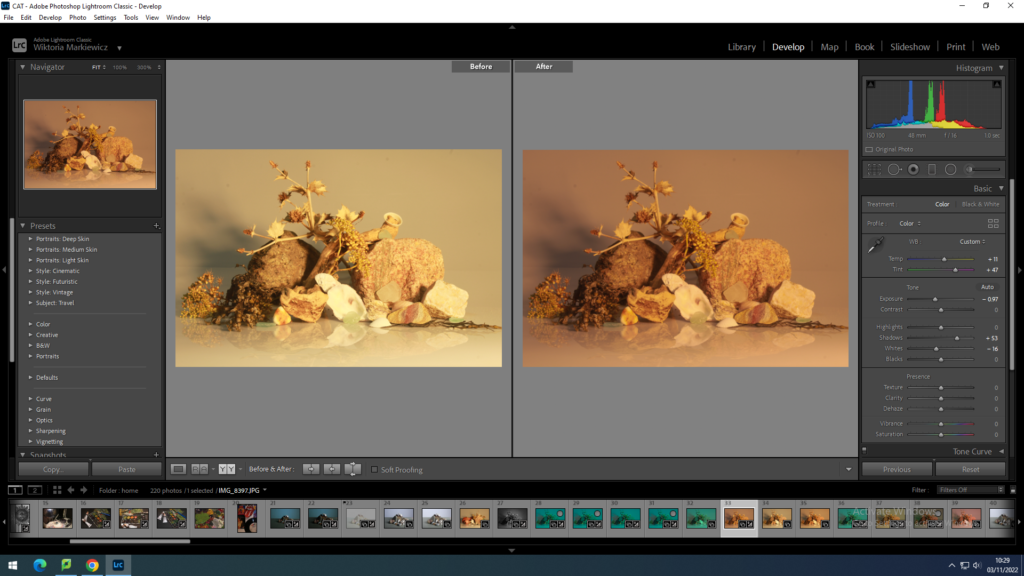
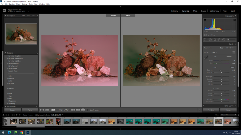
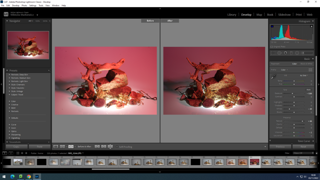
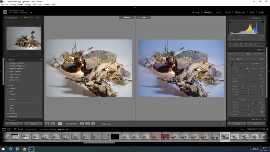
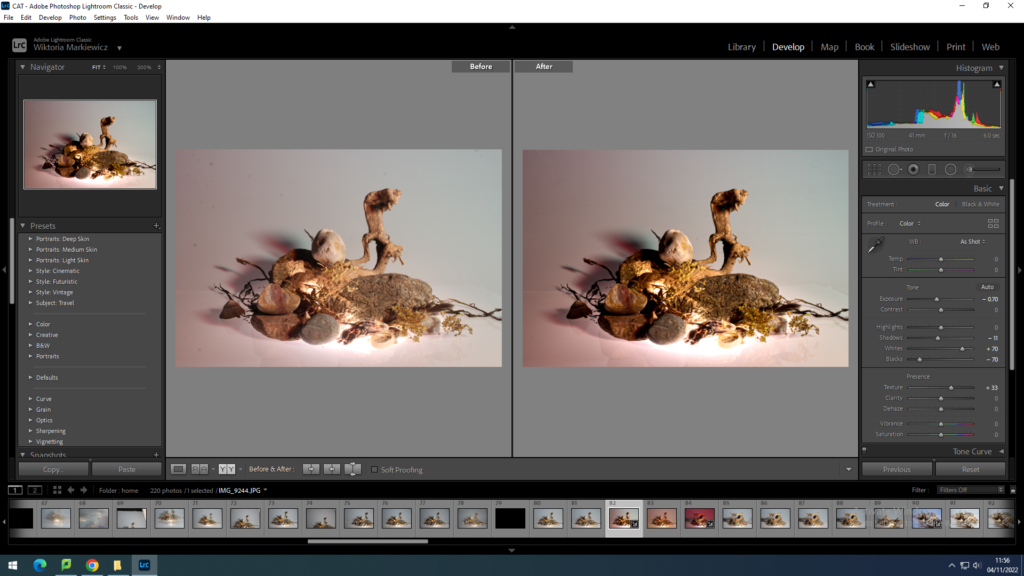
Once I was able to select my favourite images I could then edit these in adobe Lightroom. I have mainly edited them in the develop mode as then I was able to play around with the tones, exposure, lights and darks and texture. for most of my edits I have increased the texture to make the photographs more sharp and show more detail. I have also in come cases increased the saturation or tones and to make the pictures darker, decreased the exposure. Depending on the picture and how much exposed it is , I have individually increased lights and darks, but this was depending on a specific photograph.

with other photographs I changed them to black and white and adjusted them from there, usually playing with how light and dark I would want the objects in the photograph to appear.

Apart from making them black&white, in the library mode I selected for some photographs a filter which then similarly to black and white images, I played with how strong I would want the filter to be visible on the objects.

What was very useful was to copy what I have done to one image and paste it onto another , meaning the edits that I did to one would be the same on another. I was able to do this in develop mode where I would press copy in the left bottom corner and selecting a different image and pressing paste which is found in the same place as copy.

With copying the edit setting for one image and layering them onto another , I could see how the same setting would effect a completely different image. which made the process of editing a couple of the images quicker and easier. However this doesn’t mean I didn’t focus on the image by itself long enough, as I would check how the settings compliment the objects and on top of that what else I may add to make the photograph it’s best quality.

with this and a couple more images I had to use the circle erase tool, found in the top right corner, below the histogram, in the develop mode. this tool was very useful to erase all the dots that were on the camera lens, usually little bits of dirt. however by using that tool and selecting the flaws in the photograph I quickly got rid of them, making the photograph look more clean.

Still Life best images

After having a great amount of images that look to their best quality, with the help of Lightroom to meat them to this standard I could do final checks and look more for the faults in the image , like dirt or unwanted bits. After this if I was satisfied with the images I put them in a separate folder which would make them easier to find later if its needed to print them.

My response to the still life photoshoot is that for my first ever photoshoot in the studio to editing the photographs and selecting my final ones, the images are to their best quality and I have demonstrated as well as enhanced the objects beauty, if its by highlights and shadows but as well as tones. the images when put together or next to each other could be grouped as colourful yet this is what in my opinion makes the photographs interesting. When shooting the pictures with the camera, I had fun rearranging the objects as I had to creatively think ahead of how they would look from a different angle. As well as with aperture and shutter speed, I have learned how changing certain settings affect the camera, which was useful not only when taking these images but in the future , when it comes to other photoshoots. This was one of my first times using Lightroom which also was a lesson for the future and getting used to the program in order to know how to make other photos in the future to their best state and how to know what to do to achieve the effect I want on them quicker.