“MY JERSEY”
Your A Level Photography Summer Task is to respond to what Jersey means to you. You could explore aspects of heritage , lifestyle, community, surroundings, the past, present or future. You must complete a sequence of individual tasks and respond thoughtfully and creatively in order to produce a range of visual outcomes.
Expected time input = 5 hours minimum – 10 hours maximum
To get started you must choose at least one person who has a connection to Jersey. Take notes on their personal details (why and how they are in Jersey, name, age etc.) Then, you must agree with the person how you will photograph them (portraits), photograph a selection of personal objects and artefacts, and also photography a specific location. The three components must connect the person to the place.
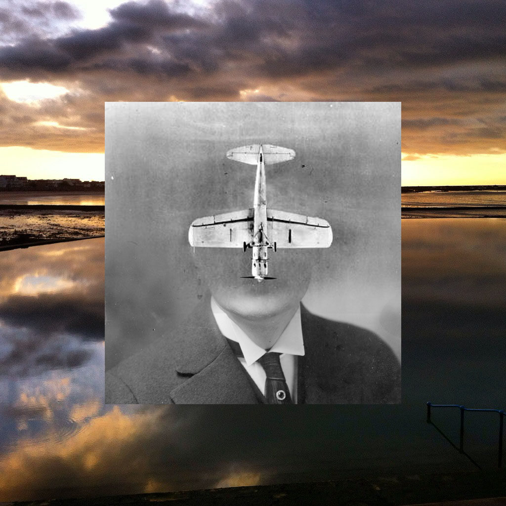
From these images : You will be creating a set of simple photo-montages that are based on a combination of a person, an object and a place…
1. by stacking 3 images on top of each other in a strict order. This can be done digitally or created with prints, scissors, glue etc…
2. by juxtaposing 2 / 3 images alongside each other
3. by merging or blending 3 images together to create a double or multi-exposure
Stacking
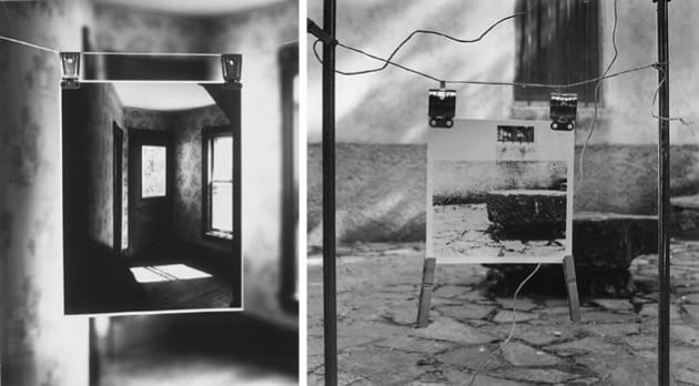
Juxtapose
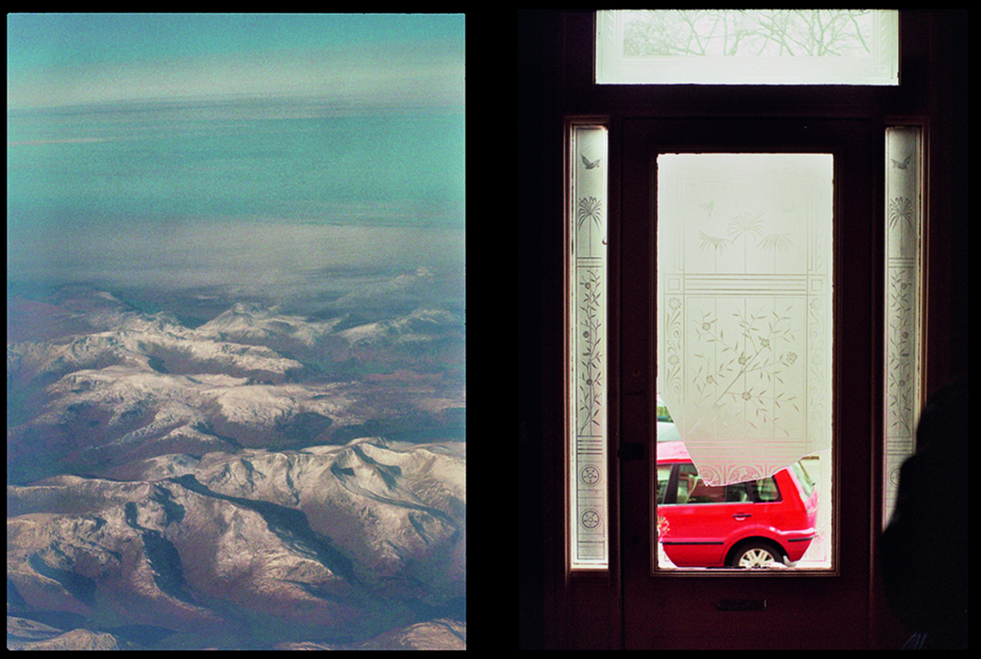

Merge
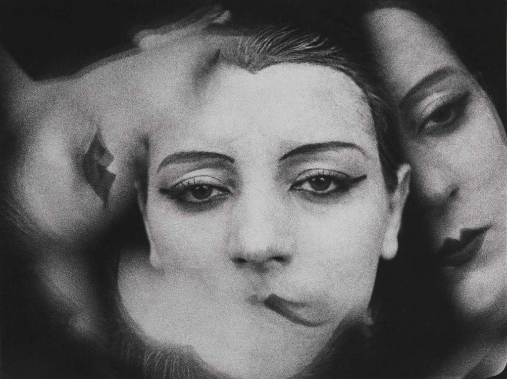
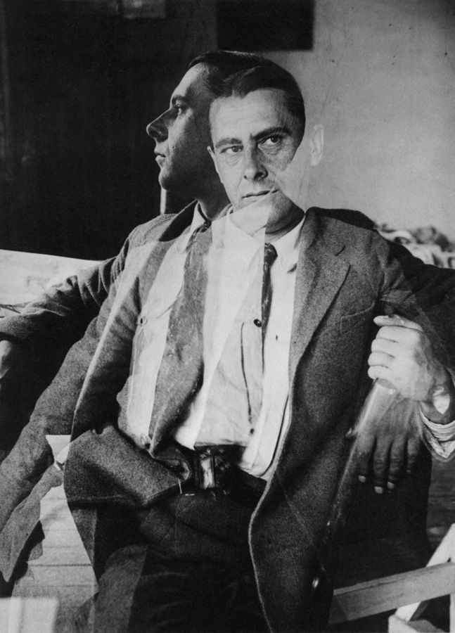
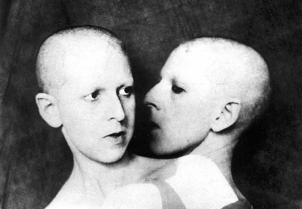
DOUBLE / MULTI-EXPOSURES
Double or multiple exposures are an illusion created by layering images (or portions of images) over the top of each other. This can be achieved in the camera settings, or on Adobe Photoshop by creating LAYERS and then using BLENDING OPTIONS and OPACITY CONTROL. Artist have used these techniques to explore Surrealist Ideas and evoke dream-like imagery, or imagery that explores time / time lapse.
You could use apps like BLENDEDITOR for this…on your iphone
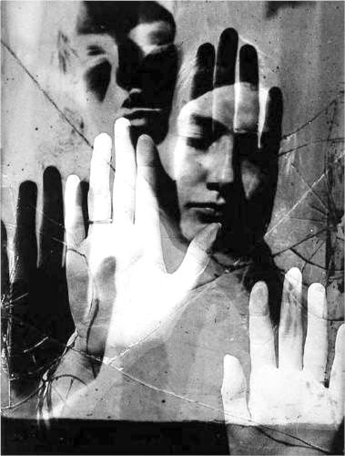
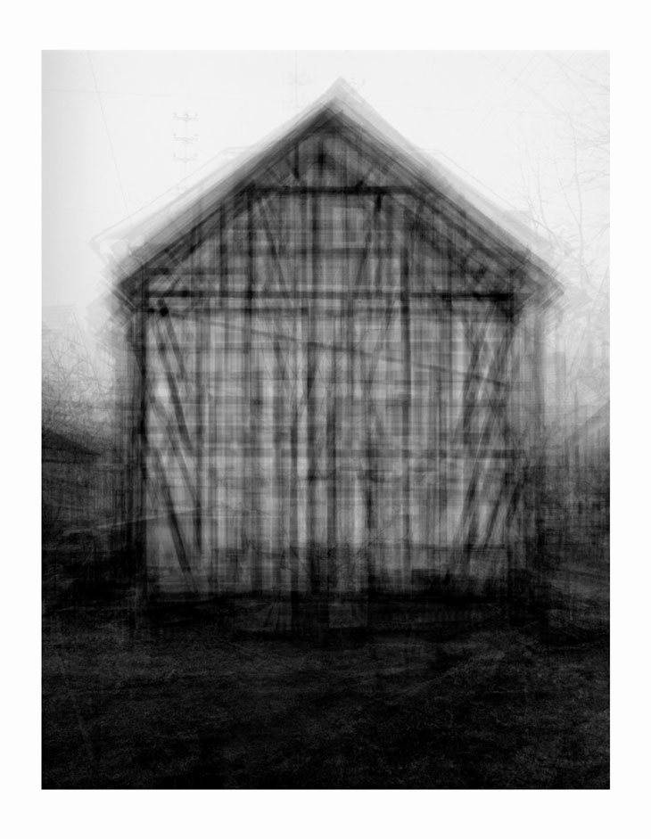
Photographic print
208 x 160 cm
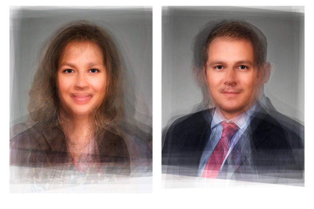
Idris Khan’s Every… Bernd And Hilla Becher… series appropriates the Bechers’ imagery and compiles their collections into single super-images. In this piece, multiple images of American-style gabled houses are digitally layered and super-imposed giving the effect of an impressionistic drawing or blurred film still.
PHOTO-MONTAGE
Photomontage is the process and the result of making a composite photograph by cutting, gluing, rearranging and overlapping two or more photographs into a new image.
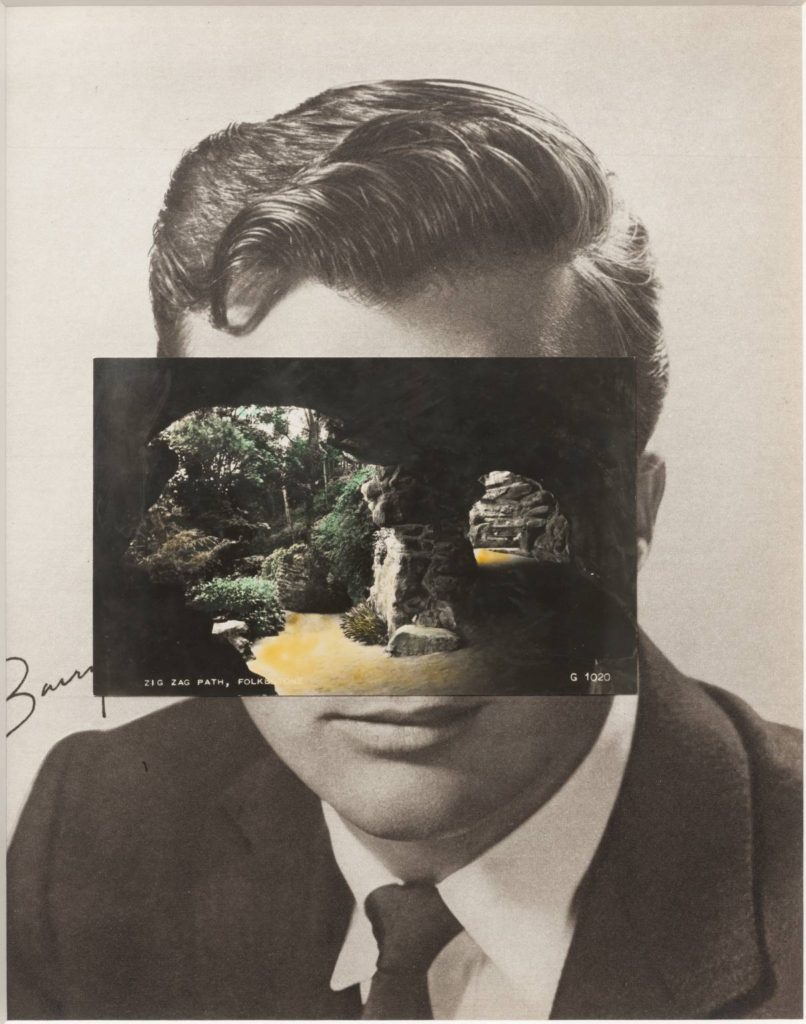
John Stezaker: Is a British artist who is fascinated by the lure of images. Taking classic movie stills, vintage postcards and book illustrations, Stezaker makes collages to give old images a new meaning. By adjusting, inverting and slicing separate pictures together to create unique new works of art, Stezaker explores the subversive force of found images. Stezaker’s famous Mask series fuses the profiles of glamorous sitters with caves, hamlets, or waterfalls, making for images of eerie beauty.

Pariwat Anantachina The L_st Album is a project that sprung from Pariwat’s love of exploring secondhand markets, ea markets, and even night markets; where he purchased fascinating mementos of unknown people. Albums that may have been lost and forgotten in houses, while moving, thereby being obtained by merchant scavengers to be sold in secondhand markets. These collections were revived by conveying about the relationships of people in the society which is known to be the smallest unit and is called “family“.
Photographs you must provide…
Task 1. The Object
Photograph a set of objects that belongs / belonged to a person who has a connection to Jersey. This could be someone who has a far-reaching family history in Jersey, or someone who has recently settled in the island.
Think about lighting and positioning of the object (s) and use white / plain backgrounds and an infinity curve if possible.
Photos required 50-100

Vanitas / still life
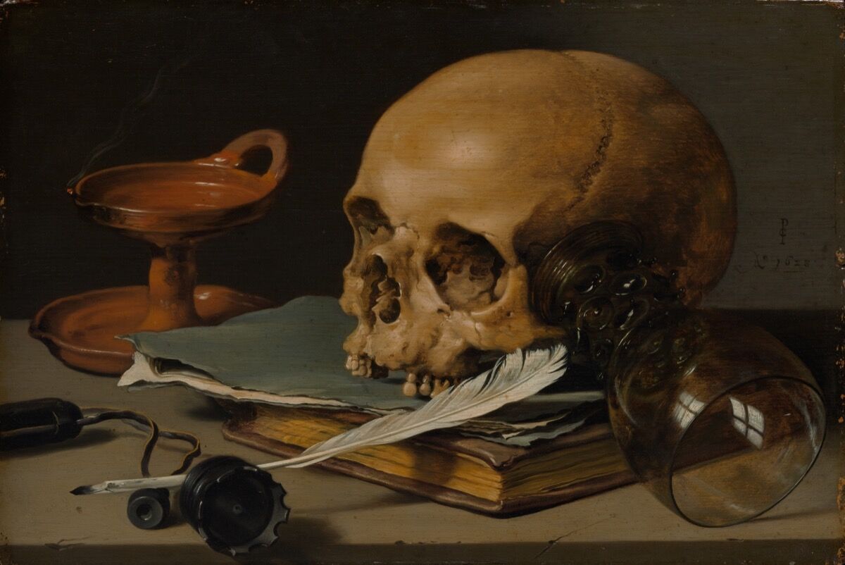
A vanitas is a symbolic work of art showing the transience of life, the futility of pleasure, and the certainty of death, often contrasting symbols of wealth and symbols of ephemerality and death.
The term originally comes from the opening lines of the Book of Ecclesiastes in the Bible: ‘Vanity of vanities, saith the Preacher, vanity of vanities, all is vanity.’
Vanitas are closely related to memento mori still lifes which are artworks that remind the viewer of the shortness and fragility of life (memento mori is a Latin phrase meaning ‘remember you must die’) and include symbols such as skulls and extinguished candles. However vanitas still-lifes also include other symbols such as musical instruments, wine and books to remind us explicitly of the vanity (in the sense of worthlessness) of worldly pleasures and goods.
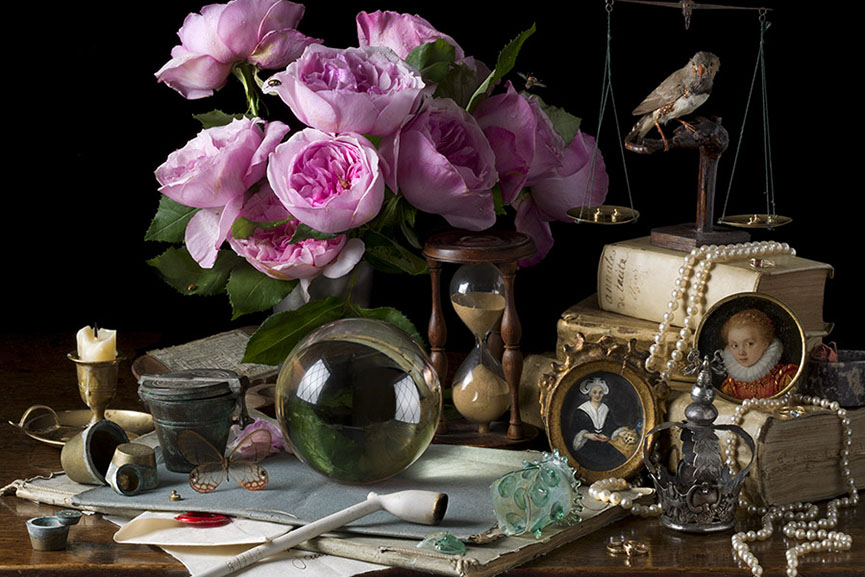
Inspired by the works of 17th century Old Master still life painters such as Giovanna Garzoni and Maria Sibylla Merian, American photographer Paulette Tavormina creates stunningly lit imagery of fruits and vegetables immersed in dark atmosphere
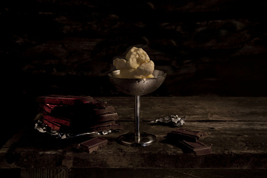
A perfect example of the old technique getting combined with modern-age ideas is Mat Collishaw’s Last Meal on Death Row series of works. Although they appear as meticulously arranged staged photography still lifes of food, each image is actually based on death row inmates’ last meals before they are executed. Apart from the eerie subject, the pictures deliver a strong drammatic effect through an excellent use of chiaroscuro.
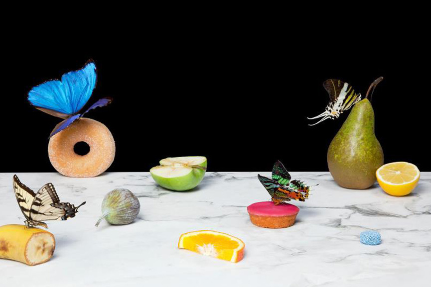
On a much more lighter, even pastel note, we have Dutch photographer Krista van der Niet, whose compositions often include fruits and vegetables mixed with mundane objects such as socks, cloths and aluminum foil, giving it all a contemporary feel. Her photos often carry a dose of satire as well, which references consumerism and popular culture through a clever employment of objects within a carefully composed scenery.
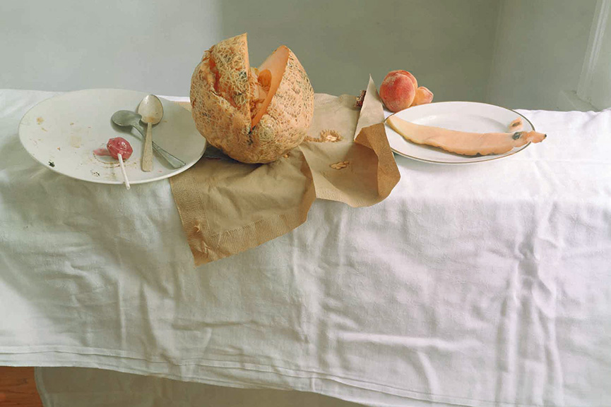
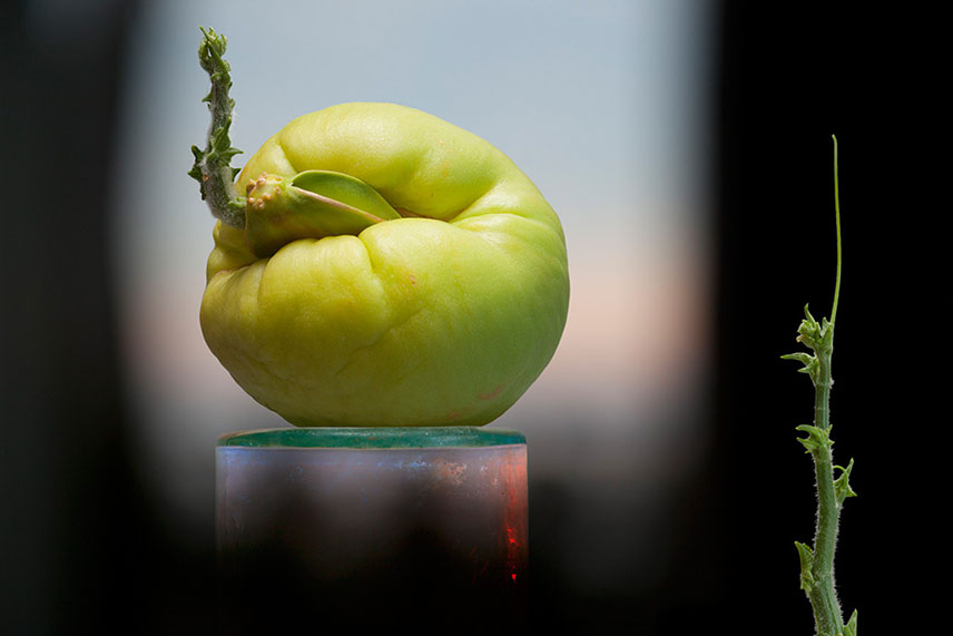
Experimenting with the endless possibilities of light, self taught photographer Olivia Parker makes ephemeral constructions. She started off as a painter, but soon turned to photography and quickly mastered the way to incorporate an extensive knowledge of art history and literature and reference the conflicts and celebrations of contemporary life in her work. Over the many years of her artistic career, her style remained fluid, yet consistent
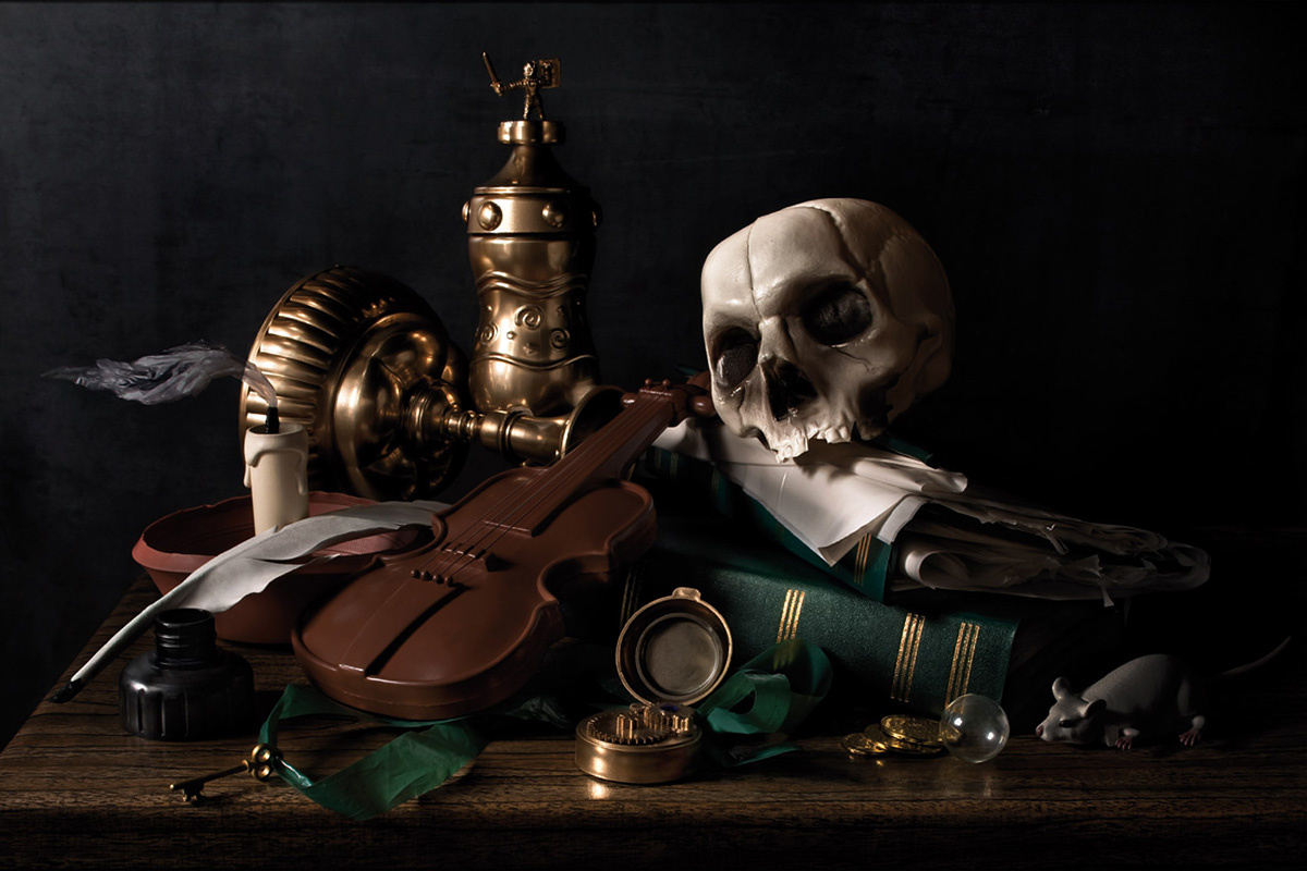
Think paintings by Pieter Claesz or Adriaen Coorte, only in plastic. That’s how one could describe the photographs of Richard Kuiper, whose objects are all made of this everlasting, widely used material, including water bottles, floral arrangements, even the feathers. The artist tries to draw our attention towards the excessive use of plastic in our everyday lives, with the hope we will be able to decrease it before it takes over completely.

Task 2. The Portrait
Create a set of portraits of the same person connected to Task 1 (The Object.)
The portraits can be headshots / close ups / half body / full length etc…see below for ideas and inspiration
Consider lighting and a clear, plain background eg a white wall
Photos required 50-100
THE DEADPAN AESTHETIC
According to sources the origins of the word “Deadpan” can be traced to 1927 when Vanity Fair Magazine compounded the words dead and pan, a slang word for a face, and used it as a noun. In 1928 the New York Times used it as adjective to describe the work of Buster Keaton.
It is less clear when it was first used to describe the style of photography associated with Edward Ruscha, Alec Soth, Thomas Ruff and many others. Charlotte Cotton devotes a complete chapter to Deadpan in The Photograph as Contemporary Art and much that has been written since references that essay.
In summary Deadpan photography is a cool, detached, and unemotional presentation and, when used in a series, usually follows a pre-defined set of compositional and lighting rules.
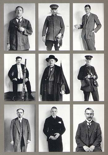
This style originated in Germany and is descended from Neue Sachlichkeit, New Objectivity, a German art movement of the 1920s that influenced the photographer August Sander who systematically documented the people of the Weimar Republic . Much later, in the 1970s, Bernd and Hilla Becher, known for their devotion to the principles of New Objectivity, began to influence a new generation of German artists at the Dusseldorf School of Photography (4). These young German photographers included Thomas Struth, Andreas Gursky, Candida Hofer and Thomas Ruff. The Bechers (4 & 5) are best remembered for their studies of the industrial landscape, where they systematically photographed large structures such as water towers, coal bunkers or pit heads to document a soon-to-disappear landscape in a formalistic manner as much akin to industrial archeology as art. The Bechers’ set of “rules” included clean, black and white pictures taken in a flat grey light with straight-on compositions that perfectly lent themselves to their presentation methodology of large prints containing a montage of nine or more similar objects to allow the study of types (typology) in the style of an entomologist.
If you want to learn more about the theoretical and philosophical basis for the deadpan aesthetic READ HERE.
Thomas Ruff wanted to mimick the setup for a having a set of passport images taken. Read an interview with him here recently published in the Financial Times
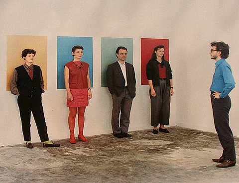
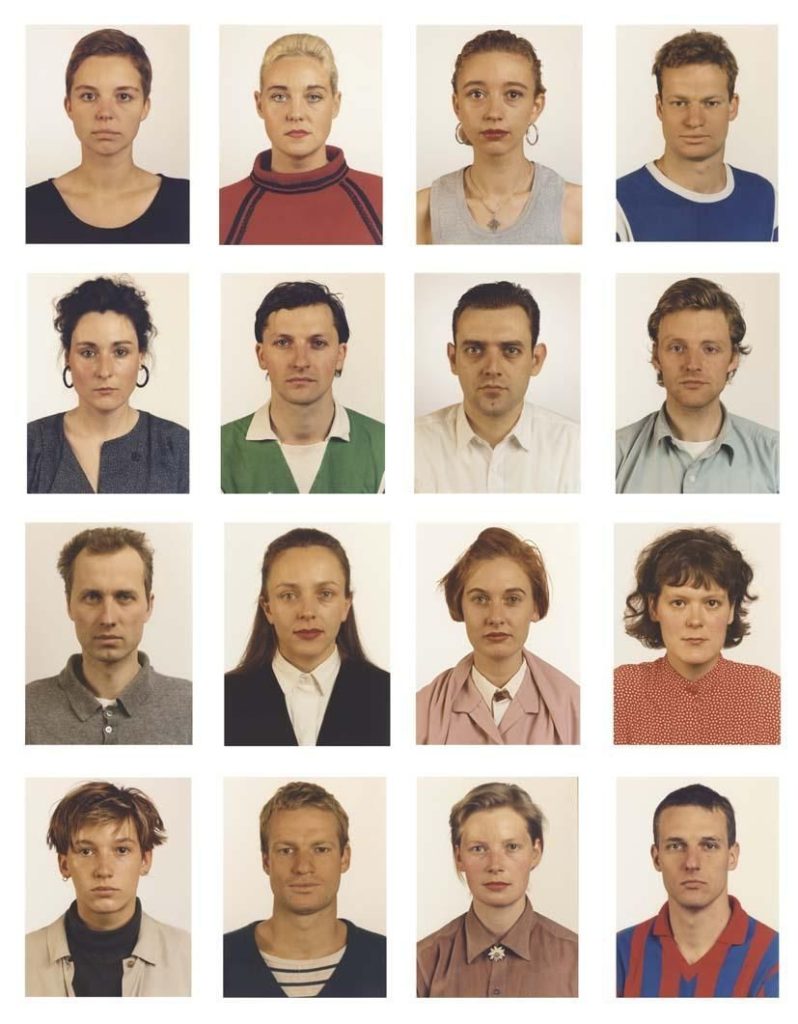
PASSPORT PHOTO
From the UK Government website
FACE:
- eyes must be open and clearly visible, with no flash reflections and no ‘red eye’
- facial expression must be neutral (neither frowning nor smiling), with the mouth closed
- photos must show both edges of the face clearly
- photos must show a full front view of face and shoulders, squared to the camera
- the face and shoulder image must be centred in the photo; the subject must not be looking over one shoulder (portrait style), or tilting their head to one side or backwards or forwards
- there must be no hair across the eyes
- hats or head coverings are not permitted except when worn for religious reasons and only if the full facial features are clearly visible
- photos with shadows on the face are unacceptable
- photos must reflect/represent natural skin tone
BACKGROUND:
Photos must have a background which:
- has no shadows
- has uniform lighting, with no shadows or flash reflection on the face and head
- shows a plain, uniform, light grey or cream background (5% to 10% grey is recommended)
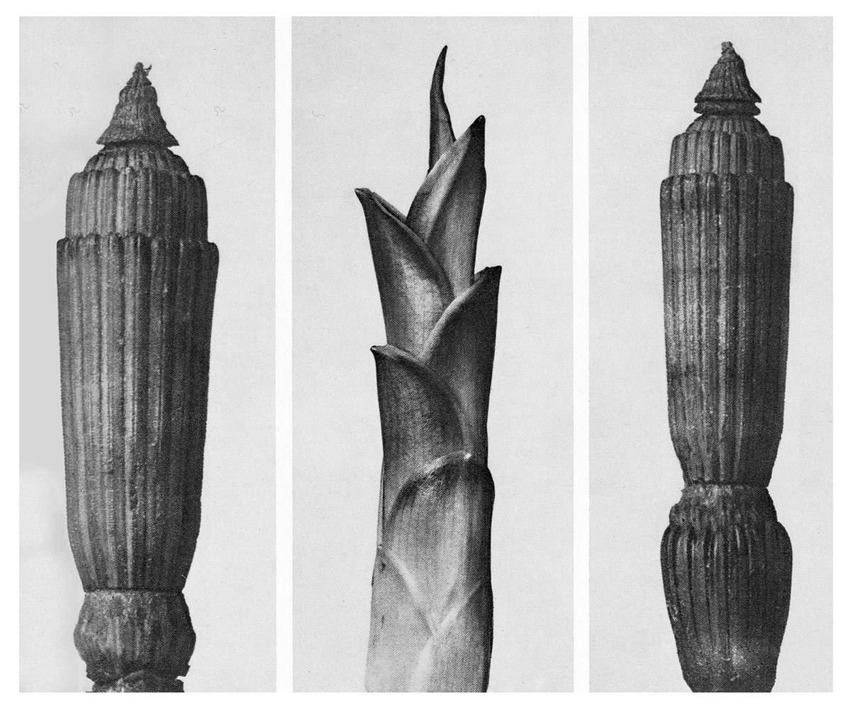
This influenced by the work of earlier German photographers linked to the New Objectivity movement of the 1920s such as August Sander, Karl Blossfeldt and Albert-Renger-Patzsch.
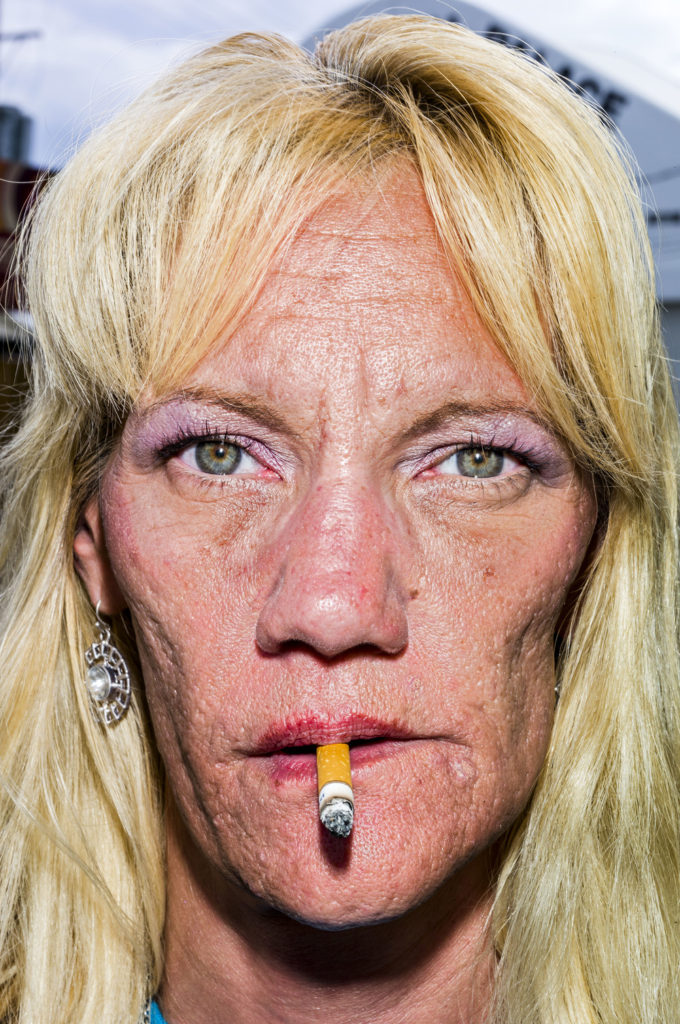
BRUCE GILDEN: FACE: Bruce Gilden is renowned for his confrontational style and getting up close to his subject. Between 2012-14 Gilden travelled in America, Great Britain, and Colombia and created a series called FACE. Read a review here in the Guardian newspaper and another on Lensculture.
UP CLOSE
In addition to focusing on details of the face try and isolate body parts, gestures, clothing and physical features, such as hands, elbows, shoulders, neck, torso, hip, knees, feet. Your understanding of abstraction in photography; focusing on shapes, colours, light and shadows, textures and repetition is crucial here.
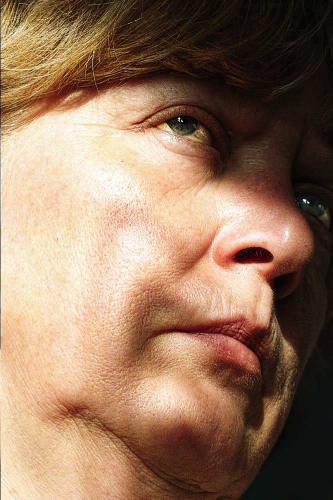
Satoshi Fujiwara: Code Unknown: In Michael Haneke’s 2000 film Code Unknown, there is a scene in which the protagonist’s lover, a photographer, secretly snaps pictures of passengers sitting across from him on the train.
When we look at another person, either directly or through another medium, we interpret a wide range of information based on outward appearance (face, physique, clothes and accessories, and movements)—in other words, various codes. By regulating and altering these codes in various ways, I set out to obscure the individuality and specificity of the subjects in the pictures in my series.—Satoshi Fujiwara
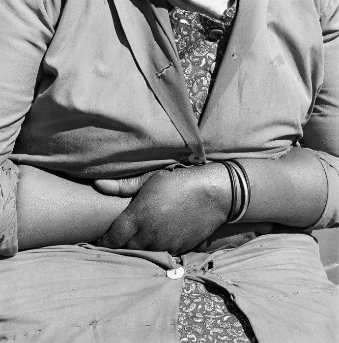
David Goldblatt: Particulars: Following a series of portraits of his compatriots made in the early 1970s, photographer David Goldblatt, for a very short and intense period of time, naturally turned to focusing on peoples’ particulars and individual body languages…
In this series we see hands resting on laps, crossed legs, the curved backs of sleepers on a lawn at midday, their fingers and feet relaxed, pausing from their usual occupations.
Task 3. The Place
Rule : The Place(s) must be connected to the person / people in Task 2. The locations could have a significance, or evoke a memory…

Robert Adams
You must include images of key locations in Jersey that have a historic significance to the person you have focused on. You must photograph the location(s). The Locations can be inside or outside. Try to avoid obvious / iconic locations (no sunsets over Corbiere please!)
-(the-lovers-(promenade)).jpg)


Aim for locations that have a personal and unique reasoning to the personalities you are focusing on…or meaningful historic locations such as…
Dolmen / German bunkers and fortifications / traditional Jersey buildings etc
Channel Island Occupation Society
Remember : landscapes and locations have memory, historical, cultural and social significance
Consider lighting and composition, camera settings and exposure levels.
Photos required 50-100
Your powerpoint must include…
- Research photo-montage and a range of artists from the selection provided
- Analyse his/her work, style, technique, meaning – show some knowledge and understanding
- Respond – produce at least 3 different shoots that show development of your ideas
- Edit – make a first selection and cut down the three shoots to the best ten images, and justify your selection
- Experiment – work on cropping, adjustments of brightness/ contrast/ colour correction and show further Photoshop / editing techniques if possible
- Evaluate – describe process of experimentation and reflect on learning
- Present – put all work together in a digital format such as Powerpoint
- Select your most successful outcomes, print out as an A4 image and explain why you have chosen it in your final evaluation (at least 200-300 words.)
How to proceed:
Research a relevant artist reference explain why you have chosen that particular photographer. What do his / her photographs say to you? Look at composition and its visual elements e.g. line, form, shape, colour, tone, contrast, texture, depth, balance, space, perspective, viewpoint, foreground/ mid-ground/ background, rule of thirds. Look at the use of lighting e.g. natural lighting; sunlight, overcast, soft, harsh, directional, contrast and artificial lighting: studio, flash, spotlight, side-light, backlight, reflected light, shadows, chiaroscuro (light / darkness).
Use photographic language as above in your annotation and consider the artistic merits :
Technical , Visual , Conceptual and Contextual elements…
- Write a short introduction about the work of your chosen photographer and the nature of their work
- Issues to consider:
- His / her attitude to photography and the advantages / disadvantages of the camera as a way of “seeing”
- Are we looking at fact or fiction (or a hybrid of both?)
- The ways in which your chosen photographer explored the formal elements in his / her work e.g. form, light, rhythm, line, texture, repetition etc.
Planning: Once you have spent time evaluating the work of your chosen photographer, plan a shoot using the same techniques and mindset.
You must: Produce a mind map showing your thought process and with breadth of thinking, and a mood board (collage of images) to illustrate the look and feel of your project.
You should: include your thoughts, how are you going to proceed with the project? What are your inspirations? Your doubts? Your worries? How will you start? Consider as many experiments as you can.
Recording: After planning your idea, gather together what you need. When you take pictures try and think about everything that you see in the frame – what’s in the foreground, mid-ground, background. To achieve this you must think about composing your picture (use your zoom lens and/or distancing yourself from subject/object), focussing (sharp, soft focus), use creative exposure tools on camera like fast/slow shutter speed to either freeze or blur a sense of movement, different aperture settings to control the area of focus and sharpness in your picture. E.g. a high aperture setting like f5.6 will make the background soft and out of focus whereas an aperture of f16 will make everything in the picture sharp from foreground to background. Also by zooming in or using a telephoto lens you can throw the background out of focus, or conversely if using a wide-angle everything in the frame will be in focus. Crop your images carefully.
You must: Produce the contact prints from at least three shoots, each dated with your selections highlighted.
Editing: Editing is one of the most important aspects of photographic practice so be critical and selective when you choose your final selection of 5 images and then your best photograph. Think about sequence and relation between images – does your series of images convey a sense of narrative (story) or are they repetitious? Sometimes less is more!
You Must: Gather your images and select your final selection of 5-10 images, describe each of the images, artistically and share your thoughts on what why you took and then selected the image.
You should: Show your ability to correct the images using image manipulation software, such as Adobe Photoshop, consider the cropping, adjust levels, contrast, colour correction, B/W and balance of the image.
You could: Use Adobe Photoshop to enhance your creativity and expand on the possibilities that photography gives you, include screen grabs to illustrate the techniques you have used.
Presentation: Think about how you present your work in terms of layout, scale, colour and perspective. A Powerpoint presentation is ideal
The presentation of your photographs is just as important as your photographic images themselves. Consistency of layout throughout is paramount and try to make your work personal.
You must: Gather all of your work and present it in a logical manner
A grid format could work well for this exercise…
You should: Produce an individual and comprehensive response to both your chosen artists and the inspirations that the artist has given you.
You could: Design within Adobe Photoshop or similar package, a theme to enhance the imagery and clarify the message of your response.
Evaluation: Reflect, contrast and compare the images and idea have lead to how you made the photos, development of ideas and what you were trying to achieve and communicate. This can be done throughout your layout as annotation or at the end as part of your final evaluation. Finally, choose your favourite image and present this separately from your series of images.
Make sure you bring with you: all of your work including your best A4 printed images / montages for your first photography lesson in September 2022
Remember to follow the 10 Step Process to tackle all Assessment Objectives thoroughly :
- Mood-board, definition and introduction (AO1)
- Mind-map of ideas (AO1)
- Artist References / Case Studies (must include image analysis) (AO1)
- Photo-shoot Action Plan (AO3)
- Multiple Photoshoots + contact sheets (AO3)
- Image Selection, sub selection (AO2)
- Image Editing/ manipulation / experimentation (AO2)
- Presentation of final outcomes (AO4)
- Compare and contrast your work to your artist reference(AO1)
- Evaluation and Critique (AO1+AO4)
Good luck and get creative!
Contact : j.cole@hautlieu.sch.je
What equipment you need to start the course…
- SD Card
- USB / pendrive
- Card-reader / comverter
- Camera (optional as we have loan cameras)
We also provide an Adobe Licence for you to install Photoshop etc
INDUCTION DAY EXERCISES
Photography’s function(s)
Photography as an art-form
Photography as a science
The difference between the study of photography and the practice of photography
Henri Cartier-Bresson once said…”Your first 10,000 photographs are your worst”
What do you think Cartier-Bresson meant by this…? Discuss
Demonstrating a critical and contextual understanding of photography can be tricky, especially if the subject is relatively new to you in Year 12. The following activities have been designed to encourage you to reflect on what you know already about photography. Hopefully, some of the prompts will encourage you to further develop your understanding of photography through additional pondering and research.
In small groups, discuss the following questions. One person in the group should be responsible for making notes capturing the main ideas of the discussion:
- Why do people take/make photographs?
- Why is photography important?
- What skills do you need to be a good photographer?
- How many different kinds of photography can you think of?
- How does photography help us see the world?
- Can photographic images be trusted?
- What are the similarities and differences between photography and other types of visual art?
- When would it not be OK to take a photograph?
- How do you know when you’ve made a good photograph?
- Are photographers also artists?
- Where is the best place to see photographs?
- What kind of photography interests you most?
- What confuses or frustrates you about photography?
Watch this short film in which the photographer Henry Wessel discusses his practice. Make some brief notes. What does he help us to understand about photography?
Now compare with this example…
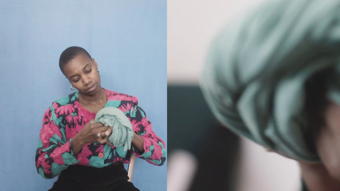
https://photoworks.org.uk/watch-artist-film-with-silvia-rosi/

