Final Evaluation

Overall I am very happy with my final images and photobook from this project and feel that it works as a nice conclusion for my time on the photography course. This project allowed me to explore more abstract concepts and imagery, taking inspiration from photographers like Eggleston and Kawauchi, and allowing me to further experiment with light and colour.
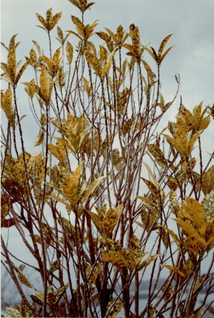
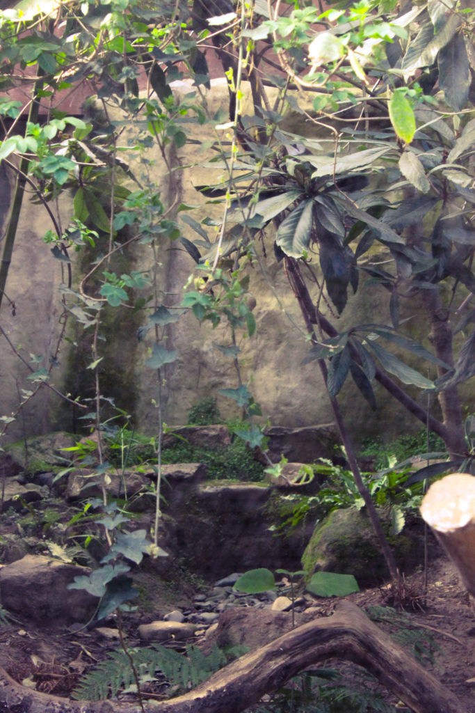
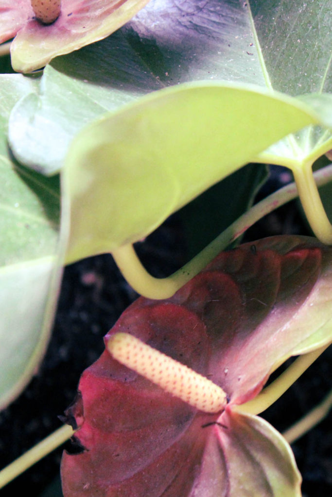
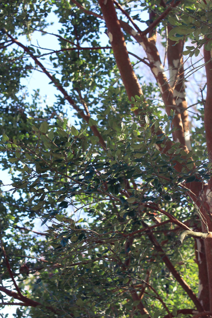
I decided to compare my image to this one by Eggleston because of their similar subjects, both being images of trees. Eggleston’s image is a bit darker and focuses on the yellow tones of the image, and how they contrast the lighter grey background. My image’s leaves are much darker and greener while the background is much lighter creating more contrast. I also adjusted the hue of the wood to make it warmer against the leaves and background. While there were ways I could have taken more inspiration from Eggleston’s editing style, I wanted to allow myself to make creative decisions of my own as well to create a body of work that is coherent across my artist references.
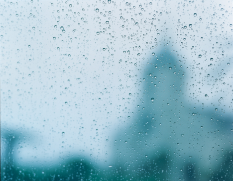
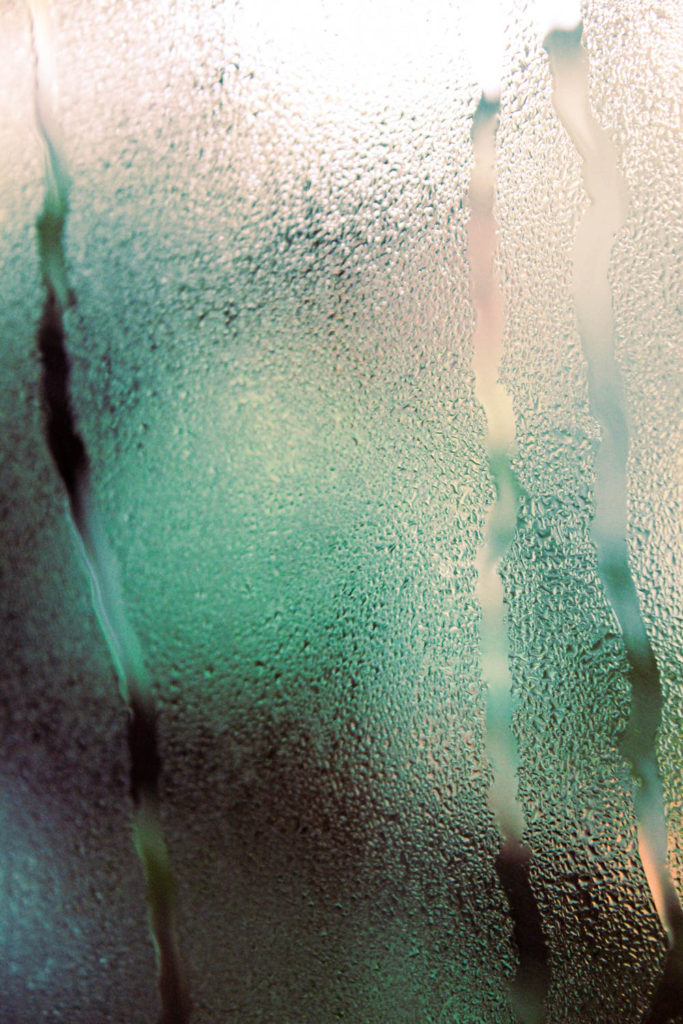
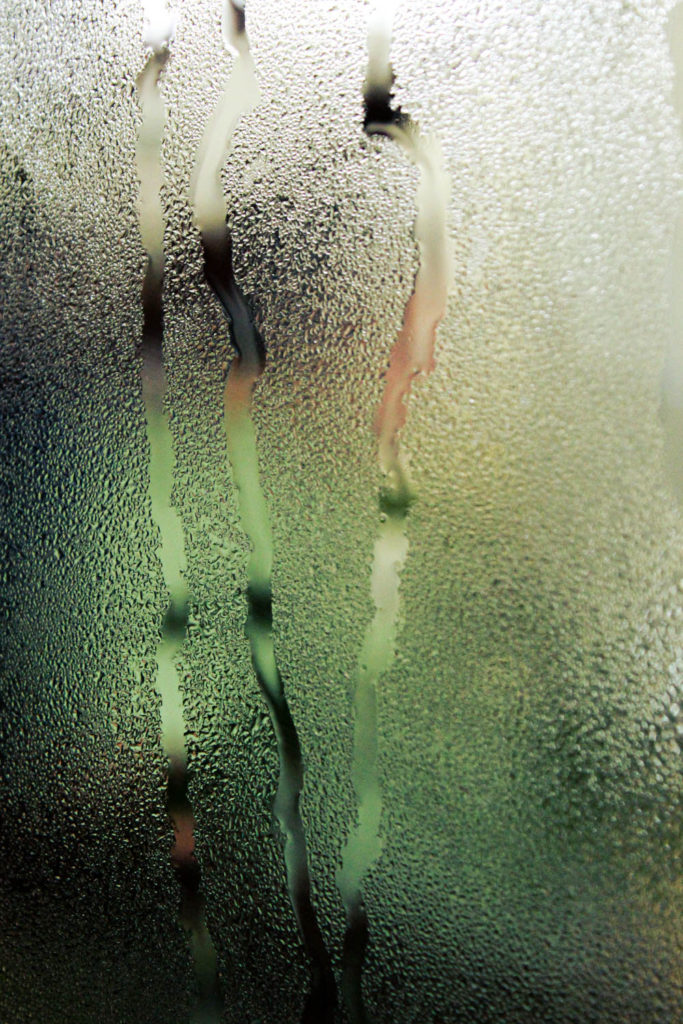
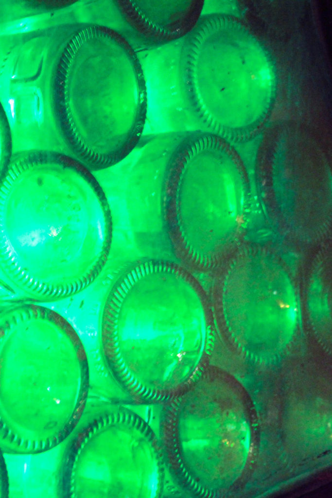
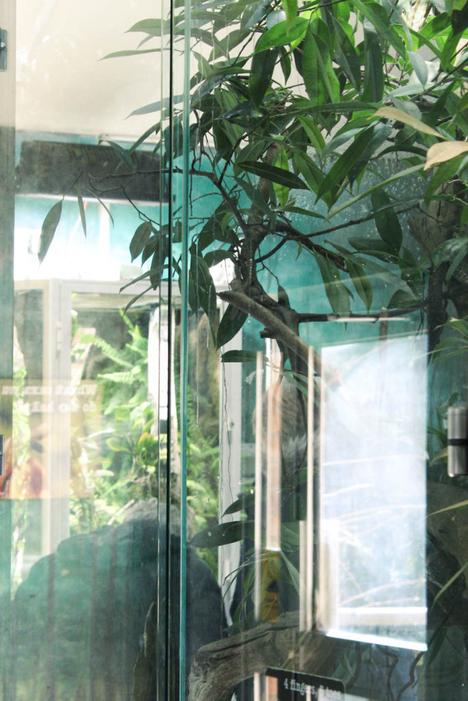
For my next image I chose to compare similar images between me and Kawauchi. Kawauchi’s image is much lighter and monochromatic, showing the silhouette of a building through a window covered in raindrops, it is simple yet effective, creating an emotive image with quite a simple composition. My image uses the condensation of one of the enclosures in the reptile house at the zoo, and shows some lines where the water has run and disturbed the droplets. I increased the saturation of the colours to try to add another layer of visual interest beyond just the texture on the glass.
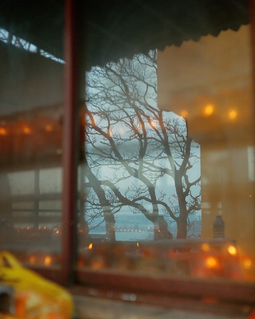
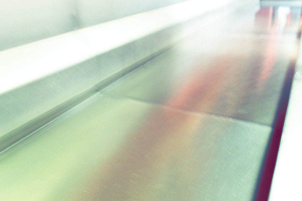
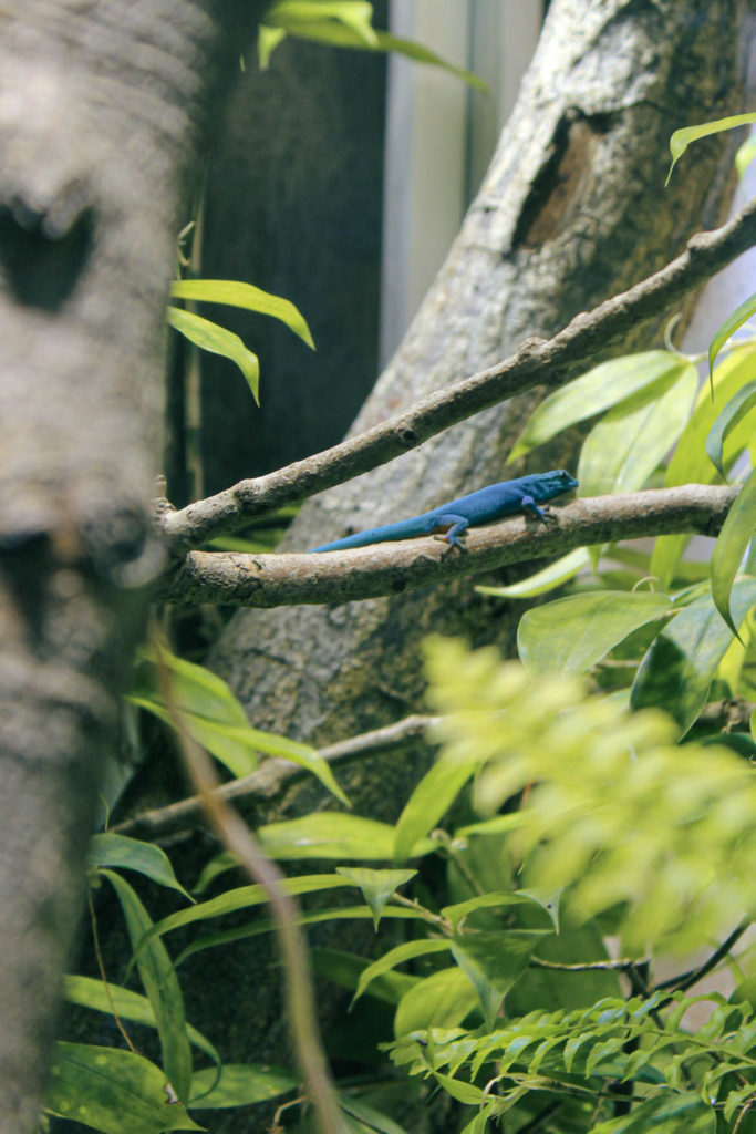
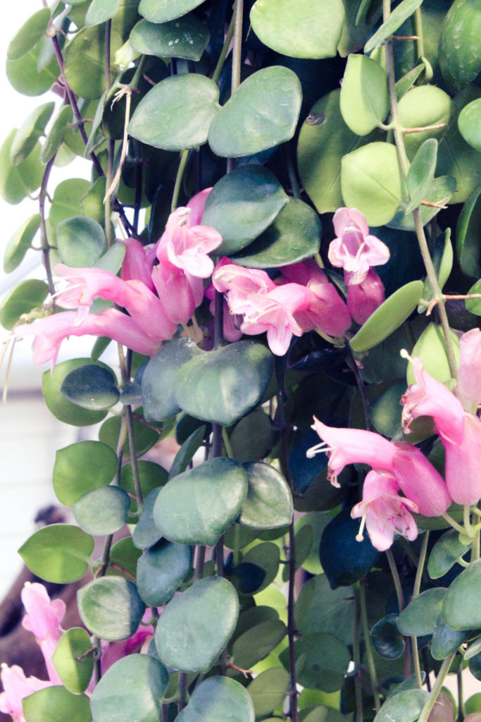
Finally I decided to compare my image with one of Yu’s because of the use of reflections. In her image, the reflection is very detailed and cool toned, contrasting with the warm lighting through the window. It is an intriguing image and very visually pleasing with her use of colour and composition. My image uses less contrasting colours and the reflection is not as clear because of how bright it is, and I possibly could have achieved a closer look by moving closer to the glass. Despite this I am still very happy with my images overall and feel that they display a lot of techniques both in and out of the camera.
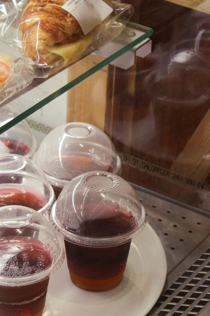
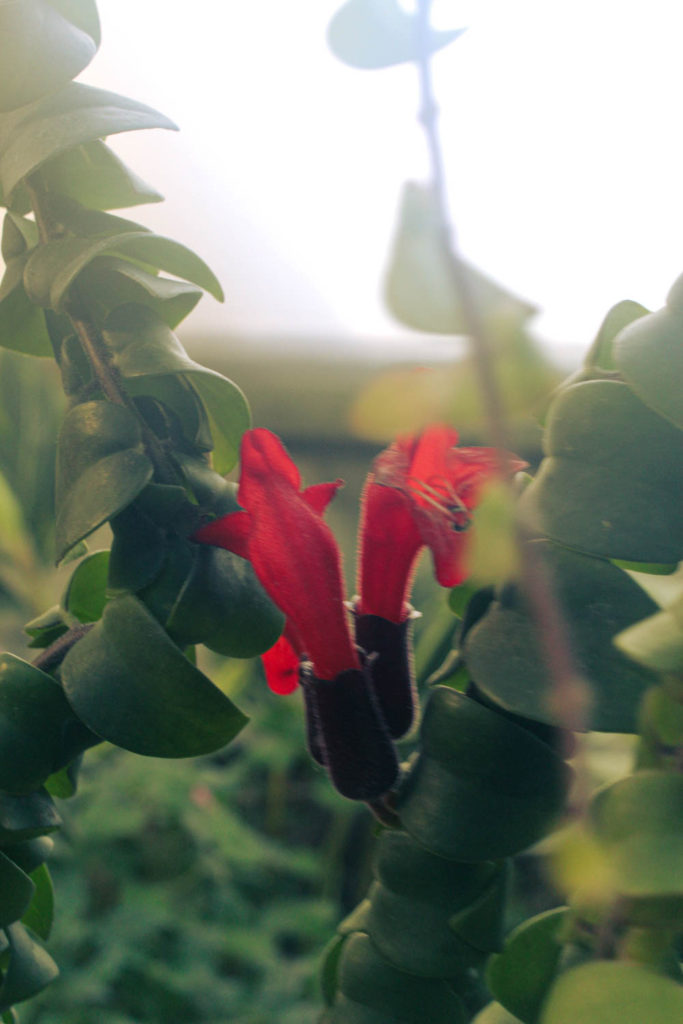
Some of my best images from across the entire project. I feel that I was successful in exploring the idea of more abstract photography through light and colour, even if I did stray a little from the exact styles of my artist references. I also could have been on more shoots to have more variety in my images but I am happy with what I did end up taking and editing, as these images encouraged me be more creative and experimental with them.
Final Images

Selection:

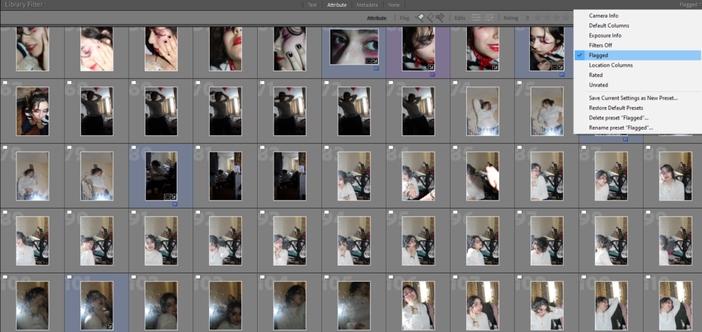
I began the selection process for my final images by putting all my images into one collection on Lightroom, allowing me to easily see them all at once. Then, I filtered the photos so I was only being shown the images that I’d previously gone through and marked as ‘pick’, making the selection process slightly quicker.

Contact Sheet

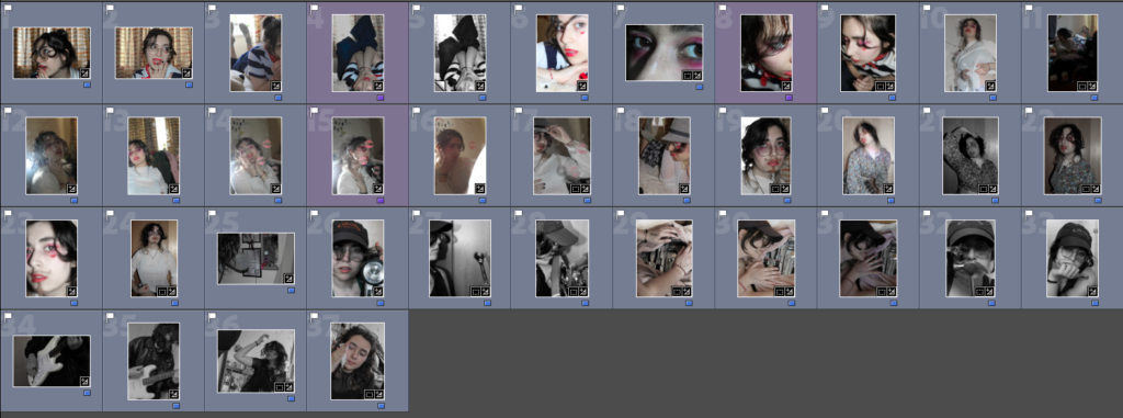
From here, I began to go through each image and mark in blue some of my favourite images that I thought would work well for my final piece and began to map out what images could go together in purple, starting to get an idea of how the final mount up will look like.

Contact Sheet

Editing:

Next, I began editing my images, making sure the image groups I created looked similar to one another as to not have images that look out of place. This took some time and experimentation as I needed to try match the saturation, exposure and contrast in each of my images in order to create the most effective result.

Example of a image group with similar editing

I didn’t want to use a lot of colours in my images and I felt as thought they’d be distracting, especially as I knew I was going to have busy looking frames which along with colour would be too much for my project.

Final Images:

These are my final images that I printed and grouped together for my final project.

Set 1
Set 2
Set 3

Experimenting

I decided to start experiment with how I could organise my images on photoshop so I knew what size to print my images, allowing me to decide how I wanted my images to be presented in terms of what types of frames I wanted to use. I decided to start digitally as I would have the option to adjust some images that I felt needed adjusting before committing to any final images. Then, I printed out some of my images onto normal printer paper and began to experiment with different ways that I could layout my prints physically.

Some Experiments:

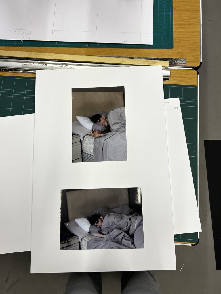
I experimented with different backgrounds, switching between white and black to get a visual for what would compliment my images best whilst changing the sizes of my images along the way, allowing me to find the layout that I think works best. Then, once I printed my images, I decided to experiment with some of my images by themselves, making sure I was committed to laying out my images as a set rather than individual images.

Here, I decided to add frames as I wanted to explore options other than mounting my images onto card or foam.
Final prints + virtual gallery + evaluation

this is my first of 2 final outcomes over all i was very happy with this one i tried to lay out the images so that they flow into each other with all having similar colours i feel that this one turned out well

for my second final outcome i decided to edit the photos i was gonna use in a window mount and merged them together and am very happy with the outcome this is my favourite one and glad it turn’t out well

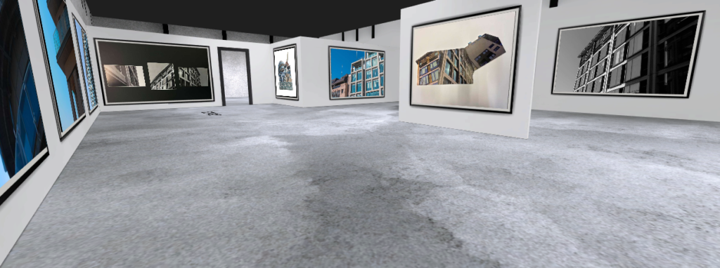
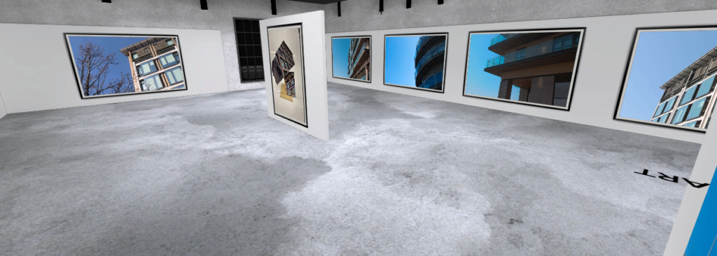
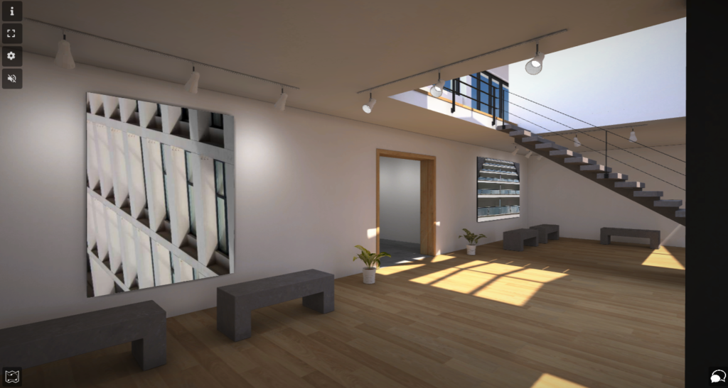
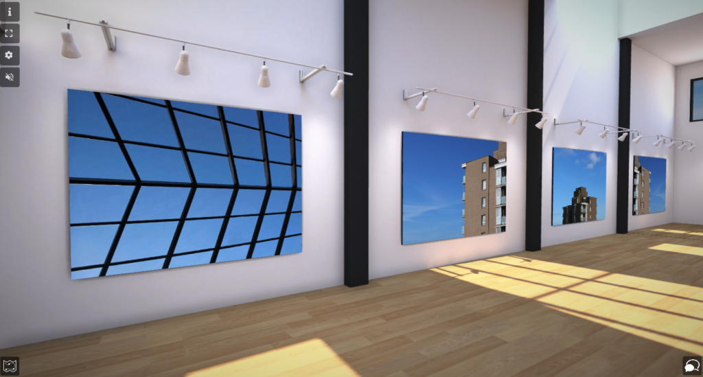
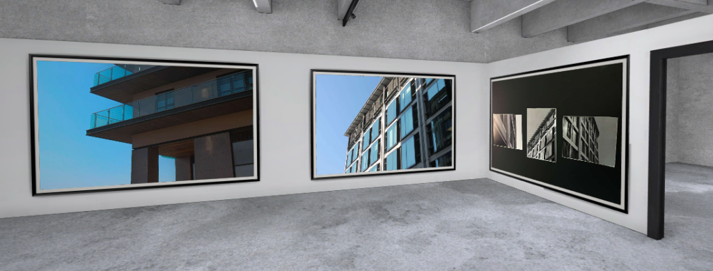
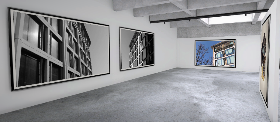
i put all of my final prints into a virtual gallery you can find below

https://www.artsteps.com/view/644ba228dfa9cef4a1b20fda

Evaluation

i was sceptical at first about this project but over all i feel that it turned out well i felt i stuck to my artist references very well and am glad i did i like how m final prints turned out with one monochrome and one colour project which i feel work very well against each other so over all i am very happy with this project but if i was to do it again i would try getting some shoots outside of St Helier and at different times of the day to have a larger range of images

compare and contrast

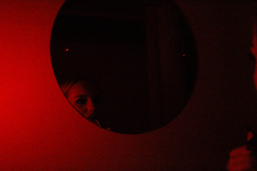
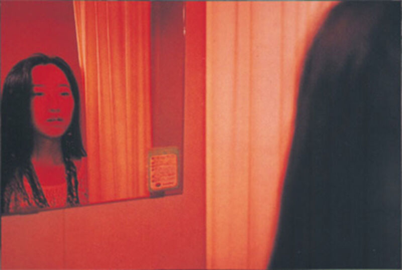
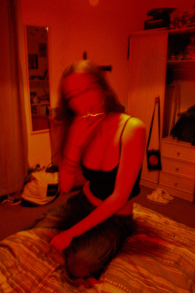
This is a comparison between my work and Nan Goldins image, ‘Mika in her Mirror’. Both images feature bold red colour, however mine involves darker tones and more shadows defining the figures face and in the mirror, whereas Nan Goldin’s image has primarily lighter colours and is for the most part devoid of shadows. Both images depict a figure looking into a mirror, however my image features a round mirror which I felt added a nice touch to the photo, whereas the figure in Goldin’s photo is facing a square mirror. Both images have a personal feel to them as they represent the insider perspective – depicting single subject facing head-on to the mirror and avoiding eye contact with the camera. The red colours in Nan Goldin’s image represent intimacy, perhaps with ones self, which I have tried to replicate within my own work.
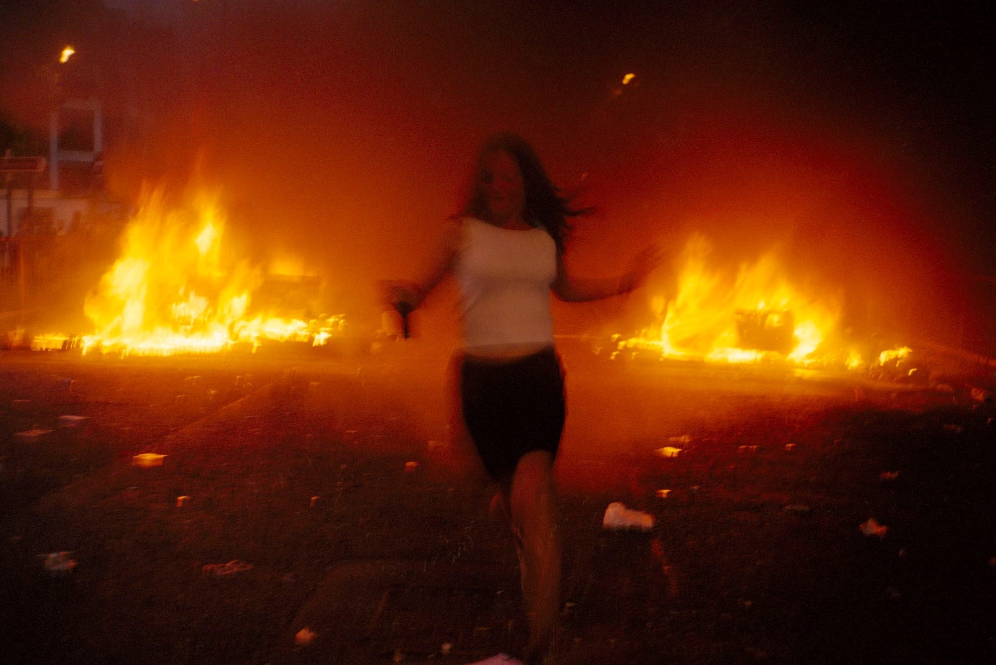
This is a comparison between mine and Vinca Petersen’s image, taken from Raves & Riots. Petersen’s image depicts a female figure running from a fire which is presumably from the aftermath of a riot. The raging flames in the background create a bold, vibrant orange tone that engulfs the whole image, and the running figures face and body are shaky, blurring her facial figures to the point of unrecognition. My image, like Petersen’s, features a single subject (myself) in the middle of the image, with facial features blurred out. I achieved this using the Tv mode on my camera, with low apeture in a dimly lit room to enhance the colours. Using these settings helped capture the subject in motion whilst everything in the background remains still – this helps shift the focus solely to the subject and creates a chaotic atmosphere much like in Petersen’s image.

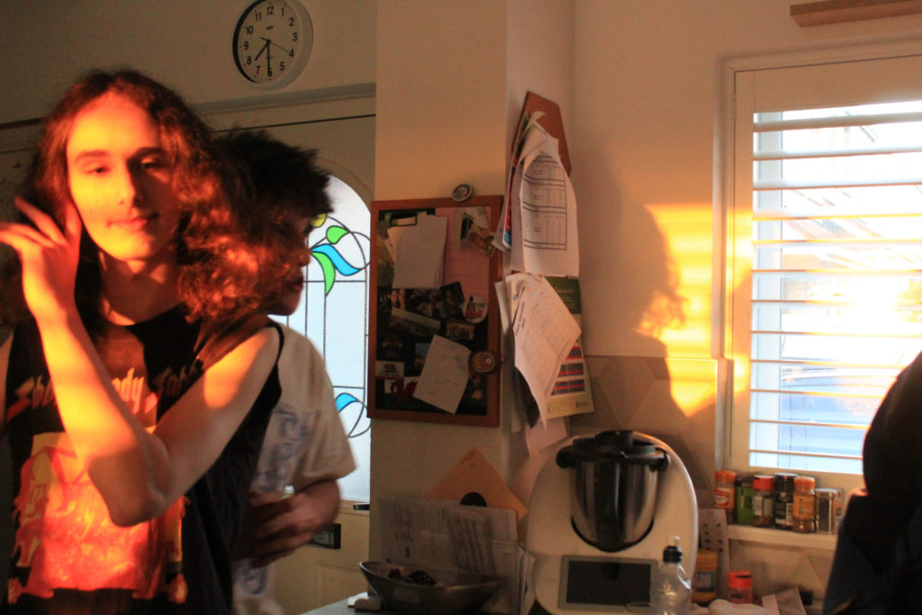
This is another comparison between Nan Goldin’s work and my own. The image, titled ‘Valerie in the light, Bruno in the dark’ Depicts two figures stood in what appears to be a kitchen. The female figure is stood fully illuminated by light from the sun, making her the primary viewpoint as the sun reflects a bright yellow / orange tone around her that seeps onto the kitchen wall. Around her the light casts different shadows that range in depth. Stood behind her is the male figure who is engulfed in shadows yet darker orange tones still reflect onto his body. My own image is similar to this because it also uses natural lighting to enhance the colours and shadows in the image. In my photo, the figure to the left is fully illuminated by the sun which makes him the sole focus of the photo, much like Nan Goldin’s image. Behind him is another figure caught in conversation, yet he is covered by the shadows – behind the figure in the forefront, shadows reflect onto the wall that depict his silhouette, surrounded by the orange tones from the sun.

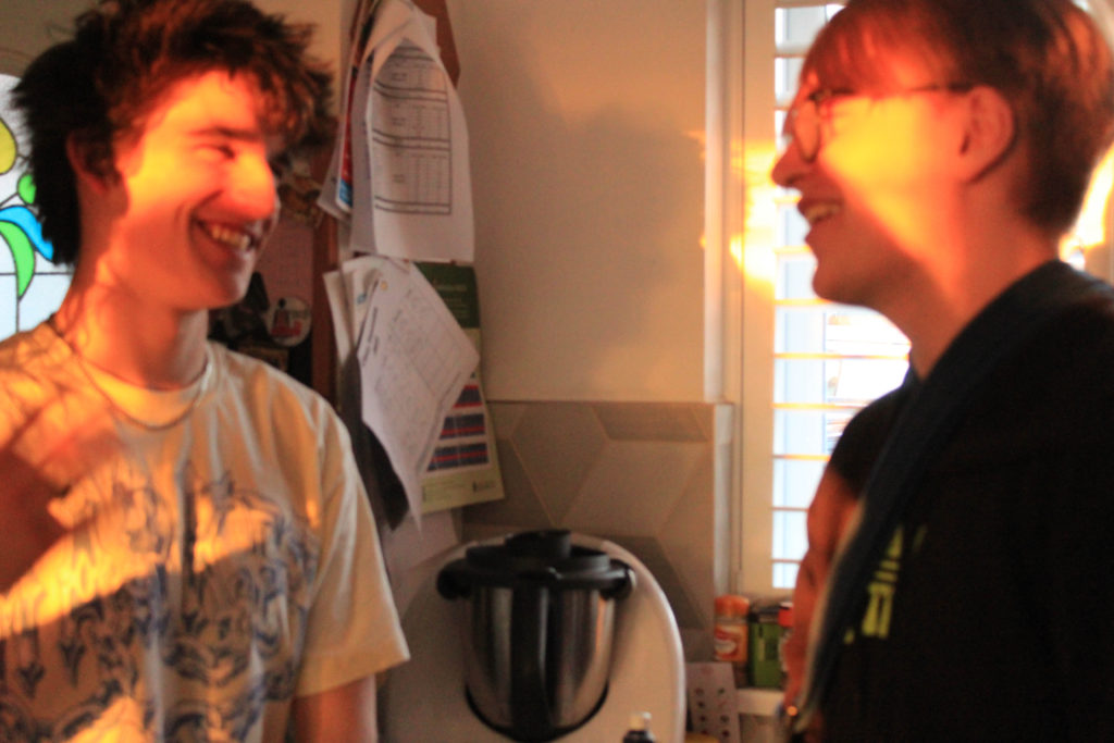
Although these two images are not visually similar, they generate the same relaxed and freeing atmosphere from capturing friends in conversation. Zielony’s image, taken from his series ‘Car Park’, depicts three friends in a car, neither of them making eye contact with the camera as different tones of red, green and yellow light reflect onto them, generated by artificial light from lamp posts, as the majority of Zielony’s work is captured during night time. On the other hand, my image was taken during the day with natural lighting, yet still depicts two friends having a conversation. Another difference between the two images is the perspective they’re taken from – This image, along with the majority of Zielony’s work, is taken from an outsider perspective looking in, whereas my image is taken from an insider as I had joined in on their conversation prior to taking the photo.

Presentation of final outcomes and evaluation

In this post, I will be presenting my final outcomes from my exam project. To present these outcomes I have displayed them in a few different forms such as, window mounting, foam board, 3d sculpture and a photo zine. All of my final outcomes were developed through Adobe Photoshop, Adobe Lightroom and Adobe InDesign to ensure the best quality editing and display. Also, I am going to create a virtual gallery for another form of presentation, this will be shown towards the bottom of the post.

Final outcome #1

Link for my production of my outcome: https://hautlieucreative.co.uk/photo23exam/2023/04/24/final-image-experimentation/#comments

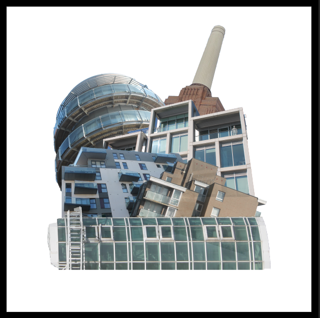
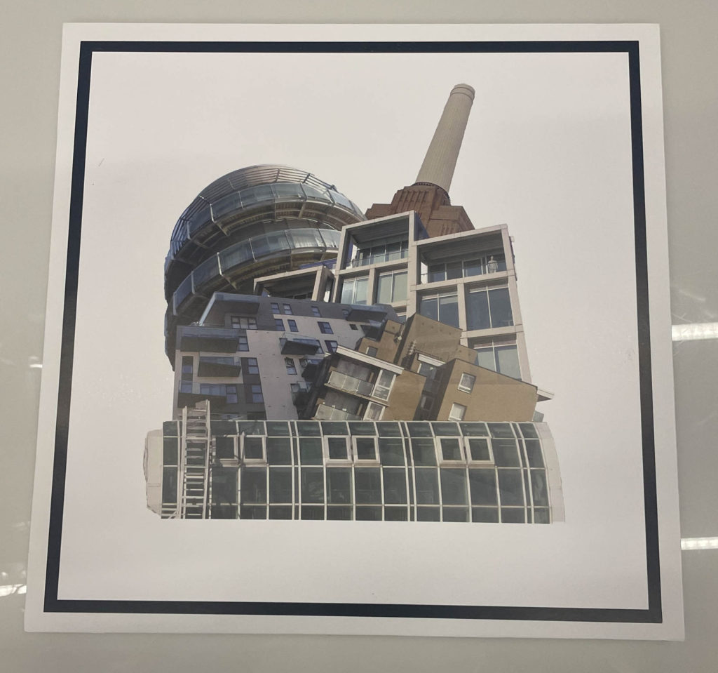
For my first final outcome I used photoshop to create this. This image was heavily inspired by my previous exam project and Laura Romero who is an artist I studied previously in the year. I experimented this image with many different background variations by using dull and vibrant colours later deciding to stick with the white background. This is one of my favourite outcomes as it is very unique and wasn’t just basic editing.

Final image #1

Final outcomes (Lightroom edits)

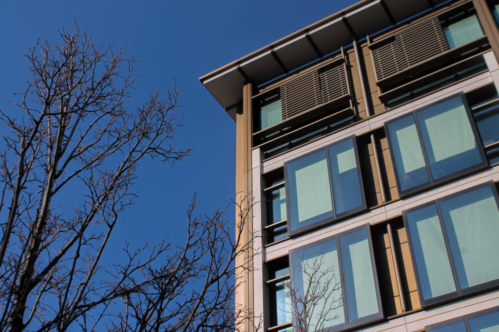
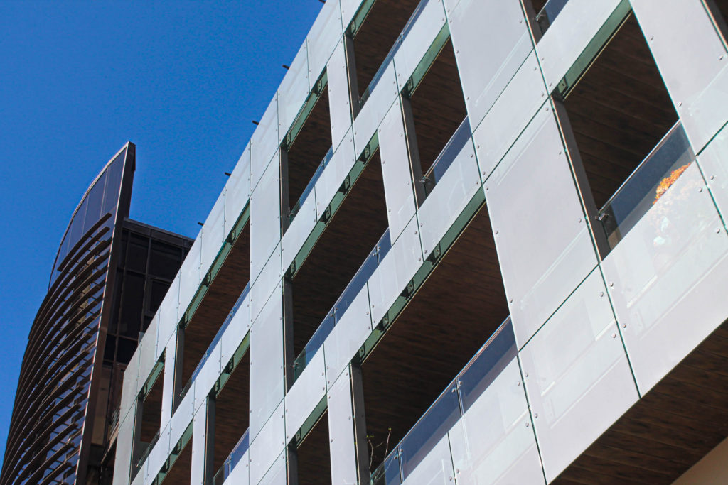
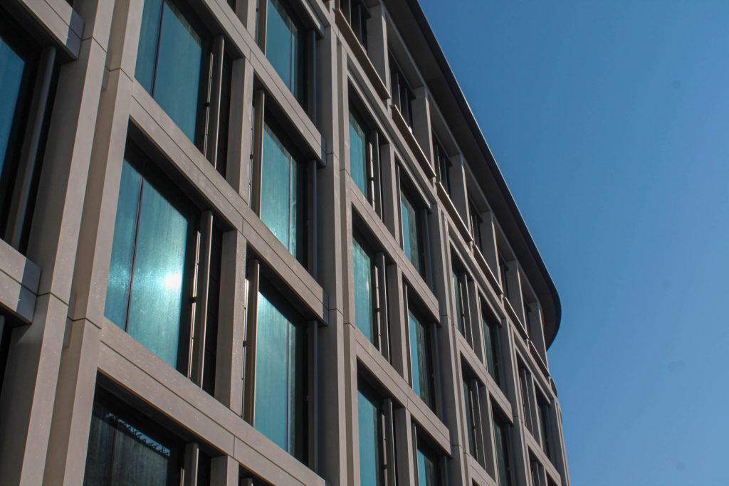
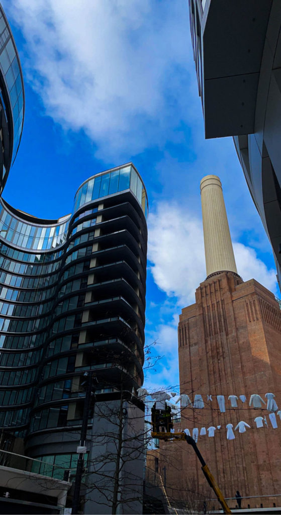
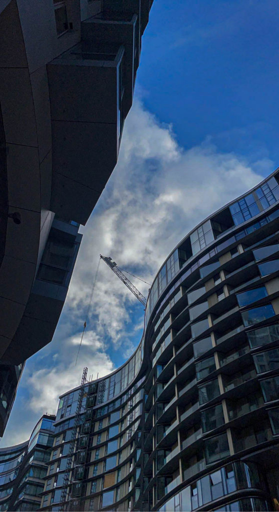
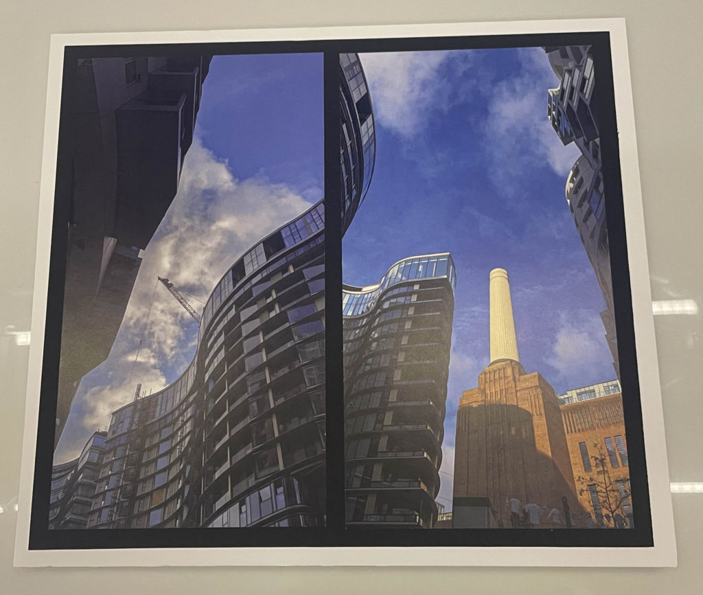
All of these images were edited and produced through Adobe Lightroom and were edited very simply. Personally, my favourite out of the lot is the first image presented as it shows both the green side of the world and the financial side of the world. The two images at the bottom were photographed in London and show a message of how different the past and future were with a futuristic apartment complex and an old powerplant that used to run the area.

Final outcome window mount and foam board

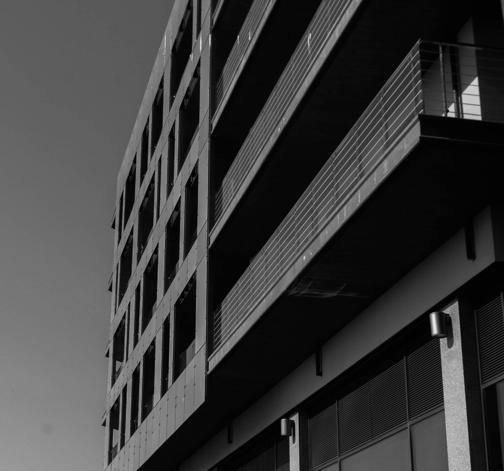
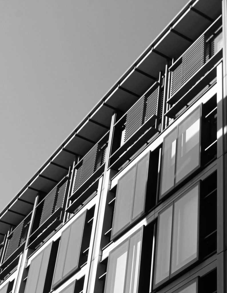
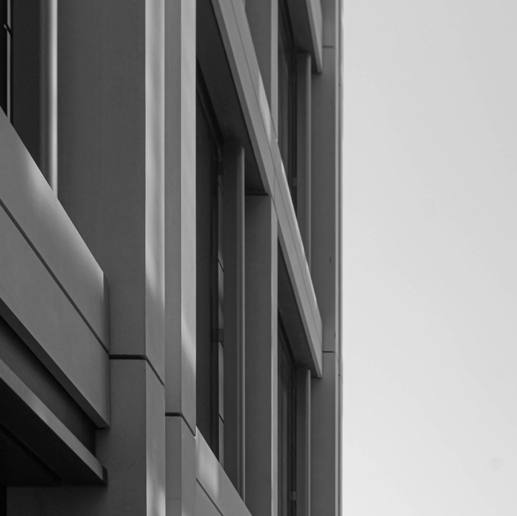
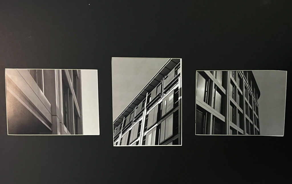
For the window mount I gathered three of my prints and experimented with different layouts and order in which the images will be placed, what made the most sense was to have the portrait image displayed in the middle of the mount so it looks less awkward. Next I positioned my other two prints on either side due to their landscape orientation. I chose to use these three images for the window mount because they are all presented in monochrome which creates a good contrast against the black background and the little white border around each print. For my first foam board mount I collected my Photoshop edit and used spray glue to stick it down onto the foam board whilst keeping a white foam border around the black border of the image. For my second foam board mount I collected my two images that correlate each other and positioned them right next to each other and stuck them onto black card. I wanted to increase the depth of the prints by including a foam board piece which I stuck my prints and black card onto, whilst also including a white foam border around.

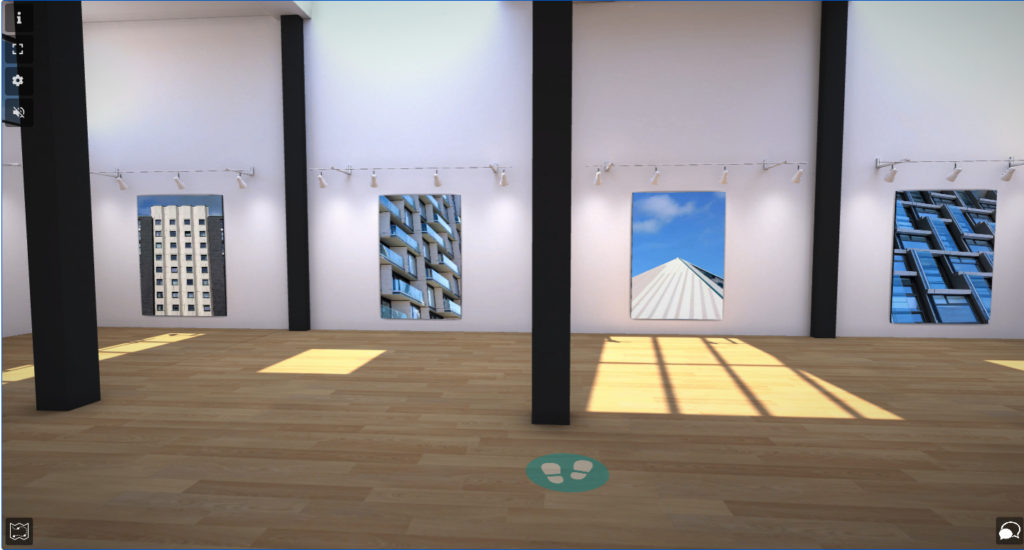
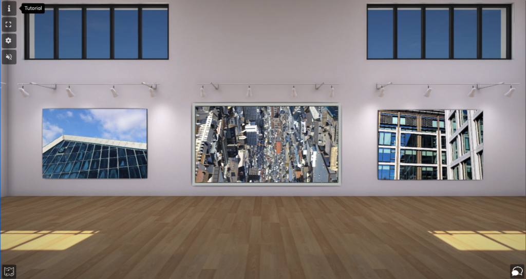
Virtual Gallery

Virtual gallery link: https://www.artsteps.com/view/64491fbe947dfd6c0ba5667a?currentUser

For this virtual gallery, I wanted to present not only all my final outcomes but other images I developed throughout this exam project.

Evaluation and Critique

Overall, I believe this exam project has gone very successfully due to the range of final outcomes and different forms they were presented in. I presented my images in forms such as, virtual gallery, window mount, foam board, photo zine, digital form, and 3d sculptures. I am particularly happy with with my window mounts and foam board experiments which I have used as my final outcomes. My virtual gallery is presented in a sequential way where images that link have been positioned together which I am happy with. My favourite outcome I produced is my window mount containing three monochrome features of the same building. It is my favourite because of how great the contrast is and it doesn’t have any mistakes that have been made clearly.

How I could’ve improved:

I could’ve improved this project by travelling to more locations around the structural area of Jersey to photograph the buildings. One place I wish I went was the recently done apartments near the Art Centre as they would’ve suited my topic of images very well. Also, I could’ve improved by taking time on my photo zine rather than rushing and hoping to get it complete in time or even creating a photobook with my wide span of images. Overall, I believe I could’ve gathered a wider range of images instead of collecting a lot of images in the same locations. Also I wish I checked the images after taking them as when I imported them into Lightroom some were out of focus, too bright, too dark and not positioned well.

Prints: final outcomes + presentation

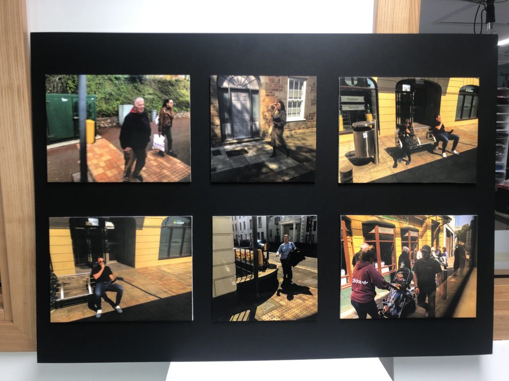
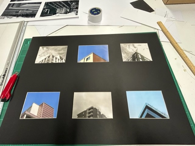
I presented my a5 prints in a 6 photo window mount. I did this by drawing up lines and measuring where to cut out the windows with even gaps between each photo. Then I taped the the photos facing forward, with a pattern of black and white and coloured photos:

I chose to position the images where I did so I could make a pattern between the coloured photos with clear blue skies and contrast them with some black and white photos. The buildings pictured in black and white are also generally older than the coloured photos. I think this creates a deeper effect with Jersey’s newer Waterfront buildings contrasting with the older buildings more central in town, that show the more historical side of the island. Window mounts are good ways to display your work because the black background can compliment your photos.

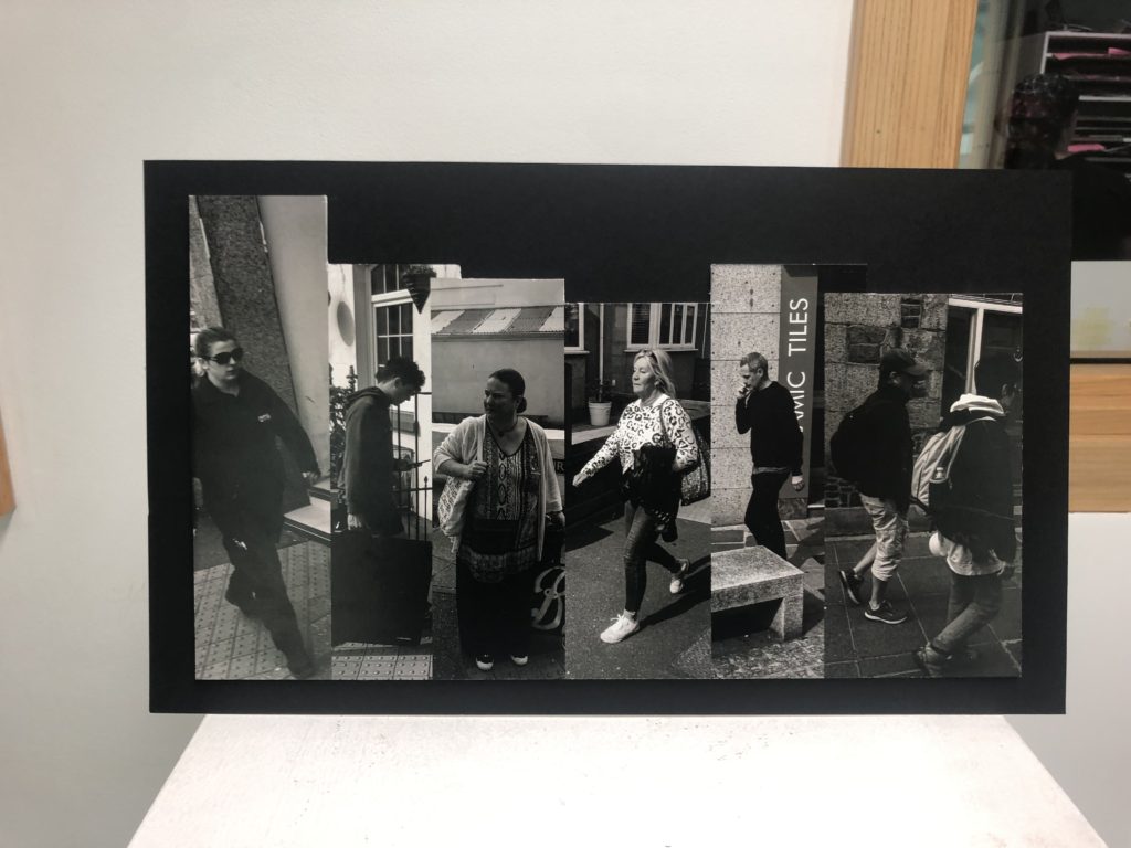
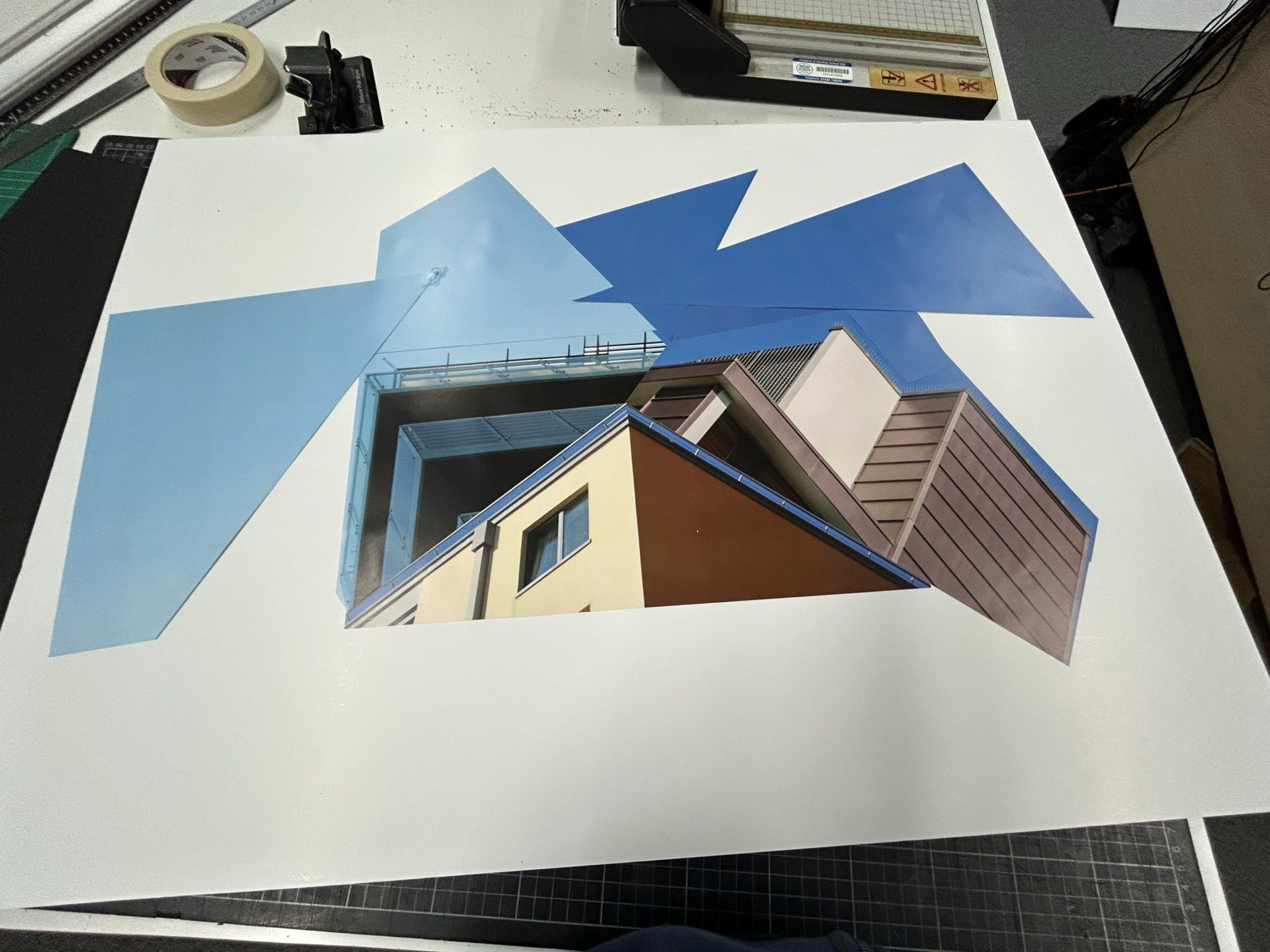
Another idea I had with my remaining a3 prints was to cut them up like this:

I did this by using spray mount and trimming all my photos