Evaluation and Critique

Evaluation:

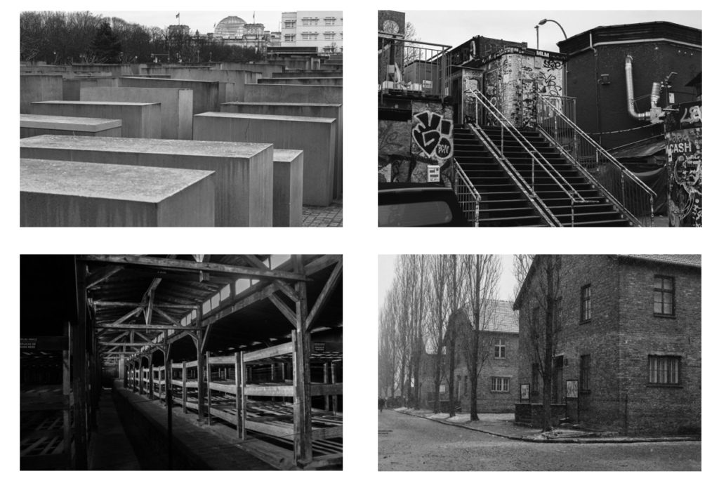
I am very happy with the photographs I took overall as I believe they were able to convey the exact message I was going for and have been presented exactly how I wanted. I am very happy with how my photobook turned out as well and I once again feel as if it meets the brief of what I was trying to aim for. I feel that what I have presented fits with the theme of “complex” due to the different countries exteriors, interiors and meaning behind them.

I made a lot of changes to my photobook after highlighting what I was going initially. At the very beginning of this project I said I was going to include black and white pages and black and white text, but I wanted to hold a similarity to Michael Schmidt’s work so I changed the idea of different coloured text and pages and just stuck to white pages and black text if needed. I also initially started off with a standard landscape format for my photobook but at the end decided to change it to a small square format as I preferred the concept of having a smaller book to contain complex imagery.

What went well:

I believe I was able to execute what I was envisioning and was very happy with the final results of each photograph taken. I wanted to have my work heavily inspired by Michael Schmidt which I believe I was able to achieve when editing and finalising my photographs. I was able to present the exact concept that I was thinking of going ahead with and I am very satisfied with the way I have laid everything out and presented my final outcomes.

Critique:

What I would have done differently is I would have taken more photos of Jersey due to the fact it is the island I live on and it means a lot to me. Although the main basis of my photography was to be on WWII and the history of the German occupation, however Jersey is filled with bunkers which highlight the history of the War which I have really taken advantage of as I have easier access to photographing these compared to ones in Germany and Poland. I also would have taken photos of the bunker in my garden as it is something that I own and have easy access to, it means a lot to me as it is part of where I live. Even though it isn’t a very exciting bunker, it is still one that I could have captured to signify the importance that bunkers in Jersey have to me.
Final Prints Presentation

For the presentation of my final print I have chosen three images from each subject which I will arrange in different ways to make four triptychs. A triptych is a set of three images which are intended to be seen together to create an aesthetic collaboration.

Above is the first arrangement of three images, I have used different formats and sizes for these prints so that they will be interesting and look cohesive. For the image on the left i will print that in A4 to set it apart from the two other photographs, the others will be printed in A5 but as the bottom image is a slightly different shape it will create a different composition to the trio of pictures which I like rather then the top and bottom being the exact same. To present these images I will glue the two smaller images onto foam board to lift them up from the bigger A4 image which will also be stuck on the same piece of foam board. By increasing the height of the two smaller images it will push them out towards the viewer as I feel that if I didn’t do this they would get looked over by the bigger image.

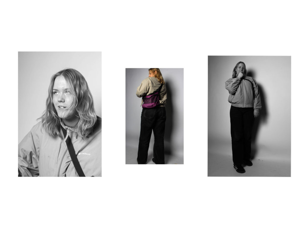
This is another triptych that I will be making with my final prints, for this presentation instead of stacking images I will be putting them side by side but the middle image will be smaller then the outside ones . To get this effect I will print the outer images at a size of A4 and the middle image in A5, this is also connected by having the two outer photographs in black and white while the middle one is in colour, i think that the pop of purple from the bag in the centre image helps to bring the triptych all together.

Above is the third triptych that I will be constructing, all of my presentations will be in a different format so that I can experiment with different designs and ideas. For this presentation I have decided to use all black and white images in a diagonal design, i like how they kind of move in a cohesive motion like the subject is spinning while the images are descending down the foam board. This presentation will have one A4 image which is the middle photo and two A5 images the outer pictures. I will lift the two A5 image up by sticking them to another piece of foam board before placing them on the big piece next to the A4 image.

This is my last triptych that I will be making for this project as I have planned to do one for each subject. This is the original way a triptych is supposed to look as they were normally connected by hinges. I have used two black and white images and one colour image in this presentation, I will also printing the coloured image at an A4 size while the others will be printed at A5.

Overall I think that all of my presentations have been very successful and display the images perfectly, they show off parts of each subject while also looking put together and that they are a collection instead of images just randomly put together.

Photobook Final layout + Evaluation

https://www.blurb.co.uk/bookstore/invited/9911395/8ab5d2bbab17d99ff36bb5ad84e40d5638fb3c5e

Evaluation

I am very happy with the final outcome of my photobook. I think that the layout is very clean as photos in the same group are together in chapters. There is an even amount of colour and black and white images as well as an even distribution of single image pages, double image pages and double page spreads. This keeps the book interesting and as it is not too long it ensures there are not loads of similar images and every photo is unique. One downsides of the photobook are that there are no images from my first photoshoot due to it not working very well.

lewis bush

Lewis Bush is a photographer, writer, curator and educator based in London. After studying history and working as a researcher for the United Nations Taskforce on HIV/AIDS he completed a MA in Documentary Photography at the London College of Communication in 2012. Since then he has developed a multidisciplinary practice which includes photography, writing and curation to explore ideas about the way power is created and exercised in the world.

For Metropole (2015) Bush investigated the transformation of London at the hands of unaccountable developers and property speculators. In Shadows of the State (2018), he examined the secret communications used by intelligence agencies, creating images from intercepted signals and uncovering a previously unknown geography of covert radio broadcast sites. More recently he completed Depravity’s Rainbow (2023) which investigates the connections between early space travel and colonialism and the Holocaust, and the impact of that history on the present.

Metropole (2014-2018)

Metropole records the brutally disorientating effects of this by documenting these legions of new luxury blocks as they are constructed and occupied. Multiple exposure photographs are combined with appropriated, repurposed photographs taken from the billboards of the developments, alongside extensive research into the property developers behind these schemes, including their extensive use of opaque offshore financial structures and unaccountable political lobbying.

Once known as the Metropole, London was the mother city at the heart of a vast empire which at its peak encompassed a quarter of all land on the planet. Its maternal name belied a profoundly hierarchical and unequal relationship with power radiating outwards from the urban heart, and territorial riches feeding back in return. The British Empire has long since collapsed but in its place has risen a new world power; globalised capitalism. London — rebranded an ‘investment opportunity’ — is now a city of continuous demolition, shifting cranes, and glittering new high rises.

Lewis arrived in Jersey in April after being named Archisle’s International Photographer in Residence. He received a bursary of £10,000 for an exhibition of new work which will take part between 20 and 29 September at Piquet House, on Royal Square.

While most of his time has been spent working on the exhibition, which will look into the finance industry and its influence on Jersey, Lewis has also been going into schools to teach the island’s students about photography. This week’s workshop was part of a partnership between Archisle and Jersey Youth Arts. Carmel Butel, Senior Youth Worker, explained that the workshop helps reach out a wider audience that might not have gotten the chance to see Lewis in schools.

Mounting my photographs

Below are the images which I have chosen as my final prints to be mounted once they were printed out, as my focus of my photography was still life I wanted to keep the mounting of my images simple as it follows the typical structure of still life photography. There were two processes which I carried out when creating my still life images, these were to use black card and create window mounts of one or two images, or spray mount my images on to foam board which I would then cut out and mount on some black card. I am really happy with how all of these images turned out while mounting as they all look uniformed and organised well amongst one another as a set of still life images.

Window mount
Mounted on foam board to black card.
Window mount
Window mount
Diptych window mount
Mounted on foam board to black card.
Diptych window mount
Window mount
Window mount
Diptych window mount

Photobook Design and Layout

Design

Covers

An idea for a front/back cover could be to create a cover similar to my last photobook, where I use an image that has been edited in photoshop to have a more angular and slightly more contrasting look. This

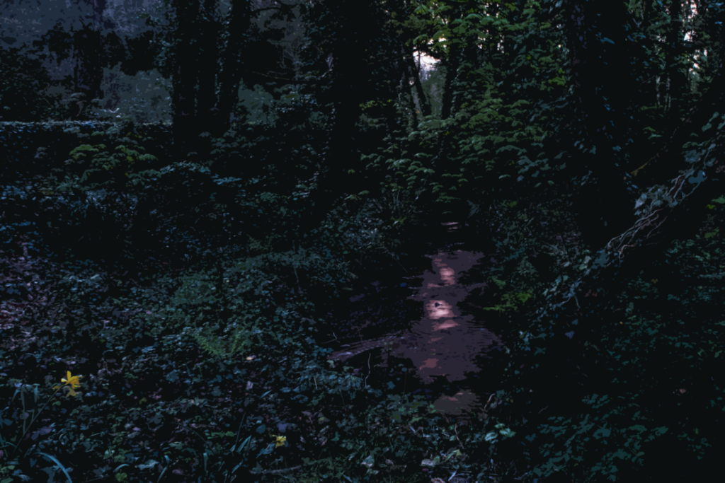
Original Image

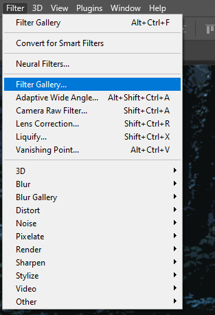
To edit the image I used the Filter Gallery – Cutout filter with these settings to create the effect. Unlike the last cover, I won’t be editing the colour or lighting as I would prefer this image to be darker with the same colours.

Edited Image

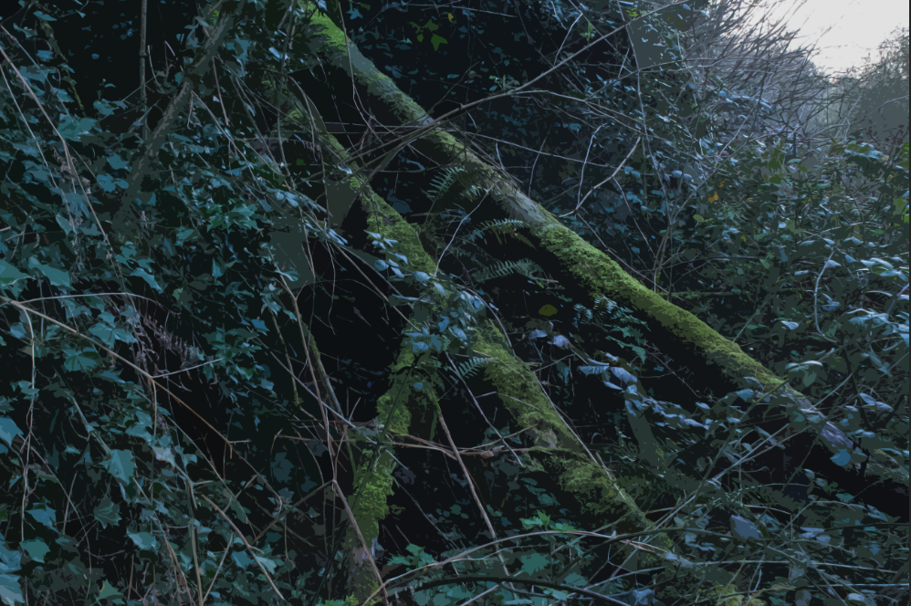
Here I have experimented with the same technique using another image:

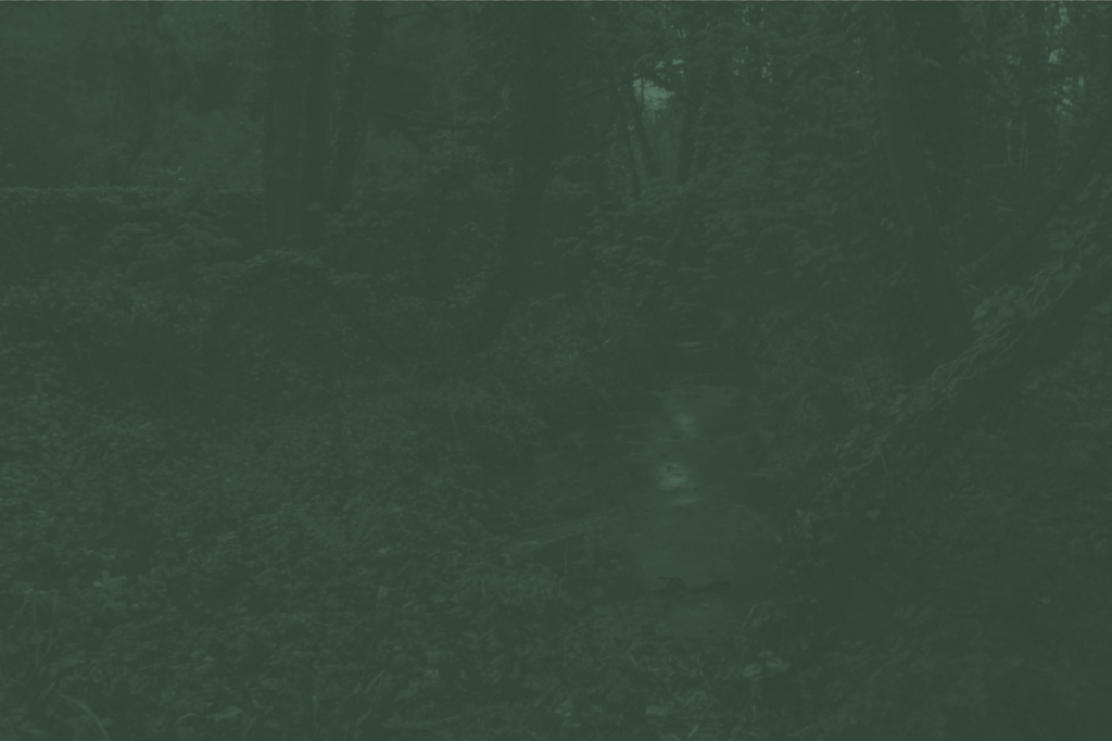
The next experiment I did was to make an image similar to Meeks’ front cover, where the image has had its contrast removed and altered to only have one colour. I chose to use green as it makes up the vast majority of the image I used.

Darker
Lighter version

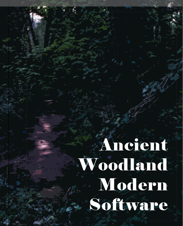
In the end I chose to use the first cover I made, as I think it fits with the aesthetics of my book being an image of a natural landscape which has been altered in some way.

Title/Text

To start arranging the title of my photobook, I started by looking for the font, position, size, etc. I would be using for my title. I would like to use a serif font, as that would give my book a more classical look, which is largely the aesthetic I was going for for the front cover.

The first font I found was called ‘Bookman Old Style’, the image above is in the bold setting.

The next was called ‘Book Antiqua’, the image above is regular

The next was ‘Papyrus’, above is regular

Another was Garamond – in bold

Next was Elephant – regular

As for the title itself, I thought about incorporating words/phrases such as ‘sublime’, ‘woodland’, ‘artificial intelligence’, as well as their synonyms. An idea I had would be to write a prompt as the title (I was thinking of the list ‘sublime, woodland, artificial intelligence’ which gave me this idea) which would work well with the themes of the book. ‘Ancient woodland, modern software’ was another idea taken from my Statement of Intent blogpost.

Next I started to focus on the positioning of the title:

Bottom Right
Top Right
Centre (At this point I decided to use Garamond for the title text)
Top right (with Garamond)

In the end I decided to use the top right orientation as it is the darkest point in the image, which would allow for the title to be slightly more readable.

This is how I designed the text on the spine


Layout

Image of photobook without final order of pages

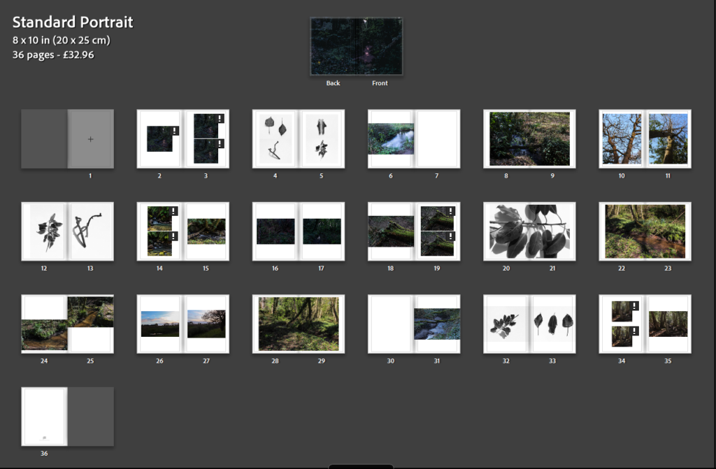
To start creating my layout, I made up the page spreads…

This will be my final layout for the book, I tried to make the sequence symmetrical like my other books as (as said above), it provides a nice sequence and connects all the images together.

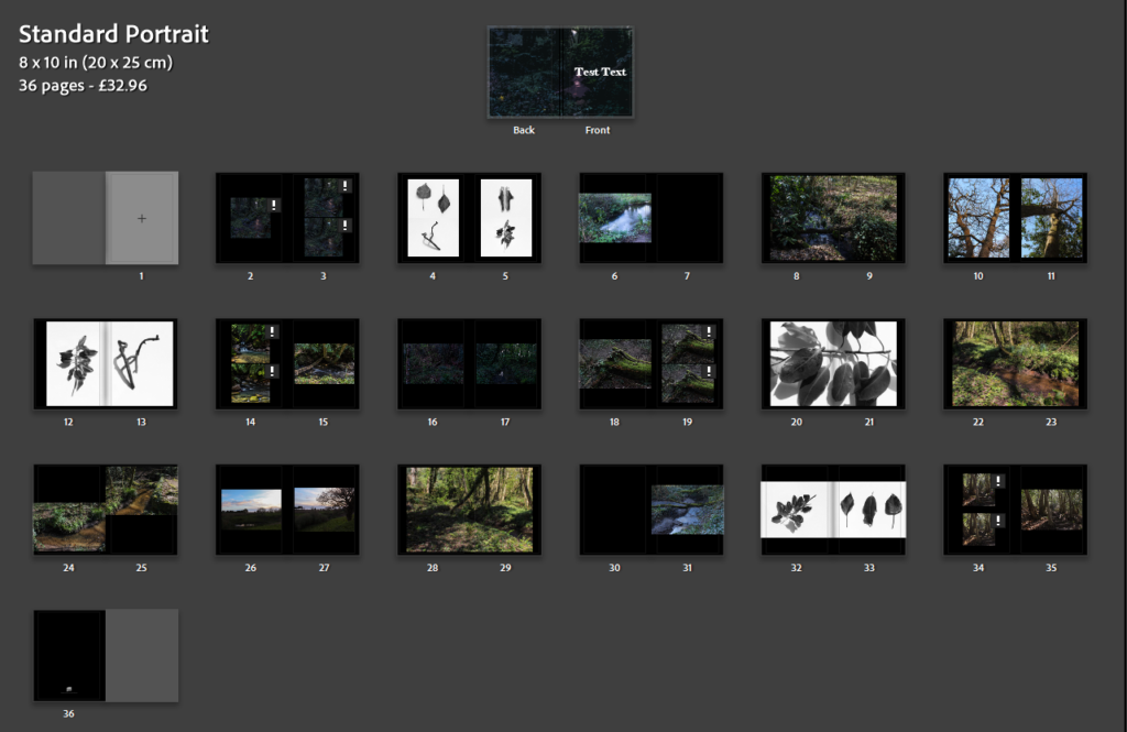
This is a version with white paper, personally I think the white looks better for this book as it makes it seem slightly more traditional in it’s presentation, although the layout of the images themselves prevents it from being fully classic.


Final Layout

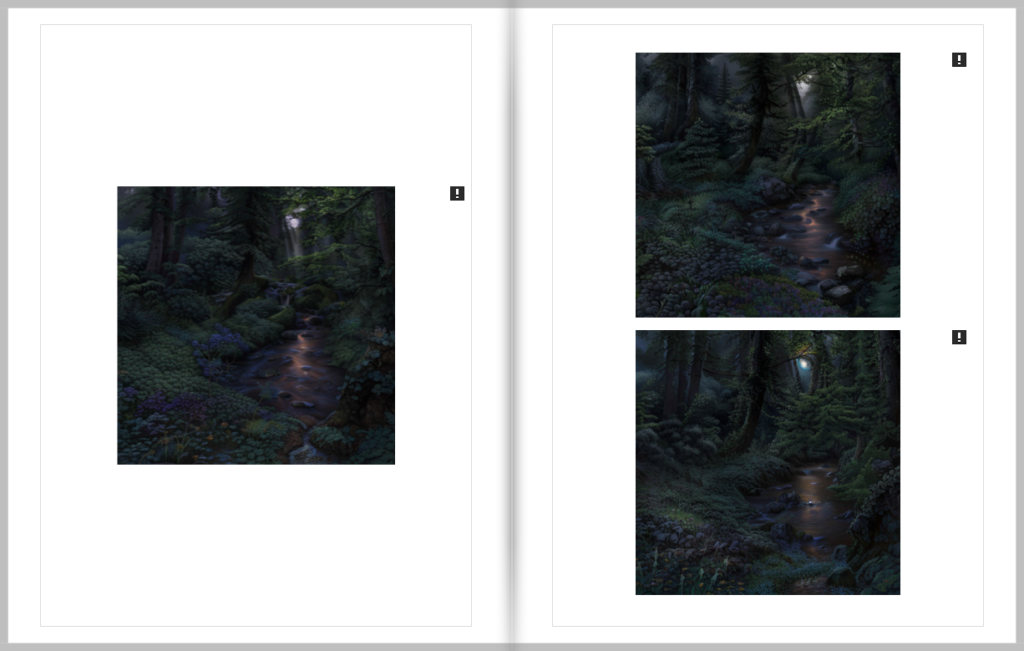
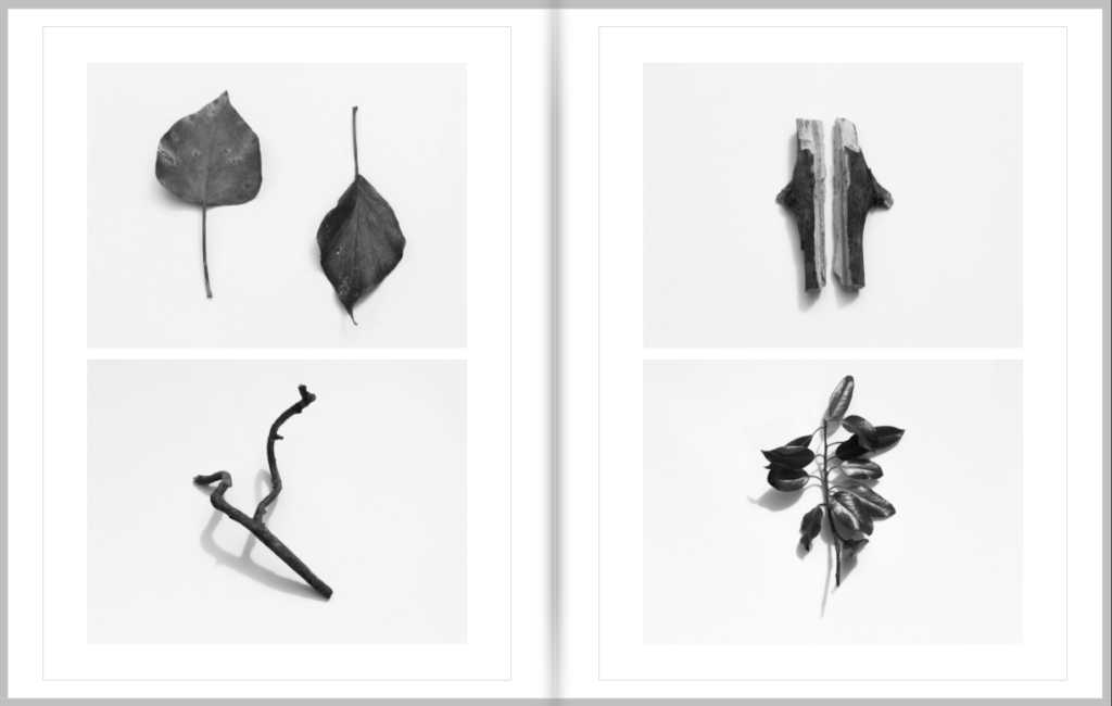
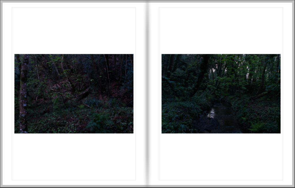
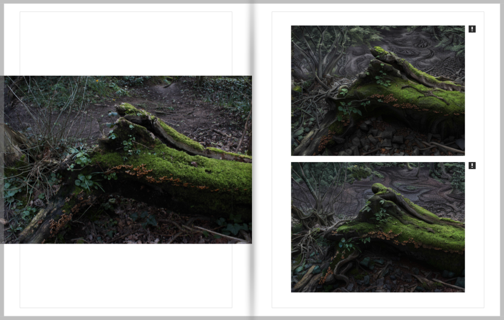
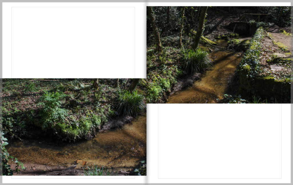
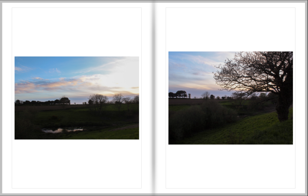
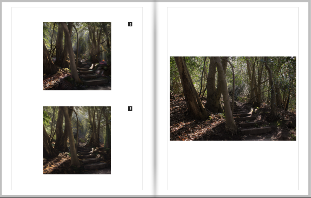
Below is a list of images of each page spread of my photobook.

(The exclamation marks are for the AI generated images due to their resolution)

Creating My Photobook

To create my photobook i used Adobe Lightroom Classic that works with Blurb the online photobook publishing company which is what i will use to get my book printed.

The first step i took towards creating my photobook was going through all my best images from each photoshoot and selecting which ones i wanted in my book.


Next i spent time comparing the images and deciding which images work best together.


I then focused on the layouts of the images on the page. For example weather the page was going to have multiple images on it as well as how the the images were going to fit on the page. Meaning would the images take up the full page, would they have a boarder all round or would they have a boarder on just two sides.

Lastly, I experimented with the order of the pages in the book.

Photo experimentation

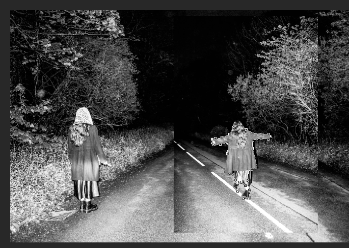
I began by placing my second image over the first image and sizing out how big i wanted it.

Using the Magnetic lasso tool, I manipulated the image to have 2 of the same characters, in order to create a story for my subject, I believe it makes it seem ominous as if something was about to happen when she walks down the road.

I began by placing my image into photoshop, i then used the magnetic lasso tool to cut out the outline of the mirror on the wall.

I then placed the image a second time into photoshop where i then dragged the image onto my first photoshop window, using the resize tool i resized the image to fit in the mirror. I then placed the second images layer behind the first creating the mirrored illusion.

history of finance in jersey

Financial services are a highly important part of the economy of Jersey.

Jersey is considered to be an offshore financial centre and one of the most economically successful OFCs in the world. Jersey has the preconditions to be a microstate, but it is a self-governing Crown dependency of the UK. It is sometimes considered to be a tax haven. As of 2021, Jersey has received an AA-credit rating from Standard and Poors. The first ever bank in Jersey was established in 1796. The island was the first jurisdiction to bring in the world to bring trust and company service providers within a regulatory regime. Jersey-based financial organisations provide services to customers worldwide, including multi-currency banking, offshore mortgages and investment solutions. It is home to banking organisations from across the globe. In June 2020, it was reported that there were 13,450 jobs within this sector. According to Jersey Finance, a group which represents financial sector companies from the island, Jersey represents an extension of the City of London.

In 1961, banks began to establish offshore operations in Jersey to meet the growing demands of British customers. In the 1970s, Jersey authorities decided that bank licences should be limited to the top 500 global banks. The Jersey Joint Stock Bank was a Methodist concern in which the chapels and most of their members kept their money. There were two other joint stock banks, the Jersey Mercantile Union and the Channel Islands Bank. However, in 1862, Jean Le Neveu became the principal director in a new banking venture trading in St Helier as Le Neveu, Sorel et Cie. On 10 December 1863 a deed was passed in which the company acquired the premises of the English Union Bank, and it may have been as a result of that acquisition that the name English and Jersey Union Bank was coined, although Le Neveu, Sorel et Cie continued as the firm’s ‘social signature’ on their banknotes.

Jerseys decline is tourism

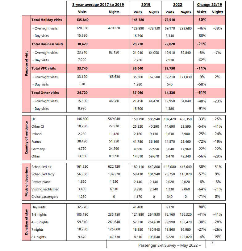
The number of people visiting Jersey between January and May 2022 is down by more than 40% on the same period in 2019. There were only 8,170 day visits in the first five months of this year – an 80% drop. Holiday visits are down by 50% and business trips have fallen by 21%. Visits from the UK have dropped by a third, while Channel Island visitor numbers have more than halved.

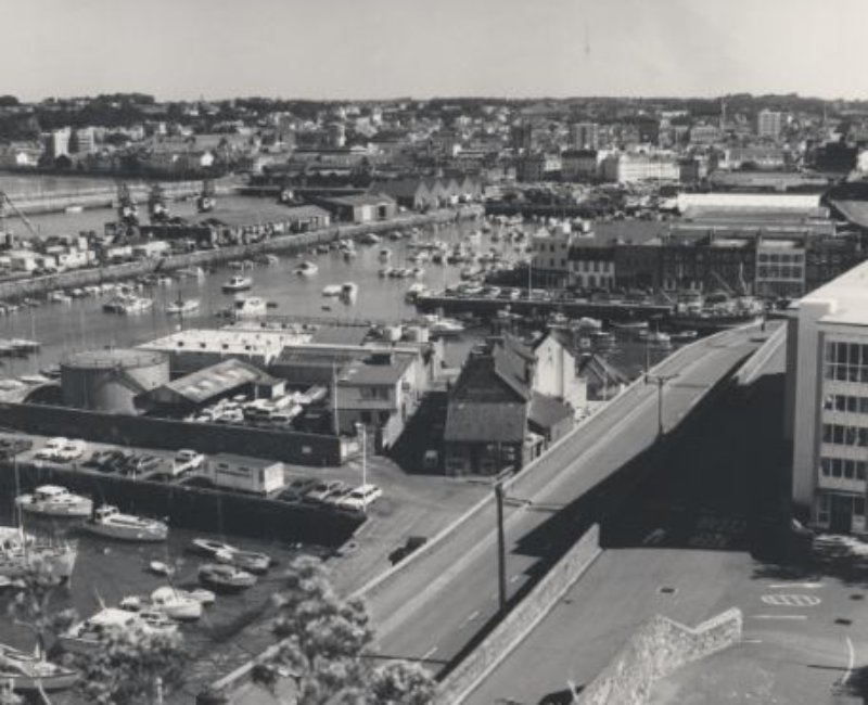
It is difficult to pinpoint exactly when the decline in tourism began, although a significant pointer would be the Seymour hotel groups plans for a large new hotel at Portelet in the 1980s. The was a large groundswell of local feeling that this would have a detrimental visual impact upon Portelet bay, but eventually planning permission was granted. By that time, however, the Seymour group had decided that the decline in the tourism market meant that the project was no longer viable, and decided not to go ahead with the building. In part, this can be seen as a consequence of the changing tourism market. Sea travel was not as popular, as lower air flights and package tour operators had opened up the continental market, and soon even further afield, as Laker Airlines provided low cost flights to America.

Jersey tourism statistics (May 2022)

By the 1990s, there was a market decline in sea travel, and the UK route was no longer viable for two competing companies, and only Condor ferries remained. In an attempt to boost travellers, faster vessels, the so-called ‘wave piercers’ were brought into play, with the facility to take cars on a roll-on, roll-off basis; unfortunately, they were subject to the vagaries of local sea conditions, and could not sail in bad weather. The frequent cancellations and re-scheduling meant that a growing number holiday makers became disgruntled with the service, and their holiday memories of Jersey were not happy ones. Eventually, the newly formed Jersey Transport Authority was forced to take action, and putting the new contract out to tender ensured that Condor entered into a service level agreement; this involved reinstating one slow ferry service to provide a poor weather contingency. The year 2002 saw the Condor group up for sale to any prospective buyer.

By 2002, the Tourism committee seemed unable to define a clear market strategy, talking of concentrating on ‘infrastructure’, although precisely what this vague term meant was never apparent. The jewel in the tourist calendar, the ‘Battle of Flowers’, celebrating its 100th year was starved of funds; the Clipper race, which promoted Jersey throughout the world, had trouble gaining any sponsorship. The Tourism committee also seemed to be pinning their hopes on the planned hotel on the harbour waterfront boosting the lost visitor numbers, although there was no guarantee that this would be the case, and no indication how the obstacle of high air travel would be overcome or the high cost of living and recruitment of staff. Meanwhile, existing hoteliers called for firm monetary incentives rather than vague promises. No one has yet considered the UK strategy of tax incentives for ailing industries, although this might be considered a viable alternative.

statement of intent

What you want to explore?

I am going to explore the simple aspects of portraiture in consideration to George Georgiou and Paul Fusco’s work. The majority of simple approaches in which appear initially simple at first are conceived from complex concepts that challenge the viewer and raise important issues. I will be acknowledging how this applies to my pictures. My project will be linked to that through images taken of people i see on the bus capturing them in there true nature, i want the subject to never know I’m there and just act as they normally do in everyday life.

Why it matters to you?

This project matters to me as i currently have crashed my car so am stuck getting busses around so it is like what i see through my eyes for this portion of my life and i try to capture that in how i edit and represent my final outcomes. It doesn’t only just matter to me as i can learn more about myself, but also because how i can learn more about individuals without them changing the way they are for the camera and are just in true nature, having a closer insight on their identities. I also feel that this links to todays society where everyone puts on a fake mask online, photoshop there photos, and pose but it never reflects who they truly are and i aim to capture that in this project.

How you wish to develop your project?

I wish to develop my project by going on multiple bus routes around different areas taking a range of different shoots experimenting with different angles, lighting, locations and to match the people i see and my own personality creating a better understanding with the meanings behind my final images.

When and where you intend to begin your study?

I intend to start my study in and around st helier at busy times of the day in order to see as many people as possible just going about there normal lives i feel this is a good starting point to find what places feel safe and have meaning to them so i can capture them as they normally are.