Research and Analysis 2: Anna Atkins and Karl Blossfeldt

Anna Atkins

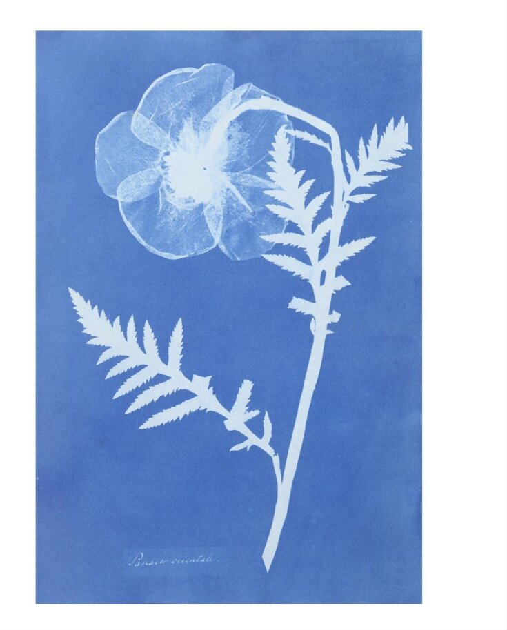
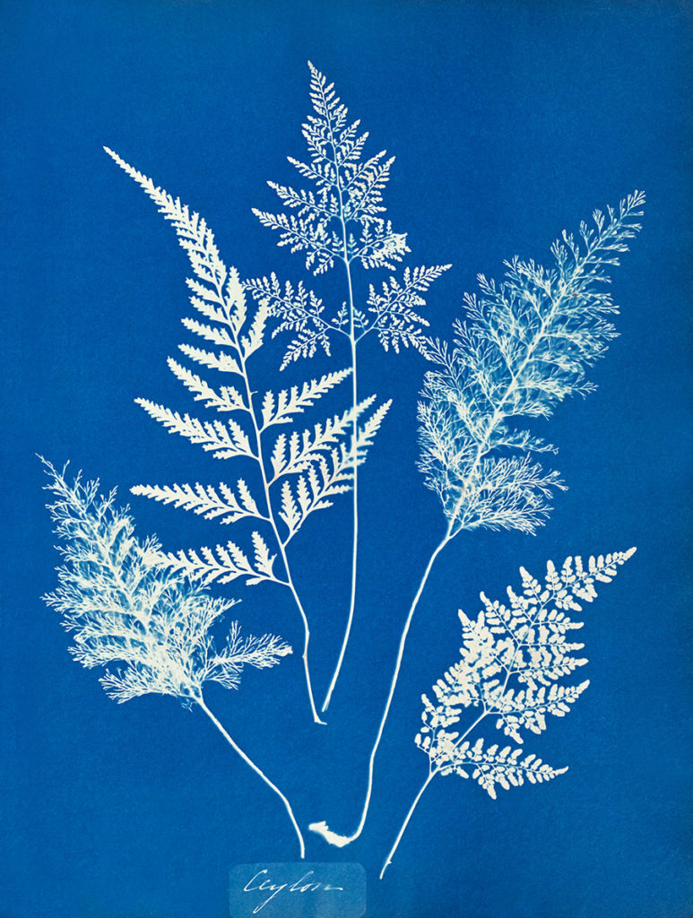
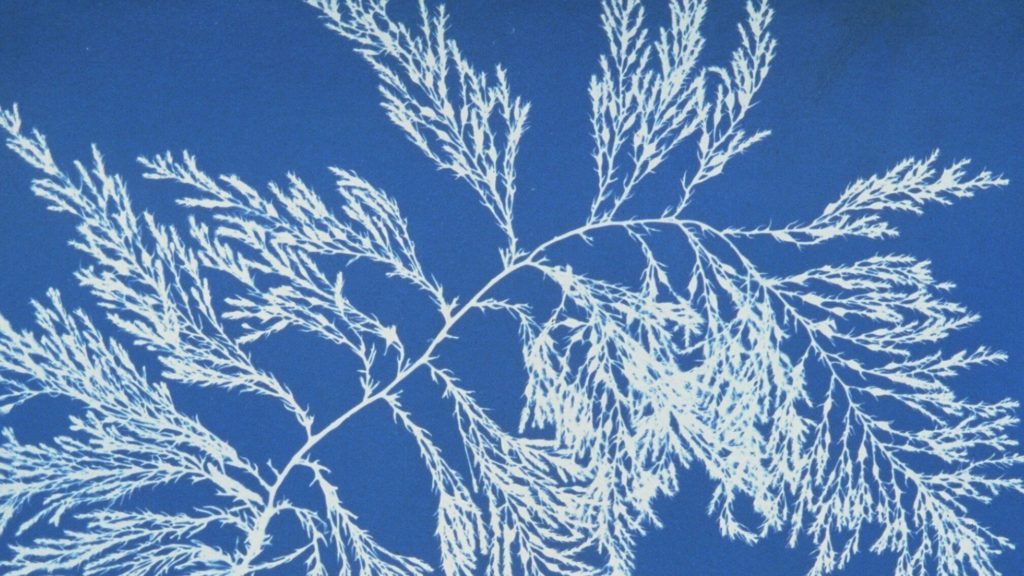
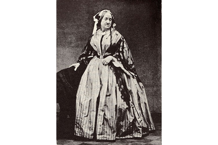
Anna Atkins (March 1799 – June 1871) was an English photographer and Botanist known widely for her work using the cyanotype process to create what is considered to be the first photography book: Photographs of British Algae: Cyanotype Impressions, which was published in 1843. By 1850, this book was expanded upon with additional text and images. In 1854, with the help of Anne Dixon, she published the book Cyanotypes of British and Foreign Flowering Plants and Ferns, demonstrating Atkin’s interest in botany: ‘Despite the simplicity of her means, Atkins’s project was the first sustained effort to demonstrate that the medium of photography could be both scientifically useful and aesthetically pleasing’. She was taught by William Henry Fox Talbot on his methods of photography, being the Salt Print and Calotype processes and is considered by some to be the first woman to take a photograph.
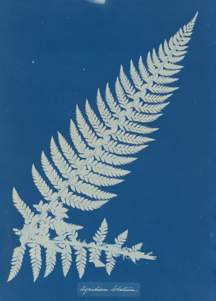
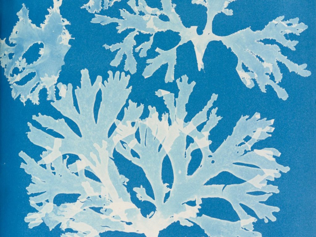
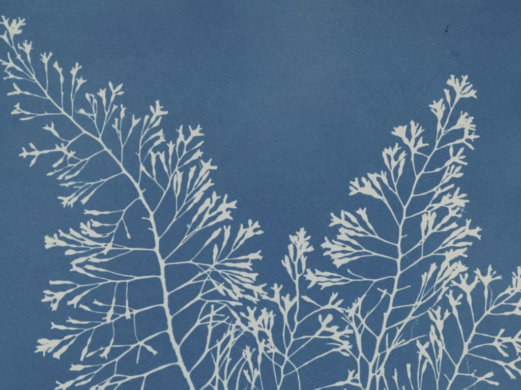
Anna Atkins Aspidium Lobatium 1853 – A cyanotype created by Atkins in Photographs of British Algae: Cyanotype Impressions

The cyanotype process used by Atkins was created by Sir John Herschel in 1842. It leaves a blueprint of the object placed on a piece of paper which is coated in chemicals and left in the sun for about 5-10 minutes (or more depending on the weather). Due to the nature of this process, only the outline, or blueprint, of the object can be placed on it.


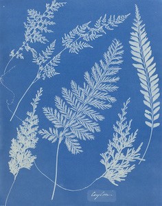
Moodboard of her Images

Karl Blossfeldt

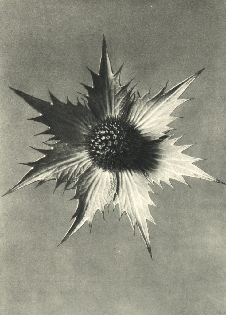
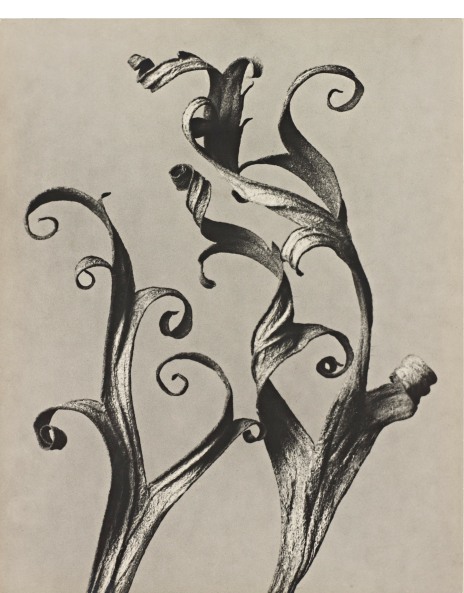
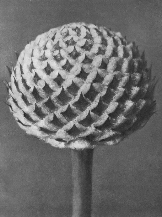
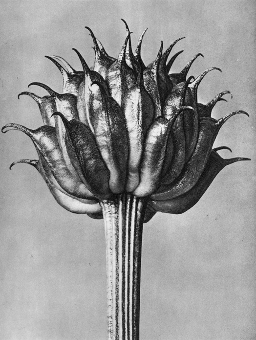
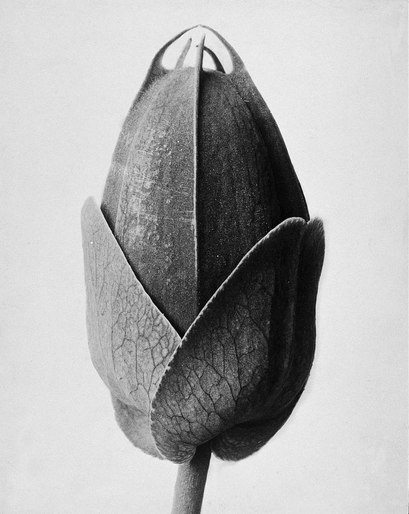
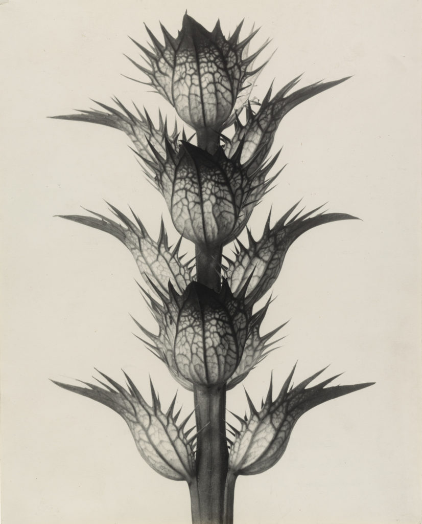
Karl Blossfeldt (June 1865 – December 1932) was a German photographer and sculptor inspired by the forms and archetypes of nature. Blossfeldt’s dedication to capturing the form and patterns within nature can be seen throughout his work as well as his development of home-made cameras that could capture large amounts of detail. His most famous works being Urformen der Kunst (Art forms in Nature), where he photographed unique plants he had retrieved on a plain background. The plants he photographed typically had an intricate and complex shape, demonstrating that art was present simply within the forms of these plants. Blossfeldt stated that ‘The plant must be valued as a totally artistic and architectural structure’, (1999, Blossfeldt. K) suggesting that the form of plants, as well as sculptures and buildings, should be admired in a similar light.
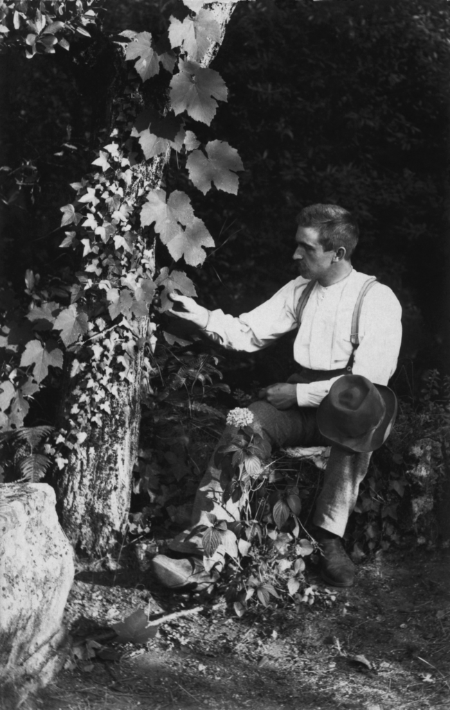
Unlike Atkins’ (as well as what some make him out to be) his is not a scientist, his photographs were made as a piece of art to marvel at the beauty of nature, to be studied through the lens of art as opposed to the sciences. ‘Blossfeldt was neither a trained photographer nor a botanist. He was a sculptor who, as a professor of art, was interested in the plants for didactic reasons’. However it is interesting to see the similarities between these artist’s styles, while both having different purposes.


Moodboard of his Images
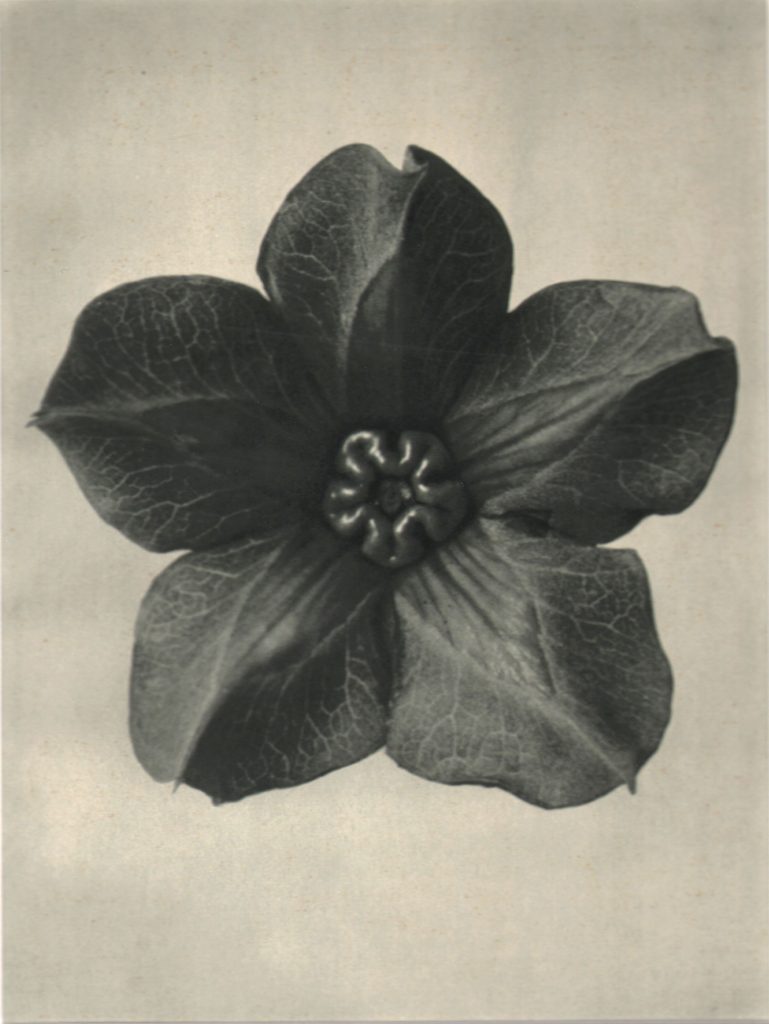

Image Analysis and Comparison

Atkin’s images, due to the nature of the cyanotype process, is a vibrant blue, giving it a colour that would not have been seen in other images created at the time, this vibrant blue also seems to give life to the leaf she has photographed. The leaf being on a blueprint may be an indirect reference to the construction of nature, linking with the golden rule, however it may also allude to the industrialisation of human society. The image itself is very angular but the shape of the leaf is organic and flowing in multiple directions, showing the irregularity of the shape.

Blossfeldt’s image is angular, with each leaf having some sort of thorns protruding off of it, creating an unusual shape. The plant itself seems to have a pattern in which the leaves are positioned, giving it a uniform, almost architectural appearance. There is a contrast between the tones of the plant; the centre parts of the leaves being a white and the ends/thorns being a dark grey/black. In addition, there is also a contrast between the lines that make up the plant, the thorns and stem having hard lines and edges due to its sharpness, and the lines inside the leaves being softer and curved.

Both of Atkins’ and Blossfeldt’s images depict a simple plant which has been removed from its natural environment, in an almost scientific way. It is work comparing the fact that Atkins was a scientist of Botany, while Blossfeldt was a teacher of art, meaning these images look similar, but have different purposes. Due to the difference of the processes the two were using, Atkins’ image is colourful compared with Blossfeldt’s, however, while Atkins’ image is still detailed, the process cannot show details within a shape (such as the lines within the leaf), unlike Blossfeldt’s image which shows the soft lines and differences in shade in the plant. As said above, both images have angular shapes and lines, giving the plants an arguably more interesting appearance.


Links to information:

Blossfeldt. K, Bataille. G, Mattenklott. G, (1999), Art Forms in Nature – The Complete Edition. Munich: Schirmer Art Books.

Accessed on 01/03/2023

https://wonderground.press/artdesign/the-art-of-nature-karl-blossfeldt/

https://www.britannica.com/biography/Anna-Atkins

Research and Analysis 1: Chrystel Lebas

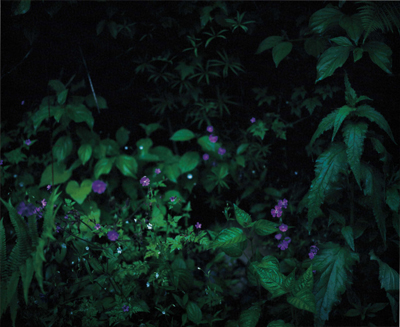
London-based photographer and film-maker Chrystel Lebas explores psychological significances that can be found within the landscapes she captures. Through her photography and films, she uses the darkness of these landscapes to create a sense of wonder in the viewer. Lebas’ signature style involves the use of a panoramic camera, providing a wide field of view, giving the images themselves a larger and almost more eerie/dangerous tone. Lebas states that:

I attempted to reveal the hidden side of nature, the nature we have glorified, forgetting its real harshness and purpose

linking psychology, history and art together creating images that I would consider to be on the scale of the sublime.


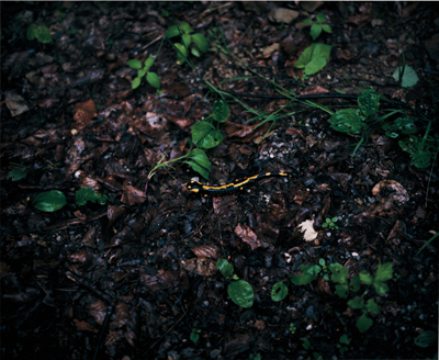
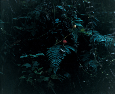
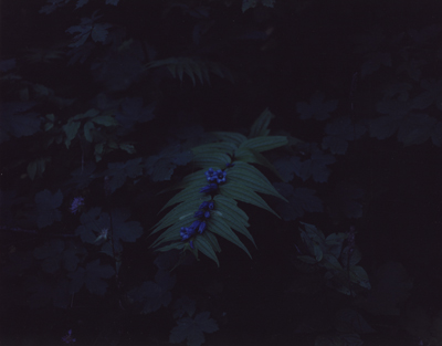
Moodboard of her Images

These are some of the images I take inspiration from. In particular, I would like to capture the darkness in a similar way to Lebas’ work, her use of colour is also a key feature within these images, as each one is vibrant, offering a contrast with the dark tones of the image. This contrast gives each image a more artistic and wonderous tone.


Overview of her work (my interpretation):

Lebas’ work clearly demonstrates the relationship between the beauty and danger found in nature. Her images have an otherworldly/dream-like aesthetic about them, something that is akin to a fairy-tale interpretation of a forest. This link between the real landscape and the man-made, dream-like interpretation of it is, to me, forefront in Lebas’ images, her works aims to create something ‘magical’ out of these bright yet sublime images. Most of Lebas’ images include either darkness due to the time she takes her images (likely an hour before sunset/sunrise) or another phenomenon that limits the visibility of her images such as fog, which is where the primary sense of danger in her images comes from. By making her images vibrant in colour yet dark in tone simultaneously, perhaps Lebas’ is commenting on the vitality of natural landscapes within the grasp of human advancements, without literally showing it, perhaps this ‘magical’ landscape now represents how nature would have been before the mechanisation of human society. I think her use of a wide-angle lens is used to accommodate for the sheer size of nature, and by widening the field of view, she is able to capture that size in a more literal sense.


Image Analysis

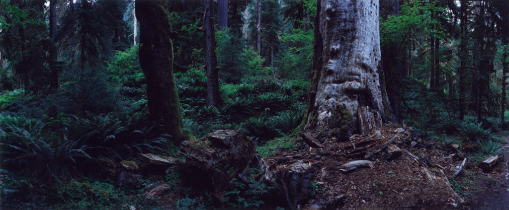
This is one of Lebas’ panoramic images, giving the image a wide and broad scope, this is effective as it gives the landscape she is photographing a feeling of size as to be somewhat threatening or awe-inducing in the viewer. The use of a panoramic field of view also links with the idea of the sublime in nature, by depicting nature as something grand and threatening. Lebas’ use of colour in this image makes the forest appear much more ‘alive’, the colours being vibrant gives each plant a healthier, prospering look. On the other hand, Lebas uses the harsher dark tones to give the forest a dangerous aesthetic, contrasting with the brighter colours used on the plants, while also adding to the idea of the sublime. Lebas likely used natural lighting for this image, as it lends to the natural aesthetic of the image, as well as what she is trying to capture in her work. The time of day this image was taken was likely later in the day, maybe just before sunset or the blue hour, meaning Lebas may have used a longer shutter speed to get the correct exposure. Linking with the colour of the image, it appears to have a colder tone, giving some of the leaves on the plants a more blue colour. This fits in with the idea of the forest being an unwelcoming place, as this use of a cold tone gives it this unsafe and unwelcoming feeling. Lebas using the large white tree on the right as a focal point was effective as it is one of the lightest parts of the image and as such it provides a contrast with the darker parts of the image.


Links to Information:

Accessed on 27/02/2023

http://www.chrystellebas.com/information.htm

https://printsales.thephotographersgallery.org.uk/artists/46-chrystel-lebas/overview/
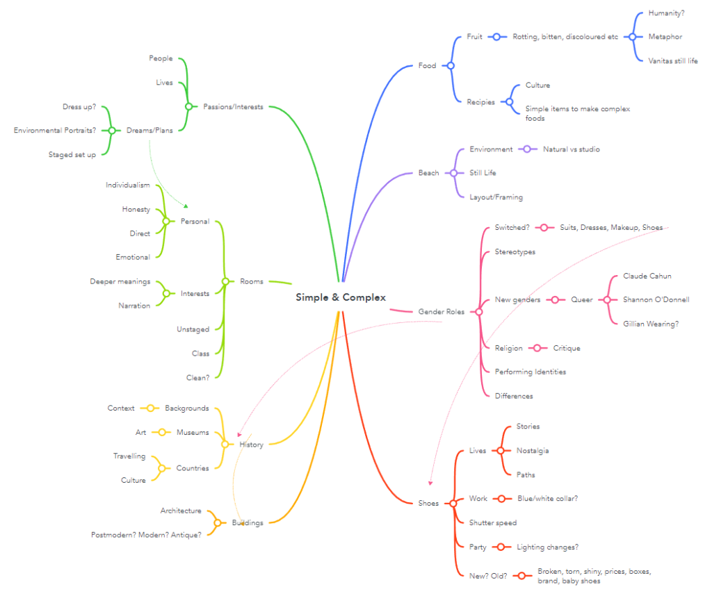
Mindmap + Moodboard

Mindmaps:

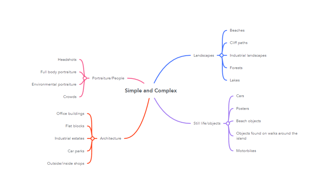
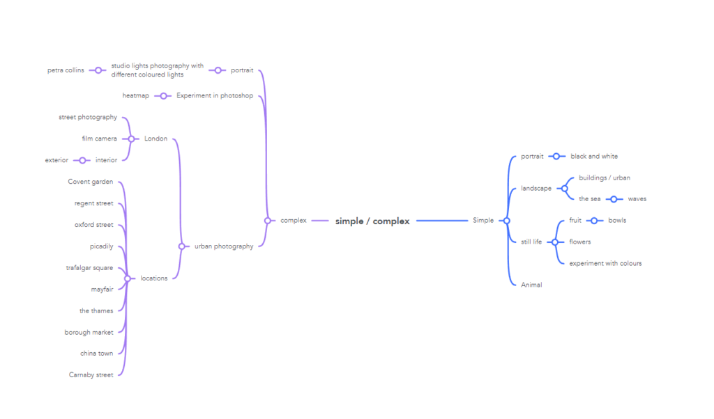
I began my exam project by creating a moodboard on any ideas I had on the words simple and complex, thinking about how I could photography each idea and going into detail about what it could link to, beginning to consider things such as style of photography, composition etc. From here, I began to understand what ideas I wanted to continue with and what I wanted to scrap.

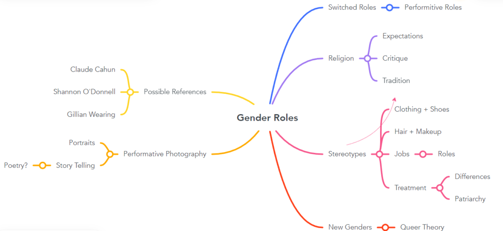
Next, I created a mindmap on gender roles as it was the idea that I decided I wanted to focus my project on. I included some parts of my other ideas into the mindmap as I felt like they could still be used within the project to accentuate meaning or help me plan out some of my future photoshoots.

Moodboard:

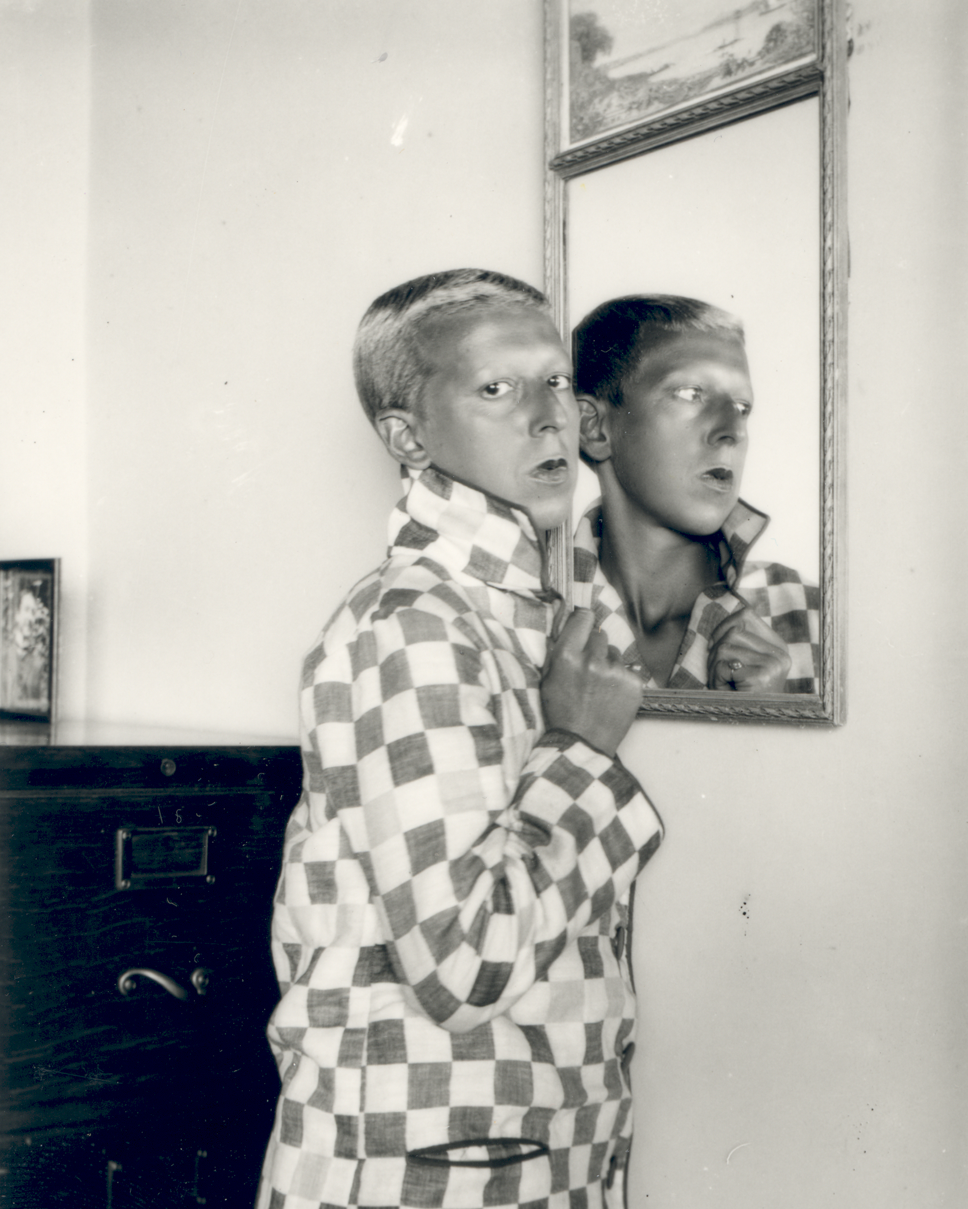
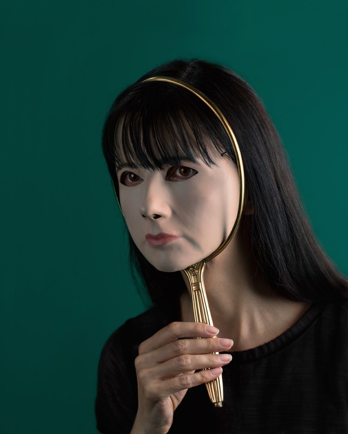
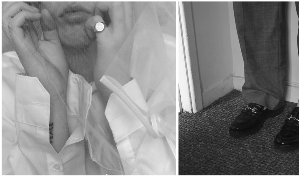
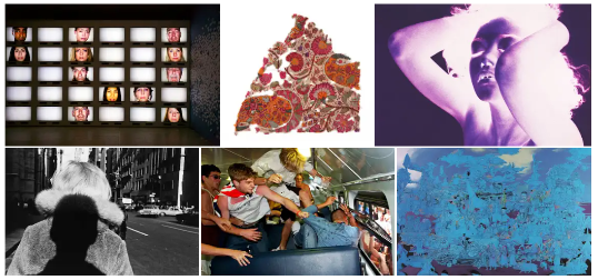
I decided to create a moodboard of images from other photographers that gave me some inspiration/ideas that I wanted to reference within my own shoots. I was inspired by these images for various reasons, from the composition to the visual elements within each image, all of which work well to convey the role of gender and how it changes how we are percieved.

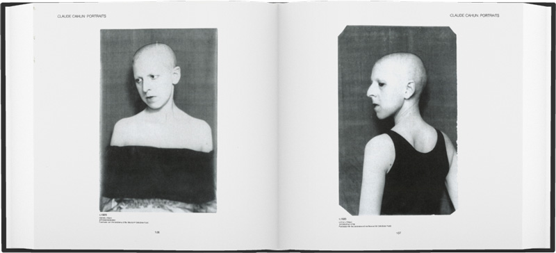
Surrealist Photographer Claude Cahun is Born | Jewish Women's Archive
Claude Cahun
Between mask and mirror, 2017 by Gillian Wearing | Ocula
Gillian Wearing
Claude Cahun - 12 Artworks, Bio & Shows on Artsy
Claude Cahun
Cahun, Claude Dont Kiss Me Art of Claude Cahun and Marcel Moore ( A-C )  Arts & Photography pan-uk.org
Claude Cahun
Sharn O’Donnell
The Child | LACMA Collections
Lyle Ashton + Renee Cox
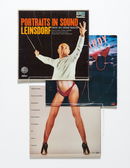
Christian Marclay - Contemporary A... Lot 214 November 2014 | Phillips
Christian Marclay
TMT

artist reference 1 – Hélène Binet

Hélène Binet is a Swiss-French architectural photographer based in London, who is also one of the leading architectural photographers in the world. She is most known for her work with architects Daniel Libeskind, Peter Zumthor and Zaha Hadid, and has published books on works of several architects.

Binet was awarded an Honorary Fellowship of the Royal Institute of British Architects in 2008 and the Julius Shulman Institute Excellence in Photography Award in 2015. Her work is held in the collections of the Museum of Modern Art in New York and the Carnegie Museum of Art in Pittsburgh, Pennsylvania.

“It’s like being a musician in front a big audience. You can’t get it wrong. In that instant, you have to be the best of yourself, you bring your mind to a place, not to lose that unique moment” – Hélène Binet is explaining her commitment to working with the venerable techniques of analogue, as opposed to digital, photography, of carrying around heavy equipment, loading it with expensive film, of putting her head under the dark cloth at the back of a large-format camera, of composing the photograph with the upside-down image it offers on its glass screen and then developing and printing the results in a dark room.

https://www.theguardian.com/artanddesign/2021/oct/10/helene-binet-photographer-light-lines-royal-academy-interview

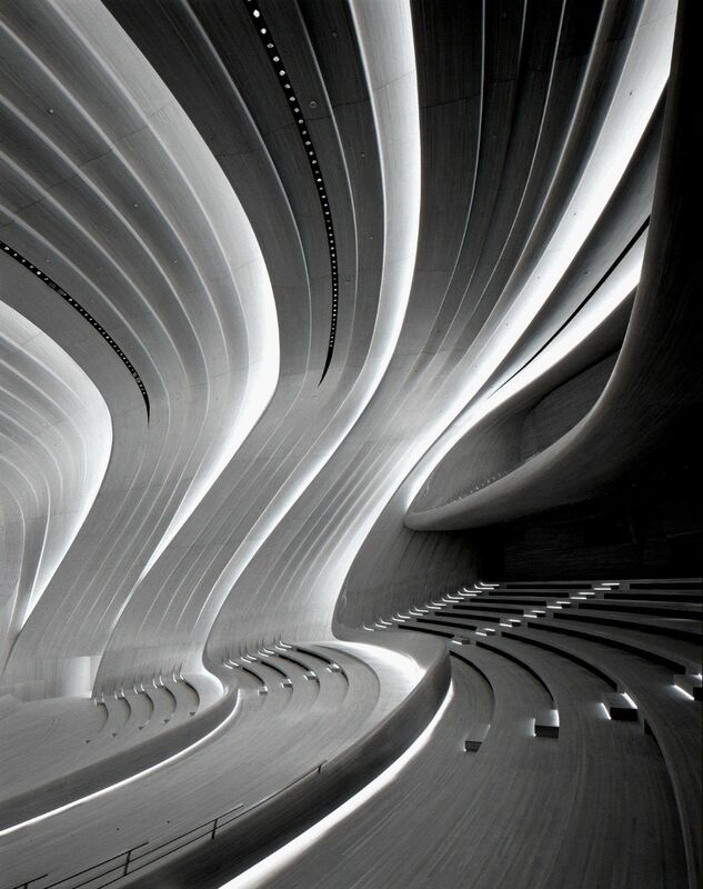
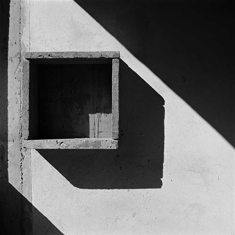
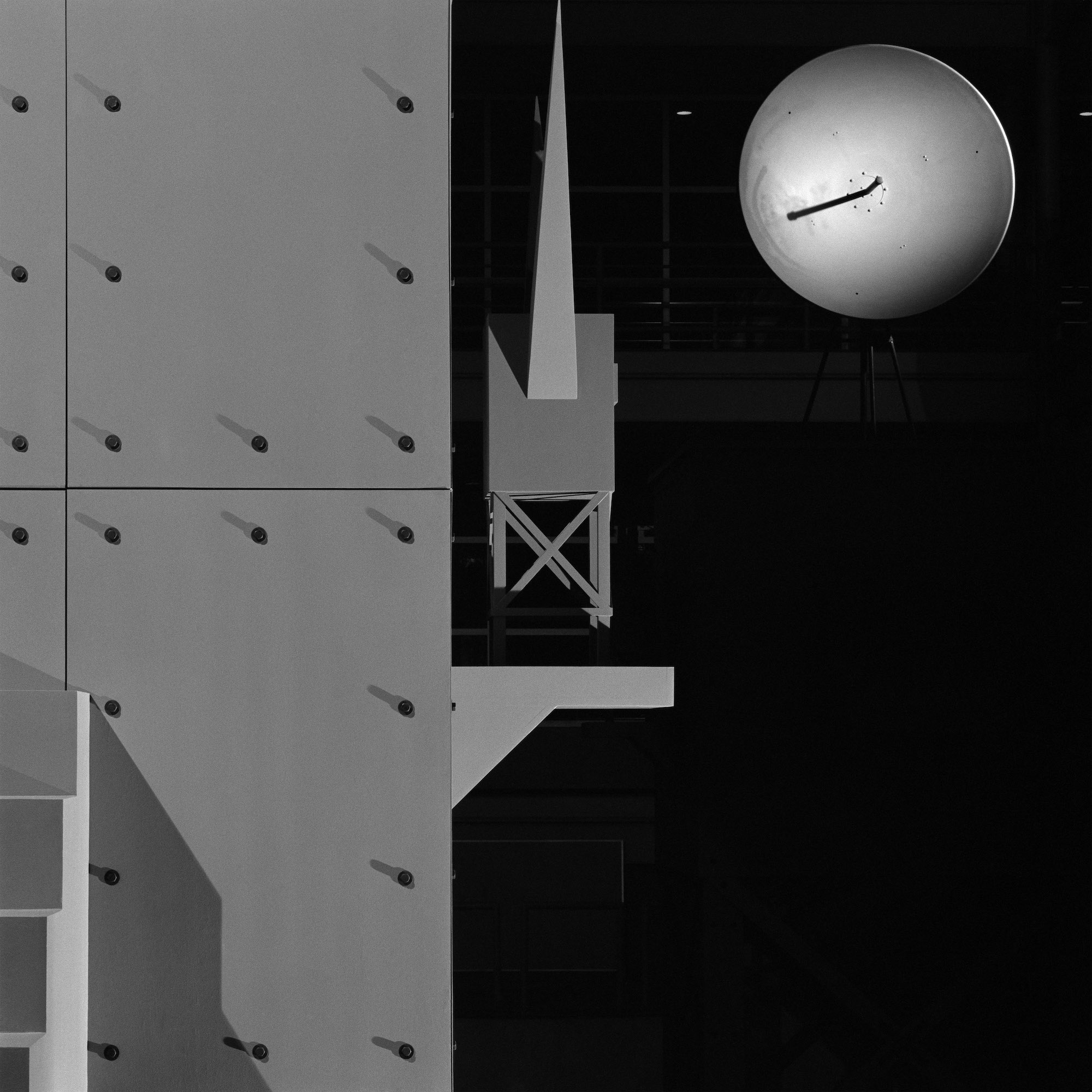
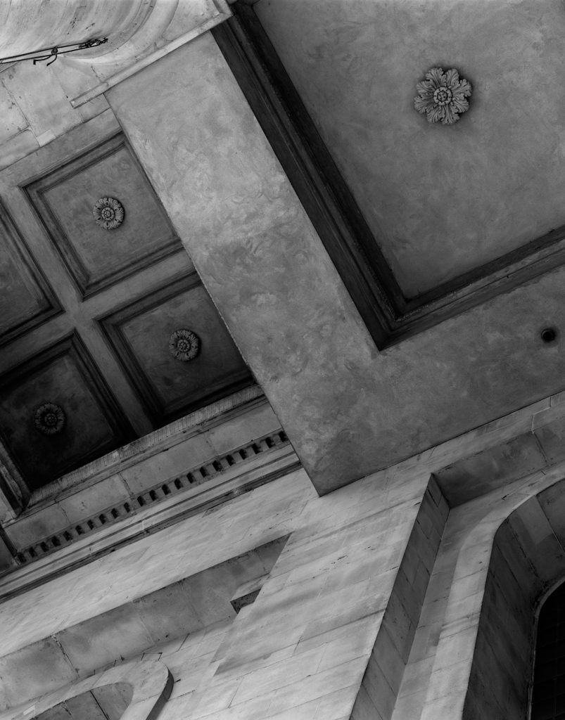
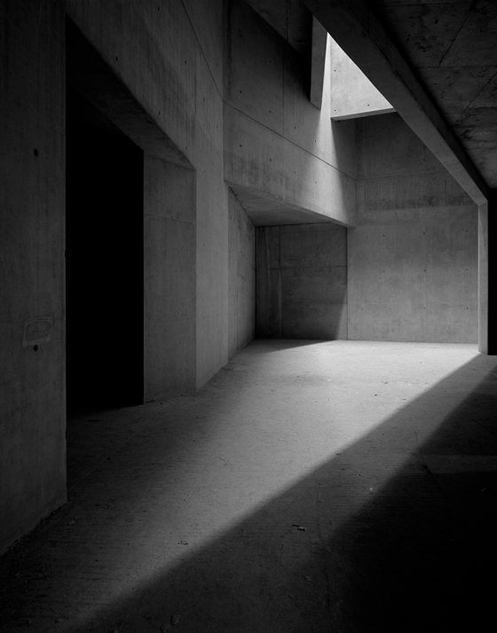
There’s a fascination in Binet’s photographs with shadows and light and how they fall on materials such as weathered stone or rough concrete. Expanses of them, which are usually in black and white, are often dark, with lit elements emerging from their depths. Your eye is drawn first to the bright spots, before finding that there’s more going on in the shadows. Most of her coloured photographs have such a limited range of hues that they look almost monochrome. When she does burst into bright primaries, as with the yellow, blue and red of some circular La Tourette skylights, the effect is all the more powerful.

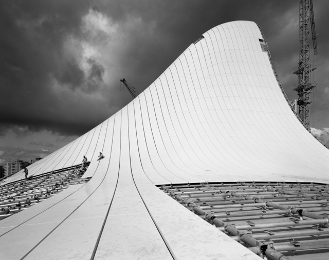
I have chosen Helene Binet as one of my artists to study because of her unique style of capturing architecture in a monochrome display. Her images range between both simple and complex ideas of architecture through the way she positions her camera towards the structures. I want to create images that are similar to her projects by involving many black and white images that are mainly classed as simple.

Examples of Helene Benits images:

https://www.helenebinet.com/
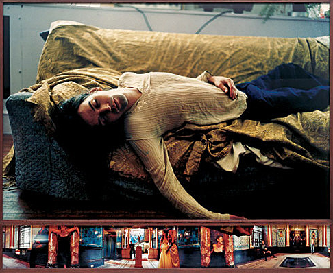
Image analysis:

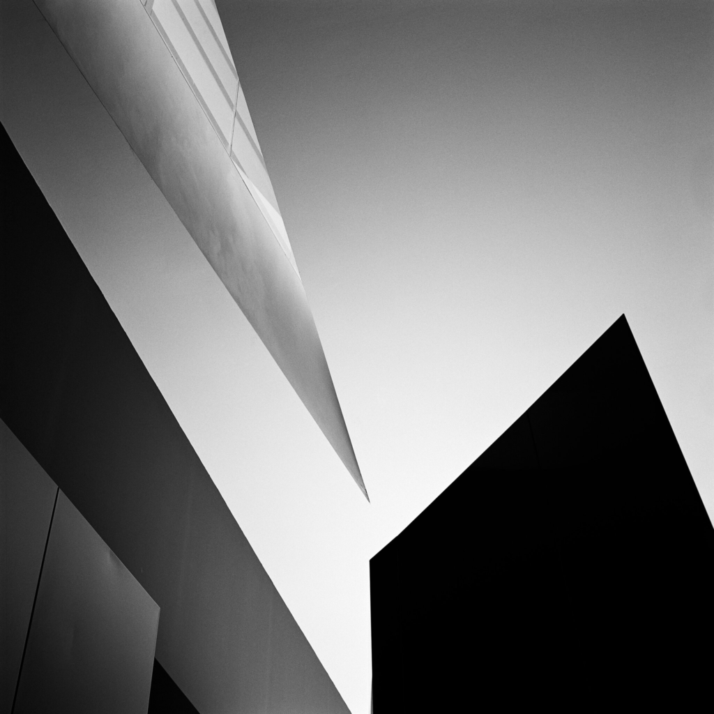
Here is one of Helene Benits most unique images throughout her architecture photo projects. In this image Benit captures the photo with the use of natural light, with many aspects of shading. It shows a low contrast image of a unique structure with a heavily shaded shape that viewers find hard to identify. The image is produced in a monochrome format displaying some sort of 3d shapes. Benit seems to have positioned her camera more below the structure to make it seem as if it is towering over the viewer. The sky and the slight shaded triangle create an effective contrast because of the binary opposite colours being black and white. I would class this image more over to the simple side of the topic, this is because of the basic colours and shapes with no complex features of the building. However some may see the image as complex due to them having no idea of what they are gazing at, which I believe Benit has done on purpose to confuse the viewer.

Artist Reference- Jiayue Yu

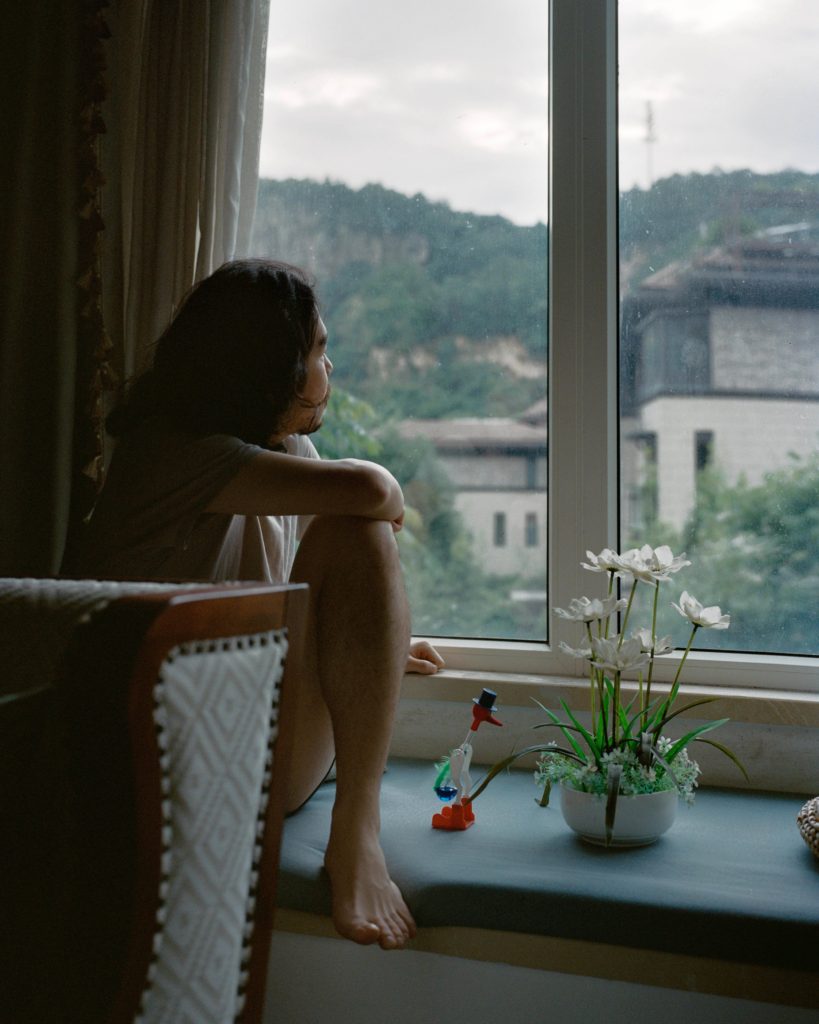
Jiayue Yu is an award-winning photographer based in Shanghai, known for combing photography and 3D sculpture in order to create pieces inspired by literature and art alongside her own experiences. Her work often explores various complex emotional states through their use of lighting and composition.

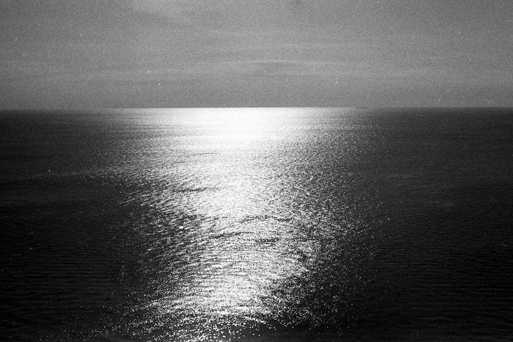
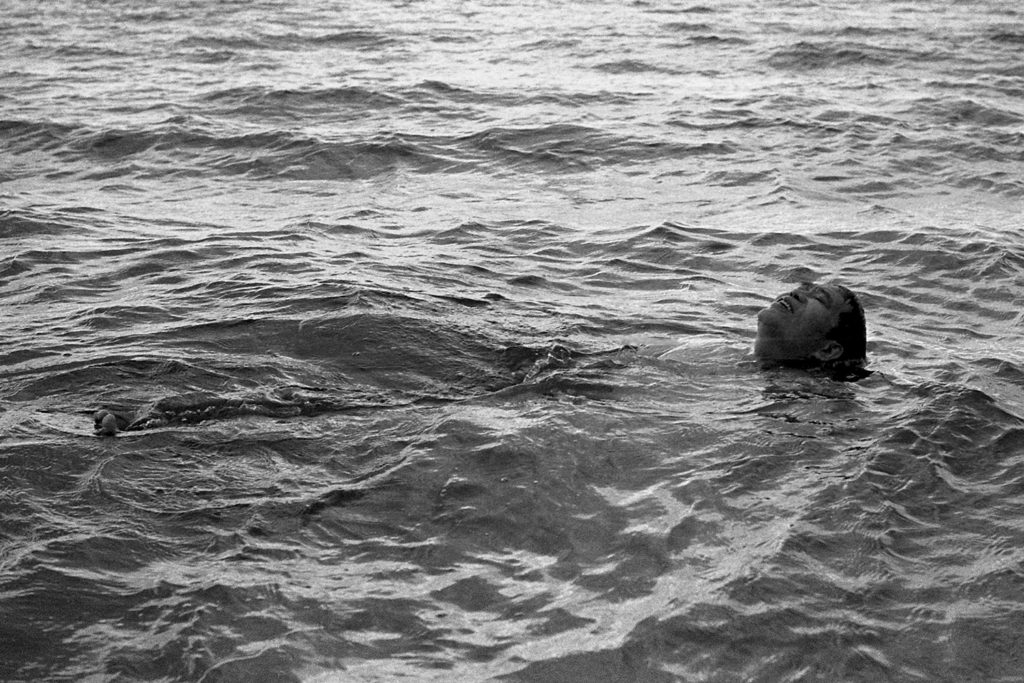
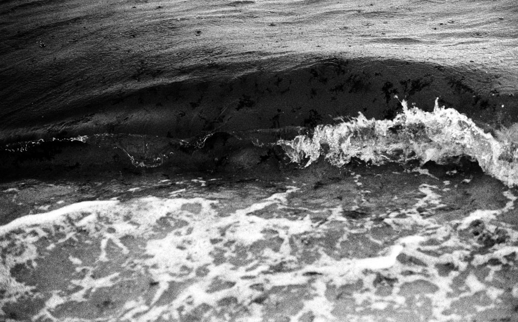
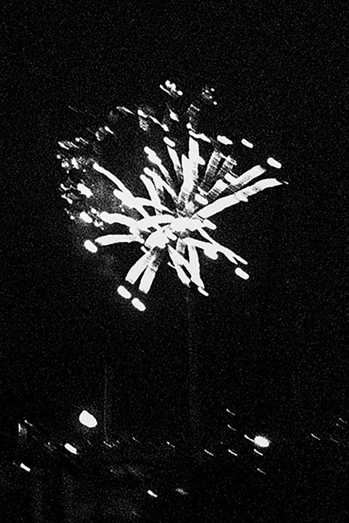
Yu created a zine called Wave which she took over a month long road trip she went on with her father as a chance to reunite after not seeing him for about six years. The images are all in black and white and focus on the beaches that they passed on their trip, showing a variety of subject matter and locations. By keeping the images monochrome with an old film-like grain, Yu is able to create pictures that appear much older than they actually are, potentially representing the lost time and memories that Yu and her father missed out on during their separation. The images look like fading memories, captured by Yu’s camera to hold onto forever.

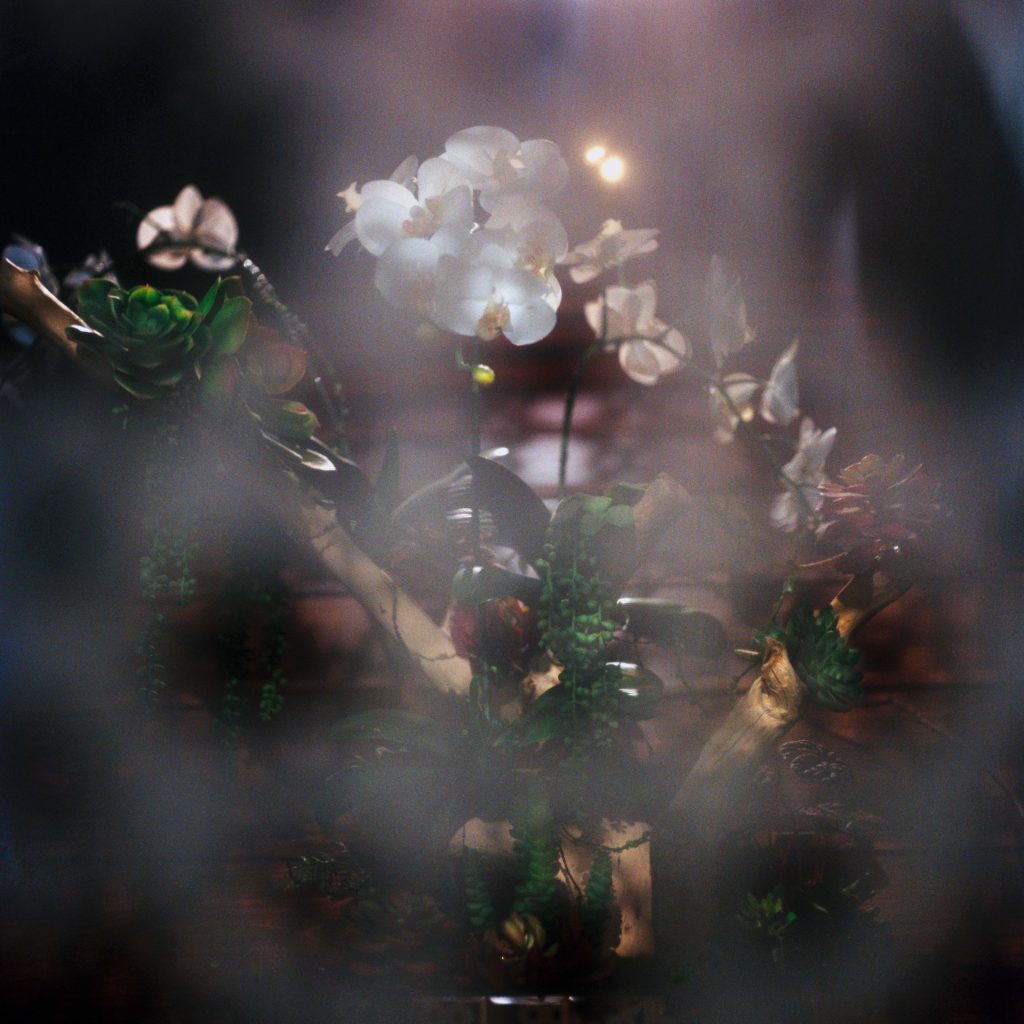
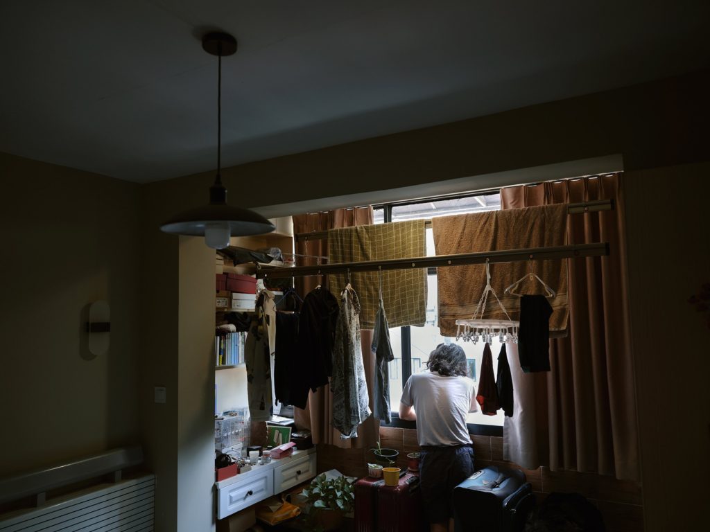
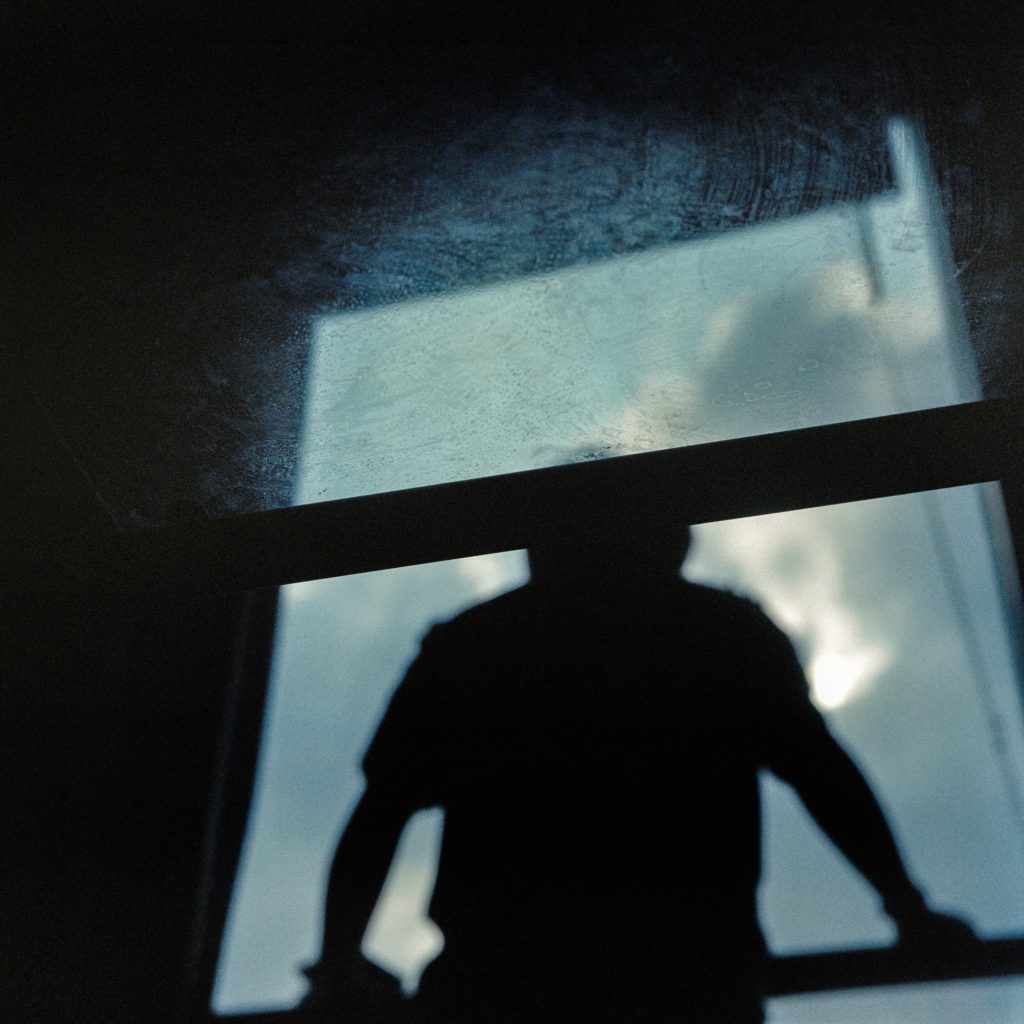
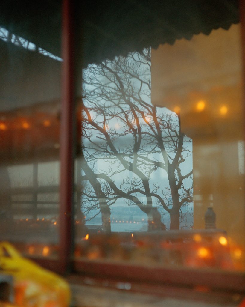
Another series of images from a different project called The River That Flows In Winter. The colours used are mostly warm and soft, evocative of a memory once again. The images are mysterious, being displayed without any kind of explanation, leaving their meanings up to the interpretation of the viewer. They utilise things like reflections and windows, creating texture and depth, and almost never show the figure in full to the viewer.

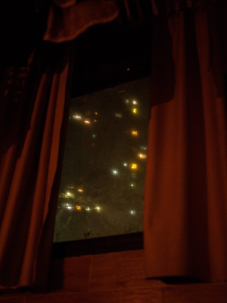
This is one of my favourite images from this project, with Yu’s use of colour and windows once again. The image shows the lights of an apartment building at night, shining through the darkness which is seen from the window Yu is shooting from. The colours are soft and dreamlike, leaving the image slightly blurred while still being clear what it is. The shading on the curtains inside is intense and dark, while the night scene outside is light and full of shades of green contrasting the red curtains. The lights from the apartments shine through like stars, mostly in various shades of yellow. The image appears as if the viewer is trapped inside by the curtains which are a lot more focused than the dreamy outside world through the window.

Mind map and Mood board

I decided to start the project by writing out any ideas I had based off of the theme of Simple or Complex:

SIMPLE:

  • Block colours -> Walls, Paper, Screens?
  • Recurring shapes -> Simple buildings, Focus on shape
  • Straightforward angles
  • Neutrality
  • Simple compositions
  • Large amount of images displayed together- grids- creating new image from this
  • Straight Photography
  • Plain lighting
  • Motifs

COMPLEX:

  • High levels of detail
  • Various angles
  • Range of colour and tone
  • Focus on texture
  • Complex compositions
  • Variety of image types
  • Displayed large in order to show details
  • Crowds, Complex structures -> Scaffolding, Construction sites
  • Emotion and Movement
  • Various lighting sources/techniques
  • Tableau

I then decided to look for artist references with work that I would like to take inspiration from.

Laurence Philomene is a photographer who uses the camera as a way of documenting their life as a chronically ill trans person on HRT. Their images are incredibly vibrant and depict everyday moments with a fantastical feel.

Jiayue Yu is an award winning Chinese photographer who explores concepts surrounding inner worlds and emotion by combining her images with 3D elements, creating complex, multi-layered compositions. Her colours are often soft and warm, like a fading memory.

Alvin Ng is a Southeast Asian photographer who explores the his relationship with the world around him through the lens of Asian folklore and religion, creating unique images inspired by these stories.

I like the styles and techniques of each of these artists and plan on looking at them closer as artist references.

Historical context of Still Life photography

What is a ‘still life’? –

A ‘still life’ comes from the Dutch word ‘stilleven’ which originated during the 17th century throughout Europe. This was when paintings of different complex compositions through a wide variety of objects became of popular and held a greater meaning within them. Still life is further used to depict inanimate objects as there is a large amount of different influences that change the way each painting/picture appears throughout different time periods throughout history.

A brief timeline of Still Life photography –

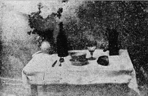
The first inclusion of still life photography happened during 1927 but was set up for reproduction in 1893, as the original was lost, this image is called ‘The Set Table’ by the inventor Nicephore Niepce.

‘The Set Table’, Nicephore Niepce, 1893.

The picture above is is Niepce’s ‘The Set Table’, this picture represents a table that is covered by a cloth with a meal/cutlery set out for one person. The photo uses a lot of dark shadows throughout on the objects and in the top right corners of the photograph, this can suggest a long exposure time on the camera where there is a lot of light being let in due to this, creating a vast amount of shadows throughout the day. I think that this photo is a good example of what we can label it as a ‘traditional’ still life photo as it has elements in it which represents what still life photography consists of, such as a having a long exposure, using traditional elements to represent wealth/class/etc and how the objects may be set up in a studio or darkroom.

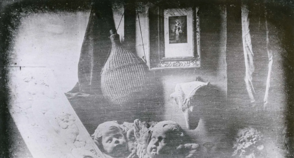
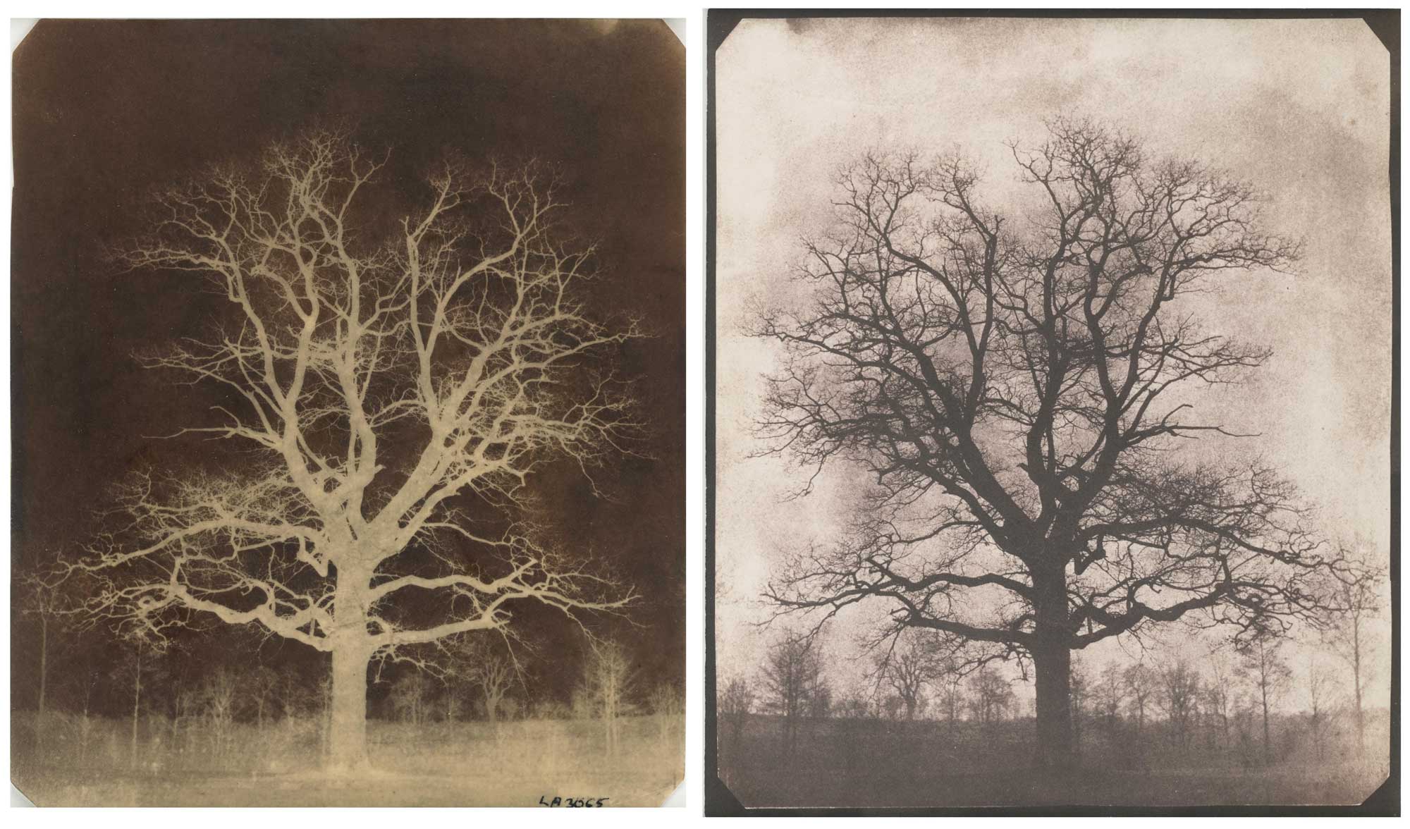
Niepce started to work with Louis Daguerre in 1829 to experiment with different elements of photography, this was where Daguerre was able to create the ‘Daguerreotype’, this was where an image was created on an polished sheet of silver-coated copper. A daguerreotype is a detailed image which has a mirrored surface, making it quite fragile and expensive, this type of photographic process was used to make images such as topographic and documentary photography of a variety of still life images. The use of daguerreotypes developed into ‘Calotypes’ through Henry Talbot, his photographs consisted of household objects (e.g. glassware and books). Therefore, the use of these different types of photographic processes links in to the movement of ‘Realism’ as the camera was used to capture real-life scenes during the 19th century.

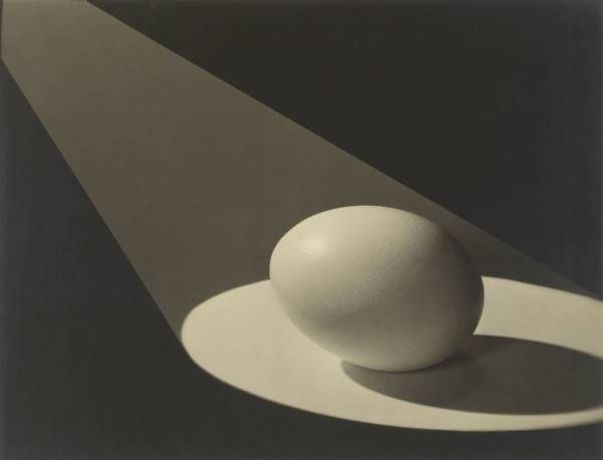
As photography moved in the 20th Century, the rise of popularity in Pictorialism photography, which suggested that photographs should resemble art forms. This led to a rise in art photographers such as Baron Adolf de Meyer, Edward Steichen, etc using techniques like soft-focus lenses and working in darkrooms where they would create photos that resemble charcoal drawings, echoing a sense of obscurity and dream photography, still in black and white.

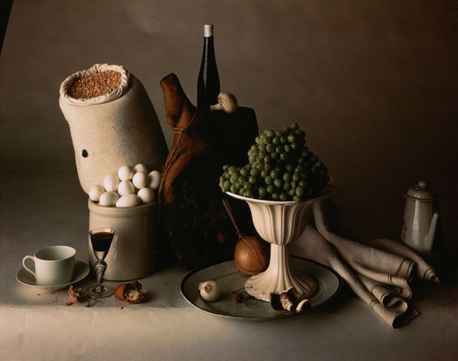
The introduction of colour into still life photography was developed in 1903 but not made available until 1907 by the Lumiere brothers. They developed a technique of using 2 sheets of glass coated with silver emulsion and a combination of potato grains dyed orange, green and violet. By the 1930’s this technique was replaced by a three colour paper based carbo transfer process. By the 1920’s, Paul Outerbridge and a small group of other artists used the dreamlike possessions of pictorialism into their advertising still life art, this was achieved through using different household objects to create a balanced composition. Outerbridge used light in his photographs, he did this through sketching out ideas on paper and then applying this in to the photographic studio. Irving Penn was another artists during the middle of the 20th, he created still life photographs, in black and white and colour, of various objects such as food, skulls, flowers, makeup, etc.

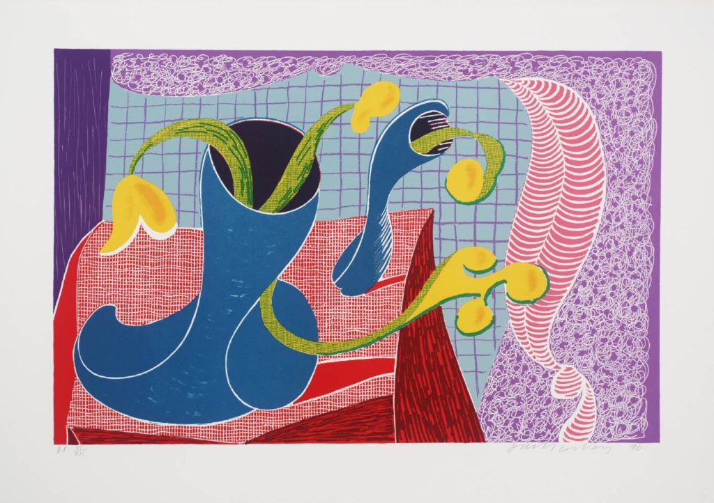
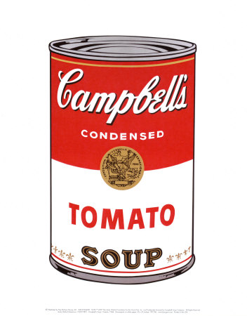
In the 21st century, the rise of still life photos such as Andy Warhol, David Hockney and Roy Lichtenstein. These photographers experimented with the abstraction of still life within modernism, which can be seen a lot in Andy Warhol’s work.

Simple and Complex

“What we’re all trying to do is make a layered, deep, complex, complicated photograph that doesn’t look complex or complicated.”

Simple

Some photographers think that a more complex photograph is better as they feel that they are able to show higher level of skill compared to something that they would class as a ‘simple’ image.

In photography the word ‘simple’, is to take away the complexity of the work, to try and make it more care free and relaxed. By saying that, some people my believe that these photographs have no depth or hold no meaning to them, but its the opposite, sometimes the most simplistic image can convey the most meaningful story.

Simple photography can be shown through any type of photographs but I think that one of the easiest genres to create images that tell a story is portraiture, by having the subject change they way they are posed or their facial expressions the photographer can change the whole narrative and portray a completely different emotion in a very easy and ‘simple’ way. Still life photography can also be a creative way to make simple images that can show the photographers or other people feeling towards and object as well as landscape photography having the same effect on locations.

Complex

The definition of complex is “involving a lot of different but related parts”, this is shown in many famous images by famous photographers. Complex images as commonly known as ‘better’ compared to ‘simplistic’ photographs which can sometimes be true.

In photography complex images has many different feature which all bring the photograph together making a creative and skillful piece of work that is interesting to look at, but there’s a fine line between multiple factors for create a story and a photographer making a busy image which isn’t very pleasing to look at.

moodboard

london street / architecture

Photographers to look at:

Buildings / architecture:

Daniel shea : 43 – 35 10th street

Gerry Johansson

colour / shapes / streets:

Siegfried Hansen – contemporary – now

Saul leiter – NYC

exploring different points of view of a city

Starting points- mood board +bullet points

Learning about the theme simple/complex, I started by bullet pointing concepts, art forms and ideas which related to either of the binary terms- binary terms consist of two opposite terms i.e. simple/complex, love/hate, male/female.

A small mood board which I used to think about ideas.

COMPLEX

Busy textures- William Morris 

Persian carpets 

Knots 

Stained glass 

Technology 

Human body and its relation to nature 

Nature including animals and plants 

Different environments- the sea, woodlands 

Human nature- routine, relationships

Emotions, thoughts, behaviours, actions- anger, love, loss 

Religion, society, laws, politics, culture, rights, stereotypes, expectations 

Clothing, subculture, style I.e., punk movement- Alexander McQueen, Vivienne Westwood- 90s heroin chic movement 

SIMPLE

Birds eye view 

Industrial 

Geometric  

Black + white 

Minimalism, brutalism and architecture  

Lighting 

My mood board

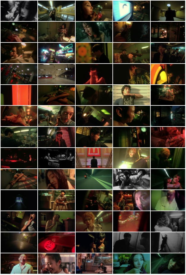
From making my mood board and researching artists, I realised I was interested in dramatic staged images- possibly ones which reflect classic paintings. To further research a dramatic staged image style, I watched films where lighting was an important factor in the cinematography (such as Fallen Angels, 1995)

Film stills from “Fallen Angels” (1995)

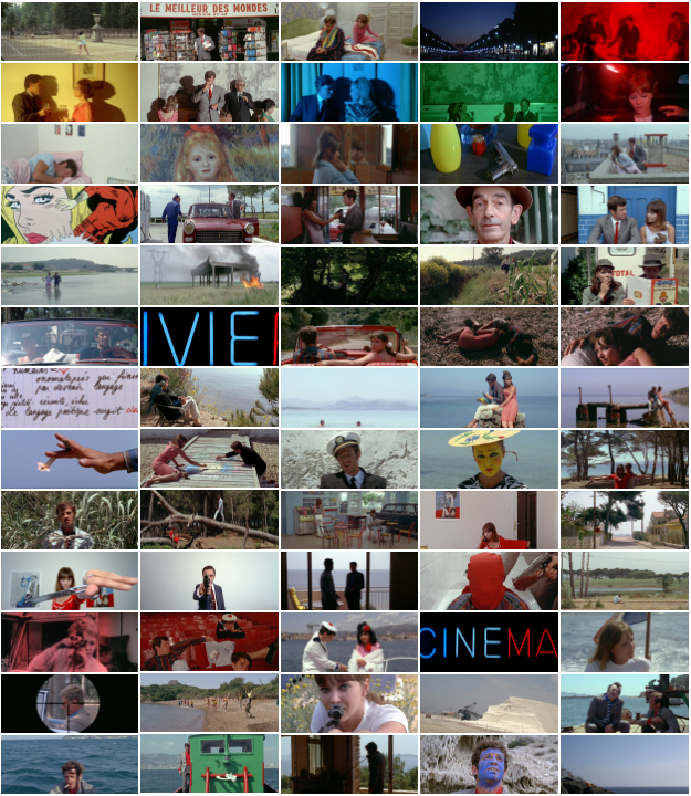
I also watched films where the style was softer, such as French new wave films (“Pierrot Le Fou”, 1965). My main interest for this theme as the minute is cinematic style images- dramatic, emotional yet staged.

Film stills from “Pierrot Le Fou” (1965)

POTIENTIAL INSPIRATIONS

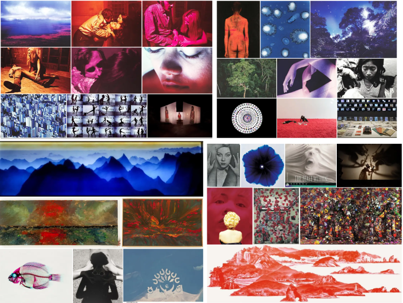
SAM TAYLOR-WOOD

Click on one of the images above to view more of Taylor-Wood’s work.

CLAUDIA ANDUJAR

Click on one of the images above to view more of Andujar’s work.

WING SHYA

Click on one of the above images to view more of Shya’s work.

CINEMATOGRAPHY- JEAN LUC GODARD

The images above are from the film “Pierrot Le Fou” (1965), click one of the above images to view the film trailer