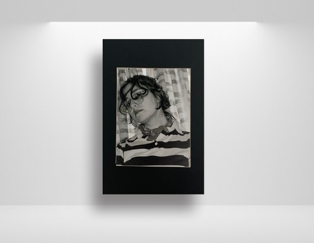
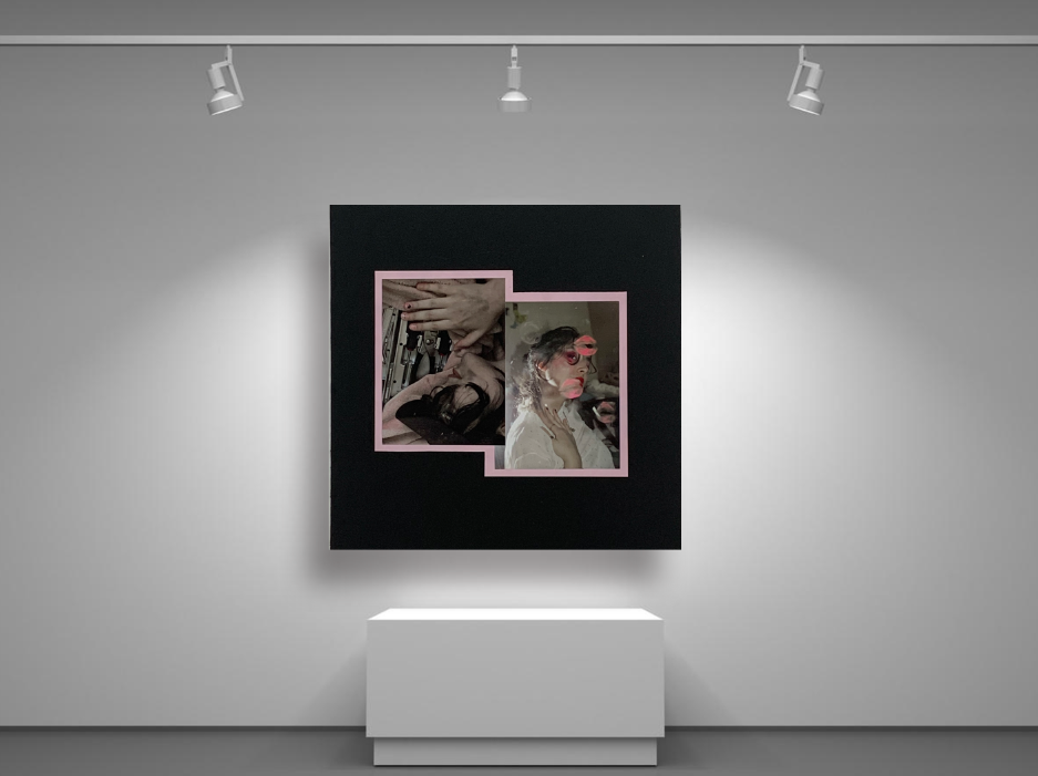
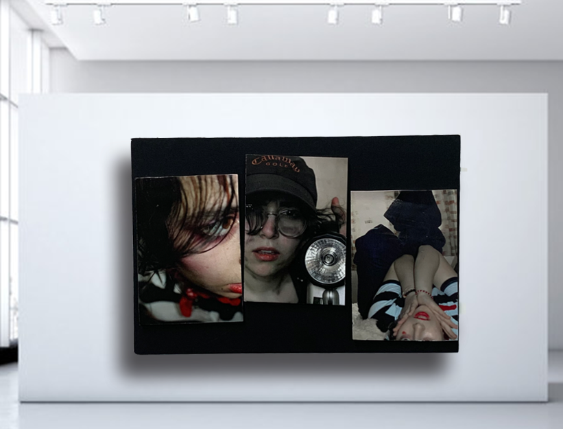
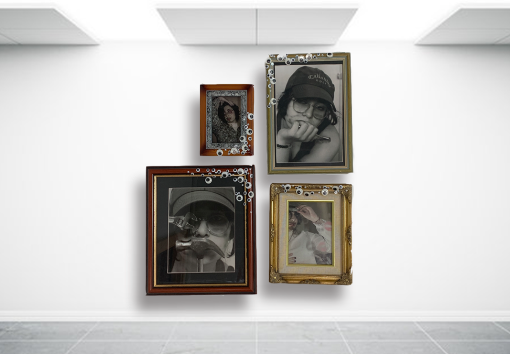
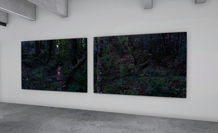
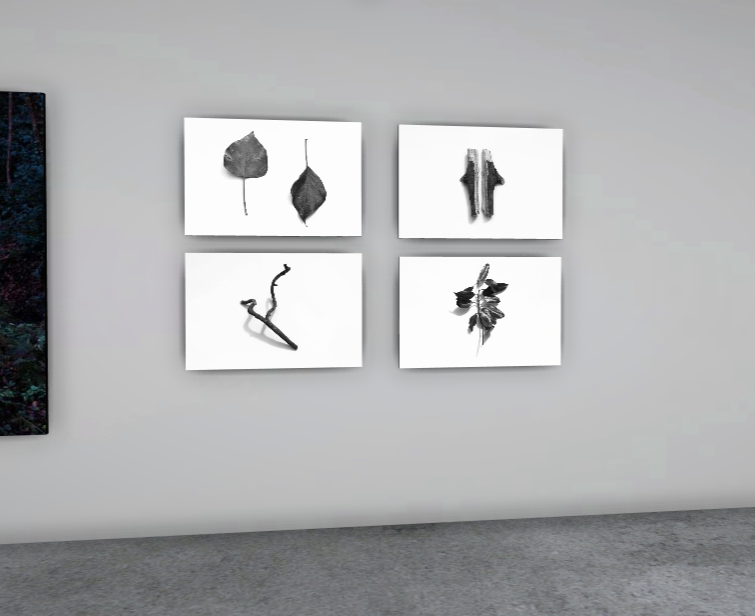
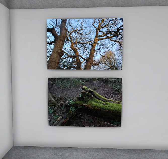
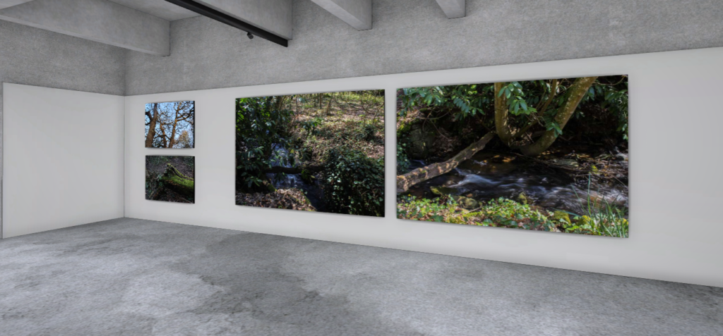
Exam Project Virtual Gallery and Evaluation

Virtual Gallery


Link to Digital Photobook

HERE is a link to a digital copy of my photobook on Blurb


Evaluation

I think my exam project was successful, as I was able to take some of my best photographs during the photoshoots and experimentation I did for this project. During the project I learned various bits of theory as well as practical work such as creating cyanotype images, using various AI software to reinterpret my images, as well as overall improving on how to frame an image to have a powerful composition. I took many varying shoots that each produced different outcomes, and I was able to incorporate each shoot into the book successfully, as well as the AI generated images which made up the ‘Complex’ half of the theme of the project. Additionally, the ‘Complex’ part of the theme was included in my woodland photoshoots, as their composition and subject matter were complex in comparison to some of my other image. As for the ‘Simple’ half, I created cyanotypes with reference to Anna Atkins using objects I collected during my woodland shoots, which I managed to include into one of my final pieces nicely. I was also able to take some traditional object photographs by using those same objects and placing them on a white background. I am proud of both of the outcomes for both of those shoots as they make up the ‘Simple’ half of the theme very nicely.

What went well:

I think my work using AI software was successful, as I was able to effectively create images that reinterpret my own images using them and create a nice contrast between a real image and a computer generated image. I was able to experiment with various software and landed on Dreamstudio AI, which produced the images that I ended up using in my photobook. I feel like my final pieces were a success, I was able to create many window mounts and some other forms of final pieces that include images from most of my photoshoots.

How I can improve:

Due to the limits of the software, I was unable to include any AI generated images into my final pieces due to their low resolution, however my work using the woodland images will make up for the ‘Complex’ side. Due to my inexperience in object shoots (which made up the ‘Simple’ side of the theme), there is less material for that side of the project, however I think the uniqueness of their composition makes up for that.

Evaluation + Virtual Gallery:

Evaluation:

Overall, I’m happy with the final outcomes I’ve managed to create and think I’ve managed to achieved my goal of creating sets of images that portray the theme of gender/gender roles in a simple yet complex manner.

Although I think my project was successful, I do think I could’ve improved on certain areas of my project – specifically in terms of time. I spent a lot of time at the start planning out various ideas that I wanted to try and recreate yet left myself without the time necessary to complete said ideas [i.e: spending some more time decorating some of the frames to create a narrative for the images that seem a bit more vague [such as my A3 image]]. Despite this, I still think I’ve managed to work around this issue and managed to mount my photos in a way that helps to elevate each image.

Virtual Gallery:

Audio Track

Another piece I made to contribute to my project is a video panning through my final images, with a few sounds in the background either captured from where I took the photos or sounds I sampled from various places online that I think would fit with them.


I first started trying to make the audio track in ableton, however I quickly realised that trying to line up the sounds with the images would be a lot harder than if I edited the audio in premiere- where the timelines are stacked.

Ableton view

My samples
Edited in Adobe Premiere Pro
Audio channel where I edited the audio track


Evaluation

In conclusion, I think this project went well for me, however I would’ve been better off completing more photoshoots so I could present a wider range of photos.

My window mount took inspiration from one of my artist references, Bernd and Hilla Becher. Their work on topologies and taking photos of buildings and displaying them in a grid definitely influenced my own work:

Also, I think another of my artist references, Lewis Baltz, influenced my work on the corners of buildings well:

Lastly, my third artist reference was Nicholas Goodden, who completed a minimal photography project in London. I think his images definitely inspired me to take minimal style photos in Jersey when I saw them.

Artist comparison – George Georgiou

I have chosen to compare these two images as I believe that they both have similarities in the two. They both contain photos of a single person so they first have a similarity within the fact they’re both in the same situation . Both images show someone walking carrying something and are both based around a urban area, having other buildings in the background of them. They both display portions of the road and showing them looking down walking not paying attention to what’s happening around them definitely capturing them in true nature not realising they are being photographed. I feel that the background and situation makes it more dull and moody as it is representing the urbanised world.

one difference is that my image has a younger male looking at his phone while the older lady is just looking down representing how the youth are much more tech concentrated nowadays

Here is a full-scale presentation of the image I have chosen to compare with that of George Georgiou . I really like how this image turned out as I feel it is very similar to that of Georgiou’s work who I used as a real inspiration for my pieces. Georgiou’s work has been a huge inspiration for me as I feel he is able to present the essence of what the uk and people are really like through it’s capturing of people in everyday life.

Evaluation and Critique

My final images

I feel as if my final images vary in strength, with the phone image (above, bottom left) being my weakest and the two top images (above) being my strongest due to their set aesthetic although this may be because they are a pair. I believe my phone box image is the weakest due to its lack of technical ability, although the blur was accidental it did add some action to an otherwise plain image however I feel as if this image has a lack of aesthetic with no coloured lighting and a lack of strong contrasting shadows, both of which are strong themes in my other images. In relation to the theme simple v complex I feel as if I succeeded with my intentions and interpretations- the images are simple however have a complex aura behind them which can be created by the viewer of the image by an unspoken narrative which I did not outline however is implied in the images with the main subjects referencing out of frame entities and not acknowledging the audience. Equating to my artist references was difficult however I think I succeeded with this, the majority of my images are clearly inspired by Wing Shya’s photography while one of my images is easily comparable with Claudia Andujar’s work (above, bottom right image). I think a criticism of my final project would be the amount of images I produced, although I am happy with my final project I feel as if I could have created more images in this style if I paid more attention to the camera settings when taking the images so there were more successful images which contained no motion blur and overexposure.

Click the image above for the whole presentation of my final outcomes

I am particularly happy with my presentation of images through a CD, I feel as if this adds more formality to my work showing that the images can be used in numerous ways- making a CD also meant that I could experiment further concepts with my images, with cinematic style images they are very fitting to other media applications such as covers for CDS/DVDs, advertising on billboards and film screengrabs. A criticism of my CD would be however the repeat of images, linking to my previous paragraph if I was more competent with the camera settings to create the correct colourful atmosphere without using flash then I would have had more images which I could have displayed: I also would have liked to burn a CD with either music on it, me talking about my images, or even a narrative to the images like a short story- however I ran out of time to do this as I did not think of what to do after creating the CD covers.

Evaluation

Best Images

Evaluation:

What went well?:

I believe my project follows the overall theme of the Male Gaze, I have used techniques such as including images from a males perspective to highlight the male impact on the female life. I think that my images are good and have been thoroughly experimented with in order to create effective shadows, light and overall interesting to look at. Throughout my project I have made sure to keep minor details up highlighted such as the use of light and shows to convey emotion.

To Improve:

To begin, I wish I had researched the work of Cindy Sherman more thoroughly, mainly because sometimes I felt slightly confused to what her images were meant to be conveying, however it is possible that Sherman’s work can be confusing because it could have so many different meanings and allows you to be confused in order too interpret your own meaning. Secondly, I should’ve taken more images, particularly ones similar to the costumed images by Sherman.

Photobook Evaluation

Front cover

For the photobook, I am very happy with the way it fits the theme of Simple and Complex, as it contains both complex themes of artificial intelligence, a woodland environment, the technical nature of photography as a medium, as well as the more simple themes to contrast with it, such as an object photograph, as well as how AI software can simplify creating an image. I think the image on the front/back cover represents this well, as the image started as a fairly complex composition in the woodland, and I edited it to be made up of simpler shapes and slightly more limited colour. I am happy with the way the book links in with my previous book in that the image on the front cover is designed in a similar way, even the text is in a similar position.

What went well:

Due to the symmetrical nature of my sequencing, many of the pages in the photobook have a similar aesthetic and presentation, this idea of a repeating page layout works nicely in making sure each image works well with one another. I think my inclusion of my AI generated images was successful, as I was able to put equal focus on those and the image they were referencing during their creation (the only page where it only has AI images uses images based off of the image from the cover of the book).

How I can improve:

Due to the limitations of the AI software, the AI generated images were at a very low resolution, which means that they may not be in the best quality once I have the book printed (however that blurriness may add to their inorganic appearance). The title of the book (Ancient Woodland Modern Software) was a fairly rushed name, however it does fit in with the themes of the project.

Experimentation + development + manipulation of images

for this experimentation i decided to put a few of my monochrome images over the top of each other

i started by cropping out my images so that i could start layering them

i started off by placing them over one of the other images but realised there wasn’t really enough space and the images seemed a bit to squeezed in so i tried placing them on a A3 blank sheet

after doing that i was much happier with how the edit turned out and i was able to fit all the images how i wanted to

finally i added my final image and cropped it down and was very happy with the outcome but after printing it i decided to keep the outline for a less basic and more interesting image

final outcome