Photoshoot 2

What was photoshoot 2?

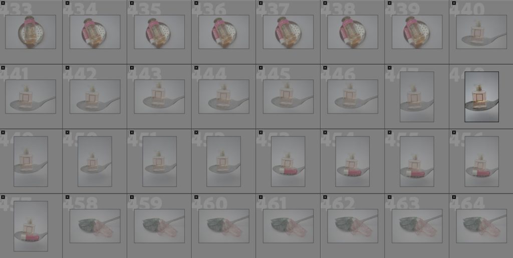
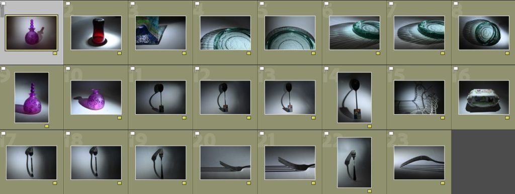
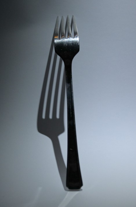
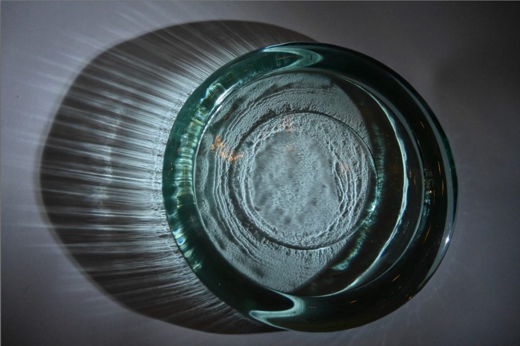
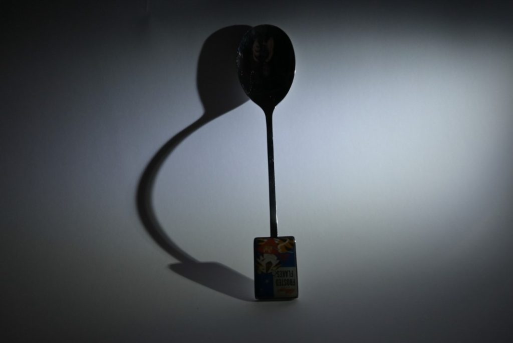
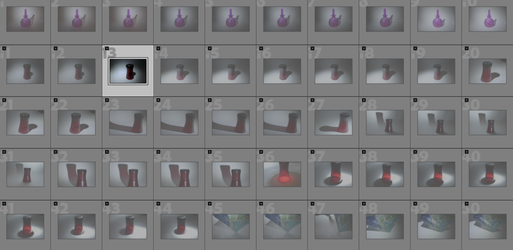
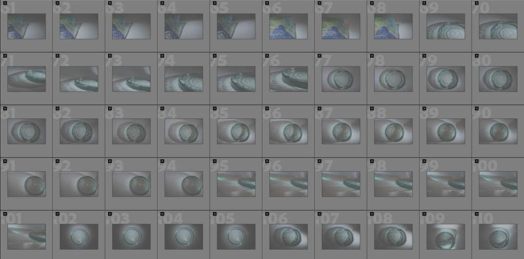
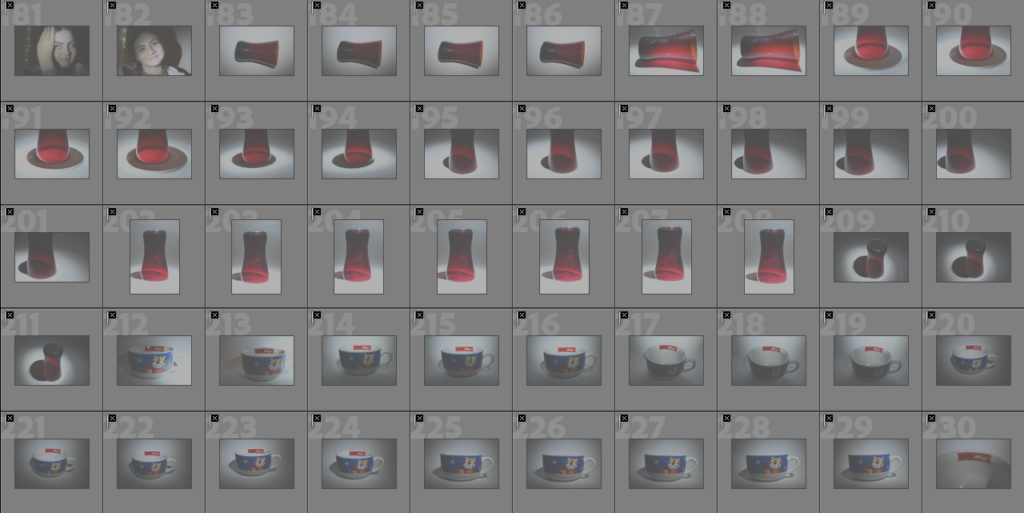
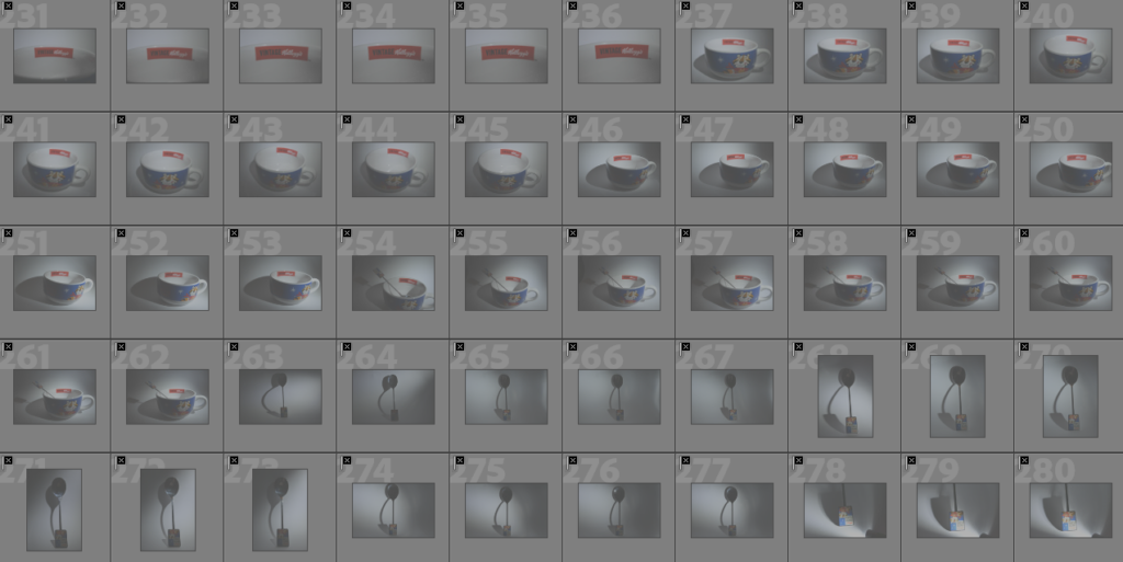
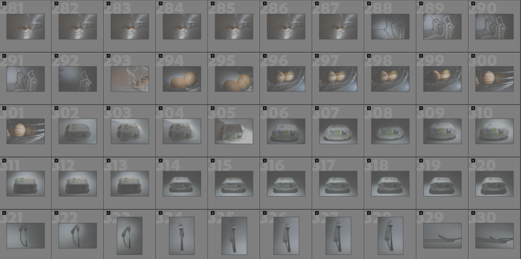
My second photoshoot consisted of taking photos of the objects which I had used in my initial photoshoot during the day, singularly or in groups, and introducing other objects such as different accessories/perfumes/etc. By carrying out this project during the day it made the background appear clear and bright due to it being white, creating a vibrant contrast between the colours of the different glassware and objects. Throughout this photoshoot I also tried to work within the style of Jaroslav Rossler and Paul Outerbridge due to the objects which I have chosen to use and how I want to further edit these photos in the future. I enjoyed this photoshoot to an extent because I was able to see the objects and their finer details/colours in more detail compared to using a spotlight within the night time and I was also able to experiment with different compositions of how I wanted them to appear in their layouts.


Most successful shots –

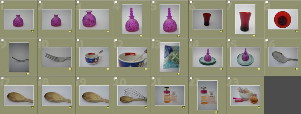
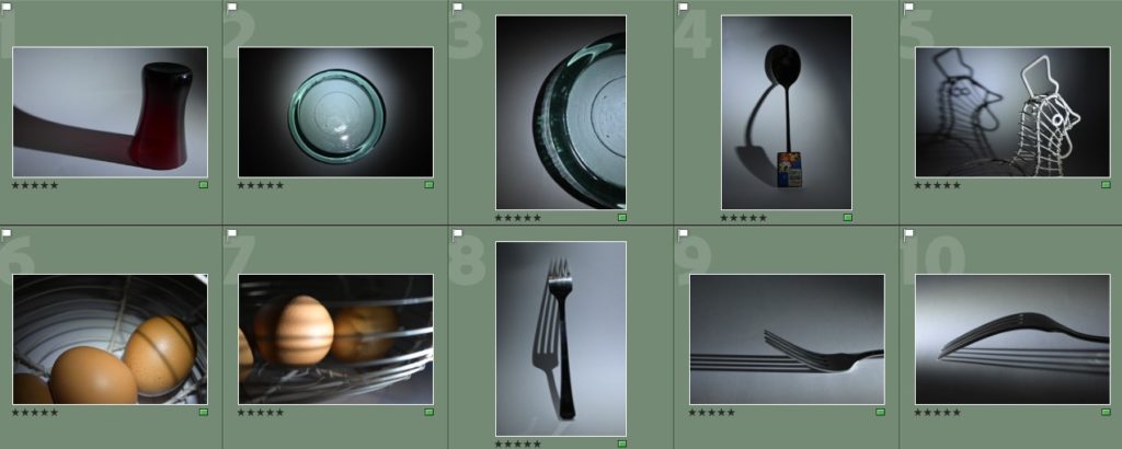
Above are the images which I chose to be my most successful shots, I did this on Adobe Lightroom by going through the images I had taken and selecting ‘P’ for pick to mark them as images which I wanted to analyse further. How I decided what images I wanted to choose as my most successful I went through a process of selecting ones; which were clear and had no shakiness, experienced with various angles such as from the side/centred/birds eye/etc, had an unusual formation due to the way that they were taken and how the objects worked with one another, how the images related to my artist references. Personally, I think that I chose a variety of images as my best shots that have a variety of potential on how I could use them in further ways to edit, I really liked the photos of the singular fork, the spoon and the fork, as well as the perfume and perfume boxes because I think that they work well in representing still life images too.

Colour coding and rating –

To further select a smaller amount of images which I can use I decided to begin a process of colour coding, this process which I had done before for my first photo shoot consisted of me putting images into two separate colours, green and yellow. I used green to recognise and sort the images which I felt 100% sure on using in my work to edit and yellow to organise images which I still was unsure of due to them not working well together or being repeats if images which I had chosen beforehand. This process made my selection process easier for me because I was able to think of different pros and cons of each image and this further helped me when it came to organising my images to be rated as a part of my selection process.

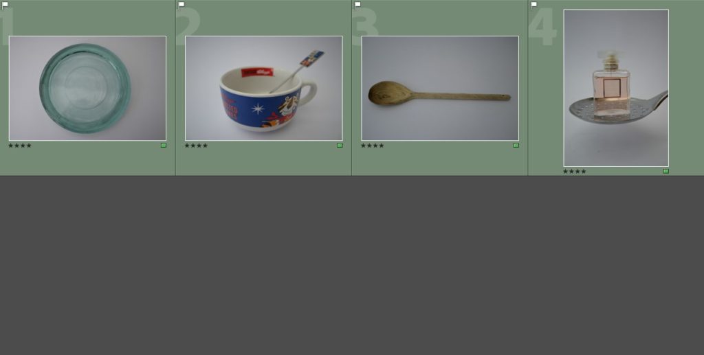
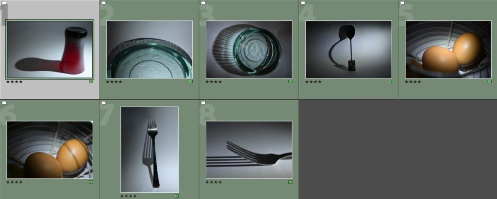
The rating process was used by myself within my work to organise my photos in to a final 8-10 images which I can use alongside other photos from my other photoshoots when editing. I decided to organise them in to two categories; 4 stars were used for images that I decided I did not want to work with as I felt as if they were too plain in how they appeared, and 5 stars which were images that I felt related well to my artists which I have chosen and had further potential with editing in different ways as well.

Evaluation of some images I chose to be my most successful –

Image 1:

  • I like how there is a dark band of colour around the edge of the image, creating a heavy contrast against the vibrant colour further within to the plain white background. This creates the idea of a barrier which is protecting others from what may be in the middle of the cup because the colour red can be seen as a sign of danger.
  • I like how the cup gets darker in the middle of the photograph, this adds depth in to the photograph.
  • As the photo is taken from a birds eye view this emphasises the fact that you are looking down in to the glass due to the effect of depth created from the darker colour in the middle.

Image 2:

  • I like thw simplicity of the image as it is a singular fork in solitide.
  • I liike how there is also a slight shadow underneath the fork as it starts off quite dark yet subtle and trails off.
  • I like the way that the fork curves within the photograph because the image is quite plain so this adds some difference and subtle variety in to the photograph.
  • In further editing of this photograph, I will experiment with different ways to crop the photo to enhance how it appears within being the main focus of the photo.

Image 3:

  • I like the placing of the spoon on top of the fork as it creates different lines, shapes and bends within the photograph and with further editing this can be manipulated through different effects e.g. filters/black and white/exposures in Lightroom and photoshop to transform how the photo turns out.
  • I like how there is a slight refection in the spoon of the surroundings and then how there is also a reflection in the fork of the spoon. This is a subtle effect of reflections which I wanted to include within my work.
  • I also like how the camera has captured the imperfections of the spoons and the forks, showing the wear on them and how they have come from a household that use them frequently which adds character and story to the image.

Image 4:

  • This photo reminds me of a photograph from Jaroslav Rossler which he also took but from a dofferent angle, which I wish that I experimented further with but could achioeve through editing in different ways.
  • I also like how the height of the perfume bottles work alongside one another as it adds dimension towards the photograph as if they were the same height they would look too uniformed.
  • In further editing I will make sure that the photograph is recentered as it is slightly wonky due to how it was taken, but this is not a big issue.

Least successful shots –

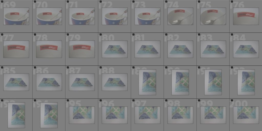
Above are the images which I chose to be my least successful shots which I had taken throughout my second photoshoot. I did this by selecting ‘X’ for images that I wanted to reject, the way in which I decided this was through; repeats of images, the framing of images, if the images were blurry, if they were too plain in how they appeared and if the objects which I had chosen to use did not work well together. Personally, I found it quite difficult to decide on images which I chose to be my most successful due to being my least successful throughout this photoshoot, this is because I did not enjoy how this photoshoot was done during the day instead of using a flashlight to create different shadows and reflections. If I were to do this photoshoot again, I would look into using a mirror, this would help with gaining different perspectives and reflections, or even a small spotlight to help with creating different shadows and manipulating where they fell on the background.

Evaluation of some shots I chose to be my least successful –

Image 1:

  • The image is off centred and wonky which I do not like as the object in the glass isn’t straight which also doesn’t help the glass to appear as if it is in an upright position.
  • The detailing at the front where it is slightly chipped is blurred, this doesn’t give the effect of it being as worn as I would like it to be as you are not able to see it.
  • I do think that the detailing on the glass is quite precise in how it appears, this means that you are mostly able to see it all clearly as it is quite different and unique.

Image 2:

  • Only the front half of the glass is in focus whereas the rest in the background is out of focus which I do not like even though it does create a depth of field within the photograph.
  • The colour of the glass isn’t that clear or as vibrant as I would like it to be and it becomes quite light at the back which makes it appear as if it is lost in the white background.
  • The image is too simple in its composition, there is nothing exciting or intriguing about the image and how it looks.
  • I do like how the natural light falls on the side of the glass and creates a subtle yet effective shadow which is varied in it’s colour as it is lighter in some places compared to others where it is darker.

Image 3:

  • I do not like the placement of the hair clips on the ladle as they look as if they are falling off and as if they have just been placed there randomly.
  • The ladle is not as shiny as I would like it to be in the light, appearing to be quite dull which makes the blue clip get lost within the photograph as well as it blends in.
  • There is no shadow or dimension in the photograph which could have been created by adding an extra spotlight or some sort of forced light which makes the object look as if it floating.

Image 4:

  • The ladle is tilted due to the way that it is being held, this makes the image seen as if it is quite off centred and as if the perfume bottle is falling off.
  • I do not like how I have placed the perfume bottle and the ladle together, personally I do not think that they work well alongside one another.
  • Due to the light colour of the perfume, as well as being in a clear bottle, it gets lost within the background of the photograph and you can’t see the logo on the bottle that says the name of the perfume.

Statement of Intent

My idea for this exam project is to capture unique angles of contrasting architecture throughout Jersey, focusing on the binary description of simple & complex. Inspired by photographers such as Gabrielli Basilico and Matthieu Venot, I will use techniques such as low angles or framing to capture a series of Images showing variety in architectural design.

To me simple & complex simply means the physical/ visual appearance of something, whether it be an intricate finance building or a simple flat block blended into the sky to look like a painting. This is why I have chosen to focus my study on architecture as it can often be described as on either end of this scale. I do however believe that while a photo may be perceived as simple upon first looks, when given meaning &/or context something simple can also be complex. This could be things such as historical or cultural significance of the building, usually related to its history- for example Buckingham Palace is frequently photographed as it represents the wealth and status of the royal family, and England how ever it also represents the divide between the classes in England. I will be using this sort of association by creating pieces based on Jersey financial buildings + new high end apartments as they stand at the centre of Jersey inevitable gentrifiation.

I will be presenting my work in the form of framed prints, varying in size- some of which I will be framing next to each other in order to give contrast (eg simple candid shot of a wall next to a complex photo of a church) as well as pieces which appear as somewhat complex patterns art on first look. Alongside this I will be attempting to create a sort of collage of some of my prints . In order to further expand my project, I will be sampling the sounds I hear while I am taking these photos, and producing a sound track to play over a display of my images. I plan to use things such as bird noises, cars passing by, the echoing voices from children inside fort regent etc to give my photos some more depth and link to my previous idea on how context creates complexity.

Kayla Varley

“I don’t think women should be afraid of showing their true selves. When we have the space to be who we really are, and we are not afraid, we flourish. I hope that someday we can shape our society so that women don’t ever think twice about their appearance or behavior – we have the right to act however we please.”

Kayla Varley is an American fashion, lifestyle and beauty photographer and director who is currently based in Los Angeles after moving from Bakersfield where she was born. Varley started her photographic journey at the age of 13 when she was given a tiny camera which she used to document her teenage life. Varley worked to develop her style even though she was restricted in options for creative outlets in her small town. In 2010 she moved to LA where she attended an Art Center College of Design. This also became the place where she began her professional photography. Varley’s recent work focuses a lot on fashion, beauty, lifestyle and motion. Her work explores the intimacy and connection with other people and looking in on emotions through colour, expression and kinetic movement. Varley’s work focuses on finding the joy in the unexpected and the playfulness that people can sometimes lose in life.

Kayla Varley’s Work

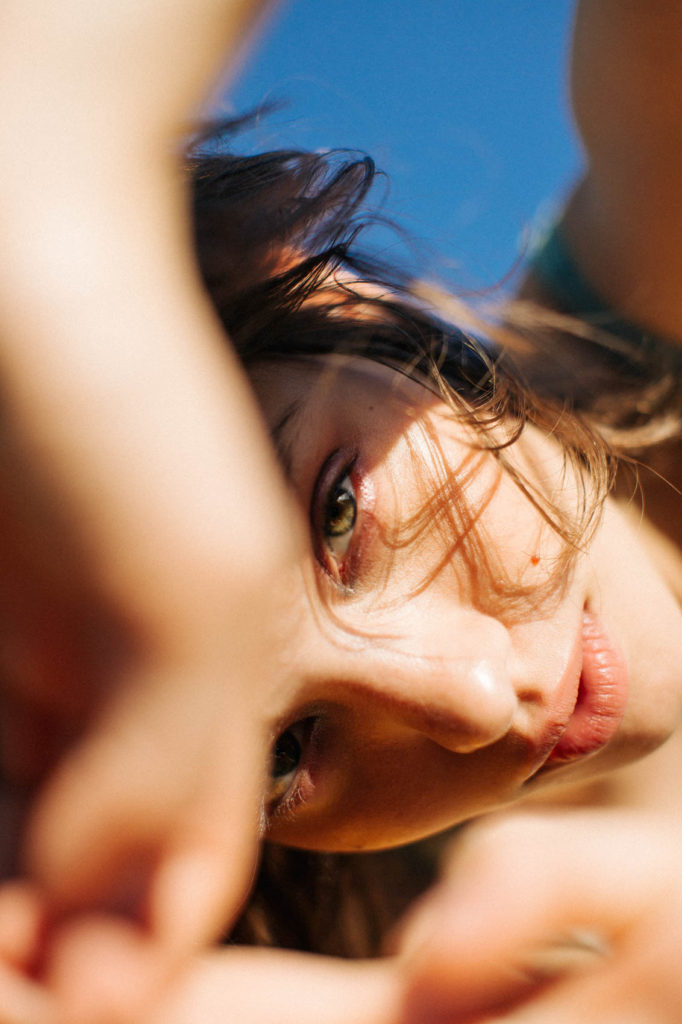
Above are some of Kayla Varley’s images that I have taken the most inspiration so that I can incorporate similar images into my project. I feel that these images help to show and convey a similar message that I want to send and the same aesthetic I want to explore.

Photoshoot 1

What was photoshoot 1?

Photoshoot 1 consisted of me working within the style of Andre Kertesz, which can be seen in images which I have produced of still life objects such as spoons/forks/bowls/etc, and Jaroslav Rossler, consisting of reflections in different glassware/perfume bottles/etc. I really enjoyed this photoshoot as it was done during the night so I could use a spotlight to manipulate where I wanted the shadows to fall of my different objects, changing the composition of them entirely. I also like how I focussed on using one object as my main focus for this photoshoot, as it provided one main object for me to focus on which I found to be easier to work with, but for my other experimentation in different photoshoots I will also focus on using groups of objects as well.


Most successful shots –

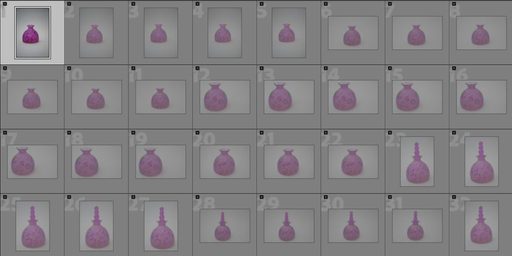
Above are images which I selected on Lightroom to be my most successful shots, this is because I feel as if these images explore the theme of reflections within still life well as they create different types of patterns on the background which makes them stand out against one another in different ways due to the various refection patterns created, just like Jaroslav Rossler’s work as he also experiments on the photography of different reflections from various objects. I also think that the photographs of objects such as spoons, forks, egg bins, etc are a good representation of still life in the style of Andre Kertesz because the shadows which have been produced are bold and stand out well due to this. I have further selected 10 main images which I would like to experiment more with and focus on editing below through a selection process.

Colour coding and rating –

To begin my selection process, I began by organising my images into green (the images which I wanted to work further with as I thought they were potentially quite successful) and yellow (the images which I was still unsure of, potential wise and did not want to work with). This process made it easier for me to determine which photos I wanted to use for further experimentation, such as manipulating through photo editing, and what photo’s I didn’t want to use. I really liked the photos which had bold shadows which stood out well against the white background as this was the effect which I was wanting to create, showing influences of Andre Kertesz. I also liked some reflections of different glassware such as the large blue plate as it created a variety of different shadow formations to use, which I thought was really unique as they were unusual.

To further my selection process down to a small amount of photos to use, I also decided to use the rating system on Adobe Lightroom. This meant that I would go through the photos that I had chosen to be green and give them a rating of either 4 stars (this meant that I still was unsure of them) or 5 stars (photos which I thought were really successful and I wanted to experiment with). This was a relatively easy process as I was able to further analyse my photos for what they consisted off and how they were composed which led to me deciding on having around 10 or so images which I could work on further when editing.

Evaluation of some images I chose to be my most successful –

Image 1:

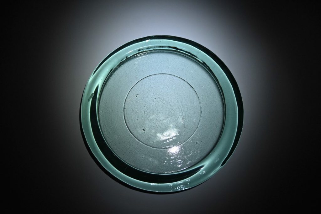
  • The colour of the glass plate is distinct and stands out well against the white backgorund.
  • The dark shadow around the plate acts as a framing tool for it.
  • The circular darker shadow around the plate which is seen on the white background draws your attention to the middle of the photograph.
  • The plate resembles an item that you might find from older times as it looks quite worn in some places, but is still in a good condition.
  • As the framing is done landscape you are able to see the whole plate, and with further editing on the sides there will only be the plate and no excess dark space which I like.

Image 2:

  • The framing makes the fork appear to be the main focus of the photograph as your eyes fall on to the shadow behind.
  • The shadow behind is bold and stands out well.
  • Due to the use of spotlight lighting, the shadow is able to be manipulated which makes it look distorted in comparison to the actual size of the fork.
  • For further editing, I will crop the photo more to make the fork centred within the frame as it is slightly wonky.

Image 3:

  • The reflection created on the left side of the photograph looks as if it is bursting out of the side of the glass, like an explosion, which I really like as it is quite unusual as the glass plate is quite plain.
  • The extra detailing of patterns within the middle of the glass is brought to life due to the use of the spotlight, making it look as if it would be found under the sea.
  • The heavy shadows on the right side of the glass create a good contrast with the left side, this is because I decided to have the spotlight fall more to the left side and this creates the darker shadow on the right side.

Image 4:

  • The spoon has become quite distorted in its figure due to the use of the infinity screen which I used to create the plain backgorund.
  • There is a clear contrast between the straight lines of the spoon and the bold, dark and curved lines of the shadow, I like this because it makes it seem quite unusual.
  • With further editing, I will make sure that the framing only focuses on the spoon being the centre main focus of the photo because at the moment there is a lot of empty space at either side due to the photo being taken at landscape.

Least successful shots –

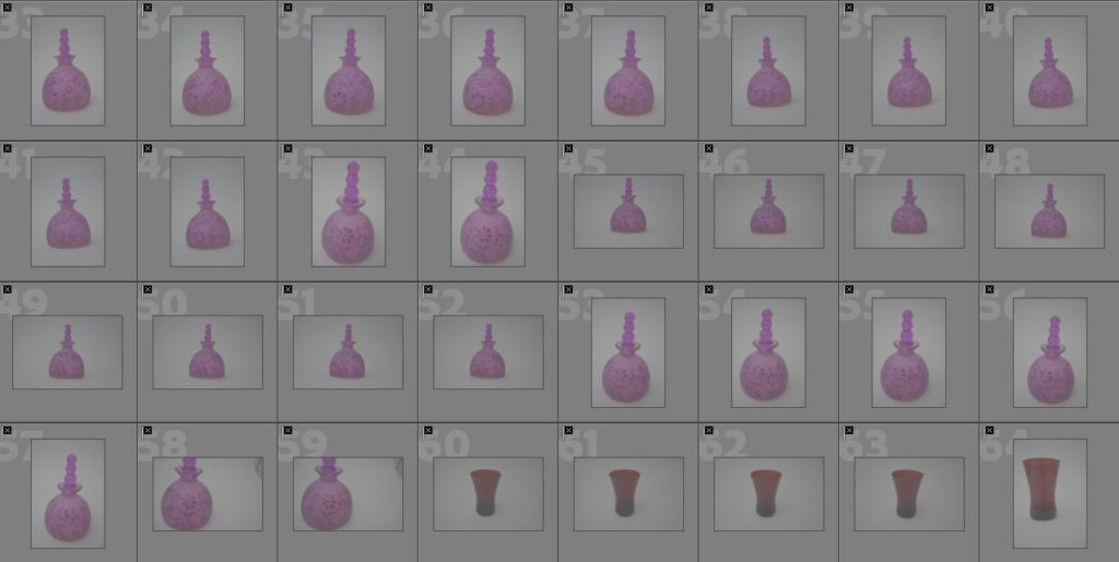
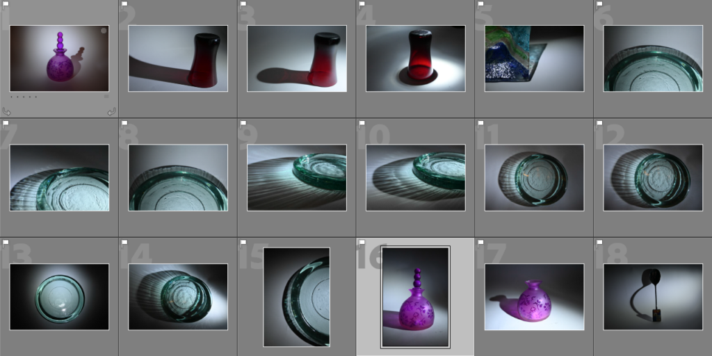
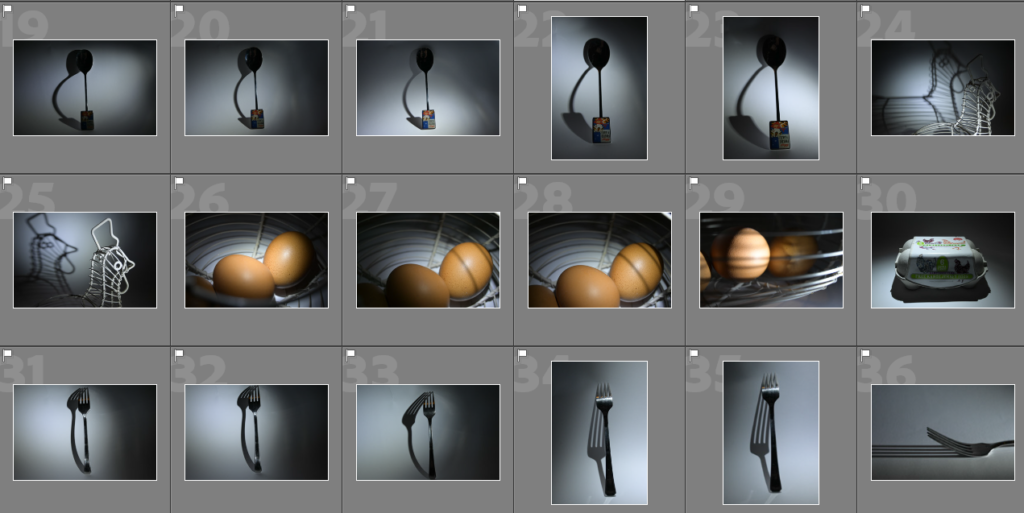
Above are images which I have produced as a part of my first photoshoot as images which I consider to be my least successful shots which I have taken in the style of Jaroslav Rossler and Andre Kertesz. This is because:

  • Some of them were out of focus and appeared to be blurry, which wasn’t the effect I was going for as I wanted them to be clear and crisp.
  • The reflected shadows which were created didn’t turn out how I expected them too and they images may not have framed them well.
  • There were many repeats of the same photo but some framings of them could be slightly off or wonky, which I didn’t like.

In my next experimentation of this photoshoot which I did at night, I will focus on using different objects such as perfume bottles/different kitchenware/glasses/other accessories to see if they change the way that different shadows and reflections are created.

Evaluation of some shots I chose to be my least successful –

Image 1:

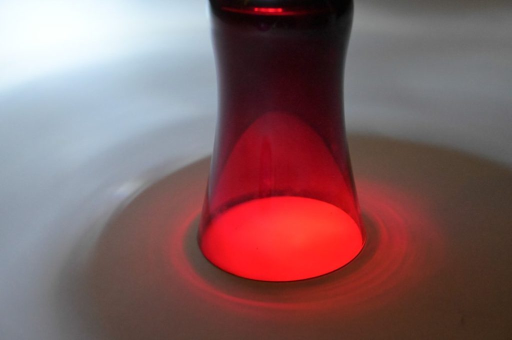
  • The lighting in the top left of the photograph floods the photograph as it makes this area appear to be quite overexposed.
  • The framinug of the photo is not centred anf the whole of the top part of the image has been cut off which I don’t like.
  • The dark ring around the bottom of the glass is not as dark as I would have liked it be to be to crate a strong contrast against the colours in the smaller inner red ring.
  • Instead of the background being a solid white, due to the over exposed light and where the spotlight was placed it makes it appear to be quite grey in composure which I don’t like as if it was white it would create a heavier contrast of shadows.

Image 2:

  • The detailing on the purple glass is blurred due to the camera not being able to focus well, I think that the photo would improve if it was in focus as the flowered detailing is very unique and different.
  • The light in the middle of the photograph overexposes the photograph which I do not like as it creates a really heavy contrast against the black background.

Image 3:

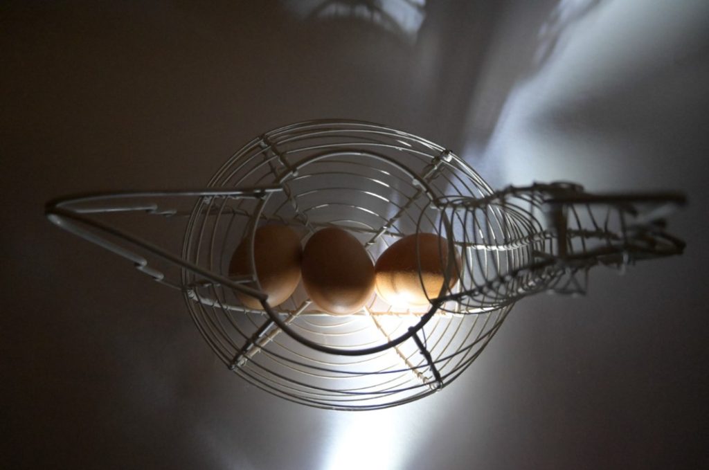
  • The camera angle does not showcase the different lines and shadow formations of the egg basket as it it taken from a birds eye view.
  • The shadows on the sides look as if they are quite messy and unorganised compared to other photographs.
  • The light which falls down the middle of the page is quite bright at the bottom of the photograph which I don’t like.

Image 4:

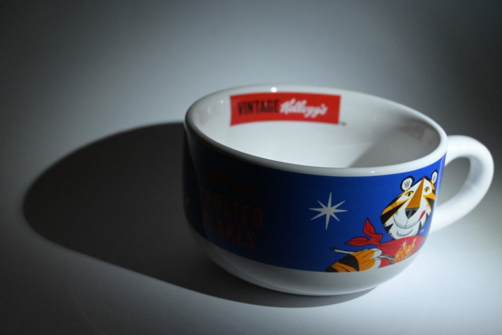
  • The “Kellogg’s” label in the backgorund isnnot in focus whihc I would have preferred it to be.
  • The formation of the shadow is clear and bold but looks as if it is a blob on the background.
  • The dark circle due to the use of the spotlight makes the border of the photograph look smaller and weird in how it appears as it is not centred.

Photoshoot 1

I was not happy with how this photoshoot turned out. Many of the photos are blurry due to difficulties with my camera, the lighting was not correct and was too one sided for the indoor shoot due to the only light source being a bay window. This would have made some nice images had my camera settings been correct. Additionally, for the outdoor shoot there were high winds which made it very difficult for my female model holly to keep her hair under control as well as it beginning to rain so i had to call it with what i had. Due to the small display on the camera i didn’t realise that the settings were wrong until i uploaded them onto my computer by which point my models had left and were unavailable to come back. In development software I did not succeed at improving the photos and making them usable. Due to having a deadline and a plan to stick too i decided it was best to not spend any more time trying to make the photos work and rather spend more time planning the rest of my photoshoots so that i could ensure that they would not go wrong.

Photoshoot #1 outcomes

The images I used as inspiration- however I think the images I got capture a more interesting perspective and narrative than images like these.

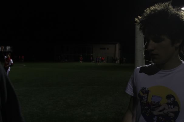
My first photoshoot was conducted at a football match- it was night with only overhead floodlights as lighting which was primarily concentrated on the pitch making my images particularly dark with motion blurs, which was the opposite of what I wanted. Once I figured out the camera settings I needed to decrease motion blurs (quicker shutter speed) my images became more cinematic.

Although my images are dark- I can brighten them in Lightroom which will give them a grainy texture- although this may lead to a decline in the quality of the images I feel as if this will suit the colour scheme in the image and positively add to the atmosphere of the images.

MY BEST IMAGES FROM THIS SHOOT

This image above- although dark- I feel may have potential after editing. The background is blurred however the subject in the right of the image is perfectly in focus, stark artificial overhead lighting creates almost a split lighting effect on the subjects face- with the subjects face turned away from the light, bold defining shadows are created around his eyes and on his shoulder.

I like this image above as it looks very cinematic due to the highlighted subjects which are defined by dramatic shadows and are in focus while there is a blurred background. There is also a slight green tint to the images due to the light which I really like as it can be easily compared to works by Wing Shya- there is also a slight symmetry with the background floodlights which I think adds to the cinematic look.

As seen in the image above I would like to play with the natural yellow/green tinge in the lighting of the images, I plan to make these colours more prominent (subtlety) in the editing. This image is also an example of stark shadows with the subject being the main focus (background blurred)

Overall I believe the images I have taken on this photoshoot provide a good baseline for editing as the lighting captured all I wanted to capture; stark shadows, cinematic style compositions and coloured lighting making this photoshoot a successful one- however possibly a flaw in this photoshoot is the lack of successful images, although taking over 200 images very few of them are “good” images due to the presence of motion blur and darkness.

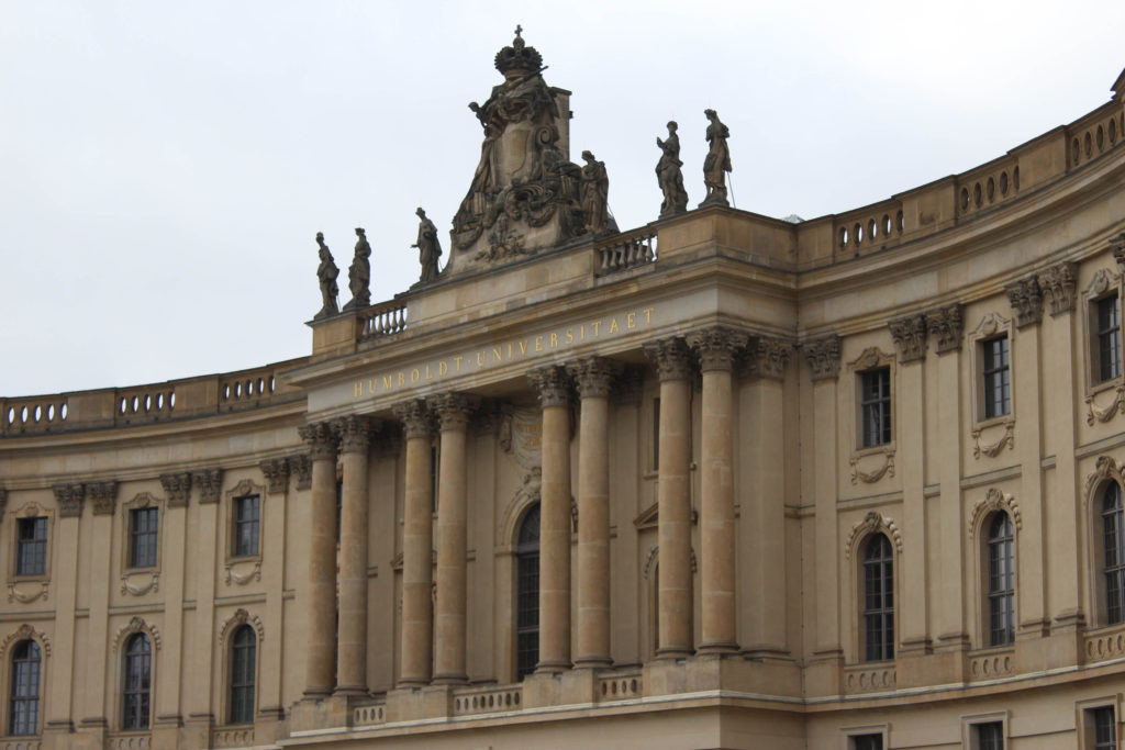
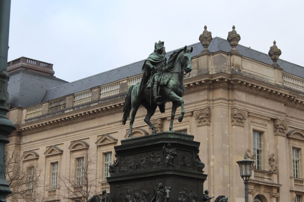
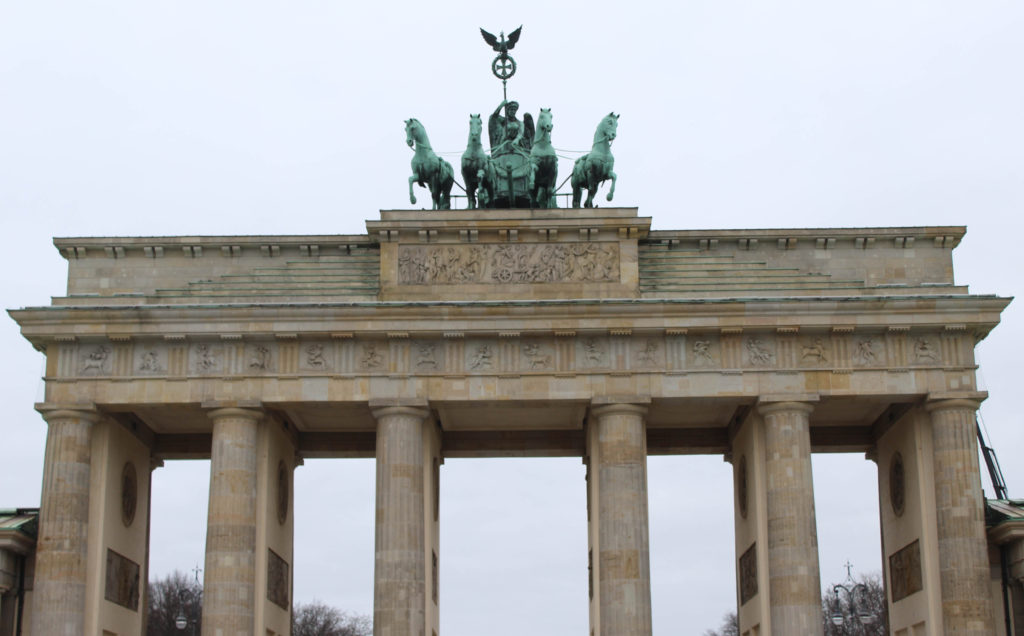
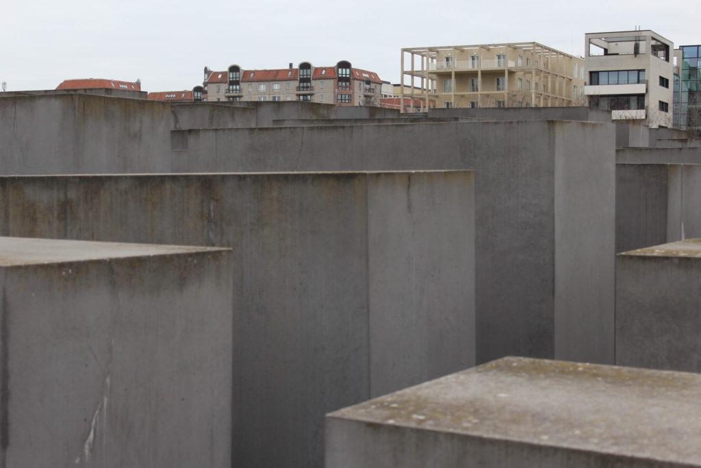
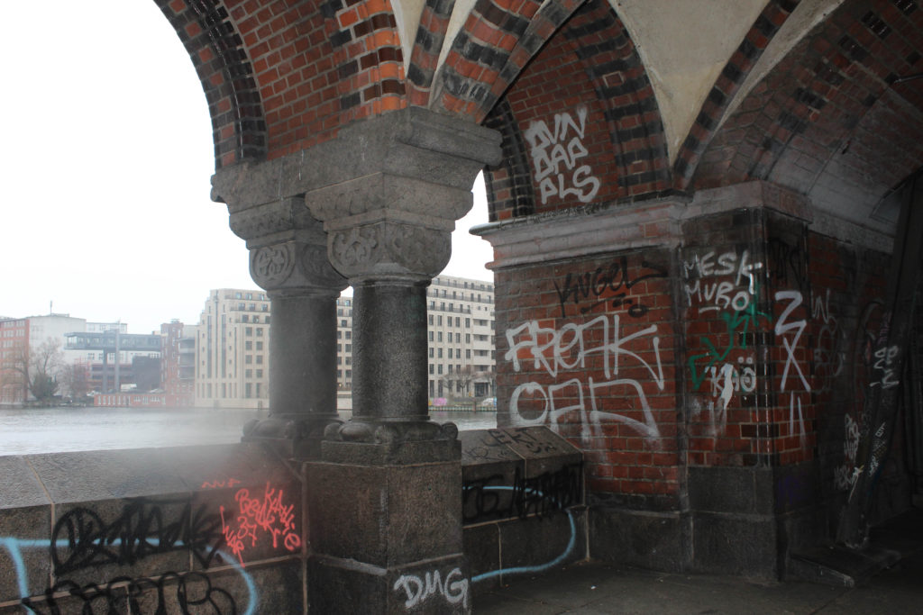
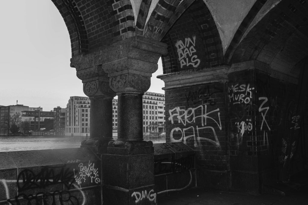
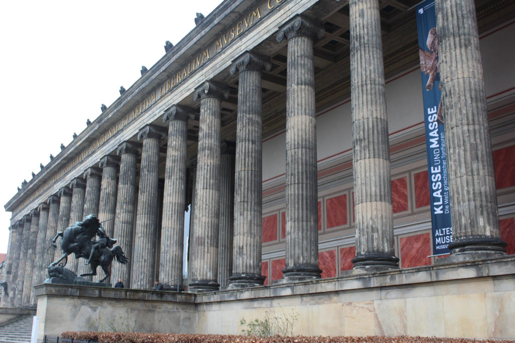
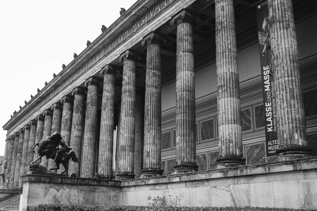
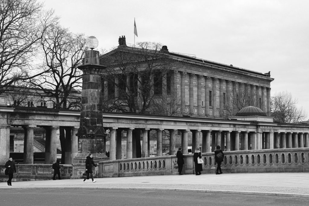
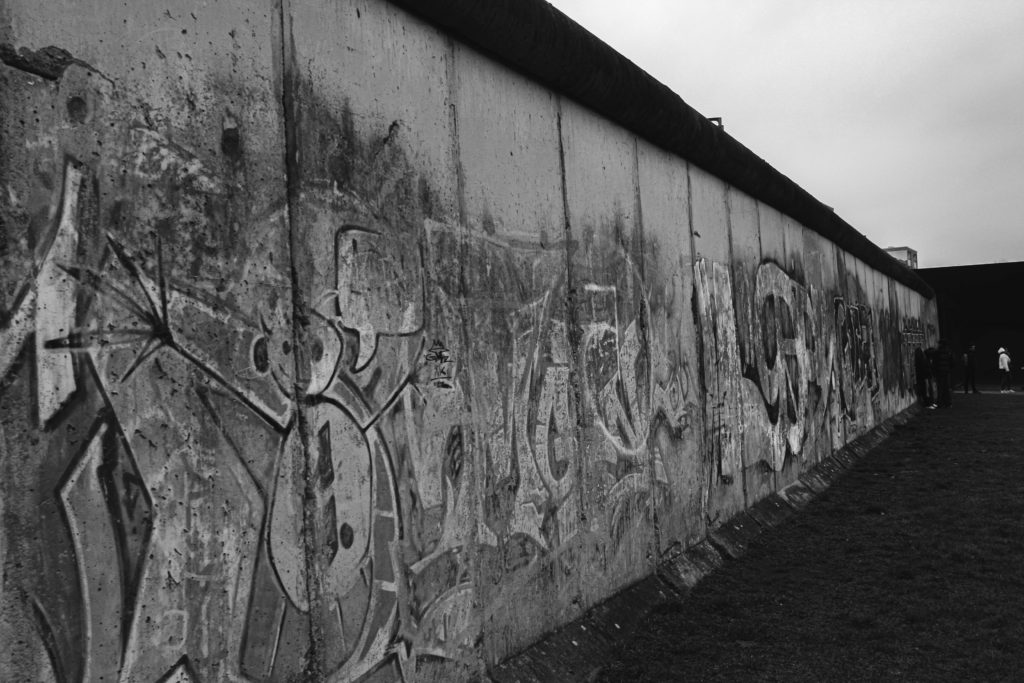
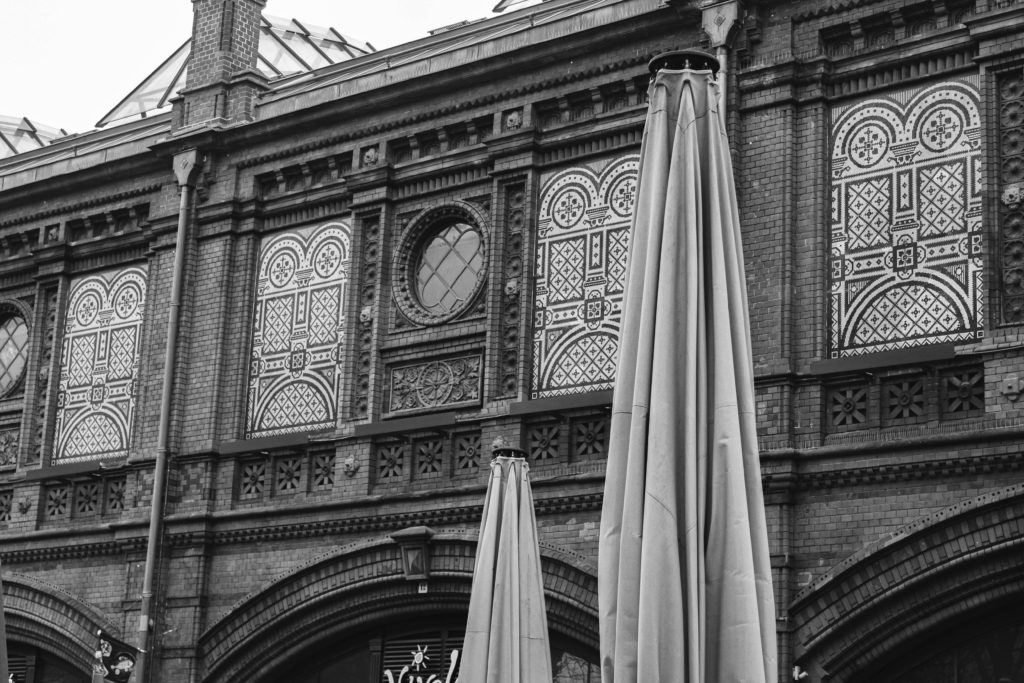
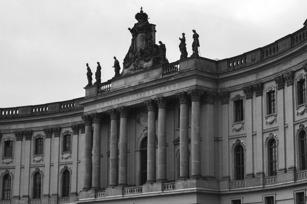
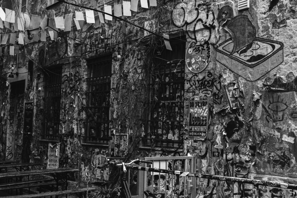
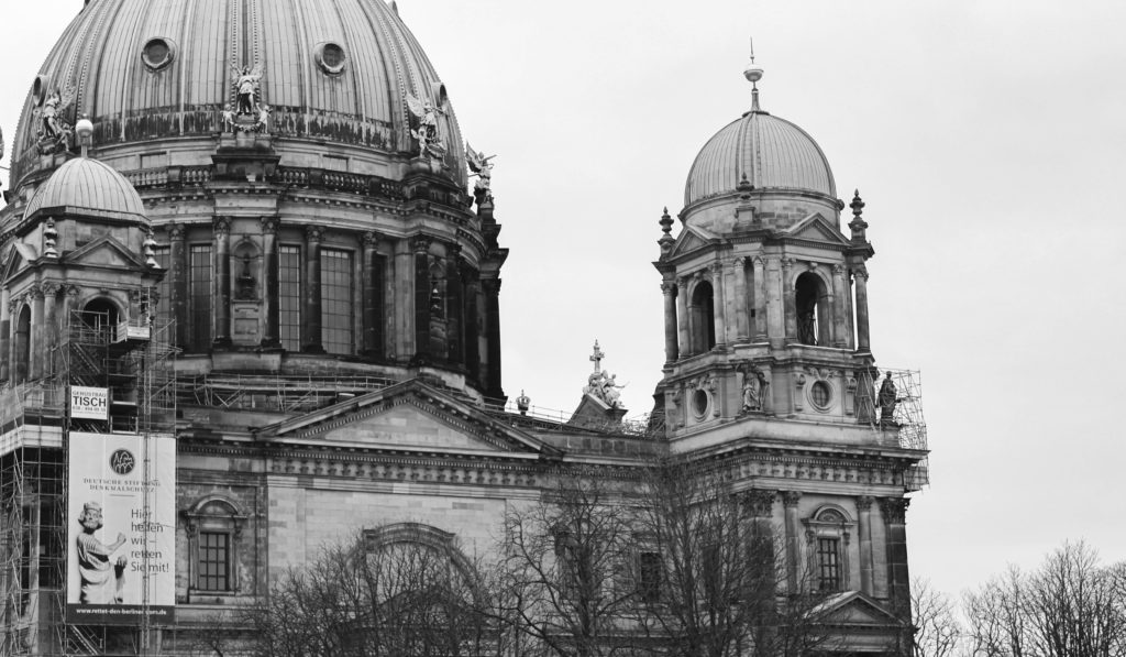
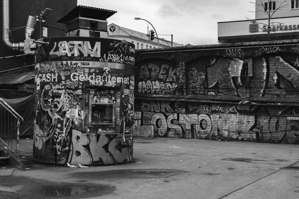
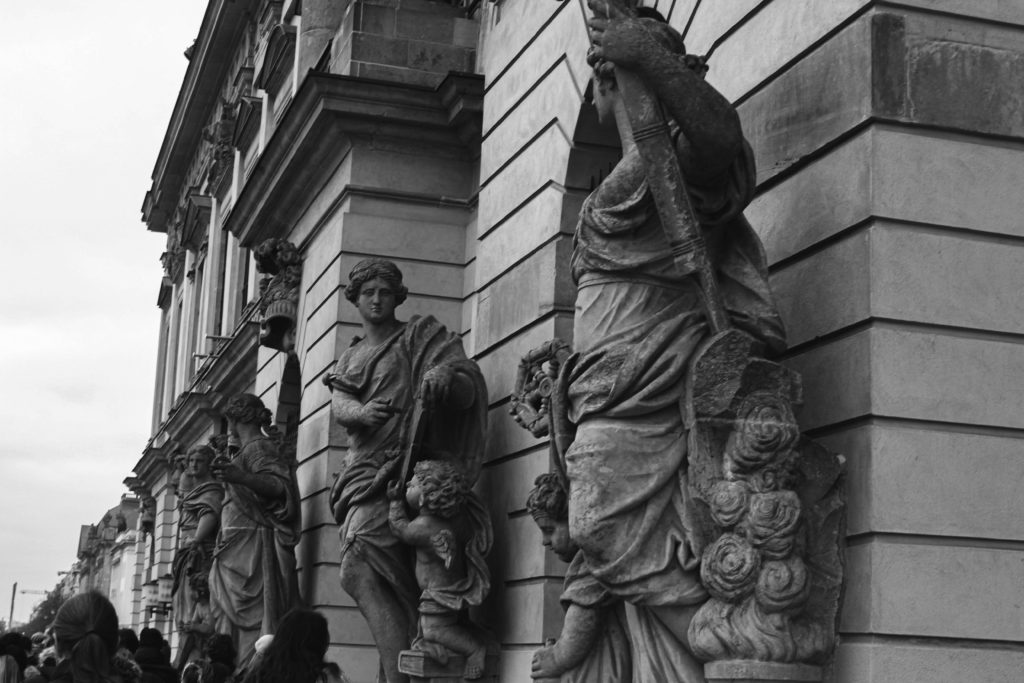
Photoshoot 1: Berlin

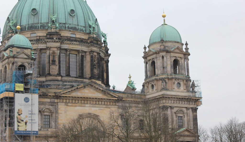
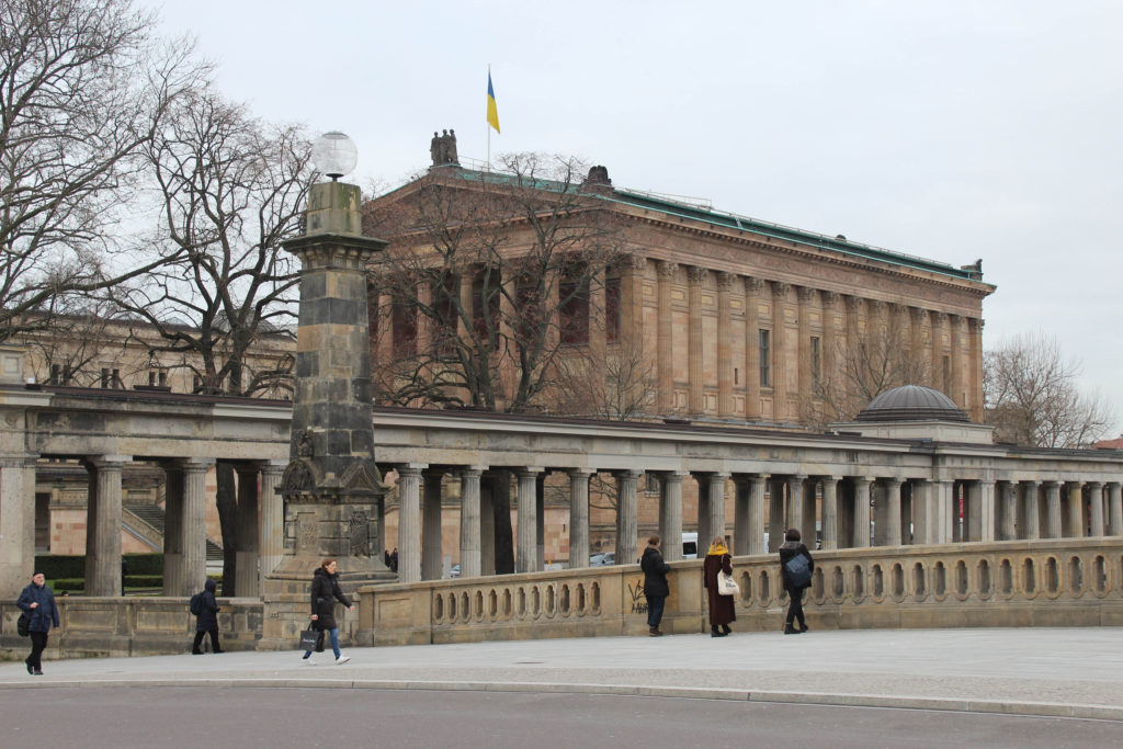
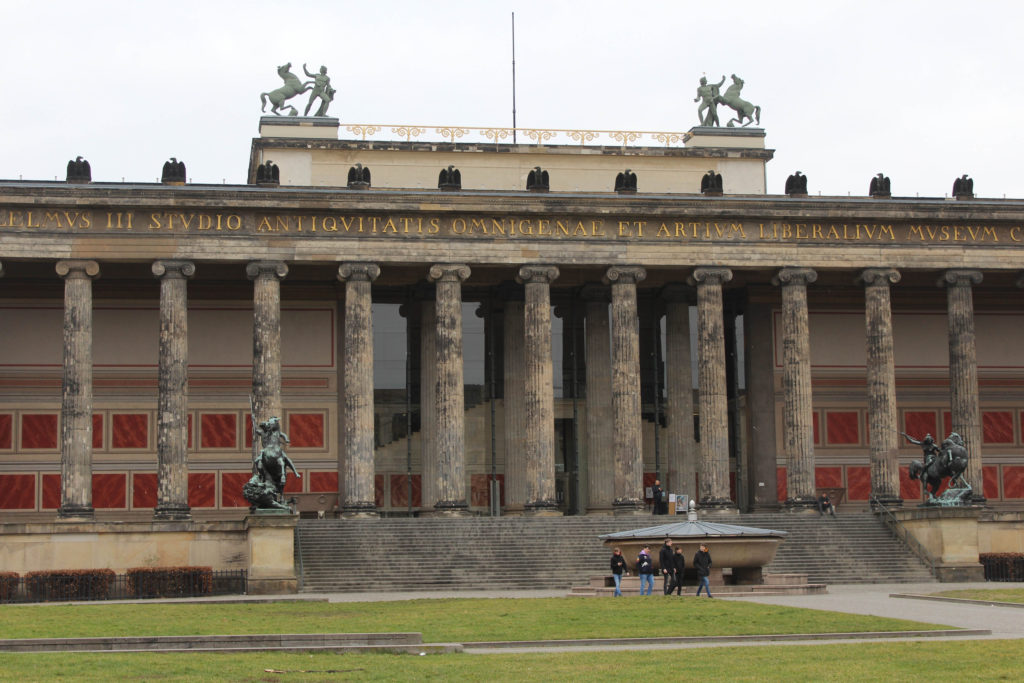
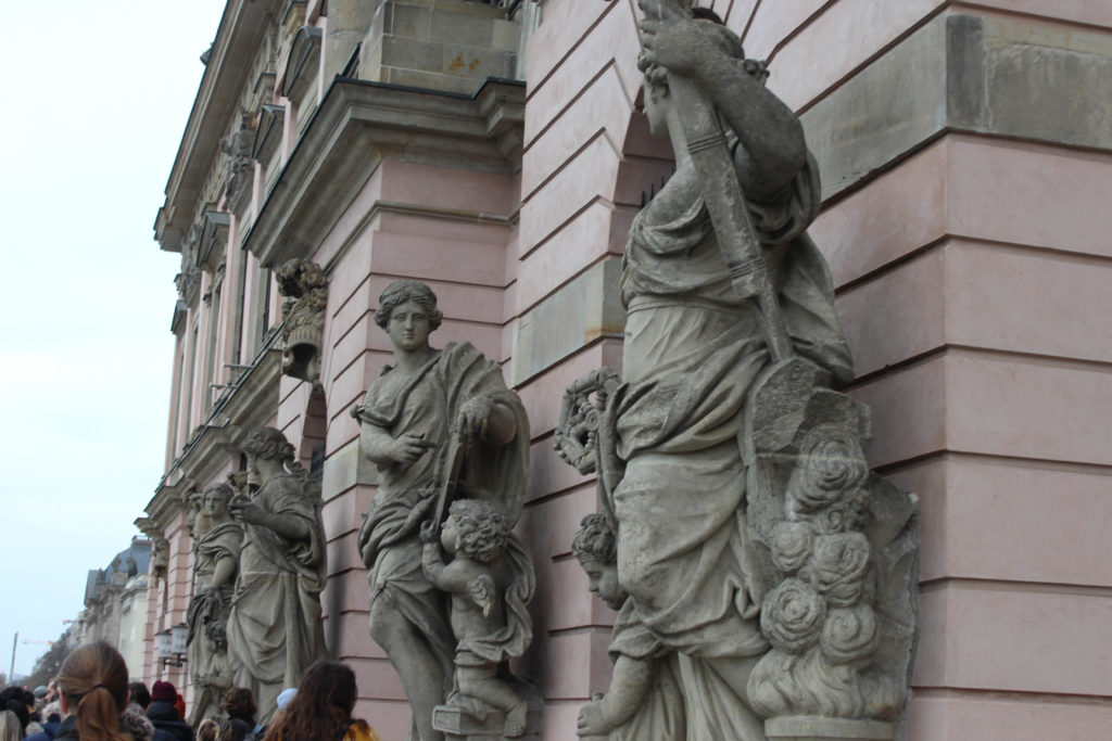
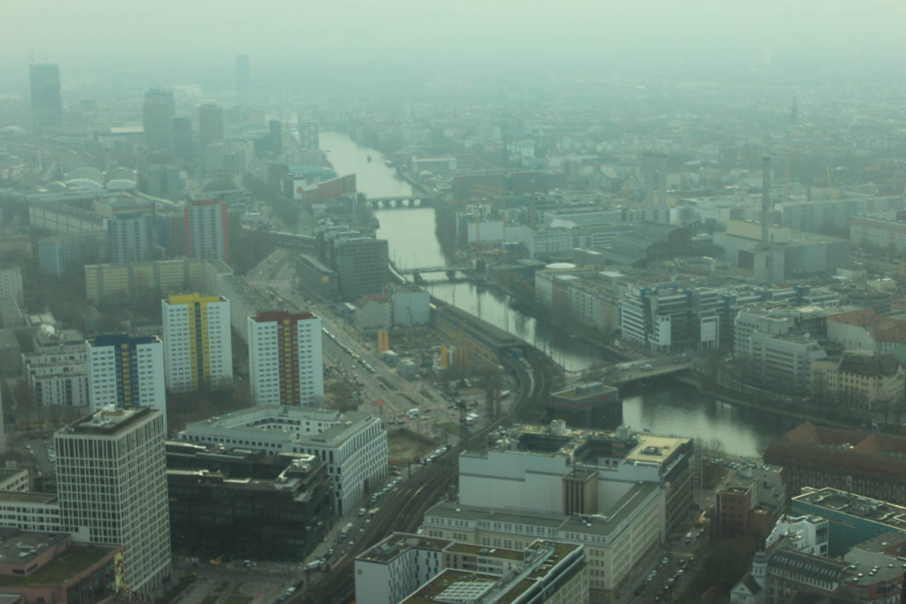
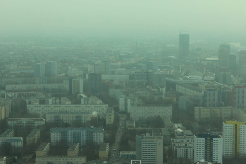
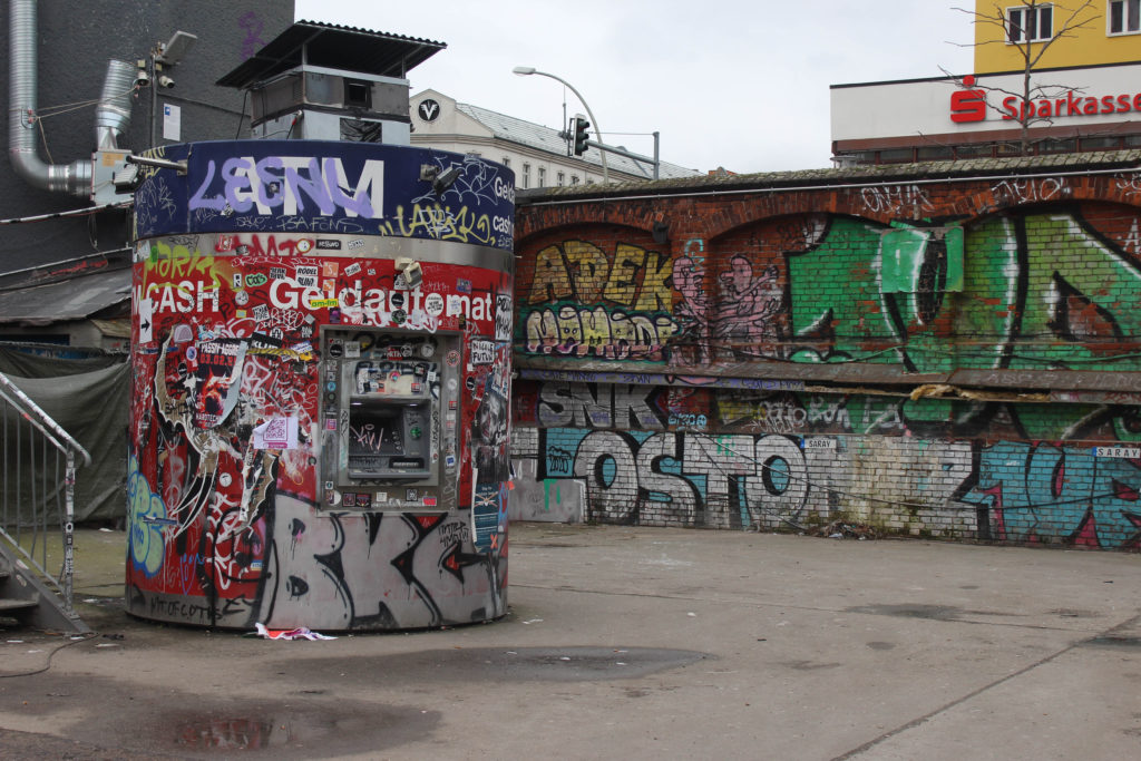
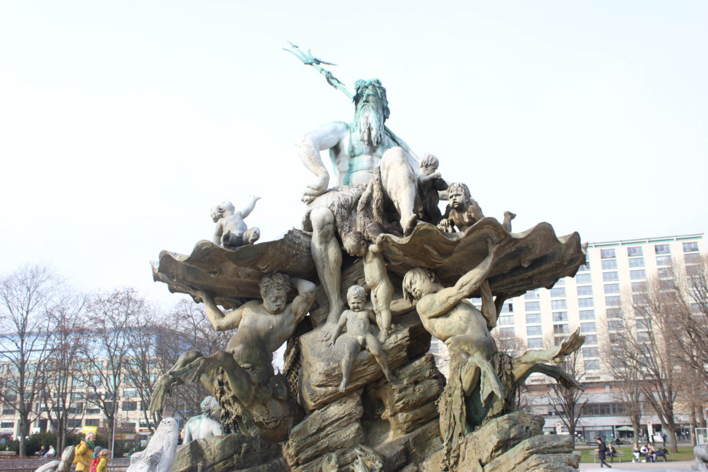
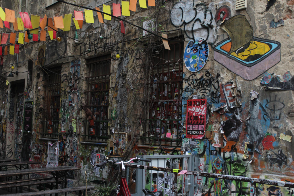
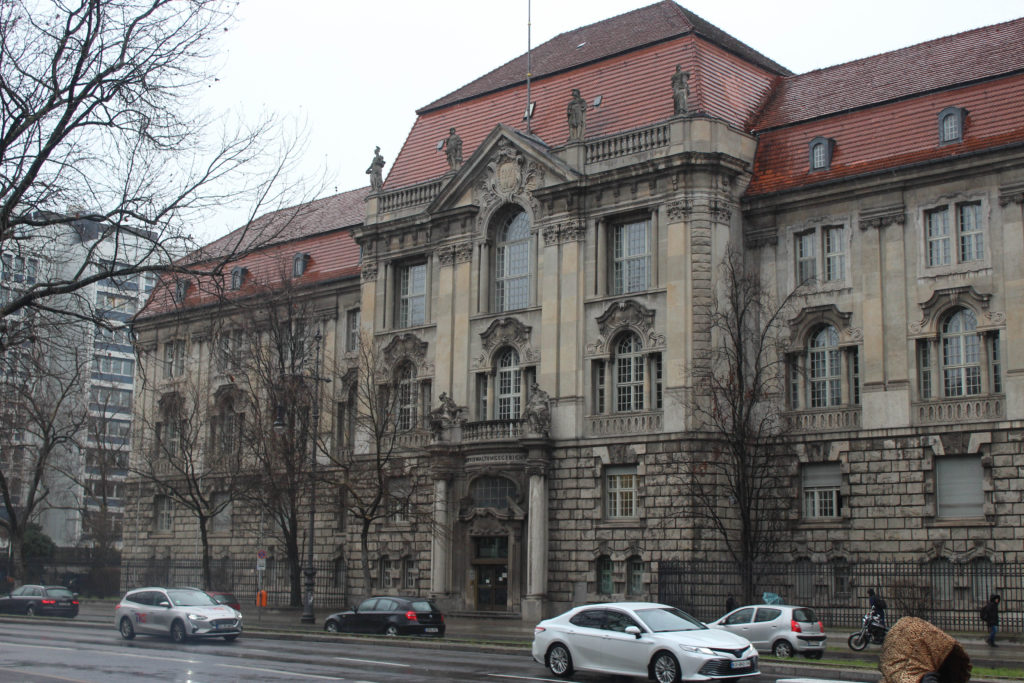
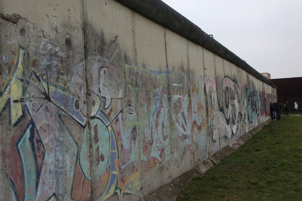
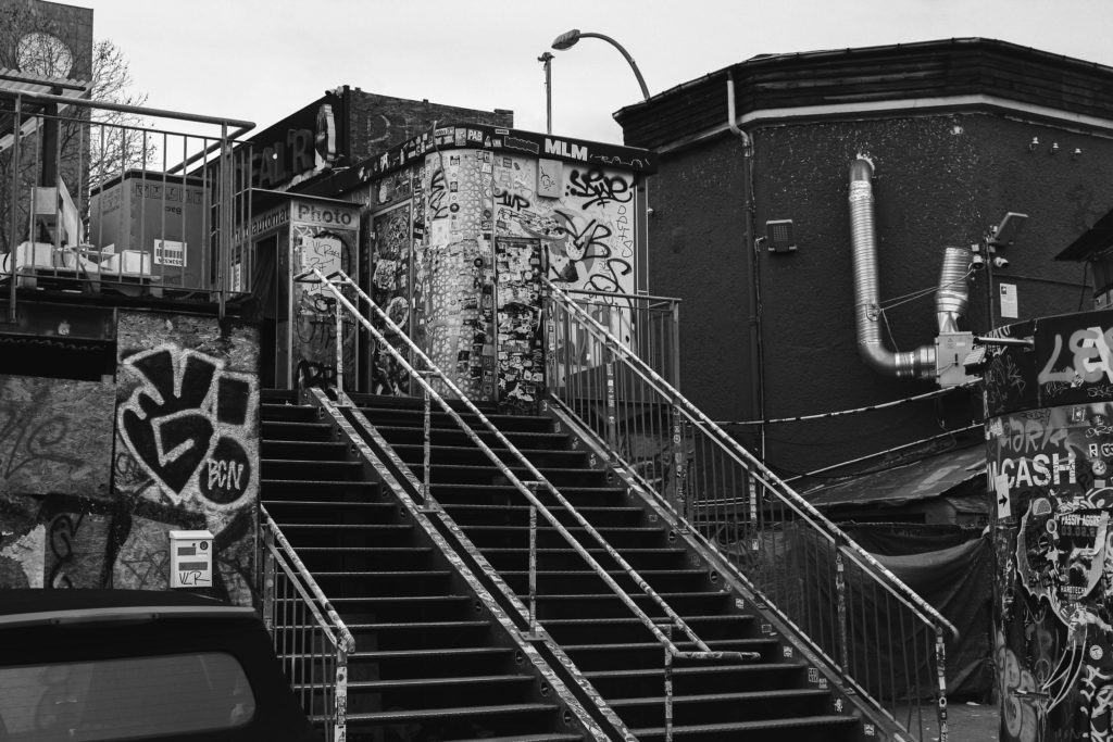
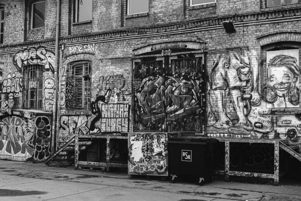
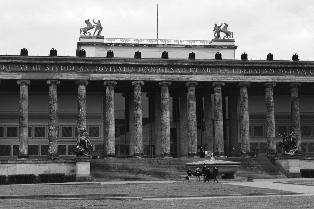
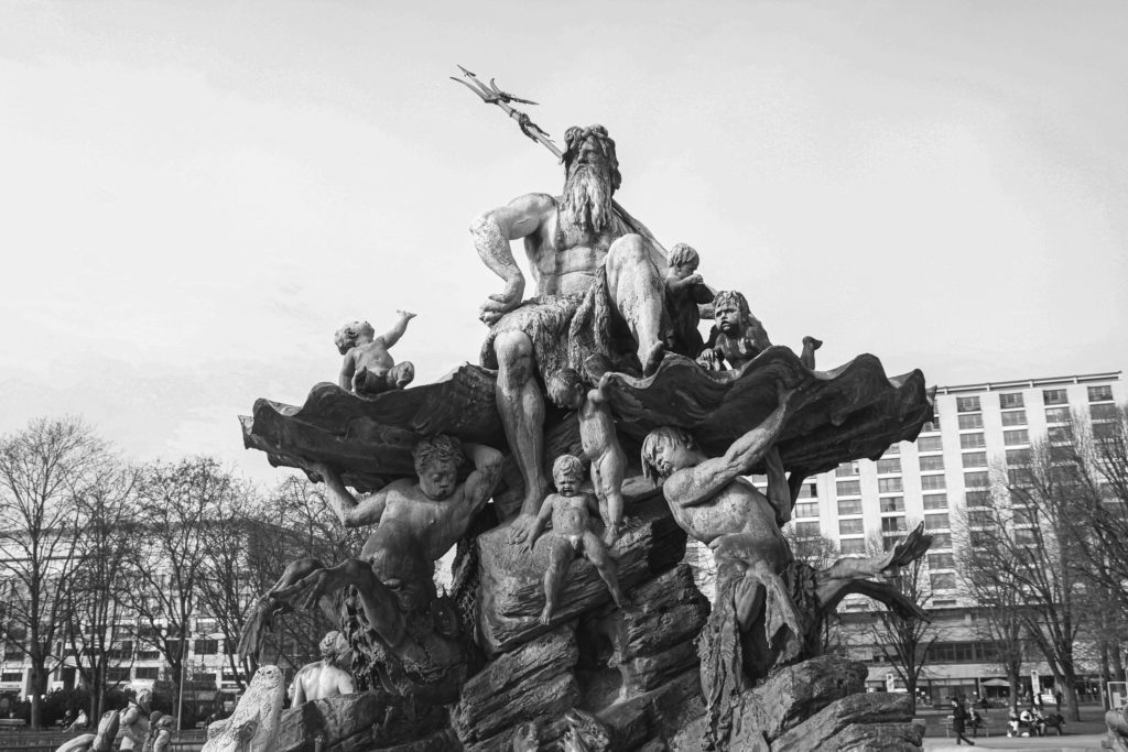
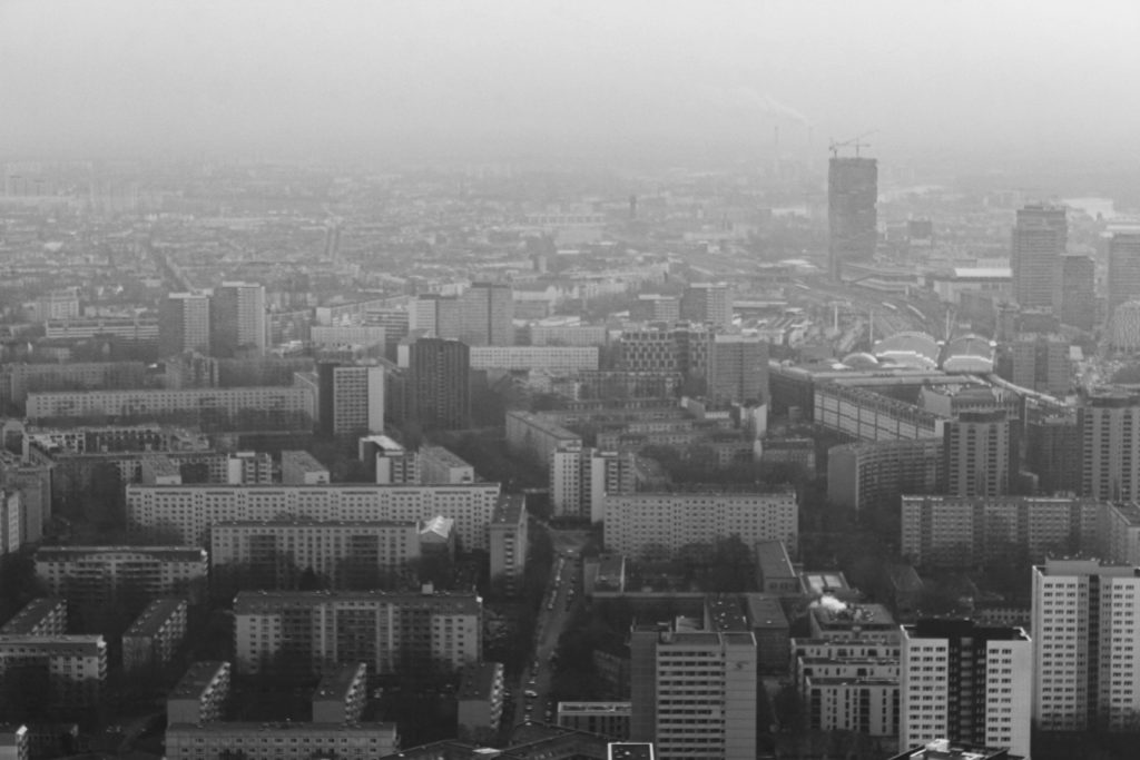
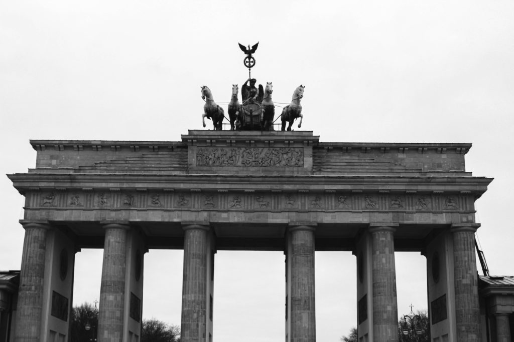
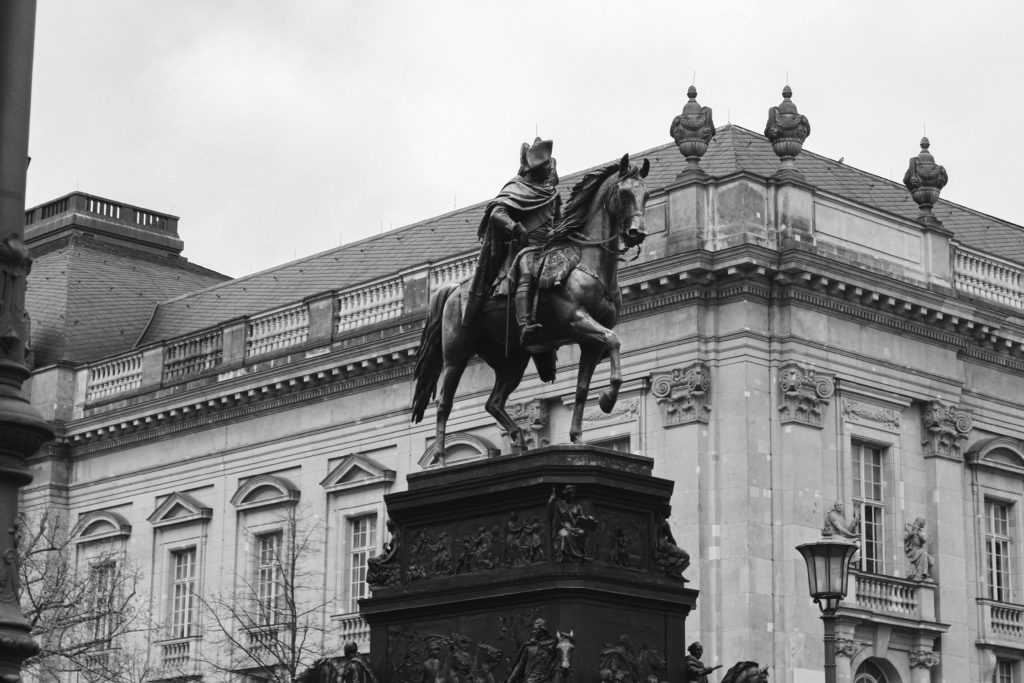
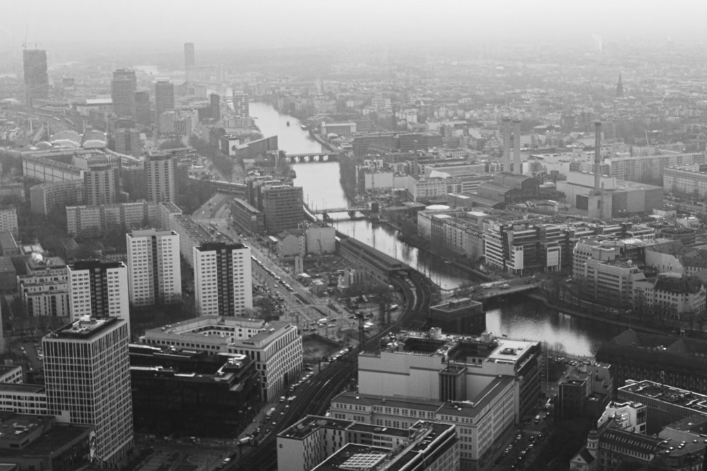
For this first photoshoot, I would like to mainly aim to capture the setting of Germany, especially the portion that is Berlin. Berlin is known for containing a vast selection of historical architecture and structures that link towards its relationship with wars, especially WWII. The Berlin Wall was a main historical monument that was included within the city itself and played a vital role within the division of areas within Germany.

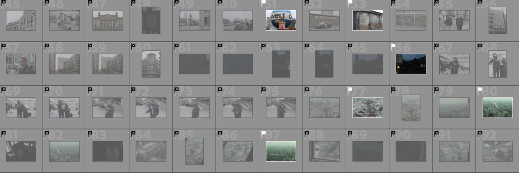
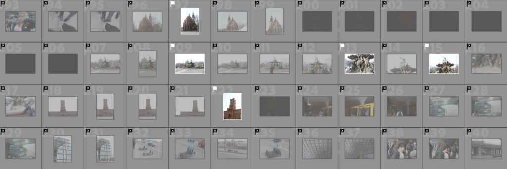
Contact sheets:

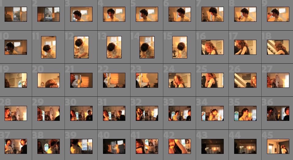
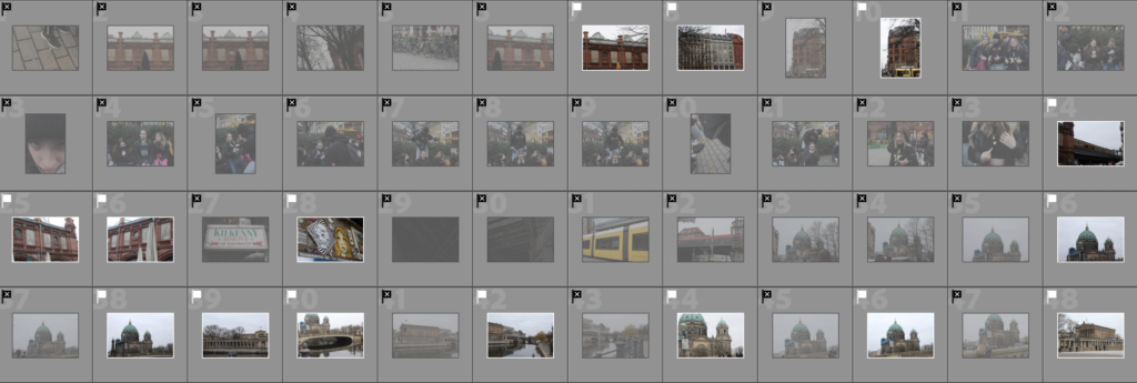
Here I have the entirety of my Berlin photoshoot. I have flagged and rejected all my images so that I can categorise them into ones I would like to use and ones I don’t want to use. I rejected the ones I don’t like by pressing X in lightroom and flagged the ones I would like to use by pressing P in lightroom.

I wanted to make sure I was making a strict choice with which I wanted to use and to reject as I wanted the photographs to fit the theme of “complex” nicely.

Colour coded and star rated:

Here I have a range of flagged photographs which I then categorised into green, yellow and red. Green being ones I wanted to definitely use, yellow being ones I was unsure of using, and red being ones I definitely don’t want to use. After colour coding my images, I then went in by adding a star rating to each out of 5. 5 and 4 being definites, 3 being ones that I might be using and 2-1 being ones I won’t be using for this project.

Green:

Yellow:

Red:

Images before editing

Editing

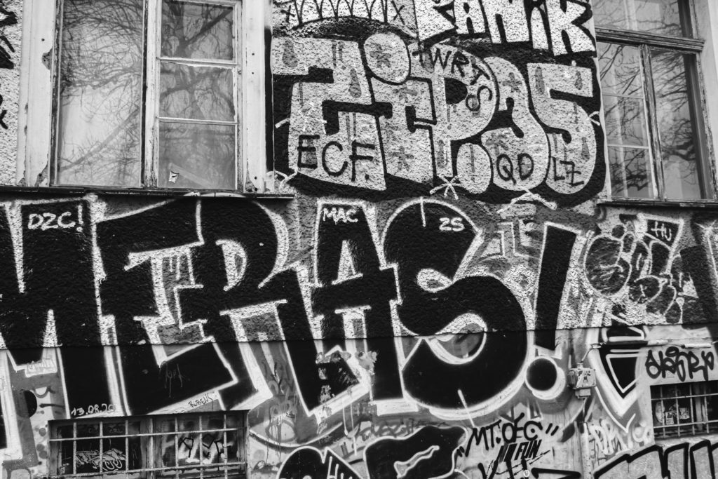
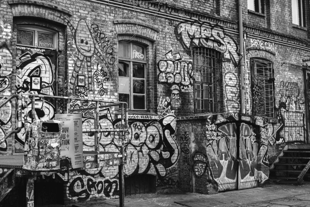
Below I have a few examples of images that I have edited after selecting my best images out of the range I have taken during my photoshoot. I particularly like these images as I feel they express the theme of Germany’s history and the aftermath of massive events that occurred during the time of WWII. I especially like the first edited image which is of the Berlin Wall, I believe this to be a very significant image as it display the very monument that separate Berlin as to keep so-called Western “fascists” from entering East Germany and undermining the socialist state.

Before
After
Before
After
Before
After

I really like how these images turned out as I believe they fit within the theme of complex. They display momentous structures that are full of complex meanings and also portray a complex exterior to themselves as well.

Before
After
Before
After
Before
After

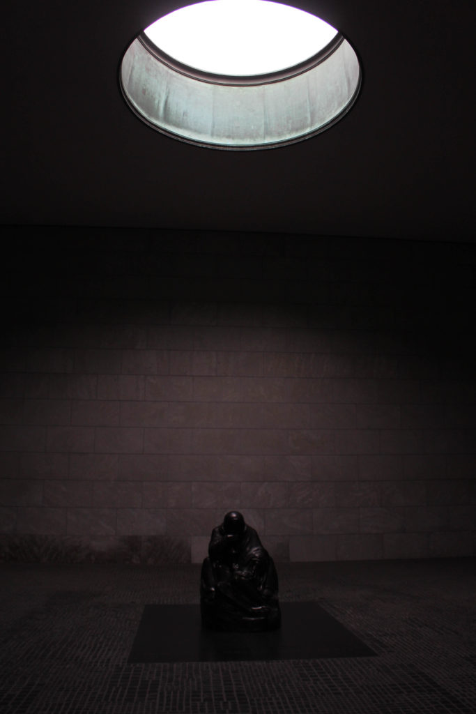
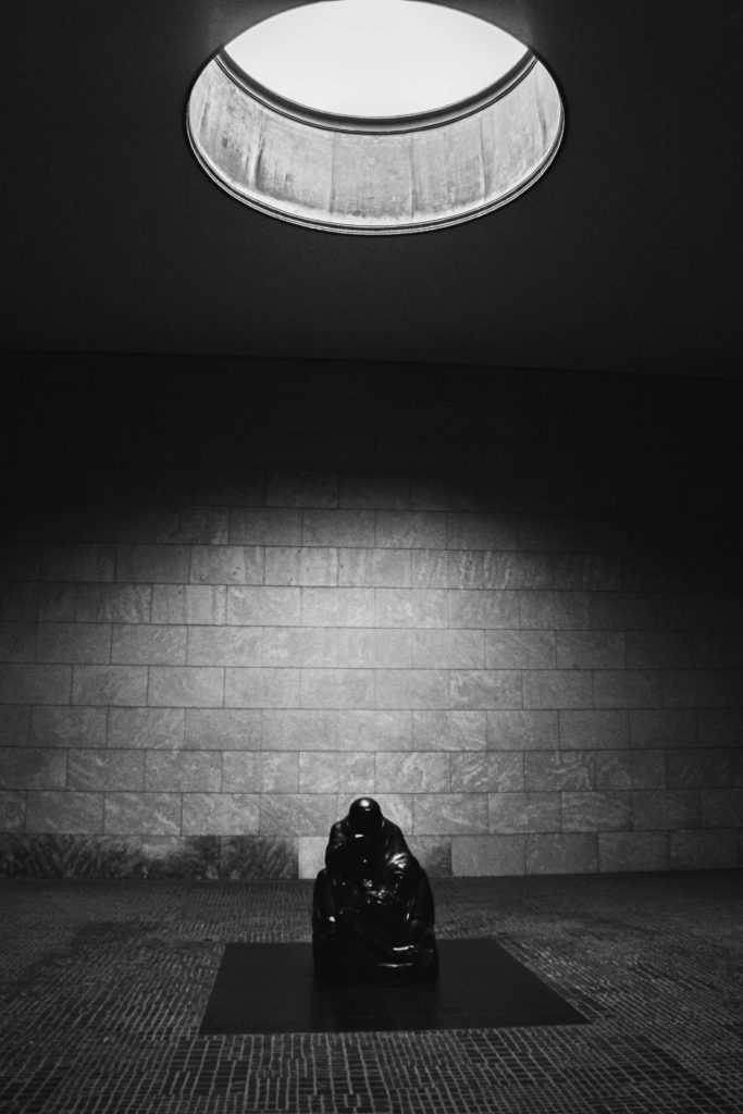
I thought it would be a good plan for me to enhance the exposure of the above image due to it being difficult to see at first glance. I wanted both the ceiling light and the figure to be the main focal points of the image so I edited it so that both aspects were highlighted more obviously. After enhancing the exposure and other aspects such as contrast, highlights and shadows, I went about changing the colour to black and white to really enhance the brightness of the lighting and make the statue more obvious.

Final Images

Analysis and Critique

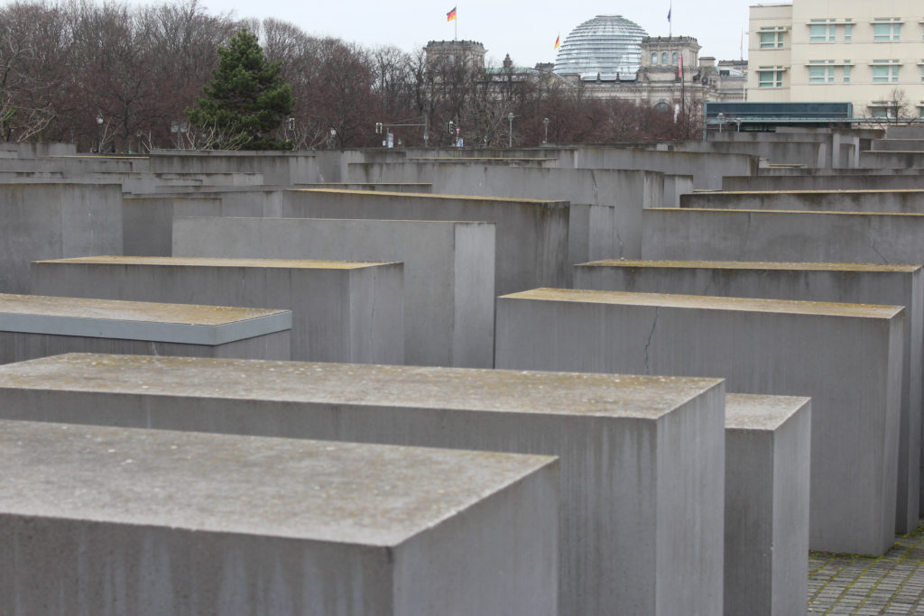
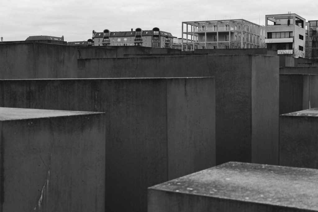
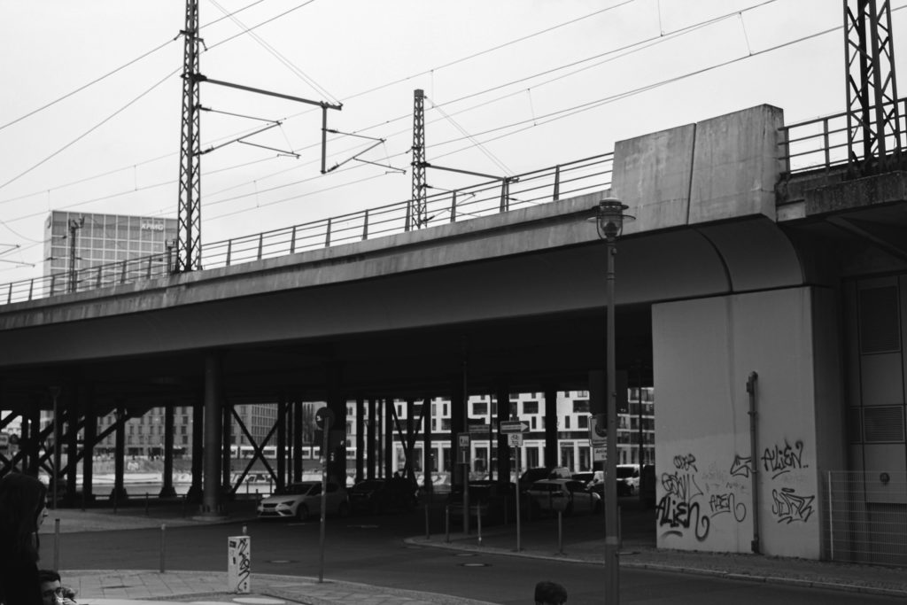
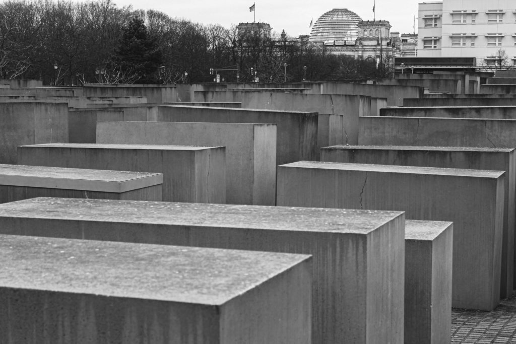
I feel as if the images above work well together as they both provide quite complex-looking imagery, with the many tram wires in the first one to the solid and intricate blocks within the second image. The second image displays Jewish victims in the form of an art form which is an almost never ending maze. It was used to impact the public as you walk through the labyrinth alone, just to showcase how many deaths had occurred during these dark times.

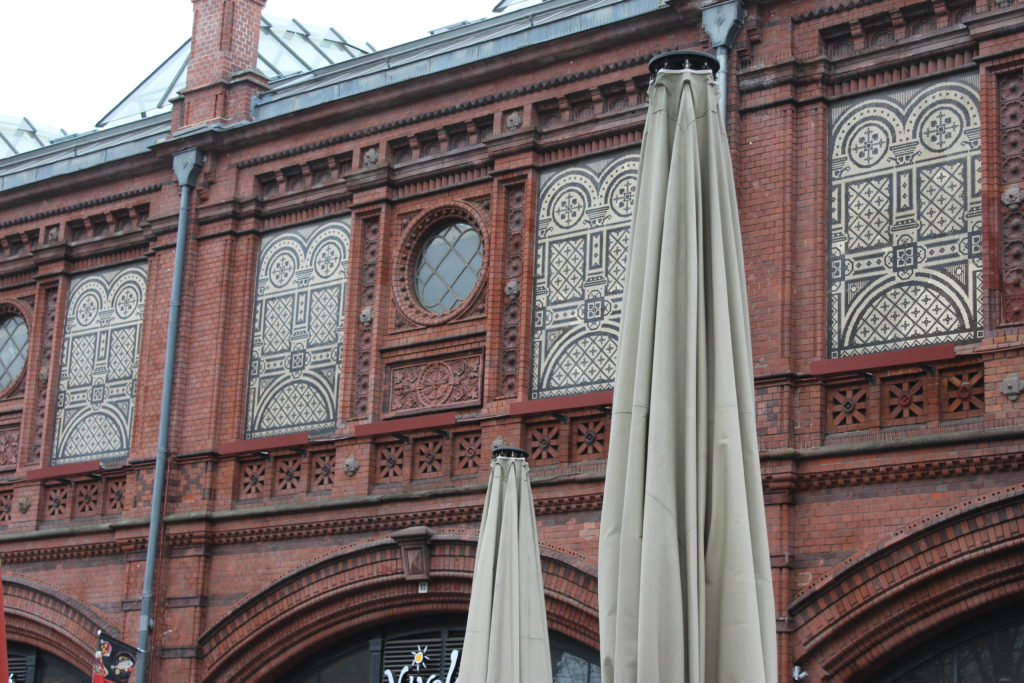
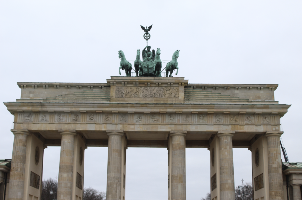
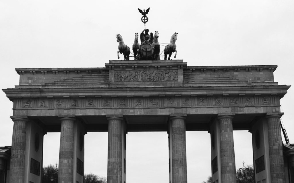
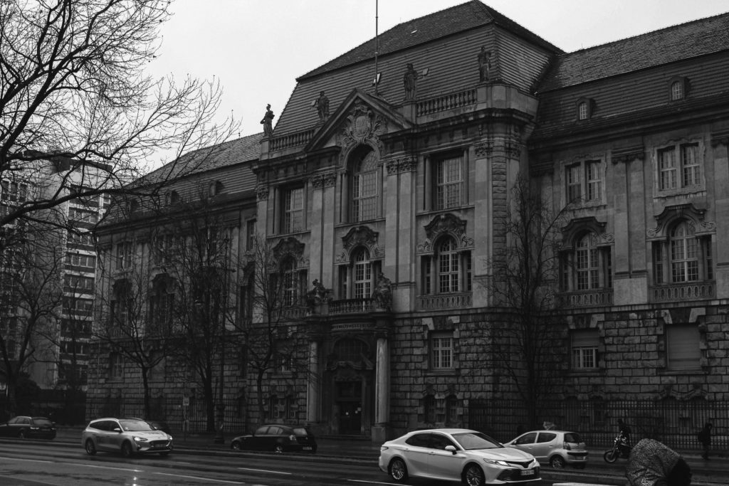
I particularly like this image above as well as I feel it displays one of the complex structures within Germany. In colour it showcases that the building itself is incredibly old due to the deterioration in colour. The roof has gone from a copper to a somewhat greenish colour due to the metal oxidising. Even though the colours from the monument are indeed intrancing in itself, I still preferred the aesthetic it gave off whilst in black and white as I feel it highlights the details of the building and creates a looming and ominous sense to it.

unedited photoshoot #2

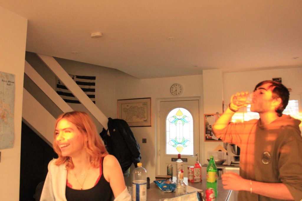
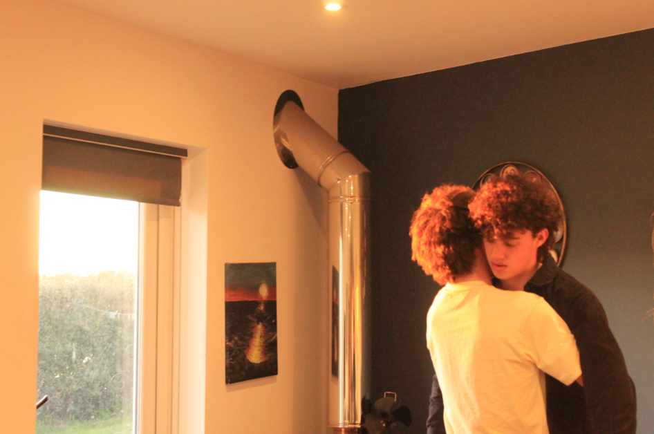
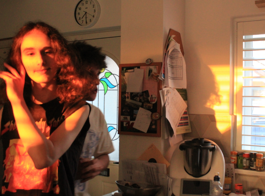
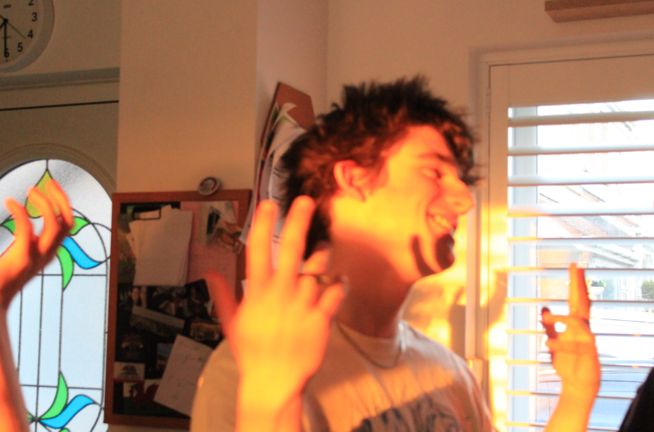
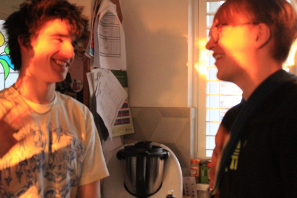
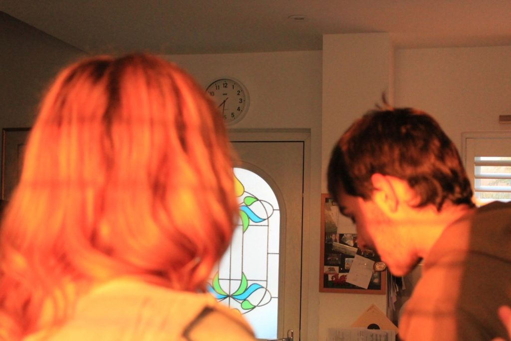
I took images for my second photoshoot at a friends house in St. Brelades. The photoshoot was spontaneous and unplanned as I saw sun was setting and I noticed the colours in the lighting that reflected into the house and thought it would be perfect for my project as I want to show a variety of different types of lighting and how it affects a photo – As my last photoshoot relied on artificial lighting to create an atmosphere, this one focused on the natural lighting from the sun and how it was cast. Taking my images spontaneously added to the candid factor I made sure to stick to in my project. This was a smaller photoshoot, as I had limited time to capture images due to the sun setting, so I took around 50-60 photos.

BEST IMAGES

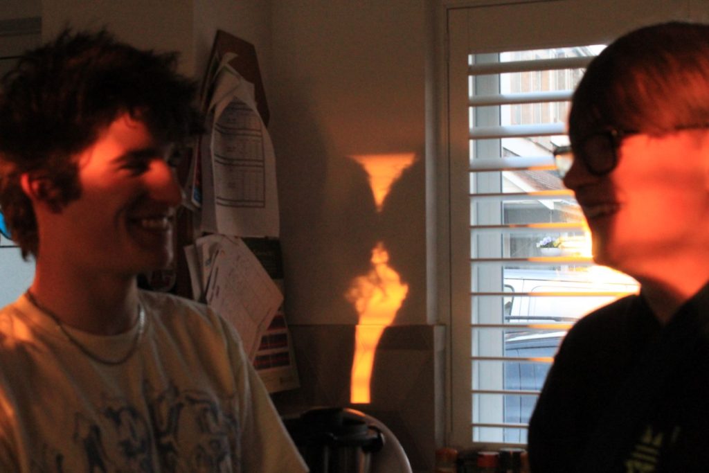
I feel this is the best image created from this photoshoot as it to me has the perfect combination of lighting, colour and shadow that creates multiple viewpoints that provides a fresh and unique perspective on the image. For example one viewer’s eye may be drawn to the warm orange tones reflected onto the faces of the models, however some may look at the silhouettes in the background and the yellow lighting that surrounds them.

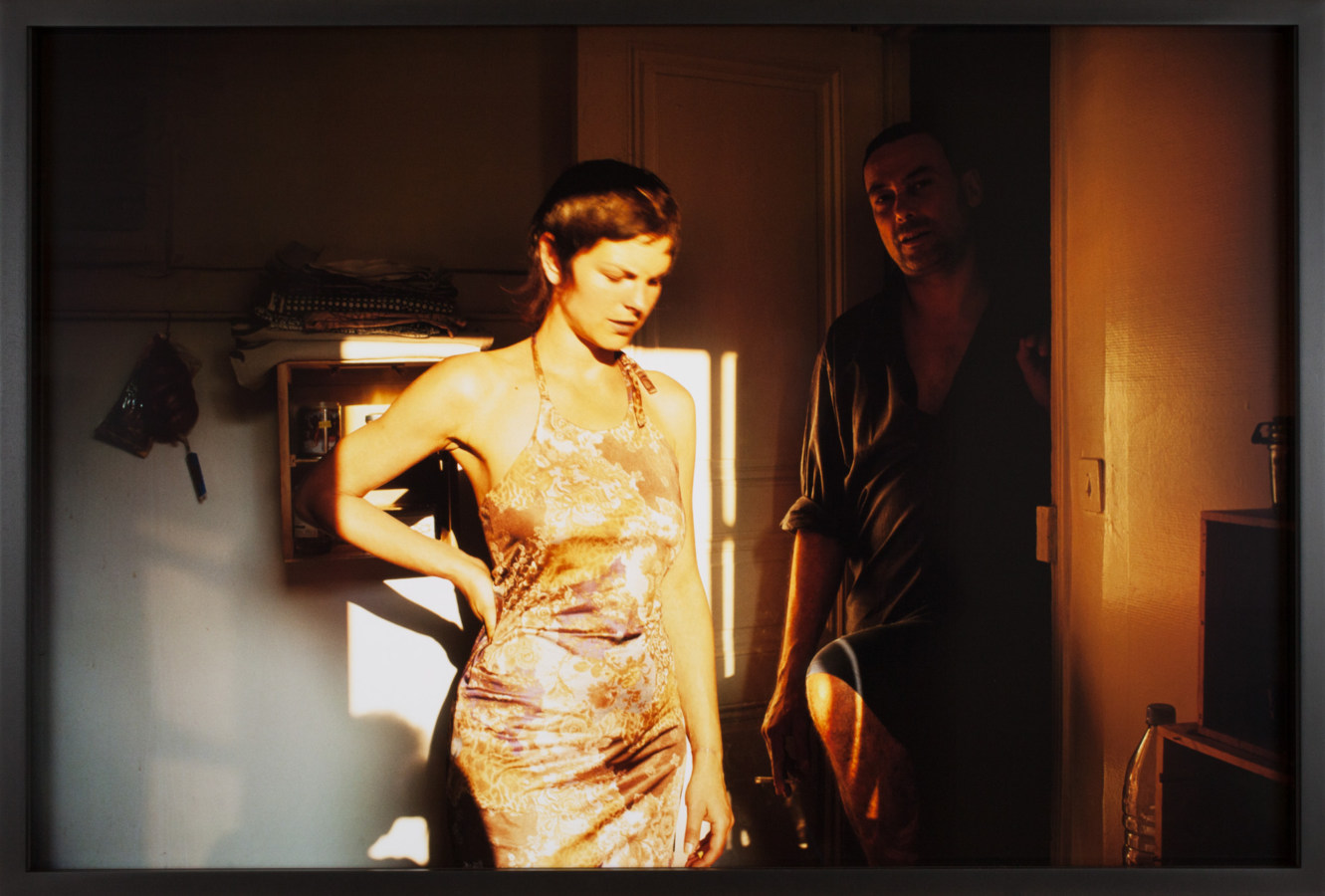
Comparison to Vinca Petersen’s work

Much like the red & orange images in my first photoshoot I wanted to generate a response based off the warm colours in this photoshoot – orange & yellow tones typically create a feeling of energy, joy and is symbollic of optimism and connection. I wanted to emphasize on the feeling of connection in particular during this shoot but still keep my images candid – Since the sun was setting I had no control over where the rays would cast so I moved my friends towards an area that had the most vibrant lighting and captured them in conversation with each other. The use of two people in the majority of my photos alludes to my chosen theme of insider vs.outsider as i personally feel these photos establish a sense of connection with the viewer as the relaxed behaviour of the models combined with the warm tones and open space create a welcoming atmosphere. I feel this photoshoot is particularly reflective of Nan Goldin’s work and my influences in photography are clearly shown through the lighting especially in this photoshoot. However i felt this photoshoot didn’t reflect Zielonys influence on my work as these images were all taken with natural lighting, something which Zielony doesn’t often incorporate in his works. My images create a different atmosphere to his, as Zielonys work is taken from an outsider perspective whereas Nan Goldins images are captured in more relaxed environments which create the feeling of insider.

Statement of intent

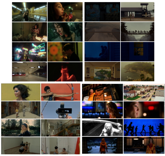
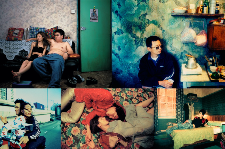
The exam theme simple or complex initially drove me to look towards visually interesting films by directors such as Wes Anderson, Wong Kar-Wai, Quentin Tarantino and Jean-Luc Godard. Through looking into the processes of how these directors created such beautiful, visually striking films I realised the process was more difficult and complex than I had thought- for example Wes Anderson’s scenes run on a metronome with the camera panning/something happening at every beat, many of his scenes (as seen in the screen grabs of Moonrise Kingdom below) have complete symmetry.

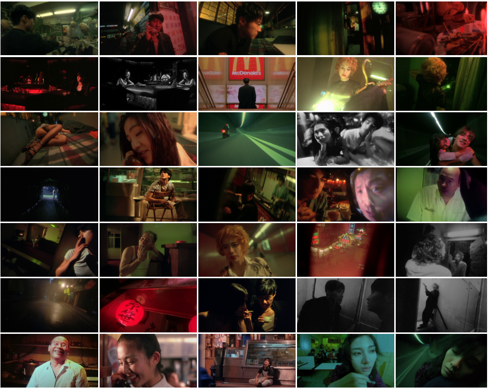
I was drawn to Wong Kar-Wai’s “Fallen Angels”, especially to its aesthetic of bright lights, dramatically emotive cinematic frames, unusual perspectives and grainy quality. From researching this film I came across the photographer Wing Shya who had worked with Wong Kar-Wai as a photographer on numerous film sets.

More film stills from Fallen Angels

From first reading the theme simple v complex, I wanted to explore cinematic images as I am particularly interested in films and directors which have a specific style- making this project one that matters to me as I have been interested in this style of images since starting the course. When looking at artist references I eventually settled on Wing Shya and Claudia Andujar as while researching them I found out they specialise in documentary style images which look staged and cinematic. I intend to start this project by just taking images- starting at football matches which my friends play in working on making the images look cinematic and getting the settings of the camera correct and then moving on to different types of lighting and settings- possibly experimenting with staged images. For my presentation of images I am planning to put them on foamboard with no boarder- if my images are cinematic style enough then a frame for the images may take away from the image itself- this will add to the “simple” theme of simple v complex. I may also create a CD or DVD case with my images in it: as my images are going to be in a cinematic style then I would like to display them as a professional, formal outcome which is related to the idea of cinema or just media in general- therefore a CD cover may be the best option for this as it is accessible to do as many DVD covers have the design imprinted on them but plain CD covers are accessible to me (and films obviously have soundtracks) so I feel as this may be the best option for me.

Photoshoot plan

I am planning to do at least 4 photoshoots in different settings, each concentrating on different lightings and atmospheres- showcasing different emotions. As my main intent is to capture cinematic images which (like Wing Shya and Claudia Andujar) are documentary style however look staged. I also intent to stage some images in certain lighting/scenes- namely purposely using coloured lighting and staging subjects in monochrome rooms if I can find any.
PHOTOSHOOT #1

For my first photoshoot I plan to take photos at football matches- making use of the bright white flood lights surrounding the pitch. These football matches take place every Monday so I am going to bring my camera and take images every week as it will be particularly difficult to get my camera settings correct on the first try due to the darkness and motion attempted to be captured- I want clear, bright, focused images with no blur. There may be a slight grain to the images due to the darkness of the setting as the floodlights are concentrated on the pitch- not on the side lines.

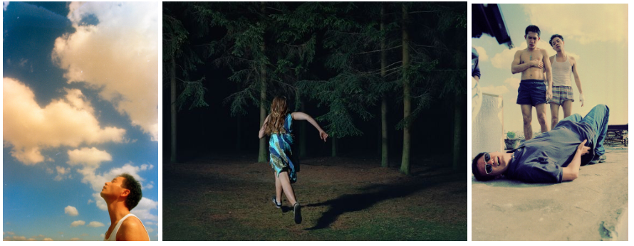
Images which serve as inspiration

PHOTOSHOOT #2

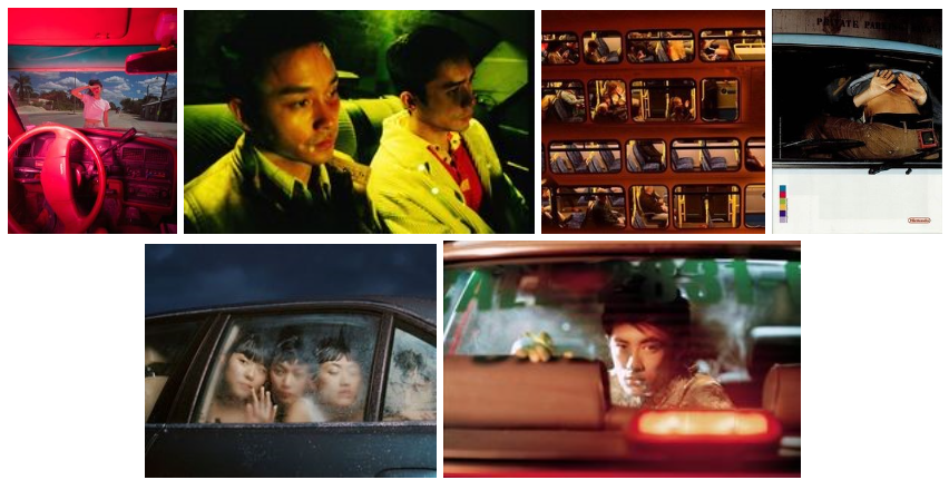
For my second photoshoot I plan to take images using cars; emphasising on using windows as frames for the images, concentrating on lights both inside and outside of the car, and playing with unusual perspectives. I want to make use of coloured lights to make the images more interesting instead of them just being pictures in a car- this will also help with me configuring the ISO and shutter speed on the camera as I do not want to use flash however I still would like sharp, clear images.

Images which serve as inspiration

PHOTOSHOOT #3

For my third photoshoot I plan to find rooms with interesting atmospheres- such as monochromatic rooms and rooms with interesting walls etc. Using monochromatic settings means I would like to place an emphasis on stark lighting including creating distinct, bold shadow while with busy rooms I would like to place an emphasis on a narrative within the subject- similarly to Wing Shya’s on set photography where he captures images which display the breakdown of an actor where they transition from a film character to their authentic self.

Images which serve as inspiration

PHOTOSHOOT #4

Some of my best images have came from me just bringing my camera around with me and just taking images of whatever catches my eye- I am considering using this strategy as a separate photoshoot as it was have no distinct timeframe however it will still be generating images that I may be able to use and edit in lightroom- as both of my artist references are documentary photographers (with a mix of staged however the style of documentary makes the images look staged) I feel as if this may be a good strategy to create images in the style I want.

Images which serve as inspiration