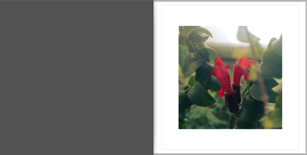
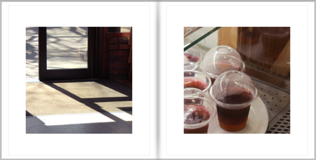
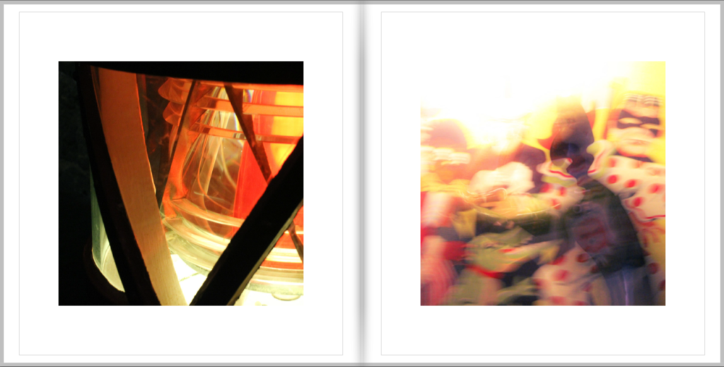
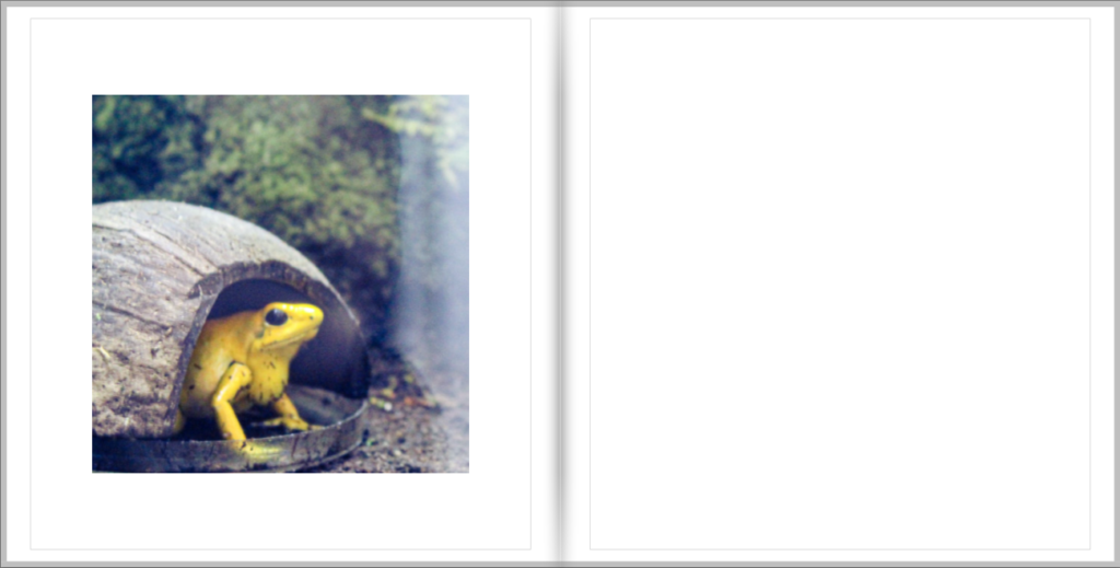
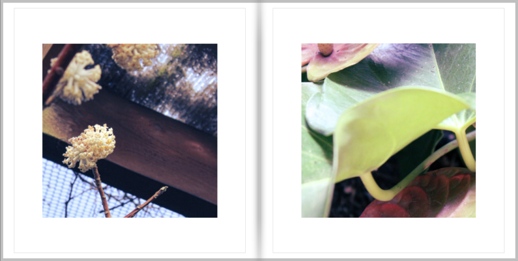
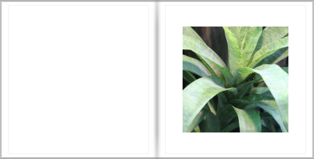
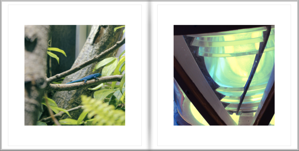
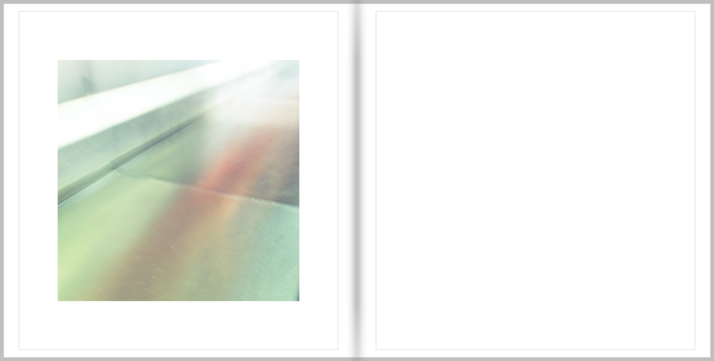
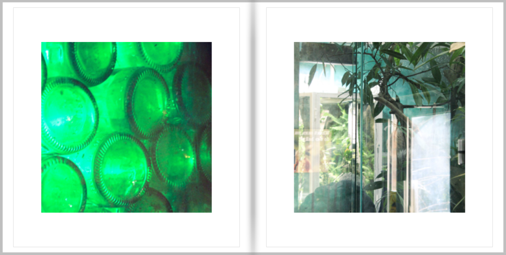
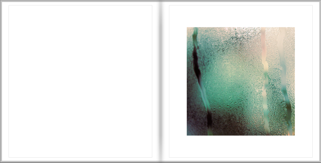
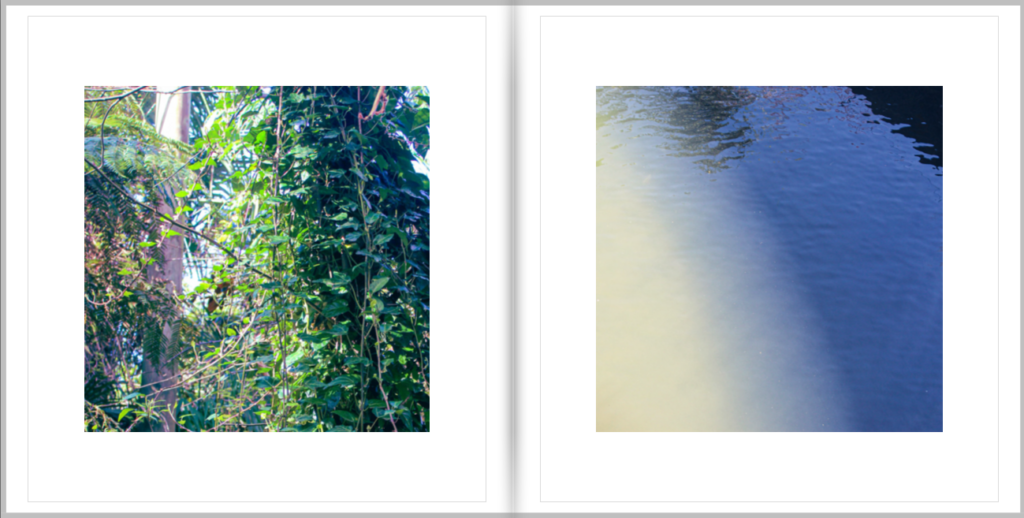
Here is my layout for my photo book made on Lightroom

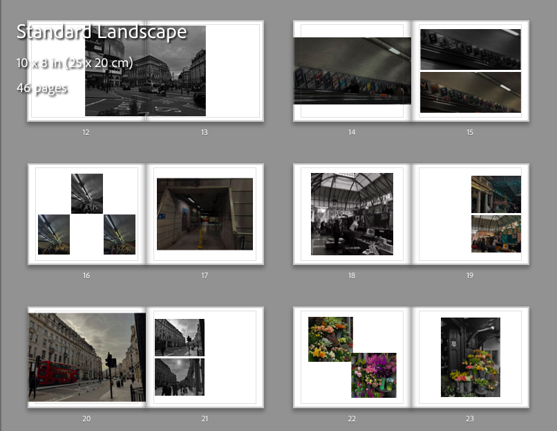
Here is my layout for my photo book made on Lightroom


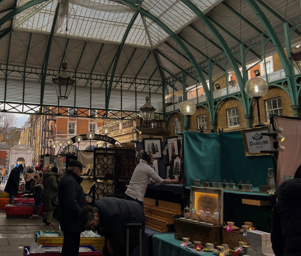


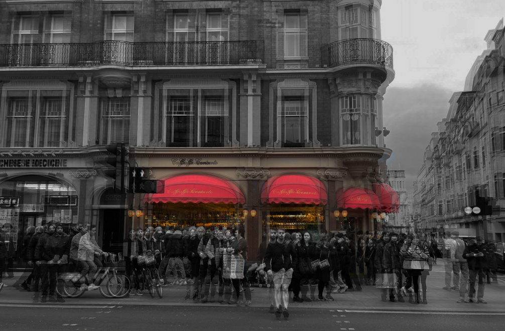




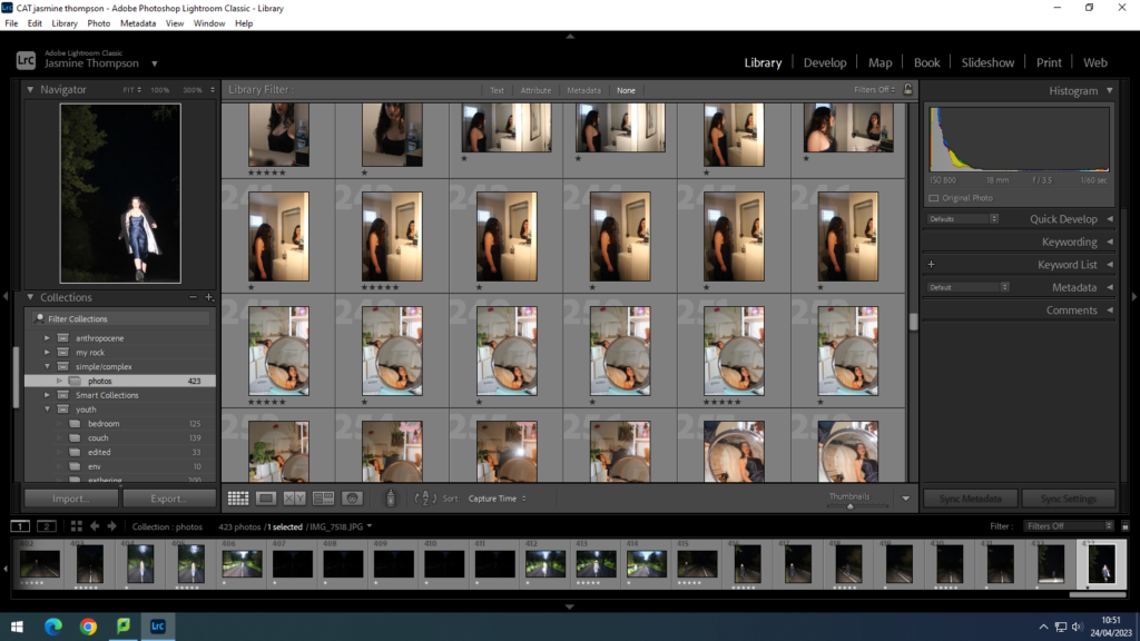
I began by importing my images into Adobe Lightroom into a folder called simple/complex. I used the star rating tool to choose between which images I liked and were suitable and the images which lacked. I used 5 stars for yes, 3 stars for maybe and 1 star for no.

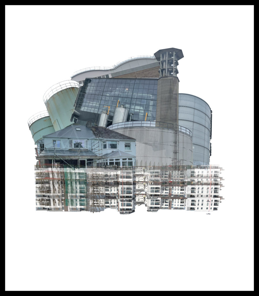
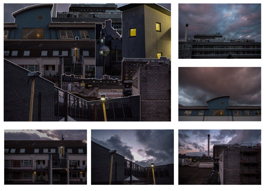
To begin, I wanted to recreate one of my past photoshop edits but with my new images. I am recreating an image from our Anthropocene project which also involved photographs of unique buildings. I first created my edit with Adobe Photoshop by randomly placing cut outs of structures together to form one big building. For this edit I will use around 6 different images of structures and put them together in a random order to respond to my previous edit. However, with this current edit I would like to position the structures in a more neat way to form a real looking building.
Editing Process
Firstly, I began by creating a new photoshop document with measurements of 2000 x 2000 and a resolution of 250. I wanted the page to be a square so my structure can be positioned dead centre on the page. Like my previous edit I wanted to keep the same style of the thick black border around the edge.

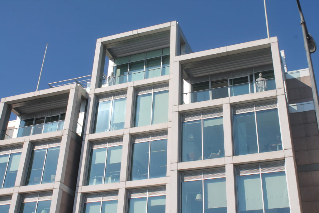
Next I cut out and added many features of buildings I have photographed to see which would be most effective in this edit. Below shown are the images I used in this edit:
Images I used for this edit

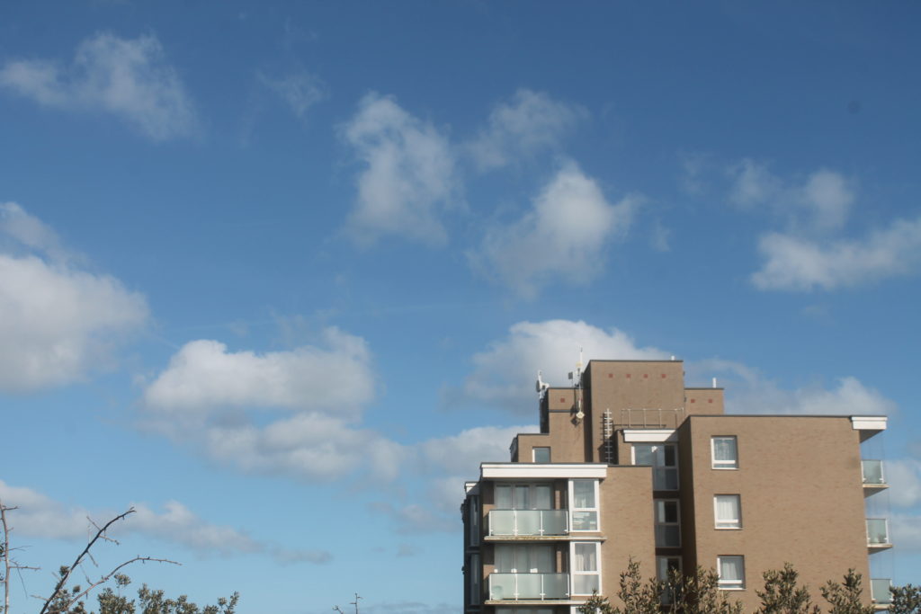
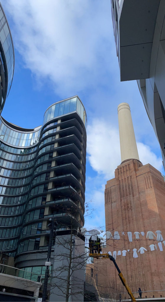
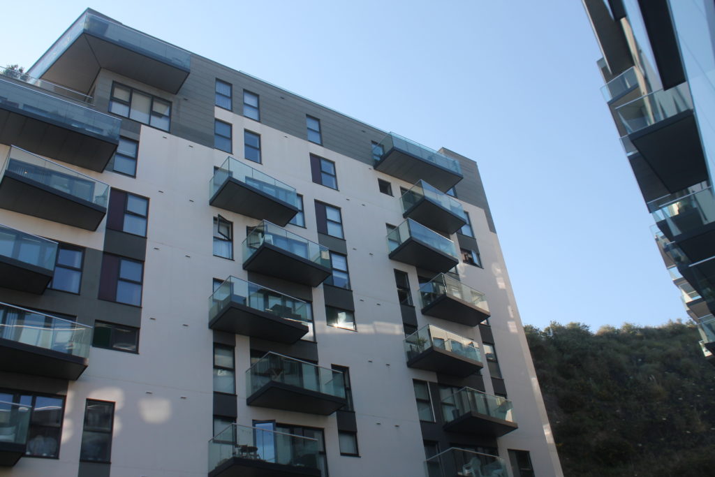
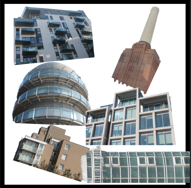
Next, I started by rotating the cut outs to different angles so it isn’t fully positioned at a straight angle. Then I put them together to give me self a slight idea of how this is going to look.
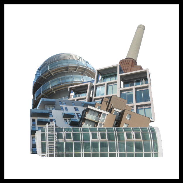
After understanding how this is going to turn out I decided to mess about with the opacity of the cut outs to create a fading effect of the buildings between each other. After finding the right formation of the cut outs I wanted to experiment with the colours of the background to see if it could be any more effective.
Background Colour Experimentation
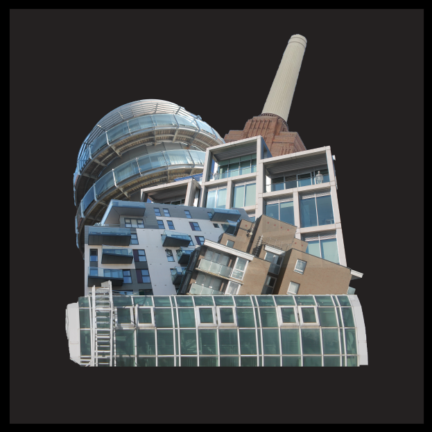
I decided to experiment with the background colour to see if I could create a contrast between the dull coloured buildings and a bright background. I started off with the more basic colours and then further developed onto the vibrant colours.
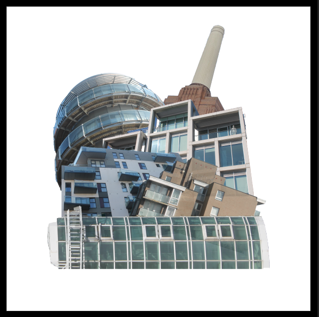
Basic colour background
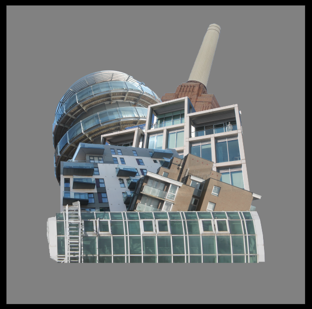
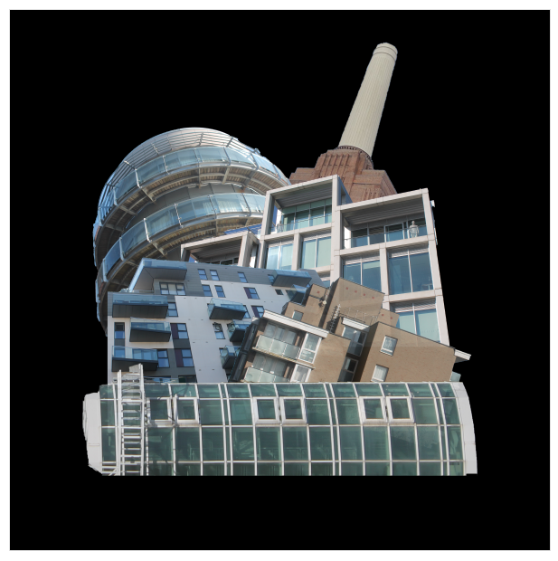
Vibrant colour background
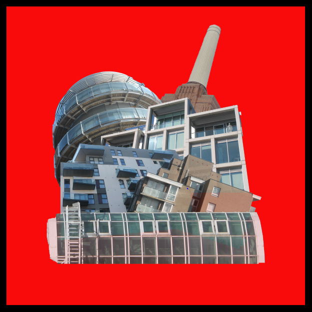
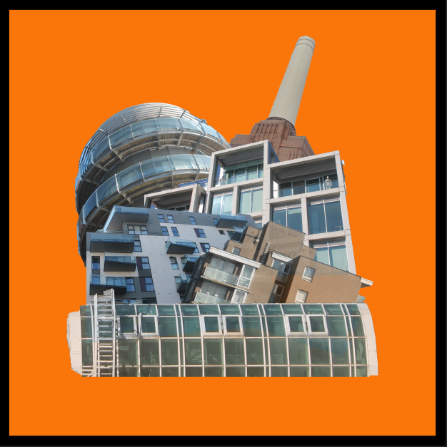
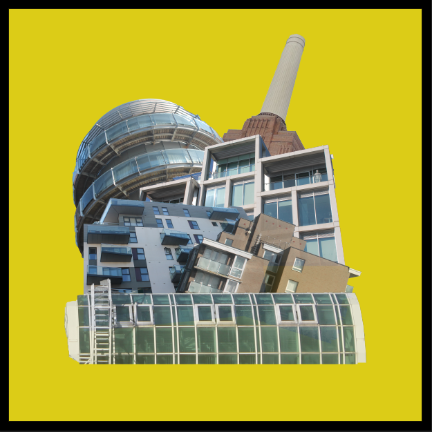
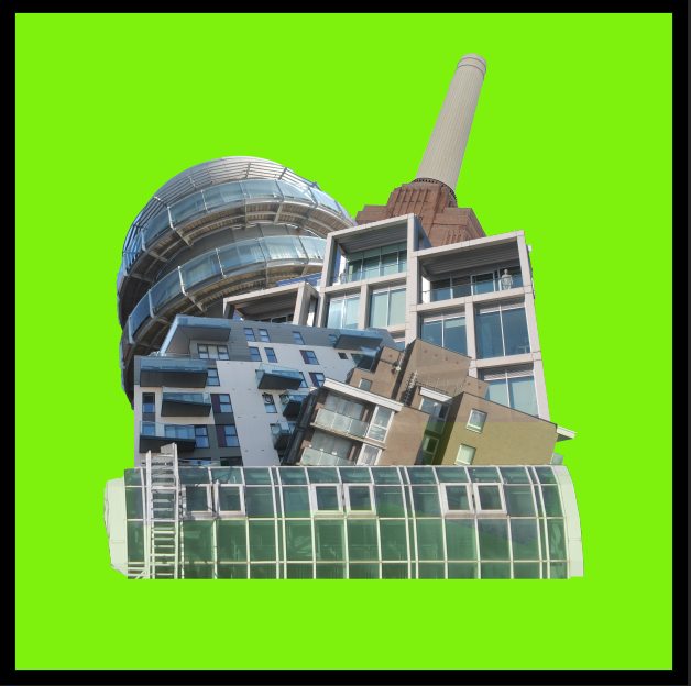
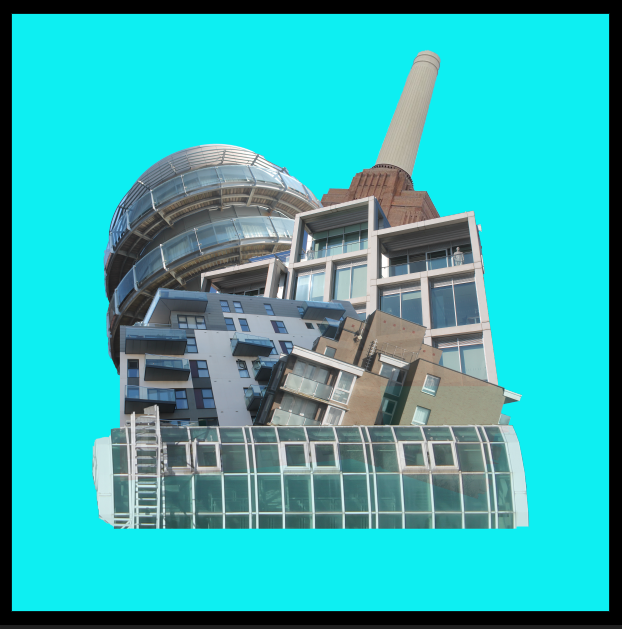
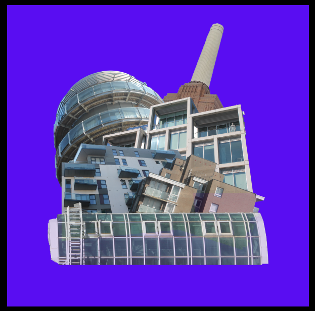
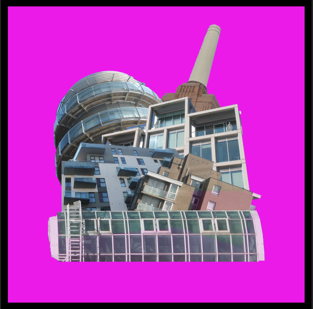
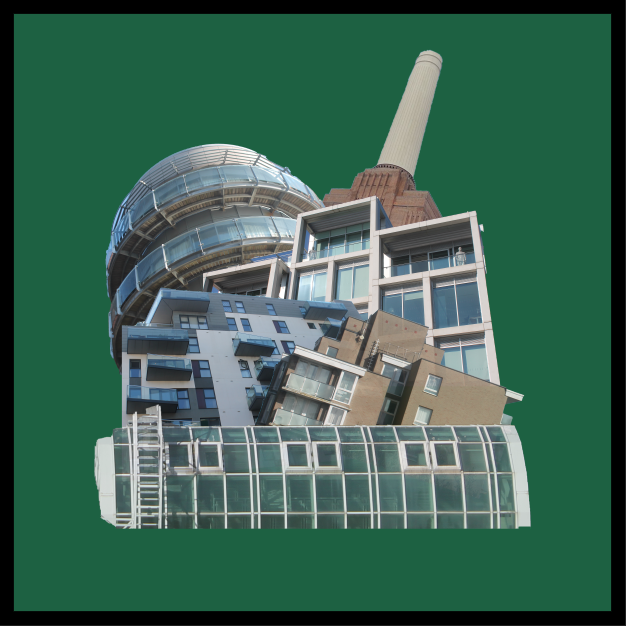
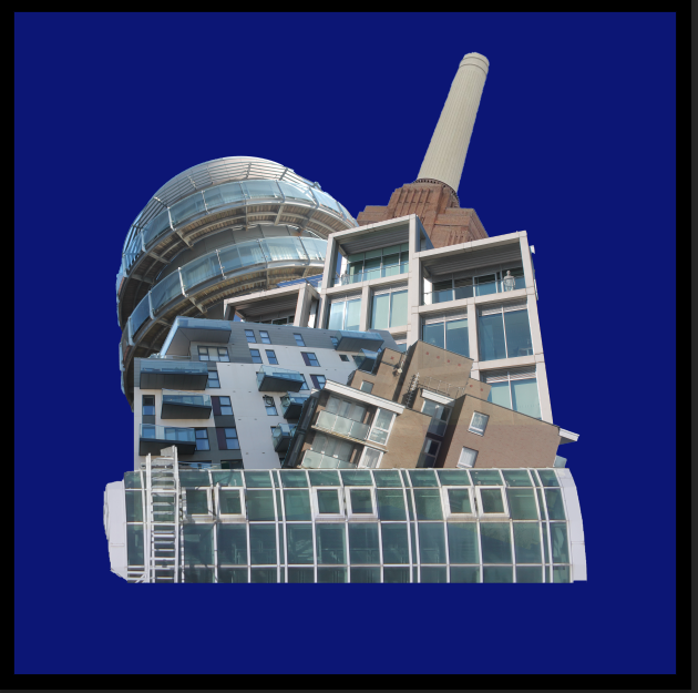
Overall, I much prefer the basic white background with a black border as it matches with colour to the structures used in the edit. Also, I think all bright colours don’t create a good contrast with the structures as most of them are dull colours or white.
Final Image

Evaluation
Overall, I am extremely happy with my final outcome as I think its a very good recreation of my previous edit done in an earlier project. I feel as if the black border brings the image together making the main subject stand out. This image was mainly inspired by artist Laura Romero who makes many similar pieces of work similar to mine. I feel as if all the colours involved contrast between each other in an effective way to not make the image seem awkward. These images I used are from Waterfront, St Helier, Westmount, Fort Regent and a powerplant located in London.
BEFORE AFTER
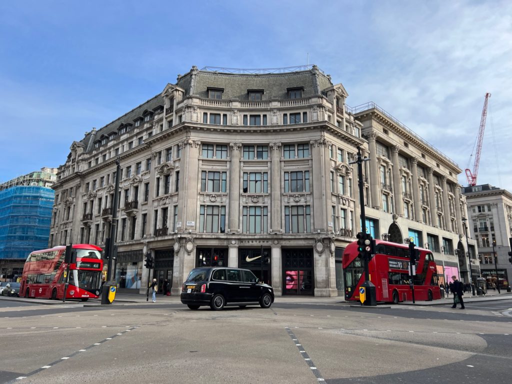

This is my favourite image I have created, using photoshop.


In this photo I wanted to darken the image to emphasize the lights on the ceiling which you can’t see well in the before photo.


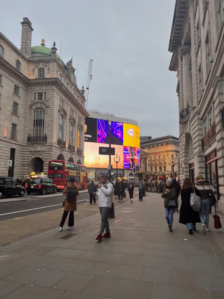
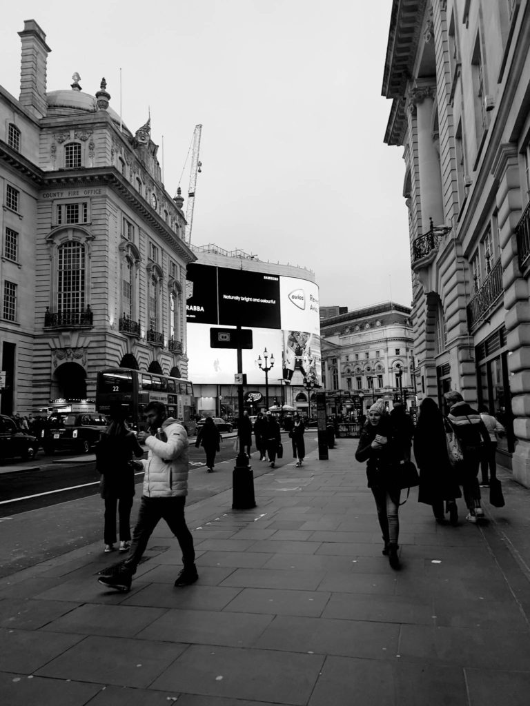


Best shots –


To begin my final selection and editing process of images to use as my final shots for my photobook and mounting up, I began an editing process where I experimented with different outcomes throughout my work. The way in which I carried this out was through the use of splitting my photographs in to 3 different coloured sections by creating virtual copies and colour sorting them to make my work more organised, these sections were:
After I had edited all of the images which can be seen below, I went through and labelled the images ‘P’, for the outcomes which I thought were my most successful and wanted to use, and ‘X’, this was for the outcomes which I did not like and didn’t think that they were successful in how they had turned out. I then moved those images to a separate folder on Lightroom labelled ‘Photobook and Mounting’ so that my best and most successful outcomes were clearly organised when I wanted to begin my process of creating my photobook and deciding what images to print out and mount up.
Experimenting with different filters in Lightroom –
Black and white –


To transform my images into black and white I began by selecting the purple section of images and the image which came up first was the first image which I chose to work on in transforming them into black and white. I started off by selecting the initial ‘Black and white’ filter on the right hand side in Lightroom and then adjusting different settings such as the exposure/contrast/highlights/blacks/whites/shadows to enhance how dark I wanted my images to appear and how the contrast between the different tones work amongst one another. Once I felt confident with this, which can be seen in the image of the bowl above, I selected the rest of my images and used the ‘Sync settings’ button which applied all of the editing choices which I had made on to the other images which made them appear to be quite uniformed and flow nicely with each other instead of being a random mix of colours due to different lightings or ways I have used the spotlight previously. To further develop my images I decided to go through them individually below, this was a more in depth approach where I experimented with different black and white filters, such as ‘infrared’/’soft’/’flat’/’high contrast’/’low contrast’, cropping and tools to help neutralise the lighting in different areas of a photograph through the use of the radial and graduated tools.
Examples –


Other experimentation –


To experiment with a variety of other filters on Lightroom I repeated the same process that I carried out for my images in black and white, but in this case I used different filters which fell under the filters such as ‘Creative’/’Colour’/’Vivid’/etc as there was a variety of different ways I was able to enhance the colours used within my photos. I really liked doing this as I was able to create different vibrancies and contrasts in colours which I was then able to compare to the images in black and white and saw how the images were changed and brought to life within them.
Examples –


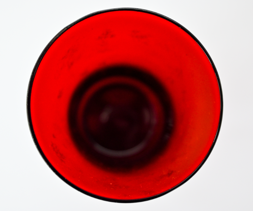


Examples of experimenting with double/multi exposures –
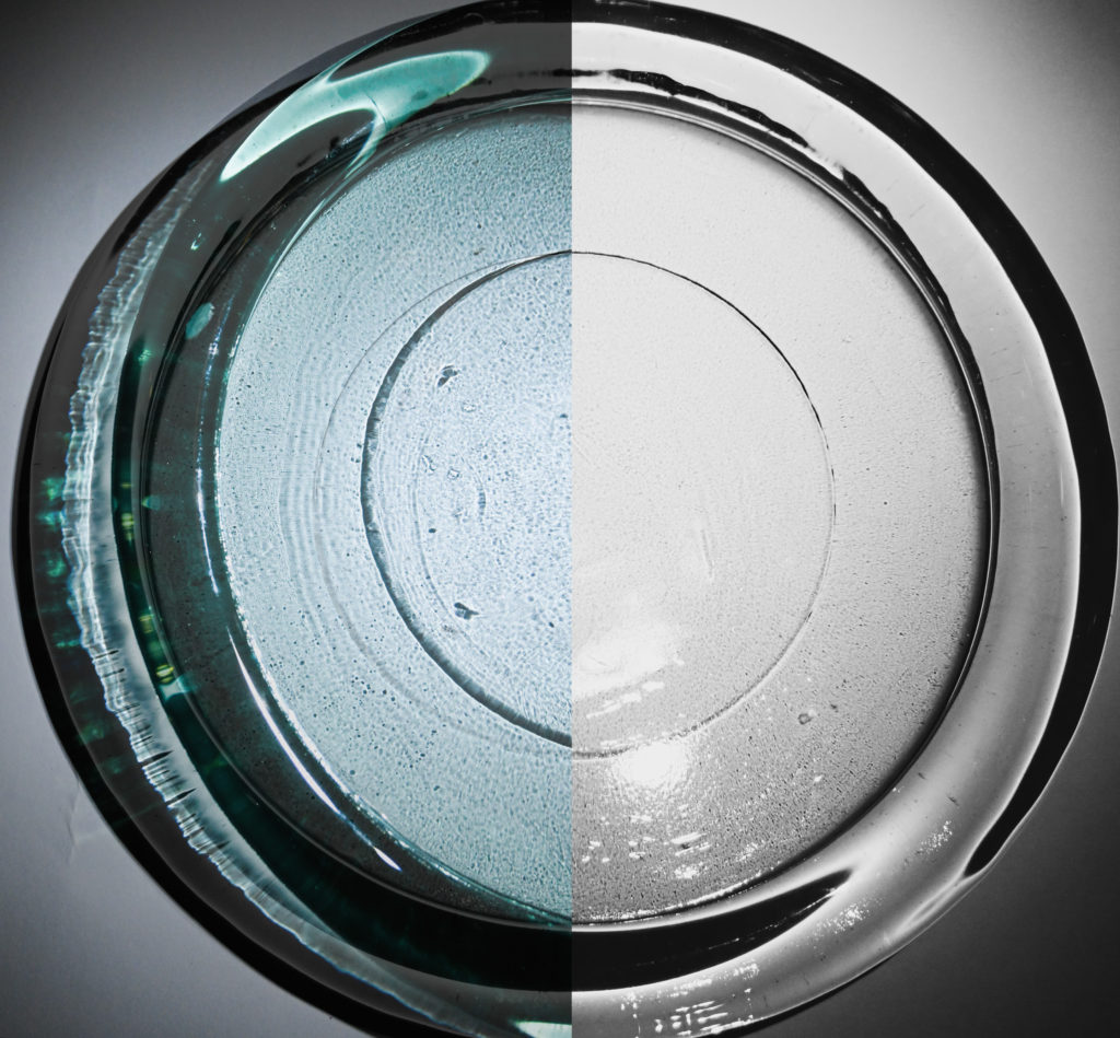
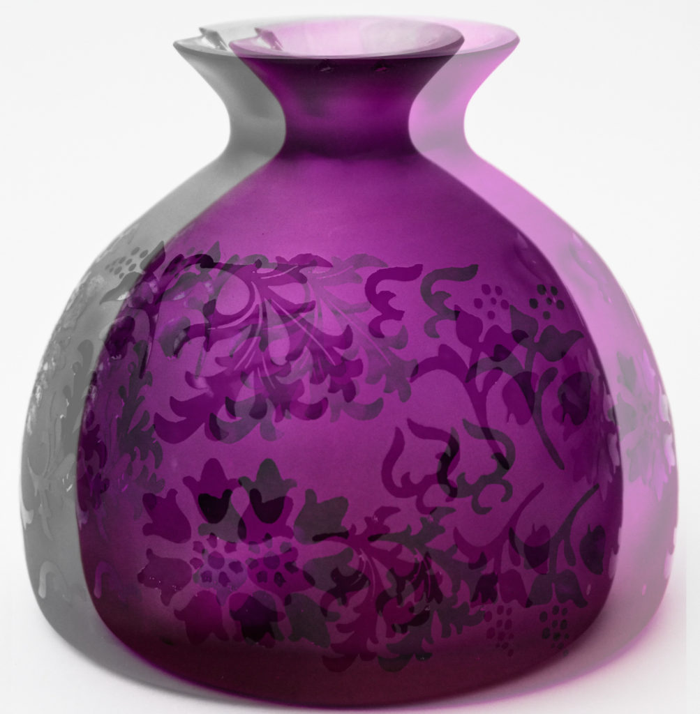
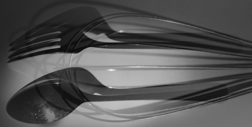


In my work I also decided to experiment with the use of double/multi-exposures, this was through the process of bring the images into photoshop and layering them on top of each other in different positions and then altering their opacity to achieve the effect that there is more than one object within the photograph. I did not like the way that these images have turned out and I think that this is because in many of my photos there may be a use of 2 different objects and once this is paired with another photo it begins to make the image look messy, this effect is something which I do not like, although ‘double 2’ does share a similarity with one of Jaroslav Rossler’s images where the effect used on the photograph makes it appear to be quite blurry and colourful. Therefore I have decided that I will not be using double/multi-exposures within my own work for creating my photobook and mounting up my images as in relation to Paul Outerbridge and Andre Kertesz’s work within the theme of still life their images feature a few different objects but with a clear lens.
Images I have chosen to print out and why –


These are three images which I have decided to create a ‘triptych’ with to print out in A4 and mount up. This is because I like how they work against one another as there is a flow between them as they are all of the same object and due to the full picture in the middle being of the plate and then having half of the plate each side makes the plate look as if it has been split in half which I really like as it reveals what is underneath.


These are two images which I have decided to create a ‘diptych’ with the print out in A4 and mount up alongside one another. This is because I think that they work well with one another due to being in black and white, being of the same objects and sharing similarities in the shadows which they have both produced which I really liked although I was unsure of them beforehand.


These are three images which I have decided to create a ‘triptych’ with to print out in A3 and mount up. I have decided to print them out in A3 because I think that they can work well together as a triptych but I am unsure of how they may print out, so if I print them as A3 I am also able to mount them up seperately. This is because I like how they work against one another as there is a flow between them as they are all of the same object and due to the full picture in the middle being of the plate but with different angles and shadows which have been created in them.


These are images which I have decided to print out in A4 images and mount up separately, this is because I think that they will work well by themselves. This is due to the hair clips and how the reflected shadow creates quite a abstract look as well as the perfume bottle and the bowl and fork represents the simplicity of still life and relates towards one of my artists which I have studied who is Andre Kertesz.

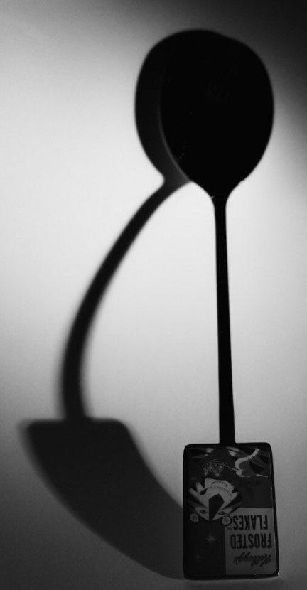

These are images which I have decided to print out in A4 images and mount up separately, this is because I think that they will work well by themselves. This is due to the hair clips and how the reflected shadow creates quite a abstract look as well as the perfume bottle and the bowl and fork represents the simplicity of still life and relates towards one of my artists which I have studied who is Andre Kertesz.



PHOTOSHOOT #3
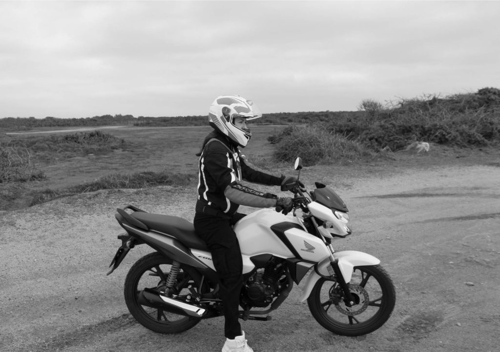
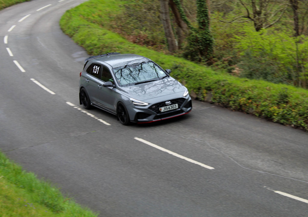
Both of these photoshoots were quite small, with only 30 images being taken overall. I coloured coded 12 images that I thought were successful green, in one set of images I concentrated in bringing out the purple of the images while in the other I concentrated on yellow when editing.
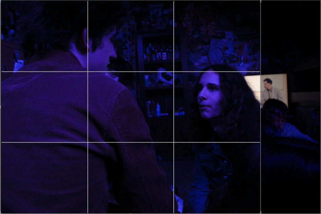
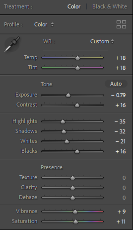
I will also be doing minimal editing for these images, being careful not to make the images too grainy as the rich coloured lighting in the room where I took the images already means that if I change the exposure massively the images will become grainy.
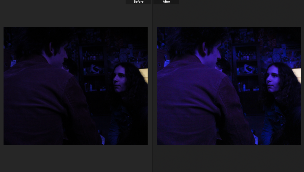
In this image I turned up the exposure trying to bring out finer details on the subjects and more definition, this was difficult due to the coloured light as the images became very grainy.
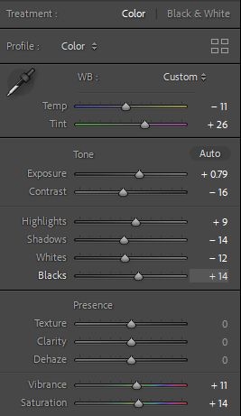
Cutting down on images after editing I put my unsuccessful images into the yellow category while keeping my successful images green.
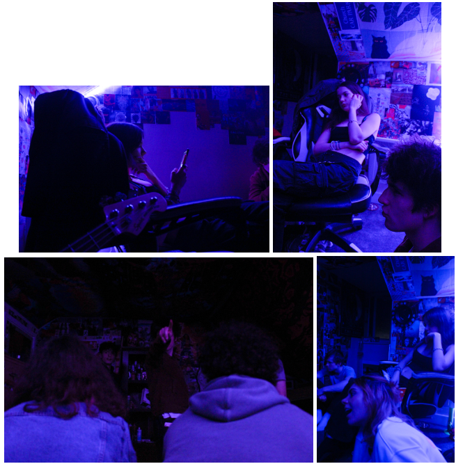
Personally I am not very fond of LED coloured lighting in images as I think it looks tacky and amateur so for these images I wanted to concentrate on the subject’s emotive expression which in these images I do not think is very effective.
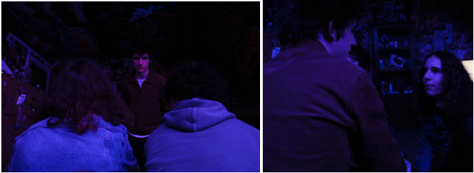
Concentrating on facial expression and body language these images above I feel are the most emotive- the image on the left has direct eye contact with the viewer (displaying almost a kubrick stare), paired with the image on the right the subject who is faced towards the camera has almost a facial expression of pleading.
PHOTOSHOOT #4

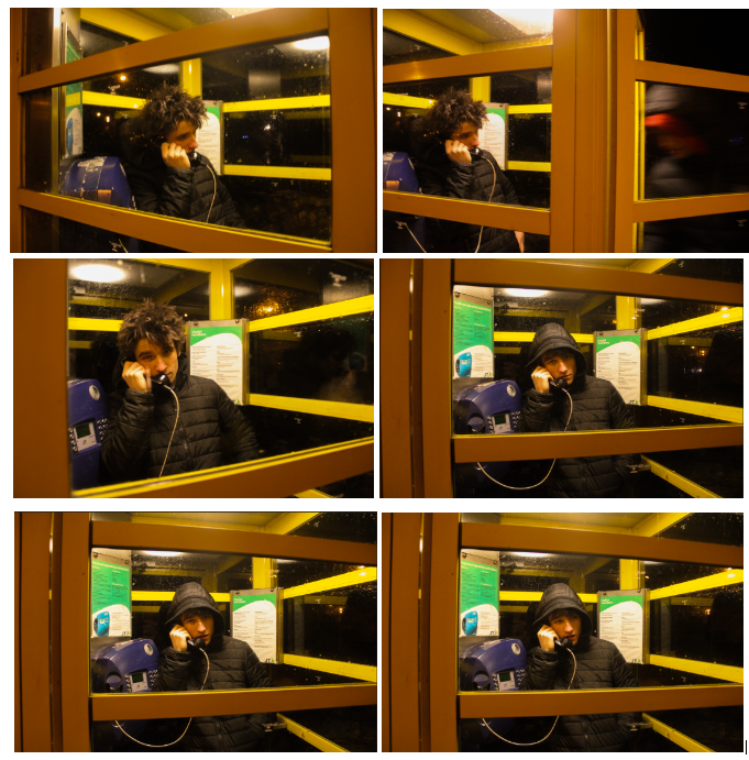
For my fourth and final photoshoot my only concentration is choosing between 6 images as a final image which are very similar, they are all edited with the same settings- to bring out the yellow in the images- however each image portrays a slightly different perspective.
The image that sticks out to me the most is the top right one, where a blurry figure is entering into the phone box with the subject- this image has slight symmetry due to the lines on the phone box doors creating yellow boarders and the motion in the image present more action in the image.
I created mock-ups on Adobe Photoshop on how I am going to present my final pieces of work.
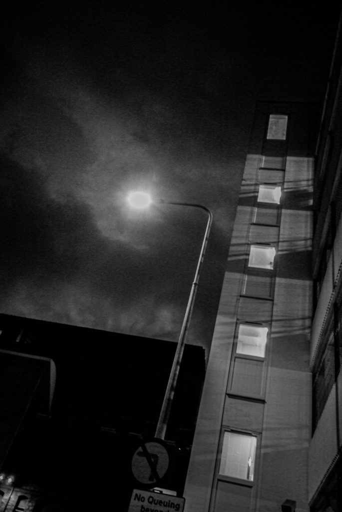
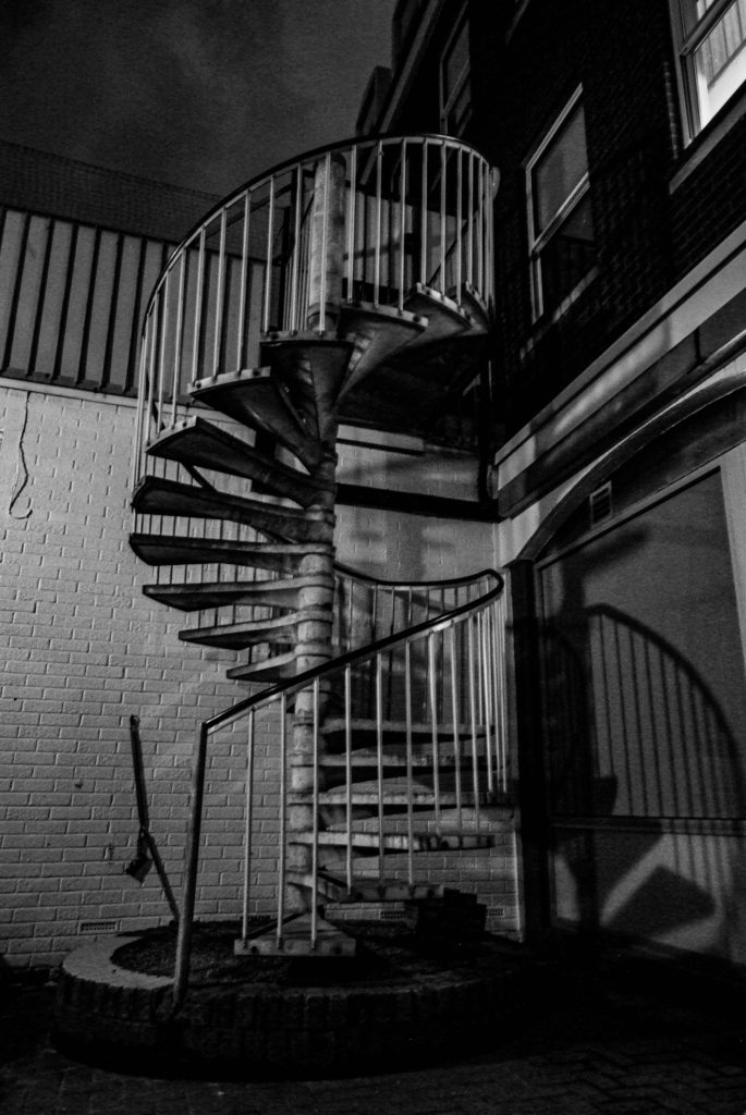
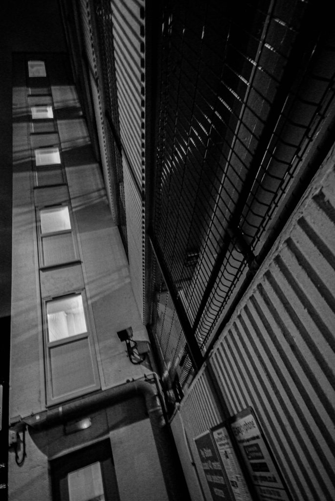
I wanted these 3 images to be placed together on an A2 black card using window mounts to present them, shown below is a mock-up on how it would look using Photoshop.
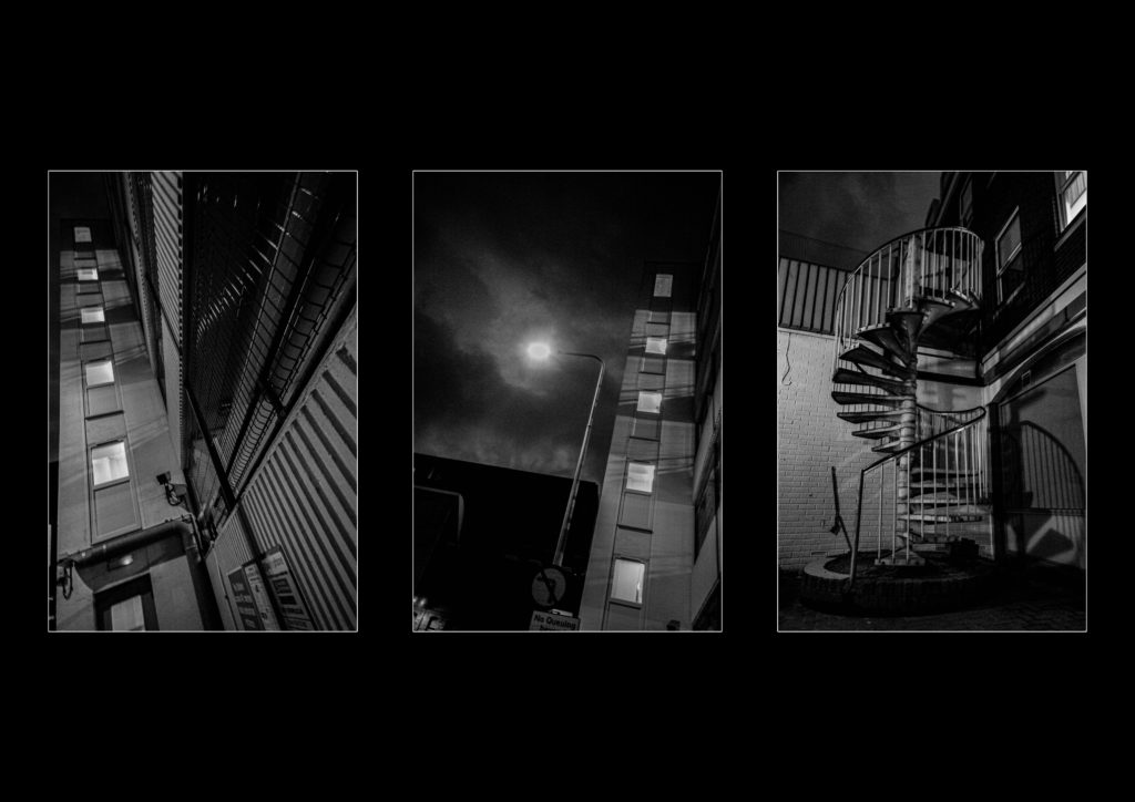
I think using juxtaposition to create this layout with these photographs is very effective and eye- catching to viewers and works really well.
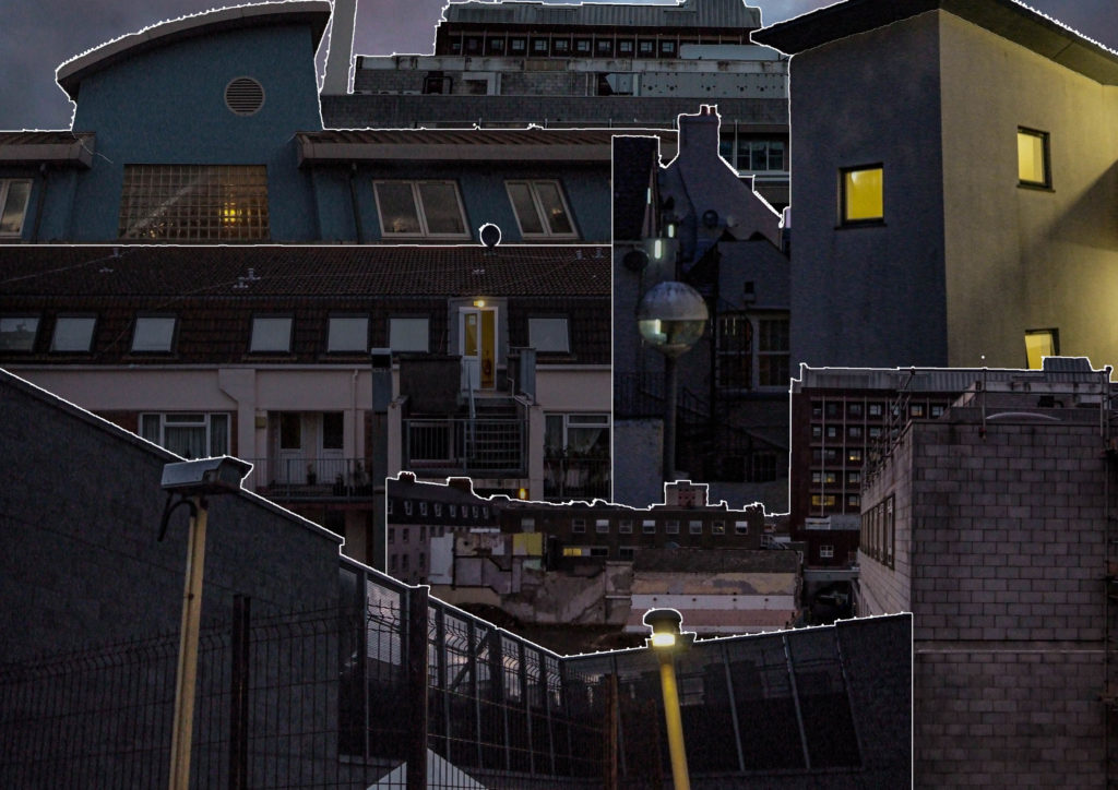
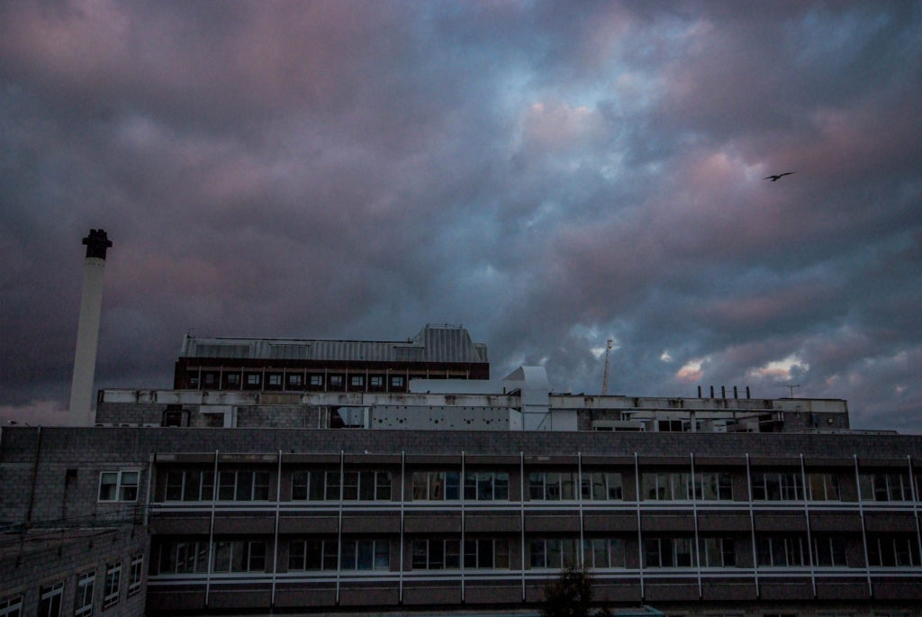

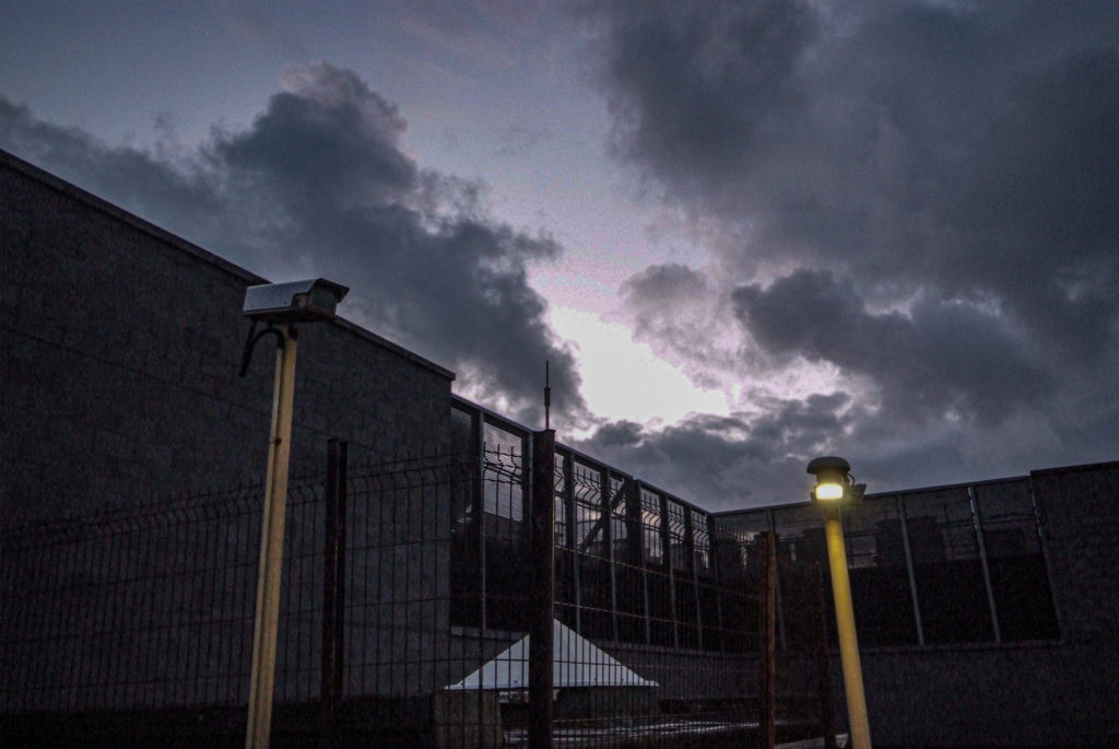
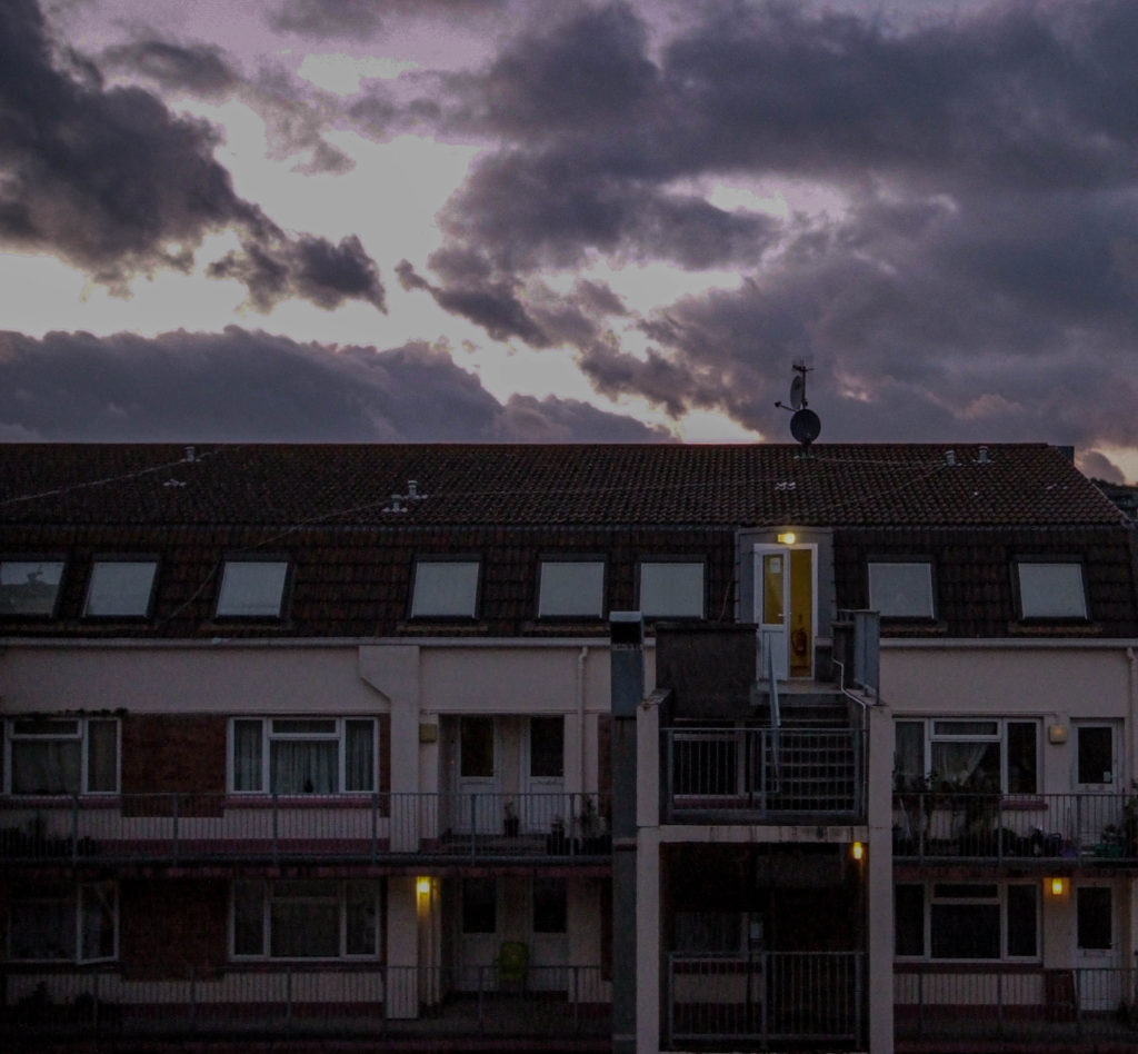
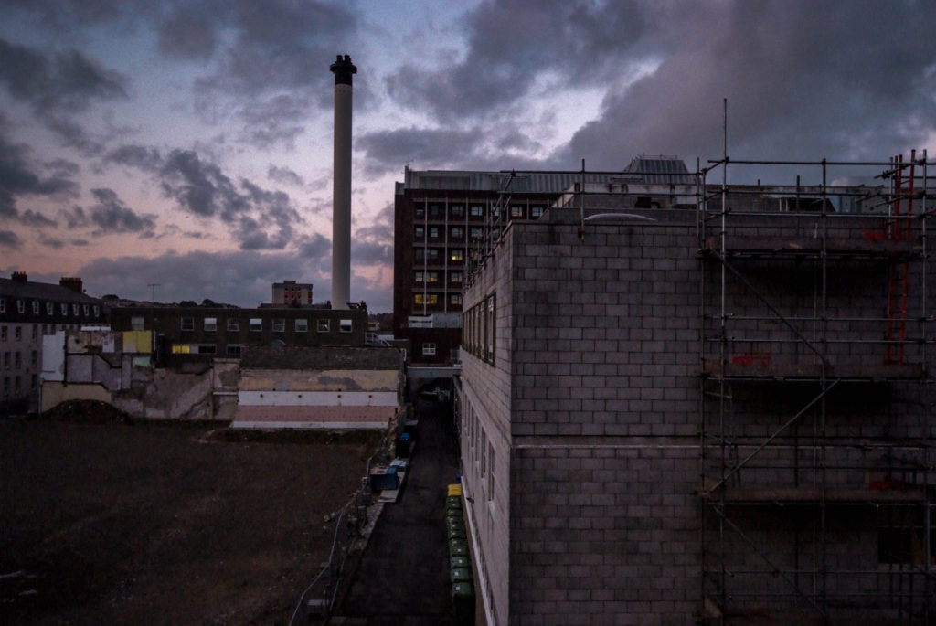
I then wanted to create a piece using the photo-montage I created being surrounded by all the photographs used in the creation of the montage itself. I will create this by using a big piece of foam board, and spray mount to mount the images onto the board, I will also have the separate images raised above the main montage image using extra foam board. The montage will be A3 sized while the other images will be A5 sized.
I think this presentation of the images works really well, and is very eye-catching to viewers. The images position next to the montage corresponds with the same images position in the actual montage photograph.
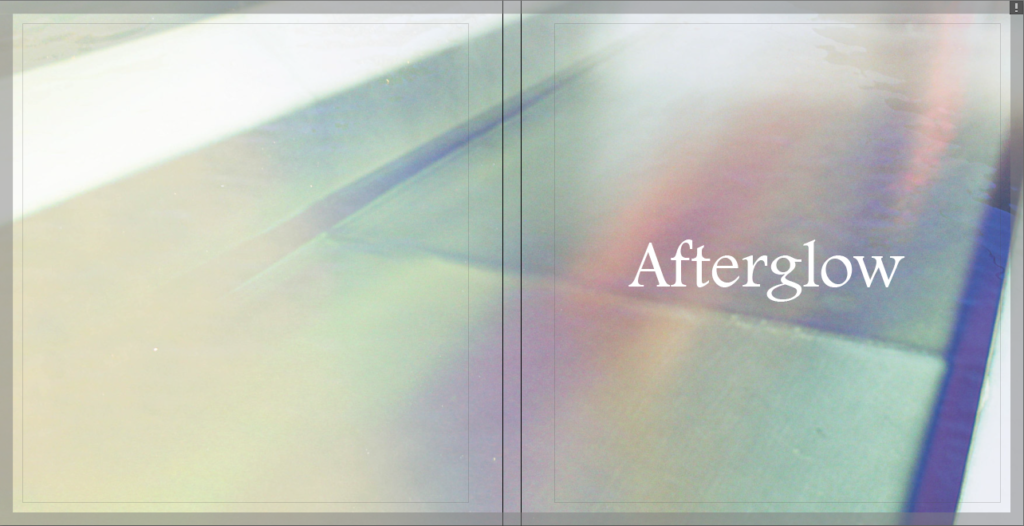
During the exam I decided to go back to my Photobook to work on the final layout as well as decide on the front and back cover design and a name.
I struggled to decide on what I wanted to use for my front cover, and narrowed it down to three options.
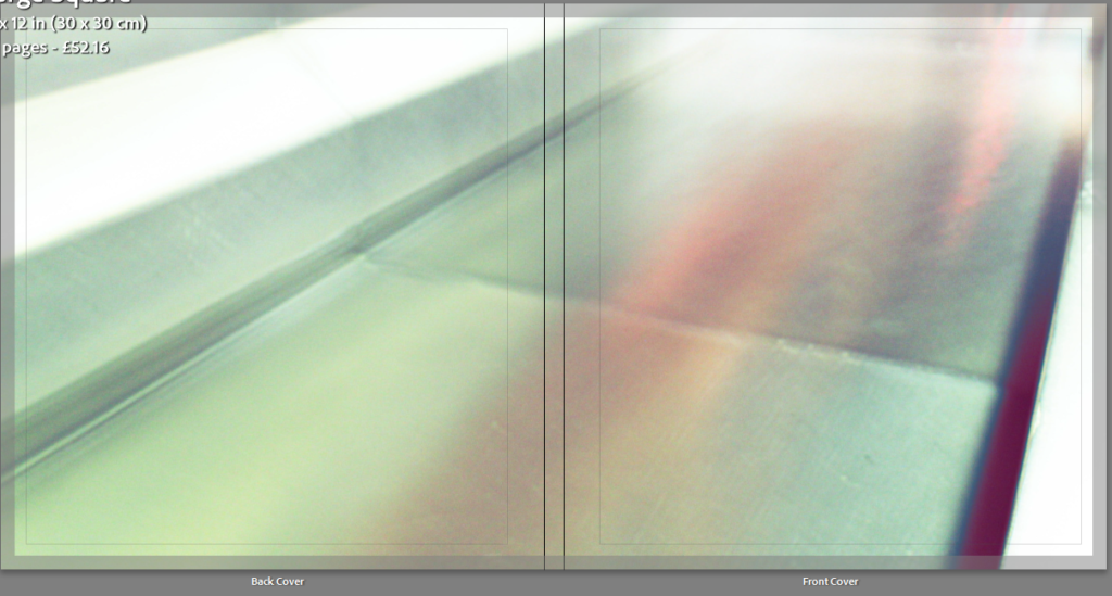
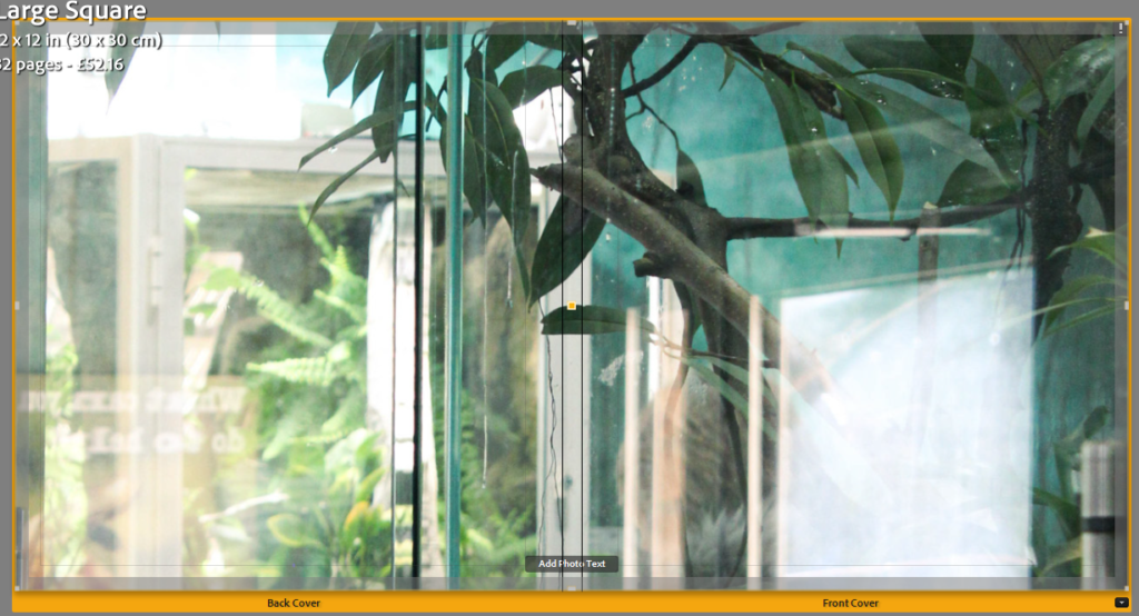
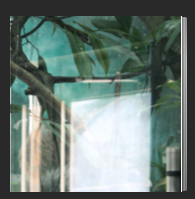
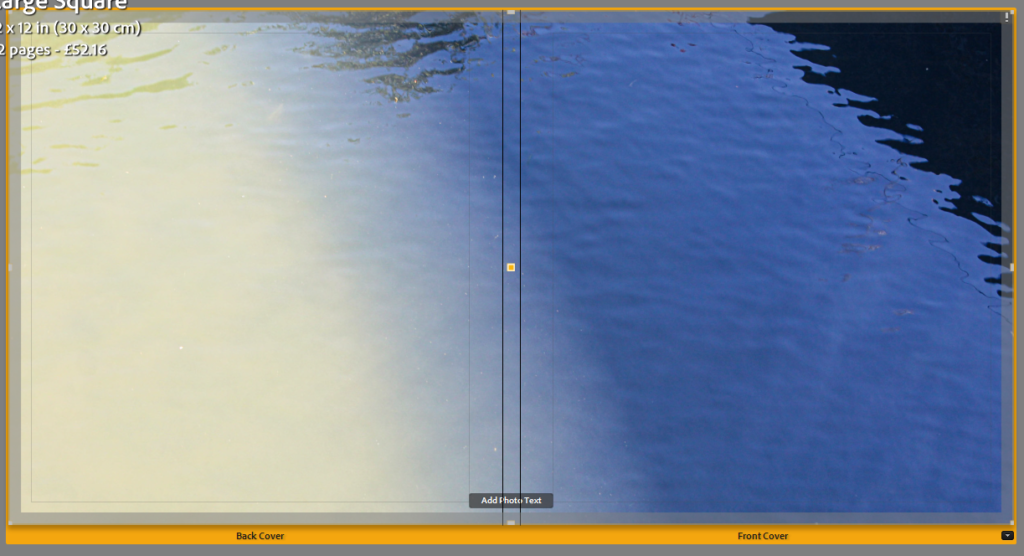
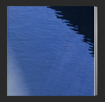
I decided to take screenshots of each and compare how well I felt they looked as covers. In my opinion 1 and 3 were my best options but I still was not entirely sure.
I decided to open up Photoshop and to see what it would look like if I tried to overlay them. I experimented with the layer types, order and opacity but eventually settled on using the Lighten layer mode at almost full opacity. I liked how this combined the image colours while still keeping most of the details.
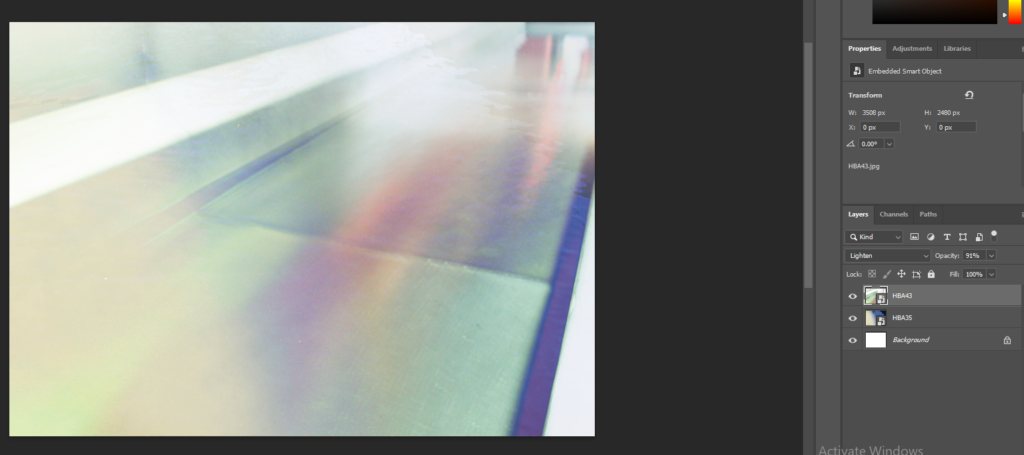
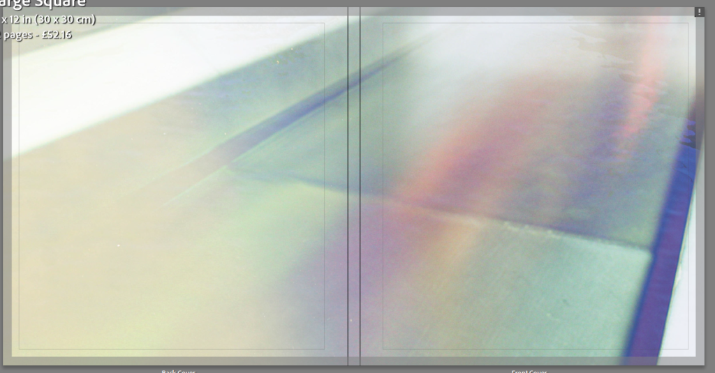
After being satisfied with the cover design, I then moved on to coming up with ideas for the title, as well as experimenting with font choices.
I looked up words associated with light and colour to see if I could find anything interesting-
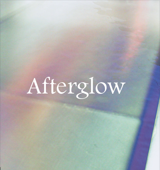

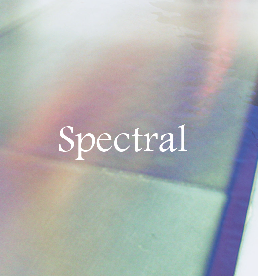
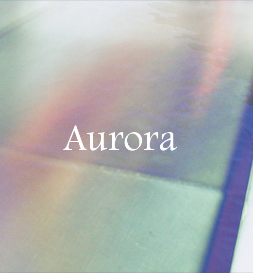
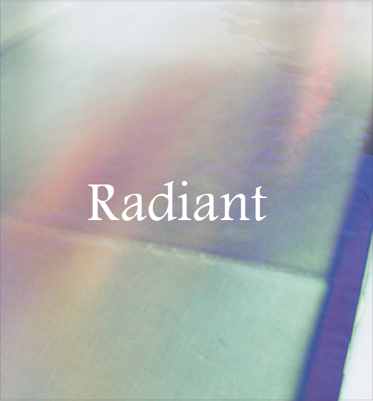
I found a font that I liked and typed out each potential title to see how they would look. I liked the simple layout of just the white text and no other writing. I experimented with having the text in capital letters but I preferred it with lowercase letters.
I then moved on to experimenting with the colour of the pages inside the book. By default they are white but I thought it would be worth seeing how page spreads would look like with a variety of options.
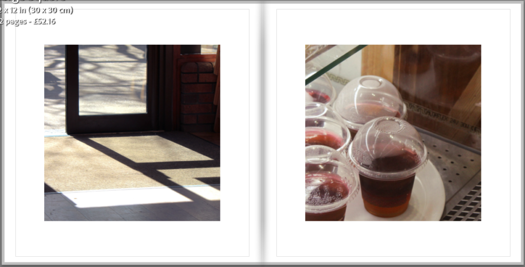
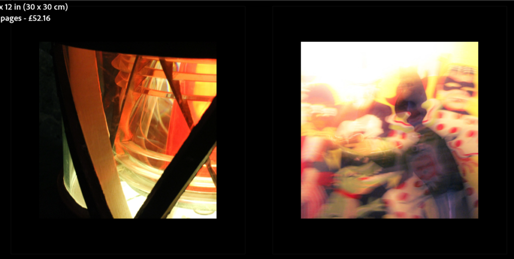
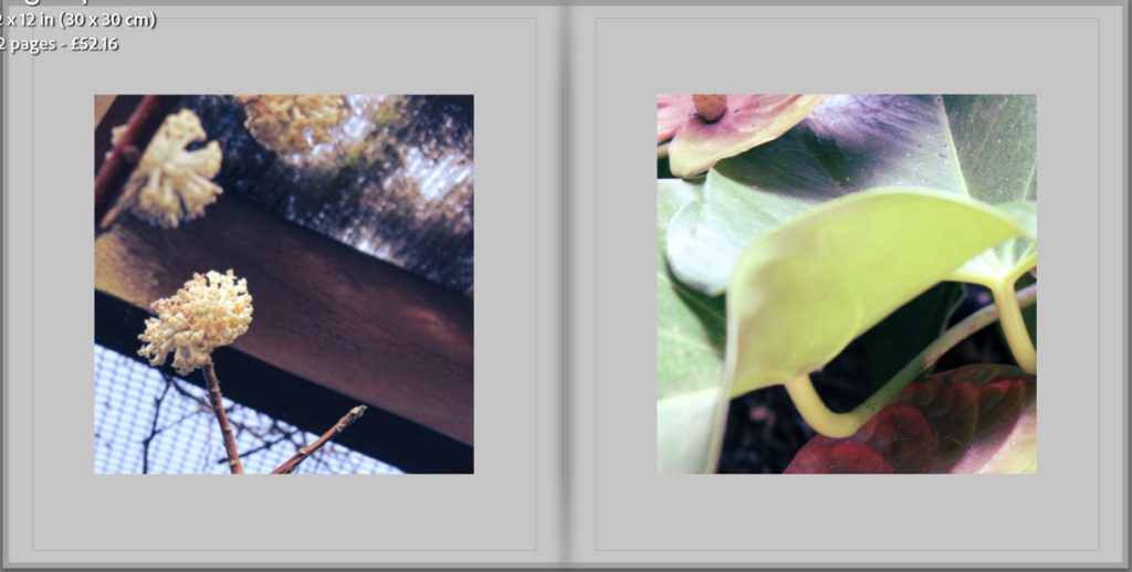
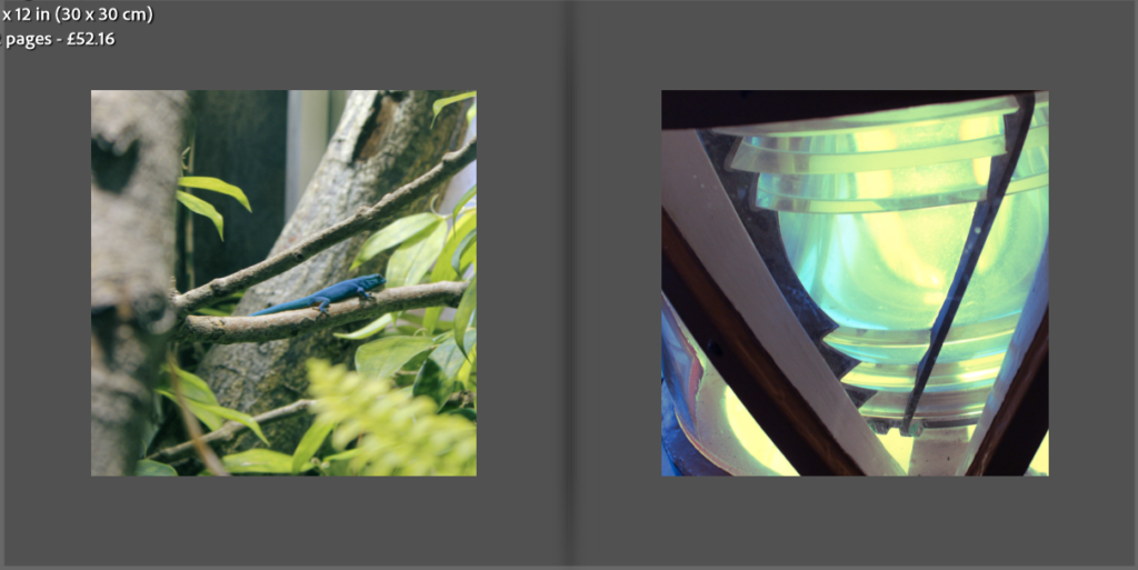
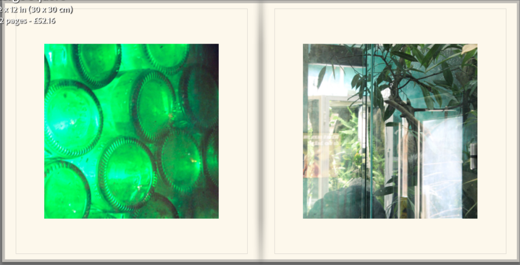
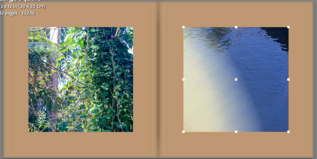
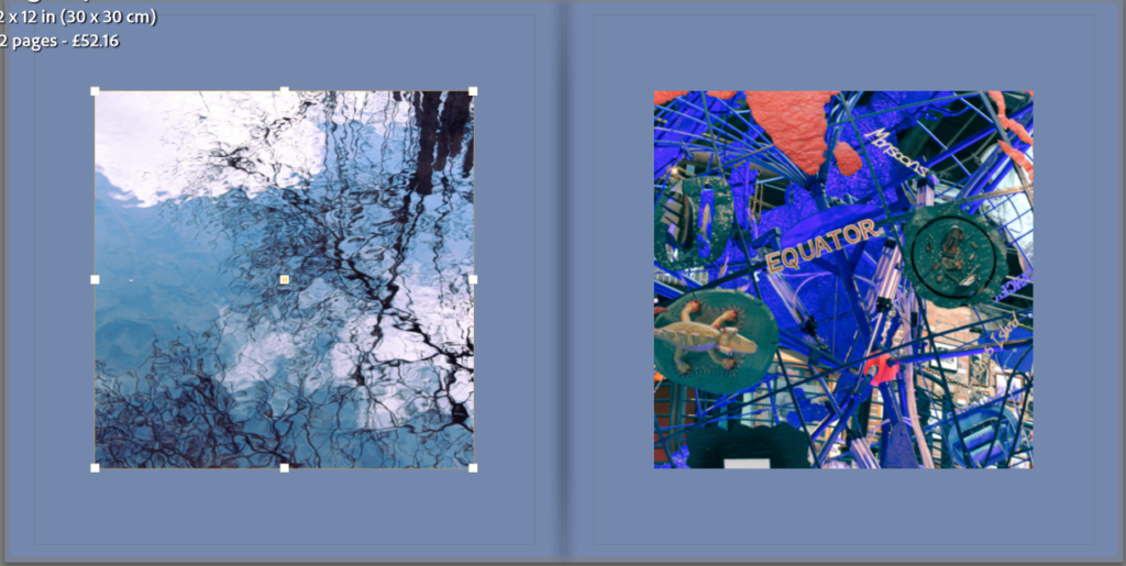
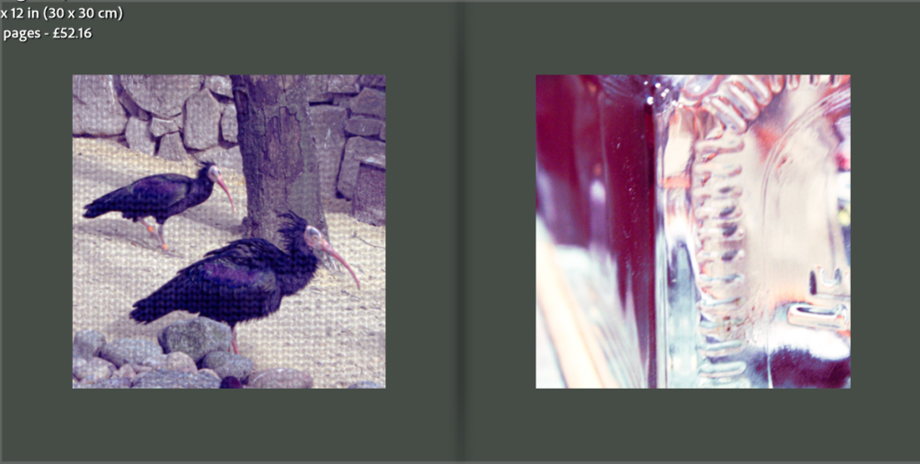
I liked the white and off white the most so decided to compare the two a little more.
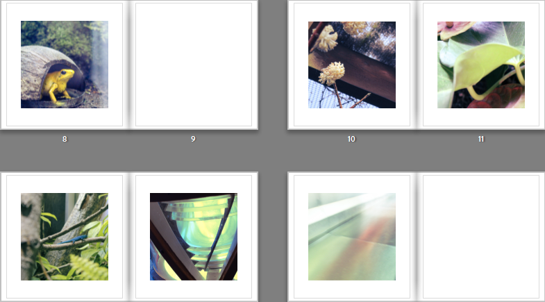
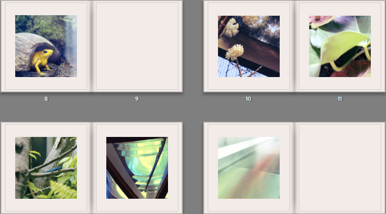
I feel that the pure white has a bigger contrast with the images than the off white, giving the two very different effects. While it was interesting to experiment with, I decided that I wanted to use the pure white, because it draws more attention to the colours in the images.
Updated Draft (still undecided on name)-
