For my third outcome I will use these images and others to create a slideshow/gif. I will centre the corners in the middle of each photo using lightroom / photoshop.
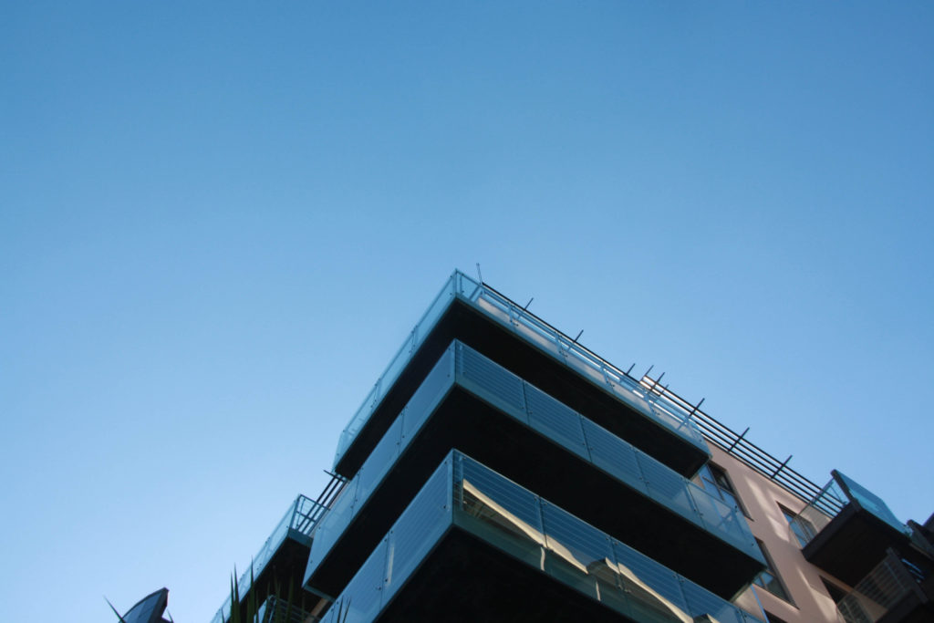
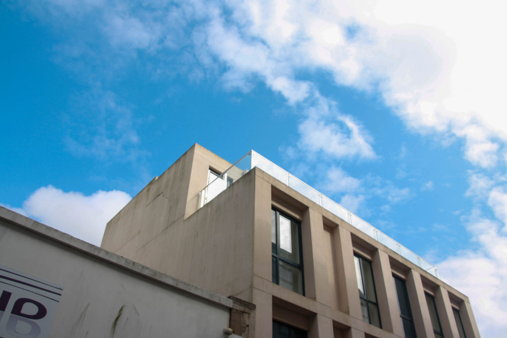
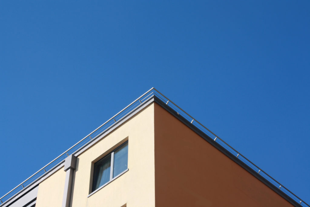
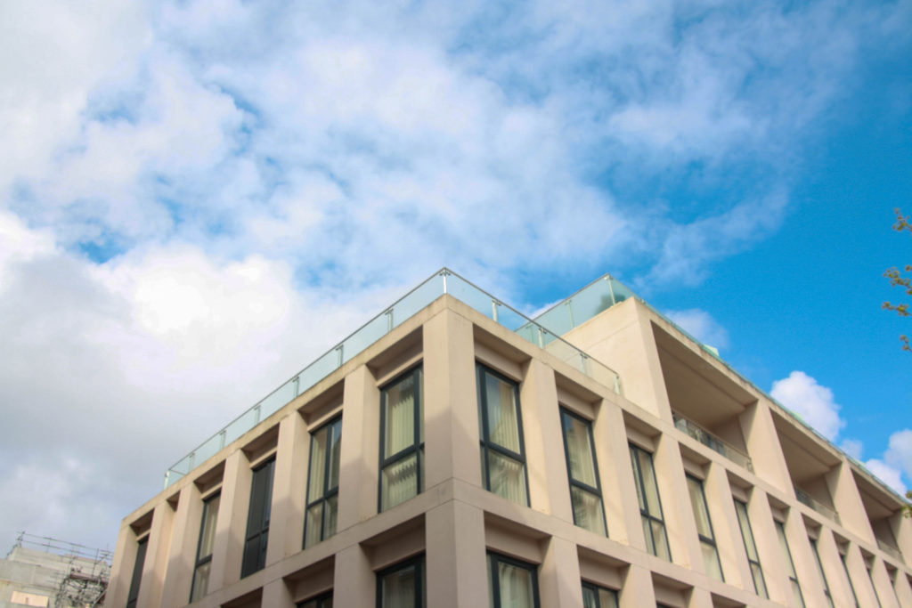
Final outcome using bloggif.com :
For my third outcome I will use these images and others to create a slideshow/gif. I will centre the corners in the middle of each photo using lightroom / photoshop.


Final outcome using bloggif.com :

Contact Sheets
My fourth photoshoot was my smallest, this was mainly due to an idea which I had while in school, these were taken in the studio so that I would be able to have a neutral background to each image.

Sub-Selection
I have used the same selection system as I have in my previous photoshoots, i have used the ‘p’ key to white flag the images that i will be editing and the ‘x’ key to reject the photographs that I wont be using in my final images. As this was quite a small shoot it was quite easy to narrow down which images I will and wont be using.

Editing
In the whole shoot I only made two images black and white as I wanted to enhances the saturation of the colours from the subjects hoodie. The two top edited images are both similar portraits which I wanted to have in different formats as well as showing more of the subjects clothing and body on the right. I have again used a similar editing style so that I will have a cohesive set of images which make a smooth flowing photobook when they are finally presented. For both the black and white images and the coloured images I have decided to decrease the exposure an slightly increase the contrast so that I create a darker background to each photograph while enhances the different tones and colours in the final image.


Final Images
Below are two of my final images in a landscape format, the left photograph is a classic portrait with the subject looking at the camera, posed while the right image is of the subjects back as i wanted to show the different dimensions of the subjects clothing. I like the contrast between the two images as the right image is full of colour which stands out against the dark black hoodie and light grey background, where as the left image in black and white but still conveys a lot of emotion.


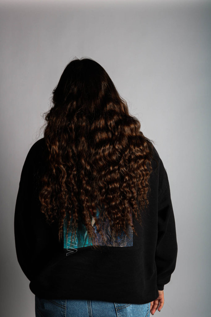
I have as got final images from this shoot in portrait which are quite similar to each other but their are either using different subjects or facing opposite ways. The image on the left is interesting as the pose tells a small story behind the photoshoot, the subject looks like she is looking towards another camera and someone has got a different angle. The two other photographs are back shots i wanted to highlight the designs of the subjects favourite hoodies which they have mentioned in their questionnaires. I turned the middle black and white as I felt that it fit better with the different tones and shading. I also had the subject in the last image have her hair behind her as I wanted to capture the details and texture which was one of the reasons I kept in in colour so that the brown would be enhanced by the lights.


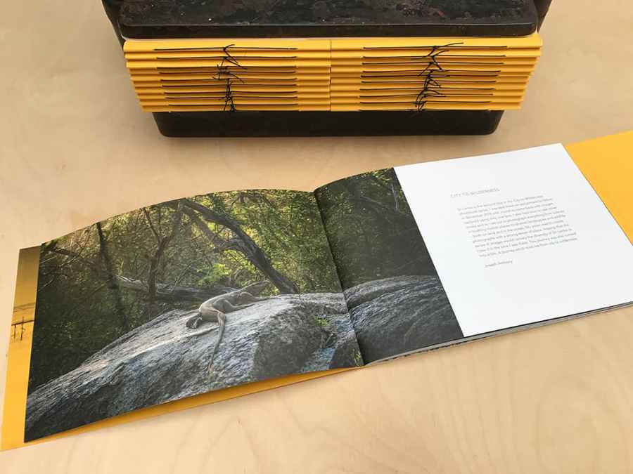
After choosing my final images I created a zine for my final images which be would put in a CD case- to put the zine in a DVD case I would simple have to change the orientation of the zine from landscape to portrait.
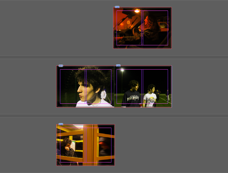
I created this zine using Indesign, I opened a new document and created four pages, I then inserted my images and readjusted them to the page size- after doing this I then made the images fit the frame proportionally to create my final zine. I wanted to make sure I kept the colour scheme of the images connected- as there are only four images the zine (by technicality) can have either set of images as the front and back covers so I kept the images with similar colour schemes together (yellow + orange and green/yellow + green/yellow).
After printing this zine I am going to put it in an empty, clear CD case, for this I have to measure the CD case and make sure the dimensions of the zine fit perfectly into the case- this will make my zine the front, back covers and the inside images: one image will be covered by the CD but for display purposes I am not going to put a CD in the case.
CD CREATING PROCESS
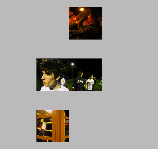
First I created the zine which will be the front cover and the traditional fold out in the CD, this is seen above.
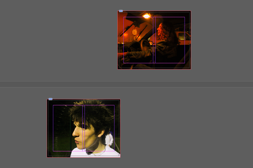
I printed the front and back cover separately as the dimensions are different for the front and back cover of the CD (front- 12x12cm, back- 15×11.8cm) so my second “zine” will simply be a double sided page, The back cover is bigger as to have the image folded so the spine of the CD has imagery in it. I may write a title and track list on the CD but I am unsure as of what to write so this is still uncertain, especially since if I was writing on the case/images it would take away from the cinematic look of the images. Once printed, I inserted the prints into an empty CD case, the final outcome as seen in this blog post.
Contact sheets
For my third photoshoot, I wanted a mixture between naturalistic and posed portraits as well as photographs taken from further away. These images were taken in three different places at different time throughout a sunny Thursday. We first went to a car park in St Clements as I thought the lighting was good and wanted some images with the sun shining towards our faces, these were taken between 5pm and 6pm so the sun had not started setting yet. The second part of this photoshoot was in Green Street car park on the top floor so that i could use the natural light, these were taken in ‘golden hour’. Lastly the third part of the shoot was taken down in a St Ouens car park connected to the beach, I decided I wanted these images to be taken while the sun was setting as I took inspiration from Kayla Varley for some of the photographs included in my shoot. I believe that this was a successful photoshoot as I have found great images that I will use in my final selection.


Sub-selection
I had a lot of images for my third photoshoot so to help myself narrow down my final images I used the flag tool to differentiate between the images that I will edit and possibly use and the photographs that I will not use. I also used the star tool to pick out the ones that I wanted to focus more on while I was editing and which ones I felt that were more likely to be picked out after.

Editing: Photoshoot 3
The editing for my third photoshoot was quite similar to my first and second as I wanted a cohesive style of editing throughout my images, I felt that my doing this my photobook would be able to flow better then if I used different styles of editing.
Below are two of my images which I have kept in colour, for the left photograph, it is shows how the original was over exposed, to combat this I decreased the exposure tool in Lightroom and increased the contrast which dulled down the image helping with the brightness. After I found the level where I wanted my image to be with the lighting, I adjusted the temp tool by putting in slightly in the yellow as I think it gives the image a sunny glow enhancing the overall look. The edited image on the write hasn’t been changed much from the original photograph, I wanted a deeper colour for the car and shadows, to get this effect I decreased the shadow tool and the whites tool in Lightroom.


I have also editing some of my images from this third photoshoot in black and white, for the image on the left I thought that the photographs would fit a more monochromatic look as it is not a normal image of a posed duo, I wanted to enhance the shadows and to do this I decreased the exposure and the shadows. The image on the right was taken during the sunset but was not one that was very saturated, to combat the duller sky I turned it to black and white and I found that it looks better. It is a more casual image which I like so I didn’t do much changing from the original image.


Final Images: Photoshoot 3


Above are three portraits that were taken at green street car park in my third photoshoot. I like how they are all similar composition but have slightly different editing, this helps to make a triptych. In the first image I like how there is a yellowish tint making it seem more golden accentuating the colour of the subjects hair and skin. The middle image is edited a little darker than the two next to it, I enjoy the contrast between the little skin and the darker tones from the subjects hair and hoodie, I feel that this helps to center the subjects face and bring the main focus to it instead of what’s in the background. In the final image I decided to edit the photograph lighter to show the colour off the subjects hair and the different textures. I also like how saturated the colours in this image are, the blue from the sky and the blue detailing on the hoodie help to make a good composition and connection in the image.
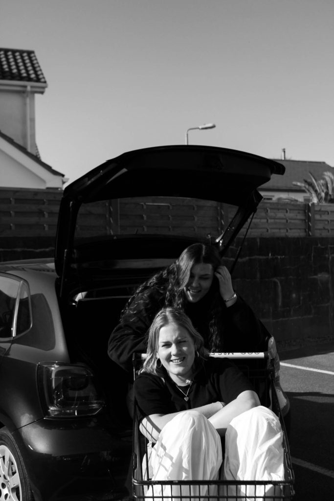


Above are are three portraiture style of photographs which have changed into black and white as well as a singular coloured image. I like the composition of the three images on top as they look cohesive due to the monochromatic similarities as well as the position of the two duo images outside of the individual naturalistic portrait. I feel that these photographs have a great way of showing the story that I am trying to convey through my images, that teenagers tend to be happier and need their friends especially during this stage of life. The first photographs is one of my favorites from this part of the photoshoot as it shows true emotions and has a great composition with the subjects centred with the car in the background. Lastly, I think that the photograph of the individual shoe is quite interesting as it using a great angle from the ground where there is lots of details being show creating a greater message. The lighting also enhances the image as the sun highlights the embroidered picture on the sock as well as the comic designs on the shoe.


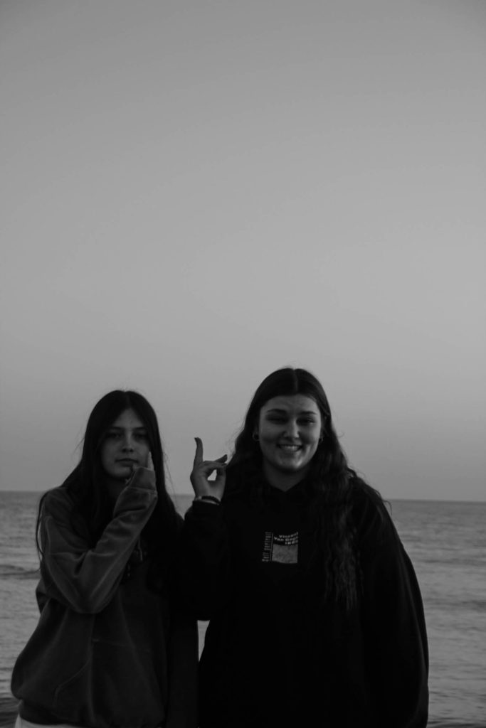
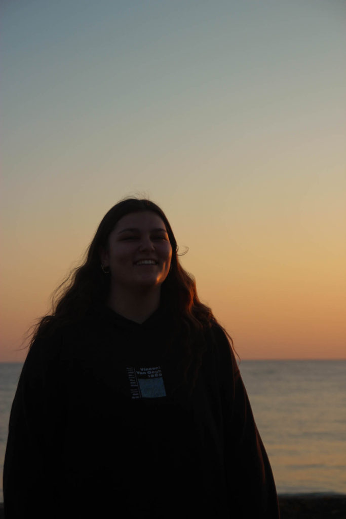
These six images are from the last part of my third photoshoot from St Ouens, I have done a mixture of black and white images as well as keep ones in colour. My top three landscape images are mainly ones to represent the friendship part of my project as they are mostly group or duo images. One of my favourites out of the three is the middle one as I like the composition between the two subjects, where they are both facing away but you are able to see the design on the back of the t-shirt as well as the details and different shading both of their hair. The bottom three portrait photographs are also some of the best from this part of the shoot, the left image is a portraits with golden lighting which helps to accentuate the subjects hair and detailing with the hair style as well as her necklace which helps to break apart the harsh black from the top. For the middle image I found that I wanted to have a classic black and white edit over the top of a funny, more relaxed image, I like how this image can show the dynamic of the friendship clearly as well as the closeness of the friendship.
A key attribute to the idea of simple & complex is the theory of binary opposition. French anthropologist Levi Straus theorized that a key part of media is opposing narratives i.e. good & bad, right & wrong, etc. This is a result of his understanding that the human mind classifies things through binary opposition- the contrasts between two things; so in turn all elements of human culture can only be understood in relation to one another and how they function within a larger system or the overall environment.
This is not only relevant to media products but also to products of the artistic spectrum. For example, people can recognize the major contrast between things such as black and white as well as dark and light. These contrasts are often taken advantage of by artists in order to convey extra effect.
An excellent example of this would be Kristen Regan’s series of images literally called ‘Binary oppositions‘ – in which she takes advantage of the binary opposites of black & white/ light & dark to create some interesting abstract pieces using fluid.
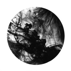
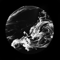
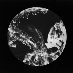
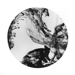
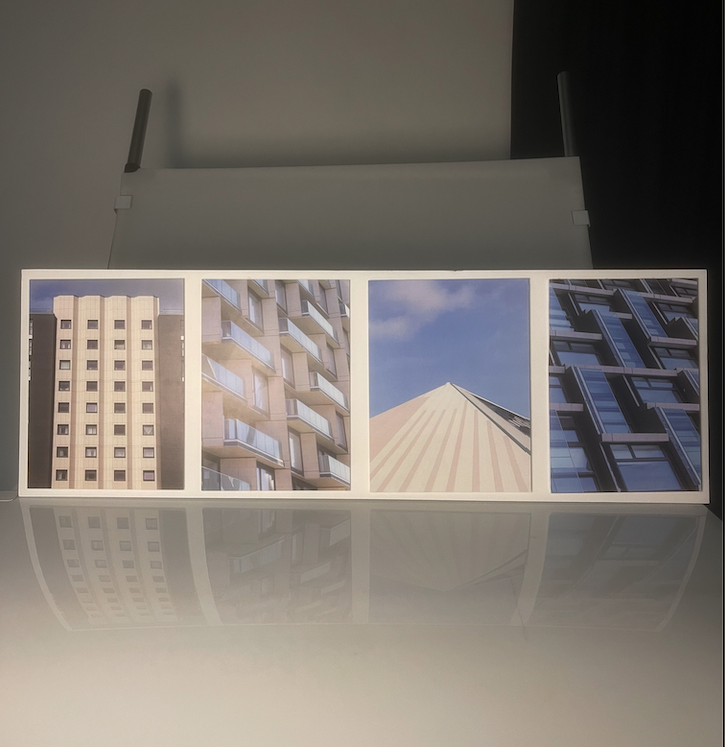
This is a technique I wanted to include in my project, as of course the theme ‘simple & complex is a blatant example of contrasting factors; so I used this contrast to my advantage when framing my final prints in order to give extra effect.
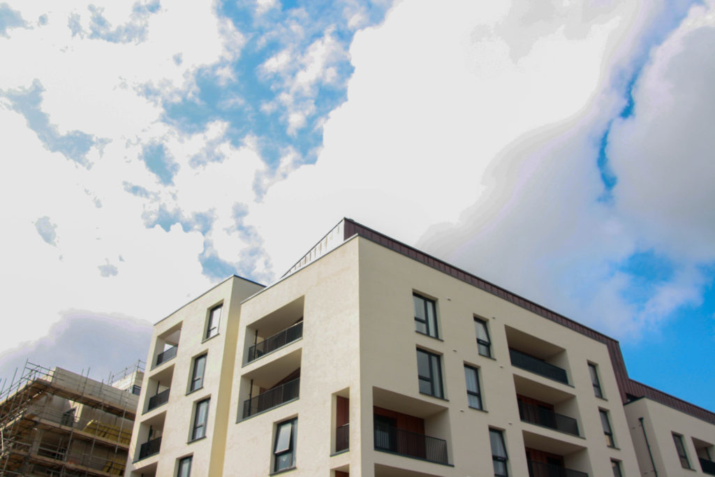
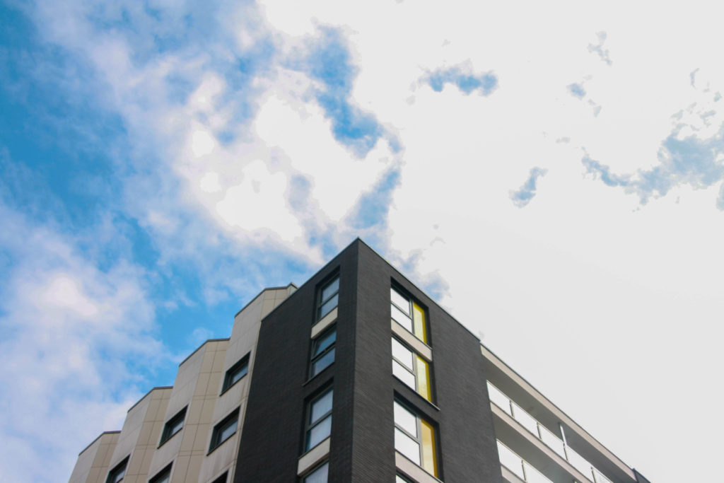
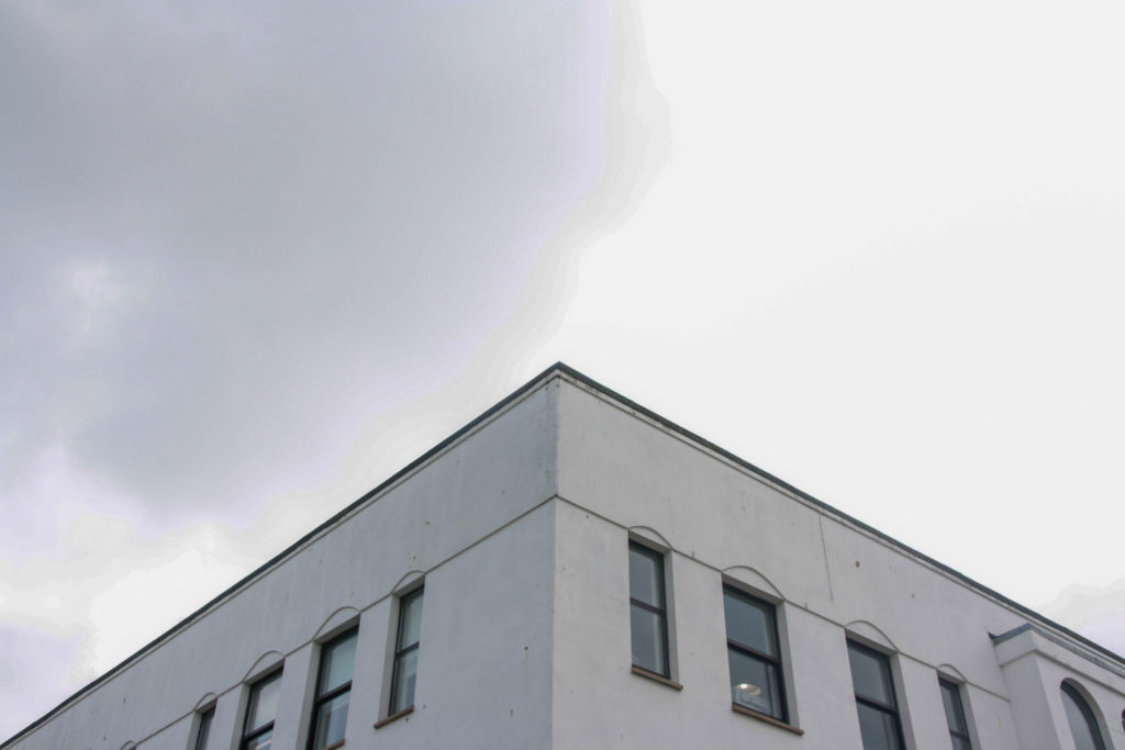
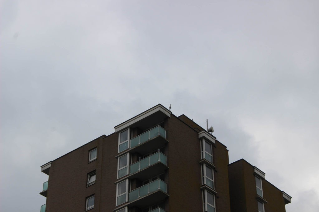
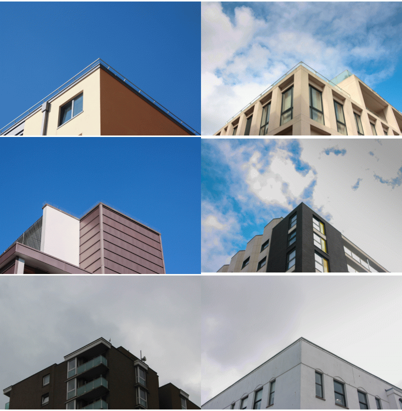
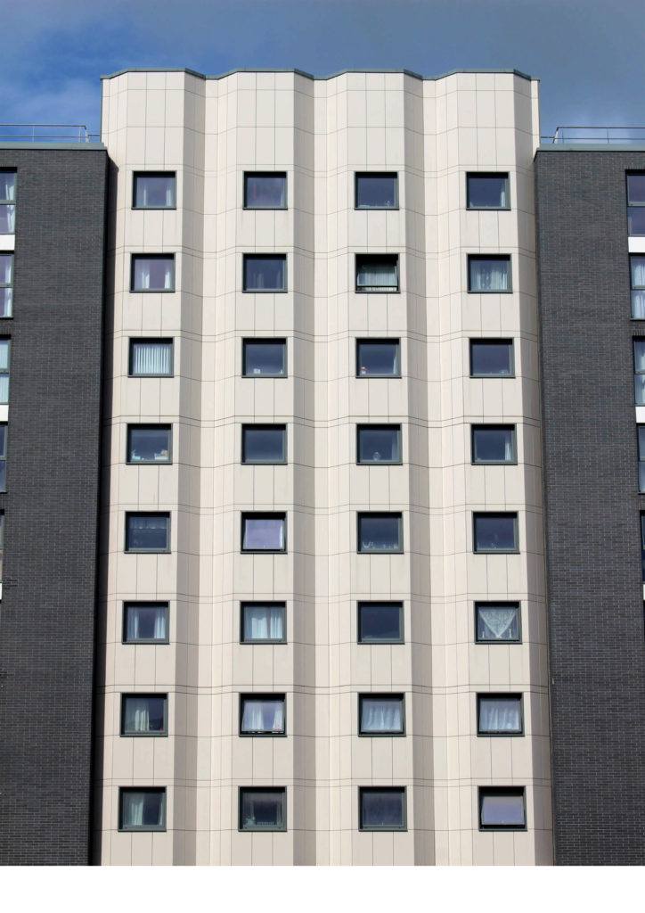
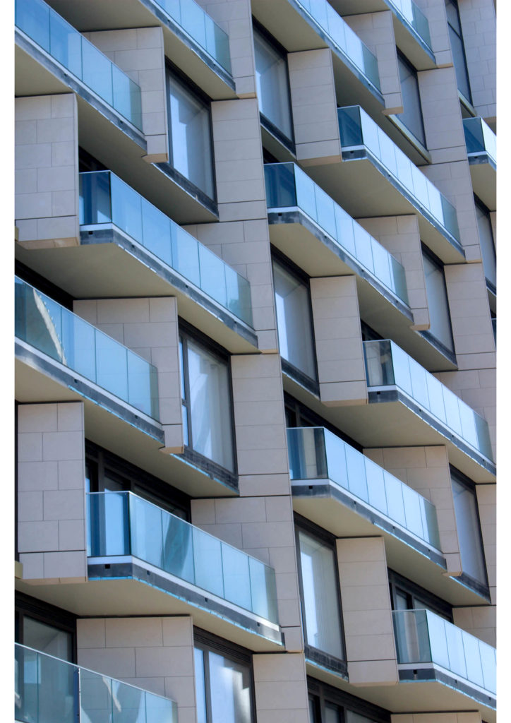
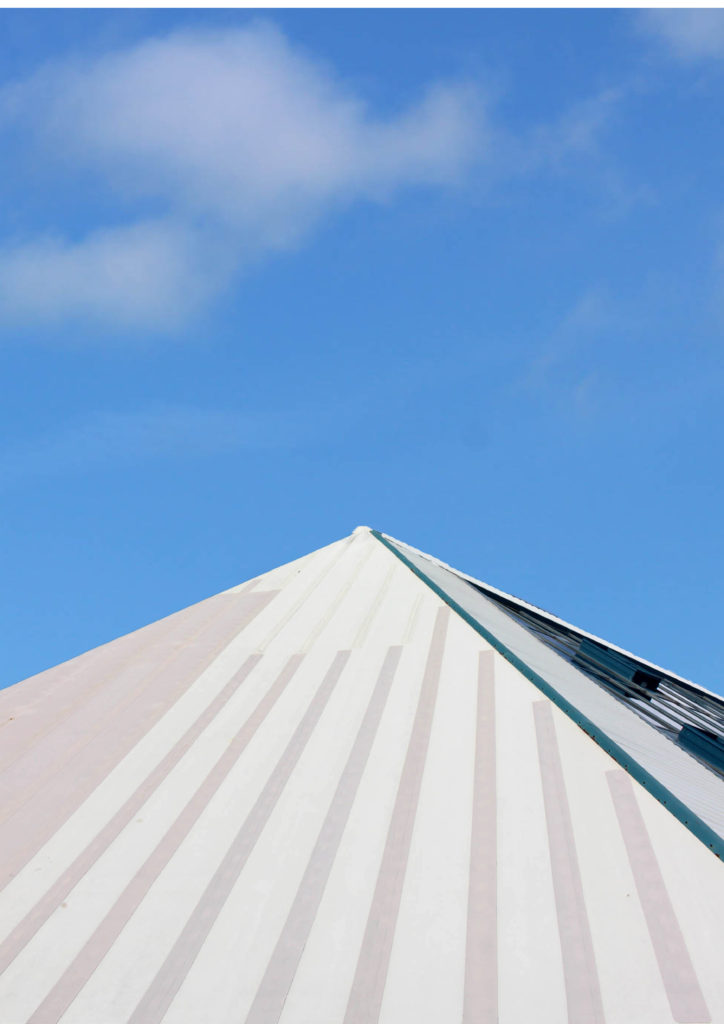
To do this I used 4 images of architecture, 2 of which could be described as ‘simple’ and 2 which are more ‘complex’. After printing to A3 & playing with the order I mounted them onto a large piece of foamboard alongside each other.
Walk in the woods
My story involves a walk through a woodland area, with the literal and imaginary depictions of the setting both being included.
My book won’t be fully story-focussed, as some of the images have little correlation between each other, so it will be difficult to make it the primary focus. It will depict a woodland area, both in a wide view showing of an entire scene as well as the minute details which make up the area.
I would like to use a matte paper for this book as it will give the paper a slightly more rough feel to it. I also think that the lack of a glare will make it easier to see the darker images I will include. As of right now (before creating the sequence/layout for the book) I would not mind using either white or black coloured paper.
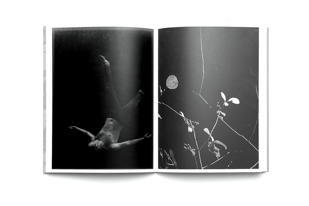
I think a similar size, format and orientation to my previous photobook would work nicely, that being around A4 in size and portrait orientation. The portrait orientation will allow for double and single page spreads using my landscape images. A4 size would be good for my AI generated images due to their very low resolution, a smaller
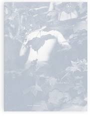
My book will have an image wrap on the cover (shown above), the image includes themes of the dangerous woodland, however I have edited it to have an artificial look, linking with the AI part of my project. I would like my book to be a hardcover, as it would put greater focus on the image and title.
As all of my previous zines/books, I will make my structure of the book as symmetrical as possible, as it allows for an effective sequence and ensures that each type of image (woodland landscape, object and AI image) does not feel out of place in the book.
The book will include double/single page spreads, pages with 2 images on them at once (this is due to the AI image being a much lower resolution compared to the other images). I will juxtapose the AI generated images with the real images that influenced them.
I will not be including any text on the book aside from the title on the cover, the title on the first page spread, and on the spine.

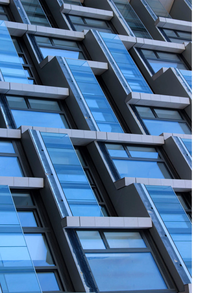
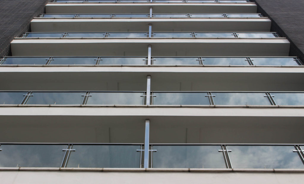
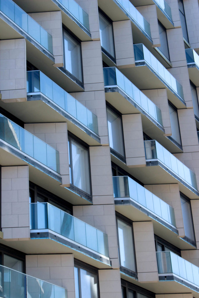
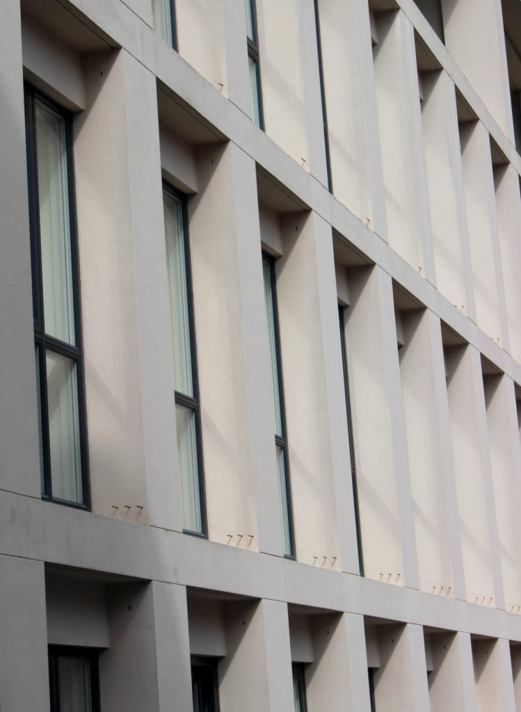
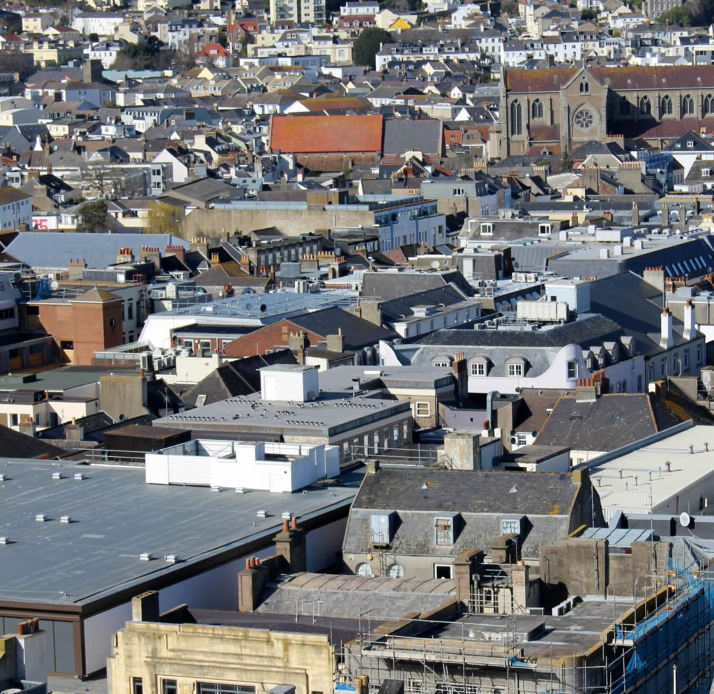
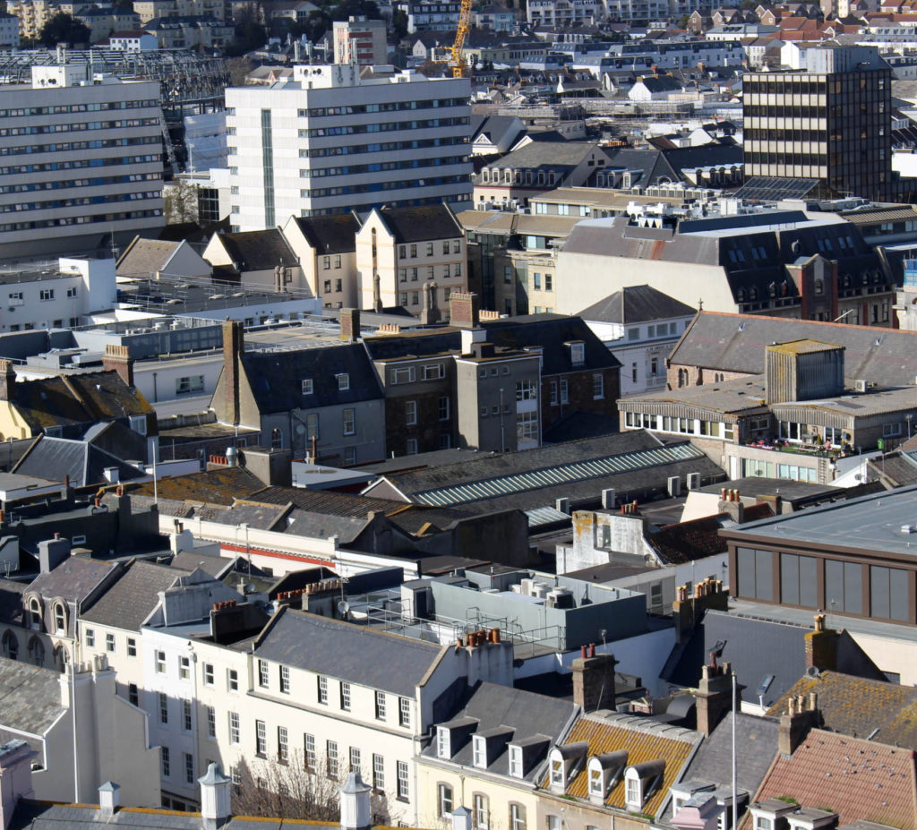
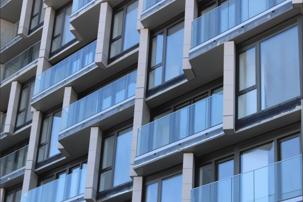
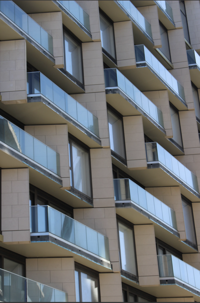
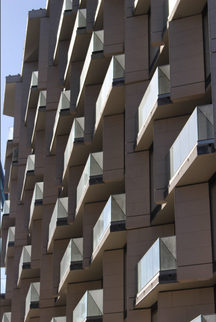
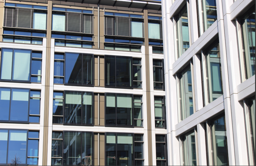
My first idea relates to the theme of complex, and I am planning to create a series of images where I have framed, cropped and warped images of more conplex/ sophisticated buildings to create an abstract piece where you almost cannot tell it is a buidling, and so it comes across more like a piece of abstract art. The uniform nature of modern buildings alongside the straight edges + sharp corners are very good to work with.
A further layer of complexity is added to these images as I captured photos of Jersey’s rising financial district and new housing developments which see large modern buildings being erected almost annually, a focal point in the gentrification of Jersey.
Process
The main part of capturing these images was both finding the right angles as well as the right framing. Due to a lot of the buildings I photographed having a lot of windows needed to find an angle where there wasn’t too much glare- while still keeping the framing just right.
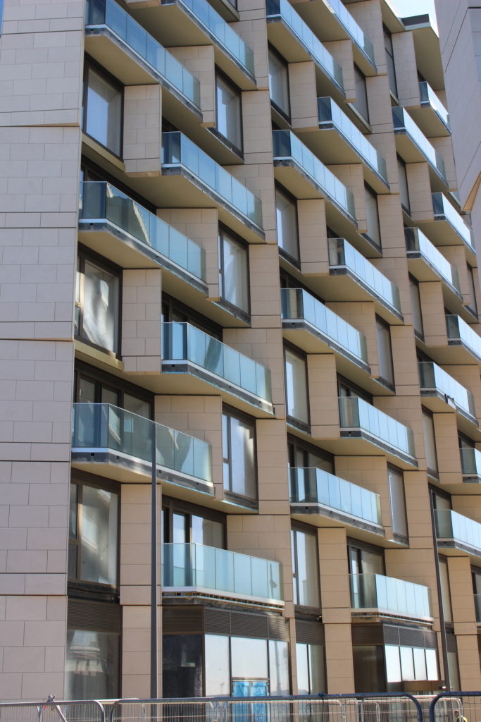
This is an example of one of my images where I didn’t quite get the framing & angle right, as you can see i wouldn’t be able to achieve my desired effect without excessive cropping + the lighting and glare on the balconys doesn’t fit in with what I’m trying to do.
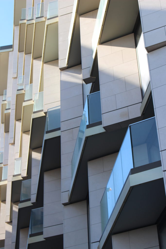
Editing Process
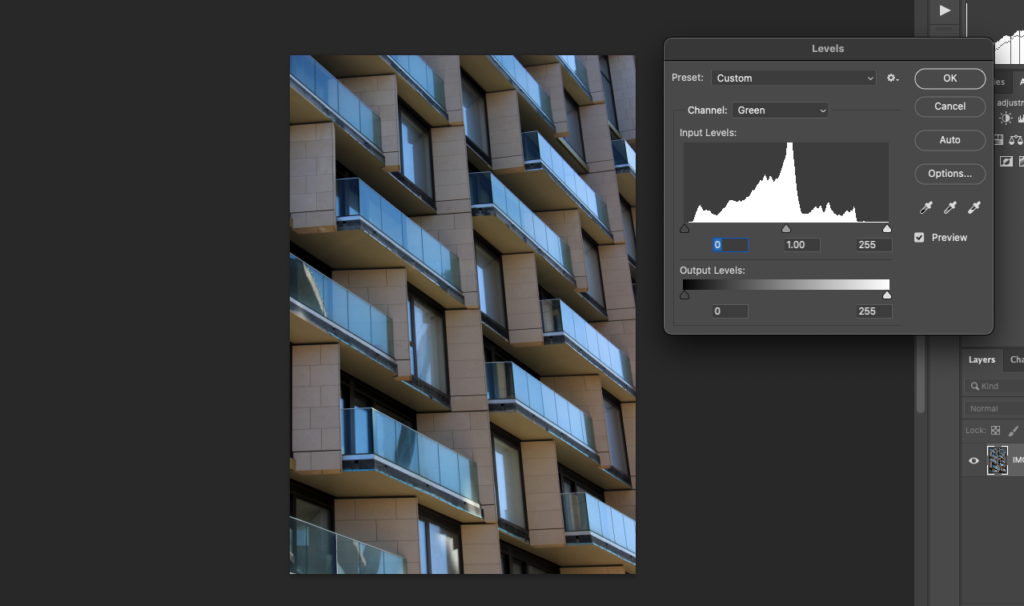
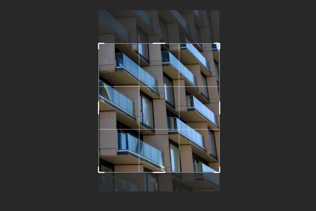
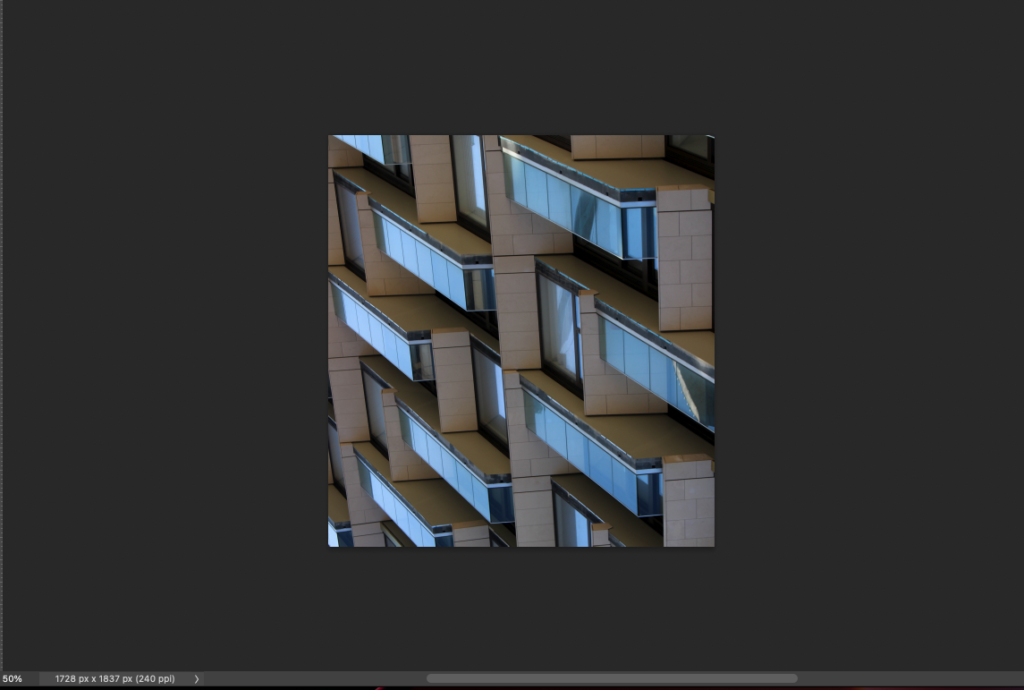
Printed Pieces
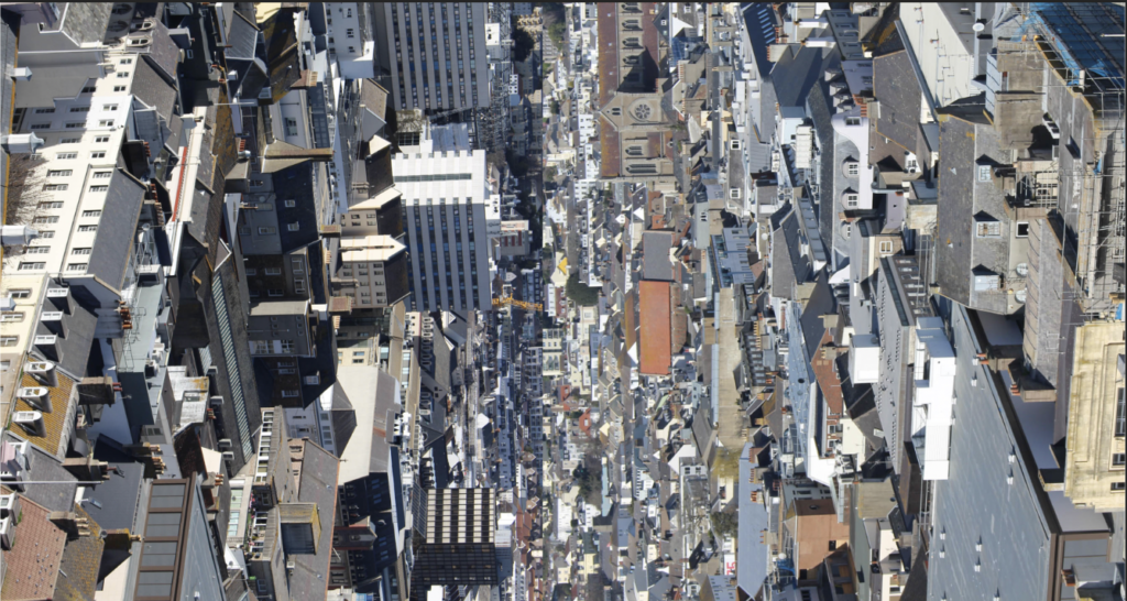
This print is a combination of the below images which I have rotated and put next to each other to create a complex piece where you can’t quite tell what you’re looking at without looking for longer. The Intricate array of rooftops from an aerial shot of Jersey’s town is the subject.
I am pleased with this piece as it portrays exactly as I intended, presenting as more of a complex pattern / abstract art piece rather than a simple landscape photo.
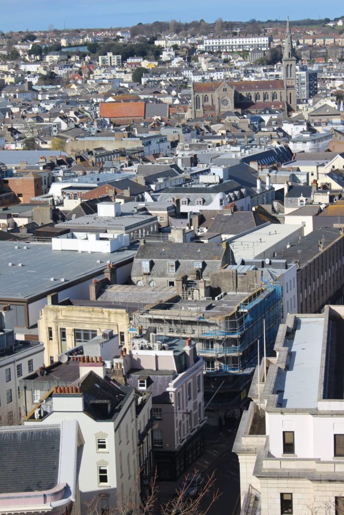
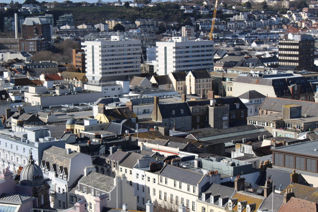
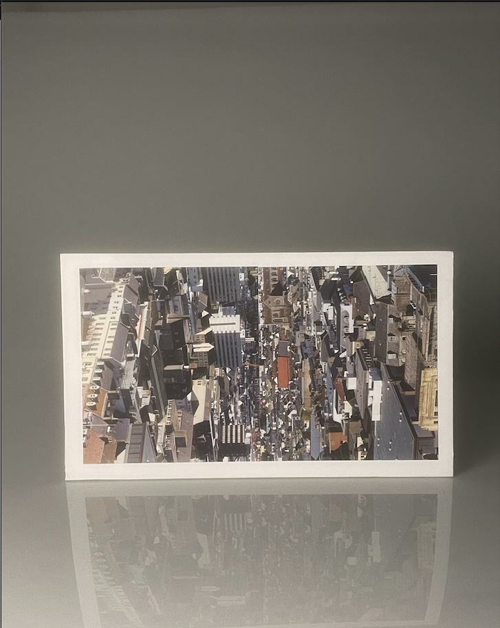
For my second piece I simply mounted a photo of one of the finance buildings, I found that this photo didn;s need much editing as it already had enough complexity due to me framing two buildings into one photo in a way that sort of merges them together.
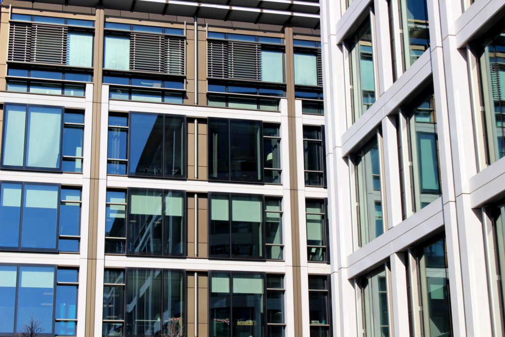
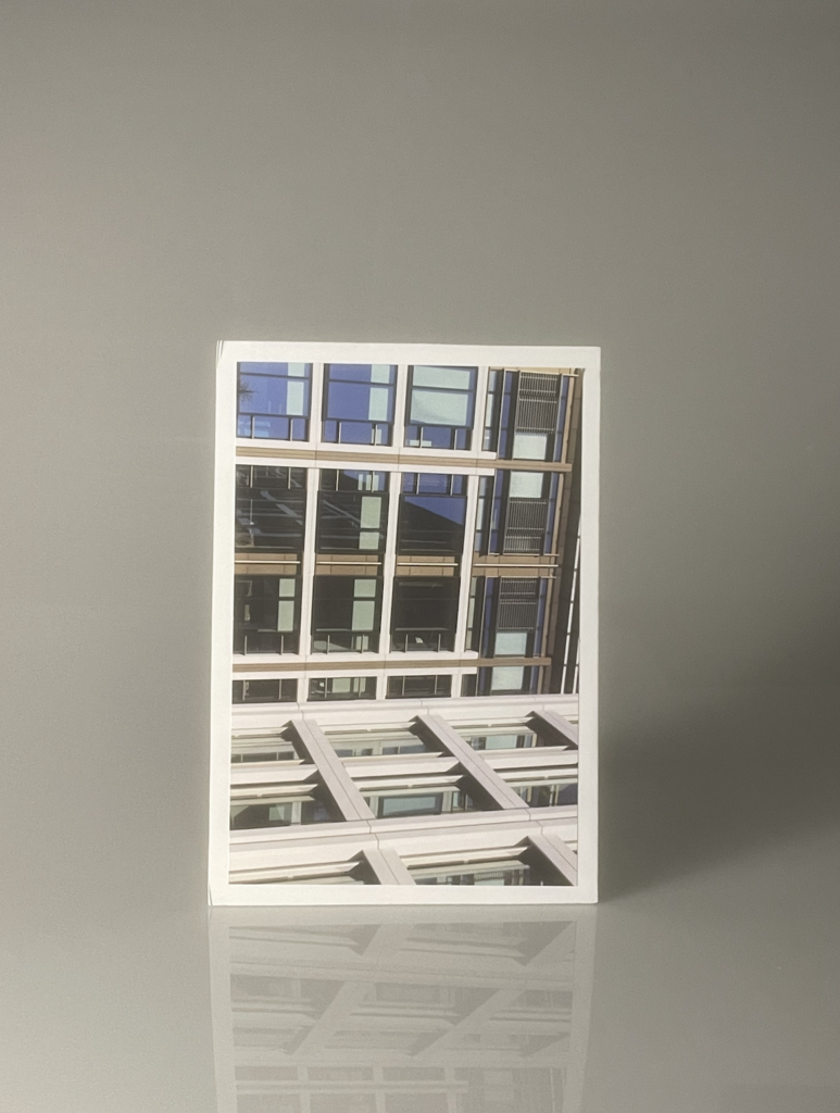
In the end the only thing I changed was the rotation of the image, to make it fit in more with my attempt at making images of architecture that come across more as patterns than buildings which I think was successful.
Images that I’m going to print



Layout experiments
Same layout with different coloured backgrounds:

Different layout with different colours:
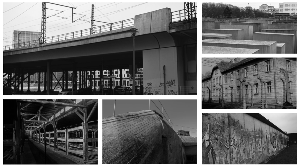
— Final choices and why I chose them —
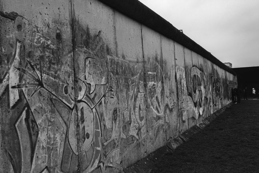
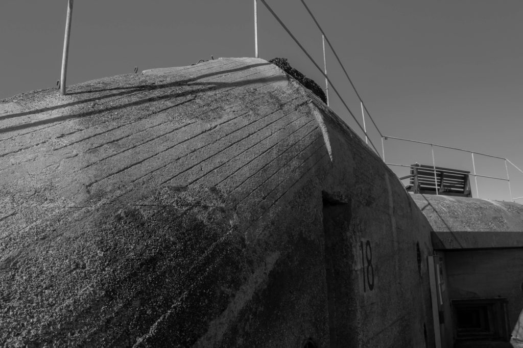
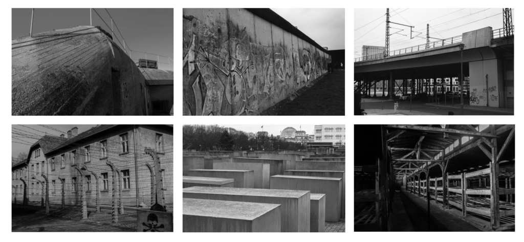
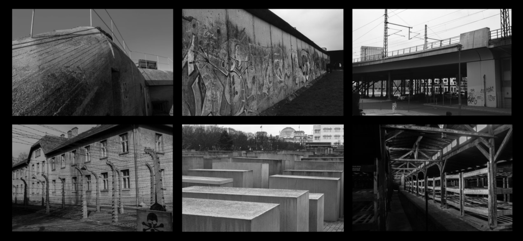
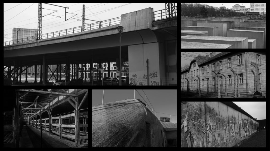
For my first photograph, I ended up photographing a picture of the Berlin wall way after it was built up and knocked down. I enjoyed the overall look of this photograph as it gave off quite a freeing image as it is extremely damaged and has also been vandalised, indicating that people have the freedom to do whatever they want to it and to show that it is no longer a worry to them. I wanted to take the photograph at a different angle so that I could show off the extent of the size that it is, photographing it at a sideways angle made me think that I was managing to get a feel of how large the wall is.
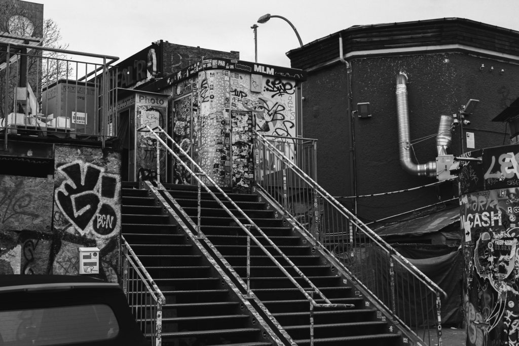
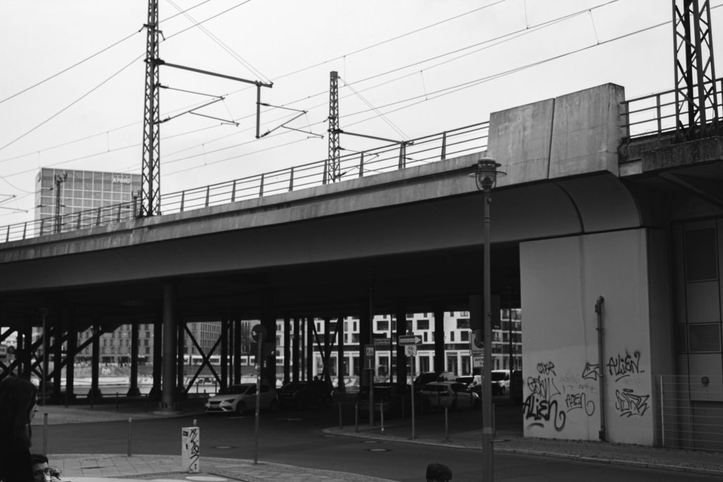
For my second photograph, I decided to photograph an almost urban location from within Berlin as to show what the city looks like nowadays after the events of the war. I wanted to follow a similar editing theme to that of the first one by making it black and white. I was heavily inspired by Michael Schmidt with this photograph as I mainly focused on the urban aspects of the city rather than the rural areas which is something the Schmidt has showcased in his book “Berlin nach 45”.
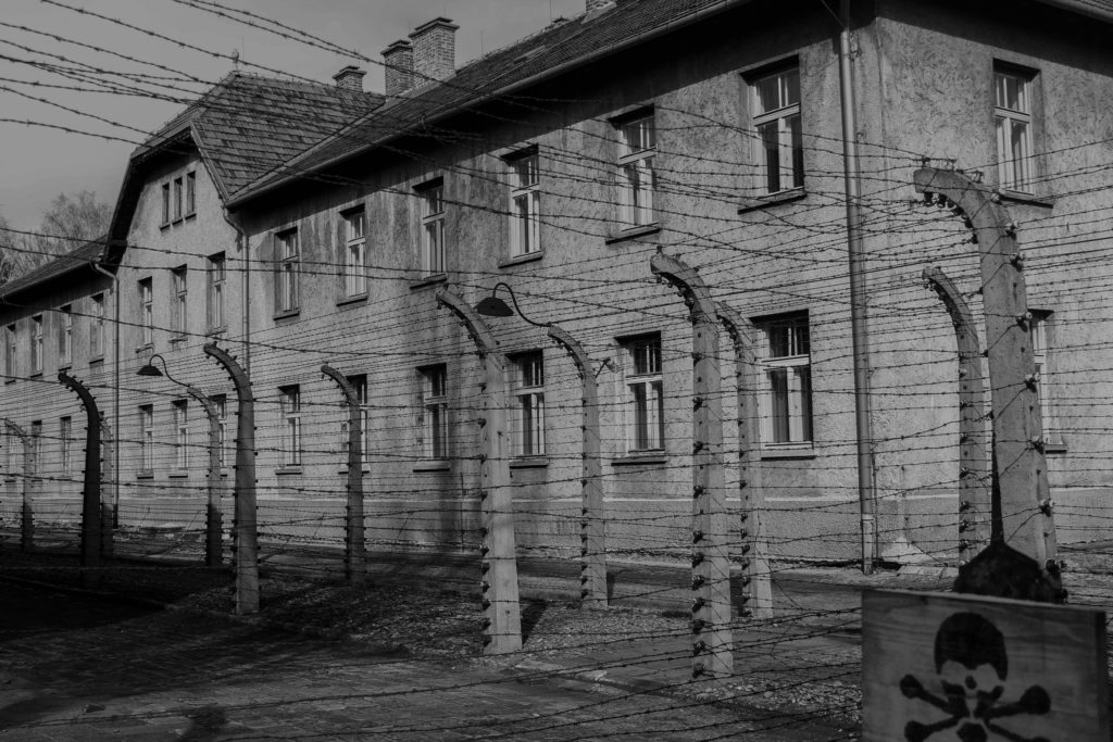

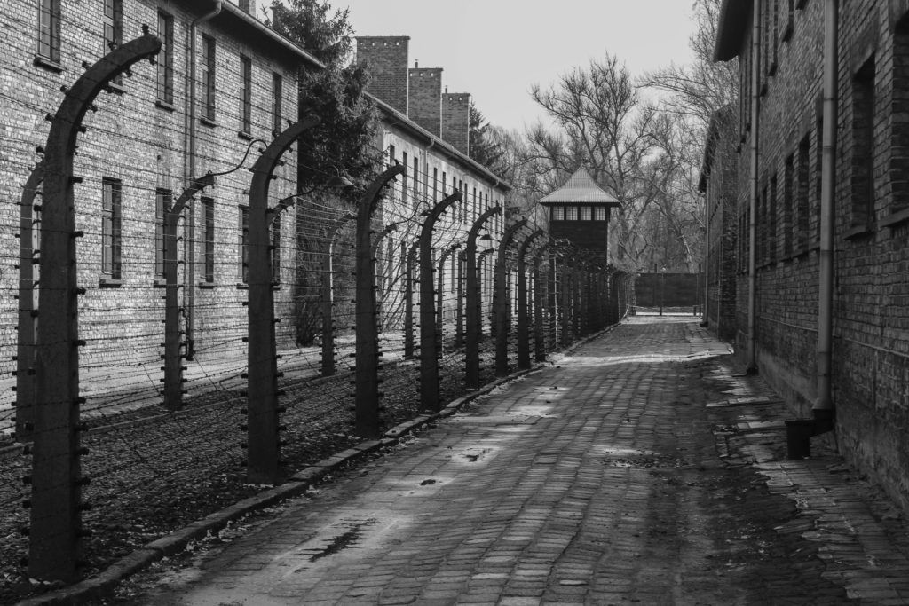
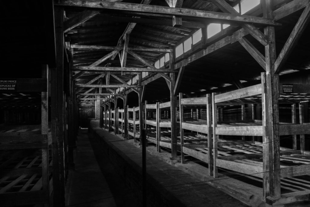
For my third photograph, I ended up following the same approach with the style of the image to the first and second image. For this image, I decided to photograph within Auschwitz and I really wanted to display the building in the background followed by the barbed wire in front of it. I once again took inspiration from Michael Schmidt when editing my image, maintaining the eerie sense of this German occupant concentration camp. Michael’s work tends to consist of buildings within the area of Berlin that are manufactured or improved after the events of World War II. His images tend to be quite simple but I went for a more complex approach by containing more into the image such as the barbed wire overlapping over the building in the background.
For my fourth photograph, I decided to photograph the alleyway between one of the buildings in Auschwitz and the barbed wire that was used to prevent anyone from escaping the facility. I wanted to capture just the sheer amount of fear that the victims of this concentration camp would have had to endure by enhancing its terrifying layout of the location. Once again I decided to add on a black and white filter, just to make the image look a lot more dispiriting and to show the negative impact this has on the society.
Physical prints – Mounting my photographs
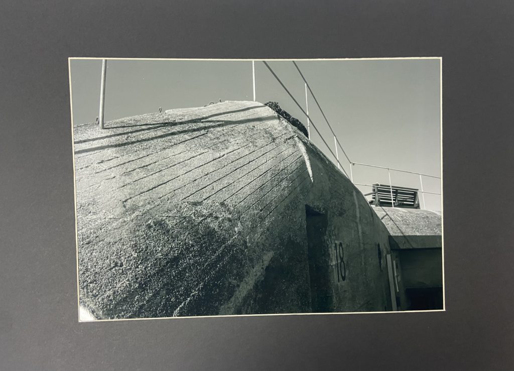
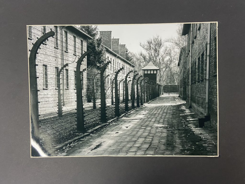
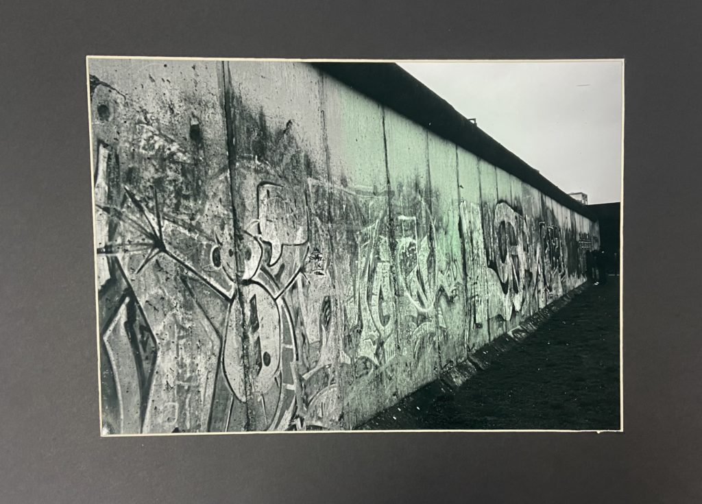
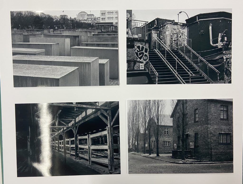
Here I have a selection of my physical prints which I have mounted up and laid out. I wanted to take an image from each photoshoot and print them off as an A3 image as to really illustrate the large impact given off at a large-scale. I wanted to highlight their importance so I made separate window mounts for each image so that they are their own thing but can also come together in a series.
After mounting my large A3 images, I went onto laying out my A4 images by first laying them out on both a black and white background to see which one I much preferred. After selecting which one I wanted to use, I grabbed some foam board and spray mounted an image onto the board and cut around it as to create a lifted image. I repeated this for another image so that I had two in total, I wanted to have two lifted images and two completely flat images on the board.
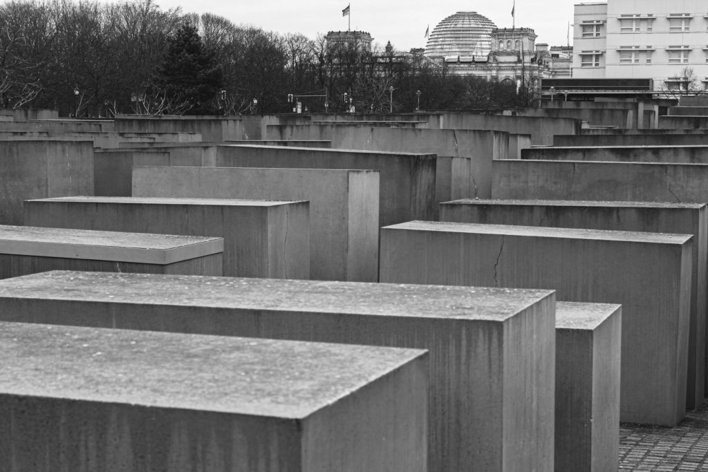
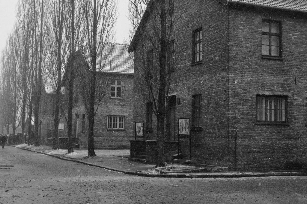
Below I have another example of a print layout experiment that I ended up doing as to finalise what colour I wanted to use for the background of my images. I ended up choosing white in the end as I thought it complimented the images more than the solid black.
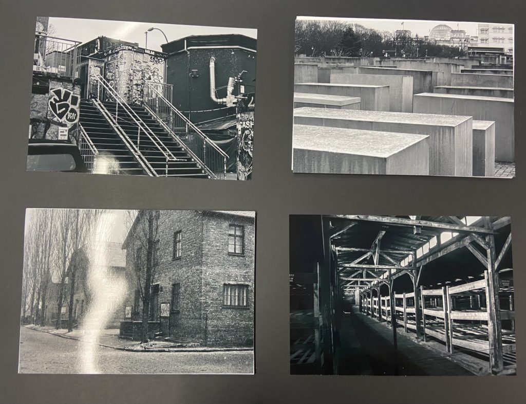
After my images had been printed out, I began mounting them up based on my plans.
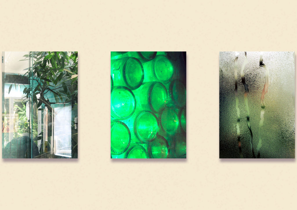
I started with these three images, trimming them down and sticking them to foam board to create a simple display. Unfortunately the colours came out a little differently in the print, especially the middle image of the green bottles as all of the images appear more yellow-green than green-blue.
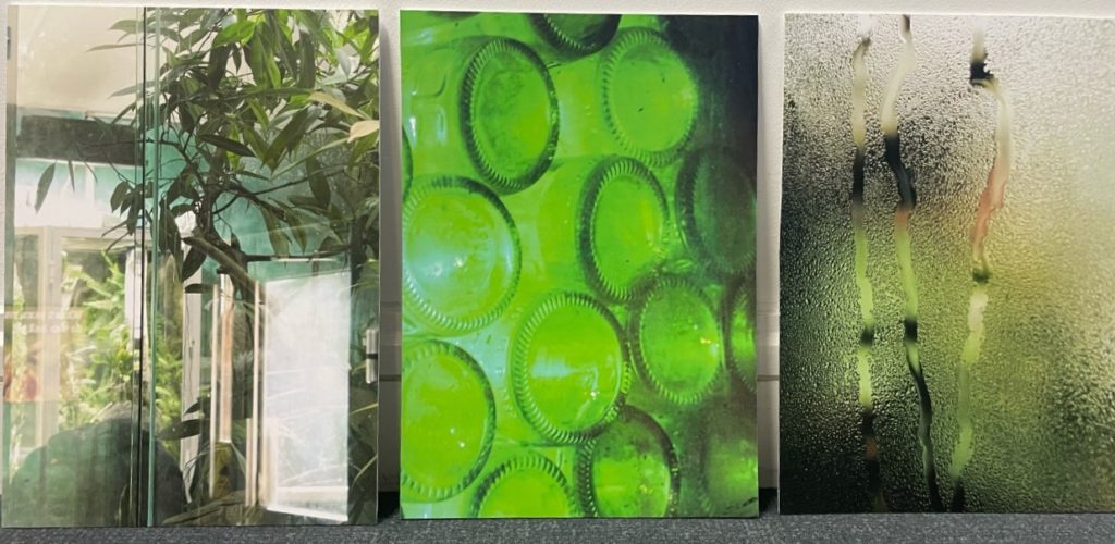
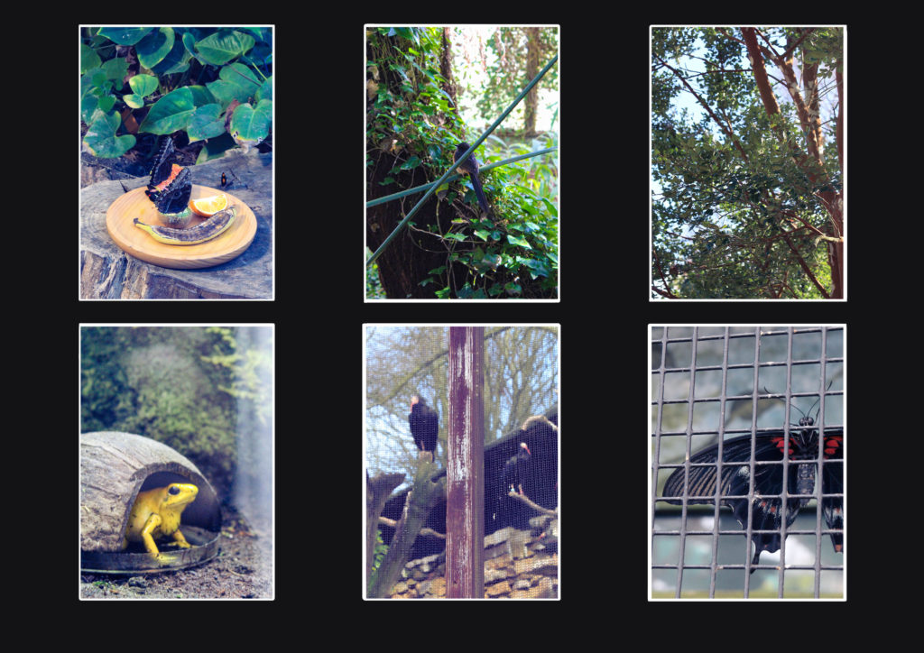
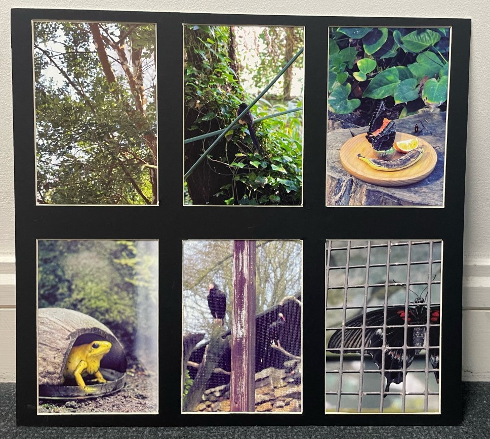
I then began working on my 6 image window mount. This was difficult to make because of the detailed measuring needed to create a successful display. It took me a while to figure out but I am very happy with the final display. Unfortunately when placing my images inside, two of them got switched by accident but it does not effect the final version too badly.
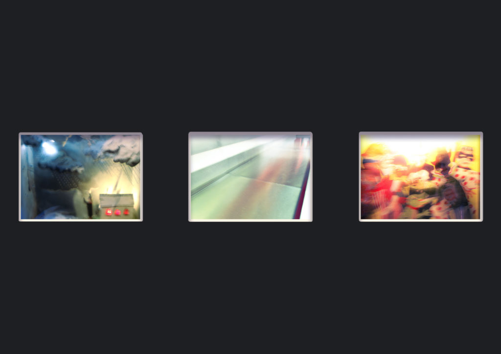
While I was originally going to create this display as a window mount, I changed my mind when it was time to assemble, instead placing on foam and then putting it against the black background. I feel that this is more effective as there is a higher contrast between the plain background and the detailed abstract images. This change is also partially because I was having difficulties placing three A4 images on one piece of paper in a pleasant layout.
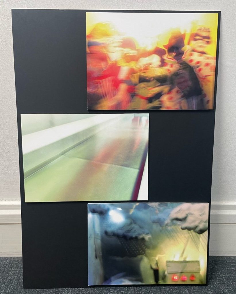
I also made another triptych that was unplanned, I decided to pick two images with similar colours and juxtapose them against an image with contrasting colours.

Overall I am very happy with my final image displays, despite the slight colour change in the prints, I feel that they show off my photographic style used in this project quite well and make interesting displays.
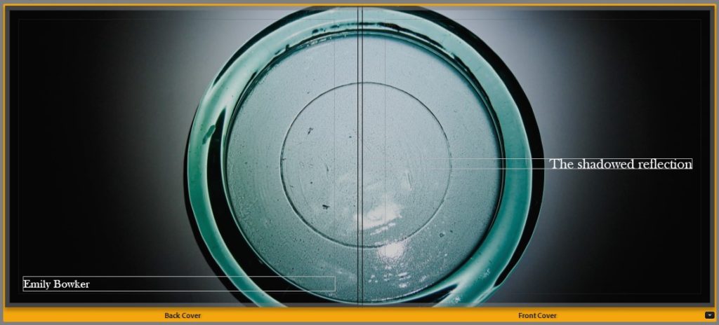


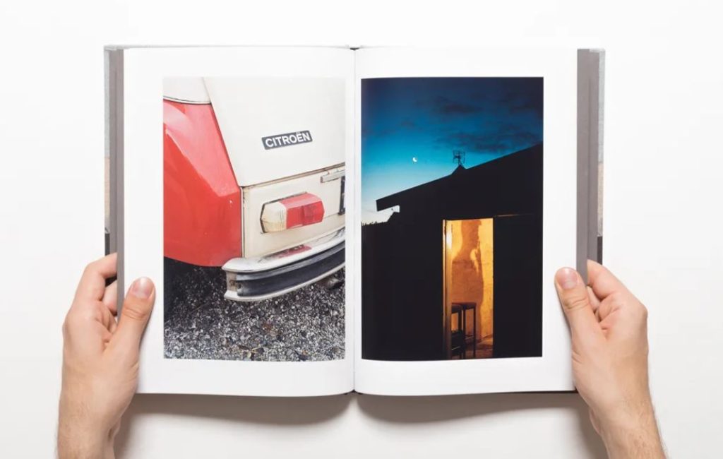
This is the final layout which I have chosen for my photobook, this process involved organising and sequencing my photos by hand which I then inputted in to Adobe Lightroom where i experimented with a range of different layouts for each page and my front/back covers. I am happy with how my photobook turned out because I like how it shows the simplicity of still life through the photobook layout consisting of just photographs with no text as you are able to see the different abstractions of shapes/shadows/reflections/colours/etc which was the main focus of my photoshoots – due to the inspiration of my previous case studies of Andre Kertesz, Paul Outerbrige and Jaroslav Rossler – and this was created through the editing of my photographs afterwards as there is a continued flow of circular and square shapes throughout the book along with different colours such as browns/oranges/reds/pinks/purples and the use of the black and white filter which can be found in many photos taken by my artist references as well. I also think that my title for my book is very unusual as it is ‘The shadowed reflection’ this initiates a lot of mystery in to what the photobook may consist of as shadows don’t typically have reflections and the use of the word ‘shadowed’ indicates that it may be hiding something about the photos, as this is what a shadow typically does. I think that my photobook also represents my photobook references which I used for inspiration well which were the Vagus magazine and ‘Breakfast’ my Niall McDiarmid as they both showed the simplicity of images which had elements of reflections and shadows throughout as well as the incorporation of different colours and how vibrant they may be.