Category Archives: Uncategorized

Filters

Author:
Category:

Creating a virtual gallery

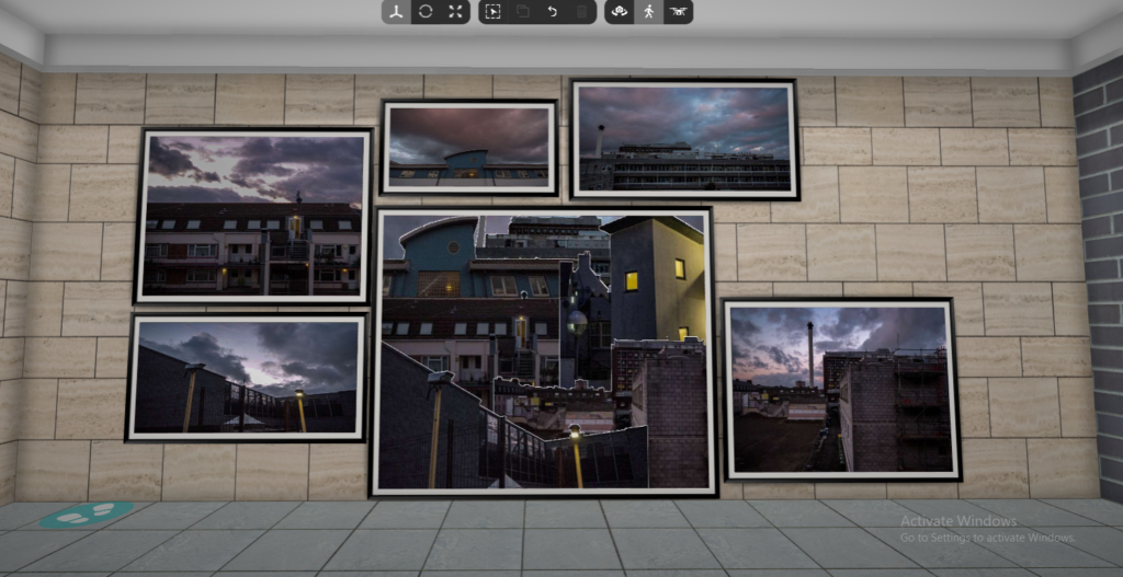
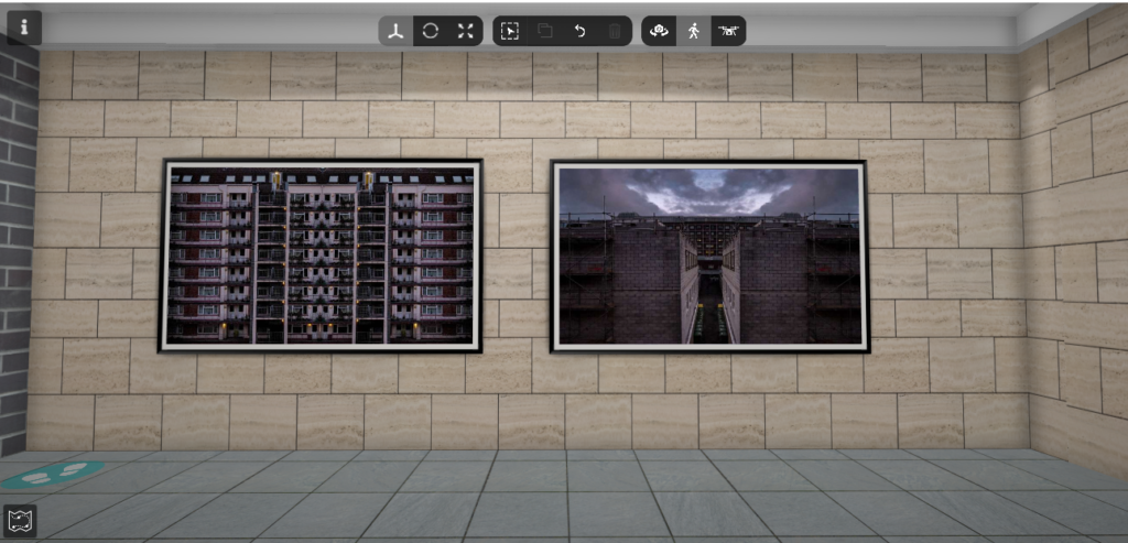
The gallery which I have chosen to use and why –

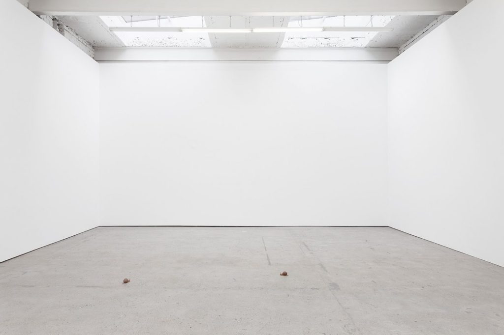
This is the gallery file which I have chosen to use to create my virtual gallery to present a few of my images with. To find this, I searched on google for an ’empty gallery file’ where I chose the one which I liked the most as I thought that it would work the best with my images. This is because the gallery has a plain colour scheme and there are 3 walls, which makes it simpler when placing the images in photoshop, I also like how there is a natural effect of light in the virtual gallery due to how bright the room is.
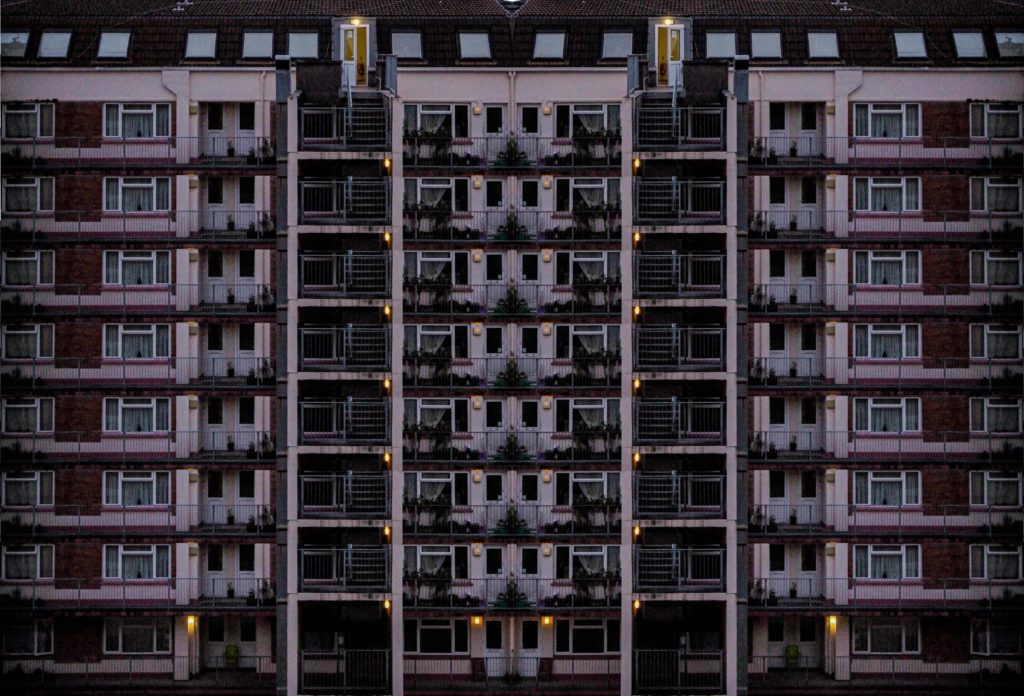
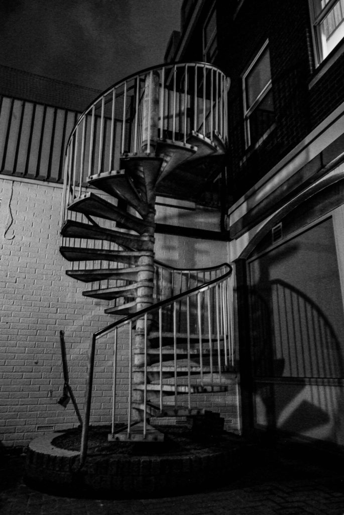
Image selection –

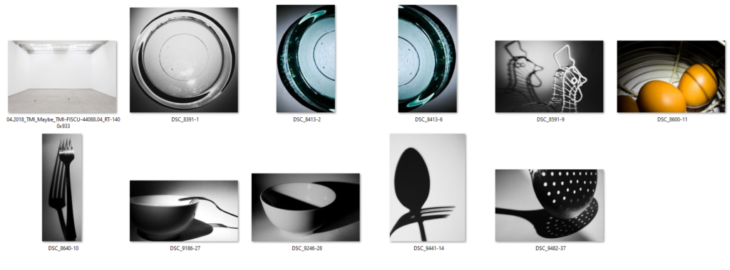
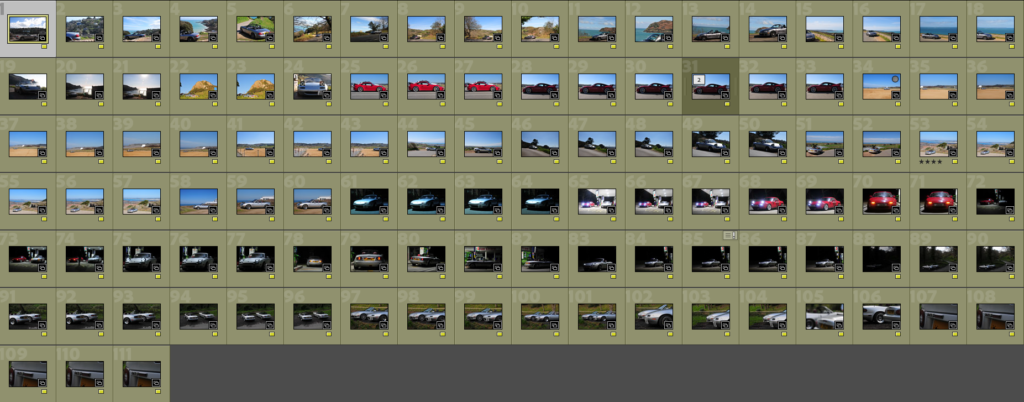
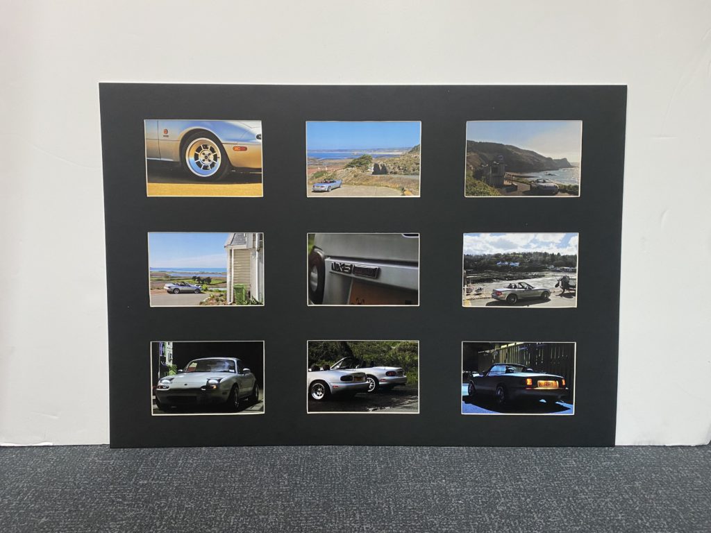
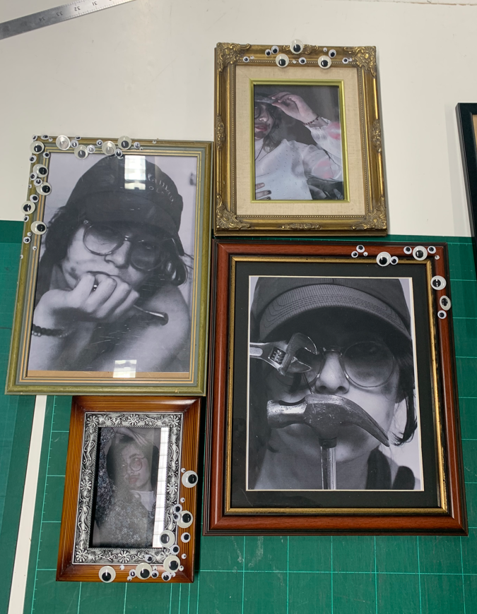
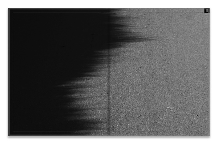
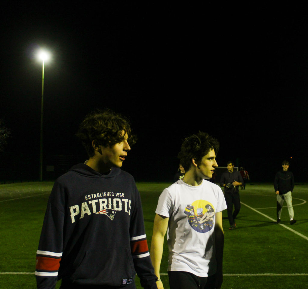
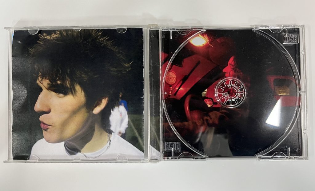
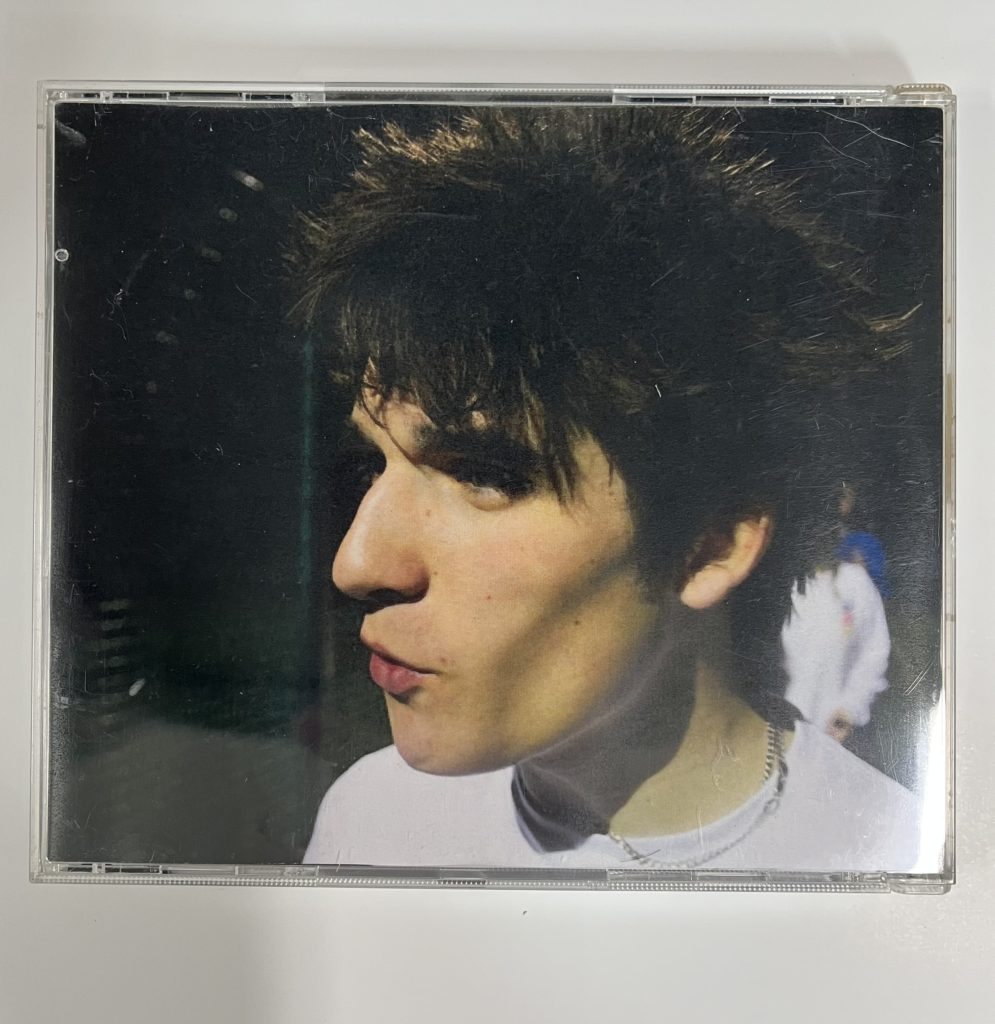
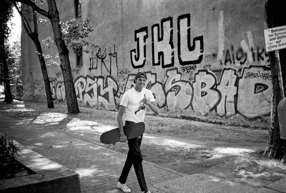
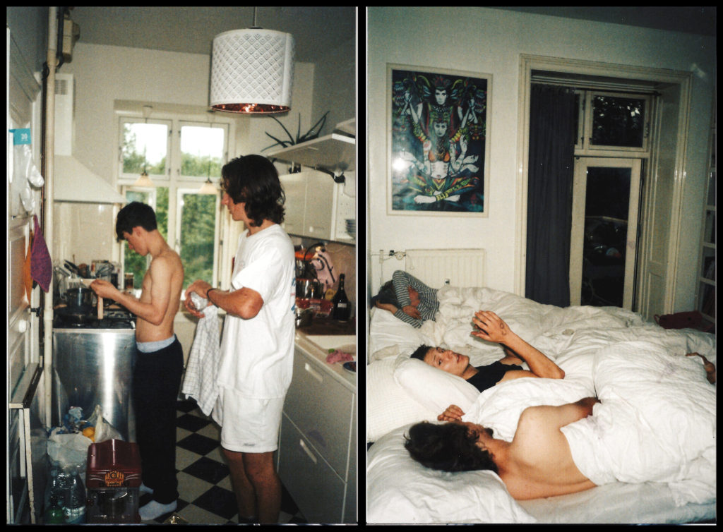
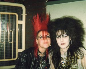
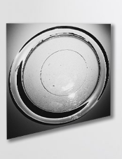
These are the images which I have selected as potential images which I could use in my virtual gallery, I decided to start with a wider range of images as it gave me more choice when inputting them into my virtual gallery. As you can see below when I begin to edit the perspective and add a drop shadow to my images I decided that I would use 4 images which I thought complimented one another quite well due to their colours which were black and white and bold shadows. The reason why I decided not to use the images with colour is because I wanted to keep the gallery to have a simple and almost ‘clean’ aesthetic, due to how simple the pictures are in relation to the theme of still life, and I thought that if there were images which featured colour I thought that this would make them appear to be quite messy, which I did not want to happen.

Placement –

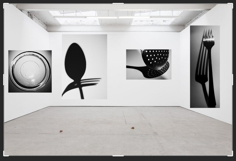
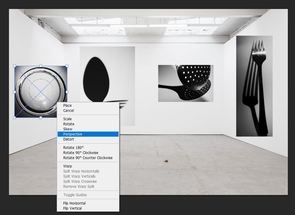
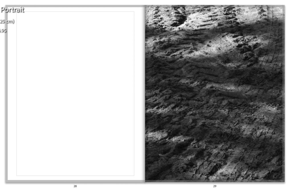
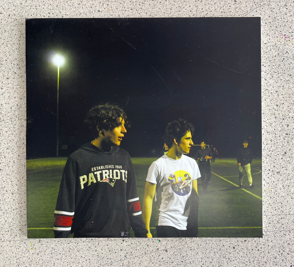
This is the placement which I decided on for my images, this was done through the process of deciding that I wanted to have only one image on wither side of the virtual gallery walls with two images in the middle as I did not want it to feel as if it was too crowded with a lot of different images. To edit the perspective on photoshop of the images to give the effect that they were mounted on the wall I selected the images using ‘Crtl-T’ which brought up free transform which allowed me to move the image to the selected area, then I right clicked it which brought up a selection of different options and I chose ‘Perspective’, this allowed me to alter the angle in which my images appeared on the wall due to adjusting the placement of the sides and how big or small it needed to be on either due to how the effect of having a photo mounted on the wall would look. This process was relatively easy to carry out and I repeated it for the rest of my images as it prepped them well to add a drop shadow on to them later on.

Adding a drop shadow –

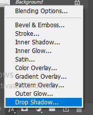
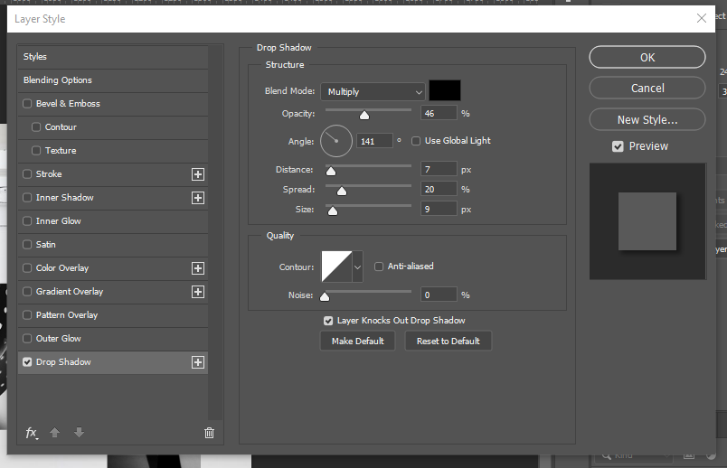
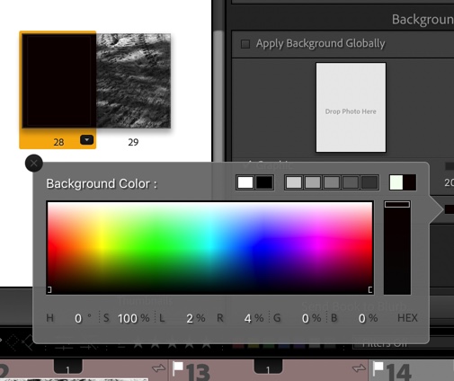
This is the process which I used to carry out the effect of adding a drop shadow on to my work. I began by selecting the image which I wanted to add the drop shadow too and choosing the ‘fx‘ button which is in the bottom right hand corner on photoshop which brings up this menu where I chose the ‘Drop shadow’ option. This then opens up this menu; this is where I am able to alter the angle of where I want the shadow to fall on the image to give the effect of lighting falling on to the image, the opacity of how bold I wanted the shadow to be, the distance and the spread of how far I wanted it to fall out beneath the photograph, for my images I chose a small distance and size as the images were already in black and white and I felt that having a large, bold shadow would make the image seem quite overpowering due to how big the shadow may have been.

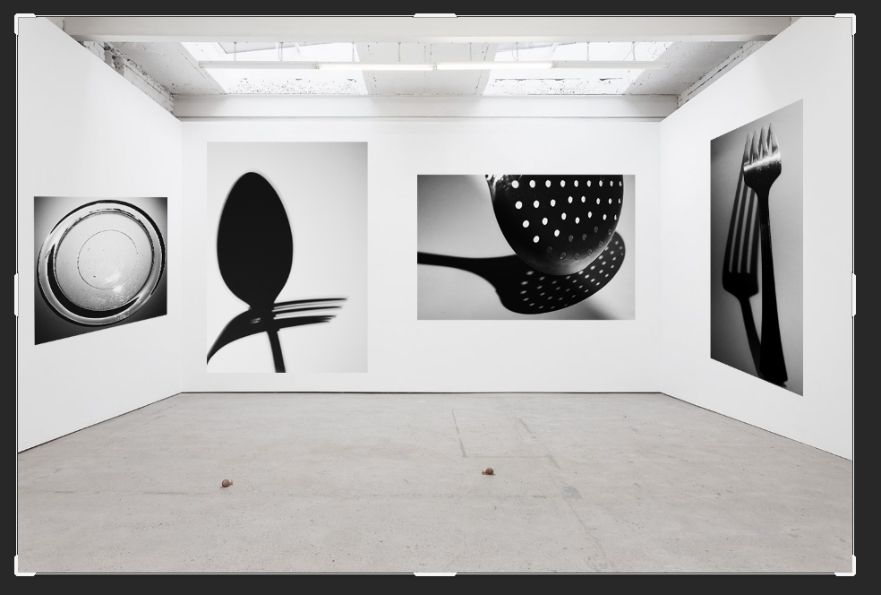
Final outcome and evaluation –

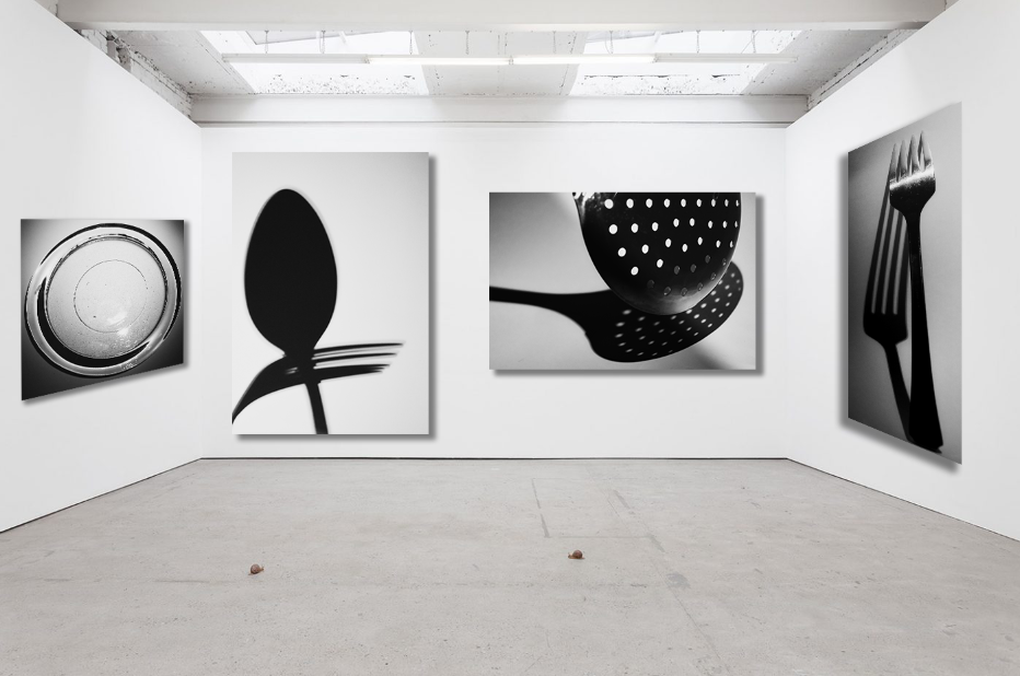
This is the final outcome which I have created on photoshop for my virtual gallery, I am really happy with how this turned out because even though there is a small selection of my images which I have chosen to use I think that it represents different shadows and how they have been created due to the different lighting in each photograph. I also like how the images are slightly grey in against the wall, which is white, because this makes them seem as if they are actual mounted prints of images which would appear bigger if you were looking at them in real life, this is also emphasised by the use of the drop shadow.

Overview of personal study

Artist Comparisons

Below I have showed how my work is similar to the work of the three artists that I have studied, this is to show that I have taken inspiration from them throughout my project, and during photoshoots considered the different kinds of shot they take. This is important as these artist guided my photography in this project and allowed for me to create more successful outcomes.

Firstly, I am using this image of my dad’s couch to compare to the work of Alec Soth, I think that if my photograph would of been more widely shot, then it would of been more similar to the photograph of the left of Soth’s. The images are similar as they both show areas of relaxation and have blue and grey tones throughout them. However, my image would of been a lot better if they lighting would of been consistent.

In my opinion, this comparison is the closest example of me taking inspiration from artists, as this image of my brother is very similar to the one from Matthew Finn’s ‘Uncle’ project. This is because how they are facing away from the camera and towards the right. This is my most successful artist comparison, and the original image has been featured into my photobook as it is one of the best photographs taken from my first photoshoot.

Printed Images and Framing Up

To finish off my project, I have below shown some of my final images, with small evaluations and then photographs of them after they have been mounted up and displayed. This is important as it demonstrates how much my project has developed and how from the photoshoots to the printing, my personal study has been successful.

I really like these two images together, the overall tones of the images are similar as there are warm, especially yellow, tones throughout both of the photographs. Also there is link within these images as both my dog and my brother love the beach and have spent a lot of time there with me as we all love to go in summer, the composition of image one is aesthetically pleasing as I have cropped the image so that my dog and brother are right in the middle. I also think that the lighting throughout this image is consistent, as I placed both of them next to a large in order to try and get the optimum lighting. The second photograph didn’t need much editing at all, this was because the natural tones of the beach and rocks was good already. I only changed the vibrancy of the image to make the rocks look less dull.

These images are among the most successful mounting that I have done for this personal study, this was because they linked perfectly together and could either be displayed on black or white. I thought that black would be the best option and it makes the background amongst the tree look brighter, and creates more contrast throughout this piece. Putting this photographs in monochromatic make them appear as if they were a lot higher quality, and helps to enhance the natural features of the tree, for example the vines along the main body of the tree. In my opinion, these are some of the best images from my project, but it could be criticised that they don’t like to my original project very well, and could be viewed as boring.

I have created this tryptic of my dog because I was not sure about what to do with my images, this is because they were not all of the same, meaning that they would not of been good for a uniform layout. This actually turned out in my favour as it allowed me to create this piece above, which I think looks really good with my photographs as the background is subtle and all of the images compliment each other well.

As this image didn’t link up with any of my another work very well, I thought that it would be best if it was mounted up by itself. Additionally, as this image appeared higher quality in colour, I thought it would be a good idea for it to have a white background, as I hoped this brightness would emphasise the saturation within the photograph. Furthermore, having this image of white foam board means that in the future if I think it would look better in black, or without the white boarder that it has at the moment, I can easily change the image to make the background black instead. I would like to be one of the prints that is displayed and is a good reflection of how this personal study has developed.

I would consider this my least successful example of mounting up my photographs, this is because when placing this image onto foamboard, I realise that my cutting lines were not clean, so when I put the image onto black, this inconsistency only became apparent. However, I do think that the darker background matches nicely with my brother black jumper.

Link to ‘Simple or Complex’

 How successful was your final outcomes? Overall, I thought my final outcomes were of good quality, however I wish that I have more raw images to work with in the beginning of the project so that I could of done more experimenting with editing and layouts (diptych and tryptic). My final outcomes were not what I was expecting when I began this project, however, this was a good thing as this whole personal study allowed me to experiment with a type of photography I have never focused on willingly before; portraits. This was good for my creative outlook and it helped me consider how lighting techniques and features such as aperture are so important when it comes to taking a high quality portrait.

Did you realise your intentions? After doing my two photoshoots and looking through them in Lightroom, I realised that it would better, for the sake of linking to my images, that I focus on the relationship me and my brother have, rather than focusing on the relationship I have with either of my parents. My intention was to focus on the separation of my parents through both portraiture and landscape imagery, however, the concept of me focusing on me and my brother’s relationship is one that was a look more intriguing to me.


Is there anything you would do differently/ change etc? I would consider the theme of ‘Simple or Complex’ more physically and literally, rather then metaphorically. I would have photographed locations and objects that appear to be simple but are in fact very complex, this would of helped me play to my strengths throughout this project, instead of exploring something new. However, I do think that its important that I took a risk.

Processes and Outcomes

Contact Sheets

Contact sheets of the three photoshoots I used for this project

Sorting and Selection

The same contact sheets after being rated and sorted
The images I have chosen to use (labelled Green)
The images I will consider using if necessary (labelled Yellow)
The images I will not use (labelled Red)

Editing in Photoshop

I wanted my images to resemble my artist references as much as possible, none of which used monochrome photos. It was because of this that I chose not to use any of the filters or layers that Lightroom has to offer. Instead I imported my photos into Photoshop and edited them to extreme detail one-by-one. Here are some of the changes that I made to test my skills:

Between these two, the differences are moderate. I wanted all of my images to look smoother and feel tidy. To achieve this I removed the fence on the right and the car on the slipway. Other minimal changes were just removing the sun glare and patching up spots where necessary.

The same goes here. Changes were subtle and kept to a minimum. I only removed a bale trailer from one of the fields and patched up the shadows. Other minimal changes included touching up patches in the fields and very small objects in the background (e.g. spire on the tower and people on the beach).

Some of my images required a bit more thinking. I find it hard to believe that these are the same image, just three hours apart from one-another. I was initially was put off by the glare from the light as it was going to be very tricky to remove, but I stuck with it and was given this result. I removed all lights reflecting off of the car’s paintwork to give it a matte finish, as well as re-coloured the number plate to make it stand out. I am very happy with this final result, as it is exactly what I was aiming to produce. This was not only due to what my artist references had produced, but personal interest too. I believe that this is my single favourite image from the project

Virtual Gallery

This was my first time using the Artsteps online software. It allows you to create your own Art/Photo Gallery for completely free. I didn’t spend ages perfecting each image on the wall, just exported 14 of my best images from Lightroom into the software, made them the same size and placed them on the walls around my gallery. This was the result:

Printing and Mounting

As previously stated, I wanted to place my images in window mounts for display. From previous experience, I have found the 3×3 A5 window mount display to look great and intend to make one with these images. I used an A1 size piece of black mount board, a pencil, a metal rule and a bevel cutter to produce my windows. This board is very nice to use as the bevels leave a small white border which makes the images stand out more. For my other display prints, I chose two of my favourite images to print out in A3 and mount individually using the same technique. I also printed out these same two images again on glossy paper which I intend to get framed and give to a friend as a thanks for letting me use his car for this project. Overall, all prints and mounts were successful and I am very pleased. Please ignore odd light patterns in these images, the prints look perfect in person.

Critique, Evaluation and Link to Topic

What Went Well

After completing my project, I feel I am able to write about how I feel it has gone. I only had 250 images to work with, which may not seem like much. This was more than enough however, as I was very careful with the composure of each angle and image, as I had used a tripod for every photo. My editing process was the main course of my exam, being the most time-consuming part. I was eager, but also cautious to try some new techniques with the tool selection available in Photoshop and feel that the results prove this. The prints were exactly as I wanted them and look great in the mounts I have placed them in. From the start of this ‘Simple and Complex’ project, I have felt that the subjects of car and landscape photography fall into both aspects well. Cars are such complex machines, yet allow a person to complete a simple task, whereas a landscape can seem simple, but is the result of millions of years of change and erosion.

Where Could I Improve

Personally, I feel that one of my artist references was left out slightly; Kyler Zeleny. I feel this is because of how his style of photography isn’t specifically revolving around cars, his images just feature them as an object. I could have benefited differently by either considering his style more when conducting my shoots, or chosen somebody different entirely. Looking back, I would have just been more considerate when taking my photos.

Creating my frames

TV Frame:

I began creating my tv frame by planning and exploring the different options I had to build them which included choosing materials and making a mock up to ensure the final frame would work with little to no faults.

I started by finding a plastic tub, paper roll, some sponges and wooden skewer and used them to create a base for my images [using paper to in place of my final prints]. Using all these materials, I was able to find a stable way to make my images spin. Next, I wanted to see if I could find a way to rewind my images which I discovered would be quite difficult without creating a second hole with another skewer. I tried to avoid this as I knew the front of the tv was going to be clear and I didn’t want to have a second skewer and have it be seen through the ‘screen’.

My Mock-up

I then painted the mock-up using red spray paint and used some card to make the inside of the tub black, making it look more visually appealing before beginning to put my prints in the box.

I found that the 5 prints I wanted to use were too heavy for the wooden skewers to spin properly which led to me reducing the amount of images used to 2. Then, I encountered another issue where one of the images could spin completely fine whilst the other kept getting stuck. Due to all of this I decided to drop the idea of the tv frame and instead focus on mounting my prints in another more effective way.

Eye Frame:

For the eye frames, I mostly needed to focus on getting various frame styles and different sized googly eyes. This set of frames was a lot simpler than the tv to create as it mostly relied on gluing the googly eyes and layering them effectively, needing a lot less experimentation and materials whilst still creating a unique and quirky outcome.

I decided on using different styles of frames in order to represent the differences between people and their experiences due to gender/gender roles, showing how nobody fits into the same box [or in this case frame].

When collecting the frames, I leaned towards older frames as I wanted to create a contrast between the worn edges and my images that portray the changing social standards for individuals regarding gender.

Once I had all my materials sorted I matched each of my images with a frame. This took some trial and error as some of the frames I collected didn’t work as well together as I had hoped leading to some more frame searching. Eventually, I managed to get my images framed to my liking which allowed me to start placing the googly eyes on each frame.

When placing the googly eyes on each frame, I made sure to start with the bigger eyes and then work my way down to the smallest sized eyes to fill in some empty spaces. I didn’t want the frames to be swallowed by the googly eyes which led to me placing each set of googly eyes on opposing sides of each frame so they were spread out form one another. I then organised my framed images and made sure that I was content with the layout before beginning to stick the eyes down with double sided tape, making the eyes easy to adjust.

Designing my Photobook

Selected Images

These are my selected images from my 4 photoshoots, to fit into my photobook. I don’t have that many, but I plan to make a simple and minimalistic layout different to my previous photobook in my coursework. As I spoke about in my statement of intent, I’m developing this photobook from my personal study, where I found my photobook to be too complex and ended up with way too many pages for my liking. Therefore, in my photobook design for this project, I’m thinking carefully about the images I include, with a few layouts only, to keep the design minimalistic – like many of my images. This will help me to keep a clear link between the reasons for my design choices and the images themselves.

Specification

I decided to use a standard portrait orientated photobook. I thought of using a layflat hardcover book as well, as I found in my previous project that the fold in the middle of each spread where the spine is ruined the composition of a few of my images. However, in this project my images are completely different, with no portraits and minimal compositions – I thought about using a layflat book for this project, but decided against it and went for a softcover portrait book. I am using a softcover book for these images as I have much less images than my previous project. I feel that using a hard cover for this book would have outshadowed the actual contents of the book and made the quantity of images look smaller also. Furthermore, I am creating a black and white only book. I think that keeping all of my chosen images in black and white was a successful choice – it enabled me to keep the formal elements of the images like light and shape the main focus of the images

Designing my book in Lightroom

After creating a new book within my ‘best images’ folder, I favourites a few simple layouts that I liked to be my principle templates for all of my images – this way I would keep the layout simple and make sure the book stays consistent visually when finally presented.

With a lot of my images, I used heavy cropping in m editing stage. Because of this, a lot of my images had changed size – I had difficulty fitting them into the templates I had picked. I ended up just zooming in /out to fit them in, seen in the imaves above.

Again here I was experimenting with different spread types for this image. For this image in particular, I struggled with where to place it – It was a much darker, more graphic image than many of my others. I ended up keeping it as a single image spread, as seen on the right, at the start of my book.

Originally I had placed these two on the same spread next to each other. However, after looking again at my plan and more closely at the minimalistic design I had wanted, I decided to separate the spread. Together, I felt they looked too busy and created a slightly chaotic spread together, which disrupted the rest of the book. I think that the white space helps with isolating each image and helps the viewer to appreciate each image solely, without distraction from the other.

Here I was experimenting with two different types of double page spreads for two of my images which I decided to use for double spreads. I was using a full bleed image on one side, and an image with a border on the right. I think that on the right the image needed a white border and it works well – the white of the border frames the white road marking the strikes across the centre of the image, coming from the top left. This layout kept the composition balanced, and made sure the focal point of the image was still the main focus.

Two different spreads put as full bleed single pages. I previously had these both together, after changing them and fitting them with other images in the book. I wanted to include this step of my experimentation, as it shows the successful outcomes of using different layouts.

In this screenshot and the others below, I was experimenting with coloured pages in my book. This was informed by one of my artist studies, Siegfried Hansen, who uses coloured pages to make the colours in his own work in his book “Hold the Line”. However, he does this in colour, and my images are in black and white. I attempted to try this style with muted pastels below, but it didnt work with my style.

An example of what I was emulating – Hold the Line by Siegfried Hansen. One image on the right and a blank coloured page on the left.

I then tried this again with black and grey, as these tones are most similar to the tones in my own work. I also chose to try this as I used the same style in my personal study photobook – however this worked better in that project because most of my images were in colour, so the coloured pages toned with the images well.

I ended up realising that this wasn’t working, after reviewing my artists’ work and what my intentions were, and changed all my blank pages back to white. Using the coloured pages took away depth from my images, and took away from the images’ quality, rather than complimenting them. Therefore, I didn’t use them.

An example of one of my spreads after I put them all bqck to white. I like this much better, and through this experiment I learnt that doing many different things in my work isn’t always best – hence why I stuck with the white.

https://members.societe-jersiaise.org/sdllj/vocab.txt – jerriase dictionary I used for inspiration.

In the above screenshots, I was experimenting with different titles. At first, I brainstormed ideas on a piece of paper for name ideas. I thought of using house names, as my work was directly linked to places where I’d lived, and also Jerriais words. – I used a jerriais vocabulary dictionary from La Societe Jersiaise to help me come up with relevant words. In the end, this led me to think of french words instead – I have links to France in my family, and myself and my grandmother both speak the language. For that reason, I decided to use a french word – ‘Avant – hier’. It means ‘the day before yesterday’ (- I will analyse this fully in my final photobook post. )

Here was my final experiment – I was adding a title page fir my book, using the same font as the cover in order to keep consistency – however I had to obviously change the font to black due to white pages. I like the minimal, and simple look to this front cover.

(Final photobook uploaded and analysed in next blog post – final evaluation)

Simple Vs Complex

“Youth culture refers to the societal norms of children, adolescents,and young adults. Specifically, it compromises the processes and symbolic systems that are shared by the youth and are distinct from those of adults in the community”

https://en.wikipedia.org/wiki/Youth_culture

In modern day within youth cultures there are common subcultures for example, Vintage obsessives, Bikers, Skaters, Goths, Roadmen and much more.

As I am following my friendship group for my final I wanted to identify our subculture and follow us as we have parties, skate, go on drives and have a quiet gathering.

However, I couldn’t find a subculture which everyone fit in. This gave me the opportunity to record different ones.

Upon research I found The Museum of Youth Culture the nail hits it on the head as to what it is and on their website they have an archive of different places and varieties of different sub cultures in which people have uploaded to the website. I found that The Museum of Youth Cultures’ website an inspiration to my work.

Youth Culture

https://i-d.vice.com/en_uk/topic/youth

Final Images, Pieces, Virtual Gallery and Evaluation

Final Images

My choice of editing my images is to present an overcrowded, claustrophobic urbanised dystopian world. These pieces of work also suggest how the gentrification of jersey and how it seems every piece of land is being built on is turning jersey into a very urbanised island which can, at times, feel very claustrophobic due to the amount of things being built on the island. The visual elements of my final pieces of work present this claustrophobic world very well, with the images themselves being very crowded with a lot going on, and I believe they are very effective for this reason.

Final Pieces

I created 3 final pieces for this project, one using 3 window mounts on a piece of black card, and one piece using foam board and spray mounts.

Mock-up:

Final Piece 1:

Mock-up:

Final Piece 2:

Final Piece 3:

For the window mounts I decided to rearrange the photographs compared to the mock-up I created, as in person I believe it looked better in this arrangement. For the foam board and spray mounts, I also rearranged the photographs around the centre montage piece. I rearranged these photographs as it also looked more effective this way in person and the photographs around are now more corresponding with their position in the montage. I also mounted the montage on an extra piece of foam board to make it stand out more from the smaller photographs. For my third final piece I just decided to back it onto some foam board and not overcomplicate it, as it was fine just being simple.

Virtual Gallery

https://www.artsteps.com/view/64491d517af8a3756f0e0e79?currentUser

Evaluation

What went well:

Overall, I believe that this project was somewhat successful, I believe that I responded to the subject of the exam as best as I could. I believe that my final outcomes came out very well and are very effective. I also think that I referenced the artists that I studied effectively as well, with similar visual, technical, contextual and conceptual subjects within my photographs. My final pieces came out looking very nice, I was able to measure up and cut the window mounts to near perfection and it came out very well. My foam board pieces also came out very nicely with near perfect sticking and spacing of images. I believe that my final images have a good contextual meaning behind them which was mentioned above, as well as great visual concepts as well as technical concepts. Overall I would give my project a 7/10 as there is some things I could improve on.

How I could improve:

To improve, I could have completed more photoshoots to ensure I had more than enough photographs to work with to complete my final pieces of work. On top of this, I could have completed more artist references to have more inspiration to complete more pieces of work. As well as this, I could have printed off more of my final images to make more foamboard or window mounted pieces of work, to increase the amount of work I have to present for this exam.

Compare and contrast work to artist references

“They’re Looking For Peace” by Claudia Andujar, my final image, an untitled image by Wing Shya

My image (above, middle) I feel is more closely related in inspiration to Claudia Andujar’s work, in relation to Wing Shya’s work I feel the only comparisons are bright colours in the background of the image while in the foreground the subjects face is illuminated with shadow either defining or hiding the face or the fact that my image was also taken in a car- apart from the obvious contrasts being my image only has one subject and has slight blur in it (which neither artists have). Andujar’s work has an emphasis on emotions and colour with the image above displaying a filter/coloured lighting over the image- my image was made colourful with the use of coloured lighting, parked outside the neon lights of a bar and illuminated with streetlights which flooded the image with a warm, vibrant orange as apposed to Andujar’s pale pink filter across the image. In relation to colour theory, Andujar’s image with a pale pink conveys different emotions than my image- pale pink supposing vulnerability, sensitivity and kindness, which is echoed in the subjects body language in the image- shows what seems to be a man and woman helping a younger woman who’s face is framed by the two figures: while my image, with the vibrant orange, shows excitement and happiness which is also emphasised by the the subjects facial expression which is framed by his long dark hair which contrasts against the light creating a waterfall effect of darkness which goes diagonally from upper left to lower right of the image.

Untitled image by Wing Shya and my final image

I do not feel as if my image can be related to Andujar’s work however these two images, again very different, echo similar atmospheric values based in the activity of the subjects. In Shya’s image there is a sense of separation between the subjects as they are both looking down quite sombrely with the man on the left remaining anonymous as he is turned away from the camera with only slight facial features visible- in my image there is a similar composition with two subjects parallel to each other however one is obscured by blur (with only slight facial features visible) creating an idea of anonymity similar to Shya’s image while the other subject is visible to the camera although in my image my subjects face is slightly obscured by the phone but I believe this presents another dimension to the image where instead of the silence and isolation which is envisioned in Shya’s image, my image seems to be more aggressive- the blur implying quick movement and the anonymity implying an intruder into a private moment. A similarity of the two images the symmetry of lines which comes with its own contrasts, in my image it is of harsh horizontal lines across the image with a vertical line separating the two subject however in Shya’s image soft vertical lines separate the two subjects in the form of subtle shadows- both ideas presenting a theme of isolation and seperation.

Untitled image by Wing Shya and my final image

Once again relating to Shya’s images, these images have similarities in editing styles and in the fact they are both portraiture- both images are edited so the skin of the subject has a yellow/greenish tinge, with hair texture in full view due to the lighting (often in portraits the subject looks “perfect” i.e. no astray hairs which presents a simple outline of the subject) and both subjects are also the only thing happening in the image however they are not acknowledging the camera, presenting a separation between the subject themselves and the audience of the image as the subject is addressing someone/something which is out of frame which is unusual for portraiture as the usual composition would be the subject looking directly into the camera and level with the camera- maybe standing or sitting a distance from the camera. Both images also contain harsh shadows around the face, under the jaw to be exact (Shya’s image presenting this more prominently). The obvious differences between the images being the fact that my image is in landscape while Shya’s is more traditional in portrait, meaning my image has more negative space and a darker background which makes the subjects face stand out more.

My final image and an untitled image by Wing Shya

The similarities of these images run in technical abilities, both images have two subjects each turned away from the camera referencing something out of frame- contrasting between my image and Shya’s my subjects are facing the same way while Shya’s are facing opposite ways however neither are creating any attempt to acknowledge the audience once again creating a feeling of separation between the subjects and audience, this could be further translated into cinema as the third wall is rarely broken and Shya’s images are taken from film sets and my images are intended to be cinematic- meaning this perspective was intentional of Shya. Both images also have the main subjects in focus, while the background is blurred making the audience drawn to the subjects as the only point of interest- in my image this can be translated differently as there are people in the background of my image which may draw attention away from the subjects however I believe this adds to the narrative of my image where it looks like a snapshot in time leaving the audience wondering what is happening out of frame while in Shya’s image it is natural for the two subjects to be alone as they are on a motorbike.