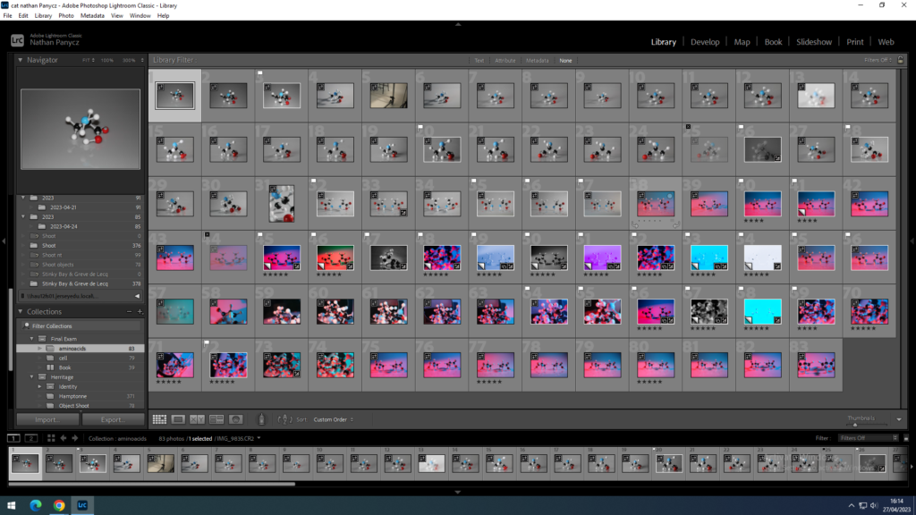
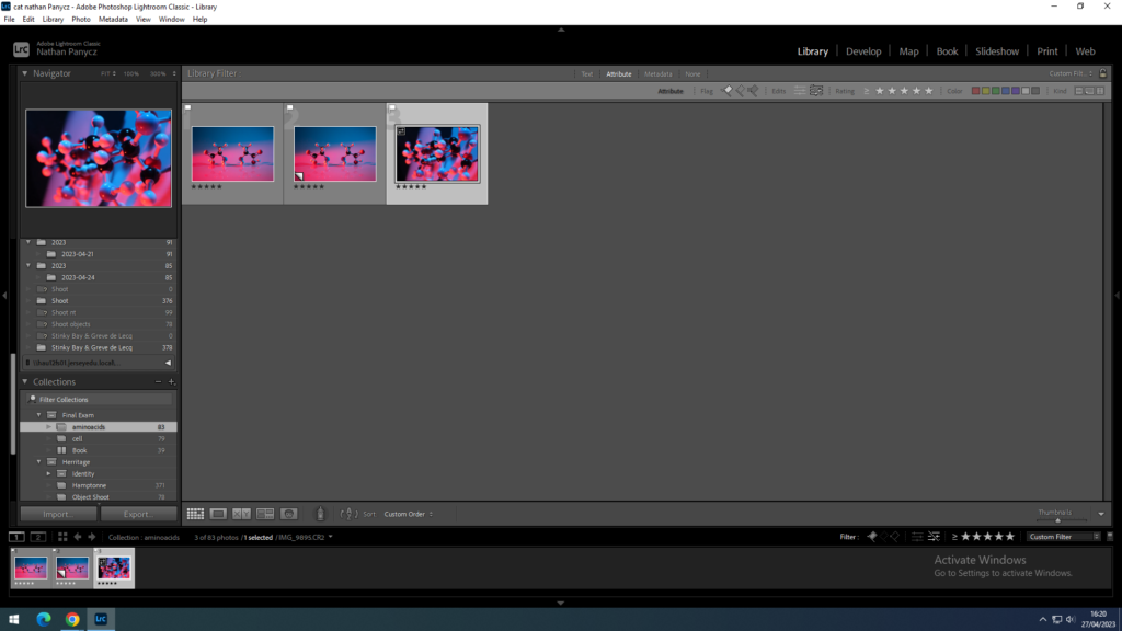
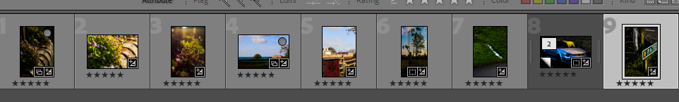
Those are photographs I chose as most appropriate based on exposure, sharpness, angle and shadow.
Those are my favourite photographs I planned to edit and use for the project.
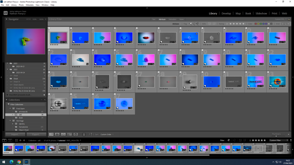
Experimentation
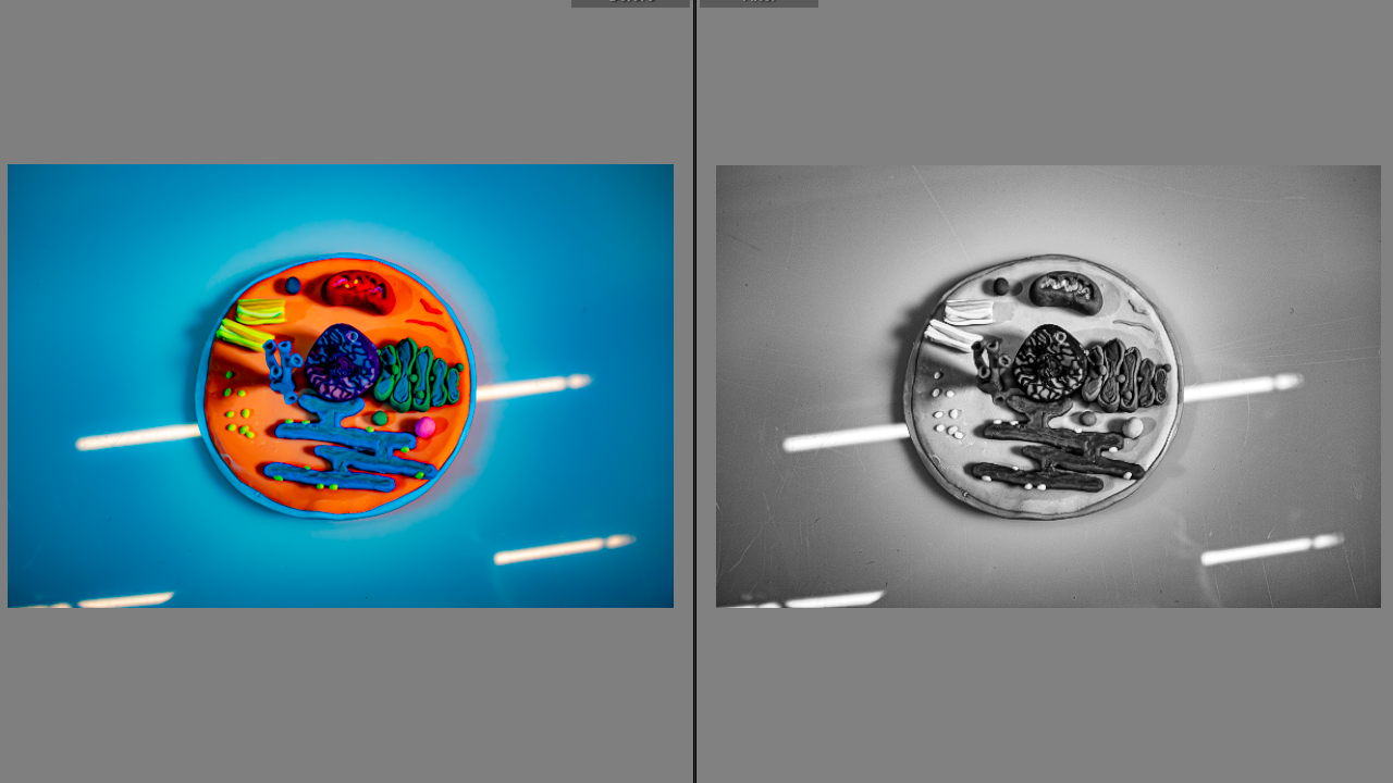
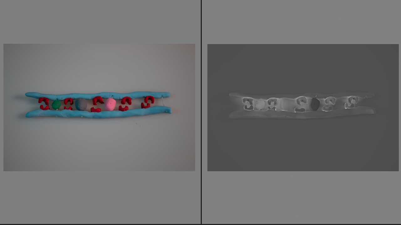
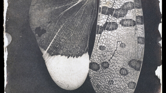
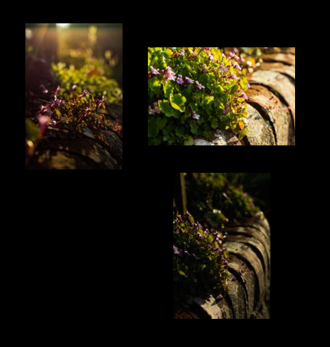
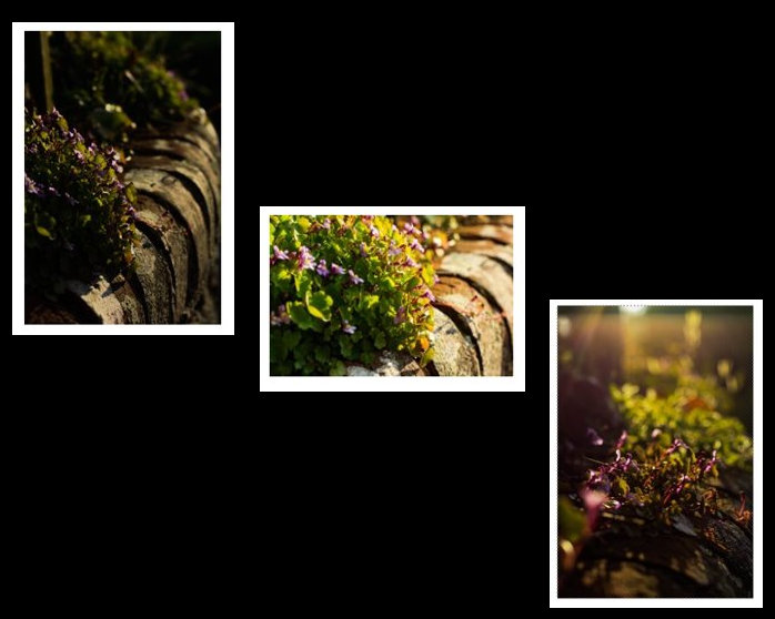
I converted this image to black and white and increased the clarity, blacks and whites, to make it sharp and show all the imperfections on the white background. I wanted it to look rustic and vintage like the Joseph Niecéphore Niépce Point De Vue.
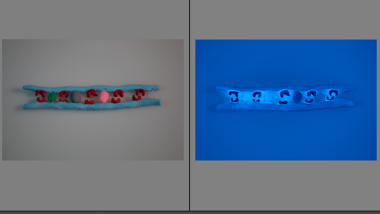
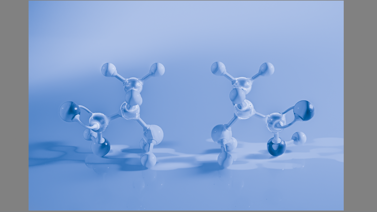
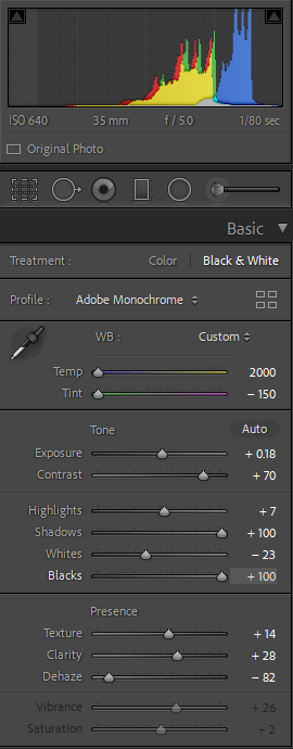
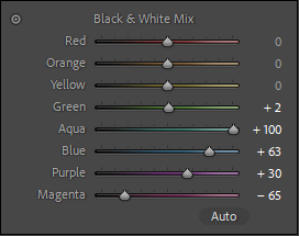
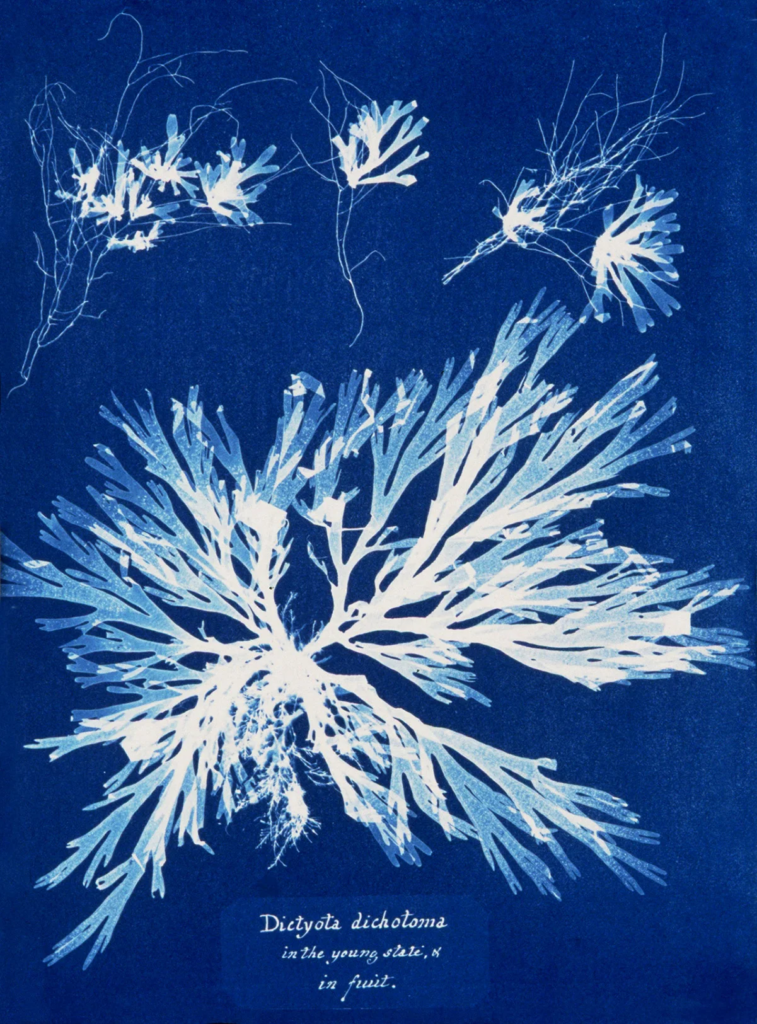
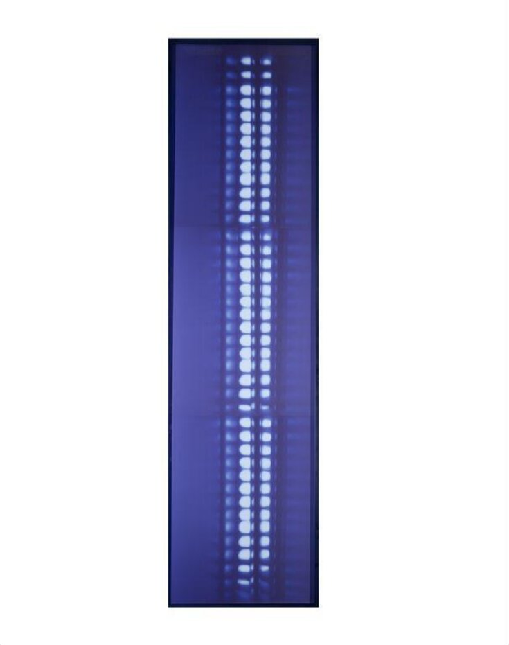
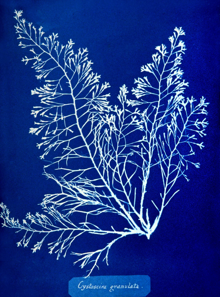
With this photograph I was influenced by Annas Atkins cyanotypes but I also wanted to give it a bit of a modern look by making it look a bit luminescent like an X-ray shot. To do this I turned up the contrast, the blacks and whites, but decreased the dehaze along with tinting the photograph completely cold.
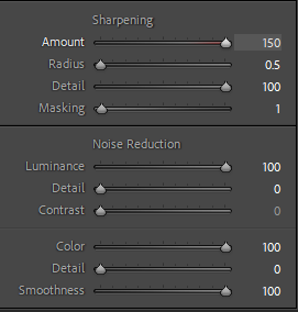
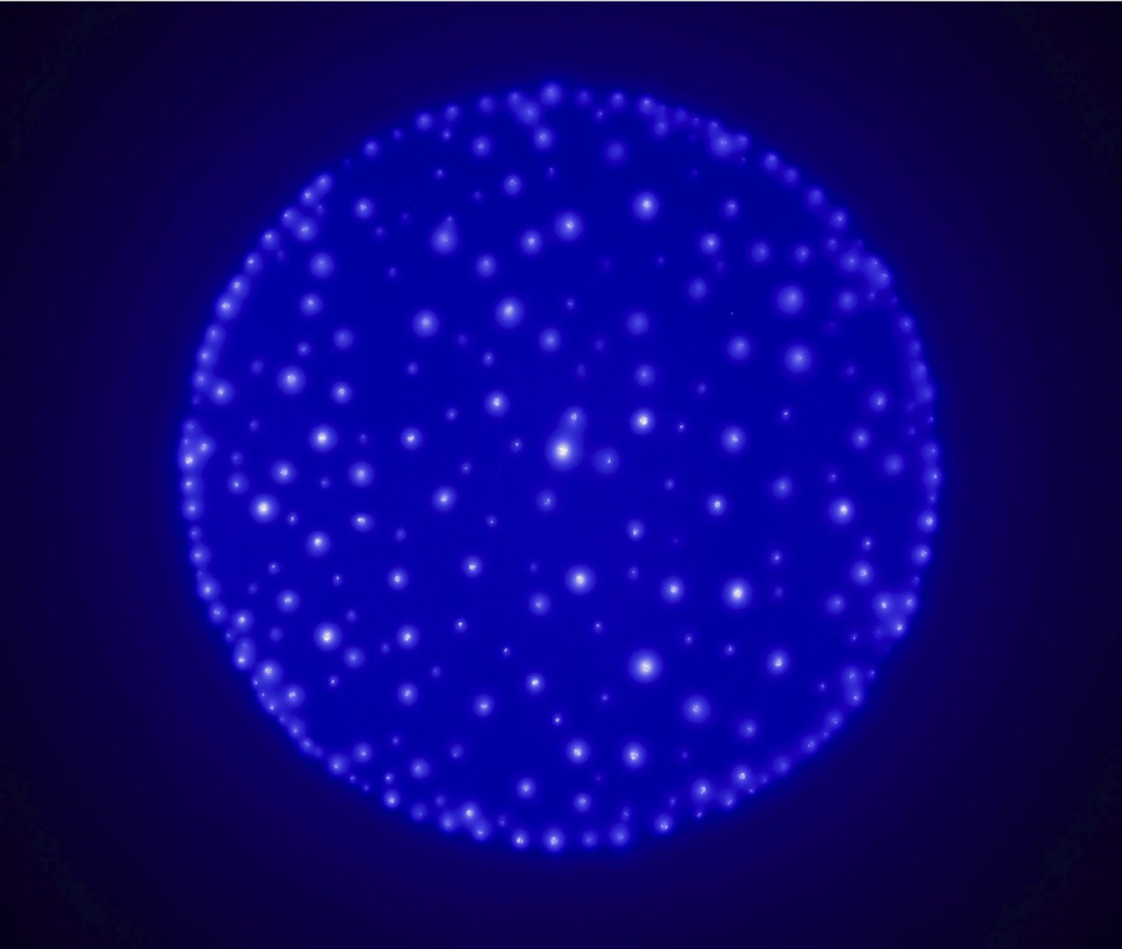
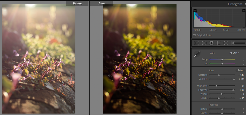
I wanted to make this photograph soft to contrast the X-ray/cyanotype looking shots which look sharp. To do this i turned down the sharpening, turned up the luminescence contrast and colour smoothing. I increased the saturation as i wanted the photograph to look lively as opposed to the dead cold blue photographs.
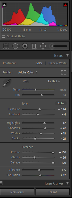
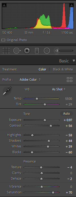
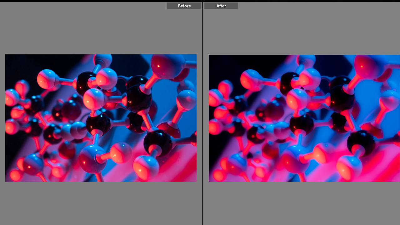
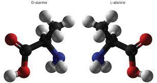
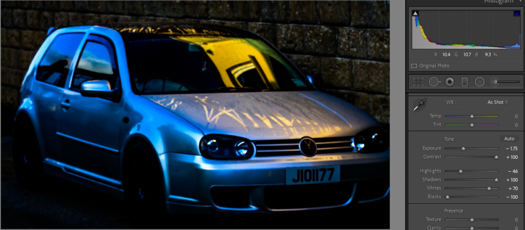
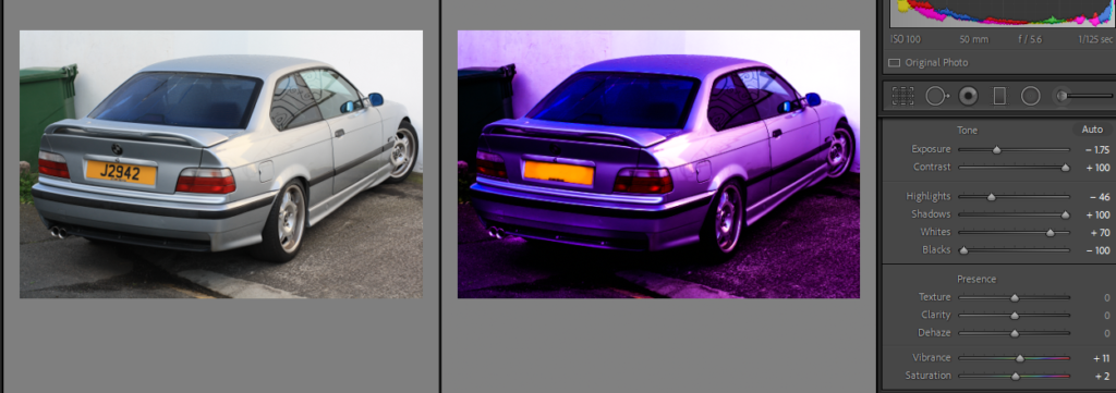
I used a wide aperture (between f/4.0 and f/8.0 depending on the size of the subject) to create a sense of space and perspective, however looking back I should have made the photos using a smaller aperture as it would made the photographs sharper and more focused. I would say I had rather good control of the light during the first shoot. I used coloured plastic sheets to change the colours of the opposing lamps. I chose red and blue specifically because the molecule I was photographing was made of black carbon, white hydrogen, blue nitrogen and a red oxygen and I wanted the photograph to look uniform. At the time of the second photoshoot, I could not control my lighting enough (turn the main light off and use the lamps alone) as there were people working in the studio. I should have chosen a different time or space for this photoshoot.
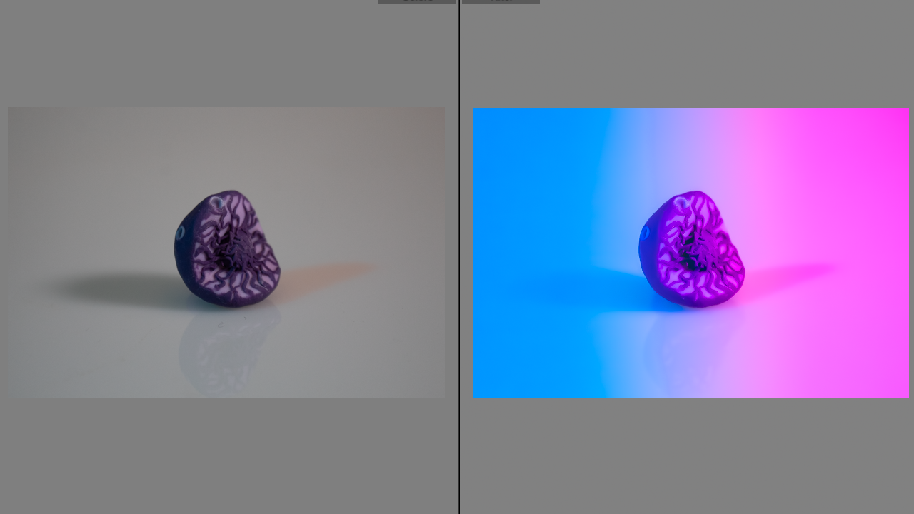
Whilst editing I decided to overlay the photographs with a pink and blue gradient. I chose blue as its associated with spirituality and I wanted to present the divine element behind the complex design of the cellular structure. Blue is a primary colour; without its existence many other colours could not exist. Just like purple or green could not exist without blue, a human being could not exist without God. Pink on the other hand is a tertiary colour, it is created by mixing red with white, with this I wanted to juxtapose something man made with God’s creation; models of cells versus actual cells. “As red is always active, so blue is always passive, from the point of view of material space. From the point of view of spiritual immateriality, blue seems active and red passive” – Faber Birren, Itten the Elements of Colour. Both colours are associated with the human body; red with blood and blue with the nervous system. I also wanted to contrast the feminine and the masculine by contrasting the pink with the blue. I used the gradient formant so that the blue and pink mix into violet. Violet represents death and chaos. I did not intent for it to carry a negative connotation, however. To me violet represents the beginning of the new cycle of birth and death, just like the cell cycle, one must die for another to be born. It is the most natural and certain quality of this universe. Similarly, I do not see chaos as equivalent to destruction but rather as complimentary to order. Jordan Peterson wrote in his book 12 Rules for Life an Antidote to Chaos “Chaos and order make up the eternal, transcendent environment the living. To straddle that fundamental duality is to be balanced: to have one foot firmly planted in order and security and the other in chaos, possibility, growth and adventure.” Mediating back and forth between the two is where creation happens, the big bang for example.
Overall, I am happy with my final prints and the photobook layout, although I think I could have been a bit more technical at points.
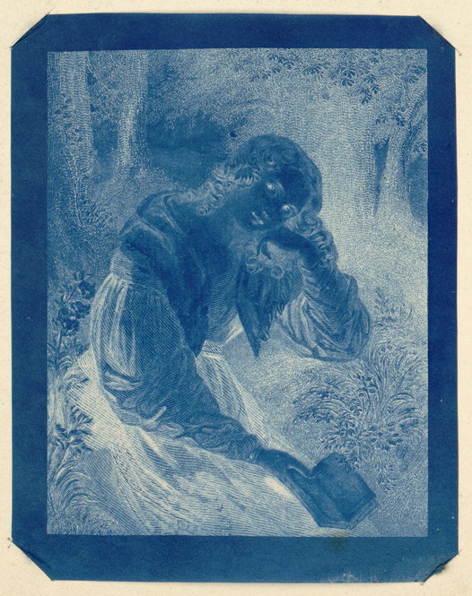
Anna Atkins, born March 1799, was an English botanist and photographer. She was the first one to publish a photographically illustrated book; “British Algae; Cyanotype impressions”. In 19th century England women were not permitted to study science professionally, botany however was a subject “gentle” enough to be considered a hobby women could engage in. Even though she studied Botany her entire life with the help of her father (John George Children, a chemist and a member of The Royal Society ) she was still considered an amateur.
Alaria esculentaDictyota dichotoma in its young state and in fruit
Her parent were close friends with William Henry Fox Talbot – a chemist, linguist and archaeologist, trained at the University of Cambridge – who invented the process called Calotype. Since he couldn’t draw his scientific observations he used a sheet of paper coated with silver chloride; by exposing it to the light of the camera obscura, he was able to create a negative image (as the areas exposed to light would become darker). Talbot went to discover that sensitising the photograph with gallic acid reduced the exposure time from an hour to a minute, by catalysing the chlorides reaction to light. The image was them fixed by submerging it in sodium hyposulfite and rinsing with warm water (it prevented the image from overexposing due to the silver chloride light sensitivity). Atkins had directly learned about the technique from Talbot.
Another influence on Atkins was an astronomer and a friend, John Herschel. Herschel was the one who invented the cyanotype process in 1842. The process involved soaking paper in a UV light sensitive substance, created by mixing a solution of potassium ferricyanide and ferric ammonium citrate, and drying it in a dark room. An image is produced by placing an object on the paper and exposing it to light. The UV light and the citrate reduce the Iron(III) to Iron(II) following the reaction of the Iron(II) with ferricyanide this produces ferric ferrocyanide which has a blue pigment. After the paper has been exposed, it gets developed by washing in water so that all the Iron(III) salts get washed away. Next, the paper is dried. The areas where the objects were places are not exposed to the UV light and so remain white whilst the rest turns blue.
Sir John Herschel. “Still in My Teens,” 1838
Gary Fabian Miller
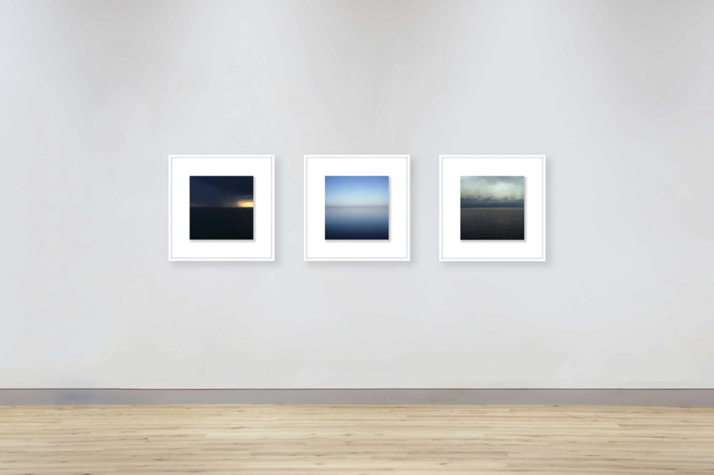
Gary Fabian Miller, born 1957, is a British photographer who makes camera less photographs inspired by the early pioneers of photography. Miller got into photography at an early age, learning from his father who was a commercial photographer. He started off by exploring the landscapes of Dartmoor to communicate the idea of contemplation. “As I walked myself into the landscape, it became an experience of the sky space, the changing weather systems, the deep-thinking space, and that is how I think the work evolved from a kind of narrative, figurative based practice around trees and plants and nature into an abstract sky, light space.” He gained International recognition for his photographs of land, sky and sea in the series Sea Horizons of England that were shown in the Arnolfini Gallery in 1979.
Sections of England: The Sea Horizon (No. 13, 17, 5), 1957
Millers journey with landscape ended in 1984 when he started exploring camera less photography. He was interested in the properties of light, time and colour, taking his photographs over days, months or even years. His process involves shining the light through a coloured glass over cut paper shapes or transparent objects such as leaves.
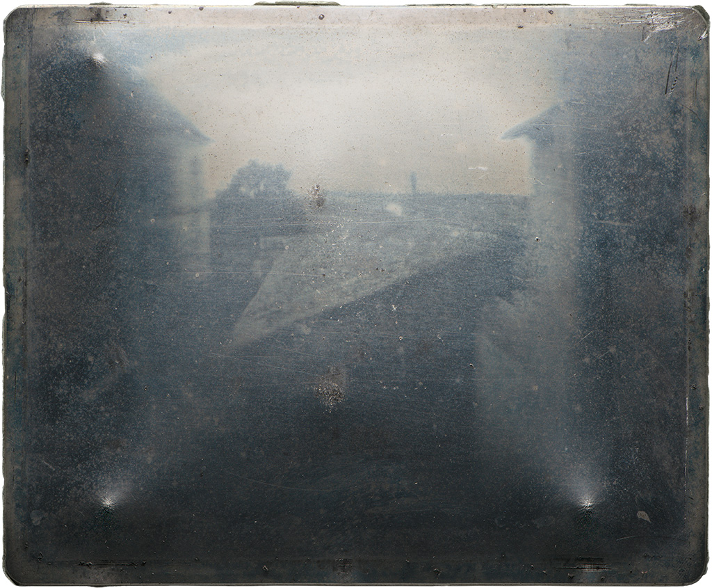
One of the biggest influences of Millers work where the early pioneers of photography such as Joseph Niecéphore Niépce. Niépce worked out a way of capturing images in a process called Heliography. It involved dissolving bitumen in lavender oil and inserting the coated pewter plate into a camera obscura to expose it to light for several hours.
Joseph Niecéphore Niépce – Point De Vue
The camera obscura has a long history. Starting in the 5th century BC with a Chinese philosopher Mozi who found that letting rays of light pass through a hole into a pitch black room created an image. The same phenomena was also observed by Aristotle in the 4th century. A camera obscuras is essentially a dark box with a hole which lets in light, producing an inverted image on the inside of the box. This simple apparatus lead to many discoveries such as Alhazen’s Book of Optics which helped us understand how vision works.
Image Analysis
‘Night Tower 3, 2001’, Gary Fabian Miller
The Night Towers resembles DNA strands. “It is as if we see in Night Towers a Blueprint for human existence.” – Martin Barns, Shadow Catchers.
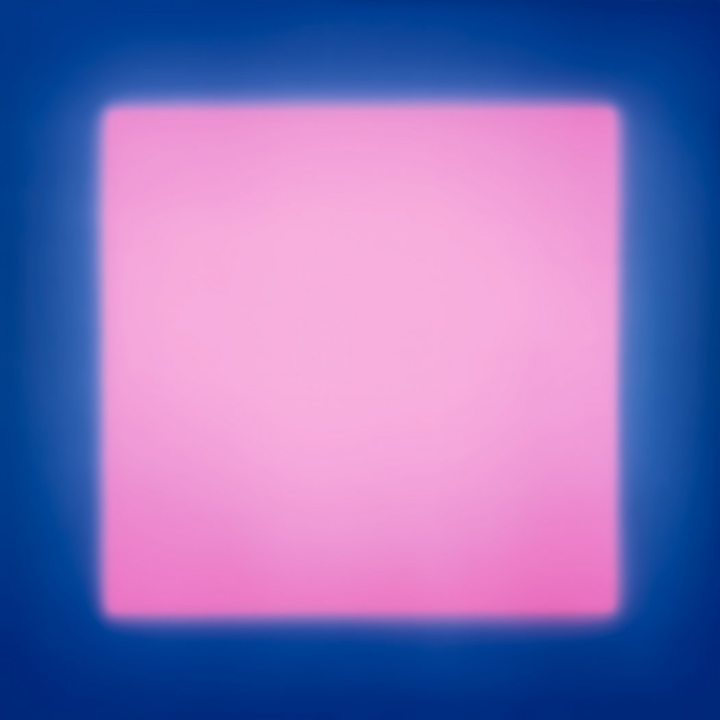
The Night Cell, Winter 2009 – 2010States of Pink (iii), 2023, Gary Fabian Miller
States of pink is a photograph taken by Gary Fabian Miller. Blue is a primary colour that belongs to the family of cold colours, it is associated with calmness, depth and spirituality. This shade of blue is dark and deep, evoking the feelings of stability combined with the square shape. Its somehow sombre and melancholic, the pink on the other hand is light, happy and passionate. Both the colours juxtaposed somehow complement each other, bringing the image together as the pink warms up the serious blue and the blue cools down the passionate pink. There is no hard edge between the pink and blue but rather a gentle fade which suggests the colours are not meant to be in competition but in complementary harmony.
“It’s hard to tell the story if you don’t have a stunning image to back it up” – Ray Villard, public relations director for the Hubble Space Telescope project
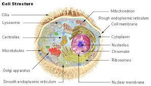
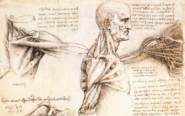
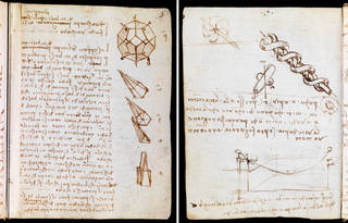
In this project I aim to explore the complexity of life at a cellular level through photography. I have chosen this topic as the cell’s ability to carry out its function and support life, despite us being completely unaware of its activities always fascinated me. I find it riveting how the microcosmic substructures that make up a human being exist in a completely different stream of consciousness independent of and unaffected by our conscious thought. Although the ability of willpower to alter the body is well known (as the placebo effect) there are things we cannot simply influence. A heart will not stop beating when you ask it to, and a cell will not divide because you told it to. There is a certain type of beauty in that. Mystical or religious if you will. The more I study the complexity of the human body the more my conviction shifts to believing it was not simply a series of coincident that lead to the development of life on earth. It was not a case of chance but rather a carefully thought-out project, designed by an architect wielding knowledge much greater than what we as humans could ever wish to understand. To illustrate the complexity of the cellular structure in the simplest possible manner I will be using modelling clay to create replicas of organelles. I am using Leonardo da Vinci’s notebooks as inspiration since I have always admired the way he combines science with art. Another artist who influences my work is Anna Atkins who documented algae and plants through cyanotype photography. Finally, I will draw inspiration from Gary Fabian Miller who created camera-less photographs exploring the properties of light and time, applying Johannes Itten’s colour theory. I hope to create a series of images that are both artistic and informative and challenge a viewer to contemplate the wonders we are so blind to see going about everyday life.
This shows some of my early ideas for simple and complex. where at first I was thinking of splitting the image using natural edges in the landscapes between jerseys coastline and the open seas surrounding it as this is a big part of my life as i have grown up in and around the ocean. secondly explored the relationships between architecture and how man made structures can sit in the environment. I was also looking at how these structures apposed/blended with the surrounding natural environments. i then looked at the two main ideas i had so far and compared the images to see he similarities and differences between my ideas. i found that both sets of images both used a lot of colour and this is what i liked about both sets of images. so then looked into the relationship colour can have in an image. i then thought how to juxtapose the complex colours with something else. after researching more i found these images that inspired me to think about the use of highlighting a subject in an image using colour then contrasting it to the rest of a black and white image. I especially liked the image of the butterfly as this accentuated the beauty of the colours that have been created in a natural environment. the black and white image does not include colour however i chose to look at this image because i thought of how i could recreate the image of a interesting naturally grown tree. however in my image i would manipulate the image to bring out the natural colours of the dark brown tree and the vivid green in the leaves and contrast it against a black back ground.
Statement of intent
In this project I would like to explore how Psychogeography which refers to how individuals emotions can change when viewing a single geographical scene. I am going to do this by taking photos of my surrounding area to capture how nature has been effected by the built environment. I will show this through complex nature thriving under simple and poor man made obstructions.
I have been intrigued by the idea of ‘Flaneur’ which is a French word that describes a person that leisurely observe society. I like this idea of sitting back and watching the world go by.
Artist reference
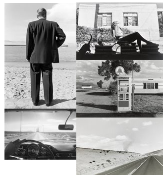
Henry Wessel Jr
Henry was alive from July 28, 1942 to September 20, 2018. he was an active photographer for four decades. he spent his time documenting Californian light, vernacular architecture and the social landscape. ” He began to photograph seriously in 1967, inspired by the work of Wright Morris, Robert Frank, and Garry Winogrand” . his images are most know for “Exploring the territory where nature and culture meet”.
whilst conducting more research on this photographer I found a quote used to describe him “turning the least monumental of subjects into a kind of personal poetry” I believe this quote to be very inspirational and describes how finding the perfect light, angle, positioning can turn even the dullest of sights into captivating images.
https://www.sfmoma.org/artist/Henry_Wessel/
Here is a mood board I created using some of his images I will use this images to provide inspiration to my work. from these images it shows how he uses high contrast black and white images. His use of shadows and glare shown in some of these images to break up the image, this give the eye more to look at. I also like his use of leading lines as shown in the top left and bottom right images. he uses this to draw the viewers eye into the image, because of his high contrast images this effect work very well as it can stand out a lot more from the rest of the image.
From this mood board I will take this inspiration out with me on my shoots. I will experiment with trying to capturing leading lines and playing with glare/ shadows in a real world environment.
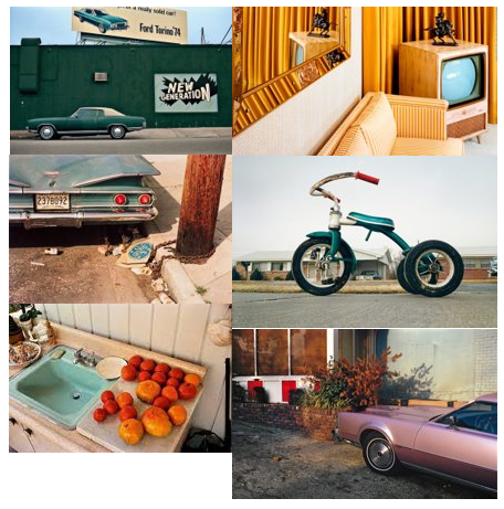
William Eggleston
William was a American photographer born in Memphis Tennessee in 1939 July 27 he is currently 83. He started his work in the early 60s he was most known for his “colour photographs to describe the cultural transformations in Tennessee and the rural South” I have looked at his work because I like how he uses colour in his work to give prominence. I chose to look at both these artist together because they are very similar as they both photograph “straightforward depictions of everyday objects and scenes” however they do this in two different ways.
I created this mood board from Williams work. I did this because I wanted to see all the different ways he went about photographing straightforward scenes in a way that also explores the effect of psychogeography. Williams uses different perspectives where as most of henry work fits the dead pan aesthetic. I like how both these methods emphasise the subject of the image in two very different ways. especially like the use of colour in Williams work. he uses very bright, vivid and eye-catching colours. the two top images show how he has incorporated colour into more than one part of the image. He has done this by matching colours in the image however, I think this could also be done by juxtaposing colours to make the main subject of the image even more prominent. by looking at Williams work I have also been exposed to the use of perspectives and colour to create very distinct images.
Photoshoot action plan
I will go out early on sunny day to capture as close as possible to the sunlight that Henry Wessel captures in his work. I will also try to follow and explore how different colours sit in the environment.
this area is located between the top of les Varines and the five oaks round about in St Saviours Jersey Channel islands.
I will explore this area of natural environments and built up environment featuring vernacular architecture from jersey heritage. this screen shot of google maps shows where i will explore these roads. I will be a flaneur in this environment trying to observe and capture striking scenery in the mundane of Jerseys built environment. I hope to achieve these striking depictions by observing the sharp sunlight that jersey gets in the morning. will will especially be trying to find how how this light effects the natural and unnatural colours in this environment.
Photo shoot
For this photo shoot I went out in the early hours of the morning on a clear day I did this to get as close to possible to the Californian light that Henry Wessel Jr spent a lot of time capturing.
I went out explore interaction between nature and man made surroundings. I went around my local area to challenge myself to create interesting images from scenery I have spent a lot of time looking in and around through out my life growing up in the area.
These images show I explored a lot of different angels and perspectives like Williams Eggleston’s work. spent along time observing shadows and glare created by the low angled sun path. the sun hitting the surrounding grass / leaves fascinated me because it created such vivid and lively greens. I also took inspiration from Henry Wessel and spent some time exploring the glare from a parked car.
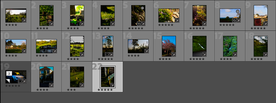
From these images I used the star system to refine them into photos that I liked. I ended up with 48 potential photos out 172 images that I took on this shoot.
These show that I have rated all these images 1 star I will continue to go through refine these images to find the best ones using this star rating system. these are the images where I have used different perspectives, glare/shadow, leading lines and colours in my images to increase the distinctness of my images.
These where the images I selected at 2 star
3 star
4 star- I believe these to be my successful images from my shoot.
Editing
after i sorted to find the shots that i could then develop further to see how i could increase the eye appeal of my images.
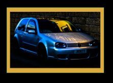
I was first attracted to this plant growing out the wall because of its pink petals, this gave me the idea to create this image around the colour like William Eggleston. I then began to think about how I would frame the image I decide I would like to place the pink petals in the mid ground of the image. then I thought about the perspective, I went in close around the same level as the wall. at this point I noticed the glare down the lens which I chose to include and keep in the image because I was influenced by Henry Wessel. this helps to create an order to the image the bottom is dark then the eye is brought up to the colourful plant then the glare draws the eye in even further. I edited this to decrease the glare slightly so that the subject of the image was more visible. I did this by reducing the exposure of the image which resulted in a darker more dramatic image.
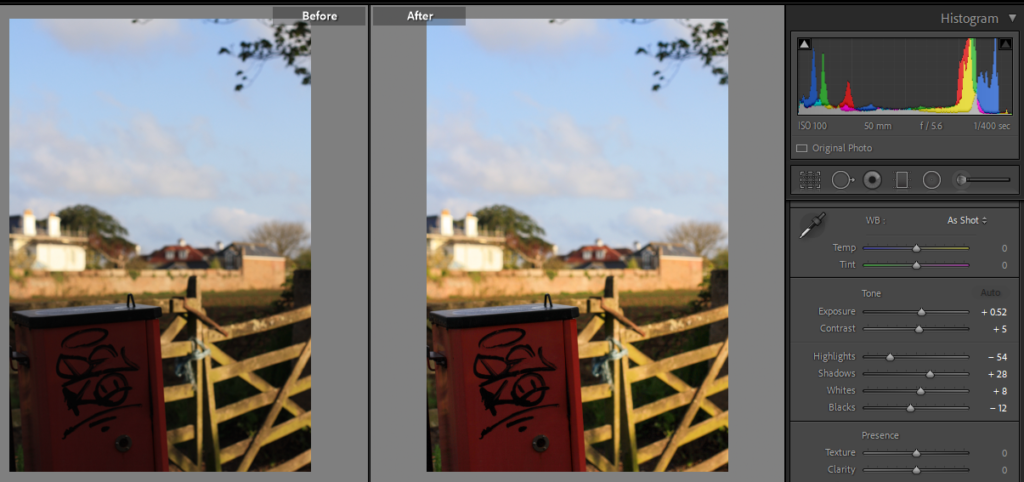
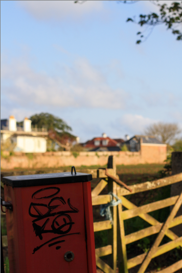
I took this image because I liked the graffiti on the side of this bright red bin. when going through my images I decided to take this image further and edit it because of how the clear brightly coloured bin juxtaposes the unfocused houses in the distant back ground. I believe this image shows how humans have interacted with the environment because it shows a large patch of the natural environment that has been disturbed by humans and now left with out any natural vegetation waiting. even further in the background there is a depiction of scaffolding on a old jersey building made from granite. this relates to Henry Wessel work because he photographed his local vernacular architecture. I increased the whites to emphasise the bright sun beaming Into the fence in the mid ground of the image. this also juxtapose the the bin which is blocked by the the shadow of the surrounding trees. I also increased the vibrance and the saturation of the image slightly to brighten up the bin. in the foreground of the image.
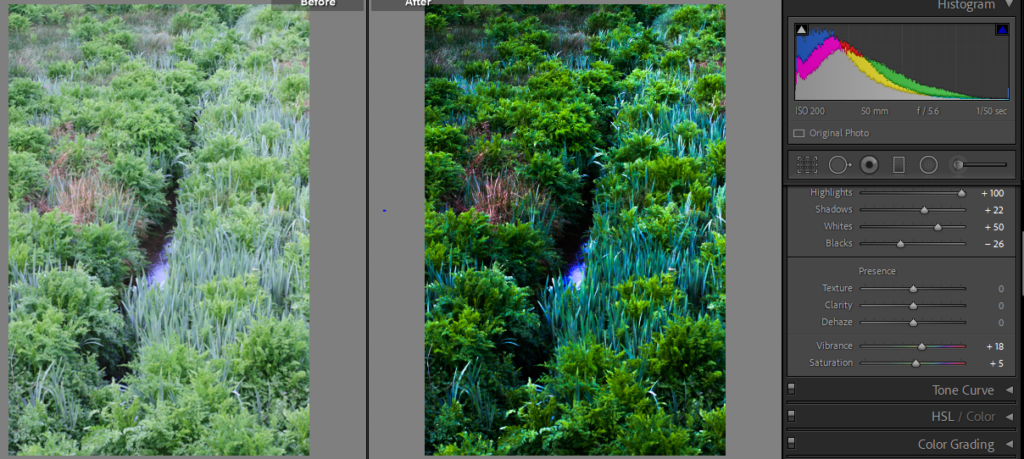
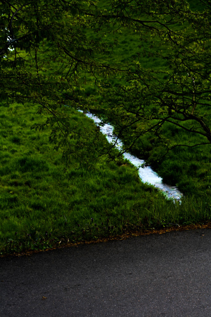
This image shows the a place in my local area less disturbed my human kind. I was first drawn to this image by the stream that creates a line that divides the image in two. I also liked the varieties of bright shades of green in this image. After I decreased the exposure and increased the contrast it created different textures in the image represented by different species of wild plant growing in this place. to me this texture creates a flatter image with more of a deadpan aesthetic which relates to Henry Wessel. like some of his, this image also uses a leading line which breaks up the texture as shown by the glare on the water. I used this glare to create attract they eye because it was in the centre of the image. To make it more appealing I used the adjustment brush tool to create oval around this glare on the surface of the stream, I then increased the exposure of this area to increase the glare slightly with out over exposing the rest of the image. I like how the this image turned out because it almost looks like something shiny and new is hiding underneath a thick layer of over grown nature. this represents me trying to find the “personal poetry” in the “least monumental of subjects”. This links to Henry Wessel Jr as this quote was used to describe his work.
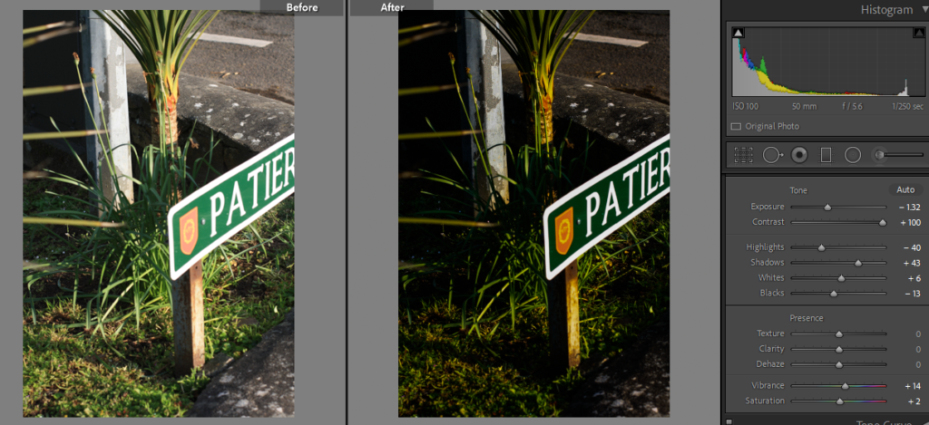
I took this image of a sign, at this point in the shoot I was experimenting with different perspective this image was taken to the side and above the sign. I like this image it is made up from different subject however not one of them is shown in its entirety. there is a lot of straight leading lines however this is disrupted by more hectic lines created by the leaves of the plant in the centre of the image and the leaves creeping in from the left of the frame. I used inspiration from both my artist references for this image I used Henry Hessel to inspire me to try and capture leading lines. William Eggleston who I have also drawn inspiration from his images that use more perspectives to emphasise the subject of the image. when editing this image I was more inspired by Henry Wessels high contrasting images so I reduced the exposure slightly and increased the shadows to make it darker then I increased the contrast a lot. this left an interesting effect created by the warm sunlight hitting the orange rust on the leg of the sign.
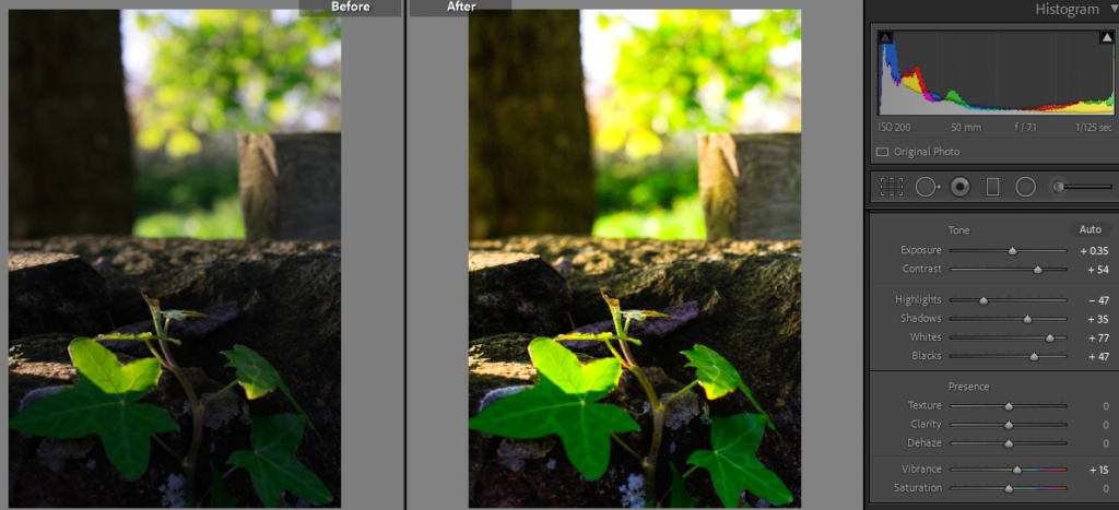
I seen this leaf that looked as if it was stretching into the sun as if it only just woke up. I thought this would be a very interesting close up shot with the trees in the back ground out of focus. I edited this image to create much more vibrant greens in the image as an experiment from Williams work where he uses colour to showcase the main subject of his images. I liked the contrast this created between the lively coloured plant against its harsh granite environment.
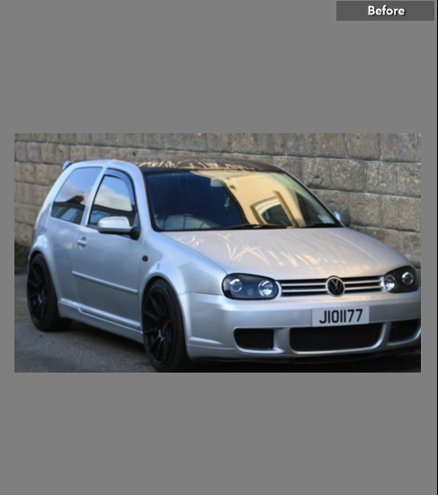
this is one of the images I have taken I took this image because of the juxtaposing light coloured house reflecting of the cold silver car parked in a shaded alley . I used ISO of 100 to increase the brightness of the image to make it clearer.
From the images I have rated to find the best. I chose this one to edit. I started by increasing the contrast and the vibrance of the image I liked how this accentuated the manufactured curves of the body work of the car. by increasing the vibrance this created a clearer reflection of a neighbouring yellow house. the reflection is so clear because I chose to go out in the early hours of the morning so that I could capture this sharp low angled sunlight. I like how the warm colour this added because it juxtaposes the rest of the image, mainly featuring cold undertones. I also like the lines that have been created on the bonnet of the car from the rain dripping off. this provides contrasting textures to the image between the reflecting lines and the matt texture created by the water droplets. the front of the image has leading lines that draw the eyes upwards to the colourful reflection that continues to draw the eye into the image.
Experimentation
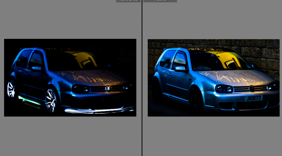
I then used the adjustment brush to increase the increase the exposure and contrast a lot then on certain parts of the image that I thought would better emphasize the shape of the vehicle that photographed on my shoot. I then decreased the exposure and highlights in the image to make the rims and the underneath of the car stand out much more than the rest of the image. this resulted in a very dark image with only reflections of the surface of the car body visible and the glow i added using the adjustment brush in Lightroom.
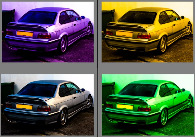
this is one of my less better images however i had the idea to add colour using Lightroom to create a more striking image. after seeing this I then thought of Andy Warhol’s coloured depictions of multiple grids of a repeating image as he also used a lot of colour in his work.
I created multiple virtual copies increased/ decreased the temp and tint in these image to create 3 coloured images that appose the silver original. I thought this could also be an interesting way to display my final images to show colour.
Final selection
After going through every star rating to refine all my images I have ended with 9 images that will become my final prints. I am going to print three images in a3, a4, a5 I aim to create 2 sets of 3 images mounted together
Mock display of images
I added a colour border around this image that matches the reflection in the window. this was an experiment and I am not sure if I like it or not.
I liked this mock up however I feel the black background does not contrast the images enough.
I re mocked up these three images in a different way with white borders to create more contrast in the image. these borders make the images stand out from the back ground making them more eye-catching.
Final outcomes
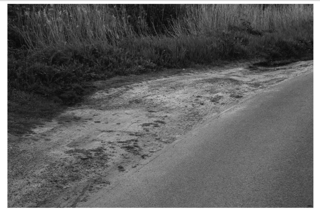
this image represents how humans have obstructed the natural environment. as shown by the reflective organic reflective line running through the image is then abruptly cut of by the straight edge of the dull man made concrete. I made use of a near by wall to get this above perspective of this scene. I liked the striking change in the image between the textured colour full grass and stream to the flat grey road. this shows simple and complex through the natural intricacies of nature vs the minimalist human designed road.
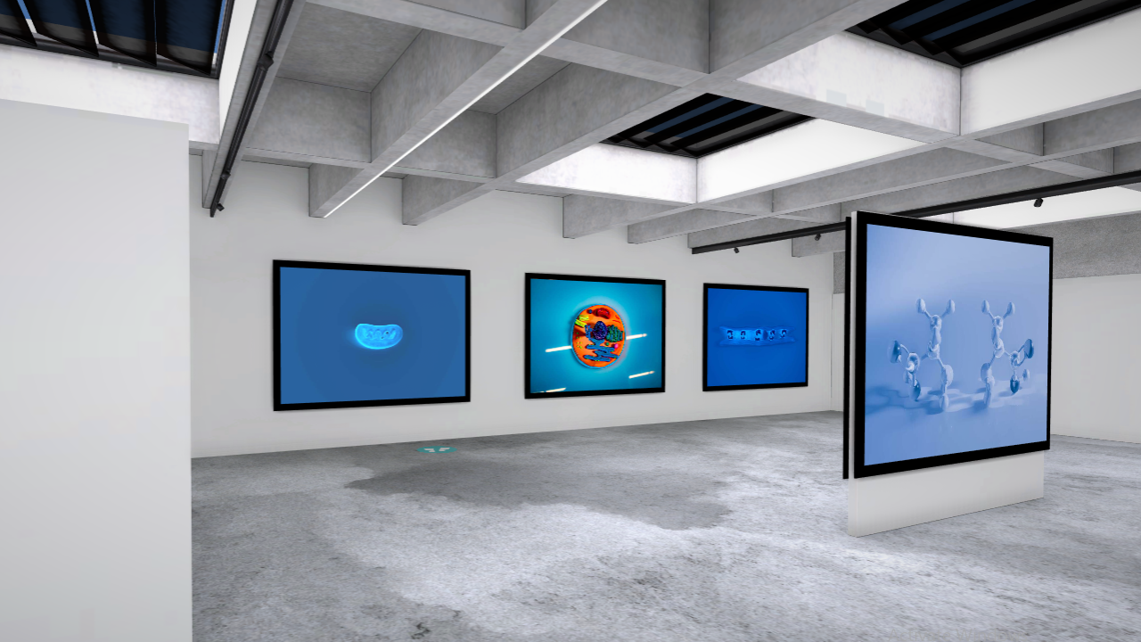
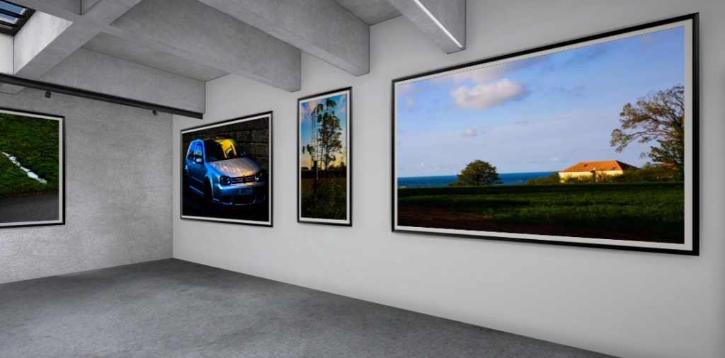
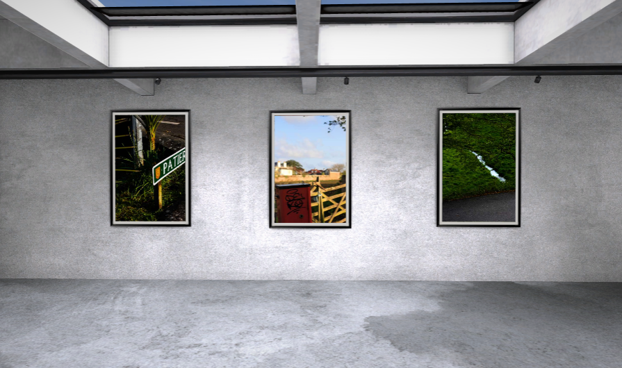
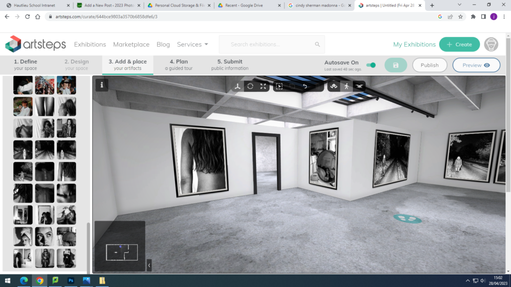
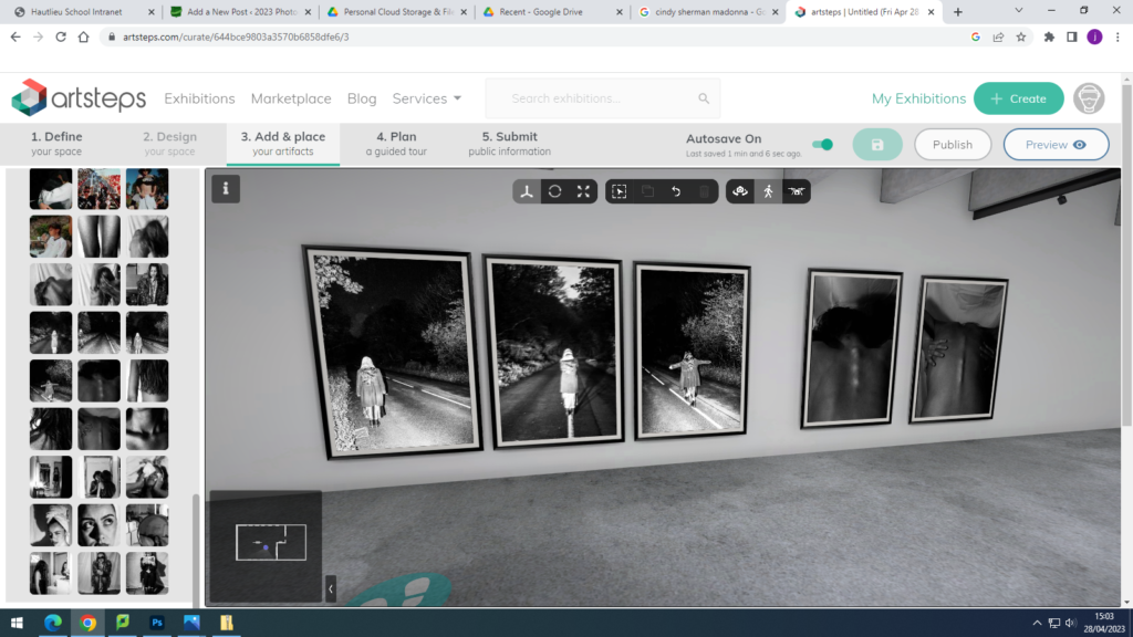
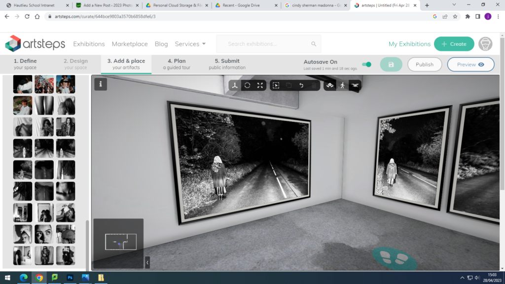
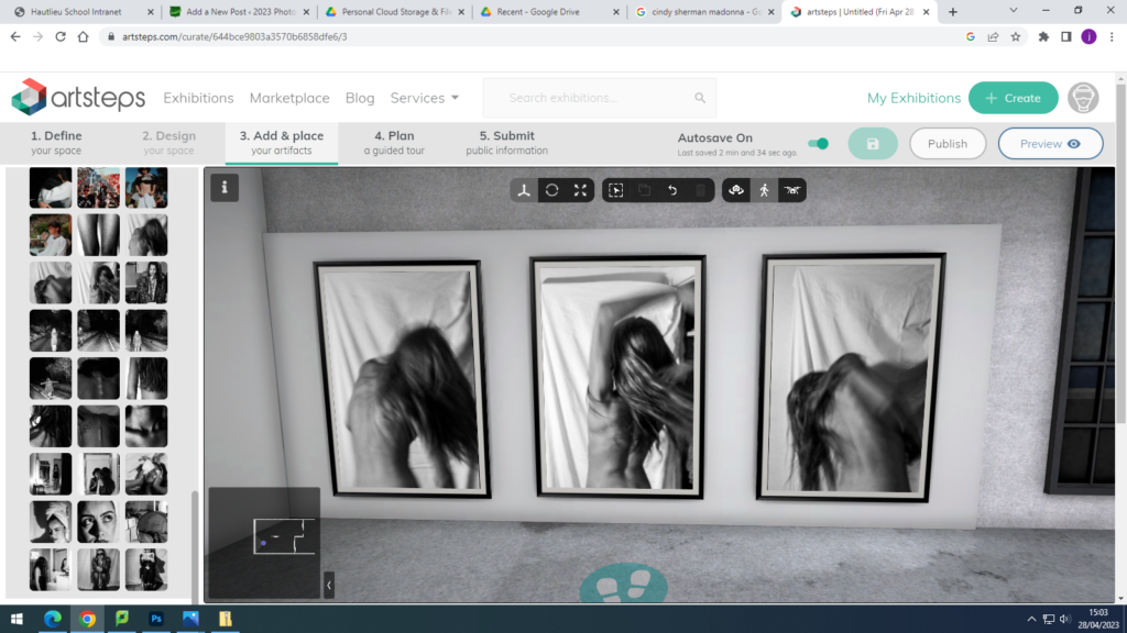
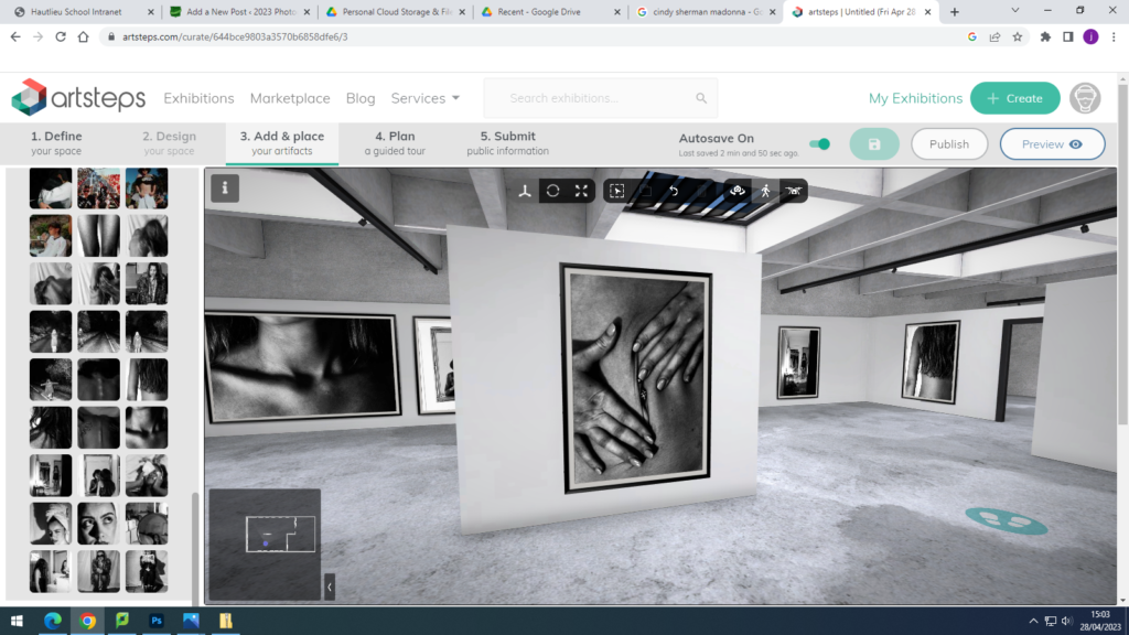
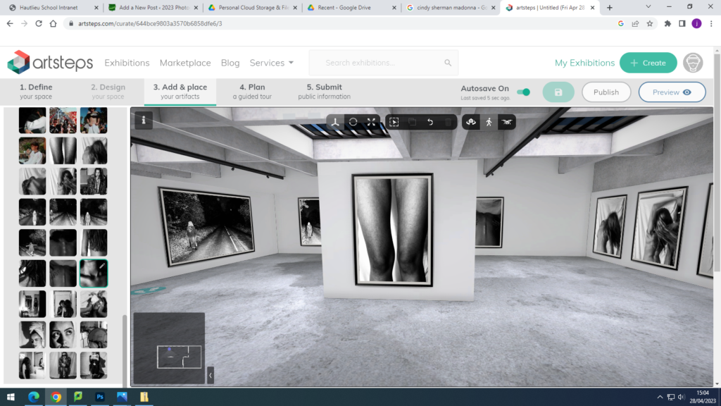
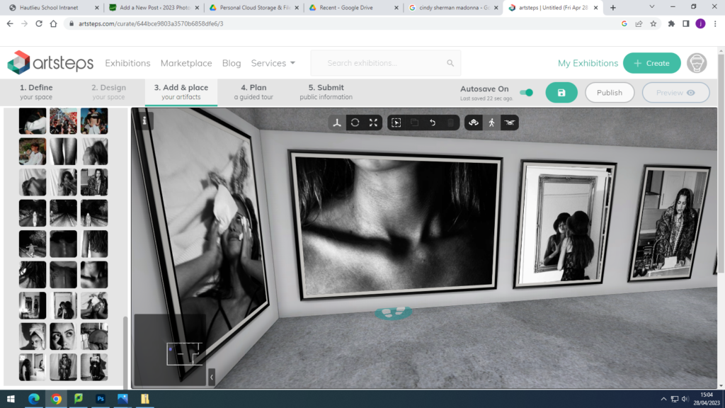
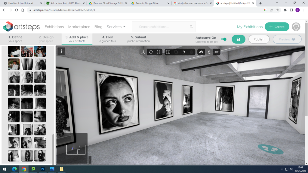
Virtual gallery
I used Artsteps.com to create a virtual gallery so that I could get a visual representation of what my work would look like professionally displayed in 3d place. I grouped my final images in two 3 image sets. I believe these sets work well together so I decided to keep them separate and spread them across the walls of the gallery.
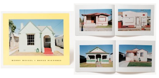
Henry Wessel Jr has published a book called ‘House Pictures’. in this book he features a large series of high exposure deadpan images of houses. these pictures show how henry has turned the most mundane of views from a Californian neighbourhood in the 90s, into very striking images that entice the viewer to take another closer look at every house in the book.
https://fraenkelgallery.com/shop/house-pictures
these particular pages I have shown here also show case Henry use of colour which was not shown in his previous work that I have looked at. these images follow a very repetitive pattern with uniform white borders this fits with his deadpan aesthetic as it is very formally and accurately presented.
Photo book
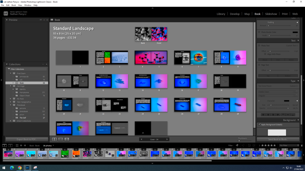
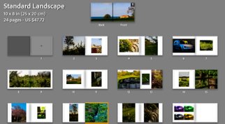
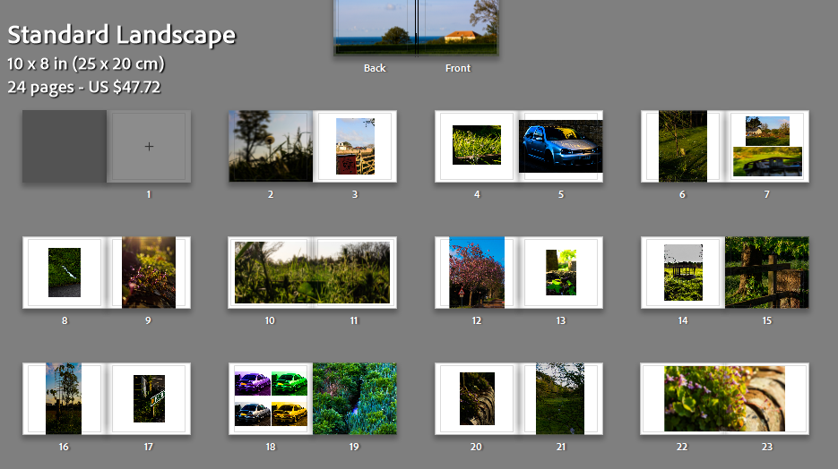
I decided to use some of my best images to create a photo book. I did this by using the book function on Lightroom classic. I used this because it was very easy to drag and drop my images from there collection into a book.
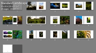
This shows the first order I decided to show case my images in this book. I decided to use a full page spread for the front and back cover because I thought one of my images would suit to be viewed in a 3rd dimension which would be created by the spine of the book. this first rough order of my images shows how I have thought about juxtaposing full bleeds to cropped images, I have also used a double page spread for one of my images I thought would best fit its own page. so that the viewer could fully appreciate it with out there eye being distracted by the next image.
This was my second attempt at ordering these images this shows how I have thought about juxtaposing my images against each other on the page. I changed on of my images into another full page spread. I did this to create a link between the middle and end of the book.
here shows my third and favourite attempt at organising these images to provide the best flow. here I have thought about repeating similar images I also thought page 9 should was a bit over crowded with image so I decided to move the diptych onto two separate pages and moved the other image to create a better diptych in page 7. I have kept a lot of white borders to contrast the image like Henry Wessel has done in his work ‘House Pictures’.
I then moved this page to create a link between the first and last image in the book because they both feature an upwards perspective that I was inspired by William Eggleston. at this point I was very happy with this book so far.
Compare and contrast artist reference
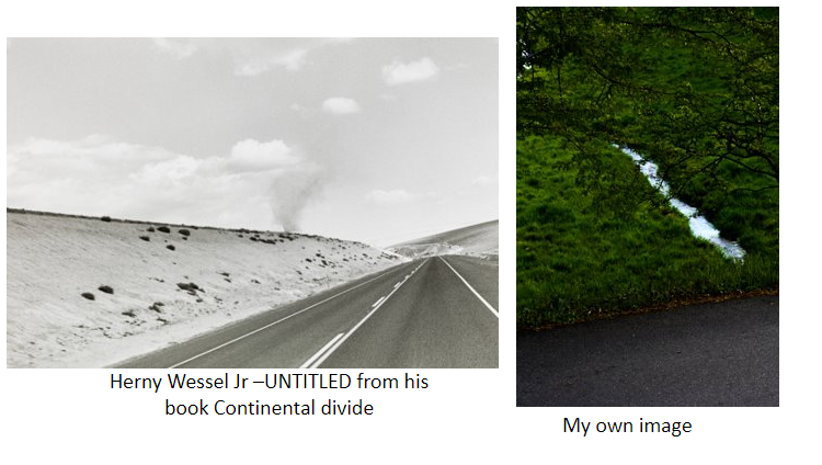
Here I have show cased Henry Wessels work against my own. I originally took inspiration from this image as I liked how the image was cut up by the road. so when is see this scenery in my local area I looked to try and find the best shot, I went for a different perspective to his him. my image is more influenced by William Eggleston and how his perspectives emphasise the subjects of his image. I chose to create a portrait shot instead of his landscape. this means less of my image is cut of by the dull concrete and my image subjects a stream that leads the eye up where as his landscape mainly focuses on the road which the eye leads along his frame instead.
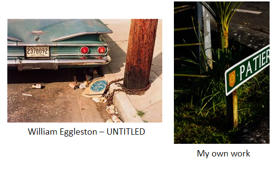
These images are similar because I have tried to recreate downward perspective, both these images feature leading lines. i took inspiration from this image because i would have never thought that there could be such striking depiction hiding at the side of a busy road in a built up environment. my own image is taken on a corner of a main road this links to the image by the lamp post however mine has a galvanized zinc coating because it is more modern this creates a shiny, reflective distinct surface. his image is much more light how ever i have edited mine to create a darker deeper image with more contrast.
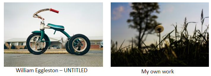
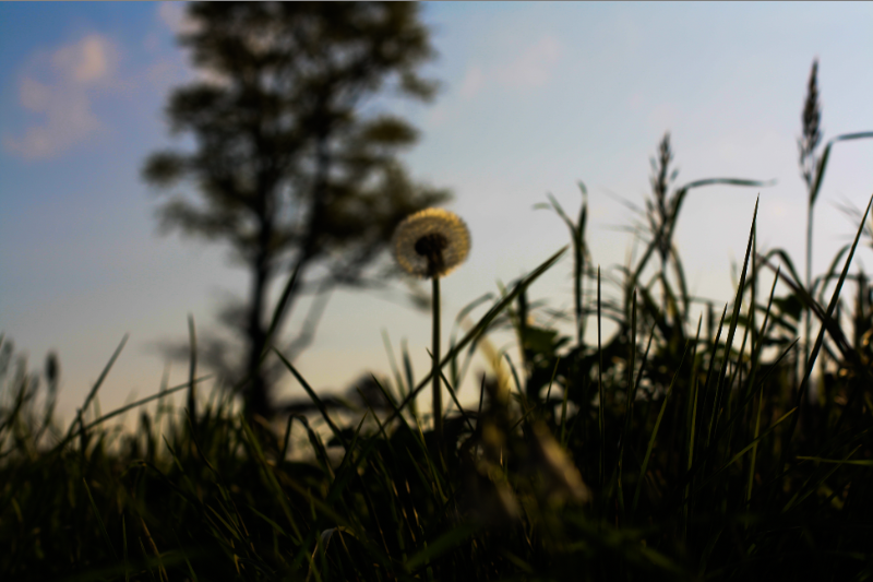
these two images show case very different environments however i was very influenced by how he used perspective to emphasise this man made tricycle. I used this effect to emphasise this dandelion over its surrounding environment. He has made the subject of his image dominate over the back ground. in my image I chose to juxtapose the frail dandelion against a large oak tree in the unfocused background.
EVALUATION
I believe this to be a successful image although not all the image is in focus i like the effect this has with the unfocused background. If I was to take this image again i would take multiple shots varying the focus every shot so i could have more choice of the best image. this image was inspired by Williams Egglestons use of perspectives in his work. I believe this to be a successful use of perspective to emphasise the subject of my work.
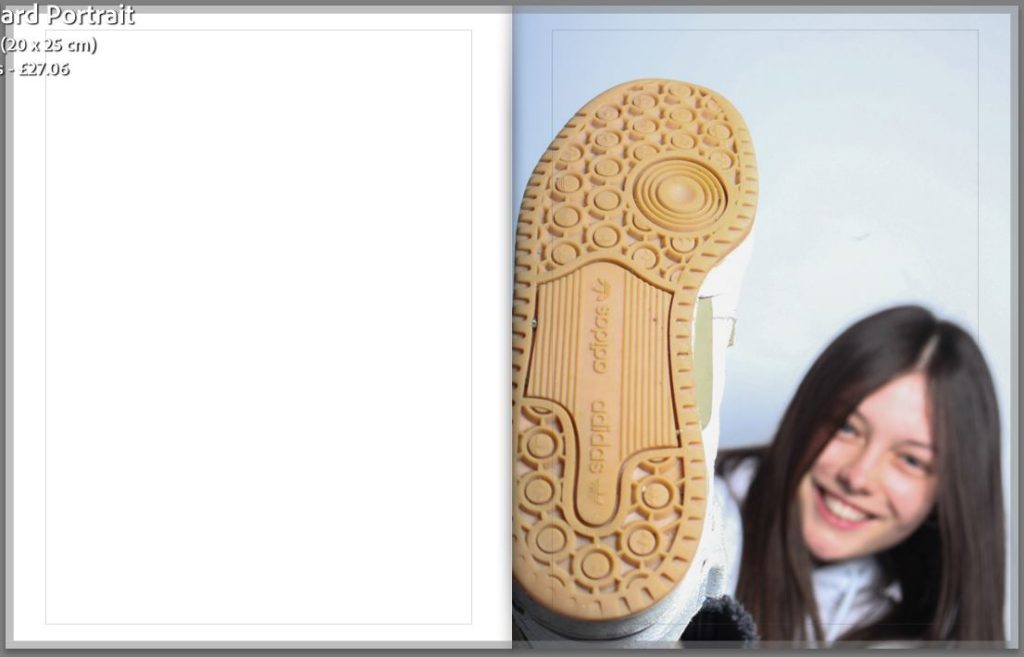
This is also one of my personal favourites from my final images. I especially like the use of vivid colour in this image that juxtapose the rest of the image. I like how I have focused this image to create the blurry foreground and background. If I were to do this again I would have tried to get a shot with both the bin and fence in focus as well. However I like how clear the graffiti is on the bin and i would not like to loose that from the image.
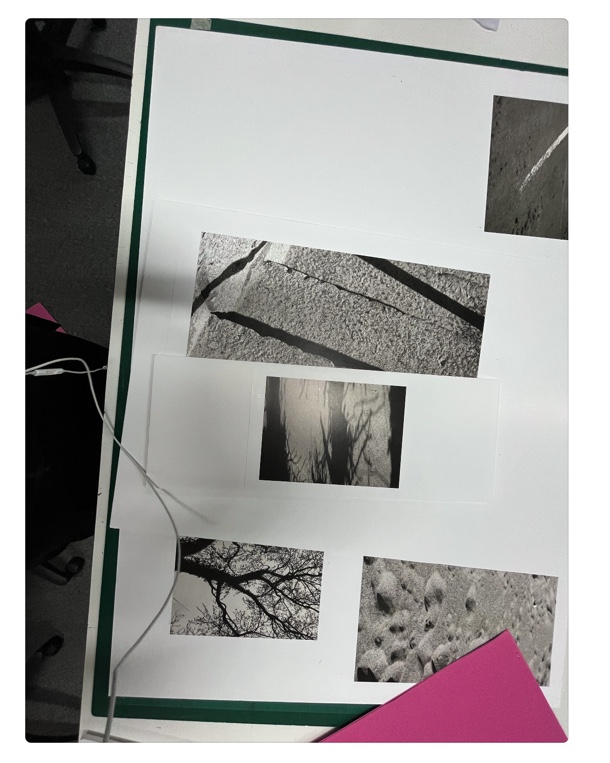
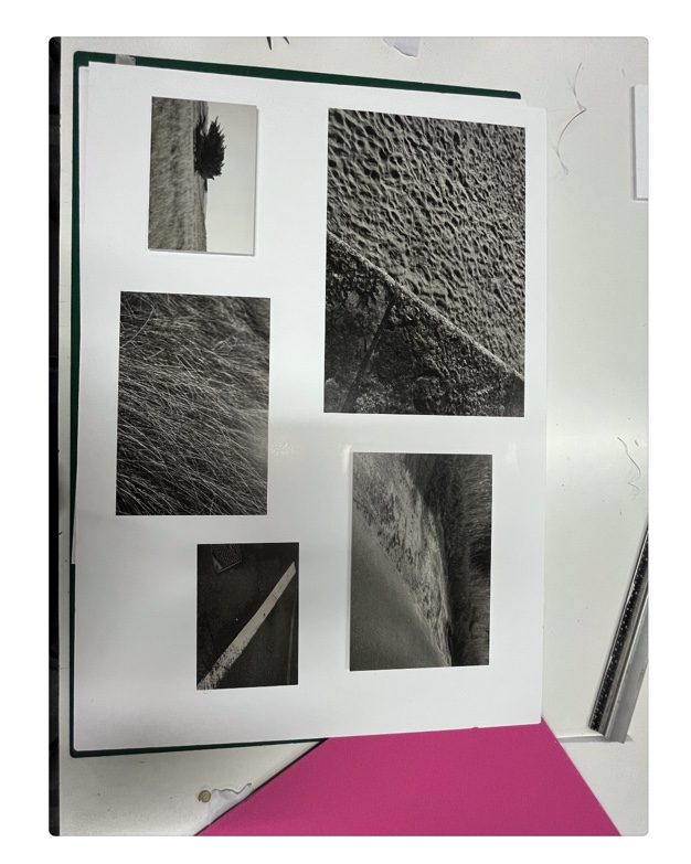
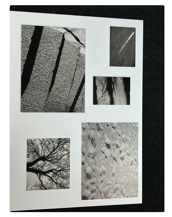
For my final prints, I am producing aset of 16 or 18 prints, onto foamboard, with some raised onto a second piece and some just sety directly onto them. For this, I am going to arrange them in a multiple, of about five per piece of A1 foamboard. I plan to use spraymount to set images directly onto foamboard, and for those that are elevated do this, an then use double sided tape to them stick the first piece of foamboad onto the second.
Final images from this project, coloured for different shoots. I used a starring system also. 3 stars – A5, 4 stars – A4, and 5 stars – A3.
Here I viewed my final images on the Loupe setting on lightroom, in order to see how they look with all their different sizes together, and on a white background like the foamboard. This acted as a mock up for me.
A3 Images
A4 Images
A5 Images
Final Presentation
Brainstorming layout on foamboard – using pencil and ruler to ensure straightnessStarting to stick downUsing elevated images on foamboard, – about to cut elevated image to size and stick ont second pieceFinal outcome 1
Final outcome 2
Final Photobook and evaluation
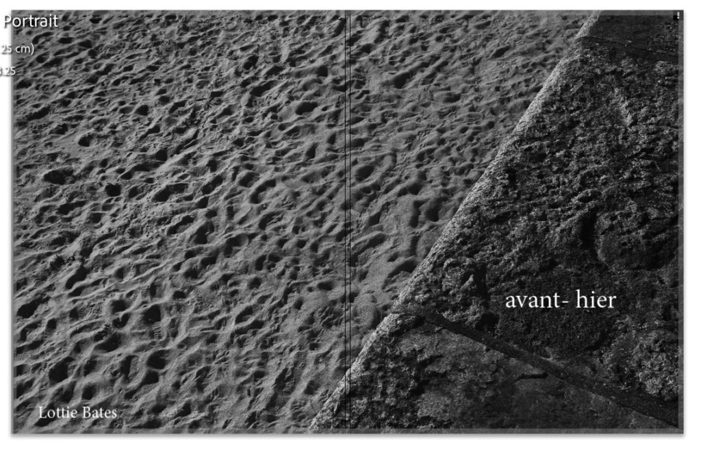
Front cover (right) and back cover (left)
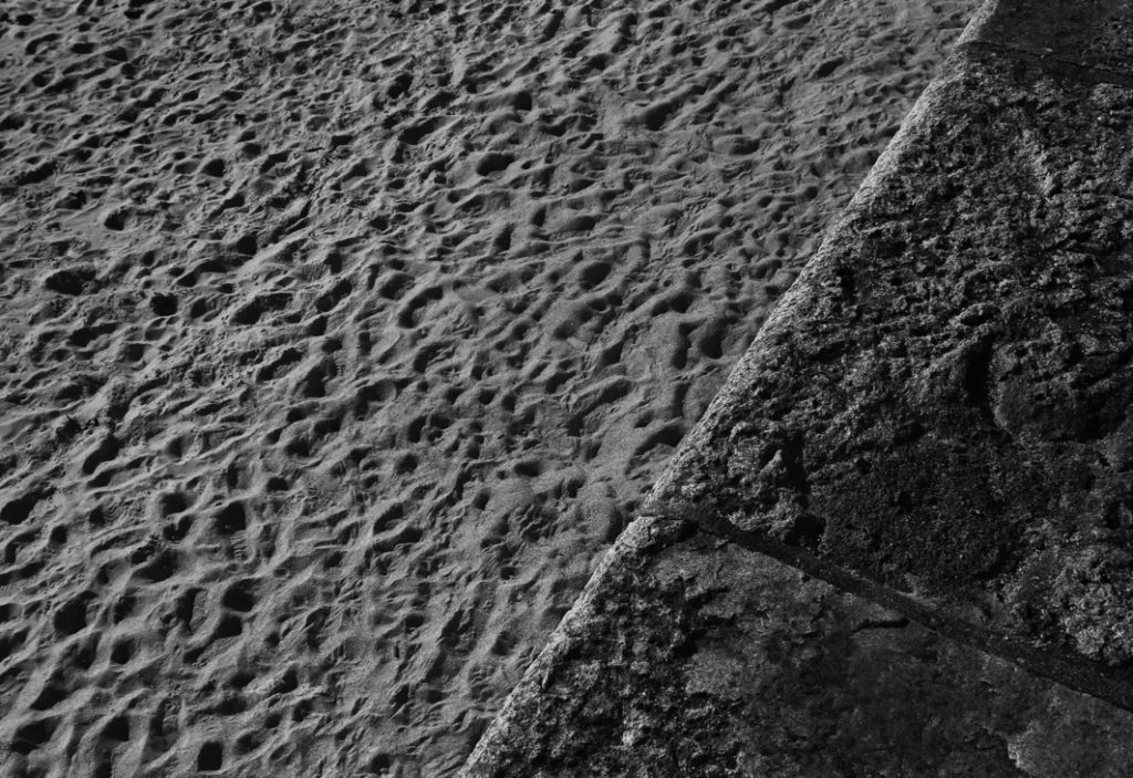
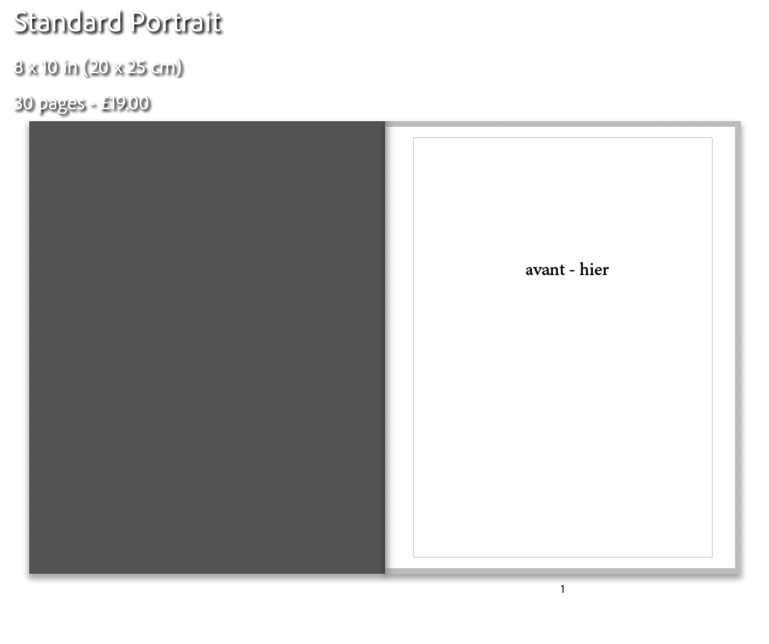
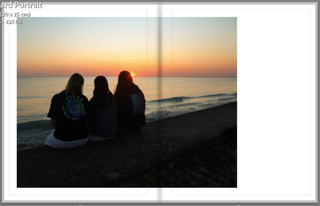
This is my front cover and back for my photobook. I used image wrap to put the image in half (zoomed)for both. I feel like this image is one of my strongest for the whole project, and I tihnk that I made a good choice by using it for my front cover. There are strong leading leading lines in this image – the harsh contrast of the wall to the right of the image creates a strong triangular shape and line leading the eye to the bottom of the image, and cover. The high detail of the sand and wall creates a graphic composition, with geometric elements. (triangular shapes and different textures with the sand and wall.) The title of my book means ‘the day before yesterday’ in French. I really like this title, as it references not only my personal links to France and the language, but also the contextual elements of my book and project. The title represents how I am referencing childhood memories and the past, and how I’m exploring the idea of changed or distorted memories.
This my title page – it ensures an understated beginning to my book, and simply having the title and nothing else, I think was a successful stylistic choice. Although simple, I think the white background with black text sets the tones of the whole book – which are black, white and grey.
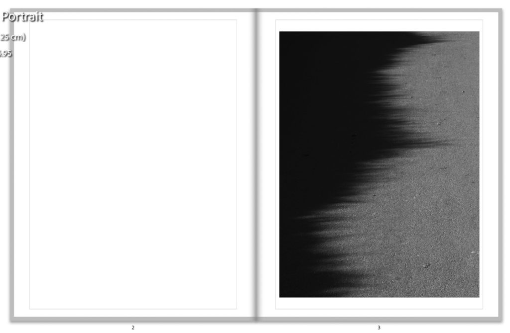
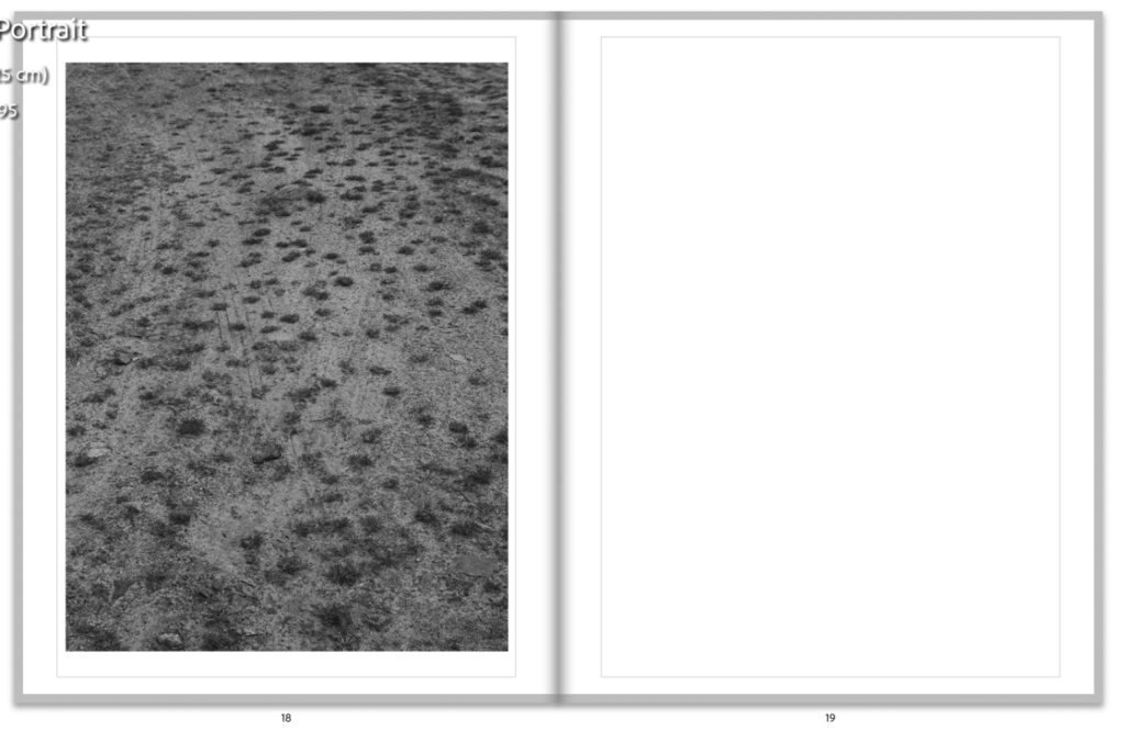
This is the first actual image on my book – i think this image is quite unusual, with its graphic nature. This image is a representation of what I wanted to capture: the idea of hidden locations, and distortion within memory.
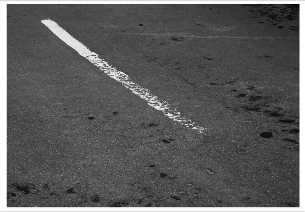
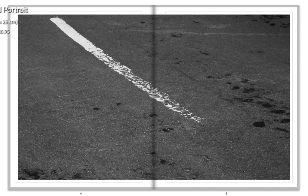
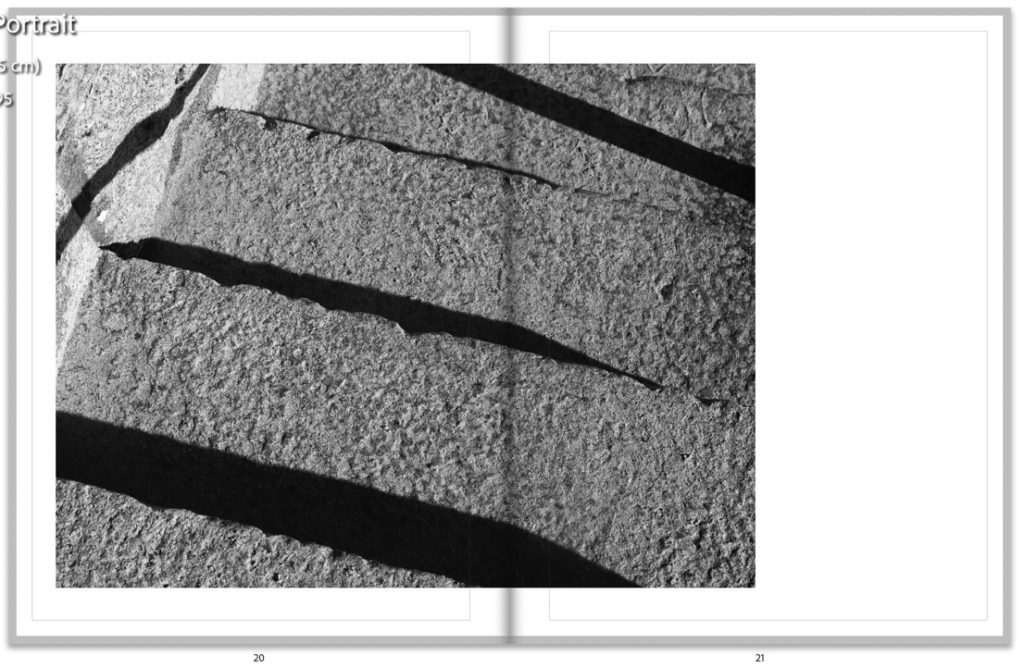
This is one of my only images with a white border in my book – this was used because it compliments the focal point of the road marking on the left, helping to balance the composition. I like the way this image’s leading lines almost sweep the eye from the left corner to the bottom right, which creates a natural progression to the next page.
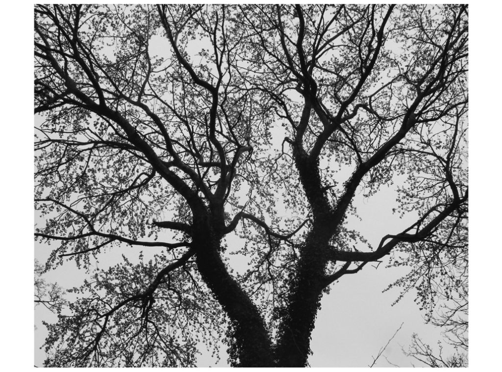
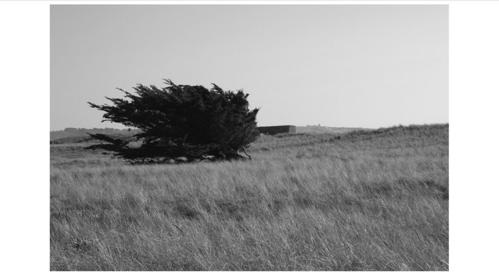
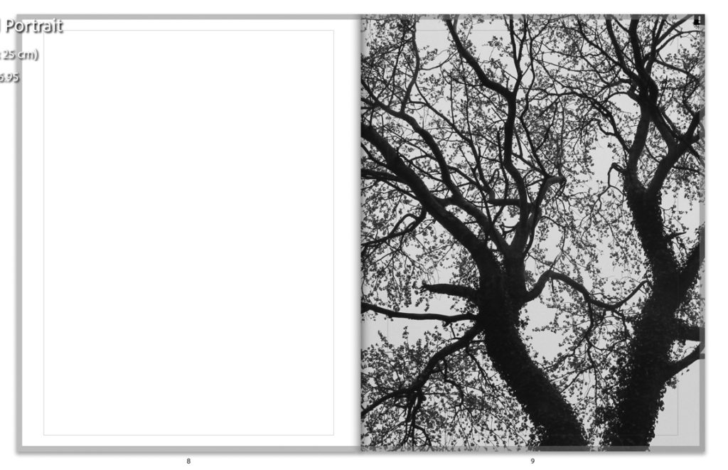
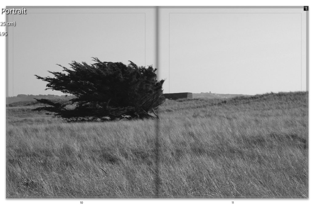
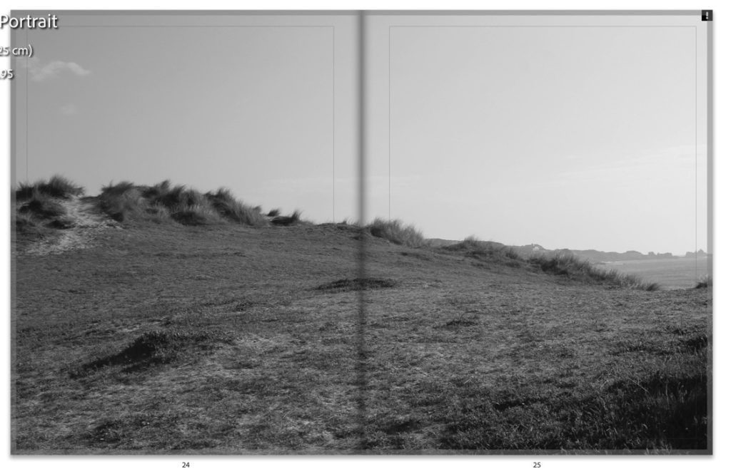
This is one of my only traditional landscape images in this project – I chose it due to the composition and inclusion of the tree to the left – this tree is an iconic part of the location of this shoot, and I wanted to include this without giving too much away in total. Furthermore, to keep a balance of different types of images, I wanted to keep a mix of rural nature, beach, and road images, with the main focus being trees and plants, roads and sand. – This image featuring the tree to the left juxtaposes nicely with the spread before, in which there is a tree to the right of the spread, creating natural progression and flow within the book’s narrative.
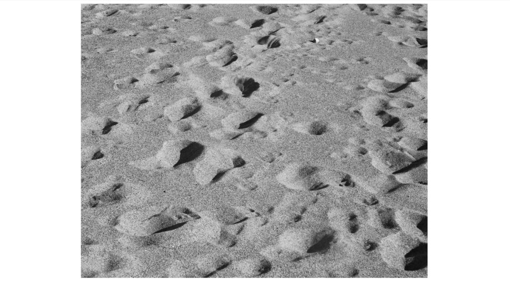
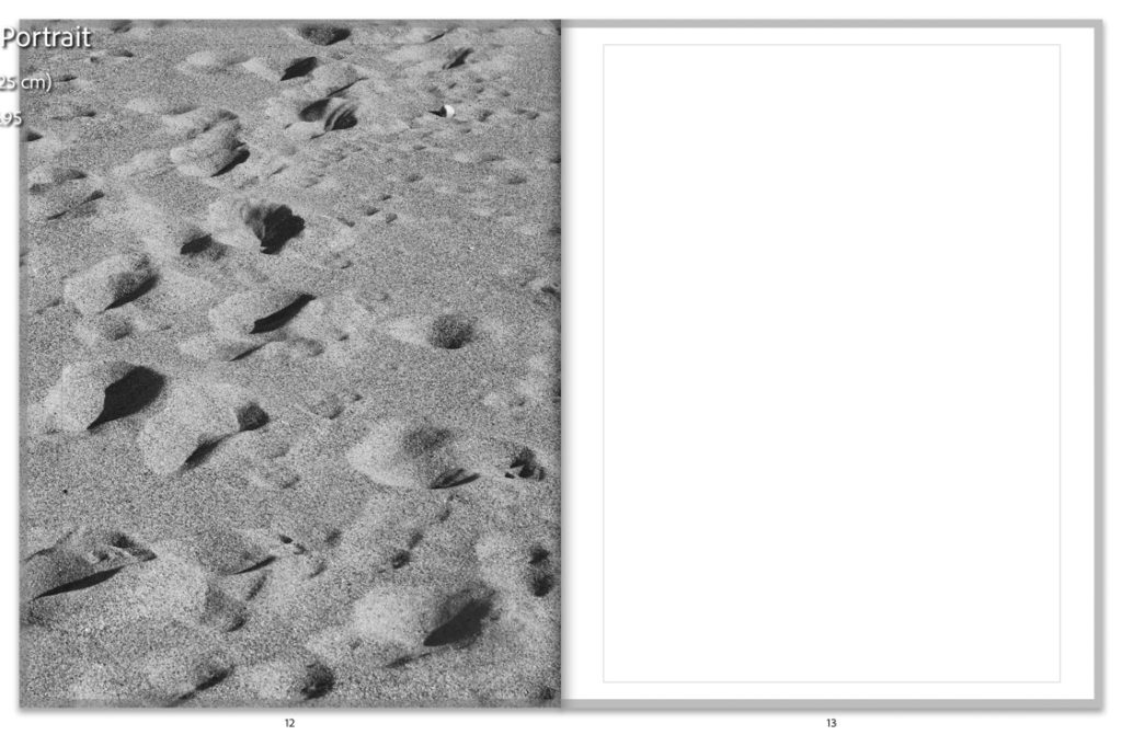
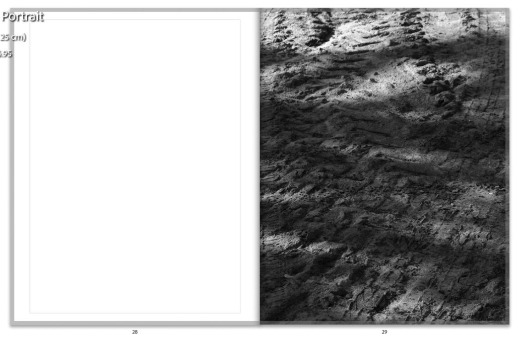
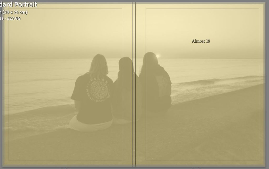
This is an image that I really love from this project – one from my favourite beach on the island, where I grew up on. The footprints create great depth within the image, and also could represent the idea of moving or travelling, which was a huge part of my life as a child. This is something I’m happy I included, as I wanted to include some personal elements in my book, but without obvious signs or hints – this adds an air of mystery and subjectivity to my work which I really like.
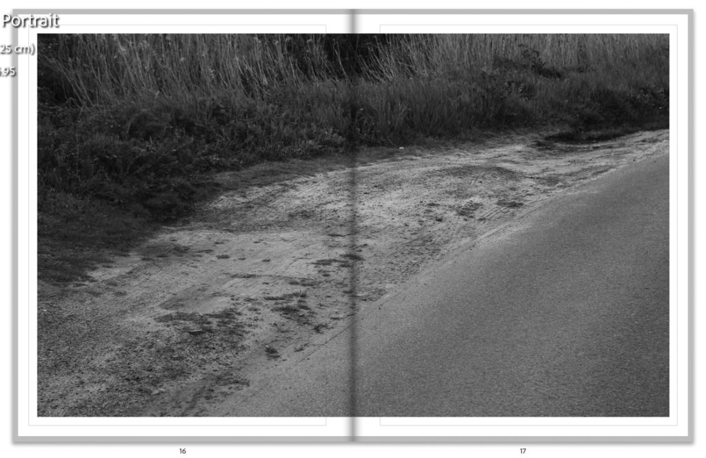
This image is another double page spread. To me, it represents the rurality of the places I was photographing. The bushes and road create three clear parts of the image – the darker, more dense bushes to the left and top right, the middle of the image, which intersects both pages with more inclusion of tracks – creating a thread onwards from the last image. Finally, the final sector of the image is the desaturated road: this links well with my other images of roads and their reflections in the project. Overall this image to me is somewhat a staple of the book, not only because of its position in the book, almost the middle, but the inclusion of all kinds of other textures and parts that feature in the rest of my images.
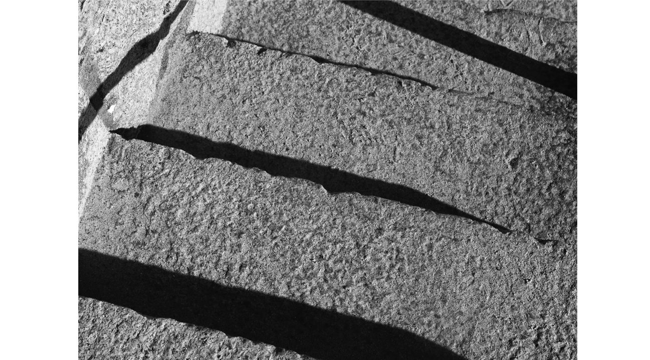
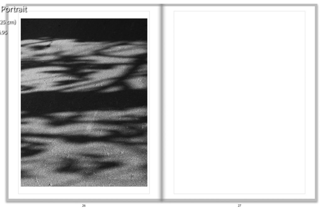
This image is another from my favourite beach, however the steps. This image features really dramatic shadow which I really love – I accentuated this with mu editing using contrast, blacks and shadows. Contextually, the inclusion of steps in my book could be seen to reference change or movement in life, and to me was important to include for these conceptual reasons. Furthermore the strong shadows link closely to other similar shadowed images in this book, and were important to include to bring all types of images together.
This is the final image in my photobook – I wanted to choose an understated, close up image for my final photograph, as it helps to create a natural end to the narrative, representing a possible final memory, or with the shadow representing confusion or ‘foggy’ memories that can be confused as a child.
Final Evaluation
Photoshoots
I had mixed experiences with my photoshoots. My first photoshoot I found to be successful, due to high quality light and a location which I knew well, so could visualise what shots I wanted to take. I found the weather to be the most impactful thing on all of my work – my first and last photoshoot were the most successful due to the high quality light and better planning, with my second and third shoots not going as well due to lack of light quality and also planning. I found that I struggled with lack of planning slightly in a few of my shoots, and that the more I visualised what I wanted to take and wrote a plan before helped me to create better images.
How successful were your final outcomes?
I think that my final prints and photobook came out better than I expected. I had a lower quantity of images for this project to normal, and was worried about this impacting the quality of my final prints and book. However, after my editing, which I think went really well, my images had come together as a set as I had envisioned. Did you realise your intentions?
I think yes, but also I think not as well as I thought. I had planned to include archival material of my locations to juxtapose my own images, but due to lack of time and poor planning on my part I didn’t manage to do this. It was a shame I didn’t include these, but I also think it was a blessing in disguise – I always include these kinds of images in my work, and this whole project was me stepping out of my comfort zone in my photography, which is something I find really difficult, as I worry about getting things wrong etc. In this way, I think I did realise my intentions as I experimented with a whole unknown type of photography that I’m not comfortable with, and created some outcomes that I am proud of.
What references did you make to artists references – comment on technical, visual, contextual, conceptual?
I think that I’ve referenced some artists more than others, for example I used Kyler Zeleny and Alec Soth for reference in my starting points, before I decided to photograph more and more abstract images. Therefore, these artists were still useful as I used their work to inform my next steps in my project and would not have been able to do this without research into their work. However, my final artist reference, Siegfriend Hansen was the most impactful on my work – I found his work to really reference what I was trying to capture, although my work was that of rural landscapes, and Hansen’s is urban street photography. I found his writing about his work to be extremely useful, as his process helped me to inform my own choices. – His focus on the formal elements of photography really helped me to focus on these in my own abstract work and make more successful outcomes.
Links to Simple and Complex
My project links finally to this theme through the idea a seemingly simple idea: rural landscapes, in black and white. This however contextually is approached in a much more complex way, through the idea of childhood memories, but not only this simplistic idea but the way they change and alter in your head as you age, and how this manifests when revisiting childhood places. This is documented in quite complex looking images, but of simple things: such as trees, sand, and roads. The elements of my photos that I focused on are simplistic, for example, such as line, shape and shadow, but they manifest in much more complex images and compositions. Is there anything you would do differently/ change etc?
If I was to complete this project again, I would use my time more effectively. I didn’t complete photoshoots enough in advance, and this meant I didn’t have enough time to reflect properly on my outcomes and change my course of my project effectively enough.
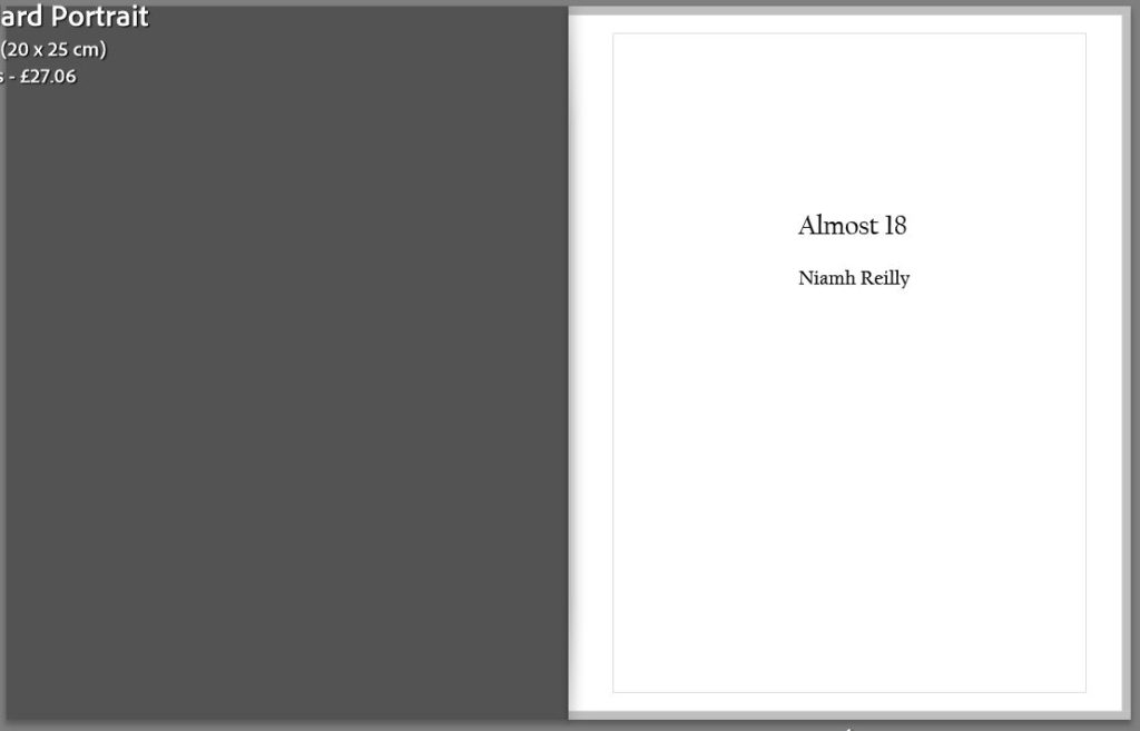
This is my front and back cover as well as my opening page into my photobook, originally I wanted a plain yellow cover for my book but as I was experimenting I overlaid an image and decreased the opacity creating what I have now. I think that this is a nice way to give a snippet of what the photobook is about but not to much where the viewer doesn’t want to look inside. I had chosen yellow as it is the colour for friendship which is one of the key themes in this photobook, I also have an opening where is states the title of the book as well as my name.
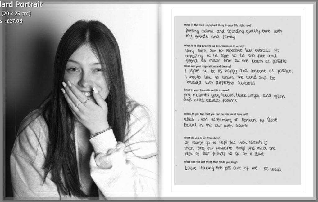
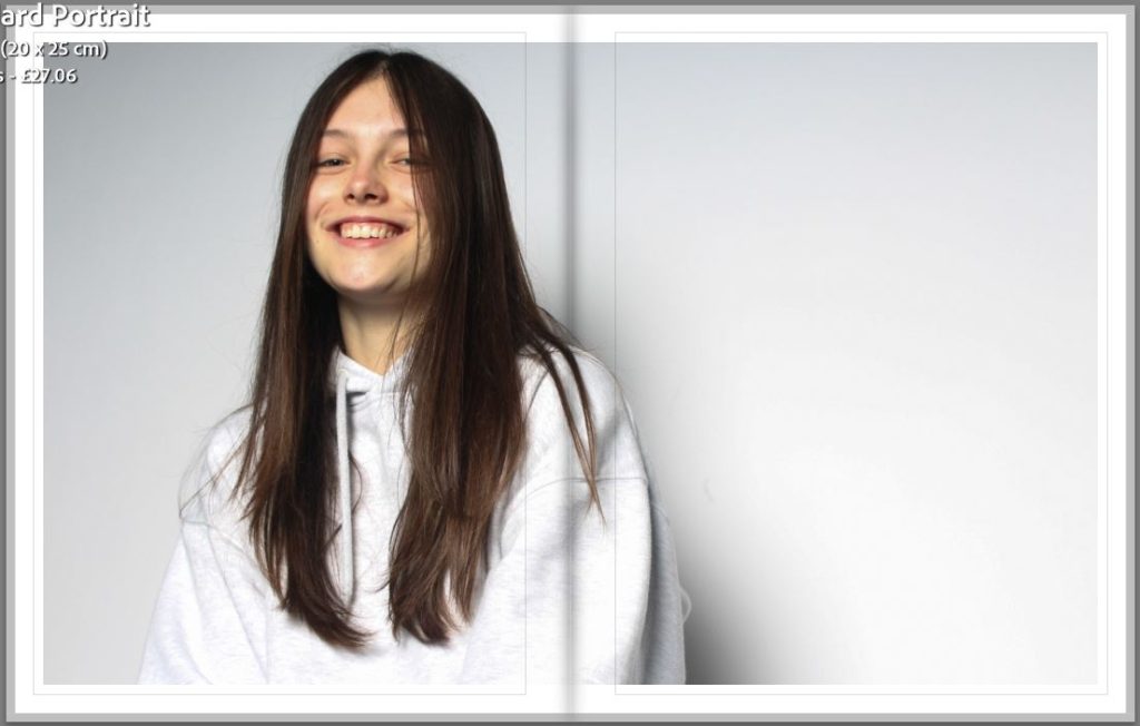
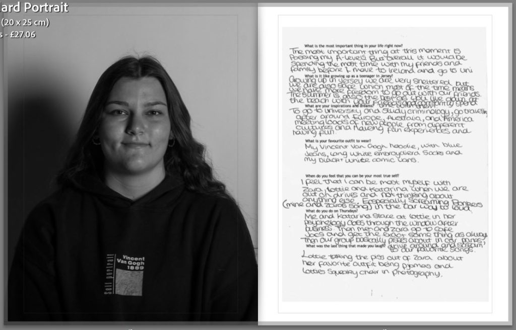
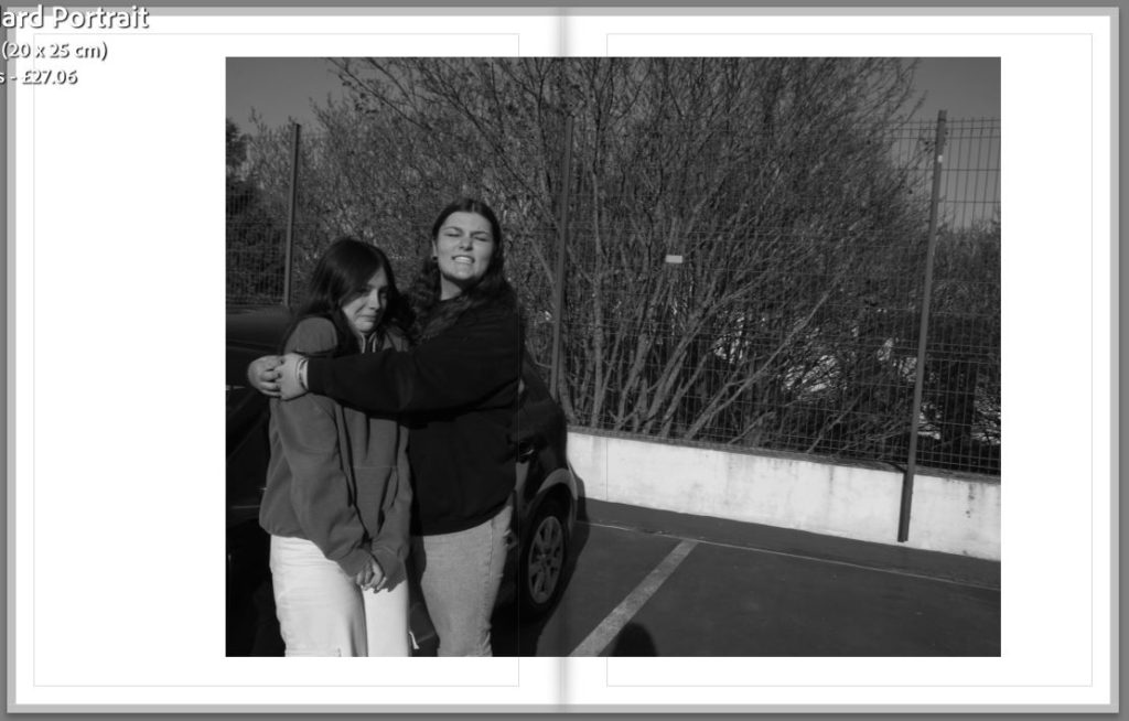
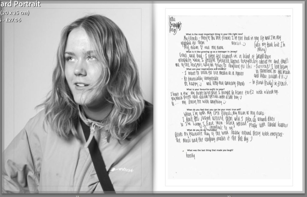
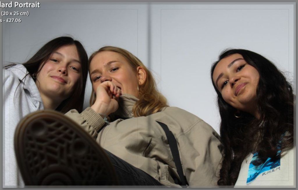
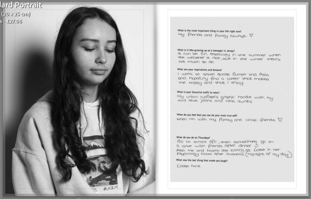
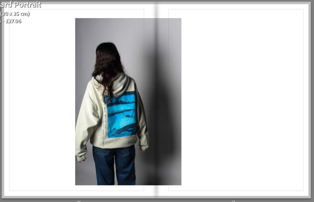
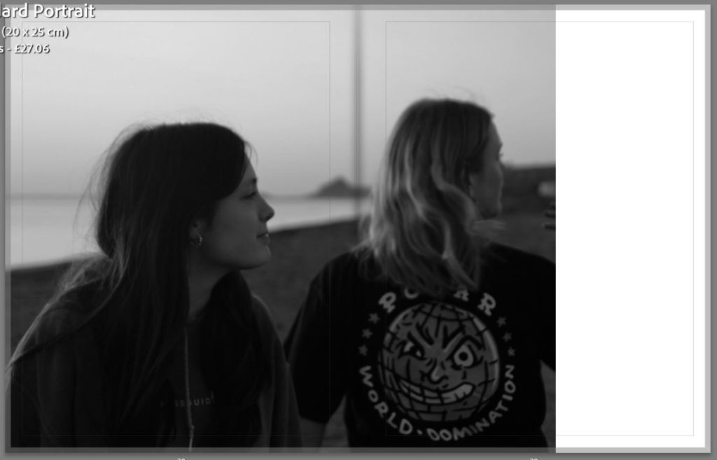
This is my proper first and second page in my photobook, I started off with a black and white portrait and the questionnaire for my first subject. I will be starting all the sections like this so that it will be easier to differentiate between each person. For my second page I have done a similar portrait but in colour and at a different angle, I wanted this over two pages but not to the edges so that it would be able to have a white boarder around the photograph.
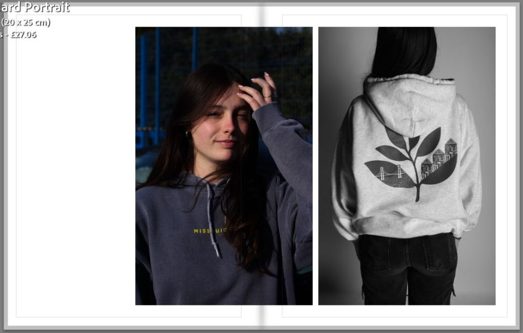
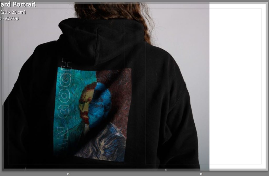
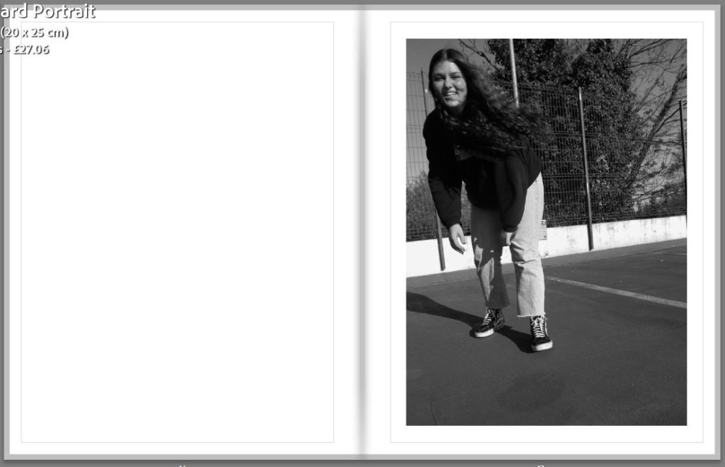
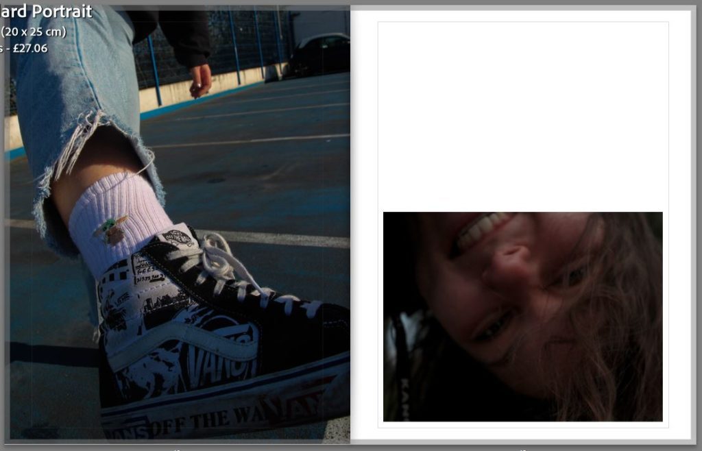
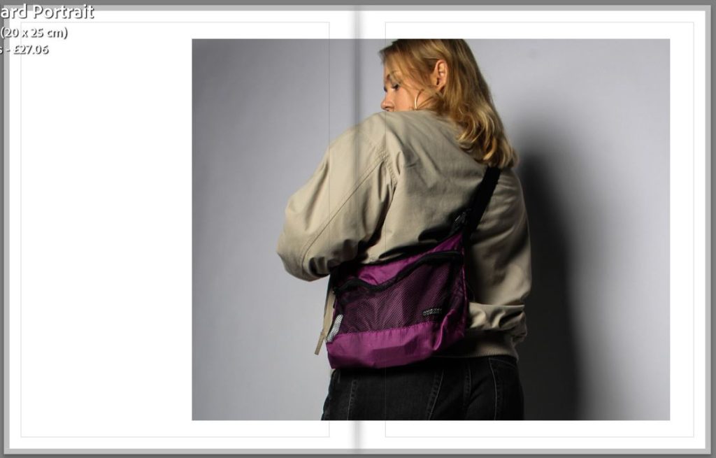
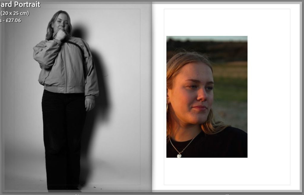
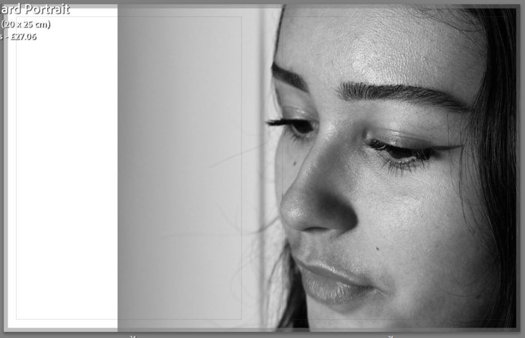
For my third and fourth I am still focusing on the same subject and trying to show different parts of her clothing and different styles of portraits. I wanted to do a front portrait and a backshot on the same page to show different perspectives. I also wanted to break apart the images by leaving a black page to make it look less cluttered. The fourth page has one of my most successful images as I was able to experiment with aperture and having the foreground in focus as well as the background out of focus.
I have also chosen to experiment with different layouts, such as my fifth page where I have a landscape image which is under a portrait image. I like the contrast between the black and the white and the enhanced sunset with the rich and vibrant colours.
For this page I did a full page spread of one of my best photographs which I have situated next to a landscape image that is covering the bottom side of the back, I like that it has a white boarder around it as it is already quite a dark image. On the following page I have used a landscape image but I have put it slightly off centre which I like as it is something different compared to a straight and centred image like I already have in my book.
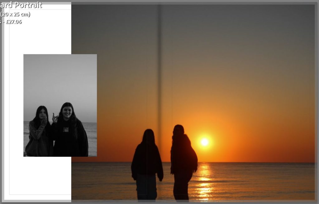
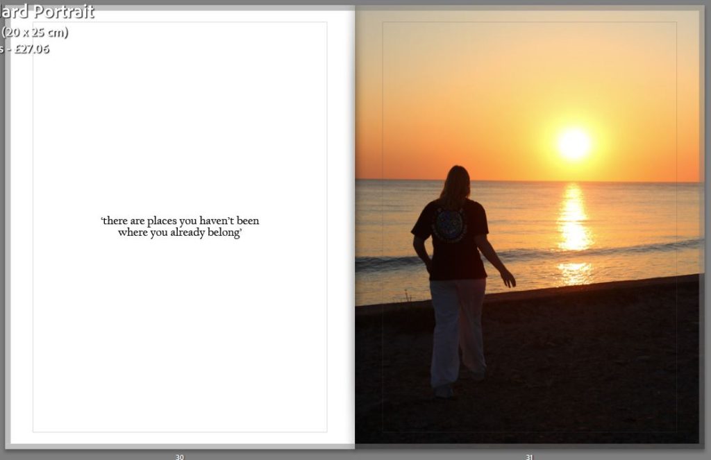
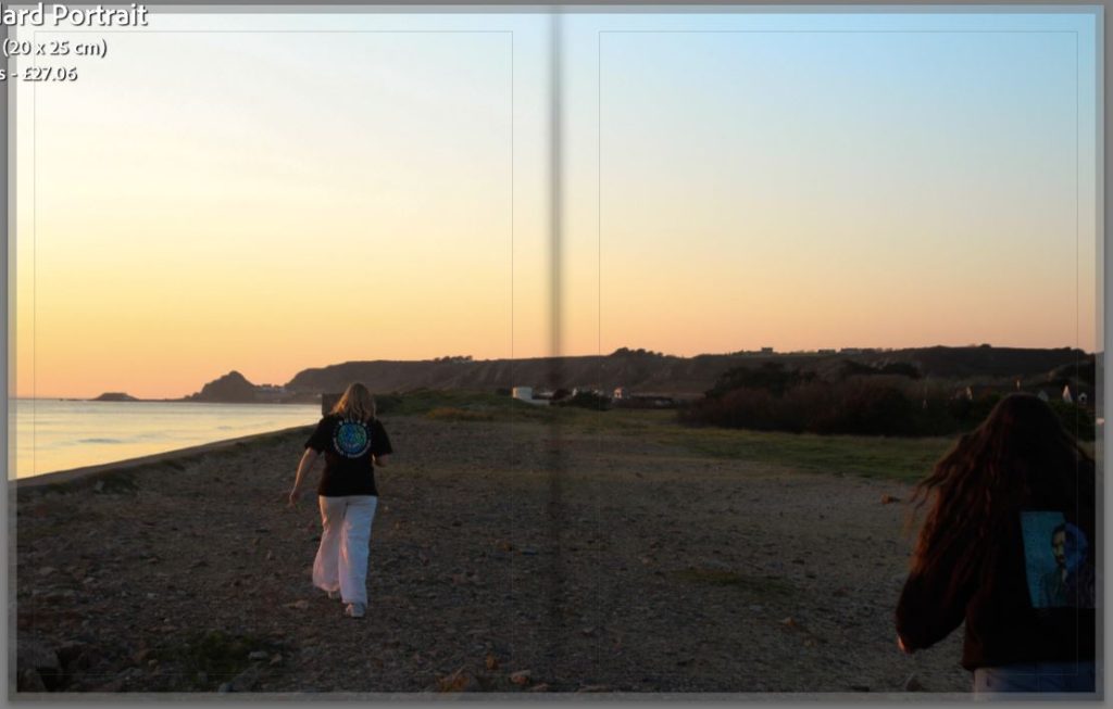
For this page I have also add a quote by the subject which she has chosen, I like how the text is able to break up the photographs so that it is a smooth viewing. I have put this next to another one of my most successful images of the subject walking towards the sunset, this was inspired by one of my photographers Kayla Varley, which is by having the subject silhouetted against a strong set of colours.
How successful was your final outcomes? I think that my final outcomes were very successful as well as a photobook which has a strong narrative and cohesive set of images. Out of my four photoshoots I believe that the compilation of images that I have come out with tell my story clearly and have a unique style to them. I defiantly have images which are stronger then others but they all have been edited where they can be put together and taken apart and still look professional and look aesthetic.
Did you realise your intentions?
At the start i struggled with linking my images with the simple or complex theme, but as I have gone on I feel that I have produced a set of images where their is a clear link. As I have explained before my main aspect in on friendship and being teenagers and both of those things are complex in themselves but I have tried to show them in a simple way through a photobook.
Is there anything you would do differently/ change etc?
I would make sure that I have more studio work as I found that I like having a neutral background as they are easier to pair together, they also tend to look good in both black and white and colour. Even though I think all my photoshoots were successful and produce great final images.
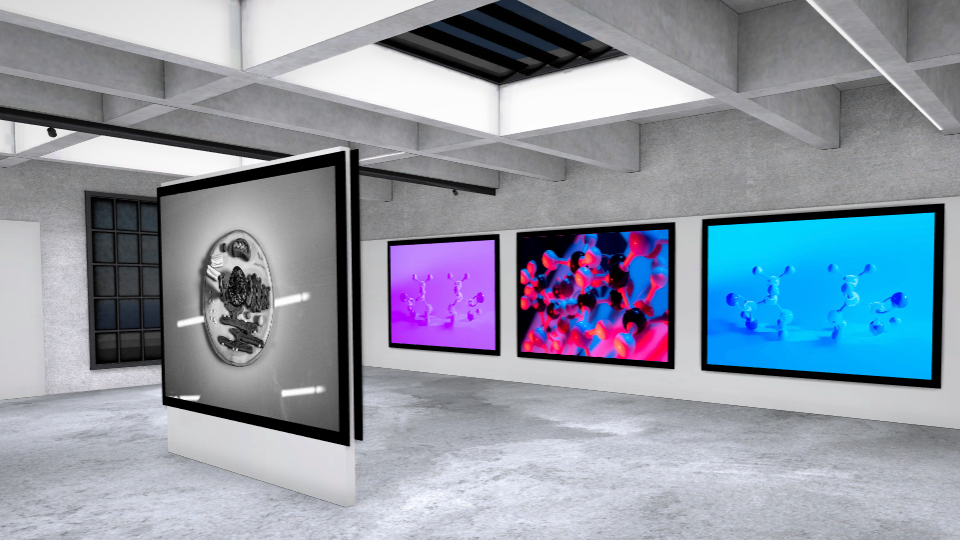
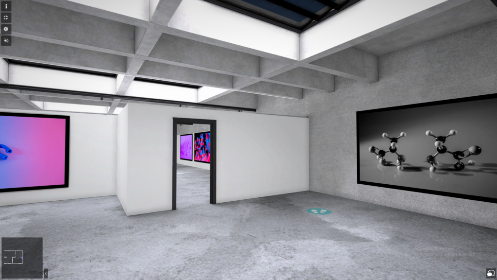
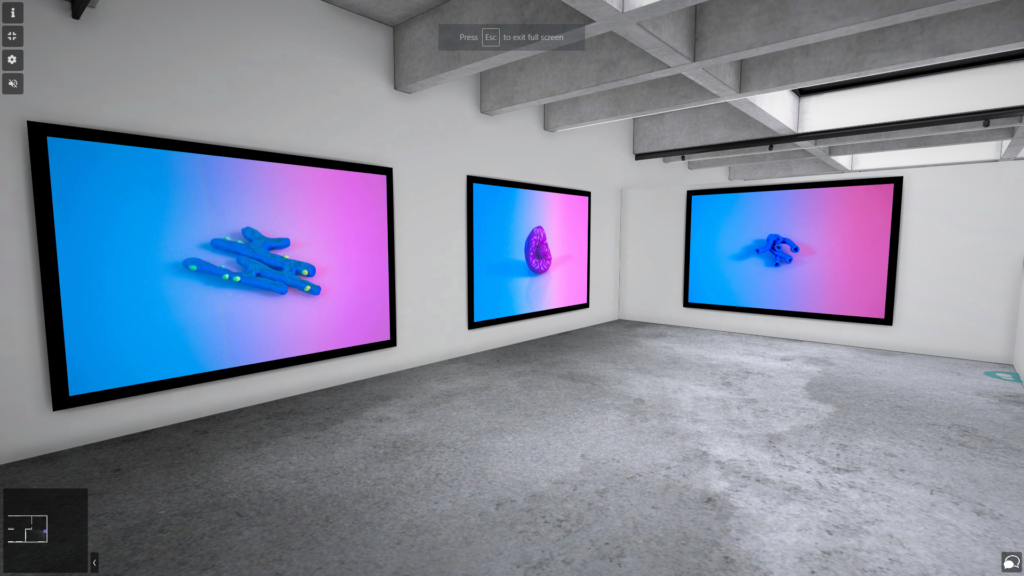
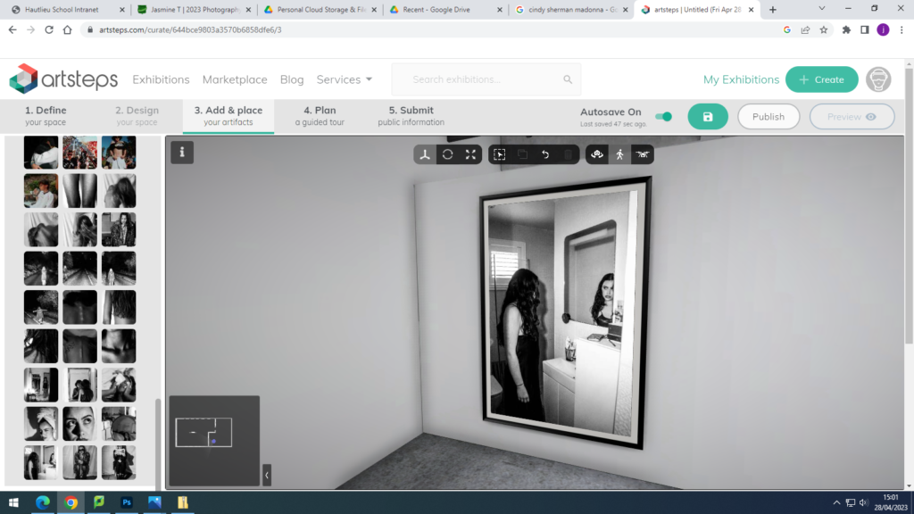
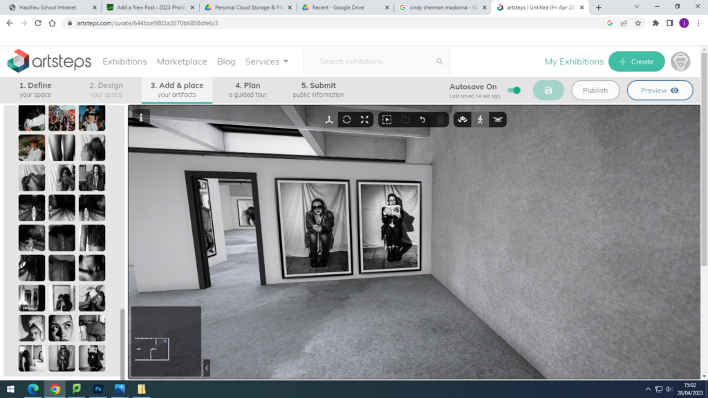
I think that the final outcome of my virtual gallery was quite successful, this was due to the use of the gallery file which I chose and the way which I decided to alter the perspective of the images and add a drop shadow which makes it appear to be more realistic.
Did you realise your intentions?
My intentions for my virtual gallery were for it to be simple in how it was composed but to have a feeling as if it is a photo which has been taken in real life of a gallery which you might go to then posted on the internet for others to see.
Is there anything you would do differently/ change etc?
If I were to do my virtual gallery again I would select some of my diptychs which I have chosen to input on to my walls instead of having individual photographs, I would also add a frame to the images to make them look more realistic and as if they are mounted images.
Mounting my images –
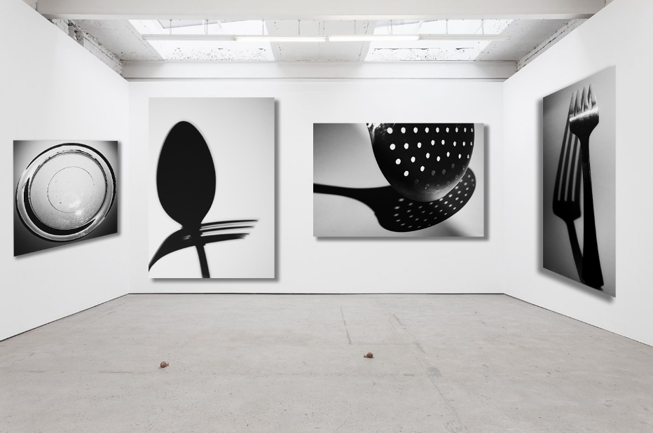
How successful were your final outcomes?
I think that the final outcomes of mounting my images was successful as they experiment with two different ways of mounting but in a simplistic way which refers back to the traditional, naturalistic style of still life images and how they are supposed to be presented.
Did you realise your intentions?
My intentions for mounting my images were to experience with different ways of mounting up but to stuck to a simple and traditional way of mounting my images through window mounts and using black card on to foam board.
What references did you make to artists references – comment on technical, visual, contextual, conceptual?
I think that my images relate well back to my artist references who were Paul Outerbridge, Andre Kertesz and Jarolsav Rossler. This is because they all inhabit a simple way of presenting their images in different photobooks and in a variety of different ways online where they may only be one or two images on the page or in the frame, this is what I have also tried to achieve in my own work.
Is there anything you would do differently/ change etc?
I think that while mounting my photos, it was quite difficult at the start to get the hang of how to mount up and present my images because of you had to construct the window mounts, but this became easier throughout doing them repeatedly which made the process easier for me.
I think that my photobook was quite successful as a final outcome as it represent different elements of the two photobook references which I used which were the Vagus magazine, and ‘Breakfast’ by Niall McDiarmid. This is because I have a variety of single/double page spreads which are featured on both, especially the Vagus magazine, but there are also elements which I have used from ‘Breakfast’ which was the simplicity of using a image on the right hand side of the page. I also like how I have used the title and page spread of ‘The shadowed reflection’ as it incorporates the two different themes which I have studied in my photography.
Did you realise your intentions?
My intentions of my photobook was like my virtual gallery and mounting my images to keep the traditional simplicity of still life images where there is not anything else happening within the spread e.g. text or different colours, and to make the main focus of the photobook to be the images which are featured inside.
What references did you make to artists references – comment on technical, visual, contextual, conceptual?
I think that the references which I have made to my artist references are strong visually, due to the way OI have taken the pictures inspired by the artists who I have studied (Paul Outerbridge/Andre Kertesz/Jaroslav Rossler) and the editing of my images into black and white as well as experiencing with different vibrancies of images has a strong connection to the artists who I have studied throughout my work.
Is there anything you would do differently/ change etc?
I do not think that there is anything which I would do differently in my photobook as I am happy with the final outcome of it.
Overall i think my exam project was a success. Three our of four of my photoshoots went well. Photoshoot one did not work due to camera settings and weather circumstances. This shows my planning for photoshoot one was not done very well. The rest of the photoshoots however worked out very well due to me doing some more planning such as checking the weather and camera settings after the failure of photoshoot 1. The prints of my final images from each shoot came back very well and mounting up was good, both the mountboard and the window mounts. I think that my photobook was a success and hopefully it will turn out good when its delivered from Blurb. I think that the title of the photobook could have been better however. Also