All posts by Zara Currie

Filters

Author:
Category:

Overview of personal study

Artist Comparisons

Below I have showed how my work is similar to the work of the three artists that I have studied, this is to show that I have taken inspiration from them throughout my project, and during photoshoots considered the different kinds of shot they take. This is important as these artist guided my photography in this project and allowed for me to create more successful outcomes.
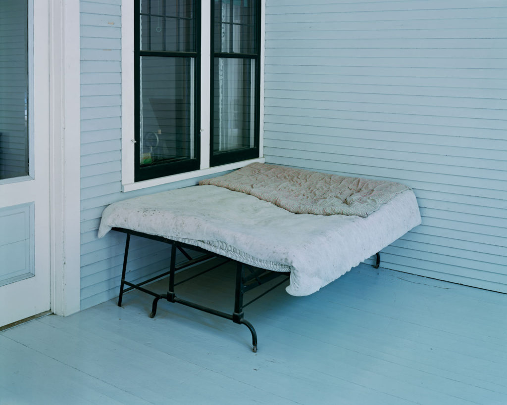
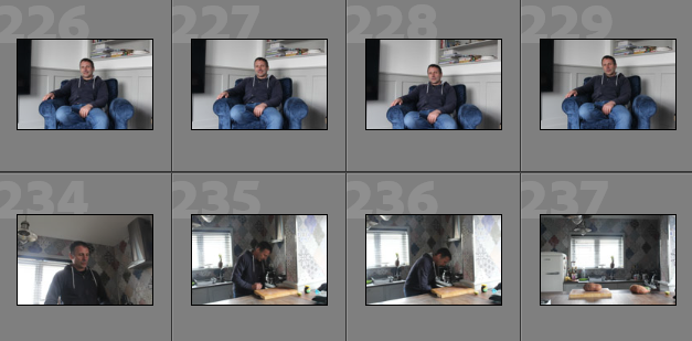
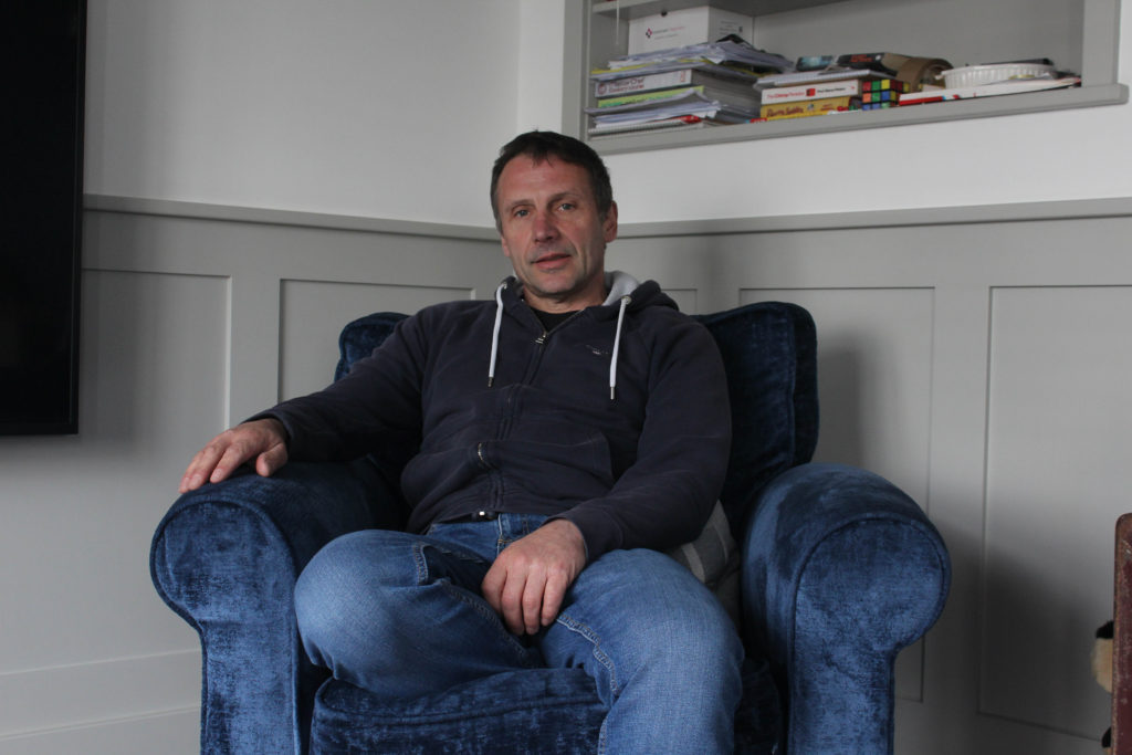
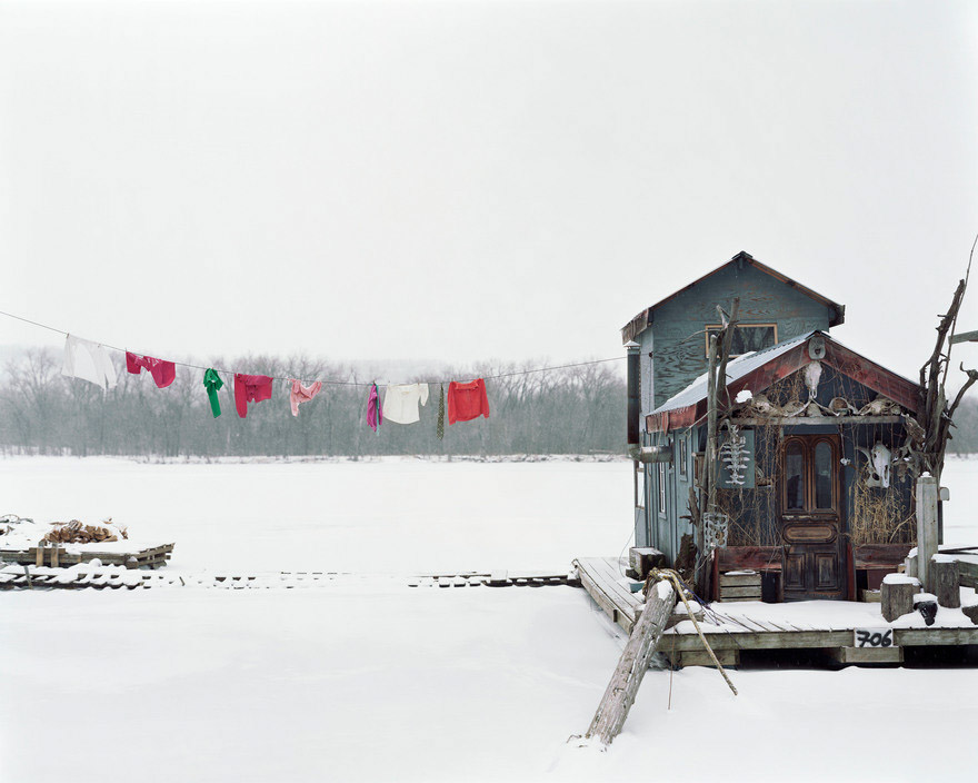
Firstly, I am using this image of my dad’s couch to compare to the work of Alec Soth, I think that if my photograph would of been more widely shot, then it would of been more similar to the photograph of the left of Soth’s. The images are similar as they both show areas of relaxation and have blue and grey tones throughout them. However, my image would of been a lot better if they lighting would of been consistent.

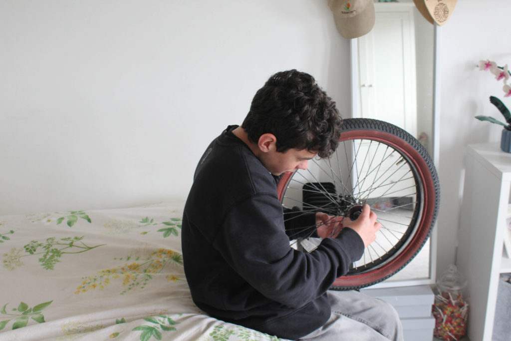
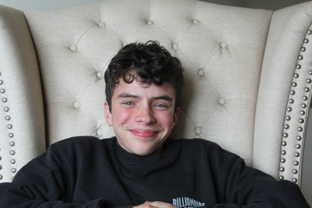
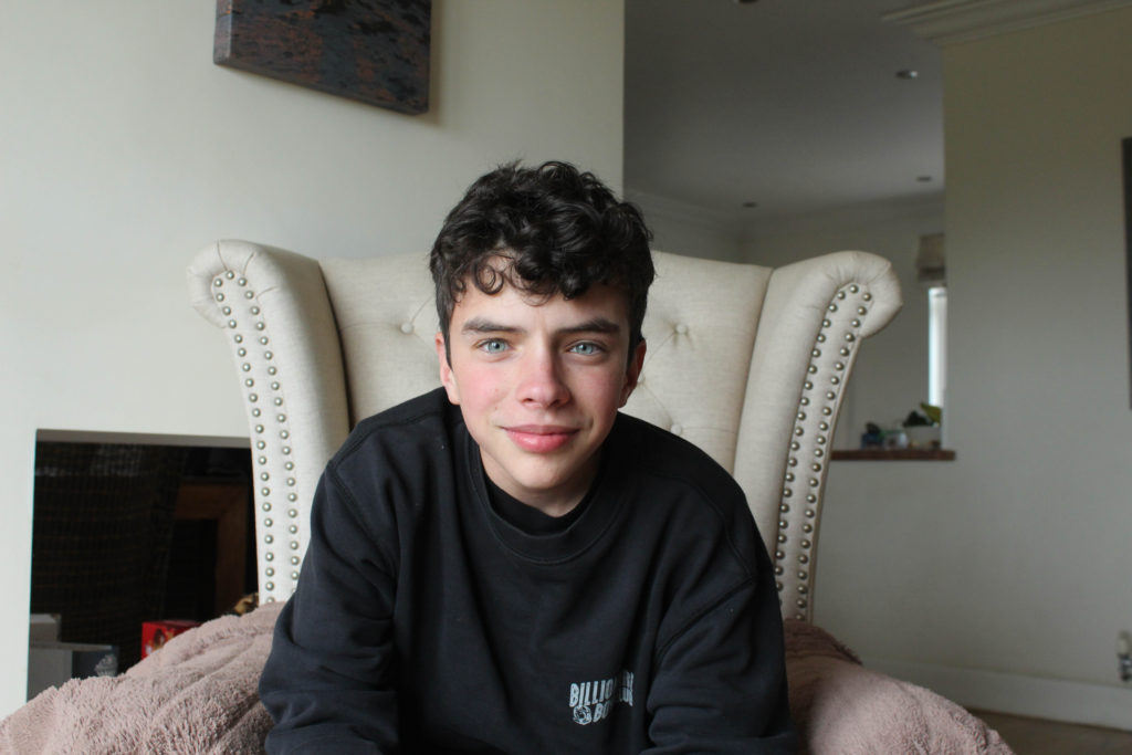
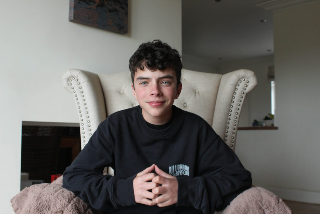
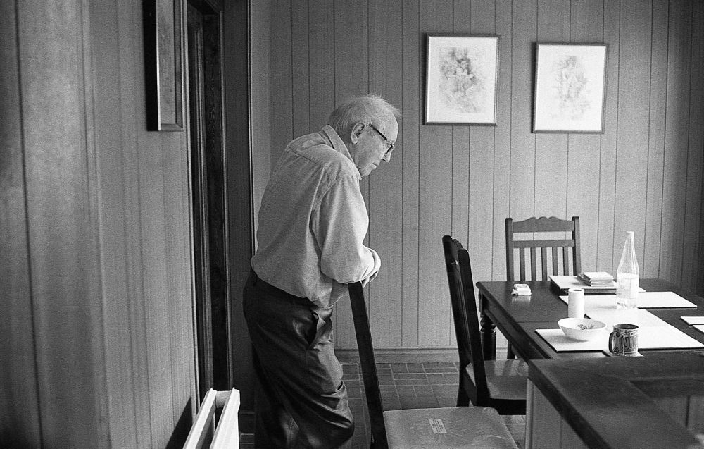
In my opinion, this comparison is the closest example of me taking inspiration from artists, as this image of my brother is very similar to the one from Matthew Finn’s ‘Uncle’ project. This is because how they are facing away from the camera and towards the right. This is my most successful artist comparison, and the original image has been featured into my photobook as it is one of the best photographs taken from my first photoshoot.

Printed Images and Framing Up

To finish off my project, I have below shown some of my final images, with small evaluations and then photographs of them after they have been mounted up and displayed. This is important as it demonstrates how much my project has developed and how from the photoshoots to the printing, my personal study has been successful.

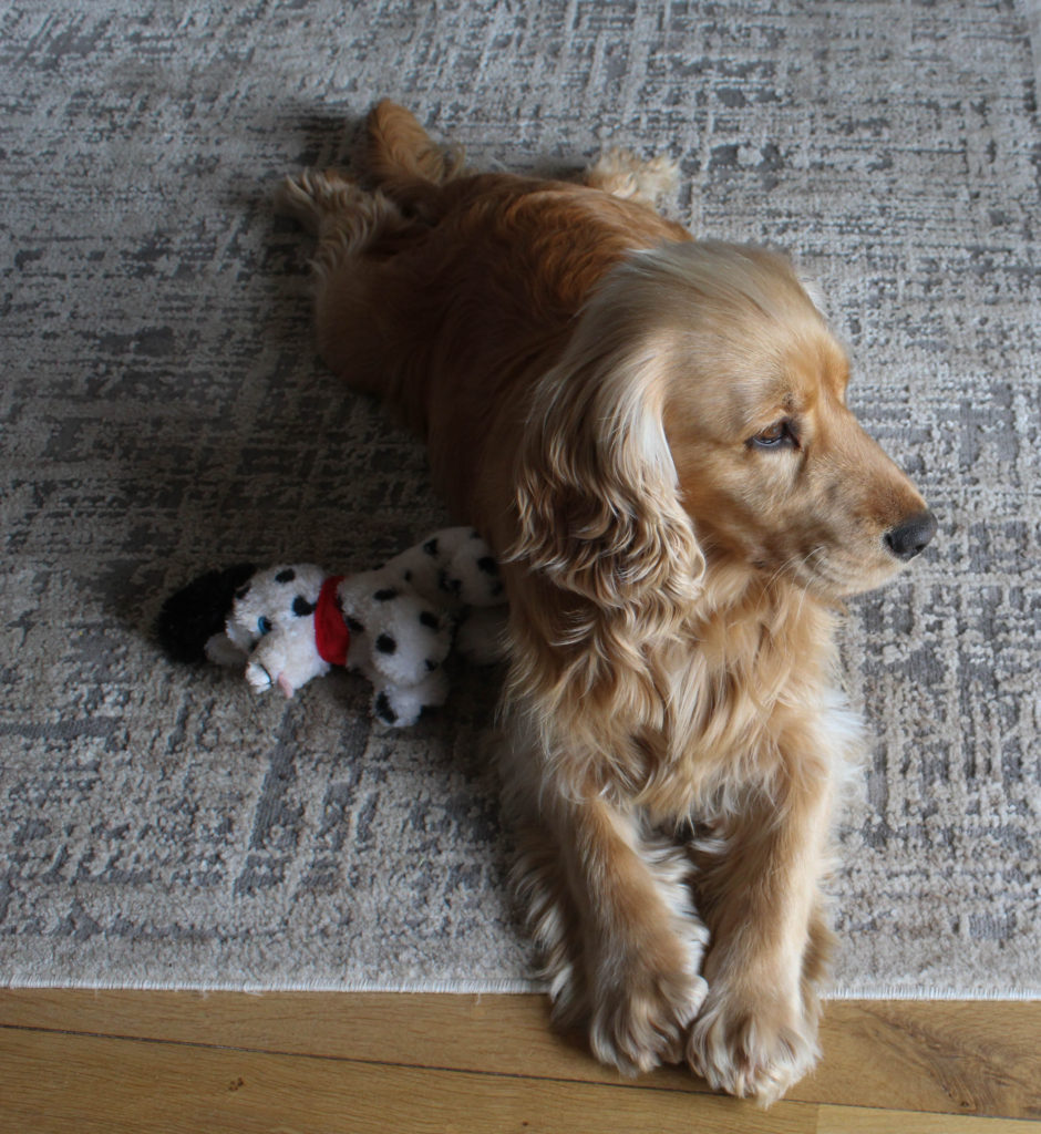
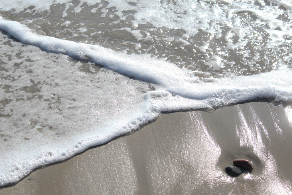
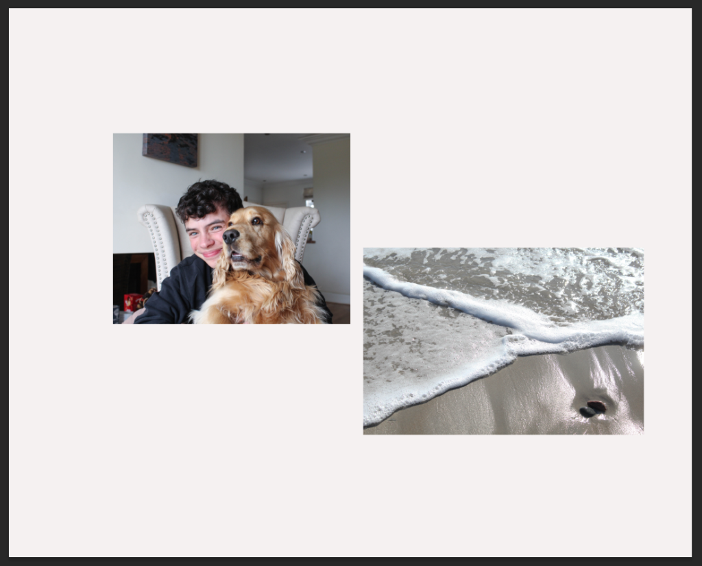
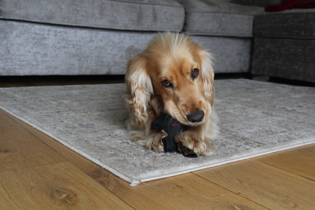
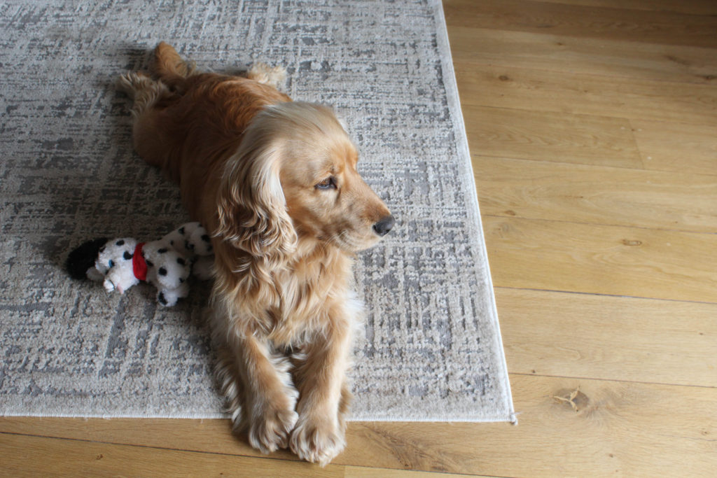
I really like these two images together, the overall tones of the images are similar as there are warm, especially yellow, tones throughout both of the photographs. Also there is link within these images as both my dog and my brother love the beach and have spent a lot of time there with me as we all love to go in summer, the composition of image one is aesthetically pleasing as I have cropped the image so that my dog and brother are right in the middle. I also think that the lighting throughout this image is consistent, as I placed both of them next to a large in order to try and get the optimum lighting. The second photograph didn’t need much editing at all, this was because the natural tones of the beach and rocks was good already. I only changed the vibrancy of the image to make the rocks look less dull.

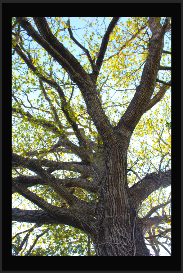
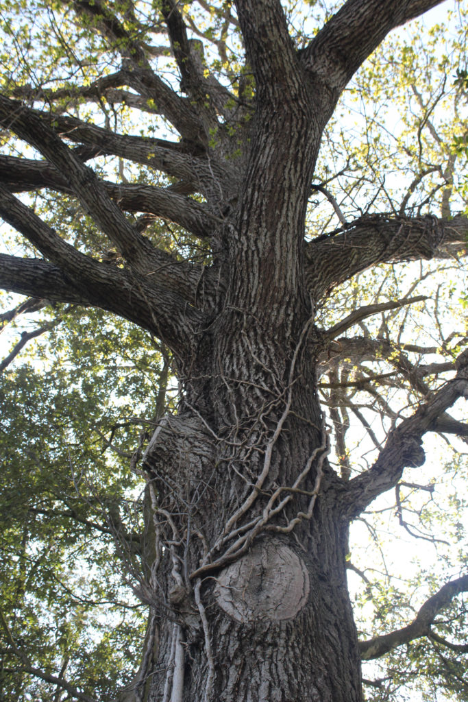
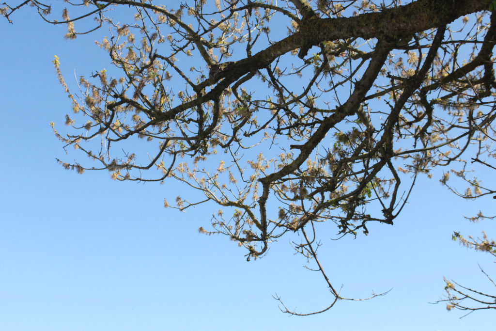
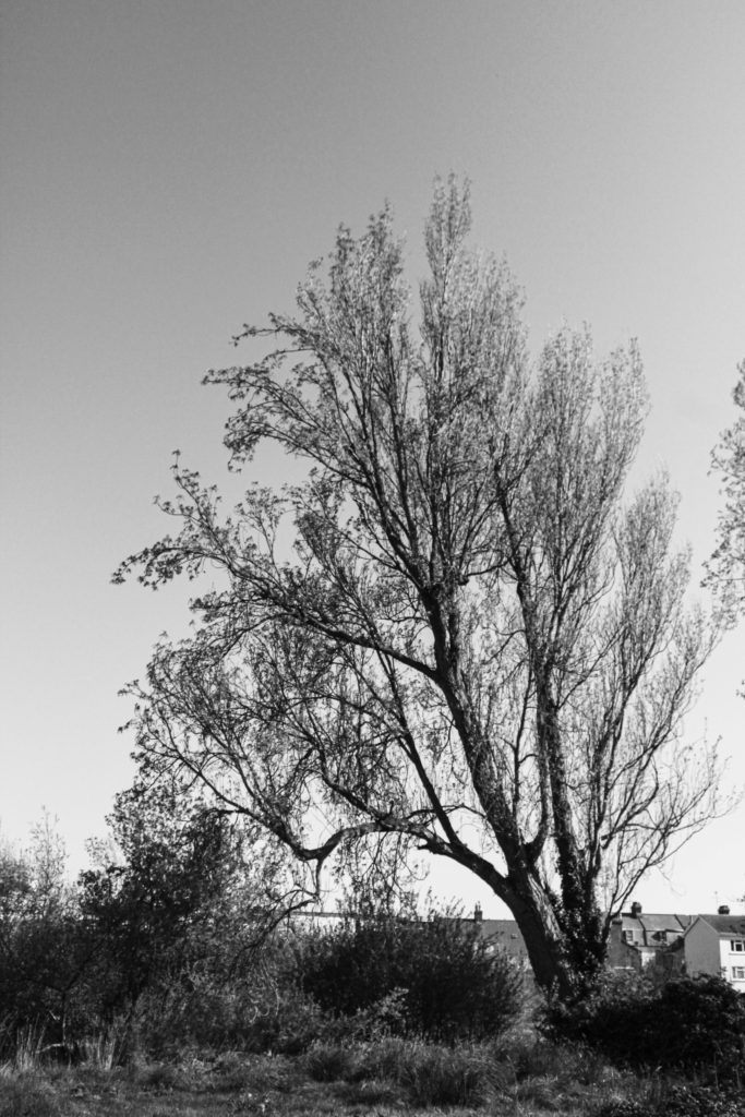
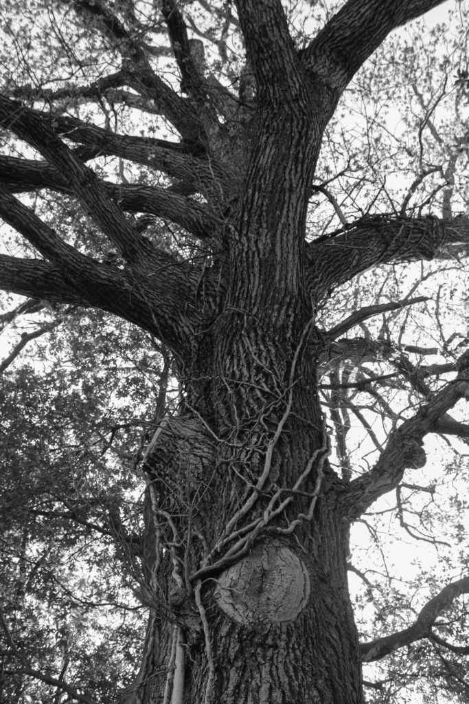
These images are among the most successful mounting that I have done for this personal study, this was because they linked perfectly together and could either be displayed on black or white. I thought that black would be the best option and it makes the background amongst the tree look brighter, and creates more contrast throughout this piece. Putting this photographs in monochromatic make them appear as if they were a lot higher quality, and helps to enhance the natural features of the tree, for example the vines along the main body of the tree. In my opinion, these are some of the best images from my project, but it could be criticised that they don’t like to my original project very well, and could be viewed as boring.

I have created this tryptic of my dog because I was not sure about what to do with my images, this is because they were not all of the same, meaning that they would not of been good for a uniform layout. This actually turned out in my favour as it allowed me to create this piece above, which I think looks really good with my photographs as the background is subtle and all of the images compliment each other well.

As this image didn’t link up with any of my another work very well, I thought that it would be best if it was mounted up by itself. Additionally, as this image appeared higher quality in colour, I thought it would be a good idea for it to have a white background, as I hoped this brightness would emphasise the saturation within the photograph. Furthermore, having this image of white foam board means that in the future if I think it would look better in black, or without the white boarder that it has at the moment, I can easily change the image to make the background black instead. I would like to be one of the prints that is displayed and is a good reflection of how this personal study has developed.

I would consider this my least successful example of mounting up my photographs, this is because when placing this image onto foamboard, I realise that my cutting lines were not clean, so when I put the image onto black, this inconsistency only became apparent. However, I do think that the darker background matches nicely with my brother black jumper.

Link to ‘Simple or Complex’

 How successful was your final outcomes? Overall, I thought my final outcomes were of good quality, however I wish that I have more raw images to work with in the beginning of the project so that I could of done more experimenting with editing and layouts (diptych and tryptic). My final outcomes were not what I was expecting when I began this project, however, this was a good thing as this whole personal study allowed me to experiment with a type of photography I have never focused on willingly before; portraits. This was good for my creative outlook and it helped me consider how lighting techniques and features such as aperture are so important when it comes to taking a high quality portrait.

Did you realise your intentions? After doing my two photoshoots and looking through them in Lightroom, I realised that it would better, for the sake of linking to my images, that I focus on the relationship me and my brother have, rather than focusing on the relationship I have with either of my parents. My intention was to focus on the separation of my parents through both portraiture and landscape imagery, however, the concept of me focusing on me and my brother’s relationship is one that was a look more intriguing to me.


Is there anything you would do differently/ change etc? I would consider the theme of ‘Simple or Complex’ more physically and literally, rather then metaphorically. I would have photographed locations and objects that appear to be simple but are in fact very complex, this would of helped me play to my strengths throughout this project, instead of exploring something new. However, I do think that its important that I took a risk.
Final Photobook Layout

Aims for my photobook: I wanted to create my most successful book yet, using Lightroom I created a softcover, small square photobook layout, using premium lustre paper. This was because I wanted the pages to be of a smooth texture and high quality imagery. I decided the shape of this photobook should be square as a lot of my images are landscape and some are not of the highest quality so I thought a smaller book would be a smarter decision as it will less apparent that the images may be fuzzy in some areas. Furthermore, the most important part of this book is communication the idea that these are not just randomly selected images, they are placed in this order to attempt to tell a story.

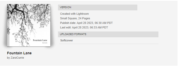
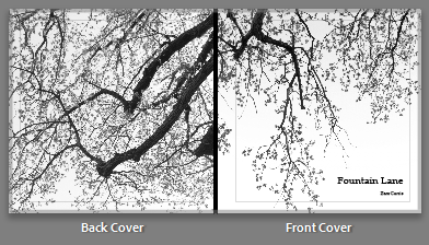
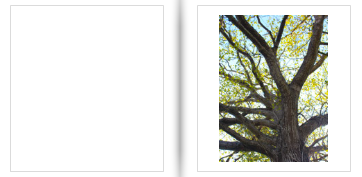
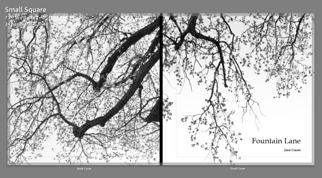
Above is my front and back cover, I thought that having these are monochromatic images and having my book filled with life and colour would be interesting for the reader, and they would be intrigued by this feature. I really like these images appear as if the tree branches are linked together despite being different images.

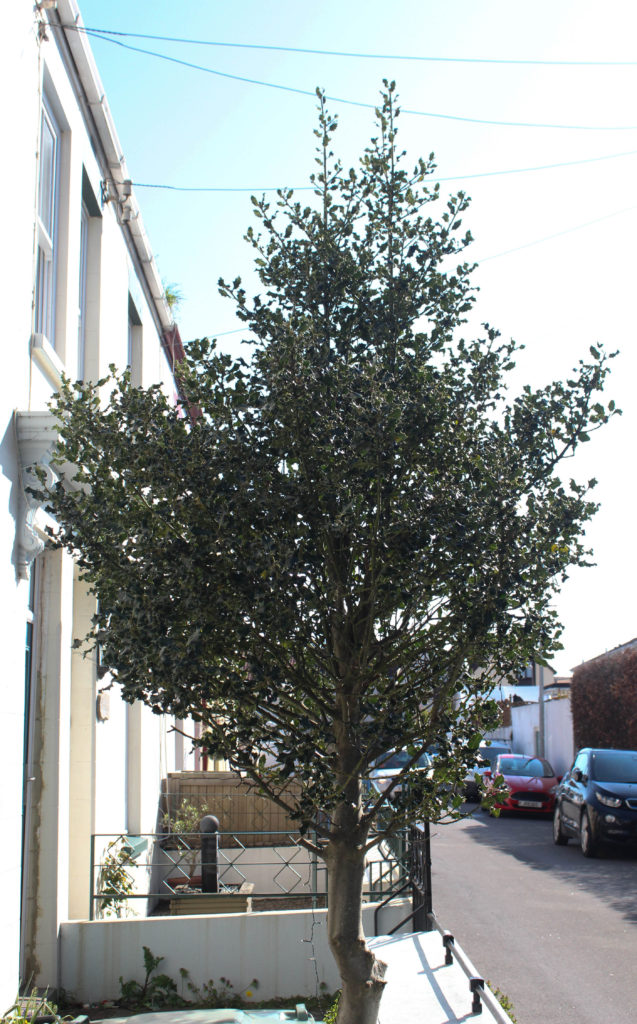
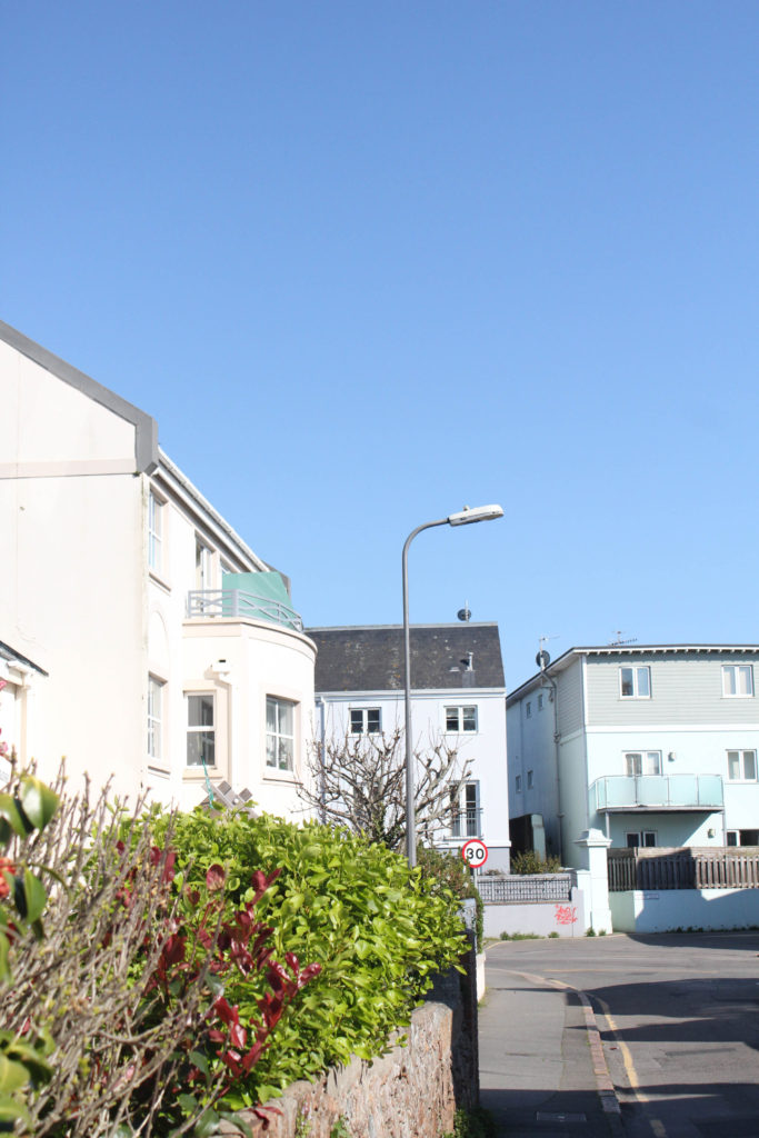
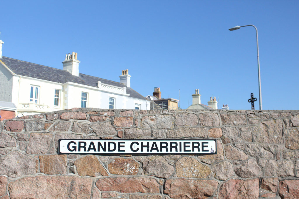
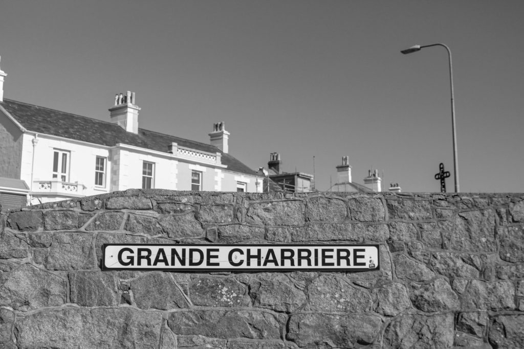
I have selected this as my title as this is the name of the main road that connect from my mums to my dads house, and this is where me and my brother spend a lot of our childhood as we used to walk from my mum’s house in St Helier to my dad’s house near Green Island in St Clement (Photoshoot 2). ‘Fountain Lane’ contains memories from my childhood as we used to spend lot of time feeding a house and finding chickens in this area. I like how this title is a physical and mental reflection of memories, and this title was my best outcome as it links to my brother life too, and this book is a reflection of how our relationship has grown in the last year.

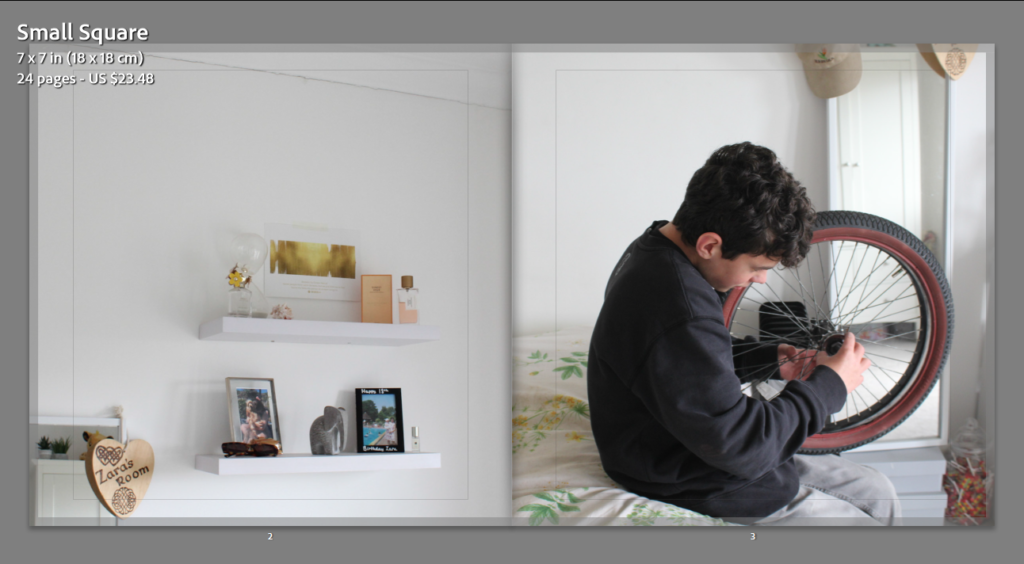
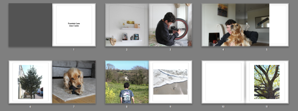
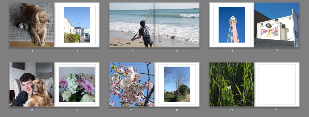
This image on the right was taken by accident, however, I think that it ended up being a really successful and natural images. Additionally, it links in well with the photograph of my bedroom on the left, as it’s taken in the same location, so the background and lighting is the same throughout both images. I think these pages are some of my most successful and this is simply because they link with each other so well, they lack contrast, however I wanted to start out will warmer toned and more subtle images as these are located at the beginning of my photobook.
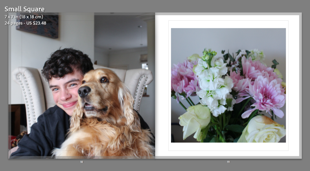
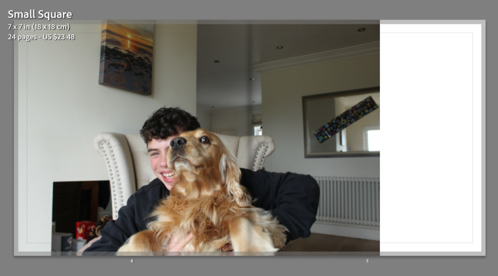
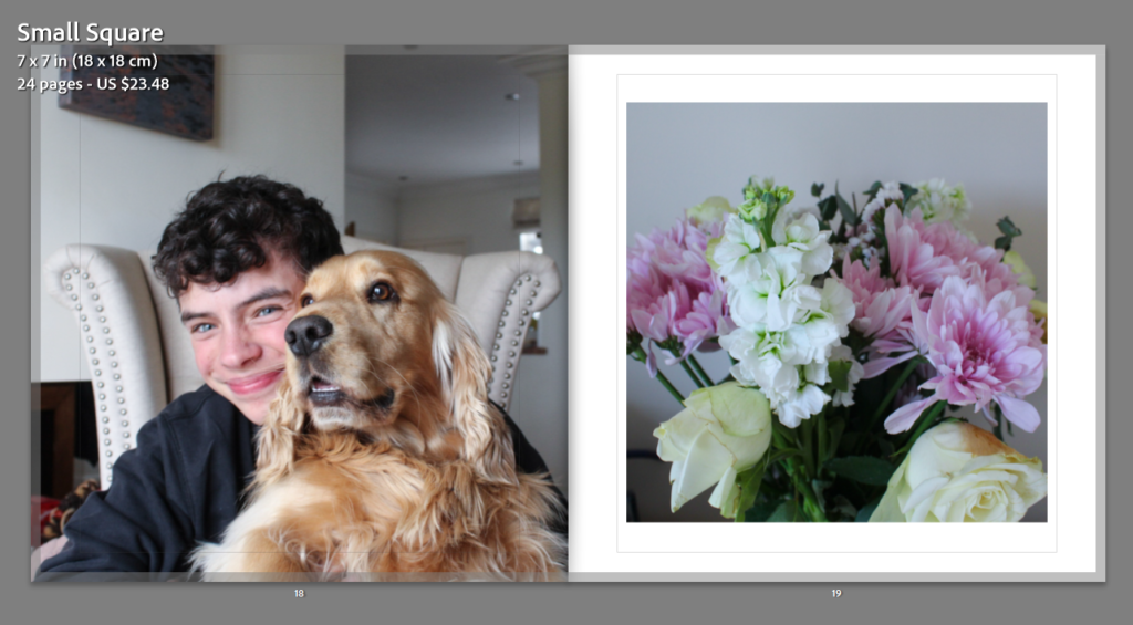
For this slide above to be successful, I have to leave the white space on the right, meaning that my dogs eye is not in the middle of the page, and when my book is printed you will be able to see his eye rather then it being lost in the middle of the page. I really like the atmosphere behind this picture, as my brother looks very happy and my looks scary which adds quite a funny affect. For this photoshoot (Photoshoot 1) I decided that the most successful photographs would be taken in my house, as this is a familiar and happy environment to take images in.
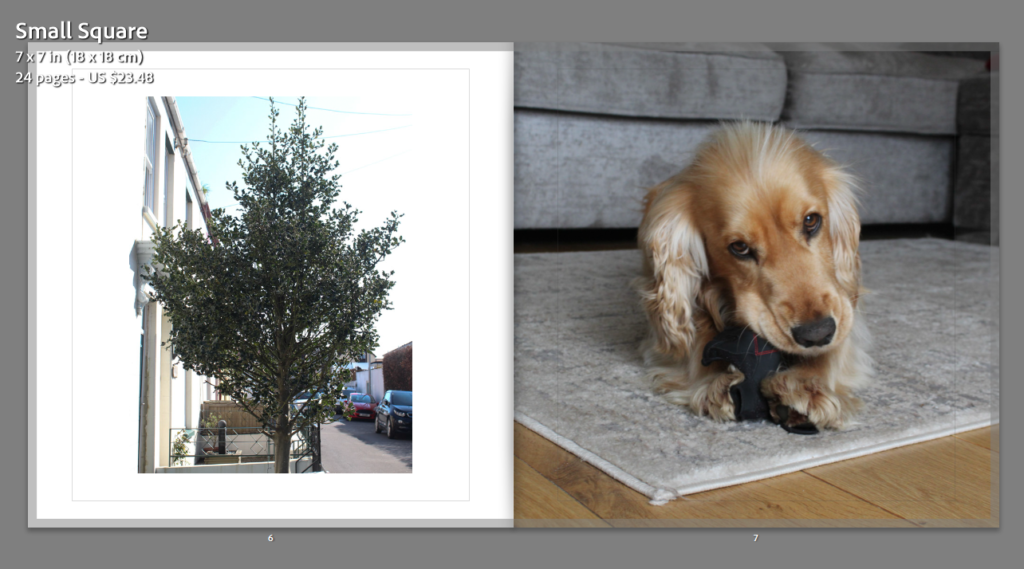
The thought process behind this spread was linking the path to my dads house to a significant figure that is within my mums house, and thought my dog was the best type of figure for this idea as he is a big part of our lives and loves doing on walks down Fountain Lane, giving another link to the name of my photobook. Throughout my book, all of the portrait images with a white background are all placed into the book with the same template in Lightroom, meaning that all these portraits images appear the same size when doing through my book, this is so that all of my book appear cohesive.
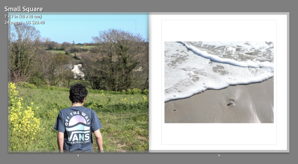
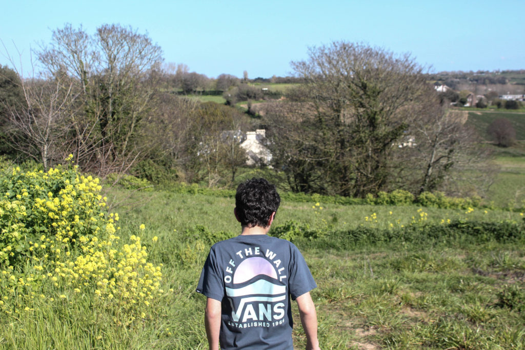
This images meaning placed together was in an attempt to show that my brother was walking to the beach, which is next to my dads house and a huge symbol of our childhood, as we spend all of our summers with our dad at the beach. I think this is successful as the first image is filled with one focal point and a lot of texture throughout the background, whilst the second image has a lack of texture and not really one focal point, this was in an attempt to create subtle contrast throughout the pages.

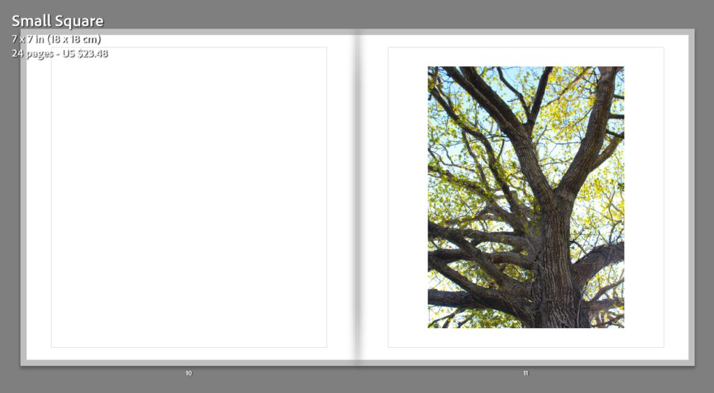
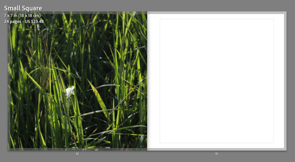
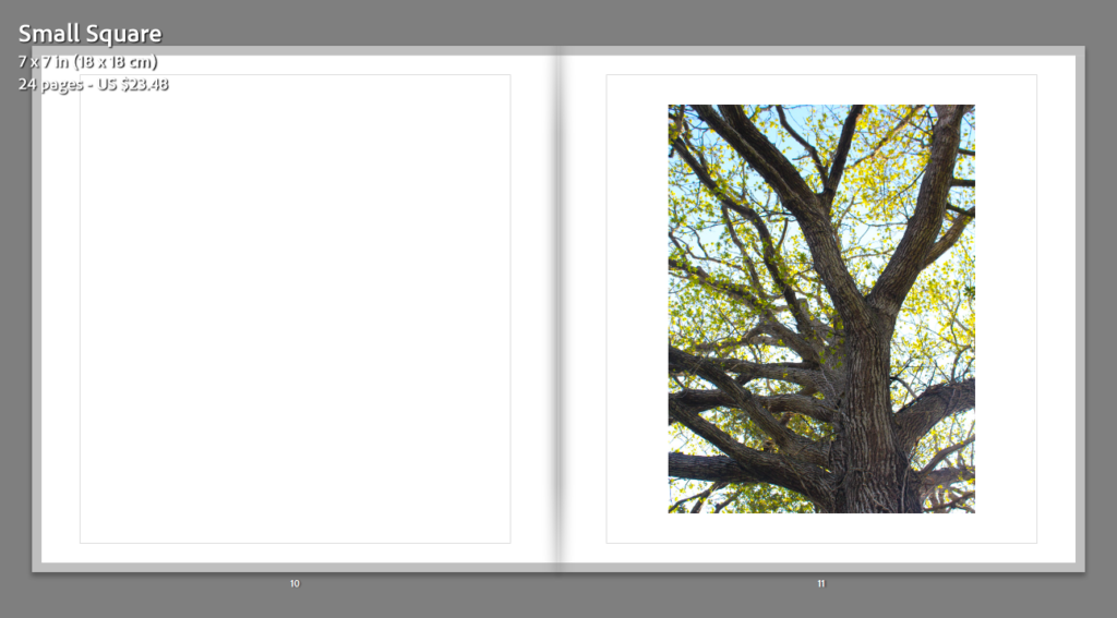
This image of the tree was one of my final images from my second photoshoot, this meant that I wanted it to be recognised more in my photobook as it is one of my higher quality images. To contradict the intricacy of the tree body, branches and leaves, I have placed a blank page next to it, this is so this image receives more attention as it is one of my most successful prints.

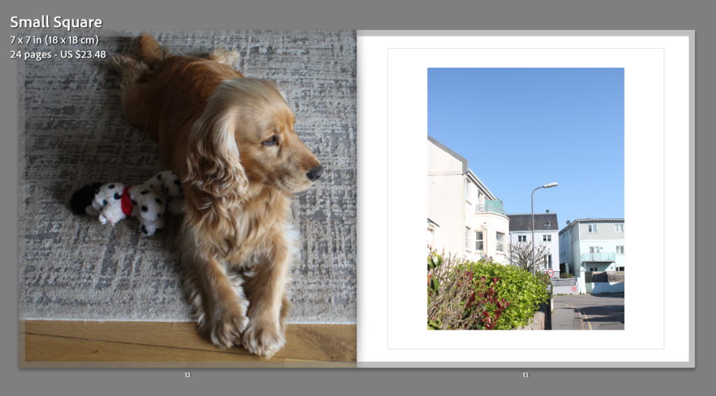
There is some red present in my dogs toy, and also within the brushes throughout the image on the right. the blue sky also contrasts with the orange like tone in my dogs fur. Additionally, the image of my dog is very dull and the image of the road is filled with lots more colour and vibrancy, meaning that these pages link well together. Also, I think its aesthetically pleasing that my dog is looking to the right, and this next image is on the right, meaning that I am attempting to give some direction to the flow of my photobook.

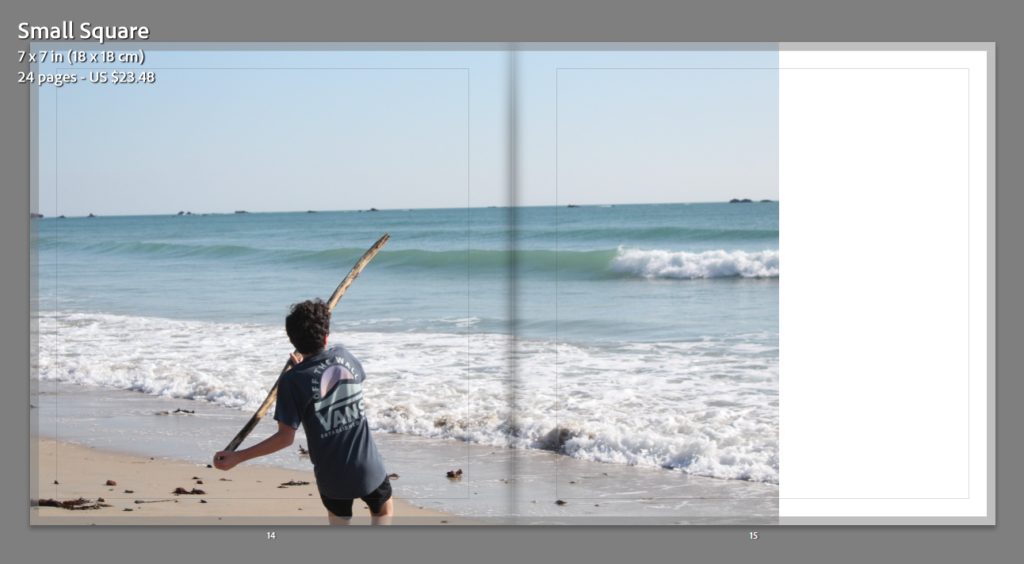
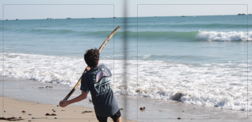
In my opinion, this double page spread is the most successful from my photobook, this is because this was originally quite a large image, so when placed into a landscape format, only some sky was lost, this means that I could make my brother the focal point of this double page, with his body not being exactly in the middle only means when the book is printed, he will not be folded and will still be visible when looking through the book.

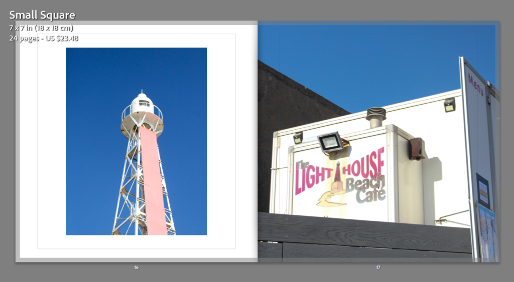
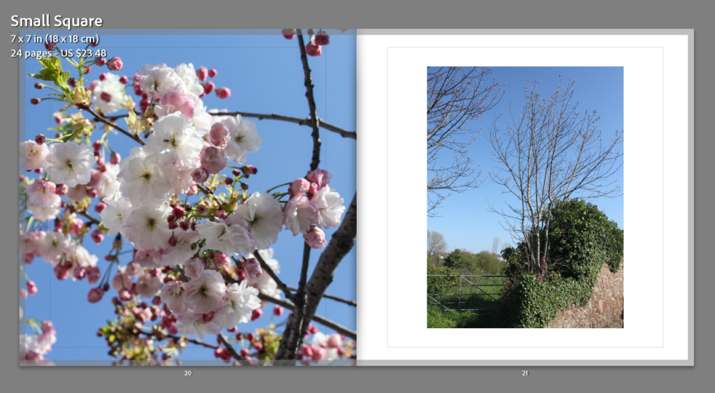
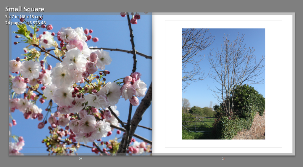
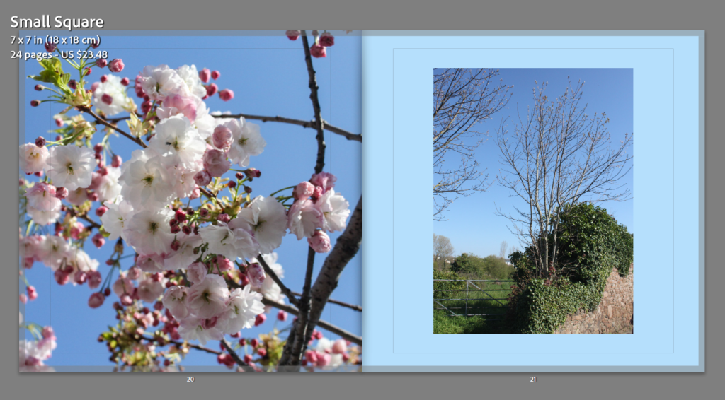
For the pages above, I thought that the natural blue sky background would link them together well, after some experimentation with the image on the left, I thought it would be more successful if it was kept in a portrait format, as the original photograph was portrait too, also I really like how the quality of these two images is high.

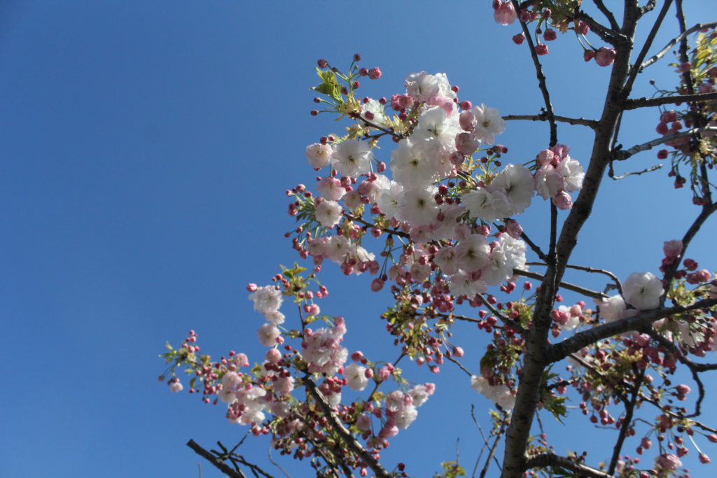
The flowers which are placed on the right hand side page, and ones that are placed inside, where the next pink and white flowers which are below are always outside, this is create a contradiction between inside and outside nature and how different they can appear, also both of these photographs were taken inside me house, and the next ones below are on the way to my dad’s house, creating the story.

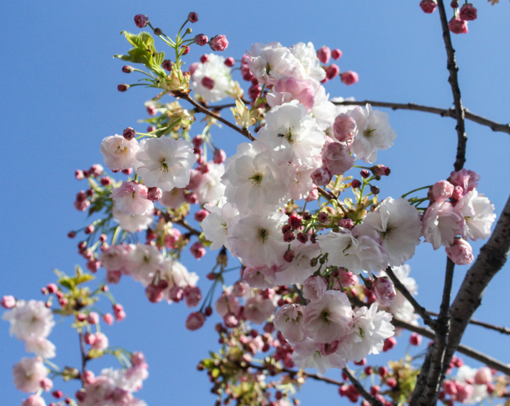
My most successful image from my second photoshoot is the one of the flowers above, this is why I have bled this image to the outside of the page, as I believe that it should have the biggest space as it did not look good as a double page spread as the image was too zoomed in and appeared more pixelated then in its normal format.

Analysis of my photobook: I thought that my photobook was very successful, compared to my previous photobook, it took me a lot less time and was of higher quality at the end. In my opinion, I told the storyline somewhat well, as my book could of been a lot better if I had another photoshoot, or simply more original images to work from, as my photoshoots were taken during the evening, the light was continuously changing, and this meant the lighting and quality of some of images was unsuccessful, limiting the amount of raw images I could of used throughout my photobook, Alternatively, creating a smaller photobook was a lot more effective for me and it meant that I had more time to do editing. The overall layout of my photobook is good in my opinion, and creating this was the best option for me as I could showcase my best images in an effective way.

The last step was to send my book to Blurb after creating it in Lightroom, after paying for the book their is an option to buy a PDF version, I didn’t end up paying for this. There was another feature which involved getting a preview of my book which allowed me to see my photobook in its digital form. This shows a version of the book where you can flick throughout all of the pages.

Creating a Photobook

Image Selection

Below I have created a gallery with some of the images I will be using throughout my photobook, this is show all of the different kind of photographs I will be using in my book. I have chosen to use landscapes images (which include flowers, roads and trees), portrait images (of my dog and brother) and a few images from inside my house, including my room and living area. These are from the 2 different photoshoot I conducted, however I didn’t have any successful photographs of my dad to include in this project and this is why he is not featured in my book.

I did struggle with the lack of images I had, as I only selected 30 to use, and only used 18 in my photobook, this was because some of my images just did not link together (too random to link to my project) or were not of high enough quality to be featured in my book, this meant that I hard to consider the layout of my photobook a lot more, as many images were not the correct tones to be placed next to each other.

Photobook Specification: Throughout my photobook I will be exploring how the strength of me and my brother’s relationship has growth overtime, and how our parents separating has made us closer, this photobook is very important to me and I would like this to be the best work I have produced so far. I like how this project is so personal to me and how this is so different from my coursework projects.

Process

To create my photobook, I created a collection in Lightroom, which after clicking the ‘Book’ button allows for this setup below to appear, this allows for images that are in your final images collection to simply be dragged up into the spaces, there are also functions which allow for boarders to be larger to appear at all, and for also double page spread to be created, which is best for short and wide images.

The meaning behind the title ‘Fountain Lane’ is the fact that this is the main road me and my brother used to use frequently to walk to my dads house. This provides the first sight of the book with more meaning, and will make some people ask more questions regarding the relevance of the book title.

Most Successful Page

Whilst designing my photobook, I had to create a lot of creative decisions, mostly regarding my images and which would look best next to each other. This meant that the tones within the image had to be similar, for example a yellow toned image could not sit next to a monochromatic one. Overall. I really liked the designing my photobook process as it allowed for me to look through all of my images and establish which of them were the best outcomes I had ever created, this is because this was our final chance to show all the types of work we could produce, this is the reason why I decided to experiment with portraiture; to take a risk with this final/ personal study. In my opinion, not a large amount of my portraits turned out to be really good, however, I did enjoy doing something different to landscapes and showcasing that any kind of photography can be successful.

Double Page Spread

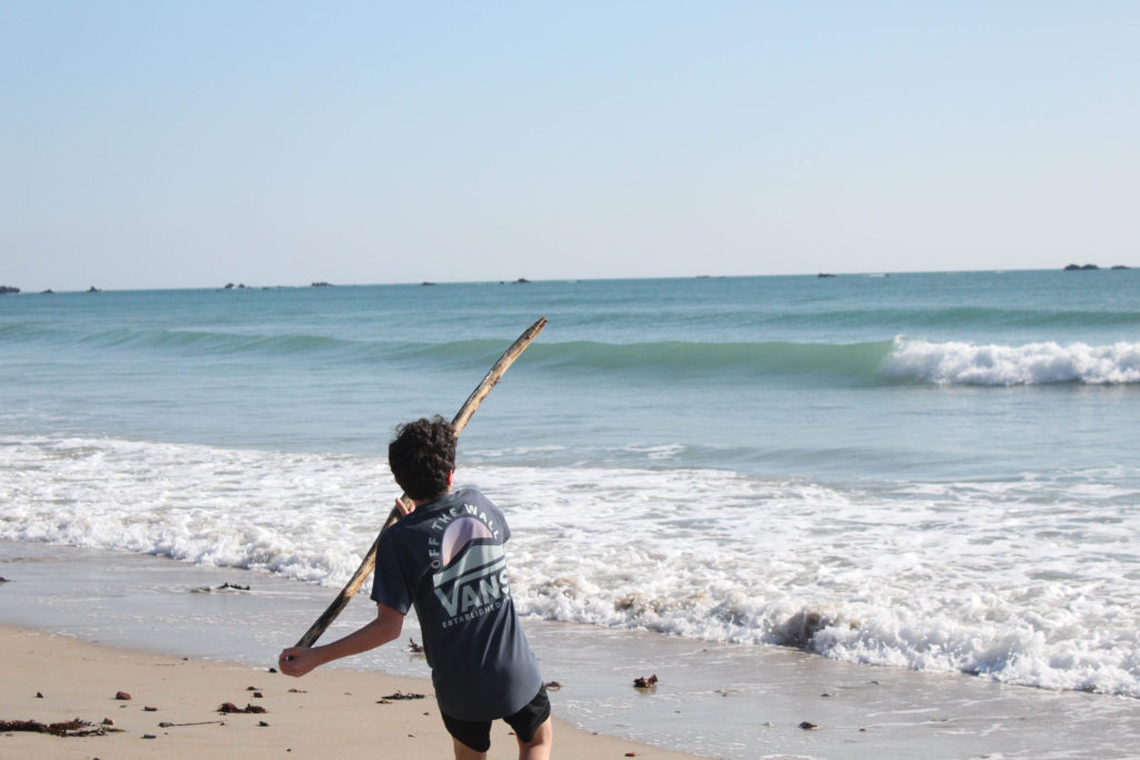
I have tried to create balance within my photobook through using multiple double page spreads, these are normally formatted with the most successful shots from the photoshoots, and I think this action shot above is one of the best I took throughout my second photoshoot. I have placed the image so that when the book comes, the only missing part (because of the fold in the middle of the book) will be the some of the top end of the stick. The problem with many double page spreads is that the middle section of the image is missed out because of the fold in the page, and this can hinder the successfulness of some of the best photos taken in shoots, I really like my photobook overall and believe that it is my best work.

Experimentation with Colour

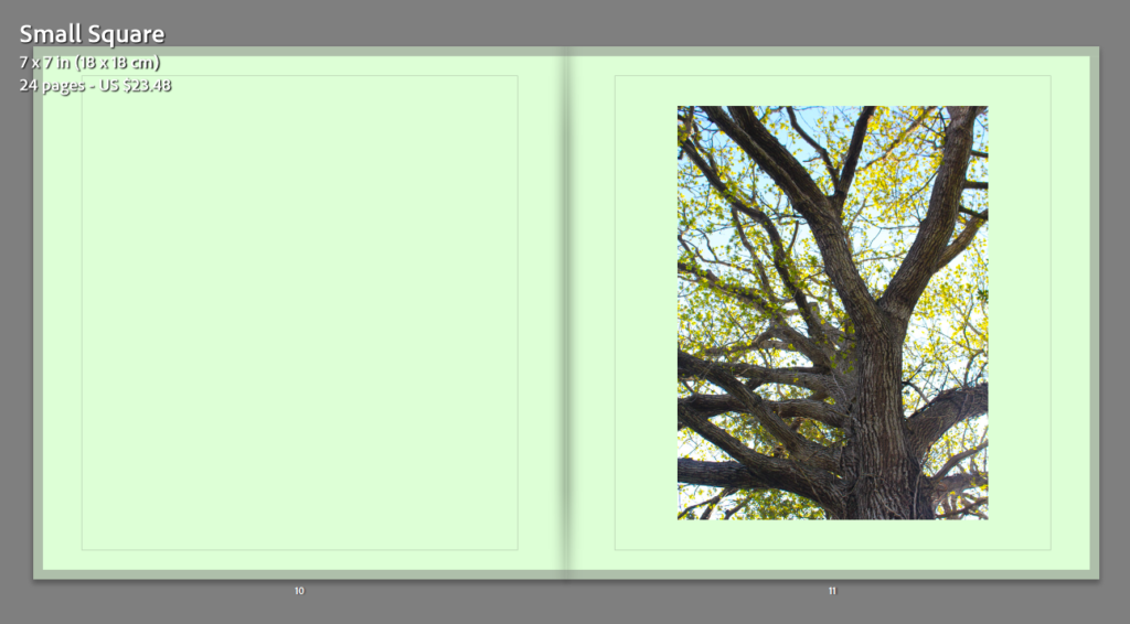
Below I have changed the background of some pages of my photobook, this is an attempt to create more uniqueness throughout my photobook, in the end I may decide that all backgrounds look better with a white background, however I would like to take time to experiment in order to make sure that my photobook is the most advanced it can get.

My aim when selecting blue here was to match with the blue background, however, I think this wasn’t very successful as the blue just blends in with the sky on the right side. Additionally, in my opinion blue is too much of a harsh colour to put as a background.

To match with the tree on the right hand side, I thought that green would be the best colour to match with the original image, I do like the green I just think its a bit too much for the photobook as I can appear quite bright.

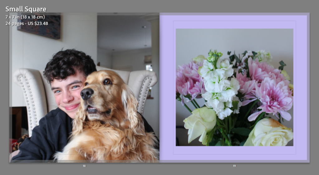
For these pages, I have selected the colour purple as on the right there is an image of my mums flowers, and to link to this I decided that purple was the best idea as this is her favourite colour too. I really like how it matches somewhat with the flowers themselves, however it doesn’t match with the left hand side photograph.

Analysis: The pink colour background above, in my opinion, is my only successful outcome of using colour backgrounds out of every colour I have experimented with, this is because it matches the best with the image on the left itself. For my future photobook I will be only using white pages as I think this helps keeps the balances throughout my whole project.

Image Presentation

Images For Printing

These will be the images that I am going to print out and then mount up, this will allow me to showcase the work that I have done, as I will have the option of placing them onto foamboard or into window mounts, which means they are surrounded by a black board, they are the best way to illustrate monochromatic photographs.

Each of these images has an A5, A4 or A3 label in the caption of the image, this is to demonstrate how large I will be printing my images. The images that are not of high qualities are going to be printed onto A5, this is so that the more blurry areas are less visible.

Layout Experimentation

To illustrate how my images will be displayed, I will be placing my photographs into Photoshop, this will allow me to play white or black boarders around them, and place them in a layout in which they will be presented once they have all be mounted up.

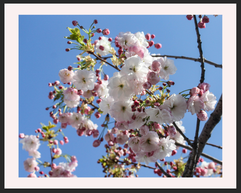
I didn’t know whether this photograph would be more successful placed on white foam board or in a black window mount, in the end I thought that it was a the best decision to go with a lighter background as I think that it compliments the white flowers the best, and will make the whole piece look cohesive when it is printed out.

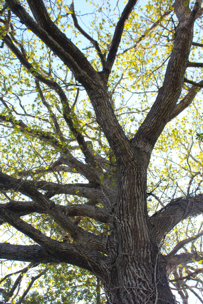
This image is one of my favourite images from both of my photoshoots, I really like that this photograph looks goo with both a black and white background. I think this is because the tree is filled with lots of dark tones, and then the surrounding leaves. I think that this image still looks better with a white background as I think this compliments the leaves and sky within the image more.

This is my favourite layout of all the ones I have created, this is because it has a lot of juxtaposition yet a lot of links. this is because in my opinion, monochromatic images look better on a black background, this is because the lighter points in the image are being highlighted. I think that placing them in a triptych means that they are more aesthetically unique and there more eye-catching, when I mount these images I will attempt to do the most equal window mount as I believe that this piece alone will increase my grade if I do it correctly.

I like that this background is almost more beige than white, I think this creates a smoother affect, along with matching with the tones in the sand and decor in my house. I like how these photographs are not going to be arranged is a perfect horizontal position, as I think this adds more depth to this mounting as I believe that these images match together well, and they additionally link as both my dog and my brother love to spend time on the beach, and this is where we spend a lot of time throughout our childhood.

To attempt to create a more interesting background, I have attempted to place pink in the background of these images, I am not a huge fan of this colour, as it appeared a lot lighter in Photoshop. Furthermore, I just think the white looks a lot better and the purpose of the flowers being in the middle was to attempt to split up photographs and I think this works well, the colour within the flowers help give a break from the lack of colourful tones in the other images.

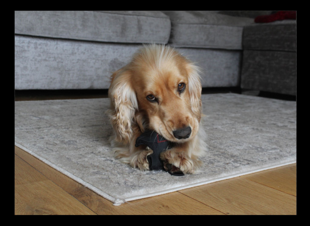
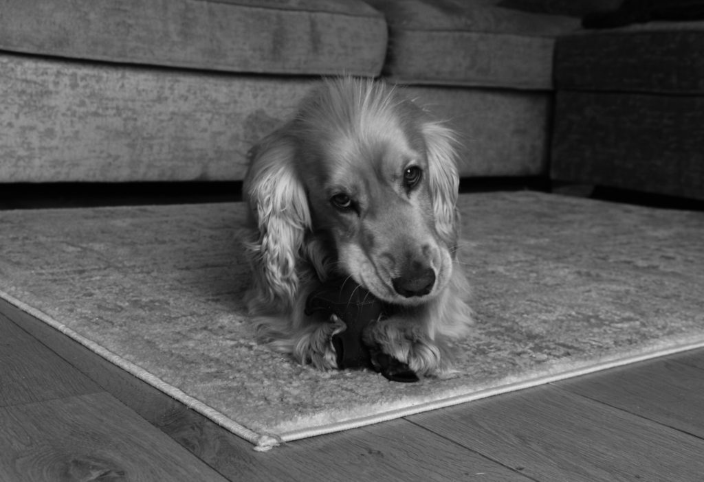
As this photograph is being printed in A3, I think it would be a good idea for it to be placed in window mount alone, this means that the full attention will be placed onto the photograph of my dog, as I think that the grey tones in the image would better suit having a black frame. There is also some darker features in the image such as his eyes, bottom of paws and nose, which will compliment the black frame.

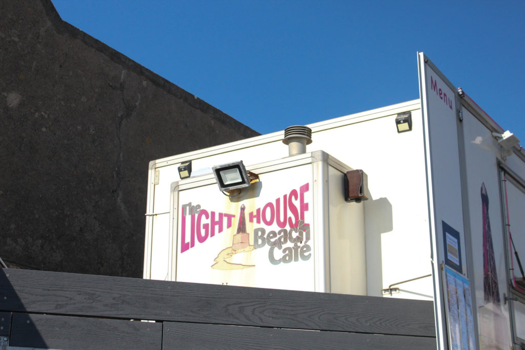
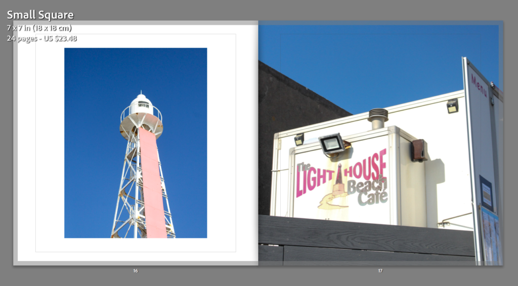
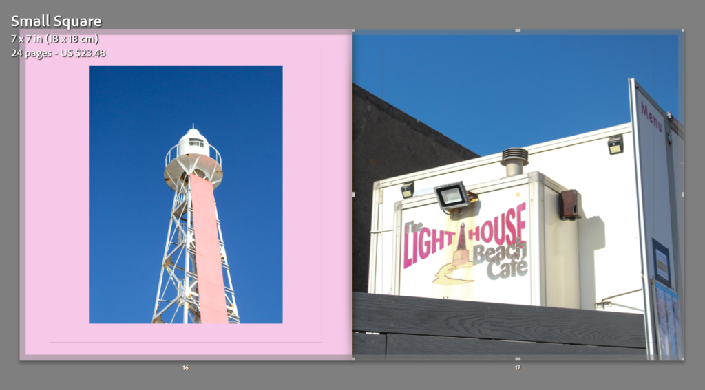
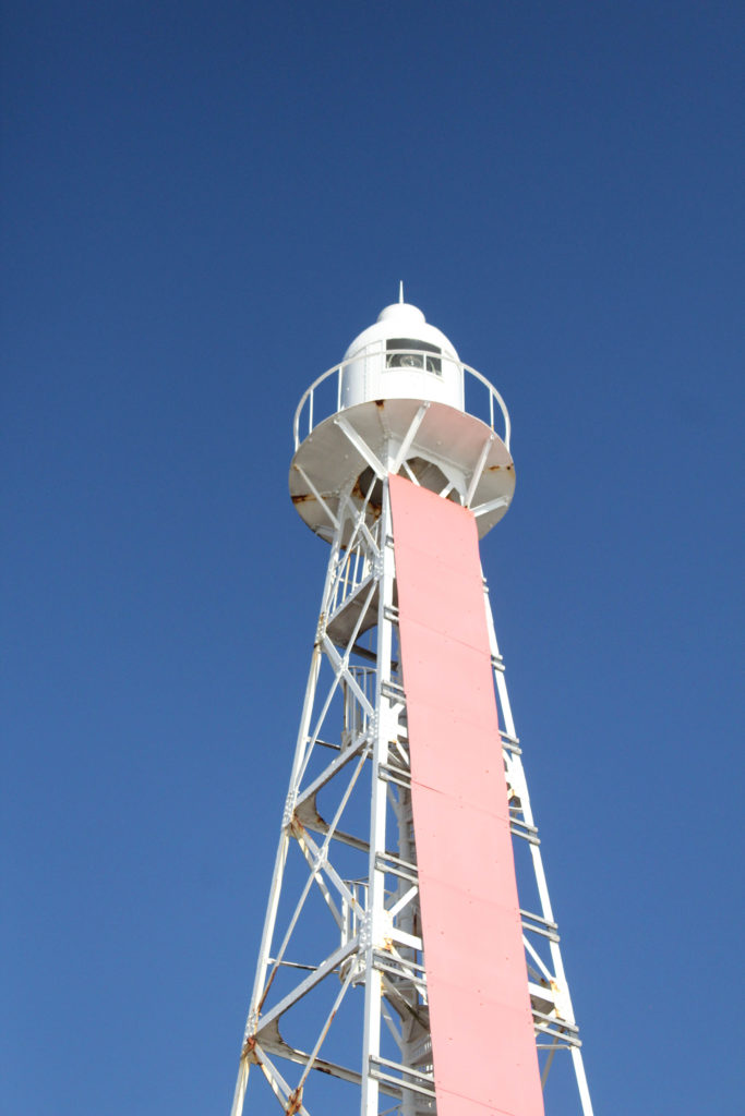
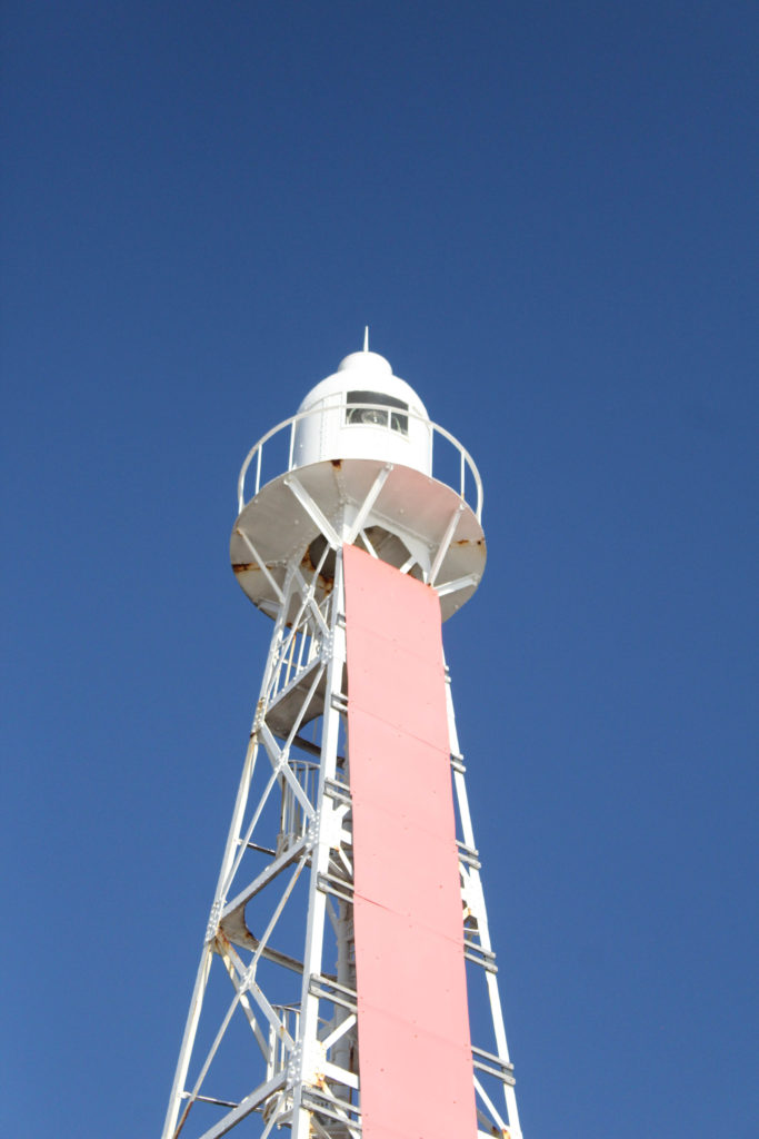
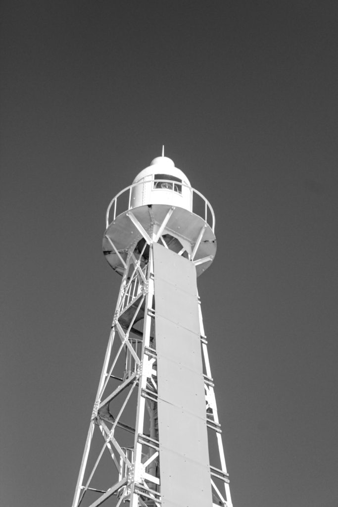
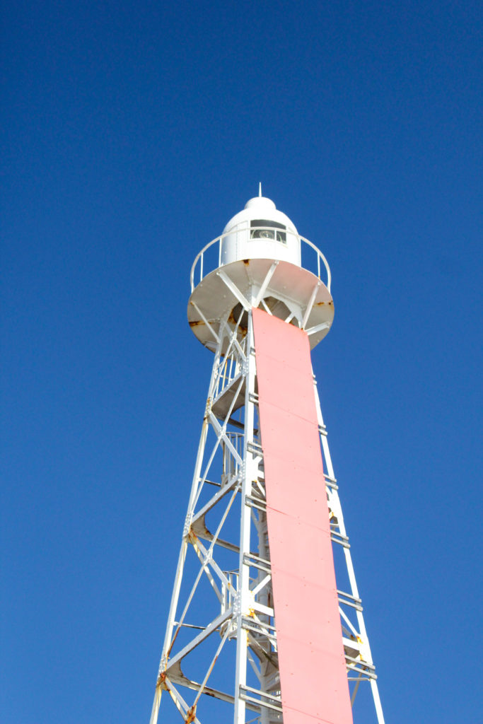
In my opinion, this is one of my most successful mounting experimentations, this is because of the matching colours within both of these images, there is a lot of pink present in the first image within the flowers, then the stripe of pink on the front of the lighthouse. Furthermore, there is a lot of white straight lines and strong blues within the background of both of these images. I think this diptych was a big success.

Photoshoot 2- St Saviour to St Clement

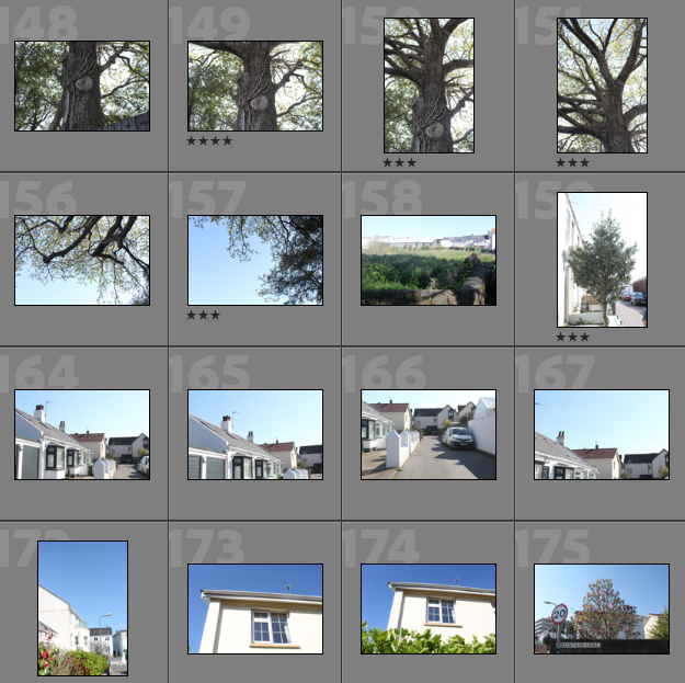
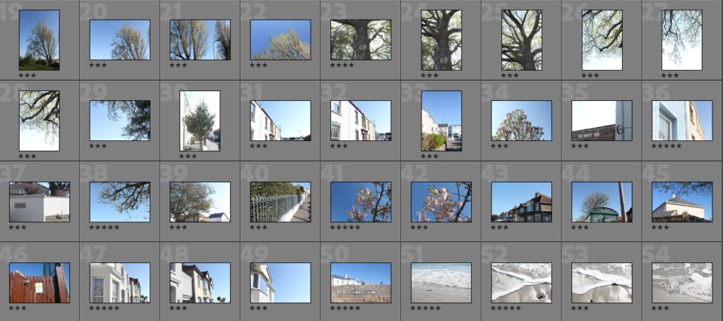
Contact Sheets

Plan for Photoshoot: For this photoshoot, I was planning on walking from my mums house in St Saviour, to my dads house in St Clement, near green island. This is because I would like to attempt to connect two sets of memories and lifestyles using landscapes images and places of significance to my childhood. I would like to do this in the last afternoon as it will provide me with bright lighting and good weather.

Overview of Photoshoot: I think that this photoshoot is more successful than my portraits photoshoot (Photoshoot 1) just based off looking at them in Lightroom. This is because I find landscapes more enjoyable and since I have done them more I find them easier. The lighting of these photographs is a lot better, and overall I found that throughout this photoshoot it was easier to create more successful images.

Image Selection

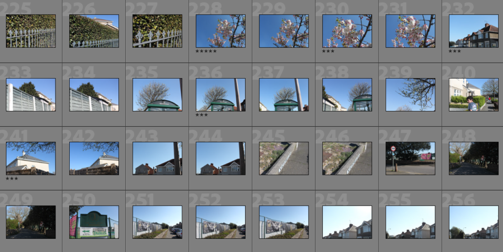
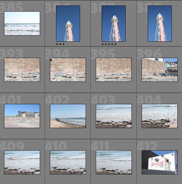
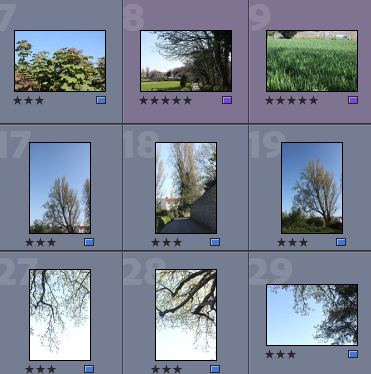
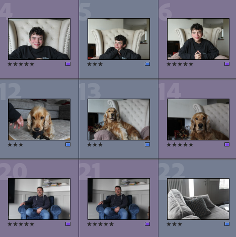
Below I have showed evidence of me rating my photographs, this is to help me decide which are going to be a big part of my project, I like to rate my images because it gives me a sense of which are slightly better than others, especially in terms of lighting and composition, as many of my images are similar to each other, but some are a lot stronger than others.

  • Purple- Images with the most relevance and potential throughout my project
  • Blue- Images that can still be used but are not of the same quality

In addition to rating my images, in Lightroom I like to colour code my photographs, the purpose of this is to double check that my image selections are correct, also when scrolling through my selections, I like being quickly able to see which are useable images, and which are the best out of my whole photoshoot.

Best Images Before Editing

Below I have included some images that are from my selection process, but before they have been edited, this is showcase the original composition and settings of the images and make sure they will be suitable for future editing.

I really liked this photoshoot as the lighting made taking images easier then usual, the bright and clear sky allowed me to take more successful photographs, as I think this is apparent in this gallery above, the lighting throughout the first and third image show that these images will not require a lot of editing, in the sense that the saturation and clarity of these images is already of good quality.

Editing

Below I have included some examples of editing throughout this photoshoot, some of these are monochromatic and some photographs I thought would be better off keeping in colour. I think that only some of this editing was successful as this photoshoot did not provide a lot of opportunities for drastic editing.

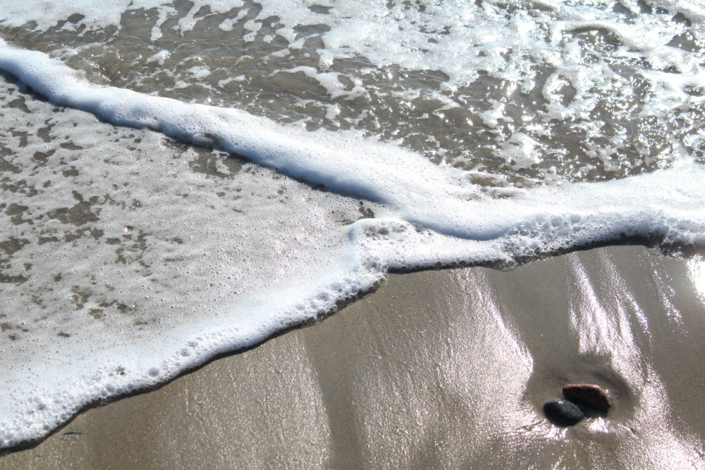
I really like this image above as the waves are layering perfect onto of each other and creating the perfect opportunity for me to take a photograph. I tried to edit this image so that the beach would appear more shiny and the exposure has been decreased, as in Lightroom, the image appears too light, I have also enhanced the texture within the waves as the foaming parts throughout the water are more clear now. Alternatively, I think the first image looks better unedited, this is because it looks better with the naturally high saturation appearing, as the colour combination of pink, blue and white go well together to create a successful image.

My intentions with the photograph above of the tree was to try to make it look older and more rustic, however, I don’t think this affect was achieved as the tree just looks older and more blurry in comparison to before editing, I think leaving in it colour emphasises the life within our island and the importance of this photoshoot.

Final Images and Analysis/ Critique

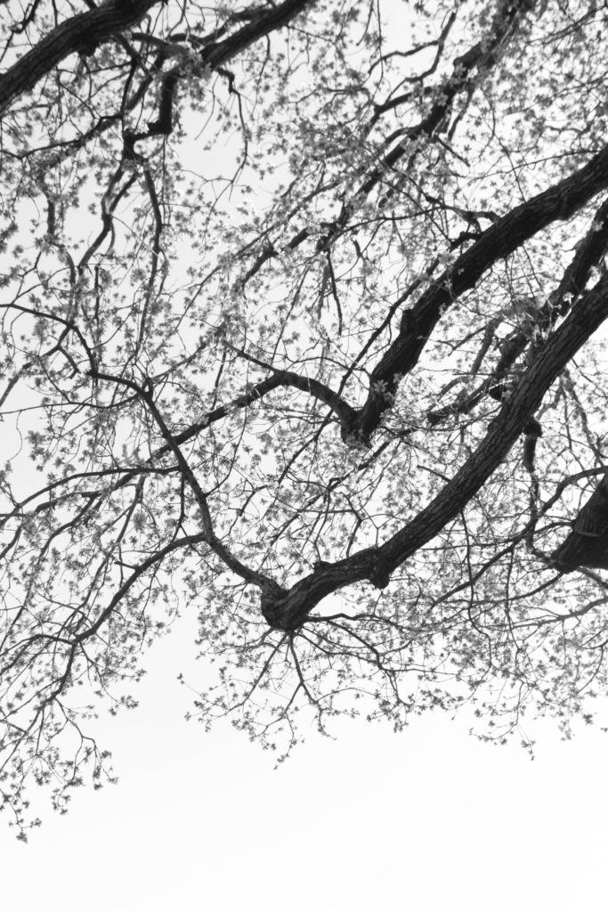
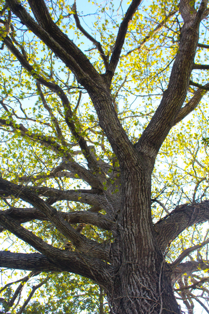
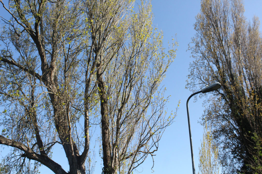
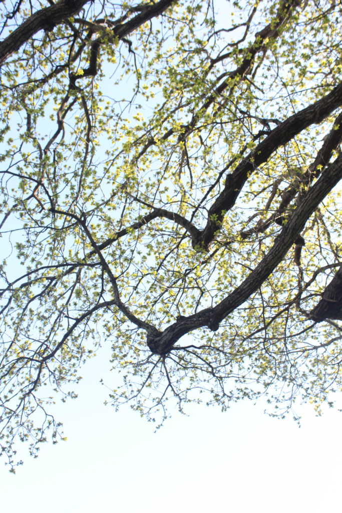
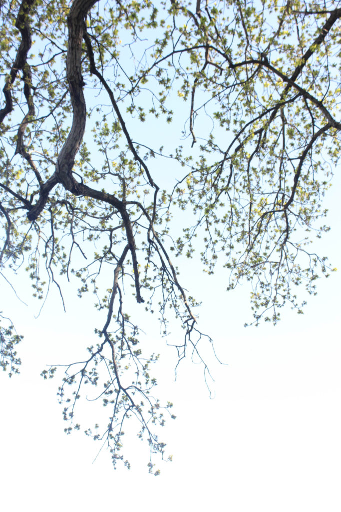
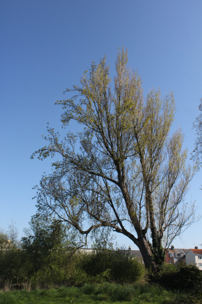
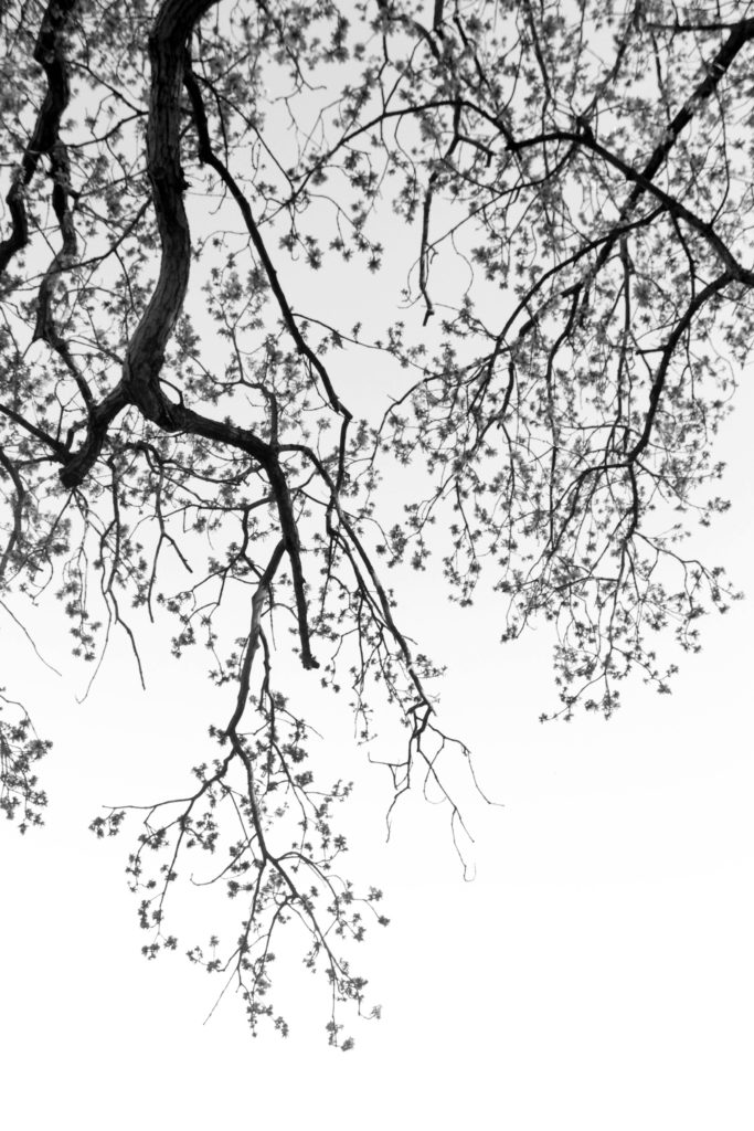
I have placed these two images as final outcomes as I believe that they complement each other well, the first image is very subtle as there is not many tree branches present, whilst the second juxtaposes this and is a very full on image, this is because it has a lot of detail and texture throughout the main tree. I decided to edit these photographs into black and white as it emphasises the details on the tree, such as the vines and bark, making them more apparent and more clear for the eye to see. Overall, I think these images are among my most successful and they do challenge the concept of ‘Simple or Complex’ as nature is mostly seen as simple, but in reality is very complex. Additionally, the trees being monochromatic and the flower being in colour represents the juxtaposition being my parents, as I would say the tree represents my dad and the flowers represent my mum. The only criticism I have for these images is some would think they aren’t clear enough to be edited monochromatically.

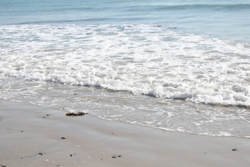
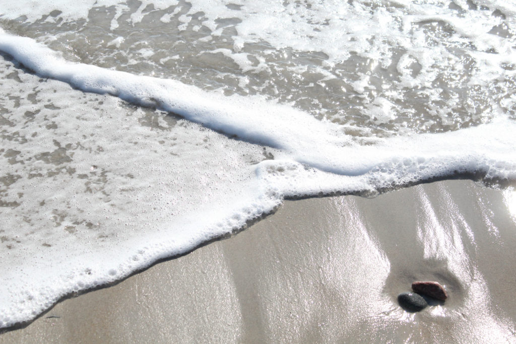
I have selected this as one of my final image as the simpleness of this photograph can link to me and my brother’s current relationship, this is because we are the closest we have been in years and the sea in the image represents how calm our relationship is the majority of the time. I like how this image is filled with a variety of textures, for example, the rocks, smooth wet sand, and then the white foaming water. This combination makes for a very aesthetically pleasing image, as the subtleness may catch people’s eye and make them wonder what the intention behind this photoshoot was. Additionally, this photograph demonstrates that simple compositions can create some of the most successful imagery, the waves taking up the majority of the image means that more attention is drawn to the lack of sand, however, the shine on the sand and the rocks may highlight the importance of land, as it provides stability for all family relations, linking to my project.

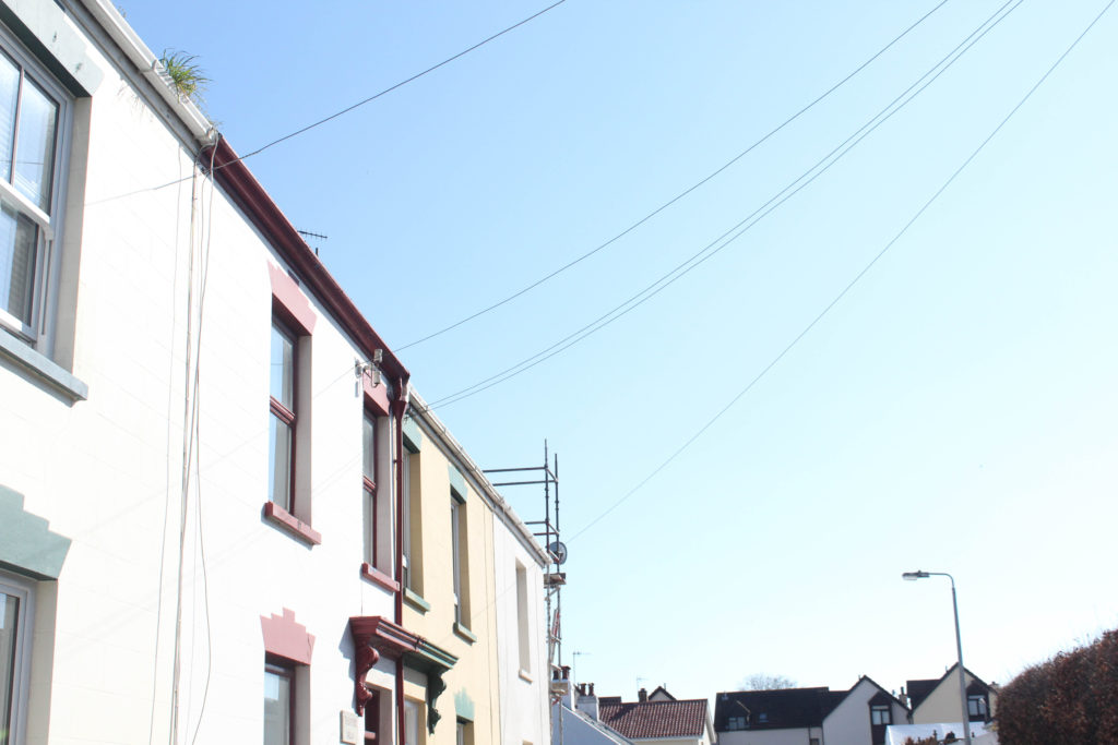
Finally, I have chosen these images as some of my most successful, they will not be displayed together but I have placed them into this galley so that I can juxtapose them against each other. Firstly, the nature part of the first image would represent where my mum lives as this image was taken where I used to go to feed horses, and the second image represents construction next to the sea and being surrounded by the beach growing up, as this is where my dad has always lived. These two photographs represent two different kinds of memories being placed together in my mind, creating a vast combination in my memories. One not so positive aspect of these image would be that visually they do not match together, and its more about the representation of the image more than what the physically look like.

Photoshoot 1- Portraits/ Home Images

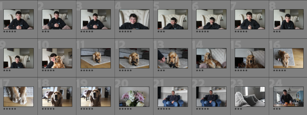
Contact Sheets

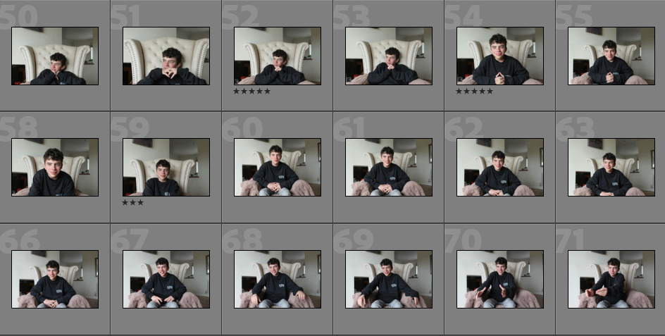
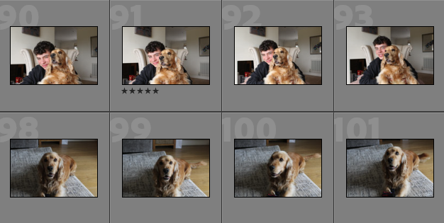
Concept: The plan for this photoshoot was to create portraits mostly inspired by Matthew Finn, as I would like to create his ‘Uncle’ project, but with my brother instead. I really would like to attempt this idea as I think that it will highlight the importance or me and my brother relationship.

Overview of Photoshoot: I think that this photoshoot turned out well, this is because the lighting in the first images with my brother is good. They capture his happiness, however, I think that as the lighting changed towards the end of the photoshoot, my images became slightly worst as the sun was going down.

Image Selection

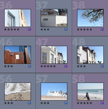
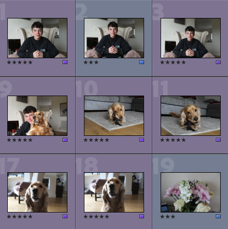
Below I have included a screenshot of me rating some of my best images, this helps me decide which images are the best for my project, and which contain the least imperfections, such as blurry spots and incorrect exposure. Overall, I think I have lots of successful images from this photoshoot, and this will help with the next stage of my image refinement.

  • Purple- Better images that are more relevant to my project
  • Blue- Images that still have potential are still good quality

These image above have been split into purple and blue categories, this means that when in lightroom, I am quickly able to tell which images need more attention when it comes to cropping/ editing. I think that placing colour labels on my images is also good as after rating the images with stars, I am, able to be definitely sure that they are the best images throughout my selections.

Best Images Before Editing

Below I have included a gallery which demonstrates my best images before they have been edited/ cropped, this shows that overall the exposure and composition of my original images has potential. Alternatively, the second picture of my dog needs to be edited as the exposure is too high, this is most likely a result of the shutter speed being too high. Whereas, the seventh image of my brother does not require as much editing in my opinion, this is because the exposure is a lot better and other features such as the saturation of the photograph, is correct.

Editing

I think that this photoshoot did not provide a lot of opportunities to showcase good editing, this is because many of the image turned out better in colour, and the exposure didn’t need much editing. Despite this, I have shown some of my editing to demonstrate that these images are more aesthetically pleasing in colour.

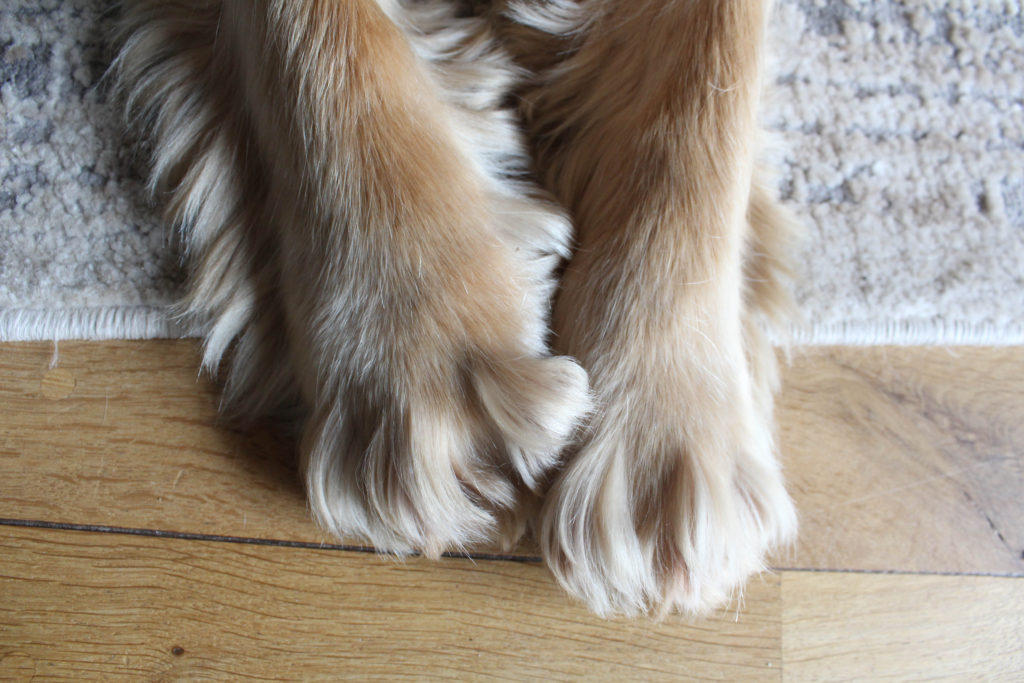
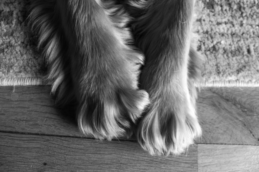
The first image at the top looks too hard with this editing, in my opinion this is because there is a large shadow coming from the right side of the image, as this is less apparent in the colour images. Alternatively, I think the image of my dogs paws below looks better in black and white as it increases the texture of his fur and the shadows that are present within this image.

With this last image, I decided that it was a good idea to crop the image before looking at its settings, this was because I thought the background distracting and didn’t add any value to the image itself.

Final Images and Evaluation/ Critique

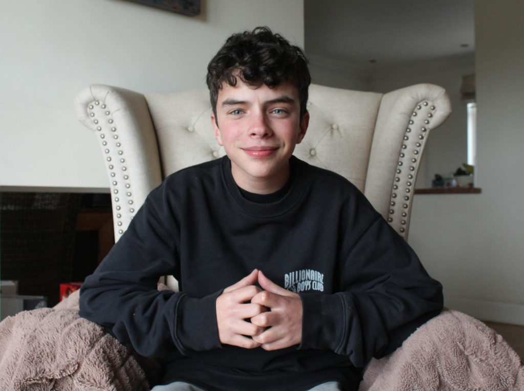
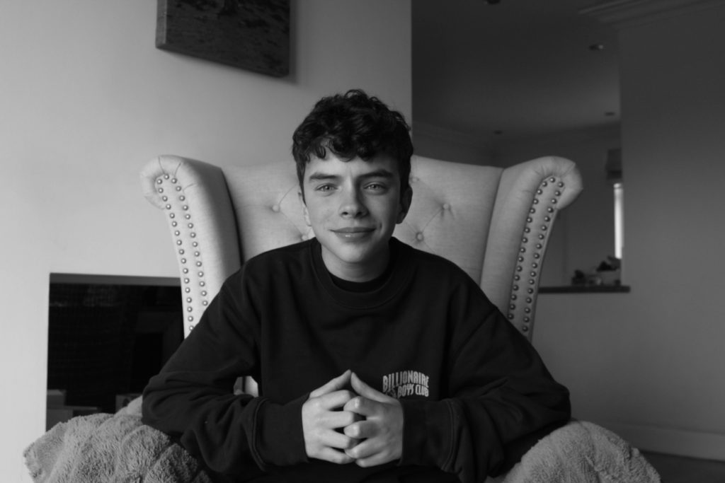
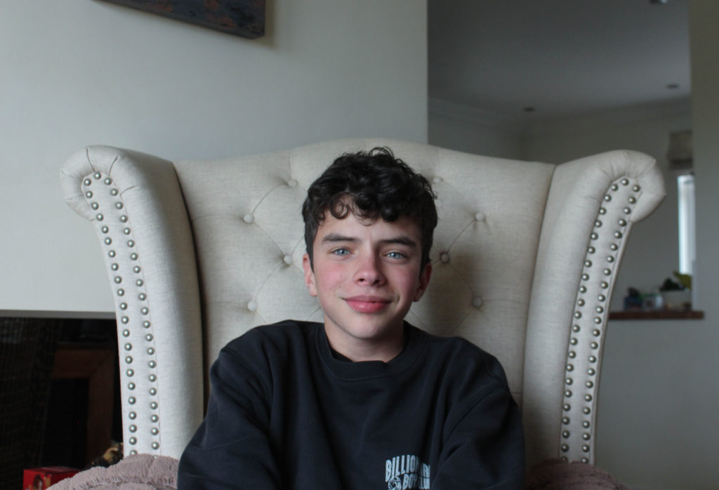
I have selected this as my first final image as I believe that it has a lot of relevance to my project, as I will be attempting to explore the relationship I have created with my brother in our teenager years, like Matthew Finn does throughout his ‘Mother’ and ‘Uncle’ projects. This reflects the premise of ‘Simple or Complex’ as the relationship between brother and sister can be viewed as very simple, or one with challenges, increasing its complexity. It’s important for me to reflect throughout my project that out relationship used to be very complex, but the peacefulness of simple within the brother and sister bond has made us welcome the simple relationship we have now, as we are more like friends. This image is important as it demonstrates how simple my brother can present himself, and hides all of the complicate things that come with having a close relationship with your siblings.

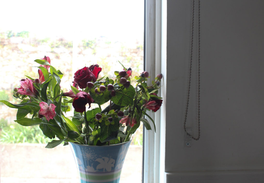
This will be another one of my final images, taken at my mums house, it reflects the simplicity of décor in our home and how my mum values nature and has always been a flower of flowers. I like that the light coming from the back of the window almost highlights the flowers and makes them the colourful focal point of this image. Furthermore, I have decided not the crop the wall in the right side of the photograph out, and this is because I think it adds a nice simplistic part of the image, with the string adding a nice touch. This image could be seen as one of my worst, this is because the lighting isn’t the best throughout the whole image, as the left side is a bit too light and the right side is a bit too hard.

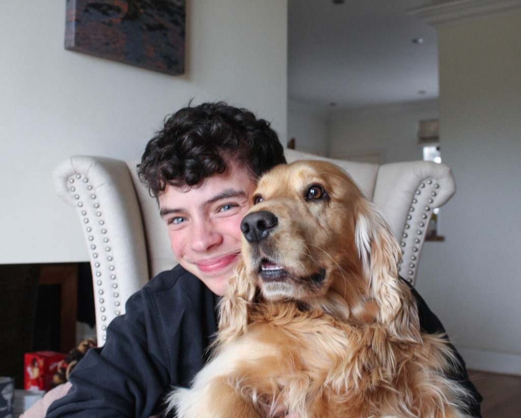
This photograph is probably my favourite from all of my shoots, this is because it captures the happiness that my family share, but within only two members, this is important for my project as it shows that some parts of family life are simple; and this is a simple moment in time. Overall, I think the lighting of the image is consistent and and the fact that the face of my brother are dog and slightly lighter than the background helps highlight their significance to my life. To improve this image I should have increased the aperture when doing this photoshoot as the right side of the image is more blurry than my brother’s face, as this decreases the quality of the photograph.

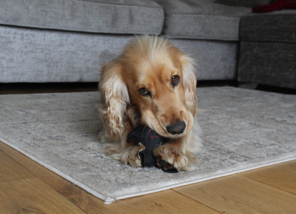
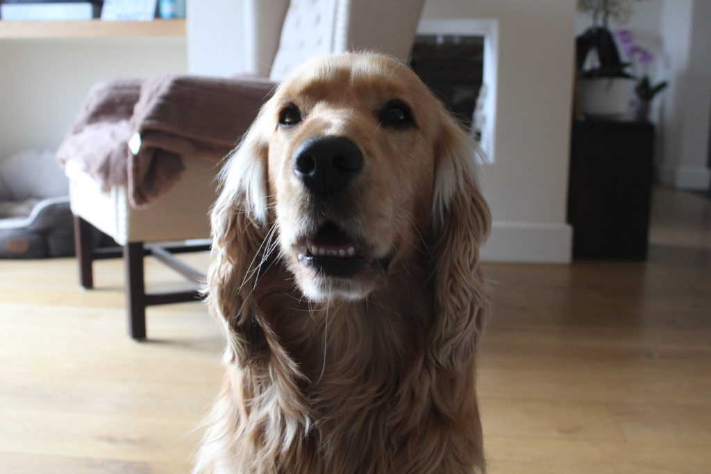
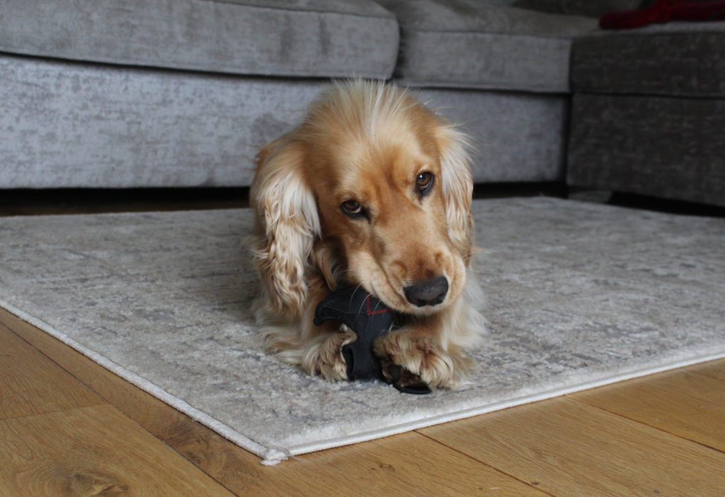
I really like this image as the composition is quite interesting in my opinion, I like how my dog is lying in this image, as it means that he is not in the middle of this image but he is still the focal point. In my opinion, this image is one of my best because it was not staged but it looks like it was. The natural lighting within this whole photoshoot meant the I came across some challenges, this was because the lighting was constantly changing and I have to adapt the camera settings (mostly the exposure and aperture) to try and maintain the overall look of the photoshoot. To make this photograph better I would of had to get multiple different angles of my dog sitting in this way, like one from a ground view.

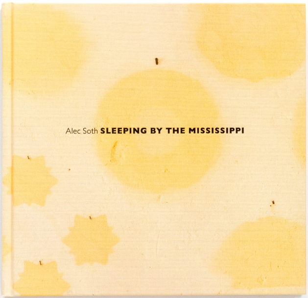
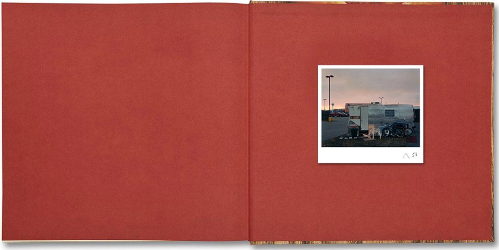
Deconstructing a Photobook- Sleeping by the Mississippi

Much has been written about Alec Soth’s Sleeping by the Mississippi. First published in 2004, it is a landmark publication in the Magnum photographer’s career, which propelled him to international recognition and notoriety. First editions of the photobook are highly prized items today. At a talk in London in 2017, in conversation with Sean O’Hagan, Soth reflected on the work, almost 15 years on, and how he began to make what would eventually become the tightly-edited tome, Sleeping By the Mississippi.

He began to follow the Mississippi River in his car, driving from place to place, letting himself progress towards locations he had vaguely researched and “using the river as a route to connect with people along the way.” These were the early days of the web and the development of his process ran parallel to the growth of the internet. “It was like web surfing in the real world” he says, “it was like trying to ride a wave.”

I really like this book overall as there is an interesting mix between portraits and landscape images, all of these images throughout the book are filled with more cool toned images, this will be because of the climate that the photographs were taken in, and this helps the reader appreciate the lengths Soth went to to create this book.

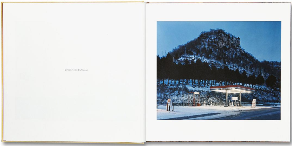
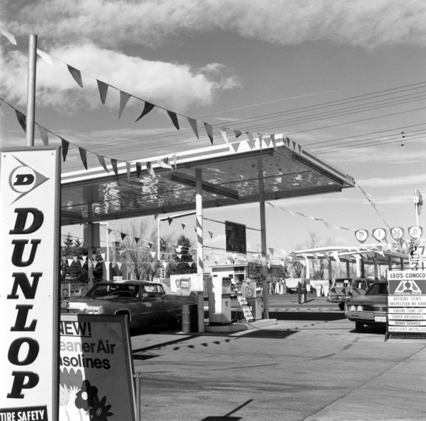
Overall, the book is quite short, this may be a reflection of the fact that Soth’s journey across the Mississippi River came with some challenges, this image above is a great way to illustrate the challenges with living in these harsh areas, as the mountainise regain is not perfect for human civilisation, with the gas station being a physical reflection of how living in these areas can be not only physically changeling but lonely as well.

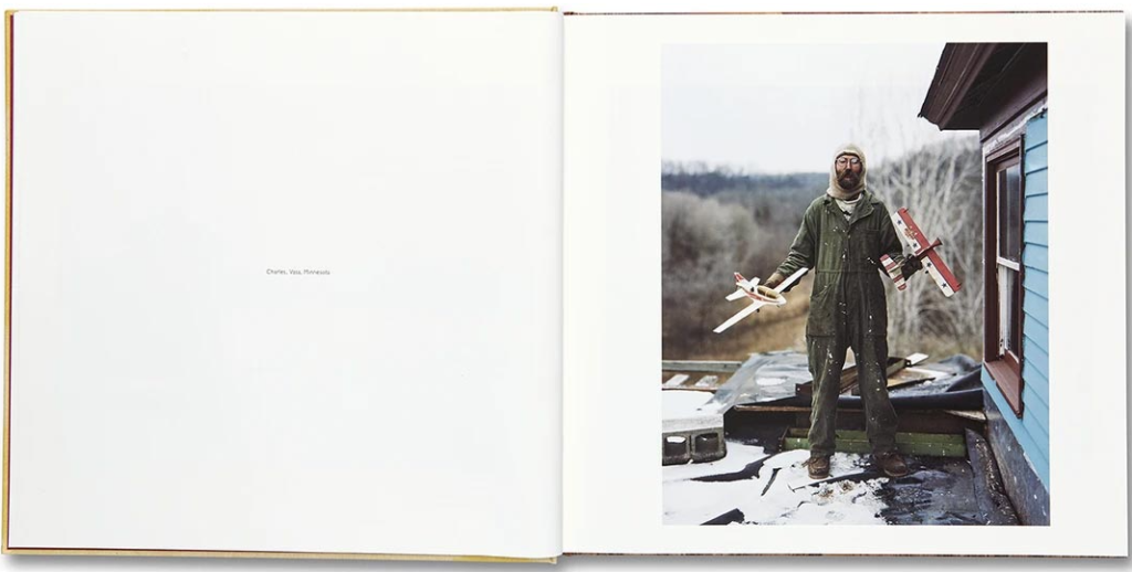
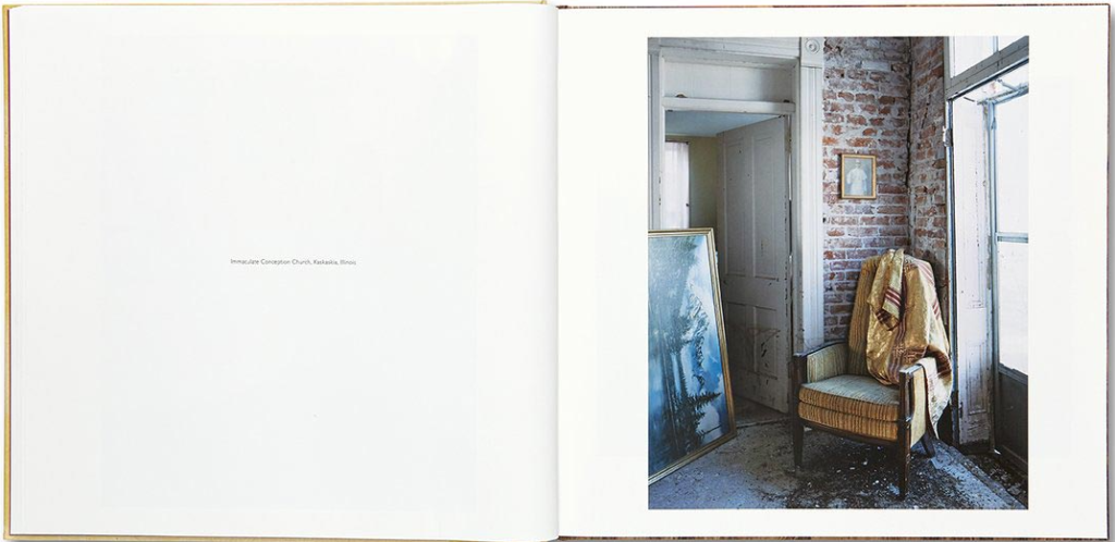
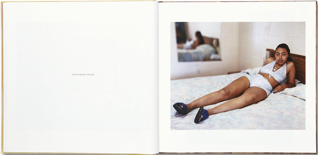
I like the simplicity of this image, and how there is one blank page with an image description, this means that all of the attention is faced onto the second page with the photograph, the fact that an image description is included means that Soth is making his work more readable for everyone, and more importantly making us consider his thought process behind his book more.

I really like that Soth has randomly placed landscape, portraits and still life type images throughout his whole book, this means that he has followed the rule of always having a pattern/ balance throughout his whole book, and this means that some aspects of his book are predictable. Furthermore, this plays into this simple looking book being increasingly complex, as the still life kind of images are of objects/ settings that have been found in different people’s homes along the Mississippi.

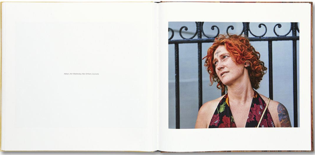
This portrait, in my opinion, is one of my favourite one that Soth has placed into this book, I think this is because of the fact that the colour of her hair is the same colour as the background of the last page of the book. I would like to replicate this kind of balance in my own photobook, also the angle of her face is one which suits her jawline and her neck being most straight matches with the black straight fencing poles that are placed in the background.

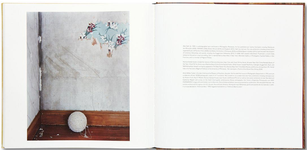
These are the only pages in the whole photobook that the image is on the left side of the pages, and the writing being on the right side of the pages. This image on the left is my favourite as it has a kind of loneliness to it, and I think one object being in the foreground of the image is the symbolism of his whole book, as there is only one object, and this is like this book, as this book is very different from his other works.

How our photobooks will be similar: we both aim to tell an intricate story throughout our photobooks, this is because like Soth, I have a variety of images, and some random images from areas in my home, such as flowers my mum displays and décor that I place in my bedroom. Both of our works will contain many blank pages and a lot of descriptive areas within our books, as I hope that anyone that looks through my book will understand the story I am attempting to tell, as it is very personal and its vital for me that anyone who wanted to could describe the storyline. Furthermore, I would like to add some coloured pages throughout my book, as I think this adds an aesthetical affect to the book, and the background could really like to the images on the pages.

Statement of Intent

What do you want to explore?

I would like to explore the concept ‘Simple or Complex’ through looking at my family life and history. In order to do this I will be creating photoshoots in areas that I spend a lot of my childhood in (such as the walk from my mums house in St Saviour to my dads house in St Clement) and also takes portraits of some of my family members in other to boost creativity and risk throughout my project. I will be focusing on the fact that my parents are separated and how this has impacted mine and my brother’s life. In addition to take portraits and incorporating landscapes that are familiar to me, I will be including photographs of my and my brother from when we are younger, and this is in an attempt to represent how much we have changed from our childhood.

This exploration of my family in this project will demonstrate that on the outside my relationship with all of my family members seems to be very simple, but are in fact very complex and makes me question how they became to be so complicated in the first place. In my opinion, this will allow me to demonstrate a different kind of photography that I will be able to carry out.

Why does it matter to you?

This project matters a lot to me because it is the most personal concept I have ever created throughout my whole photography course. I would really like to make this project the best I’ve ever done as it is centred around a very specific time in my life when I was very young. Additionally, this subject is something that is very sensitive for me, and I would like this to be reflected in my work as its so special to me.

How do you wish to develop your project?

I would like to take inspiration from the artists Alec South, Matthew Finn and Roberts Adams. With me creating monochromatic landscape images, full face portraits and focusing mostly on my close relationship with my brother. These artists are some of my most inspiring as the pure quality of their work is just amazing. In addition to this, I would like to create a lot of black and white portraits as they will enhance all of my brothers facial features and show how much we look alike, especially through our eyes and nose.

By the end of this project, I would like to have created another photobook, this will allow me to show again that creatively I find creating layout and books very interesting in comparison to other options such as sequences. This will give me a chance to contrast my older family photographs and the new portraits I will take.

When are where do you intend to begin your study?

I wish to begin my study very soon with my first photoshoot, this will likely be of me walking from my mums house to my dads, I will be doing this because this walk will give me an opportunity to take images of a lot of green/ grass landscapes, along with roads and also beach views. I am looking forward to this photoshoot as it will create a wide variety of images and this will mean that there will be some variation within this photoshoot alone.

Photoshoot 1: Will include taking landscape images whilst I walk from my mums to my dads house, I will do this in the early afternoon to try and get the best lighting and only a school camera will be required to do this.

Photoshoot 2: I will take portraits of myself and my brother, I will most likely do this with the backgrounds at my mums house during the morning to try and get the best lighting. Only a camera will be needed for this photoshoot

Robert Adams

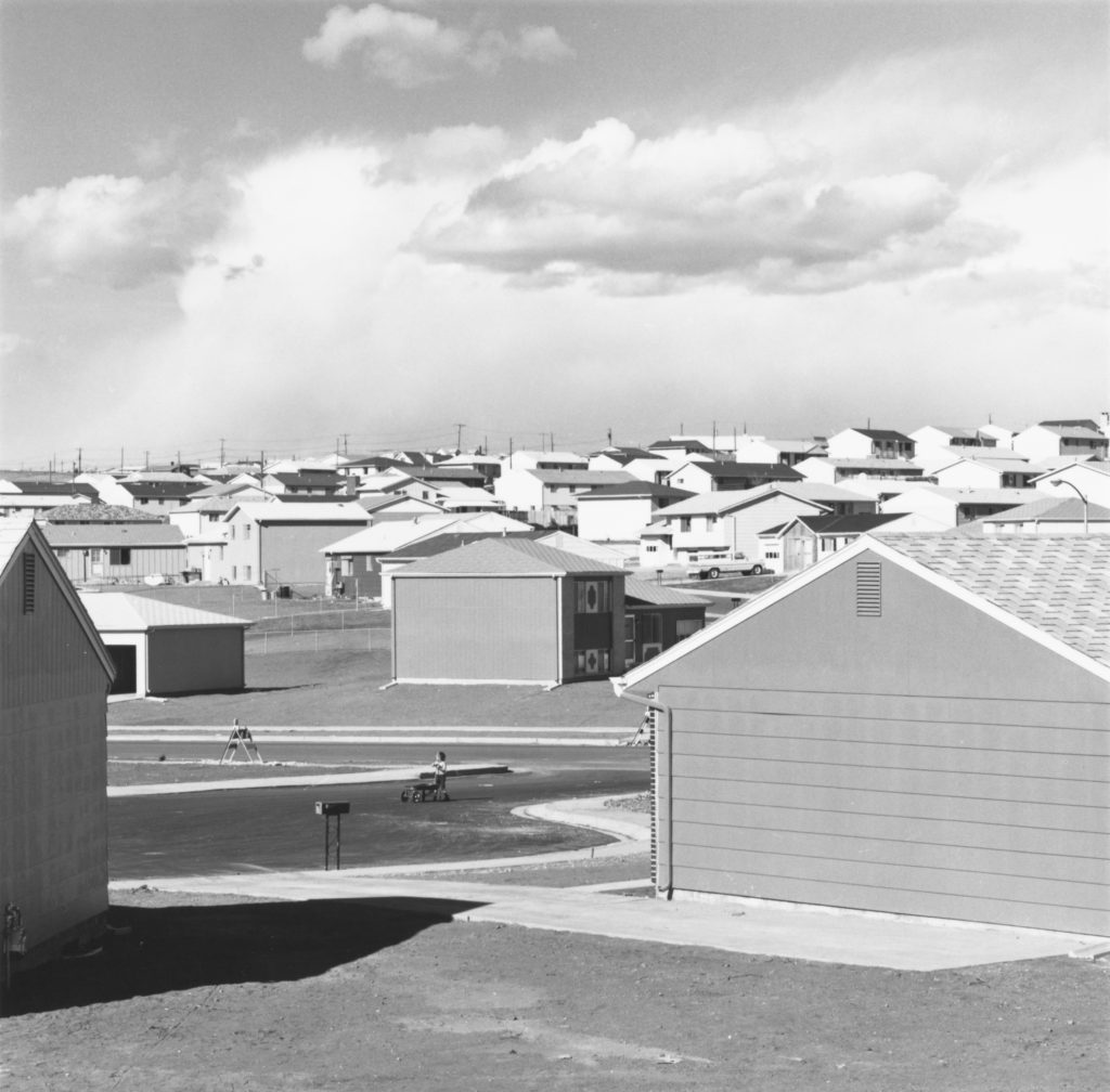
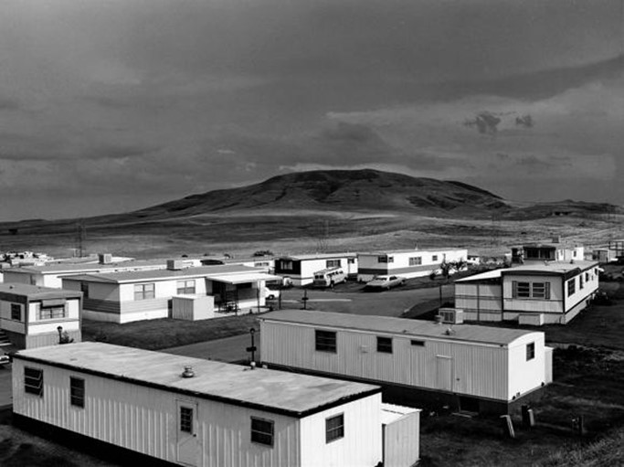
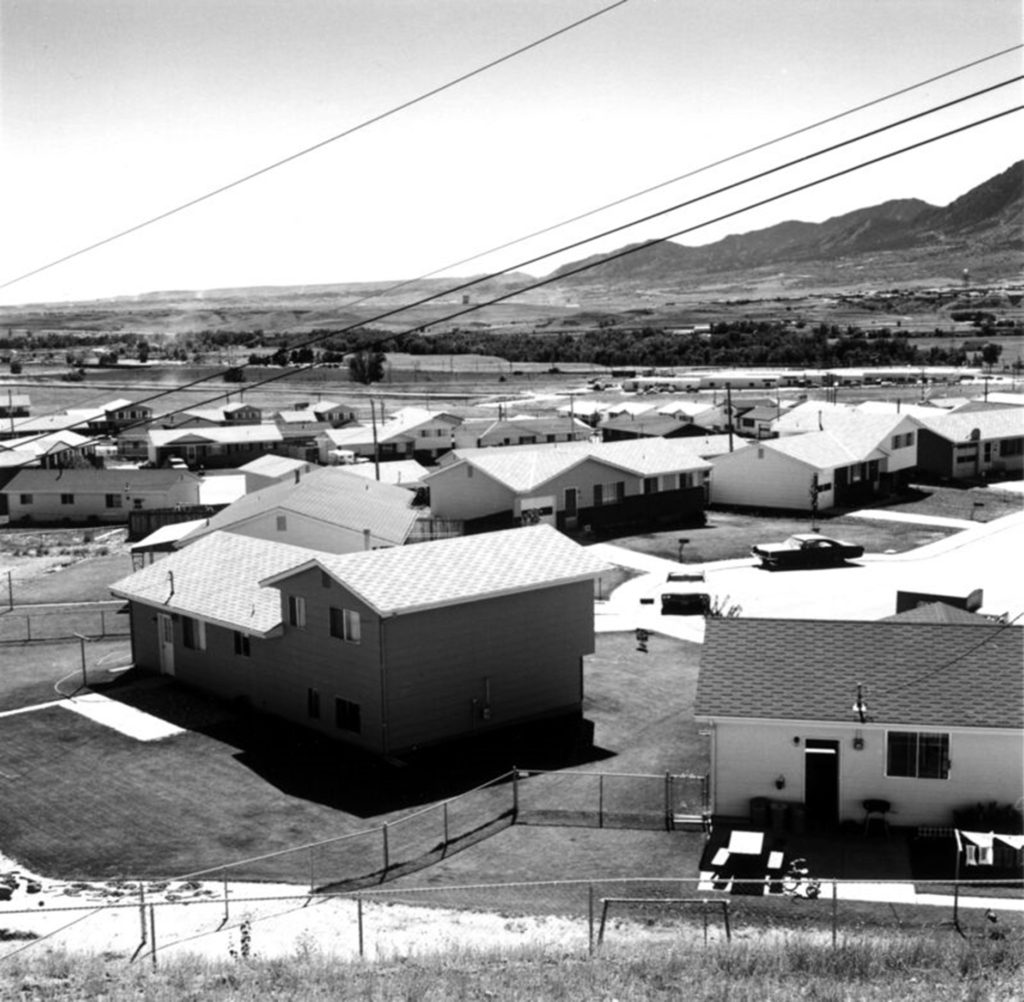
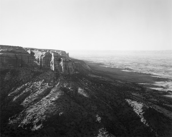
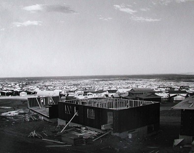
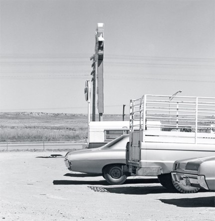
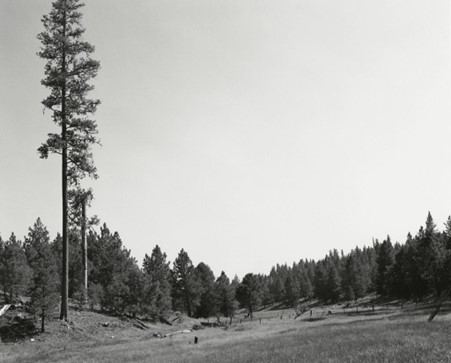
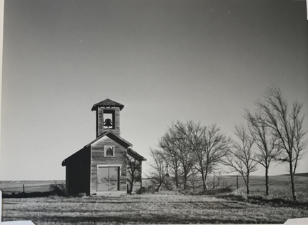
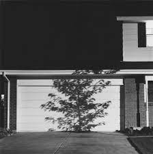
Robert Adams was born in Orange, New Jersey, in 1937. His refined black-and-white photographs document scenes of the American West of the past four decades, revealing the impact of human activity on the last vestiges of wilderness and open space. Although often devoid of human subjects, or sparsely populated, Adams’s photographs capture the physical traces of human life: a garbage-strewn roadside, a clear-cut forest, a half-built house. 

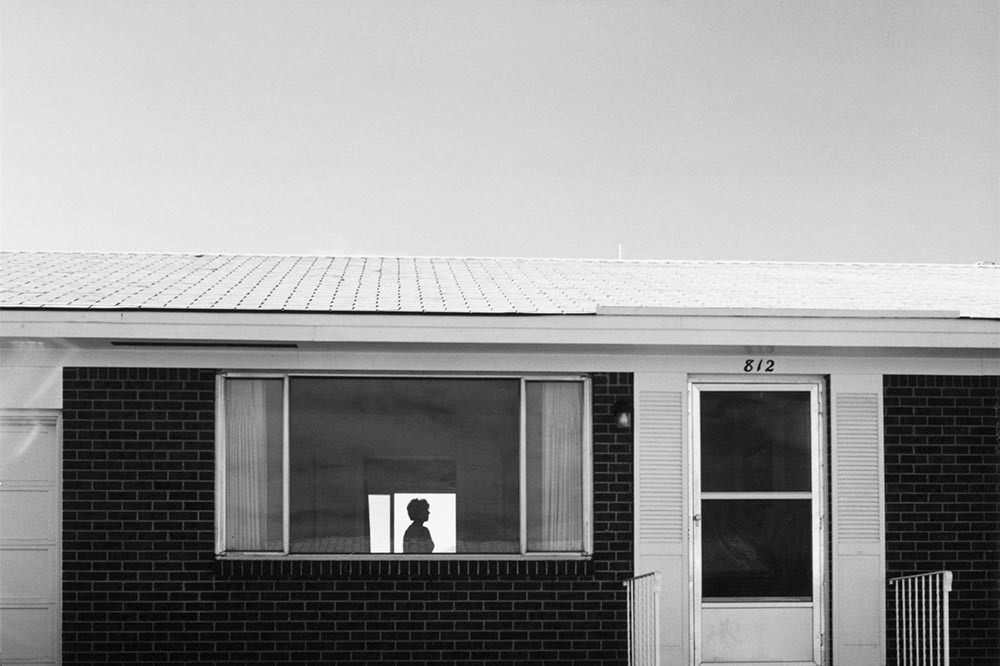
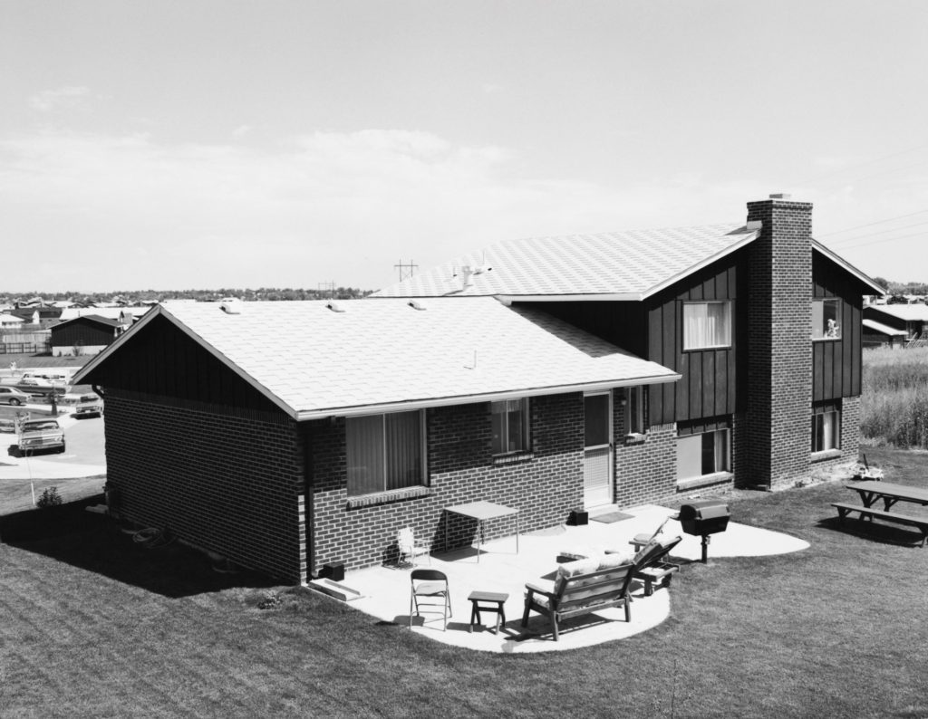
Mobile Homes, Jefferson County, Colorado

An underlying tension in Adams’s body of work is the contradiction between landscapes visibly transformed or scarred by human presence and the inherent beauty of light and land rendered by the camera. Adams’s complex photographs expose the hollowness of the nineteenth-century American doctrine of Manifest Destiny, expressing sombre indignation at the idea (still alive in the twenty-first century) that the West represents an unlimited natural resource for human consumption. 

“I think if you placed me almost anywhere and gave me a camera you could return the next day to find me photographing. It helps me, more than anything I know, to find home.”- Robert Adams

He has received numerous awards, including a John D. and Catherine T. MacArthur Foundation Award (1994); the Spectrum International Prize for Photography (1995); and the Deutsche Börse Photography Prize (2006). Major exhibitions include San Francisco Museum of Modern Art (2005); Yale University Art Gallery (2002); Denver Art Museum (1993); Philadelphia Museum of Art (1989); and the Museum of Modern Art, New York (1979). Adams lives and works in north-western Oregon.

What I like about his work: I really like the simplicity yet complexness of this work, this is because the photographic skill is reflected onto the landscape, whilst the landscape provides a different point of view, as it provides Adams’ with a chance to express his love for this American space throughout his photos. I think that the lighting and brightness throughout his work highlights the importance of our nature environment and brings attention to the fact that we need to address our environmental issues sooner rather then later on order to have a future.

  • 1975: New Topographics: Photographs of a Man-Altered Landscape, International Museum of Photography, George Eastman House, Rochester, New York, January 1975. Curated by William Jenkins. Included work by Adams, Lewis Baltz, Joe Deal, Frank Gohlke, Nicholas Nixon, John Schott, Stephen Shore and Henry Wessel, Jr.
  • 1989: The Philadelphia Museum of Art. Mid-career retrospective.
  • 2005–2006: Turning Back, Haus der Kunst, Munich, Germany, 2005; San Francisco Museum of Modern Art, San Francisco, 2005; Matthew Marks Gallery, New York, 2006. Center for Creative Photography, Tucson.

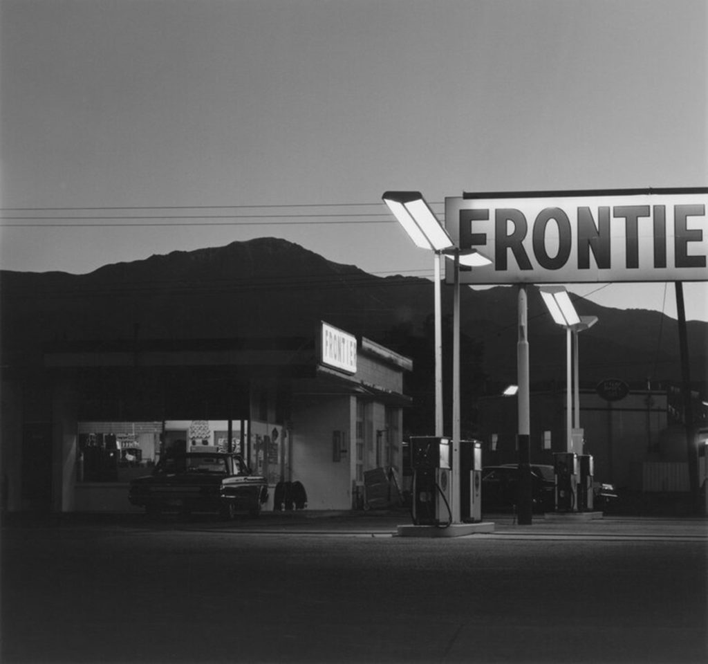
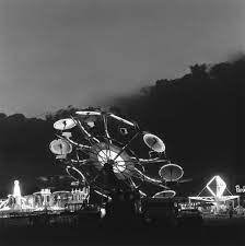
Summer Nights, Walking

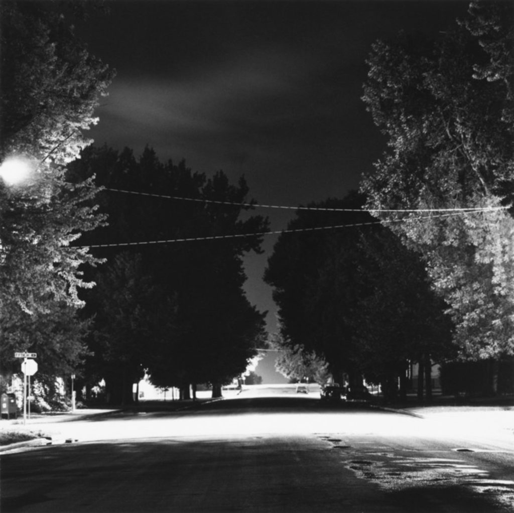
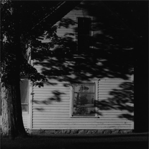
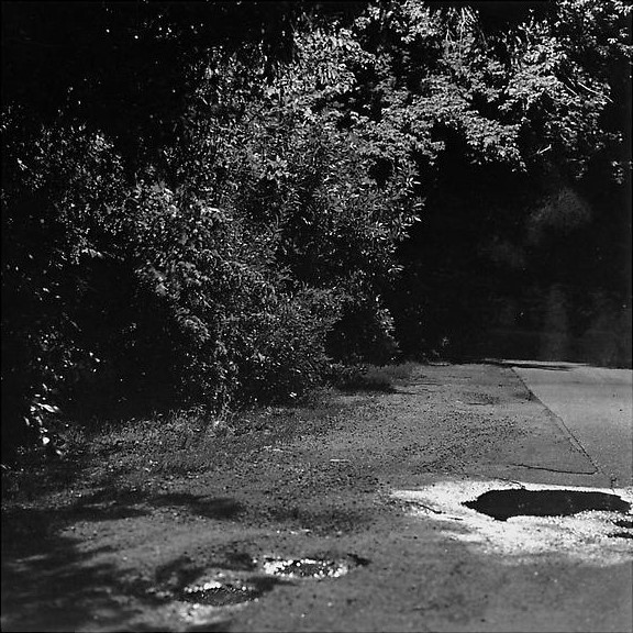
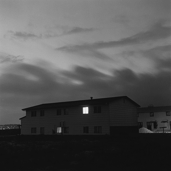
In the mid-1970s, Robert Adams began recording nocturnal scenes near his former home in Colorado. Illuminated by moonlight and streetlamp, houses, roads, sidewalks and fields seemed transfigured. 25 years after first publishing a sequence of these photos in 1985 as Summer Nights, he revisited his project, amending its title and completely re-editing its contents to create a more disquieting and more accurate reflection of his experience. Hailed as a new classic, Summer Nights, Walking went out of print soon after it was published in 2009. This sensitively enlarged edition, printed with the same exquisite care as the original, makes this revered body of work available to a new audience.

What I like about this work: I like that the contrast within his projects are very consistent, for example in Adams’ ‘Summer Nights, Walking’ project all of the images have a dark exposure, helping to help create this eerie atmosphere and high contrast. Adams’ has done other projects in places such as Arizona, where the exposure of his images are very high, and more attention is drawn to the landscape rather then any other aspects of the images. Additionally, I like that all of his photography focuses on the landscape, as I find this kind of photography very interesting and it can be created in many different locations with different equipment. Throughout my project I would like to attempt to recreate some of Adams’ lightly exposed work, as I think that this makes images more successful.

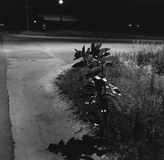
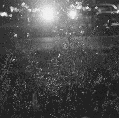
Image analysis: I think the blurriness and and complexity yet simpleness of this image is very interesting in itself. In my opinions, this image is very complex as all of the leaves and flowers which are focused in the foreground are not very clear, and this means that it takes more attention to figure out what exactly is going on throughout this image, it makes us consider what the intention behind this image is and also what could possibly be in the background? On the other hand, this image could be be interpreted as increasingly simple as the image is mostly just because of flowers and leaves, the background is confusing meaning that more simplicity is present throughout the foreground and I think thats what I like most about this image.

Robert Adams’ created lots of work throughout his lifetime, producing many books which ended up having enormous amounts of recognition. His work has also been recognised as it addresses concerns regarding the environment and our ever-changing climate we life in. This is because he was a part of the ‘New Topographic’ and this helped increase his name in the photographic world.

Matthew Finn

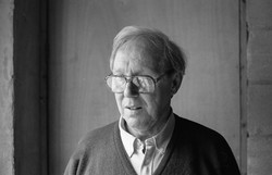
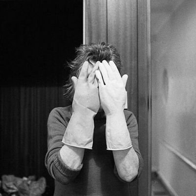
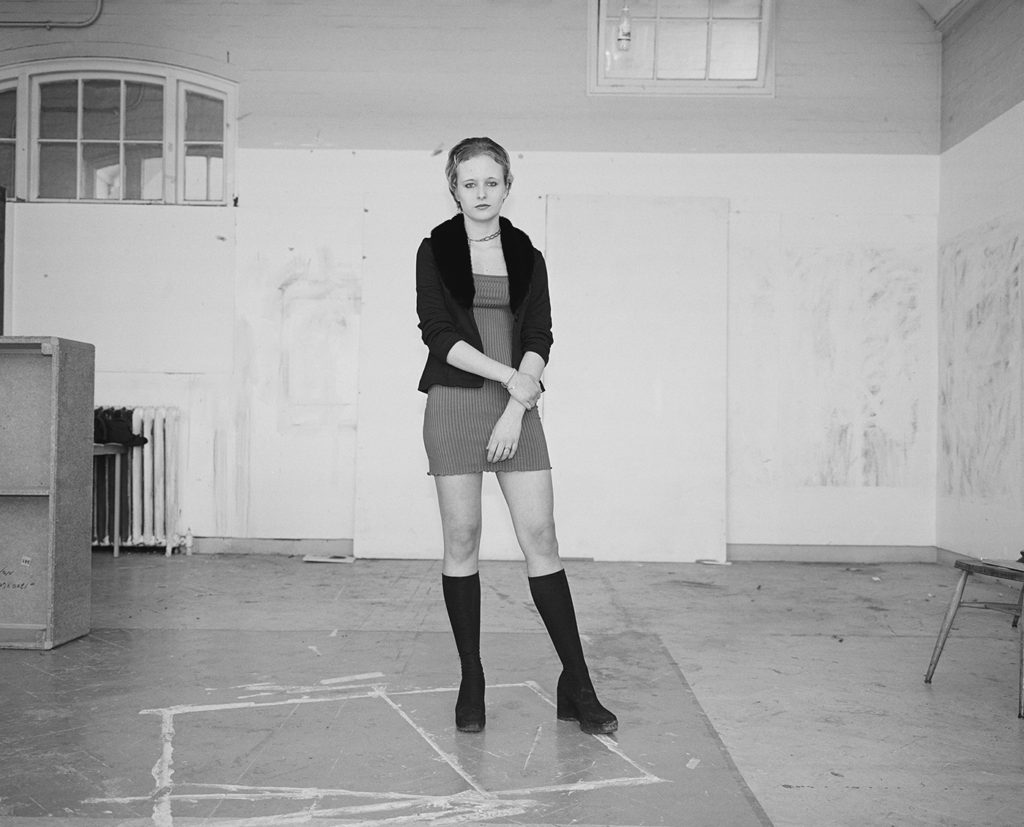
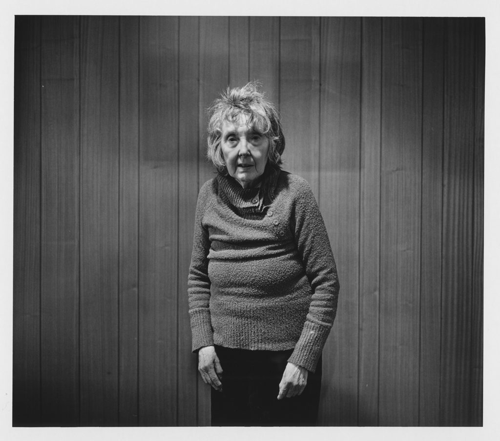
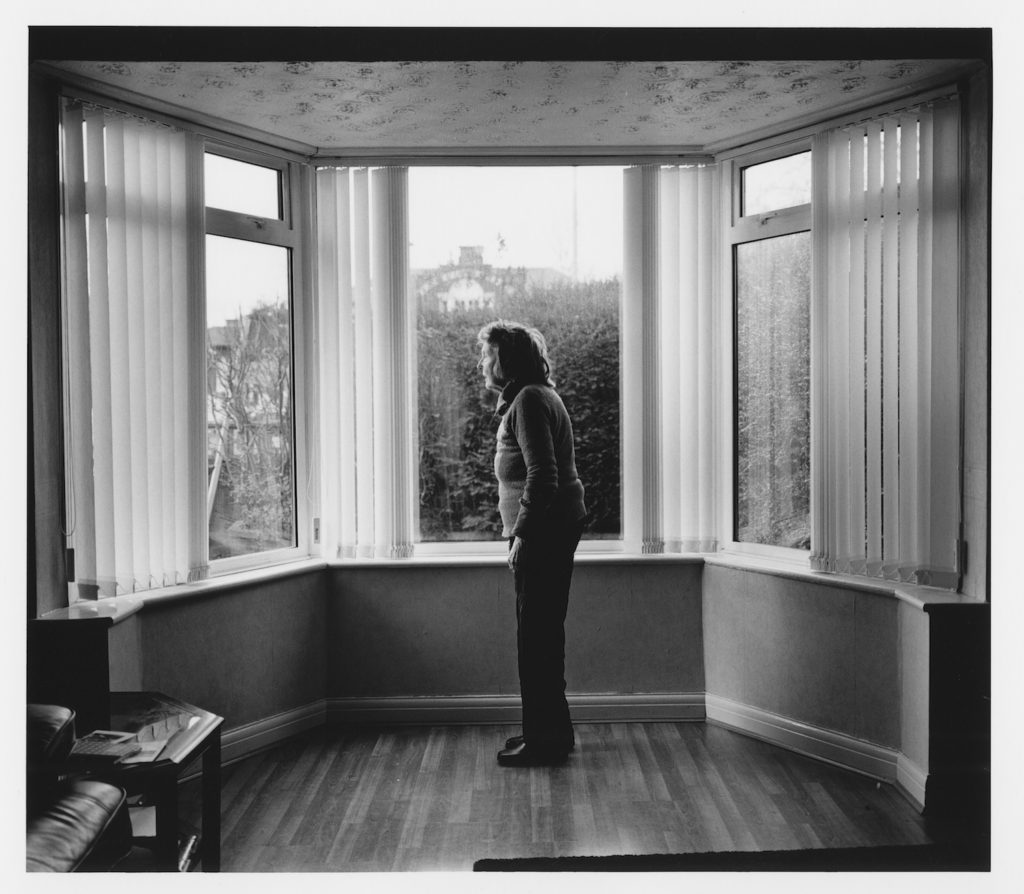
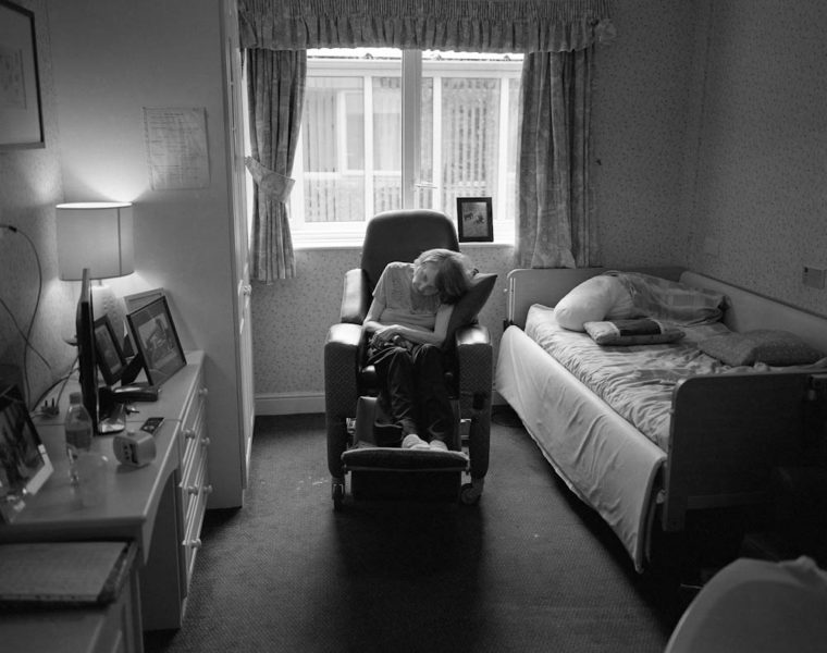
Matthew Finn explores personal relationships both within the corpus of the family as well as the wider stage of personal relationships through photographic projects. With no commercial constraints or deadlines, Finn cultivates a working practice of an auteur, in charge of all the elements of the work where the craft of the print and the process as a whole are equally important. Finn makes bodies of work including his series of portraits of students, commencing in the early 1990s, and durational bodies of work that focus on the province of family life and close relationships.

Finn’s most notable works include the thirty-one-year process of making intimate, domestic portraits of his mother and the twenty-eight years he documented his relationship with his uncle. Today Finn collaborates with family members as he pursues the universal themes of love, loss, bereavement and intimacy. Through these current and completed projects Matthew Finn has expanded the frontiers of documentary photography, bringing a new and deeply psychological reality to the genre.

What I like about his work: I really like that his work is all monochromatic, even throughout his ‘School of Art’ project, which doesn’t focus on Finn’s family, he still considers using this style of photography. This means that there is a nostalgic tone and imaginary to his work, and I would to recreate this kind of feeling throughout my work. I think that the composition of his photography means that

‘Mother’ Project

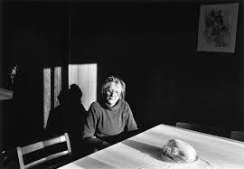
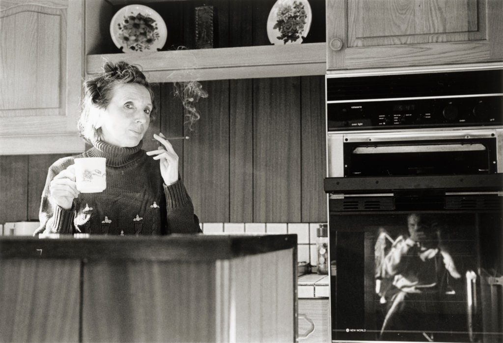
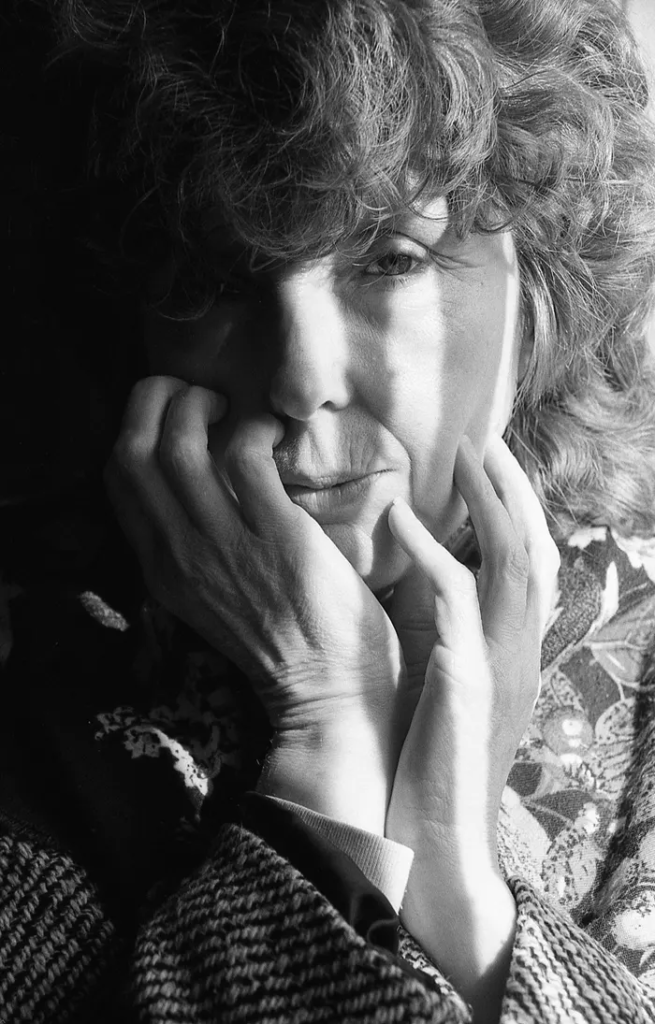
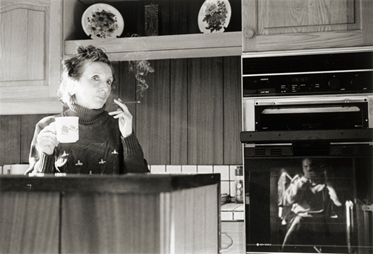
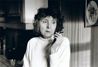
Finn states “My father is not present in these photographs just as he wasn’t in our lives and yet he haunts these images. He was also the main reason that this project became so important to both me and my mother. He died twenty six years ago. On the evening before the funeral, my mother, cigarette in hand, told me of half-brothers sisters that I would meet the following day at the funeral. This was a complete shock to me. It seemed that my father was well known around Leeds and had been married several times (at the same time).”

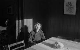
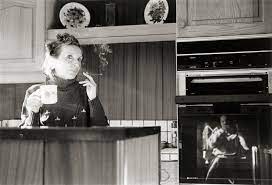
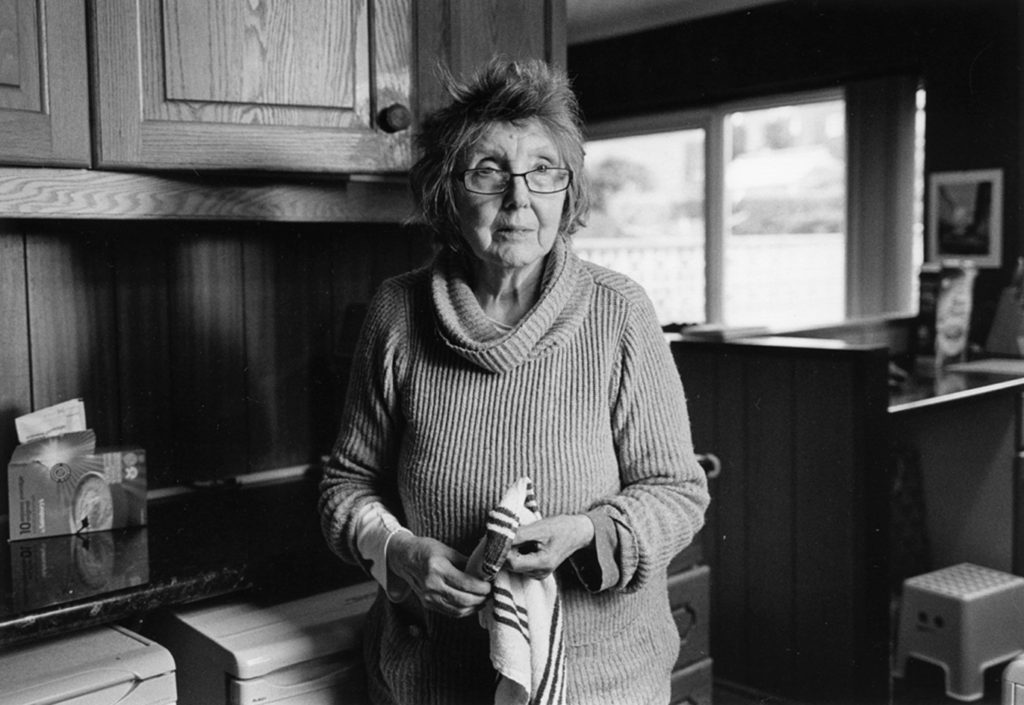
Image Analysis: I really like this photograph above, this is mostly because the concept behind the imaginary is clear within this style of photography, this means that the bright lighting and the fact that her face is in the middle of the image. The love that he shares for his mum is something that is very obvious throughout this image, and I would like to replicate this in my own project. Furthermore, the fact that his mother is touching her face may be a link to the lack of love she has experienced from Finn’s father, who was distance and was married to multiple different women at once. Her individual strength of character and the fact that she has been able to deal with this kind of family issues if definitely shown throughout this project.

“School of Art is everything I’d hoped it would be. This is a subject I love and Stanley / Barker always does a fantastic job. But it’s MOTHER that was the punch in the gut. Your introduction is one of the finest I’ve ever read. It’s perfect, and supercharges the photographs.”- Alec Soth

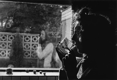
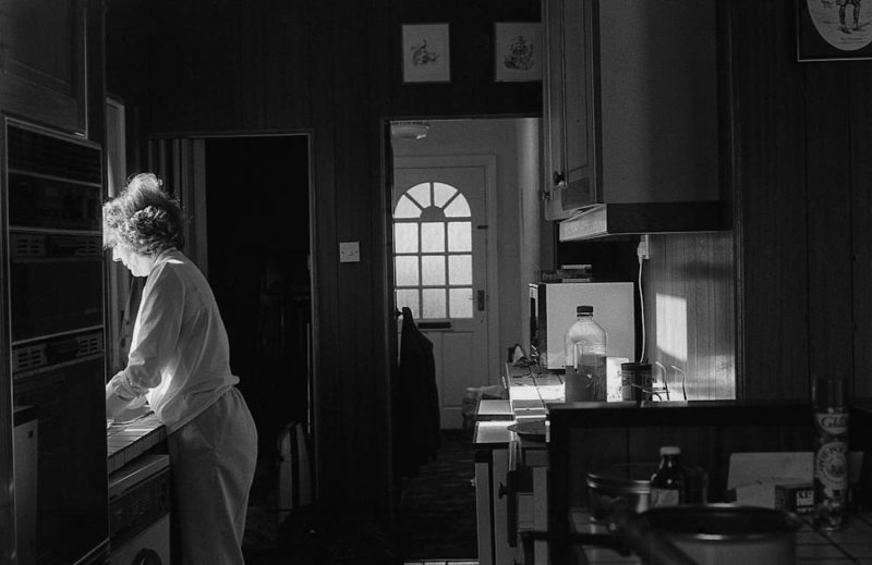
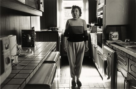
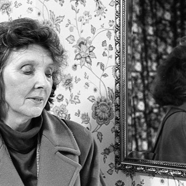
This are some of my favourite images from the whole of Finn’s whole ‘Mother’ project, I think that the contrast within these images is very strong and is most present, with the bright lights highlighting his mothers figure along with the darker backgrounds means that her significance is implied. Is it clear to the viewer throughout these four photographs alone that his mother was someone that he looked up to, and her bright figure supports this concept. This style of photography is one that is very hard to replicate, this is because of the quality and the quantity of the images.

Finn also states: “It turned out that I was the youngest child and that I was the only one who didn’t know anything about these entangled lives. Now I was able to begin to piece things together: to understand why I would see my father’s car all over Leeds during the summer holidays, outside a terraced house with an unfinished painted fence, outside a semi with an overgrown garden. These were the places he called home.”

“Matthew Finn’s work draws us into the always fascinating dynamic between mother and son. That he is the only son of a single mother intensifies this connection. Matthew and his mother, Jean, are a family of two, and their lives are deeply intertwined. They are dependent on each other, and Matthew is, in many senses, the ‘man’ in Jean’s life. Through the lens, Matthew seems to find perspective on this intensified version of what is the most natural, elemental bond – that of a mother and child.”- Elinor Carucci

What aspects of his work will be present in my project? I would like to show my admiration for some of my closest family members through my future project, just like Finn has done with his Mother and also his Uncle. I’m not sure what kind of photography style I will adapt to do this, but I would like to take image of my mum, dad and brother and make sure that they are a significant part of this project. Furthermore, I would like to make a lot of my images monochromatic as this means that their is a nostalgic feeling towards my work.