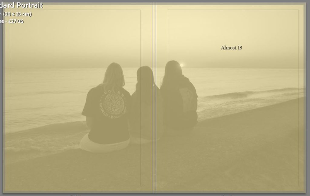
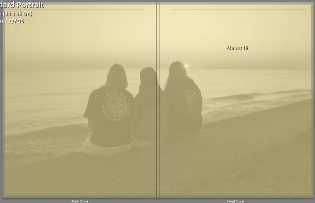
This is my front and back cover as well as my opening page into my photobook, originally I wanted a plain yellow cover for my book but as I was experimenting I overlaid an image and decreased the opacity creating what I have now. I think that this is a nice way to give a snippet of what the photobook is about but not to much where the viewer doesn’t want to look inside. I had chosen yellow as it is the colour for friendship which is one of the key themes in this photobook, I also have an opening where is states the title of the book as well as my name.
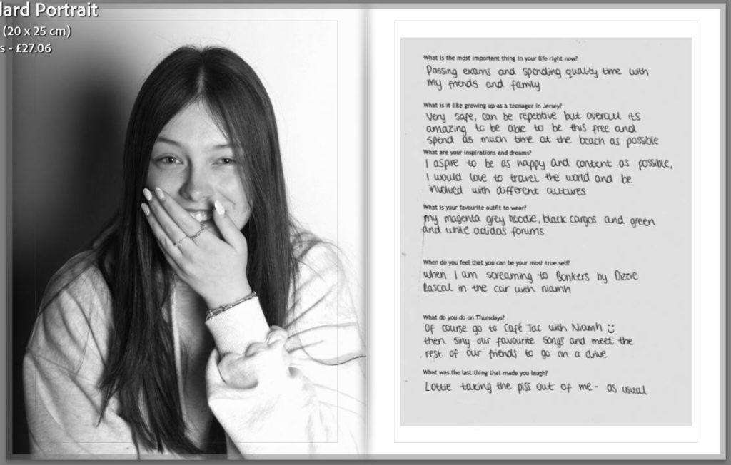
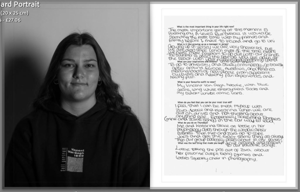
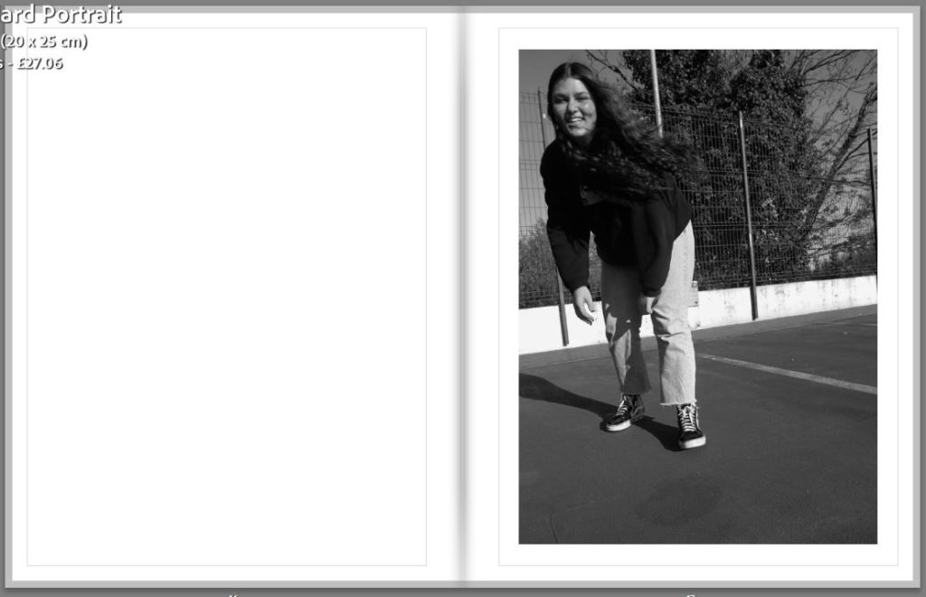
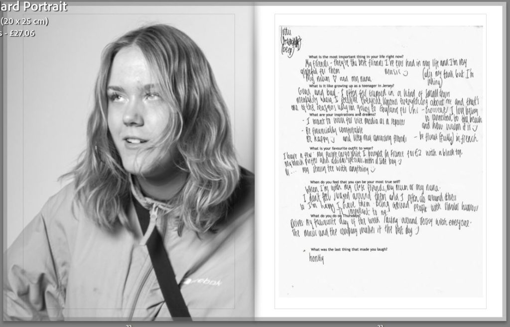
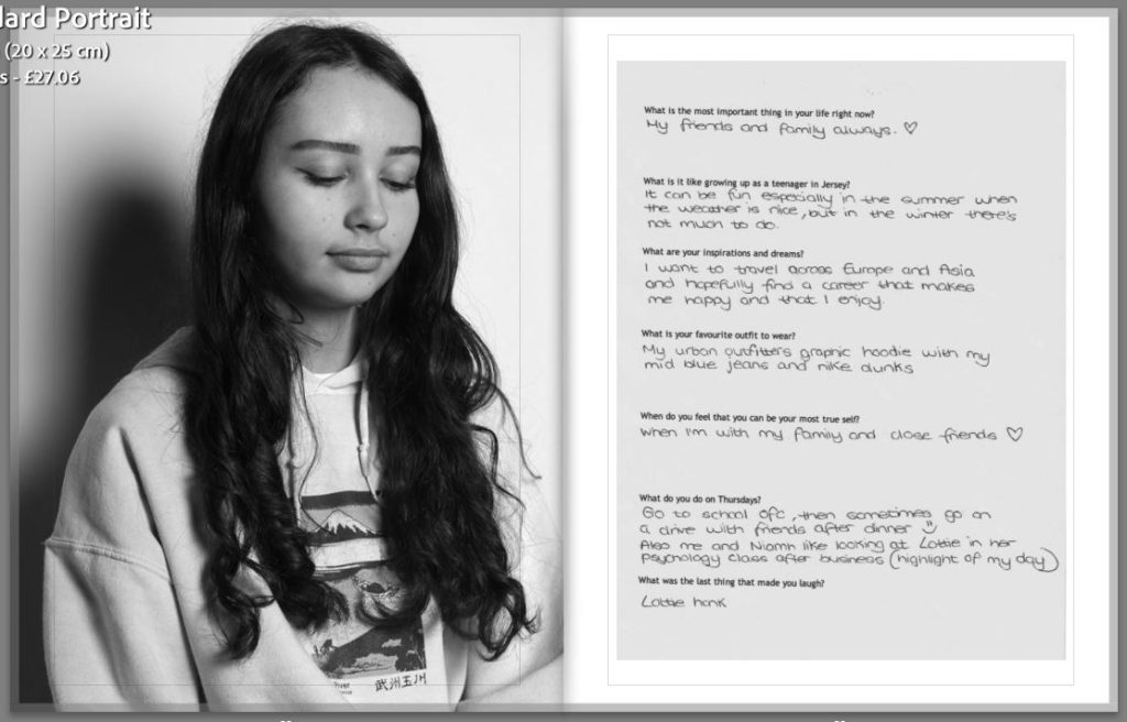
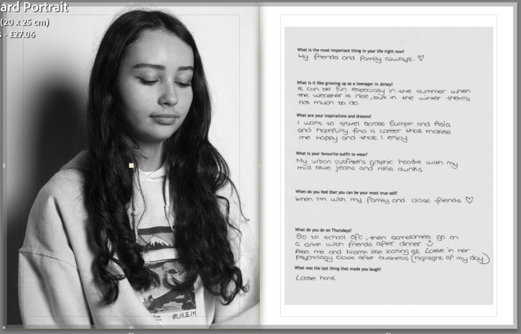
This is my proper first and second page in my photobook, I started off with a black and white portrait and the questionnaire for my first subject. I will be starting all the sections like this so that it will be easier to differentiate between each person. For my second page I have done a similar portrait but in colour and at a different angle, I wanted this over two pages but not to the edges so that it would be able to have a white boarder around the photograph.
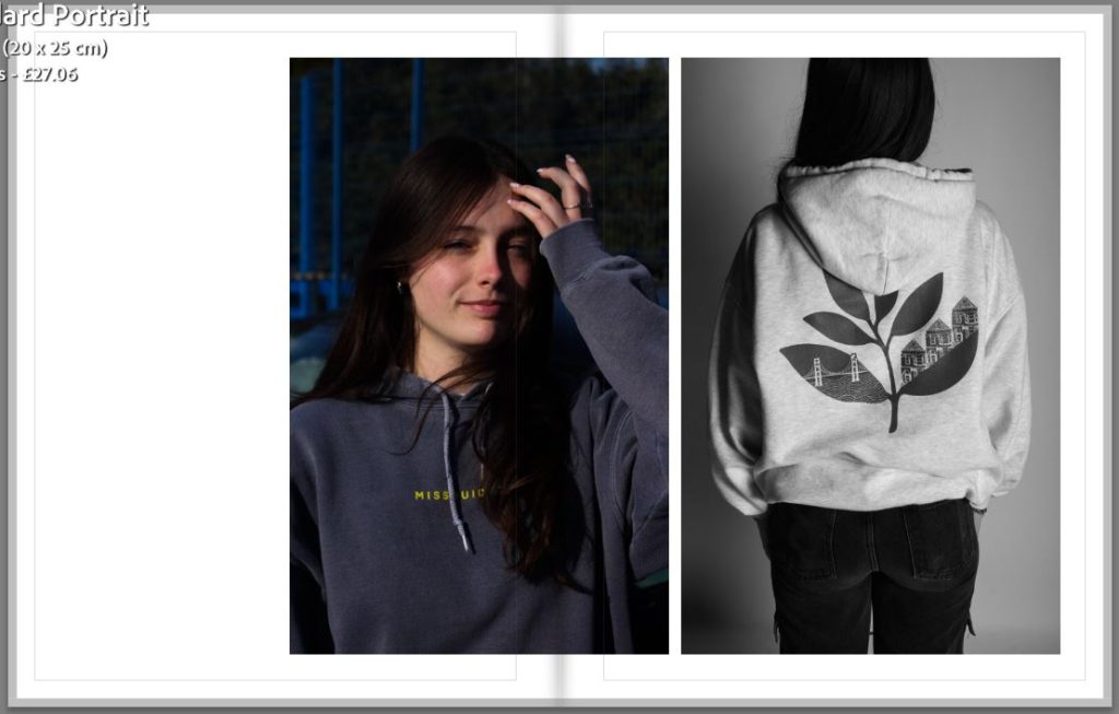
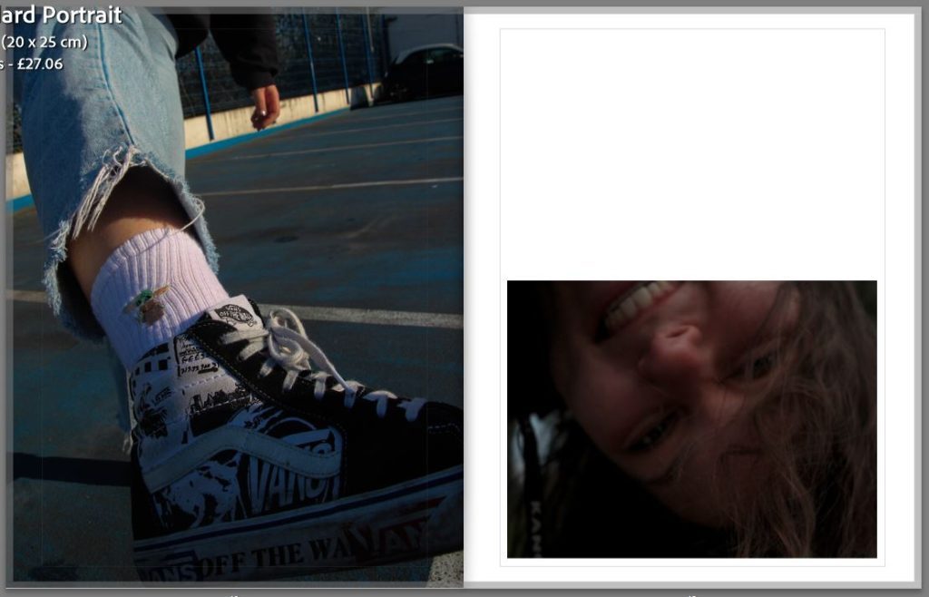
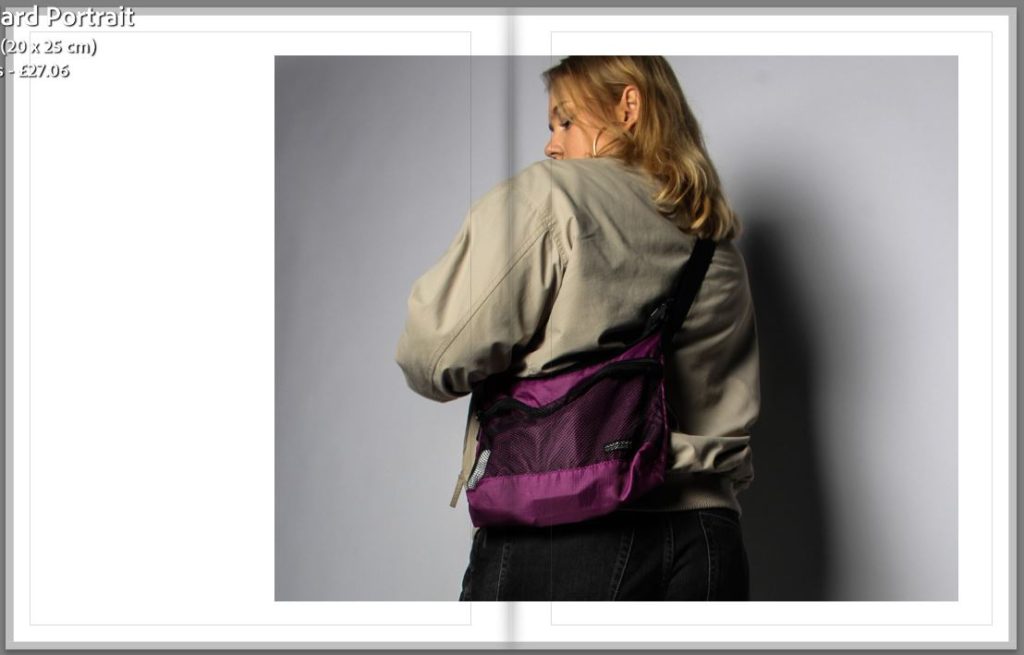
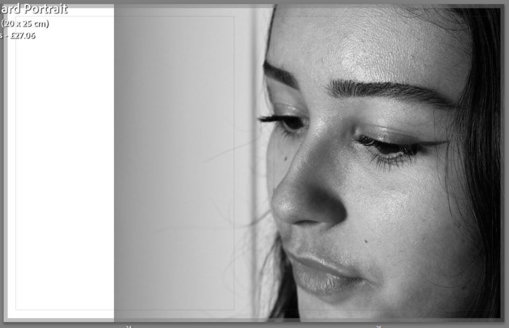
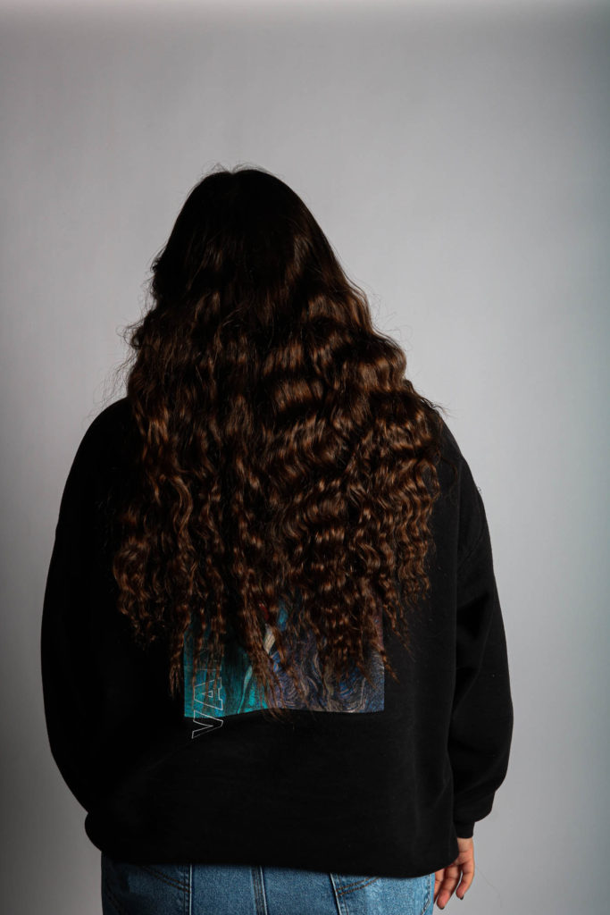
For my third and fourth I am still focusing on the same subject and trying to show different parts of her clothing and different styles of portraits. I wanted to do a front portrait and a backshot on the same page to show different perspectives. I also wanted to break apart the images by leaving a black page to make it look less cluttered. The fourth page has one of my most successful images as I was able to experiment with aperture and having the foreground in focus as well as the background out of focus.
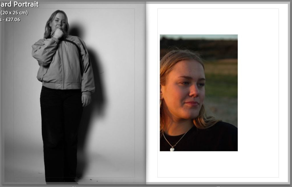
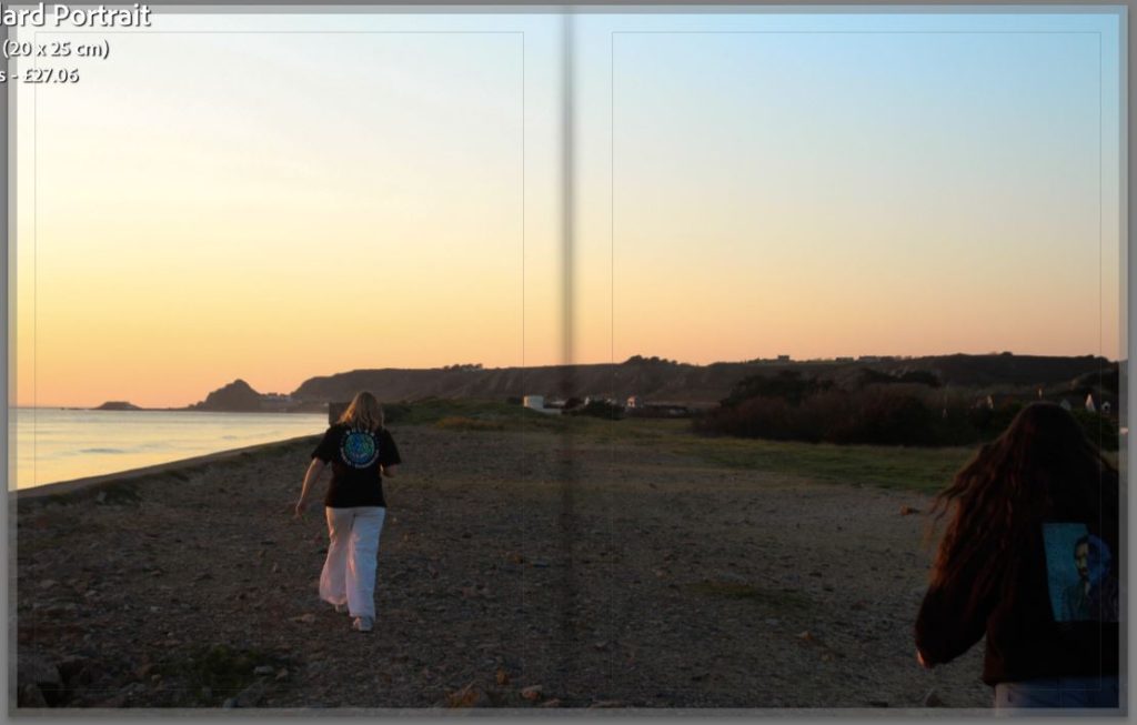
I have also chosen to experiment with different layouts, such as my fifth page where I have a landscape image which is under a portrait image. I like the contrast between the black and the white and the enhanced sunset with the rich and vibrant colours.
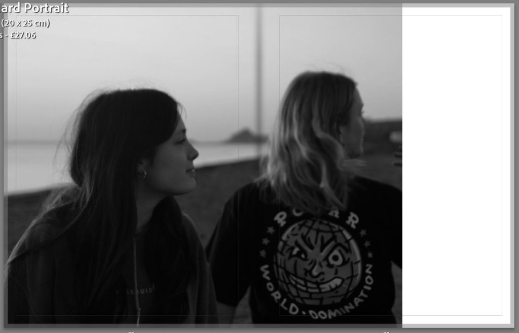
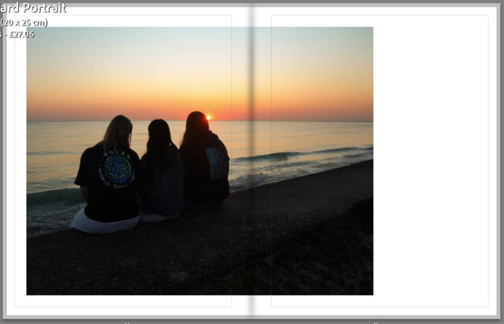
For this page I did a full page spread of one of my best photographs which I have situated next to a landscape image that is covering the bottom side of the back, I like that it has a white boarder around it as it is already quite a dark image. On the following page I have used a landscape image but I have put it slightly off centre which I like as it is something different compared to a straight and centred image like I already have in my book.
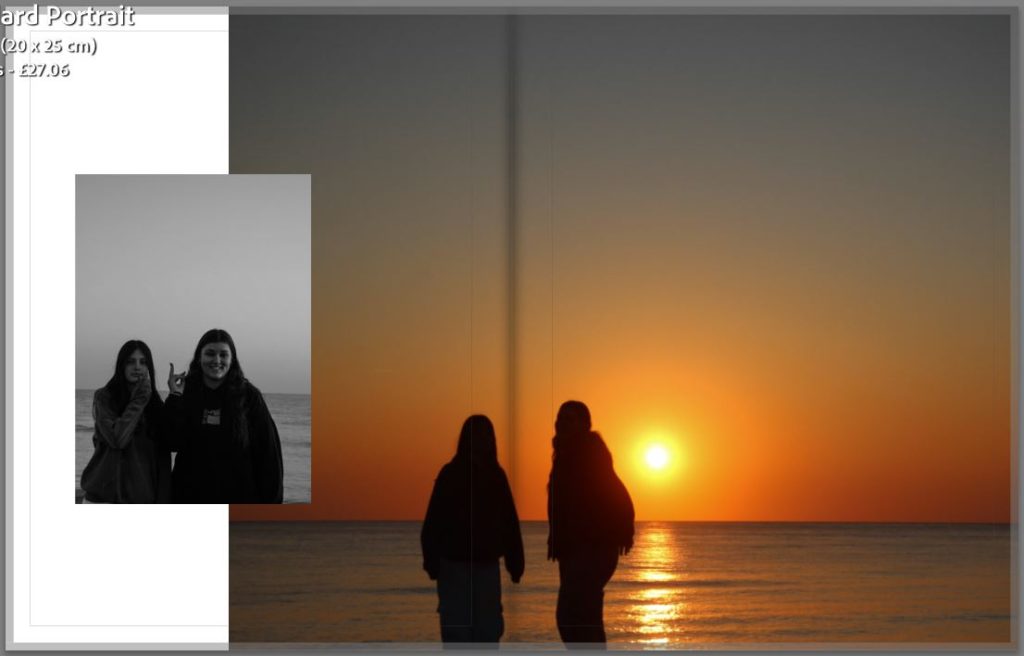
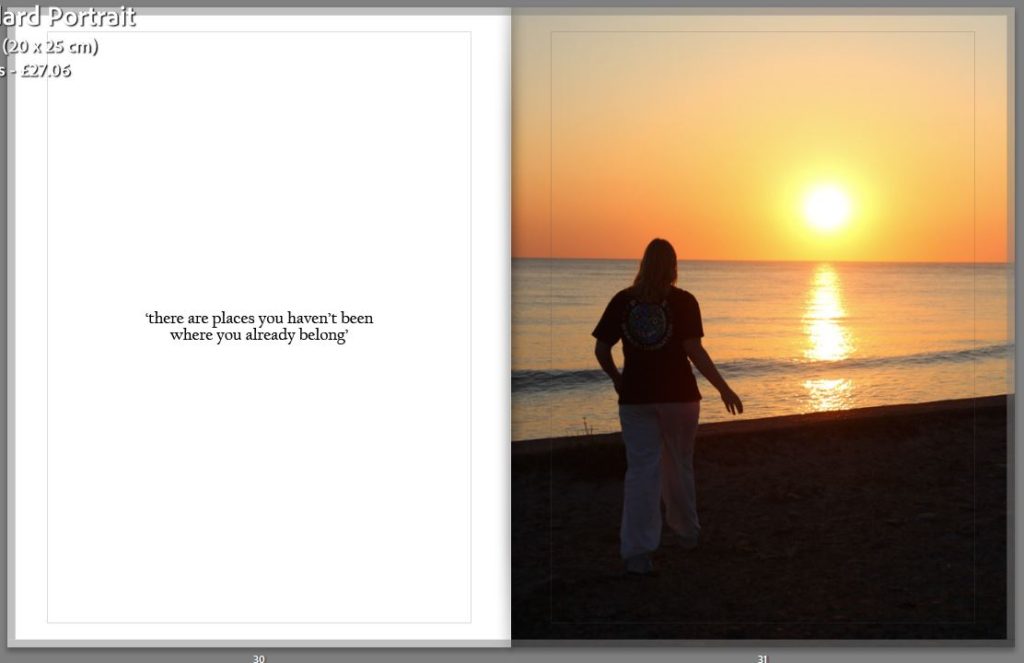
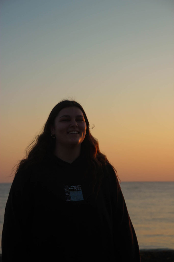
For this page I have also add a quote by the subject which she has chosen, I like how the text is able to break up the photographs so that it is a smooth viewing. I have put this next to another one of my most successful images of the subject walking towards the sunset, this was inspired by one of my photographers Kayla Varley, which is by having the subject silhouetted against a strong set of colours.
How successful was your final outcomes? I think that my final outcomes were very successful as well as a photobook which has a strong narrative and cohesive set of images. Out of my four photoshoots I believe that the compilation of images that I have come out with tell my story clearly and have a unique style to them. I defiantly have images which are stronger then others but they all have been edited where they can be put together and taken apart and still look professional and look aesthetic.
Did you realise your intentions?
At the start i struggled with linking my images with the simple or complex theme, but as I have gone on I feel that I have produced a set of images where their is a clear link. As I have explained before my main aspect in on friendship and being teenagers and both of those things are complex in themselves but I have tried to show them in a simple way through a photobook.
Is there anything you would do differently/ change etc?
I would make sure that I have more studio work as I found that I like having a neutral background as they are easier to pair together, they also tend to look good in both black and white and colour. Even though I think all my photoshoots were successful and produce great final images.
For the presentation of my final print I have chosen three images from each subject which I will arrange in different ways to make four triptychs. A triptych is a set of three images which are intended to be seen together to create an aesthetic collaboration.
Above is the first arrangement of three images, I have used different formats and sizes for these prints so that they will be interesting and look cohesive. For the image on the left i will print that in A4 to set it apart from the two other photographs, the others will be printed in A5 but as the bottom image is a slightly different shape it will create a different composition to the trio of pictures which I like rather then the top and bottom being the exact same. To present these images I will glue the two smaller images onto foam board to lift them up from the bigger A4 image which will also be stuck on the same piece of foam board. By increasing the height of the two smaller images it will push them out towards the viewer as I feel that if I didn’t do this they would get looked over by the bigger image.
This is another triptych that I will be making with my final prints, for this presentation instead of stacking images I will be putting them side by side but the middle image will be smaller then the outside ones . To get this effect I will print the outer images at a size of A4 and the middle image in A5, this is also connected by having the two outer photographs in black and white while the middle one is in colour, i think that the pop of purple from the bag in the centre image helps to bring the triptych all together.
Above is the third triptych that I will be constructing, all of my presentations will be in a different format so that I can experiment with different designs and ideas. For this presentation I have decided to use all black and white images in a diagonal design, i like how they kind of move in a cohesive motion like the subject is spinning while the images are descending down the foam board. This presentation will have one A4 image which is the middle photo and two A5 images the outer pictures. I will lift the two A5 image up by sticking them to another piece of foam board before placing them on the big piece next to the A4 image.
This is my last triptych that I will be making for this project as I have planned to do one for each subject. This is the original way a triptych is supposed to look as they were normally connected by hinges. I have used two black and white images and one colour image in this presentation, I will also printing the coloured image at an A4 size while the others will be printed at A5.
Overall I think that all of my presentations have been very successful and display the images perfectly, they show off parts of each subject while also looking put together and that they are a collection instead of images just randomly put together.
following along with four girls as they explore themselves while living on a small island
A paragraph
During your teenage years, friendship is one of the most import things in you life, this is to show you how four girls rely and support each other as well as having fun driving around and exploring their small island. You will see how they explore themselves through portraiture as well spending time together before they all start new chapters in their lives by moving to university.
Design
Paper and ink
I will be using white paper behind my images in my photobook as well as black ink for the title and quotes on the inside. I have chosen to stay with white as I think that is a neutral colour helps to accentuate my images as most of them either have a lot of colour or are in black and white. By using a white background the colour images tend to look brighter making them standout against the darker black and white photographs that will be presented in my book.
Format, size and orientation, binding and cover
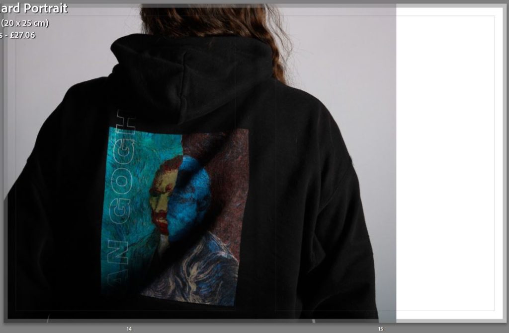
For the size and format of my photo book I will have a soft cover as I think that will be fitting for my style of book, I will also have the front cover be matte as I want to add a different type of texture instead of the classic shiny cover. I also think that the matte cover will look better with my front cover where I have a yellow background which I have chosen due to that colour being the colour for friendship as well as having one of my final images layered over the top with the opacity turned down so that you can still see the yellow peaking through.
Title
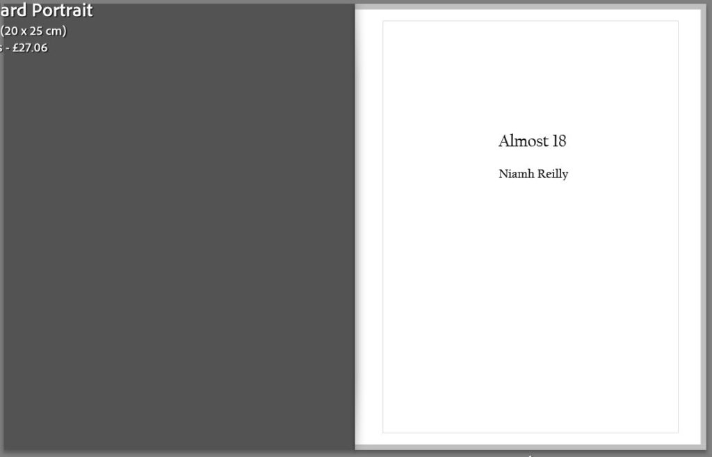
I struggled when picking out my title as I could not find one that was fitting for my photo book, I first wanted to experiment with names including the word YELLOW as I thought that it would fit best with the concept. For example, YELLOW HEARTS. After I looked up the meaning which is the opposite to what the book is about I moved on to thinking about my friends, the title I was experimenting with was DIRTY BLONDES as their in one blonde and three brunets but I felt that this really only focused on one person where I wanted everyone to be included. Next I was thinking about doing something simple like a number or letter so I started off with 18 which developed into ALMOST 18 as three of us are 18 but we are still waiting on one. The age 18 is very important, we are starting new chapters in our lives and everything will be changing so I wanted to have a title that represented that.
Editing and sequencing
For my images I will be using a mix of coloured and black and white images which will all have similar editing techniques used so that my photobook looks cohesive. In my book I want sections that are dedicated to one person with a mix of group photos included. I will start off with a black and white portrait and there responses to the questionnaire, this will lead into different compositions of images of the induvial and finish with group images, I will then start a new persons section.
Images and text
In my photobook I will use a small amount of text, but I will be add a singular quote from each person next to another portrait. I think that by adding a quote which they picked out themselves and that they like will allow for the viewers to get to know each person more. By adding text will also help break up the images so that they don’t seem like they are to squashed together in the book.
Layout
In my photobook I have been experimenting with different image layouts, I have a range of layouts presented in my photobook as I wanted variety to keep the book interesting and not repetitive.
To keep the book from looking cramped I have left blank space around some images as well as leaving while white pages to help break apart the colours and shades which can get overwhelming. I like the contrast between the black and white and coloured images in the first layout as it is of the same two subjects but completely different compositions.
For my project I took some inspiration from Michelle Sank and her ‘Sixteen’ collection where she had UK teenagers from Cornwall answer questions about their lives and how it feels to be 16 as well as growing up in poverty and isolation from big cities. I thought it was very impact full how she would connect a portrait of each teenager with their answer showing viewers the diversity in their small town. I liked that you were able to get a deeper insight into the teens lives just by their answers not matter how short or how detailed their made them. I wanted to do something similar in my photo book so that it would help viewers get a greater understanding of each subject and their lives.
Questions
For this part of my project I came up with seven questions which ranged from being quite generic to more specific questions that have meaning to me and my friends. I wanted to have a wide variety of questions which gave a lot of detail to help tell a story of what it is like growing up in Jersey as a teenage girl as well as how important friendships are as they become people that were most comfortable around.
One of the questions in this questionnaire is catered more for my friend group specifically, it I the second to last, it may seem strange that I have asked what they do on a random day in the week but to us this is a specific day where we all try and meet up. Depending on the week sometime there only be 4 people but there can also be the whole group, it is a day where we make time to spend together which I think is very important especially for teenagers at stressful times.
Responses
As I wanted a more personal feel to my project, I got myself and my friends to had write our responses. I also wanted to show the difference between how each of us write which I think gives a deeper meaning to the answers and overall concept. I think the way people layout their answers on paper and their handwriting can tell you a lot about their mind. For example, my friend on lefts responses are shot and straight to the point as well as being simple and some could say that they look sweet with the little hearts draw on the side where as my friend on the right has a louder personality which I think can be shown through her responses and the way she has laid out her answers.
Katarina LottieNiamhZara
Photobook Layout
I have decided to use this layout in my photo book as I want viewers to be able to see the person and what they look like as well as their answers before they see any other images which I have taken. I wanted to keep all these portraits in black and white so that it can be shown for when a new persons section is being shown in the book. I think this was a very successful part of my project as viewers are now able to get a deeper insight into each of the subjects lives as well as their thoughts of certain matters.
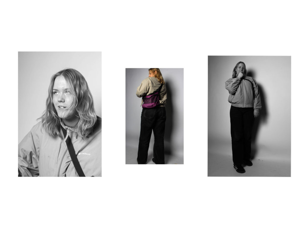
My fourth photoshoot was my smallest, this was mainly due to an idea which I had while in school, these were taken in the studio so that I would be able to have a neutral background to each image.
Sub-Selection
I have used the same selection system as I have in my previous photoshoots, i have used the ‘p’ key to white flag the images that i will be editing and the ‘x’ key to reject the photographs that I wont be using in my final images. As this was quite a small shoot it was quite easy to narrow down which images I will and wont be using.
Editing
In the whole shoot I only made two images black and white as I wanted to enhances the saturation of the colours from the subjects hoodie. The two top edited images are both similar portraits which I wanted to have in different formats as well as showing more of the subjects clothing and body on the right. I have again used a similar editing style so that I will have a cohesive set of images which make a smooth flowing photobook when they are finally presented. For both the black and white images and the coloured images I have decided to decrease the exposure an slightly increase the contrast so that I create a darker background to each photograph while enhances the different tones and colours in the final image.
Final Images
Below are two of my final images in a landscape format, the left photograph is a classic portrait with the subject looking at the camera, posed while the right image is of the subjects back as i wanted to show the different dimensions of the subjects clothing. I like the contrast between the two images as the right image is full of colour which stands out against the dark black hoodie and light grey background, where as the left image in black and white but still conveys a lot of emotion.
I have as got final images from this shoot in portrait which are quite similar to each other but their are either using different subjects or facing opposite ways. The image on the left is interesting as the pose tells a small story behind the photoshoot, the subject looks like she is looking towards another camera and someone has got a different angle. The two other photographs are back shots i wanted to highlight the designs of the subjects favourite hoodies which they have mentioned in their questionnaires. I turned the middle black and white as I felt that it fit better with the different tones and shading. I also had the subject in the last image have her hair behind her as I wanted to capture the details and texture which was one of the reasons I kept in in colour so that the brown would be enhanced by the lights.
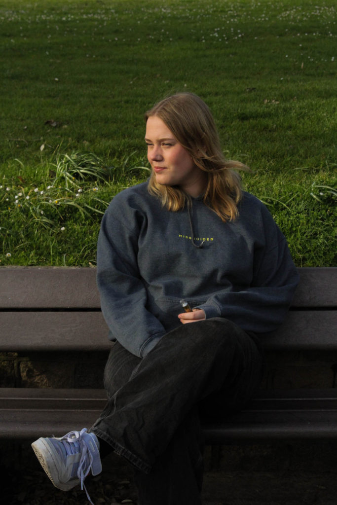
For my third photoshoot, I wanted a mixture between naturalistic and posed portraits as well as photographs taken from further away. These images were taken in three different places at different time throughout a sunny Thursday. We first went to a car park in St Clements as I thought the lighting was good and wanted some images with the sun shining towards our faces, these were taken between 5pm and 6pm so the sun had not started setting yet. The second part of this photoshoot was in Green Street car park on the top floor so that i could use the natural light, these were taken in ‘golden hour’. Lastly the third part of the shoot was taken down in a St Ouens car park connected to the beach, I decided I wanted these images to be taken while the sun was setting as I took inspiration from Kayla Varley for some of the photographs included in my shoot. I believe that this was a successful photoshoot as I have found great images that I will use in my final selection.
Sub-selection
I had a lot of images for my third photoshoot so to help myself narrow down my final images I used the flag tool to differentiate between the images that I will edit and possibly use and the photographs that I will not use. I also used the star tool to pick out the ones that I wanted to focus more on while I was editing and which ones I felt that were more likely to be picked out after.
Editing: Photoshoot 3
The editing for my third photoshoot was quite similar to my first and second as I wanted a cohesive style of editing throughout my images, I felt that my doing this my photobook would be able to flow better then if I used different styles of editing.
Below are two of my images which I have kept in colour, for the left photograph, it is shows how the original was over exposed, to combat this I decreased the exposure tool in Lightroom and increased the contrast which dulled down the image helping with the brightness. After I found the level where I wanted my image to be with the lighting, I adjusted the temp tool by putting in slightly in the yellow as I think it gives the image a sunny glow enhancing the overall look. The edited image on the write hasn’t been changed much from the original photograph, I wanted a deeper colour for the car and shadows, to get this effect I decreased the shadow tool and the whites tool in Lightroom.
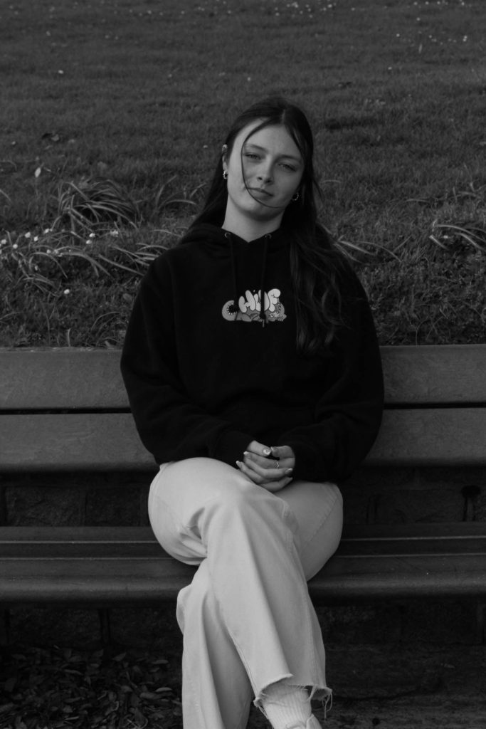
I have also editing some of my images from this third photoshoot in black and white, for the image on the left I thought that the photographs would fit a more monochromatic look as it is not a normal image of a posed duo, I wanted to enhance the shadows and to do this I decreased the exposure and the shadows. The image on the right was taken during the sunset but was not one that was very saturated, to combat the duller sky I turned it to black and white and I found that it looks better. It is a more casual image which I like so I didn’t do much changing from the original image.
Final Images: Photoshoot 3
To help myself choose which images I will be using as my final images I decided to use a colour coding technique by using green to signify the photographs I will definitely be using and yellow as the ones that I won’t be using.
Above are three portraits that were taken at green street car park in my third photoshoot. I like how they are all similar composition but have slightly different editing, this helps to make a triptych. In the first image I like how there is a yellowish tint making it seem more golden accentuating the colour of the subjects hair and skin. The middle image is edited a little darker than the two next to it, I enjoy the contrast between the little skin and the darker tones from the subjects hair and hoodie, I feel that this helps to center the subjects face and bring the main focus to it instead of what’s in the background. In the final image I decided to edit the photograph lighter to show the colour off the subjects hair and the different textures. I also like how saturated the colours in this image are, the blue from the sky and the blue detailing on the hoodie help to make a good composition and connection in the image.
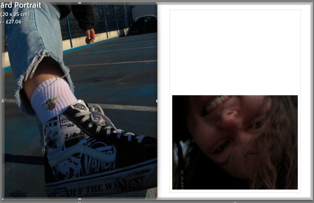
Above are are three portraiture style of photographs which have changed into black and white as well as a singular coloured image. I like the composition of the three images on top as they look cohesive due to the monochromatic similarities as well as the position of the two duo images outside of the individual naturalistic portrait. I feel that these photographs have a great way of showing the story that I am trying to convey through my images, that teenagers tend to be happier and need their friends especially during this stage of life. The first photographs is one of my favorites from this part of the photoshoot as it shows true emotions and has a great composition with the subjects centred with the car in the background. Lastly, I think that the photograph of the individual shoe is quite interesting as it using a great angle from the ground where there is lots of details being show creating a greater message. The lighting also enhances the image as the sun highlights the embroidered picture on the sock as well as the comic designs on the shoe.
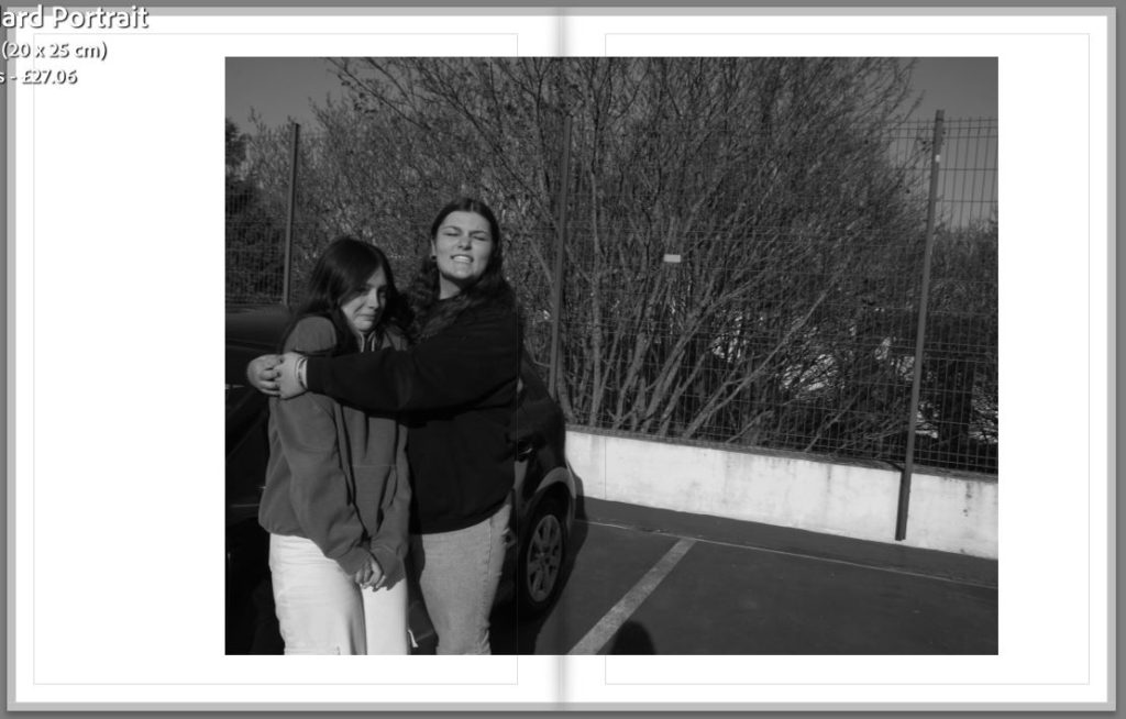
These six images are from the last part of my third photoshoot from St Ouens, I have done a mixture of black and white images as well as keep ones in colour. My top three landscape images are mainly ones to represent the friendship part of my project as they are mostly group or duo images. One of my favourites out of the three is the middle one as I like the composition between the two subjects, where they are both facing away but you are able to see the design on the back of the t-shirt as well as the details and different shading both of their hair. The bottom three portrait photographs are also some of the best from this part of the shoot, the left image is a portraits with golden lighting which helps to accentuate the subjects hair and detailing with the hair style as well as her necklace which helps to break apart the harsh black from the top. For the middle image I found that I wanted to have a classic black and white edit over the top of a funny, more relaxed image, I like how this image can show the dynamic of the friendship clearly as well as the closeness of the friendship.
Below I have my contact sheets for my first and second photoshoot. For my first photoshoot I used the studio as I wanted to complete some of the portraits for my project, I found that a lot of them were successful and showed off the subject well. I used two different types of lighting in the studio shoot one being a warmer toned light and also the flash light which was connected to the transmitter on the camera. This allowed for the subject to be framed by the pure white background as well as being well lit which complimented their skin and helped to have stronger colours. For my second photoshoot I went to St Andrews park in first tower as I wanted a more colourful and natural background to my images. I first started with the subjects standing together and individually, I then moved on to a bench where I also took some photographs together and one of just the subject.
Sub-selection
I have narrowed down the images I might be including by using the flag tool, I did this by pressing either the ‘p’ of ‘x’ key which rejected or kept the image that I wanted. I will make a new selection of images after I have edited these. As you can see below there is both my first photoshoot and my second photoshoot in this sub-selection. I have also used the star tool, but this is to help me figure out which images I should spend more time on compared to others. The ratings range from 1 star which is the photographs which I liked but don’t think will be included in my final prints to 4/5 stars which as the photographs that i will be focused more on with the editing and the ones that are most likely to used in my final prints.
Editing: Photoshoot 1
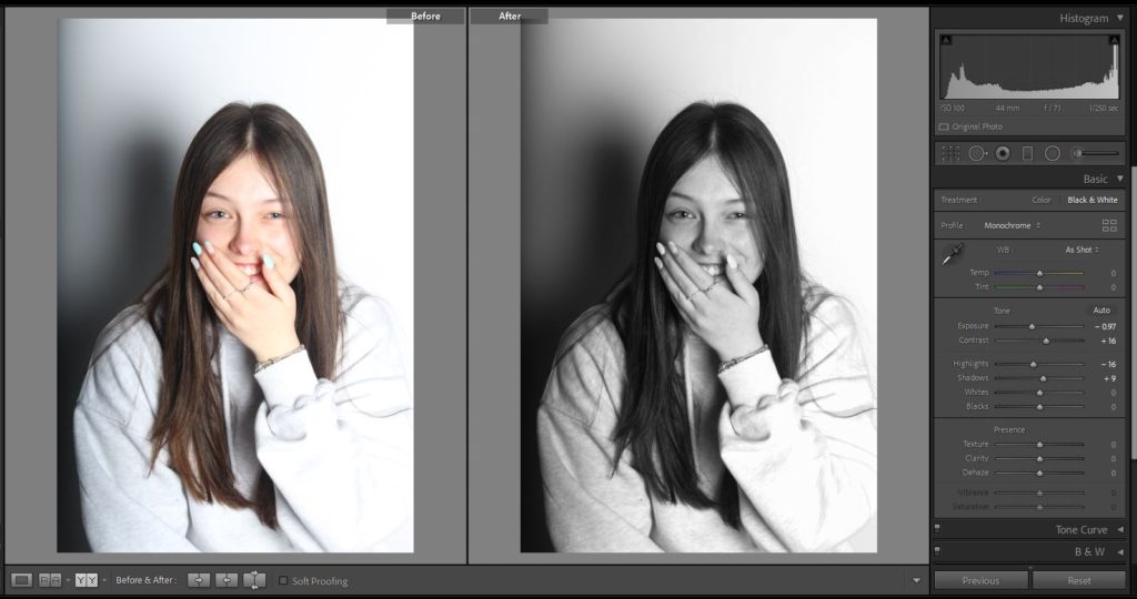
As I was using the studio for my first photoshoot I wanted to focus more on portraits and the different angle of each subjects faces. I also did some full body images as I wanted to show how they like to dress and the different colours which are incorporated into the clothes. Below are two of my portraits which I have decided to edit in black and white as I felt that they conveyed more of a message and suited the lighting better. For my black and white images I switch the original photographs form colour and then adjust both the contrast and exposure to a darker setting and I prefer a image with more exaggerated shadows. As well a increasing the contrast and decreasing the exposure I also use the shadow setting to get the darker look.
Another example of my editing I have shown below of how I have kept my images in colour, for this photographs I felt that using colour would compliment the subject more. For these I have decreased the exposure and increased the contrast so that the colour form the subjects skin and hair become more saturated and standout more against the white background.
Editing: Photoshoot 2
Below I have two of the images from my second photoshoot which I have chosen to keep in colour as I wanted to be able to show my editing techniques with both colour and black and white. With these images I have decreased the exposure as I felt that they were slightly over exposed, I have also increased the contrast on both as I like a darker look to my photographs. For these images I have also experimented with using the temp tool in Lightroom. As these images were taken during an overcast day I increased the temp tool giving a more yellow effect and imitates ‘golden hour’ which I prefer to the original image which is quite cold and grey. For the right image I have also increased the tint tool into the pink colour as I wanted to add more colour into the face of the subject.
I have also edited some of the images form this photoshoot in black and white, all of my black and white images have been edited in a similar way as I wanted my photographs to look cohesive when they are put next to each other. I have decreased the exposure and increased the contrast which is the same as my colour images but with these black and white ones I tend to increase the shadows and white tool so that the image isn’t to dark and you can still make out the details.
Final Images: Photoshoot 1
I have used the colour system to help differentiate between the images I will be using (Green) and the images which have been edited but will not be chosen to be final photographs (Yellow).
Below are 5 of my favourite images from my first photoshoot, I have a few other final images for this shoot but I have chosen to analyse the photographs I think are the best.
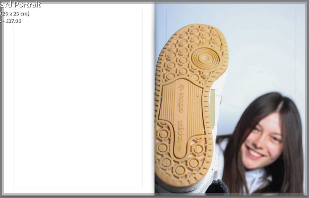
The top 4 photographs are different types of portraits which I have taken in the studio, two of which I have edited to be black and white. The first image on the left I like how the subject isn’t looking towards the camera but you can still clearly see the emotion on her face, I also think that this is a contrast to other images which have been taken in a similar format throughout photography. When you see a portrait with the subject looking down and it being in black and white, it normally is a sad image but I enjoy how this is the opposite. The second photograph I have left in colour as I wanted the sole of the shoe to be the main focus, I also liked how the ‘gum’ colour contrasted with the white background. This image I find interesting as the foreground is in focus putting the shoe at the centre but it has the background where the subjects face is blurred. I like this as it gives viewers different things to focus on and pick at when they are looking at my images. I have tried to make sure that the emotion on the subjects face can still be clear made out as it tells a small story of what it was like during the photoshoot and what everyone was feeling.
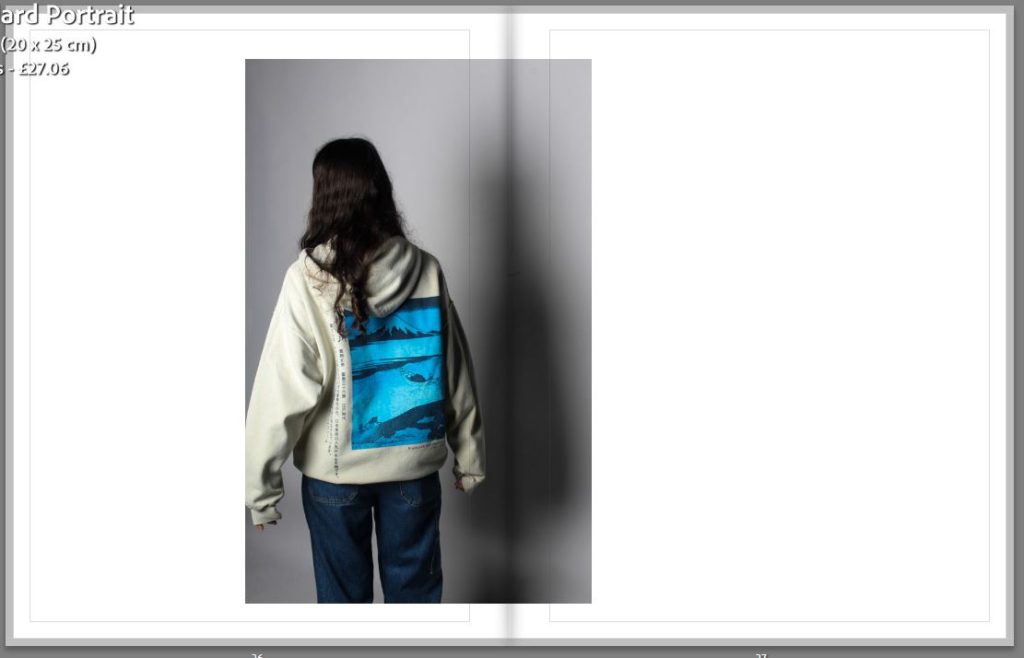
For the two images to the left I also kept one in colour and changed the other to black and white as I wanted the monochromatic look as I thought it fit the image better. The third image is one of my favourites as it is not a classic portrait of the subject looking directly at the camera and posing, the stance is more natural and conveys a more relaxed feeling to the photograph. I like how people can see the different shades of grey from the subjects hair with it originally being blonde. I feel that using black and white was able to add more texture to the image and enhance the details compared to if I had left it in colour. The fourth photograph I decided to keep in colour as I wanted to exaggerate the design on the back of the subjects hoodie. I increased the contrast on the image so that the different shades of blue become more prominent and saturated against the cream jumper and white background. The image gives a different view to the subject, something that they cannot see but also a view that hundreds of people see everyday. I like to use the backshot as I believe it can add meaning to the story behind the image.
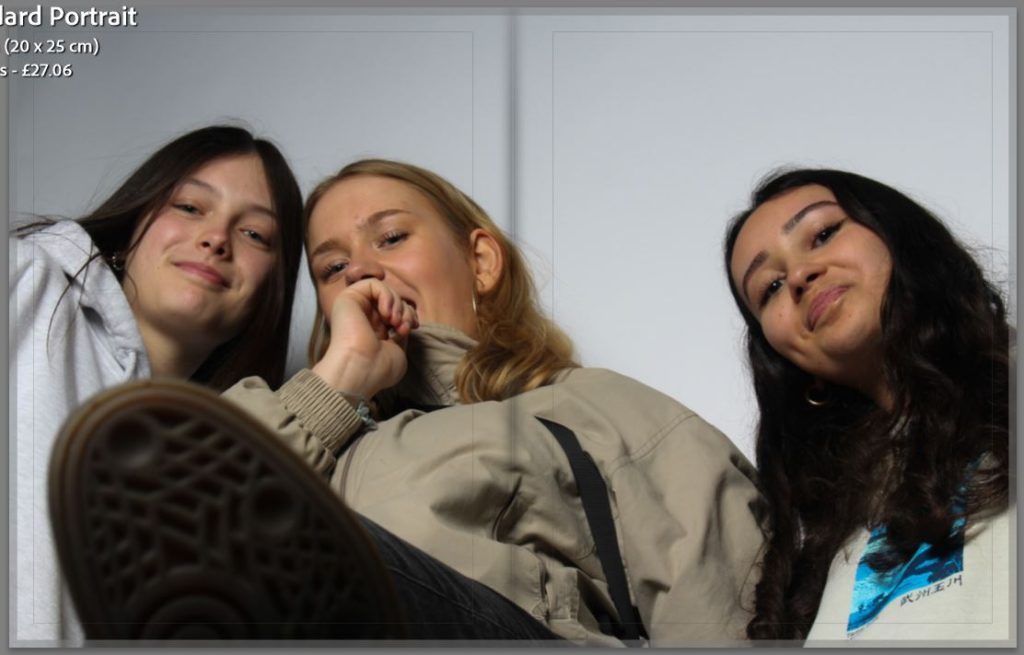
Finally, above is a photograph of all three subjects taken from a lowered angle with the middle subjects foot in the foreground out of focus and their faces towards the background in focus looking at the camera. I like this photograph as it shows how i have been experimenting with different compositions in my photoshoots. I have been enjoying using different angles and using a blurry foreground or background to my advantage to make my images more interesting and able to tell a short story.
Final Images: Photoshoot 2
I have used the colour tool to help myself choose my final images. I used the green colour to represent the photographs that I will defiantly be using as my final images, I have also used yellow to represent the images that I most likely wont be using in my final images.
Below I have 4 of my final images from my second photoshoot, I do not believe that this is my most successful photoshoot as the background contrasted with with the subject in the foreground. For the first three images I wanted to keep them in colour as I liked the warmer colour from the editing in lightroom. For the first image the subject is looking away from the camera with the sunlight on her back making it shadowed in the background on the grass. For the fourth image in this sequence I turned it black and white as I wanted to experiment with the outside portraits in different shades and colours. The second and fourth image are quite similar but I wanted to use them both as I liked the difference between the facial expressions and I enjoy how people will be able to see the development in the photoshoot.
For my exam project I want to explore the relationship between growing up in Jersey (mostly teenage life) and the way we value friendships. I chose this as a way to present the theme of simple or complex as some people believe that friendships are simple things that are easy and require little effort, but as many people know it is the complete opposite. I also wanted to connect this to being a teenager as adults sometimes think that we have simple lives but in reality we can sometimes feel that we are put in the most complex situations for our age. Friendships in teenage years can have a great effect on individuals especially when they enter young adulthood, i wanted to portray this in my project nad photo book as i have found great comfort in my friends.
Kayla VarleyKayla Varley
Why it matters to you?
I wanted to base my project around friendships as I have found that as a teenager they have become some very important people in my life, I wanted to portray the need for companionship in this stage of life in my photobook by using questionnaires and portraiture. I believe that in mid to late teen years we develop very stable friendships that we rely on to get through most situations that we are put in, we have new experiences and feelings with them and they helps us understand different sides to every story. Teenage friendships are also valued a lot more as we that they are the only ones that truly understand us.
Michelle SankMichelle Sank
How you wish to develop your project?
I will be using images of myself and three of my closest friends in my exam project, i chose to only include three of my friends as i wanted to focus more into how females and males tend to have different dynamics in their friendships and as I cannot cater for the male perspective i will be using the female perspective on friendships. I will include individual portraits of our faces and different part of our bodies as well as clothing and shoes. There will also be duo photographs and group images to try and break up the individual photographs. I want to experiment with both naturalistic portraits where the subjects will not be posing and just caught in their natural state but I will also use posed portraiture in the studio to get a more professional look to some of my images.
Kayla Varley Kayla Varley
When and where you intend to begin your project?
I will being my project by getting each of my subject to wear their favorite outfits as it relates to one of the questions that I will be including in my questionnaire. I want some of my images to connect specifically with the questions, I will do this in the photography studio in school as I want and clean and neutral background for this specific photoshoot. I will also be trying to find different places around Jersey where I will be able to create interesting photographs but that also I will be able to match with the studio images. I want to try and get images down in St Ouens, possibly with the sunset as i want to try and recreate an image inspired by Kayla Varley, when you can see the silhouette of her subjects with a saturated gradient in the sky.
“I don’t think women should be afraid of showing their true selves. When we have the space to be who we really are, and we are not afraid, we flourish. I hope that someday we can shape our society so that women don’t ever think twice about their appearance or behavior – we have the right to act however we please.”
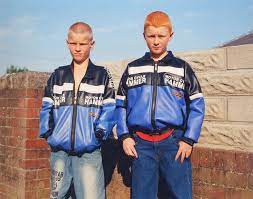
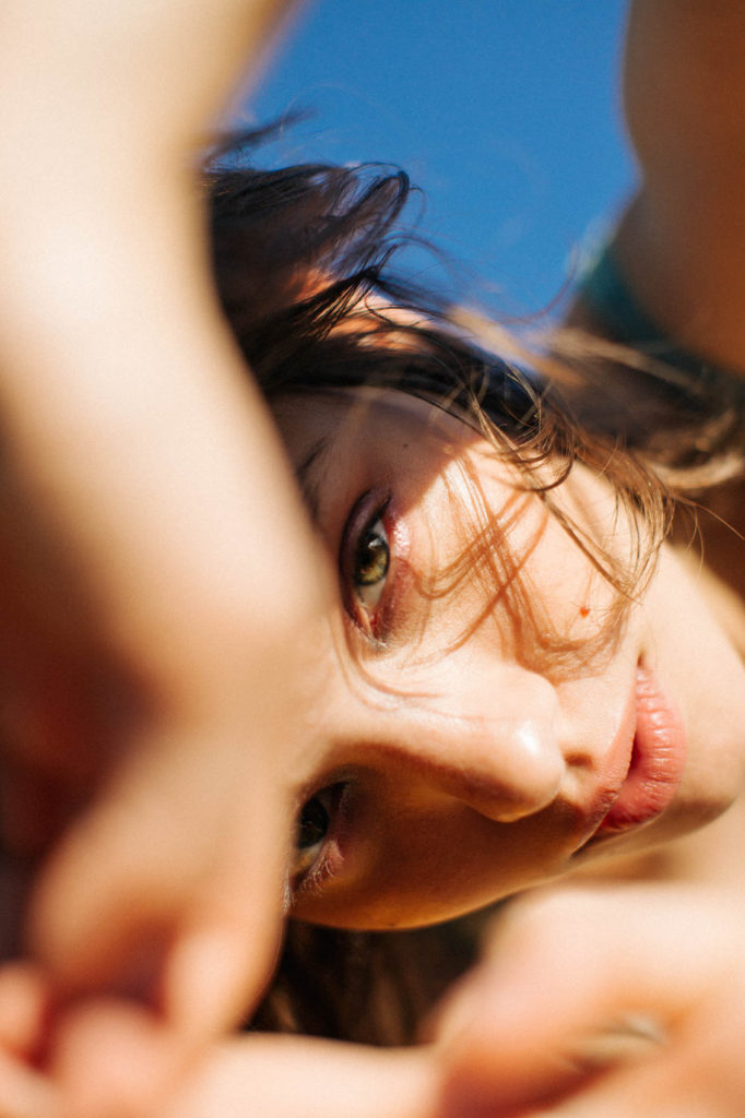
Kayla Varley is an American fashion, lifestyle and beauty photographer and director who is currently based in Los Angeles after moving from Bakersfield where she was born. Varley started her photographic journey at the age of 13 when she was given a tiny camera which she used to document her teenage life. Varley worked to develop her style even though she was restricted in options for creative outlets in her small town. In 2010 she moved to LA where she attended an Art Center College of Design. This also became the place where she began her professional photography. Varley’s recent work focuses a lot on fashion, beauty, lifestyle and motion. Her work explores the intimacy and connection with other people and looking in on emotions through colour, expression and kinetic movement. Varley’s work focuses on finding the joy in the unexpected and the playfulness that people can sometimes lose in life.
Kayla Varley’s Work
Above are some of Kayla Varley’s images that I have taken the most inspiration so that I can incorporate similar images into my project. I feel that these images help to show and convey a similar message that I want to send and the same aesthetic I want to explore.
“My work captures an awkwardness, but it’s also a celebration of some kind of beauty or empowerment.”
Michelle Sank was born in Cape Town, South Africa and moved to England in 1987 which is were she has been living till now. Sank has centred her work around topics such as socioeconomic diversity and growing up. Sank’s images explore the pressures and hopes of young people in suburban and coastal towns. Sank’s photographic gaze is highly inquisitive and non-judgmental due to her growing up during Apartheid. Sank describes her portraiture as a form of social documentary, she seeks to empower her subjects through their photographic experience with her.
Sixteen
Michelle Sanks ‘Sixteen’ project was focused on tenneragers lives while growing up in the UK, she used a questionnaire and portraits to show the person who she was interviewing as well as hand written answers which I felt gave the project a lot more depth. Throughout the different questionnaires Sank asked multiple different questions changing with each person, but the first question always stayed the same “What does sixteen mean to you?”.
Sank what to explore the meaning of Sixteen and wanted to answer her own question of ‘what is it like to be sixteen years old in the UK now?’. This project was a joint exhibit where some of the UK’s foremost documentary portrait photographs collaborated in opening conversations with young people about their hopes and fears, who or what sustains them. The photographers wanted to give these young people a voice and to have them heard by the bigger world. Michelle Sank focused around Cornwall as she was interested in exploring how the economic poverty and physical isolation of the county impacts the future of its young people. Sank chose to work in areas such as Camborne, Falmouth, Penzance and Treneere. Sank stated that she felt ‘privileged’ by the connections she was able to make which her subjects, their families and guardians who had shared their stories with her. She also got a closer look into their social and family structures and their domestic surroundings. This helped Sank to have a better understanding of the social challenges that people face which are hidden.
Image Analysis
I have chosen to use this portrait and questionnaire as it was one of the less detailed but also i feel that it was still able to convey an insightful message into what being sixteen in the the UK is really like. Compared to some other answers people might see this and think that its to simple and not a lot of meaning, but with reading the answers you are able to see how an adolescent thinks when answering meaningful questions such as these. The young man doesnt go into much detail but in his answers to some he allowed a little bit of his past to show through, such as the third question where he writes about his Father. He also writes about his girlfriend which shows the view slightly more to his story outside of the portrait. I think that the image Sank used was about to portray an accurate representation of how sixteen year olds act with their friends. I liked that it wasn’t a simple head on shot with just the subject, this allowed Sank to mix up her photographs and create different impressions for each individual.