All posts by Lottie B

Filters

Author:
Category:

My Final Prints, Photobook and Evaluation

Final Prints

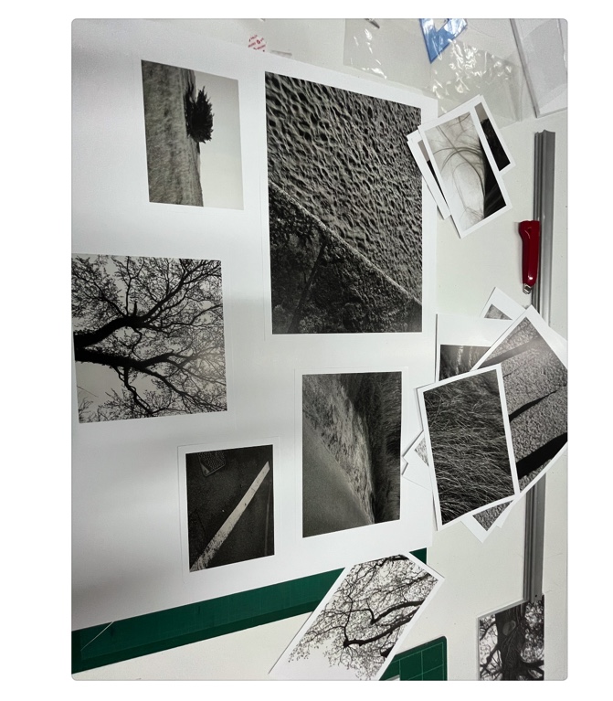
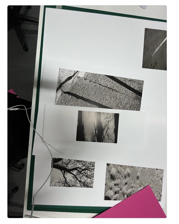
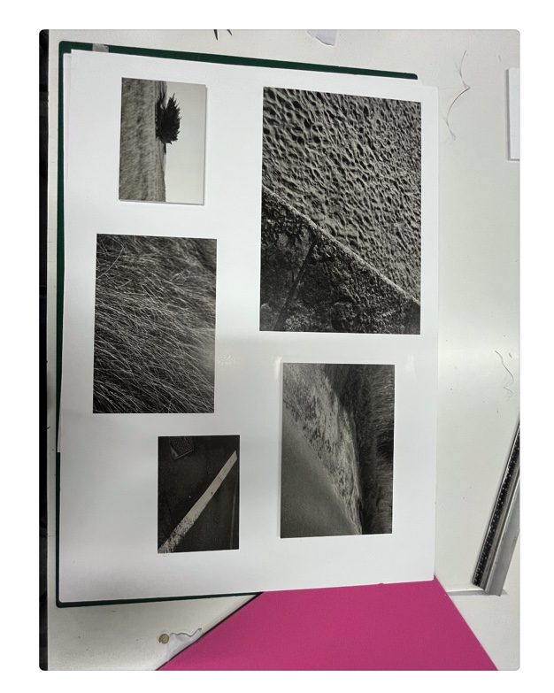
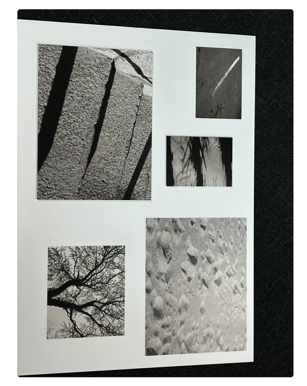
For my final prints, I am producing aset of 16 or 18 prints, onto foamboard, with some raised onto a second piece and some just sety directly onto them. For this, I am going to arrange them in a multiple, of about five per piece of A1 foamboard. I plan to use spraymount to set images directly onto foamboard, and for those that are elevated do this, an then use double sided tape to them stick the first piece of foamboad onto the second.
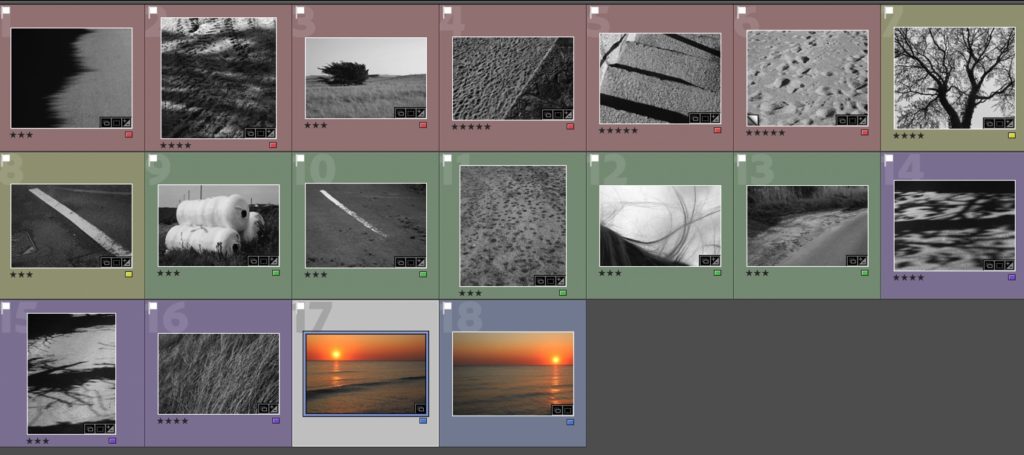
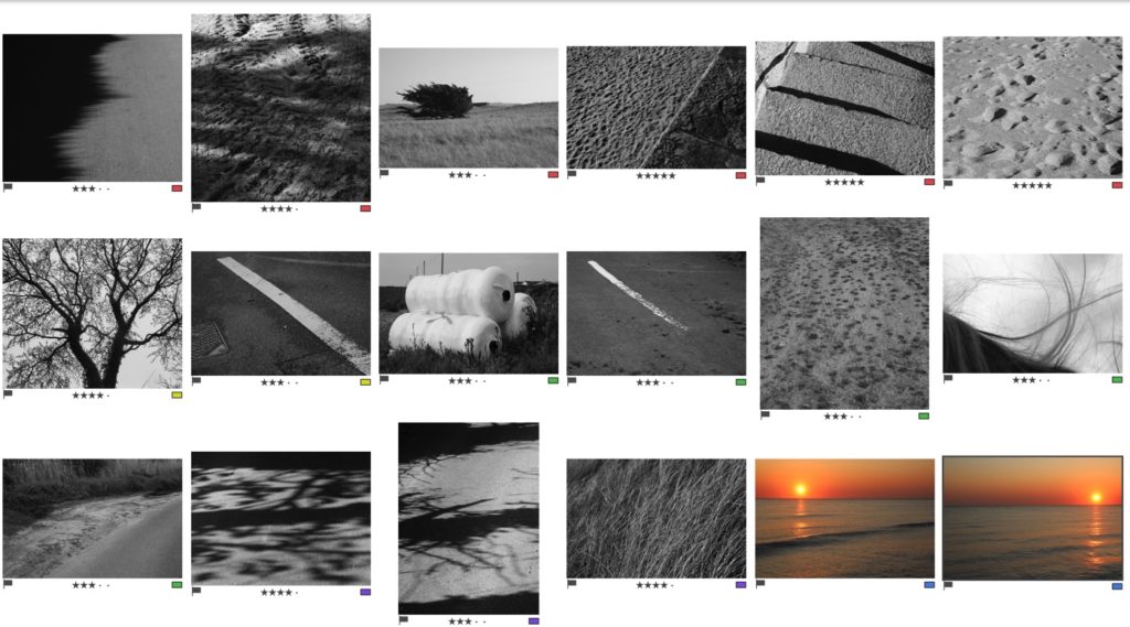
Final images from this project, coloured for different shoots. I used a starring system also. 3 stars – A5, 4 stars – A4, and 5 stars – A3.
Here I viewed my final images on the Loupe setting on lightroom, in order to see how they look with all their different sizes together, and on a white background like the foamboard. This acted as a mock up for me.

A3 Images

A4 Images

A5 Images
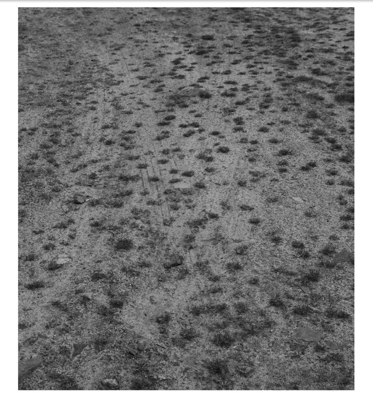
Final Presentation
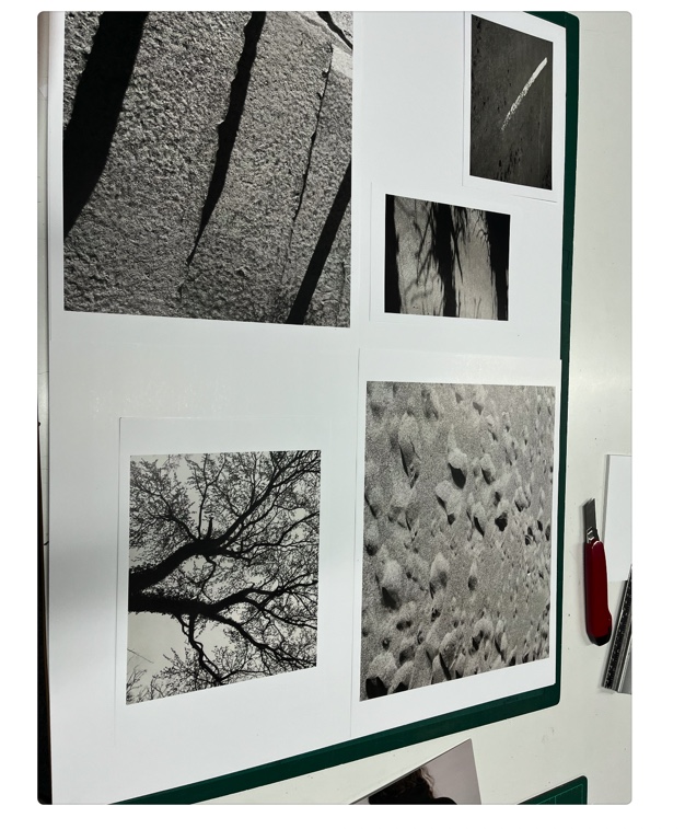
Final outcome 2

Final Photobook and evaluation

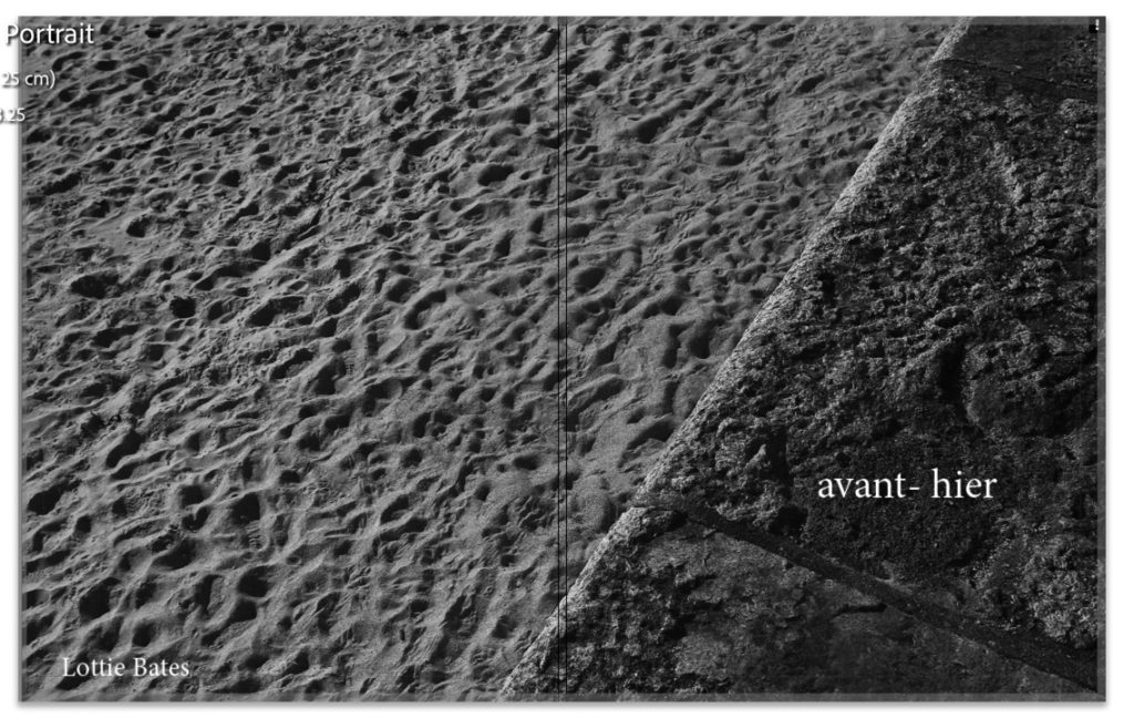
Front cover (right) and back cover (left)

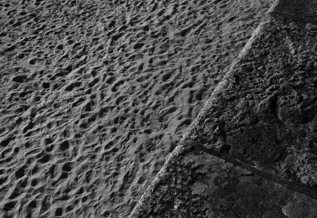
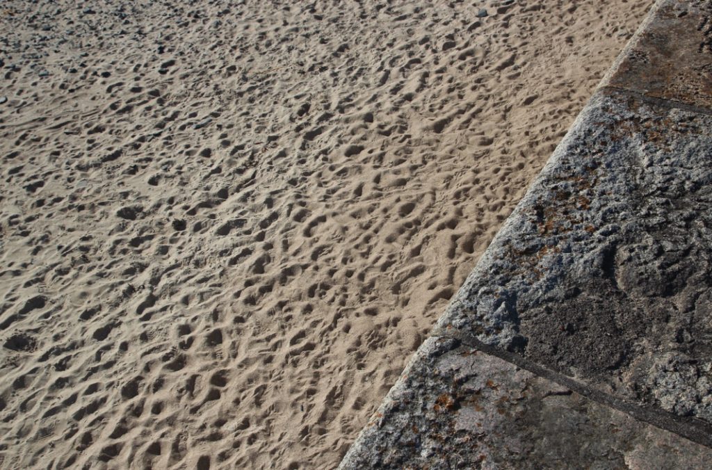
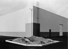
This is my front cover and back for my photobook. I used image wrap to put the image in half (zoomed)for both. I feel like this image is one of my strongest for the whole project, and I tihnk that I made a good choice by using it for my front cover. There are strong leading leading lines in this image – the harsh contrast of the wall to the right of the image creates a strong triangular shape and line leading the eye to the bottom of the image, and cover. The high detail of the sand and wall creates a graphic composition, with geometric elements. (triangular shapes and different textures with the sand and wall.) The title of my book means ‘the day before yesterday’ in French. I really like this title, as it references not only my personal links to France and the language, but also the contextual elements of my book and project. The title represents how I am referencing childhood memories and the past, and how I’m exploring the idea of changed or distorted memories.
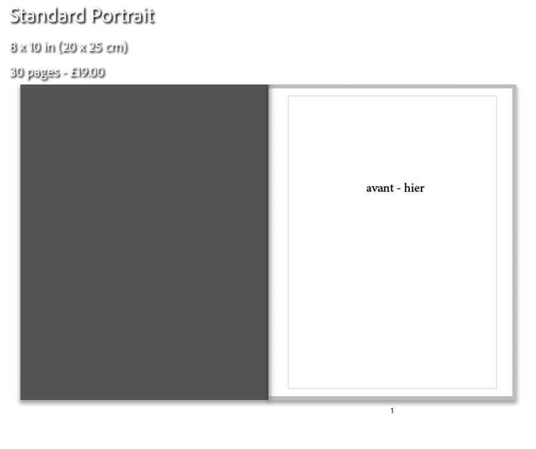
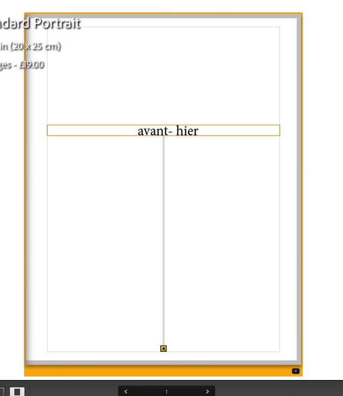
This my title page – it ensures an understated beginning to my book, and simply having the title and nothing else, I think was a successful stylistic choice. Although simple, I think the white background with black text sets the tones of the whole book – which are black, white and grey.
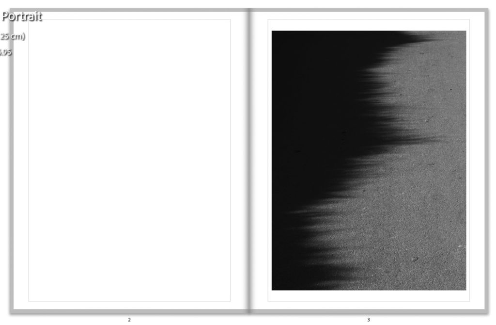
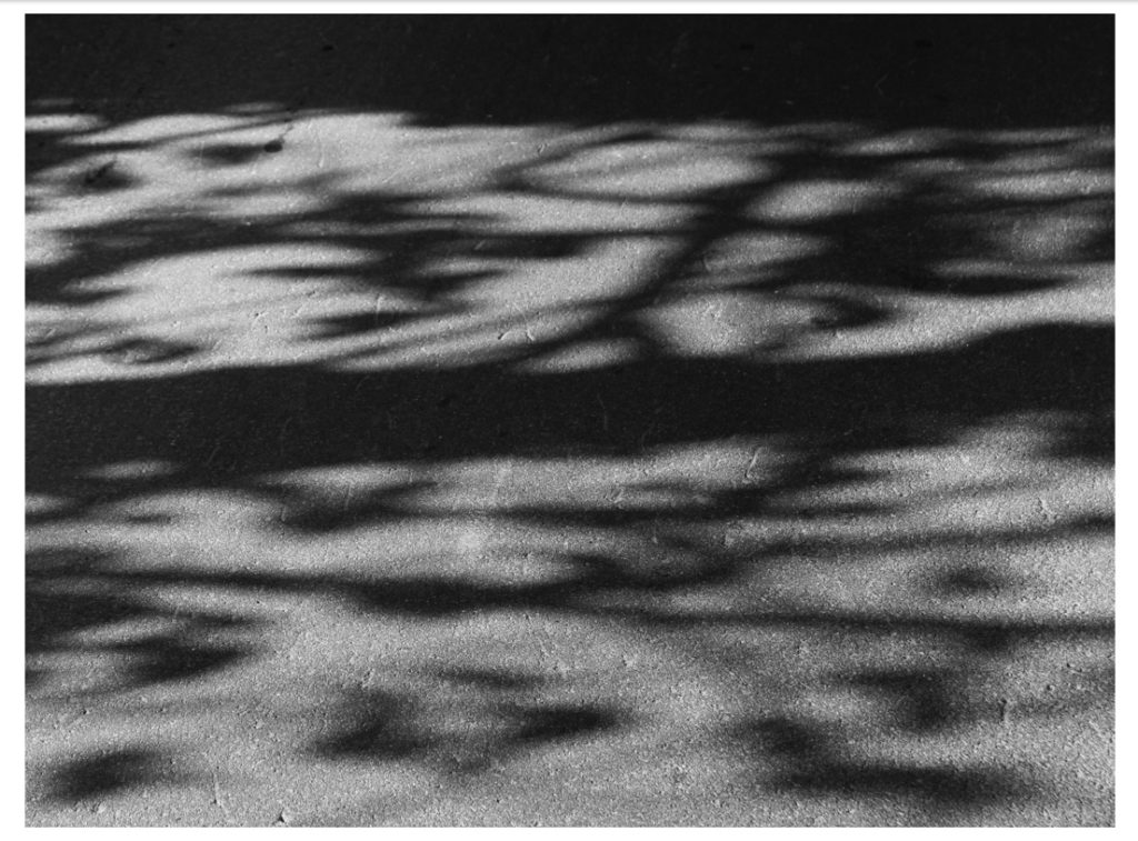
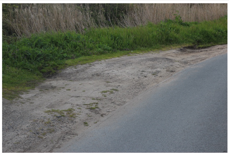
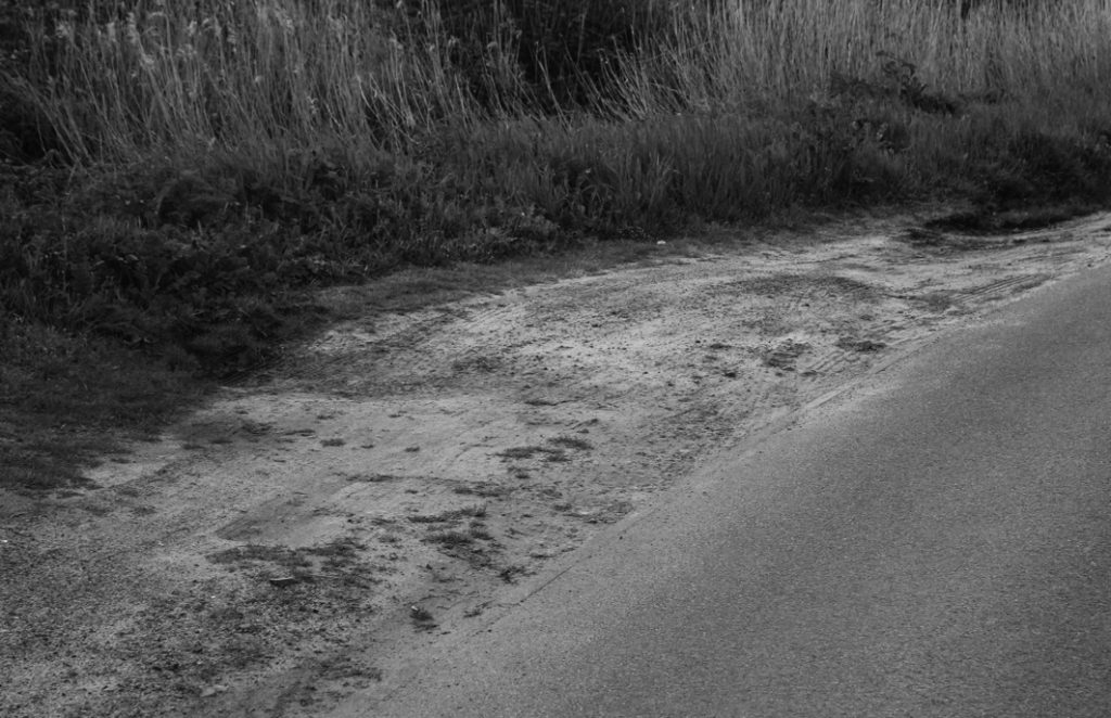
This is the first actual image on my book – i think this image is quite unusual, with its graphic nature. This image is a representation of what I wanted to capture: the idea of hidden locations, and distortion within memory.
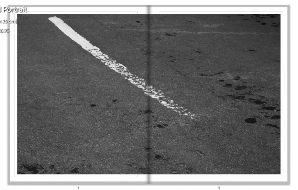
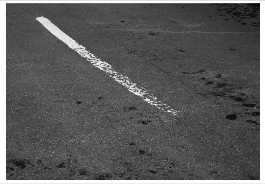
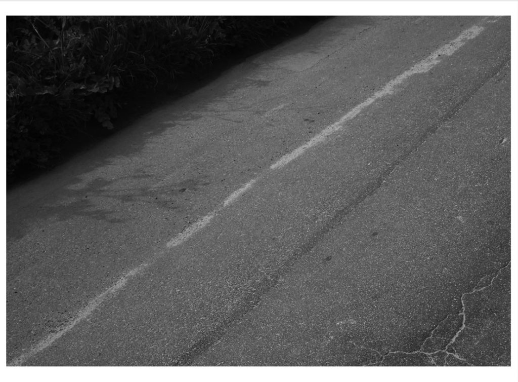
This is one of my only images with a white border in my book – this was used because it compliments the focal point of the road marking on the left, helping to balance the composition. I like the way this image’s leading lines almost sweep the eye from the left corner to the bottom right, which creates a natural progression to the next page.
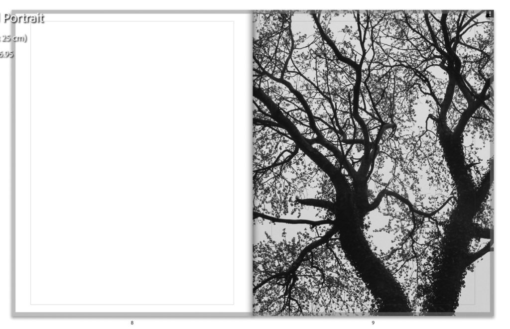
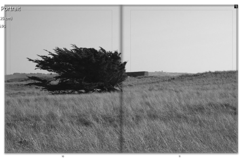
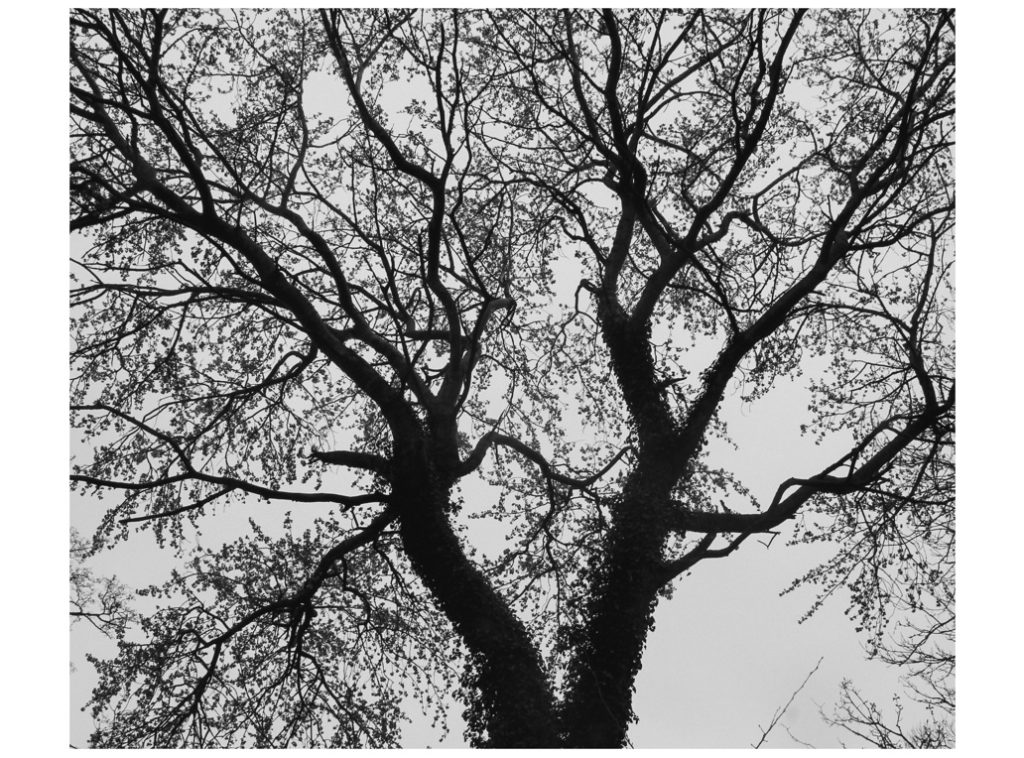
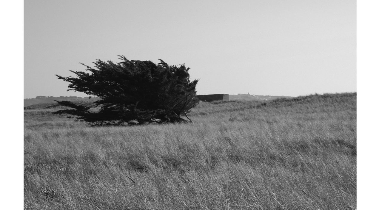
This is one of my only traditional landscape images in this project – I chose it due to the composition and inclusion of the tree to the left – this tree is an iconic part of the location of this shoot, and I wanted to include this without giving too much away in total. Furthermore, to keep a balance of different types of images, I wanted to keep a mix of rural nature, beach, and road images, with the main focus being trees and plants, roads and sand. – This image featuring the tree to the left juxtaposes nicely with the spread before, in which there is a tree to the right of the spread, creating natural progression and flow within the book’s narrative.
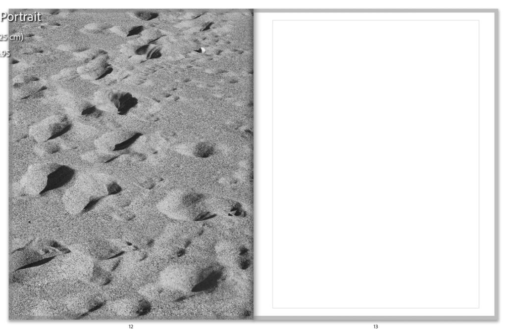
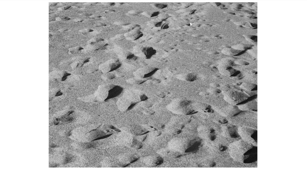
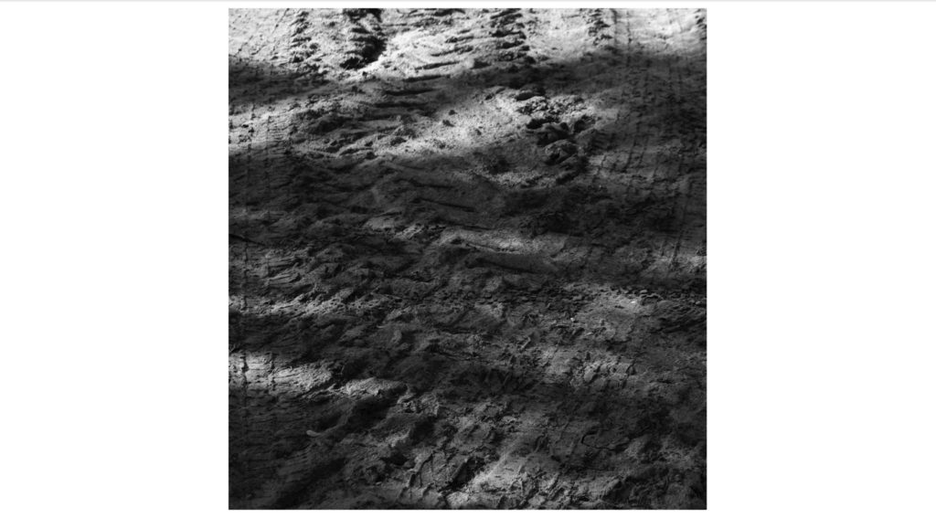
This is an image that I really love from this project – one from my favourite beach on the island, where I grew up on. The footprints create great depth within the image, and also could represent the idea of moving or travelling, which was a huge part of my life as a child. This is something I’m happy I included, as I wanted to include some personal elements in my book, but without obvious signs or hints – this adds an air of mystery and subjectivity to my work which I really like.
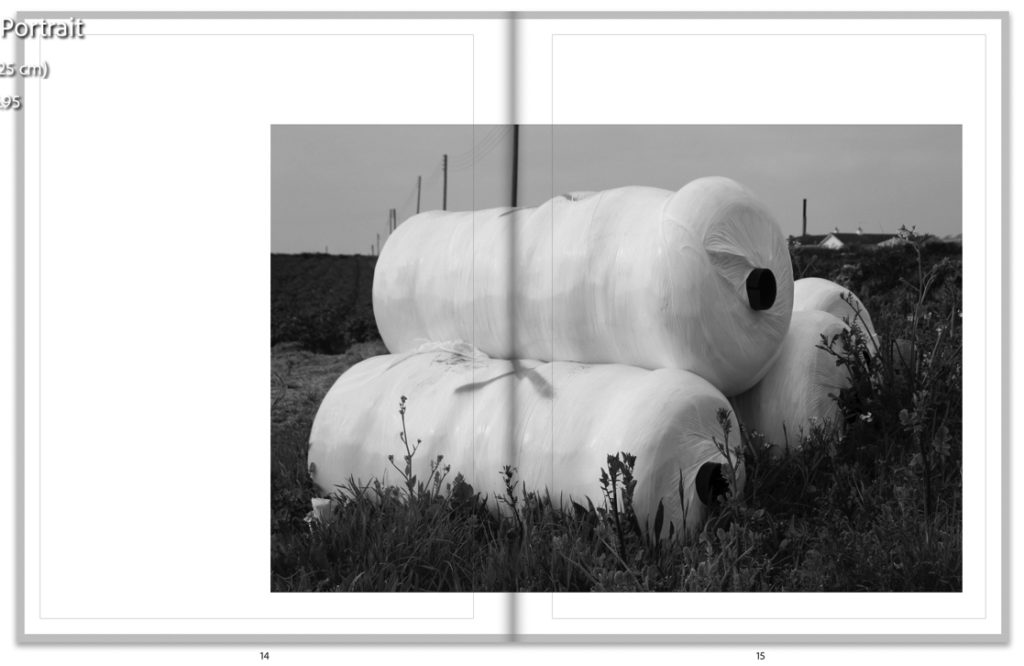
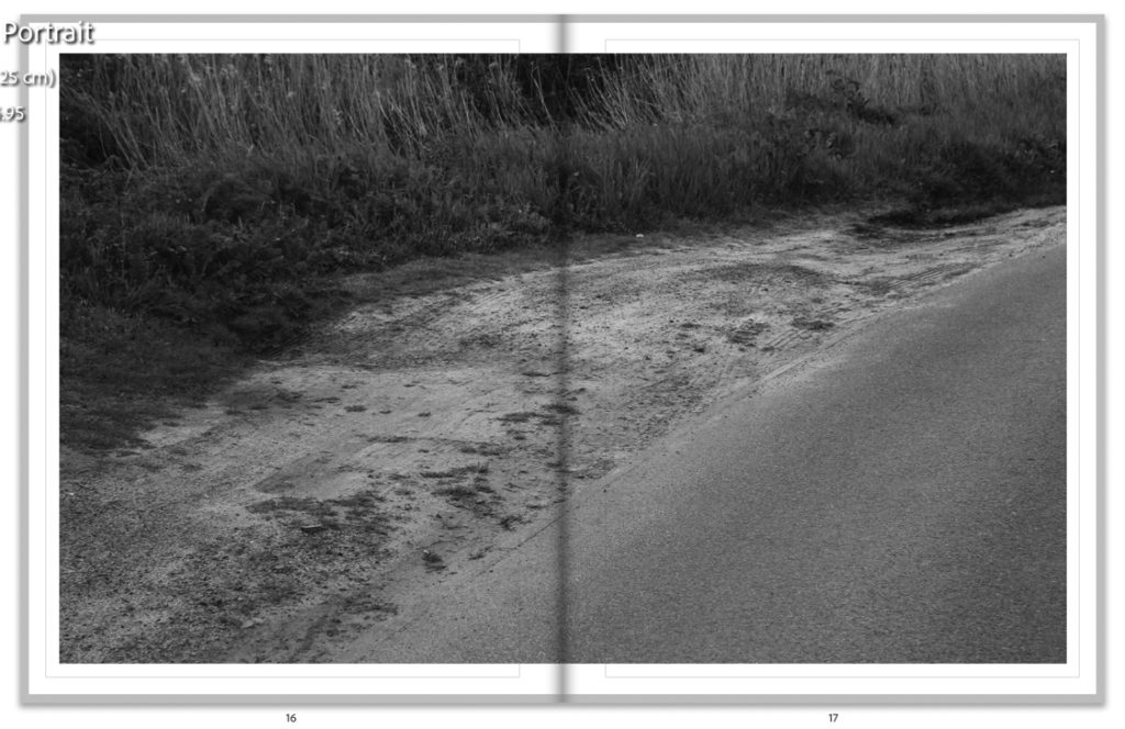
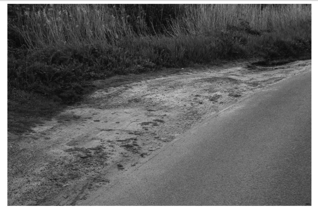
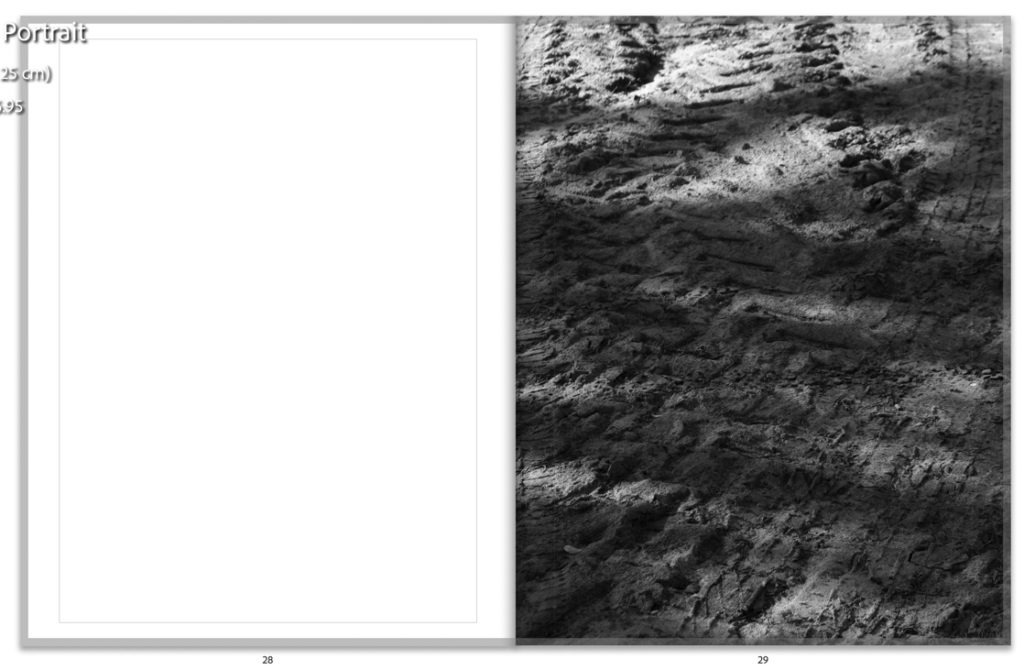
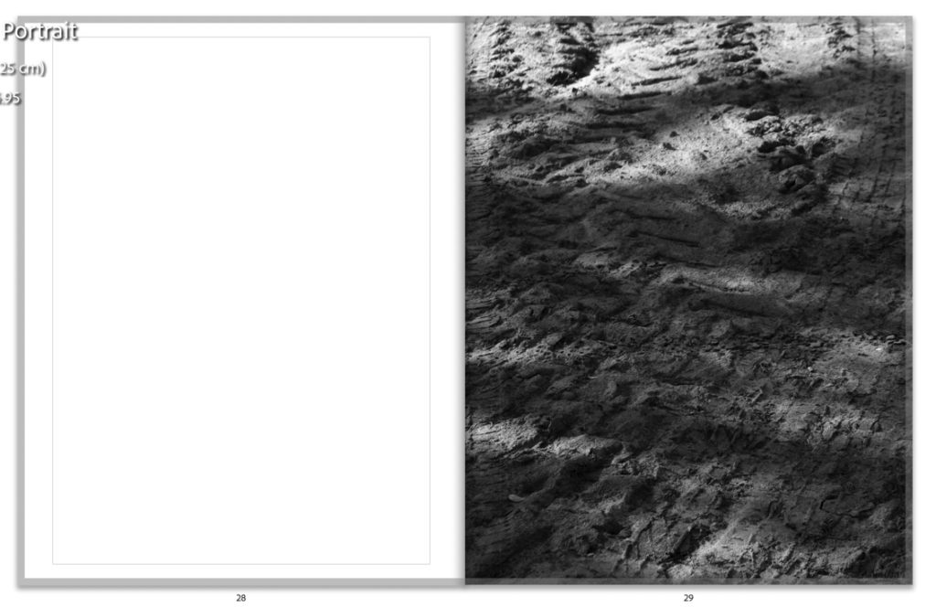
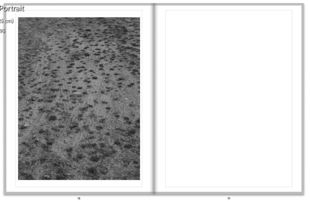
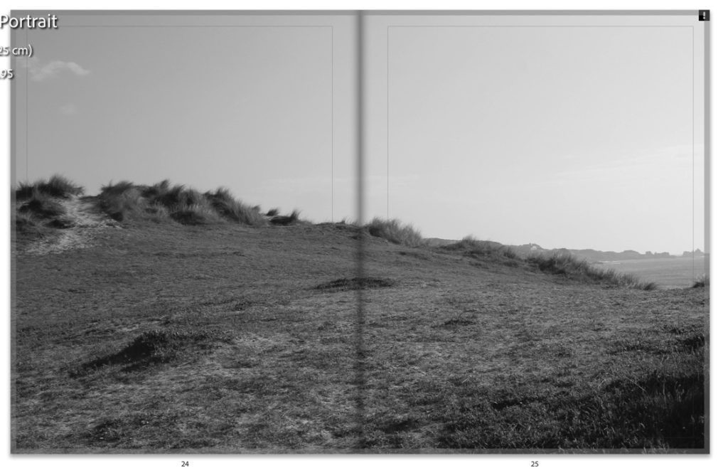
This image is another double page spread. To me, it represents the rurality of the places I was photographing. The bushes and road create three clear parts of the image – the darker, more dense bushes to the left and top right, the middle of the image, which intersects both pages with more inclusion of tracks – creating a thread onwards from the last image. Finally, the final sector of the image is the desaturated road: this links well with my other images of roads and their reflections in the project. Overall this image to me is somewhat a staple of the book, not only because of its position in the book, almost the middle, but the inclusion of all kinds of other textures and parts that feature in the rest of my images.
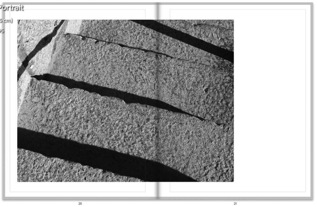
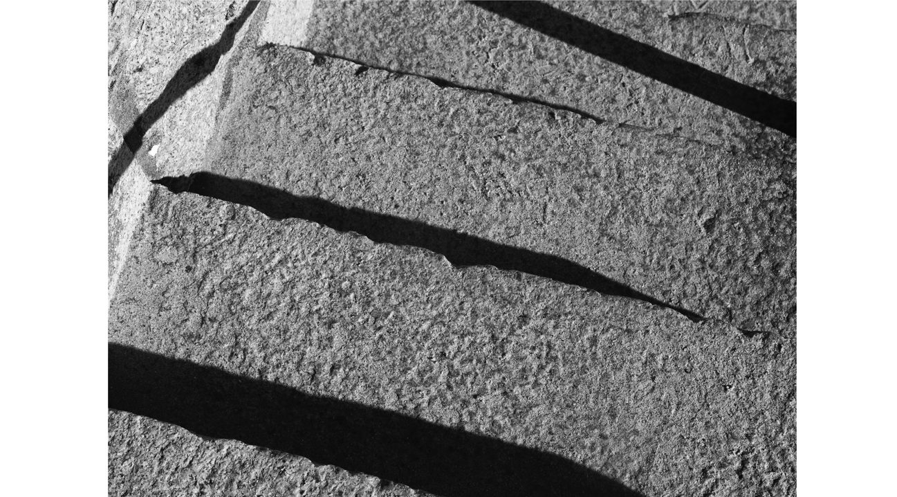
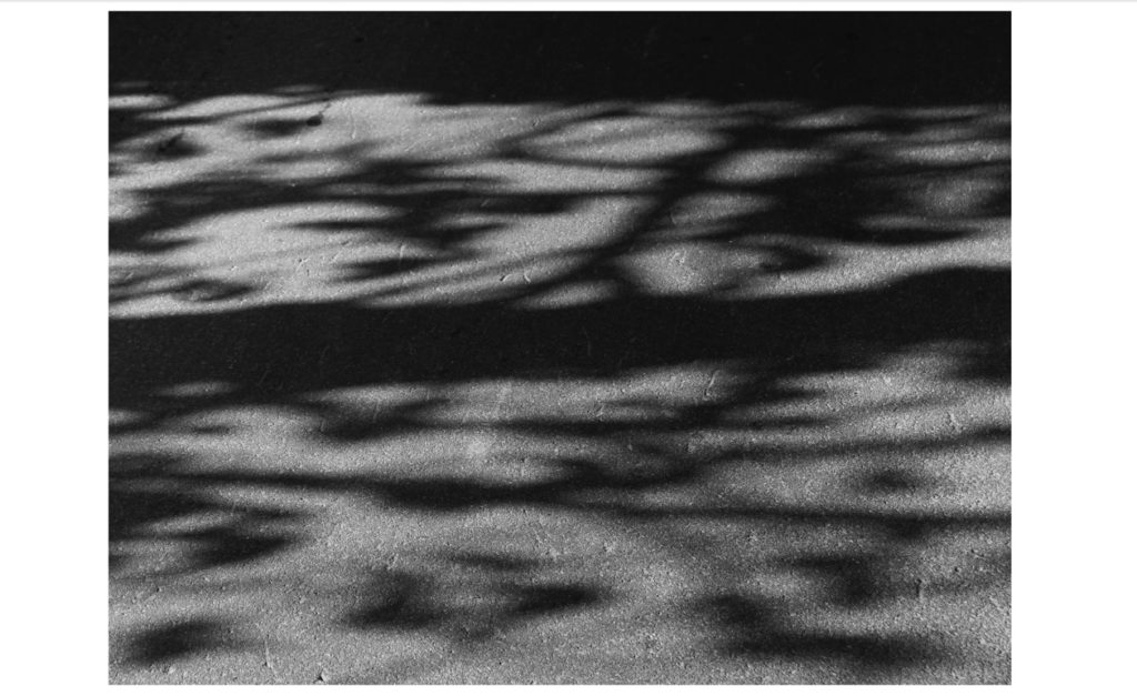
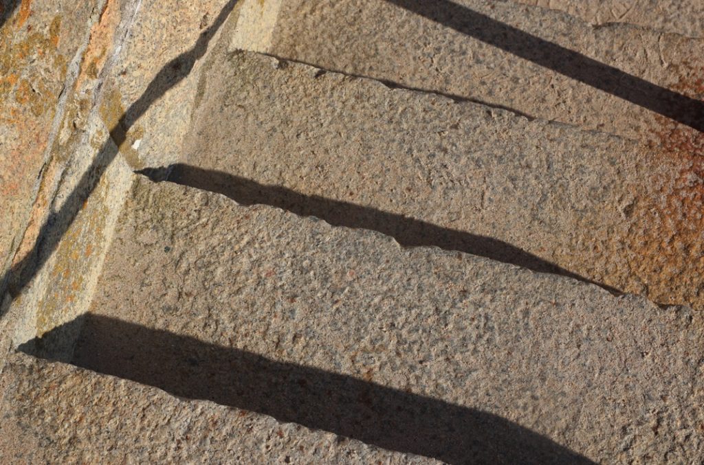
This image is another from my favourite beach, however the steps. This image features really dramatic shadow which I really love – I accentuated this with mu editing using contrast, blacks and shadows. Contextually, the inclusion of steps in my book could be seen to reference change or movement in life, and to me was important to include for these conceptual reasons. Furthermore the strong shadows link closely to other similar shadowed images in this book, and were important to include to bring all types of images together.
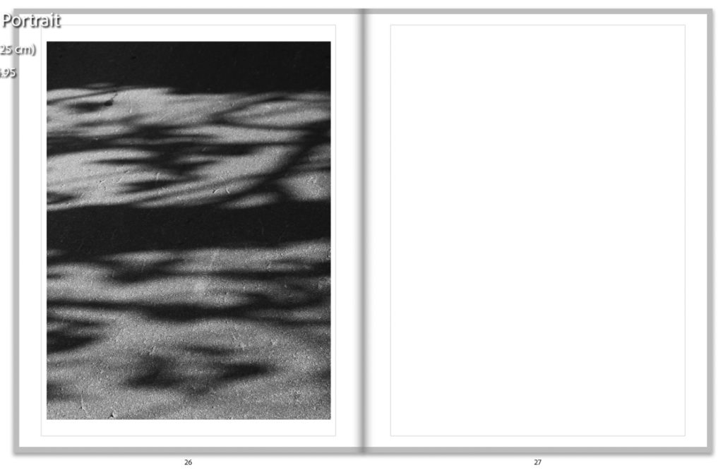
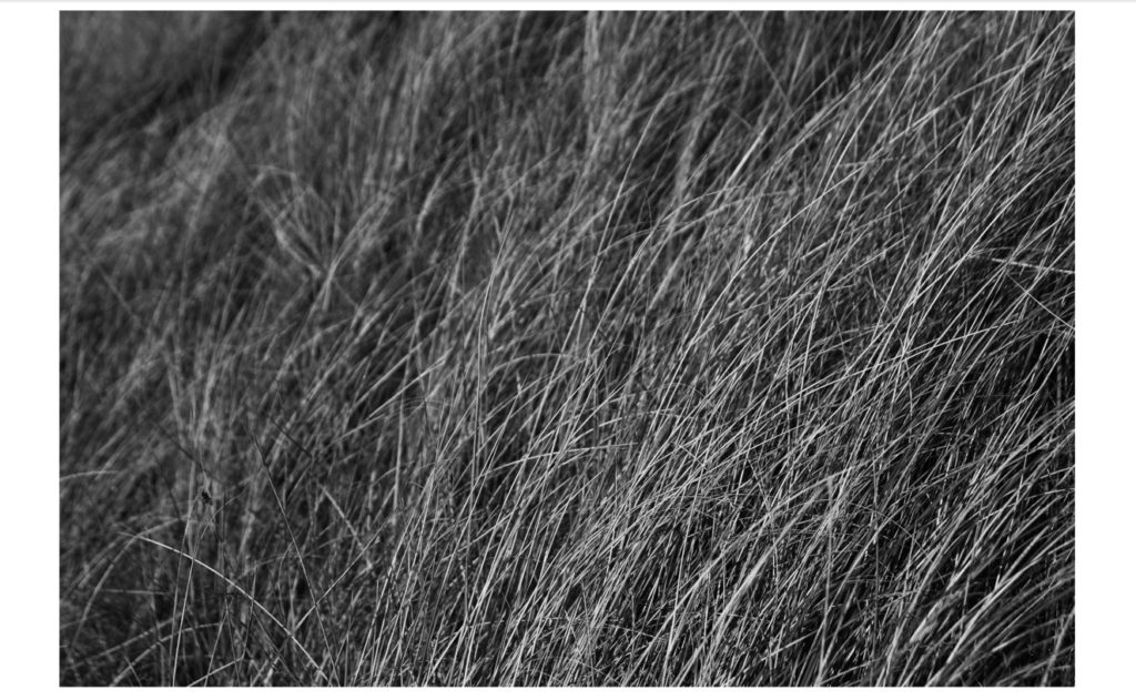
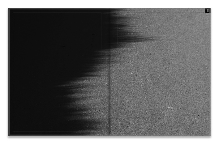
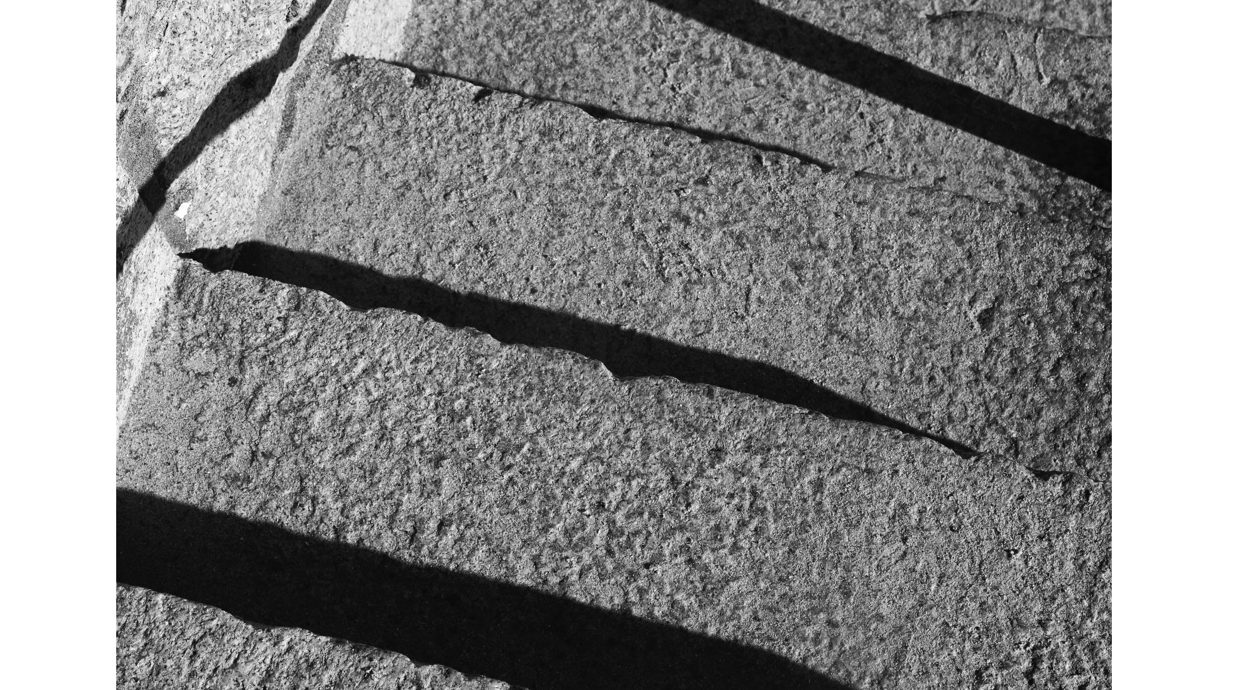
This is the final image in my photobook – I wanted to choose an understated, close up image for my final photograph, as it helps to create a natural end to the narrative, representing a possible final memory, or with the shadow representing confusion or ‘foggy’ memories that can be confused as a child.

Final Evaluation

Photoshoots

I had mixed experiences with my photoshoots. My first photoshoot I found to be successful, due to high quality light and a location which I knew well, so could visualise what shots I wanted to take. I found the weather to be the most impactful thing on all of my work – my first and last photoshoot were the most successful due to the high quality light and better planning, with my second and third shoots not going as well due to lack of light quality and also planning. I found that I struggled with lack of planning slightly in a few of my shoots, and that the more I visualised what I wanted to take and wrote a plan before helped me to create better images.

How successful were your final outcomes?

I think that my final prints and photobook came out better than I expected. I had a lower quantity of images for this project to normal, and was worried about this impacting the quality of my final prints and book. However, after my editing, which I think went really well, my images had come together as a set as I had envisioned.
Did you realise your intentions?

I think yes, but also I think not as well as I thought. I had planned to include archival material of my locations to juxtapose my own images, but due to lack of time and poor planning on my part I didn’t manage to do this. It was a shame I didn’t include these, but I also think it was a blessing in disguise – I always include these kinds of images in my work, and this whole project was me stepping out of my comfort zone in my photography, which is something I find really difficult, as I worry about getting things wrong etc. In this way, I think I did realise my intentions as I experimented with a whole unknown type of photography that I’m not comfortable with, and created some outcomes that I am proud of.

What references did you make to artists references – comment on technical, visual, contextual, conceptual?

I think that I’ve referenced some artists more than others, for example I used Kyler Zeleny and Alec Soth for reference in my starting points, before I decided to photograph more and more abstract images. Therefore, these artists were still useful as I used their work to inform my next steps in my project and would not have been able to do this without research into their work. However, my final artist reference, Siegfriend Hansen was the most impactful on my work – I found his work to really reference what I was trying to capture, although my work was that of rural landscapes, and Hansen’s is urban street photography. I found his writing about his work to be extremely useful, as his process helped me to inform my own choices. – His focus on the formal elements of photography really helped me to focus on these in my own abstract work and make more successful outcomes.

Links to Simple and Complex

My project links finally to this theme through the idea a seemingly simple idea: rural landscapes, in black and white. This however contextually is approached in a much more complex way, through the idea of childhood memories, but not only this simplistic idea but the way they change and alter in your head as you age, and how this manifests when revisiting childhood places. This is documented in quite complex looking images, but of simple things: such as trees, sand, and roads. The elements of my photos that I focused on are simplistic, for example, such as line, shape and shadow, but they manifest in much more complex images and compositions.
Is there anything you would do differently/ change etc?

If I was to complete this project again, I would use my time more effectively. I didn’t complete photoshoots enough in advance, and this meant I didn’t have enough time to reflect properly on my outcomes and change my course of my project effectively enough.

Designing my Photobook

Selected Images

These are my selected images from my 4 photoshoots, to fit into my photobook. I don’t have that many, but I plan to make a simple and minimalistic layout different to my previous photobook in my coursework. As I spoke about in my statement of intent, I’m developing this photobook from my personal study, where I found my photobook to be too complex and ended up with way too many pages for my liking. Therefore, in my photobook design for this project, I’m thinking carefully about the images I include, with a few layouts only, to keep the design minimalistic – like many of my images. This will help me to keep a clear link between the reasons for my design choices and the images themselves.

Specification

I decided to use a standard portrait orientated photobook. I thought of using a layflat hardcover book as well, as I found in my previous project that the fold in the middle of each spread where the spine is ruined the composition of a few of my images. However, in this project my images are completely different, with no portraits and minimal compositions – I thought about using a layflat book for this project, but decided against it and went for a softcover portrait book. I am using a softcover book for these images as I have much less images than my previous project. I feel that using a hard cover for this book would have outshadowed the actual contents of the book and made the quantity of images look smaller also. Furthermore, I am creating a black and white only book. I think that keeping all of my chosen images in black and white was a successful choice – it enabled me to keep the formal elements of the images like light and shape the main focus of the images

Designing my book in Lightroom

After creating a new book within my ‘best images’ folder, I favourites a few simple layouts that I liked to be my principle templates for all of my images – this way I would keep the layout simple and make sure the book stays consistent visually when finally presented.

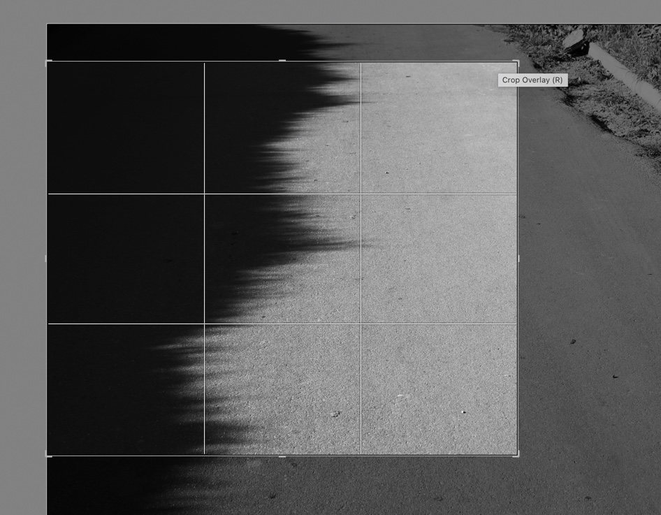
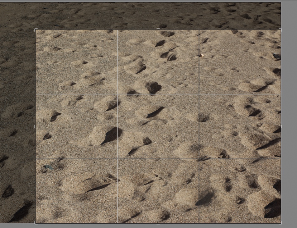
With a lot of my images, I used heavy cropping in m editing stage. Because of this, a lot of my images had changed size – I had difficulty fitting them into the templates I had picked. I ended up just zooming in /out to fit them in, seen in the imaves above.

Again here I was experimenting with different spread types for this image. For this image in particular, I struggled with where to place it – It was a much darker, more graphic image than many of my others. I ended up keeping it as a single image spread, as seen on the right, at the start of my book.

Originally I had placed these two on the same spread next to each other. However, after looking again at my plan and more closely at the minimalistic design I had wanted, I decided to separate the spread. Together, I felt they looked too busy and created a slightly chaotic spread together, which disrupted the rest of the book. I think that the white space helps with isolating each image and helps the viewer to appreciate each image solely, without distraction from the other.

Here I was experimenting with two different types of double page spreads for two of my images which I decided to use for double spreads. I was using a full bleed image on one side, and an image with a border on the right. I think that on the right the image needed a white border and it works well – the white of the border frames the white road marking the strikes across the centre of the image, coming from the top left. This layout kept the composition balanced, and made sure the focal point of the image was still the main focus.

Two different spreads put as full bleed single pages. I previously had these both together, after changing them and fitting them with other images in the book. I wanted to include this step of my experimentation, as it shows the successful outcomes of using different layouts.

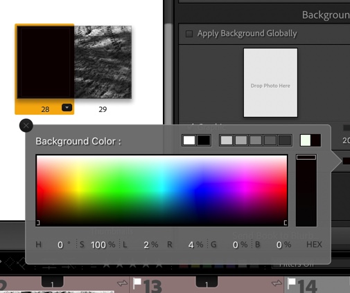
In this screenshot and the others below, I was experimenting with coloured pages in my book. This was informed by one of my artist studies, Siegfried Hansen, who uses coloured pages to make the colours in his own work in his book “Hold the Line”. However, he does this in colour, and my images are in black and white. I attempted to try this style with muted pastels below, but it didnt work with my style.

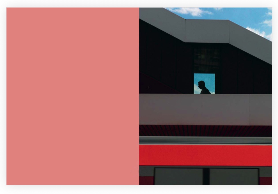
An example of what I was emulating – Hold the Line by Siegfried Hansen. One image on the right and a blank coloured page on the left.

I then tried this again with black and grey, as these tones are most similar to the tones in my own work. I also chose to try this as I used the same style in my personal study photobook – however this worked better in that project because most of my images were in colour, so the coloured pages toned with the images well.

I ended up realising that this wasn’t working, after reviewing my artists’ work and what my intentions were, and changed all my blank pages back to white. Using the coloured pages took away depth from my images, and took away from the images’ quality, rather than complimenting them. Therefore, I didn’t use them.

An example of one of my spreads after I put them all bqck to white. I like this much better, and through this experiment I learnt that doing many different things in my work isn’t always best – hence why I stuck with the white.

https://members.societe-jersiaise.org/sdllj/vocab.txt – jerriase dictionary I used for inspiration.

In the above screenshots, I was experimenting with different titles. At first, I brainstormed ideas on a piece of paper for name ideas. I thought of using house names, as my work was directly linked to places where I’d lived, and also Jerriais words. – I used a jerriais vocabulary dictionary from La Societe Jersiaise to help me come up with relevant words. In the end, this led me to think of french words instead – I have links to France in my family, and myself and my grandmother both speak the language. For that reason, I decided to use a french word – ‘Avant – hier’. It means ‘the day before yesterday’ (- I will analyse this fully in my final photobook post. )

Here was my final experiment – I was adding a title page fir my book, using the same font as the cover in order to keep consistency – however I had to obviously change the font to black due to white pages. I like the minimal, and simple look to this front cover.

(Final photobook uploaded and analysed in next blog post – final evaluation)

Photoshoot 4 and 5

Plan

ConceptLocationThemeSettings
Photoshoot 4Abstract photography, rural landscapesSt Mary – Hamptonne, St ouens – sand dunes at La BrayeHidden Identity, childhood identity, identity in natureManual, Landscape, Macro, Creative Auto

Photoshoot 4

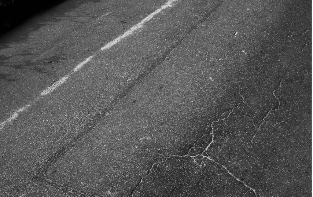
After all of my trouble with the weather in my other shoots, I did my last photoshoot on a sunny evening, during the golden hour. This worked out well for me, and I managed to produce some quality outcomes that were useful going forward. In particular, I managed to capture nature’s interaction with the urban world that disrupts it – for example, the reflections of things such as trees and sand on roads. I focused a lot on roads and beaches in this project – I began to become more and more interested in the different textures on the old, non-resurfaced roads where I was photographing, and their weathered look. I photographed most roads where I was photographing and as my shoots went on I knew what to look for – in this shoot I was looking at uneven and cracked tarmac, markings and reflections.

Selections

Editing

Photoshoot 5

This shoot was unplanned – I was out at this location and had my camera with me, – I decided to take a few shots of the sunset. These images may not necessarily fit with my photo book, but may make some successful final prints in colour, as most of my work is in black and white.

Selections

Editing

I didn’t do much editing for these images – I liked the colours in a lot of them, and only adjusted minor things such as straightening the horizon line or slight cropping.

Final Images for both shoots

Evaluation for both shoots

Overall, both of these shoots were really successful, and as my final photoshoots, I think that my project has generated some really strong final photos. As usual, I found that my photoshoots improved as I went along and in my last formal shoot, I found it easier to find what I was looking for in my images in the landscape. For example strong shadows and contrasts in light and colour, interesting textures such as roads and sand, different light and reflections. Overall, I think these two shoots were successful – however, I do think that in photoshoot 5, I should have changed location for the last part of the shoot. I found my images to be a little repetitive towards the end and this led to my images becoming uninteresting. Therefore, if I was to carry out this shoot again, I would move around the sand dunes where I was shooting more to produce a higher variety of shots, and more different types of images to work with.

Photoshoot 2 and 3

Plan

Below are my photoshoot plans for photoshoots 2 and 3. They were quite similar shoots, with photoshoot 2 being quite small – so I decided to compile them together into one blog post.

LocationThemeIdeaSettingsProps
Shoot 2St Brelade: La pulente and la moyeRural Landscapes, abstract photographySense of place, hidden locations, identityLandscape, manualCamera
Shoot 3St OuenRural landscapes, abstract photographySame as the above shoot.Landscape, macroCamera

Photoshoot 2

I struggled with weather conditions in this shoot, due to poor planning on my part – because of this, there was often rain on my lens, creating less and less quality images.

As the shoot progressed, I walked to an area which I had envisioned as a good location to photograph and produced better images. I struggled with overexposure in this photoshoot also because of the bright grey skies – this ruined the quality of quite a few potentially successful images and therefore in my other shoots I decided to plan around the weather to improve my images. Even though the bright grey skies were quite inconvenient for me, the recent rain and bright white tones made some quite nice reflections in the water on the roads, where most of my successful images for this shoot came from.

Selections

These are my selections for my second photoshoot – I didn’t have many for this shoot but still selected a few images that I liked the look of to develop.

Editing

Evaluation

This shoot was probably my least successful in this series of photoshoots. I shot on a grey, rainy day, which meant the light conditions were not the best. I chose a location which I thought would be successful, but it ended up being a little too urban for what I wanted – I was trying to capture the intersection between urban and rural life and its connection to my childhood, but I found that the colours captured mixed with the poor light conditions made a shoot that had few successful outcomes. However, even though this shoot wasn’t the most successful, it provided me with things to work on for my next shoots. In all shoots after this, I tried to shoot in the best lighting possible, which creates a much better environment for capturing the strong directional light, shadow and shapes that are crucial for me in this project. Furthermore, I think that this shoot also had a lack of proper planning – I didn’t choose exactly where I was photographing beforehand, so couldn’t visualise what I was going to photograph – doing this often helps me before a photoshoot so I can think of what I am trying to create with my images.

https://www.dptips-central.com/lighting-conditions.html – a website I used as help for choosing lighting conditions for my next shoots.

Photoshoot 3

This shoot was much more successful than my previous one. The weather was slightly better and was developing this shoot from my first, where I photographed the same place.

In this shoot, with two previous shoots done, I had a much clearer idea of what I wanted to capture. I focused on looking at lines and shape in the landscape I was capturing, with the aim of producing more abstract images of higher quality. The light was better in this shoot, but I think that I shot a little too late in the day. Some images ended up being underexposed because of the lack of light, which was a shame.

Shooting in the same location was a good idea for this location – I was able to see it from a different perspective on my second shoot and also take similar pictures to my first shoot here, but with higher quality as I was informed by another shoot and new ideas.

Selections

Editing

Evaluation

I found this shoot to be somewhat successful but also in need of improvement. I think it was successful as I was more purposeful in looking for smaller, unnoticeable things in the landscape to capture, and more thoughtful with what I photographed. The weather had improved from the second shoot, but I found that it still heavily impacted the light quality in many of my images. For this reason, a lot of my images didn’t have the depth and shadow that I wanted and appeared a bit flat. However, I think that my location choice for this shoot was great, as I returned to a previous shoot location that was very important to me. I expanded my area of shooting a little as well, in order to generate a new perspective on the location. With the location being a really important place to me in my life, it made me more motivated to create quality images, to represent my childhood home and its surroundings in the way I wanted. This also meant I was more thoughtful about what I was photographing, as personal connections were involved.

Final Images from Both Shoots

Photoshoot 1

Plan

Below is my plan for my first photoshoot – I may end up splitting this photoshoot into two, due to ease of access and different weather etc – my desired locations for this shoot are listed below, both important locations to me and my childhood, having grown up there. I plan to capture abstract type and traditional landscape images.

GenreIdeaLocationPropsSettings
Landscape, abstractmemory and nature, sense of place
St Ouens bay and St Brelade’s Camera, Tripod.Landscape, Creative Auto, Manual.
Photoshoot plan for my first photoshoot.

Contact Sheets

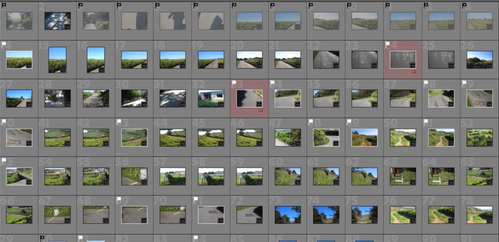
After importing my images from this photoshoot into a folder in Lightroom titled ‘shoot1’ inside my “Simple and Complex” collection set, I began to filter and select my images. I used P and X to filter my images, and highlighted specific types of images in different colours: for example, as seen below, abstract type images in red.

I started this shoot at the top of Mont Matthieu, in St Ouens. This is the hill that I lived at the top of for the first few years of my life. In this part of the shoot, I wanted to capture the lines of the roads, the horizon and the textures in the surrounding landscapes: the fields, roads and sky.

As the shoot continued, I moved down the hill of Mont Matthieu and into St Ouen’s Bay, starting first at the fields at the bottom of the hill and then to a section of the beach that is really important to me – in this section of my shoot, also pictured below, I was focusing on line and shape. I shot in the golden hour on this day, which meant I captured some really lovely shadows and warm tones in my images. After creating some abstract images that I really liked in the first part of my shoot on the hill, I reviewed them and continued to produce similar images on the beach.

I normally struggle with over/underexposure in my shoots at some point, but in this shoot, I didn’t find this to be a massive problem. I tried to think about where the sun was in every shot and location, which avoided unwanted glare in my photographs. Furthermore, I planned this shoot for golden hour, which was about 3/4 pm at this time. This meant the sun was at the perfect level to provide the highest quality light, eliminating overexposure and creating rich warm tones in my images.

Selections

Below are my best images, unedited. In my editing process for this photo shoot, I used a lot of cropping to create more interesting compositions, so the final images look quite different in comparison to their originals.

Editing

In my editing for this shoot, I focused on cropping to create more interesting compositions. Due to the strong leading lines and different shapes in a lot of my images, I used cropping to highlight these more and create more balanced photographs.

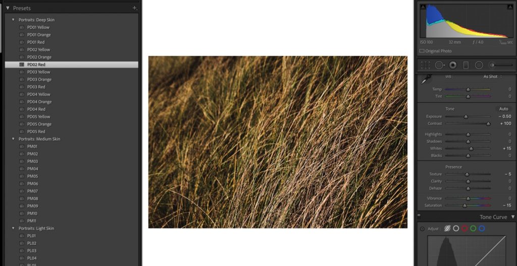
In a few of my edits for this photoshoot, I experimented with colour edits after editing in B and W, mainly experimenting with tint and different filters. specifically, I focused on increased/decreased contrast, because I wanted to try different presentations of strong lines and shapes in these images. For example, in the first image I edited, I increased the contrast a lot in order to accentuate the strong lines and differences in black and white tones in either side of the image.

Final Images

These are my best images for this shoot.

Evaluation

I think this shoot was probably my most successful out of my whole project. This is unusual for me, as I normally find my shoots get better as my project progresses, as my ideas become more clear and I get into a better flow of making images. However, I had quite clear ideas of what I wanted to capture before I went out on this shoot and I picked a good time to shoot. I shot in golden hour, with dry conditions on a sunny day, without wind to minimise camera shake. I shot in a familiar location too, which meant I could visualise before I took my images what I wanted them to look like and where specifically I would be shooting. I also think I used slightly different types of editing to my usual style. I don’t normally use a lot of cropping, and often seem to neglect it in my previous projects. However, in this project this has become one of, if not the most important part of my editing, as I have created much more abstract images to my usual style. Cropping has become much more important in these images to create better compositions, and also because different cropping can change the perspective of lines and shapes in an image completely.

Research and Deconstructing a Photobook – Hold the Line by Siegfried Hansen

Abstract Photography

What is abstract photography?

Abstract photography, sometimes called non-objective, experimental or conceptual photography, is a means of depicting a visual image that does not have an immediate association with the object world and that has been created through the use of photographic equipment, processes or materials. An abstract photograph may isolate a fragment of a natural scene in order to remove its inherent context from the viewer, it may be purposely staged to create a seemingly unreal appearance from real objects, or it may involve the use of color, light, shadow, texture, shape and/or form to convey a feeling, sensation or impression.

Bill Brandt

History

Some of the earliest images of what may be called abstract photography appeared within the first decade after the invention of the photography. In 1842 John William Draper created images with a spectroscope, which dispersed light rays into a then previously unrecorded visible pattern. The prints he made had no reference to the reality of the visible world that other photographers then recorded, and they demonstrated photography’s unprecedented ability to transform what had previously been invisible into a tangible presence. Draper saw his images as science records rather than art, but their artistic quality is appreciated today for their groundbreaking status and their intrinsic individuality. Another early photographer, Anna Atkins in England, produced a self-published book of photograms made by placing dried algae directly on cyanotype paper. Intended as a scientific study, the stark white on blue images have an ethereal abstract quality due to the negative imaging and lack of natural context for the plants.

Anna Atkins

The discovery of the X-ray in 1895 and radioactivity in 1896 caused a great public fascination with things that were previously invisible or unseen. In response, photographers began to explore how they could capture what could not been seen by normal human vision. About this same time Swedish author and artist August Strindberg experimented with subjecting saline solutions on photographic plates to heat and cold. The images he produced with these experiments were indefinite renderings of what could not otherwise be seen and were thoroughly abstract in their presentation. Near the turn of the century Louis Darget in France tried to capture images of mental processes by pressing unexposed plates to the foreheads of sitters and urging them to project images from their minds onto the plates. The photographs he produced were blurry and indefinite, yet Darget was convinced that what he called “thought vibrations” were indistinguishable from light rays.

August Strindberg

But it wasn’t before Surrealists such as László Moholy-Nagy and Man Ray that the genre got its first serious boost. Their experiments within the darkroom established a whole new expressive language, which sometimes didn’t even involve the use of a camera, like in the case of rayograms. Walking the line between surrealism and abstraction were the works of Otto Steinert and Heinz Hajek-Halke, who reinvented the concepts of portraiture, for instance, towards the second half of the 20th century. In the 1960s, technology got even more involved in the creation of abstract photos, particularly through microscopes that were now evolved enough to provide remarkable imagery. Then came the computers and with the rise of digital photography in the 1990s, the genre has been taken to a whole new level, although many artists remained faithful to the old-school techniques that didn’t include Photoshop or other editing software.

Deconstructing a Photobook

Research a photo book and describe the story it is communicating with reference to subject matter, genre and approach to image-making.

Who is the photographer?

Siegfried Hansen traces visual compositions from graphics and colours and creates „street photography“ the main point of which is not bodies or faces, but graphic connections and formal relations. It shows the aesthetics of coincidence in a public area, which is full of surprises.
His work has been profiled in the books “Street Photography Now“ published by Thames and Hudson and “100 Great Street Photographs” by David Gibson. Siegfried is a member of the renowned street photography collective UN-PUBLIC and a founder member of the German street photography site and German Street Photography Festival.
Siegfried has been a speaker and a juror at many photo festivals around the world. His internationally acclaimed photo book “Hold the Line” published by Kettler Verlag sold out and won several awards.

“Street photography exists as a genre in incredibly many facets and manifestations. It is always about the right time to release the shutter, at a moment that captures and accurately reflects what is fleeting and coincidental. For Siegfried Hansen, street photography is not so much in the nature of reportage and documentation.” What Hansen is interested in is graphic elements, shapes, interwoven lines and structures that, when harmoniously related to one another, yield an abstract image. “Whereas in the photographs of such prominent role models as Henri Cartier-Bresson and André Kertész people play a major role, in the works of this Hamburg photographer faces and people are only suggested and are at best only dimly visible. No more is shown than is needed to create an interesting and balanced combination of people and objects.“

A video with Siegfried Hansen, talking about his process and works.

The Flow of the Lines

The Flow of the Lines” is the second book by renowned street photographer Siegfried Hansen, featuring an introduction by David Gibson. Following the overwhelming success of Hansen’s first book, which has since sold out, this highly anticipated release showcases 147 captivating photos that capture the energy and vibrancy of the urban landscape.  In “The Flow of the Lines”, Hansen’s ability to notice such smallquiet detailsloudly celebrates the joy of graphics and absolute precision, which is indeed typical of Hansen’s love of graphic lines in urban settings.

Siegfreid Hansen’s work is world-renowned and has been exhibited in Galleries across the world, such as in Berlin, and Hamburg, where many of his photographs are created, London, Miami, Krakow and Kentucky. He now holds workshops in Germany on the art of street photography and offers personal coaching as well.

Hold the Line

Book in hand: how does it feel? Smell, and sniff the paper.

It feels robust, and clean cut.

Paper and ink: use of different paper/ textures/ colour or B&W or both.

This book is mostly in colour, and relies on colour in order to create some of the highly intriguing compositions found in the book.

Format, size and orientation: portraiture/ landscape/ square/ A5, A4, A3 / number of pages.

The book is a portrait A4 book, with 56 pages.

Binding, soft/hardcover. image wrap/dust jacket. saddle stitch/swiss binding/ Japanese stab-binding/ leperello

The book is hardcover, with perfect binding.

Cover: linen/ card. graphic/ printed image. embossed/ debossed. letterpress/ silkscreen/hot stamping.

The cover is a printed image, printed on card. The image on the front cover is wrapped from the back to the front, as one image.

Title: literal or poetic/relevant or intriguing.

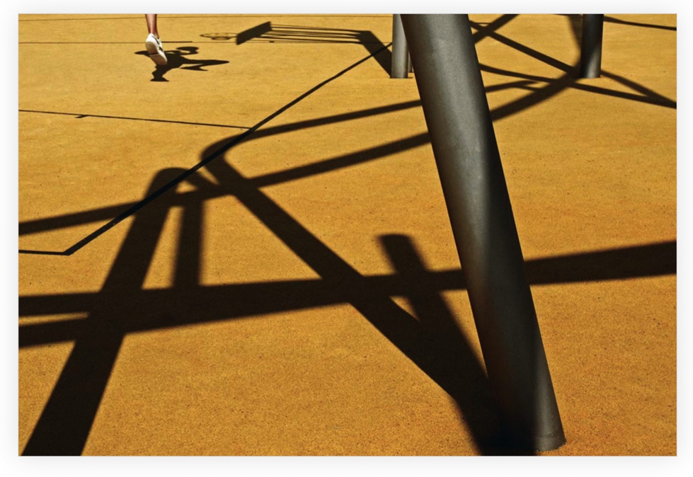
The title ‘Hold the Line’ can be seen as literal in a sense that the photobook mainly focuses on strong lines and shapes within architecture. However, it can also be seen as metaphorical, as many of the spreads in the book feature lines that are interrupted or ‘held’ in reference to the title. They are interrupted, and continued by another line similar from a different plane of view. For example, in the image to the right below, the red line that intersects the shape at the bottom of the pole and wall in the background is broken apart by the line of the pole of the left – this creates a geometric composition.

The Narrative: what is the story/subject matter? How is it told?

The narrative of this book is the idea of street photography but without faces or humans, but visual and graphic connections in our everyday world, by coincidence. Hansen presents these ideas by using bold colours and shapes, creating spreads where each image / colour fit well together with similar lines and shapes. In this book, Siegfried seeks to prove that all of these compositions are found coincidentally in an everyday landscape – creating a new perspective on street photography, without the inclusion of faces.

Structure and architecture: how the design/ repeating motifs/ or specific features develop a concept or construct a narrative.

Design and layout: image size on pages/ single page, double-spread/ images/ grid, fold-outs/ inserts.

The pages in this photobook are mixed. Some feature two images, that link strongly together, through shape, line or colour. However, some pages are with one image, and the other page a similar colour to a key one in the photograph. (See right below). Images are on a single page mostly, with 3 or 4 double page spreads scattered in the book.

Editing and sequencing: selecting images/ juxtaposition of photographs/ editing process.

There is clear juxtaposition in the photobook – each spread features two images, and some with a plain colour and an image on one side. Each spread has some sort of link between each image or colour. For example, In the spread above to the right, the blue lines of the vehicle in the top right link well with the solid blue of the same colour on the left, with the solid down the centre line of the spread creating a strong frame with the three subjects.

Links to my Simple and Complex project

https://www.lensculture.com/siegfried-hansen?modal_type=project&modal_project_id=132705&modal=project-323446 – a link to a preview of my studied book.

This book links quite well to my Simple and Complex project, not only the theme but also my personal project for my exam. Before finding this artist to cover, I was searching for a book / artist who documented the idea of fragmented landscapes or an abstract photographer documenting landscapes. My project and photobook are similar to the work of Siegfried Hansen as I am also focusing on the less traditional ideas of my genre – not taking so many traditional landscapes, but thinking more about the formal elements of the landscapes: light, shape, line and shadow. I also am going to draw inspiration from Hansens’ unique layout with colour blocking, and single images, mixed with a few double page spreads, although not in colour.

Statement of Intent

What do you want to explore?

In my simple and Complex project, I want to explore the concept of memory and childhood identity through a sense of place, photographing important locations around the island to me. I’m exploring this through landscapes, both traditional landscapes and more abstract images. Through both these methods, I plan to capture the way that memories can change or become less clear as we get older, changing our perception of something. With my more abstract images, I plan to capture strong lines and shapes, providing a more detailed, but equally hidden view of the landscape I’m capturing. I covered the subject of identity both the Identity project and in my Islandness project this year, and this topic is something I really enjoy covering, as it means I can convey my own opinions about a very personal subject without being in front of the camera, through photographs. However, I have always stuck to portraiture, and decided in my final project that taking myself out of my comfort zone was important. – I feel much less confident taking landscapes, and in this project I wanted to explore a subject I’ve covered but in a completely different way – more subtly, with less obvious links and with more abstract images as I mentioned above.

https://www.ideelart.com/magazine/abstract-photography-tate – an article on the history of Abstract Photograhy – my chosen genre for this project.

Siegfreid Hansen – “Hold the line”

Why it matters to you?

This project matters to me as I care a lot about where I grew up and my childhood places, and they are a big part of how I developed into the person I am now. I had quite a unique upbringing, constantly on the beach and around the sea, but also living in a lot of different places in my life. I’ve lived in many different houses in Jersey and also have links to quite a few different places on the island. Finding it difficult moving from place to place was difficult as a child, and this is something I wanted to document through my images of these important places.

Kyler Zeleny, one of my chosen artists

How do you wish to develop your project?

I’m planning to create traditional landscape images, of places related to my childhood, such as my old houses and surrounding areas, and areas of the beach that are key places to me. Furthermore, I plan to diversify my work by creating abstract images of these areas, capturing more complex landscapes with strong shapes and textures. I am including these as I haven’t really explored abstraction in my coursework or personal study, and exploring this in my final project will allow me to explore a completely new area of study. As my final outcome, I plan to produce a photobook, after producing one for my personal study at the end of my coursework. This was something I really enjoyed, and creating another photobook for my exam project with a completely different type of my photobook, with completely different material and layout.

Alec Soth – USA. Little Falls, Minnesota. 1999.
My final photobook for my personal study – I plan to draw on this for inspiration but also improve from my first time creating a photobook.

In my photobook for my personal study, I found the layout to be a little too chaotic for my liking and therefore this time when creating one I will keep it very simple, with fewer pages – I felt also in my personal study photobook that I had too many pages, with too many images included. This made it difficult for me to work with, and I found that I had trouble creating a narrative. It was difficult to make sure so many pages flowed succinctly together, and I think that creating a smaller, simpler book for this project will produce an outcome that has a strong story to it, that flows from beginning to end. I plan to create a different kind of photobook from what I made in my personal study. In my personal study, I used a hardback image wrap cover, and found that inside portraits were slightly tarnished by the folding of the book in the middle of the page – this is not something I want to have the problem with within my final photobook, hence my decision to use a different type of book.

I have also thought about creating a zine instead of a photobook, with fewer images than a traditional photobook printed on paper. I have experience in creating zines in my ‘Islandness’ project, where I created two zines that I found to be very successful – I actually found the process of creating a zine to be much more enjoyable than making a photo book, as the number of images was much more manageable, and it meant I was able to streamline my layout and selection of images a lot more. For these reasons, I have considered making a zine instead of a photobook for my final exam project. If I make a photobook for my final exam, I plan to keep it simple by using a set amount of images, but also by using a simple layout: I will use a few presets of image layouts, favourite these, and stick to these throughout the book. This will ensure a clear flow of images in the book, with a clear and simple design.

As seen above in Kyler Zeleny’s work, I have thought about also using archival material of the places I photograph and juxtapose these with my new images. I used archival material and collage in two previous projects, but this project would use them in a different way, with landscapes and different types of material – for example old maps, landscape images, or articles. I plan to gain access to these by asking groups on Facebook, asking my family if they had anything of interest, and possibly contacting the Societe Jersaise Photographic Archive.

When and where do you intend to begin your study?

The headland at La Pulente, where I plan to photograph.

For my final exam project, I plan to execute at least 3 or 4 photoshoots. After researching key artists that will influence my decisions and photographs, I have a more clear idea of my starting points. Firstly, I thought it was a good idea to think about places across the west of the island that are important to me, and related to my childhood. The first of these locations is near my old house, at La Pulente, in St Brelade. I plan to drive to La Pulente and walk from my old house, down around the headland and down to the beach. This was a place I walked through every day when I lived there, and photographing this location is a good starting point to capture important landscapes. Following on from this, I plan to photograph down in the bay. I plan to photograph the sand dunes at la Braye, and also at Barge a Ground, further along. Particularly Barge is very important to me as I grew up on the beach at this spot, and my family has generational connections to the spot, through Jersey’s surfing and beach culture. Here, I want to capture important parts of the location: the wall, and its texture, the sunlight and reflections, and also the sand, which obviously is a key part.

Barge Aground, St Ouens

I plan to take classic landscape images, but also capture more abstract images. I want to take these more abstract photographs in order to show the intricacies of a landscape that may be overlooked but to also develop the idea of childhood memory. As we get older, memories develop in our heads and change, and things from the past become ‘foggy’ or unclear. I want to highlight the idea of fragmented or distorted childhood memories, and I plan to do this by creating close-up, highly abstract images. that do not reveal too much of a location, but show its more detailed, conceptual components such as depth and light.

https://www.bbc.com/future/article/20190516-why-you-cannot-trust-your-earliest-childhood-memories – a BBC article about the validity of childhood memories and how they change over time. “Memories are malleable and tend to change slightly each time we revisit them, in the same way, that spoken stories do,” says Loveday. They are influenced by our perceptions, state of mind, knowledge and even the company we are in when recalling events, which can lend us a new perspective on a familiar life event.” – From the article above.

Siegfried Hansen: “Hold the Line”

Alec Soth

Alec Soth (b. 1969) is a photographer born and based in Minneapolis, Minnesota. He has published over twenty-five books including Sleeping by the Mississippi (2004), NIAGARA (2006), Broken Manual (2010), Songbook (2015), I Know How Furiously Your Heart is Beating (2019), and A Pound of Pictures (2022). Soth has had over fifty solo exhibitions including survey shows organized by Jeu de Paume in Paris (2008), the Walker Art Center in Minnesota (2010) and Media Space in London (2015). Soth has been the recipient of numerous fellowships and awards, including the Guggenheim Fellowship (2013). In 2008, Soth created Little Brown Mushroom, a multi-media enterprise focused on visual storytelling. Soth is represented by Sean Kelly in New York, Weinstein Hammons Gallery in Minneapolis, Fraenkel Gallery in San Francisco, and Loock Galerie in Berlin, and is a member of Magnum Photos.

Soth liked the work of Diane Arbus. He travelled around the Mississippi River and made a self-printed book entitled Sleeping by the Mississippi which included both landscapes and portraits. Curators for the 2004 Whitney Biennial put him in their show, and one of his photographs entitled “Charles”, of a man in a flight suit on his roof holding two model aeroplanes, was used in their poster. Soth’s work has since been compared to that of Walker Evans and Stephen Shore. He has photographed for The New York Times Magazine, Fortune and Newsweek.

When he photographs people, Soth feels nervous at times. He said: “My own awkwardness comforts people, I think. It’s part of the exchange.” When he was on the road, he’d have notes describing the types of pictures he wanted taping to the steering wheel of his car. One list was: “beards, birdwatchers, mushroom hunters, men’s retreats, after the rain, figures from behind, suitcases, tall people (especially skinny), targets, tents, treehouses and tree lines. With people, he’ll ask their permission to photograph them, and often wait for them to get comfortable; he sometimes uses an 8×10 camera. He tries to find a “narrative arc and true storytelling” and pictures in which each picture will lead to the next one.

Sleeping by the Mississippi

Soth has been photographing different parts of the US since his first book, Sleeping by the Mississippi, was published in 2004.

Much has been written about Alec Soth’s Sleeping by the Mississippi. First published in 2004, it is a landmark publication in the Magnum photographer’s career, which propelled him to international recognition and notoriety. First editions of the photobook are highly prized items today. At a talk in London in 2017, in conversation with Sean O’Hagan, Soth reflected on the work, almost 15 years on, and how he began to make what would eventually become the tightly-edited tome, Sleeping By the Mississippi. “I was a morose, introverted young man,” says Soth of his early years, identifying with a version of a Midwestern American sensibility that was “dark and lonely”. Working in a photo-processing lab on other people’s pictures throughout his early 20s, he had (almost) given up the ambition to become a famous artist, yet it was this very relaxation of his personal ambition that eventually allowed him the degree of freedom necessary to accept the influence of the American tradition of road trip photography in his own work – to stop pretending he was reinventing the wheel, to carry on the tradition and make it his own.

USA. Venice, Louisiana. 2002, Alex Soth

He began to follow the Mississippi River in his car, driving from place to place, letting himself progress towards locations he had vaguely researched and “using the river as a route to connect with people along the way.” These were the early days of the web and the development of his process ran parallel to the growth of the internet. “It was like web surfing in the real world,” he says, “it was like trying to ride a wave.”

Alec Sloth talking about his processes.

He drove from location to location, going from one thing to another, with a list of keywords for things he was interested in taped to his steering wheel; Soth’s aim was to stop his car as soon as something caught his eye, but he found that what had captured his attention was not necessarily the stuff of pictures he wanted to make. “Often these are photo clichés, things that look like work by another photographer,” he says. He first needed to weed out these well-trodden tropes in order to find the personal, the things that would allow him to honestly carve out his own meaning and make pictures. “A miraculous time in my life,” is how Soth describes this process. He felt warmly welcomed in the region; he was allowed into the intimacy of people’s homes. Hyper-alive to the world, Soth had in fact just spent an intense month-long period with his mother-in-law, who had become very ill. He lived with her in her house as she died.

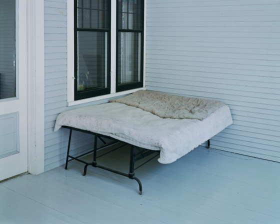
USA. Little Falls, Minnesota. 1999. Charles Lindbergh’s boyhood bed, Alex Soth

Soth made several more photographic books including Last Days of W, a book about a country “exhausted by George W. Bush’s presidency”. Soth spent the years between 2006 and 2010 exploring the idea of retreat. Using the pseudonym Lester B. Morrison, he created Broken Manual over four years (2006–2010) an underground instruction manual for those looking to escape their lives. Soth investigates the places in which people retreat to escape civilization, he photographs monks, survivalists, hermits and runaways. He concurrently produced the photo book From Here to There: Alec Soth’s America, an overview of Soth’s photography from the early 1990s to the present.

In 2010, Soth flew to the United Kingdom but despite not having applied for a work visa was allowed into the country on the understanding that if he was “caught taking photographs” he could be put in prison for two years. So he handed the camera to his young daughter who took pictures in Brighton. A 2016 photo exhibition, titled Hypnagogia, featured 30 images from Soth’s 20-year exploration of the state between wakefulness and sleep. “Described as a neurological phenomenon, one recurrently associated with creativity, a hypnagogic state is the dreamlike experience while awake that conjures vivid, sometimes realistic imagery,” Soth explained in the artist statement for the project.

A video about Alec Soth’s career and different projects.

A Pound of Pictures

A Pound of Pictures is a stream-of-consciousness celebration of the photographic medium, bringing together an entirely new collection of work by Alec Soth made between 2018 and 2021. Depicting a sprawling array of subjects — from Buddhist statues and birdwatchers to sun-seekers and busts of Abe Lincoln — this book reflects on the photographic desire to pin down and crystallise experience, especially as it is represented and recollected by printed images.

Throughout this eclectic sequence are the recurring presences of iconography, souvenirs and mementoes, and of the image-makers that surround us day to day. Forming a winding, ruminative road trip, Soth’s photographs are followed by his own notes and reflections in an extended afterword. ‘If the pictures in this book are about anything other than their shimmering surfaces,’ he writes, ‘they are about the process of their own making. They are about going into the ecstatically specific world and creating a connection between the ephemeral (light, time) and the physical (eyeballs, film).’

Alec Soth, USA. Little Falls, Minnesota. 1999. Charles Lindbergh’s boyhood bed.

This image is from Soth’s “Sleeping by the Missisippi” project. The image was taken on film, and as a result of this has faded tones, with high amounts of blues and blacks. There are strong leading lines that lead from the outer sides of either end of the image, almost directly into the centre of the image. This image clearly uses the rule of thirds – both edges of the wooden exterior fall within or on the lines of the bottom thirds of the image, and the focal point, the bed, intersects with the right corner of the black window at the almost exact middle of the image. There is stark contrast in this image, between the bright white of the doorframe to the left, the faded white bedsheets and the outside of the windows, with the bold, harsh black of the window paine, and the legs of the bed. This area is therefore a focal point, contrasting from the faded blues and whites in the other parts of the image. There are also different shapes in this image, intersecting. For example, there is a triangle shape formed by the leading lines, but also many rectangle shapes: the windows, the pillows, and the doorframe to the left. Also this image doesn’t really provide any social context to life in the area of rural America that Alec Soth was documenting in this project, it can be seen through the someone stark and stripped down presentation of this image. This could represent issues of poverty, or a lack of opportunities in the area photographed, or just show a reality of living in rural or small communities.

Kyler Zeleny

Kyler Zeleny grew up on a farm in Central Alberta, Canada. The farm isolated him, it taught him lessons about the prairie landscape and the importance of a vibrant imagination. As a result, he is left with a propensity towards open spaces, a residue of his upbringing, and megacities, a response to his desire to connect. His work is influenced by a fascination for elements of the past and a pondering for the future. As a result, he rarely lives in the present. He believes one of the highest virtues is not intellect itself but the pursuit of knowledge, whether that is learning how to weld or reading Bourdieu.

Over the last five years, his pursuit of knowledge has taken him onto the back roads of rural Western Canada and the occasional dip into Montana. Sleeping in his car, and showering in lakes and community pools, he occupies his time trying to understand present-day ideas of rurality and how it has been visually represented. This pursuit of understanding the rural consumes him, but that’s ok because he thinks it’s important work.

A video with Kyler Zeleny about his process on making photobooks and long term projects.

Out West

“This entire project is then further coloured by an engagement with the occult and is one that is as preoccupied with excavating the past as it is with recoding the present.” 

Kyler 1.jpg

Out West is a visual travelogue documenting rural communities in the Canadian west. Over a hundred communities of between six and 1,000 inhabitants were documented. The project offers a version of the current state of affairs in the Canadian West, exploring how rural spaces experience an urban-rural time lag. The images conjure up a Vonnegut-like idea of being “unstuck in time”, where objects and the built landscape deceive the viewer as to what period they belong to.

The images in this book are part of a project documenting the built landscape of small rural communities (1,000 inhabitants or less) in the Canadian West. As demographic changes – ‘rural drain, urban claim’ – persist, many would argue that the rural is becoming a redundant sidepiece in a world that is increasingly concerned with the urban. The project investigates how rural communities in the Canadian West landscape struggle to hold onto their heritage despite the diminishing vitality of these towns.

Train Passing Car Graveyard, Rosebud, MT, 2017, Kyler Zeleny

Work from the project has appeared in exhibitions in Canada, The United States, England, Columbia, Austria and Australia. Conference talks as well as radio and television interviews on the work have been conducted in Canada, The United Kingdom and The United States. It has appeared in print in: After-Image Journal, Blackflash Magazine, Aesthetica Magzine, Of The Afternoon, and Ain’t Bad Magazine. In 2014 the project was compiled into a limited edition book in 2014 with the independent publishing house The Velvet Cell.

Bury Me in the Back Forty

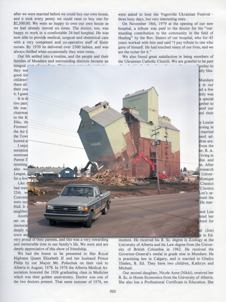
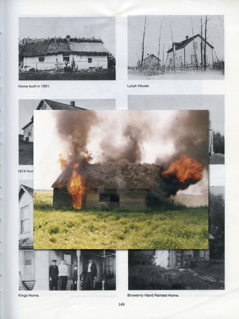
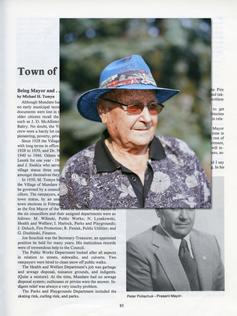
From the Dakotas to Alberta, small towns on the prairies are a dime a dozen; peaceful and congenial sleepy towns that can often be substituted for another. Bury Me in the Back Forty is a long-term multi-media project that documents Mundare, Alberta, a seemingly typical rural community. Through photographs, collected objects, community archives, audio recordings, oral histories, drawings and sketches, the idea of a prairie town is performed. Together with these documents, these private objects and souvenirs tangle to tell an intimate story of rurality. The project is both a document, an inquiry, a performance, and a transgression. More importantly, it is simply a story being recorded, recollected, reconfigured and told—a layered portrait of rurality that is both unique and universal. What we are really left with is the stoicism of place, a lived existence, which roars at times and suffers so quietly at others.

This is not a straightforward document, it is meant to excite, awe, confuse, bore and most of all, it is meant to be revisited. The narrative that follows is somewhat of a fugitive storyline, a place where folklore and alchemy mix with the academy to create a collective, albeit paradoxically disjoined, narrative of life on the prairies. The fugitive narrative we are left with is made up of organic components synthetically placed to create a gestalt-like feel of community past and present. A form of community particle collider, forcing narratives together, merging them, grinding them against one another until something collective emerges, something new and indistinguishable from one another—real and imagined. These collisions inhabit an in-betweenness, an imagined community. This in-betweenness is not a place to shy away from, it allows us the opportunity to gleam into a possible future. Like Stonehenge was built in the past, but guiding future solstices, Bury Me is equal parts time machine and time capsule guiding us towards one of the many fates awaiting the rural, marking its constellations, telling us when it is time for growth and more importantly when it is time for dormancy.

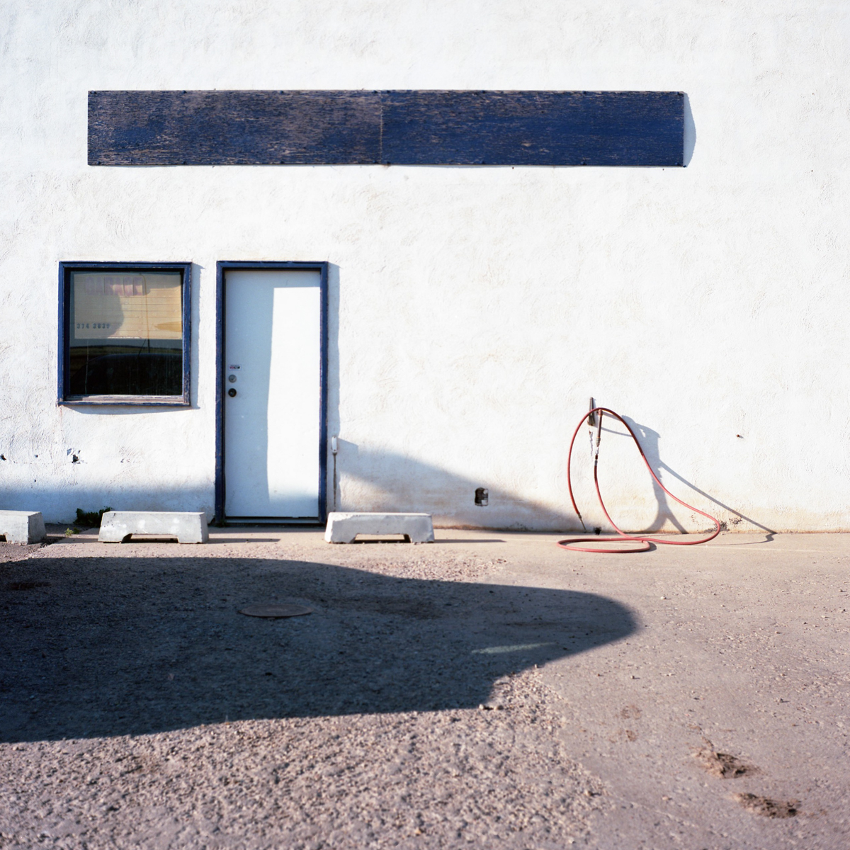
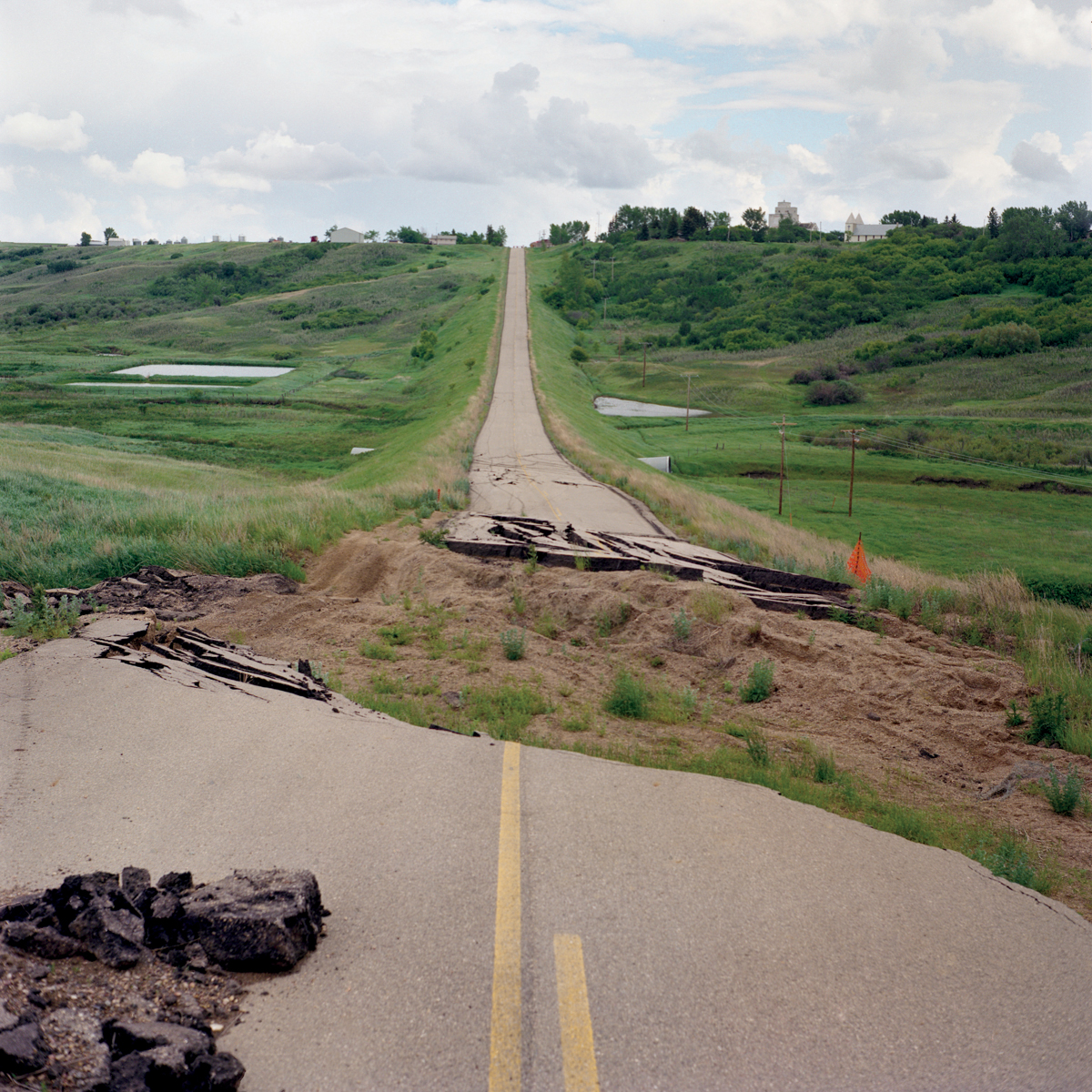
From Out West, Kyler Zeleny

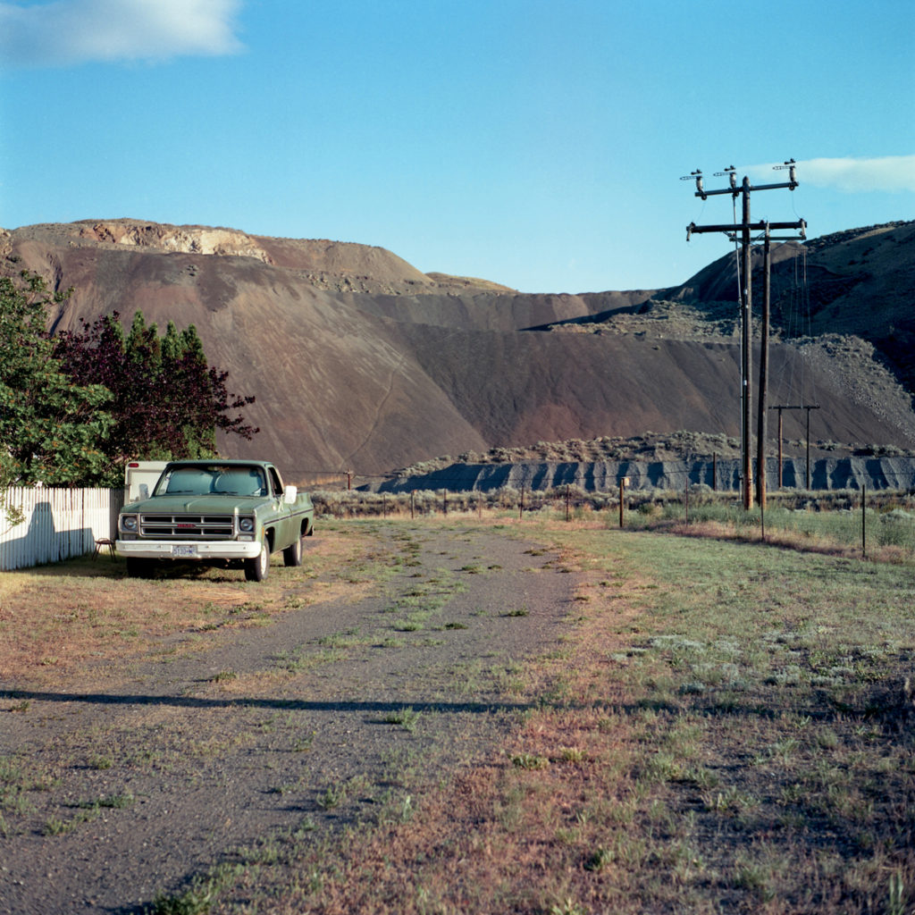
This image is one of many from Zeleny’s Out West project, documenting “The built landscape of small rural communities in the Canadian West”(On Landscape Project, 2014). This image is basically split into two halves, which opposes the traditional use of the rule of thirds. However using the rule, it is clear that the road, narrowing into the distance creates a clear division, through the centre of the middle thirds of the photograph. There is also a clever use of line and shape in the image, with the straight yellow lines on the road in the foreground naturally leading the eye up the road. The viewer’s eye is then taken to the horizon at the top of the image, which forms a perfectly straight line. This straight horizon line enhances the contrast between the light blue and grey of the sky, and the rich greens of the fields below. The obvious contrasts in this image, as illustrated by the difference between the road and the fields, could show the stark differences between the rural and urban communities of Canada’s west – in the image we can also see areas in the road where nature has taken back over. By photographing this landscape, Zeleny creates a visual representation of the overdevelopment of rural communities, and how the urbanisation of landscapes is taking over rural communities.

.

Link to my ‘Simple and Complex’ project

Kyler Zeleny’s work links to my own project due in a few ways. Firstly, the concept of capturing community and a sense of place is crucial in my work, as I’m documenting my childhood homes/places through landscapes. Also, Zeleny photographs rural areas and landscapes which is a similar subject to my own. This makes it easier for me to formulate ideas on my own compositions, photoshoots and ideas. Another part of Kyler Zeleny’s work that has really inspired me is his use of archival material relating to his own family and surroundings in his project “Bury me in the back forty”. I have used archival material in a lot of my projects for my coursework, but mainly only linked to portraiture. For this project, I want to draw upon my previous projects and the use of this material in Kyler Zeleny’s project, to find new material from family albums and possibly photographic archives to use alongside my landscapes.

Mindmap and Moodboard

Mindmap

Simple

“Easily understood or done; presenting no difficulty, plain, basic, or uncomplicated in form, nature, or design; without much decoration or ornamentation.

The concept of something simple can be seen throughout art and photography in different ways. For example, lighting, using a simple single source, or with context or intent of an image, for example taking photographs of traditionally simple or uninteresting things in a conventional way. The concept of simplicity can also be seen in arrangments of images, for example using a simple composition, simple colours, for example, black and white or only a selection of a few colours in an image. For example, posed, simply lit portraits can be seen as simple as only documenting the surface-level subject. If no context is given or hinted at in an image, it can be seen as simple at a first glance. Simple photography can be linked to minimalism, with minimalist photographs “stripping a subject down to its essence.” For example, classic photographs such as those of Ansel Adams are classic, well composed images of natural beauty, which have a traditionally simple concept and composition. Furthermore, images such as Alex Soth’s portraits in his project “Sleeping by the Mississipi” present as visually simple, with a clear use of the rule of thirds and with the subject often in the middle of the image. However, the context of his images and narrative behind them is often more complex. The two concepts of simple and complex are often intertwined in photography, and it is often difficult to call an image purely ‘simple’ or ‘complex’.

Complex

“Consisting of many different and connected parts; a group or system of different things that are linked in a close or complicated way; a network.

Complexity in photography and art can be seen in many different contexts. It relates to its’ binary opposite of simplicity, as seemingly simple images can have complex ideas attached to them, such as contextual ideas, links to photographic movements, or complex processes and materials used to photograph. Complexity in photography can also relate to the presentation of images: for example using sculpture or manipulating images to create intricate presentations and different angles. For example, Cindy Sherman and Jim Goldberg’s work can be seen as complex due to the issues their photographs address – mysoginy, feminism, wealth and poverty. These photographs also present as visually complex, but this is not always true for complex photography. As seen in my moodboard of ‘simple’ images above, some images can be seen as visually simple but often have great ocntext linked to personal experiences, or social context. Therefore, the notion of a simple or compex photograph is mostly subjective, and the definition would be different for every viewer of an image.