All posts by Joshua L

Filters

Author:
Category:

Final Images, Pieces, Virtual Gallery and Evaluation

Final Images

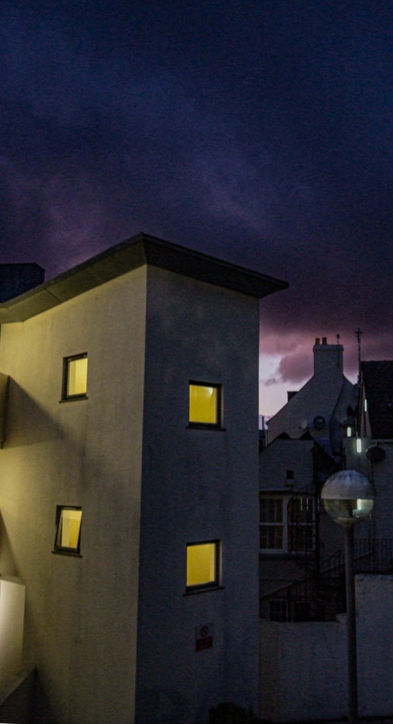
My choice of editing my images is to present an overcrowded, claustrophobic urbanised dystopian world. These pieces of work also suggest how the gentrification of jersey and how it seems every piece of land is being built on is turning jersey into a very urbanised island which can, at times, feel very claustrophobic due to the amount of things being built on the island. The visual elements of my final pieces of work present this claustrophobic world very well, with the images themselves being very crowded with a lot going on, and I believe they are very effective for this reason.

Final Pieces

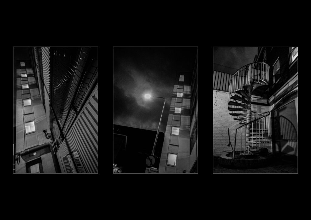
I created 3 final pieces for this project, one using 3 window mounts on a piece of black card, and one piece using foam board and spray mounts.

Mock-up:

Final Piece 1:

Mock-up:

Final Piece 2:

Final Piece 3:

For the window mounts I decided to rearrange the photographs compared to the mock-up I created, as in person I believe it looked better in this arrangement. For the foam board and spray mounts, I also rearranged the photographs around the centre montage piece. I rearranged these photographs as it also looked more effective this way in person and the photographs around are now more corresponding with their position in the montage. I also mounted the montage on an extra piece of foam board to make it stand out more from the smaller photographs. For my third final piece I just decided to back it onto some foam board and not overcomplicate it, as it was fine just being simple.

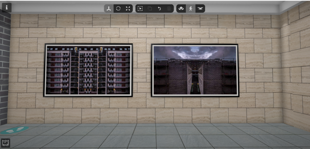
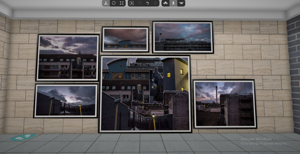
Virtual Gallery

https://www.artsteps.com/view/64491d517af8a3756f0e0e79?currentUser
Evaluation

What went well:

Overall, I believe that this project was somewhat successful, I believe that I responded to the subject of the exam as best as I could. I believe that my final outcomes came out very well and are very effective. I also think that I referenced the artists that I studied effectively as well, with similar visual, technical, contextual and conceptual subjects within my photographs. My final pieces came out looking very nice, I was able to measure up and cut the window mounts to near perfection and it came out very well. My foam board pieces also came out very nicely with near perfect sticking and spacing of images. I believe that my final images have a good contextual meaning behind them which was mentioned above, as well as great visual concepts as well as technical concepts. Overall I would give my project a 7/10 as there is some things I could improve on.

How I could improve:

To improve, I could have completed more photoshoots to ensure I had more than enough photographs to work with to complete my final pieces of work. On top of this, I could have completed more artist references to have more inspiration to complete more pieces of work. As well as this, I could have printed off more of my final images to make more foamboard or window mounted pieces of work, to increase the amount of work I have to present for this exam.

More Experimentation

I decided to create more experimentational photographs using Adobe Photoshop.

Experiment 1

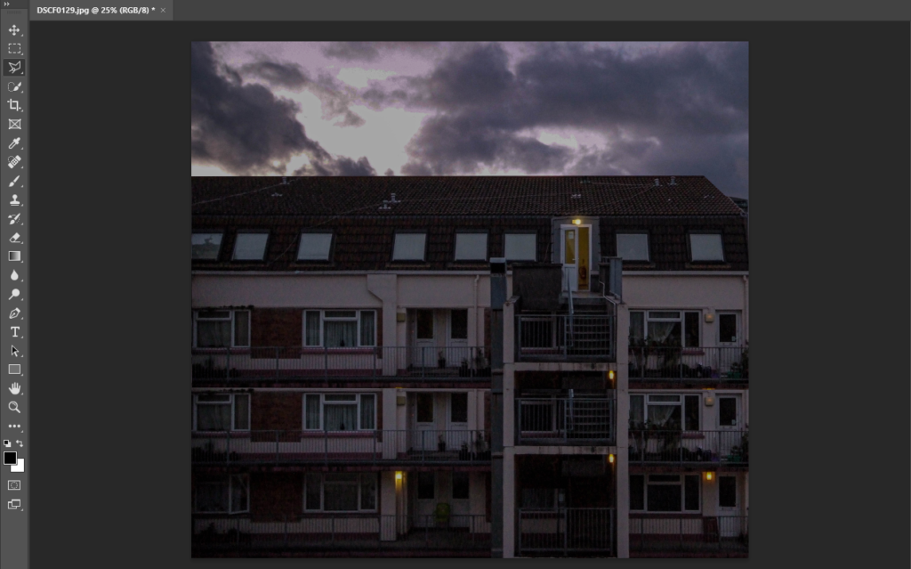
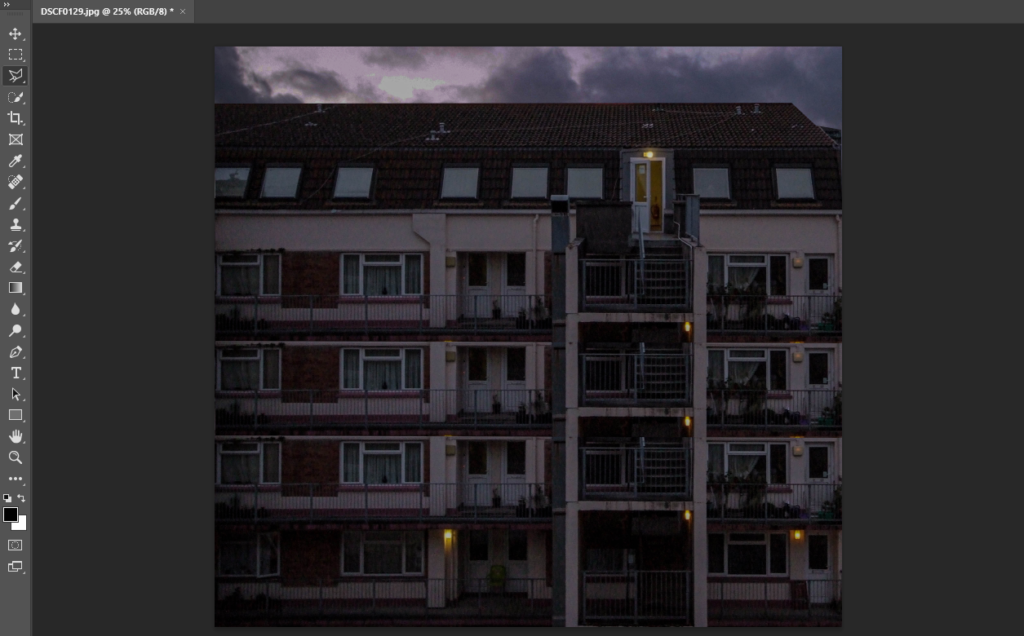
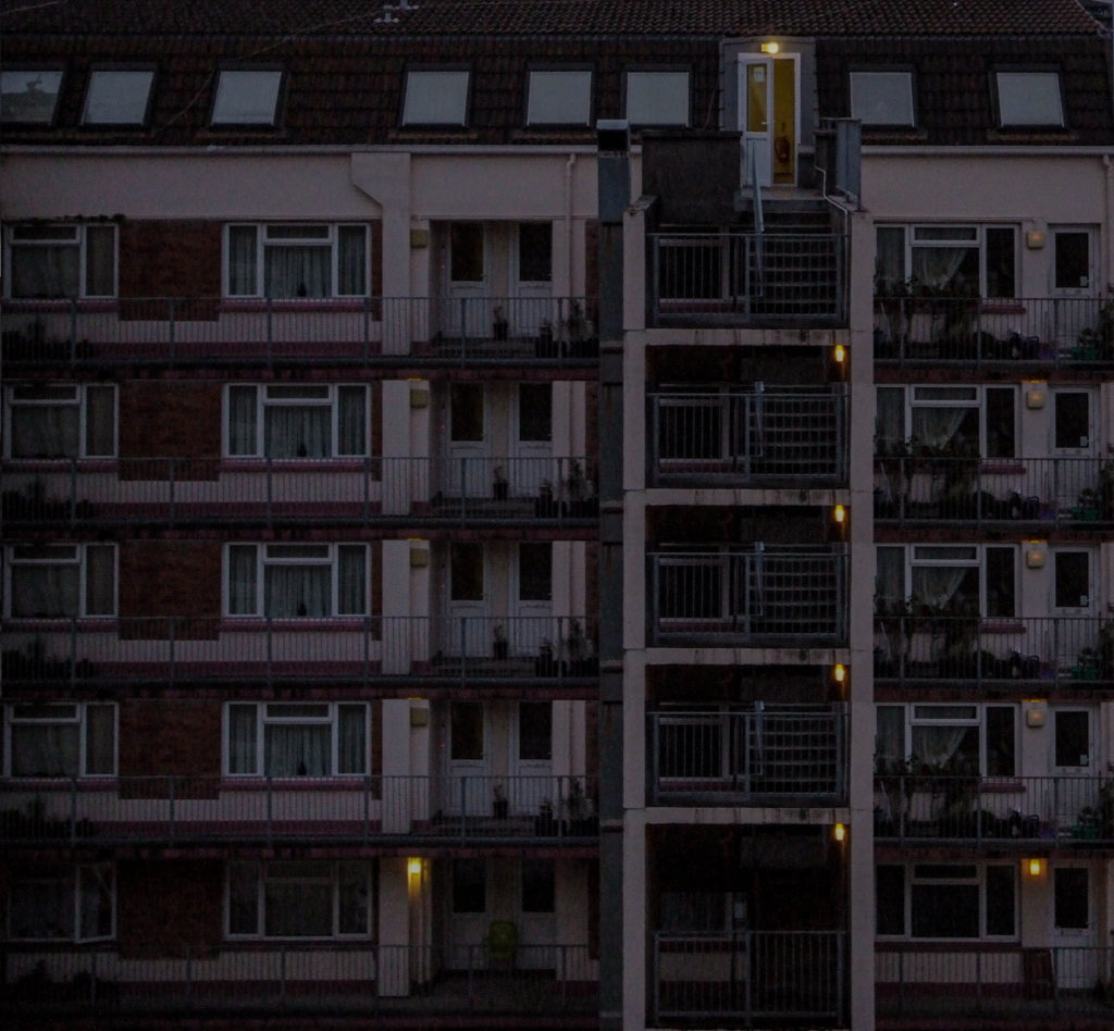
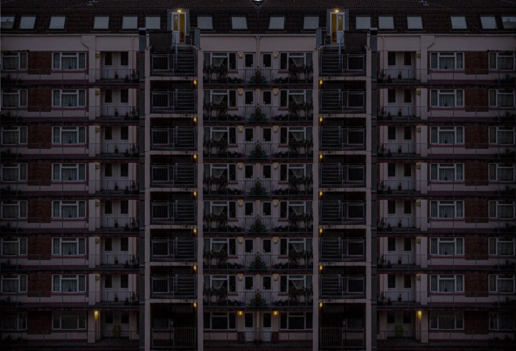
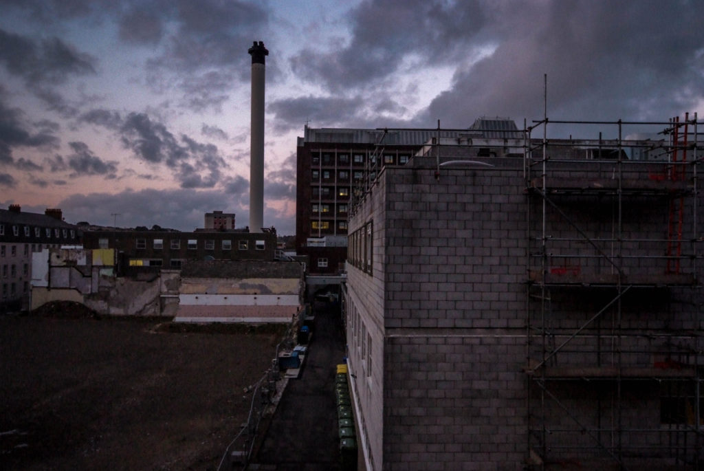
I wanted to create another montage style photo, I did this using the polygonal lasso tool to select the second level of the building in the image, and then copied and pasted the new layer, and so on.

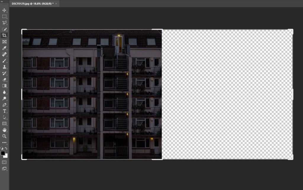
I then decided I wanted to make the image much bigger on a much bigger canvas. I did this using the crop tool to make the canvas bigger, after that I used copy and paste to create the final image.

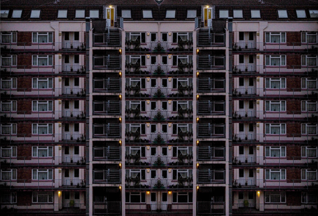
I then put the image into Adobe Lightroom and touched it up using the exposure, contrast and other lighting settings as I believe it looked a bit too dull.

Experiment 2

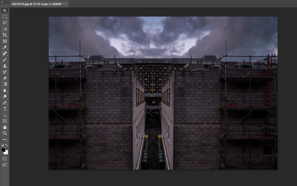
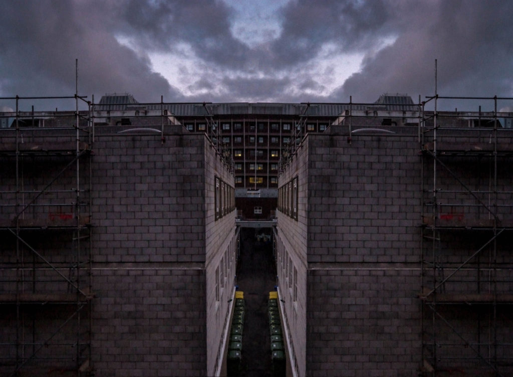
I wanted to create a double exposure type image on photoshop. I started by copying the layer and flipping it horizontally. I then cut half of the second layer off and rearranged it next to the original layer.

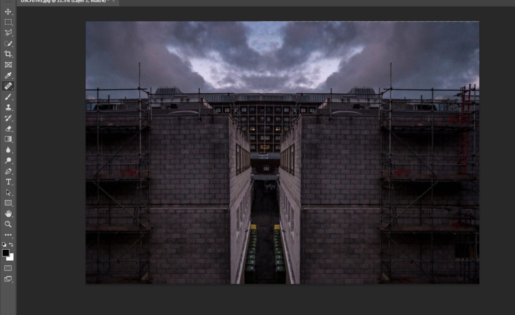
I then used the spot healing brush to fix the line down the middle where it looks slightly off where the 2 layers connect.

I then cropped the left side of the image to make both sides look even to create the final image.

Presentation Ideas

I created mock-ups on Adobe Photoshop on how I am going to present my final pieces of work.

Final Piece 1

I wanted these 3 images to be placed together on an A2 black card using window mounts to present them, shown below is a mock-up on how it would look using Photoshop.

I think using juxtaposition to create this layout with these photographs is very effective and eye- catching to viewers and works really well.

Final Piece 2

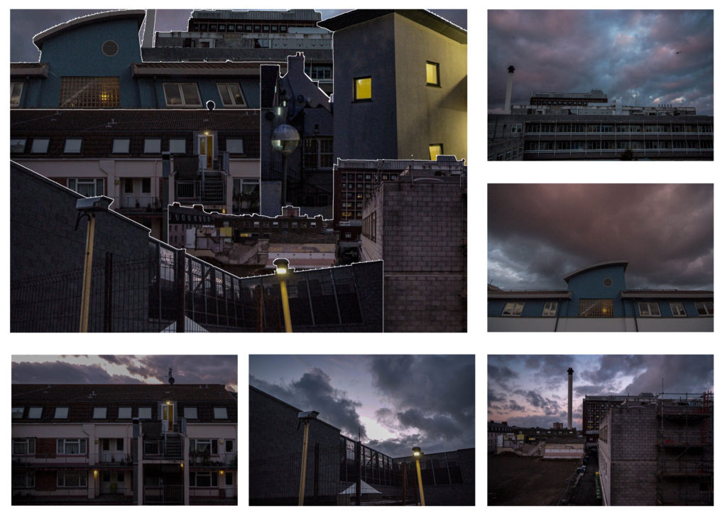
I then wanted to create a piece using the photo-montage I created being surrounded by all the photographs used in the creation of the montage itself. I will create this by using a big piece of foam board, and spray mount to mount the images onto the board, I will also have the separate images raised above the main montage image using extra foam board. The montage will be A3 sized while the other images will be A5 sized.

I think this presentation of the images works really well, and is very eye-catching to viewers. The images position next to the montage corresponds with the same images position in the actual montage photograph.

Photoshoot 1 Final Images

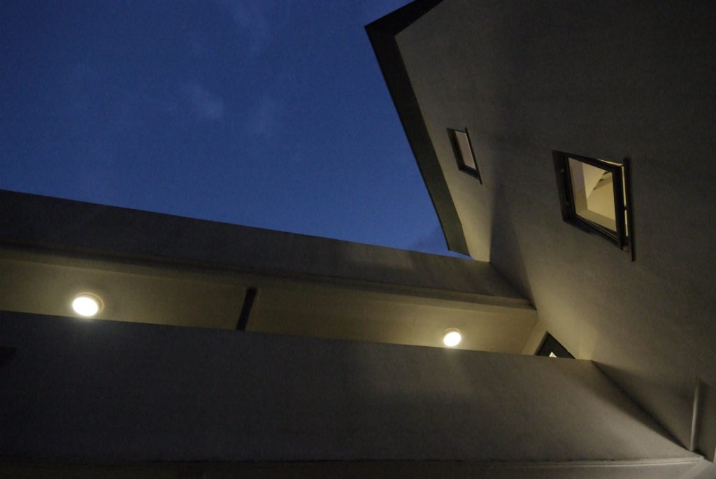
Overall I had 6 final images from shoot 1 which I would use in my final pieces of work, my work and editing was loosely inspired by the artists which I studied within the case studies.

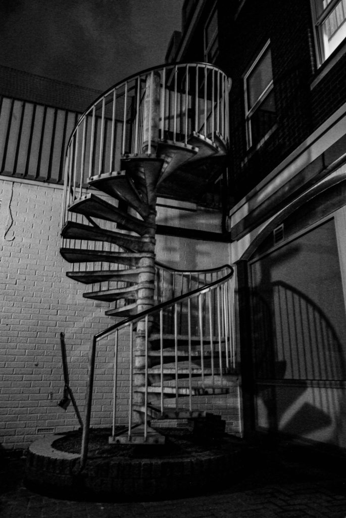
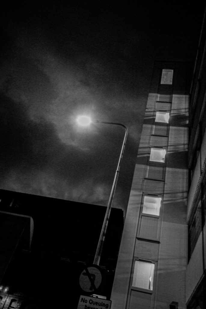
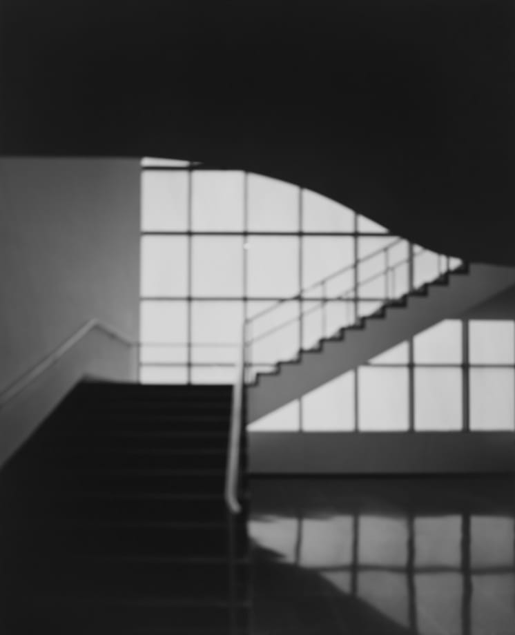
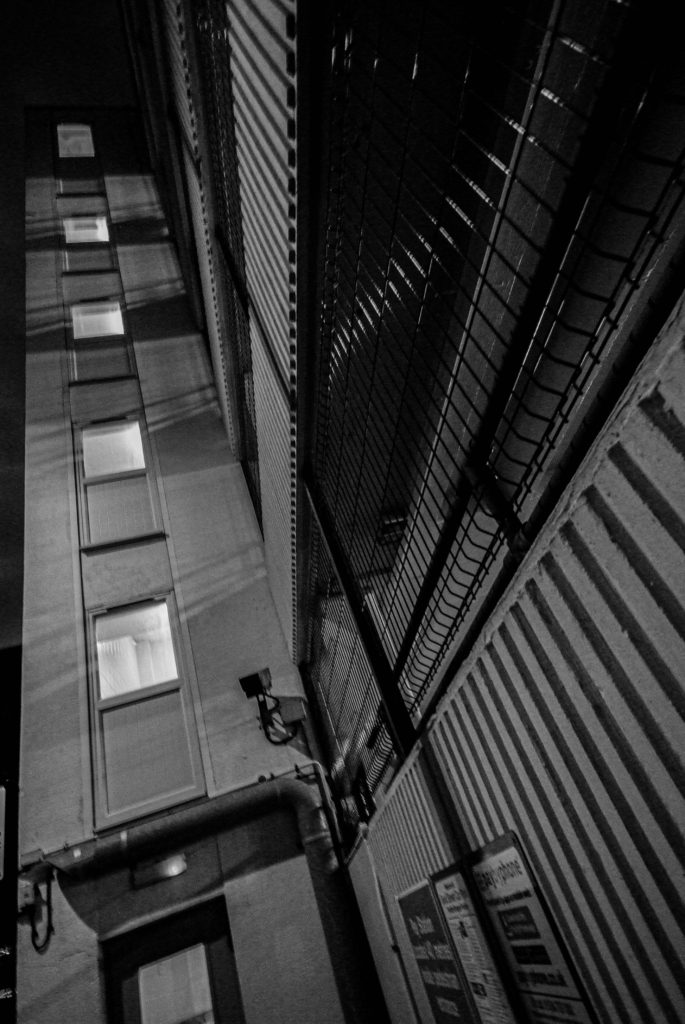
These 3 images above were inspired by the work of Hiroshi Sugimoto, who shoots architecture in black and white. Overall I believe that these images are very effective at catching the eyes of viewers.

These images above are the work of Hiroshi Sugimoto, who captured these in similar style to mine, black and white with shadows exaggerated within the images.

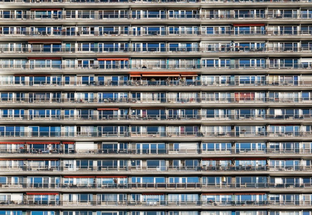
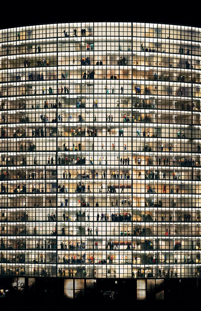
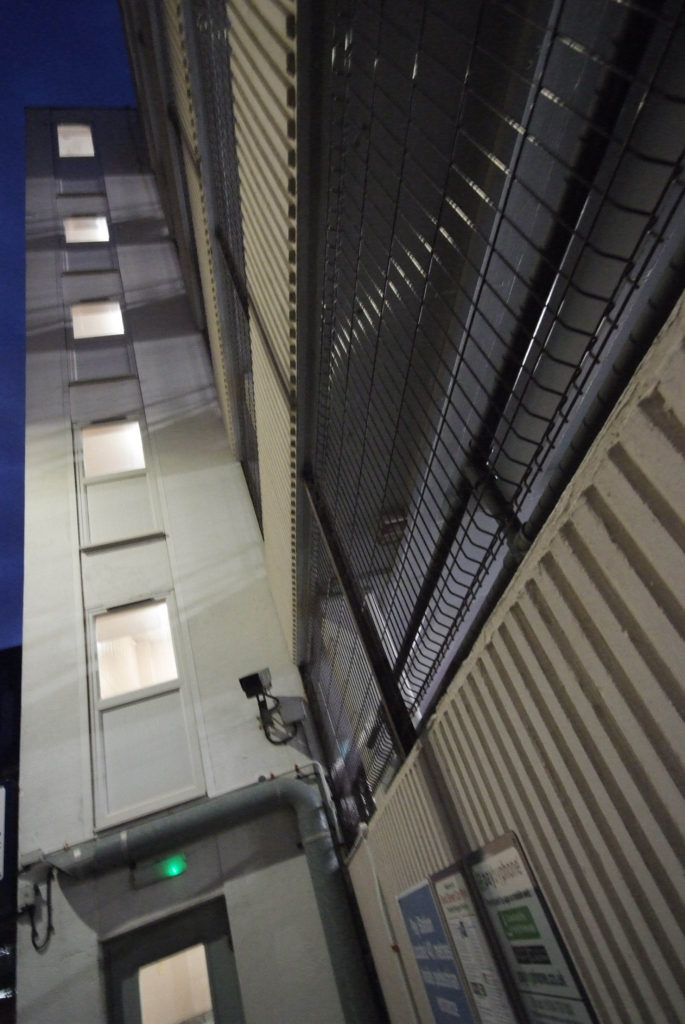
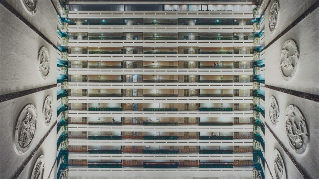
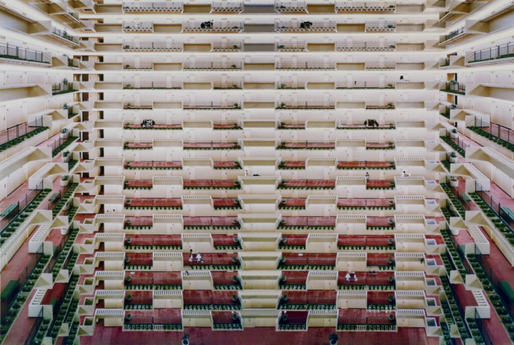
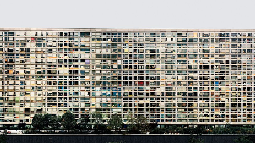
These 3 images were inspired by another artist who I studied, Andreas Gursky, who photographs buildings at large scales and detail showing off much of the buildings. I took inspiration from his work to create these pieces. The large scale and details of the photos are very effective in my opinion and are very eye-catching.

These images by Gursky, are very vast and show off a suprising amount of detail for the subjects in which he is photographing.

Final Images

Evaluation

I am very happy with the final images which I have produced from shoot 1, I believe that they are all very effective photographs and have been a good response to the topic of the project which I am doing.

Photoshoot 1 editing

Lightroom Edits

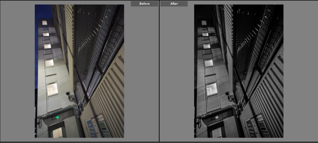
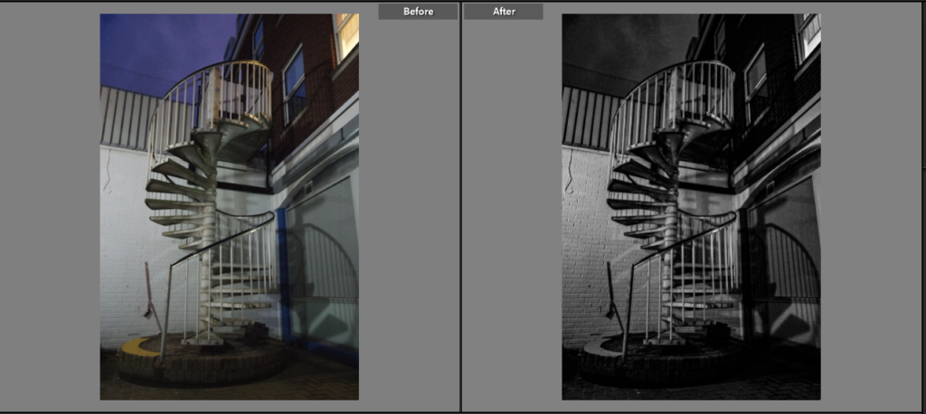
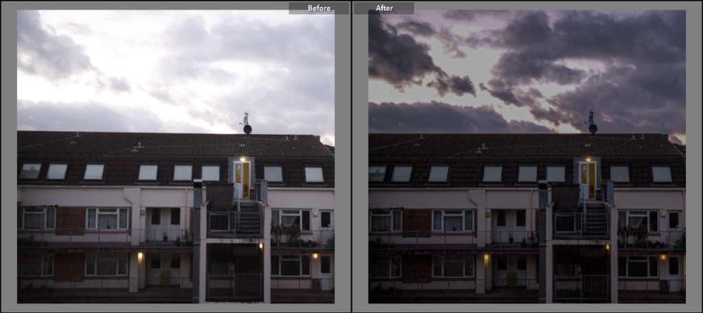
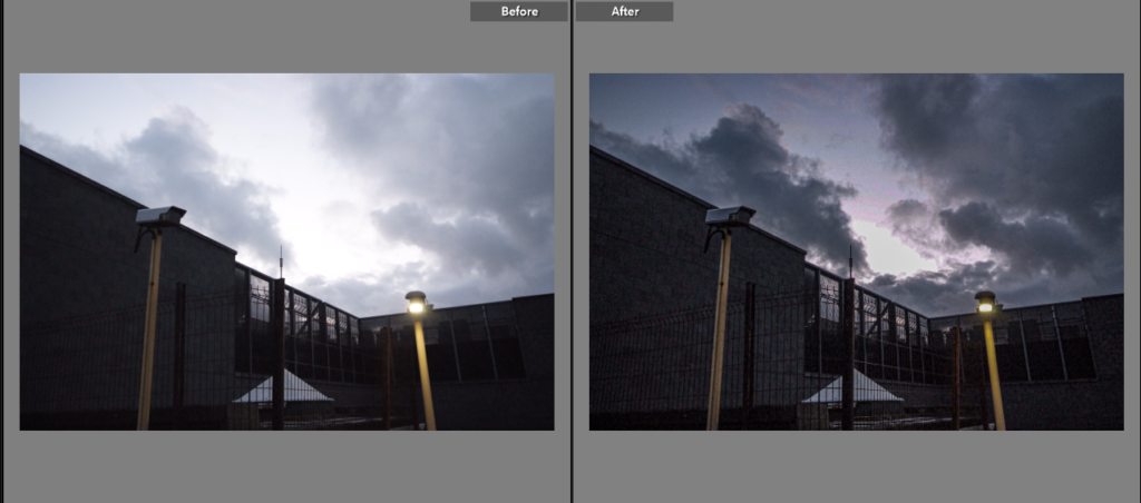
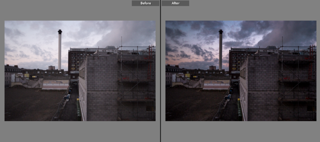
My first photoshoot provided me with 12 final images to edit and use within my final pieces. Below is a before and after of the editing made to these images to improve on them and make them stand out, the before picture is on the left, while the after picture is on the right. I experimented with both coloured and black and white images, as some of these final images looked much more effective as black and white.

This image looked much more effective in black and white, and the editing really brought out the shadows within the image to create a cool effect.

This image too looked better in black and white, and once again the editing really brought out the shadows making it look much more effective.

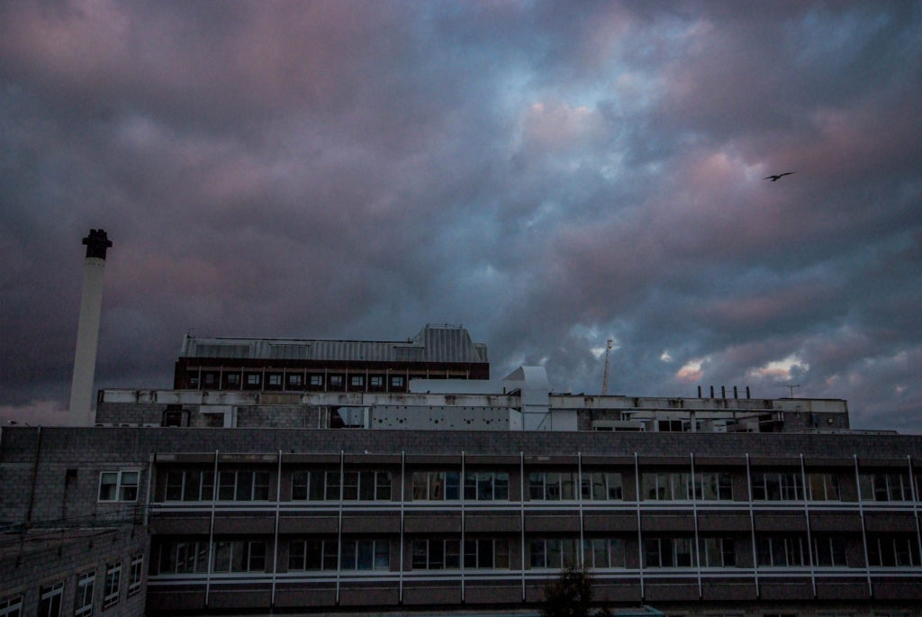
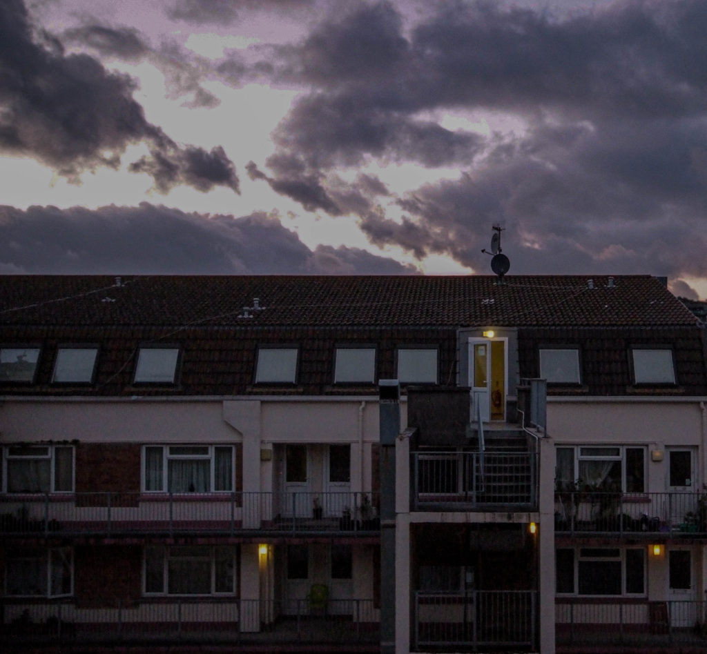
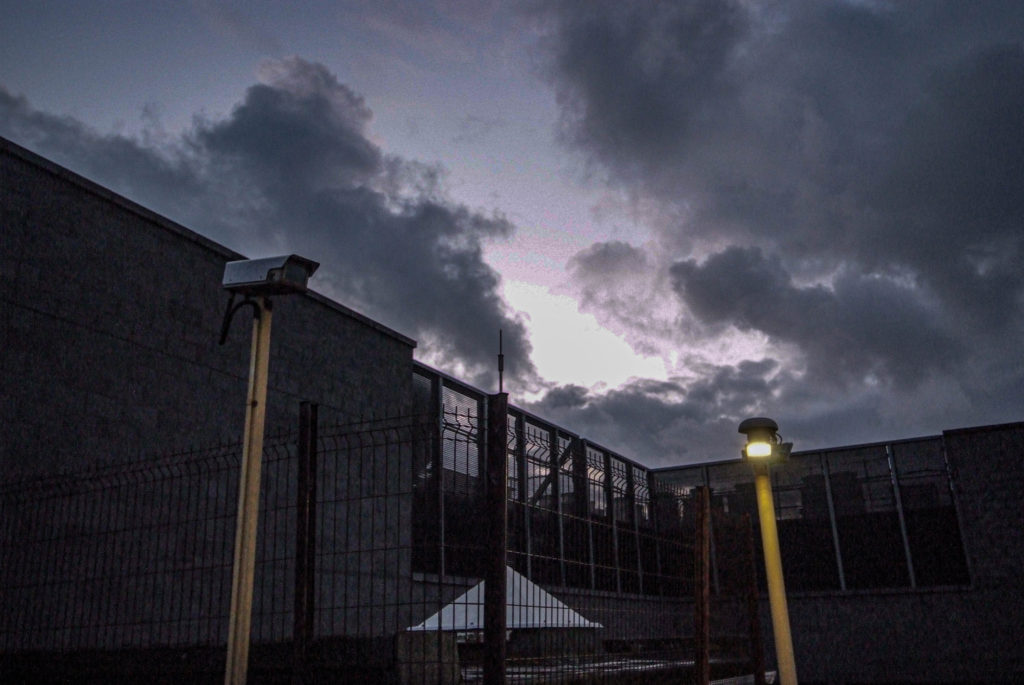
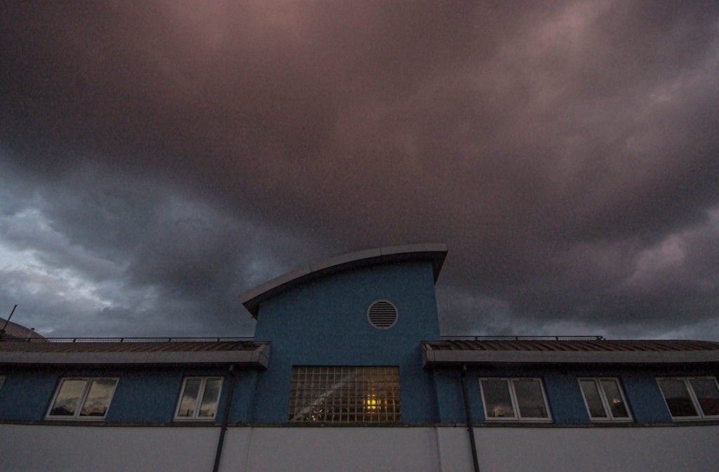
Using editing brought out the colours in the sky and made it look much more unique and really added to the image, as well as this the sky now contrasts much better with the building.

Once again the colours of the sky have been brought out much more, making the image stand out a lot better than it did before.

The sky has been brought out a lot more after editing making the image look much grander, as well as this the editing has brought out much more detail in the image making it look more effective.

Final Edits:

Further/Advanced Edits

For further editing, I wanted to create a photomontage of my various images all in one to create a unique looking final piece, I created this using Adobe Photoshop.

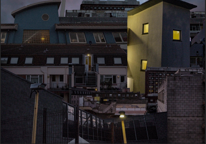
Images used:

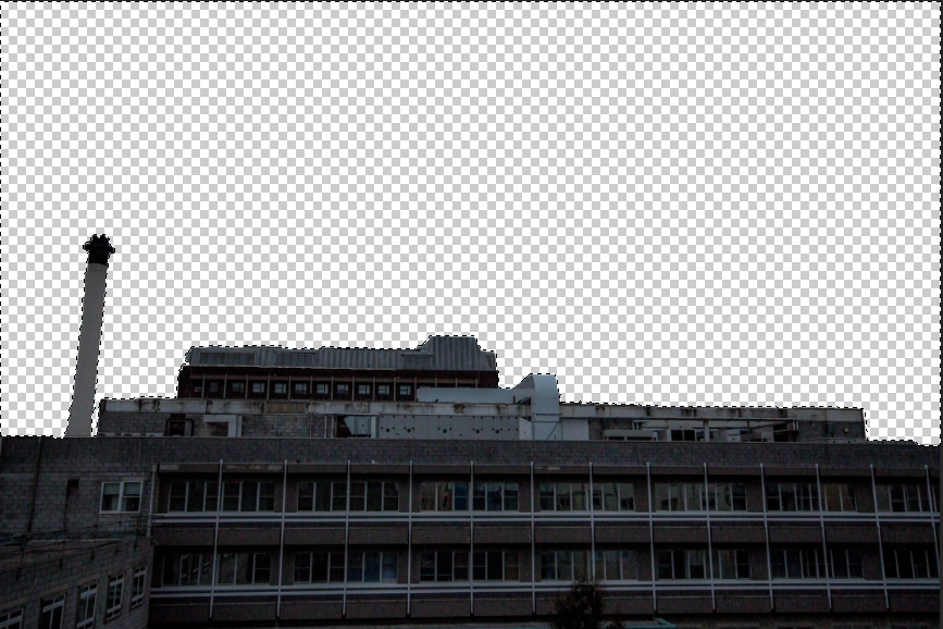
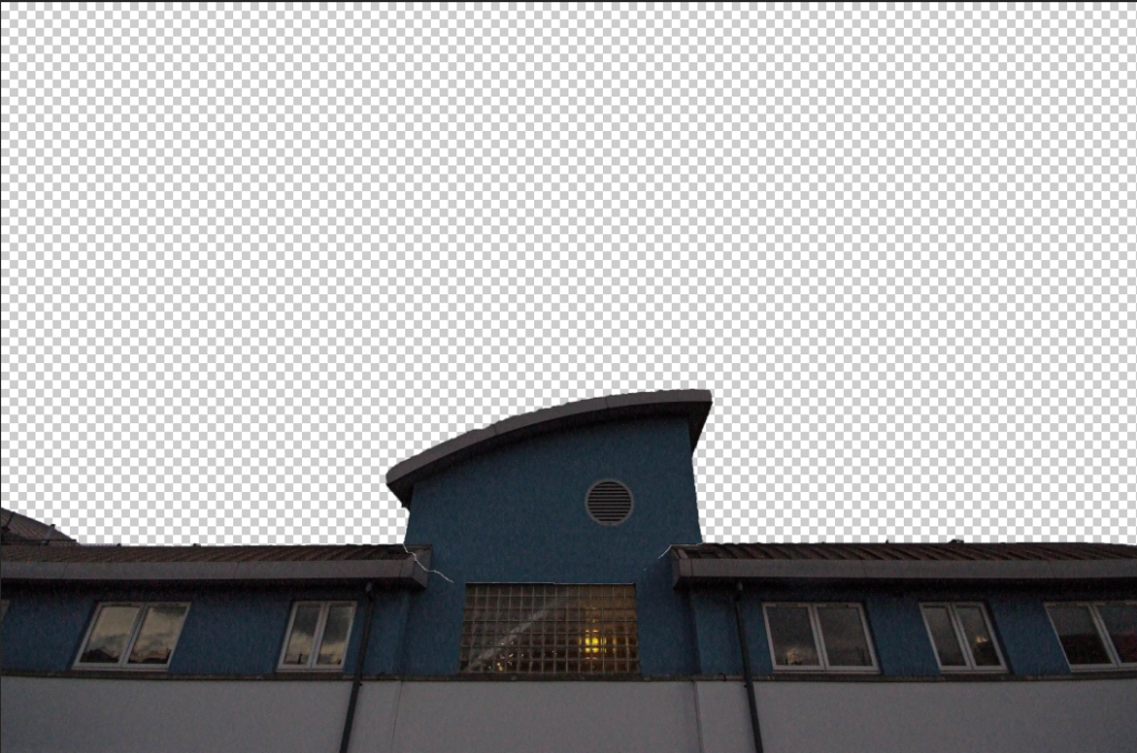
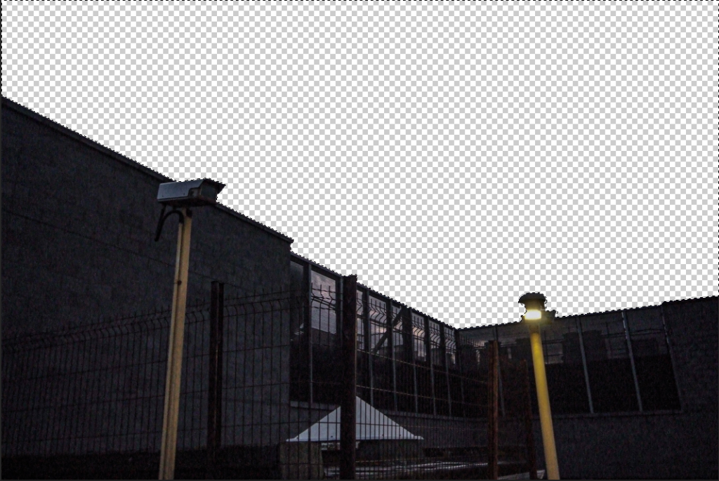
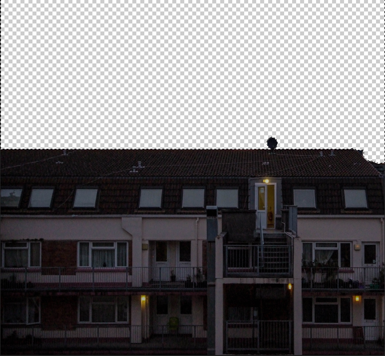
To start off I used an A3 landscape print within photoshop and started by removing the sky from each of the images:

I then arranged the buildings in the A3 document in a position which I liked.

After much experimentation I decided to go with this layout of the buildings in the document.

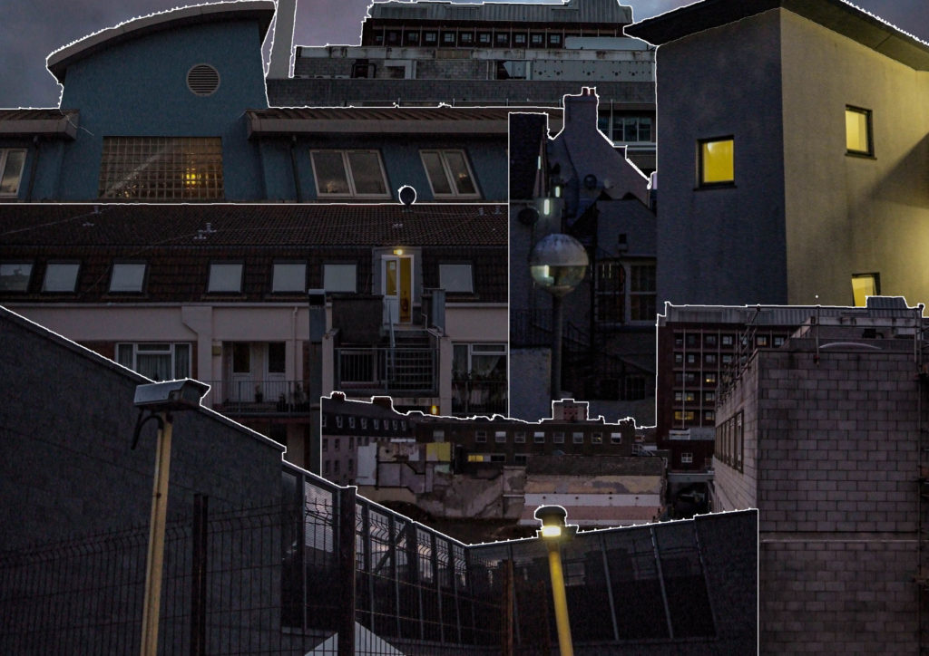
I then decided to add a stroke to each of the layers within the image, I think this really adds to the image and makes it look much more like a photomontage.

Final Piece:

Evaluation:

Overall, the editing of shoot 1 really brought out the effectiveness of the photographs taken, and I believe that some of these photographs have come out really well. To improve I would have experimented with more ideas other than just photo montaging to create different and unique results.

Photoshoot 1

Photoshoot locations

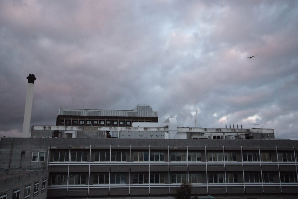
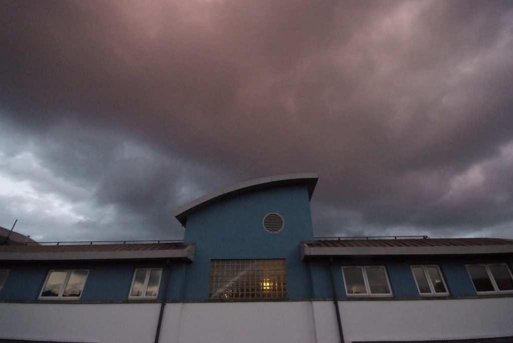
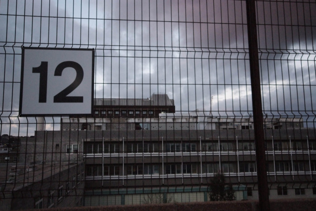
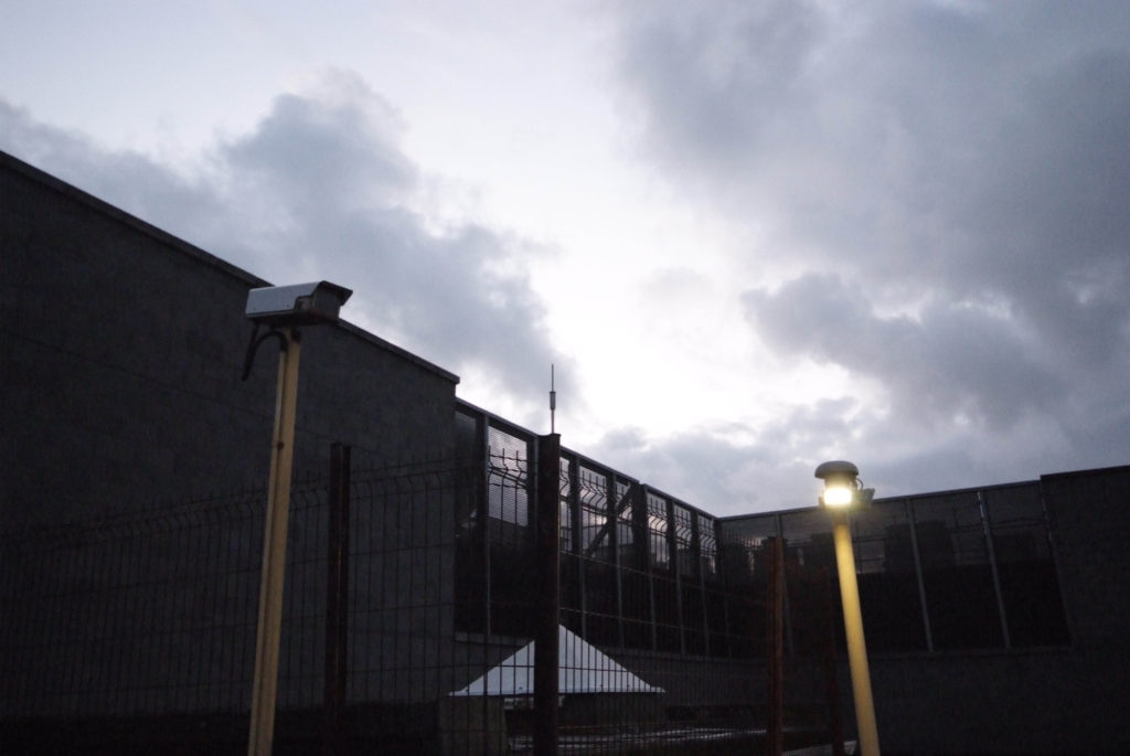
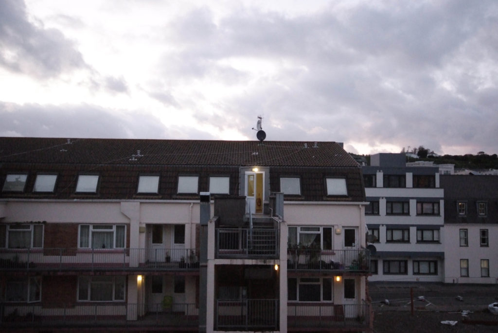
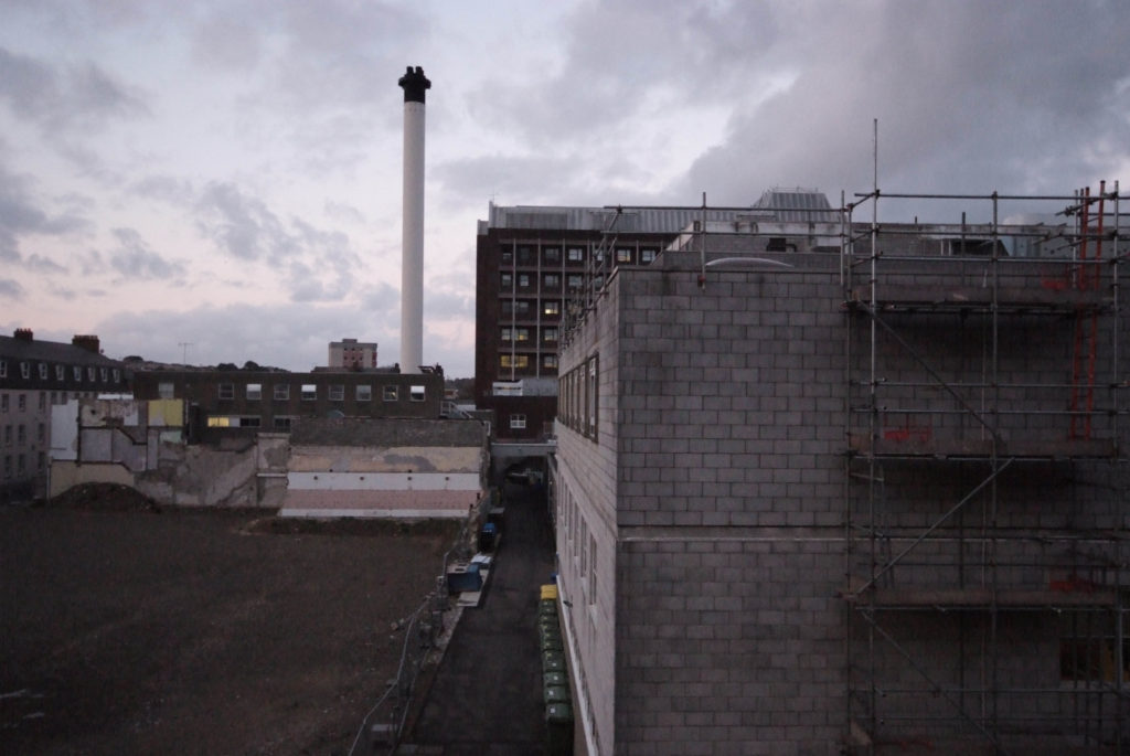
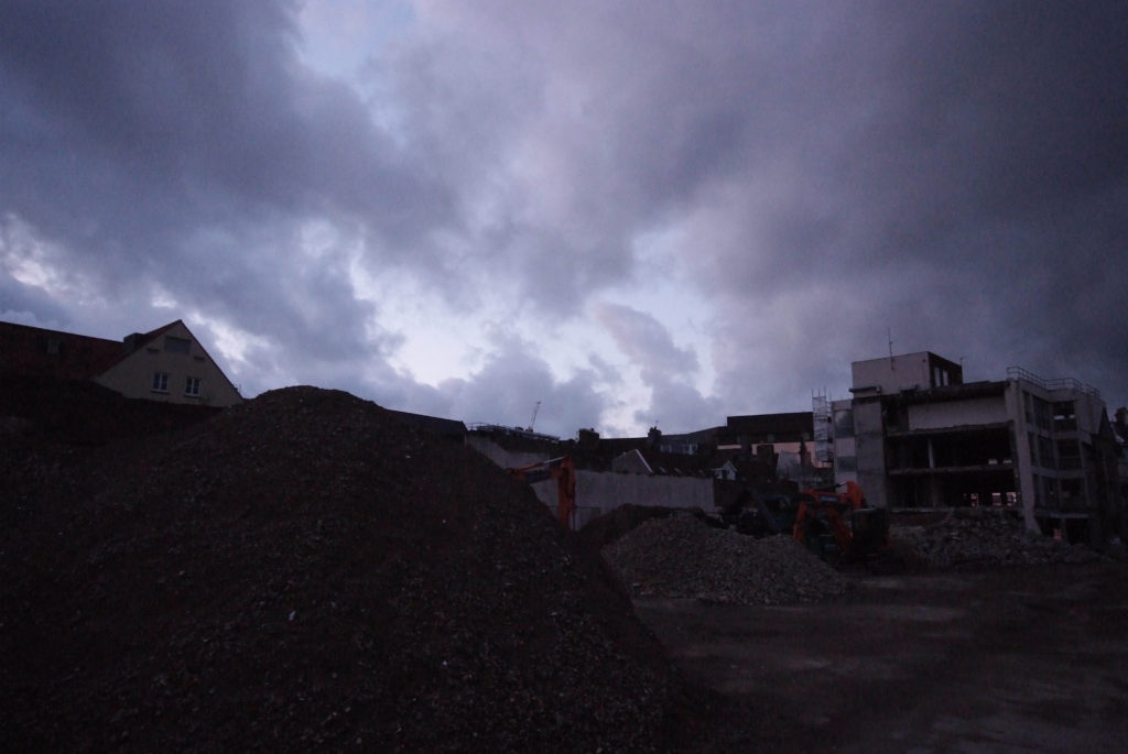
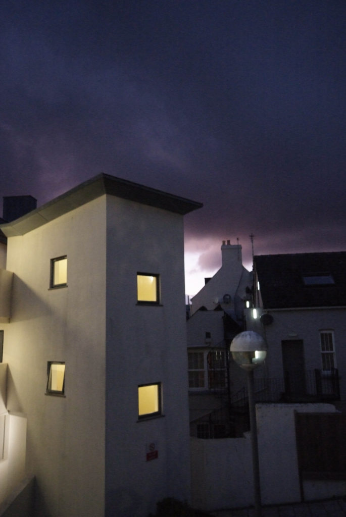
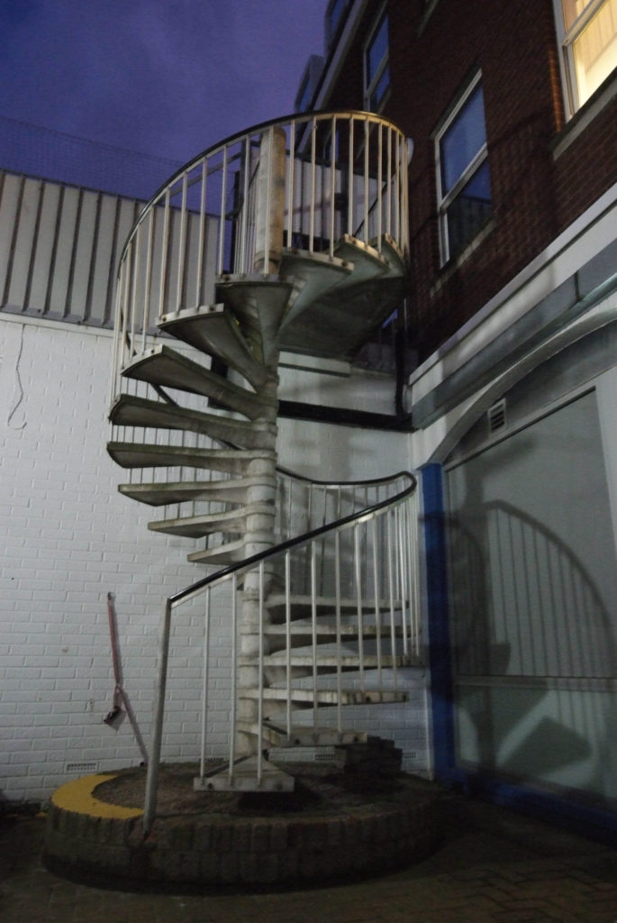
For my first photoshoot I took photographs around areas of St. Helier, From high areas of elevation such as multi-story carparks as well as some apartment complexes. The weather during this photoshoot was cloudy and went from around sunset into early night time with a bit of darkness. I believe the time of day and the weather made these photos come out very effective, and contrasted well with the subjects I was photographing.

Contact Sheets

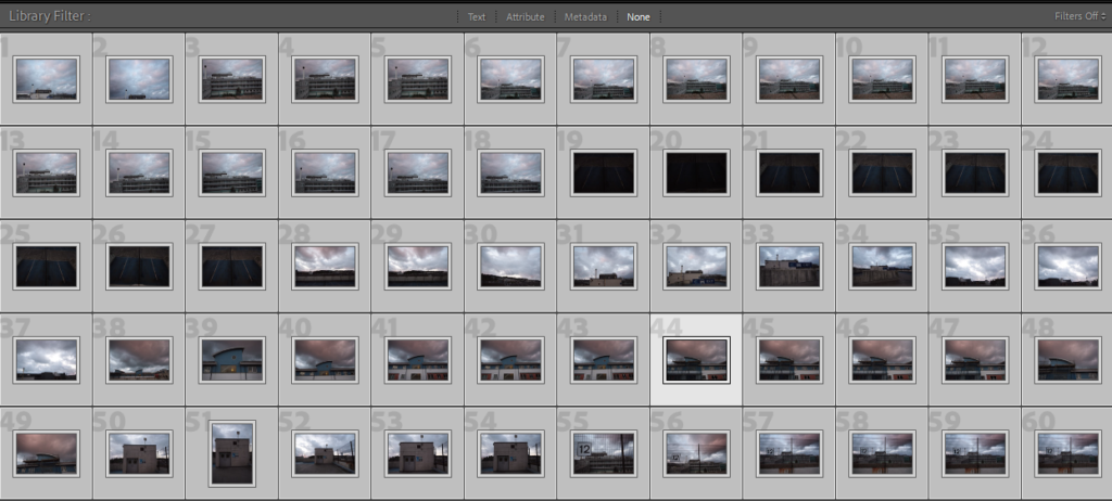
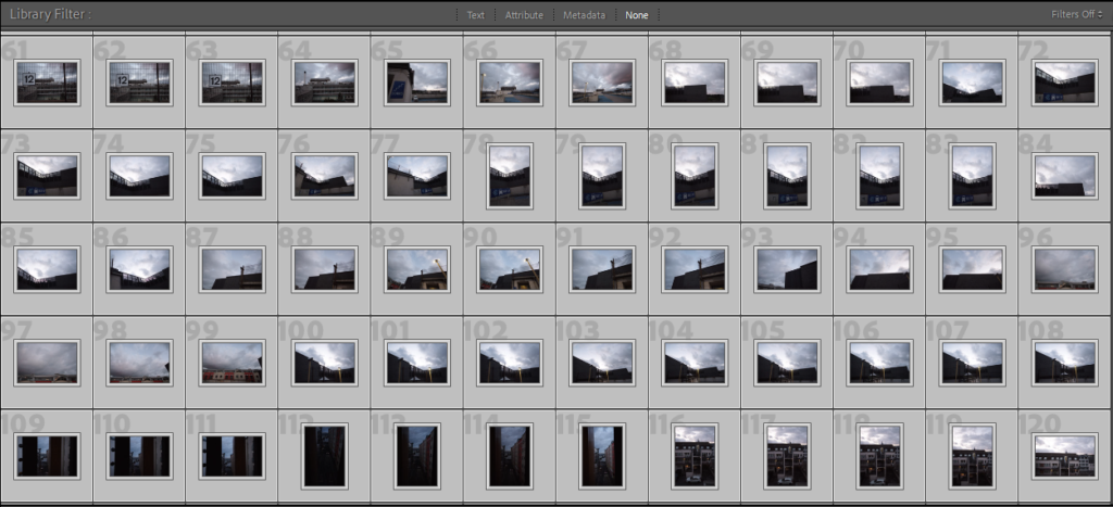
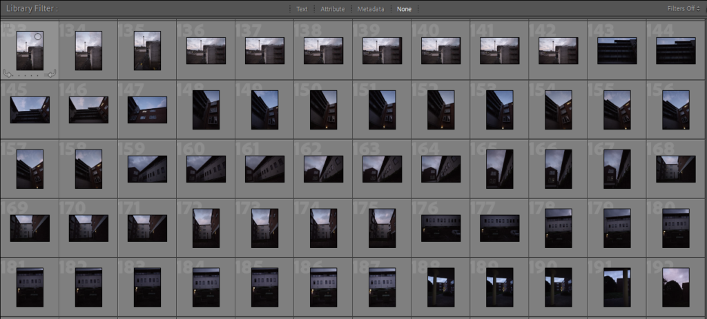
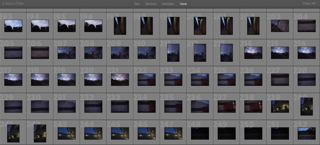
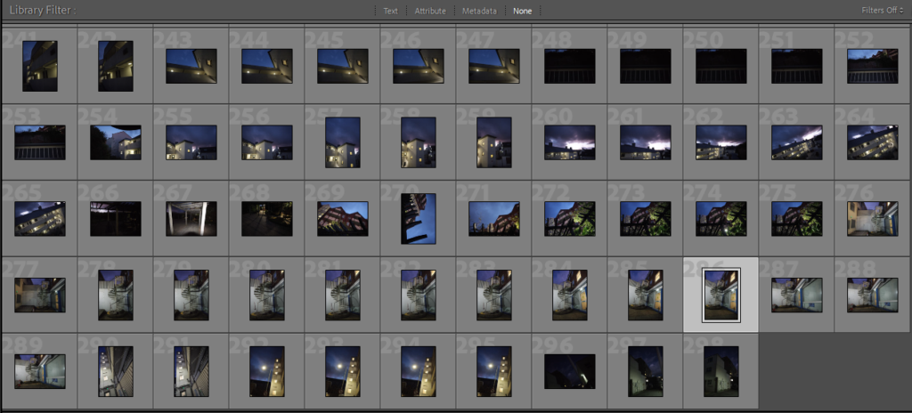
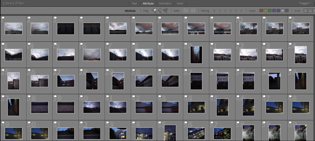
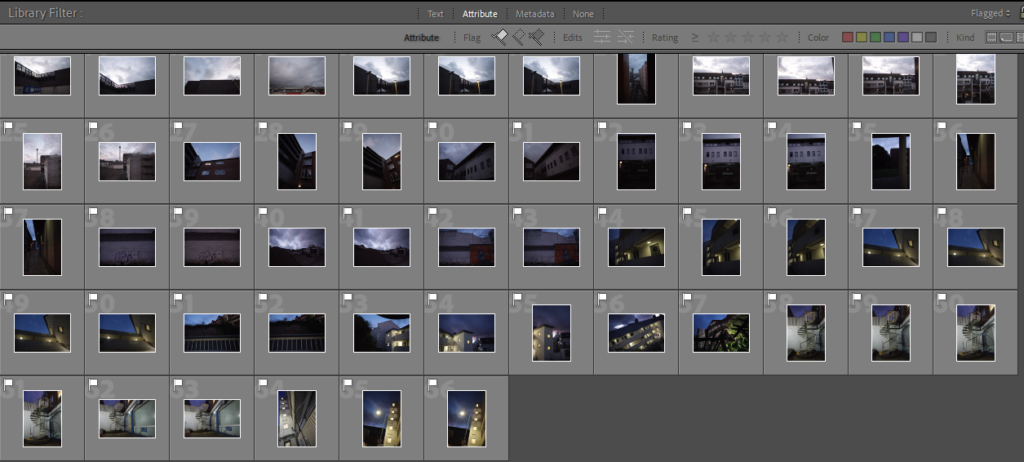
From photoshoot 1 I captured 298 photographs, I used the pick, reject flagging system on Adobe Lightroom to select my favourite images. From using this system I came up with 66 images which were my favourite from this photoshoot.

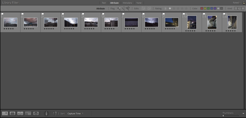
After this I then once again narrowed down the images even more using the star rating system on Lightroom, the best images I rated 5 starts, which I would use in my final pieces.

Best Images from the shoot

Using this rating system on Lightroom left me with 12 final images to edit and use within my final pieces. The images below are the unedited versions of my favourite/best images from this photoshoot.

Evaluation

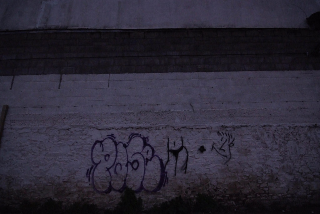
Overall, I believe that this photoshoot went well, some images came out too dark or slightly blurry but apart from that there were no problems with the photographs. To improve I would have brought a second camera lens with me to capture various different shots of the same subjects to improve the amount of photographs I could have used for my final pieces.

Photoshoot Plans

First Photoshoots

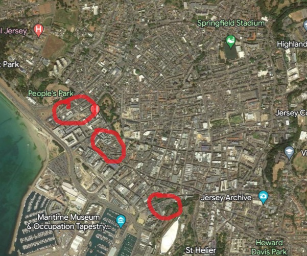
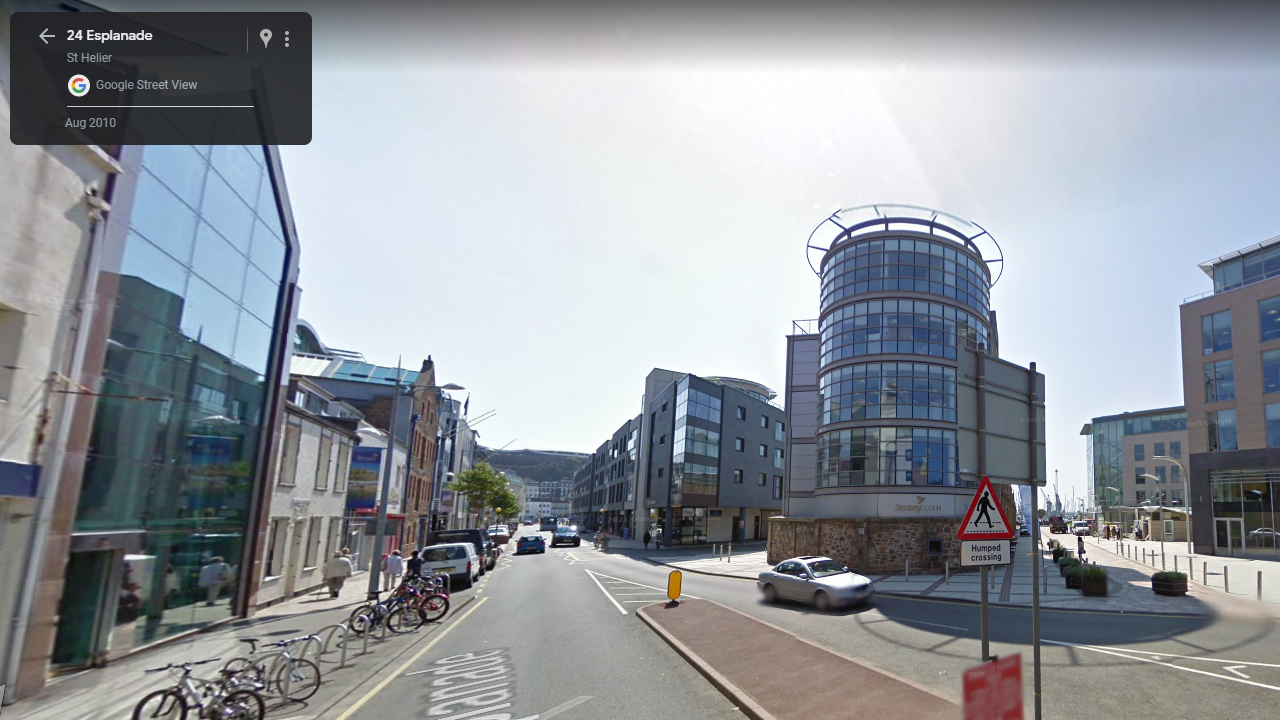
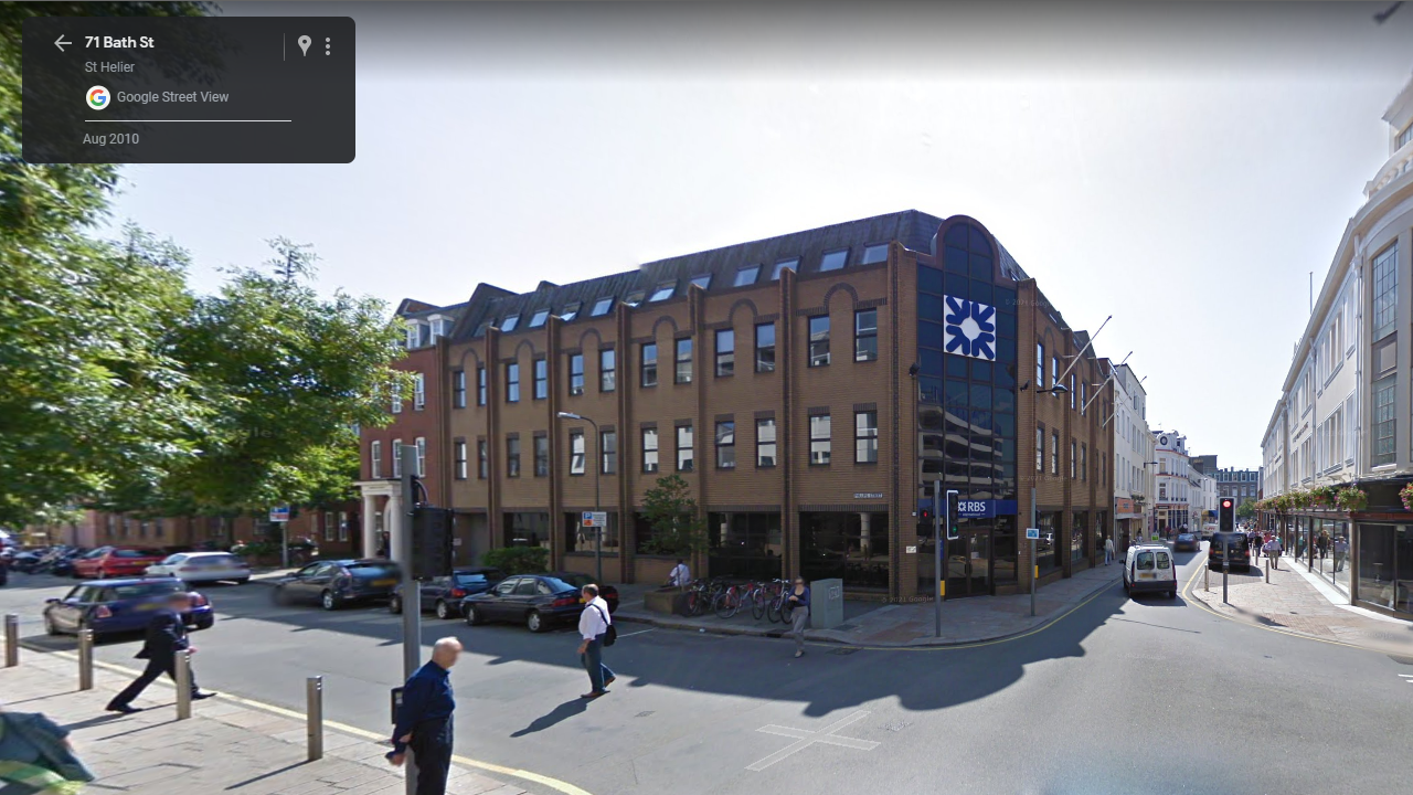
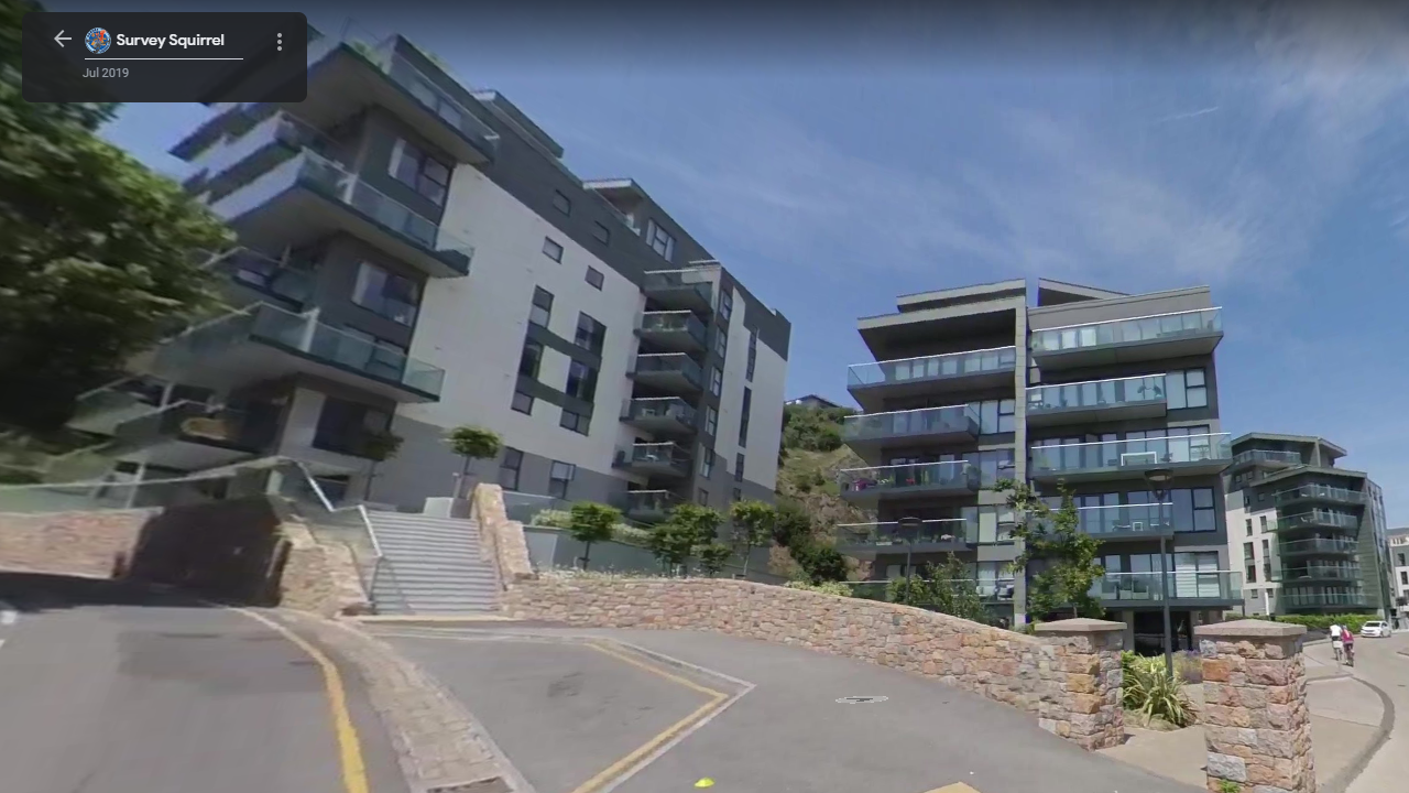
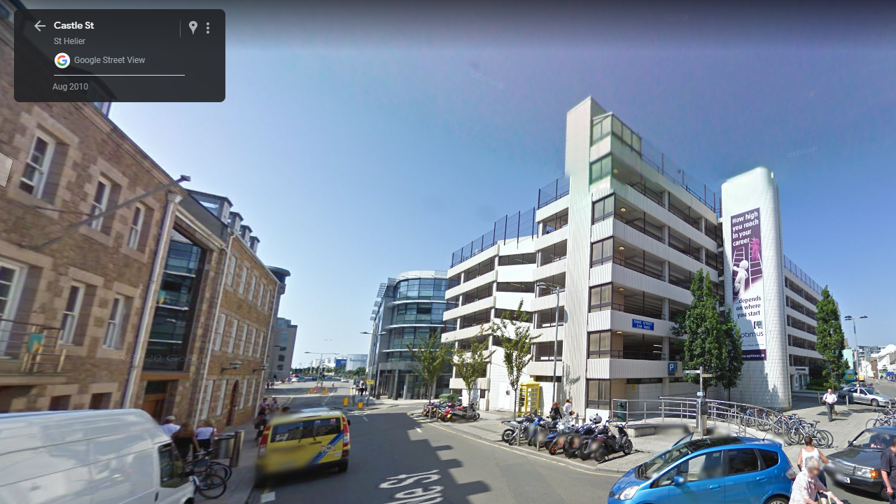
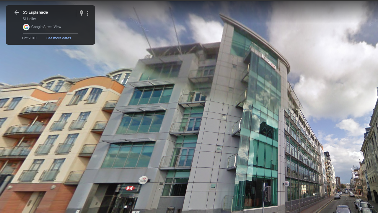
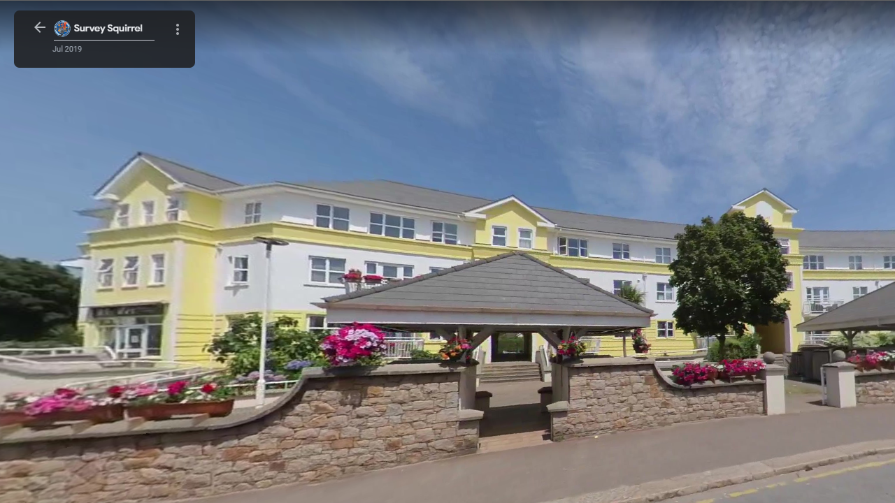
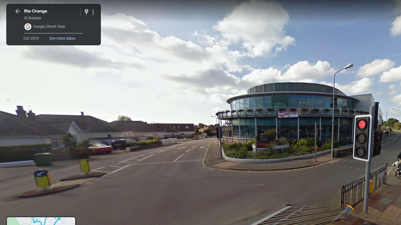
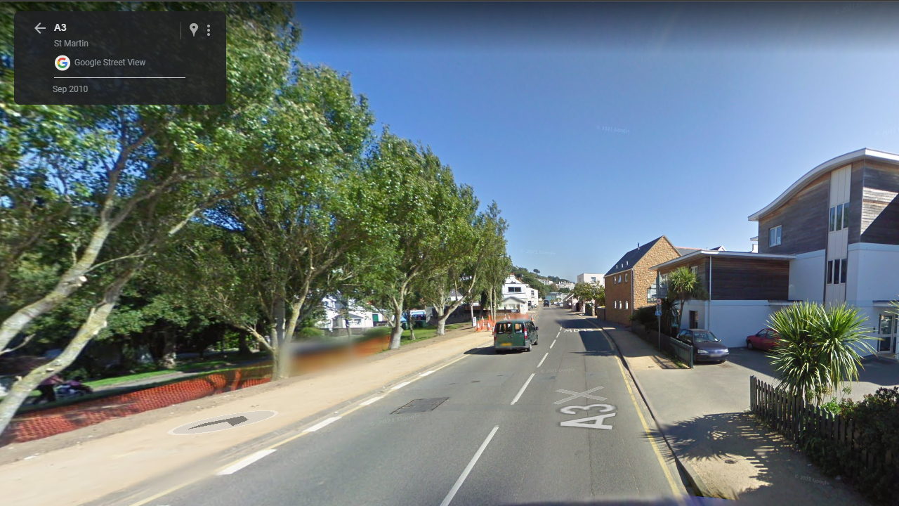
My plan for my photoshoots is to walk around different areas of St. Helier photographing the architecture using different angles and lighting to capture some interesting shots of buildings, as well as this I would like to photograph during different times of the day to create different results of images. Using google maps, I have screenshotted areas of interest within Jersey to photograph for my project. I am aiming to produce 3-4 photoshoots of the architecture around St. Helier.

Additional Photoshoots

For my additional photoshoots, If I wish to take more photographs, I will focus on out of town architecture, such as places like Gorey and Red Houses, I will do this to create a variety within my images.

Statement of Intent

  • What you want to explore?
  • Why it matters to you?
  • How you wish to develop your project?
  • When and where you intend to begin your study?

My plan with this project is to focus on the simplicity and complexity of the landscapes and architecture of the place I live, Jersey. I have studied 2 artists/photographers, Hiroshi Sugomito and Andreas Gursky, who I believe fit into my ideas perfectly as they both demonstrate the simplicity and complexity of architecture and landscapes within their work. I would like to document the architecture and landscape of Jersey because, I believe it is important to appreciate the land around yourself, especially when it is the place you have grown up. My plan is to shoot 5-7 photo-shoots of different landscapes and architecture in and around Jersey in order to ensure I am fully prepared for my exam. I also want to experiment with taking shots at different times of the day and during different weather conditions. I also want to explore the use of photo manipulation to create various different outcomes of work. I want to use techniques such as, photo montaging, juxtapositioning, multiple exposure shoots as well as using Adobe Lightroom and Photoshop to create some interesting and effective outcomes. I plan to start my study straight away in order to give myself enough time to capture a lot of the island.
Artist Case Study: Andreas Gursky

Andreas Gursky is a German photographer known for his large-scale, highly-detailed photographs of architecture, landscapes, and everyday objects. Born in Leipzig, Germany in 1955, Gursky studied photography at the Folkwang University of the Arts in Essen, Germany and later at the Düsseldorf Art Academy under the tutelage of the influential photographers Bernd and Hilla Becher.

Gursky has exhibited his work internationally and has been the subject of major retrospectives at museums such as the Museum of Modern Art in New York and the Tate Modern in London. He has won numerous awards for his work, including the Hasselblad Award in 1998 and the Infinity Award for Art from the International Center of Photography in 2007.

His Work

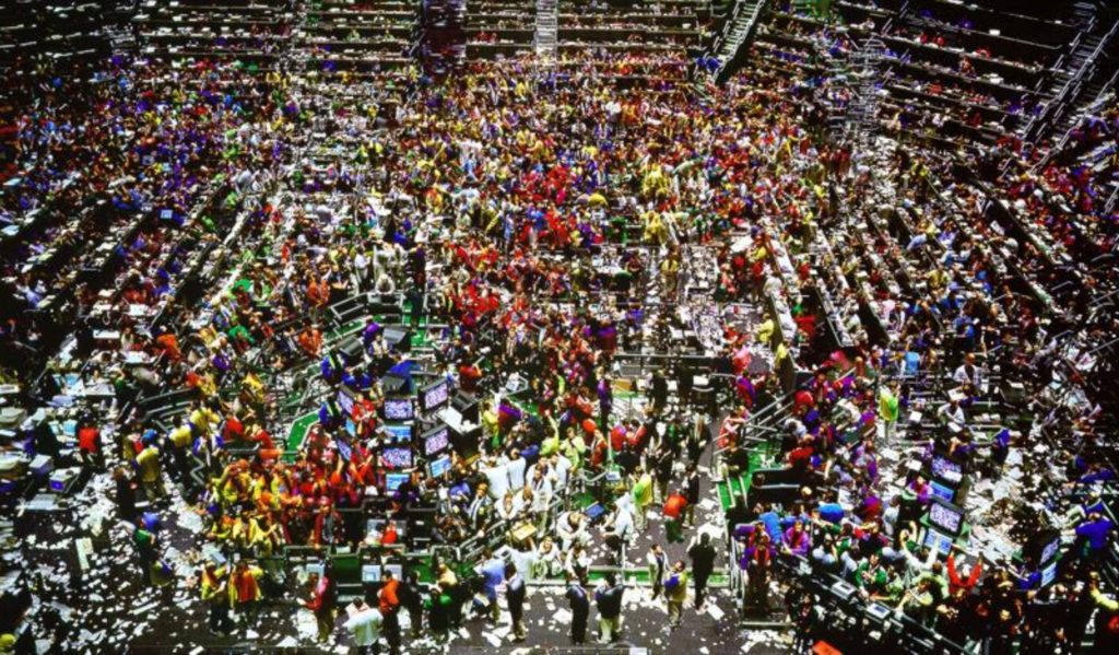
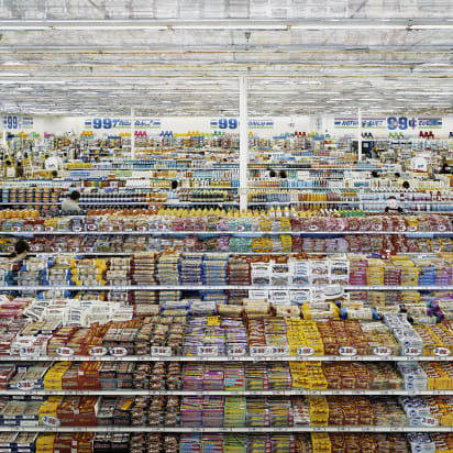
Gursky’s photographs often feature vast, complex spaces such as supermarkets, factories, and stock exchanges, which he photographs from a distance and with a bird’s eye view perspective. His photographs are meticulously composed, often taking weeks or even months to prepare and shoot. He uses digital manipulation techniques to create highly-detailed and often surreal images, pushing the boundaries of what is traditionally considered photography. His photographs challenge the viewer’s perception of space, time, and reality, often featuring a bird’s eye view perspective that emphasizes the scale and magnitude of the spaces he photographs.

Andreas Gursky’s work has a profound impact on viewers due to its ability to challenge and transform the way we see and experience the world around us. His large-scale, highly-detailed photographs of vast and complex spaces have a disorienting effect, often leaving viewers feeling overwhelmed by the scale and magnitude of the environments depicted. By depicting spaces and objects in such a hyper-realistic manner, Gursky’s work encourages viewers to question their assumptions about the world and our place within it. His photographs challenge us to consider the relationship between humans and the built environment, as well as the impact of technology on our perceptions of space and time.

Image Analysis

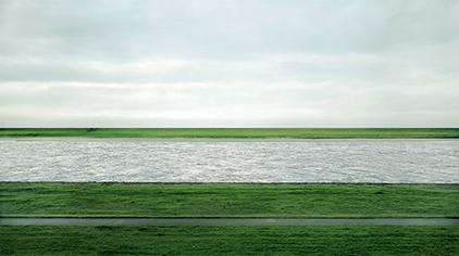
Rhein II - Wikipedia
Rhein II

At first glance, this image appears to be a simple and serene image of a river flowing through a flat, rocky landscape. However, on closer inspection, it becomes clear that the image has been heavily manipulated and stripped of all human elements, creating a surreal and otherworldly scene. Gursky’s use of digital manipulation techniques is particularly evident in the image’s strikingly uniform color and tone, which give the river and surrounding landscape a flat, almost monochromatic quality. The image is also highly detailed, with individual rocks and ripples on the river’s surface rendered with exquisite precision. The absence of any human presence in the image creates a sense of timelessness and emptiness, as if the landscape has been frozen in time. The river and surrounding rocks seem to stretch on forever, creating a sense of vastness and infinity that is both awe-inspiring and unsettling.