All posts by Emily Bowker

Filters

Author:
Category:

Photoshoot 1

What was photoshoot 1?

Photoshoot 1 consisted of me working within the style of Andre Kertesz, which can be seen in images which I have produced of still life objects such as spoons/forks/bowls/etc, and Jaroslav Rossler, consisting of reflections in different glassware/perfume bottles/etc. I really enjoyed this photoshoot as it was done during the night so I could use a spotlight to manipulate where I wanted the shadows to fall of my different objects, changing the composition of them entirely. I also like how I focussed on using one object as my main focus for this photoshoot, as it provided one main object for me to focus on which I found to be easier to work with, but for my other experimentation in different photoshoots I will also focus on using groups of objects as well.


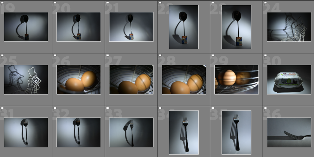
Most successful shots –
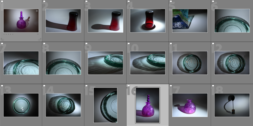
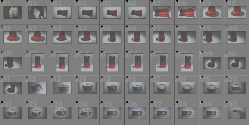
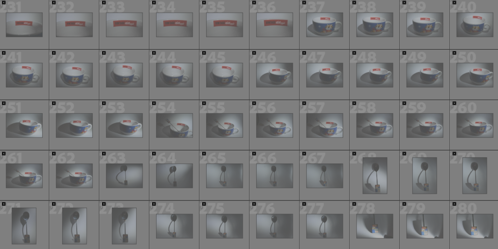
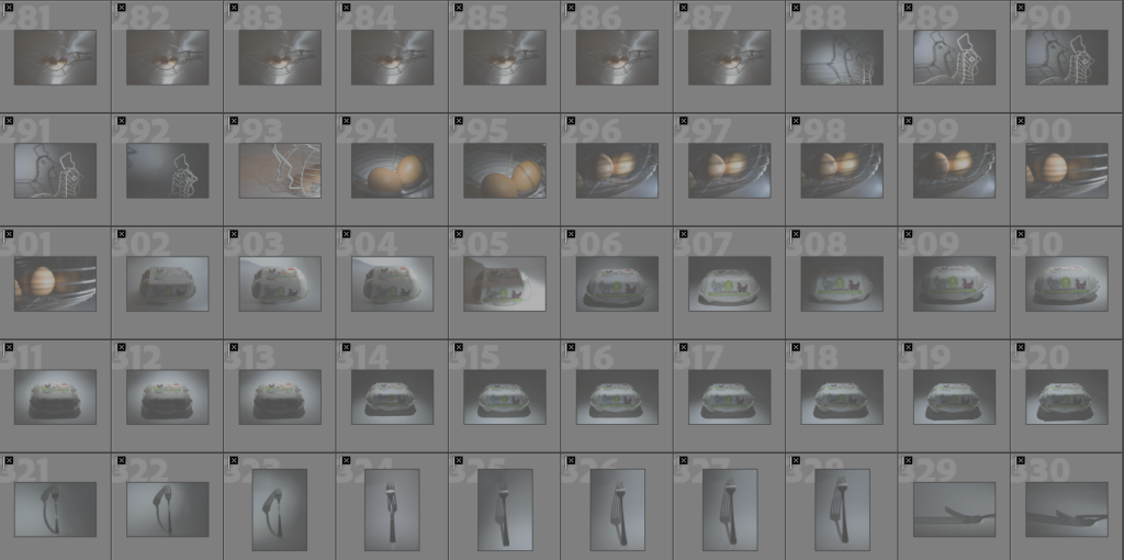
Above are images which I selected on Lightroom to be my most successful shots, this is because I feel as if these images explore the theme of reflections within still life well as they create different types of patterns on the background which makes them stand out against one another in different ways due to the various refection patterns created, just like Jaroslav Rossler’s work as he also experiments on the photography of different reflections from various objects. I also think that the photographs of objects such as spoons, forks, egg bins, etc are a good representation of still life in the style of Andre Kertesz because the shadows which have been produced are bold and stand out well due to this. I have further selected 10 main images which I would like to experiment more with and focus on editing below through a selection process.

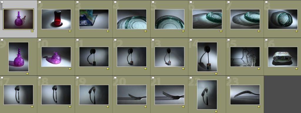
Colour coding and rating –

To begin my selection process, I began by organising my images into green (the images which I wanted to work further with as I thought they were potentially quite successful) and yellow (the images which I was still unsure of, potential wise and did not want to work with). This process made it easier for me to determine which photos I wanted to use for further experimentation, such as manipulating through photo editing, and what photo’s I didn’t want to use. I really liked the photos which had bold shadows which stood out well against the white background as this was the effect which I was wanting to create, showing influences of Andre Kertesz. I also liked some reflections of different glassware such as the large blue plate as it created a variety of different shadow formations to use, which I thought was really unique as they were unusual.
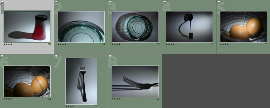
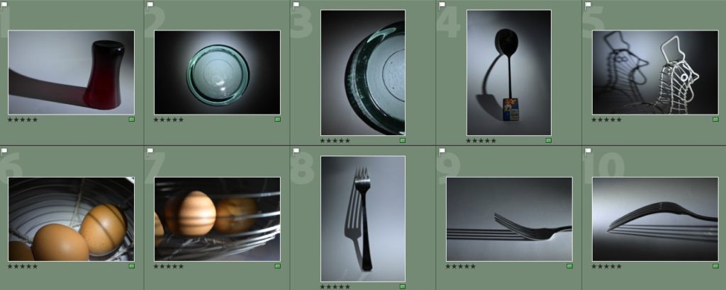
To further my selection process down to a small amount of photos to use, I also decided to use the rating system on Adobe Lightroom. This meant that I would go through the photos that I had chosen to be green and give them a rating of either 4 stars (this meant that I still was unsure of them) or 5 stars (photos which I thought were really successful and I wanted to experiment with). This was a relatively easy process as I was able to further analyse my photos for what they consisted off and how they were composed which led to me deciding on having around 10 or so images which I could work on further when editing.

Evaluation of some images I chose to be my most successful –
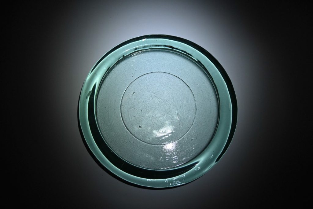
Image 1:

  • The colour of the glass plate is distinct and stands out well against the white backgorund.
  • The dark shadow around the plate acts as a framing tool for it.
  • The circular darker shadow around the plate which is seen on the white background draws your attention to the middle of the photograph.
  • The plate resembles an item that you might find from older times as it looks quite worn in some places, but is still in a good condition.
  • As the framing is done landscape you are able to see the whole plate, and with further editing on the sides there will only be the plate and no excess dark space which I like.

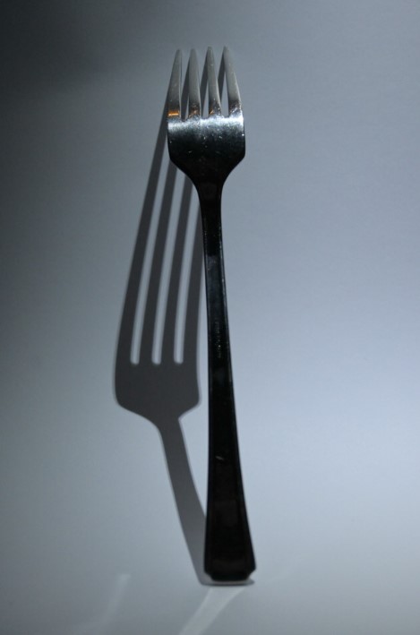
Image 2:

  • The framing makes the fork appear to be the main focus of the photograph as your eyes fall on to the shadow behind.
  • The shadow behind is bold and stands out well.
  • Due to the use of spotlight lighting, the shadow is able to be manipulated which makes it look distorted in comparison to the actual size of the fork.
  • For further editing, I will crop the photo more to make the fork centred within the frame as it is slightly wonky.
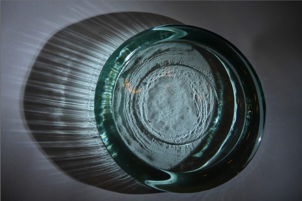
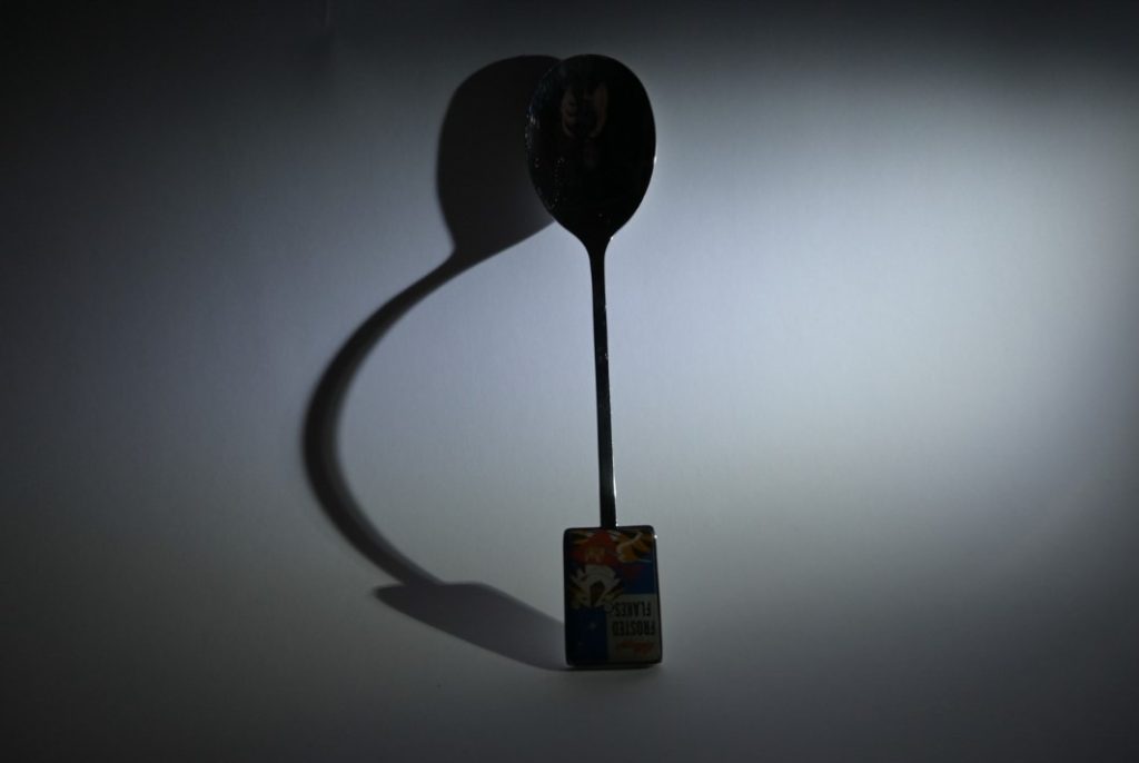
Image 3:

  • The reflection created on the left side of the photograph looks as if it is bursting out of the side of the glass, like an explosion, which I really like as it is quite unusual as the glass plate is quite plain.
  • The extra detailing of patterns within the middle of the glass is brought to life due to the use of the spotlight, making it look as if it would be found under the sea.
  • The heavy shadows on the right side of the glass create a good contrast with the left side, this is because I decided to have the spotlight fall more to the left side and this creates the darker shadow on the right side.

Image 4:

  • The spoon has become quite distorted in its figure due to the use of the infinity screen which I used to create the plain backgorund.
  • There is a clear contrast between the straight lines of the spoon and the bold, dark and curved lines of the shadow, I like this because it makes it seem quite unusual.
  • With further editing, I will make sure that the framing only focuses on the spoon being the centre main focus of the photo because at the moment there is a lot of empty space at either side due to the photo being taken at landscape.

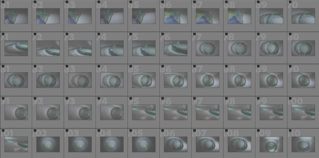
Least successful shots –
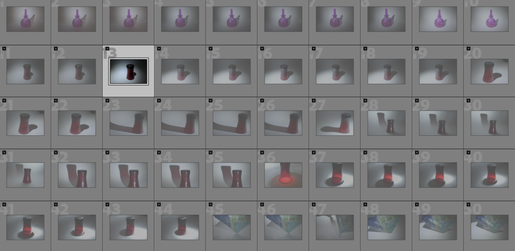
Above are images which I have produced as a part of my first photoshoot as images which I consider to be my least successful shots which I have taken in the style of Jaroslav Rossler and Andre Kertesz. This is because:

  • Some of them were out of focus and appeared to be blurry, which wasn’t the effect I was going for as I wanted them to be clear and crisp.
  • The reflected shadows which were created didn’t turn out how I expected them too and they images may not have framed them well.
  • There were many repeats of the same photo but some framings of them could be slightly off or wonky, which I didn’t like.

In my next experimentation of this photoshoot which I did at night, I will focus on using different objects such as perfume bottles/different kitchenware/glasses/other accessories to see if they change the way that different shadows and reflections are created.

Evaluation of some shots I chose to be my least successful –
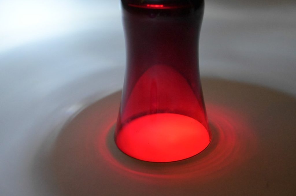
Image 1:

  • The lighting in the top left of the photograph floods the photograph as it makes this area appear to be quite overexposed.
  • The framinug of the photo is not centred anf the whole of the top part of the image has been cut off which I don’t like.
  • The dark ring around the bottom of the glass is not as dark as I would have liked it be to be to crate a strong contrast against the colours in the smaller inner red ring.
  • Instead of the background being a solid white, due to the over exposed light and where the spotlight was placed it makes it appear to be quite grey in composure which I don’t like as if it was white it would create a heavier contrast of shadows.

Image 2:

  • The detailing on the purple glass is blurred due to the camera not being able to focus well, I think that the photo would improve if it was in focus as the flowered detailing is very unique and different.
  • The light in the middle of the photograph overexposes the photograph which I do not like as it creates a really heavy contrast against the black background.
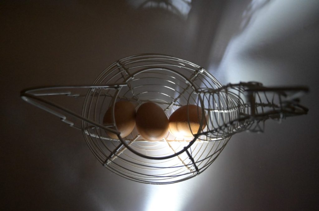
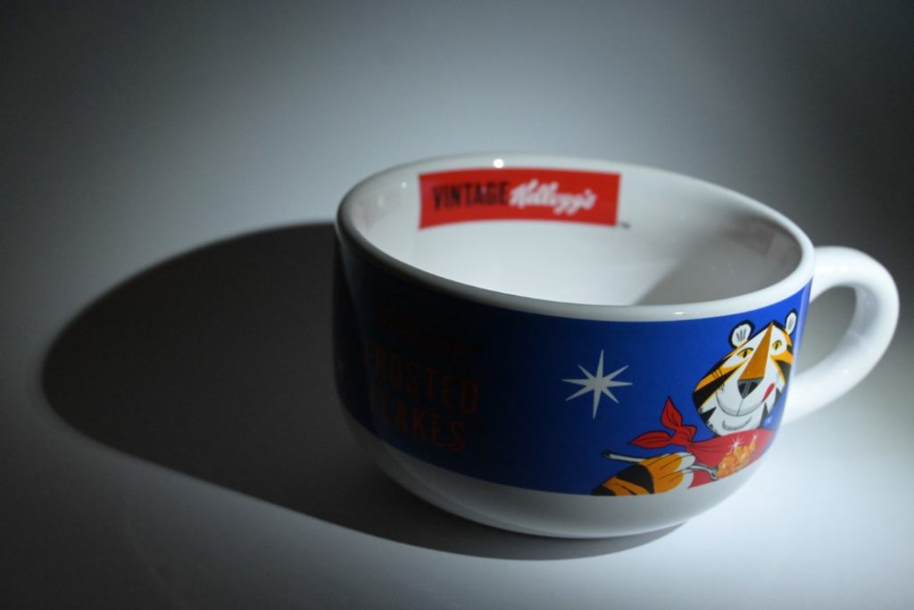
Image 3:

  • The camera angle does not showcase the different lines and shadow formations of the egg basket as it it taken from a birds eye view.
  • The shadows on the sides look as if they are quite messy and unorganised compared to other photographs.
  • The light which falls down the middle of the page is quite bright at the bottom of the photograph which I don’t like.

Image 4:

  • The “Kellogg’s” label in the backgorund isnnot in focus whihc I would have preferred it to be.
  • The formation of the shadow is clear and bold but looks as if it is a blob on the background.
  • The dark circle due to the use of the spotlight makes the border of the photograph look smaller and weird in how it appears as it is not centred.

Statement of intent and photoshoot ideas

Statement of intent –

  • What you want to explore?

The reflections/shadows of different kitchenware/glassware still life images, this is because I have found different photographers such as Andre Kertesz, Jarolsav Rossler and Paul Outerbridge who have xplored this theme heavily throughout their careers. Another way in which I want to develop my work is through the use of using more feminine objects as well, such as perfume/accessories, and creating different juxtapositions of the images of kitchenware/glassware/etc with these objetcs. This is because I want to represent how people still share these traditional stereotypes where women are seen to belong towards their household roles of being within the kitchen, and in my work I want to show how we should move away from this idea entirely.

  • Why it matters to you?

This theme matters to me because as a woman myself, these ideas/jokes of women belonging towards the kitchen still get made and it is unfair and degrading towards the position of women in a society that should be moving away from this type of stereotype.

  • How you wish to develop your project?

I hope to develop my project through using different photographic techniques of being in light/dark photography, then moving in to Lightroom where I will begin initially experimenting with different types of diptychs/triptychs, then moving towards photoshop where I will experiment with juxtapositions/double or multi-exposures. In the end I would like to create a photobook regarding the theme of still life with elements of how it relates to women but with a large focus on still life objects.

  • When and where you intend to begin your study?

I intend to create 3/4 photoshoots and begin my study over study leave and then if I need further pictures, I will also use Easter break. In these photoshoots I will focus on a range of different photographical techniques which can be seen below.


Photoshoot 1 –

  • Focus on different kitchenware/glassware and the reflections/shadows that they create, do it during the night and use a flashlight to create a spotlight on the objects.

Photoshoot 2 –

  • Focus on the same and different objects such as hair accessories/lip gloss/ perfumes/etc, begin to merge objects of previous photoshoot together, do it during the day so I can experiment with the natural lighting.

Photoshoot 3 –

  • Return to photographing at night using a flashlight to create a spotlight, use a few more different objects for different shadows/reflections but also use previous ones.

Case study on Andre Kertesz

Mood board on Andre Kertesz’s work –

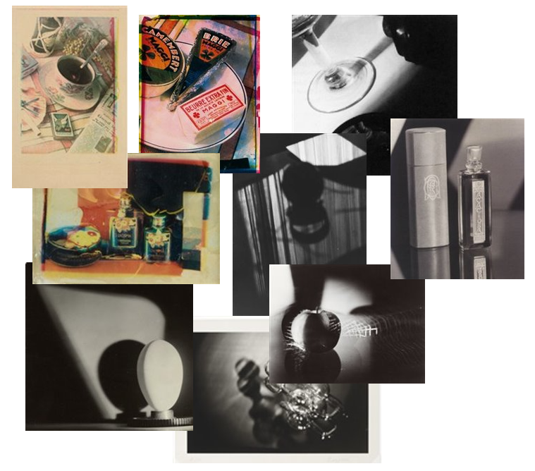
Above is a mind map which I created in relation to Andre Kertesz’s still life photography. While exploring his work, I decided that I liked his images which he created where he focuses on different shadows, such as in the image of the fork, and reflections, such as in the images of the flower and glassware. This is because I have decided that I wanted to explore photography regarding different shadows/reflections in different glassware and various kitchen objects as I want to represent the connection of women towards the stereotype of them being linked towards the kitchen as well. In relation to the mood board of the photo on the bottom left, I will also experiment with different objects besides ones that are within the field of the kitchen objects such as perfume, makeup, different accessories etc. I will also focus on how the shadows and reflections are able to be manipulated and changed.

Research on Andre Kertesz –

To gather inspiration for my mood board on Andre Kertesz, which is seen above, and to gather further research I used this website for reference. This was very helpful as it provided me with a deeper look into who Andre Kertesz is and how he developed his career as a photographer.

  • Andre Kertesz experimented with ‘Purist’ photography, this was where he produced images such as Fork (1928) in Paris, where he was able to build his reputation as a photographer.
  • In Paris, he held an exhibition of 42 photos in the left-bank gallery.
  • In 1928, he experimented with using the camera regarded as a Leica.
  • He moved to New York in 1936 where he began working within advertising with companies such as Vogue.

3 Key quotes –

To gather further information on Kertesz’s still life photography, I used this website for reference as well as this website. The first website provided me with , and the second website provided me with a different view towards Kertesz’s work and this was from , these are opinions are what I will use further in my image analysis as well.

1.

“He had an aim to transform the mundane into something poetic”

The quote above discusses the photographic aim that Kertesz intended when creating his different photographs as he didn’t want to make them appear to be the same as someone else’s in their characteristics, he wanted them to represent a poetical element within them, creating this subjective view on what it may represent. This can be seen in different images he has created such as on the mood board with the images of a flower in a vase, the flower instead of being full of life is droopy and sad, creating a gloomy and dark atmosphere of the photo.

2.

“He also made the use of monochrome lines which were bold and he used shadows as well as reflections to enhance his photographs.”

The quote above is used to discuss how Kertesz was able to make these bold, dark lines created from different shadows and reflections stand out amongst different still life works who have also experimented with the same techniques. This is because he was able to transform what they were able to represent and enhance the images which he was producing.

3.

“He illuminated The Fork (1928) under a harsh light to cast a grill of shadows through its tines, making the image stark and poetic at the same time: Kertész reveals that the fork is an object of beauty—without dissipating any of its essential forkness.”

This quote is used to discuss how the composition of one of the images called ‘The Fork’ in 1928 was created through the manipulation of different shadows from the fork and the plate as they bend around the side of the bowl but underneath there is a dark, bold and sharp image which is being show. This can re[resent how everything always ends up looking the same no matter what we want to see or believe, keeping that initial ‘forkness’ which is discussed above, which I will use for further analysis in my image analysis. This is what I would like to show in my work as well, the simplicity of still life kitchenware and glassware compared to the deeper meaning of how it links towards the stereotypical views of women in the kitchen.

Image analysis –

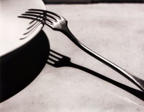
The Fork, Paris 1928, Andre Kertesz

I think that this image taken by Andre Kertesz called ‘The Fork’ in 1928 is a successful image and this is because I think that it shows the simplicity of still life photography yet visually there is a deeper, poetical meaning behind the shapes created through the different shadows casted on to the ground and bowl. This is discussed through the comment of Shonquis Monero, who looked at Andre Kertesz’s work, from the ‘Kinfolk’ website where it states “making the image stark and poetic at the same time“. This quote is used to discuss how Kertesz’s work follows a poetic manipulation yet uses objects which are quite plain or bare in their appearance, such as a bowl or a fork, and how they have a deeper meaning within them. This can be clearly seen within this photo as the fork and bowls shadow is dark and bold underneath but as you look as the bowl you are able to see how the shadow of the fork begins to curve and follow the bowl instead. Therefore, this can be used to represent how society cling to these older ideas of gender relating towards how you are viewed within a household role and then the top, where it begins to curve, can be used to show people beginning to move away from these different stereotypes. If I were to give a critic towards this image, I would consider how the background isn’t plain and looks somewhat grainy or dirty, although this may be a photographic choice from Kertesz, I believe that having a plain white background would make the objects shadows stand out more and create more of an effect, this is what I will be using within my work instead.

Case study on Jaroslav Rossler

Mood board on Jaroslav Rossler’s work –

Above is a mood board which I created of images that Jaroslav Rossler produced throughout his career. I think that these images are a good representation of the abstraction of still life in different reflections/shadows of glasses/different kitchen objects. I really like how Rossler explores the darkness in is photography through different lighting and shadows as well as the colour and composition in different photos where he uses a variety of different objects which are different colours, but compliment each other well to create a vivid contrast within their colour. This makes me feel inspired within my own work because I was going to focus on the abstraction of different shadows through glassware within my work, but through exploring Russler’s work I have decided that I will also explore using different objects besides glasses to represent different kitchenware as it can create a deeper message.

Research on Jaroslav Rossler –

  • Studied from 1917-20 under the photographer Frantisek Drtikol where he was a lab technician.
  • By the age of 21, he began an art project with Karel Teige where he was able to create typographical layouts for magazines, this was where he was able to broaden his understanding on different photographical methods, e.g. photogram, photomontage, collage, carbon print process which was used to produce his still life’s etc.
  • He experienced with isms such as Pictorialism, Cubism and Futurism, but also experimented with abstraction and Avant Garde.
  • In 1925, he began working as a photographer in Prague/Paris with the magazine called ‘Pestry tyden’.
  • In the 1950’s he created ‘prizmata’ (prisms) which were photos that are taken through a birefringent prism, as well as experimenting with solarisation and the Sabatier effect.

3 Key quotes –

To gather further information on Rossler’s still life photography, I used this website for reference as well as this website. The first website provided me with an extra insight into the photographic techniques that Rossler used within his work to create his photographs within the field of advertising, and the second website was providing me with a different view towards Rossler’s work and this was from Allan Graubard, these opinions are what I will use further in my image analysis as well.

1.

“In the early 1920s he created several works which show minimal objects and forms that relish in abstraction like images”

This quote is used to discuss the early stages of Rossler’s career where he experimented a lot with different compositions of still life photography. This quote also discusses the abstract form that Rossler’s takes with his work, I really like this experimentation that I found when researching more in to his works through my mood boards.

2.

“He photographed simple objects against a backdrop of black and white cardboard paper; he gave spherical form to light through long exposures.”

This quote discusses the photographic process in which Rossler takes within his work to create the photographs that he has produced. This quote represents how it is a simple process with simple objects that he manipulates in to these complex forms through the use of long exposures. This can be seen in images where the light changes colour throughout the photos as Rossler has manipulated the colours. I really like this effect and will consider this within my photoshoots, remembering how simple and effective some objects can be due to the manipulation of camera settings.

3.

“he also used photo-grams, diagonal compositions, multiple negatives and lettering to create modern advertising.”

This quote discusses the different photographic techniques which Jaroslav Rossler uses within his work to create the images in which he does which relate towards modern advertising, which is a large area of photography he has worked within.

Image analysis –


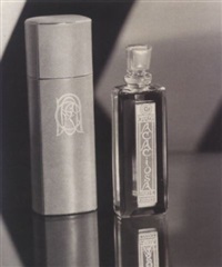
‘Caron Acaiosa perfume bottle’, 1929, Jaroslav Rossler

I think that this image taken by Jaroslav Rossler called ‘Caron Acaiosa perfume bottle’ produced in 1929, is successful to an extent and this is because I like how there has been experimentation within the shadows that are found in the background of the image. This is because they are unusual in their shape as it has a bend within it as the lines meet one another. The shadow is also used within the photograph to highlight the bottle next to it as the shadow looks as if it is surrounding it, this can be used within modern advertising photography to highlight a certain product to the audience. Another element of this photograph take by Rossler which I like is the use of the reflections beneath the bottles, this is because they look as if they are connected to themselves below which can represent solidarity amongst women, as perfume can mainly be seen as a feminine product. If I were to give a critic of this photograph, I would say that I would look on improving the intensity of the shadows and how dark and bold they are, this is because the shadow gets lost within the background of the photo and I believe that the shadow could be more effective if the focus of the boldness of the shadow was more focussed on. This could also be focussed on within the perfume bottles as they could be used to create different shapes and the use of the liquid inside of the smaller perfume bottle on the right could be used to reflect on to the background that is being used as it can create unusual patterns. Within my own work, I will consider using different objects such as perfume bottles and the use of different shadows as well as focussing on the liquid inside of them and how it can be used to create different patterns.

Case study on Paul Outerbridge

Mood board of Paul Outerbridge’s work –

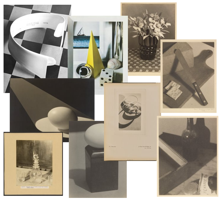
Series of images from Paul Outerbridge’s still life works.

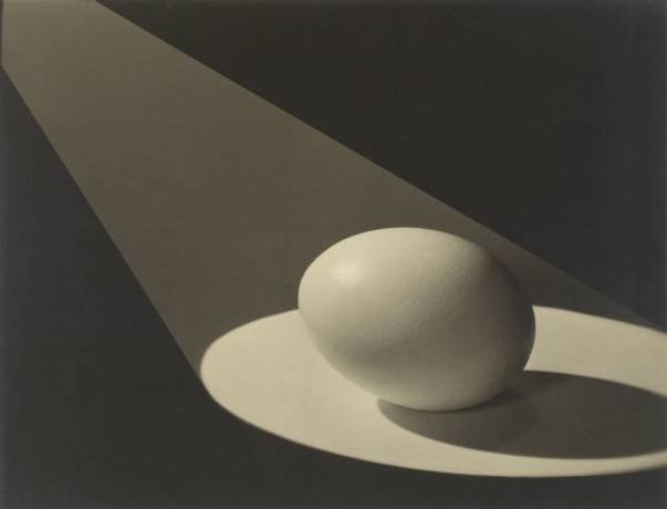
I think that these images represent the selection of Still Life work which Paul Outerbridge had created within his career, it ranges from simplicity to complex abstraction. I really like the simplicity of many of these images because many of them feature one or two objects as the main focus of the photograph, which I want to incorporate into my work as well. He also uses lighting well within his work because he is able to use it to create spotlights on certain objects, such as his egg work, or uses lighting to create bolder lines and shadows in his still life photos.

Research on Paul Outerbridge –

  • Born in 1896, and served in the US Army in 1917.
  • Started as an illustrator and designer before he got into photography.
  • Enrolled in the Clarence H White school of photography at Colombia University in 1921.
  • Worked with different publications such as Vanity Fair and Vogue.
  • Moved to Paris in 1925, and befriended many different artits/designers such as Edward Steichen, where they went on to build one of the largest and well equipped photographic studios of all time.
  • He returned back to New York by 1929, where he opened his own studio producing commercial and art photography, this was where he was also able to start experimenting with colour in his photography using the tri-colour process.
  • By 1940, he published a book called, ‘Photographing in Colour’.
  • Retired as a commercial photographer in 1943, where he moved to Hollywood and married, but later died in 1958.

3 Key quotes –

To gather further information on Outerbridge’s still life photography, I used this website for reference as well as this website. This first website provided me with an extra insight into how and why Outerbridge may have created some of his images as the rise of still life photography grew, and the second website was an online article from the ‘New York Times’ written by Ken Johnson who offers a different view towards Outerbridge’s work which I will use in my image analysis.

1.

“A photograph, Outerbridge wrote, “should do something to its beholder; either give a more complete appreciation of beauty, or, if nothing else, even a good mental kick in the pants.””

This quote explains how Paul Outebridge explains what effect that a photo should have on the people who are viewing it, it could either be visually appealing or creating a distinct message throughout it depending on the context of the photograph. I have chosen to use it because this is the effect that I also want to create within my work, from taking inspiration from many of Outerbridge’s still life work as he experiments with black and white/colour abstraction well within his work.

2.

“Even when platinum and palladium emulsion materials became scarce in the years after World War I, Outerbridge insisted on using them to craft prints whose tonal depth and warmth trump the more meagre materiality of conventional processes.”

This quote explains the photographic process that Outerbridge used within his work to create coloured/black and white photographs, this is because colour was still quite a new concept in photography which many photographers were yet to experience well with. The use of this photographic process is highly evident within his work as you can see how he experiments with tonal depth within his photos and I have chosen to use this quote because I also want to experiment with the different black and white tones within my photograph in my photoshoots as I can use the black and white technique inputted on the camera and further edit it within Lightroom.

3.

“Throughout the 1930s, his riveting photographs of dining rooms, tabletop still lifes and displays of necessities like sandwiches and toilet paper—commissioned by clients that included House Beautiful, McCall’s and Scott Paper—attracted attention by offering up heightened visual experiences that bordered on the hyperreal.”

This quote explains the range of images, regarding the theme of still life, that Outerbridge created throughout his career and the impact which they have had on society. This is because the quote explains how many of his photos have provided people with a range of different experiences which are hyper realistic in how many of them appear, especially in his abstract still life work. I have chosen to use this quote because I think that it successfully discusses the impact of Outerbridge’s work towards others and how many of his works border along the lines of dreamlike still life photography.

Image analysis –

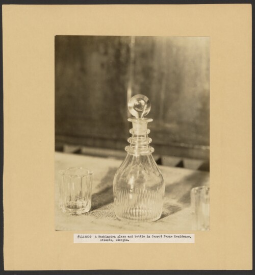
This photograph taken by Paul Outerbridge in 1927, as a part of his ‘American’ collection is an example of his still life images which he has created throughout his career. This image features a glass and bottle and experiments with different techniques such as the tonal depth which can be seen in the background of the photograph as it is shown to be quite dark which creates a heavy contrast against the bottles which are appearing to be light in how they appear as they are most likely clear. These bottles stand out further through the use of the shadows which fall beneath them in the photograph too, I really like this effect because the shadows create these unique patterns on the surface which they are on due to the unusual and unique formation of the bottle as well. Referencing Paul Outerbridge’s work for inspiration in my own work, where I will be focussing on how the light creates different reflections and shadows in glassware/different kitchenware, I will consider how the light falls on the bottles and the shadows which they will create through what objects I decide to use, I will also experiment within colour and black and white because I think that the use of coloured glasses could create patterns that are abstract in how they appear on the background which I will use. Other works by Paul Outerbridge such as ‘Images de Deauville’, produced in 1936 which hold an abstract view in commercial photography have been criticised and in an online article from the ‘New York Times’ written by Ken Johnson, which I referenced above, it discusses Outerbridge’s career and journey throughout time. The article begins by saying that Outerbridge was amongst some of the most successful commercial photographers in his time but as times changed there are many critiques towards Paul Outerbridge’s work. In 1973, the Museum of Modern Art director called John Szarkowski wrote a book called “Looking at Photographs”, and this is where he called Outerbridge’s work to be referenced towards “commercial illustrations” and Johnson says that many people argued that colour photography appear to be ‘tacky’ as it didn’t hold the uniformed and organised look that appeared to be seen in many black and white photography. By the 1970s, the popularity of colour rose up again and Outerbridge’s work began to come back into focus as and he was regarded as one of the 20th century’s most successful photographers for his work.

Historical context of Still Life photography

What is a ‘still life’? –

A ‘still life’ comes from the Dutch word ‘stilleven’ which originated during the 17th century throughout Europe. This was when paintings of different complex compositions through a wide variety of objects became of popular and held a greater meaning within them. Still life is further used to depict inanimate objects as there is a large amount of different influences that change the way each painting/picture appears throughout different time periods throughout history.

A brief timeline of Still Life photography –

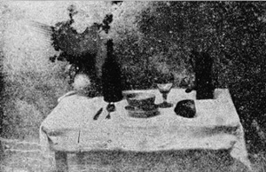
The first inclusion of still life photography happened during 1927 but was set up for reproduction in 1893, as the original was lost, this image is called ‘The Set Table’ by the inventor Nicephore Niepce.

‘The Set Table’, Nicephore Niepce, 1893.

The picture above is is Niepce’s ‘The Set Table’, this picture represents a table that is covered by a cloth with a meal/cutlery set out for one person. The photo uses a lot of dark shadows throughout on the objects and in the top right corners of the photograph, this can suggest a long exposure time on the camera where there is a lot of light being let in due to this, creating a vast amount of shadows throughout the day. I think that this photo is a good example of what we can label it as a ‘traditional’ still life photo as it has elements in it which represents what still life photography consists of, such as a having a long exposure, using traditional elements to represent wealth/class/etc and how the objects may be set up in a studio or darkroom.

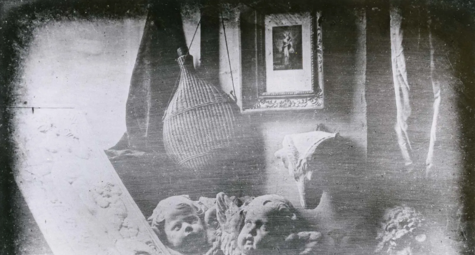
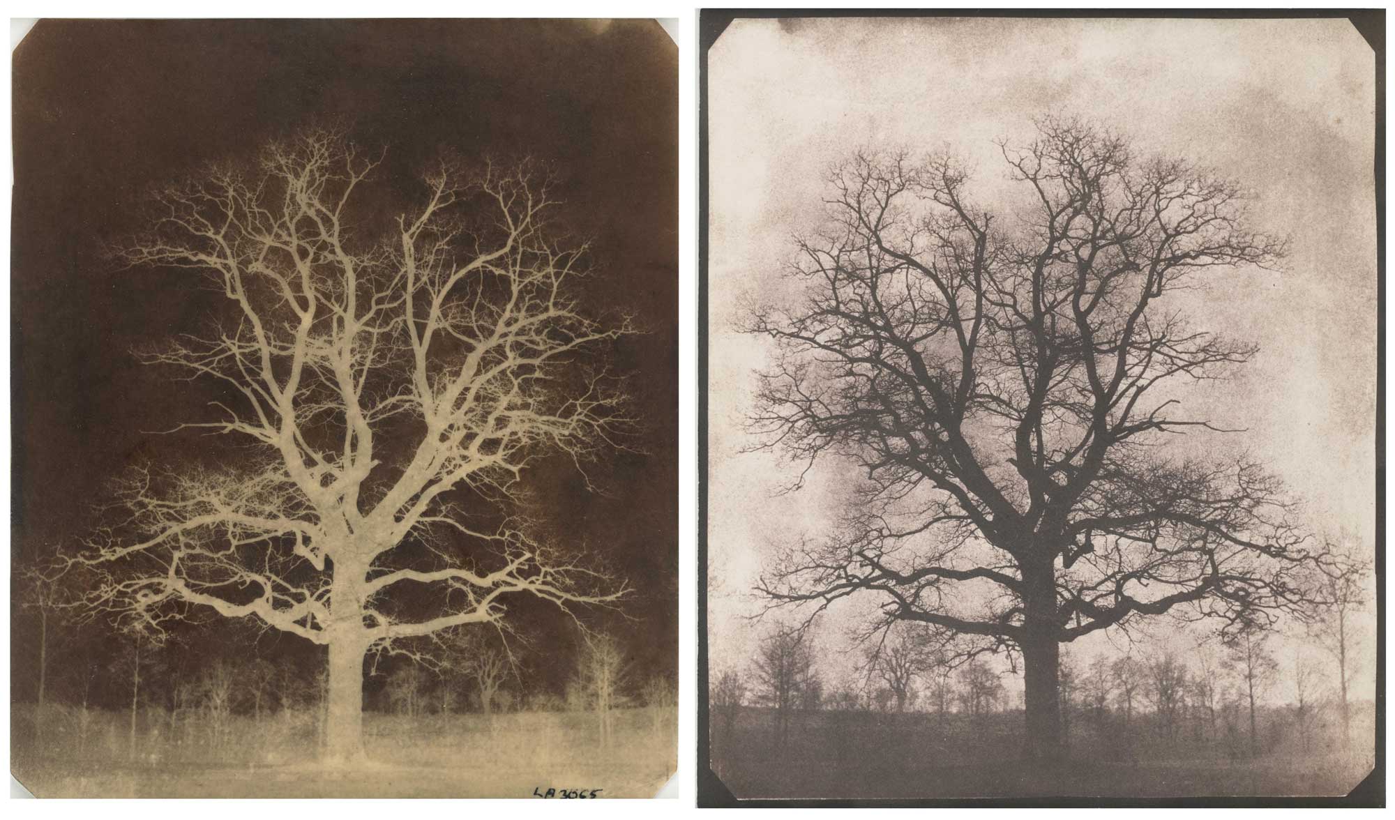
Niepce started to work with Louis Daguerre in 1829 to experiment with different elements of photography, this was where Daguerre was able to create the ‘Daguerreotype’, this was where an image was created on an polished sheet of silver-coated copper. A daguerreotype is a detailed image which has a mirrored surface, making it quite fragile and expensive, this type of photographic process was used to make images such as topographic and documentary photography of a variety of still life images. The use of daguerreotypes developed into ‘Calotypes’ through Henry Talbot, his photographs consisted of household objects (e.g. glassware and books). Therefore, the use of these different types of photographic processes links in to the movement of ‘Realism’ as the camera was used to capture real-life scenes during the 19th century.

As photography moved in the 20th Century, the rise of popularity in Pictorialism photography, which suggested that photographs should resemble art forms. This led to a rise in art photographers such as Baron Adolf de Meyer, Edward Steichen, etc using techniques like soft-focus lenses and working in darkrooms where they would create photos that resemble charcoal drawings, echoing a sense of obscurity and dream photography, still in black and white.

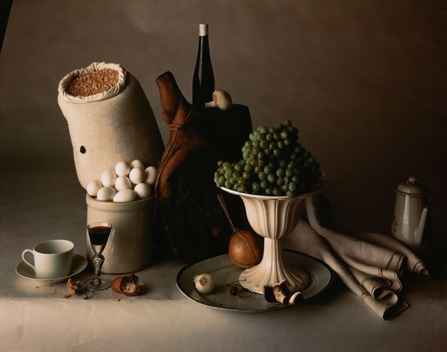
The introduction of colour into still life photography was developed in 1903 but not made available until 1907 by the Lumiere brothers. They developed a technique of using 2 sheets of glass coated with silver emulsion and a combination of potato grains dyed orange, green and violet. By the 1930’s this technique was replaced by a three colour paper based carbo transfer process. By the 1920’s, Paul Outerbridge and a small group of other artists used the dreamlike possessions of pictorialism into their advertising still life art, this was achieved through using different household objects to create a balanced composition. Outerbridge used light in his photographs, he did this through sketching out ideas on paper and then applying this in to the photographic studio. Irving Penn was another artists during the middle of the 20th, he created still life photographs, in black and white and colour, of various objects such as food, skulls, flowers, makeup, etc.

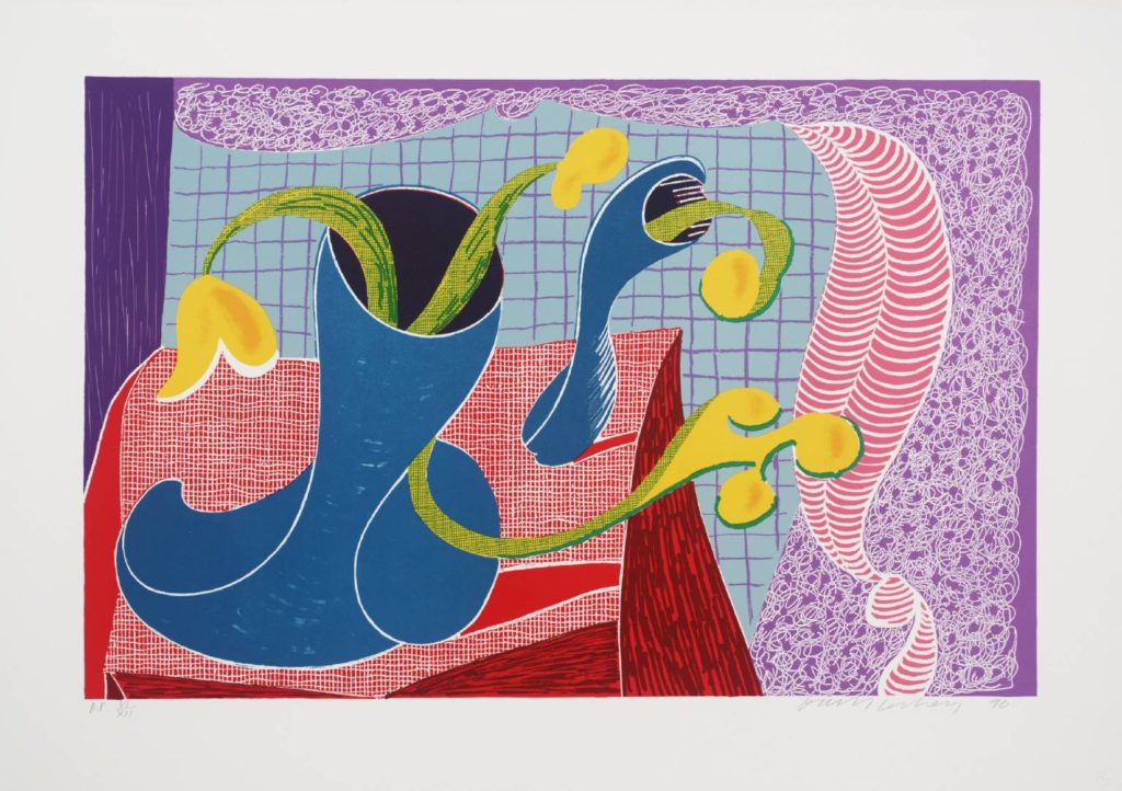
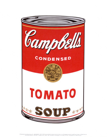
In the 21st century, the rise of still life photos such as Andy Warhol, David Hockney and Roy Lichtenstein. These photographers experimented with the abstraction of still life within modernism, which can be seen a lot in Andy Warhol’s work.

Binary opposites in photography

The theory behind ‘Binary opposites’ –

The theory of ‘Binary opposition’ within photography and in a larger context reveals how everything in life revolves around a system which we can use to classify everything around us into a variety of 2 different groups. These groups can be seen as two opposites which are strictly against one another, e.g. ‘simple or complex’, ‘hot or cold’, ‘win or lose’, ‘left or right’, ‘love or hate’, etc. The term ‘Binary opposition’ can also be applied within literature and language where there are ‘Synonyms’, a word which means the same as another, against the opposing term of ‘Antonyms’, which is a word that is of opposite meaning. Furthermore, this shows how we are always surrounded by the theme of ‘Binary opposition’ as it is applied within everyday life in objects, cultures, systems, politics, ethics, language, etc.

Further examples of binary opposites.

Therefore, this ‘theory of binaries’ comes from a larger bracket of ‘Structuralism’ which is apart of psycholinguistics of how we create meanings of language. This was furthered through the early work of a famous Swiss linguist Ferdinand de Saussure and then this was further studied by the French anthropologist Levi Strauss and another linguist academic, Roland Barthes, during the 1900s. This theory explored into the insight of how we understand words and not their direct meaning, and how they have opposing terms as well. They concluded that words are a part of symbolism regarding societies ideas, and that their relationships were a fixed idea amongst one another and that one term is always valued more than the other. An example of this can be seen in the understanding of the word ‘coward’, someone who is weak and scared, and its opposing word ‘hero’, used to describe someone who is impressive in their nature and what they may do, which can link towards attitudes which we can refer to as ‘dominant ideologies’, which means the shared ideas/beliefs which justify the interests of different groups. A further exploration into this was in the study of literature as there are many layers from the meanings of words and how they are made and reinforced through the theory of ‘binary opposition’. For example, this can be seen in Simon Armitage’s poetry as he creates this reinforced idea of binary opposition through the ‘sincerity’ opposed to ‘insincerity’ of societies dislikes towards cultures.


How I will use binary opposition within my own work –

Simple –

The theme of the binary opposite of ‘Simple’ in photography, can be interpreted in a variety of different ways. This can be linked to the ideas of still life and how you can easily compose objects together with the use of how they may appear or the colours, and how well they work together which can represent how simple life can be portrayed through the use of different objects. There are many artists and photographers who have explored the theme of still life photography extensively in a variety of different ways, such as through abstraction or contrasts, an initial selection of these artists and photographers are:

  • Thomas Demand
  • Jan Bruegel
  • Willem Kalf
  • Paulette Tavormina
  • Richard C. Miller
  • Henry Fox Talbot
  • Josef Sudek
  • Andy Warhol

Complex –

The theme of the binary opposite of ‘Complex’ in photography, can also be interpreted in a variety of different ways. This can be seen through the contrasting ideas of the complexity of still life and how they can hold a deeper message within them besides using different objects/colours to create a contrast against one another. In my own work I have chosen to explore how different kitchenware/utensils create unique reflections and shadows and how this can be linked towards the theme of feminism and the links that are still around, although they have mainly died out, of women holding traditional household roles such as being in the kitchen or cleaning. I will represent this theme within my own work through using harsher and bolder shadows through uniformed kitchenware/utensils to represent the past and how women are still linked towards this whereas to show the change of this mindset in my own work, I will use more colourful and bright kitchenware/utensils to represent how women have mostly been able to move past the stereotype. Artists/photographers who I have found that can link towards this theme of shadows/reflections in still life are:

  • Irving Penn
  • Paul Outerbridge
  • Andre Kertesz
  • Sophie Calle
  • Imogen Cunningham
  • Simon Brutnell

Mindmap and moodboards

Above is the mind map which I created of initial ideas regarding the themes of ‘Simple’ and ‘Complex’. I decided to split it into two sections, even though some ideas may overlap, this is because it makes it easier to organise what ideas work well alongside each other and what ideas work well in either theme. Initially, I really liked the idea of studying the simplicity of graffiti but then realised that it can also overlap with the theme of complexity and that Jersey does not have a lot of graffiti around which would make this a harder theme to look at. Also while creating ideas, I came across the idea of studying the complexity of still life in shadows and reflections, mainly in glassware or various kitchenware, this is because I liked how they were able to produce these different and unusual designs/patterns within them as they reflected on different surfaces and how their designs/colours can alter how they may appear on different backgrounds. This idea became quite intriguing to me as many of us would view shadows as a simple idea which we may come across briefly, but their is a complexity within them of how shadows can be manipulated and changed through different lightings, locations, backgrounds, etc which can be used to tell a story or create a visual image that we may not think of imagining, which could relate to historical context regarding how women were related to being in the kitchen or having home duties.

Moodboard for theme of ‘simple’ –

Here is the mood board of initial ideas that I made regarding the theme of ‘Simple’ in photography. I started off by looking at the use of graffiti photography, but started to realise how I was not keen on the photos as they looked quite messy and unorganised and lost that ‘simplicity’ which I saw they had previously as well as how there is little graffiti that there is in Jersey. Therefore I moved over to exploring still life photography, this is in relation to how there is a simplicity within the still life objects and colours and how they can be so easily composed. This is due to if you have a select number of objects which you reuse as they work well alongside one another, due to their colours and how these may contrast against each other, and represent the simplicity of still life objects.

Moodboard for theme of ‘complex’ –

Here is the mood board of initial ideas that I made regarding the theme of ‘Complex’ in photography. To begin with, I started off by exploring the themes of shadows and reflections within still life photography, which I was drawn to due to the complex way that simple kitchenware for example could create different types of shadows or reflections on to various surfaces. I really liked the effect that simple glassware and utensils had as they created these bold shadows that draw you towards them as they have a black/white composure that create these bold shadowed photographs. I also liked the use of different coloured marbles and glasses that may be formed in unusual ways, this is because the shadows and reflections which they created. I feel as if this theme of reflections/shadows in different kitchenware can link towards feminism and how woman are often disregarded and linked towards the kitchen and other traditional household roles. This could be represented in my work through the use of different glasses/utensils and how the darker, bolder glassware/utensils show how people are still stuck within this old fashioned mindset compared to the open, more colourful glassware and utensils which could represent how women have been able to eventually move past this stereotype but can still feel slightly trapped and linked towards it.