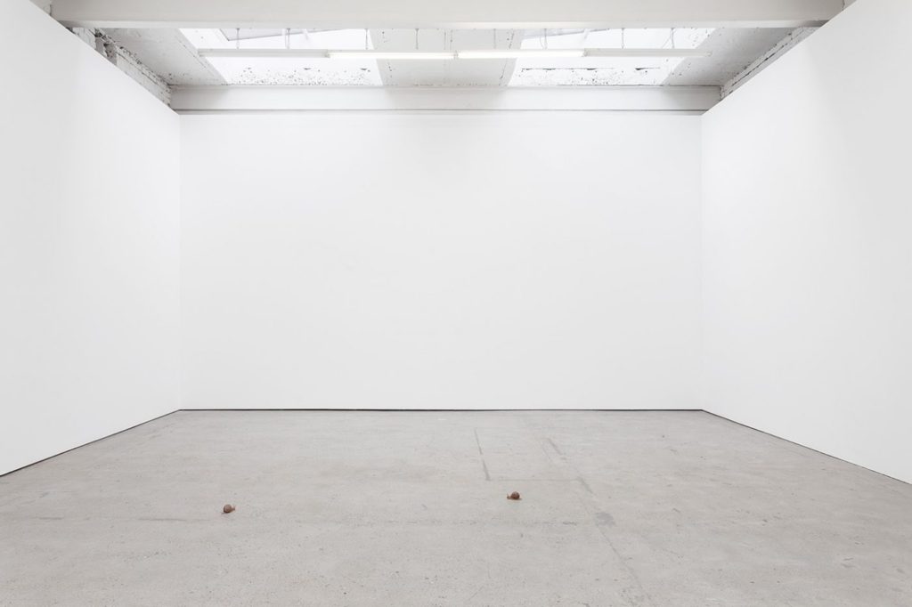
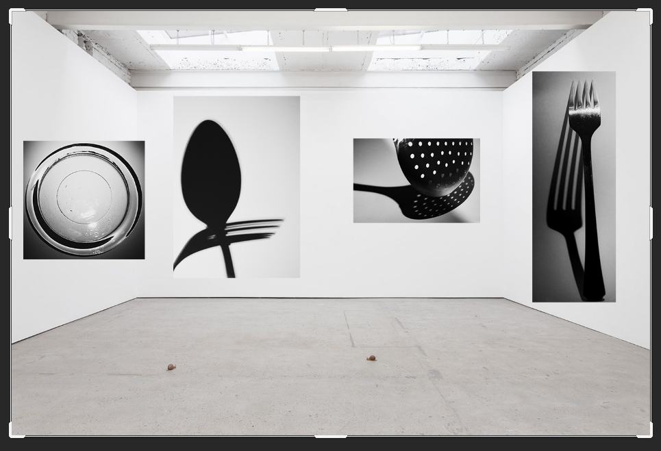
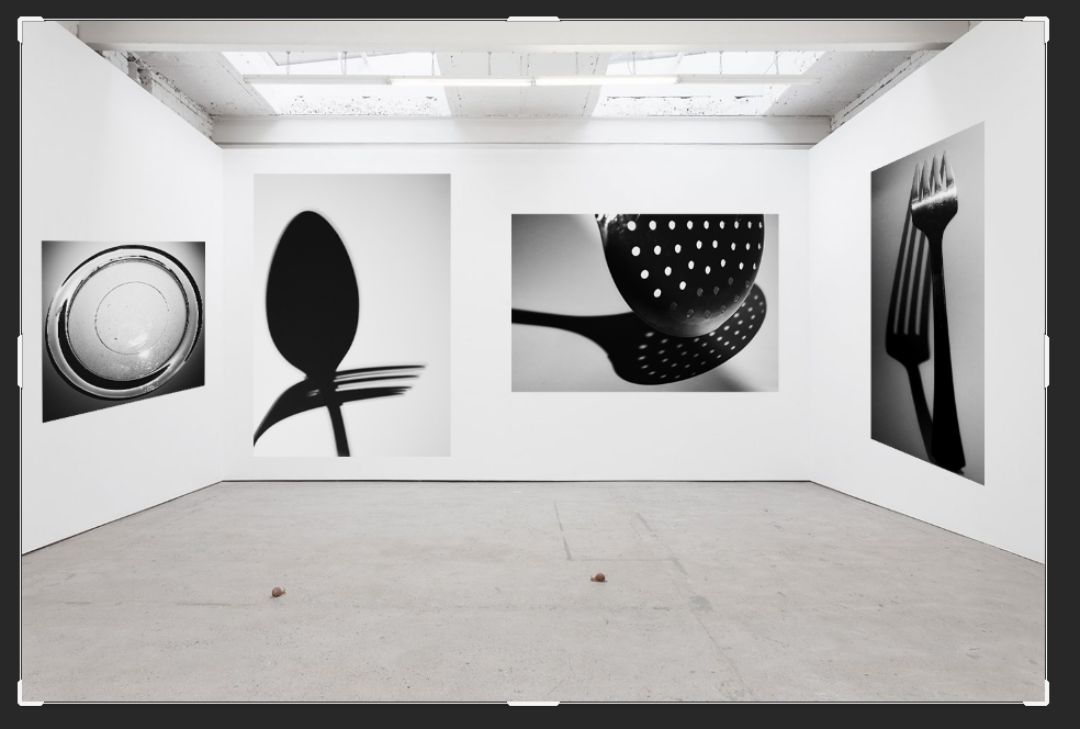
All posts by Emily Bowker

Filters

Author:
Category:

Final evaluation

Virtual gallery –

  • How successful was your final outcome?

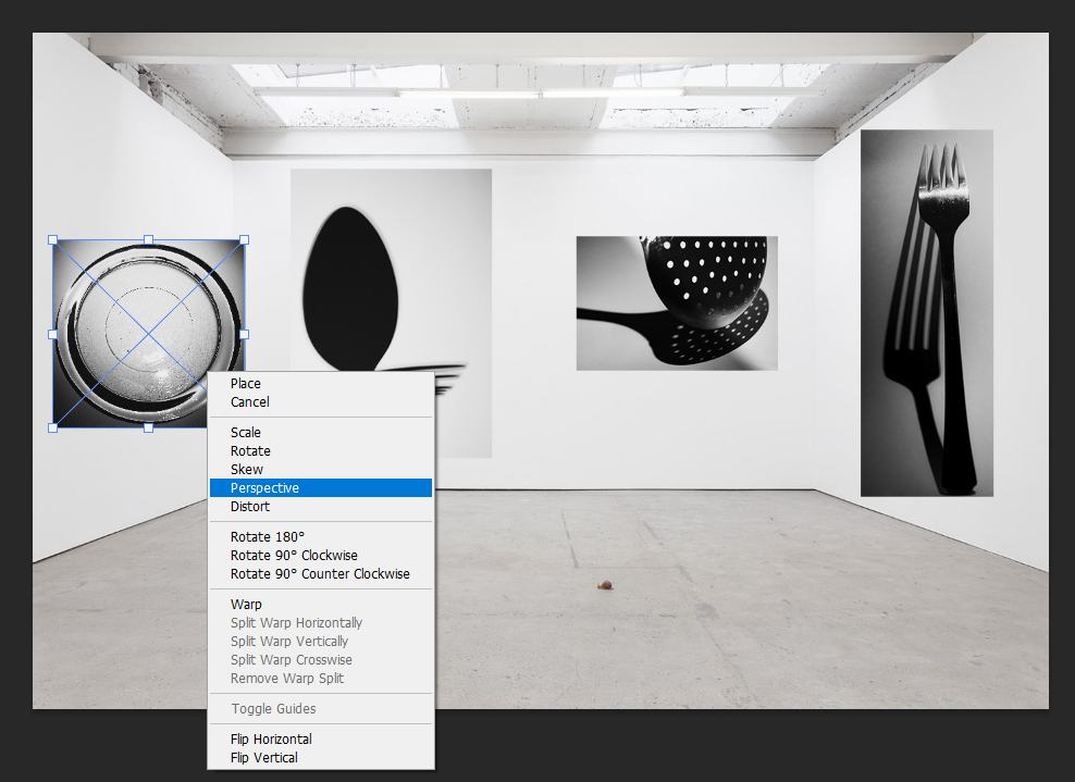
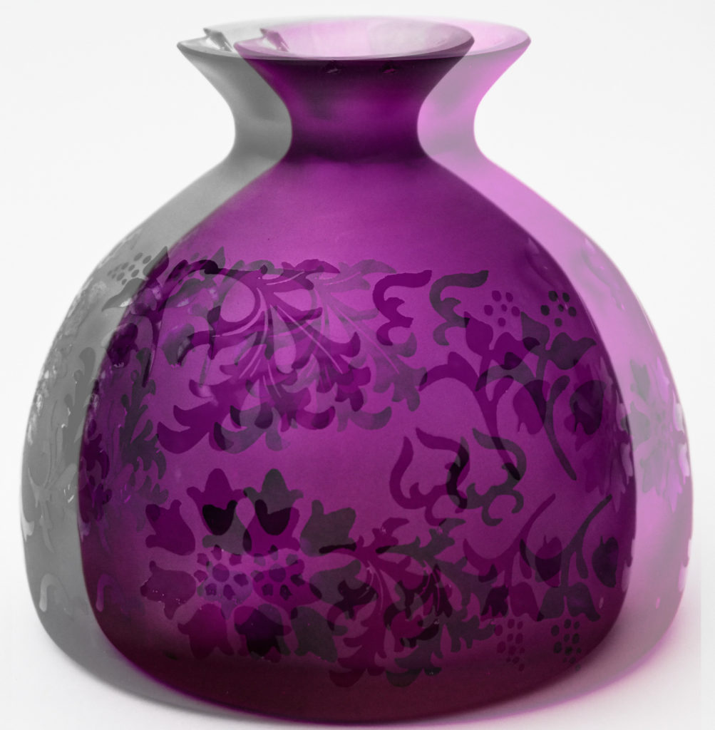
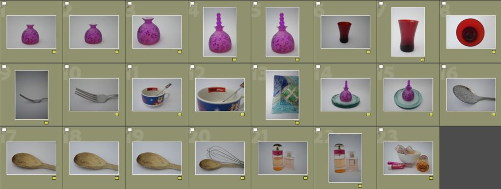
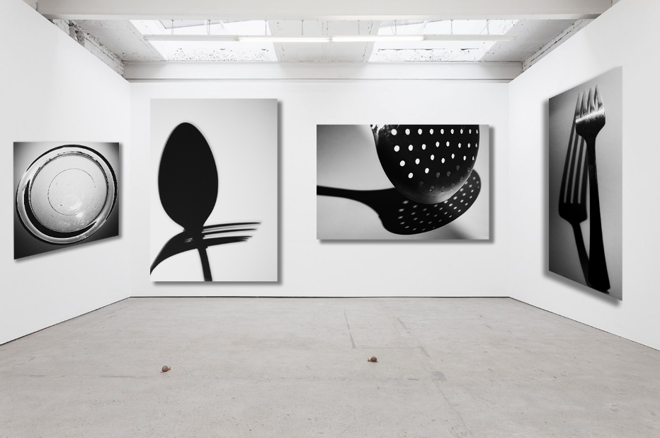
I think that the final outcome of my virtual gallery was quite successful, this was due to the use of the gallery file which I chose and the way which I decided to alter the perspective of the images and add a drop shadow which makes it appear to be more realistic.

  • Did you realise your intentions?

My intentions for my virtual gallery were for it to be simple in how it was composed but to have a feeling as if it is a photo which has been taken in real life of a gallery which you might go to then posted on the internet for others to see.

  • Is there anything you would do differently/ change etc?

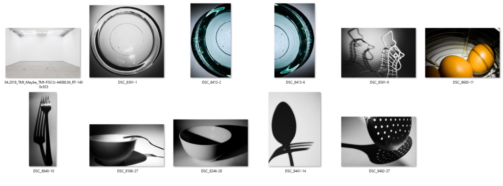
If I were to do my virtual gallery again I would select some of my diptychs which I have chosen to input on to my walls instead of having individual photographs, I would also add a frame to the images to make them look more realistic and as if they are mounted images.


Mounting my images –

  • How successful were your final outcomes?

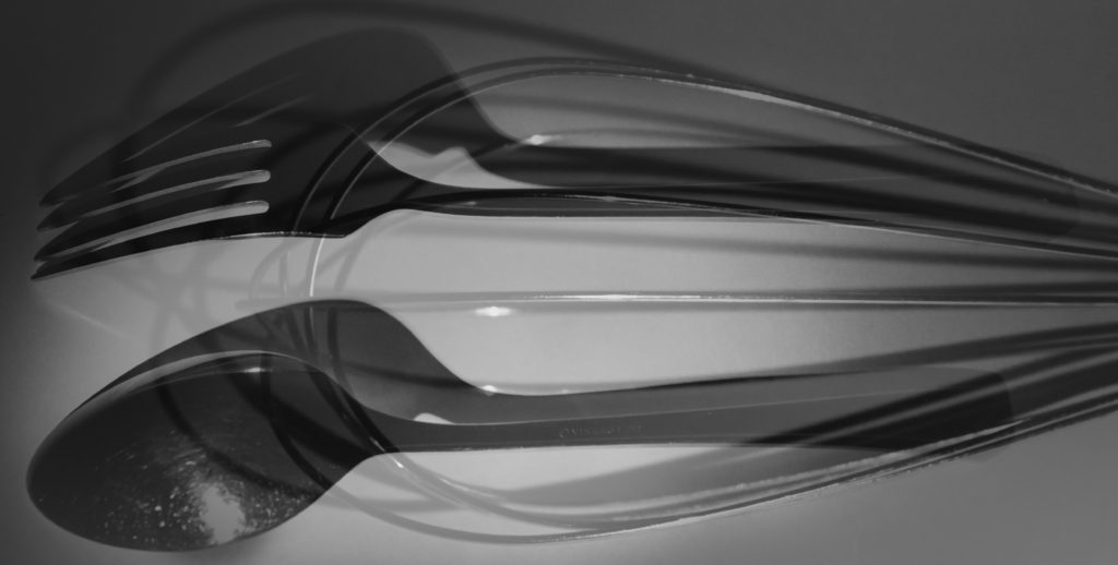
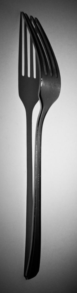
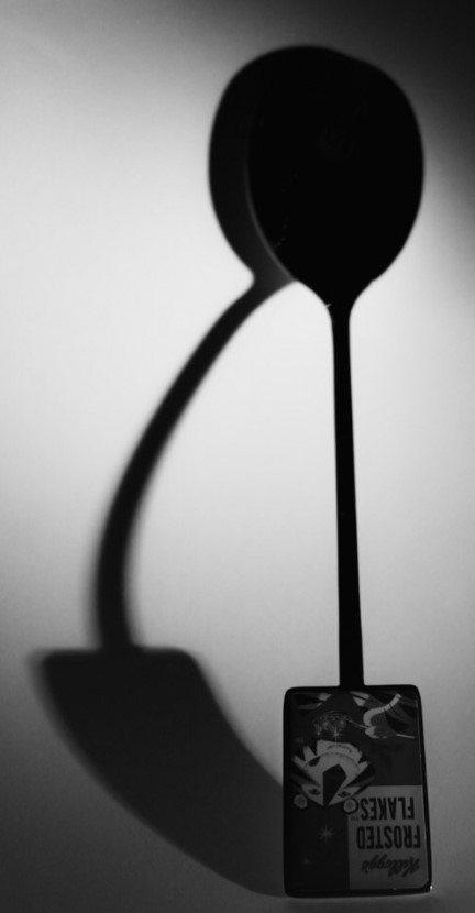
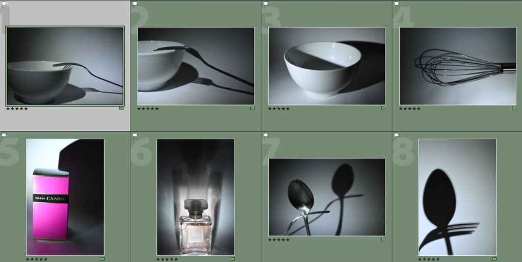
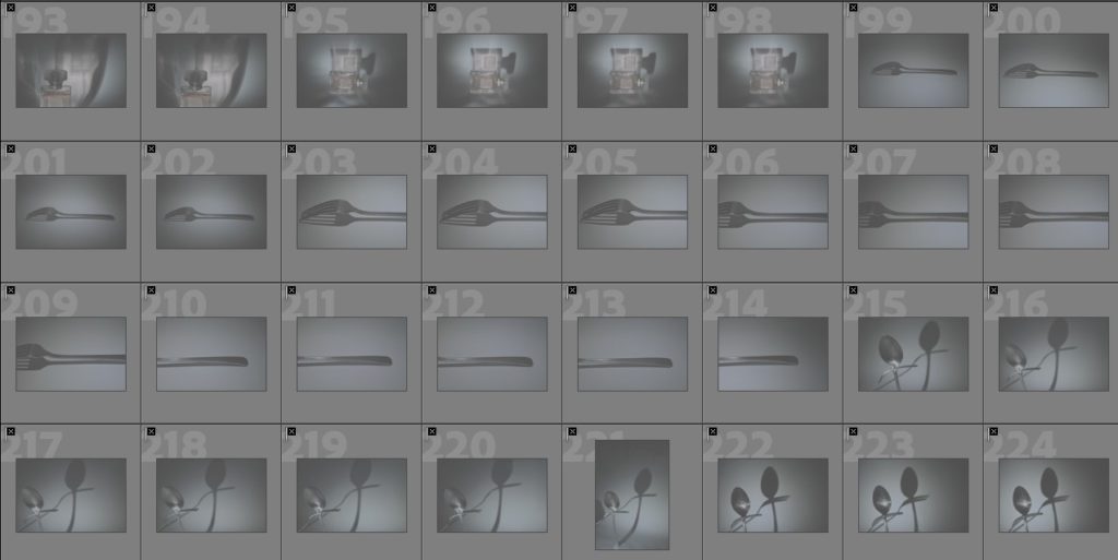
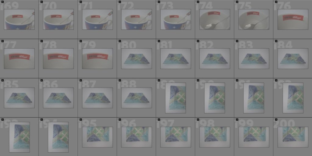
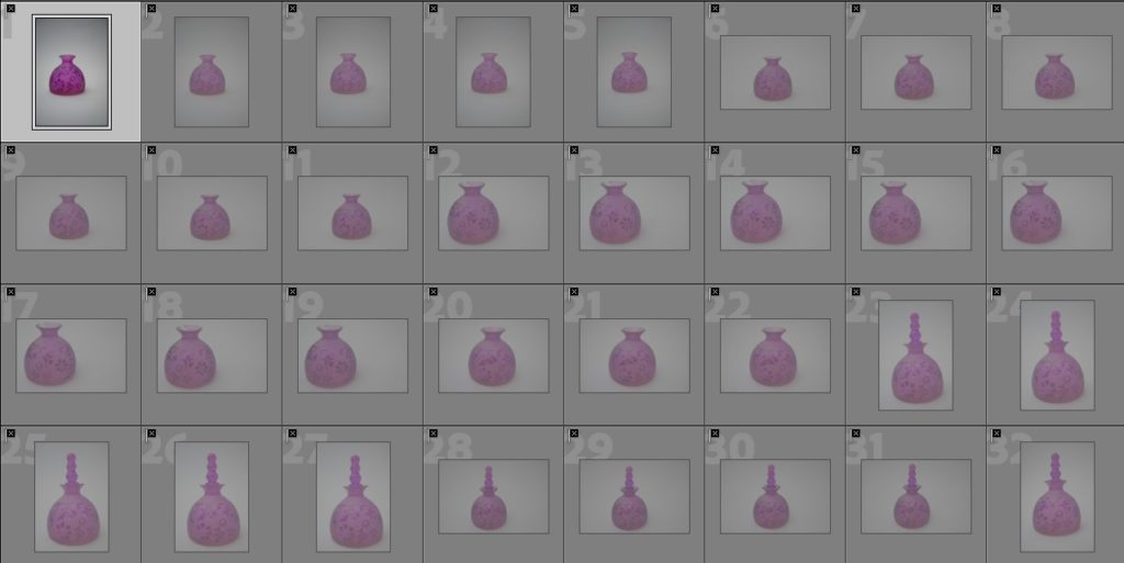
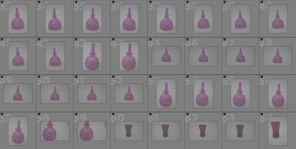
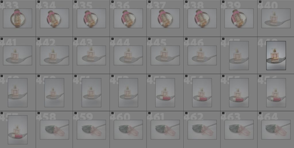
I think that the final outcomes of mounting my images was successful as they experiment with two different ways of mounting but in a simplistic way which refers back to the traditional, naturalistic style of still life images and how they are supposed to be presented.

  • Did you realise your intentions?

My intentions for mounting my images were to experience with different ways of mounting up but to stuck to a simple and traditional way of mounting my images through window mounts and using black card on to foam board.

  • What references did you make to artists references – comment on technical, visual, contextual, conceptual?

I think that my images relate well back to my artist references who were Paul Outerbridge, Andre Kertesz and Jarolsav Rossler. This is because they all inhabit a simple way of presenting their images in different photobooks and in a variety of different ways online where they may only be one or two images on the page or in the frame, this is what I have also tried to achieve in my own work.

  • Is there anything you would do differently/ change etc?

I think that while mounting my photos, it was quite difficult at the start to get the hang of how to mount up and present my images because of you had to construct the window mounts, but this became easier throughout doing them repeatedly which made the process easier for me.

Here is the link to mounting my images blog post.


Photobook –

  • How successful was your final outcome?

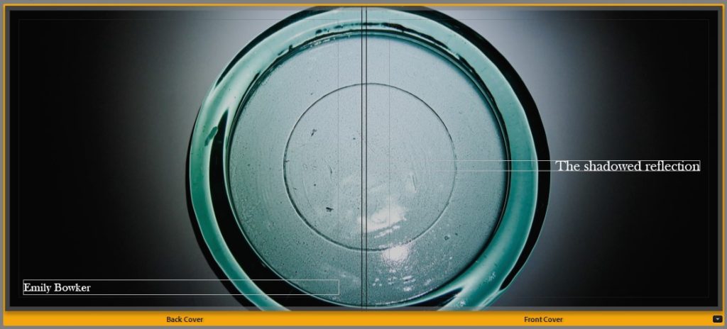
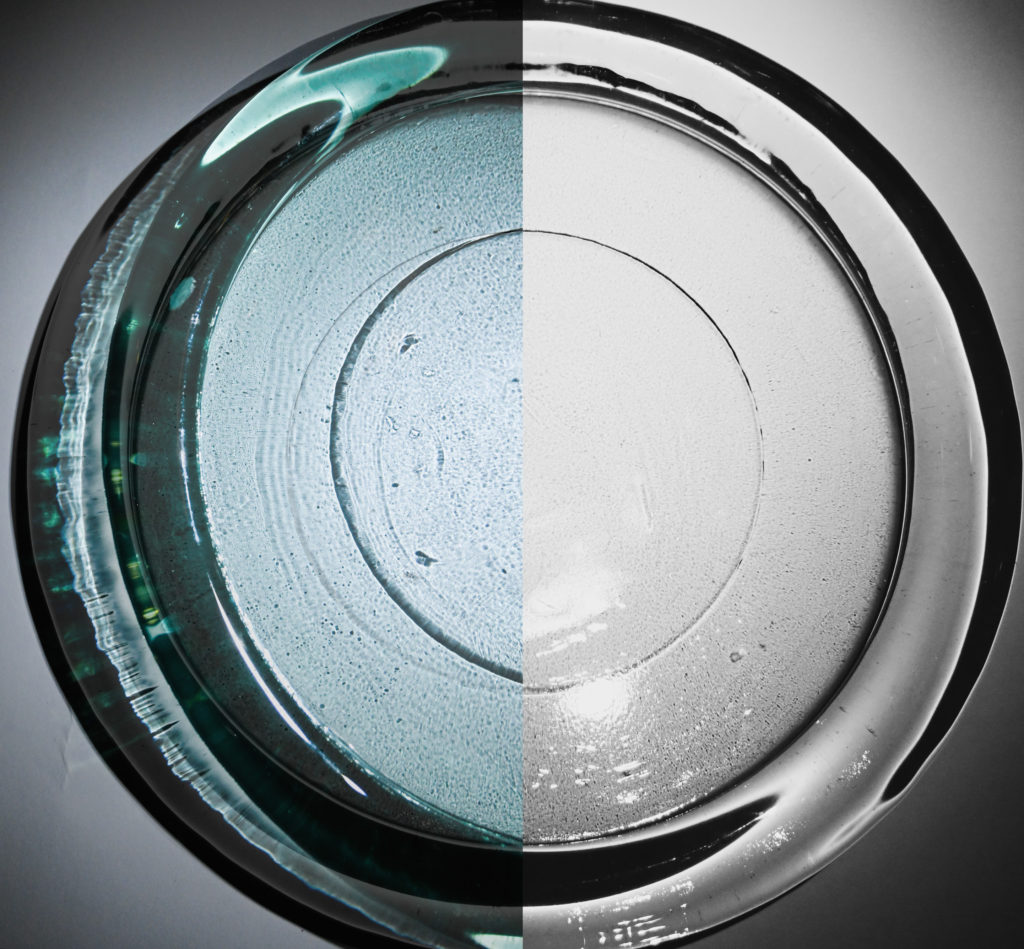
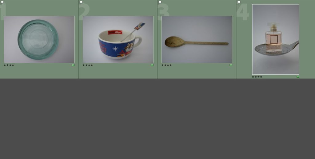
I think that my photobook was quite successful as a final outcome as it represent different elements of the two photobook references which I used which were the Vagus magazine, and ‘Breakfast’ by Niall McDiarmid. This is because I have a variety of single/double page spreads which are featured on both, especially the Vagus magazine, but there are also elements which I have used from ‘Breakfast’ which was the simplicity of using a image on the right hand side of the page. I also like how I have used the title and page spread of ‘The shadowed reflection’ as it incorporates the two different themes which I have studied in my photography.

  • Did you realise your intentions?

My intentions of my photobook was like my virtual gallery and mounting my images to keep the traditional simplicity of still life images where there is not anything else happening within the spread e.g. text or different colours, and to make the main focus of the photobook to be the images which are featured inside.

  • What references did you make to artists references – comment on technical, visual, contextual, conceptual?

I think that the references which I have made to my artist references are strong visually, due to the way OI have taken the pictures inspired by the artists who I have studied (Paul Outerbridge/Andre Kertesz/Jaroslav Rossler) and the editing of my images into black and white as well as experiencing with different vibrancies of images has a strong connection to the artists who I have studied throughout my work.

  • Is there anything you would do differently/ change etc?

I do not think that there is anything which I would do differently in my photobook as I am happy with the final outcome of it.

Here is the link to my final photobook outcome.

Creating a virtual gallery

The gallery which I have chosen to use and why –

This is the gallery file which I have chosen to use to create my virtual gallery to present a few of my images with. To find this, I searched on google for an ’empty gallery file’ where I chose the one which I liked the most as I thought that it would work the best with my images. This is because the gallery has a plain colour scheme and there are 3 walls, which makes it simpler when placing the images in photoshop, I also like how there is a natural effect of light in the virtual gallery due to how bright the room is.

Image selection –

These are the images which I have selected as potential images which I could use in my virtual gallery, I decided to start with a wider range of images as it gave me more choice when inputting them into my virtual gallery. As you can see below when I begin to edit the perspective and add a drop shadow to my images I decided that I would use 4 images which I thought complimented one another quite well due to their colours which were black and white and bold shadows. The reason why I decided not to use the images with colour is because I wanted to keep the gallery to have a simple and almost ‘clean’ aesthetic, due to how simple the pictures are in relation to the theme of still life, and I thought that if there were images which featured colour I thought that this would make them appear to be quite messy, which I did not want to happen.

Placement –

This is the placement which I decided on for my images, this was done through the process of deciding that I wanted to have only one image on wither side of the virtual gallery walls with two images in the middle as I did not want it to feel as if it was too crowded with a lot of different images. To edit the perspective on photoshop of the images to give the effect that they were mounted on the wall I selected the images using ‘Crtl-T’ which brought up free transform which allowed me to move the image to the selected area, then I right clicked it which brought up a selection of different options and I chose ‘Perspective’, this allowed me to alter the angle in which my images appeared on the wall due to adjusting the placement of the sides and how big or small it needed to be on either due to how the effect of having a photo mounted on the wall would look. This process was relatively easy to carry out and I repeated it for the rest of my images as it prepped them well to add a drop shadow on to them later on.

Adding a drop shadow –

This is the process which I used to carry out the effect of adding a drop shadow on to my work. I began by selecting the image which I wanted to add the drop shadow too and choosing the ‘fx‘ button which is in the bottom right hand corner on photoshop which brings up this menu where I chose the ‘Drop shadow’ option. This then opens up this menu; this is where I am able to alter the angle of where I want the shadow to fall on the image to give the effect of lighting falling on to the image, the opacity of how bold I wanted the shadow to be, the distance and the spread of how far I wanted it to fall out beneath the photograph, for my images I chose a small distance and size as the images were already in black and white and I felt that having a large, bold shadow would make the image seem quite overpowering due to how big the shadow may have been.

Final outcome and evaluation –

This is the final outcome which I have created on photoshop for my virtual gallery, I am really happy with how this turned out because even though there is a small selection of my images which I have chosen to use I think that it represents different shadows and how they have been created due to the different lighting in each photograph. I also like how the images are slightly grey in against the wall, which is white, because this makes them seem as if they are actual mounted prints of images which would appear bigger if you were looking at them in real life, this is also emphasised by the use of the drop shadow.

Mounting my photographs

Below are the images which I have chosen as my final prints to be mounted once they were printed out, as my focus of my photography was still life I wanted to keep the mounting of my images simple as it follows the typical structure of still life photography. There were two processes which I carried out when creating my still life images, these were to use black card and create window mounts of one or two images, or spray mount my images on to foam board which I would then cut out and mount on some black card. I am really happy with how all of these images turned out while mounting as they all look uniformed and organised well amongst one another as a set of still life images.

Window mount
Mounted on foam board to black card.
Window mount
Window mount
Diptych window mount
Mounted on foam board to black card.
Diptych window mount
Window mount
Window mount
Diptych window mount

Final photobook layout

This is the final layout which I have chosen for my photobook, this process involved organising and sequencing my photos by hand which I then inputted in to Adobe Lightroom where i experimented with a range of different layouts for each page and my front/back covers. I am happy with how my photobook turned out because I like how it shows the simplicity of still life through the photobook layout consisting of just photographs with no text as you are able to see the different abstractions of shapes/shadows/reflections/colours/etc which was the main focus of my photoshoots – due to the inspiration of my previous case studies of Andre Kertesz, Paul Outerbrige and Jaroslav Rossler – and this was created through the editing of my photographs afterwards as there is a continued flow of circular and square shapes throughout the book along with different colours such as browns/oranges/reds/pinks/purples and the use of the black and white filter which can be found in many photos taken by my artist references as well. I also think that my title for my book is very unusual as it is ‘The shadowed reflection’ this initiates a lot of mystery in to what the photobook may consist of as shadows don’t typically have reflections and the use of the word ‘shadowed’ indicates that it may be hiding something about the photos, as this is what a shadow typically does. I think that my photobook also represents my photobook references which I used for inspiration well which were the Vagus magazine and ‘Breakfast’ my Niall McDiarmid as they both showed the simplicity of images which had elements of reflections and shadows throughout as well as the incorporation of different colours and how vibrant they may be.

Blurb access link to virtual copy of my photobook

Creating my photo book

Designing the layout –

Sequencing –

To begin the process of designing my photobook I started off by printing out my images into smaller versions and lying them all out on a sheet of white paper, this allowed me to clearly see what images I had and what may work well together. This can be seen through the photo underneath where I organised the photos in to pairs of what looked well together and what worked well by itself, this would help me later on when putting the photos in to Lightroom and deciding how they look next to one another. Finally to complete this process so that I was able to move on to bringing the layout in to Lightroom, I put the photos in a specific order of how I would like them to appear. Therefore, I am happy with the layout which I have chosen to experiment with in Lightroom as I think that the photos flow nicely in to one another due to the use of shapes and colours which are continued thorughout.


The layout in Lightroom –

I began the process of creating my book in Lightroom by creating an initial layout of the images which I had previously organised by hand and then started to experiment with different page layouts and what to use for my front/back cover and title.

Layouts for page spreads that I have used –

Left hand single page square spread.
Double page square spread.
Right hand single page square spread.
Right hand single page double picture spread.
Single portrait right hand side spread and full page rectangular spread.
Double page square spread.
Single page right hand side spread.
3/4 page spread on either left or right side.

Front cover experiments –

For this experiment for my cover page, I used an image on either side and lined them up in the middle.
For this experiment for my cover page, I used an image on either side but this one was slightly off centred with how it lined up which I liked as it added an element of abstraction to the image.
For this experiment for my cover page, I used an image in a square in the middle of the front cover and filled the background with a colour which was similar to the ones used in the image.
For this experiment for my cover page, I inserted an image to an image drop area on which placed it into the centre of my cover page, I then altered the opacity levels with a black colour over the top which made the image appear darker and I liked this affect more as I think that it controlled the lighting in the photograph more, therefore I chose this as the image which I will use for my front/back cover.

Title experiments –

Above, are the different experiments which I carried out when deciding on the placement of my title ‘The shadowed reflection’, I decided that it looked best in the middle of the page using the Baskerville old face font in size 28.5 in white as it stood out well amongst the cover page. I also decided to add my name on the back cover on the left hand side in the lower corner in a smaller font size of 22, this is because I didn’t want it to distract anybody from the main photo of the front cover.

Photobook specification and mood board

What my photobook is about?

My photobook doesn’t have a narrative structure of a story or progression throughout it, instead I am creating my photobook to display different images regarding the theme of still life and with a primary focus of shadows and reflections. I liked the idea of this as many of my photos flow and work well with one another but do not hold a story value towards them, I also want to show an experimentation of colour and black and white throughout my photobook as the use of different colours can bring some of the different page spreads to life but the use of black and white also brings a sense of structure and uniformity towards the images and structuring of the photobook as well.

Describe in –

3 words: Colour, uniformity, shadows/reflections.
A sentence: The uniformity of still life images through the use of black and white and colours is represented through the use of different shadows and reflections.
A paragraph: The topic of still life photography can be described and explored in a variety of different ways, this can be due to the different objects and colours used throughout which create a sense of unity and structure throughout.

Design –

How you want your book to look and feel with the paper and ink: Softcover, simply organised, using black for different texts on black and white spreads then matching colours for coloured spreads (if text is included).
Format, size and orientation: A4, not too thick, able to be carried around.
Binding and cover: I want the cover to be of a coloured/image in black and white which I have taken previously and have a border around it with a title underneath.
Title: The shadowed reflection, Reflections of a shadow, etc.
Design and layout: Double/single page spreads, triptychs, diptychs, use of different page layouts which are repeated throughout the book.

Mood board of ideas for my photobook –

Here is my mood board which I have created in relatio9n to different ideas for my photobook, it combines images of spreads which I had looked at previously in my photobook references of the Vagus magazine and ‘Breakfast’, this is because the layouts were simple which I thought worked well with my subject of still life and shadows/reflections as there is already a lot of different abstraction going on in my images so if I had used a lot of different page layouts it wouldn’t give the simplistic effect which I wanted.

Researching and deconstructing a photobook

While looking for inspiration for how I could create a layout for my photo book, I came across two sources the first one was the ‘Vagus’ magazine December 2022 edition which can be available here on blurb for preview. The magazine is only a online version but described as a soft cover, which I wanted to use in my own book, and it experimented with still life in different glassware in some of the images which I will discuss further later on and I liked some of the way that the pages were laid out throughout this book which I thought that I could use within my own work. The second source which I have found for inspiration of my photobook is called ‘Breakfast’ by Niall McDiarmid, which can be found here, this book focussed on different what having breakfast means to him as a person and how it is a natural still life with lighting that changes in different ways to manipulate and change the shadows or reflections that we may see day to day in a space we are always in but never notice. I really liked this book as it experimented with different colours and how vibrant they were along with the simplicity of repeating different page spreads, I also really like the cover of the book as it is a bright yellow colour with a photo taken previously and the has ‘Breakfast’ written on the back in red letters.


Examples of page layouts from the Vagus Magazine –

Vagus Magazine, December 2022 edition –

Book in hand and binding, soft/hard cover: Image wrap/dust jacket/Swiss binding/How does it feel?:

As I can only get the online version of the magazine, it is smaller due to being seen on a computer screen but it described to be softcover just like any normal magazine would have, with an element of flimsiness as it would be used by other people in a setting where they are flipping through the magazine to keep themselves occupied when they are travelling or waiting in a line for something..

Paper/ink and format, size and orientation: Portrait/landscape/square/A5, A4, A3/number of pages/Use of different paper/textures/colour or black and white or both?

The layout is in an A4 portrait for the orientation and size, the paper which is used is white and there is a variety of different bright colours and patterns throughout the book, revolved around a piece of text, there is also other pages that are plain in their appearance or revolved around a certain colour and theme.

Cover: Linen/card/graphic/printed image/embossed/deposed/letterpress/silkscreen/etc?

The cover is a printed image which has been taken previously, it has bold letters in white for the title and date of publishing with a small description of the right hand side. There is also a small description in black in the left corner of what may be featured in this issue, this stands out well but also works on the cover because there is a feature of black within the front cover on the bottle and text that reads ‘happy birthday’.

Title: Literal or poetic/relevant or intriguing?

The title is literal as it is the name of the magazine which is ‘vagus’ in lowercase letters, it is intriguing to an extent because there is no meaning which I can find in relation to the title which can suggest that it is made up and created just for the purpose of having a title for something.

Narrative: What is the story/subject matter? How is it told?

There is no narrative throughout this magazine as it is used by one specific photographer to discuss their inspirations that they have used in relation to their creation of images such as different glassware photography, plants, still life, etc.

Structure and architecture: Design/specific features/layout of images/grid/fold-outs/inserts/single of double page spread?

Throughout the magazine their are repeats of single and double page spreads, there are also double page spreads which feature an image on one side and text on the other which is discussing what the inspiration was for the pictures and the pictures following. When there is a new subject there is an introductory page which highlights the subject of the photoshoot and some other background context in relation to it, I really like this as it is showing a high level of organisation throughout the magazine. There is also a feature of different quotes from different people throughout the book and they all mostly share the same layout where it is a box in the middle of the page with a title above and the text inside of it.

Editing/sequencing/images and text/Are they linked?/use of captions/Selection of images/how they were juxtaposed/editing process:

The images for each subject that have been selected are in relation to a specific subject such as candles, people, Stences (a home décor business), other still life objects. The photos all have a title on the top right hand corner of the page which gives more information on what each picture is about specifically. The images also have similarities in the colours, shapes and objects which are being used which I really like.


Examples of page layouts from ‘Breakfast’ –

Breakfast, by Niall McDiarmid –

Book in hand and binding, soft/hard cover: Image wrap/dust jacket/Swiss binding/How does it feel?:

As I only have access to an online preview of the book I am unable to know how it feels in hand but from seeing the book and a description of it, it is described as a ‘cloth covered hard back’ which means that the cover would feel like fabric with a bit of texture to it.

Paper/ink and format, size and orientation: Portrait/landscape/square/A5, A4, A3/number of pages/Use of different paper/textures/colour or black and white or both?

The photobook is orientated in a square format and is of A4 size, it is described to have 56 pages with 26 coloured images as the format of the layout of this photobook follows a uniformed structure of one image on the right hand side of the page.

Cover: Linen/card/graphic/printed image/embossed/deposed/letterpress/silkscreen/etc?

The cover features a printed image on the front of it, which has been taken previously, and as previously described has a cloth cover. This gives the book texture and the title of the book ‘Breakfast’ is on the back of the book in red letters, this stands out against the yellow cover of the book due to them being contrasting colours.

Title: Literal or poetic/relevant or intriguing?

The title of the book is literal as it is ‘Breakfast’ which means that the photographer has taken these photos every time he has had breakfast in his house from around his breakfast table.

Narrative: What is the story/subject matter? How is it told?

The subject matter of this photobook is to show a story of how breakfast is the most important part of the day and shouldn’t be missed by others as it is where you think about what your day may hold and is shown through a series of images which feature different breakfast table layouts and people.

Structure and architecture: Design/specific features/layout of images/grid/fold-outs/inserts/single of double page spread?

The book features a specific repeated layout of having one image on the right hand side of the page in a square layout, following the formation of the photobook.

Editing/sequencing/images and text/Are they linked?/use of captions/Selection of images/how they were juxtaposed/editing process:

There is no use of captions throughout the book but the images feature the same space in which the photos are taken in but from different perspectives and layouts of the breakfast table each morning as it may be set up or shown to be people in a rush or getting up at different times so they might not be able to sit down formally and have to take their breakfast on the go with them

Editing and experimentation of my photos

Best shots –

To begin my final selection and editing process of images to use as my final shots for my photobook and mounting up, I began an editing process where I experimented with different outcomes throughout my work. The way in which I carried this out was through the use of splitting my photographs in to 3 different coloured sections by creating virtual copies and colour sorting them to make my work more organised, these sections were:

  • Green – These were the original images in their natural form before any editing so that I had a hard copy of each image, just in case something happened to other edited images.
  • Purple – These were the images which I wanted to transform in to black and white.
  • Blue – These were the images which I wanted to edit in different ways through different filters, hues, saturations, vibrancies, etc.

After I had edited all of the images which can be seen below, I went through and labelled the images ‘P’, for the outcomes which I thought were my most successful and wanted to use, and ‘X’, this was for the outcomes which I did not like and didn’t think that they were successful in how they had turned out. I then moved those images to a separate folder on Lightroom labelled ‘Photobook and Mounting’ so that my best and most successful outcomes were clearly organised when I wanted to begin my process of creating my photobook and deciding what images to print out and mount up.


Experimenting with different filters in Lightroom –

Black and white –

To transform my images into black and white I began by selecting the purple section of images and the image which came up first was the first image which I chose to work on in transforming them into black and white. I started off by selecting the initial ‘Black and white’ filter on the right hand side in Lightroom and then adjusting different settings such as the exposure/contrast/highlights/blacks/whites/shadows to enhance how dark I wanted my images to appear and how the contrast between the different tones work amongst one another. Once I felt confident with this, which can be seen in the image of the bowl above, I selected the rest of my images and used the ‘Sync settings’ button which applied all of the editing choices which I had made on to the other images which made them appear to be quite uniformed and flow nicely with each other instead of being a random mix of colours due to different lightings or ways I have used the spotlight previously. To further develop my images I decided to go through them individually below, this was a more in depth approach where I experimented with different black and white filters, such as ‘infrared’/’soft’/’flat’/’high contrast’/’low contrast’, cropping and tools to help neutralise the lighting in different areas of a photograph through the use of the radial and graduated tools.

Examples –

Other experimentation –

To experiment with a variety of other filters on Lightroom I repeated the same process that I carried out for my images in black and white, but in this case I used different filters which fell under the filters such as ‘Creative’/’Colour’/’Vivid’/etc as there was a variety of different ways I was able to enhance the colours used within my photos. I really liked doing this as I was able to create different vibrancies and contrasts in colours which I was then able to compare to the images in black and white and saw how the images were changed and brought to life within them.

Examples –


Examples of experimenting with double/multi exposures –

In my work I also decided to experiment with the use of double/multi-exposures, this was through the process of bring the images into photoshop and layering them on top of each other in different positions and then altering their opacity to achieve the effect that there is more than one object within the photograph. I did not like the way that these images have turned out and I think that this is because in many of my photos there may be a use of 2 different objects and once this is paired with another photo it begins to make the image look messy, this effect is something which I do not like, although ‘double 2’ does share a similarity with one of Jaroslav Rossler’s images where the effect used on the photograph makes it appear to be quite blurry and colourful. Therefore I have decided that I will not be using double/multi-exposures within my own work for creating my photobook and mounting up my images as in relation to Paul Outerbridge and Andre Kertesz’s work within the theme of still life their images feature a few different objects but with a clear lens.


Images I have chosen to print out and why –

These are three images which I have decided to create a ‘triptych’ with to print out in A4 and mount up. This is because I like how they work against one another as there is a flow between them as they are all of the same object and due to the full picture in the middle being of the plate and then having half of the plate each side makes the plate look as if it has been split in half which I really like as it reveals what is underneath.

These are two images which I have decided to create a ‘diptych’ with the print out in A4 and mount up alongside one another. This is because I think that they work well with one another due to being in black and white, being of the same objects and sharing similarities in the shadows which they have both produced which I really liked although I was unsure of them beforehand.

These are three images which I have decided to create a ‘triptych’ with to print out in A3 and mount up. I have decided to print them out in A3 because I think that they can work well together as a triptych but I am unsure of how they may print out, so if I print them as A3 I am also able to mount them up seperately. This is because I like how they work against one another as there is a flow between them as they are all of the same object and due to the full picture in the middle being of the plate but with different angles and shadows which have been created in them.

These are images which I have decided to print out in A4 images and mount up separately, this is because I think that they will work well by themselves. This is due to the hair clips and how the reflected shadow creates quite a abstract look as well as the perfume bottle and the bowl and fork represents the simplicity of still life and relates towards one of my artists which I have studied who is Andre Kertesz.

These are images which I have decided to print out in A4 images and mount up separately, this is because I think that they will work well by themselves. This is due to the hair clips and how the reflected shadow creates quite a abstract look as well as the perfume bottle and the bowl and fork represents the simplicity of still life and relates towards one of my artists which I have studied who is Andre Kertesz.

Photoshoot 3

What was photoshoot 3?

Photoshoot 3 consisted of me returning to photographing within a dark setting at night using the infinity white background. The objects which I used for this were objects that had appeared previously such as perfume bottles/spoons/forks/hair accessories/etc and then using objects such as a fork and a bowl together or a knife and fork together, I really liked experimenting with different object combinations during this photoshoot because the different shadows and reflections which were created were very abstract in how they appeared. Mainly for this photoshoot, I wanted to take my photos in the style of all three of my artist references who were Andre Kertesz, Jaroslav Rossler and Paul Outerbridge. Personally, I think that this can be clearly seen in a lot of my images which I have decided to choose for my most successful shots.


Most successful shots –

Above are the images which I chose to be my most successful shots, I did this on Adobe Lightroom by going through the images I had taken and selecting ‘P’ for pick to mark them as images which I wanted to analyse further. How I decided what images I wanted to choose as my most successful I went through a process of selecting ones; which had an abstract look towards them due to their reflection or shadow, the composition of how the images work well together and how well the photographs related towards my case studies on Andre Kertesz, Jaroslav Rossler and Paul Outerbridge.

Colour coding and rating –

To further select a smaller amount of images which I can use I decided to begin a process of colour coding, this process which I had done before for my first photo shoot consisted of me putting images into two separate colours, green and yellow. The photos which I chose to be yellow for this photoshoot were images which were either repeats or similar in how they appeared to other photos which I had taken, or I didn’t like the angle or the way the shadow/reflection fell on to the background. For the Images which I selected to be green, these were images that I thought had strong and bold shadows, related towards the theme of still life and the artists which I chose well and how they may work alongside other photos from different photoshoots which I have done. I think that I have successfully been able to decide which images I want to use due to how successful they have turned out compared to the others which may not be.

The rating process was used by myself within my work to organise my photos in to a final 8-10 images which I can use alongside other photos from my other photoshoots when editing. I decided to organise them in to two categories; 4 stars were the ones which I was still unsure about upon further analysis due to the way and 5 stars, were the images which were able to be related successfully towards my artists and the theme of still life which I had discussed beforehand. Altogether, I feel as if this photoshoot was quite successful in the images which I had produced from it due to how they relate towards my artists such as Andre Kertesz and Paul Outerbridge more than Jarolsav Rossler, this is because in this photoshoot I used more objects that would be considered kitchenware such as forks/bowls/spoons/whisks/etc and how the shadows have been created, compared to Jaroslav Rossler who uses a variety of different objects, which can be seen as a slight experiment within my work with different perfume bottles throughout this photoshoot.

Evaluation of some images I chose to be my most successful –

Image 1:

  • I think that the slight blur of the shadow of the fork and spoon makes the image look quite abstract with how it has been composed.
  • I like the framing of the photograph, as it is in portrait view which means that I have only been able to capture the shadow of the objects which I used instead of having the objects in it as well.
  • With further editing, I will change the composition of the photograph and experiment with different filters which could transform the colour and how the blur of the shadow is shown in my work.
  • I like how the image has contrasted well against the white background due to the shadow being bold and dark in colour, this makes it catch your eye and wonder what it may be and why it is like that.

Image 2:

  • I like how I have created this image with inspiration from one of Andre Kertesz’s images for the same fork and spoon in a bowl and how the shadow is created throughout the image in it, but I have also experimented with a variety of different angles with this as well.
  • I like how the shadow of the fork falls in to the bowl which makes your eyes follow it and wonder what might be inside of the bowl.
  • I think that the white background creates a successful contrast to an extent within this photograph but with further experimentation of filters e.g. turning it into black and white may transform the image entirely in how the shadow appears.

Image 3:

  • I like how the shadow of the perfume bottle has reflected the colour of the liquid inside of it, even if it is subtle, and how you are able to see the branding “COCO” in the shadow as well which is a small but essential detail in the photograph as it represents how intricate and detailed the use of shadows/reflections in photography can be.
  • I like how the light around the bottle creates a ring which highlights the perfume bottle and its shadow as it makes your eyes be drawn to the middle of the photograph.

Image 4:

  • I like how the left side of the photograph’s lighting is really bright in comparison to the right side, this is because it creates a heavy difference in the contrast of the two sides of the photo.
  • I like how the brightness of the perfume box has stayed consistent within the photograph as it captures your attention and is also reflected in the bottom of the background which I really like.
  • I like the shape of the shadow as it is a rectangular box shape which is quite bold and dark.

Least successful shots –

Above are the images which I chose to be my least successful shots which I had taken throughout my second photoshoot. I did this by selecting ‘X’ for images that I wanted to reject, the way in which I decided this was through; if there were a lot of repeats in images which were quite similar, if they were blurry in how they appeared, the use of the spotlight for lighting was too overexposed either on the objects or on different parts of the photograph and if the shadows weren’t created in the way which I had liked them too or if I just didn’t like the way that the objects which I had chosen to use together worked well alongside one another. Personally, I think that this photoshoot was successful to an extent as there were many images which I had taken that I really liked due to how they turned out with the use of shadows and reflections but if I were to do this photoshoot again I would make sure that I go back and use more glassware to experiment more with the creation of different shadows and reflections, this is because I felt as if I didn’t do this much within this photoshoot.

Evaluation of some shots I chose to be my least successful –

Image 1:

  • I do not like how the shadow has been created as it looks as if it is one big blob which is coming off of the right side of the bowl, due to it having no shape to it it doesn’t look as natural as I would like it to be.
  • I don’t like the way that the use of the spotlight has created an uneven look at the top of the image where the light falls, this makes the image look as if it is quite tilted in the way it has been taken.
  • I don’t like the angle which I have taken this from, this is because it looks quite messy and unorganised due to how the bowl is only featured in the left side of the photograph ever so slightly.

Image 2:

  • I don’t like the way the dark shadow engulfs the top of the photo compared to the bottom of the photograph which is bright due to the light.
  • I don’t like the way that the shadow has been created on the right side of the image, this is because it makes it look uneven compared to the left side of the image where there is no shadow due to the positioning of the spotlight which I used.

Image 3:

  • I don’t like how the light falls on to the ladle as it falls on to different areas of the ladle in a variety of ways which makes the photograph seem quite messy.
  • I do not like the way that the shadow has been created in the background of the photograph as it looks quite weird compared to the bottom of the photograph where the shadow is bold and stands out well.
  • I do not like the way that the use of the spotlight has created this large area of darkness on the right side of the photograph.

Image 4:

  • I do not like the angle which I have taken this photograph from as it is tilted which makes the image appear quite uneven in its composure.
  • I do not like how there is a large area of darkness on the left side of the photograph compared to the right side where it is brighter and quite overexposed in the corner of it.
  • I do like how you are able to see the reflection and the colour of the reflection of the perfume bottle in the background of the photograph as it looks quite unusual at a glance due to how the glass bottle of the perfume reflects the liquid inside of it.

Photoshoot 2

What was photoshoot 2?

My second photoshoot consisted of taking photos of the objects which I had used in my initial photoshoot during the day, singularly or in groups, and introducing other objects such as different accessories/perfumes/etc. By carrying out this project during the day it made the background appear clear and bright due to it being white, creating a vibrant contrast between the colours of the different glassware and objects. Throughout this photoshoot I also tried to work within the style of Jaroslav Rossler and Paul Outerbridge due to the objects which I have chosen to use and how I want to further edit these photos in the future. I enjoyed this photoshoot to an extent because I was able to see the objects and their finer details/colours in more detail compared to using a spotlight within the night time and I was also able to experiment with different compositions of how I wanted them to appear in their layouts.


Most successful shots –

Above are the images which I chose to be my most successful shots, I did this on Adobe Lightroom by going through the images I had taken and selecting ‘P’ for pick to mark them as images which I wanted to analyse further. How I decided what images I wanted to choose as my most successful I went through a process of selecting ones; which were clear and had no shakiness, experienced with various angles such as from the side/centred/birds eye/etc, had an unusual formation due to the way that they were taken and how the objects worked with one another, how the images related to my artist references. Personally, I think that I chose a variety of images as my best shots that have a variety of potential on how I could use them in further ways to edit, I really liked the photos of the singular fork, the spoon and the fork, as well as the perfume and perfume boxes because I think that they work well in representing still life images too.

Colour coding and rating –

To further select a smaller amount of images which I can use I decided to begin a process of colour coding, this process which I had done before for my first photo shoot consisted of me putting images into two separate colours, green and yellow. I used green to recognise and sort the images which I felt 100% sure on using in my work to edit and yellow to organise images which I still was unsure of due to them not working well together or being repeats if images which I had chosen beforehand. This process made my selection process easier for me because I was able to think of different pros and cons of each image and this further helped me when it came to organising my images to be rated as a part of my selection process.

The rating process was used by myself within my work to organise my photos in to a final 8-10 images which I can use alongside other photos from my other photoshoots when editing. I decided to organise them in to two categories; 4 stars were used for images that I decided I did not want to work with as I felt as if they were too plain in how they appeared, and 5 stars which were images that I felt related well to my artists which I have chosen and had further potential with editing in different ways as well.

Evaluation of some images I chose to be my most successful –

Image 1:

  • I like how there is a dark band of colour around the edge of the image, creating a heavy contrast against the vibrant colour further within to the plain white background. This creates the idea of a barrier which is protecting others from what may be in the middle of the cup because the colour red can be seen as a sign of danger.
  • I like how the cup gets darker in the middle of the photograph, this adds depth in to the photograph.
  • As the photo is taken from a birds eye view this emphasises the fact that you are looking down in to the glass due to the effect of depth created from the darker colour in the middle.

Image 2:

  • I like thw simplicity of the image as it is a singular fork in solitide.
  • I liike how there is also a slight shadow underneath the fork as it starts off quite dark yet subtle and trails off.
  • I like the way that the fork curves within the photograph because the image is quite plain so this adds some difference and subtle variety in to the photograph.
  • In further editing of this photograph, I will experiment with different ways to crop the photo to enhance how it appears within being the main focus of the photo.

Image 3:

  • I like the placing of the spoon on top of the fork as it creates different lines, shapes and bends within the photograph and with further editing this can be manipulated through different effects e.g. filters/black and white/exposures in Lightroom and photoshop to transform how the photo turns out.
  • I like how there is a slight refection in the spoon of the surroundings and then how there is also a reflection in the fork of the spoon. This is a subtle effect of reflections which I wanted to include within my work.
  • I also like how the camera has captured the imperfections of the spoons and the forks, showing the wear on them and how they have come from a household that use them frequently which adds character and story to the image.

Image 4:

  • This photo reminds me of a photograph from Jaroslav Rossler which he also took but from a dofferent angle, which I wish that I experimented further with but could achioeve through editing in different ways.
  • I also like how the height of the perfume bottles work alongside one another as it adds dimension towards the photograph as if they were the same height they would look too uniformed.
  • In further editing I will make sure that the photograph is recentered as it is slightly wonky due to how it was taken, but this is not a big issue.

Least successful shots –

Above are the images which I chose to be my least successful shots which I had taken throughout my second photoshoot. I did this by selecting ‘X’ for images that I wanted to reject, the way in which I decided this was through; repeats of images, the framing of images, if the images were blurry, if they were too plain in how they appeared and if the objects which I had chosen to use did not work well together. Personally, I found it quite difficult to decide on images which I chose to be my most successful due to being my least successful throughout this photoshoot, this is because I did not enjoy how this photoshoot was done during the day instead of using a flashlight to create different shadows and reflections. If I were to do this photoshoot again, I would look into using a mirror, this would help with gaining different perspectives and reflections, or even a small spotlight to help with creating different shadows and manipulating where they fell on the background.

Evaluation of some shots I chose to be my least successful –

Image 1:

  • The image is off centred and wonky which I do not like as the object in the glass isn’t straight which also doesn’t help the glass to appear as if it is in an upright position.
  • The detailing at the front where it is slightly chipped is blurred, this doesn’t give the effect of it being as worn as I would like it to be as you are not able to see it.
  • I do think that the detailing on the glass is quite precise in how it appears, this means that you are mostly able to see it all clearly as it is quite different and unique.

Image 2:

  • Only the front half of the glass is in focus whereas the rest in the background is out of focus which I do not like even though it does create a depth of field within the photograph.
  • The colour of the glass isn’t that clear or as vibrant as I would like it to be and it becomes quite light at the back which makes it appear as if it is lost in the white background.
  • The image is too simple in its composition, there is nothing exciting or intriguing about the image and how it looks.
  • I do like how the natural light falls on the side of the glass and creates a subtle yet effective shadow which is varied in it’s colour as it is lighter in some places compared to others where it is darker.

Image 3:

  • I do not like the placement of the hair clips on the ladle as they look as if they are falling off and as if they have just been placed there randomly.
  • The ladle is not as shiny as I would like it to be in the light, appearing to be quite dull which makes the blue clip get lost within the photograph as well as it blends in.
  • There is no shadow or dimension in the photograph which could have been created by adding an extra spotlight or some sort of forced light which makes the object look as if it floating.

Image 4:

  • The ladle is tilted due to the way that it is being held, this makes the image seen as if it is quite off centred and as if the perfume bottle is falling off.
  • I do not like how I have placed the perfume bottle and the ladle together, personally I do not think that they work well alongside one another.
  • Due to the light colour of the perfume, as well as being in a clear bottle, it gets lost within the background of the photograph and you can’t see the logo on the bottle that says the name of the perfume.