Overall i think my exam project was a success. Three our of four of my photoshoots went well. Photoshoot one did not work due to camera settings and weather circumstances. This shows my planning for photoshoot one was not done very well. The rest of the photoshoots however worked out very well due to me doing some more planning such as checking the weather and camera settings after the failure of photoshoot 1. The prints of my final images from each shoot came back very well and mounting up was good, both the mountboard and the window mounts. I think that my photobook was a success and hopefully it will turn out good when its delivered from Blurb. I think that the title of the photobook could have been better however. Also
All posts by Dan
Filters
Virtual Gallery


Photobook Final layout + Evaluation


https://www.blurb.co.uk/bookstore/invited/9911395/8ab5d2bbab17d99ff36bb5ad84e40d5638fb3c5e
Evaluation
I am very happy with the final outcome of my photobook. I think that the layout is very clean as photos in the same group are together in chapters. There is an even amount of colour and black and white images as well as an even distribution of single image pages, double image pages and double page spreads. This keeps the book interesting and as it is not too long it ensures there are not loads of similar images and every photo is unique. One downsides of the photobook are that there are no images from my first photoshoot due to it not working very well.
Creating My Photobook
To create my photobook i used Adobe Lightroom Classic that works with Blurb the online photobook publishing company which is what i will use to get my book printed.


The first step i took towards creating my photobook was going through all my best images from each photoshoot and selecting which ones i wanted in my book.
Next i spent time comparing the images and deciding which images work best together.


I then focused on the layouts of the images on the page. For example weather the page was going to have multiple images on it as well as how the the images were going to fit on the page. Meaning would the images take up the full page, would they have a boarder all round or would they have a boarder on just two sides.


Lastly, I experimented with the order of the pages in the book.


Photobook Specification
What is your story?
My book will not be story orientated rather it will be a selection of my images that compliment and contrast each other in their colours, focal point and background. For example i will try and compliment a close up image with a wider angle image. This will show the viewer the details of the image such as my models face and clothing as well as the surroundings in one page.
Motorcycles Cars People
My friends cars and motorcycles with the riders and drivers.
My friends from my driving and riding groups in their cars and on their motorcycles as well as working on their vehicles. Some photographs of the jersey hill climb and a 1920s Bentley close up for some high detail photographs.
How you want your book to look and feel?
I want my book to look clean and neat as it shows the respect the riders and drivers give to their vehicles. I want it to have bright colours on the coloured photos and deep contrasts on the black and white photos.
Paper
I want to have a glossy photopaper as it will be the best at showing the detail of the images.
Format, size and orientation
My book will be 33cm wide and 28cm tall when closed. This is a landscape orientation
Binding and cover
It will be hard back with no sleeve.
Title
??
Design and layout
Most pages in my book have full page spreads as it best shows my images and ensures the book is full without loads of blank space. There will be a double page spread so that all aspects of one of my best images can be seen. I will do a couple pages with two photos on it so they can compliment each other and some with a white boarder a couple of cm thick.
Editing and sequencing
I am grouping each photoshoot together as the images were taken to work together.
Images and text
My photobook will be only images. The only text will be the title, my name and the names of my models.
5. Photobook: Final layout + evaluation
6. Prints: Final outcomes + presentation
7. Prints: Virtual Gallery + Evaluation
Photobook Research

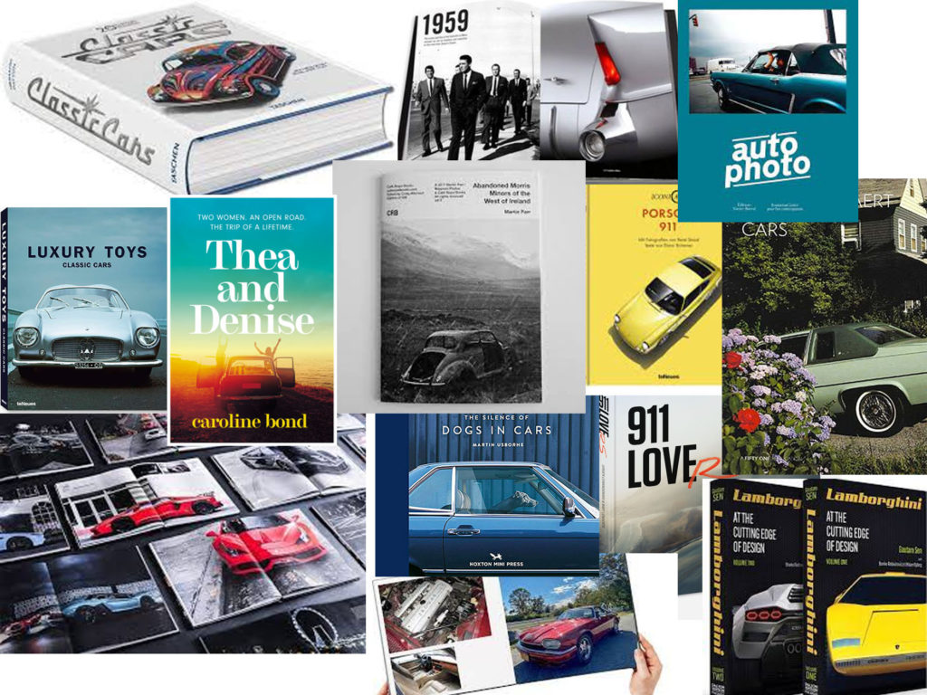
For my photobook i have taken inspiration from all of these photobooks. Firstly like the front cover of “CORTINA”. I think having just two thirds of the car showing looks really good as you can still see some background for context however it is still obvious to anyone who doesn’t know what a Cortina is that the car is the focus of the book. Second i really like the illustrated motorbike on the front of “Born to ride”. Due to its design it shows that the book has the theme of speed the whole way through. The book on the top right has a really good layout as it shows an image of the full car as well as the internal workings, I am going to use the idea in my photobook however i am going to switch the images so that the full car is on the left page and the smaller aspects are on the right. This will work better as it shows more of a sequence as the viewer can see the full car or bike then when the move to the next page it will show the photographs of the details.
Print previews
A3


A4


A5


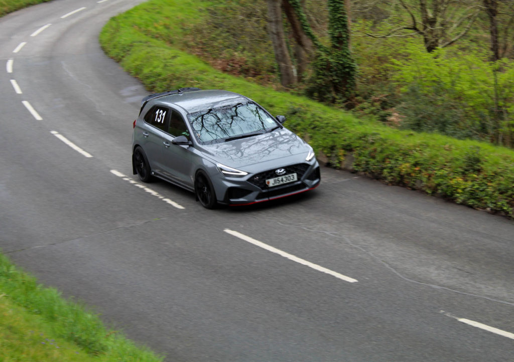

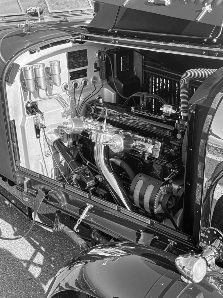
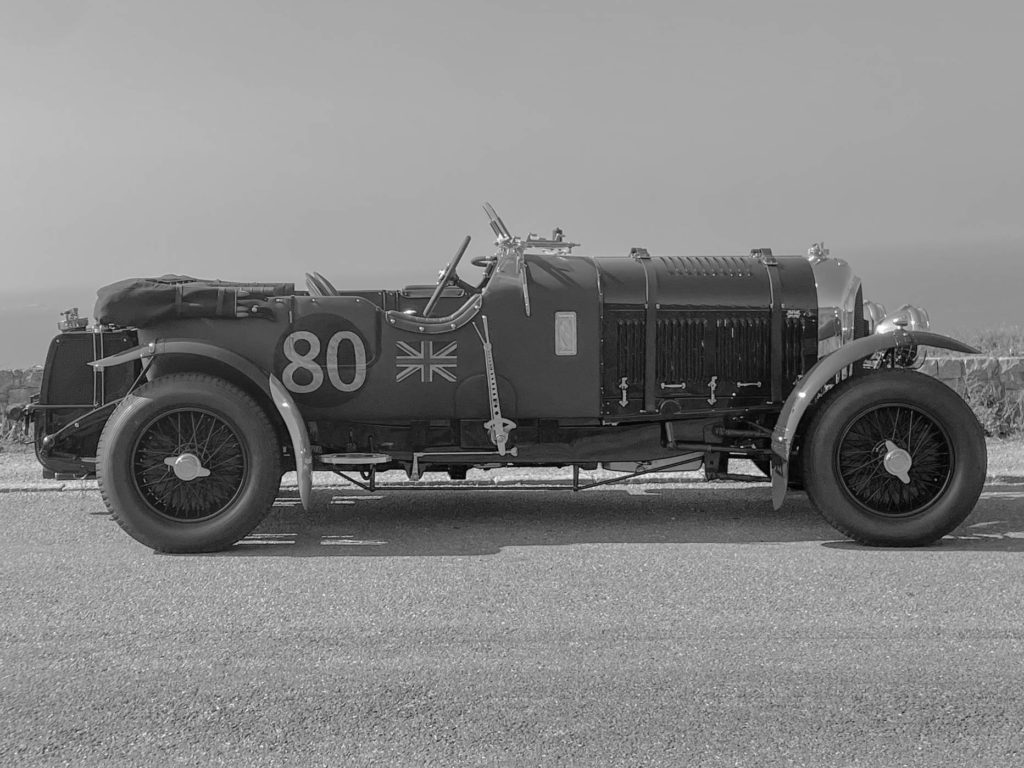
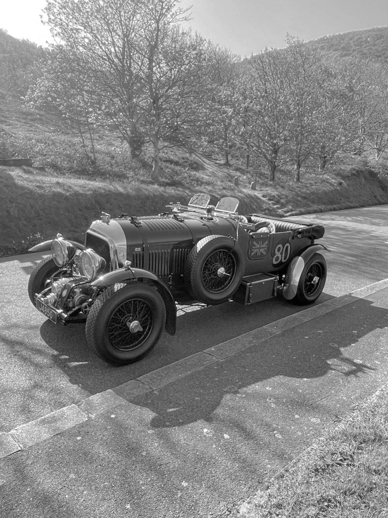
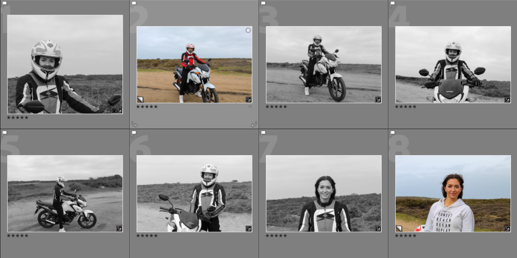
Photoshoot 4 (Unplanned)
This photoshoot wasn’t planned because i wasn’t expecting it however i was presented with the opportunity to go for a ride in this vehicle and i asked the owner if i could take some pictures.
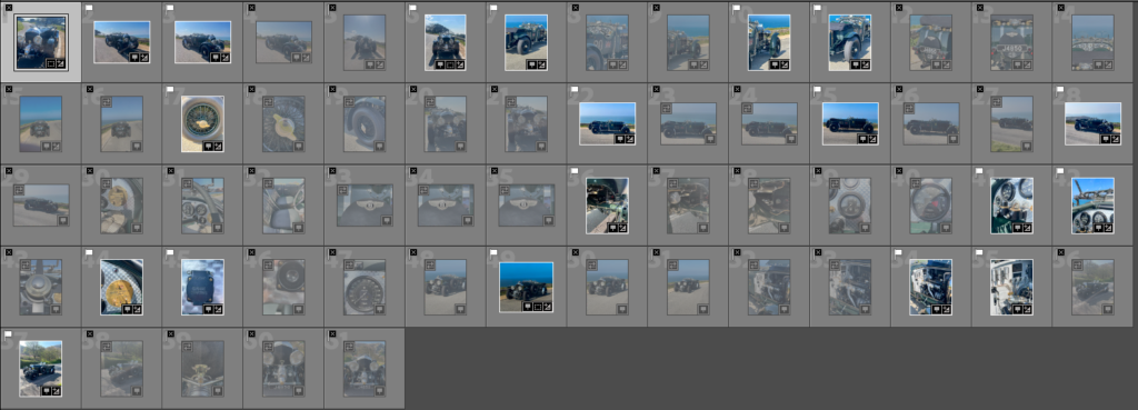
I uploaded my photos into adobe light room classic and began to pick out my best images using the p for pick and x for don’t pick feature.

These 19 images were the ones i thought were best from my photoshoot

I experimented by creating virtual copies of my best images and making them black and white. This makes the images look much more authentic as the car was built in the 1920s.
Developing the images


In addition to using the contrast, highlights, exposure and shadows features to slightly improve the look of the image i also used the levelling features available in light room. This is because i took the photographs at Sorel racetrack which is on the north coast of the island and it has a slight decline.

After I had developed all of the images including the black and white copies I used the rating system in Lightroom. I rated each image 3, 4 or 5 stars depending on their quality.
My Final Images
These were the 5 best images from my final photoshoot.


Experimentation
I lowered the contrast of the images in lightroom. This made a significant difference and made them look like they were taken in the 1920s when the car was made. This is because the camera technology wasnt very advanced then they could not pick up a large amount of contrast.


Photoshoot 3
For my third photoshoot the circumstances changed from my photoshoot plan due to weather and models not being available.

These are my images from my third photoshoot of my exam project. They were inspired by Danny Lyons’ The bike riders.

I used adobe light room classic to go through the images i had taken and pick which ones were the best from the shoot and for my photobook.
Development
I used the tools in adobe light room classic to manipulate my images to make them look better.

I used the crop tool on many of my images to remove some of the background to increase the focus on my models and their motorbikes.

I also edited the tone of the images such as increasing the contrast and the shadows as well as decreasing the exposure due to it being a sunny day and the highlights to reduce the reflection off the shiny panels on the bikes and the visors on the helmets.
Experimentation

I experimented with making the images black and white in order to more closely stick represent Lyons’ style. However, due to the images i took having bright and vibrant colours i think they look much better in colour. Additionally, when in black and white i don’t think that there is enough contrast between the rider, the background, the bike and the floor. For these reasons i am going to present my images in colour.


I also experimented with textures and tints over the image however these modifications took the focus away from the subject of the image.
Final Images


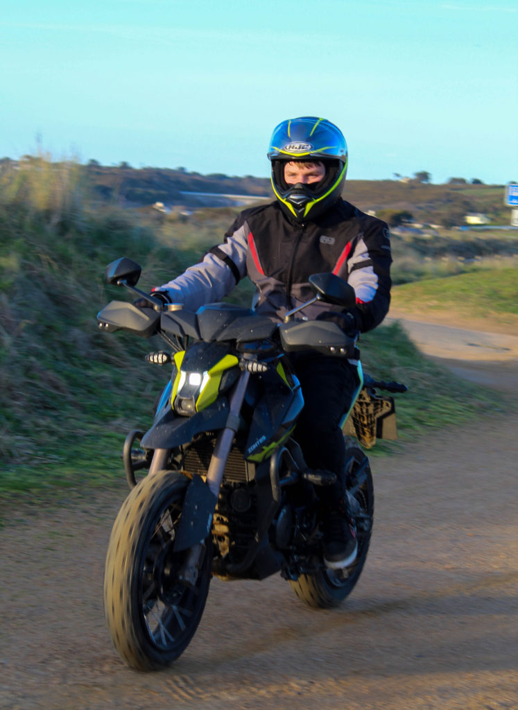


Image Analysis

The subject of this image being the rider and his motorbike are sharp and in focus with a high contrast to the background which is slightly out of focus which ensures the subject is what the viewer focuses on. Both the rider and the motorbike consist of vibrant colours that are opposing on the colour wheel which separates the rider from his bike yet the darker colours in the riders trousers and the bottom of the bike connect my model and his vehicle due to little contrast in the colours. I used a 18-50mm lens set to 18mm for this image. I set the shutter speed to 1/160 sec, the ISO to 100 and f/50. This gave me a sharp and crisp image in the foreground and a slightly blur over the background. These settings were perfect for the weather conditions on the day of the shoot which was sunny. The sun was going down to the west which gave powerful shadows to the east. I positioned the camera low down. This have a new perspective of the scene as well as showing the true shape of the motorbike which is much taller and wider at the front than at the back which is common in the style of the bike it was.
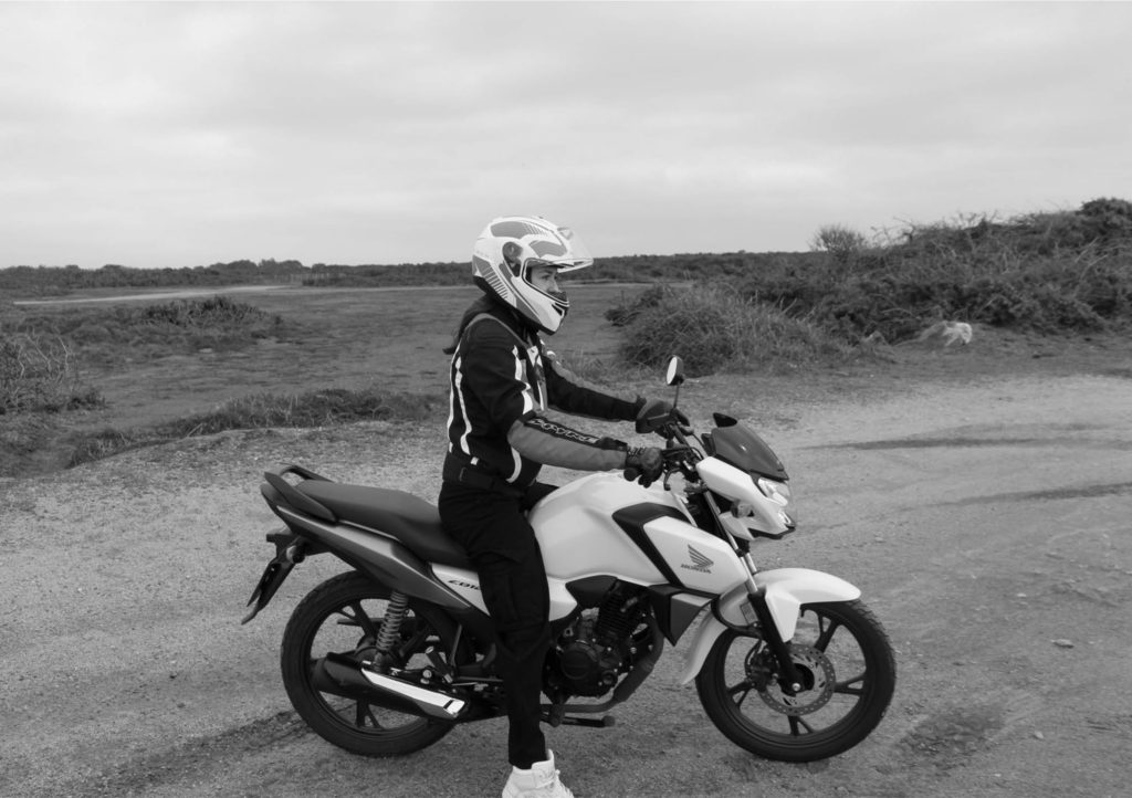
Photoshoot 2

These are the images i got from my second photoshoot of my exam project.

I went through my images in adobe light room classic and selected which images were the best and could be used in my final photobook.

I created virtual copies of each image and made them black and white. I then started developing the images in light room classic.
Experimentation


I experimented with the texture, dehaze and clarity of my images from this shoot. When decreasing the texture and clarity my images had an animated effect and when i increased the dehaze the background of the image looked stormy and ominous. I didn’t like the effects of decreasing the settings on my images however when increasing the settings i really liked the effect i got so i will be implementing it into my final image from this shoot.
Final Images


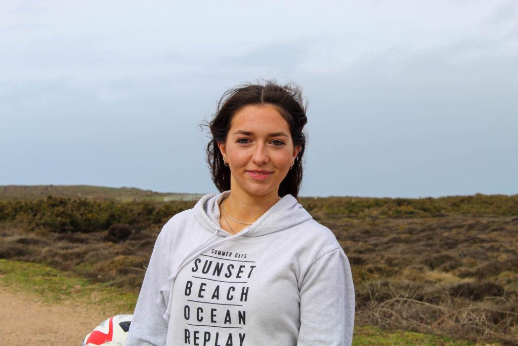
Image Analysis
This image was taken in colour and adjusted to black and white in light room. The weather on the day was overcast which gave an even lighting preventing shadows from forming which is good in a black and white image as it can can take the focal point off of the model. I got low to take the photo as it shows the scale of the motorbike in comparison with the rider as well as showing a different angle. The image has a high contrast with a central focal point and symmetrical surroundings.