All posts by alex m

Filters

Author:
Category:

Evaluation and Critique

My final images

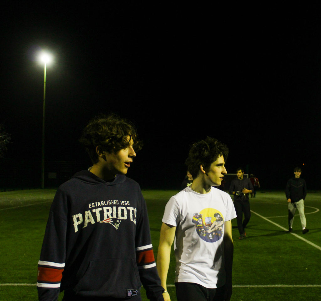
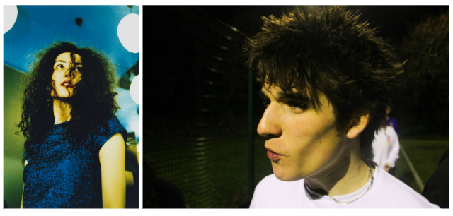
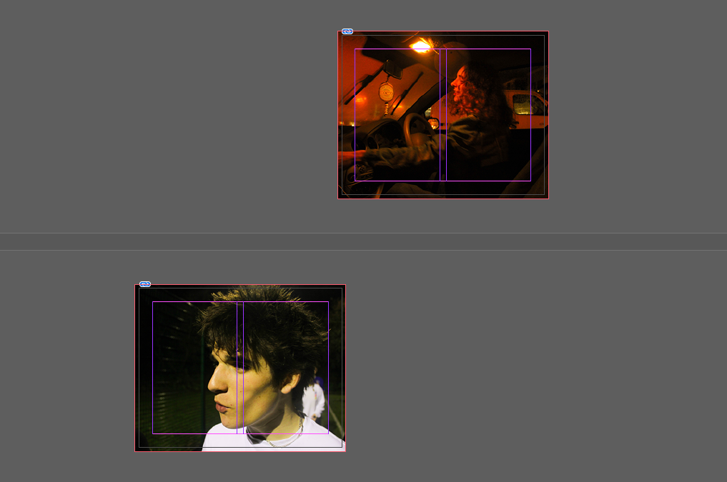
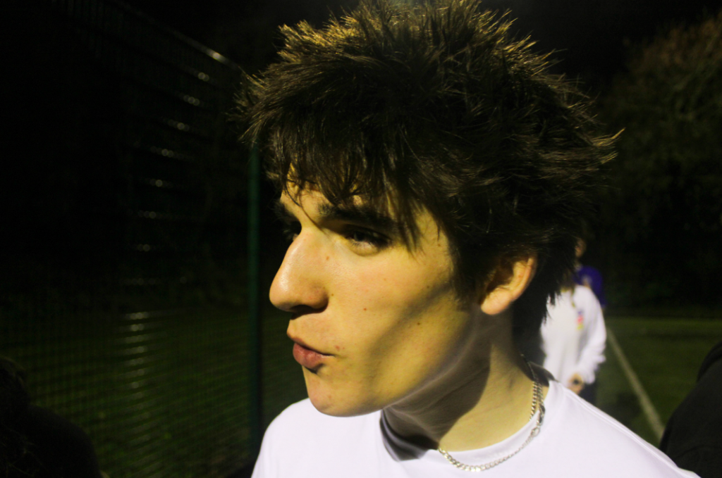
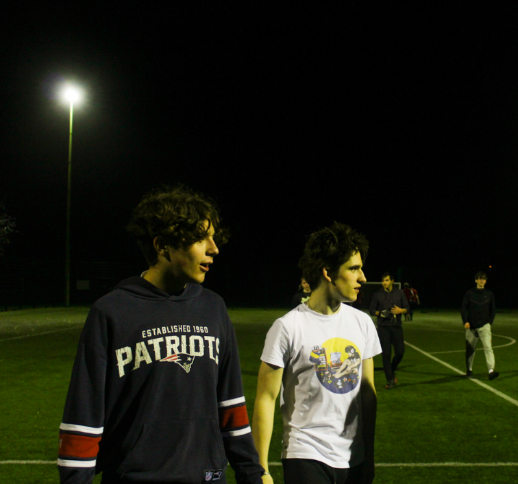
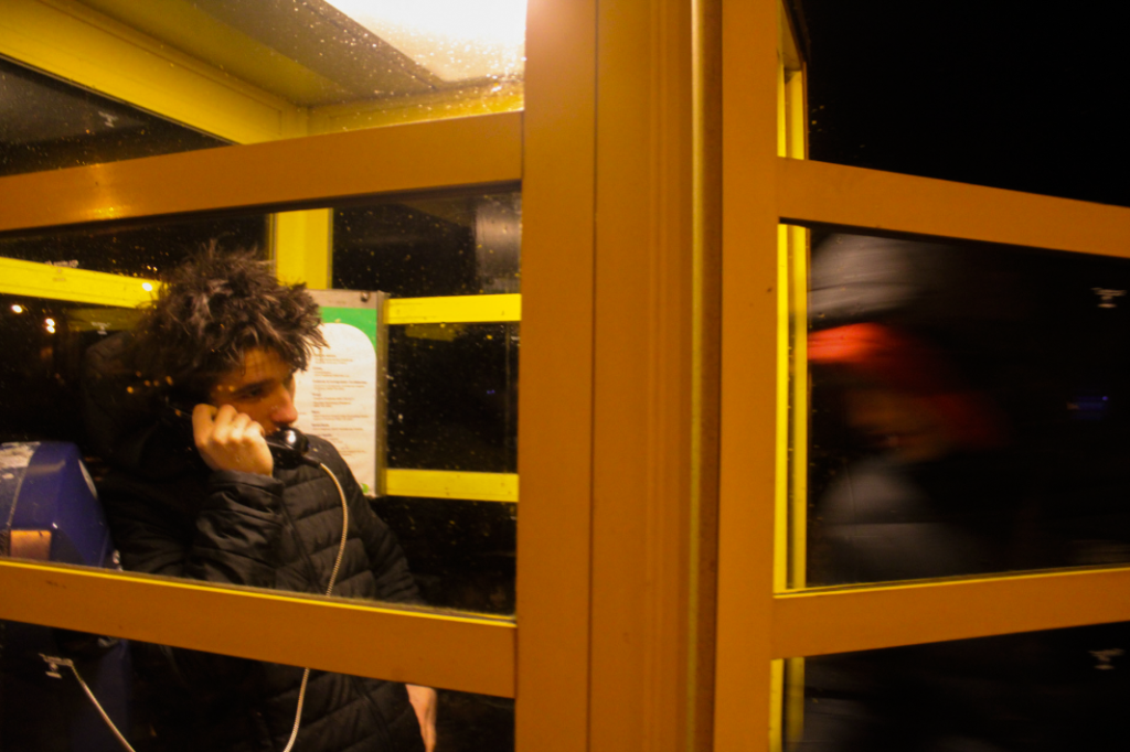
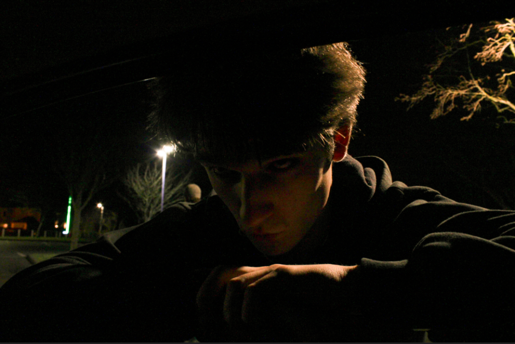
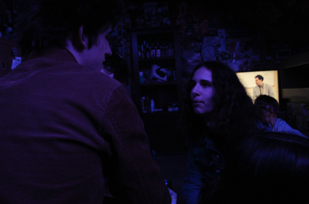
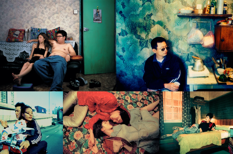
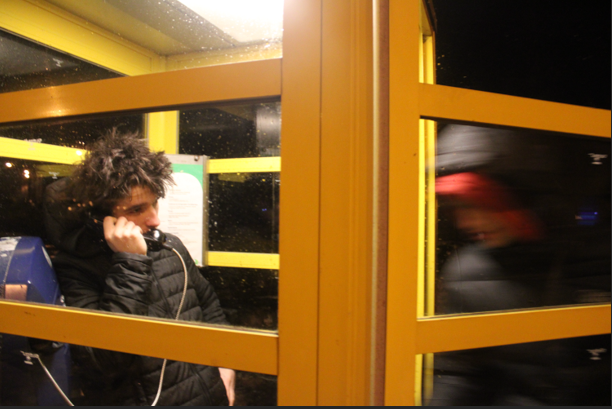
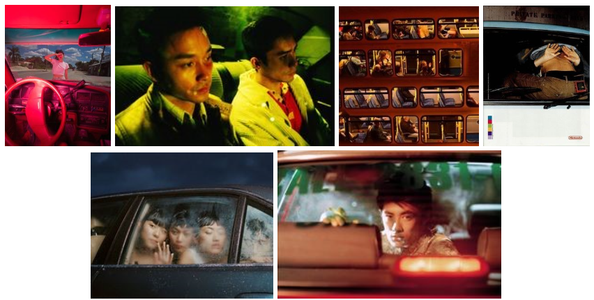
I feel as if my final images vary in strength, with the phone image (above, bottom left) being my weakest and the two top images (above) being my strongest due to their set aesthetic although this may be because they are a pair. I believe my phone box image is the weakest due to its lack of technical ability, although the blur was accidental it did add some action to an otherwise plain image however I feel as if this image has a lack of aesthetic with no coloured lighting and a lack of strong contrasting shadows, both of which are strong themes in my other images. In relation to the theme simple v complex I feel as if I succeeded with my intentions and interpretations- the images are simple however have a complex aura behind them which can be created by the viewer of the image by an unspoken narrative which I did not outline however is implied in the images with the main subjects referencing out of frame entities and not acknowledging the audience. Equating to my artist references was difficult however I think I succeeded with this, the majority of my images are clearly inspired by Wing Shya’s photography while one of my images is easily comparable with Claudia Andujar’s work (above, bottom right image). I think a criticism of my final project would be the amount of images I produced, although I am happy with my final project I feel as if I could have created more images in this style if I paid more attention to the camera settings when taking the images so there were more successful images which contained no motion blur and overexposure.

Click the image above for the whole presentation of my final outcomes

I am particularly happy with my presentation of images through a CD, I feel as if this adds more formality to my work showing that the images can be used in numerous ways- making a CD also meant that I could experiment further concepts with my images, with cinematic style images they are very fitting to other media applications such as covers for CDS/DVDs, advertising on billboards and film screengrabs. A criticism of my CD would be however the repeat of images, linking to my previous paragraph if I was more competent with the camera settings to create the correct colourful atmosphere without using flash then I would have had more images which I could have displayed: I also would have liked to burn a CD with either music on it, me talking about my images, or even a narrative to the images like a short story- however I ran out of time to do this as I did not think of what to do after creating the CD covers.

Compare and contrast work to artist references

“They’re Looking For Peace” by Claudia Andujar, my final image, an untitled image by Wing Shya

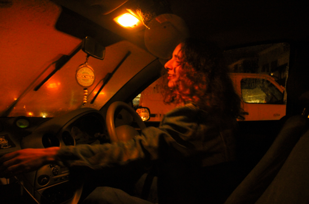
My image (above, middle) I feel is more closely related in inspiration to Claudia Andujar’s work, in relation to Wing Shya’s work I feel the only comparisons are bright colours in the background of the image while in the foreground the subjects face is illuminated with shadow either defining or hiding the face or the fact that my image was also taken in a car- apart from the obvious contrasts being my image only has one subject and has slight blur in it (which neither artists have). Andujar’s work has an emphasis on emotions and colour with the image above displaying a filter/coloured lighting over the image- my image was made colourful with the use of coloured lighting, parked outside the neon lights of a bar and illuminated with streetlights which flooded the image with a warm, vibrant orange as apposed to Andujar’s pale pink filter across the image. In relation to colour theory, Andujar’s image with a pale pink conveys different emotions than my image- pale pink supposing vulnerability, sensitivity and kindness, which is echoed in the subjects body language in the image- shows what seems to be a man and woman helping a younger woman who’s face is framed by the two figures: while my image, with the vibrant orange, shows excitement and happiness which is also emphasised by the the subjects facial expression which is framed by his long dark hair which contrasts against the light creating a waterfall effect of darkness which goes diagonally from upper left to lower right of the image.

Untitled image by Wing Shya and my final image

I do not feel as if my image can be related to Andujar’s work however these two images, again very different, echo similar atmospheric values based in the activity of the subjects. In Shya’s image there is a sense of separation between the subjects as they are both looking down quite sombrely with the man on the left remaining anonymous as he is turned away from the camera with only slight facial features visible- in my image there is a similar composition with two subjects parallel to each other however one is obscured by blur (with only slight facial features visible) creating an idea of anonymity similar to Shya’s image while the other subject is visible to the camera although in my image my subjects face is slightly obscured by the phone but I believe this presents another dimension to the image where instead of the silence and isolation which is envisioned in Shya’s image, my image seems to be more aggressive- the blur implying quick movement and the anonymity implying an intruder into a private moment. A similarity of the two images the symmetry of lines which comes with its own contrasts, in my image it is of harsh horizontal lines across the image with a vertical line separating the two subject however in Shya’s image soft vertical lines separate the two subjects in the form of subtle shadows- both ideas presenting a theme of isolation and seperation.

Untitled image by Wing Shya and my final image

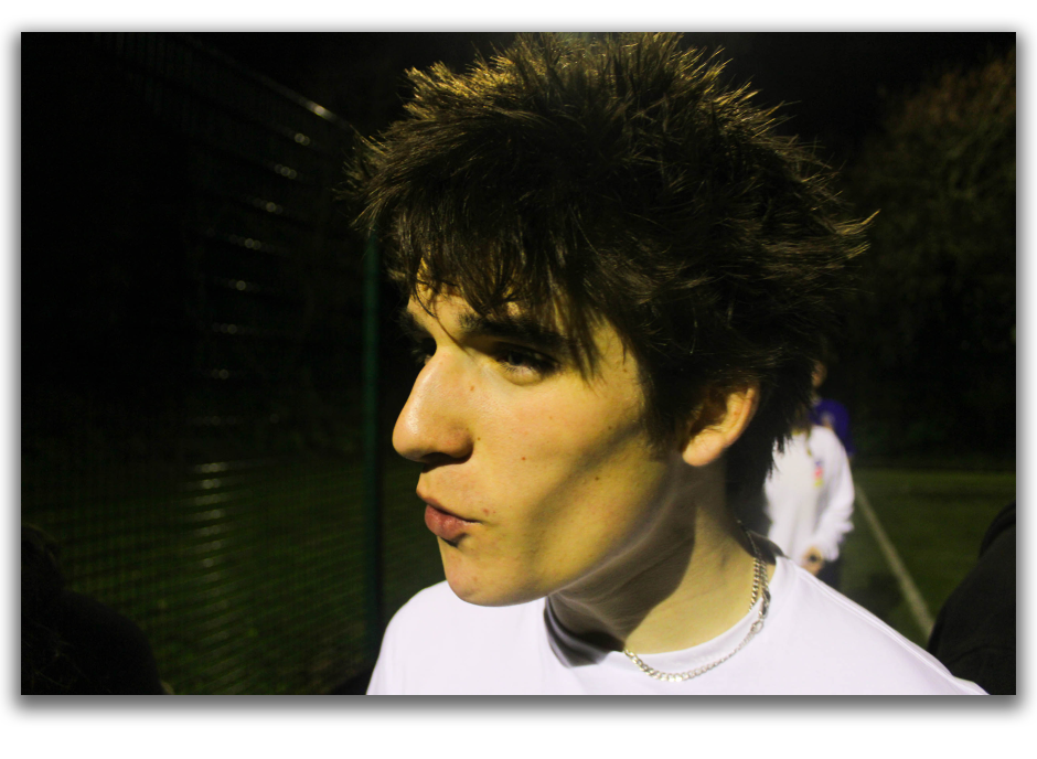
Once again relating to Shya’s images, these images have similarities in editing styles and in the fact they are both portraiture- both images are edited so the skin of the subject has a yellow/greenish tinge, with hair texture in full view due to the lighting (often in portraits the subject looks “perfect” i.e. no astray hairs which presents a simple outline of the subject) and both subjects are also the only thing happening in the image however they are not acknowledging the camera, presenting a separation between the subject themselves and the audience of the image as the subject is addressing someone/something which is out of frame which is unusual for portraiture as the usual composition would be the subject looking directly into the camera and level with the camera- maybe standing or sitting a distance from the camera. Both images also contain harsh shadows around the face, under the jaw to be exact (Shya’s image presenting this more prominently). The obvious differences between the images being the fact that my image is in landscape while Shya’s is more traditional in portrait, meaning my image has more negative space and a darker background which makes the subjects face stand out more.

My final image and an untitled image by Wing Shya

The similarities of these images run in technical abilities, both images have two subjects each turned away from the camera referencing something out of frame- contrasting between my image and Shya’s my subjects are facing the same way while Shya’s are facing opposite ways however neither are creating any attempt to acknowledge the audience once again creating a feeling of separation between the subjects and audience, this could be further translated into cinema as the third wall is rarely broken and Shya’s images are taken from film sets and my images are intended to be cinematic- meaning this perspective was intentional of Shya. Both images also have the main subjects in focus, while the background is blurred making the audience drawn to the subjects as the only point of interest- in my image this can be translated differently as there are people in the background of my image which may draw attention away from the subjects however I believe this adds to the narrative of my image where it looks like a snapshot in time leaving the audience wondering what is happening out of frame while in Shya’s image it is natural for the two subjects to be alone as they are on a motorbike.

Zine design process + display of final prints in CD

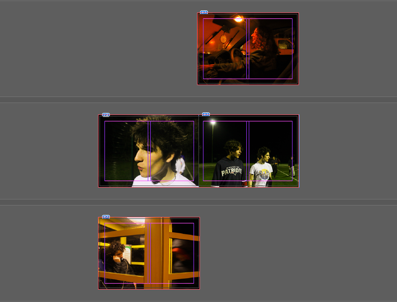
After choosing my final images I created a zine for my final images which be would put in a CD case- to put the zine in a DVD case I would simple have to change the orientation of the zine from landscape to portrait.

My zine

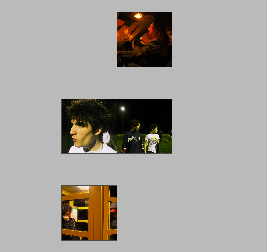
I created this zine using Indesign, I opened a new document and created four pages, I then inserted my images and readjusted them to the page size- after doing this I then made the images fit the frame proportionally to create my final zine. I wanted to make sure I kept the colour scheme of the images connected- as there are only four images the zine (by technicality) can have either set of images as the front and back covers so I kept the images with similar colour schemes together (yellow + orange and green/yellow + green/yellow).

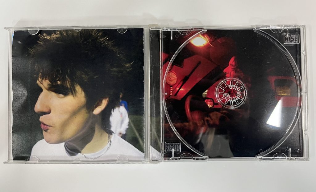
After printing this zine I am going to put it in an empty, clear CD case, for this I have to measure the CD case and make sure the dimensions of the zine fit perfectly into the case- this will make my zine the front, back covers and the inside images: one image will be covered by the CD but for display purposes I am not going to put a CD in the case.

CD CREATING PROCESS

Zine for foldout and front cover

First I created the zine which will be the front cover and the traditional fold out in the CD, this is seen above.

Back cover and behind the CD

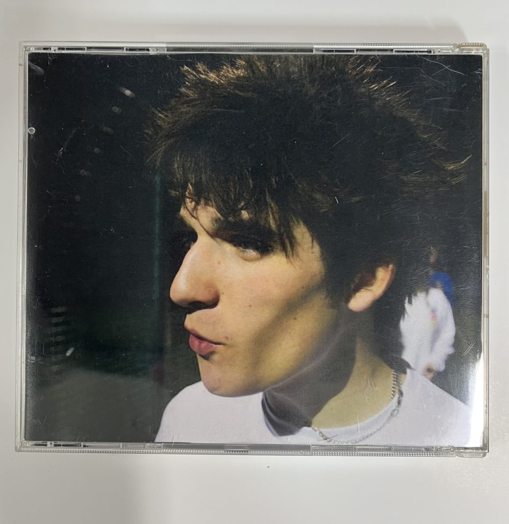
I printed the front and back cover separately as the dimensions are different for the front and back cover of the CD (front- 12x12cm, back- 15×11.8cm) so my second “zine” will simply be a double sided page, The back cover is bigger as to have the image folded so the spine of the CD has imagery in it. I may write a title and track list on the CD but I am unsure as of what to write so this is still uncertain, especially since if I was writing on the case/images it would take away from the cinematic look of the images. Once printed, I inserted the prints into an empty CD case, the final outcome as seen in this blog post.

Mock display of final prints + virtual gallery

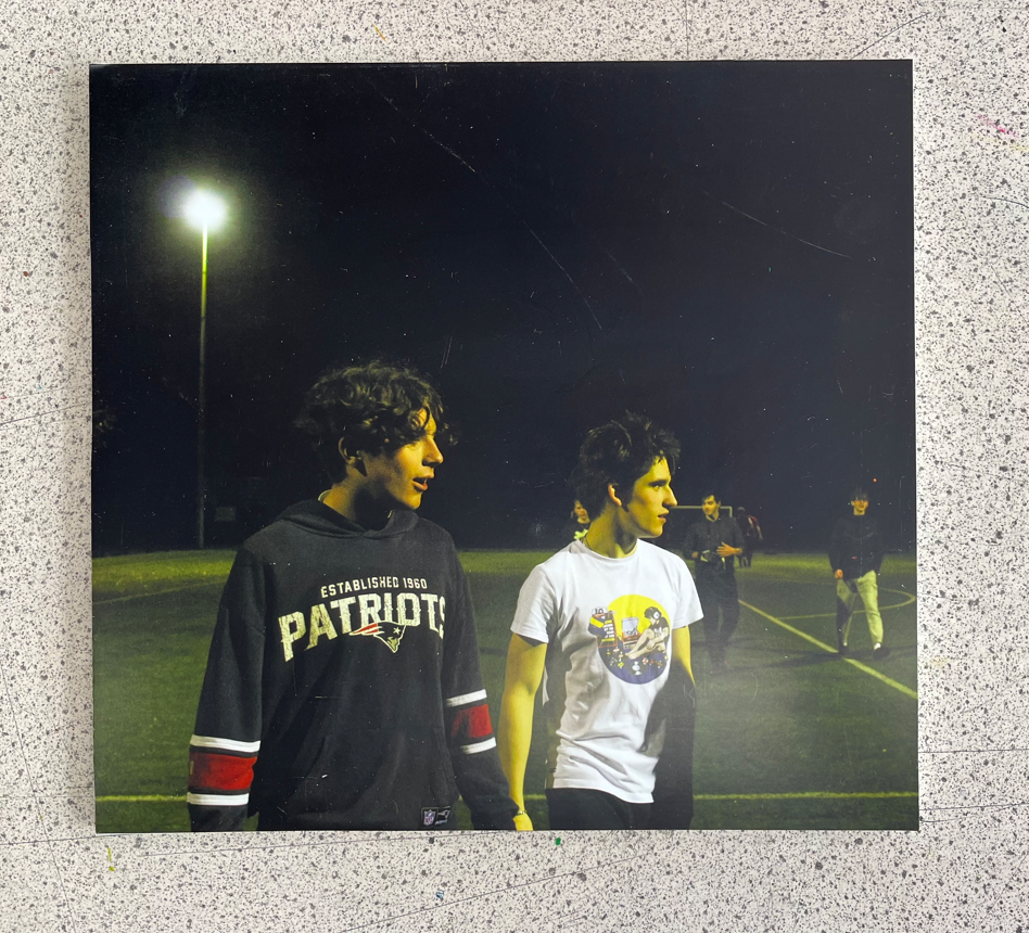
Below is my final selection of images which has equated to four images, for these images I have been thinking of how to display the physical prints of them- I do not want to take away from the image by using a frame so when displaying these images I am going to stick them onto foamboard. The images have been printed in A3 size so I want just something subtle so the images stand out where they are being displayed.

FINAL PRINTS

DISPLAY

Experimentation on photoshop of making the image look like it is one foamboard (layer, layer style, drop shadow)
A mock up of the display on foamboard

I think for my display on foamboard I am going to keep the two images on the left as a pair and have the other two as separate images.

VIRTUAL GALLERY

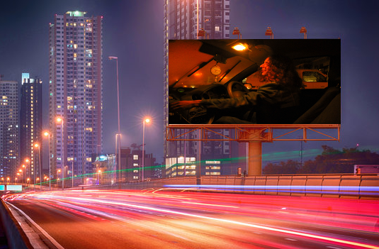
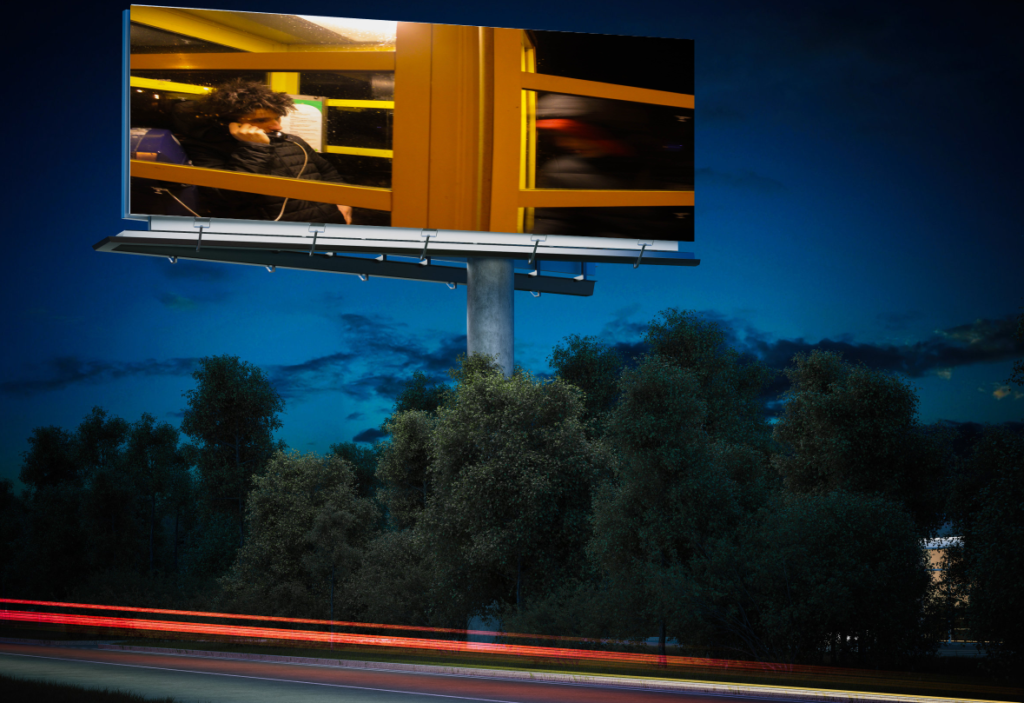
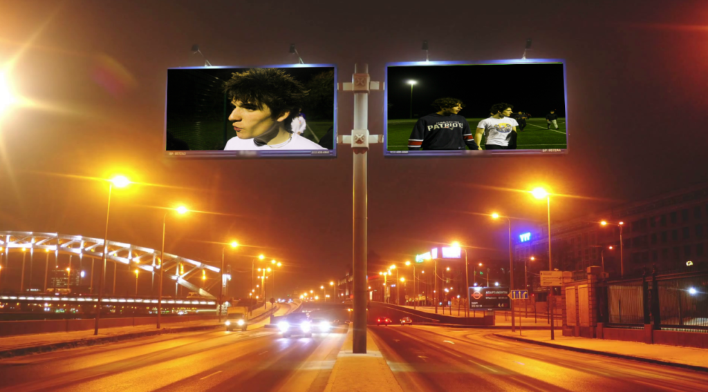
I did not intend my images to be displayed in a gallery, so instead of a virtual gallery I feel my images would be more suited as advertisements, film posters or billboards. On photoshop I experimented with viewing my images as billboards.

Another display of final images I may do is creating a small zine, one which would go in a DVD case containing the information for a film or in a CD case where there are song lists – my zine design is in my next blog post accessible here.

Editing images photoshoot #3 + #4

PHOTOSHOOT #3

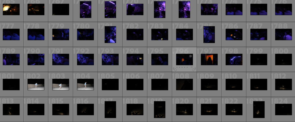
Click on the contact sheets above for outcomes of photoshoot #3 + #4

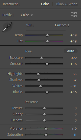
Both of these photoshoots were quite small, with only 30 images being taken overall. I coloured coded 12 images that I thought were successful green, in one set of images I concentrated in bringing out the purple of the images while in the other I concentrated on yellow when editing.

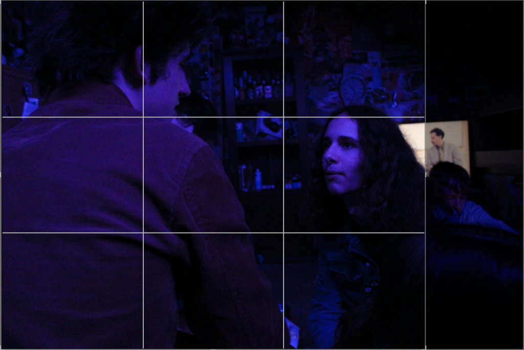
An image I cropped

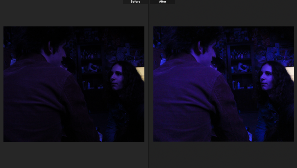
I will also be doing minimal editing for these images, being careful not to make the images too grainy as the rich coloured lighting in the room where I took the images already means that if I change the exposure massively the images will become grainy.

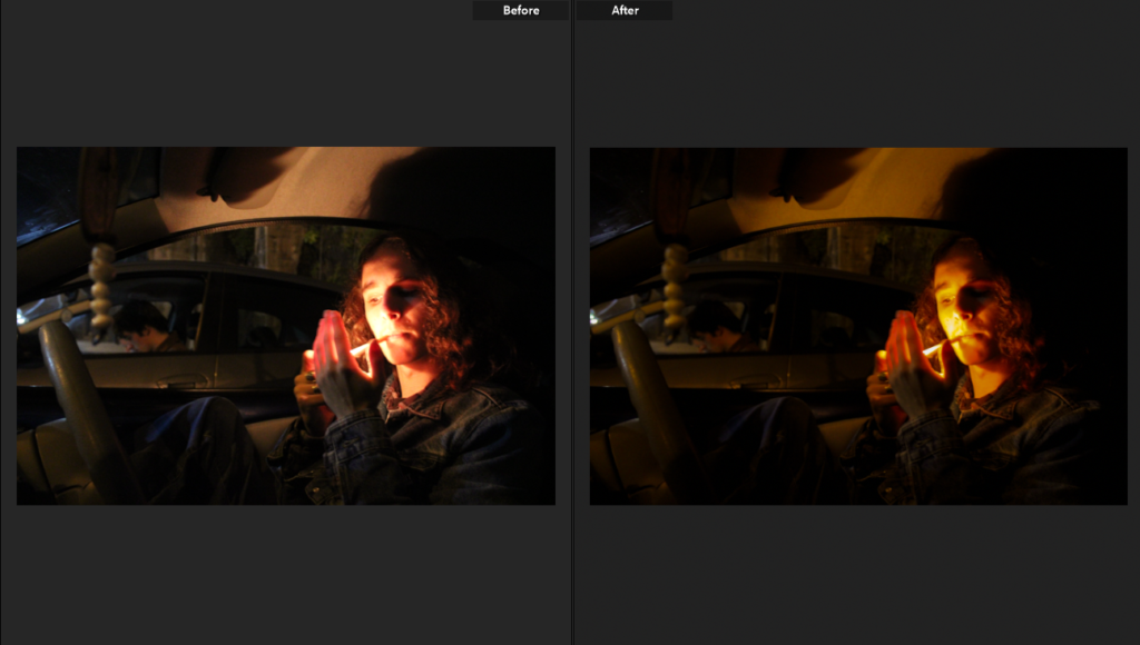
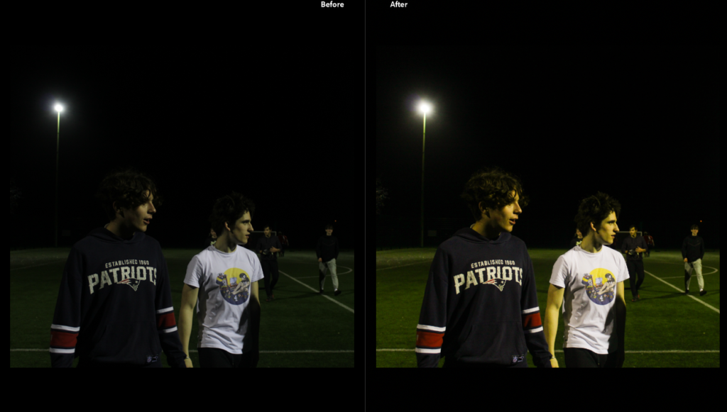
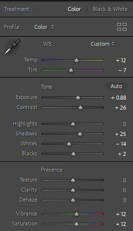
In this image I turned up the exposure trying to bring out finer details on the subjects and more definition, this was difficult due to the coloured light as the images became very grainy.

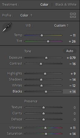
The editing for the “After” image above.

Cutting down on images after editing I put my unsuccessful images into the yellow category while keeping my successful images green.

My unsuccessful images

Personally I am not very fond of LED coloured lighting in images as I think it looks tacky and amateur so for these images I wanted to concentrate on the subject’s emotive expression which in these images I do not think is very effective.

My successful images

Concentrating on facial expression and body language these images above I feel are the most emotive- the image on the left has direct eye contact with the viewer (displaying almost a kubrick stare), paired with the image on the right the subject who is faced towards the camera has almost a facial expression of pleading.

PHOTOSHOOT #4

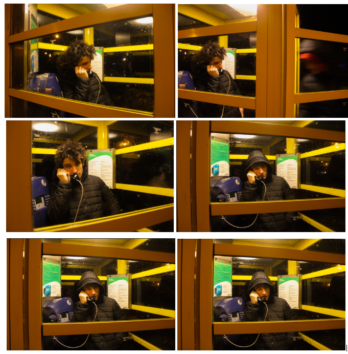
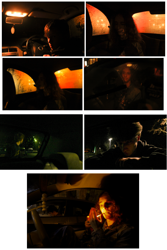
For my fourth and final photoshoot my only concentration is choosing between 6 images as a final image which are very similar, they are all edited with the same settings- to bring out the yellow in the images- however each image portrays a slightly different perspective.

The editing for the images below.

The image that sticks out to me the most is the top right one, where a blurry figure is entering into the phone box with the subject- this image has slight symmetry due to the lines on the phone box doors creating yellow boarders and the motion in the image present more action in the image.

The 6 images I am picking between

Editing images photoshoot #2

Click on the contact sheets above to see the outcomes from photoshoot #2

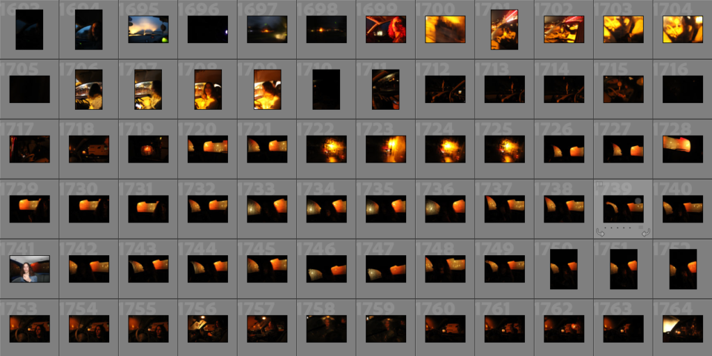
Following the same structure as my blog post on editing, I started by flagging all the images I believed were successful green, this turned out 8 images as the rest of my images from this photoshoot were blurry and dark, a common theme in trying to capture images in the dark. I did not have to crop any of these images so I went straight to editing to bring out colours.
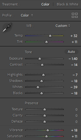
Editing is once again minimal, in this photoshoot many of my images turned out with orange and yellow tones which I have chosen to accentuate- once again my images have grain in hem which suits them however some have turned out too grainy for me to introduce colour without making them look low quality.

The editing for the “After” image above, meant to bring out yellow and orange tones which is my main focus for this photoshoot.
Some of my images became very grainy after editing- due to this I may not use the ones which are massively grainy as it makes them look low quality and less defined.

Through editing I was able to make a smaller selection of successful/unsuccessful images, I have changed the images which were less successful to yellow in my coding system.

My unsuccessful images

A lot of my images were too grainy after turning up the exposure so this already made them unsuccessful however this was a difficult selection of images I feel did not fit up to the intent I had for them- images I am still not sure about are the first and third images on the left of the grid as well as the bottom image as I like the interaction with the camera (turned towards it- including making eye contact with the camera) and the colours in the images (specifically the highly grainy green image however I feel as if it does not suit the rest of the images).

What I think is my most successful image from this photoshoot

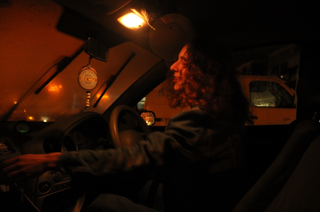
I really like this image as it massively reminds me of Claudia Andujar’s “They’re Looking For Peace” collection which is one of my biggest inspirations for this project, this is due to the sweeping motion my subject has- making him the certain main subject, the colour is also similar to Andujar’s work, she often used oil lamps to keep the colour consistent across the whole image however although I did not use an oil lamp the lighting outside of the car carried throughout the car, keeping the same consistency. Although this image is slightly blurry it is not massively noticeable- I feel as if this blur adds to the image in a positive light as it looks like it was screenshotted from a film- showing motion makes the image more than an image as it implies a further story.

Editing images photoshoot #1

Click on the image above to see the outcomes from photoshoot #1

I started by flagging all the images I believed were successful green, this turned out being only 10 images as the rest of my images from this photoshoot were blurry and dark.

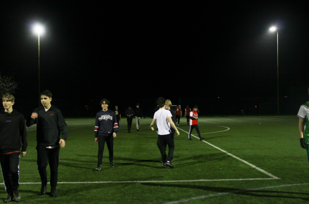
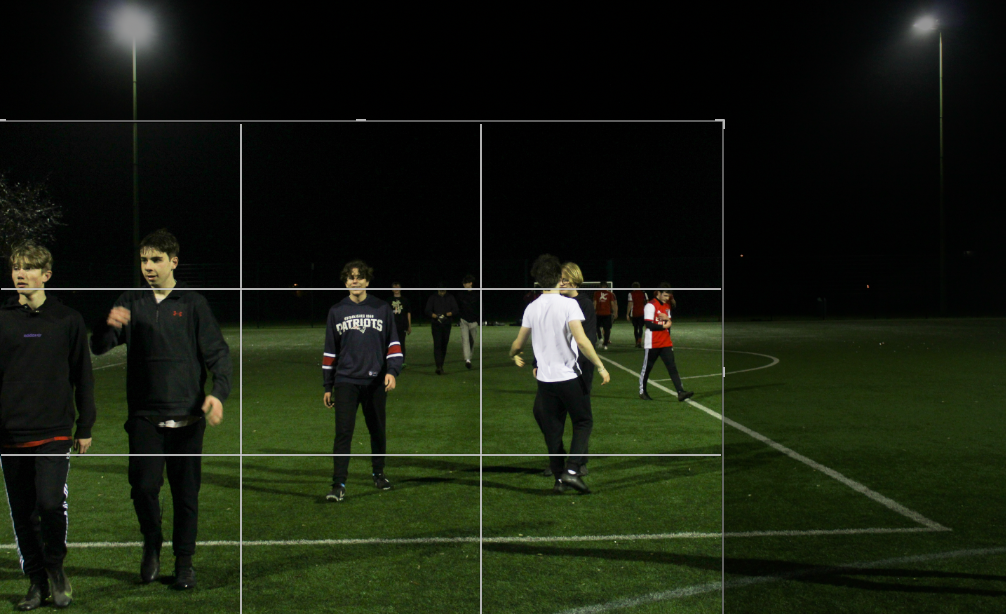
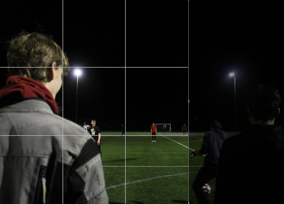
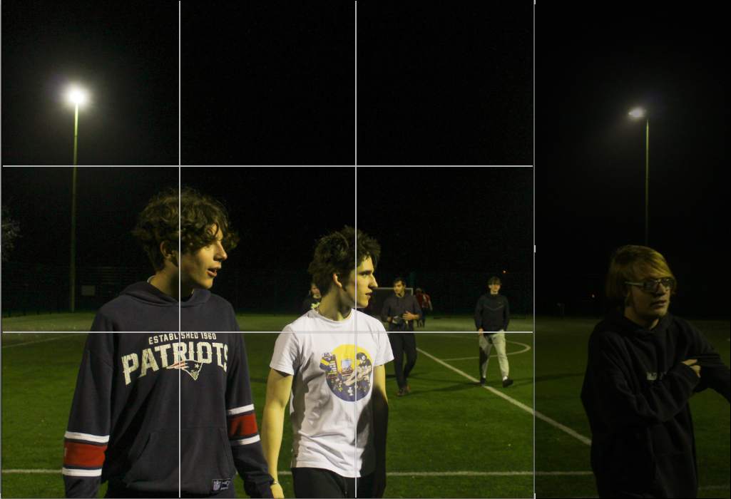
For some images I wanted to crop them into a main focal point so they have less negative space- for cinematic style images there would rarely be space where something is not happening, this is due to the nature of cinema and films where cameras are often concentrated on the action.

An image I decided to crop
Another image I decided to crop

When editing these images I wanted to stay committed to the green/yellow tinge that the floodlights produced on the images- I am going to do minimal editing however my main concentration will be bringing out colour and making the images more vibrant. All the images will be edited similarly- adjudgments will mainly be made for the exposure of each image as this is quite inconsistent.

As seen for the image above, editing is minimal and primarily concentrated on colour- bringing out greens and yellows in the image. I was going to turn up the grain in the images however due to underexposure the images themselves are already quite grainy.

The editing for the “After” image above, this is the same editing for the rest of my images from this shoot.

Though editing my images I was able to cut down to some final images as changing the exposure and contrast I could see blur and images which were more unsuccessful, I changed these images to yellow in my coding system so I can still access them.

The images I found were less successful

I find many of these images more unsuccessful as they portray too much of an outsider point of view, with no focal point they make the subjects look isolated with a lack of interaction towards the camera (many subjects have their back to the camera which is uncommon in film photography). In the bottom image although almost every subject is presented towards the camera there is an amateur feeling towards the perspective, a lack of focal point as the subjects are spread out which I do not feel is very appealing in the type of effect I am trying to accomplish.

The images I found were successful from this shoot after editing.

I think these images are more successful as they have clear focal points with a clear aesthetic theme running through them: the one outlier is the image at the bottom of the montage above which is darker and more underexposed, making it less clear and out of focus due to grain- there is also a lot of negative space in the image so I am unsure if I will consider this image a final image however the other two images are in focus and carry the same idea of cinematic images; in focus, clear, an idea of narrative as the subjects are concentrated on what is out of frame and definition in the subject with not too much grain.

Photoshoot #3 + #4 outcomes

Photoshoot #3 and #4 were considerably smaller photoshoots than the other photoshoots, with only about 30 images being taken overall.

PHOTOSHOOT #3

The images which served as inspiration for this shoot

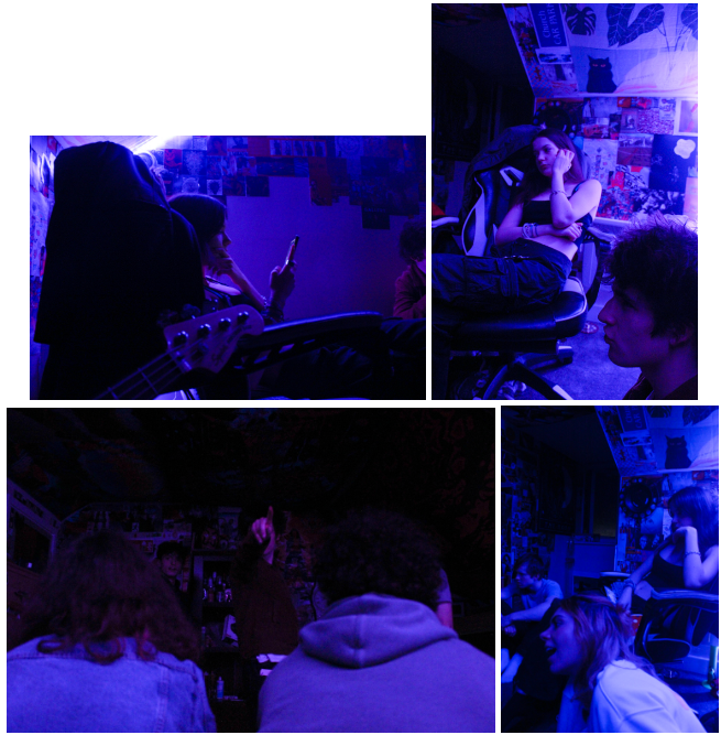
For my third photoshoot I was taking pictures in colourful (monotone) settings- in this instance my images were taken in a room with LED coloured lighting.

Contact sheets from my photoshoot

My images in this shoot were slightly dark- if turned up the exposure I expect the images would become very grainy. Personally I do not like the images I obtained from this shoot mainly because I do not like LED lighting in photographs, especially in the context of trying to take cinematic images as I struggled to get the correct camera settings to adjust to the lighting.

MY BEST IMAGES FROM THIS SHOOT

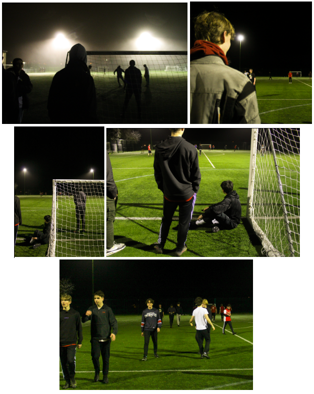
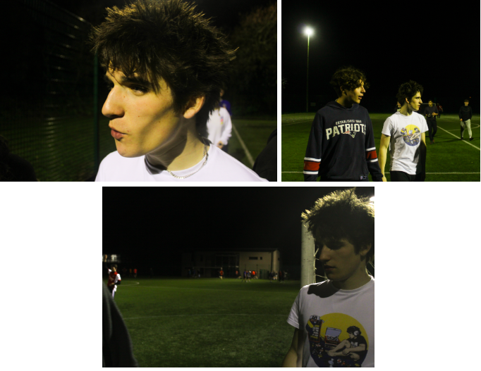
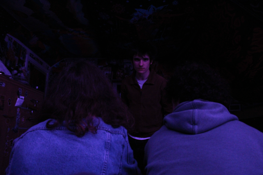
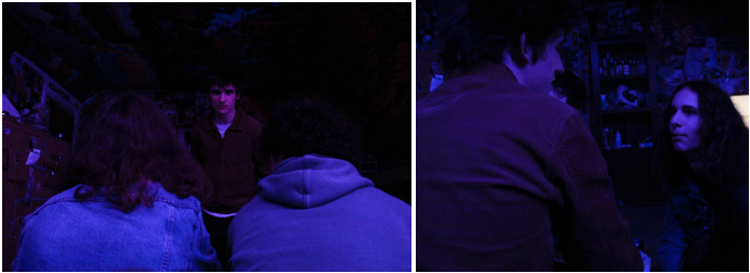
The image above is one of my best images due to composition, I don’t really like the image itself but the natural framing of the two backs to the camera and the subject in the middle is a good account of cinematic display in photography, with the main subject making direct eye contact with the camera in an almost “breaking the third wall” style.

This image is one which reminds me of Claudia Andujar’s work based off the emotion shown on the main subject’s face and the fact the image looks like a snapshot during a conversation where the subject is emotive.

PHOTOSHOOT #4

The images which served as inspiration for this shoot

For this photoshoot I was just out with my friends, a lot of the pictures I got ended up being my friends just posing for pictures (with flash- so unusable for what I wanted to accomplish).

Contact sheets from my photoshoot

However at one point we had a small photoshoot in a phone box which turned out quite successful with 6 usable images being produced- there was very little blur and my camera setting ensured the subject was in focus, if I had any criticisms for this shoot it would be that I did not take enough images.
I think this image above is one of my best images due to the accidental blur which makes the image more dynamic as the subject on the left is in focus which on the right it seems as if someone is intruding with anonymity due to the blur and what they are wearing. This image also has slight symmetry due to the yellow window frames of the box.

Photoshoot #2 outcomes

The images I used as inspiration, none of my images really came out like this however I concentrated on lighting, using settings with colourful lighting so this is definitely present in my images.

For my second photoshoot I was in friends cars taking photos, on this night in particular the car was parked outside of a bar with neon signs and lighting creating interesting colours.

Contact sheets from my photoshoot

Many of my images from this photoshoot were overexposed and blurry, it was difficult to capture images in the lighting in the car as it was dark and raining inside with the mix of trying to capture the lighting and the subject with equal light balance so the colours of the neon lighting would be prevalent.

MY BEST IMAGES FROM THIS SHOOT

I really like the image above as it reminds me of Claudia Andujar’s set works “They’re Looking For Peace” due to the natural emotions captured- the lighting is also very rich and vibrant. Colour theory is also be apparent in these images with reds and oranges being the colours of passion and excitement while my subject has an excited facial expression.

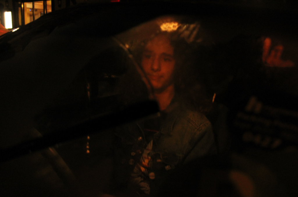
This is also one of my best images due to the way the lighting frames the subject, almost like a spotlight spilling down. This image was taken outside of the car so the subject also looks a bit blurry due to the rain on the windscreen. I do not think I will use this image as a final piece due to the blurring the rain introduced- making the image look less than cinematic.

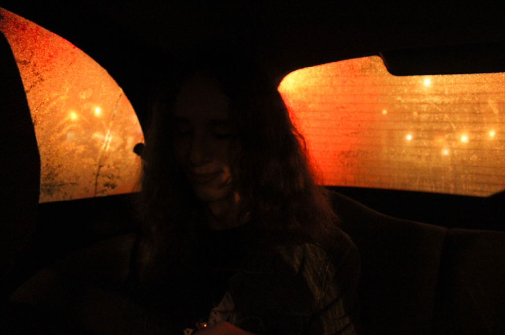
I really like the lighting in this image above as the condensation on the windows makes a colour gradient of the lighting outside, with the red being the subject creating a silhouette of the subject. Like the image prior to this one, I probably will not be using this image mainly because the subject is very dark and when editing turning up the exposure would damage the look of the lights and colours in the background, making the background overexposed.