After giving it some thought, I settled on the name Chroma for my photobook, it refers to the purity or intensity of a colour, which I feel works well for my final layout.
I uploaded my photobook onto Blurb to be printed, it can be previewed here.
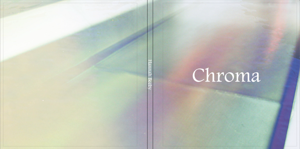
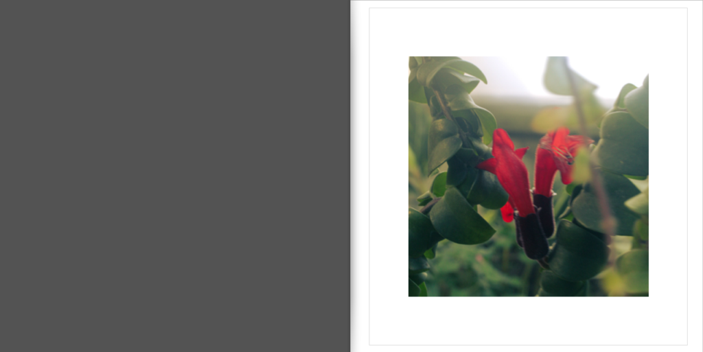
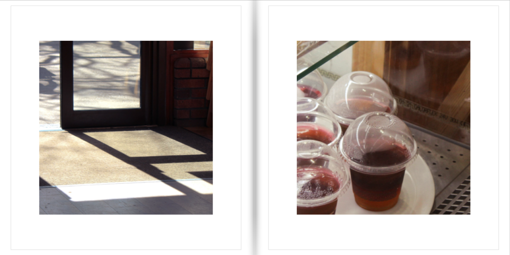
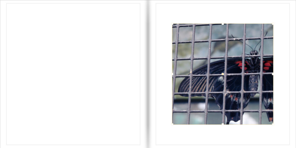
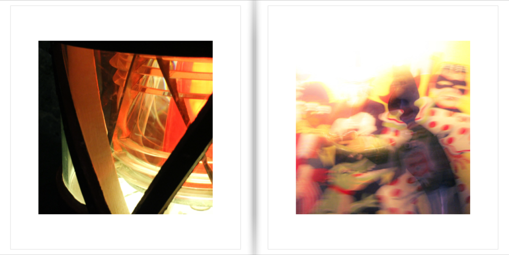
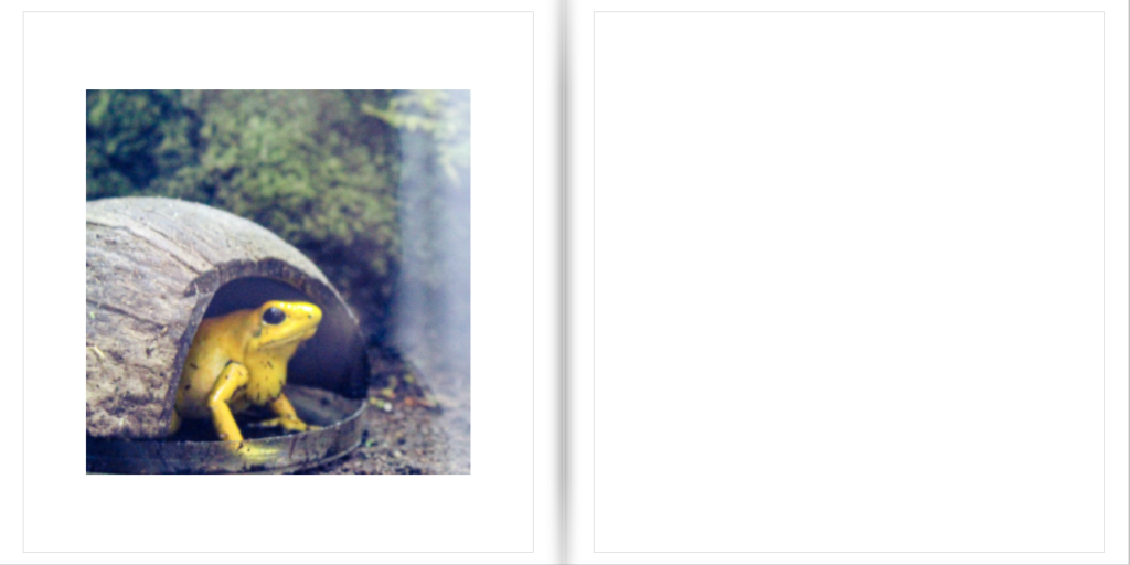
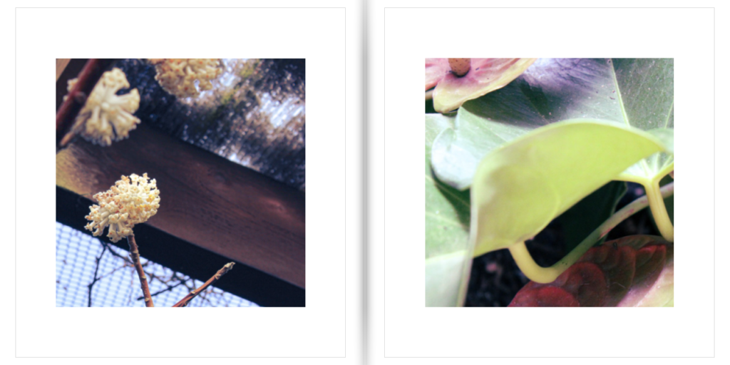
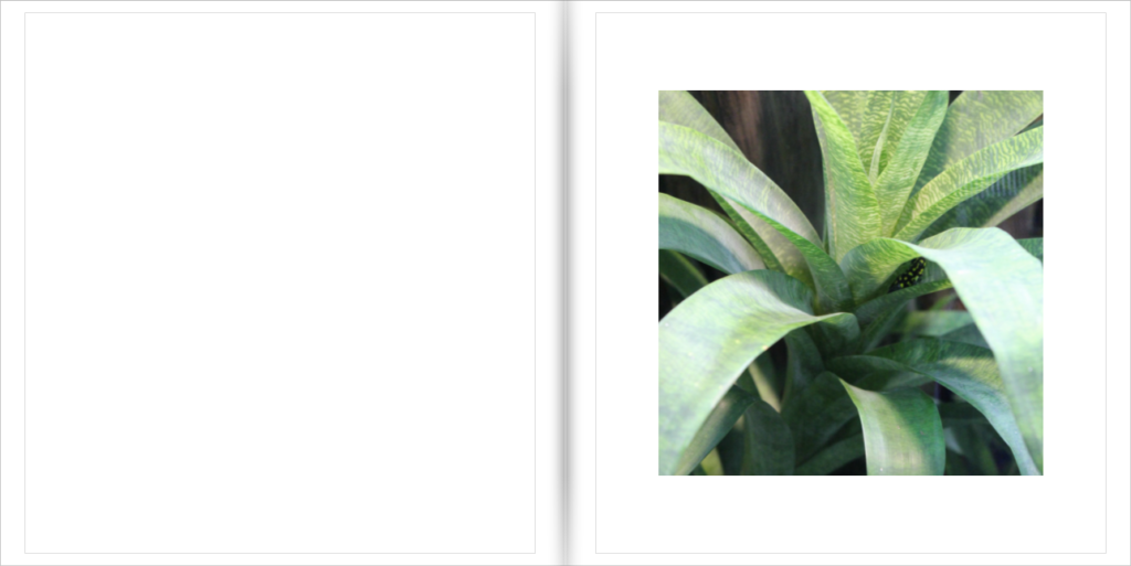
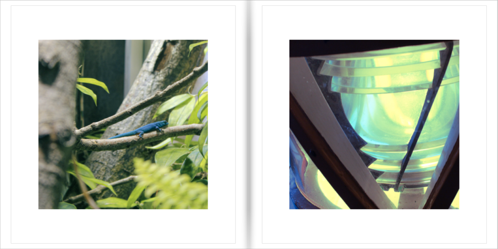
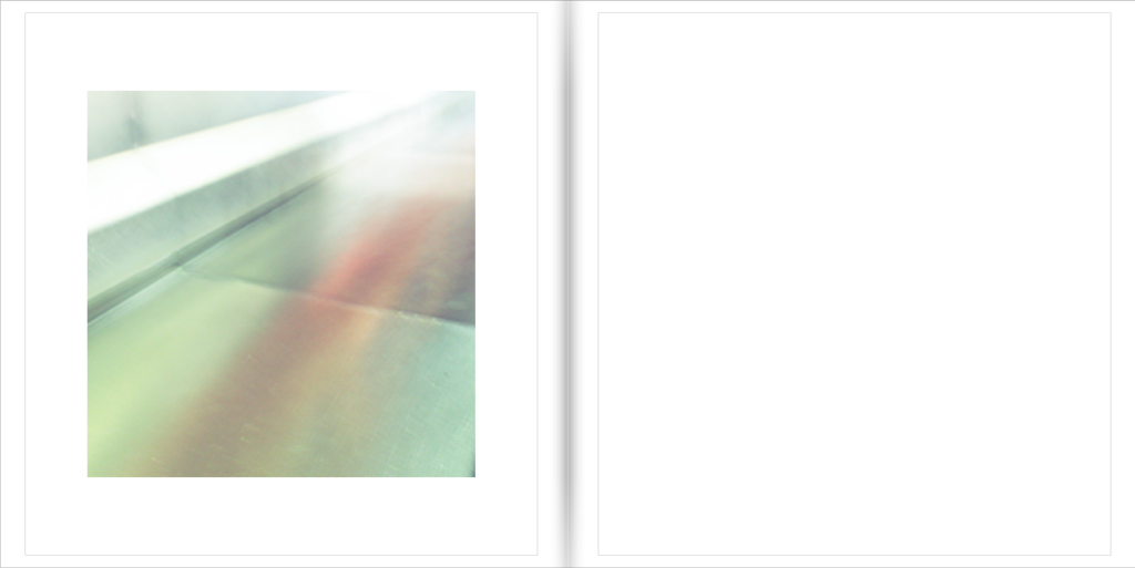
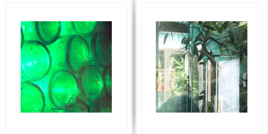
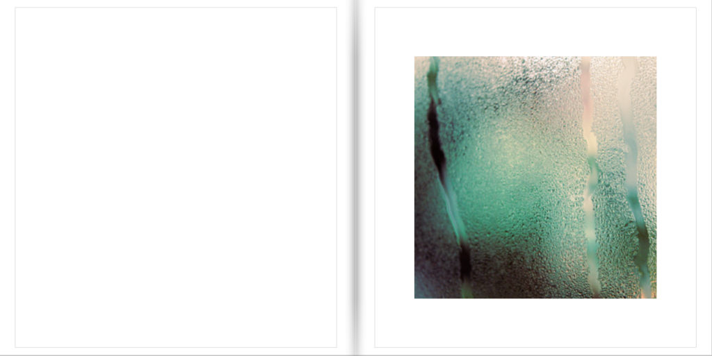
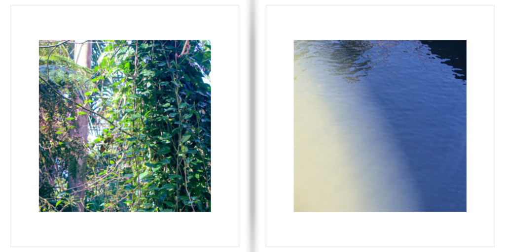
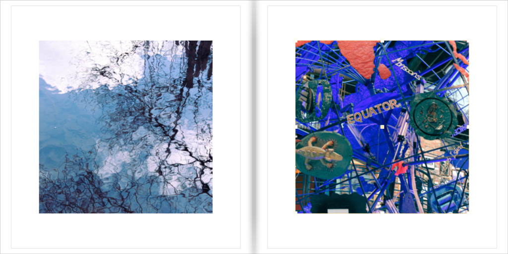
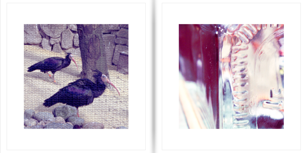
Overall I am very happy with my final layout, however I would have liked to add more images as this version is very small. I had 77 potential images I wanted to use but only used 24 of them in the final version. If I were to do this project again I would want to take more images so I had more high quality material to use in the book. Despite this I feel that I was successful in this project in exploring colour and light in a unique and abstract way, and it is very different compared to my previous project which mostly used old archival images.