Design
Covers
An idea for a front/back cover could be to create a cover similar to my last photobook, where I use an image that has been edited in photoshop to have a more angular and slightly more contrasting look. This

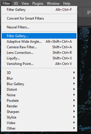

To edit the image I used the Filter Gallery – Cutout filter with these settings to create the effect. Unlike the last cover, I won’t be editing the colour or lighting as I would prefer this image to be darker with the same colours.
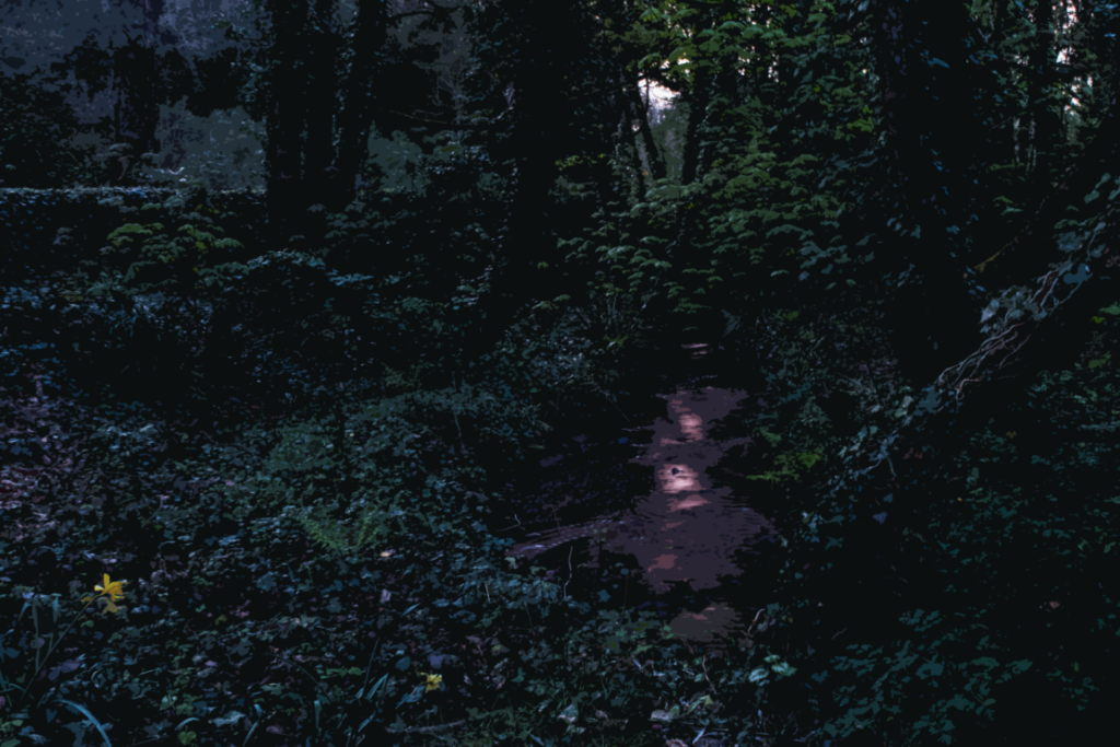
Here I have experimented with the same technique using another image:

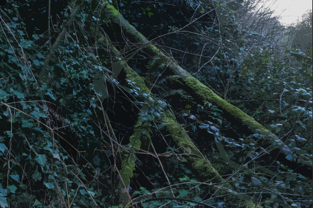
The next experiment I did was to make an image similar to Meeks’ front cover, where the image has had its contrast removed and altered to only have one colour. I chose to use green as it makes up the vast majority of the image I used.

In the end I chose to use the first cover I made, as I think it fits with the aesthetics of my book being an image of a natural landscape which has been altered in some way.
Title/Text
To start arranging the title of my photobook, I started by looking for the font, position, size, etc. I would be using for my title. I would like to use a serif font, as that would give my book a more classical look, which is largely the aesthetic I was going for for the front cover.

The first font I found was called ‘Bookman Old Style’, the image above is in the bold setting.

The next was called ‘Book Antiqua’, the image above is regular

The next was ‘Papyrus’, above is regular

Another was Garamond – in bold

Next was Elephant – regular
As for the title itself, I thought about incorporating words/phrases such as ‘sublime’, ‘woodland’, ‘artificial intelligence’, as well as their synonyms. An idea I had would be to write a prompt as the title (I was thinking of the list ‘sublime, woodland, artificial intelligence’ which gave me this idea) which would work well with the themes of the book. ‘Ancient woodland, modern software’ was another idea taken from my Statement of Intent blogpost.
Next I started to focus on the positioning of the title:
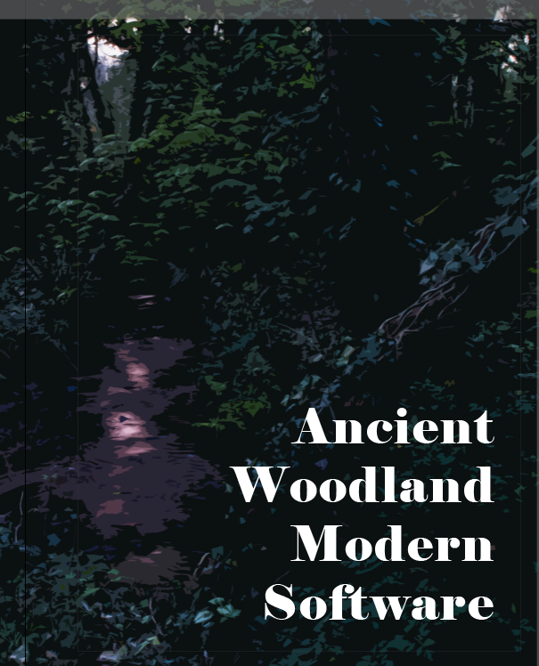


In the end I decided to use the top right orientation as it is the darkest point in the image, which would allow for the title to be slightly more readable.
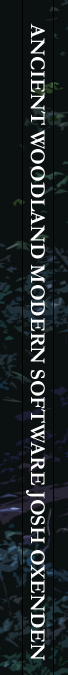
This is how I designed the text on the spine
Layout

To start creating my layout, I made up the page spreads…
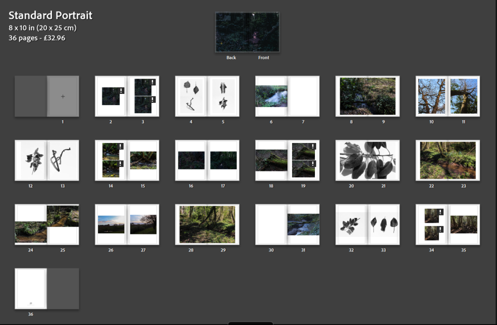
This will be my final layout for the book, I tried to make the sequence symmetrical like my other books as (as said above), it provides a nice sequence and connects all the images together.
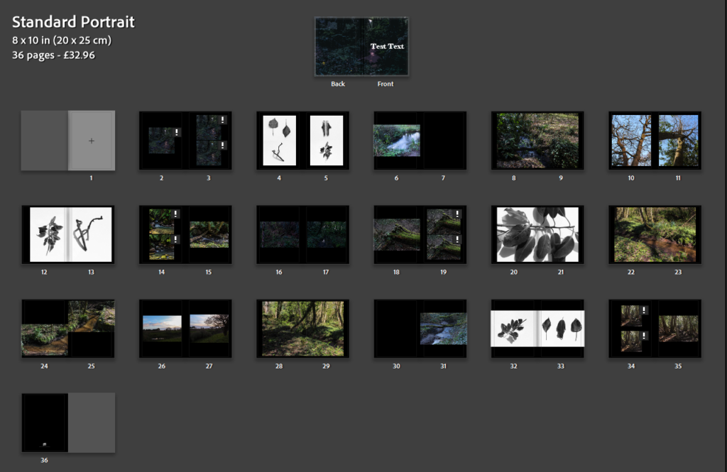
This is a version with white paper, personally I think the white looks better for this book as it makes it seem slightly more traditional in it’s presentation, although the layout of the images themselves prevents it from being fully classic.
Final Layout
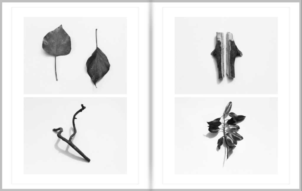
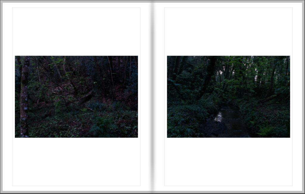
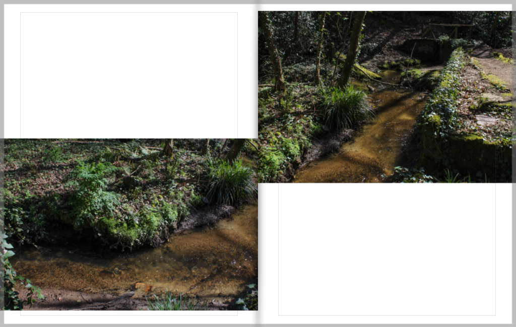
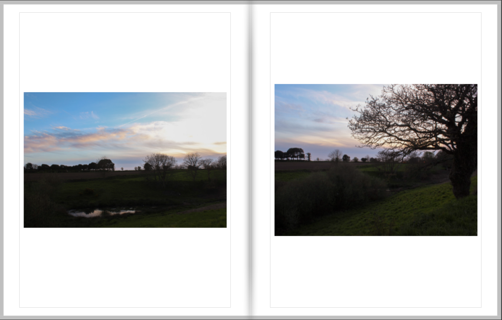
Below is a list of images of each page spread of my photobook.


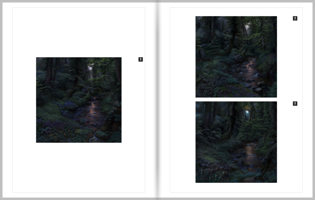


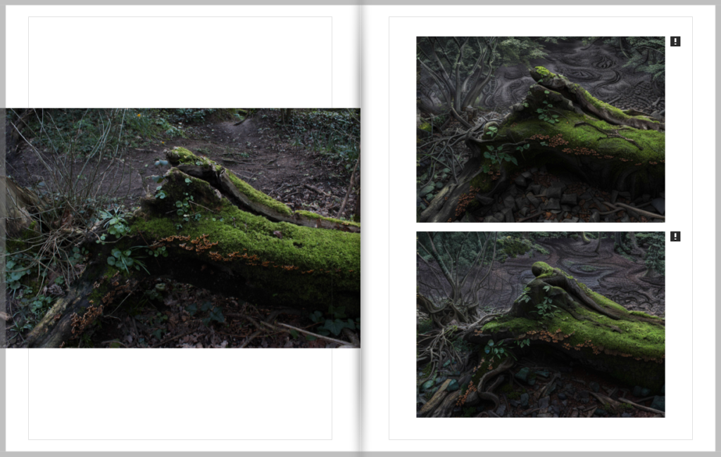


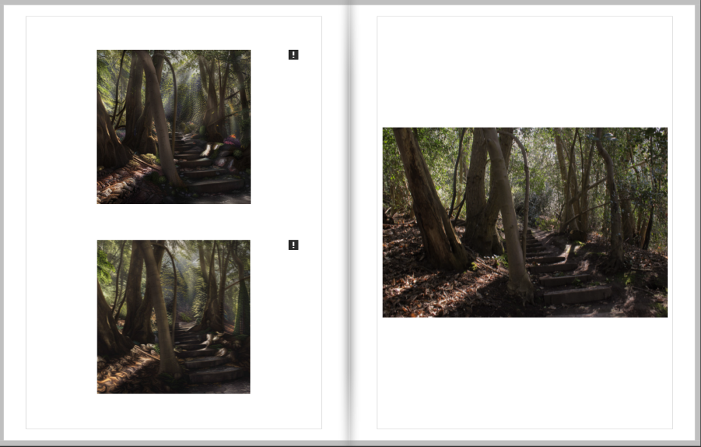
(The exclamation marks are for the AI generated images due to their resolution)