In order to help create my photobook, I hope to gain a better understanding of how they are created by researching another photobook. I created a photobook in my personal study project, in that project I studied a book by Troy Paiva. For this project I will study a book made by Raymond Meeks called: Halfstory Halflife. While the subject matter and general aesthetic of the book is different to what I envision my book will look like, I think this book executes its story very well in its presentation.
1. Research and deconstructing photobook:

Starting with the title of the book: Halfstory Halflife, my interpretation of this idea of something being half-story/half-life, especially an image (or collection of images), is something that represents real events in someone’s life, without any filter or staging, which is what I think this photobook clearly represents in the majority of its images, a lot of them being personal, in-the-moment shots. The Half-story part comes from the fact that Meeks has sequenced these images into a book and arranged them with other images of the area.
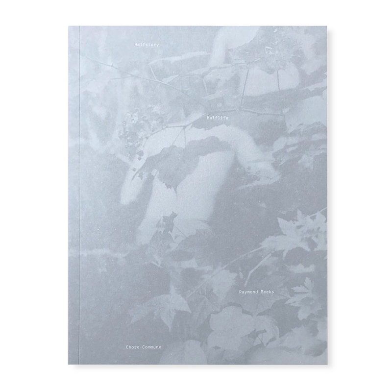
The front cover of the book gives the impression of a hazy image, like a memory or idea. The cover is wholly a blue shade, further linking with the idea of details of an event being forgotten or altered in someone’s mind. It also reminds me of an old photographic process, such as a calotype, with the way it lacks much contrast.
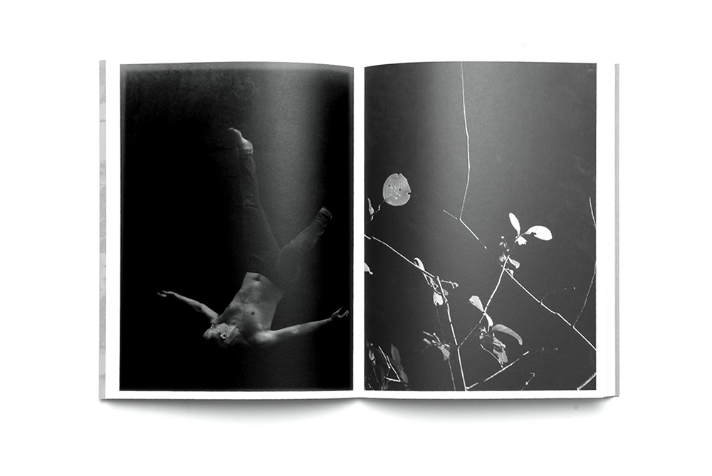
All of the images in this book are black and white, giving many of the images a far more dramatic aesthetic. Some of the images depict a trip in the woods with a group of young people, jumping into a lake, the lake is never directly shown and is only seen as pure black. Other images are images of nature and some urban locations around them, practically all of the images involve nature of some sort. The vast majority of the images are portrait oriented, with only a few landscapes, no formal/traditional portraits. The images being black and white also remind me of old photographs of memories of youth and such, which I think works effectively with the snapshot style of a lot of the images.

My interpretation of the story of this book is that it is a representation of youth and memories, with a group of youths going for a trip lake-jumping in the woods. The story includes snapshot like images of the group of people, perhaps representing the fleeting nature of memories and time (which photography captures easily), while the more formal/traditional images of the locations could be used to provide a contrast to those snapshots, and perhaps representing how the earth (a location/area) does not change (or is lost like memories) as easily.
The book includes text written by Meeks and a poem excerpt by C.D. Wright, the text is largely emotional and directed at a group of people whom he mentions at the end of the book (likely the ones depicted in the book).
2. Physical Analysis:
Book in hand: The book has a rough texture, which nicely mirrors the front cover’s slightly grainy, faded appearance. Despite being a softcover, the book feels very solid and secure due to the thickness of the book, as well as the paper used.
Paper and ink: The paper is consistent throughout the entire book. The book uses matte paper, making the pages less shiny, which I think works nicely with the style of the images as well as the front cover. The paper’s colour is white, offering a nice contrast to the large amount of black seen in Meeks’ images.
Format, size and orientation: The book has roughly 150 pages in total. It uses a portrait orientation, allowing for the predominantly portrait oriented images to fit nicely on a singular page spread. The book is not exactly A4, as it has slightly more width and less height than an A4 piece of paper.
Binding, soft/hard cover. The book is soft cover and has no dust jacket, however it does have cover flaps on the front and back cover pages. It uses a perfect binding.
Cover: The cover has an image printed on it, the colours of the image having been altered to be only a light blue. The image also has had most of its contrast taken out of it, which is what gives it that faded look. It likely uses a type of card as the material, it feels rough, which adds to the faded and slightly grainy look of the image printed on it,
Title: The title (to me) is both literal and metaphorical. As said above, the literal interpretation of the title represents the nature of the book itself representing both a real event and the story (Meeks’ perspective) of the event. The title is laid out in very small, white text with each word (‘Halfstory’, ‘Halflife’, ‘Raymond Meeks’) being on a different part of the page at different alignments
Narrative: As said above, the story is told using both snapshot images of a group of youths likely near a lake, and more formal/traditional images of the surrounding area.
Structure and architecture: The images are mostly laid out as a portrait on one page of a page spread, with the other mostly being blank (however there are a few double-page spreads and two images on each page of a page spread). All of the images are in black and white. The vast majority of images incorporate nature into them, either as the primary focus, or part of the environment the people are in.
Design and layout: All of the images have some form of border on them, none of the images bleed off of the page, except for a few landscape images that bleed onto the adjacent page. There are no inserts on any of the pages. There are only a maximum of two images on a page spread at a time, some having none.
Editing and sequencing: Some of the page spreads, such as the one shown above, juxtaposes a natural image with an image of a person. All the images being black and white (as well as the majority of the images being portrait) allows them to conform to a consistent style. There are far less landscape shots of an area than there are snapshots of people, Meeks likely using them as a contrast to the snapshot images.
Images and text: The book uses very limited text, only being seen on the front/back cover, spine, first and last pages on the book.