Contact Sheets
Below I have my contact sheets for my first and second photoshoot. For my first photoshoot I used the studio as I wanted to complete some of the portraits for my project, I found that a lot of them were successful and showed off the subject well. I used two different types of lighting in the studio shoot one being a warmer toned light and also the flash light which was connected to the transmitter on the camera. This allowed for the subject to be framed by the pure white background as well as being well lit which complimented their skin and helped to have stronger colours. For my second photoshoot I went to St Andrews park in first tower as I wanted a more colourful and natural background to my images. I first started with the subjects standing together and individually, I then moved on to a bench where I also took some photographs together and one of just the subject.


Sub-selection
I have narrowed down the images I might be including by using the flag tool, I did this by pressing either the ‘p’ of ‘x’ key which rejected or kept the image that I wanted. I will make a new selection of images after I have edited these. As you can see below there is both my first photoshoot and my second photoshoot in this sub-selection. I have also used the star tool, but this is to help me figure out which images I should spend more time on compared to others. The ratings range from 1 star which is the photographs which I liked but don’t think will be included in my final prints to 4/5 stars which as the photographs that i will be focused more on with the editing and the ones that are most likely to used in my final prints.

Editing: Photoshoot 1
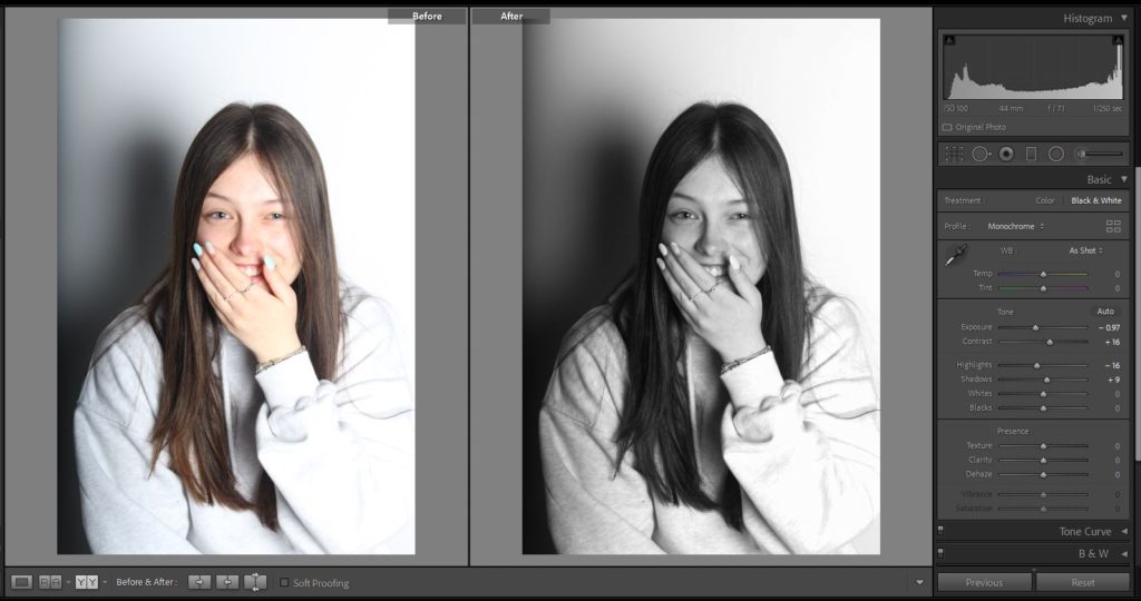
As I was using the studio for my first photoshoot I wanted to focus more on portraits and the different angle of each subjects faces. I also did some full body images as I wanted to show how they like to dress and the different colours which are incorporated into the clothes. Below are two of my portraits which I have decided to edit in black and white as I felt that they conveyed more of a message and suited the lighting better. For my black and white images I switch the original photographs form colour and then adjust both the contrast and exposure to a darker setting and I prefer a image with more exaggerated shadows. As well a increasing the contrast and decreasing the exposure I also use the shadow setting to get the darker look.


Another example of my editing I have shown below of how I have kept my images in colour, for this photographs I felt that using colour would compliment the subject more. For these I have decreased the exposure and increased the contrast so that the colour form the subjects skin and hair become more saturated and standout more against the white background.


Editing: Photoshoot 2
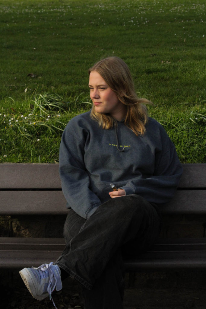
Below I have two of the images from my second photoshoot which I have chosen to keep in colour as I wanted to be able to show my editing techniques with both colour and black and white. With these images I have decreased the exposure as I felt that they were slightly over exposed, I have also increased the contrast on both as I like a darker look to my photographs. For these images I have also experimented with using the temp tool in Lightroom. As these images were taken during an overcast day I increased the temp tool giving a more yellow effect and imitates ‘golden hour’ which I prefer to the original image which is quite cold and grey. For the right image I have also increased the tint tool into the pink colour as I wanted to add more colour into the face of the subject.


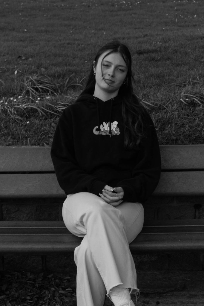
I have also edited some of the images form this photoshoot in black and white, all of my black and white images have been edited in a similar way as I wanted my photographs to look cohesive when they are put next to each other. I have decreased the exposure and increased the contrast which is the same as my colour images but with these black and white ones I tend to increase the shadows and white tool so that the image isn’t to dark and you can still make out the details.


Final Images: Photoshoot 1

Below are 5 of my favourite images from my first photoshoot, I have a few other final images for this shoot but I have chosen to analyse the photographs I think are the best.
The top 4 photographs are different types of portraits which I have taken in the studio, two of which I have edited to be black and white. The first image on the left I like how the subject isn’t looking towards the camera but you can still clearly see the emotion on her face, I also think that this is a contrast to other images which have been taken in a similar format throughout photography. When you see a portrait with the subject looking down and it being in black and white, it normally is a sad image but I enjoy how this is the opposite. The second photograph I have left in colour as I wanted the sole of the shoe to be the main focus, I also liked how the ‘gum’ colour contrasted with the white background. This image I find interesting as the foreground is in focus putting the shoe at the centre but it has the background where the subjects face is blurred. I like this as it gives viewers different things to focus on and pick at when they are looking at my images. I have tried to make sure that the emotion on the subjects face can still be clear made out as it tells a small story of what it was like during the photoshoot and what everyone was feeling.
For the two images to the left I also kept one in colour and changed the other to black and white as I wanted the monochromatic look as I thought it fit the image better. The third image is one of my favourites as it is not a classic portrait of the subject looking directly at the camera and posing, the stance is more natural and conveys a more relaxed feeling to the photograph. I like how people can see the different shades of grey from the subjects hair with it originally being blonde. I feel that using black and white was able to add more texture to the image and enhance the details compared to if I had left it in colour. The fourth photograph I decided to keep in colour as I wanted to exaggerate the design on the back of the subjects hoodie. I increased the contrast on the image so that the different shades of blue become more prominent and saturated against the cream jumper and white background. The image gives a different view to the subject, something that they cannot see but also a view that hundreds of people see everyday. I like to use the backshot as I believe it can add meaning to the story behind the image.


Finally, above is a photograph of all three subjects taken from a lowered angle with the middle subjects foot in the foreground out of focus and their faces towards the background in focus looking at the camera. I like this photograph as it shows how i have been experimenting with different compositions in my photoshoots. I have been enjoying using different angles and using a blurry foreground or background to my advantage to make my images more interesting and able to tell a short story.
Final Images: Photoshoot 2

Below I have 4 of my final images from my second photoshoot, I do not believe that this is my most successful photoshoot as the background contrasted with with the subject in the foreground. For the first three images I wanted to keep them in colour as I liked the warmer colour from the editing in lightroom. For the first image the subject is looking away from the camera with the sunlight on her back making it shadowed in the background on the grass. For the fourth image in this sequence I turned it black and white as I wanted to experiment with the outside portraits in different shades and colours. The second and fourth image are quite similar but I wanted to use them both as I liked the difference between the facial expressions and I enjoy how people will be able to see the development in the photoshoot.


