Contact Sheet
Shoot 1
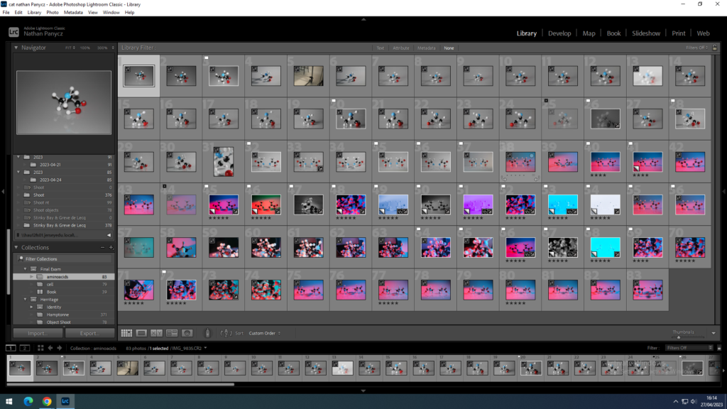
Shoot 2
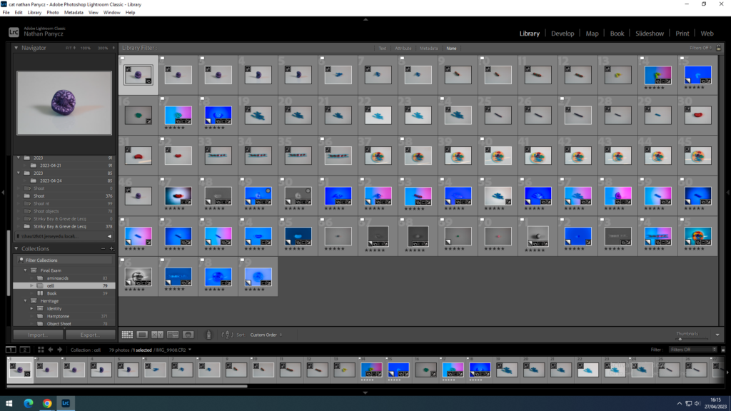
Choice
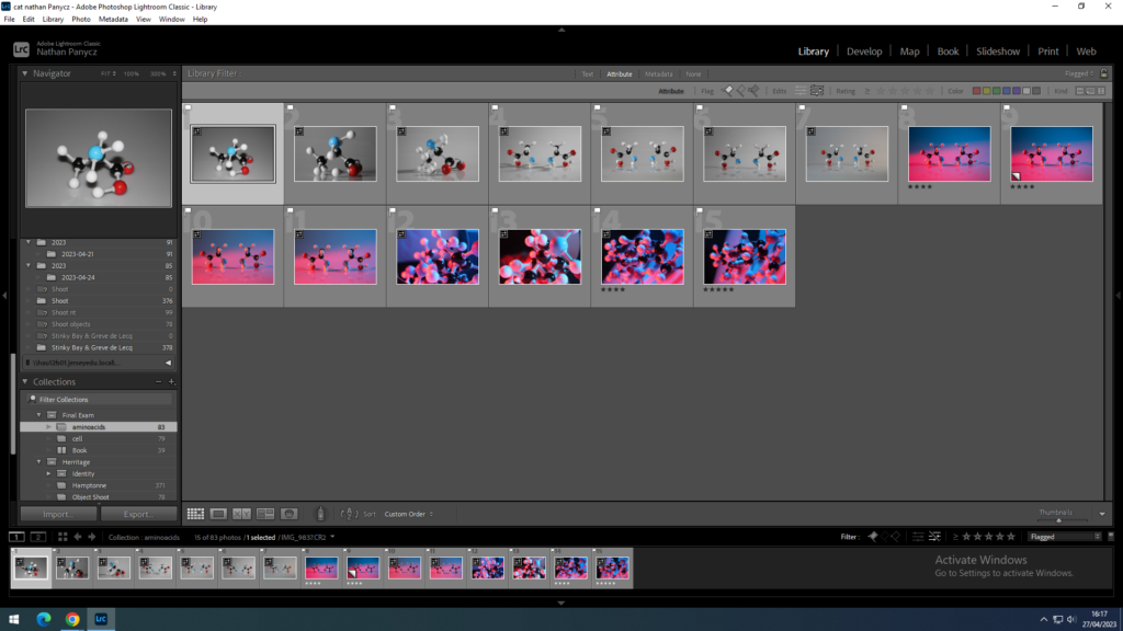
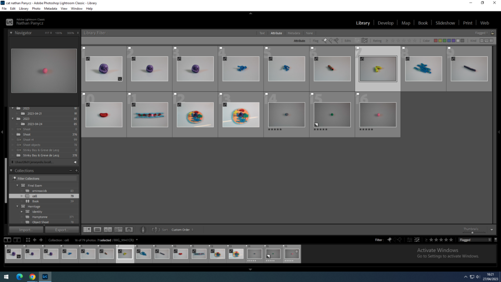
Those are photographs I chose as most appropriate based on exposure, sharpness, angle and shadow.
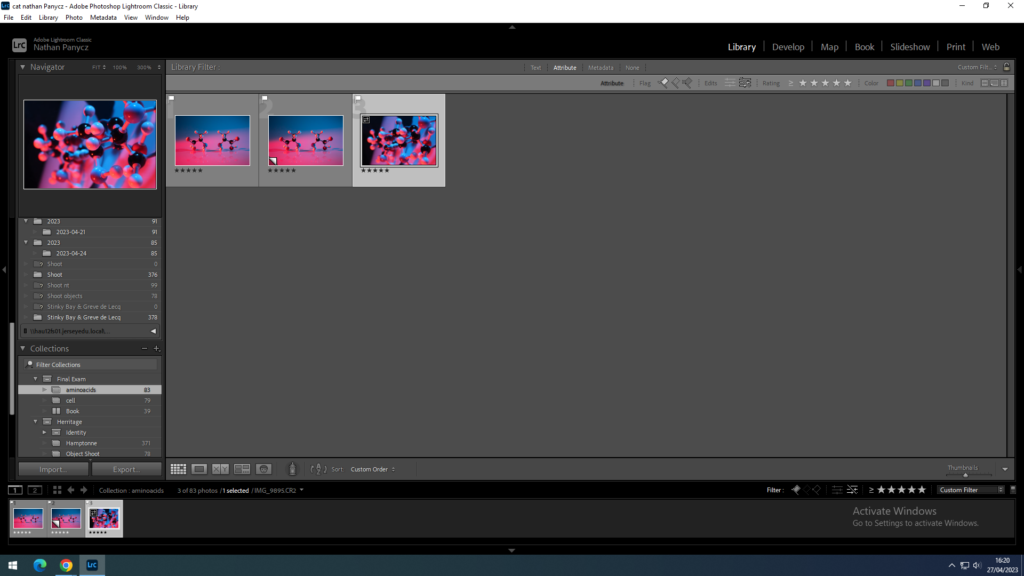
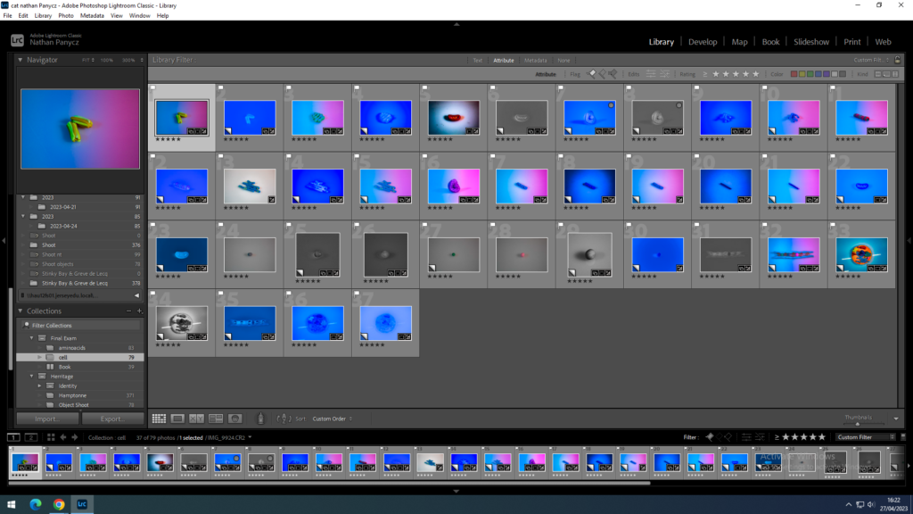
Those are my favourite photographs I planned to edit and use for the project.
Experimentation
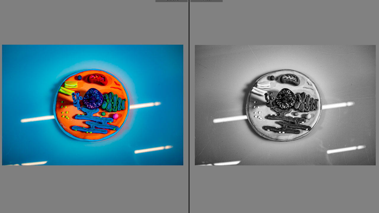
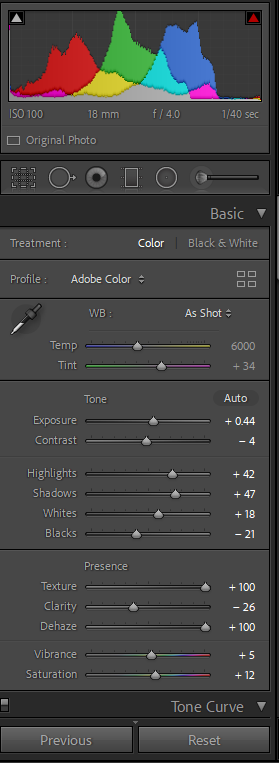
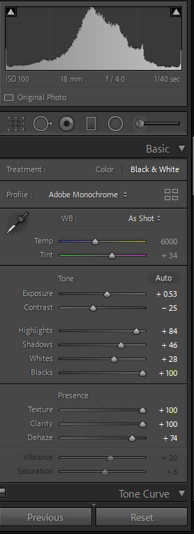
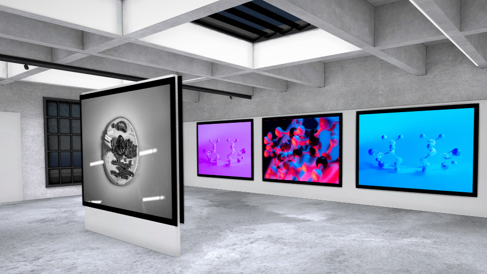
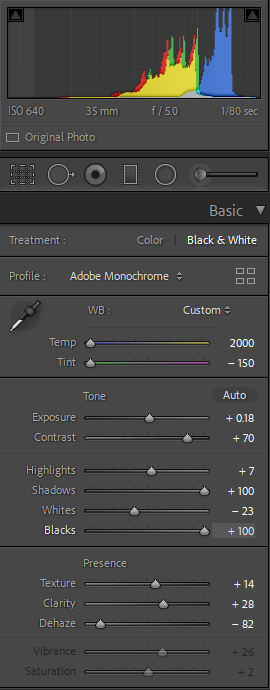
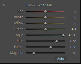
I converted this image to black and white and increased the clarity, blacks and whites, to make it sharp and show all the imperfections on the white background. I wanted it to look rustic and vintage like the Joseph Niecéphore Niépce Point De Vue.
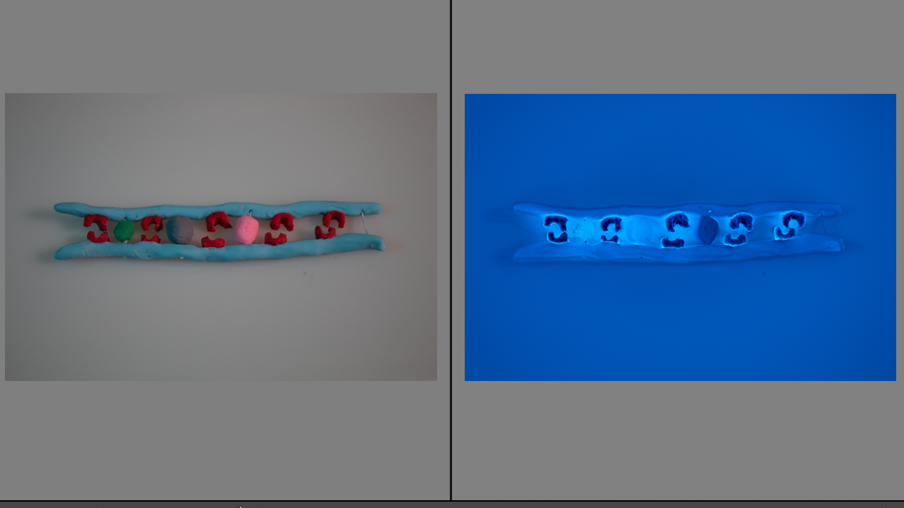
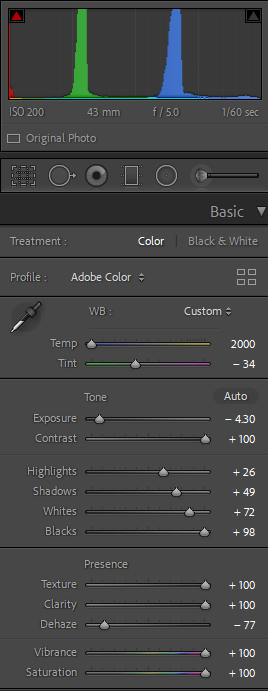
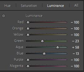
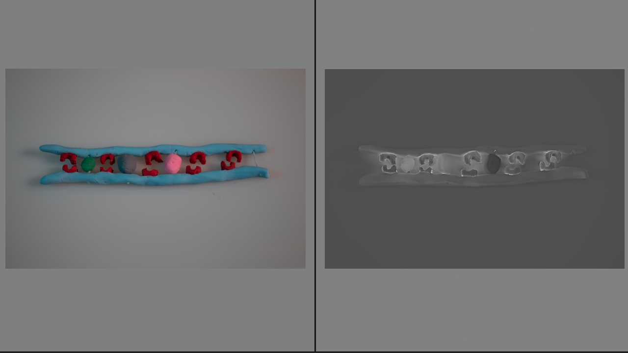
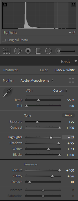
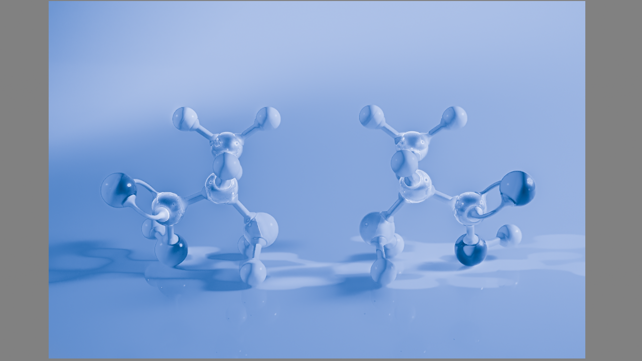
With this photograph I was influenced by Annas Atkins cyanotypes but I also wanted to give it a bit of a modern look by making it look a bit luminescent like an X-ray shot. To do this I turned up the contrast, the blacks and whites, but decreased the dehaze along with tinting the photograph completely cold.
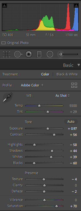
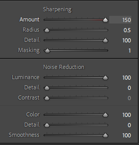
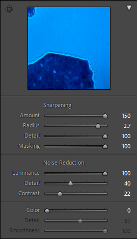
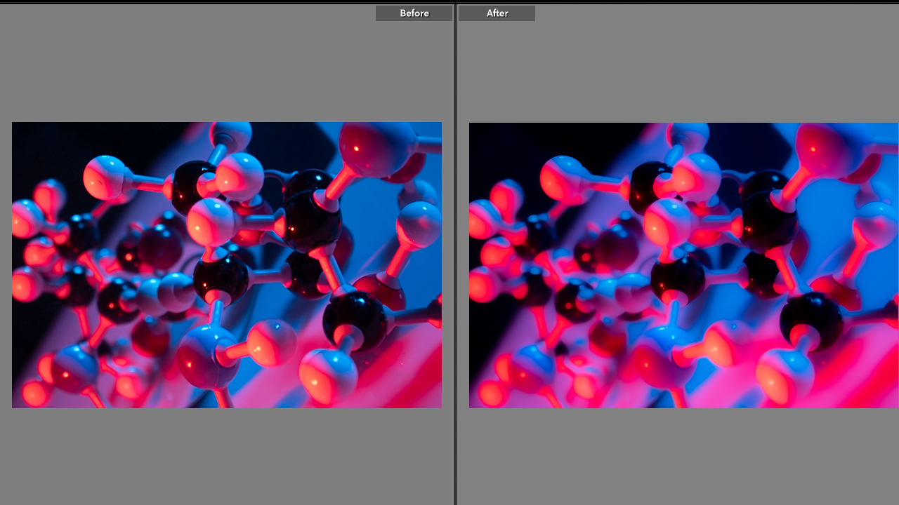
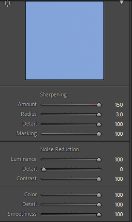
I wanted to make this photograph soft to contrast the X-ray/cyanotype looking shots which look sharp. To do this i turned down the sharpening, turned up the luminescence contrast and colour smoothing. I increased the saturation as i wanted the photograph to look lively as opposed to the dead cold blue photographs.
Final Outcomes
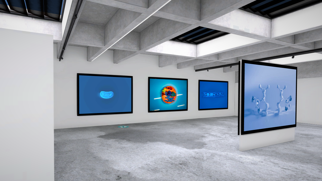
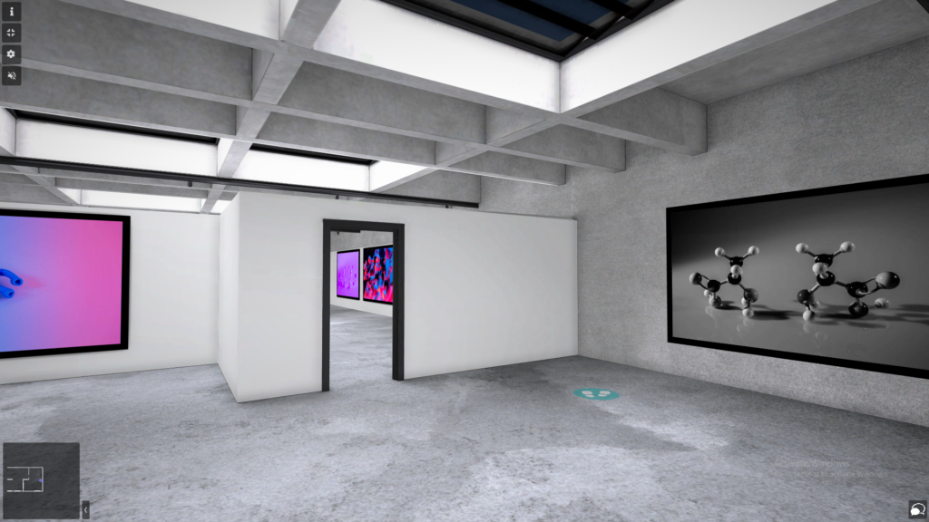
I used a wide aperture (between f/4.0 and f/8.0 depending on the size of the subject) to create a sense of space and perspective, however looking back I should have made the photos using a smaller aperture as it would made the photographs sharper and more focused. I would say I had rather good control of the light during the first shoot. I used coloured plastic sheets to change the colours of the opposing lamps. I chose red and blue specifically because the molecule I was photographing was made of black carbon, white hydrogen, blue nitrogen and a red oxygen and I wanted the photograph to look uniform. At the time of the second photoshoot, I could not control my lighting enough (turn the main light off and use the lamps alone) as there were people working in the studio. I should have chosen a different time or space for this photoshoot.
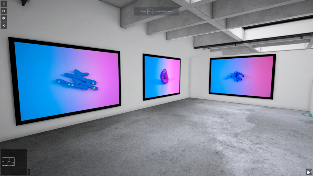
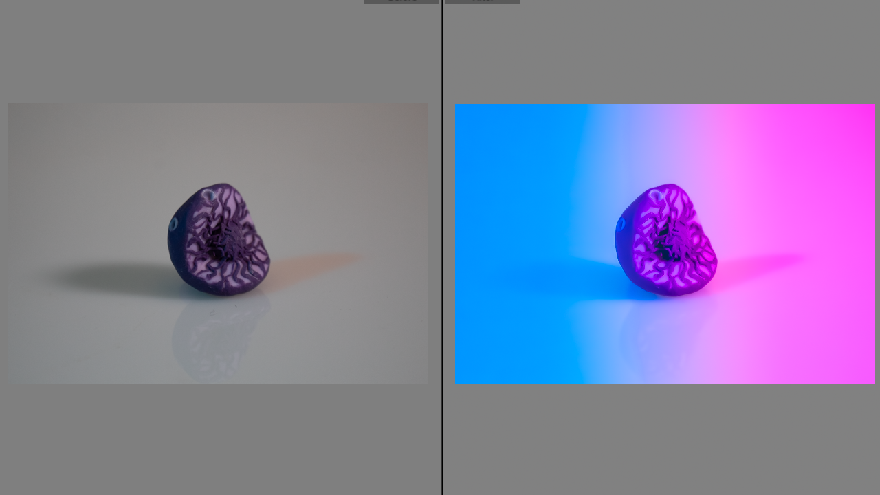
Whilst editing I decided to overlay the photographs with a pink and blue gradient. I chose blue as its associated with spirituality and I wanted to present the divine element behind the complex design of the cellular structure. Blue is a primary colour; without its existence many other colours could not exist. Just like purple or green could not exist without blue, a human being could not exist without God. Pink on the other hand is a tertiary colour, it is created by mixing red with white, with this I wanted to juxtapose something man made with God’s creation; models of cells versus actual cells. “As red is always active, so blue is always passive, from the point of view of material space. From the point of view of spiritual immateriality, blue seems active and red passive” – Faber Birren, Itten the Elements of Colour. Both colours are associated with the human body; red with blood and blue with the nervous system. I also wanted to contrast the feminine and the masculine by contrasting the pink with the blue. I used the gradient formant so that the blue and pink mix into violet. Violet represents death and chaos. I did not intent for it to carry a negative connotation, however. To me violet represents the beginning of the new cycle of birth and death, just like the cell cycle, one must die for another to be born. It is the most natural and certain quality of this universe. Similarly, I do not see chaos as equivalent to destruction but rather as complimentary to order. Jordan Peterson wrote in his book 12 Rules for Life an Antidote to Chaos “Chaos and order make up the eternal, transcendent environment the living. To straddle that fundamental duality is to be balanced: to have one foot firmly planted in order and security and the other in chaos, possibility, growth and adventure.” Mediating back and forth between the two is where creation happens, the big bang for example.
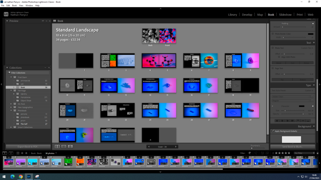
Overall, I am happy with my final prints and the photobook layout, although I think I could have been a bit more technical at points.
Virtual Gallery
