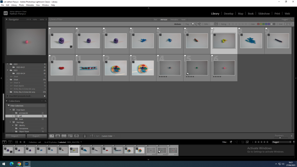
Simple and Complex Photobook Shoot

Contact Sheet

Shoot 1

Shoot 2

Choice

Those are photographs I chose as most appropriate based on exposure, sharpness, angle and shadow.

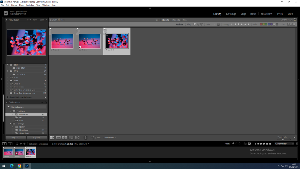
Those are my favourite photographs I planned to edit and use for the project.
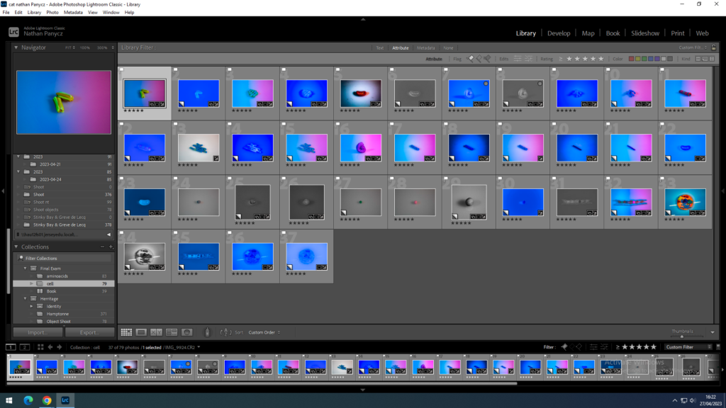
Experimentation

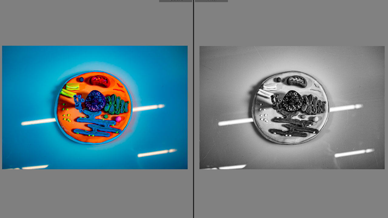
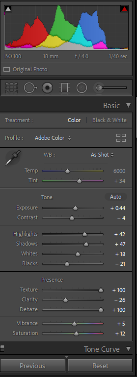
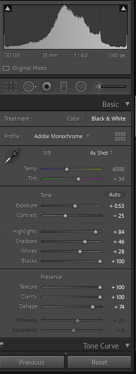
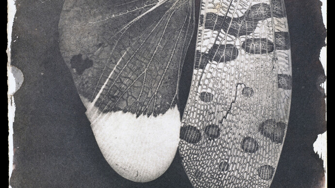
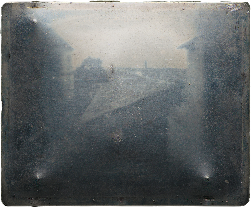
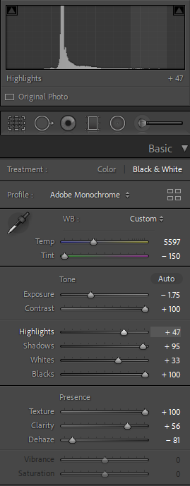
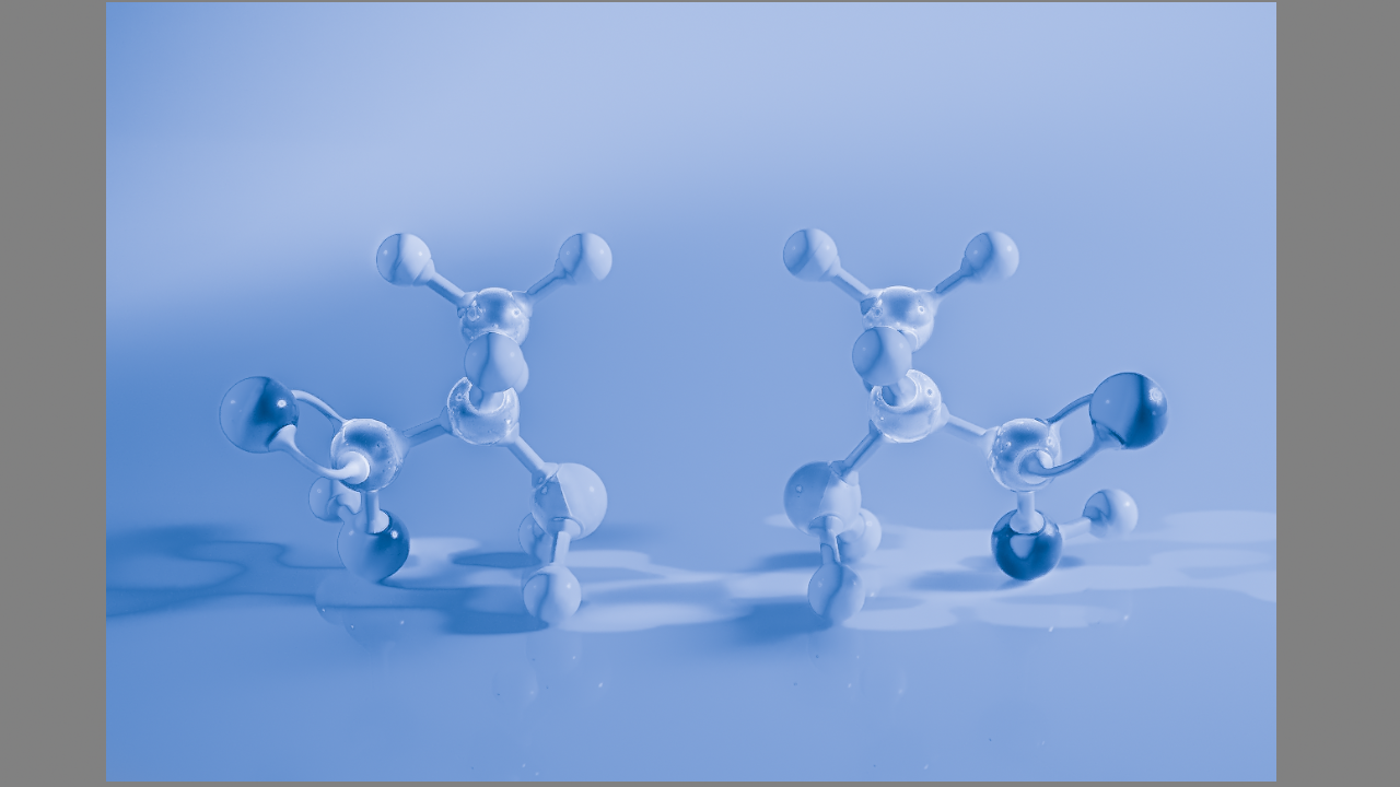
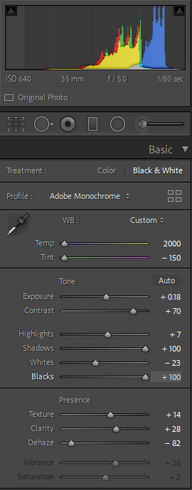
I converted this image to black and white and increased the clarity, blacks and whites, to make it sharp and show all the imperfections on the white background. I wanted it to look rustic and vintage like the Joseph Niecéphore Niépce Point De Vue.

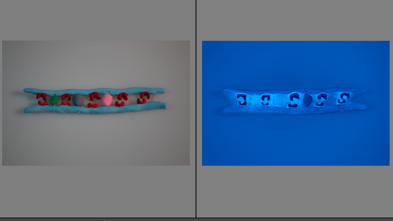
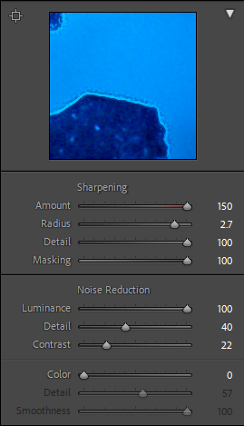
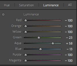
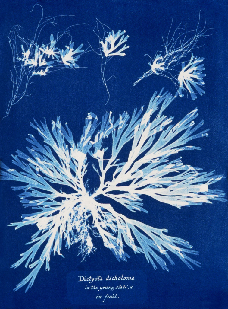
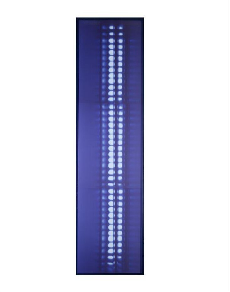
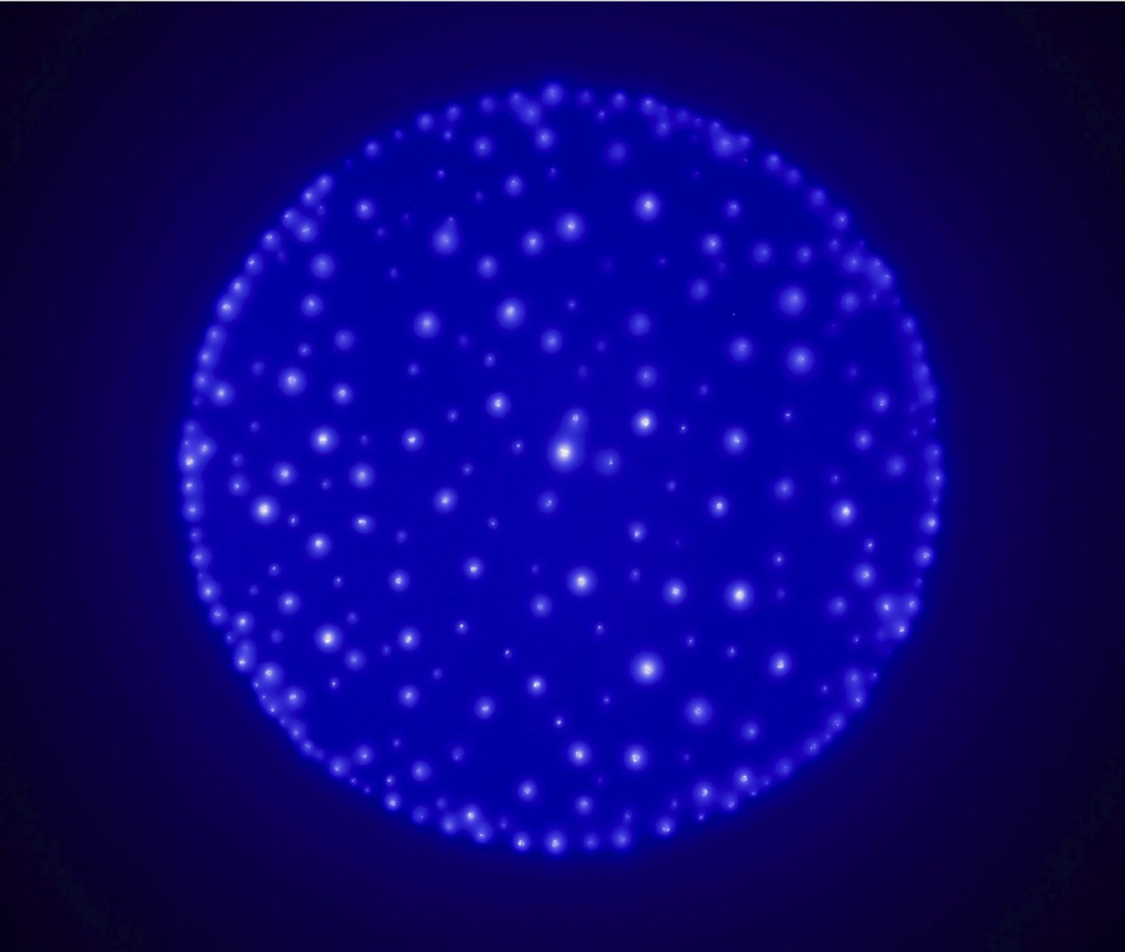
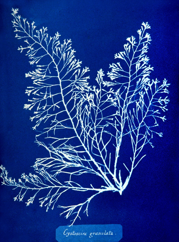
With this photograph I was influenced by Annas Atkins cyanotypes but I also wanted to give it a bit of a modern look by making it look a bit luminescent like an X-ray shot. To do this I turned up the contrast, the blacks and whites, but decreased the dehaze along with tinting the photograph completely cold.

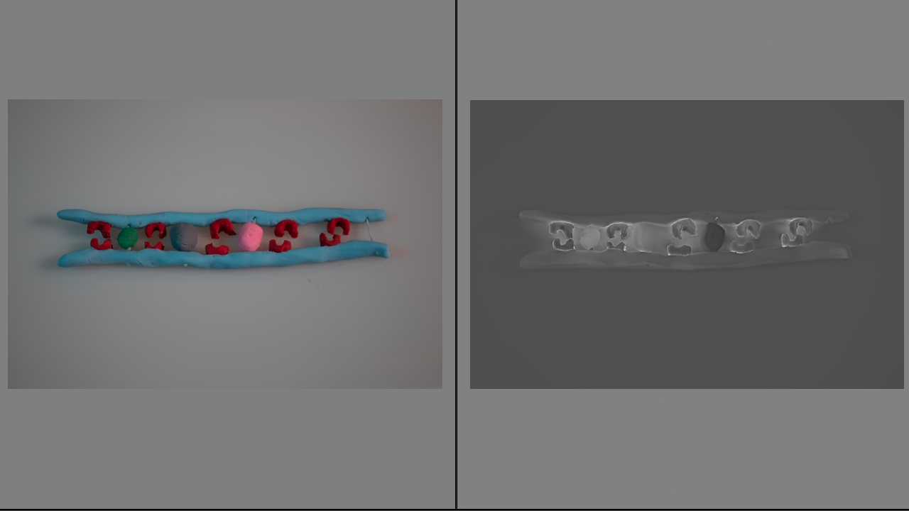
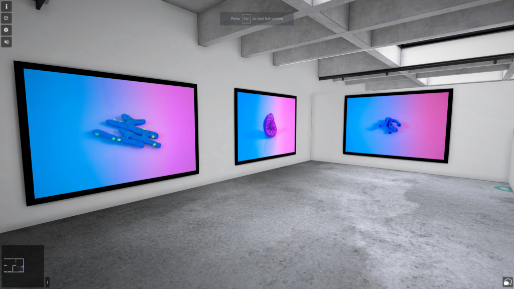
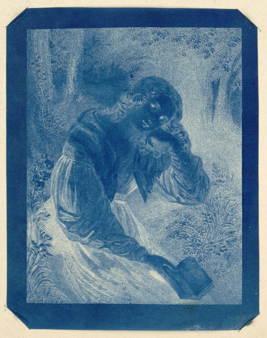
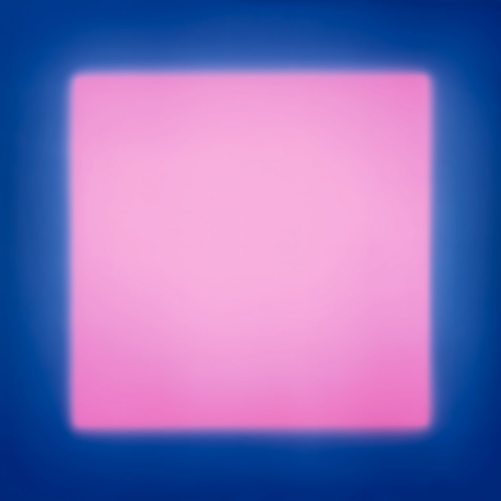
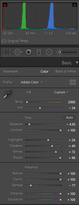
I wanted to make this photograph soft to contrast the X-ray/cyanotype looking shots which look sharp. To do this i turned down the sharpening, turned up the luminescence contrast and colour smoothing. I increased the saturation as i wanted the photograph to look lively as opposed to the dead cold blue photographs.

Final Outcomes

https://www.blurb.com/books/11567997-the-microcosm

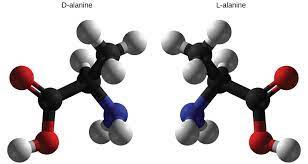
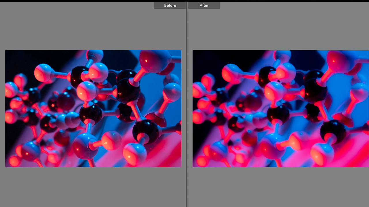
I used a wide aperture (between f/4.0 and f/8.0 depending on the size of the subject) to create a sense of space and perspective, however looking back I should have made the photos using a smaller aperture as it would made the photographs sharper and more focused. I would say I had rather good control of the light during the first shoot. I used coloured plastic sheets to change the colours of the opposing lamps. I chose red and blue specifically because the molecule I was photographing was made of black carbon, white hydrogen, blue nitrogen and a red oxygen and I wanted the photograph to look uniform. At the time of the second photoshoot, I could not control my lighting enough (turn the main light off and use the lamps alone) as there were people working in the studio. I should have chosen a different time or space for this photoshoot.  

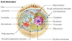
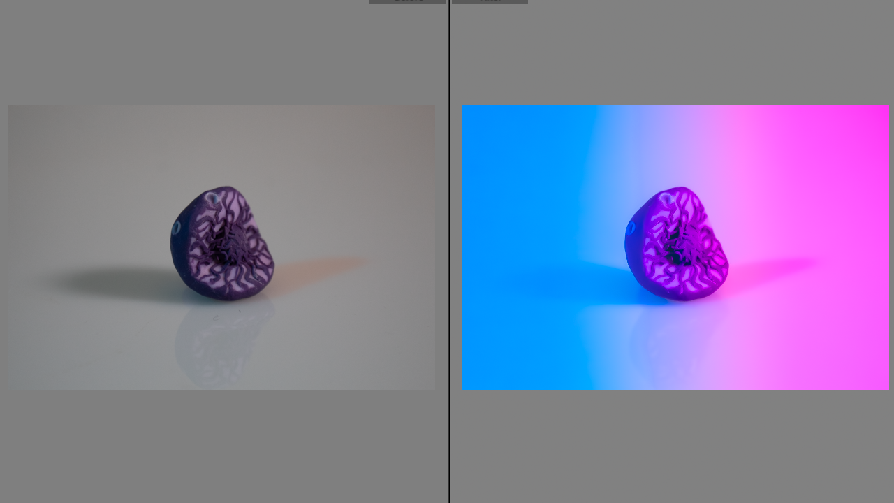
Whilst editing I decided to overlay the photographs with a pink and blue gradient. I chose blue as its associated with spirituality and I wanted to present the divine element behind the complex design of the cellular structure. Blue is a primary colour; without its existence many other colours could not exist. Just like purple or green could not exist without blue, a human being could not exist without God. Pink on the other hand is a tertiary colour, it is created by mixing red with white, with this I wanted to juxtapose something man made with God’s creation; models of cells versus actual cells. “As red is always active, so blue is always passive, from the point of view of material space. From the point of view of spiritual immateriality, blue seems active and red passive” – Faber Birren, Itten the Elements of Colour. Both colours are associated with the human body; red with blood and blue with the nervous system. I also wanted to contrast the feminine and the masculine by contrasting the pink with the blue. I used the gradient formant so that the blue and pink mix into violet. Violet represents death and chaos. I did not intent for it to carry a negative connotation, however. To me violet represents the beginning of the new cycle of birth and death, just like the cell cycle, one must die for another to be born. It is the most natural and certain quality of this universe. Similarly, I do not see chaos as equivalent to destruction but rather as complimentary to order. Jordan Peterson wrote in his book 12 Rules for Life an Antidote to Chaos “Chaos and order make up the eternal, transcendent environment the living. To straddle that fundamental duality is to be balanced: to have one foot firmly planted in order and security and the other in chaos, possibility, growth and adventure.” Mediating back and forth between the two is where creation happens, the big bang for example. 

Overall, I am happy with my final prints and the photobook layout, although I think I could have been a bit more technical at points. 
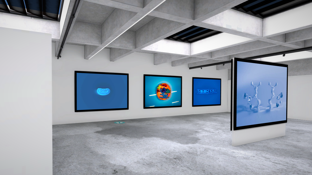
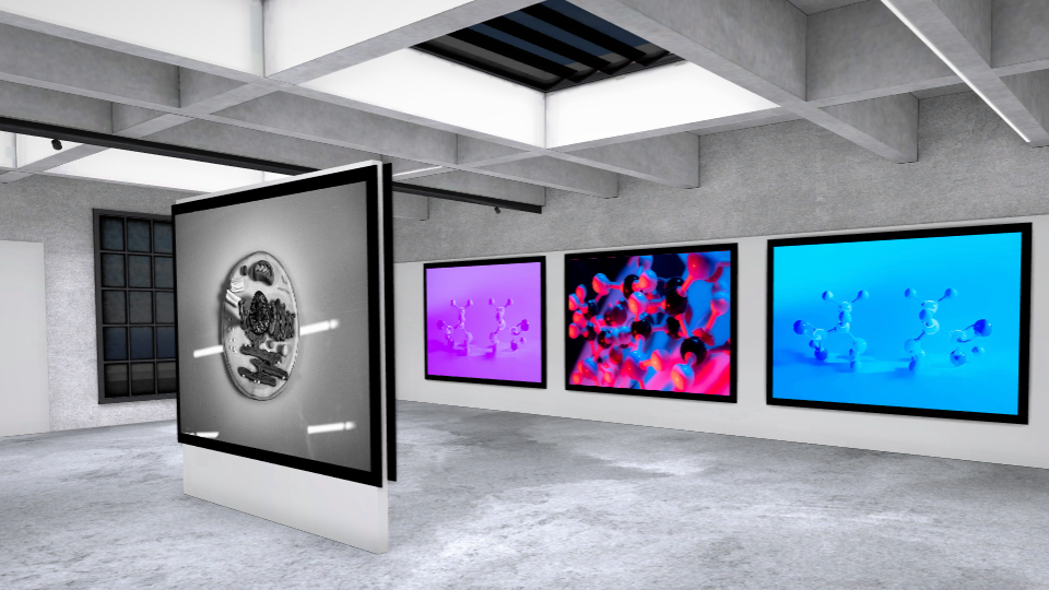
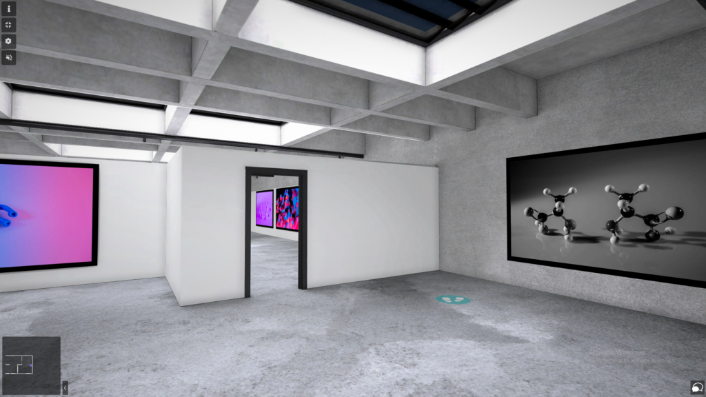
Virtual Gallery

Simple Complex Artist Reference

Anna Atkins

Anna Atkins, born March 1799, was an English botanist and photographer. She was the first one to publish a photographically illustrated book; “British Algae; Cyanotype impressions”. In 19th century England women were not permitted to study science professionally, botany however was a subject “gentle” enough to be considered a hobby women could engage in. Even though she studied Botany her entire life with the help of her father (John George Children, a chemist and a member of The Royal Society ) she was still considered an amateur.

Alaria esculenta
Dictyota dichotoma in its young state and in fruit

Her parent were close friends with William Henry Fox Talbot – a chemist, linguist and archaeologist, trained at the University of Cambridge – who invented the process called Calotype. Since he couldn’t draw his scientific observations he used a sheet of paper coated with silver chloride; by exposing it to the light of the camera obscura, he was able to create a negative image (as the areas exposed to light would become darker). Talbot went to discover that sensitising the photograph with gallic acid reduced the exposure time from an hour to a minute, by catalysing the chlorides reaction to light. The image was them fixed by submerging it in sodium hyposulfite and rinsing with warm water (it prevented the image from overexposing due to the silver chloride light sensitivity). Atkins had directly learned about the technique from Talbot.

Insect Wings, c.1840, William Henry Fox Talbot © National Media Museum, Bradford

Another influence on Atkins was an astronomer and a friend, John Herschel. Herschel was the one who invented the cyanotype process in 1842. The process involved soaking paper in a UV light sensitive substance, created by mixing a solution of potassium ferricyanide and ferric ammonium citrate, and drying it in a dark room. An image is produced by placing an object on the paper and exposing it to light. The UV light and the citrate reduce the Iron(III) to Iron(II) following the reaction of the Iron(II) with ferricyanide this produces ferric ferrocyanide which has a blue pigment. After the paper has been exposed, it gets developed by washing in water so that all the Iron(III) salts get washed away. Next, the paper is dried. The areas where the objects were places are not exposed to the UV light and so remain white whilst the rest turns blue.

Sir John Herschel. “Still in My Teens,” 1838

Gary Fabian Miller

Gary Fabian Miller, born 1957, is a British photographer who makes camera less photographs inspired by the early pioneers of photography. Miller got into photography at an early age, learning from his father who was a commercial photographer. He started off by exploring the landscapes of Dartmoor to communicate the idea of contemplation. “As I walked myself into the landscape, it became an experience of the sky space, the changing weather systems, the deep-thinking space, and that is how I think the work evolved from a kind of narrative, figurative based practice around trees and plants and nature into an abstract sky, light space.” He gained International recognition for his photographs of land, sky and sea in the series Sea Horizons of England that were shown in the Arnolfini Gallery in 1979.

Sections of England: The Sea Horizon (No. 13, 17, 5), 1957

Millers journey with landscape ended in 1984 when he started exploring camera less photography. He was interested in the properties of light, time and colour, taking his photographs over days, months or even years. His process involves shining the light through a coloured glass over cut paper shapes or transparent objects such as leaves.

One of the biggest influences of Millers work where the early pioneers of photography such as Joseph Niecéphore Niépce. Niépce worked out a way of capturing images in a process called Heliography. It involved dissolving bitumen in lavender oil and inserting the coated pewter plate into a camera obscura to expose it to light for several hours.

Joseph Niecéphore Niépce – Point De Vue

The camera obscura has a long history. Starting in the 5th century BC with a Chinese philosopher Mozi who found that letting rays of light pass through a hole into a pitch black room created an image. The same phenomena was also observed by Aristotle in the 4th century. A camera obscuras is essentially a dark box with a hole which lets in light, producing an inverted image on the inside of the box. This simple apparatus lead to many discoveries such as Alhazen’s Book of Optics which helped us understand how vision works.

Image Analysis

‘Night Tower 3, 2001’, Gary Fabian Miller

The Night Towers resembles DNA strands. “It is as if we see in Night Towers a Blueprint for human existence.” – Martin Barns, Shadow Catchers.

The Night Cell, Winter 2009 – 2010
 States of Pink (iii), 2023, Gary Fabian Miller
 

States of pink is a photograph taken by Gary Fabian Miller. Blue is a primary colour that belongs to the family of cold colours, it is associated with calmness, depth and spirituality. This shade of blue is dark and deep, evoking the feelings of stability combined with the square shape. Its somehow sombre and melancholic, the pink on the other hand is light, happy and passionate. Both the colours juxtaposed somehow complement each other, bringing the image together as the pink warms up the serious blue and the blue cools down the passionate pink. There is no hard edge between the pink and blue but rather a gentle fade which suggests the colours are not meant to be in competition but in complementary harmony. 

Simple and Complex Statement of Intent

“It’s hard to tell the story if you don’t have a stunning image to back it up” – Ray Villard, public relations director for the Hubble Space Telescope project 

In this project I aim to explore the complexity of life at a cellular level through photography. I have chosen this topic as the cell’s ability to carry out its function and support life, despite us being completely unaware of its activities always fascinated me. I find it riveting how the microcosmic substructures that make up a human being exist in a completely different stream of consciousness independent of and unaffected by our conscious thought. Although the ability of willpower to alter the body is well known (as the placebo effect) there are things we cannot simply influence. A heart will not stop beating when you ask it to, and a cell will not divide because you told it to. There is a certain type of beauty in that. Mystical or religious if you will. The more I study the complexity of the human body the more my conviction shifts to believing it was not simply a series of coincident that lead to the development of life on earth. It was not a case of chance but rather a carefully thought-out project, designed by an architect wielding knowledge much greater than what we as humans could ever wish to understand. To illustrate the complexity of the cellular structure in the simplest possible manner I will be using modelling clay to create replicas of organelles. I am using Leonardo da Vinci’s notebooks as inspiration since I have always admired the way he combines science with art. Another artist who influences my work is Anna Atkins who documented algae and plants through cyanotype photography. Finally, I will draw inspiration from Gary Fabian Miller who created camera-less photographs exploring the properties of light and time, applying Johannes Itten’s colour theory. I hope to create a series of images that are both artistic and informative and challenge a viewer to contemplate the wonders we are so blind to see going about everyday life. 

Simple and Complex Mindmap and Moodboard

Models of L-alanine and D-alanine amino acids showing chiral symmetry, explain the stereochemistry.

Make models of the cell structure out of clay present them in as much scientifically correct way as possible.

Reference to Leonardo Da Vinci notebooks?

Ana Atkins cyanotypes

Use colour theory of Johannes Itten