case study #3

VINCA PETERSEN

Vinca Petersen reminisces about good times with Corinne Day in 90s London –  HERO

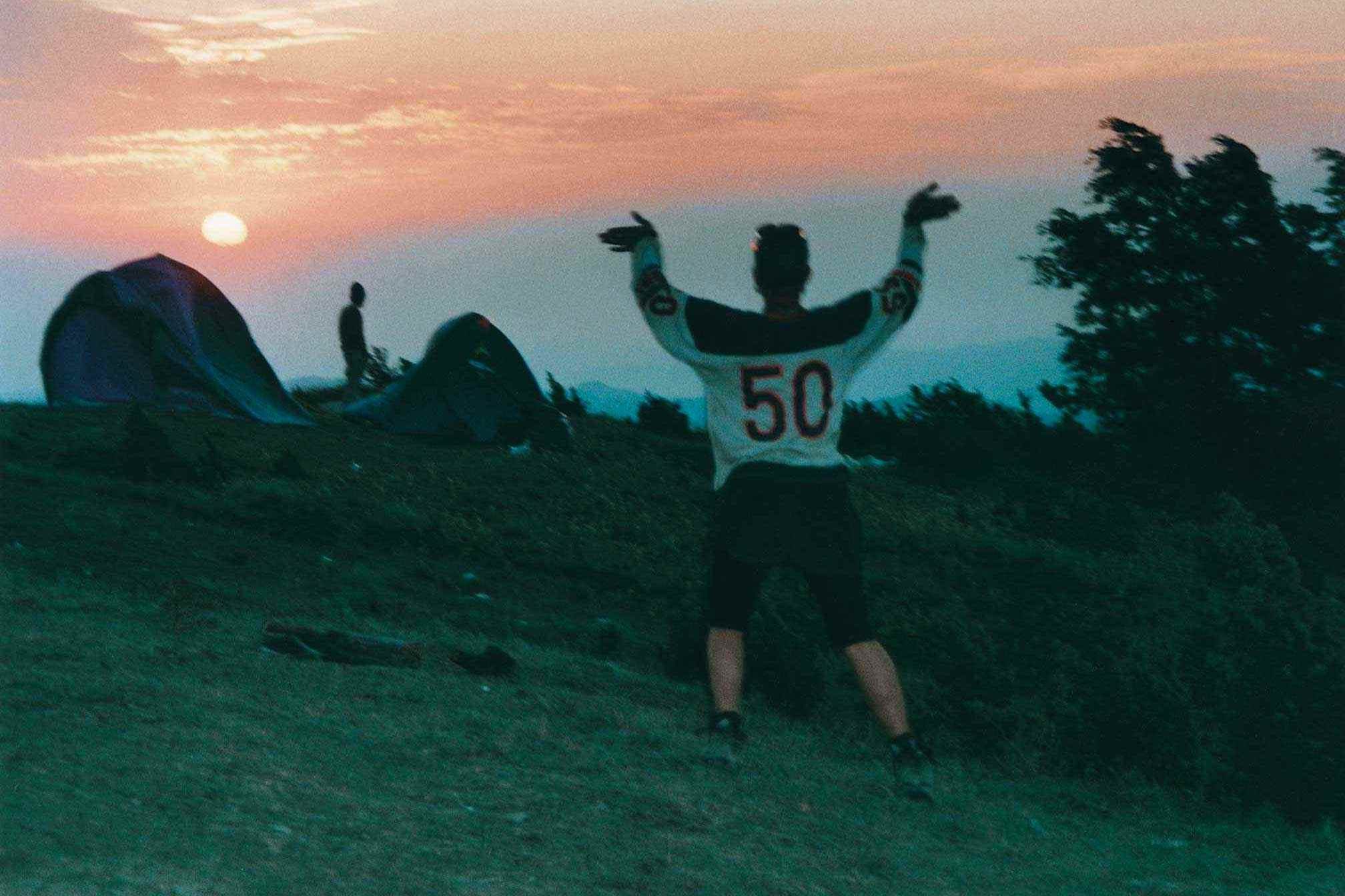
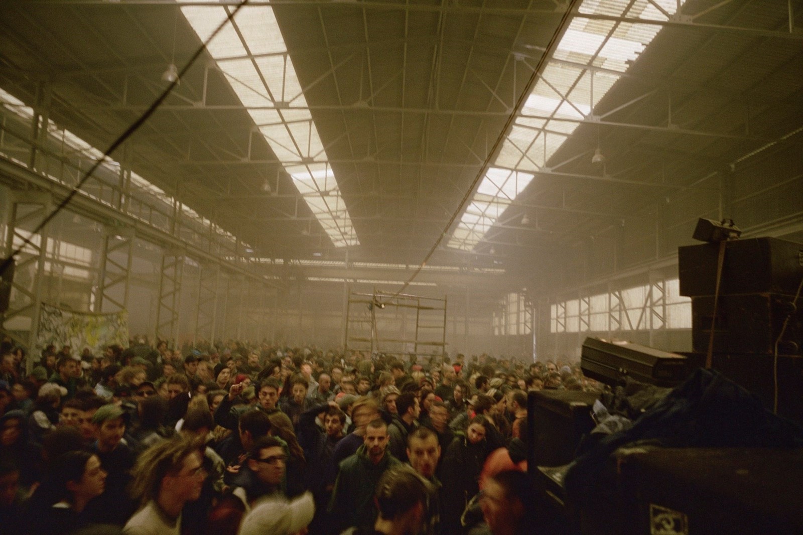
Vinca Petersen is a British photographer and artist, living on the Isle of Skye. Her work consists of documentary-style photography captured with a diaristic narrative as she travels across the world photographing different cultures – in particular the rave / party culture around Europe in the 90s, which was the product and main focus for her photobook ‘No System’ A ten year long documentation of her journey around Europe in 1990s, putting on illegal free raves and festivals with other Techno Travellers. This photobook became amongst her most known works due to its unique outlook on rave culture and shows an insider perspective through the eyes of Petersen and her friends who travelled around solely to experience raves and festivals in different areas. ‘No System’ Includes some of my favourite images taken by Petersen that inspired me to use her as an artist reference or my own project – She takes photos of ravegoers in their element with photos full of colour and vibrancy, and documents the journey of going to a festival – from the massive crowds to the riots and fires that occur, capturing photos of subjects dancing amongst raging flames which a slightly blurry lens to paint a chaos-filled landscape. However along with capturing the madness and danger of raves, Petersen also captures the quieter moments of travelling – some photos depict her friends in peaceful, relaxed states – whether swimming in a lake, lying on a beach or simply lounging around as they prepare to travel to their next destination. Along with creating photobooks and documenting her love for travelling and raves, Petersen has worked with many different youth groups and charities across the world, most of which she has discovered whilst travelling.
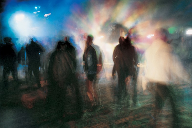
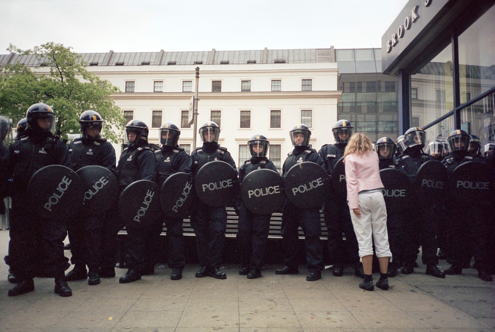
Along with ‘No System’, Petersen released a second photobook about travelling to illegal raves / festivals, titled ‘Raves and Riots 1999-2004’ Displayed as a solo exhibition after the success of ‘No System’ this photobook isn’t based on one particular journey and is a collection of random images taken at different locations around Europe, such as England, Czech Republic, Italy, etc. ‘Raves & Riots’ is simply a showcase of Petersen and her friends having fun, capturing moments of freedom in travelling and the adrenaline of dangerous situations such as riots, protests and run-ins with the police. Not only do the photographs form a vital record of a unique moment in recent history – on the cusp of a digital era, when there was arguably more freedom to stage gatherings in such a way – but, as Petersen says, they are just as relevant today. “As we were putting the show together we realised it’s completely reflective of right now – so many of the images could be from today,” she said in an interview to anothermag.com. Through this project, Petersen shares the freedom and the continued importance of raving and rioting.
Petersen is also friends with famous photographer Corinne Day, who is known for her raw and gritty documentary photography style or herself and her friends. In 1999, Day was paid to do a road trip in Texas and invited Petersen along with her – there she captured around 200 images of the four of them on their roadtrip and created a photobook titled Deuce and a Quarter. Petersen states her book is about women together, having an adventure. She says ‘We had no phones with us, we just felt very free, and untraceable. No one knew where we were. It’s about four women, on a road trip, doing fairly dangerous things at times, but mainly just mucking about. No one fell out, no one got hurt, there was no disaster, and they don’t die at the end like Thelma and Louise. They just have a really great time!’ The final product of the book is composed of images depicting Petersen and her friends doing everyday activities – the majority of images are taken in the car, but although these photos may be simple and not particularly eye-catching they still carry the atmosphere of freedom and fun that Petersen aimed to convey in her work, upholding her typical documentary-style narrative that runs through her projects. Although this project does not inspire me as much as No System does, i still like it as it is a unique depiction of an everyday activity such as driving and showcases the feeling of freedom through soft lighting featuring colours like pastel blues, purple and yellows to convey the relaxed atmosphere of the journey.
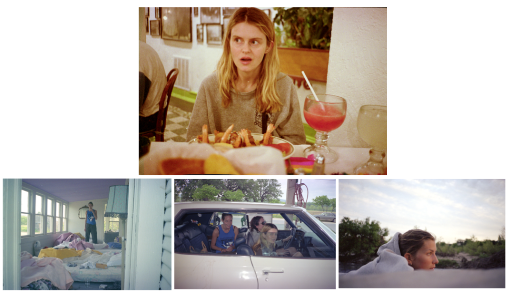
Images from Deuce and a Quarter

IMAGE ANALYSIS

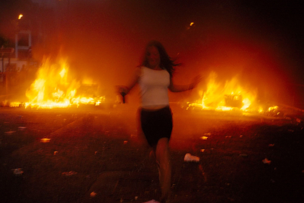
This image taken from Raves & Riots is amongst my favourites by Petersen and is also the photo i feel is closest to the images i have produced due to its bold, vibrant colours and shaky slightly blurred camera. This photo taken during what appears to be a riot depicts a figure surrounded by flames and debris. The subject is running in the middle of the photo, the flames behind her display a bold orange lighting that illuminates the background of the photo and leaves darker red and brown tones to seep into the foreground of the image – this contrasts the figure from the flames and creates a primary viewpoint. Colour theory plays a major role in this image – the red colours symbolize anger, chaos, destruction. Paired with the raging flames and blurry figure this creates a hectic atmosphere which helps create a story behind the image.
Artist references: case study 3

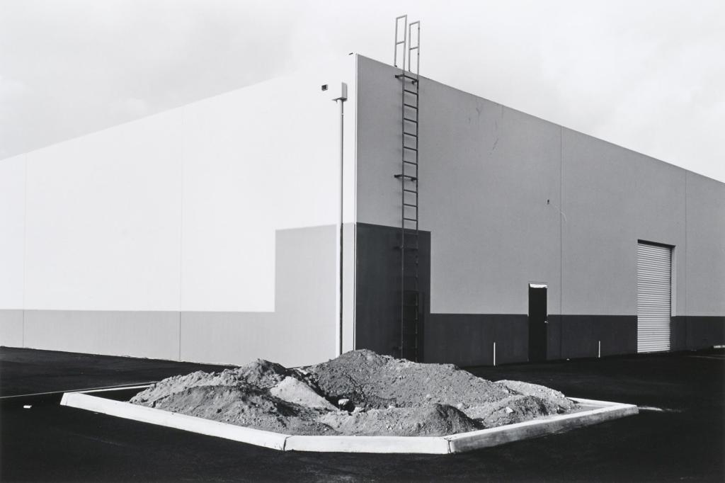
Lewis Baltz

Lewis Baltz was an American photographer who focused some of his work on industrial buildings, car parks and apartment blocks.

His images “describe the architecture of the human landscape”

His work also aims to show destruction to nature and how humans can change landscapes.

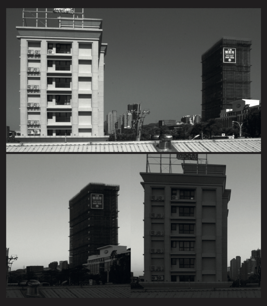
One of Lewis’ contemporaries is Bernd and Hilla Becher, another 2 artists I am also focusing my artist case studies on. This link can help me in my own project, as I can use both of their work as inspiration for a modern attempt at the project.

Photoshoot 1

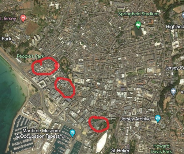
Photoshoot locations

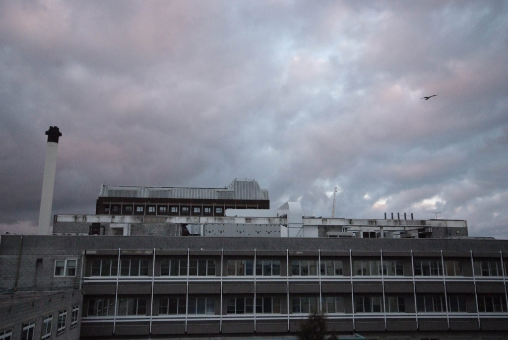
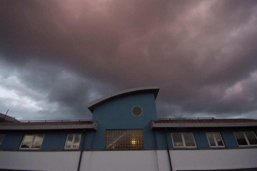
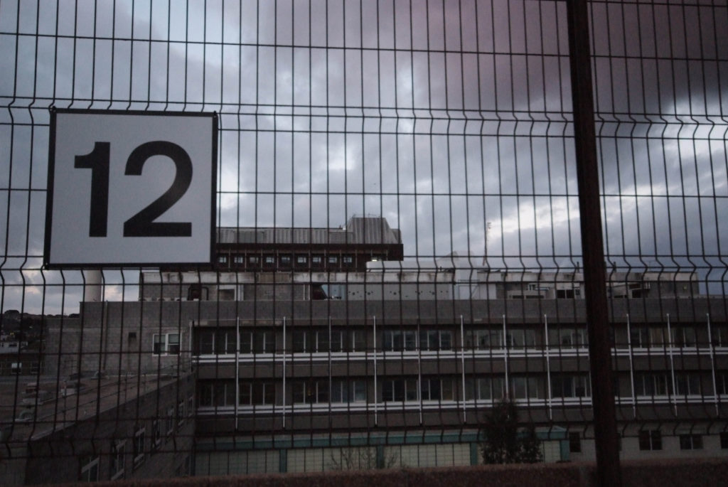
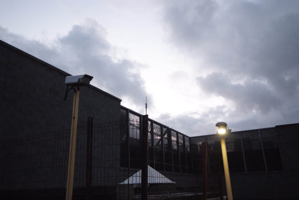
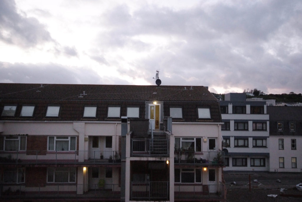
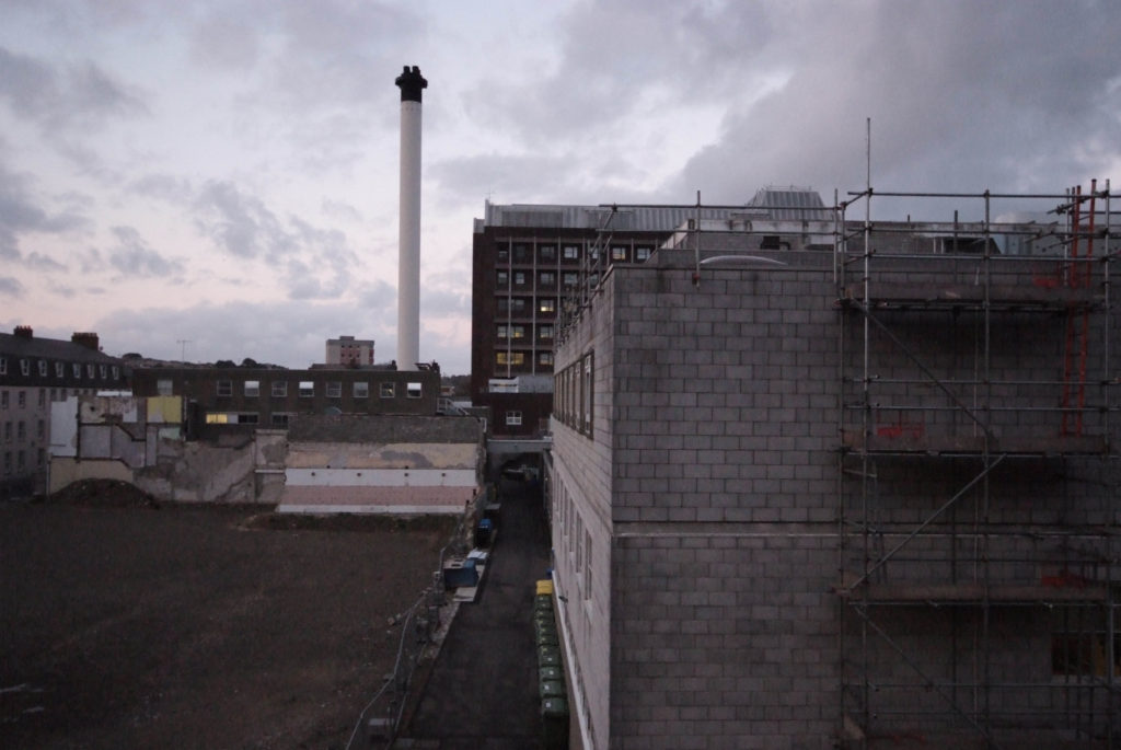
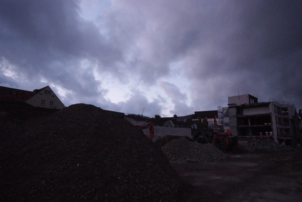
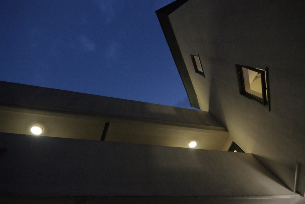
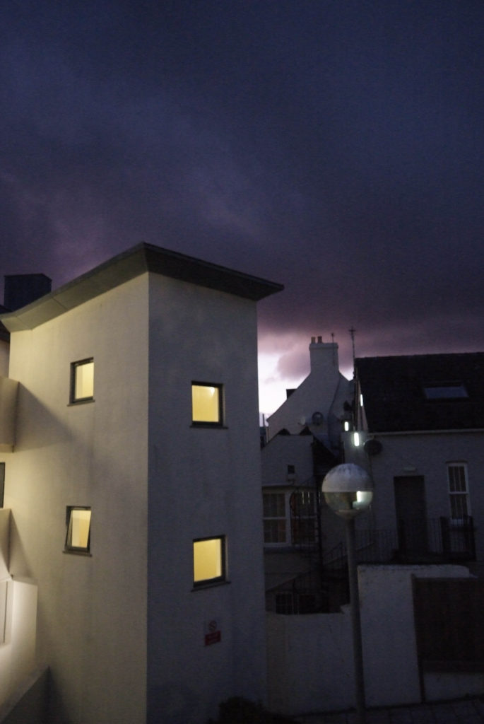
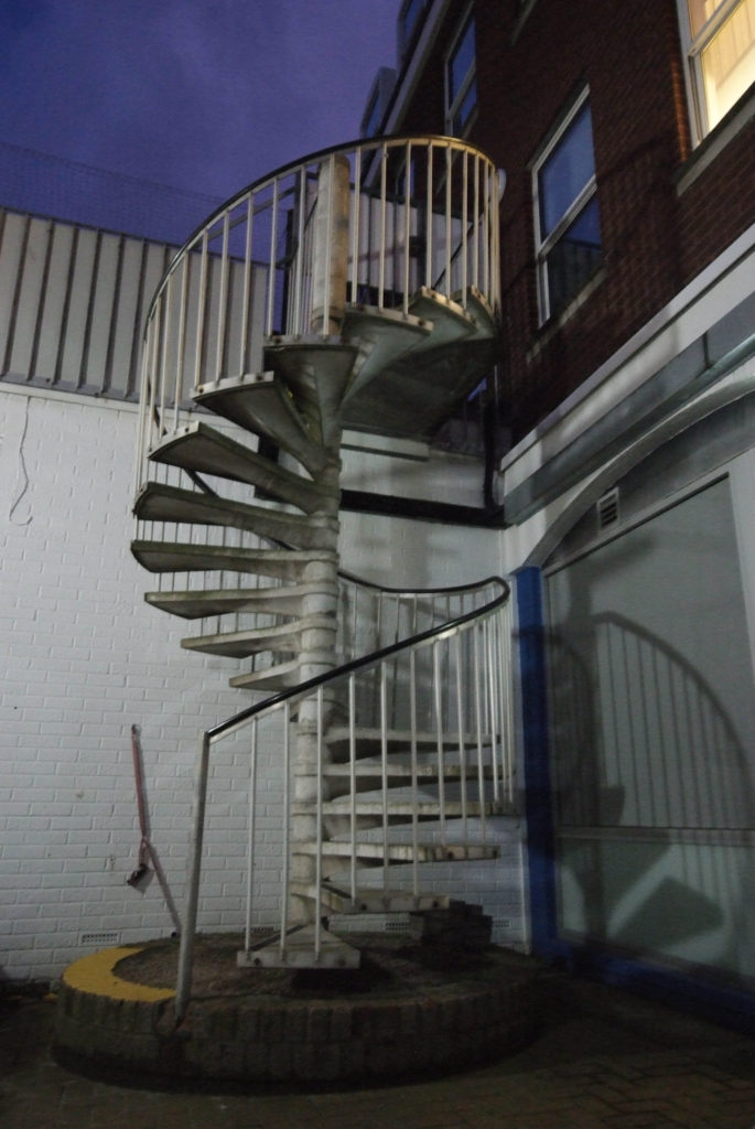
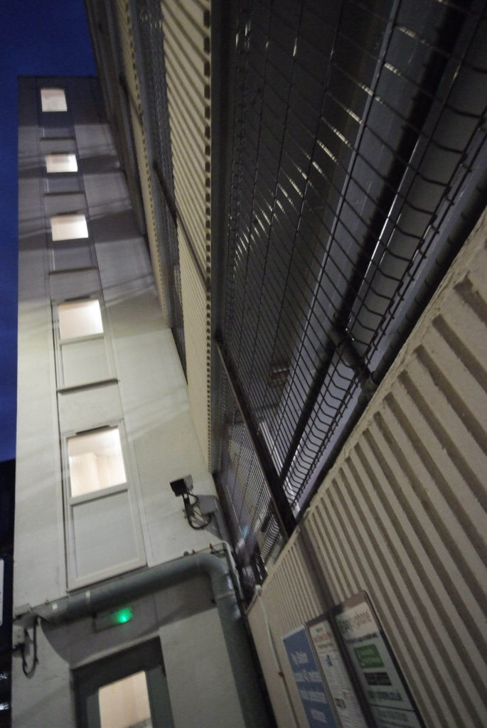
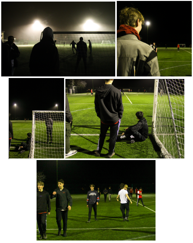
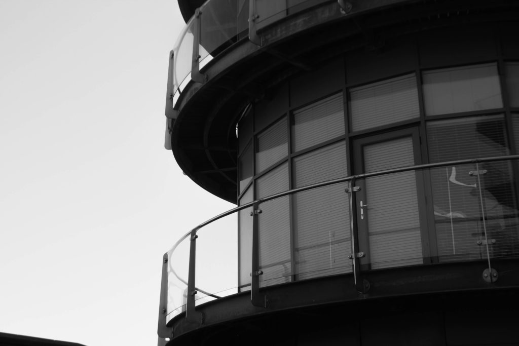
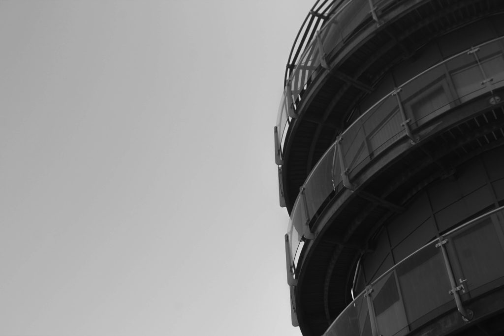
For my first photoshoot I took photographs around areas of St. Helier, From high areas of elevation such as multi-story carparks as well as some apartment complexes. The weather during this photoshoot was cloudy and went from around sunset into early night time with a bit of darkness. I believe the time of day and the weather made these photos come out very effective, and contrasted well with the subjects I was photographing.

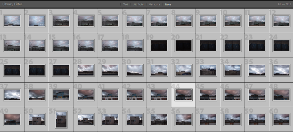
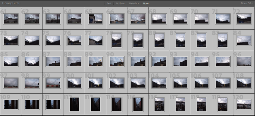
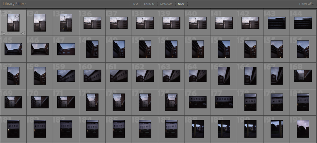
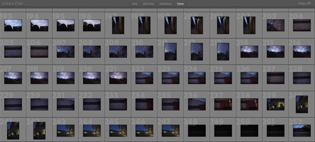
Contact Sheets

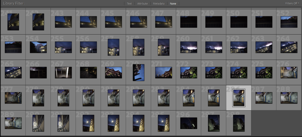
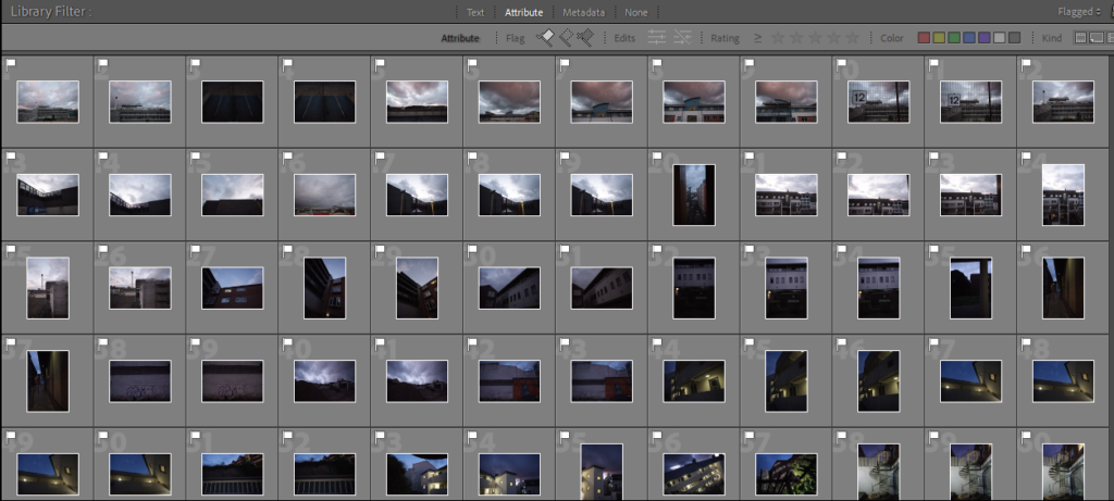
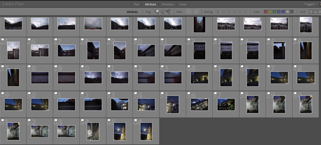
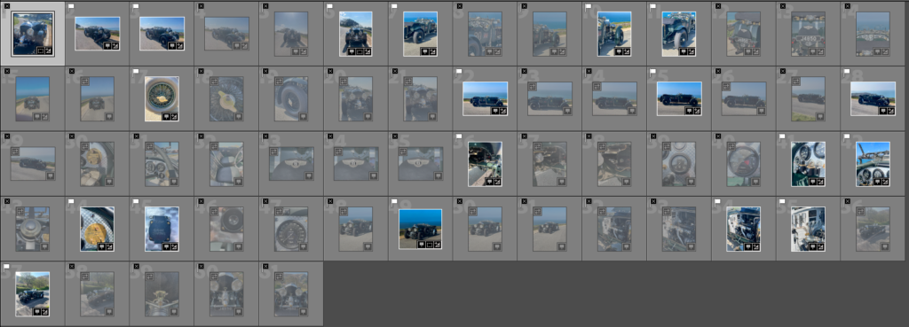
From photoshoot 1 I captured 298 photographs, I used the pick, reject flagging system on Adobe Lightroom to select my favourite images. From using this system I came up with 66 images which were my favourite from this photoshoot.

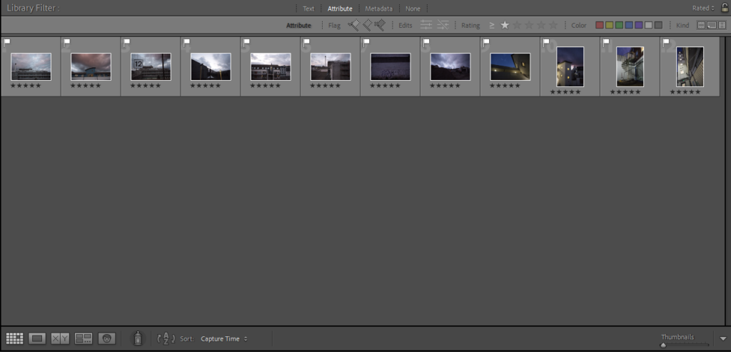
After this I then once again narrowed down the images even more using the star rating system on Lightroom, the best images I rated 5 starts, which I would use in my final pieces.

Best Images from the shoot

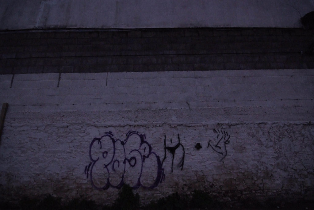
Using this rating system on Lightroom left me with 12 final images to edit and use within my final pieces. The images below are the unedited versions of my favourite/best images from this photoshoot.

Evaluation

Overall, I believe that this photoshoot went well, some images came out too dark or slightly blurry but apart from that there were no problems with the photographs. To improve I would have brought a second camera lens with me to capture various different shots of the same subjects to improve the amount of photographs I could have used for my final pieces.

Editing images photoshoot #1

Click on the image above to see the outcomes from photoshoot #1

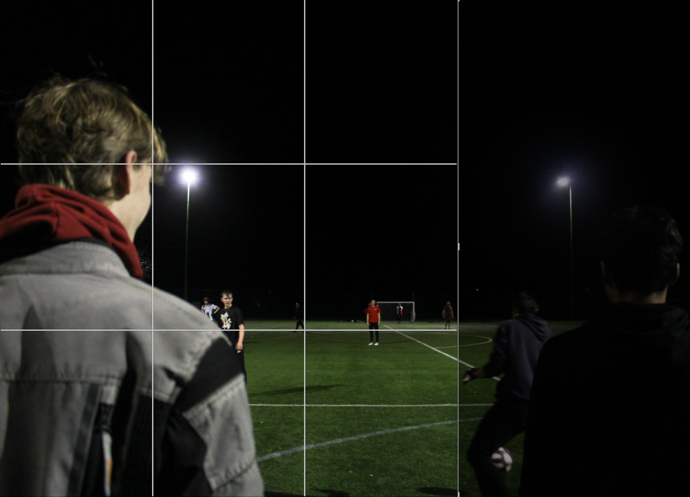
I started by flagging all the images I believed were successful green, this turned out being only 10 images as the rest of my images from this photoshoot were blurry and dark.

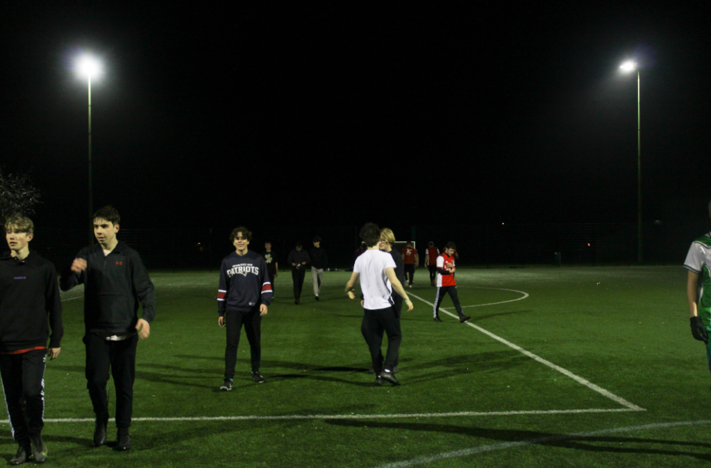
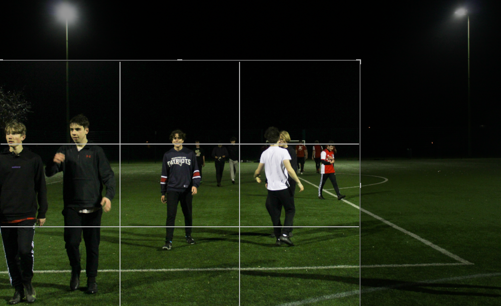
For some images I wanted to crop them into a main focal point so they have less negative space- for cinematic style images there would rarely be space where something is not happening, this is due to the nature of cinema and films where cameras are often concentrated on the action.

An image I decided to crop
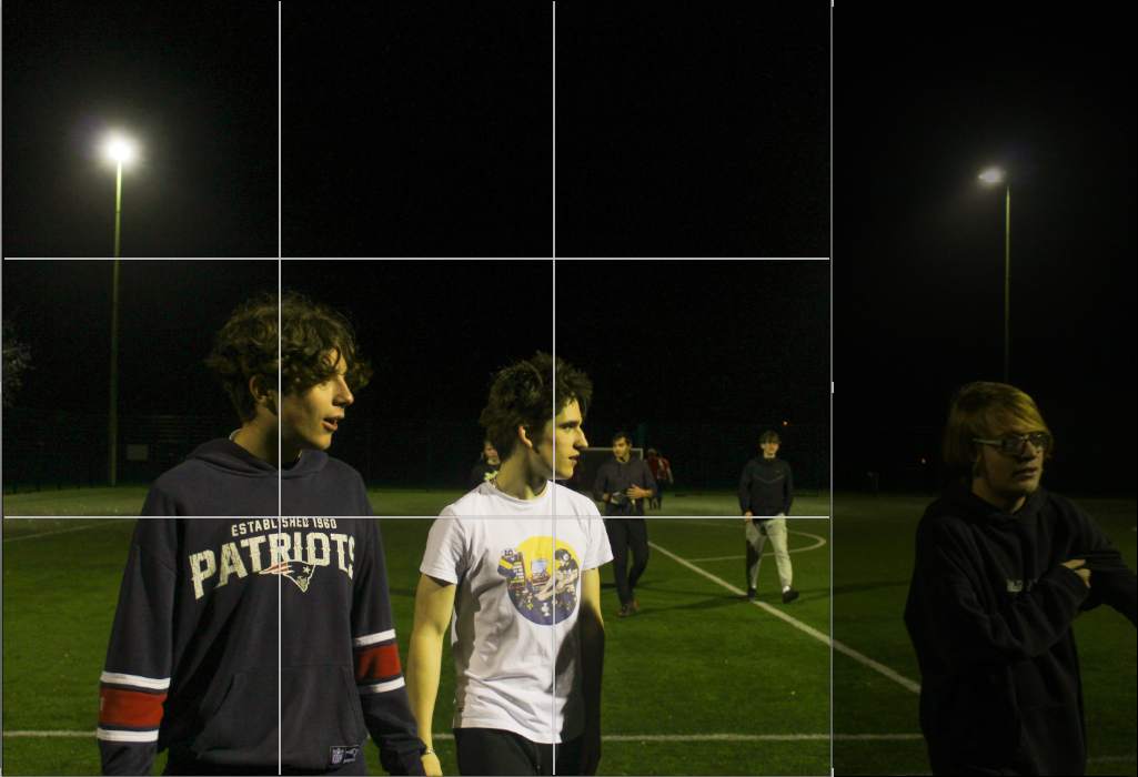
Another image I decided to crop

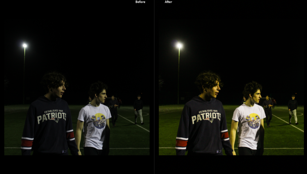
When editing these images I wanted to stay committed to the green/yellow tinge that the floodlights produced on the images- I am going to do minimal editing however my main concentration will be bringing out colour and making the images more vibrant. All the images will be edited similarly- adjudgments will mainly be made for the exposure of each image as this is quite inconsistent.

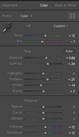
As seen for the image above, editing is minimal and primarily concentrated on colour- bringing out greens and yellows in the image. I was going to turn up the grain in the images however due to underexposure the images themselves are already quite grainy.

The editing for the “After” image above, this is the same editing for the rest of my images from this shoot.

Though editing my images I was able to cut down to some final images as changing the exposure and contrast I could see blur and images which were more unsuccessful, I changed these images to yellow in my coding system so I can still access them.

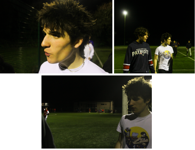
The images I found were less successful

I find many of these images more unsuccessful as they portray too much of an outsider point of view, with no focal point they make the subjects look isolated with a lack of interaction towards the camera (many subjects have their back to the camera which is uncommon in film photography). In the bottom image although almost every subject is presented towards the camera there is an amateur feeling towards the perspective, a lack of focal point as the subjects are spread out which I do not feel is very appealing in the type of effect I am trying to accomplish.

The images I found were successful from this shoot after editing.

I think these images are more successful as they have clear focal points with a clear aesthetic theme running through them: the one outlier is the image at the bottom of the montage above which is darker and more underexposed, making it less clear and out of focus due to grain- there is also a lot of negative space in the image so I am unsure if I will consider this image a final image however the other two images are in focus and carry the same idea of cinematic images; in focus, clear, an idea of narrative as the subjects are concentrated on what is out of frame and definition in the subject with not too much grain.

Final Prints Layout- Planning

I decided to print out an array of my images from this project in a range of sizes, in order to display them in an interesting way. I started by resizing my best images onto A3, A4, and A5 canvases to be sent off to be printed.

I then decided to use photoshop to experiment with the order in which I would display this images, based on their new sizes.

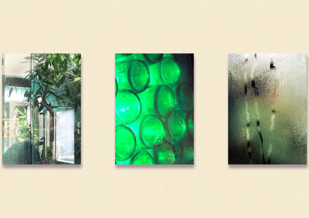
For example I had selected these three images to be printed A3 so I thought it would make the most sense to have them displayed together, likely on foamboard. I decided to group these images together because they are all rather detailed and have a variety of shades of green within them. I placed them equally far apart in Photoshop and used a drop shadow layer to make them look a little bit more 3D.

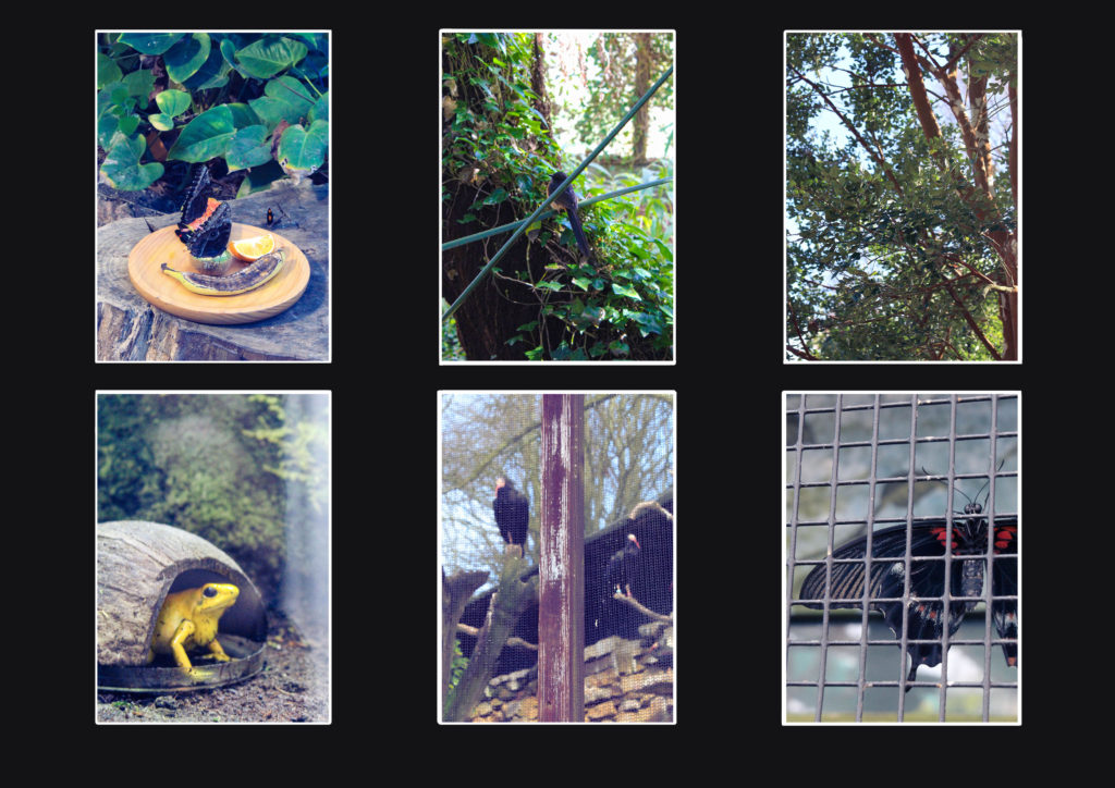
I decided to make a second layout idea with six images placed inside of a window mount. Each image is printed in A5 so I thought placing a collection of smaller images together would make an interesting composition. I placed the images in this order due to their colouring, shapes, and subject matter, like placing the images of birds in the two centre spaces. If I did assemble this in real life, I would use black foam board, allowing the white on the other side to contrast that and the image. I replicated this effect in Photoshop to see how effective this would be.
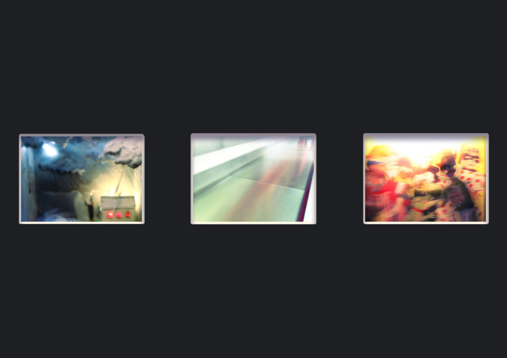
Another layout idea using some of my A4 images in a window mount. I picked these images because of the blur caused by their slow shutter speed.

Since I was also making a photobook, I thought it best that I have a reduced number of prints compared to how many I would normally make, so I would have enough time to assemble them to a quality I was happy with.

Photoshoot 4 (Unplanned)

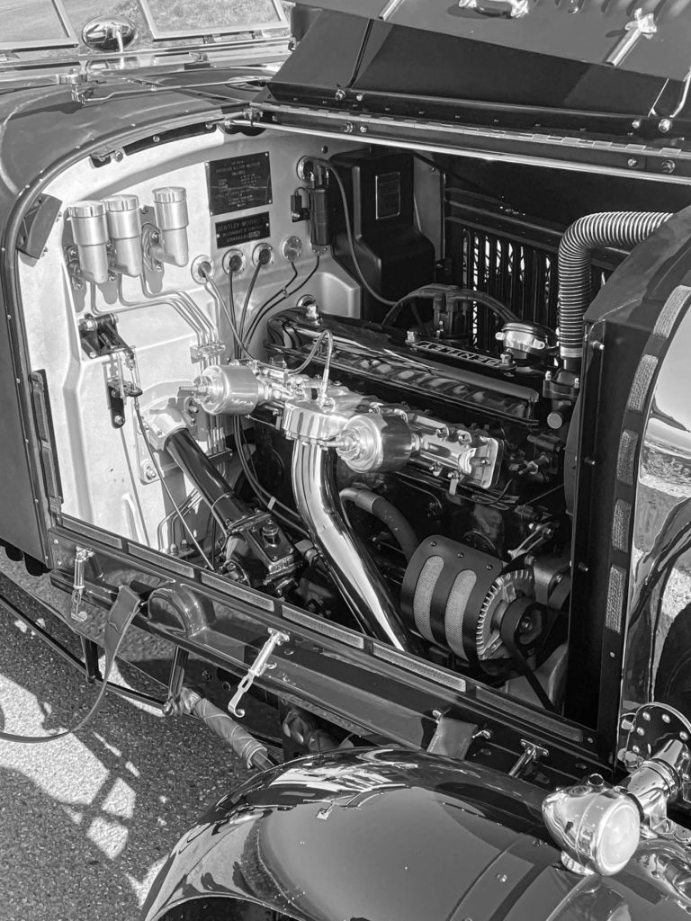
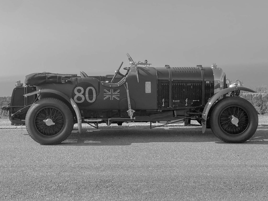
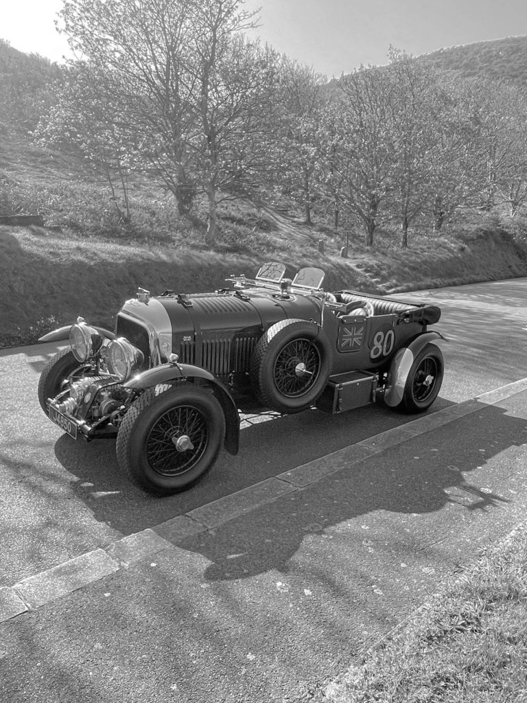
This photoshoot wasn’t planned because i wasn’t expecting it however i was presented with the opportunity to go for a ride in this vehicle and i asked the owner if i could take some pictures.

I uploaded my photos into adobe light room classic and began to pick out my best images using the p for pick and x for don’t pick feature.

These 19 images were the ones i thought were best from my photoshoot

I experimented by creating virtual copies of my best images and making them black and white. This makes the images look much more authentic as the car was built in the 1920s.

Developing the images

In addition to using the contrast, highlights, exposure and shadows features to slightly improve the look of the image i also used the levelling features available in light room. This is because i took the photographs at Sorel racetrack which is on the north coast of the island and it has a slight decline.

After I had developed all of the images including the black and white copies I used the rating system in Lightroom. I rated each image 3, 4 or 5 stars depending on their quality.

My Final Images

These were the 5 best images from my final photoshoot.

Experimentation

I lowered the contrast of the images in lightroom. This made a significant difference and made them look like they were taken in the 1920s when the car was made. This is because the camera technology wasnt very advanced then they could not pick up a large amount of contrast.

Photoshoot 3

For my third photoshoot the circumstances changed from my photoshoot plan due to weather and models not being available.

These are my images from my third photoshoot of my exam project. They were inspired by Danny Lyons’ The bike riders.

I used adobe light room classic to go through the images i had taken and pick which ones were the best from the shoot and for my photobook.

Development

I used the tools in adobe light room classic to manipulate my images to make them look better.

I used the crop tool on many of my images to remove some of the background to increase the focus on my models and their motorbikes.

I also edited the tone of the images such as increasing the contrast and the shadows as well as decreasing the exposure due to it being a sunny day and the highlights to reduce the reflection off the shiny panels on the bikes and the visors on the helmets.

Experimentation

I experimented with making the images black and white in order to more closely stick represent Lyons’ style. However, due to the images i took having bright and vibrant colours i think they look much better in colour. Additionally, when in black and white i don’t think that there is enough contrast between the rider, the background, the bike and the floor. For these reasons i am going to present my images in colour.

I also experimented with textures and tints over the image however these modifications took the focus away from the subject of the image.
Final Images

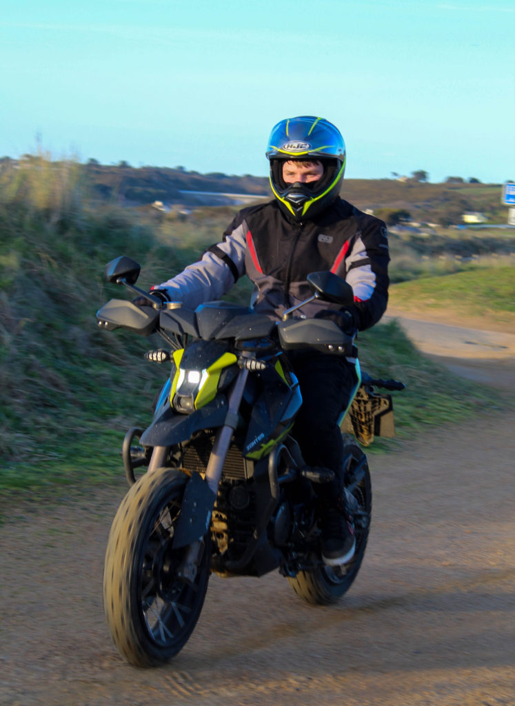
Image Analysis

The subject of this image being the rider and his motorbike are sharp and in focus with a high contrast to the background which is slightly out of focus which ensures the subject is what the viewer focuses on. Both the rider and the motorbike consist of vibrant colours that are opposing on the colour wheel which separates the rider from his bike yet the darker colours in the riders trousers and the bottom of the bike connect my model and his vehicle due to little contrast in the colours. I used a 18-50mm lens set to 18mm for this image. I set the shutter speed to 1/160 sec, the ISO to 100 and f/50. This gave me a sharp and crisp image in the foreground and a slightly blur over the background. These settings were perfect for the weather conditions on the day of the shoot which was sunny. The sun was going down to the west which gave powerful shadows to the east. I positioned the camera low down. This have a new perspective of the scene as well as showing the true shape of the motorbike which is much taller and wider at the front than at the back which is common in the style of the bike it was.
Artist references: case study 2

Nicholas Goodden

Nicholas is a full time commercial photographer with 15 years of experience. He has had a long list of clients in the past, including Adidas, Peugeot, Amazon and Heineken.

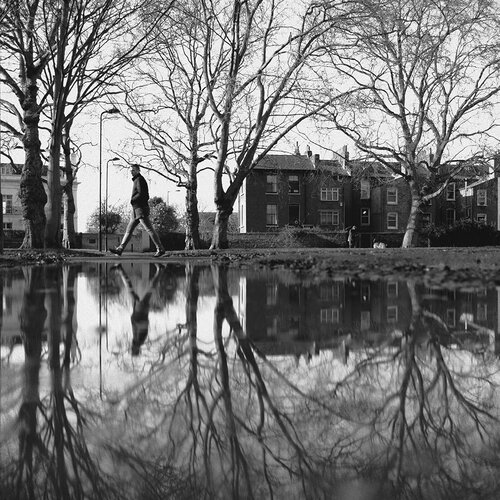
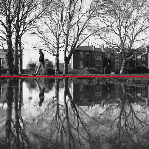
I am focusing on his reflective and symmetrical work:

Taken from his website:

“Now… I cannot speak for others but in my opinion symmetry is key in photography.

Of course it needn’t be present in all photography but it’s hard to deny the strong and positive impact it has on any photograph.

Symmetry seems to satisfy a need within us.”

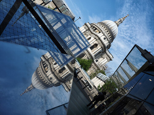
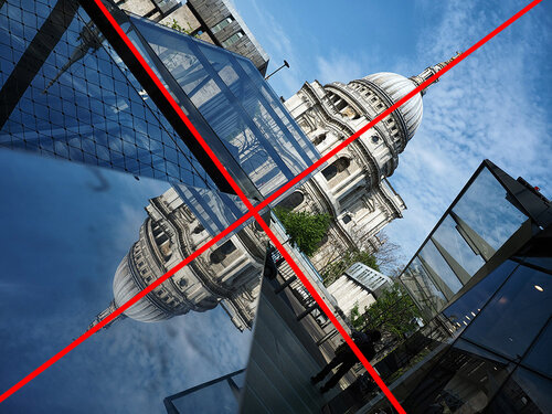
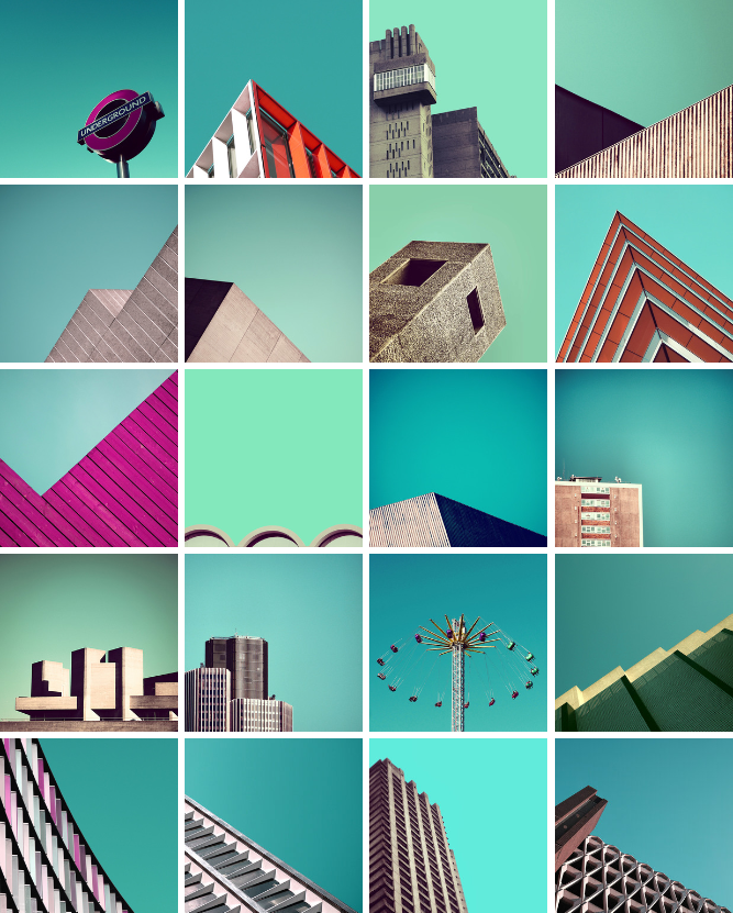
Nicholas also did a minimal photography project in London:

I will be taking photos similar to this kind of style in Jersey,

photoshoot 2 – waterfront apartments

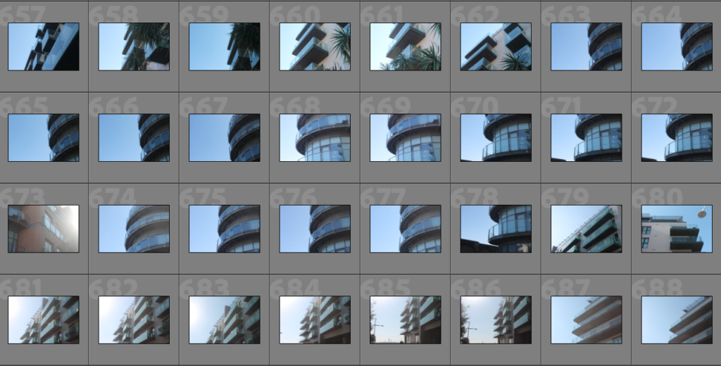
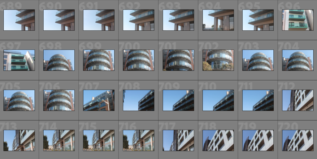
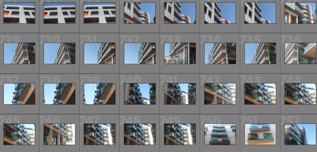
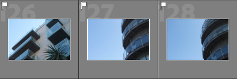
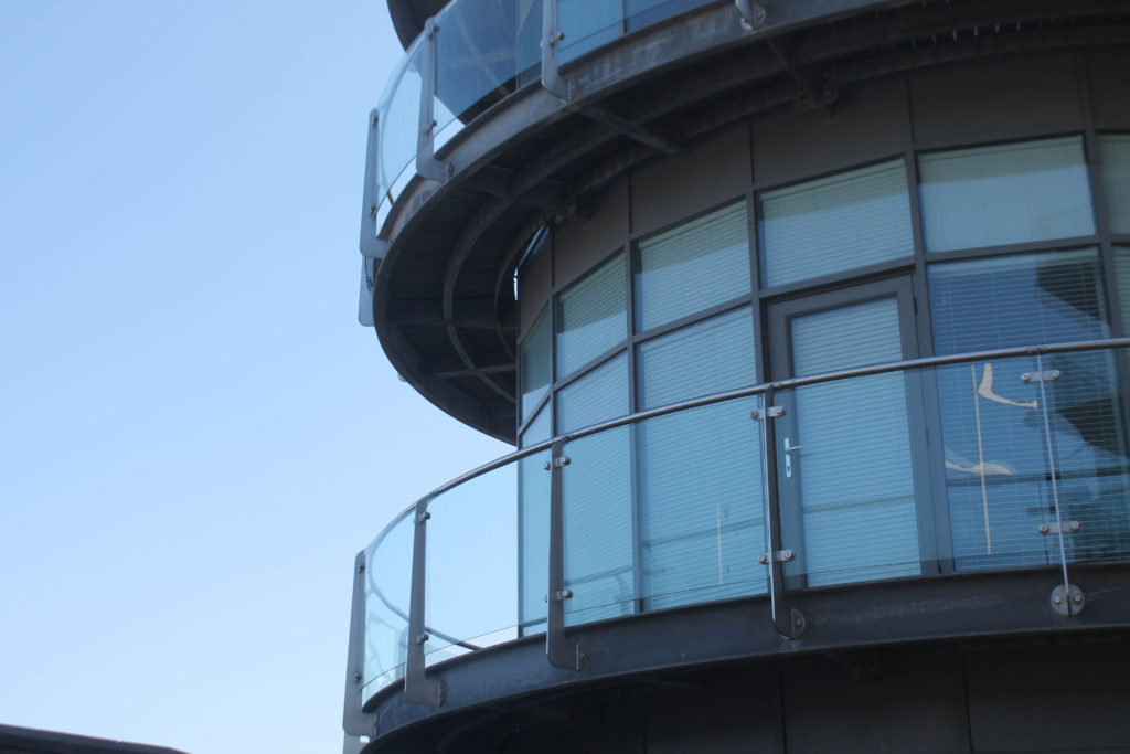
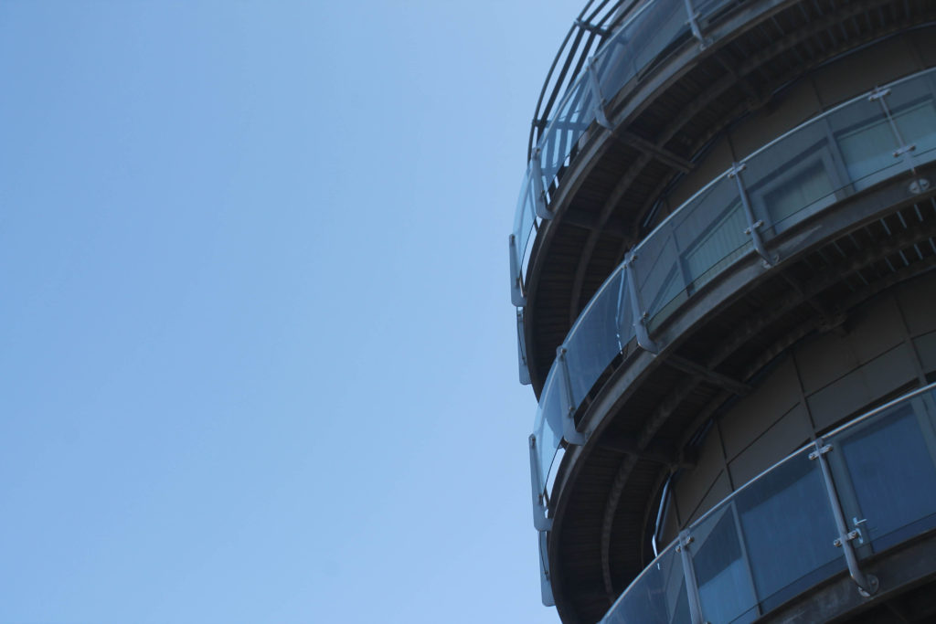
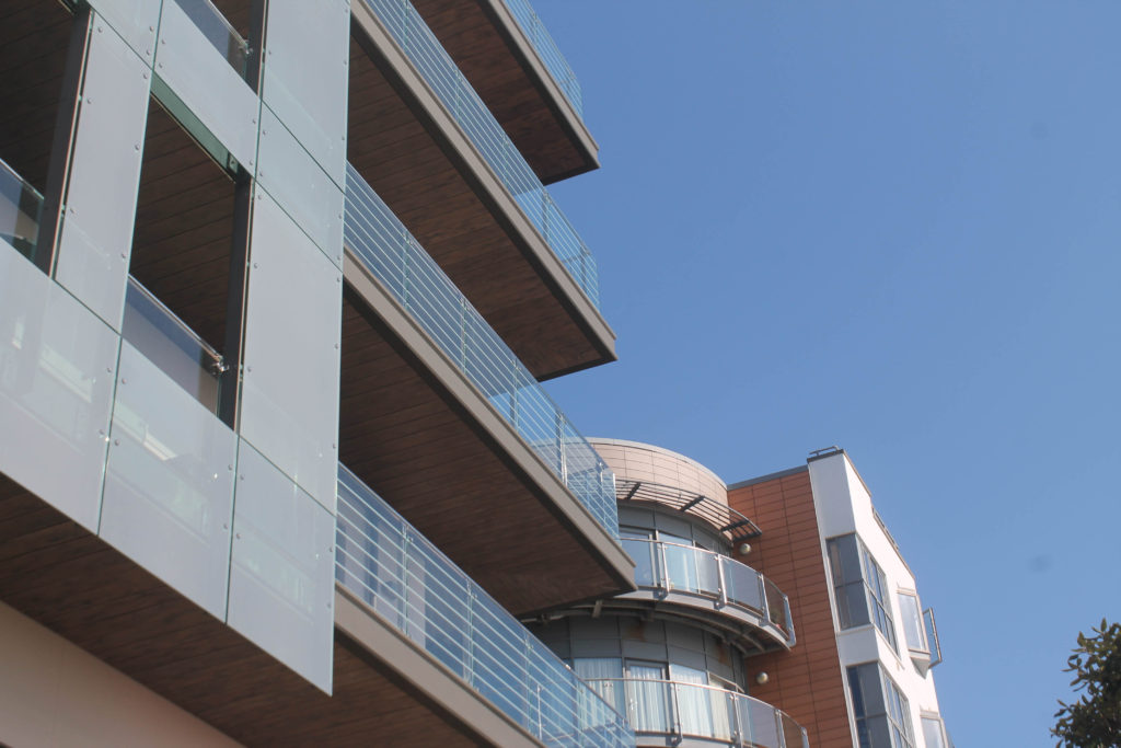
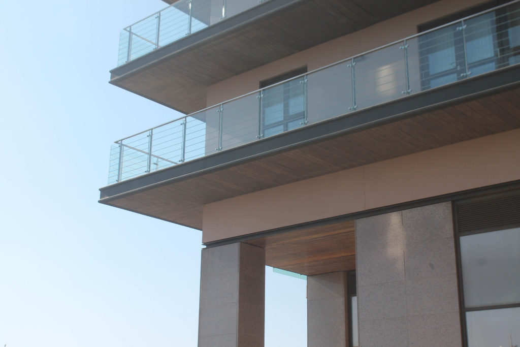
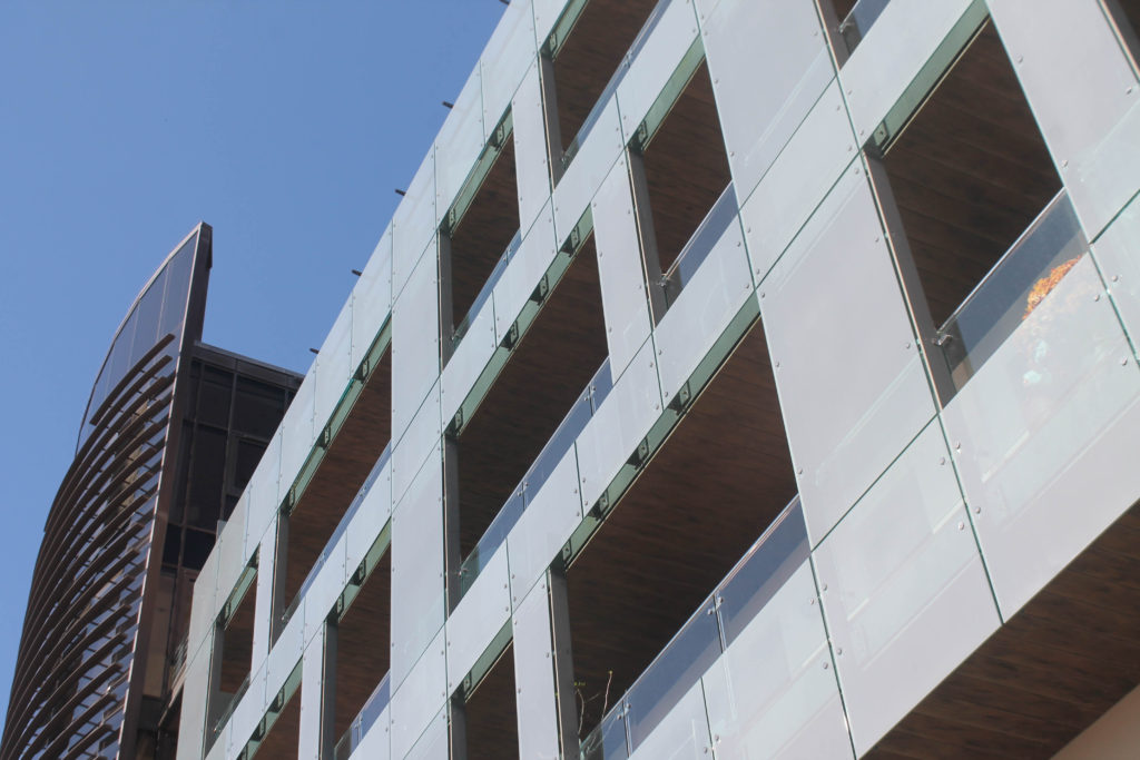
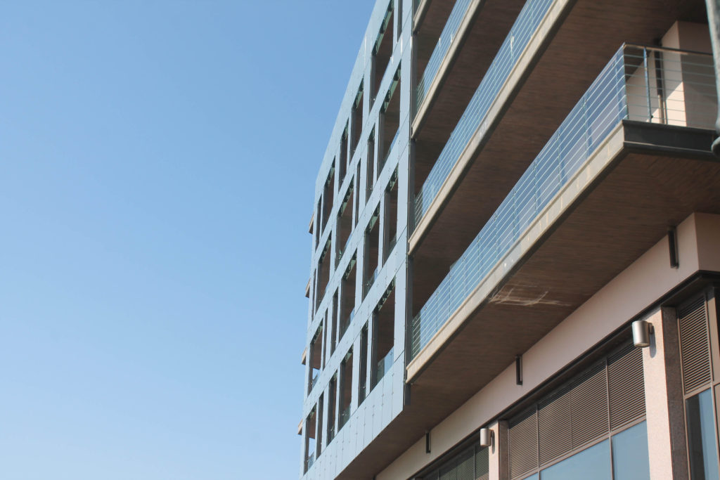
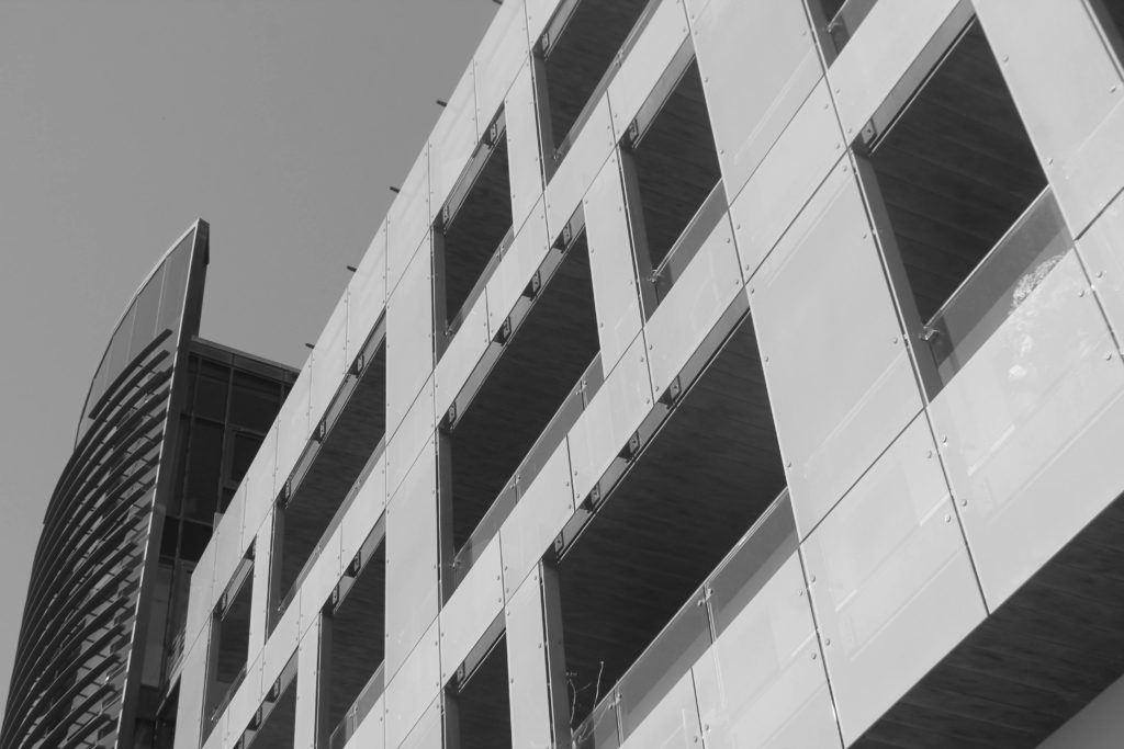
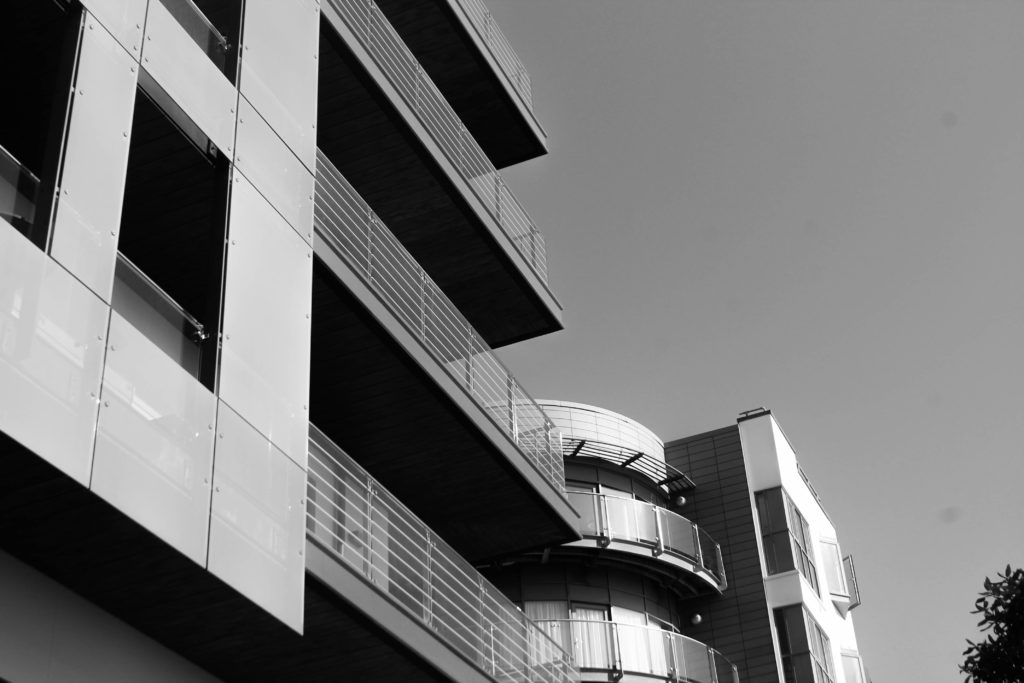
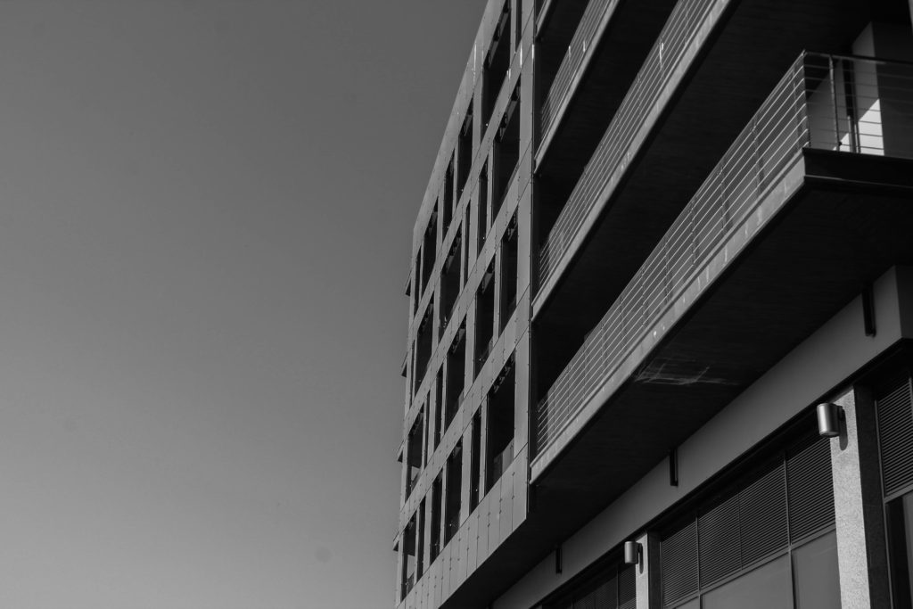
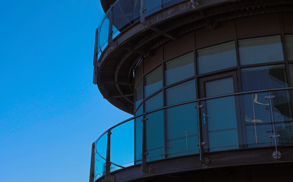
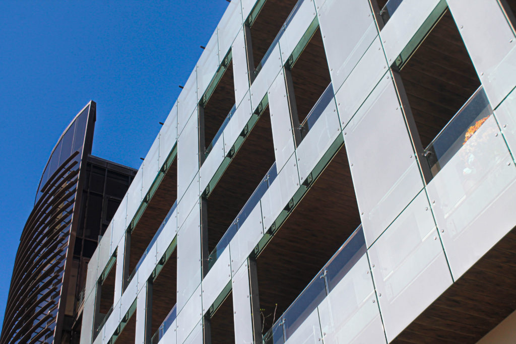
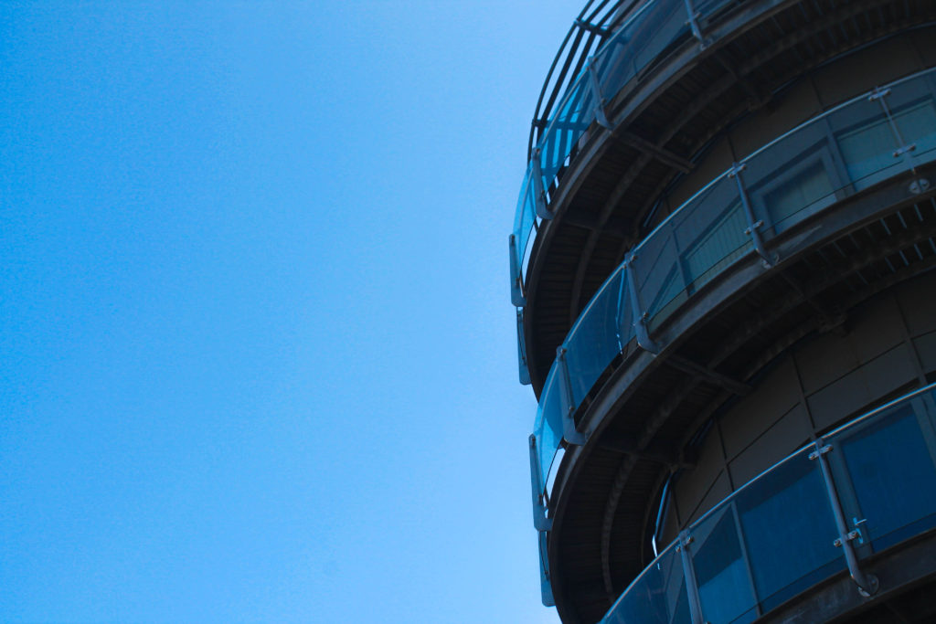
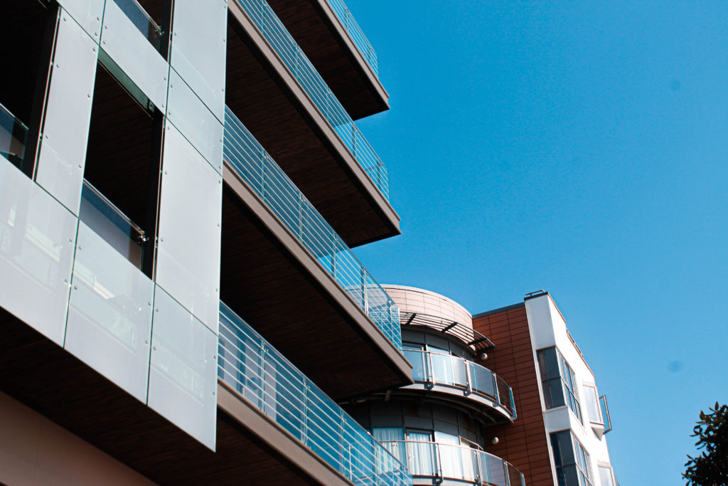
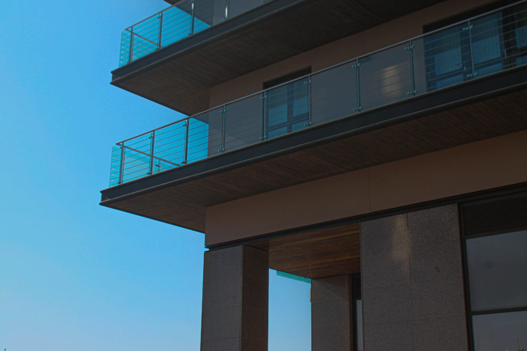
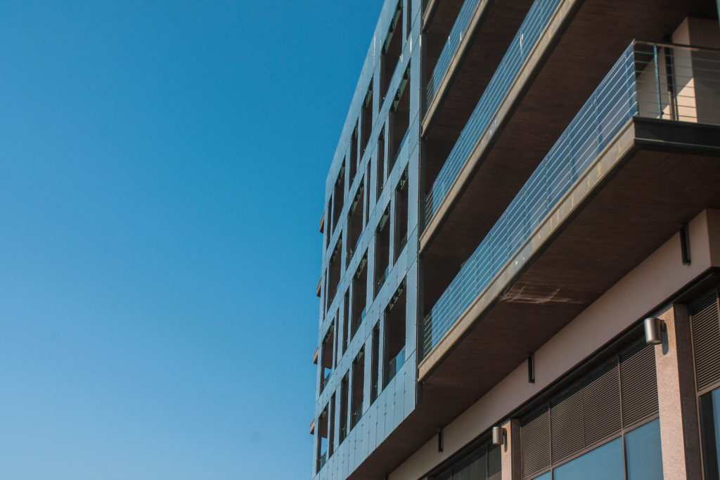
This was my second photoshoot I carried out for my exam project. I took this photos on the 20th of April because of the perfect weather with a bright sun and very clear blue sky, giving the images a nice blue background. I photographed buildings mainly from an angle from underneath the buildings to cast shadows and forecast light on my main focus being the unique features of these apartments. I tried experimenting with close ups and further angles to decide which idea I would like to further carry out. I tried to follow Matthieu Venots style of taking images but with less vibrant colours and more basic coloured structures. Also, the buildings I took photos of contain much more unique and complex features rather than Venots simple structures containing a maximum of 3 colours.

Contact Sheets:

Editing Process:

To begin, I used the P and X method (Pick and reject) to decide which images I wanted to further expand in my project and potentially use as my final images. Below shown are the images I chose to Pick:


After using the P and X tool I realised I did not get enough high quality images for my Waterfront shoot and I am going to need to go their again. Next I used the star rating tool to rate my chosen images from 1-5 based on which I like best.

My Best Unedited Images

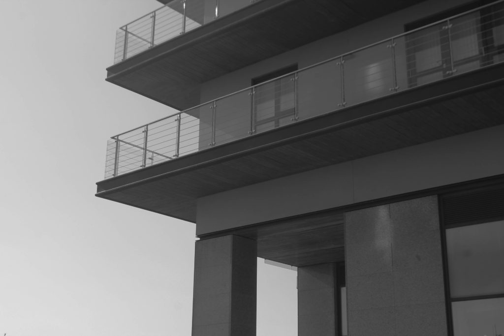
Black and White

Best Edited Images

With these edited images I attempted to follow Matthieu Venots style of work by increasing the blueness of the sky. In my original images the sky is too bright and was barely seen as blue so I used the calibration tools to develop the vibrancy of the sky to try and respond to Venots images.

Evaluation

Overall, I am not fully confident with these images as I didn’t take enough quality images, however the images that did turn out well I am more than happy with. My images is a slight response towards the work of Matthieu Venot because my images contain the light blue sky but with no vibrant colours. I much prefer the coloured variant of my images compared to the black and white because I think the contrast between the blue sky and the dull coloured building is a nice scene to look at. Also, my inclusion of the shadows create great contrast between the sky and the brown like colours. To improve this photoshoot I am going to go to Waterfront apartments again and try and caputre more quality images and take more time when photographing to try and prevent any motion blur, images out of focus, and images that are too bright.

Presentation Ideas

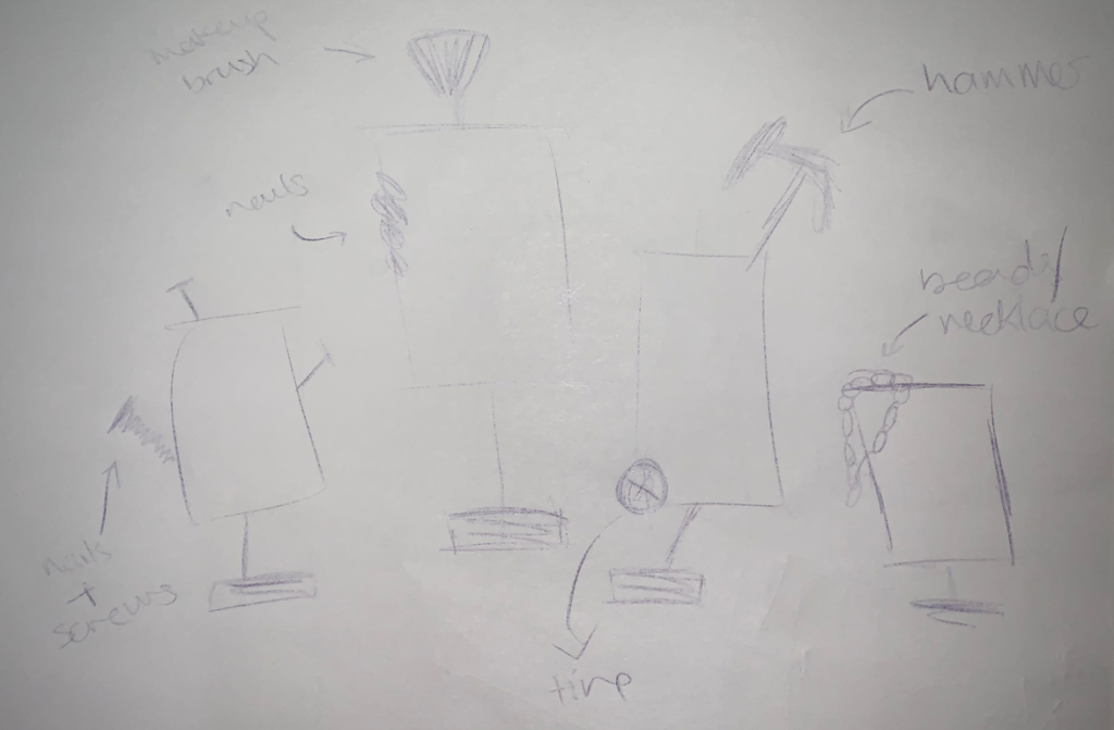
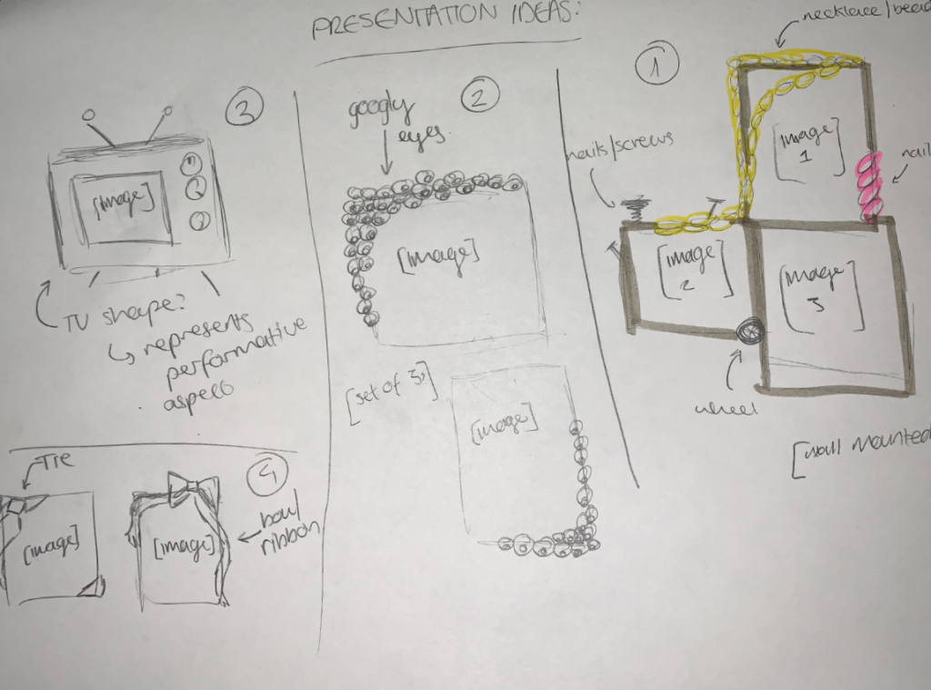
For my presentation/mount up, I wanted to ensure that my framing would enhance the images by being personalised to the images. Due to this, I created some sketches of my ideas and labelled some key elements within each idea.

At first, I wanted to mount the photos so that they would be able to spin – planning to reuse old mirrors and decorate them according to match each image. However, I felt as though the images would look disconnected from one another rather than be viewed as a set due to the differences in decorations which led me to create some more sketches to work around this issue.
Sketch 1

Next, I began to experiment with my ideas, creating 4 new sketches that I began to explore. I was leaning into the idea of creating a small tv [sketch 3] and trying to make my images spin by using the notches to make my final project more interactive. Alongside that, I felt the tv would help to portray the performativity of gender/gender roles as it’d be showing my images on the topic as a fabrication whilst mocking the idea of people imitating what they see on tv. However, I knew that it would take a lot of time to create so I decided on using sketch 2 as a back up plan in case I wouldn’t be able to create sketch 1 as I the eyes around the frames would symbolise how society is constantly watching and judging the actions of those around them and criticising those who stand out/reject conformity.
I decided against using sketches 1 & 4 as they felt too plain for my liking and felt as though they wouldn’t use help elevate my images like sketches 3 & 4 would.

Sketches 1-4