lightroom editing & selection

SELECTION (PHOTOSHOOT #1)

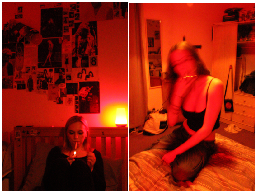
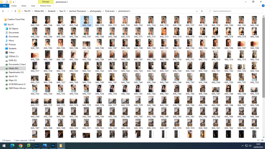
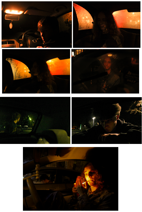
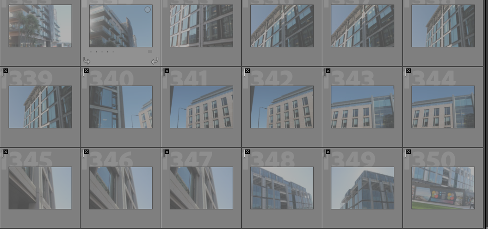
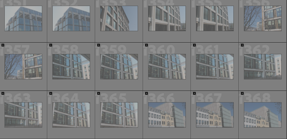
I began my selection process by separating my photoshoots into two separate collections on Lightroom, named according to photoshoot – therefore this would make the selection process easier and quicker to sort through since I have limited time. I then went through my images and labelled them with the colour rating – green for my strongest images, yellow for ones i was unsure about and red for photos I wouldn’t use, for examples ones that were blurry or boring. The use of artificial lighting (LED lamp) proved very successful for this photoshoot, therefore I feel none of my final images for shoot #1 needed editing as I am satisfied with their outcome.

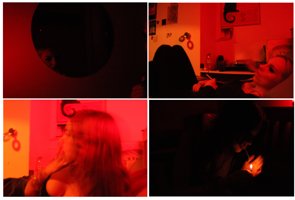
For my project, I either wanted to display my photos framed up on a board or create a small zine. For this, I needed to shorten my selection process down to only 6 images, which left me with some difficult decisions, as this was a big photoshoot and the majority of my images I really liked – however, some of them were taken from the same angles with similar poses, so I made sure that my final six were all aesthetically different yet captured the same insider perspective I aimed to achieve. Unfortunately none of my purple / blue coloured images made the final cut, as they were either too blurry or didn’t quite catch my eye. I am satisfied with the final six photos I chose as I feel they are all very unique and although they do contain the same colour scheme, shutter speed and lighting help to enhance each image differently to make each one more aesthetically interesting to look at.

SELECTION (PHOTOSHOOT #2)

Unlike my first shoot, some of the images in my second photoshoot needed further editing, as I felt the colours and lighting didn’t stand out enough compared to my first photoshoot – however my first shoot used artificial lighting, which I could heighten and adjust as I wanted. The second shoot relied on natural lighting from the sun and was therefore out of my control, so i had to carefully decide the angles i took my images from to get the outcome I wanted. Repeating the method I used earlier, I sectioned my images from photoshoot #2 into a separate folder then sorted through them.

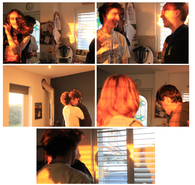
Unlike my other photoshoot, I chose to have only 5 final images instead of 6, as I want to display them a certain way once I frame my photos up. Once again my selection process was difficult, as there were a lot of photos I liked, but again wanted to make sure all of them were visually different. This photoshoot was the more difficult of the two, as although my other images appeared candid, the photoshoot was staged and carefully prepared. Whilst capturing images for this photoshoot I aimed to have all my images candid, however in the majority of them the subjects are looking at the camera or posing, and although the image may have turned out well, I felt they weren’t aesthetically fitting with the rest of my photos as i really relied on the candidacy of my images to convey the insider atmosphere.

EDITING
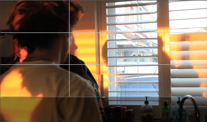
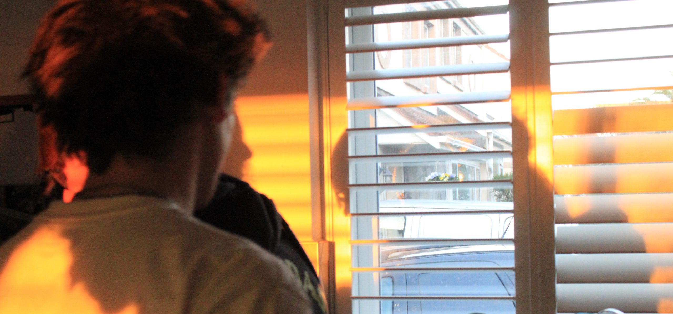
I decided to crop this image as I felt the objects on the sink were too much of a distraction and instead wanted the focus to be on the way the lighting reflected onto the figure and the window. Cropping this image will also help it fit nicely in my arrangement of images once I have them framed up.
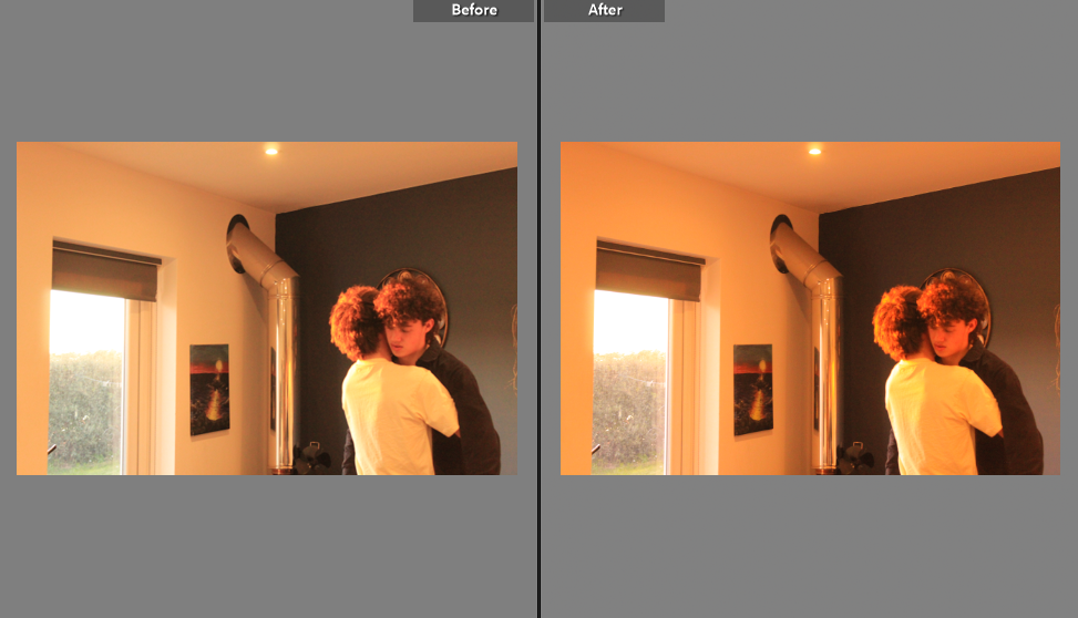
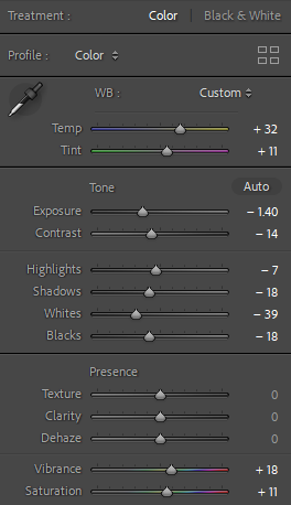
I edited this image too as I felt it was lacking colour in comparison to my other images – therefore I turned up the vibrancy, temperature and tint in order to achieve the outcome I wanted. Although the editing is minimal I still felt it made a change to the image when displayed amongst the others. My other images for the most part however were left unedited, as I wanted to keep the authenticity of the natural lighting and not further enhance it too much.
Development and experimentation: outcome 1

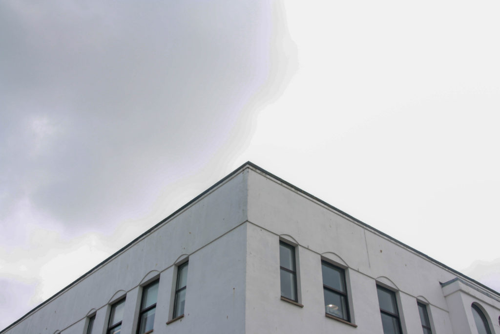
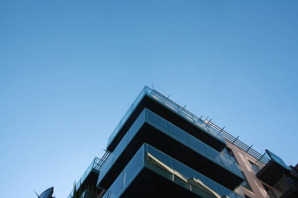
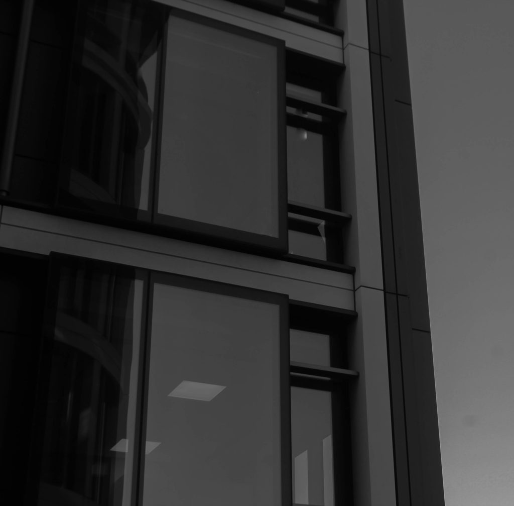
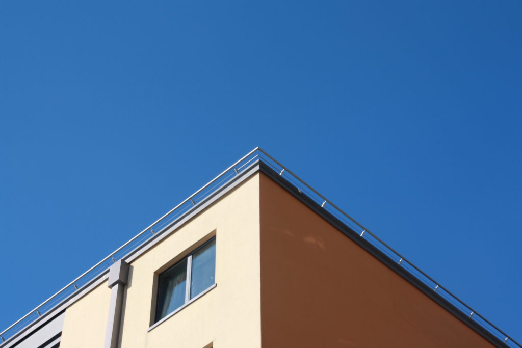
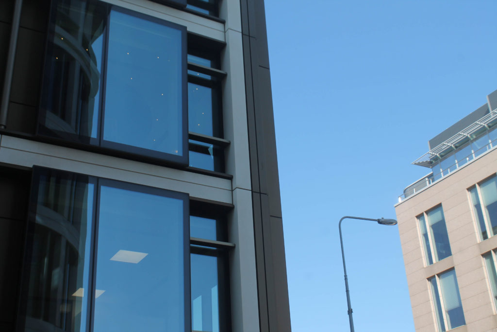
One idea I had for this project was to photograph corners of buildings. Photos taken in this way show both sides of the building stretching off, and can sometimes create a shadow effect if the sun is in the right place. I think I captured this shadow effect in this photo:

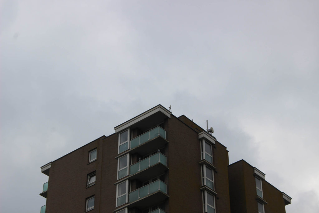
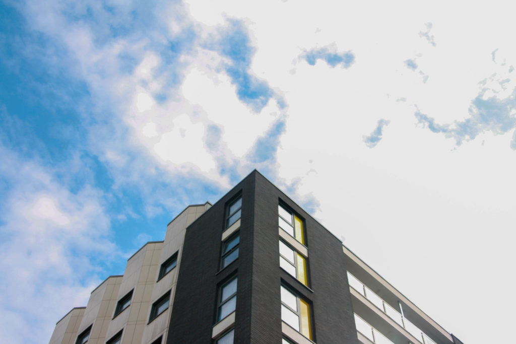
Here are some more of the photos I took in this style

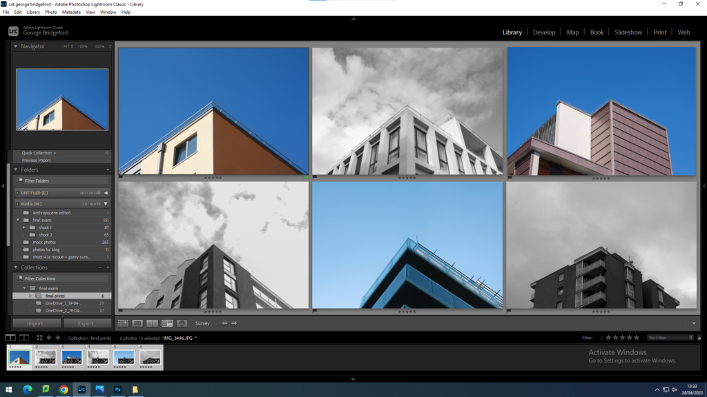
I am printing these images to create a grid of photos. This will be my final presentation of this idea. It will look like this:

Photoshoot 2

For my second photoshoot, I wanted to create a few different characters similar to Sherman. I used makeup and costumes on my subject in order to create the illusion of different characters as well as creating that classic Hollywood makeup look.

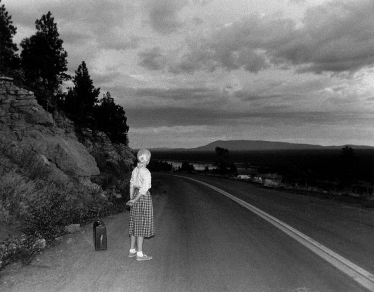
Here are a few images which I looked at in order to gain inspiration for this shoot

I

Editing images photoshoot #2

Click on the contact sheets above to see the outcomes from photoshoot #2

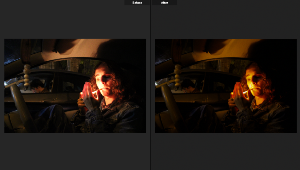
Following the same structure as my blog post on editing, I started by flagging all the images I believed were successful green, this turned out 8 images as the rest of my images from this photoshoot were blurry and dark, a common theme in trying to capture images in the dark. I did not have to crop any of these images so I went straight to editing to bring out colours.

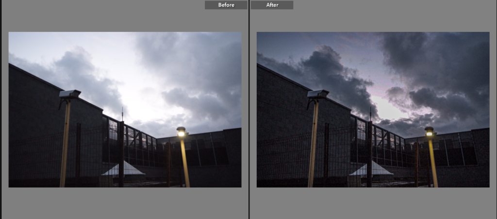
Editing is once again minimal, in this photoshoot many of my images turned out with orange and yellow tones which I have chosen to accentuate- once again my images have grain in hem which suits them however some have turned out too grainy for me to introduce colour without making them look low quality.

The editing for the “After” image above, meant to bring out yellow and orange tones which is my main focus for this photoshoot.
Some of my images became very grainy after editing- due to this I may not use the ones which are massively grainy as it makes them look low quality and less defined.

Through editing I was able to make a smaller selection of successful/unsuccessful images, I have changed the images which were less successful to yellow in my coding system.

My unsuccessful images

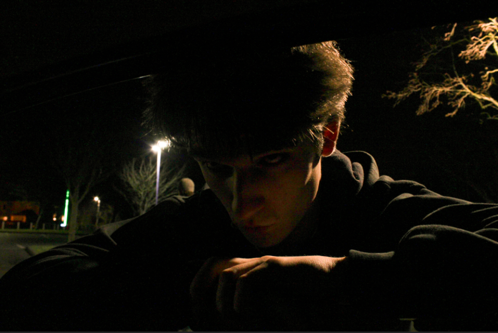
A lot of my images were too grainy after turning up the exposure so this already made them unsuccessful however this was a difficult selection of images I feel did not fit up to the intent I had for them- images I am still not sure about are the first and third images on the left of the grid as well as the bottom image as I like the interaction with the camera (turned towards it- including making eye contact with the camera) and the colours in the images (specifically the highly grainy green image however I feel as if it does not suit the rest of the images).

What I think is my most successful image from this photoshoot

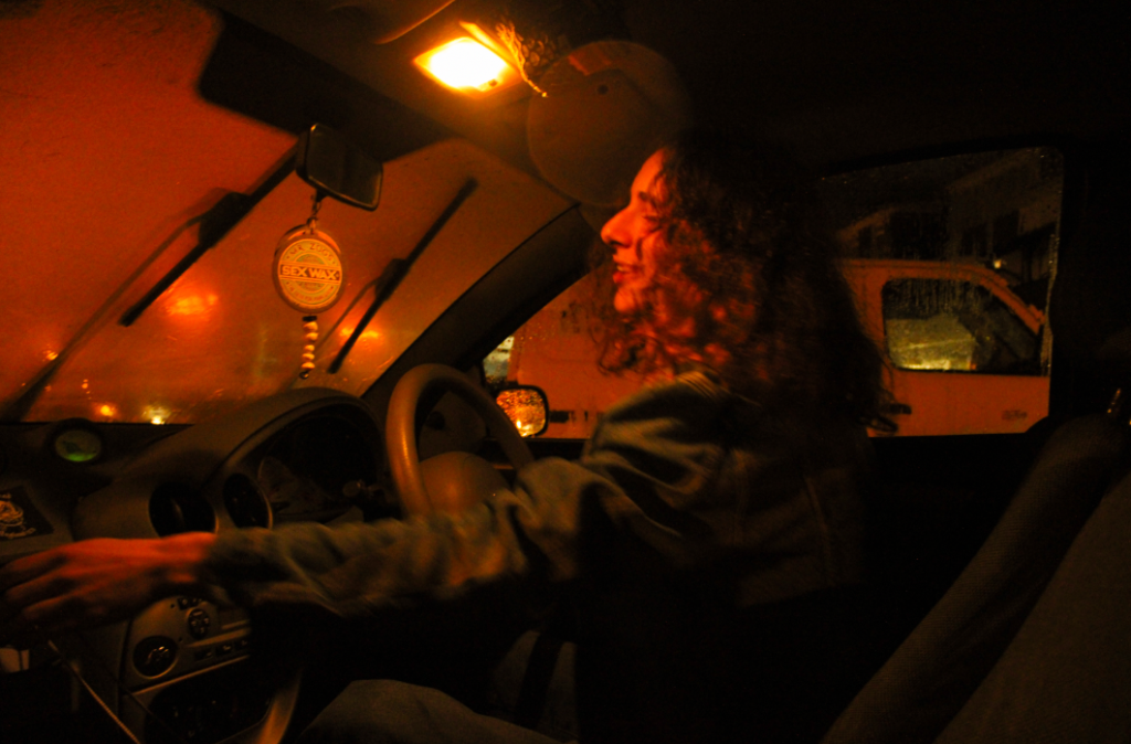
I really like this image as it massively reminds me of Claudia Andujar’s “They’re Looking For Peace” collection which is one of my biggest inspirations for this project, this is due to the sweeping motion my subject has- making him the certain main subject, the colour is also similar to Andujar’s work, she often used oil lamps to keep the colour consistent across the whole image however although I did not use an oil lamp the lighting outside of the car carried throughout the car, keeping the same consistency. Although this image is slightly blurry it is not massively noticeable- I feel as if this blur adds to the image in a positive light as it looks like it was screenshotted from a film- showing motion makes the image more than an image as it implies a further story.

Planning and recording: photoshoot 2

For my second photoshoot I will stay in St Helier, but explore different buildings that are more centred in the town. These buildings will mostly be a lot older than the waterfront buildings, so I am aiming to show the history of some of the architecture right in the centre of St Helier.

Here are a couple examples of what my work might look like:

Photoshoot 1

My idea for my first photoshoot was to blur the male gaze, to do this I captured images of the female subject moving around on a low shutter speed in order to create a blurry image as well as an image which displayed clear movement.

I also wanted to create a character profile within these images, I decided to capture images of my subject dressed up and crying, similar too the style of Sherman.

photoshoot 3 – esplanade and westmount apartments

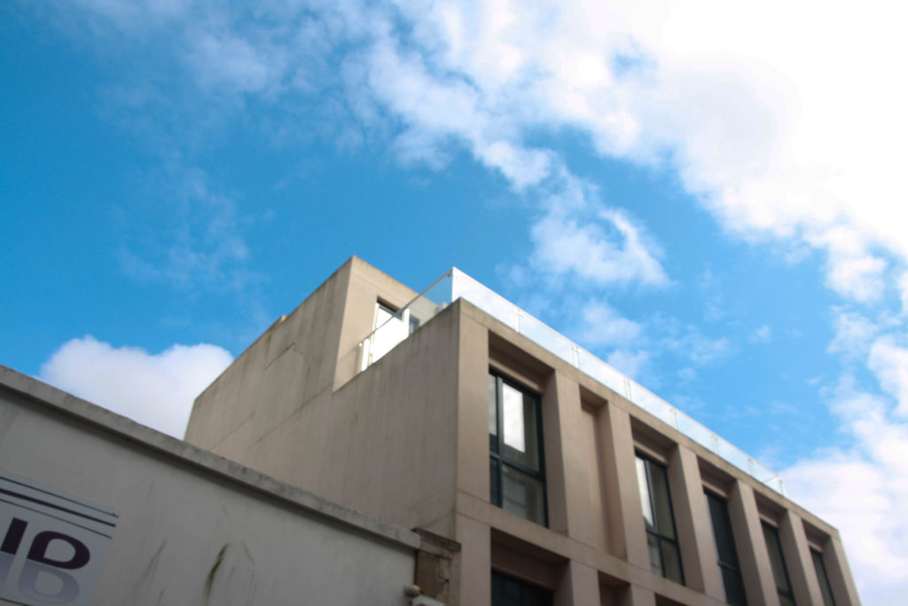
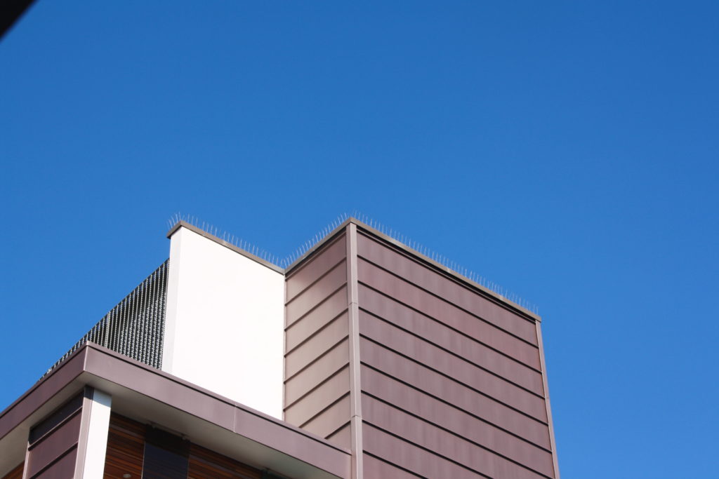
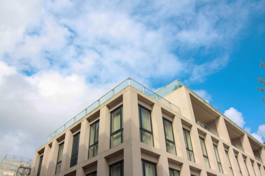
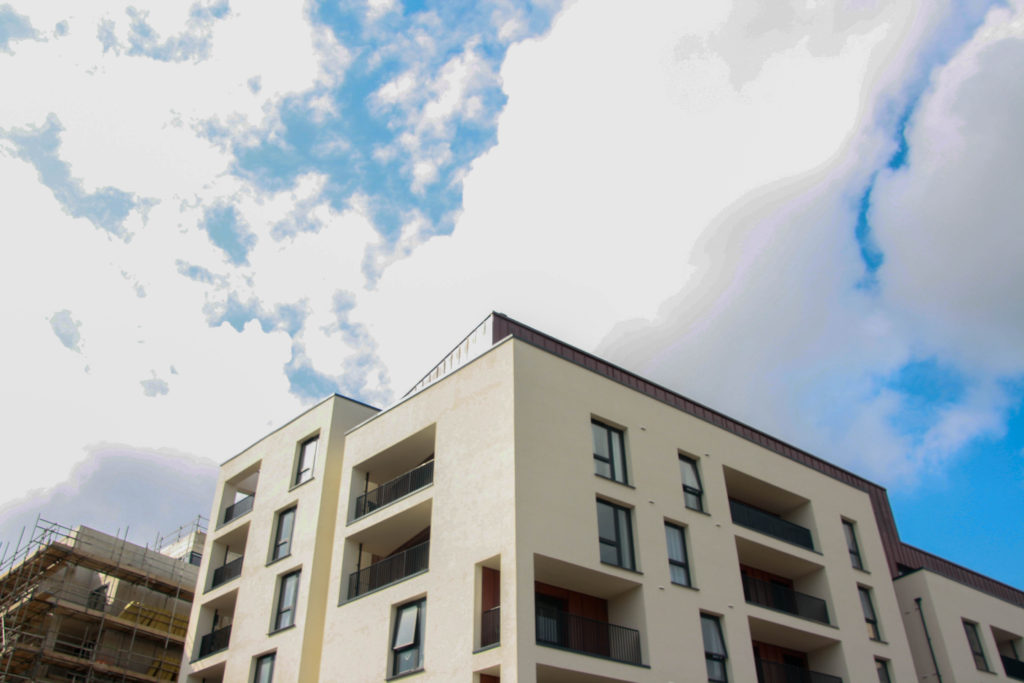
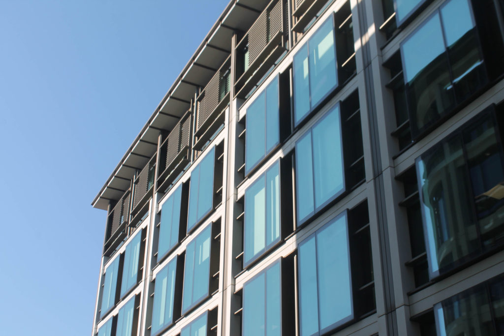
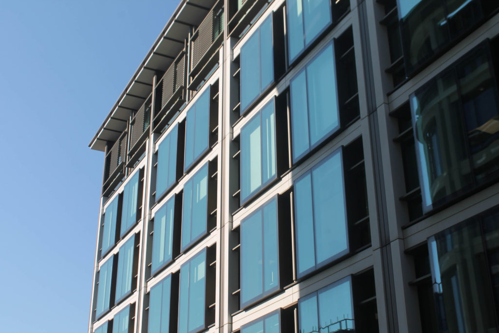
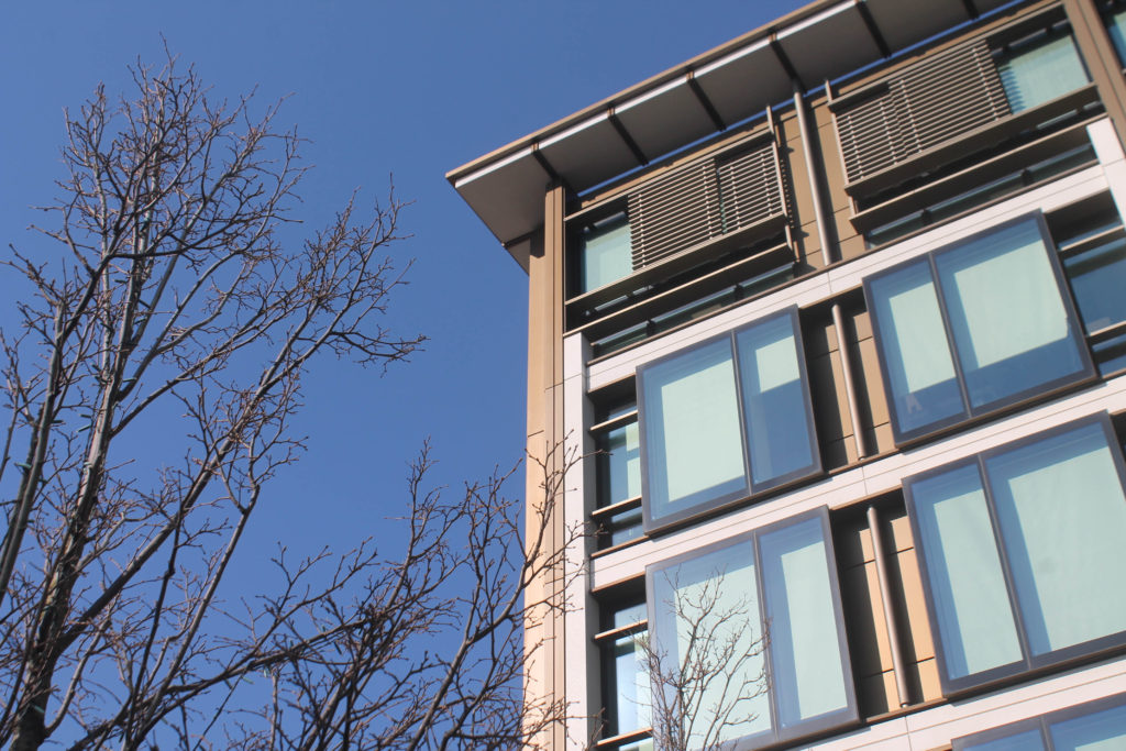
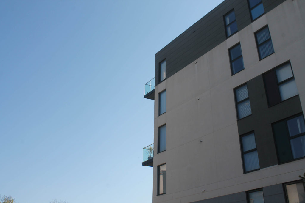
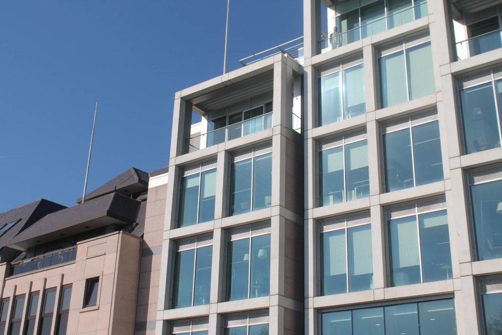
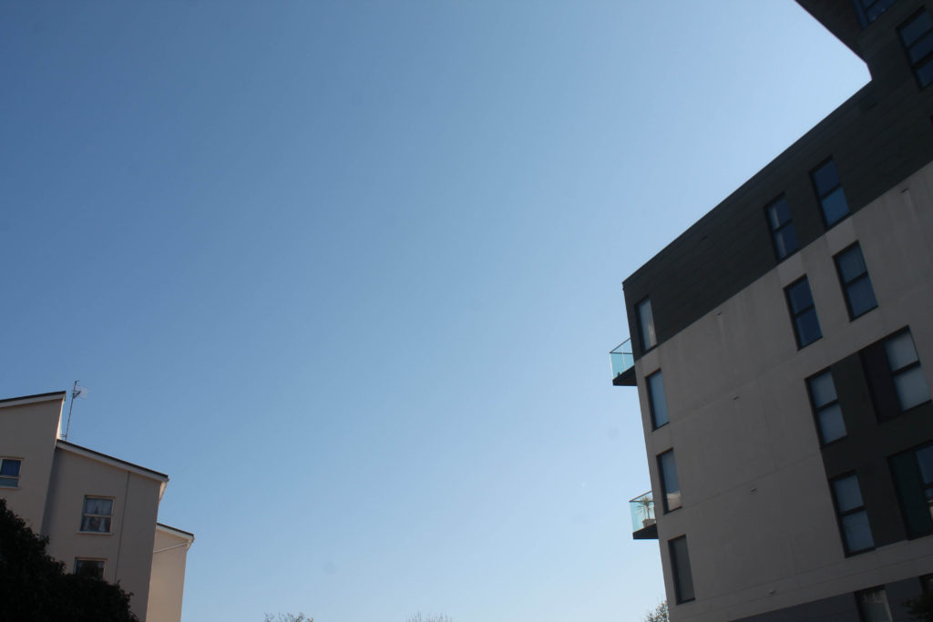
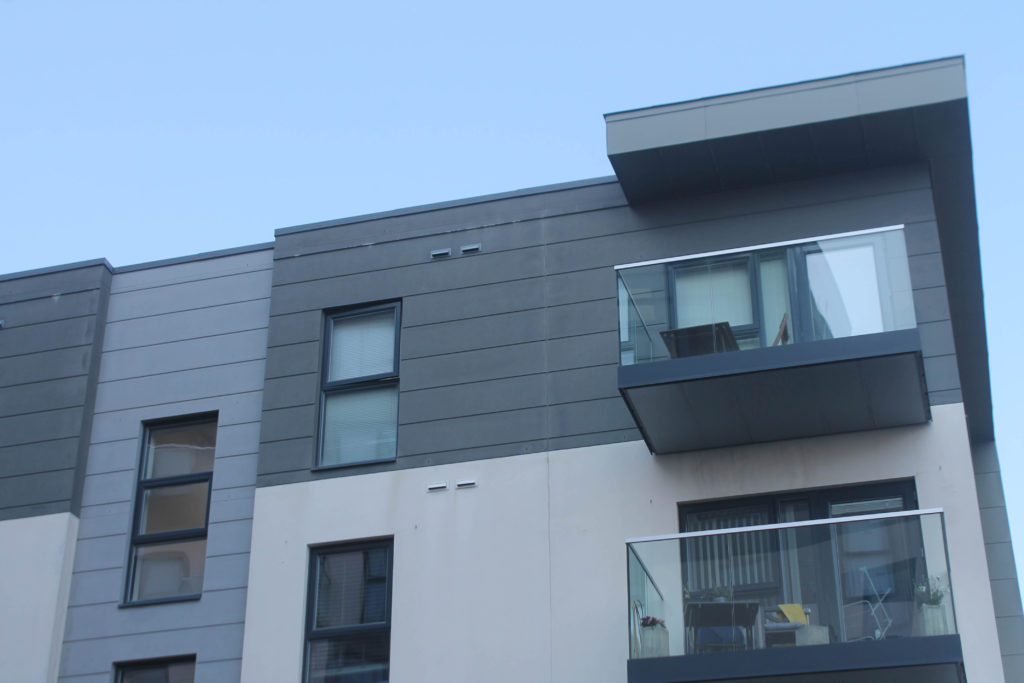
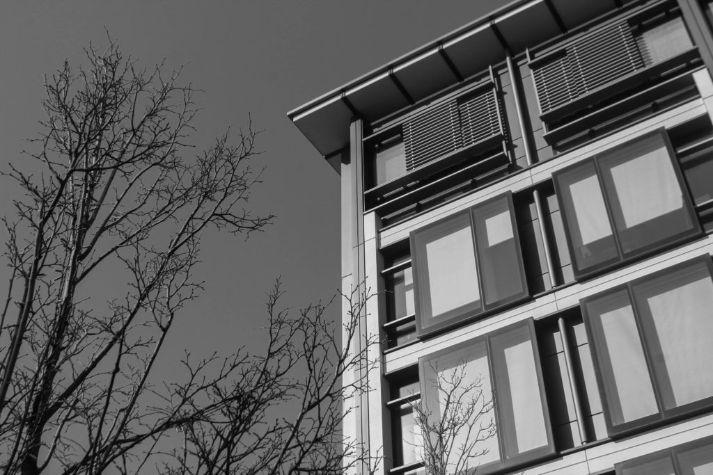
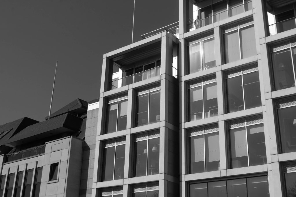
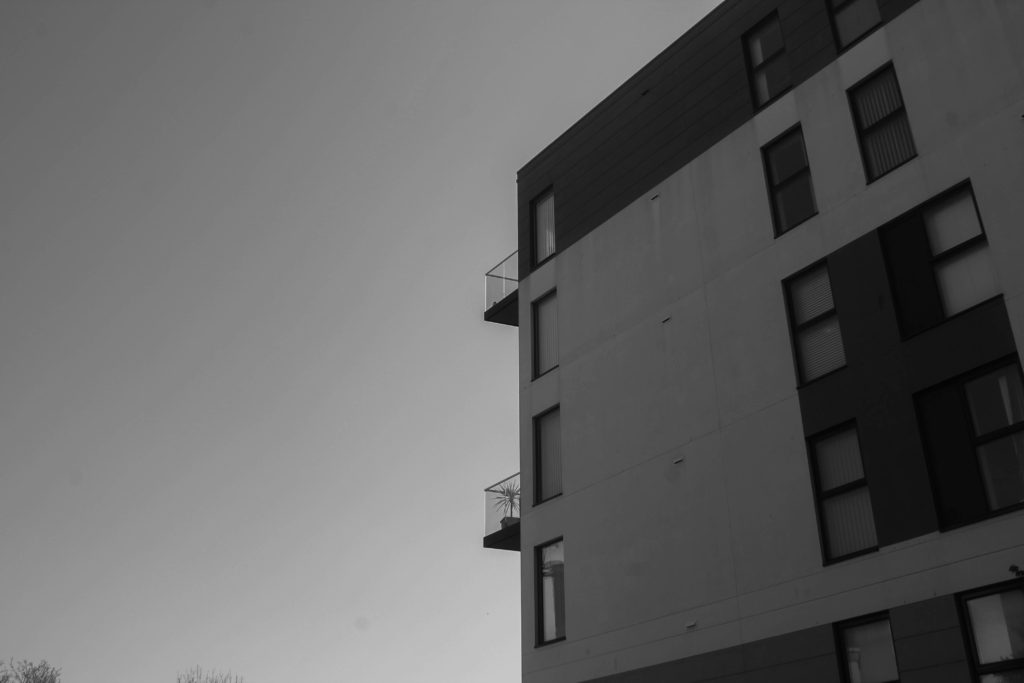
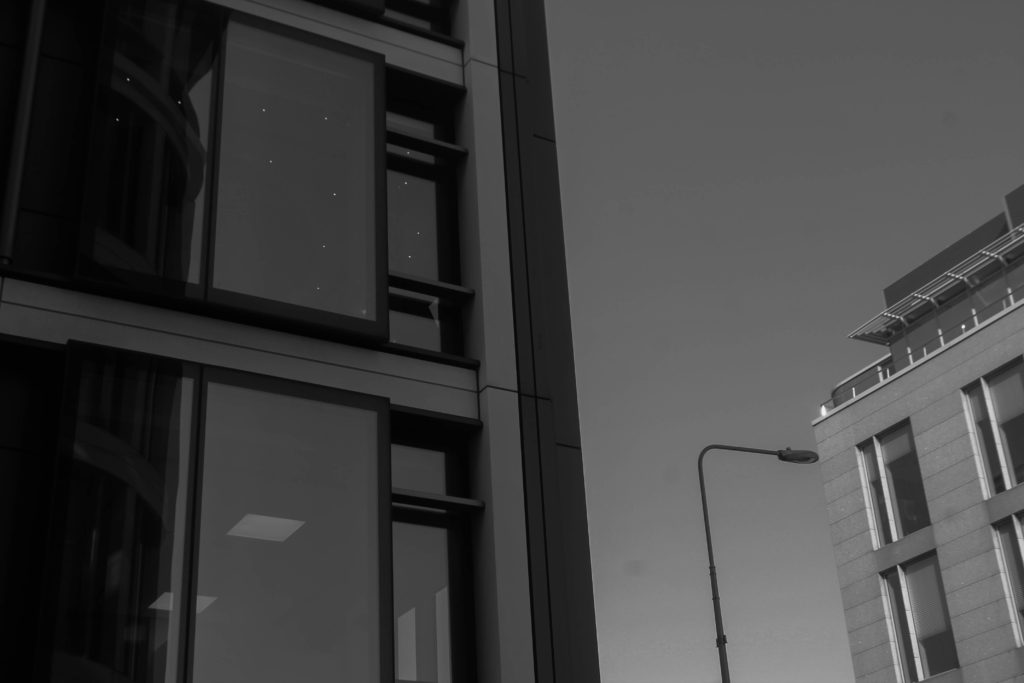
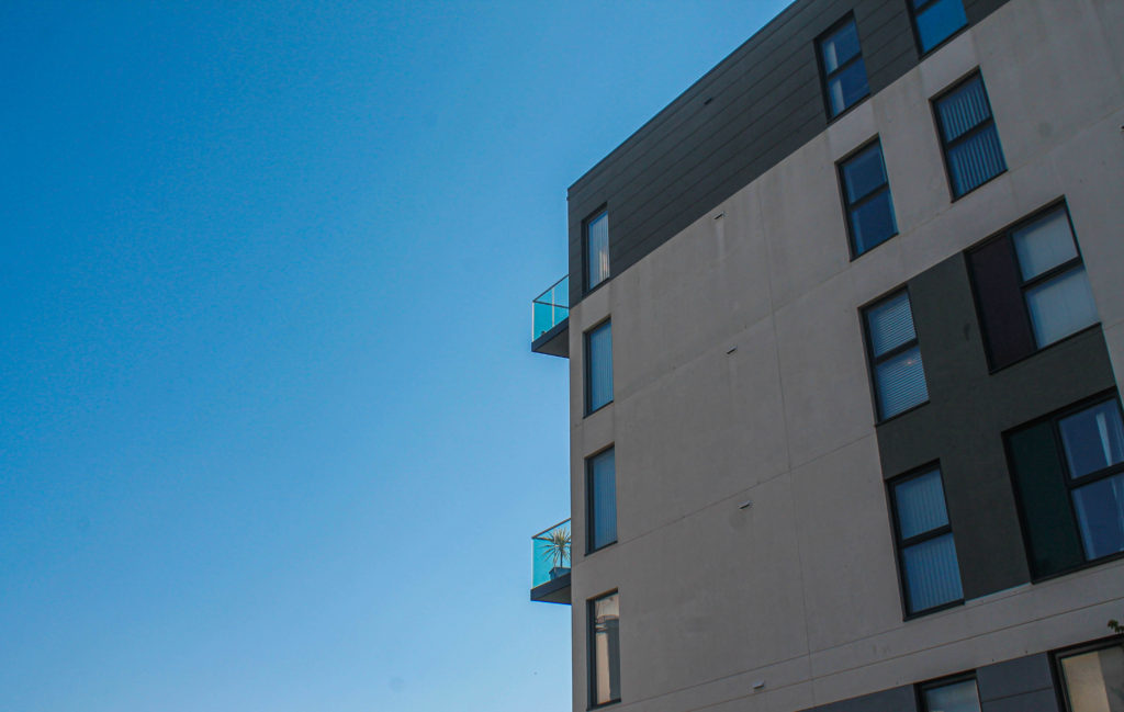
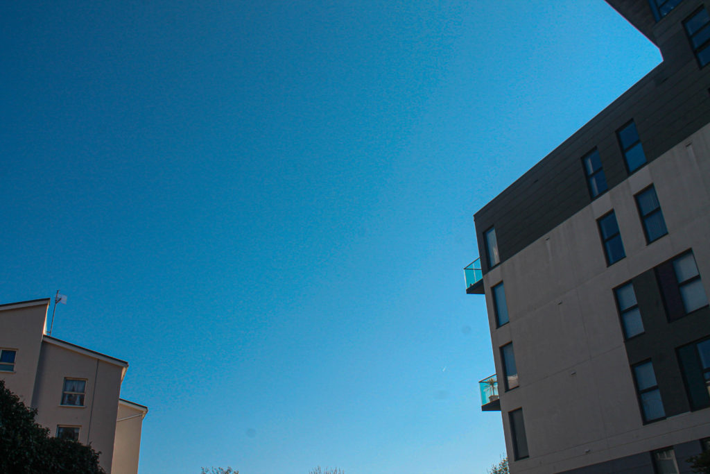
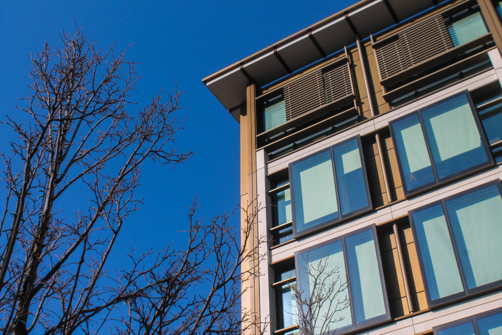
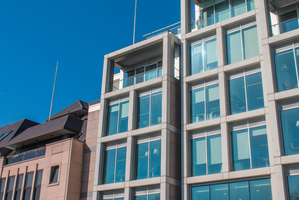
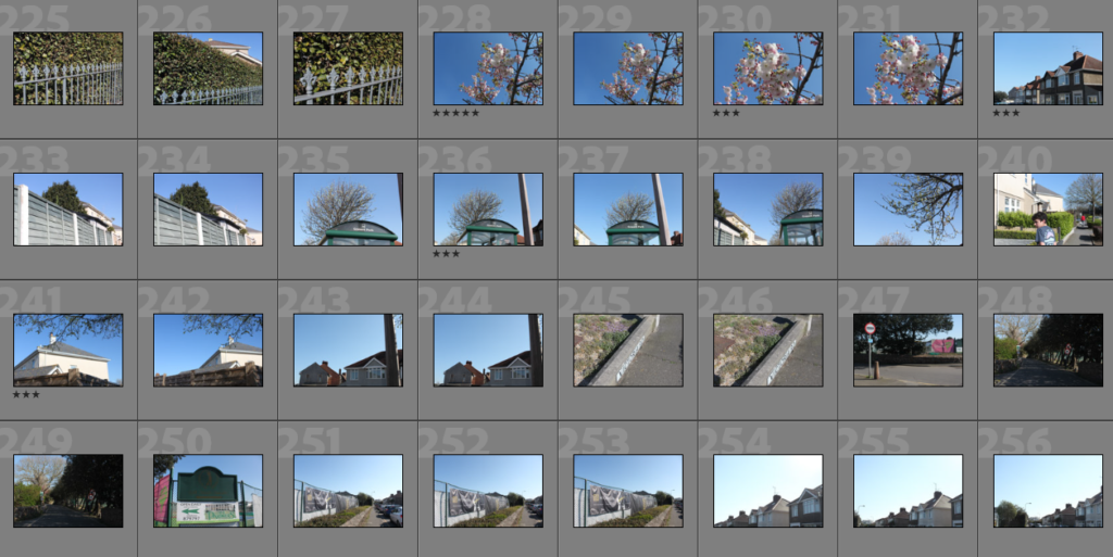
For this being my third and final photoshoot I wanted to make sure I captured more than enough images. I took around 100 – 150 images at these locations to ensure I wouldn’t need to go back. This photoshoot was carried out on the same day as my Waterfront photoshoot because of how clear the sky was. I tried experimenting with different angles of where I was taking the photos to try and involve the blue sky in most of my photos. The structures at these locations are much less complex when compared to the Waterfront which is good for my simple side of the project. I carried on with the attempted theme of Matthieu Venot but I wasn’t trying to replicate his images. Also, these buildings only contain a small amount of colours which is what I was aiming to photograph before going on the photoshoot.

Editing Process

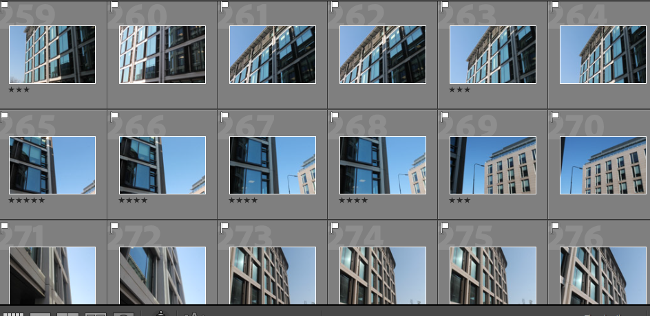
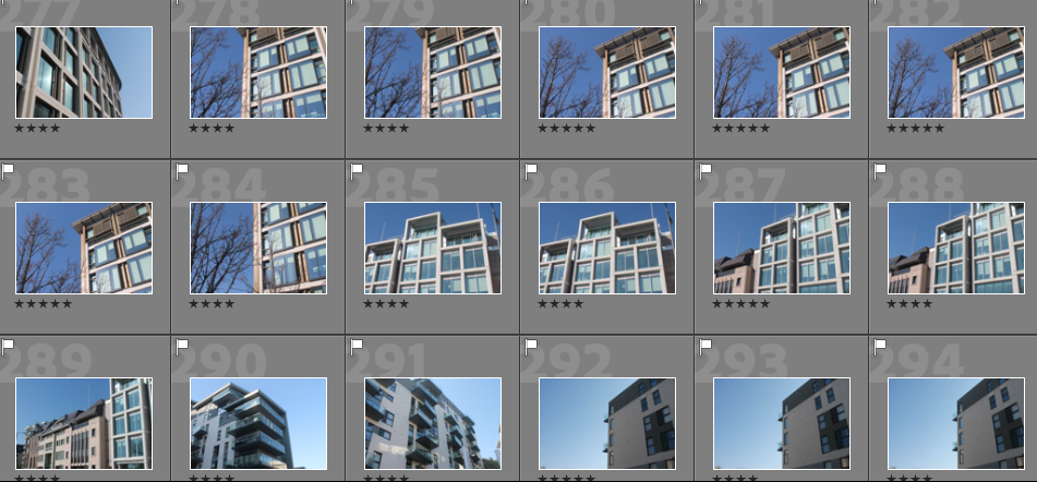
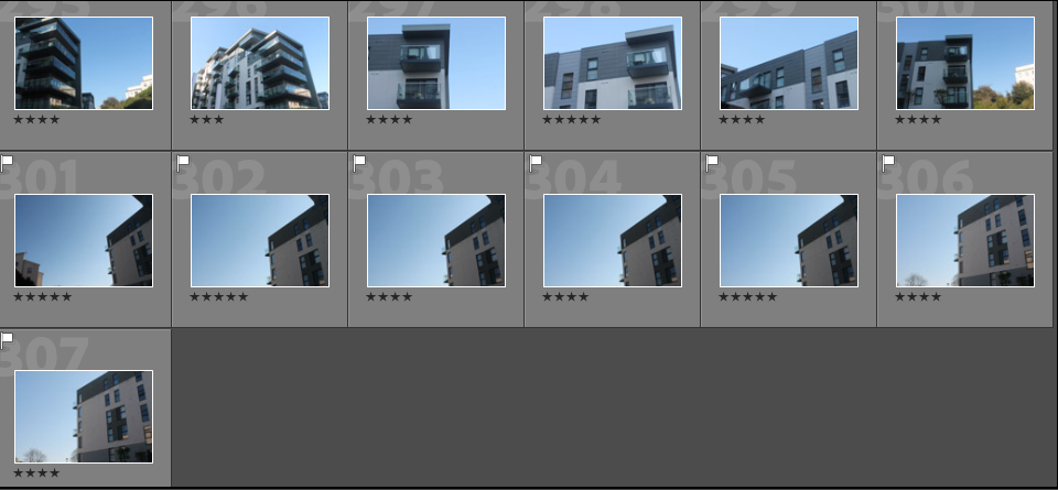
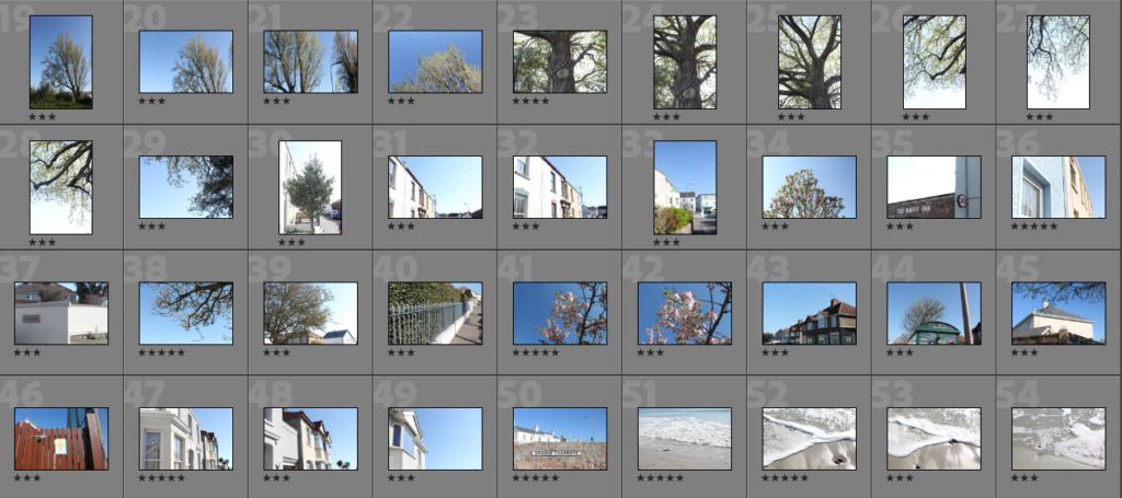
To begin this process I started with the basic P and X flag method to identify which images I was going to edit. Also, when rating my previous images I rated the rest of my photoshoots so the images below have also been rated from a scale of 1-5 (1 being worst and 5 being my favourite). Shown below are the images I want to further develop:

Best Unedited Images:

Black and White

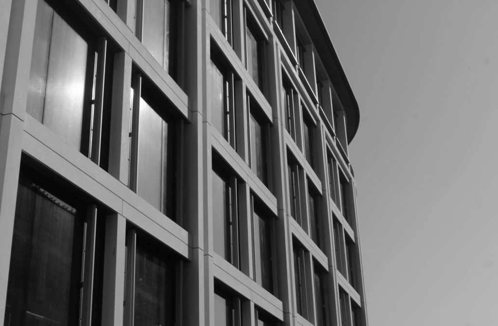
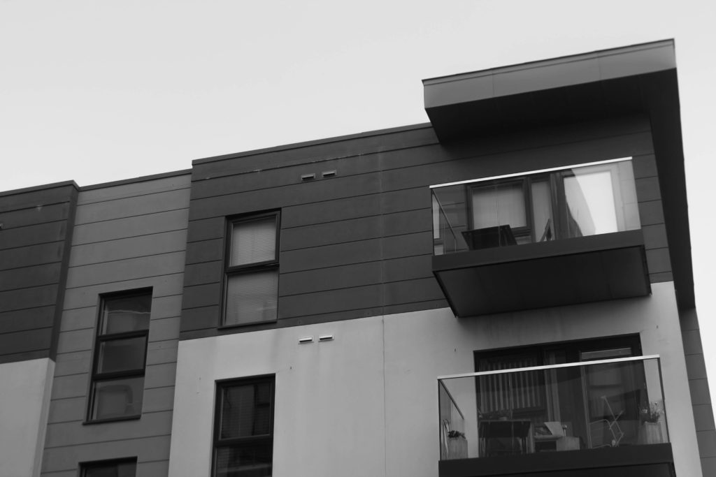
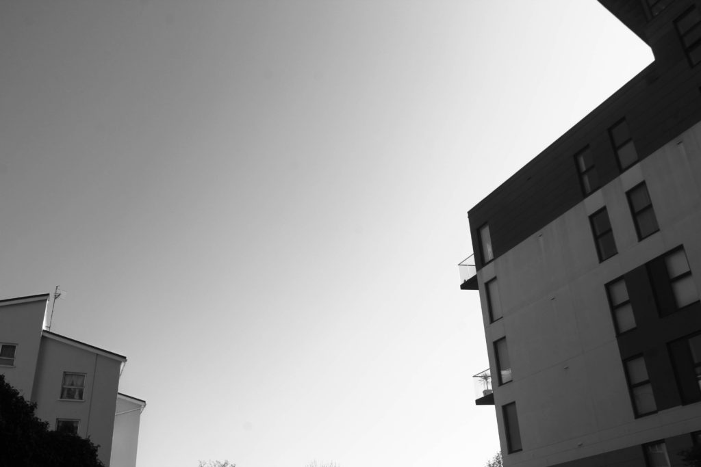
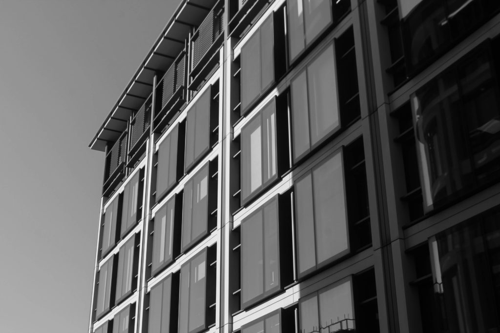
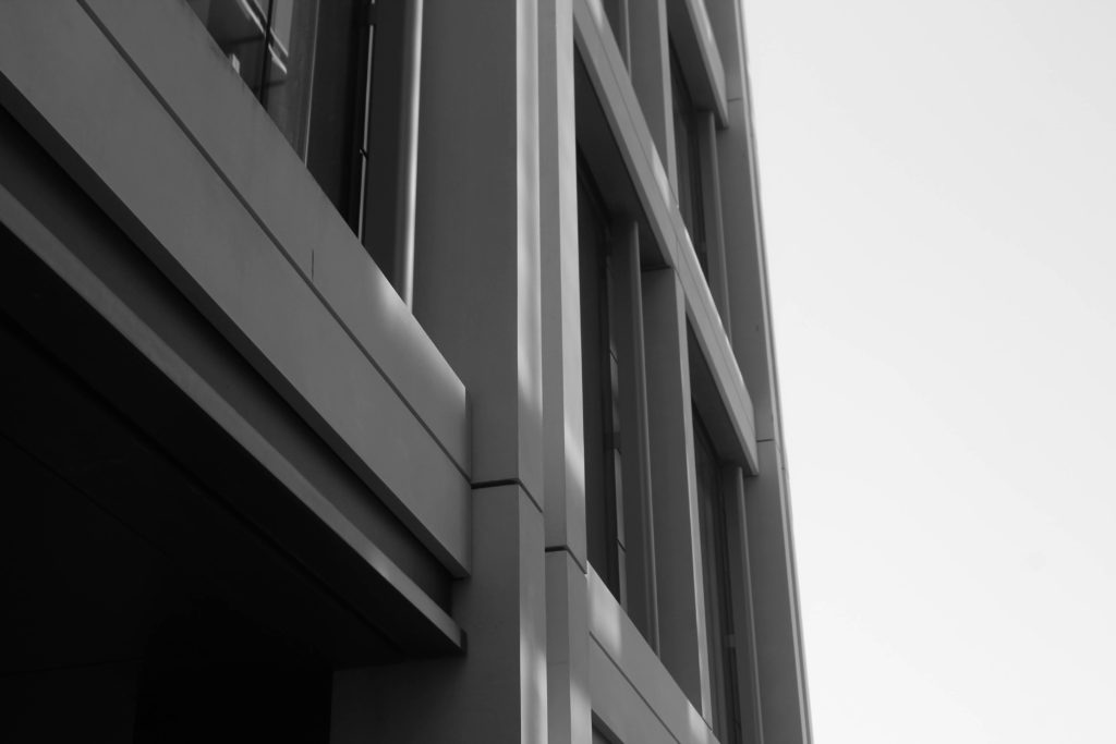
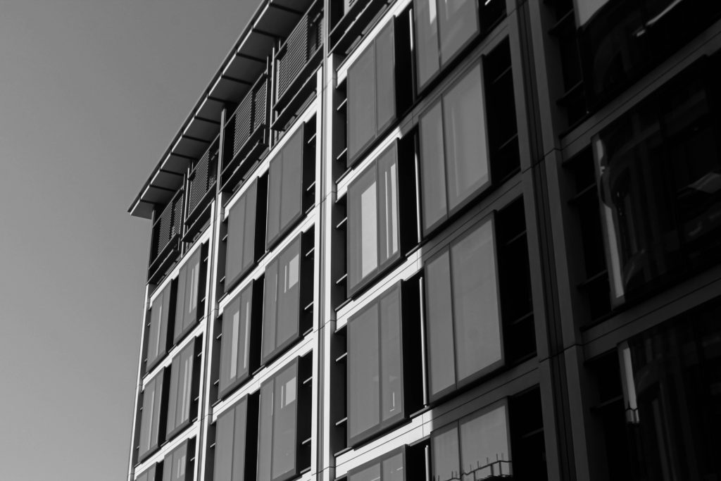
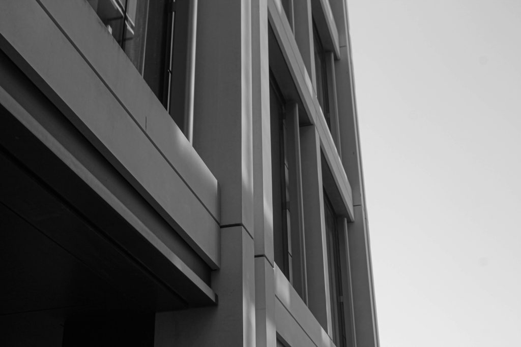
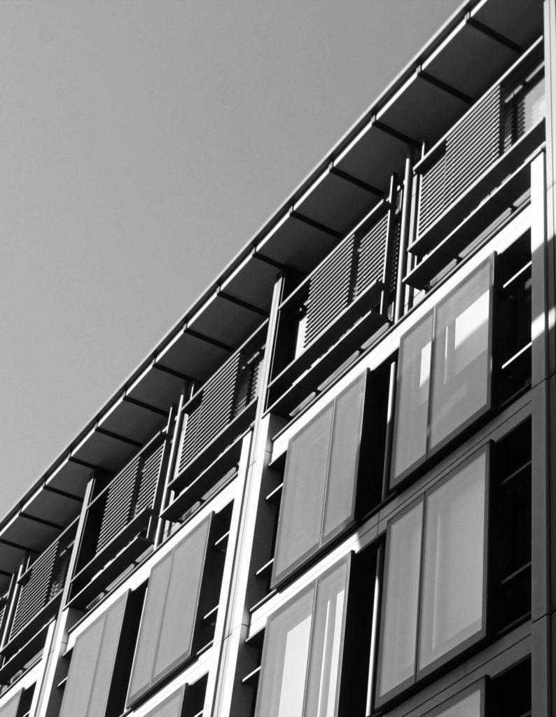
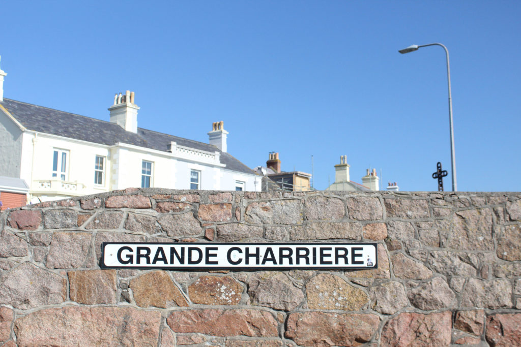
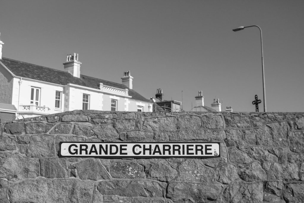
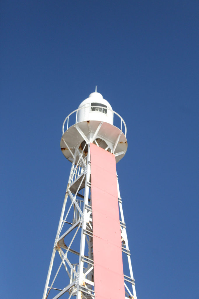
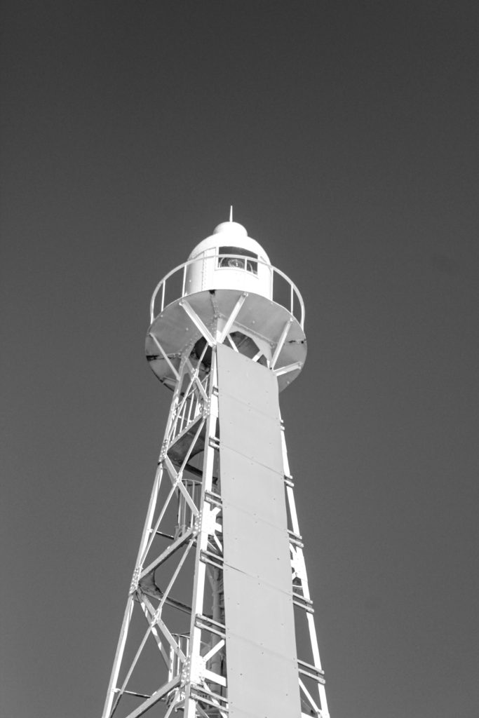
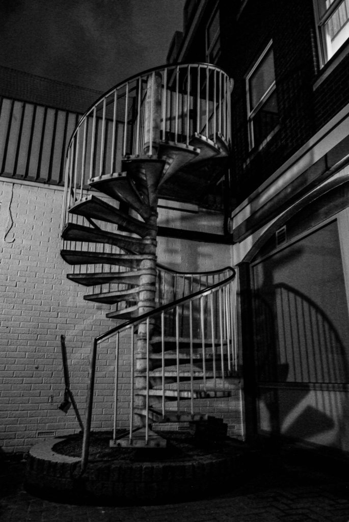
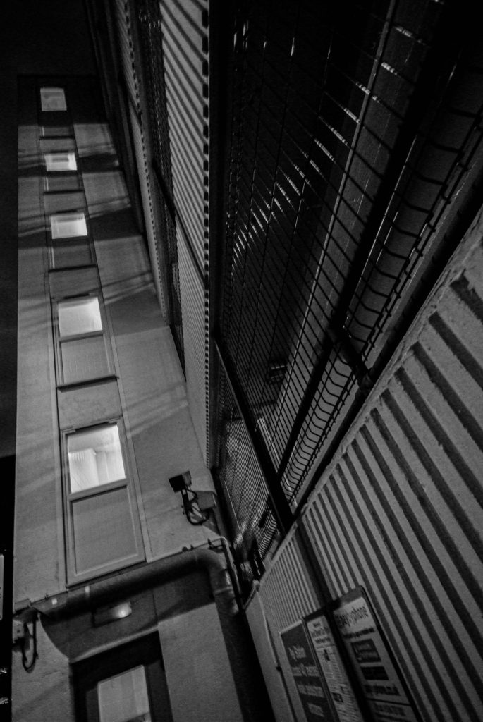
Next I wanted to see how effective my images would be in black and white. I did this to try and experiment the style of Helene Binet as all her images are displayed in black and white, however I much prefer my images with colour and I like how the blueness of the sky contrast with the dull coloured buildings.

Favourite Edited Images

For my final prints I wanted to include some images that are displayed in black and white because I didn’t want to only follow one artists style. Also, the more simple, close up images look a lot better in black and white due to the sky not giving a great contrast to the close up features of the buildings.

Evaluation

Overall, I am very happy with the quality and amount of photos I produced, however there are some images which didn’t turn out the best with bright skies and out of focus images. For my edited images that aren’t in black and white I wanted to attempt to follow Matthieu Venots style again but then differ over to Helene Binets style of monochrome, close up images. In this set of images I seem to prefer the black and white range because the shadows create a really good contrast to the light grey sky. Also, I believe I gained enough images to not have to go back to these locations and focus more on another Waterfront shoot due to a lack of images. I could of improved by taking more close ups of corners of buildings to create more monochrome style images but overall I am very happy with this photoshoot.

Photoshoot 2- St Saviour to St Clement

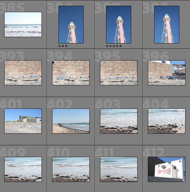
Contact Sheets

Plan for Photoshoot: For this photoshoot, I was planning on walking from my mums house in St Saviour, to my dads house in St Clement, near green island. This is because I would like to attempt to connect two sets of memories and lifestyles using landscapes images and places of significance to my childhood. I would like to do this in the last afternoon as it will provide me with bright lighting and good weather.

Overview of Photoshoot: I think that this photoshoot is more successful than my portraits photoshoot (Photoshoot 1) just based off looking at them in Lightroom. This is because I find landscapes more enjoyable and since I have done them more I find them easier. The lighting of these photographs is a lot better, and overall I found that throughout this photoshoot it was easier to create more successful images.

Image Selection

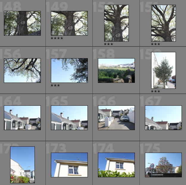
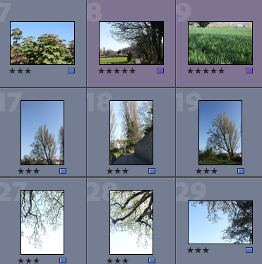
Below I have showed evidence of me rating my photographs, this is to help me decide which are going to be a big part of my project, I like to rate my images because it gives me a sense of which are slightly better than others, especially in terms of lighting and composition, as many of my images are similar to each other, but some are a lot stronger than others.

  • Purple- Images with the most relevance and potential throughout my project
  • Blue- Images that can still be used but are not of the same quality

In addition to rating my images, in Lightroom I like to colour code my photographs, the purpose of this is to double check that my image selections are correct, also when scrolling through my selections, I like being quickly able to see which are useable images, and which are the best out of my whole photoshoot.

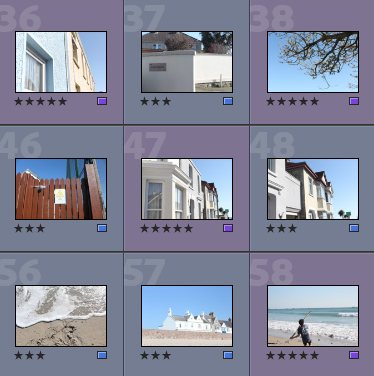
Best Images Before Editing

Below I have included some images that are from my selection process, but before they have been edited, this is showcase the original composition and settings of the images and make sure they will be suitable for future editing.

I really liked this photoshoot as the lighting made taking images easier then usual, the bright and clear sky allowed me to take more successful photographs, as I think this is apparent in this gallery above, the lighting throughout the first and third image show that these images will not require a lot of editing, in the sense that the saturation and clarity of these images is already of good quality.

Editing

Below I have included some examples of editing throughout this photoshoot, some of these are monochromatic and some photographs I thought would be better off keeping in colour. I think that only some of this editing was successful as this photoshoot did not provide a lot of opportunities for drastic editing.

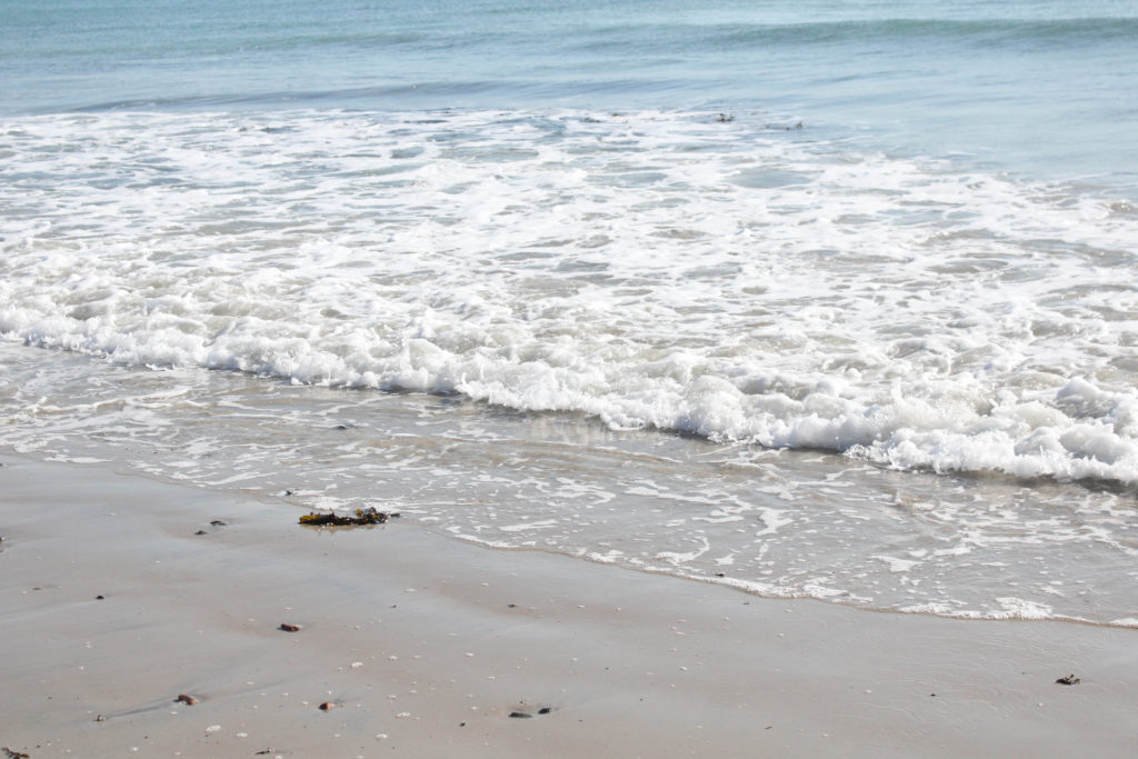
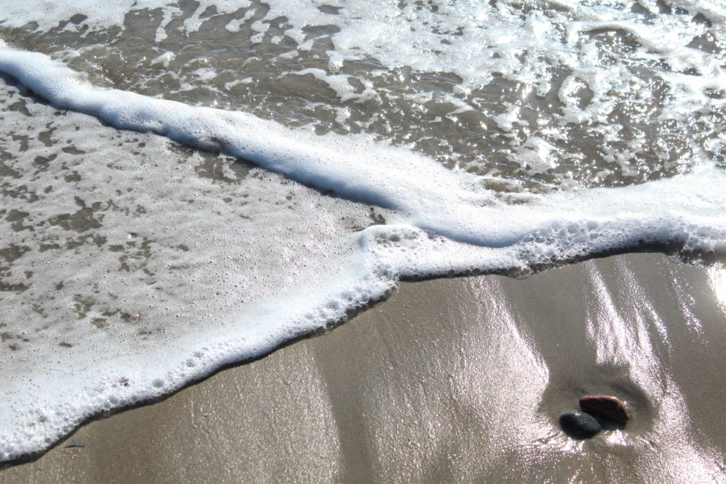
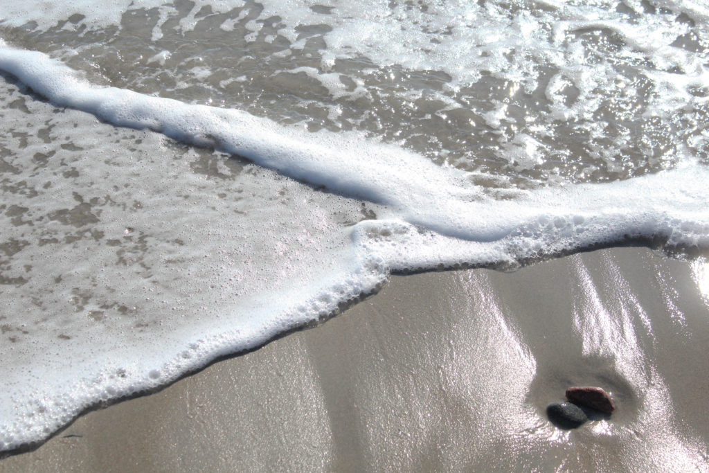
I really like this image above as the waves are layering perfect onto of each other and creating the perfect opportunity for me to take a photograph. I tried to edit this image so that the beach would appear more shiny and the exposure has been decreased, as in Lightroom, the image appears too light, I have also enhanced the texture within the waves as the foaming parts throughout the water are more clear now. Alternatively, I think the first image looks better unedited, this is because it looks better with the naturally high saturation appearing, as the colour combination of pink, blue and white go well together to create a successful image.
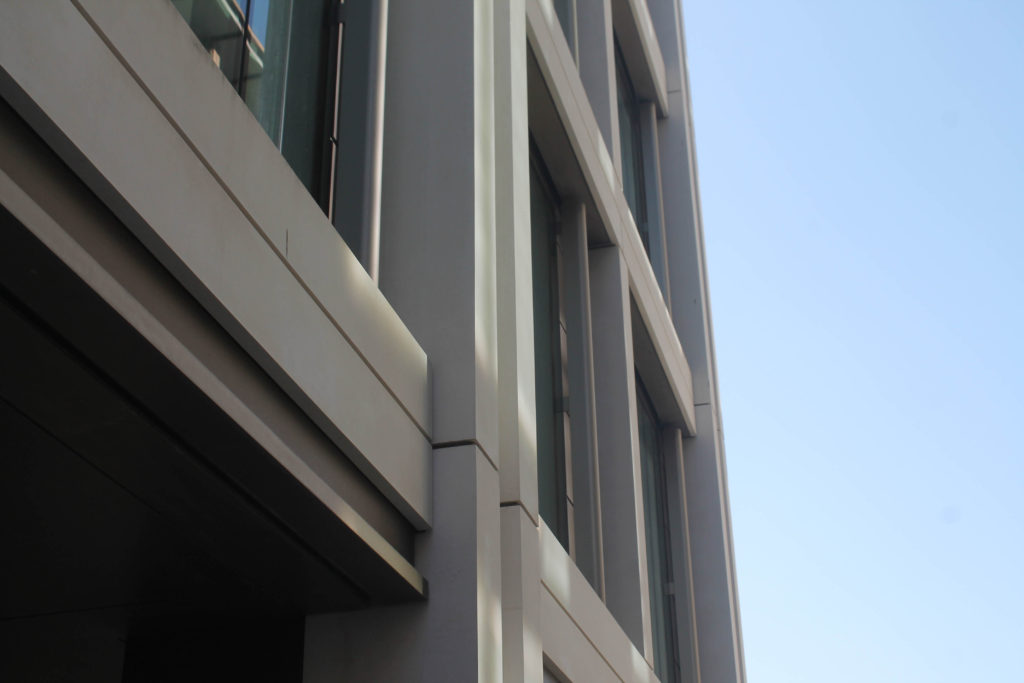
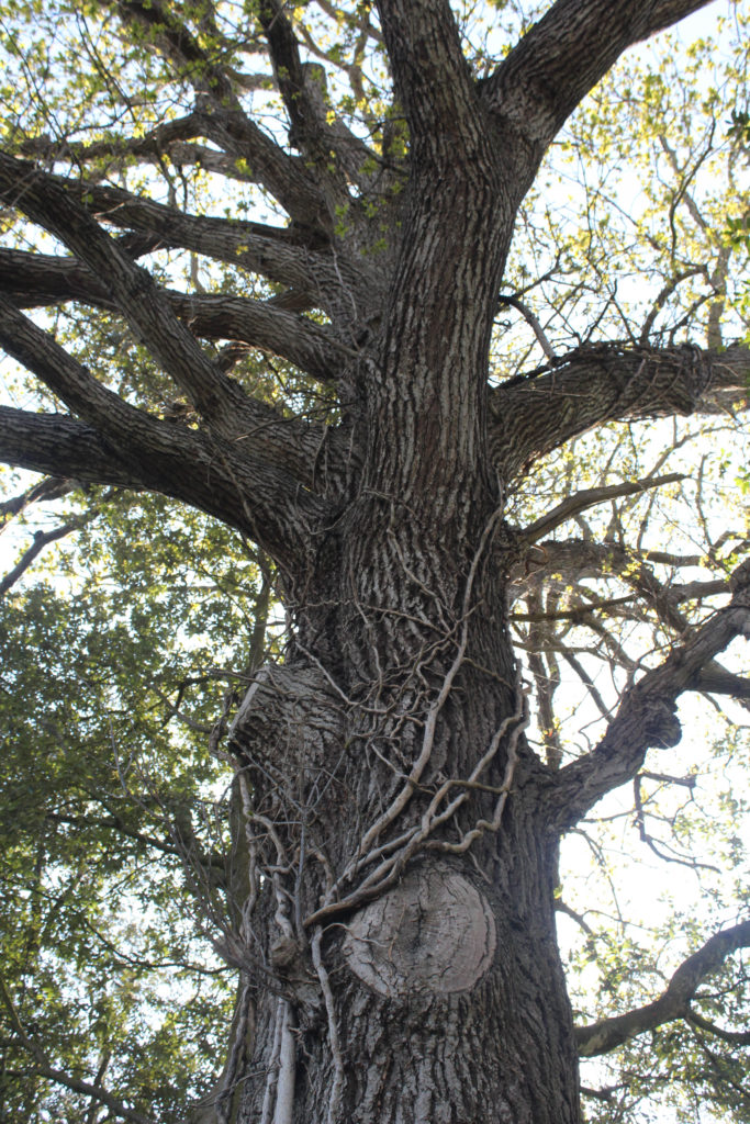
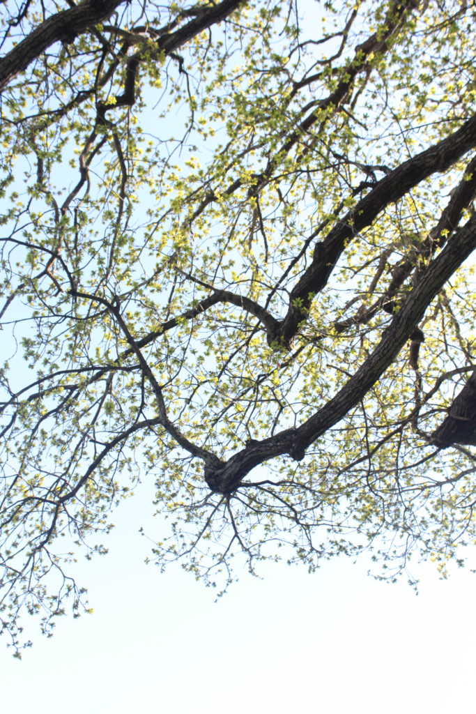
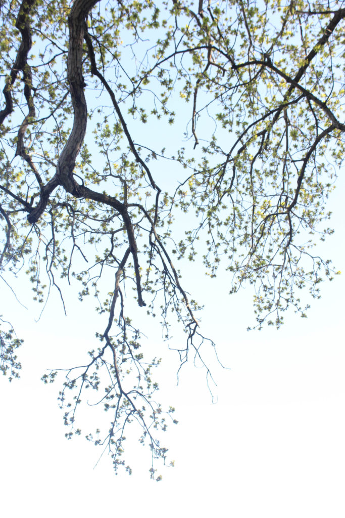
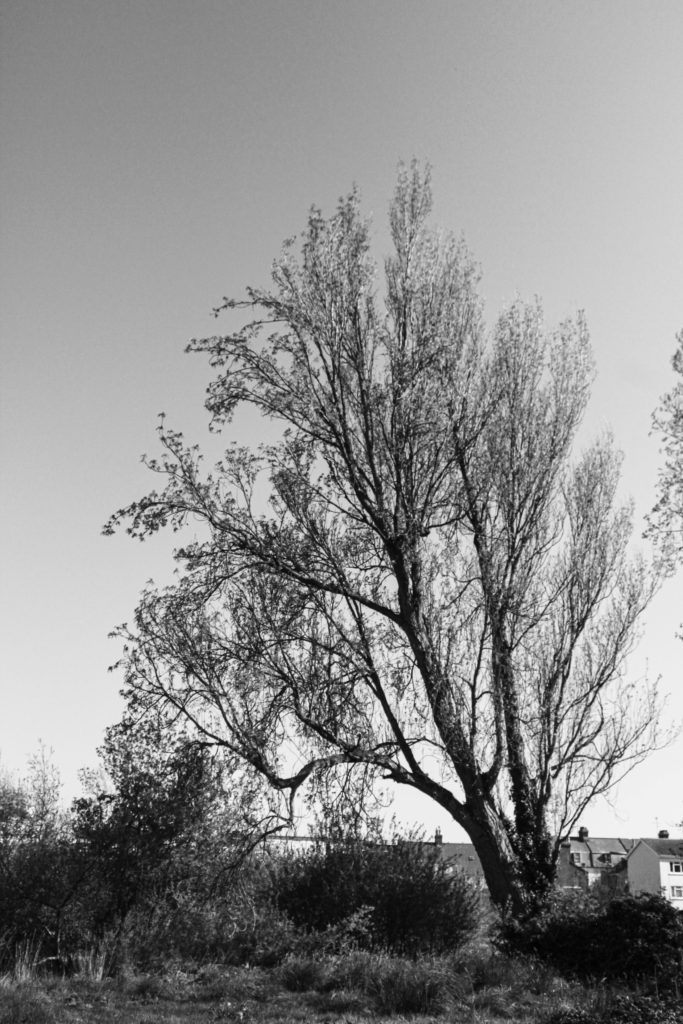
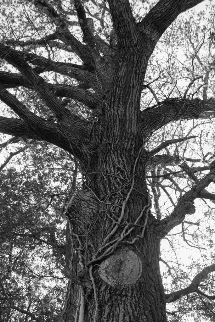
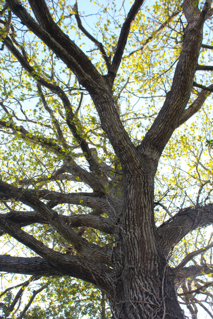
My intentions with the photograph above of the tree was to try to make it look older and more rustic, however, I don’t think this affect was achieved as the tree just looks older and more blurry in comparison to before editing, I think leaving in it colour emphasises the life within our island and the importance of this photoshoot.

Final Images and Analysis/ Critique

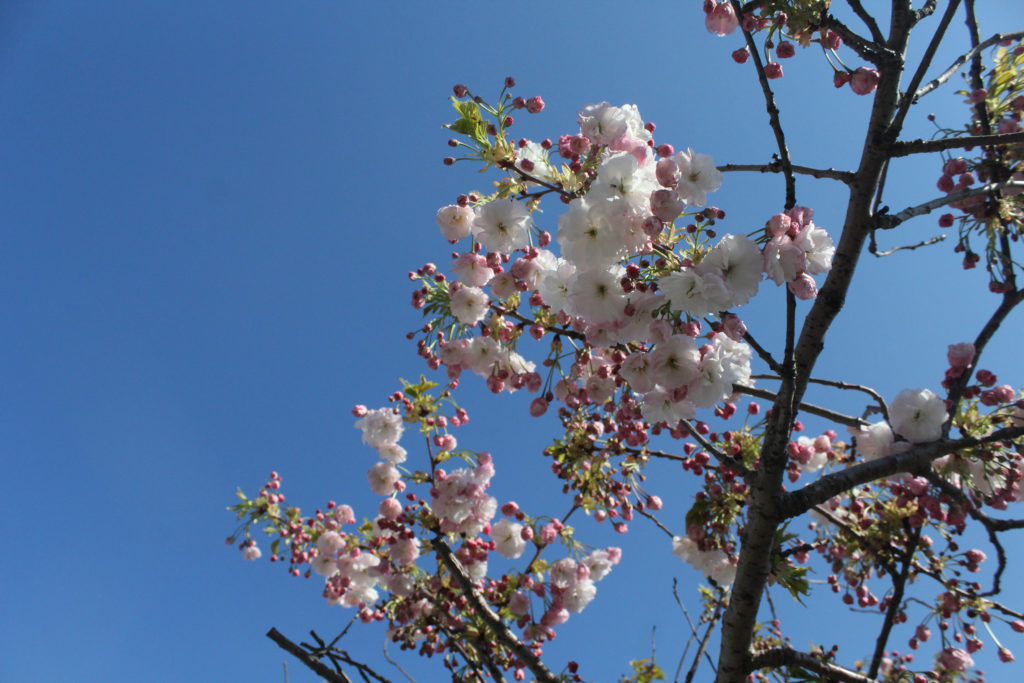
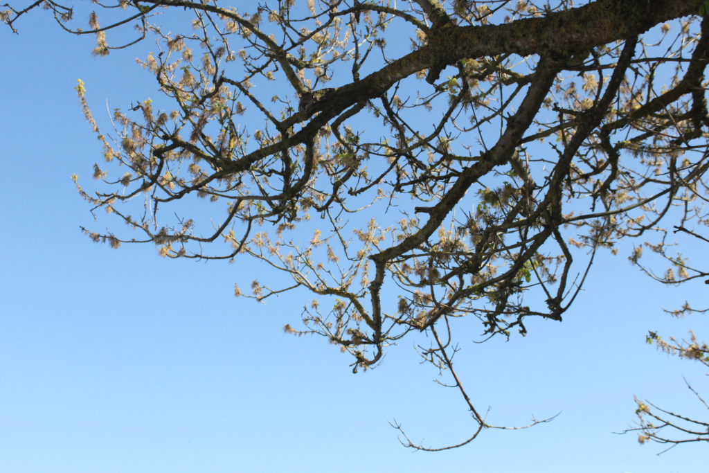
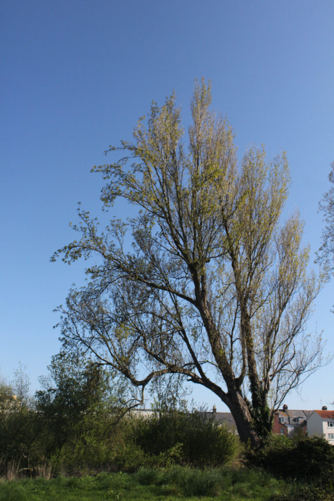
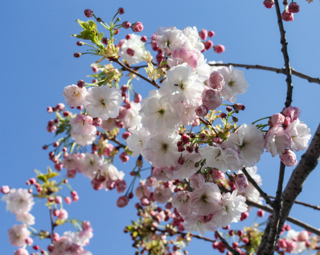
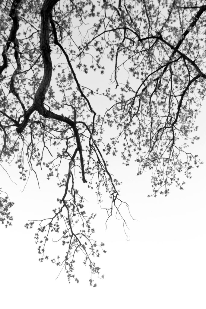
I have placed these two images as final outcomes as I believe that they complement each other well, the first image is very subtle as there is not many tree branches present, whilst the second juxtaposes this and is a very full on image, this is because it has a lot of detail and texture throughout the main tree. I decided to edit these photographs into black and white as it emphasises the details on the tree, such as the vines and bark, making them more apparent and more clear for the eye to see. Overall, I think these images are among my most successful and they do challenge the concept of ‘Simple or Complex’ as nature is mostly seen as simple, but in reality is very complex. Additionally, the trees being monochromatic and the flower being in colour represents the juxtaposition being my parents, as I would say the tree represents my dad and the flowers represent my mum. The only criticism I have for these images is some would think they aren’t clear enough to be edited monochromatically.

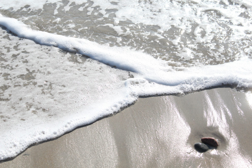
I have selected this as one of my final image as the simpleness of this photograph can link to me and my brother’s current relationship, this is because we are the closest we have been in years and the sea in the image represents how calm our relationship is the majority of the time. I like how this image is filled with a variety of textures, for example, the rocks, smooth wet sand, and then the white foaming water. This combination makes for a very aesthetically pleasing image, as the subtleness may catch people’s eye and make them wonder what the intention behind this photoshoot was. Additionally, this photograph demonstrates that simple compositions can create some of the most successful imagery, the waves taking up the majority of the image means that more attention is drawn to the lack of sand, however, the shine on the sand and the rocks may highlight the importance of land, as it provides stability for all family relations, linking to my project.

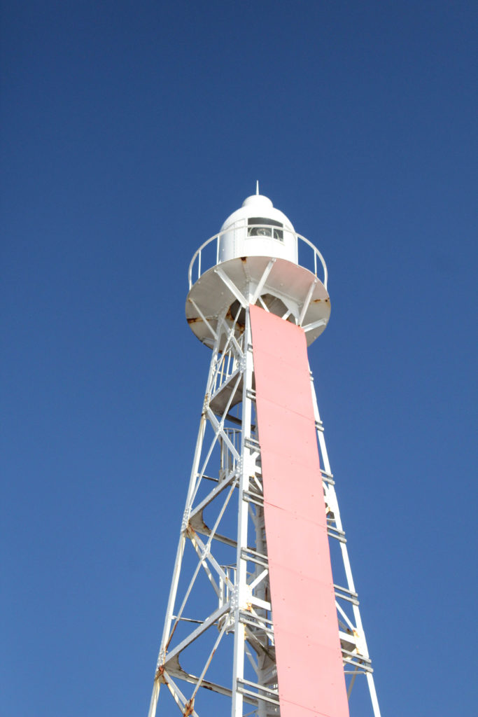
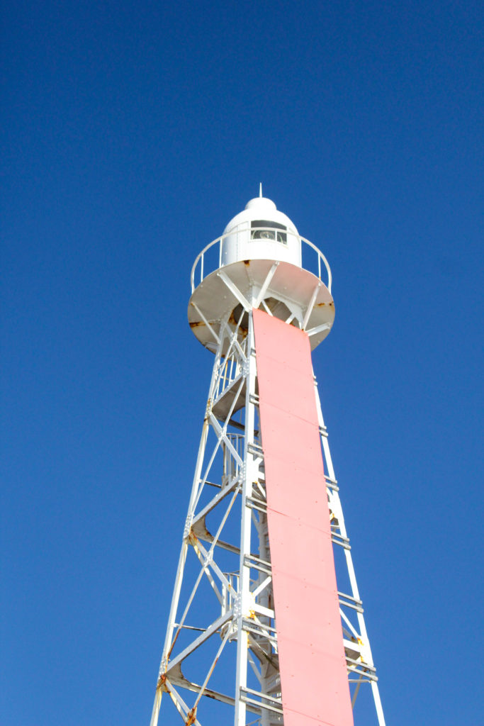
Finally, I have chosen these images as some of my most successful, they will not be displayed together but I have placed them into this galley so that I can juxtapose them against each other. Firstly, the nature part of the first image would represent where my mum lives as this image was taken where I used to go to feed horses, and the second image represents construction next to the sea and being surrounded by the beach growing up, as this is where my dad has always lived. These two photographs represent two different kinds of memories being placed together in my mind, creating a vast combination in my memories. One not so positive aspect of these image would be that visually they do not match together, and its more about the representation of the image more than what the physically look like.

Photoshoot 1 editing

Lightroom Edits

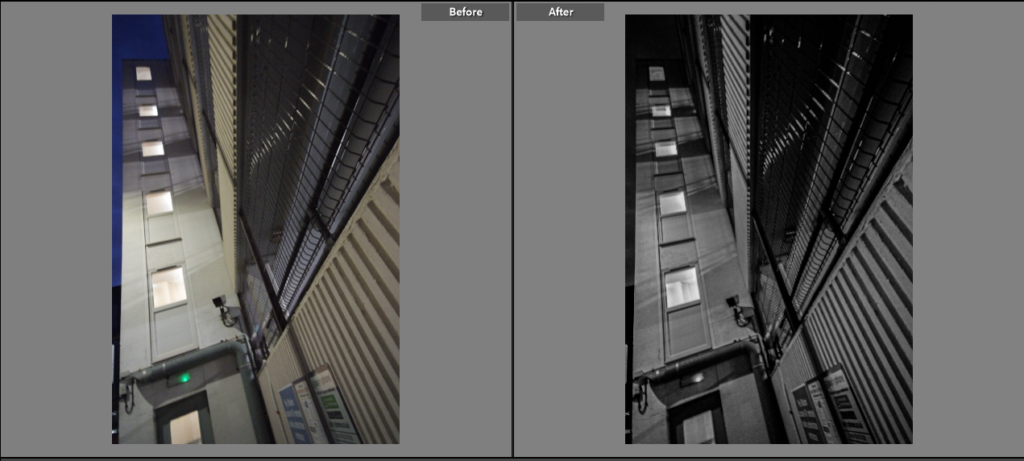
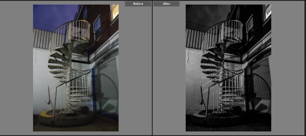
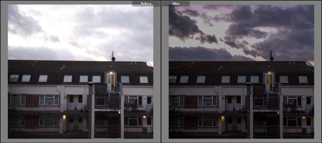
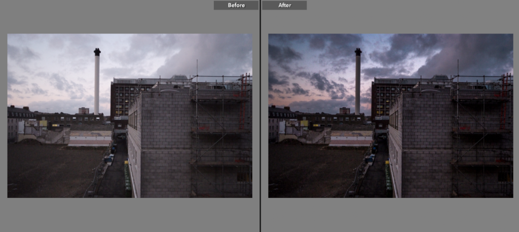
My first photoshoot provided me with 12 final images to edit and use within my final pieces. Below is a before and after of the editing made to these images to improve on them and make them stand out, the before picture is on the left, while the after picture is on the right. I experimented with both coloured and black and white images, as some of these final images looked much more effective as black and white.

This image looked much more effective in black and white, and the editing really brought out the shadows within the image to create a cool effect.

This image too looked better in black and white, and once again the editing really brought out the shadows making it look much more effective.

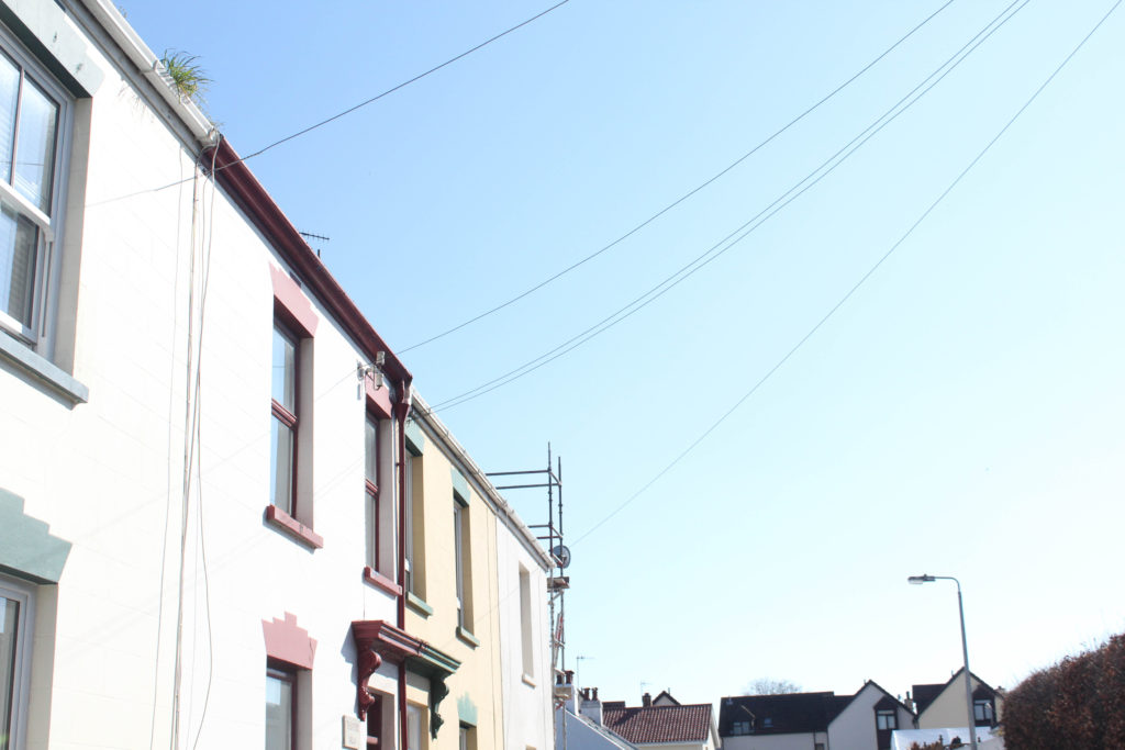
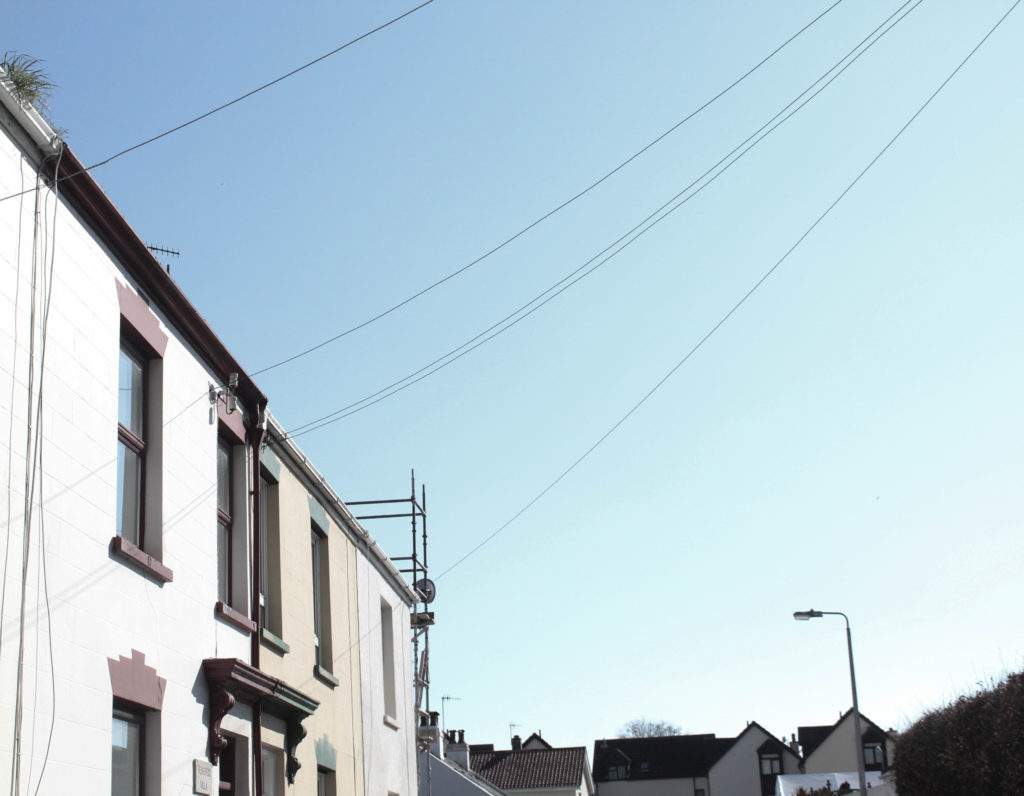
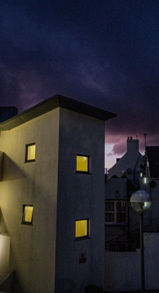
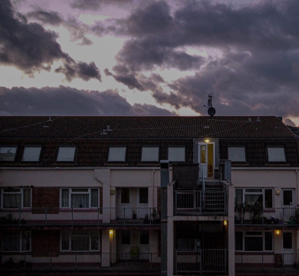
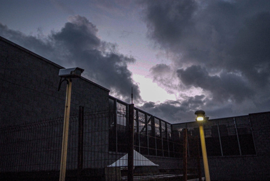
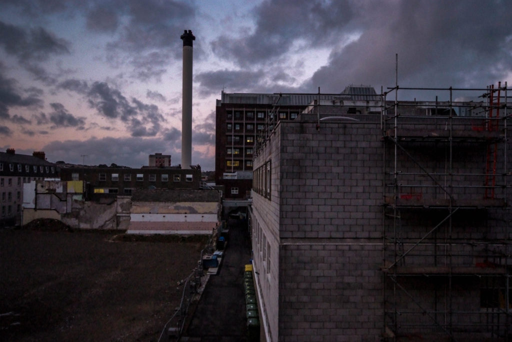
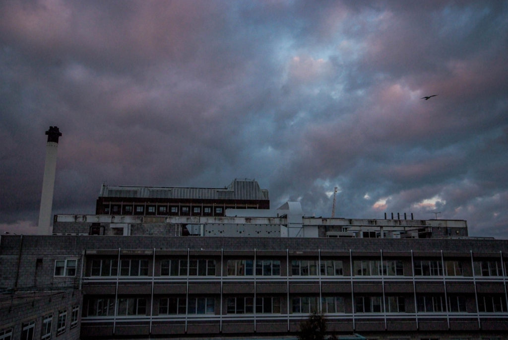
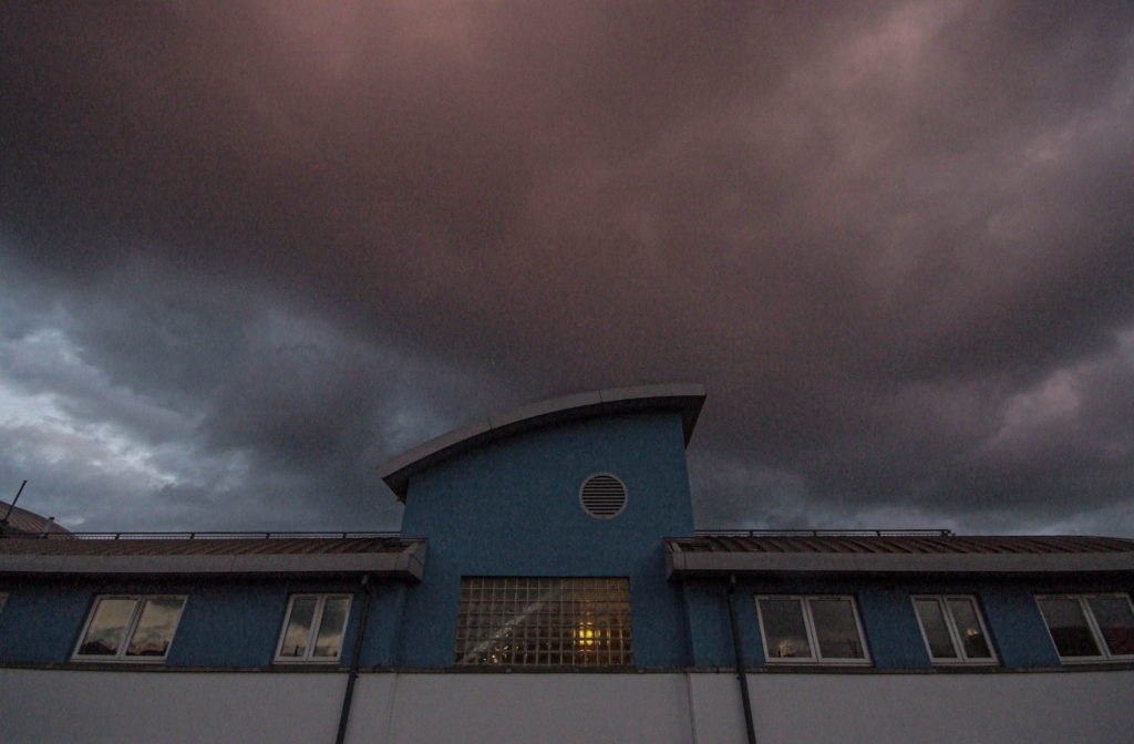
Using editing brought out the colours in the sky and made it look much more unique and really added to the image, as well as this the sky now contrasts much better with the building.

Once again the colours of the sky have been brought out much more, making the image stand out a lot better than it did before.

The sky has been brought out a lot more after editing making the image look much grander, as well as this the editing has brought out much more detail in the image making it look more effective.

Final Edits:

Further/Advanced Edits

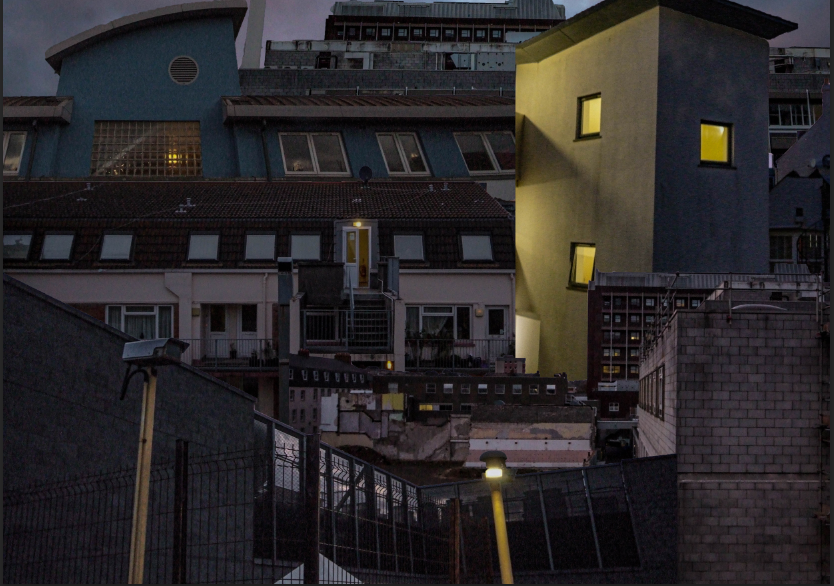
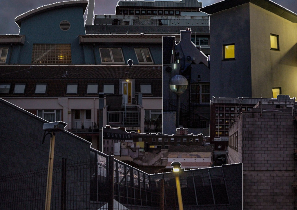
For further editing, I wanted to create a photomontage of my various images all in one to create a unique looking final piece, I created this using Adobe Photoshop.

Images used:

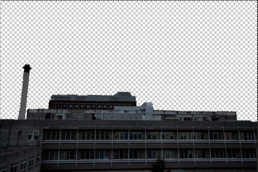
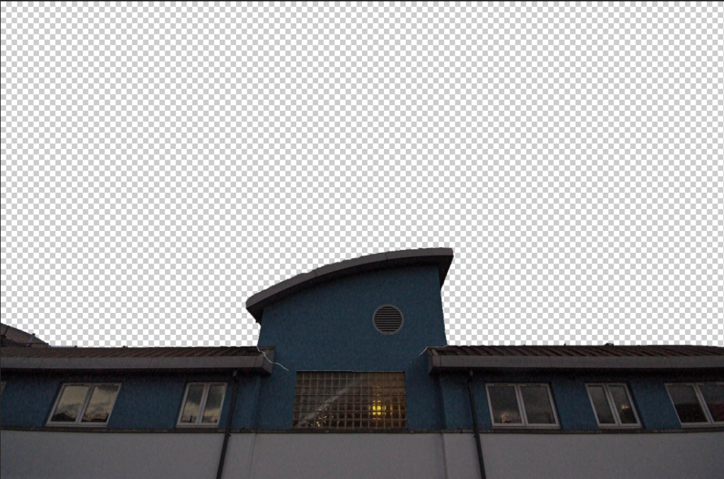
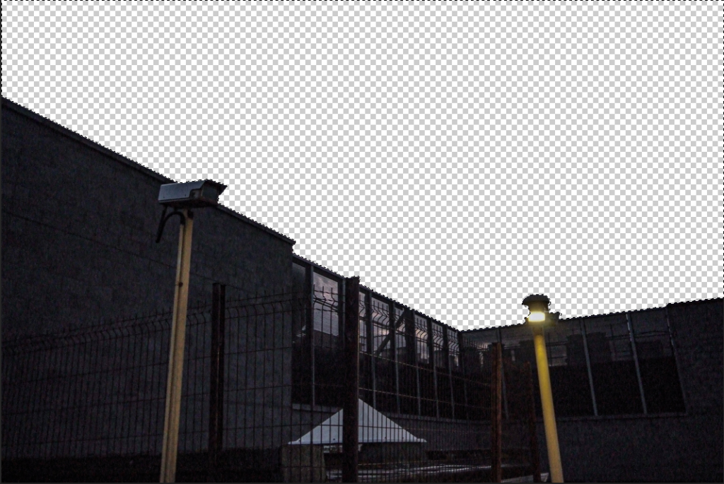
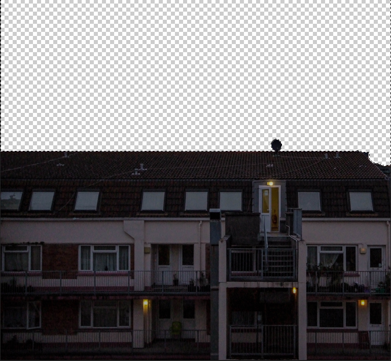
To start off I used an A3 landscape print within photoshop and started by removing the sky from each of the images:

I then arranged the buildings in the A3 document in a position which I liked.

After much experimentation I decided to go with this layout of the buildings in the document.

I then decided to add a stroke to each of the layers within the image, I think this really adds to the image and makes it look much more like a photomontage.

Final Piece:

Evaluation:

Overall, the editing of shoot 1 really brought out the effectiveness of the photographs taken, and I believe that some of these photographs have come out really well. To improve I would have experimented with more ideas other than just photo montaging to create different and unique results.