Contact sheets
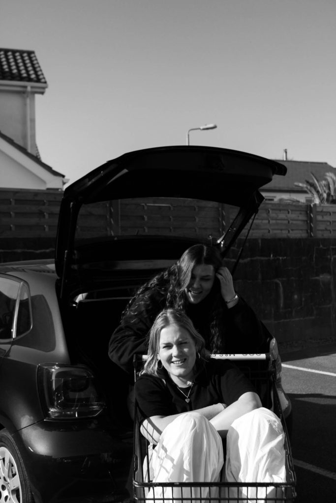
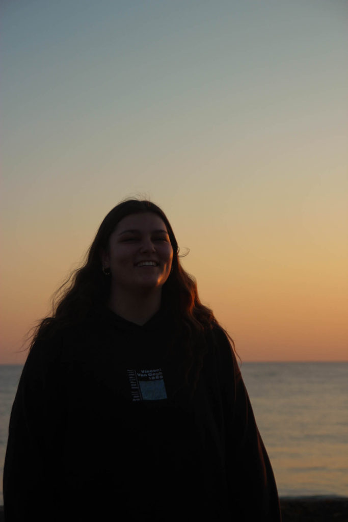
For my third photoshoot, I wanted a mixture between naturalistic and posed portraits as well as photographs taken from further away. These images were taken in three different places at different time throughout a sunny Thursday. We first went to a car park in St Clements as I thought the lighting was good and wanted some images with the sun shining towards our faces, these were taken between 5pm and 6pm so the sun had not started setting yet. The second part of this photoshoot was in Green Street car park on the top floor so that i could use the natural light, these were taken in ‘golden hour’. Lastly the third part of the shoot was taken down in a St Ouens car park connected to the beach, I decided I wanted these images to be taken while the sun was setting as I took inspiration from Kayla Varley for some of the photographs included in my shoot. I believe that this was a successful photoshoot as I have found great images that I will use in my final selection.


Sub-selection
I had a lot of images for my third photoshoot so to help myself narrow down my final images I used the flag tool to differentiate between the images that I will edit and possibly use and the photographs that I will not use. I also used the star tool to pick out the ones that I wanted to focus more on while I was editing and which ones I felt that were more likely to be picked out after.

Editing: Photoshoot 3
The editing for my third photoshoot was quite similar to my first and second as I wanted a cohesive style of editing throughout my images, I felt that my doing this my photobook would be able to flow better then if I used different styles of editing.
Below are two of my images which I have kept in colour, for the left photograph, it is shows how the original was over exposed, to combat this I decreased the exposure tool in Lightroom and increased the contrast which dulled down the image helping with the brightness. After I found the level where I wanted my image to be with the lighting, I adjusted the temp tool by putting in slightly in the yellow as I think it gives the image a sunny glow enhancing the overall look. The edited image on the write hasn’t been changed much from the original photograph, I wanted a deeper colour for the car and shadows, to get this effect I decreased the shadow tool and the whites tool in Lightroom.


I have also editing some of my images from this third photoshoot in black and white, for the image on the left I thought that the photographs would fit a more monochromatic look as it is not a normal image of a posed duo, I wanted to enhance the shadows and to do this I decreased the exposure and the shadows. The image on the right was taken during the sunset but was not one that was very saturated, to combat the duller sky I turned it to black and white and I found that it looks better. It is a more casual image which I like so I didn’t do much changing from the original image.


Final Images: Photoshoot 3


Above are three portraits that were taken at green street car park in my third photoshoot. I like how they are all similar composition but have slightly different editing, this helps to make a triptych. In the first image I like how there is a yellowish tint making it seem more golden accentuating the colour of the subjects hair and skin. The middle image is edited a little darker than the two next to it, I enjoy the contrast between the little skin and the darker tones from the subjects hair and hoodie, I feel that this helps to center the subjects face and bring the main focus to it instead of what’s in the background. In the final image I decided to edit the photograph lighter to show the colour off the subjects hair and the different textures. I also like how saturated the colours in this image are, the blue from the sky and the blue detailing on the hoodie help to make a good composition and connection in the image.


Above are are three portraiture style of photographs which have changed into black and white as well as a singular coloured image. I like the composition of the three images on top as they look cohesive due to the monochromatic similarities as well as the position of the two duo images outside of the individual naturalistic portrait. I feel that these photographs have a great way of showing the story that I am trying to convey through my images, that teenagers tend to be happier and need their friends especially during this stage of life. The first photographs is one of my favorites from this part of the photoshoot as it shows true emotions and has a great composition with the subjects centred with the car in the background. Lastly, I think that the photograph of the individual shoe is quite interesting as it using a great angle from the ground where there is lots of details being show creating a greater message. The lighting also enhances the image as the sun highlights the embroidered picture on the sock as well as the comic designs on the shoe.


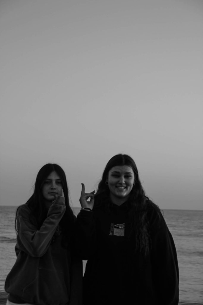
These six images are from the last part of my third photoshoot from St Ouens, I have done a mixture of black and white images as well as keep ones in colour. My top three landscape images are mainly ones to represent the friendship part of my project as they are mostly group or duo images. One of my favourites out of the three is the middle one as I like the composition between the two subjects, where they are both facing away but you are able to see the design on the back of the t-shirt as well as the details and different shading both of their hair. The bottom three portrait photographs are also some of the best from this part of the shoot, the left image is a portraits with golden lighting which helps to accentuate the subjects hair and detailing with the hair style as well as her necklace which helps to break apart the harsh black from the top. For the middle image I found that I wanted to have a classic black and white edit over the top of a funny, more relaxed image, I like how this image can show the dynamic of the friendship clearly as well as the closeness of the friendship.