To present my final prints in a different form than foam board and window mounting I want to create another photo-zine as I think it is an effective way to present my images. I created a photo-zine for My Rock project to present my images from our La Hocq trip. Previously, I created my zine on Adobe InDesign so I am going to do the same but make sure I make these much needed improvements. Most of my final prints will be displayed in this zine perhaps in a monochrome format as well as other images I took in preparation for this project. Not all my images involved will be presented as my final images but only a small selection of 7-10 that I am going to mount. I am aiming to have around 14-18 pages in my zine to include all my best shots of architecture.
Front and Back Cover
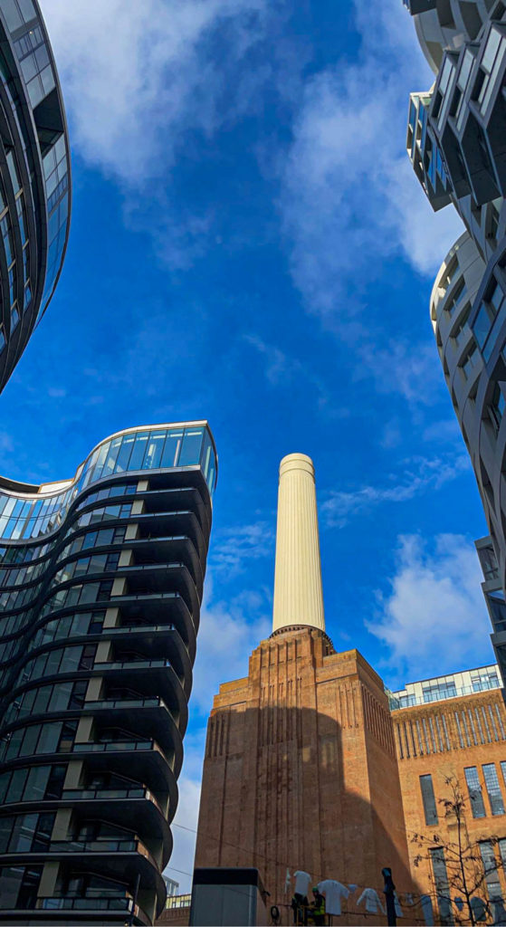
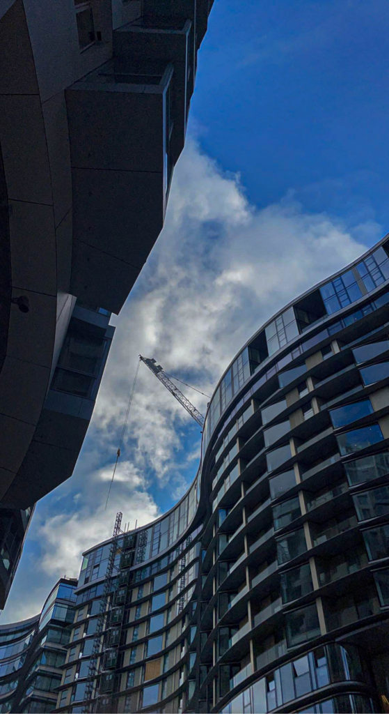
Photo zine creation
To begin with the construction of my photo-zine I needed to create a document following the correct measurements and pages in order to craft a good quality zine. I then had to decide if I wanted to keep a monochrome theme throughout the whole zine which I think would look the best. I wanted to keep the front and back cover in colour to attract viewers with the bright blue sky. I chose this front cover because it gives a brief idea of what images will be involved in this zine, the idea of Simple vs Complex architectural structures.
For my first 4 pages I wanted to present my images from the finance district located near the Esplanade as I think they are my most eye catching images in the zine.
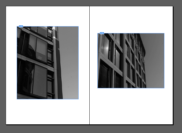
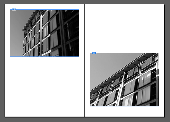
Next, I wanted to introduce my first double page spread of one image which is also photographed at the finance district of the same buildings displayed above.
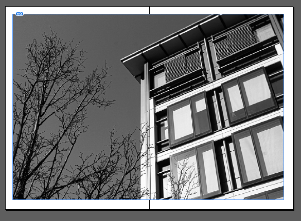
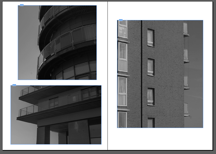
Then I wanted to present my images from the Waterfront apartment complex, carrying on the theme of monochrome images to make the zine more organised.
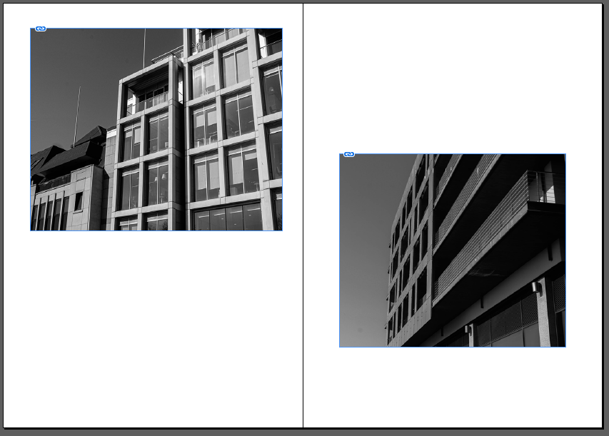
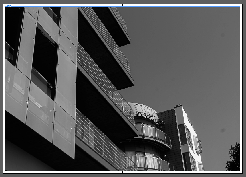
After thinking about which location I wanted to present next I decided to use images from all locations again carrying on the black and white images.
Evaluation
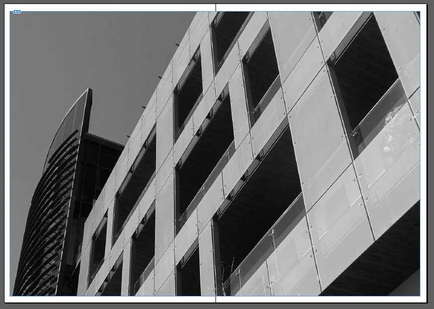
Overall, I am happy with my zine but could’ve been heavily improved if I decided to start the creation much earlier in the exam, however I do like how all my images are in black and white as it follows the style of Helene Binet who is one of my chosen artists. I tried to connect the images together by almost making it seem as if two images create one structure such as on page 13. I could of improved this zine by including more close up shots of unique features of the buildings I have photographed. I included one image from my Fort Regent photoshoot to try and mix up the style of images with the photo on page 14 being a structure which is much more simple compared to the rest. I did experiment with only using images from the Waterfront but I believe I did not get enough quality photos for them to be included. I was thinking about creating a photobook instead of a zine however it wouldn’t of been worth making due to a lack of effective images.