compare and contrast

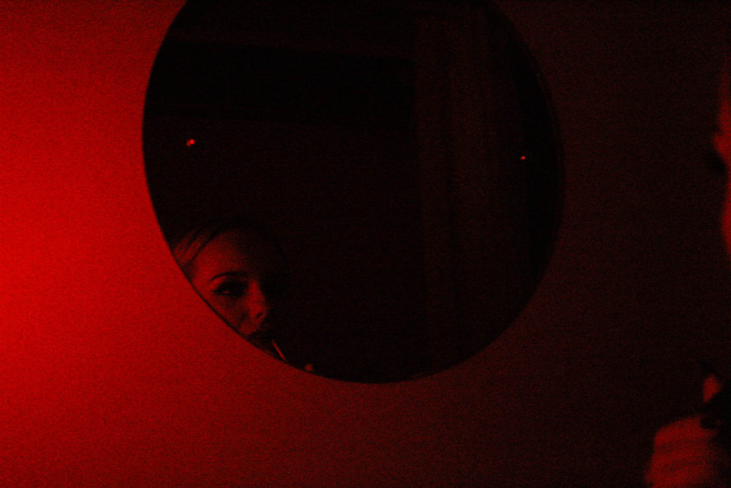
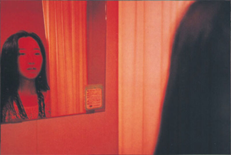
This is a comparison between my work and Nan Goldins image, ‘Mika in her Mirror’. Both images feature bold red colour, however mine involves darker tones and more shadows defining the figures face and in the mirror, whereas Nan Goldin’s image has primarily lighter colours and is for the most part devoid of shadows. Both images depict a figure looking into a mirror, however my image features a round mirror which I felt added a nice touch to the photo, whereas the figure in Goldin’s photo is facing a square mirror. Both images have a personal feel to them as they represent the insider perspective – depicting single subject facing head-on to the mirror and avoiding eye contact with the camera. The red colours in Nan Goldin’s image represent intimacy, perhaps with ones self, which I have tried to replicate within my own work.
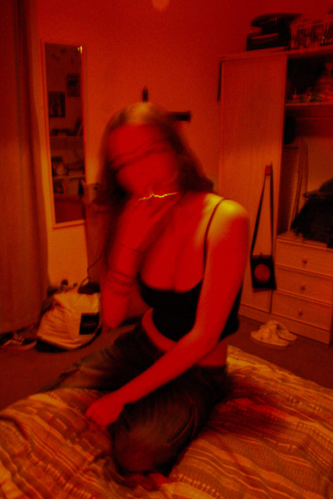
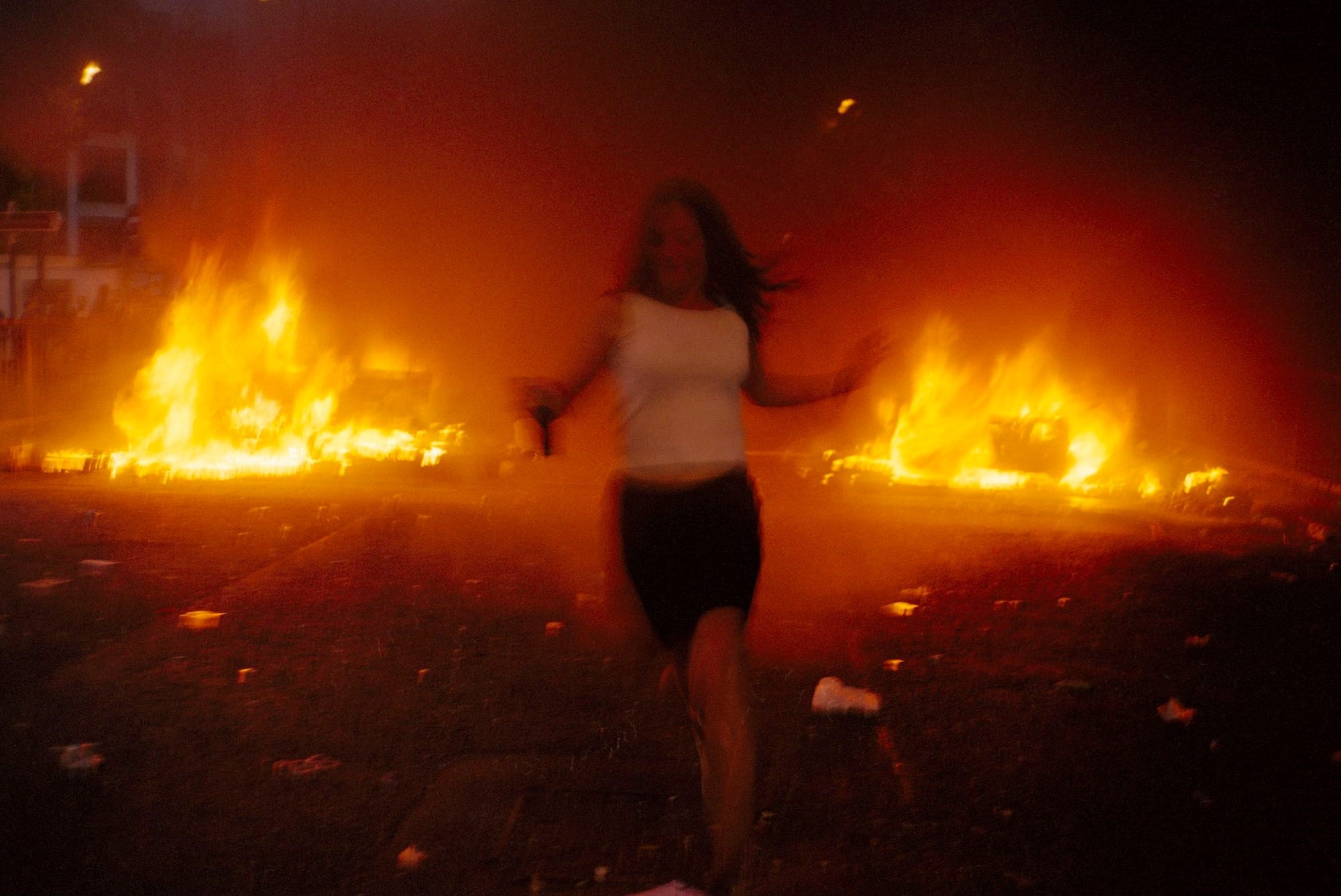
This is a comparison between mine and Vinca Petersen’s image, taken from Raves & Riots. Petersen’s image depicts a female figure running from a fire which is presumably from the aftermath of a riot. The raging flames in the background create a bold, vibrant orange tone that engulfs the whole image, and the running figures face and body are shaky, blurring her facial figures to the point of unrecognition. My image, like Petersen’s, features a single subject (myself) in the middle of the image, with facial features blurred out. I achieved this using the Tv mode on my camera, with low apeture in a dimly lit room to enhance the colours. Using these settings helped capture the subject in motion whilst everything in the background remains still – this helps shift the focus solely to the subject and creates a chaotic atmosphere much like in Petersen’s image.
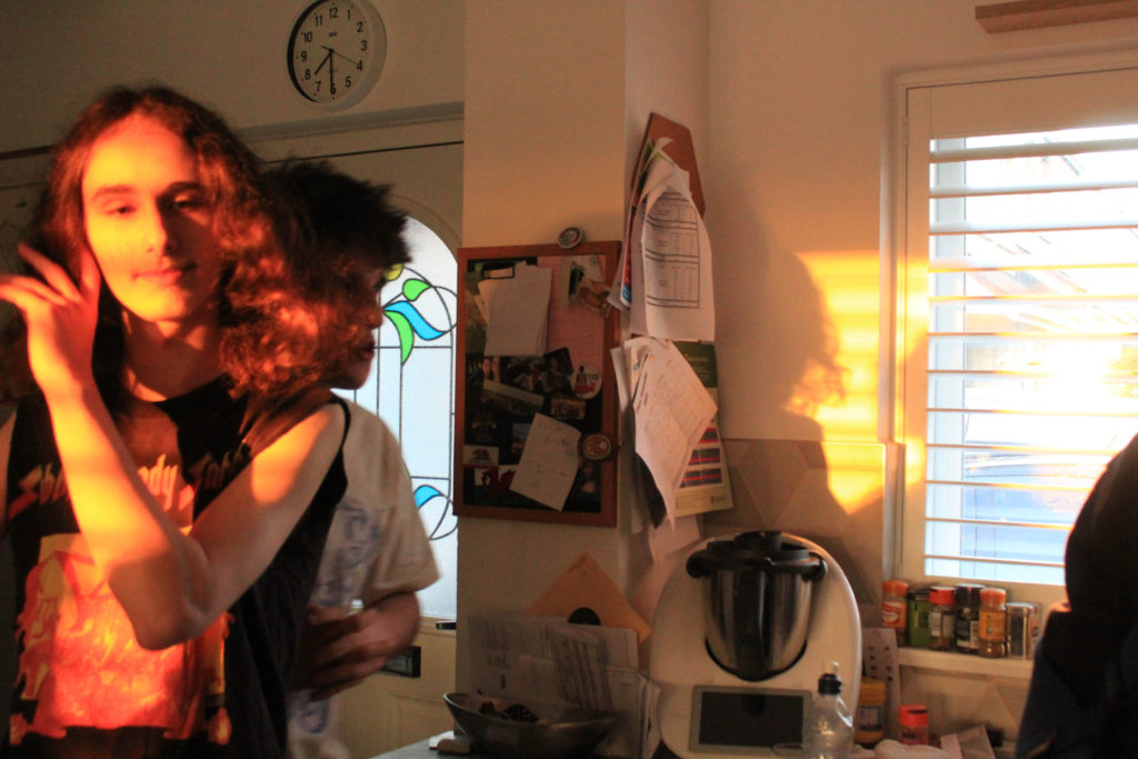
This is another comparison between Nan Goldin’s work and my own. The image, titled ‘Valerie in the light, Bruno in the dark’ Depicts two figures stood in what appears to be a kitchen. The female figure is stood fully illuminated by light from the sun, making her the primary viewpoint as the sun reflects a bright yellow / orange tone around her that seeps onto the kitchen wall. Around her the light casts different shadows that range in depth. Stood behind her is the male figure who is engulfed in shadows yet darker orange tones still reflect onto his body. My own image is similar to this because it also uses natural lighting to enhance the colours and shadows in the image. In my photo, the figure to the left is fully illuminated by the sun which makes him the sole focus of the photo, much like Nan Goldin’s image. Behind him is another figure caught in conversation, yet he is covered by the shadows – behind the figure in the forefront, shadows reflect onto the wall that depict his silhouette, surrounded by the orange tones from the sun.
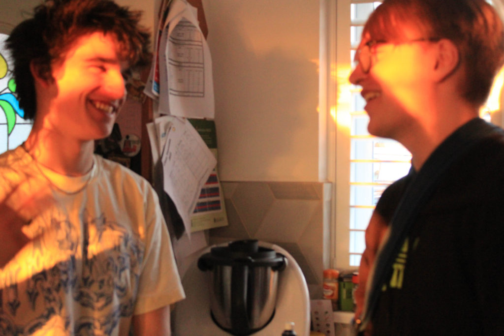
Although these two images are not visually similar, they generate the same relaxed and freeing atmosphere from capturing friends in conversation. Zielony’s image, taken from his series ‘Car Park’, depicts three friends in a car, neither of them making eye contact with the camera as different tones of red, green and yellow light reflect onto them, generated by artificial light from lamp posts, as the majority of Zielony’s work is captured during night time. On the other hand, my image was taken during the day with natural lighting, yet still depicts two friends having a conversation. Another difference between the two images is the perspective they’re taken from – This image, along with the majority of Zielony’s work, is taken from an outsider perspective looking in, whereas my image is taken from an insider as I had joined in on their conversation prior to taking the photo.
Presentation of final outcomes and evaluation

In this post, I will be presenting my final outcomes from my exam project. To present these outcomes I have displayed them in a few different forms such as, window mounting, foam board, 3d sculpture and a photo zine. All of my final outcomes were developed through Adobe Photoshop, Adobe Lightroom and Adobe InDesign to ensure the best quality editing and display. Also, I am going to create a virtual gallery for another form of presentation, this will be shown towards the bottom of the post.

Final outcome #1

Link for my production of my outcome: https://hautlieucreative.co.uk/photo23exam/2023/04/24/final-image-experimentation/#comments

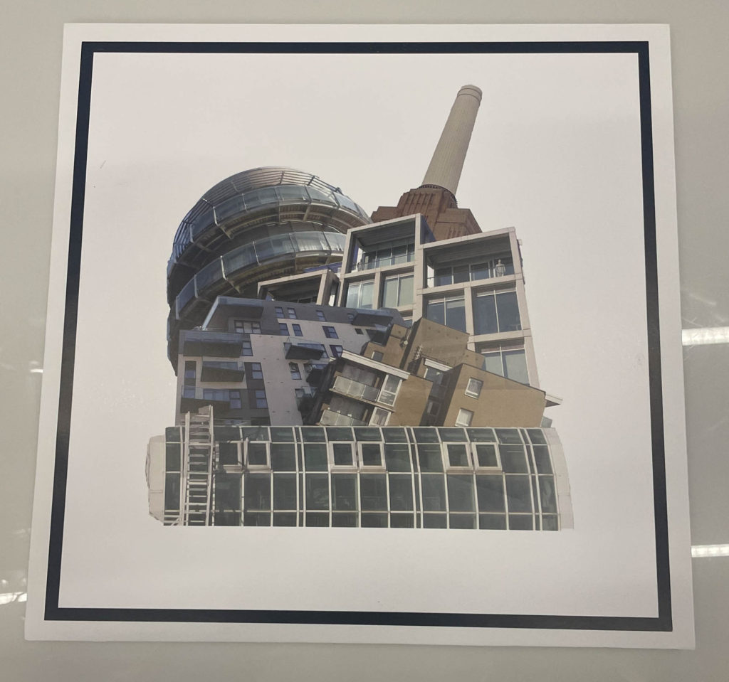
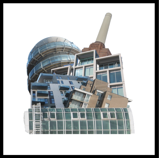
For my first final outcome I used photoshop to create this. This image was heavily inspired by my previous exam project and Laura Romero who is an artist I studied previously in the year. I experimented this image with many different background variations by using dull and vibrant colours later deciding to stick with the white background. This is one of my favourite outcomes as it is very unique and wasn’t just basic editing.

Final image #1

Final outcomes (Lightroom edits)

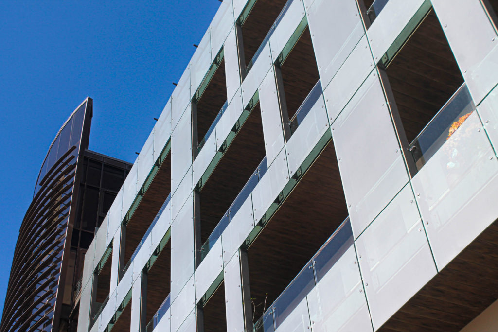
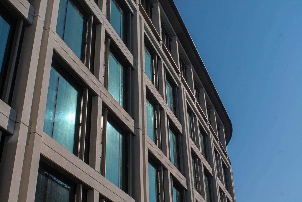
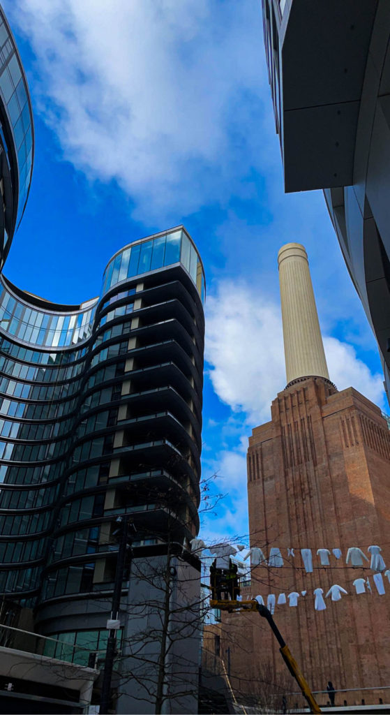
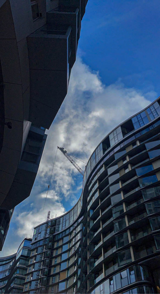
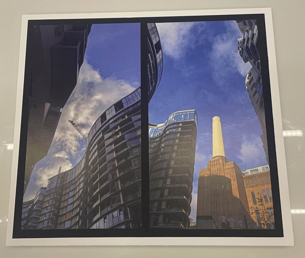
All of these images were edited and produced through Adobe Lightroom and were edited very simply. Personally, my favourite out of the lot is the first image presented as it shows both the green side of the world and the financial side of the world. The two images at the bottom were photographed in London and show a message of how different the past and future were with a futuristic apartment complex and an old powerplant that used to run the area.

Final outcome window mount and foam board

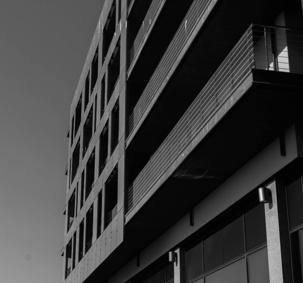
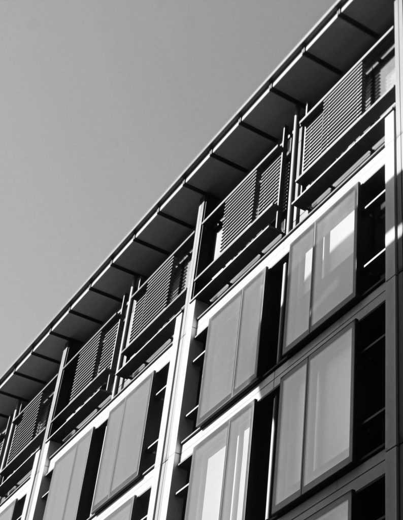
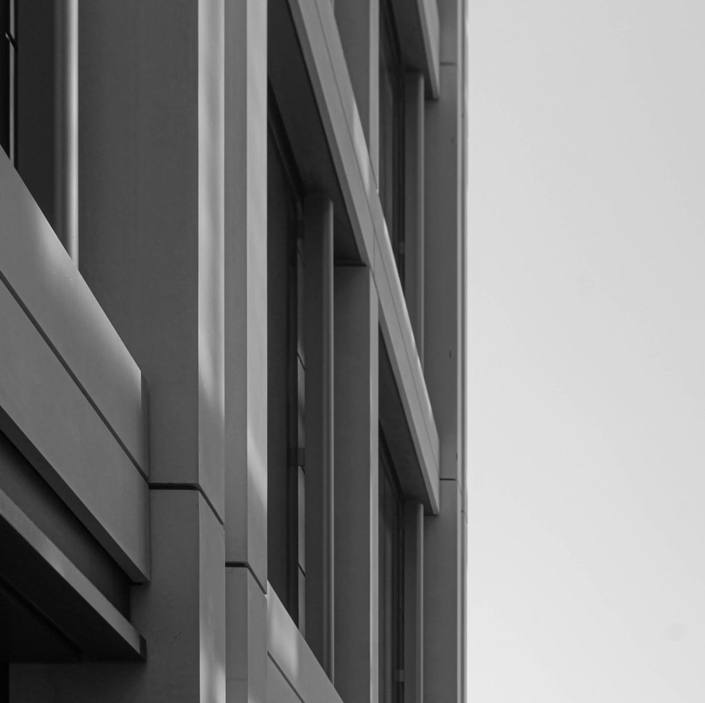
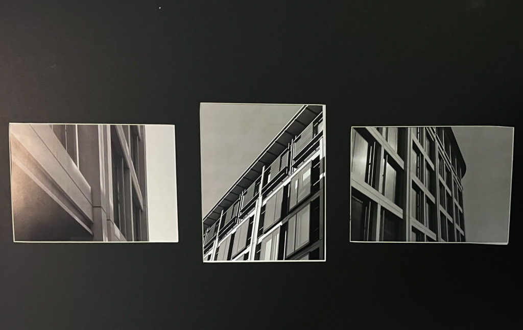
For the window mount I gathered three of my prints and experimented with different layouts and order in which the images will be placed, what made the most sense was to have the portrait image displayed in the middle of the mount so it looks less awkward. Next I positioned my other two prints on either side due to their landscape orientation. I chose to use these three images for the window mount because they are all presented in monochrome which creates a good contrast against the black background and the little white border around each print. For my first foam board mount I collected my Photoshop edit and used spray glue to stick it down onto the foam board whilst keeping a white foam border around the black border of the image. For my second foam board mount I collected my two images that correlate each other and positioned them right next to each other and stuck them onto black card. I wanted to increase the depth of the prints by including a foam board piece which I stuck my prints and black card onto, whilst also including a white foam border around.

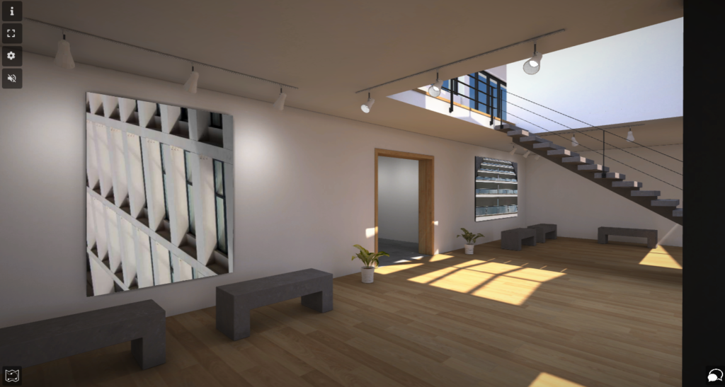
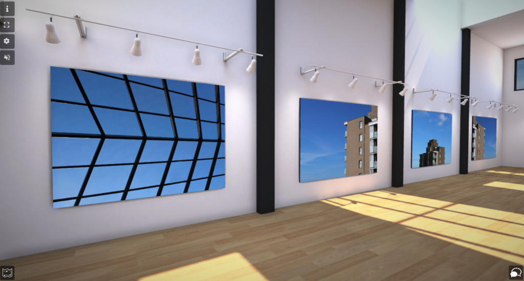
Virtual Gallery

Virtual gallery link: https://www.artsteps.com/view/64491fbe947dfd6c0ba5667a?currentUser

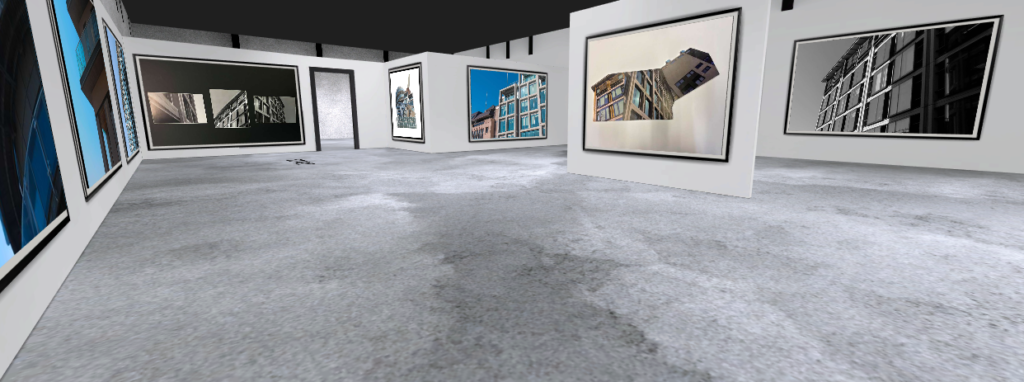
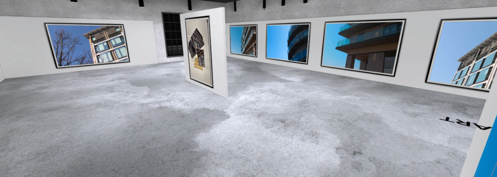
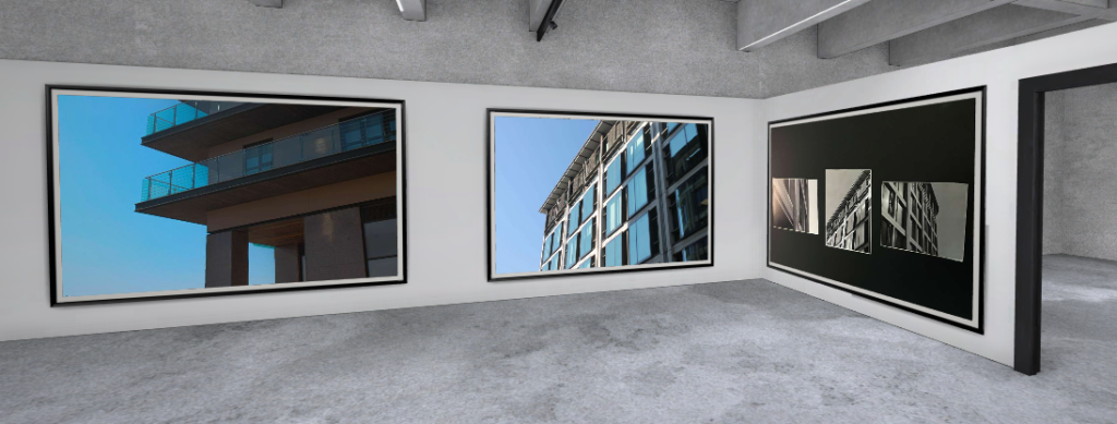
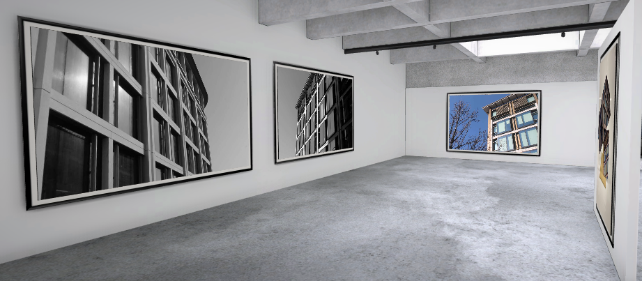
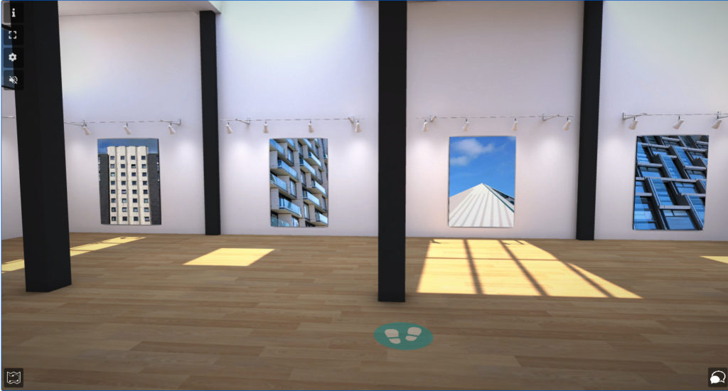
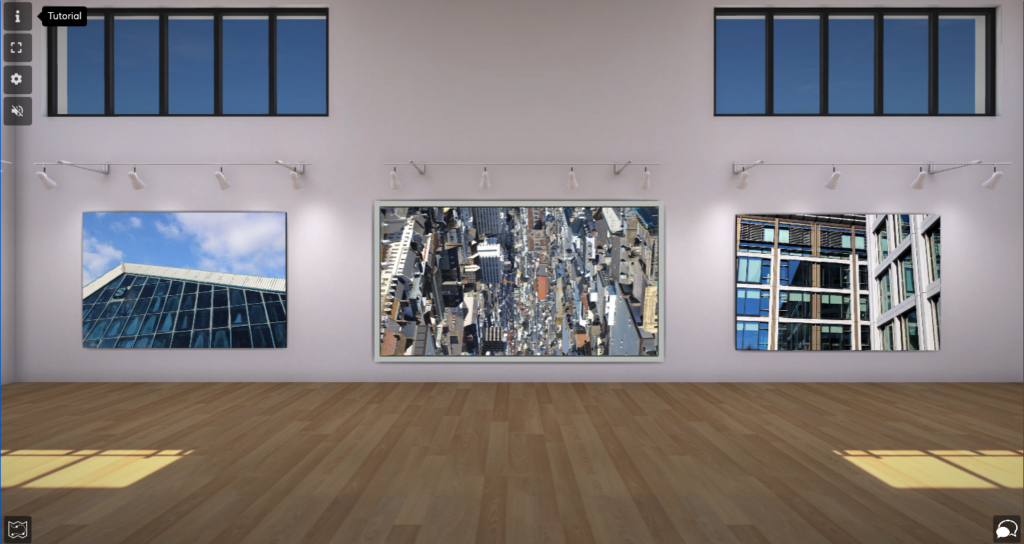
For this virtual gallery, I wanted to present not only all my final outcomes but other images I developed throughout this exam project.

Evaluation and Critique

Overall, I believe this exam project has gone very successfully due to the range of final outcomes and different forms they were presented in. I presented my images in forms such as, virtual gallery, window mount, foam board, photo zine, digital form, and 3d sculptures. I am particularly happy with with my window mounts and foam board experiments which I have used as my final outcomes. My virtual gallery is presented in a sequential way where images that link have been positioned together which I am happy with. My favourite outcome I produced is my window mount containing three monochrome features of the same building. It is my favourite because of how great the contrast is and it doesn’t have any mistakes that have been made clearly.

How I could’ve improved:

I could’ve improved this project by travelling to more locations around the structural area of Jersey to photograph the buildings. One place I wish I went was the recently done apartments near the Art Centre as they would’ve suited my topic of images very well. Also, I could’ve improved by taking time on my photo zine rather than rushing and hoping to get it complete in time or even creating a photobook with my wide span of images. Overall, I believe I could’ve gathered a wider range of images instead of collecting a lot of images in the same locations. Also I wish I checked the images after taking them as when I imported them into Lightroom some were out of focus, too bright, too dark and not positioned well.

Prints: final outcomes + presentation

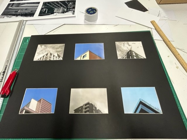
I presented my a5 prints in a 6 photo window mount. I did this by drawing up lines and measuring where to cut out the windows with even gaps between each photo. Then I taped the the photos facing forward, with a pattern of black and white and coloured photos:
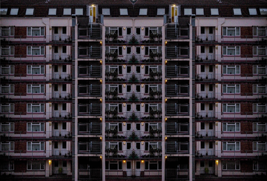
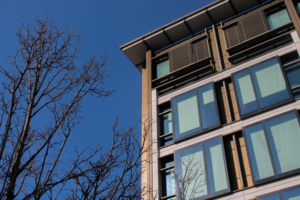
I chose to position the images where I did so I could make a pattern between the coloured photos with clear blue skies and contrast them with some black and white photos. The buildings pictured in black and white are also generally older than the coloured photos. I think this creates a deeper effect with Jersey’s newer Waterfront buildings contrasting with the older buildings more central in town, that show the more historical side of the island. Window mounts are good ways to display your work because the black background can compliment your photos.
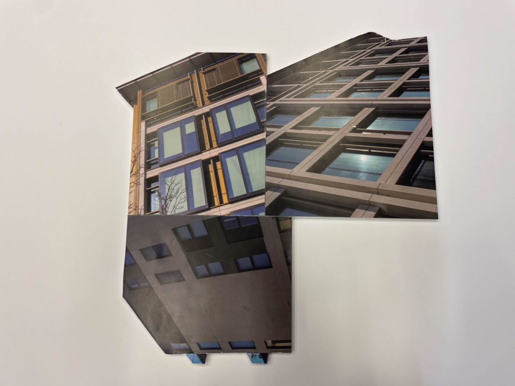
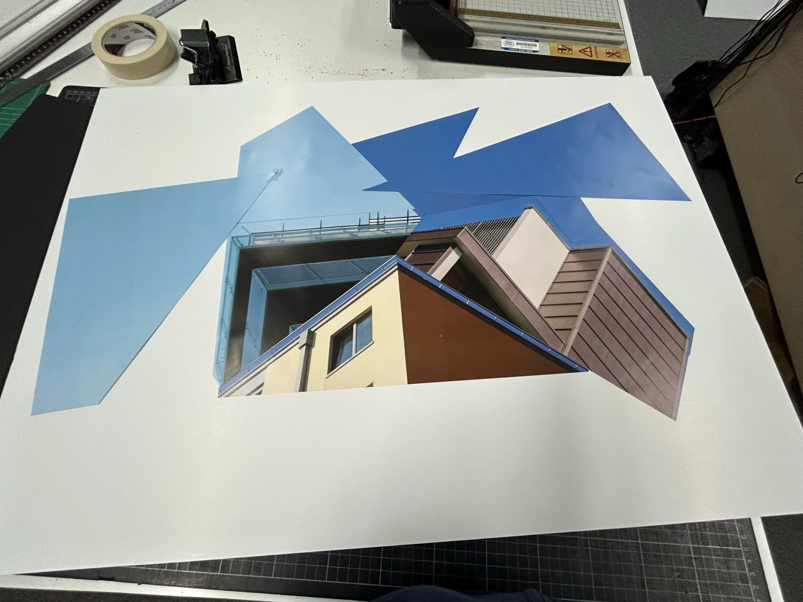
Another idea I had with my remaining a3 prints was to cut them up like this:

I did this by using spray mount and trimming all my photos

More Experimentation

I decided to create more experimentational photographs using Adobe Photoshop.

Experiment 1

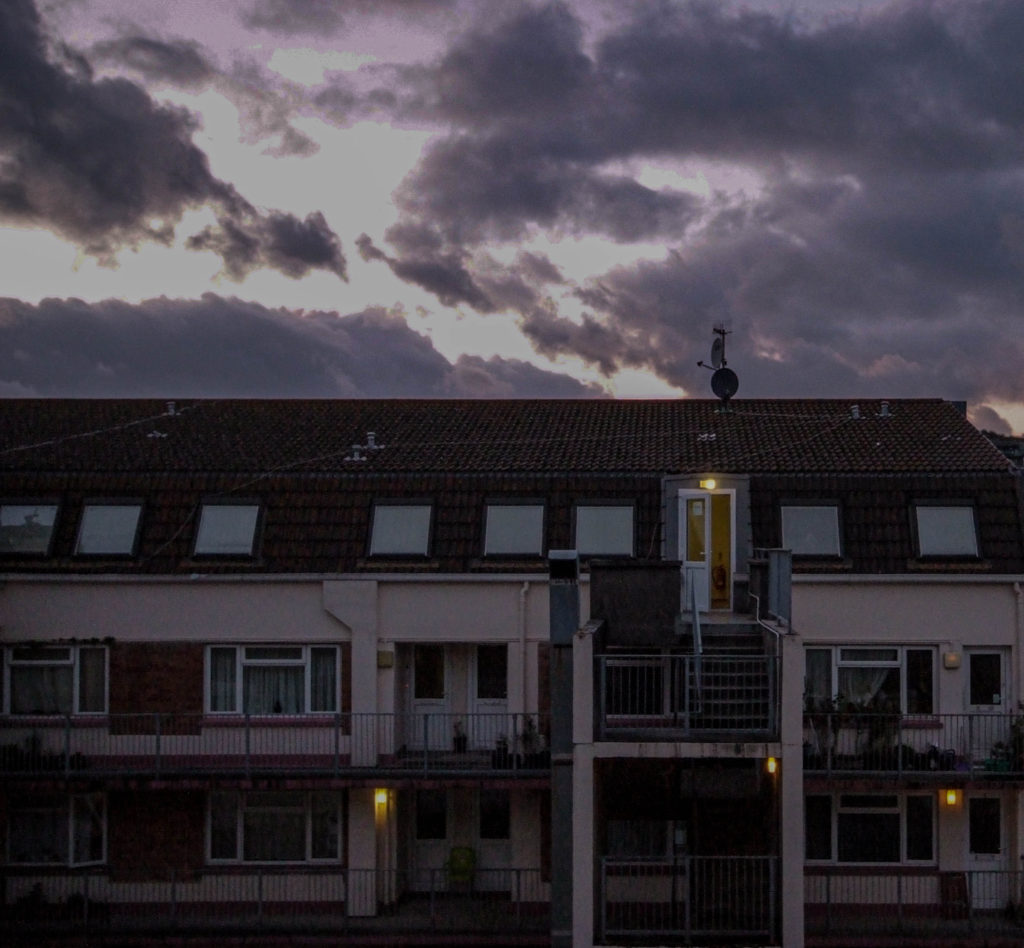
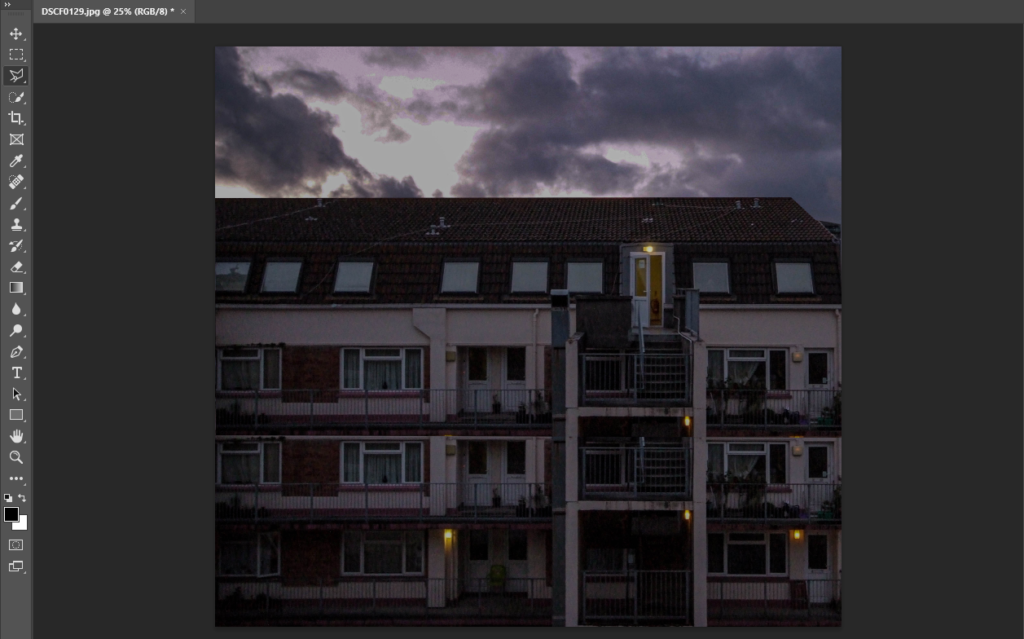
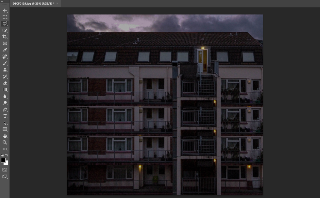
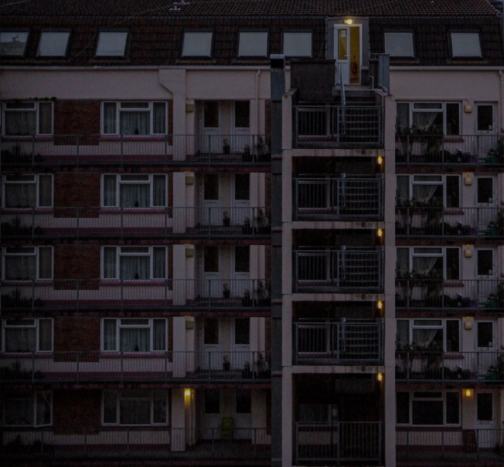
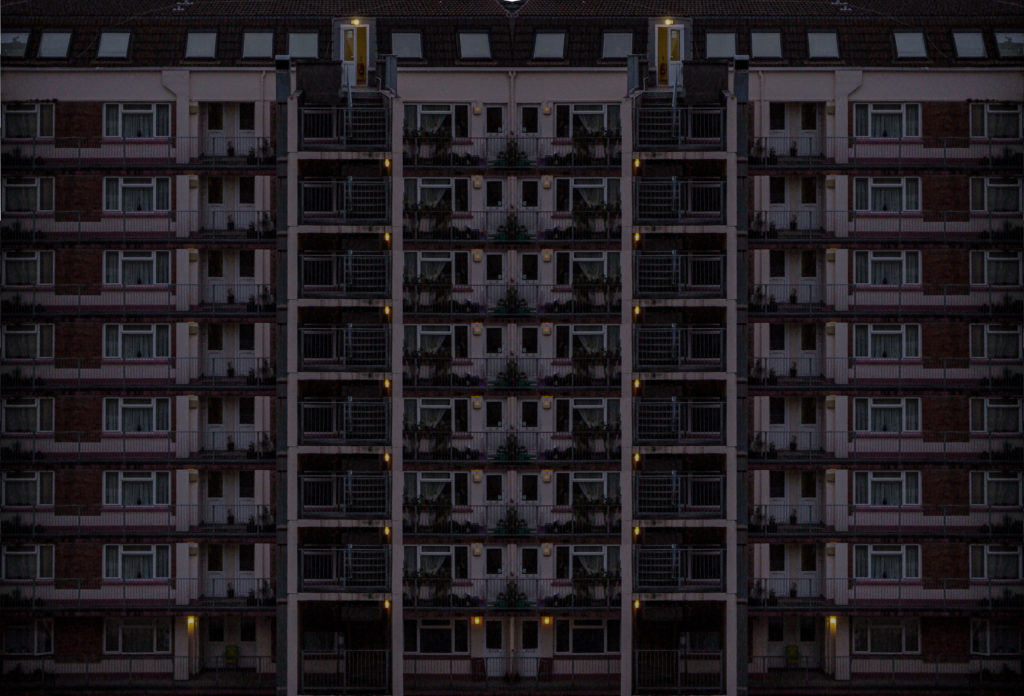
I wanted to create another montage style photo, I did this using the polygonal lasso tool to select the second level of the building in the image, and then copied and pasted the new layer, and so on.

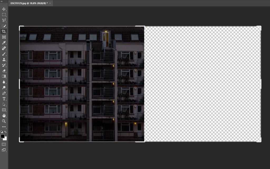
I then decided I wanted to make the image much bigger on a much bigger canvas. I did this using the crop tool to make the canvas bigger, after that I used copy and paste to create the final image.

I then put the image into Adobe Lightroom and touched it up using the exposure, contrast and other lighting settings as I believe it looked a bit too dull.

Experiment 2

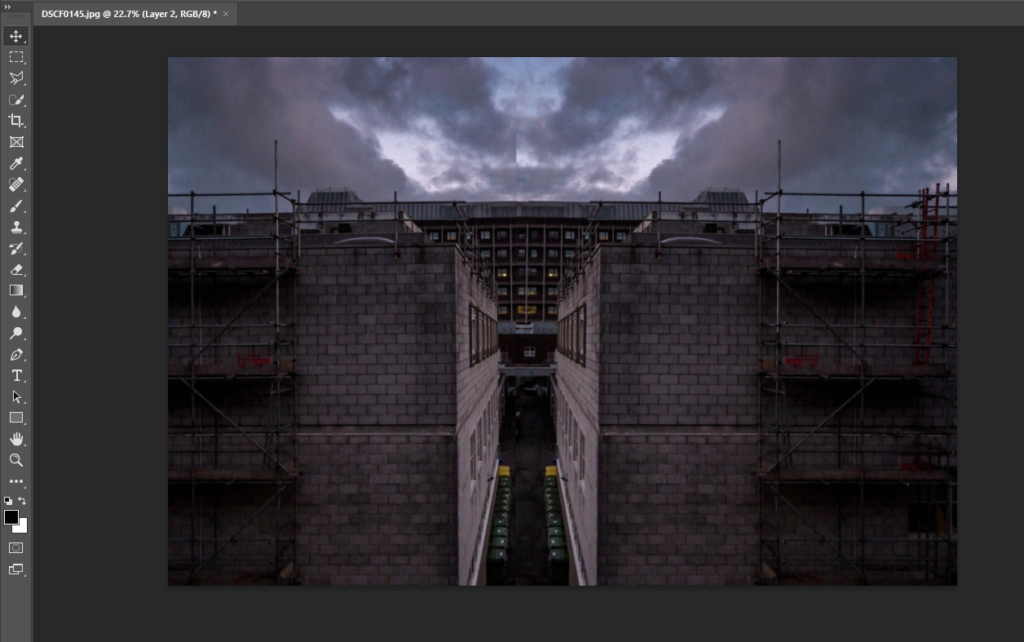
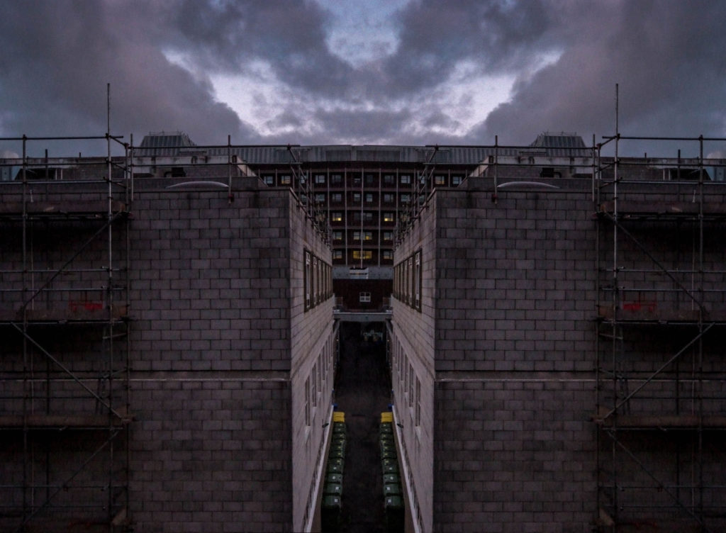
I wanted to create a double exposure type image on photoshop. I started by copying the layer and flipping it horizontally. I then cut half of the second layer off and rearranged it next to the original layer.

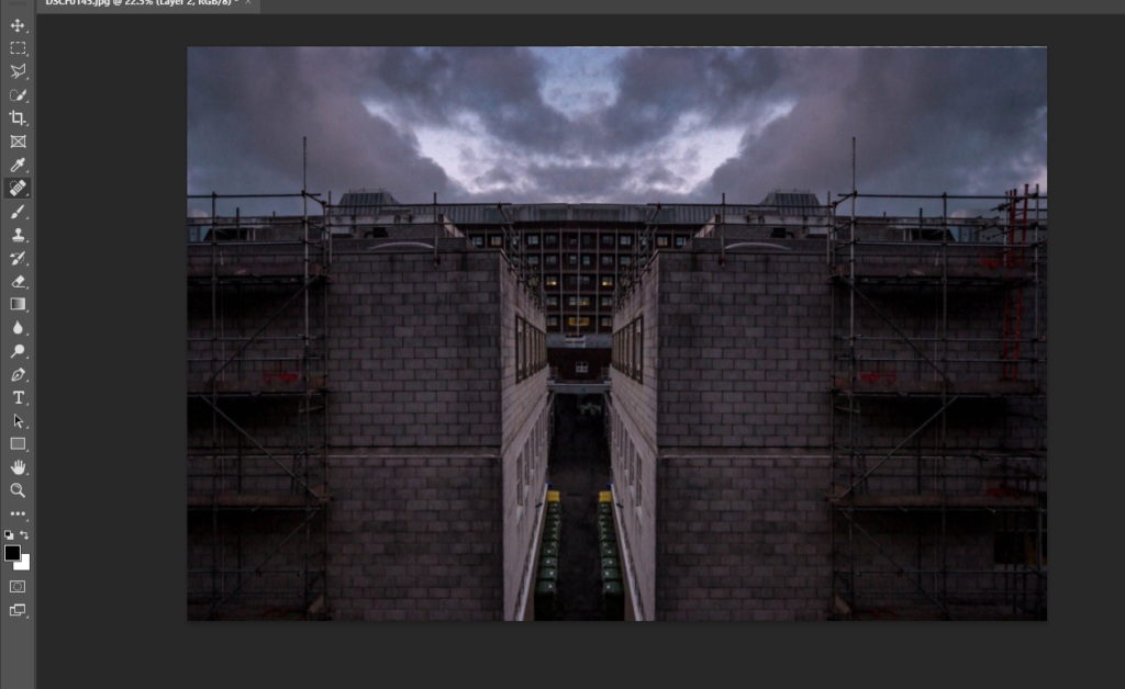
I then used the spot healing brush to fix the line down the middle where it looks slightly off where the 2 layers connect.

I then cropped the left side of the image to make both sides look even to create the final image.

foam board experimentation

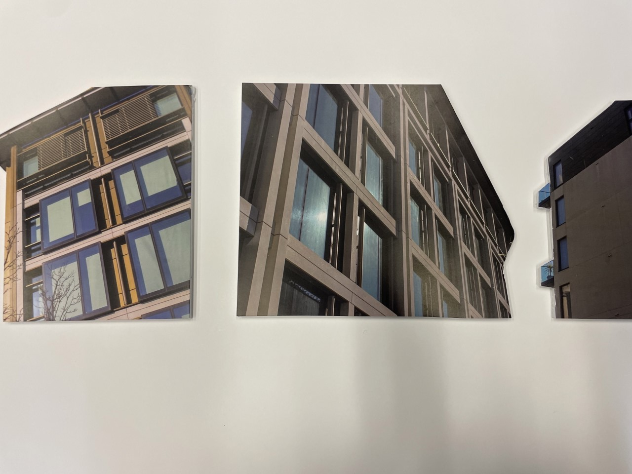
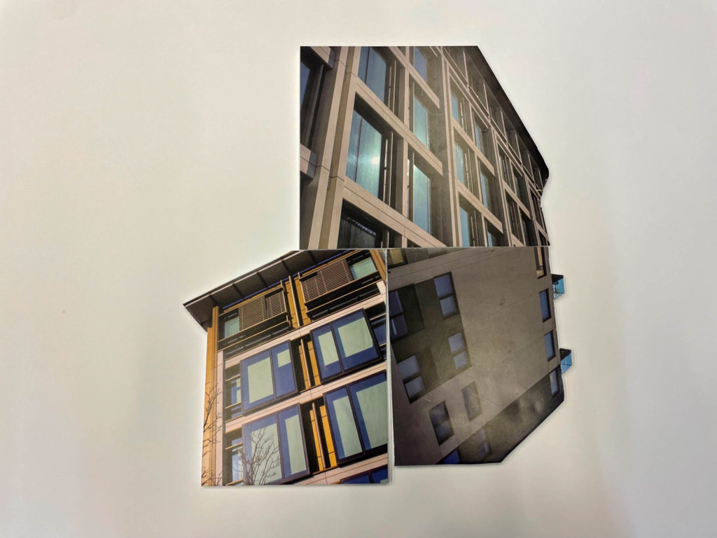
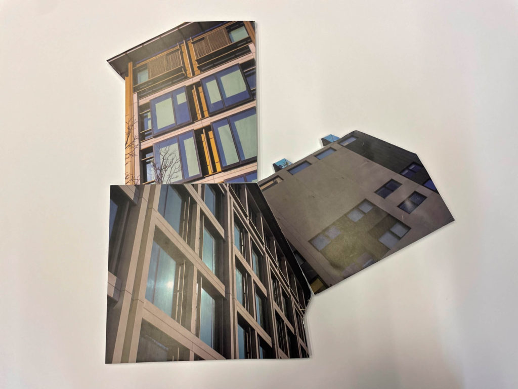
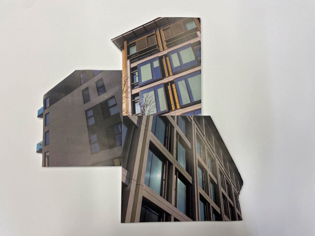
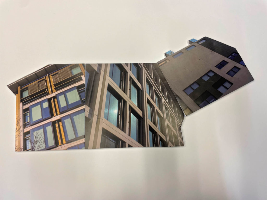
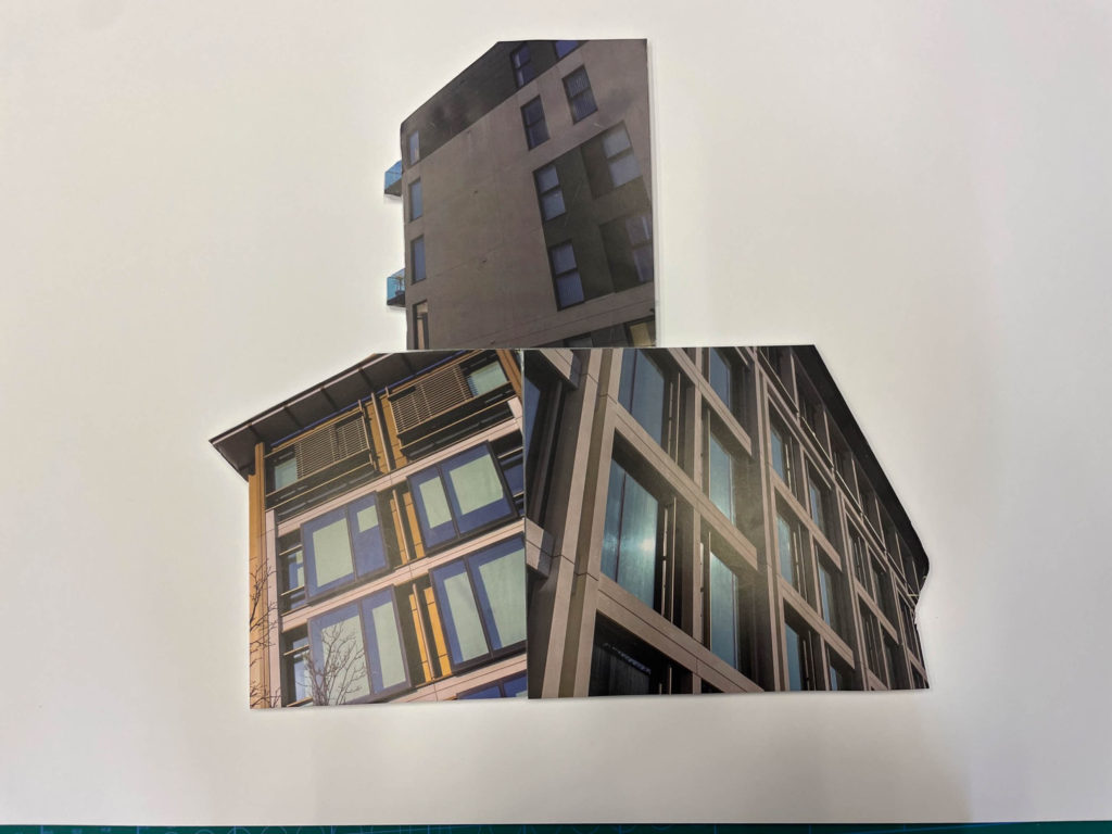
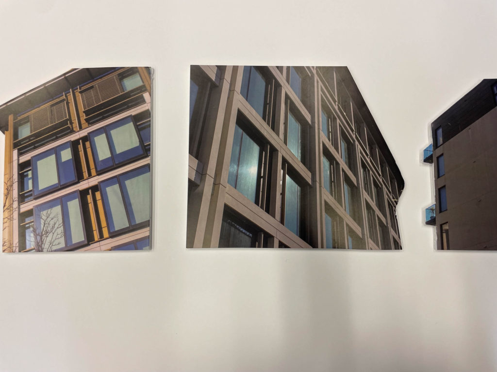
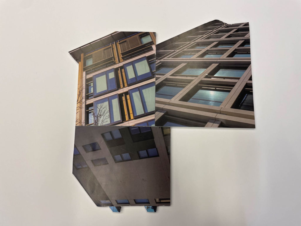
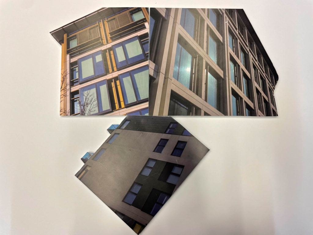
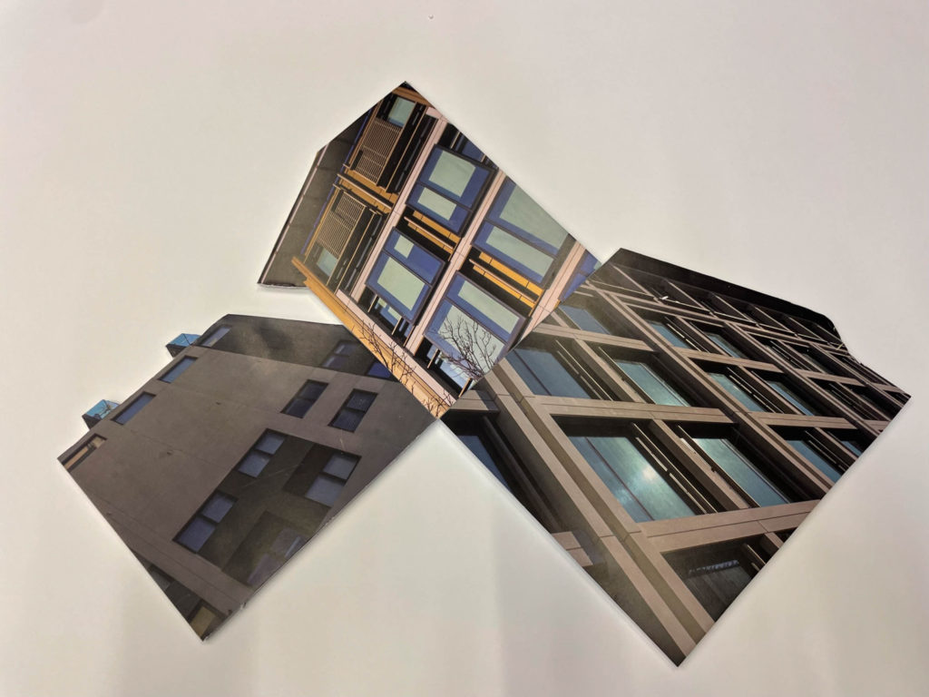
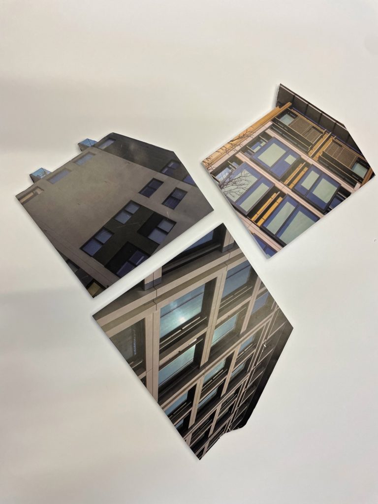
For this part of my project, I wanted to experiment presenting my images in a different form to a zine or mounting my images. Firstly I cut out 3 segments of structures I have photographed after sticking the images onto foam board. I used a sharp knife to carefully and smoothly cut out these segments without encountering any rough edges or cutting mistakes. To begin with the experimentation I laid out my three cut outs in a basic sequence to see how it would look.

Foam board layouts

Basic sequential layout

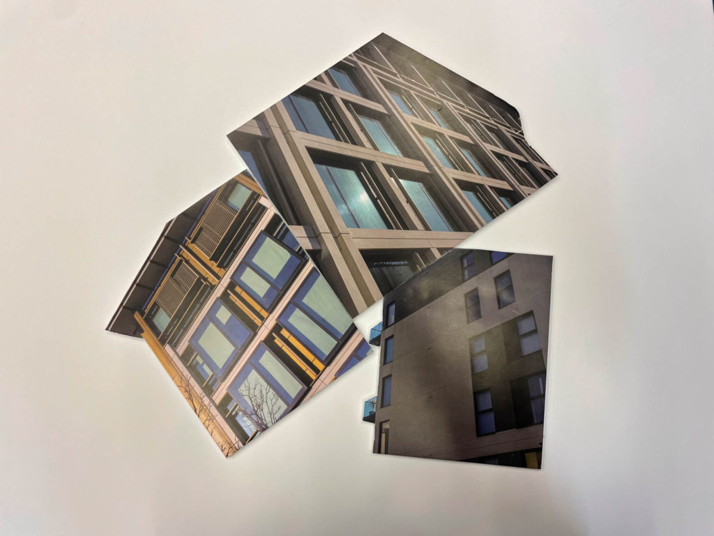
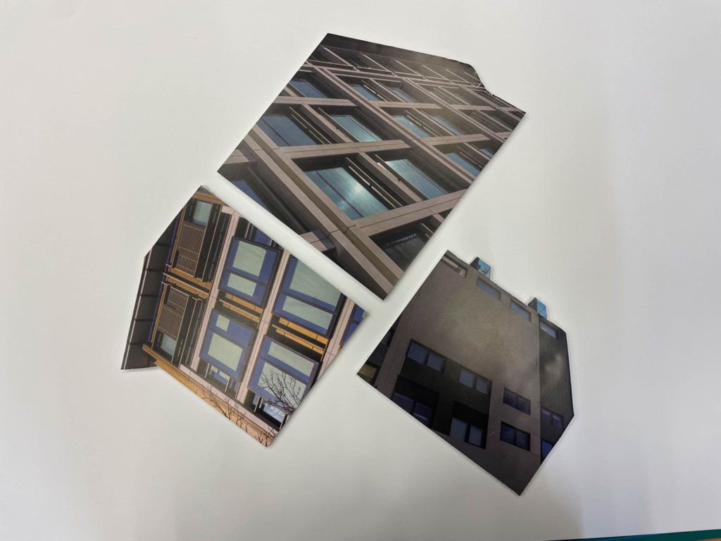
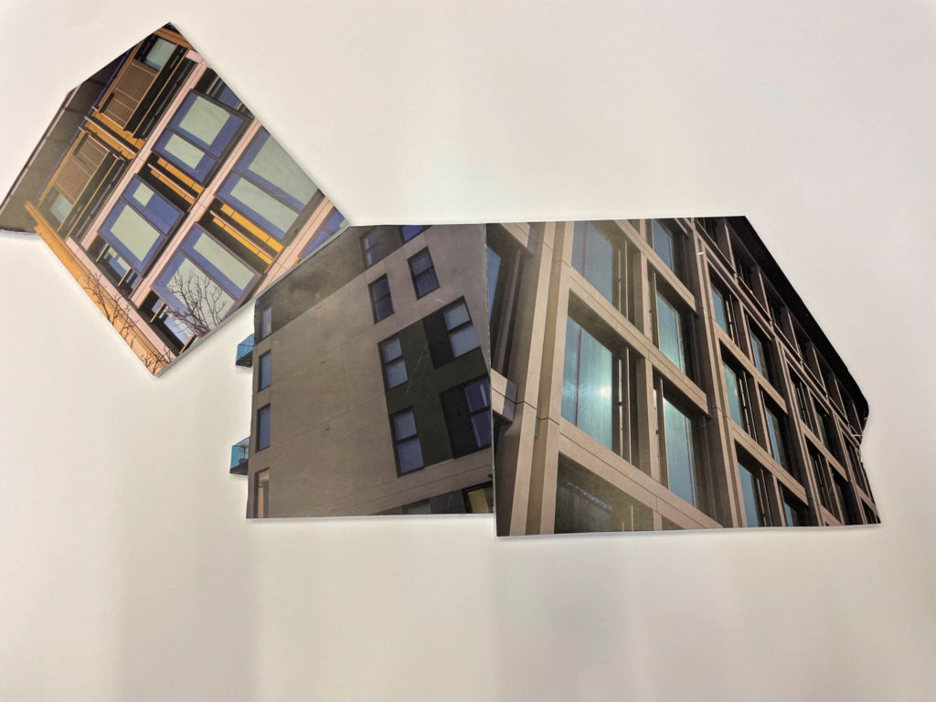
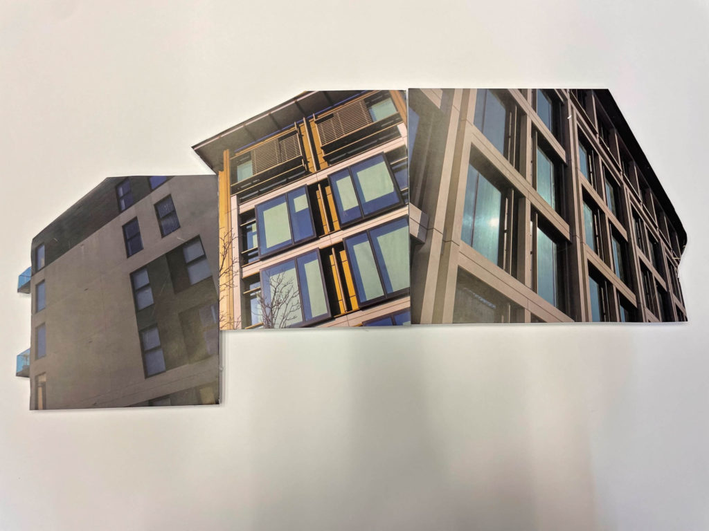
I did around 20 different positions for these cut outs to experiment which format I can present as my final arrangement. I started with a simple shuffle of the images to experiment which format is most effective.

I think most of these layout experiments are really effective and don’t look unorganised. I believe they all create a assembled sequence with no flaws. Every experiment was done by placing these foam board cut outs onto a bigger piece of foam board and created a 3 dimensional effect and added some depth. My favourite layout from these experiments in Experiment #5 because of how the order of the images create what almost looks like a whole new buildings. Also, I like how their are no rough corners or edges due to all cut outs linking up.

3d sculpture experimentation

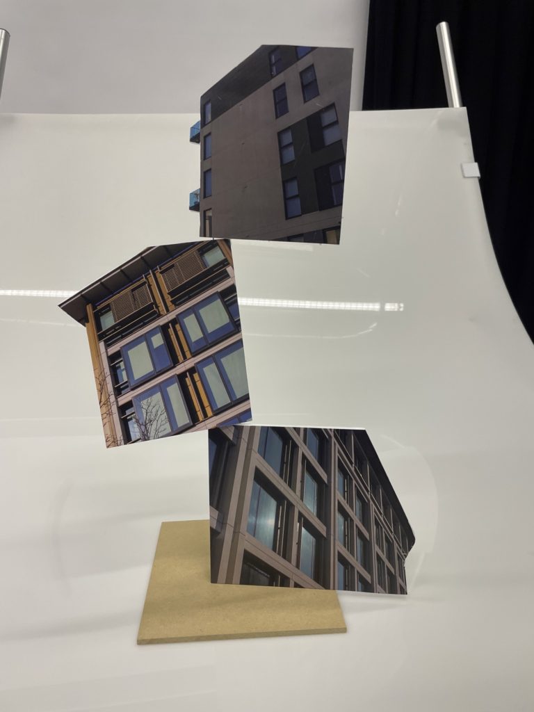
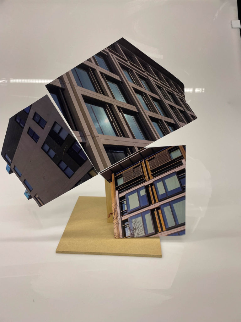
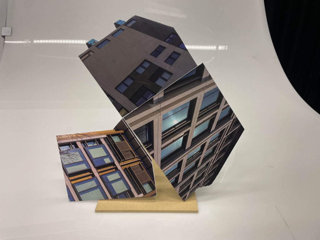
After seeing how these experiments looked I wanted to create a 3d sculpture that stands high looking like a unique whole building. To create these sculptures I used a straight piece of wire to connect the cut outs together by placing them on top of one another to form an effective layout. However I didn’t do too much experimentation for this area as after around 3 attempts I found a good and effective layout for my sculpture.

As I stated, I only did 3 experiments until I found the effective layout and stance in which my sculpture stands. My favourite sculpture is Experiment #3 as I really like how all the buildings link up near perfectly creating an almost new structure.

Letha Wilson

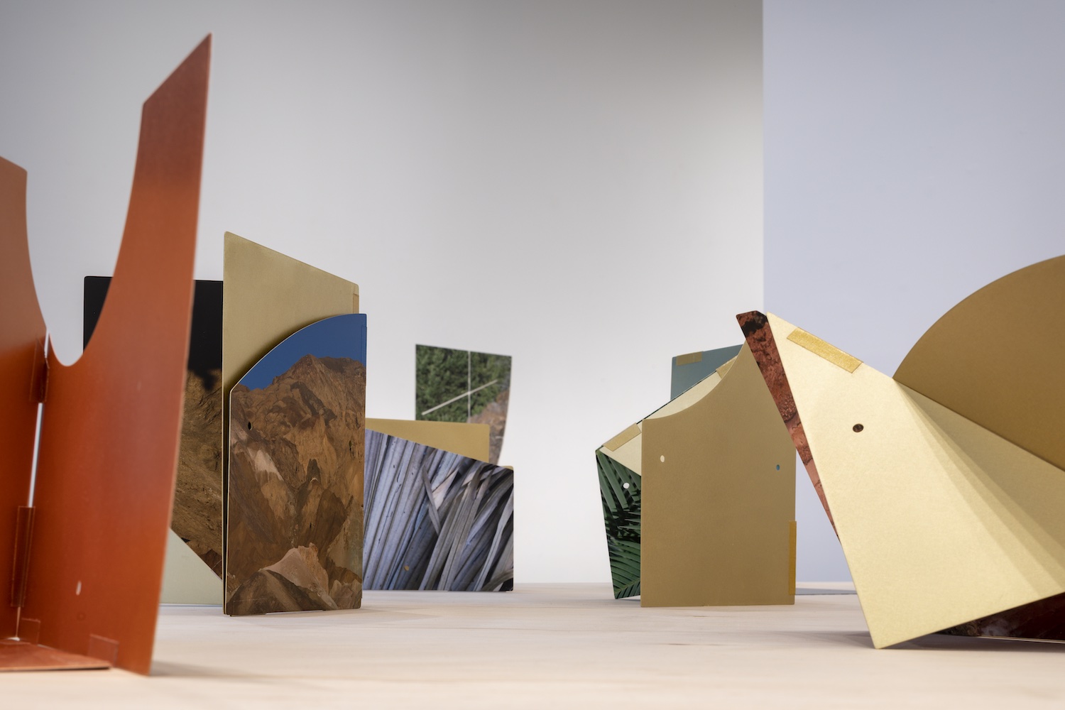
Letha Wilson is an American artist working in photography and sculpture making who often combines large-scale landscape photographs with sculptural elements of metal and concrete, challenging the two-dimensional nature of traditional photography. I have chosen to include Letha in my post as she has slightly similar work to my 3d sculptures I have created using foam board and cut outs. Her work is much more advanced and unique compared to mine by not only focusing on the topic of architecture but many outdoor images. Her and Felicity Hammond have inspired me to experiment with these sculptures as they are the most unique artists for sculptures as such.

Final sculpture experimentation

Evaluation:

Overall, I am extremely pleased with these experiments as it gives me many new ideas with how I would like to present my work instead of through mounting and digital forms. I used 3 different images of buildings to create one main structure which links together well with no rough edges. I could’ve improved these sculptures by experimenting more with the 3d creations by trying out different layouts. Also, I could’ve made more cut outs on the foam board to further expand the sculpture by introducing new features. The three images I used I selected as final prints that I have mounted and stuck onto foam board so I can present them in another form.

Photobook Specification/Design

Narrative

  • Three words

friendship, teenagers, girls

  • A sentence

following along with four girls as they explore themselves while living on a small island

  • A paragraph

During your teenage years, friendship is one of the most import things in you life, this is to show you how four girls rely and support each other as well as having fun driving around and exploring their small island. You will see how they explore themselves through portraiture as well spending time together before they all start new chapters in their lives by moving to university.

Design

Paper and ink

I will be using white paper behind my images in my photobook as well as black ink for the title and quotes on the inside. I have chosen to stay with white as I think that is a neutral colour helps to accentuate my images as most of them either have a lot of colour or are in black and white. By using a white background the colour images tend to look brighter making them standout against the darker black and white photographs that will be presented in my book.

Format, size and orientation, binding and cover

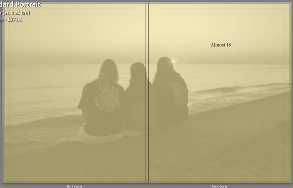
For the size and format of my photo book I will have a soft cover as I think that will be fitting for my style of book, I will also have the front cover be matte as I want to add a different type of texture instead of the classic shiny cover. I also think that the matte cover will look better with my front cover where I have a yellow background which I have chosen due to that colour being the colour for friendship as well as having one of my final images layered over the top with the opacity turned down so that you can still see the yellow peaking through.

Title 

I struggled when picking out my title as I could not find one that was fitting for my photo book, I first wanted to experiment with names including the word YELLOW as I thought that it would fit best with the concept. For example, YELLOW HEARTS. After I looked up the meaning which is the opposite to what the book is about I moved on to thinking about my friends, the title I was experimenting with was DIRTY BLONDES as their in one blonde and three brunets but I felt that this really only focused on one person where I wanted everyone to be included. Next I was thinking about doing something simple like a number or letter so I started off with 18 which developed into ALMOST 18 as three of us are 18 but we are still waiting on one. The age 18 is very important, we are starting new chapters in our lives and everything will be changing so I wanted to have a title that represented that.

Editing and sequencing

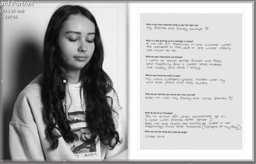
For my images I will be using a mix of coloured and black and white images which will all have similar editing techniques used so that my photobook looks cohesive. In my book I want sections that are dedicated to one person with a mix of group photos included. I will start off with a black and white portrait and there responses to the questionnaire, this will lead into different compositions of images of the induvial and finish with group images, I will then start a new persons section.

Images and text

In my photobook I will use a small amount of text, but I will be add a singular quote from each person next to another portrait. I think that by adding a quote which they picked out themselves and that they like will allow for the viewers to get to know each person more. By adding text will also help break up the images so that they don’t seem like they are to squashed together in the book.

Layout

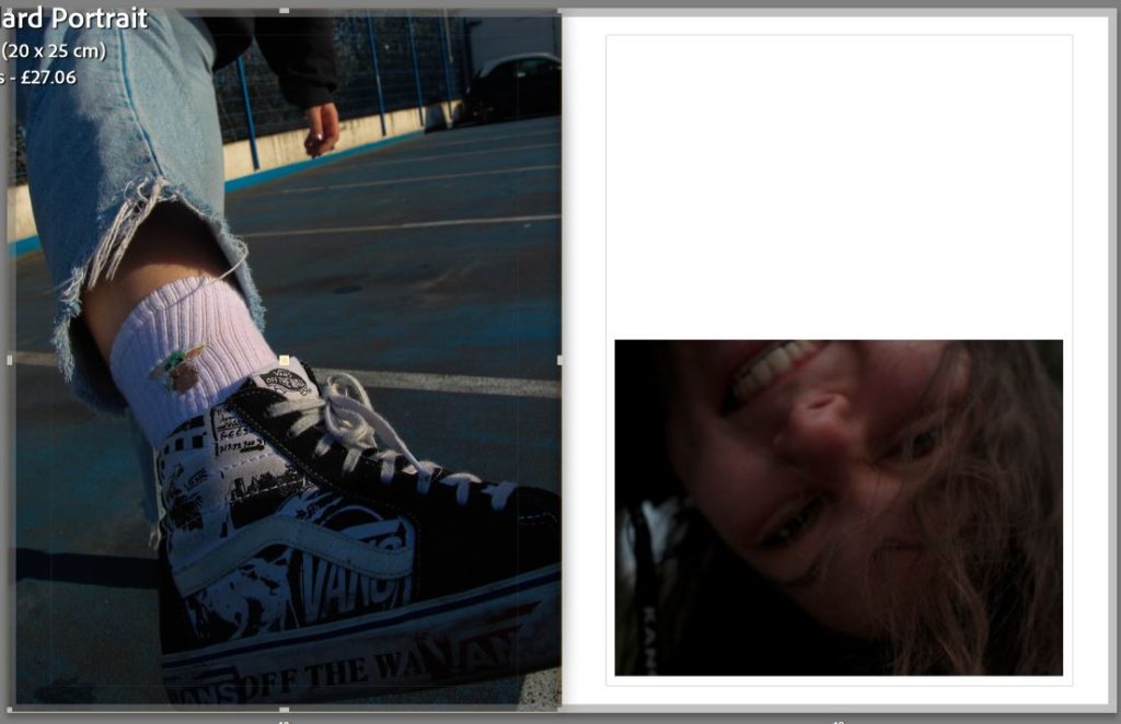
In my photobook I have been experimenting with different image layouts, I have a range of layouts presented in my photobook as I wanted variety to keep the book interesting and not repetitive.

To keep the book from looking cramped I have left blank space around some images as well as leaving while white pages to help break apart the colours and shades which can get overwhelming. I like the contrast between the black and white and coloured images in the first layout as it is of the same two subjects but completely different compositions.

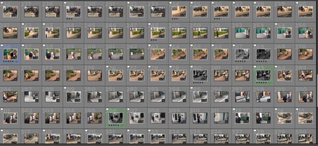
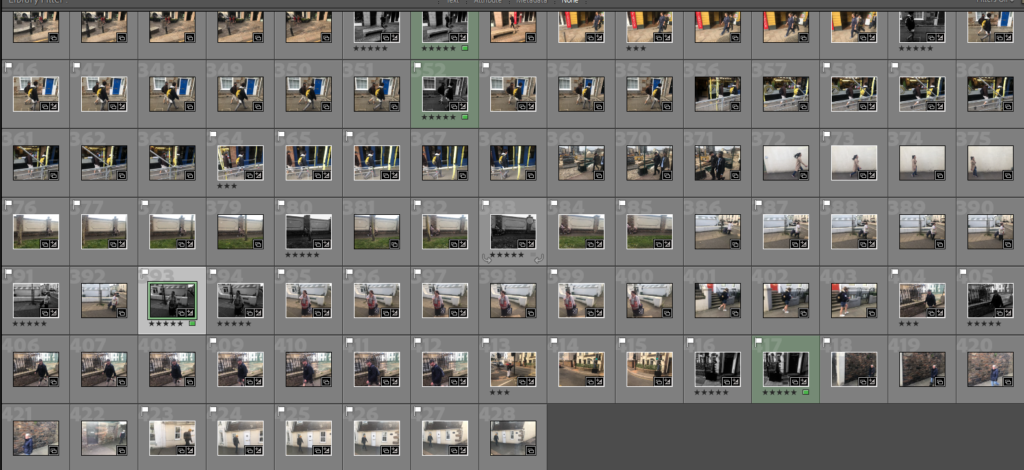
photoshoot 3

for my third and final shoot i wanted to make sure i had more than enough images to finish my project with for this shoot i took around 200 images still around St Helier but again a different route with slightly brighter lighting

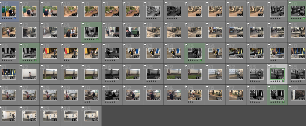
to pick out the ones i liked most i used the pick and reject tool again and came up with 80 images i liked the most

after further narrowing them down with the star rating tool i came up with 40 i wanted to use

for this project i experimented with a mix of colour editing and monochrome editing to add to my final projects after some experimenting i came up with 5 of the best ones

best images from shoot 3

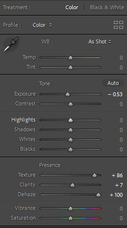
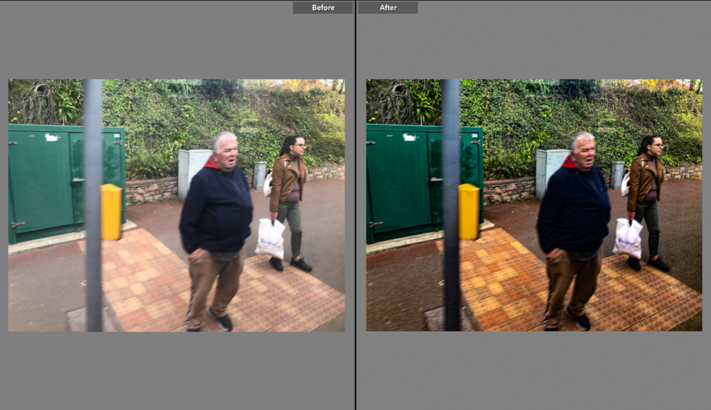
for the colour image i decided to all a bit of vibrancy and changing exposure to create a more catching image

editing i used

i was happy with how this image turn’t out because first time i seen it i almost didn’t even flag it but after some editing i liked it much more

after edit comparison

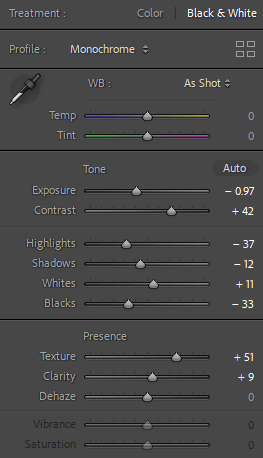
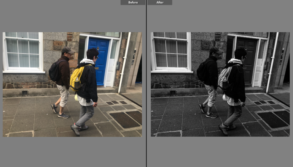
for the monochrome images i used similar edits to photoshoot 2 so that i could make a sequence using them all

edits i used

i liked how they all turn’t out but my favourite out of the the monochrome edits from this shoot is this one as i like the strong contrast

overall i was very happy with this shoot as it gave me much more final images and allowed me to have to final projects one being black and white and the other in colour i was glad i got as many photos as i did for this shoot as was very useful for me to get more final images