

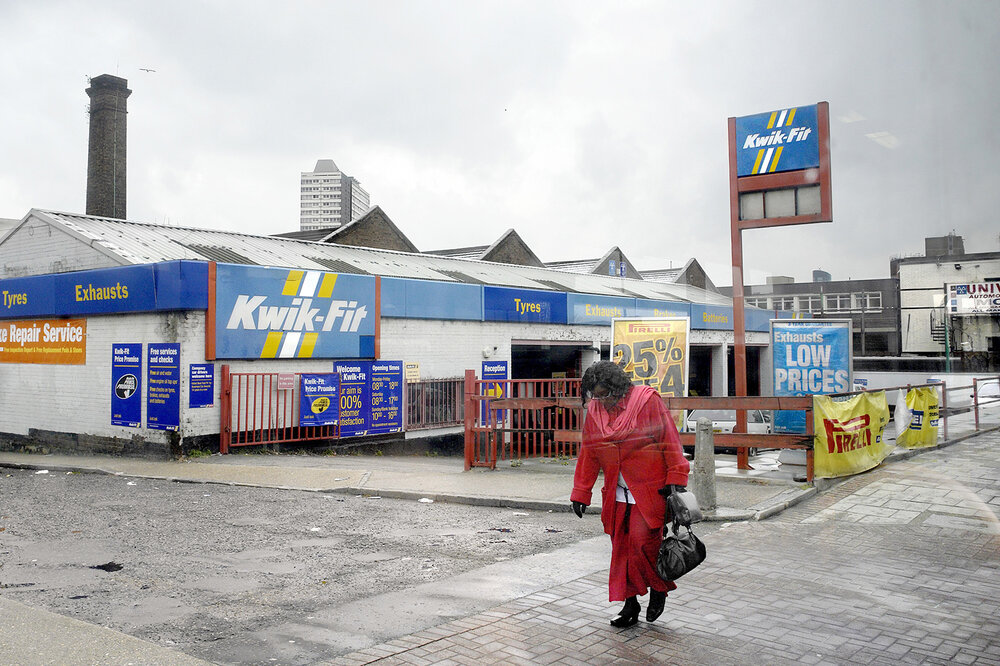

I have chosen to compare these two images as I believe that they both have similarities in the two. They both contain photos of a single person so they first have a similarity within the fact they’re both in the same situation . Both images show someone walking carrying something and are both based around a urban area, having other buildings in the background of them. They both display portions of the road and showing them looking down walking not paying attention to what’s happening around them definitely capturing them in true nature not realising they are being photographed. I feel that the background and situation makes it more dull and moody as it is representing the urbanised world.
one difference is that my image has a younger male looking at his phone while the older lady is just looking down representing how the youth are much more tech concentrated nowadays

Here is a full-scale presentation of the image I have chosen to compare with that of George Georgiou . I really like how this image turned out as I feel it is very similar to that of Georgiou’s work who I used as a real inspiration for my pieces. Georgiou’s work has been a huge inspiration for me as I feel he is able to present the essence of what the uk and people are really like through it’s capturing of people in everyday life.

I feel as if my final images vary in strength, with the phone image (above, bottom left) being my weakest and the two top images (above) being my strongest due to their set aesthetic although this may be because they are a pair. I believe my phone box image is the weakest due to its lack of technical ability, although the blur was accidental it did add some action to an otherwise plain image however I feel as if this image has a lack of aesthetic with no coloured lighting and a lack of strong contrasting shadows, both of which are strong themes in my other images. In relation to the theme simple v complex I feel as if I succeeded with my intentions and interpretations- the images are simple however have a complex aura behind them which can be created by the viewer of the image by an unspoken narrative which I did not outline however is implied in the images with the main subjects referencing out of frame entities and not acknowledging the audience. Equating to my artist references was difficult however I think I succeeded with this, the majority of my images are clearly inspired by Wing Shya’s photography while one of my images is easily comparable with Claudia Andujar’s work (above, bottom right image). I think a criticism of my final project would be the amount of images I produced, although I am happy with my final project I feel as if I could have created more images in this style if I paid more attention to the camera settings when taking the images so there were more successful images which contained no motion blur and overexposure.
I am particularly happy with my presentation of images through a CD, I feel as if this adds more formality to my work showing that the images can be used in numerous ways- making a CD also meant that I could experiment further concepts with my images, with cinematic style images they are very fitting to other media applications such as covers for CDS/DVDs, advertising on billboards and film screengrabs. A criticism of my CD would be however the repeat of images, linking to my previous paragraph if I was more competent with the camera settings to create the correct colourful atmosphere without using flash then I would have had more images which I could have displayed: I also would have liked to burn a CD with either music on it, me talking about my images, or even a narrative to the images like a short story- however I ran out of time to do this as I did not think of what to do after creating the CD covers.

Best Images


Evaluation:
What went well?:
I believe my project follows the overall theme of the Male Gaze, I have used techniques such as including images from a males perspective to highlight the male impact on the female life. I think that my images are good and have been thoroughly experimented with in order to create effective shadows, light and overall interesting to look at. Throughout my project I have made sure to keep minor details up highlighted such as the use of light and shows to convey emotion.
To Improve:
To begin, I wish I had researched the work of Cindy Sherman more thoroughly, mainly because sometimes I felt slightly confused to what her images were meant to be conveying, however it is possible that Sherman’s work can be confusing because it could have so many different meanings and allows you to be confused in order too interpret your own meaning. Secondly, I should’ve taken more images, particularly ones similar to the costumed images by Sherman.

For the photobook, I am very happy with the way it fits the theme of Simple and Complex, as it contains both complex themes of artificial intelligence, a woodland environment, the technical nature of photography as a medium, as well as the more simple themes to contrast with it, such as an object photograph, as well as how AI software can simplify creating an image. I think the image on the front/back cover represents this well, as the image started as a fairly complex composition in the woodland, and I edited it to be made up of simpler shapes and slightly more limited colour. I am happy with the way the book links in with my previous book in that the image on the front cover is designed in a similar way, even the text is in a similar position.
Due to the symmetrical nature of my sequencing, many of the pages in the photobook have a similar aesthetic and presentation, this idea of a repeating page layout works nicely in making sure each image works well with one another. I think my inclusion of my AI generated images was successful, as I was able to put equal focus on those and the image they were referencing during their creation (the only page where it only has AI images uses images based off of the image from the cover of the book).
Due to the limitations of the AI software, the AI generated images were at a very low resolution, which means that they may not be in the best quality once I have the book printed (however that blurriness may add to their inorganic appearance). The title of the book (Ancient Woodland Modern Software) was a fairly rushed name, however it does fit in with the themes of the project.
for this experimentation i decided to put a few of my monochrome images over the top of each other

i started by cropping out my images so that i could start layering them

i started off by placing them over one of the other images but realised there wasn’t really enough space and the images seemed a bit to squeezed in so i tried placing them on a A3 blank sheet

after doing that i was much happier with how the edit turned out and i was able to fit all the images how i wanted to

finally i added my final image and cropped it down and was very happy with the outcome but after printing it i decided to keep the outline for a less basic and more interesting image

The gallery which I have chosen to use and why –
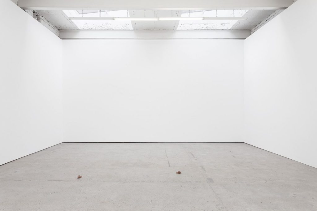
This is the gallery file which I have chosen to use to create my virtual gallery to present a few of my images with. To find this, I searched on google for an ’empty gallery file’ where I chose the one which I liked the most as I thought that it would work the best with my images. This is because the gallery has a plain colour scheme and there are 3 walls, which makes it simpler when placing the images in photoshop, I also like how there is a natural effect of light in the virtual gallery due to how bright the room is.
Image selection –
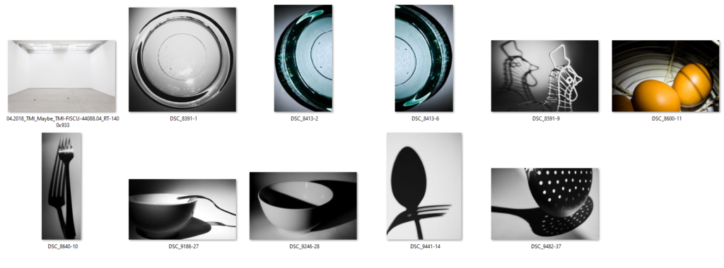
These are the images which I have selected as potential images which I could use in my virtual gallery, I decided to start with a wider range of images as it gave me more choice when inputting them into my virtual gallery. As you can see below when I begin to edit the perspective and add a drop shadow to my images I decided that I would use 4 images which I thought complimented one another quite well due to their colours which were black and white and bold shadows. The reason why I decided not to use the images with colour is because I wanted to keep the gallery to have a simple and almost ‘clean’ aesthetic, due to how simple the pictures are in relation to the theme of still life, and I thought that if there were images which featured colour I thought that this would make them appear to be quite messy, which I did not want to happen.
Placement –
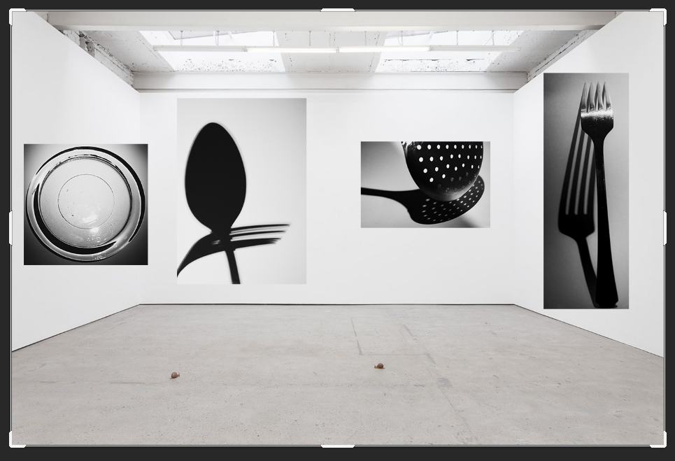
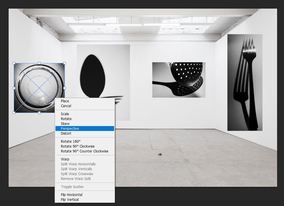
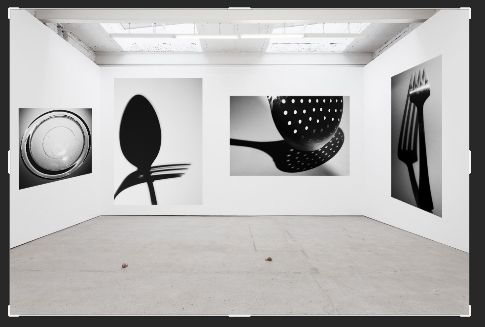
This is the placement which I decided on for my images, this was done through the process of deciding that I wanted to have only one image on wither side of the virtual gallery walls with two images in the middle as I did not want it to feel as if it was too crowded with a lot of different images. To edit the perspective on photoshop of the images to give the effect that they were mounted on the wall I selected the images using ‘Crtl-T’ which brought up free transform which allowed me to move the image to the selected area, then I right clicked it which brought up a selection of different options and I chose ‘Perspective’, this allowed me to alter the angle in which my images appeared on the wall due to adjusting the placement of the sides and how big or small it needed to be on either due to how the effect of having a photo mounted on the wall would look. This process was relatively easy to carry out and I repeated it for the rest of my images as it prepped them well to add a drop shadow on to them later on.
Adding a drop shadow –
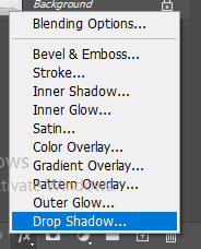
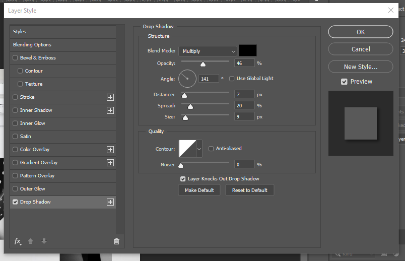
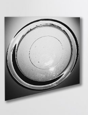
This is the process which I used to carry out the effect of adding a drop shadow on to my work. I began by selecting the image which I wanted to add the drop shadow too and choosing the ‘fx‘ button which is in the bottom right hand corner on photoshop which brings up this menu where I chose the ‘Drop shadow’ option. This then opens up this menu; this is where I am able to alter the angle of where I want the shadow to fall on the image to give the effect of lighting falling on to the image, the opacity of how bold I wanted the shadow to be, the distance and the spread of how far I wanted it to fall out beneath the photograph, for my images I chose a small distance and size as the images were already in black and white and I felt that having a large, bold shadow would make the image seem quite overpowering due to how big the shadow may have been.
Final outcome and evaluation –
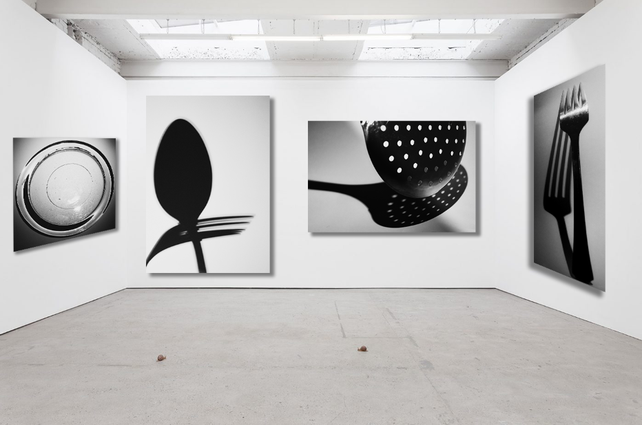
This is the final outcome which I have created on photoshop for my virtual gallery, I am really happy with how this turned out because even though there is a small selection of my images which I have chosen to use I think that it represents different shadows and how they have been created due to the different lighting in each photograph. I also like how the images are slightly grey in against the wall, which is white, because this makes them seem as if they are actual mounted prints of images which would appear bigger if you were looking at them in real life, this is also emphasised by the use of the drop shadow.
Artist Comparisons
Below I have showed how my work is similar to the work of the three artists that I have studied, this is to show that I have taken inspiration from them throughout my project, and during photoshoots considered the different kinds of shot they take. This is important as these artist guided my photography in this project and allowed for me to create more successful outcomes.
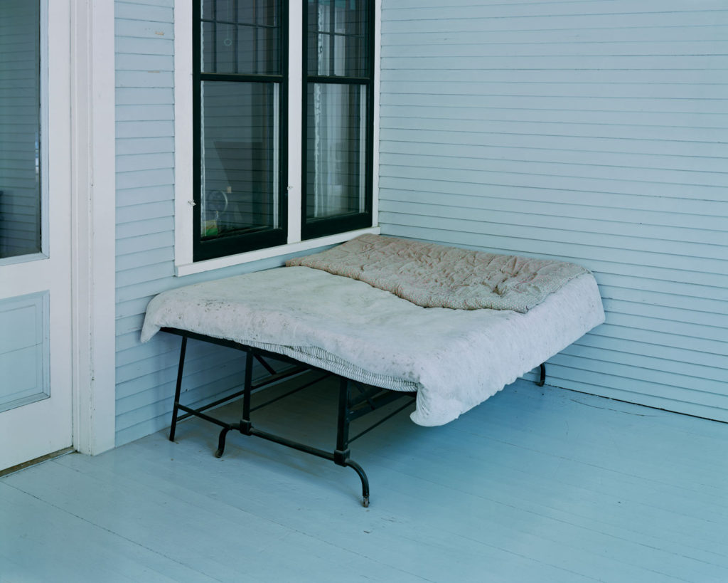

Firstly, I am using this image of my dad’s couch to compare to the work of Alec Soth, I think that if my photograph would of been more widely shot, then it would of been more similar to the photograph of the left of Soth’s. The images are similar as they both show areas of relaxation and have blue and grey tones throughout them. However, my image would of been a lot better if they lighting would of been consistent.


In my opinion, this comparison is the closest example of me taking inspiration from artists, as this image of my brother is very similar to the one from Matthew Finn’s ‘Uncle’ project. This is because how they are facing away from the camera and towards the right. This is my most successful artist comparison, and the original image has been featured into my photobook as it is one of the best photographs taken from my first photoshoot.
Printed Images and Framing Up
To finish off my project, I have below shown some of my final images, with small evaluations and then photographs of them after they have been mounted up and displayed. This is important as it demonstrates how much my project has developed and how from the photoshoots to the printing, my personal study has been successful.


I really like these two images together, the overall tones of the images are similar as there are warm, especially yellow, tones throughout both of the photographs. Also there is link within these images as both my dog and my brother love the beach and have spent a lot of time there with me as we all love to go in summer, the composition of image one is aesthetically pleasing as I have cropped the image so that my dog and brother are right in the middle. I also think that the lighting throughout this image is consistent, as I placed both of them next to a large in order to try and get the optimum lighting. The second photograph didn’t need much editing at all, this was because the natural tones of the beach and rocks was good already. I only changed the vibrancy of the image to make the rocks look less dull.


These images are among the most successful mounting that I have done for this personal study, this was because they linked perfectly together and could either be displayed on black or white. I thought that black would be the best option and it makes the background amongst the tree look brighter, and creates more contrast throughout this piece. Putting this photographs in monochromatic make them appear as if they were a lot higher quality, and helps to enhance the natural features of the tree, for example the vines along the main body of the tree. In my opinion, these are some of the best images from my project, but it could be criticised that they don’t like to my original project very well, and could be viewed as boring.


I have created this tryptic of my dog because I was not sure about what to do with my images, this is because they were not all of the same, meaning that they would not of been good for a uniform layout. This actually turned out in my favour as it allowed me to create this piece above, which I think looks really good with my photographs as the background is subtle and all of the images compliment each other well.


As this image didn’t link up with any of my another work very well, I thought that it would be best if it was mounted up by itself. Additionally, as this image appeared higher quality in colour, I thought it would be a good idea for it to have a white background, as I hoped this brightness would emphasise the saturation within the photograph. Furthermore, having this image of white foam board means that in the future if I think it would look better in black, or without the white boarder that it has at the moment, I can easily change the image to make the background black instead. I would like to be one of the prints that is displayed and is a good reflection of how this personal study has developed.


I would consider this my least successful example of mounting up my photographs, this is because when placing this image onto foamboard, I realise that my cutting lines were not clean, so when I put the image onto black, this inconsistency only became apparent. However, I do think that the darker background matches nicely with my brother black jumper.
Link to ‘Simple or Complex’
How successful was your final outcomes? Overall, I thought my final outcomes were of good quality, however I wish that I have more raw images to work with in the beginning of the project so that I could of done more experimenting with editing and layouts (diptych and tryptic). My final outcomes were not what I was expecting when I began this project, however, this was a good thing as this whole personal study allowed me to experiment with a type of photography I have never focused on willingly before; portraits. This was good for my creative outlook and it helped me consider how lighting techniques and features such as aperture are so important when it comes to taking a high quality portrait.
Did you realise your intentions? After doing my two photoshoots and looking through them in Lightroom, I realised that it would better, for the sake of linking to my images, that I focus on the relationship me and my brother have, rather than focusing on the relationship I have with either of my parents. My intention was to focus on the separation of my parents through both portraiture and landscape imagery, however, the concept of me focusing on me and my brother’s relationship is one that was a look more intriguing to me.
Is there anything you would do differently/ change etc? I would consider the theme of ‘Simple or Complex’ more physically and literally, rather then metaphorically. I would have photographed locations and objects that appear to be simple but are in fact very complex, this would of helped me play to my strengths throughout this project, instead of exploring something new. However, I do think that its important that I took a risk.


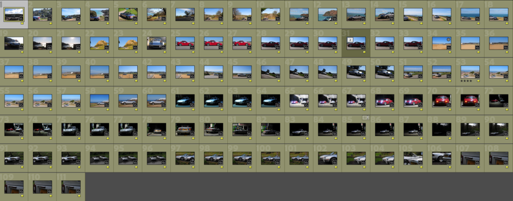

I wanted my images to resemble my artist references as much as possible, none of which used monochrome photos. It was because of this that I chose not to use any of the filters or layers that Lightroom has to offer. Instead I imported my photos into Photoshop and edited them to extreme detail one-by-one. Here are some of the changes that I made to test my skills:
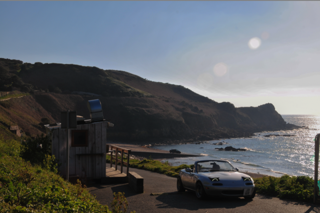

Between these two, the differences are moderate. I wanted all of my images to look smoother and feel tidy. To achieve this I removed the fence on the right and the car on the slipway. Other minimal changes were just removing the sun glare and patching up spots where necessary.

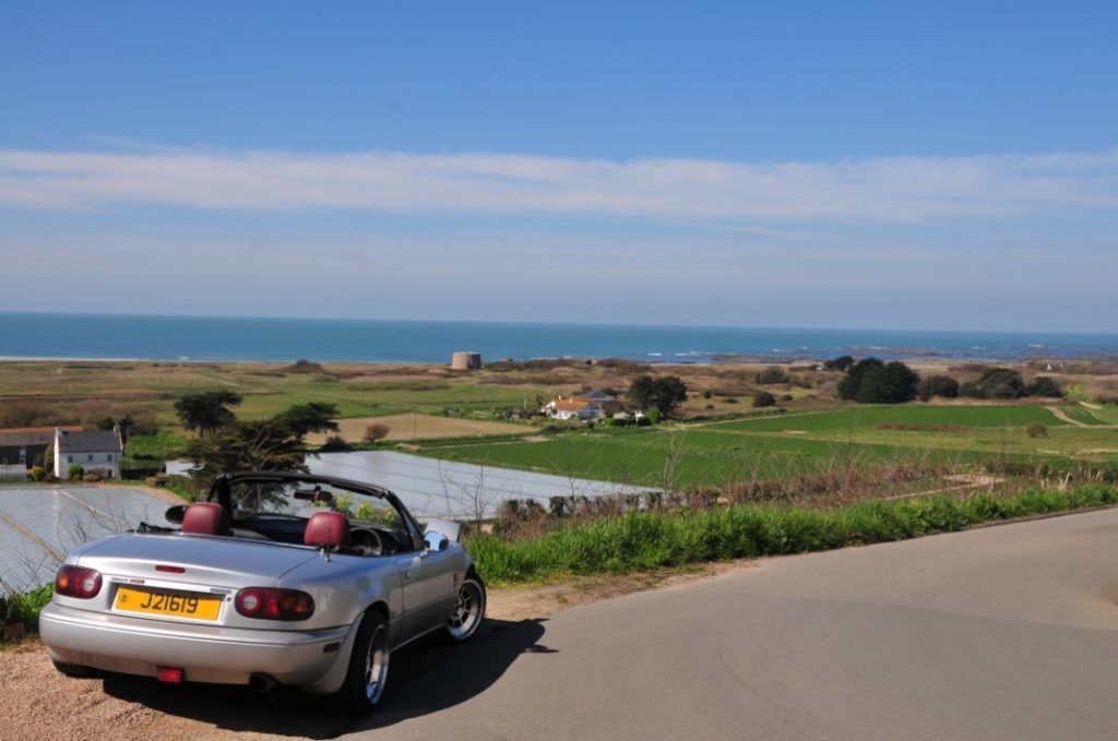
The same goes here. Changes were subtle and kept to a minimum. I only removed a bale trailer from one of the fields and patched up the shadows. Other minimal changes included touching up patches in the fields and very small objects in the background (e.g. spire on the tower and people on the beach).


Some of my images required a bit more thinking. I find it hard to believe that these are the same image, just three hours apart from one-another. I was initially was put off by the glare from the light as it was going to be very tricky to remove, but I stuck with it and was given this result. I removed all lights reflecting off of the car’s paintwork to give it a matte finish, as well as re-coloured the number plate to make it stand out. I am very happy with this final result, as it is exactly what I was aiming to produce. This was not only due to what my artist references had produced, but personal interest too. I believe that this is my single favourite image from the project
This was my first time using the Artsteps online software. It allows you to create your own Art/Photo Gallery for completely free. I didn’t spend ages perfecting each image on the wall, just exported 14 of my best images from Lightroom into the software, made them the same size and placed them on the walls around my gallery. This was the result:


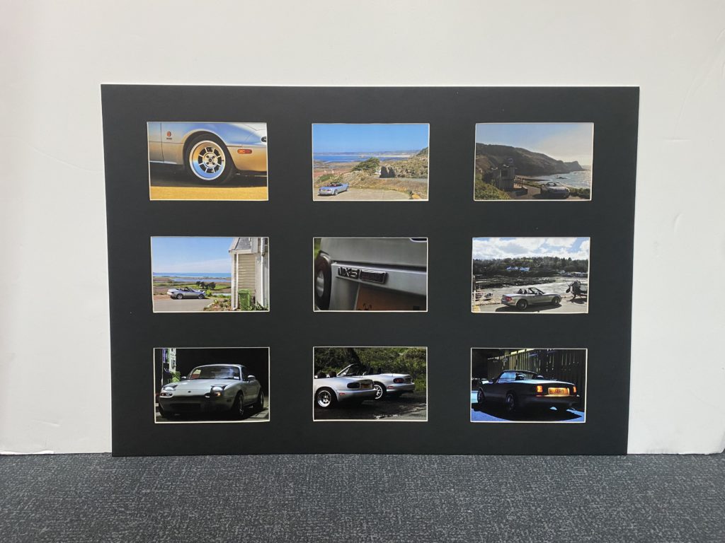
As previously stated, I wanted to place my images in window mounts for display. From previous experience, I have found the 3×3 A5 window mount display to look great and intend to make one with these images. I used an A1 size piece of black mount board, a pencil, a metal rule and a bevel cutter to produce my windows. This board is very nice to use as the bevels leave a small white border which makes the images stand out more. For my other display prints, I chose two of my favourite images to print out in A3 and mount individually using the same technique. I also printed out these same two images again on glossy paper which I intend to get framed and give to a friend as a thanks for letting me use his car for this project. Overall, all prints and mounts were successful and I am very pleased. Please ignore odd light patterns in these images, the prints look perfect in person.

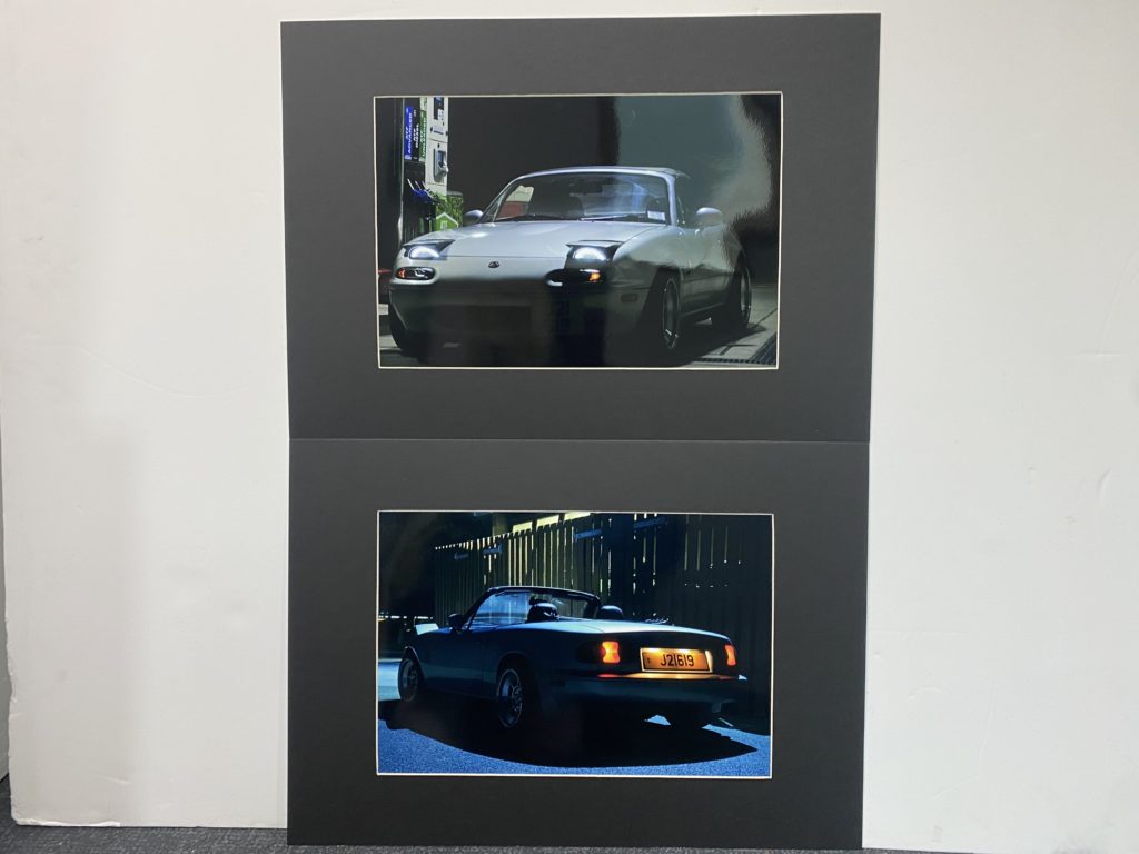
After completing my project, I feel I am able to write about how I feel it has gone. I only had 250 images to work with, which may not seem like much. This was more than enough however, as I was very careful with the composure of each angle and image, as I had used a tripod for every photo. My editing process was the main course of my exam, being the most time-consuming part. I was eager, but also cautious to try some new techniques with the tool selection available in Photoshop and feel that the results prove this. The prints were exactly as I wanted them and look great in the mounts I have placed them in. From the start of this ‘Simple and Complex’ project, I have felt that the subjects of car and landscape photography fall into both aspects well. Cars are such complex machines, yet allow a person to complete a simple task, whereas a landscape can seem simple, but is the result of millions of years of change and erosion.
Personally, I feel that one of my artist references was left out slightly; Kyler Zeleny. I feel this is because of how his style of photography isn’t specifically revolving around cars, his images just feature them as an object. I could have benefited differently by either considering his style more when conducting my shoots, or chosen somebody different entirely. Looking back, I would have just been more considerate when taking my photos.
TV Frame:
I began creating my tv frame by planning and exploring the different options I had to build them which included choosing materials and making a mock up to ensure the final frame would work with little to no faults.
I started by finding a plastic tub, paper roll, some sponges and wooden skewer and used them to create a base for my images [using paper to in place of my final prints]. Using all these materials, I was able to find a stable way to make my images spin. Next, I wanted to see if I could find a way to rewind my images which I discovered would be quite difficult without creating a second hole with another skewer. I tried to avoid this as I knew the front of the tv was going to be clear and I didn’t want to have a second skewer and have it be seen through the ‘screen’.
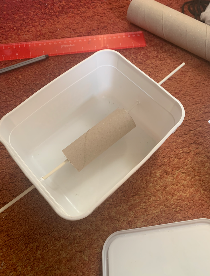


I then painted the mock-up using red spray paint and used some card to make the inside of the tub black, making it look more visually appealing before beginning to put my prints in the box.
I found that the 5 prints I wanted to use were too heavy for the wooden skewers to spin properly which led to me reducing the amount of images used to 2. Then, I encountered another issue where one of the images could spin completely fine whilst the other kept getting stuck. Due to all of this I decided to drop the idea of the tv frame and instead focus on mounting my prints in another more effective way.
Eye Frame:
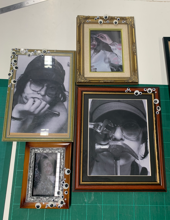
For the eye frames, I mostly needed to focus on getting various frame styles and different sized googly eyes. This set of frames was a lot simpler than the tv to create as it mostly relied on gluing the googly eyes and layering them effectively, needing a lot less experimentation and materials whilst still creating a unique and quirky outcome.

I decided on using different styles of frames in order to represent the differences between people and their experiences due to gender/gender roles, showing how nobody fits into the same box [or in this case frame].
When collecting the frames, I leaned towards older frames as I wanted to create a contrast between the worn edges and my images that portray the changing social standards for individuals regarding gender.
Once I had all my materials sorted I matched each of my images with a frame. This took some trial and error as some of the frames I collected didn’t work as well together as I had hoped leading to some more frame searching. Eventually, I managed to get my images framed to my liking which allowed me to start placing the googly eyes on each frame.

When placing the googly eyes on each frame, I made sure to start with the bigger eyes and then work my way down to the smallest sized eyes to fill in some empty spaces. I didn’t want the frames to be swallowed by the googly eyes which led to me placing each set of googly eyes on opposing sides of each frame so they were spread out form one another. I then organised my framed images and made sure that I was content with the layout before beginning to stick the eyes down with double sided tape, making the eyes easy to adjust.


