Artist Comparisons
Below I have showed how my work is similar to the work of the three artists that I have studied, this is to show that I have taken inspiration from them throughout my project, and during photoshoots considered the different kinds of shot they take. This is important as these artist guided my photography in this project and allowed for me to create more successful outcomes.
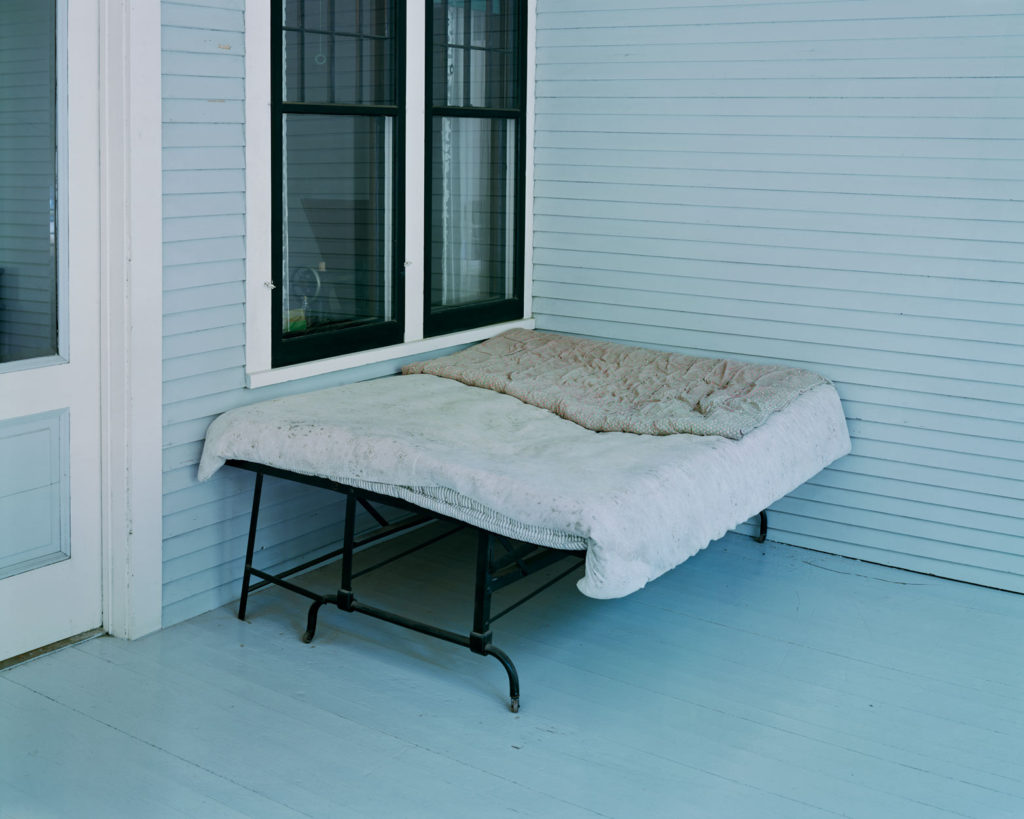

Firstly, I am using this image of my dad’s couch to compare to the work of Alec Soth, I think that if my photograph would of been more widely shot, then it would of been more similar to the photograph of the left of Soth’s. The images are similar as they both show areas of relaxation and have blue and grey tones throughout them. However, my image would of been a lot better if they lighting would of been consistent.


To replicate the work of Robert Adams, I have decided to take an images of houses that I took during my second photoshoot, and made them black and white, this meant that my work could be a closer reflection of his. The main differences throughout our work is that my images contain more contrast and taken closer up the the houses, whereas Adams’ is a lot further away and shows more background in comparison.


In my opinion, this comparison is the closest example of me taking inspiration from artists, as this image of my brother is very similar to the one from Matthew Finn’s ‘Uncle’ project. This is because how they are facing away from the camera and towards the right. This is my most successful artist comparison, and the original image has been featured into my photobook as it is one of the best photographs taken from my first photoshoot.
Printed Images and Framing Up
To finish off my project, I have below shown some of my final images, with small evaluations and then photographs of them after they have been mounted up and displayed. This is important as it demonstrates how much my project has developed and how from the photoshoots to the printing, my personal study has been successful.


I really like these two images together, the overall tones of the images are similar as there are warm, especially yellow, tones throughout both of the photographs. Also there is link within these images as both my dog and my brother love the beach and have spent a lot of time there with me as we all love to go in summer, the composition of image one is aesthetically pleasing as I have cropped the image so that my dog and brother are right in the middle. I also think that the lighting throughout this image is consistent, as I placed both of them next to a large in order to try and get the optimum lighting. The second photograph didn’t need much editing at all, this was because the natural tones of the beach and rocks was good already. I only changed the vibrancy of the image to make the rocks look less dull.


These images are among the most successful mounting that I have done for this personal study, this was because they linked perfectly together and could either be displayed on black or white. I thought that black would be the best option and it makes the background amongst the tree look brighter, and creates more contrast throughout this piece. Putting this photographs in monochromatic make them appear as if they were a lot higher quality, and helps to enhance the natural features of the tree, for example the vines along the main body of the tree. In my opinion, these are some of the best images from my project, but it could be criticised that they don’t like to my original project very well, and could be viewed as boring.


I have created this tryptic of my dog because I was not sure about what to do with my images, this is because they were not all of the same, meaning that they would not of been good for a uniform layout. This actually turned out in my favour as it allowed me to create this piece above, which I think looks really good with my photographs as the background is subtle and all of the images compliment each other well.


As this image didn’t link up with any of my another work very well, I thought that it would be best if it was mounted up by itself. Additionally, as this image appeared higher quality in colour, I thought it would be a good idea for it to have a white background, as I hoped this brightness would emphasise the saturation within the photograph. Furthermore, having this image of white foam board means that in the future if I think it would look better in black, or without the white boarder that it has at the moment, I can easily change the image to make the background black instead. I would like to be one of the prints that is displayed and is a good reflection of how this personal study has developed.


I would consider this my least successful example of mounting up my photographs, this is because when placing this image onto foamboard, I realise that my cutting lines were not clean, so when I put the image onto black, this inconsistency only became apparent. However, I do think that the darker background matches nicely with my brother black jumper.
Link to ‘Simple or Complex’
How successful was your final outcomes? Overall, I thought my final outcomes were of good quality, however I wish that I have more raw images to work with in the beginning of the project so that I could of done more experimenting with editing and layouts (diptych and tryptic). My final outcomes were not what I was expecting when I began this project, however, this was a good thing as this whole personal study allowed me to experiment with a type of photography I have never focused on willingly before; portraits. This was good for my creative outlook and it helped me consider how lighting techniques and features such as aperture are so important when it comes to taking a high quality portrait.
Did you realise your intentions? After doing my two photoshoots and looking through them in Lightroom, I realised that it would better, for the sake of linking to my images, that I focus on the relationship me and my brother have, rather than focusing on the relationship I have with either of my parents. My intention was to focus on the separation of my parents through both portraiture and landscape imagery, however, the concept of me focusing on me and my brother’s relationship is one that was a look more intriguing to me.
Is there anything you would do differently/ change etc? I would consider the theme of ‘Simple or Complex’ more physically and literally, rather then metaphorically. I would have photographed locations and objects that appear to be simple but are in fact very complex, this would of helped me play to my strengths throughout this project, instead of exploring something new. However, I do think that its important that I took a risk.