Aims for my photobook: I wanted to create my most successful book yet, using Lightroom I created a softcover, small square photobook layout, using premium lustre paper. This was because I wanted the pages to be of a smooth texture and high quality imagery. I decided the shape of this photobook should be square as a lot of my images are landscape and some are not of the highest quality so I thought a smaller book would be a smarter decision as it will less apparent that the images may be fuzzy in some areas. Furthermore, the most important part of this book is communication the idea that these are not just randomly selected images, they are placed in this order to attempt to tell a story.
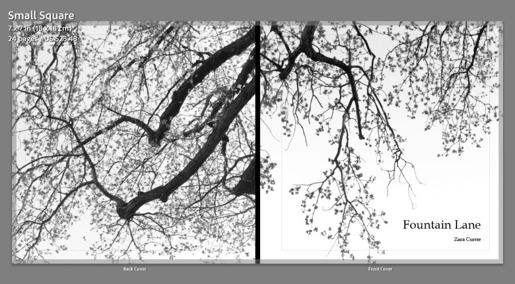
Above is my front and back cover, I thought that having these are monochromatic images and having my book filled with life and colour would be interesting for the reader, and they would be intrigued by this feature. I really like these images appear as if the tree branches are linked together despite being different images.
I have selected this as my title as this is the name of the main road that connect from my mums to my dads house, and this is where me and my brother spend a lot of our childhood as we used to walk from my mum’s house in St Helier to my dad’s house near Green Island in St Clement (Photoshoot 2). ‘Fountain Lane’ contains memories from my childhood as we used to spend lot of time feeding a house and finding chickens in this area. I like how this title is a physical and mental reflection of memories, and this title was my best outcome as it links to my brother life too, and this book is a reflection of how our relationship has grown in the last year.
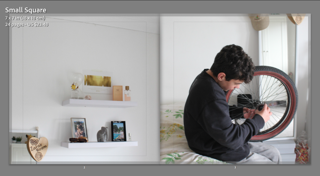
This image on the right was taken by accident, however, I think that it ended up being a really successful and natural images. Additionally, it links in well with the photograph of my bedroom on the left, as it’s taken in the same location, so the background and lighting is the same throughout both images. I think these pages are some of my most successful and this is simply because they link with each other so well, they lack contrast, however I wanted to start out will warmer toned and more subtle images as these are located at the beginning of my photobook.
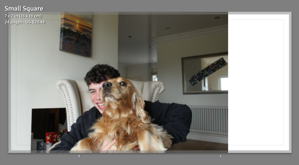
For this slide above to be successful, I have to leave the white space on the right, meaning that my dogs eye is not in the middle of the page, and when my book is printed you will be able to see his eye rather then it being lost in the middle of the page. I really like the atmosphere behind this picture, as my brother looks very happy and my looks scary which adds quite a funny affect. For this photoshoot (Photoshoot 1) I decided that the most successful photographs would be taken in my house, as this is a familiar and happy environment to take images in.
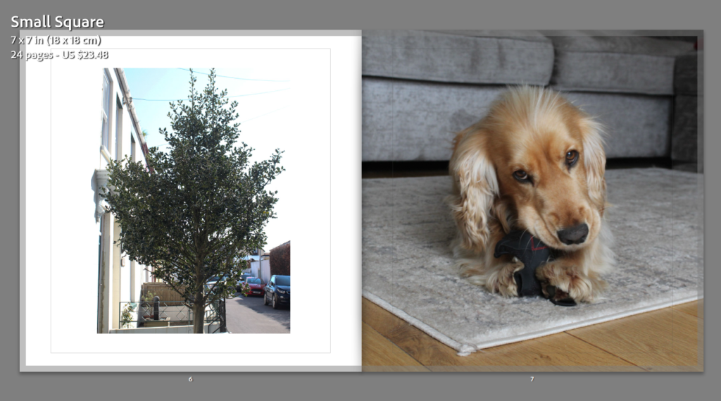
The thought process behind this spread was linking the path to my dads house to a significant figure that is within my mums house, and thought my dog was the best type of figure for this idea as he is a big part of our lives and loves doing on walks down Fountain Lane, giving another link to the name of my photobook. Throughout my book, all of the portrait images with a white background are all placed into the book with the same template in Lightroom, meaning that all these portraits images appear the same size when doing through my book, this is so that all of my book appear cohesive.
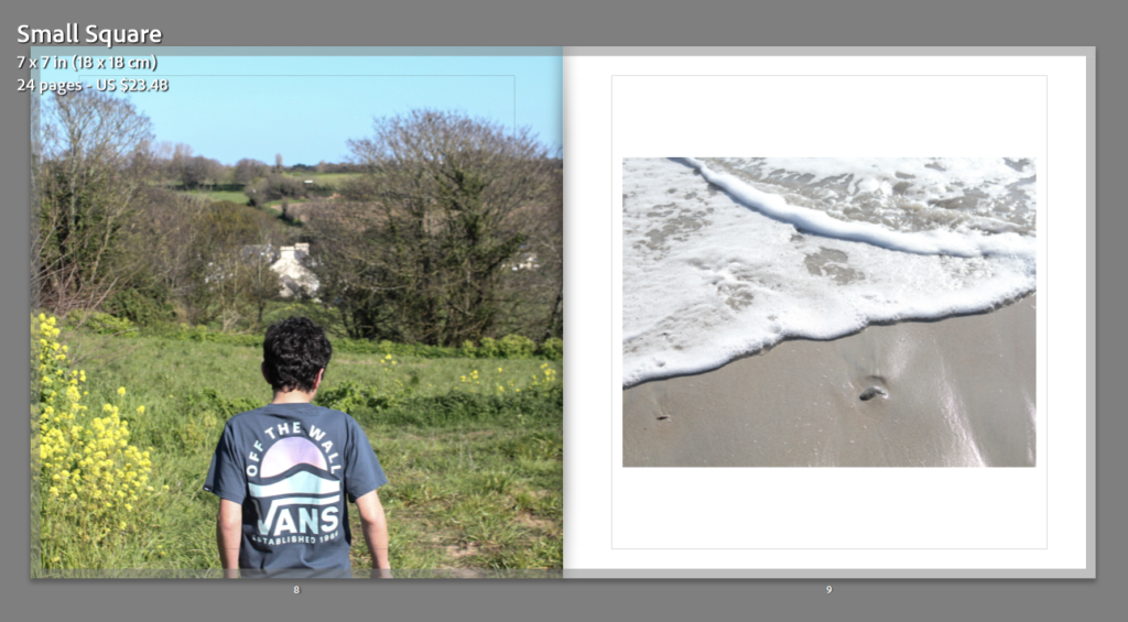
This images meaning placed together was in an attempt to show that my brother was walking to the beach, which is next to my dads house and a huge symbol of our childhood, as we spend all of our summers with our dad at the beach. I think this is successful as the first image is filled with one focal point and a lot of texture throughout the background, whilst the second image has a lack of texture and not really one focal point, this was in an attempt to create subtle contrast throughout the pages.
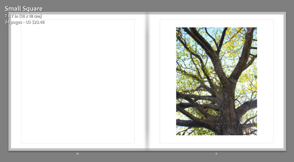
This image of the tree was one of my final images from my second photoshoot, this meant that I wanted it to be recognised more in my photobook as it is one of my higher quality images. To contradict the intricacy of the tree body, branches and leaves, I have placed a blank page next to it, this is so this image receives more attention as it is one of my most successful prints.
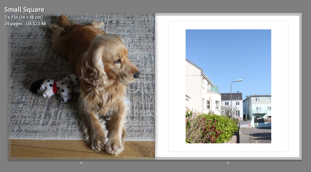
There is some red present in my dogs toy, and also within the brushes throughout the image on the right. the blue sky also contrasts with the orange like tone in my dogs fur. Additionally, the image of my dog is very dull and the image of the road is filled with lots more colour and vibrancy, meaning that these pages link well together. Also, I think its aesthetically pleasing that my dog is looking to the right, and this next image is on the right, meaning that I am attempting to give some direction to the flow of my photobook.
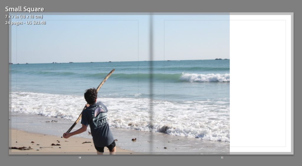
In my opinion, this double page spread is the most successful from my photobook, this is because this was originally quite a large image, so when placed into a landscape format, only some sky was lost, this means that I could make my brother the focal point of this double page, with his body not being exactly in the middle only means when the book is printed, he will not be folded and will still be visible when looking through the book.
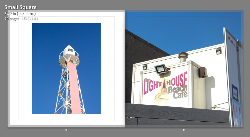
For the pages above, I thought that the natural blue sky background would link them together well, after some experimentation with the image on the left, I thought it would be more successful if it was kept in a portrait format, as the original photograph was portrait too, also I really like how the quality of these two images is high.
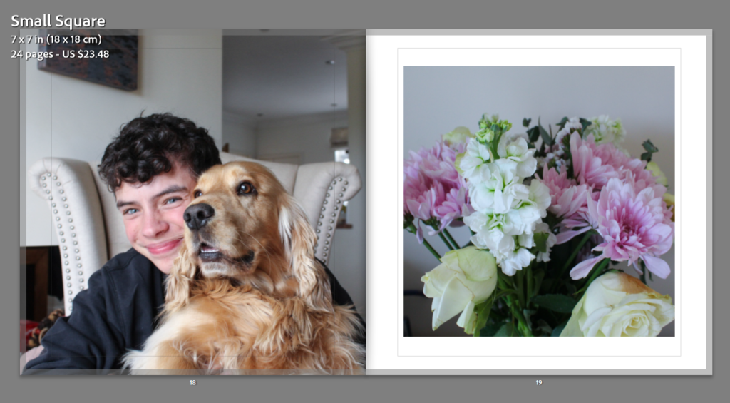
The flowers which are placed on the right hand side page, and ones that are placed inside, where the next pink and white flowers which are below are always outside, this is create a contradiction between inside and outside nature and how different they can appear, also both of these photographs were taken inside me house, and the next ones below are on the way to my dad’s house, creating the story.
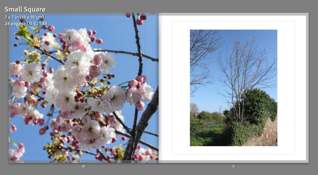
My most successful image from my second photoshoot is the one of the flowers above, this is why I have bled this image to the outside of the page, as I believe that it should have the biggest space as it did not look good as a double page spread as the image was too zoomed in and appeared more pixelated then in its normal format.
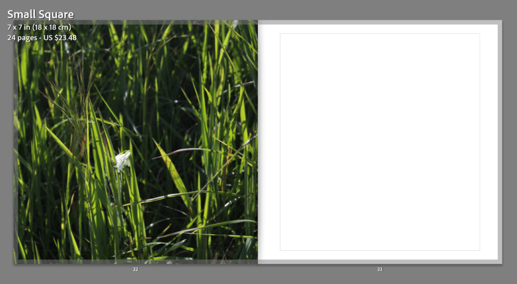
Analysis of my photobook: I thought that my photobook was very successful, compared to my previous photobook, it took me a lot less time and was of higher quality at the end. In my opinion, I told the storyline somewhat well, as my book could of been a lot better if I had another photoshoot, or simply more original images to work from, as my photoshoots were taken during the evening, the light was continuously changing, and this meant the lighting and quality of some of images was unsuccessful, limiting the amount of raw images I could of used throughout my photobook, Alternatively, creating a smaller photobook was a lot more effective for me and it meant that I had more time to do editing. The overall layout of my photobook is good in my opinion, and creating this was the best option for me as I could showcase my best images in an effective way.
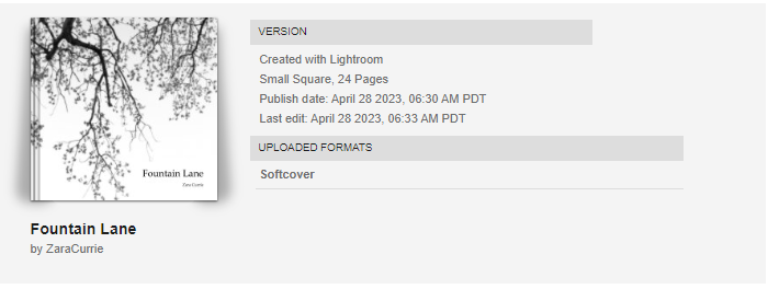
The last step was to send my book to Blurb after creating it in Lightroom, after paying for the book their is an option to buy a PDF version, I didn’t end up paying for this. There was another feature which involved getting a preview of my book which allowed me to see my photobook in its digital form. This shows a version of the book where you can flick throughout all of the pages.