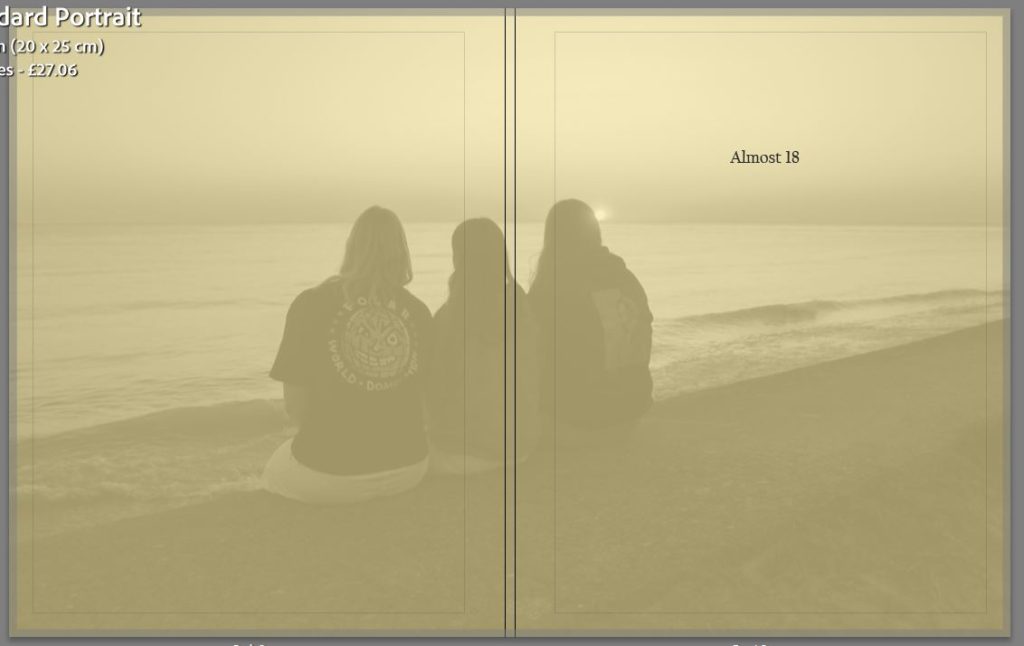
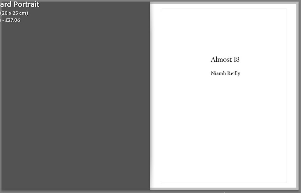
This is my front and back cover as well as my opening page into my photobook, originally I wanted a plain yellow cover for my book but as I was experimenting I overlaid an image and decreased the opacity creating what I have now. I think that this is a nice way to give a snippet of what the photobook is about but not to much where the viewer doesn’t want to look inside. I had chosen yellow as it is the colour for friendship which is one of the key themes in this photobook, I also have an opening where is states the title of the book as well as my name.
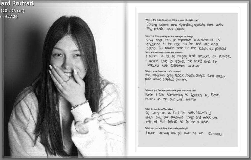
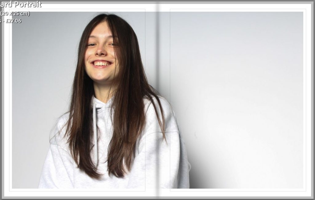
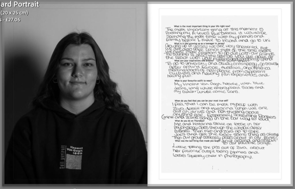
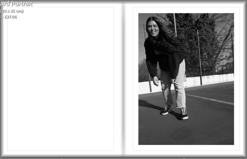
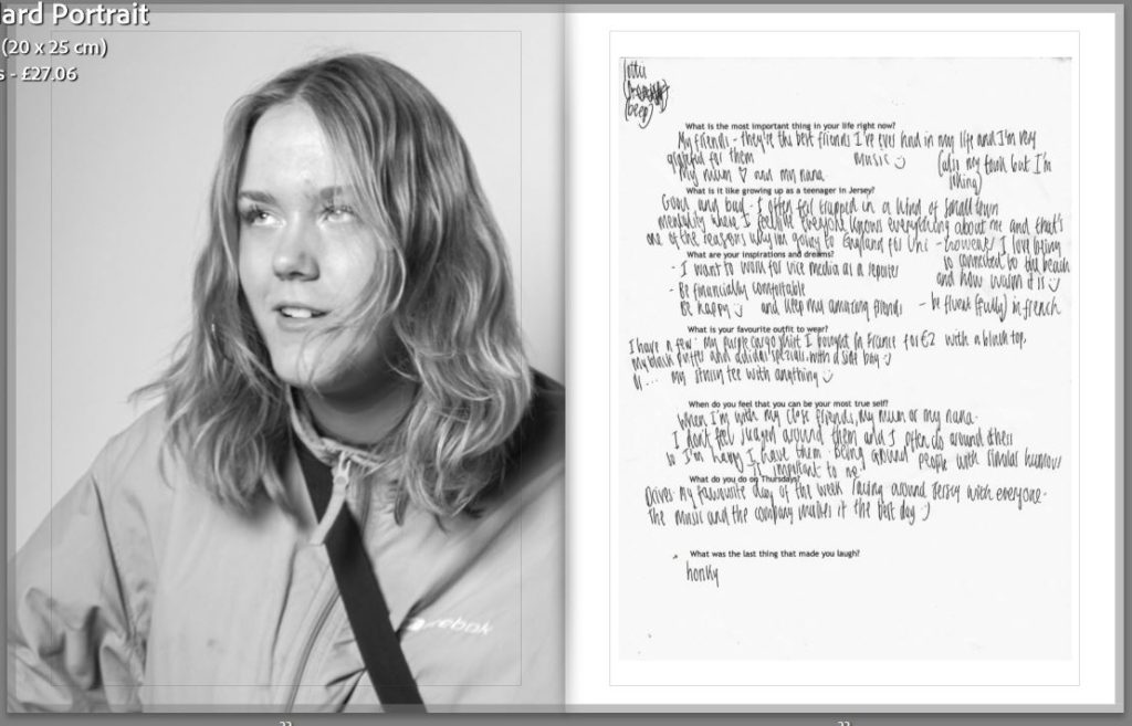
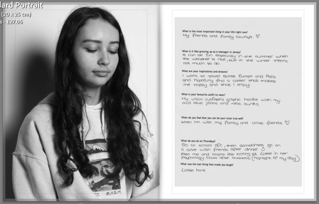
This is my proper first and second page in my photobook, I started off with a black and white portrait and the questionnaire for my first subject. I will be starting all the sections like this so that it will be easier to differentiate between each person. For my second page I have done a similar portrait but in colour and at a different angle, I wanted this over two pages but not to the edges so that it would be able to have a white boarder around the photograph.
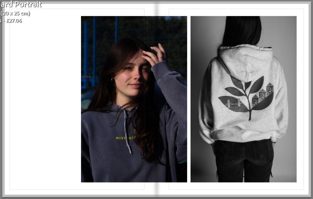
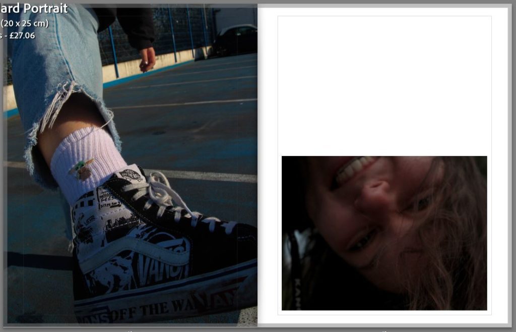
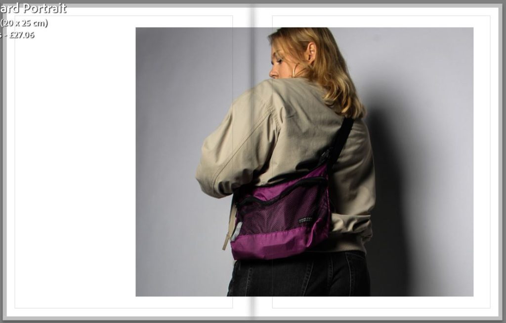
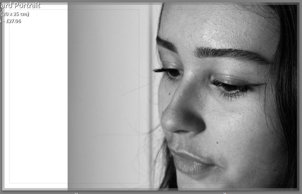
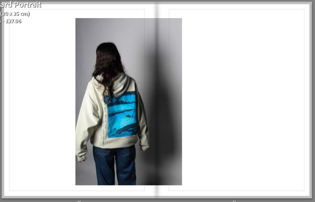
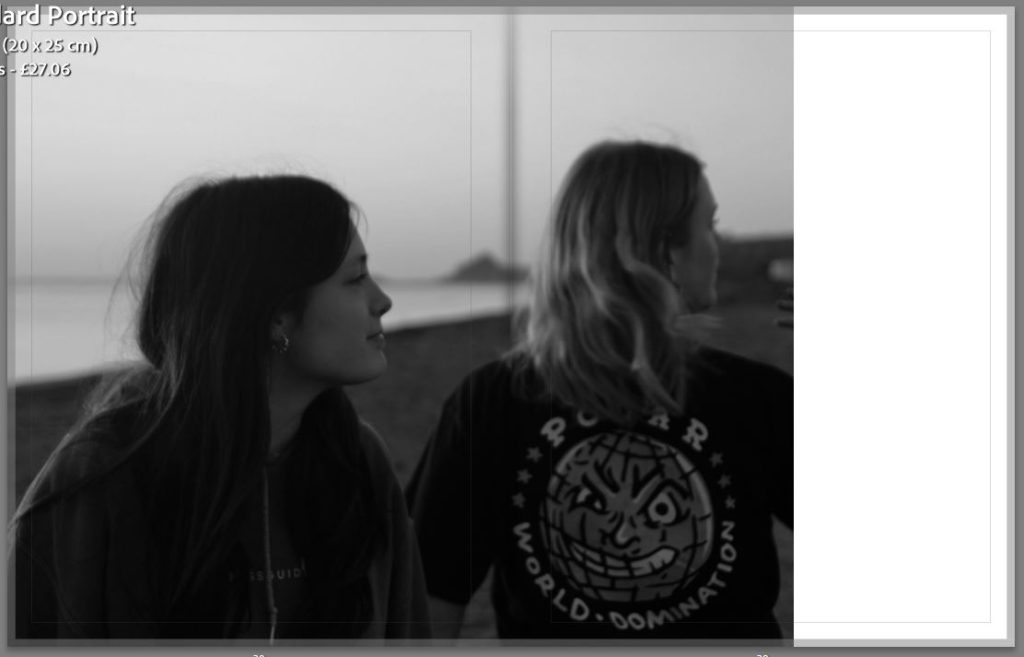
For my third and fourth I am still focusing on the same subject and trying to show different parts of her clothing and different styles of portraits. I wanted to do a front portrait and a backshot on the same page to show different perspectives. I also wanted to break apart the images by leaving a black page to make it look less cluttered. The fourth page has one of my most successful images as I was able to experiment with aperture and having the foreground in focus as well as the background out of focus.
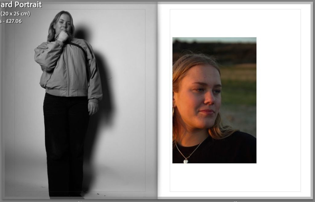
I have also chosen to experiment with different layouts, such as my fifth page where I have a landscape image which is under a portrait image. I like the contrast between the black and the white and the enhanced sunset with the rich and vibrant colours.
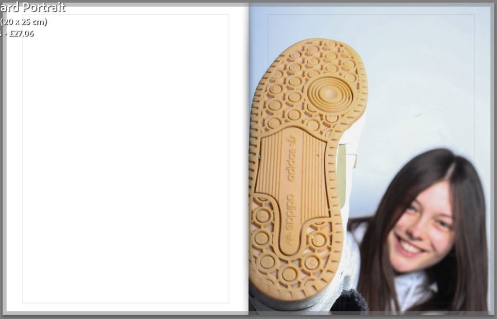
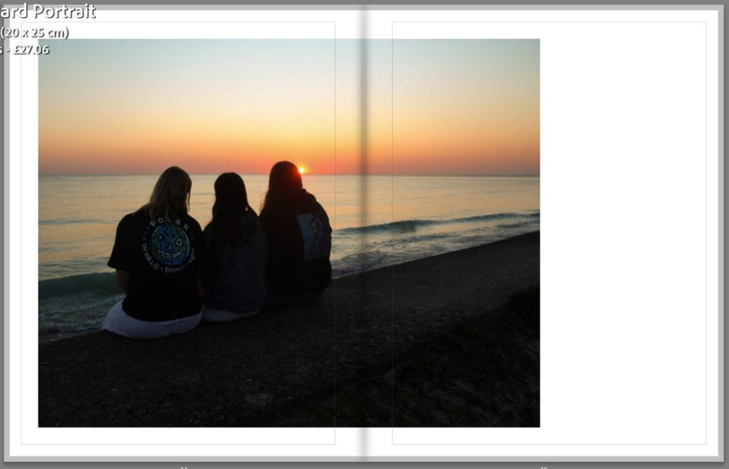
For this page I did a full page spread of one of my best photographs which I have situated next to a landscape image that is covering the bottom side of the back, I like that it has a white boarder around it as it is already quite a dark image. On the following page I have used a landscape image but I have put it slightly off centre which I like as it is something different compared to a straight and centred image like I already have in my book.
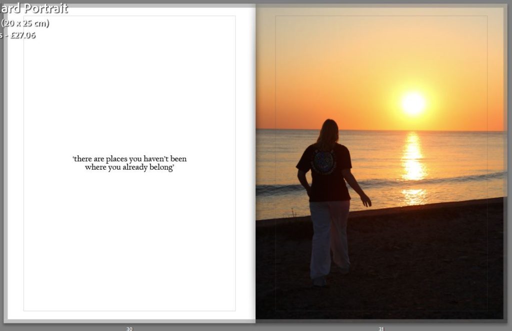
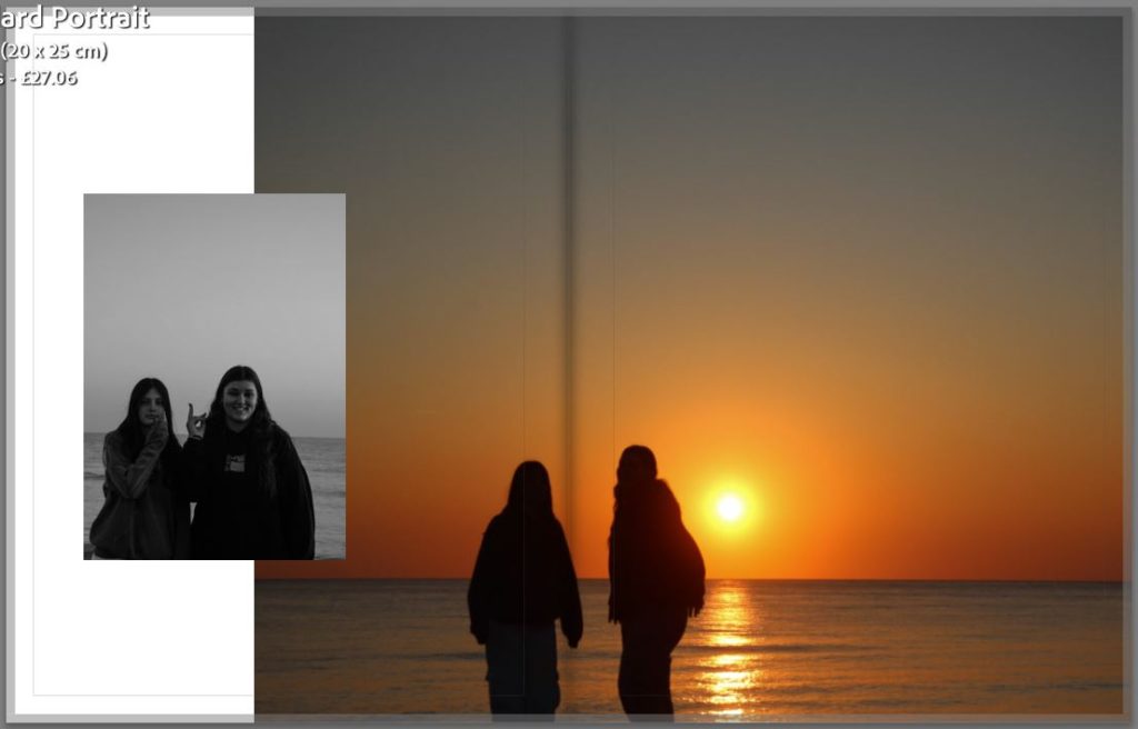
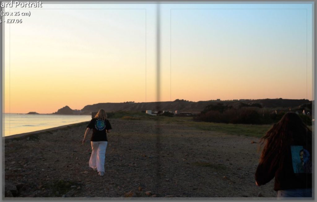
For this page I have also add a quote by the subject which she has chosen, I like how the text is able to break up the photographs so that it is a smooth viewing. I have put this next to another one of my most successful images of the subject walking towards the sunset, this was inspired by one of my photographers Kayla Varley, which is by having the subject silhouetted against a strong set of colours.
How successful was your final outcomes?
I think that my final outcomes were very successful as well as a photobook which has a strong narrative and cohesive set of images. Out of my four photoshoots I believe that the compilation of images that I have come out with tell my story clearly and have a unique style to them. I defiantly have images which are stronger then others but they all have been edited where they can be put together and taken apart and still look professional and look aesthetic.
Did you realise your intentions?
At the start i struggled with linking my images with the simple or complex theme, but as I have gone on I feel that I have produced a set of images where their is a clear link. As I have explained before my main aspect in on friendship and being teenagers and both of those things are complex in themselves but I have tried to show them in a simple way through a photobook.
Is there anything you would do differently/ change etc?
I would make sure that I have more studio work as I found that I like having a neutral background as they are easier to pair together, they also tend to look good in both black and white and colour. Even though I think all my photoshoots were successful and produce great final images.