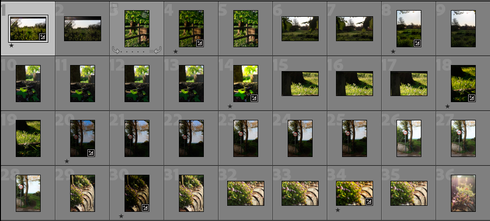
Mood board and mind map
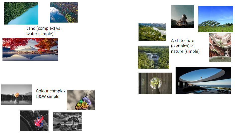
This shows some of my early ideas for simple and complex. where at first I was thinking of splitting the image using natural edges in the landscapes between jerseys coastline and the open seas surrounding it as this is a big part of my life as i have grown up in and around the ocean. secondly explored the relationships between architecture and how man made structures can sit in the environment. I was also looking at how these structures apposed/blended with the surrounding natural environments. i then looked at the two main ideas i had so far and compared the images to see he similarities and differences between my ideas. i found that both sets of images both used a lot of colour and this is what i liked about both sets of images. so then looked into the relationship colour can have in an image. i then thought how to juxtapose the complex colours with something else. after researching more i found these images that inspired me to think about the use of highlighting a subject in an image using colour then contrasting it to the rest of a black and white image. I especially liked the image of the butterfly as this accentuated the beauty of the colours that have been created in a natural environment. the black and white image does not include colour however i chose to look at this image because i thought of how i could recreate the image of a interesting naturally grown tree. however in my image i would manipulate the image to bring out the natural colours of the dark brown tree and the vivid green in the leaves and contrast it against a black back ground.
Statement of intent
In this project I would like to explore how Psychogeography which refers to how individuals emotions can change when viewing a single geographical scene. I am going to do this by taking photos of my surrounding area to capture how nature has been effected by the built environment. I will show this through complex nature thriving under simple and poor man made obstructions.
I have been intrigued by the idea of ‘Flaneur’ which is a French word that describes a person that leisurely observe society. I like this idea of sitting back and watching the world go by.
Artist reference
Henry Wessel Jr
Henry was alive from July 28, 1942 to September 20, 2018. he was an active photographer for four decades. he spent his time documenting Californian light, vernacular architecture and the social landscape. ” He began to photograph seriously in 1967, inspired by the work of Wright Morris, Robert Frank, and Garry Winogrand” . his images are most know for “Exploring the territory where nature and culture meet”.
whilst conducting more research on this photographer I found a quote used to describe him “turning the least monumental of subjects into a kind of personal poetry” I believe this quote to be very inspirational and describes how finding the perfect light, angle, positioning can turn even the dullest of sights into captivating images.
https://www.sfmoma.org/artist/Henry_Wessel/
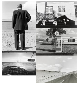
Here is a mood board I created using some of his images I will use this images to provide inspiration to my work. from these images it shows how he uses high contrast black and white images. His use of shadows and glare shown in some of these images to break up the image, this give the eye more to look at. I also like his use of leading lines as shown in the top left and bottom right images. he uses this to draw the viewers eye into the image, because of his high contrast images this effect work very well as it can stand out a lot more from the rest of the image.
From this mood board I will take this inspiration out with me on my shoots. I will experiment with trying to capturing leading lines and playing with glare/ shadows in a real world environment.
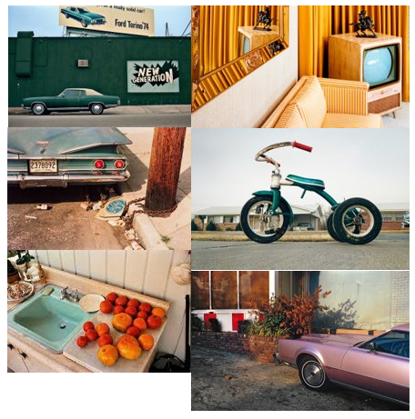
William Eggleston
William was a American photographer born in Memphis Tennessee in 1939 July 27 he is currently 83. He started his work in the early 60s he was most known for his “colour photographs to describe the cultural transformations in Tennessee and the rural South” I have looked at his work because I like how he uses colour in his work to give prominence. I chose to look at both these artist together because they are very similar as they both photograph “straightforward depictions of everyday objects and scenes” however they do this in two different ways.
https://www.theartstory.org/artist/eggleston-william/
https://www.britannica.com/biography/William-Eggleston#:~:text=William%20Eggleston%2C%20in%20full%20William,precise%20composition%2C%20and%20evocative%20allure.
Photoshoot action plan
I will go out early on sunny day to capture as close as possible to the sunlight that Henry Wessel captures in his work. I will also try to follow and explore how different colours sit in the environment.
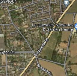
I will explore this area of natural environments and built up environment featuring vernacular architecture from jersey heritage. this screen shot of google maps shows where i will explore these roads. I will be a flaneur in this environment trying to observe and capture striking scenery in the mundane of Jerseys built environment. I hope to achieve these striking depictions by observing the sharp sunlight that jersey gets in the morning. will will especially be trying to find how how this light effects the natural and unnatural colours in this environment.
Photo shoot
For this photo shoot I went out in the early hours of the morning on a clear day I did this to get as close to possible to the Californian light that Henry Wessel Jr spent a lot of time capturing.
I went out explore interaction between nature and man made surroundings. I went around my local area to challenge myself to create interesting images from scenery I have spent a lot of time looking in and around through out my life growing up in the area.
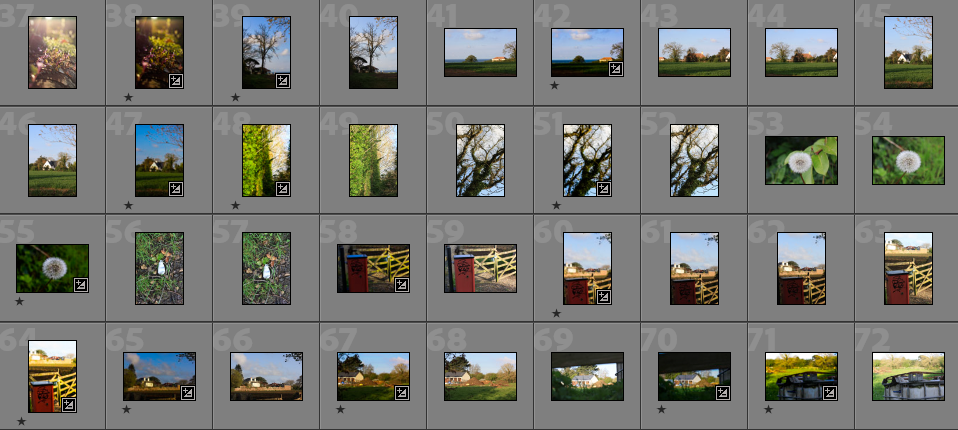
These images show I explored a lot of different angels and perspectives like Williams Eggleston’s work. spent along time observing shadows and glare created by the low angled sun path. the sun hitting the surrounding grass / leaves fascinated me because it created such vivid and lively greens. I also took inspiration from Henry Wessel and spent some time exploring the glare from a parked car.
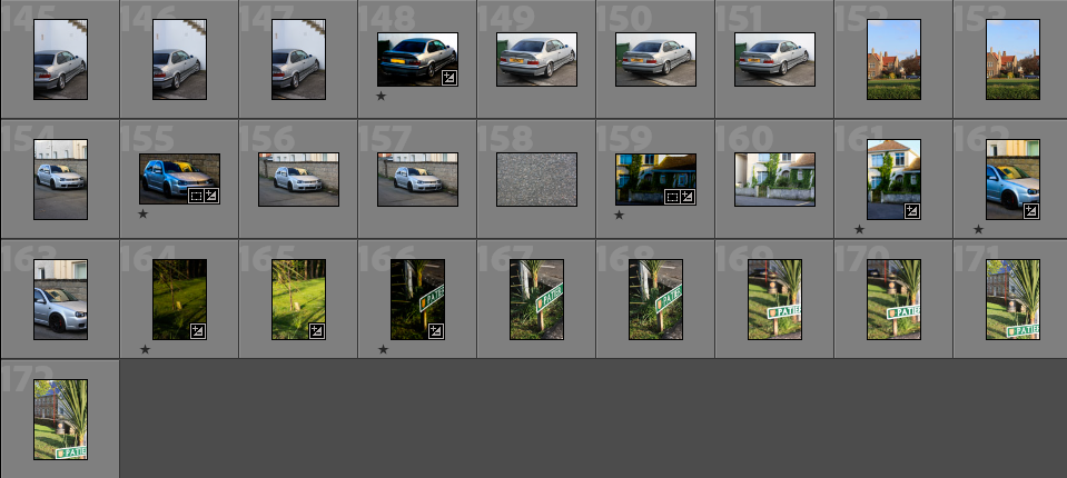
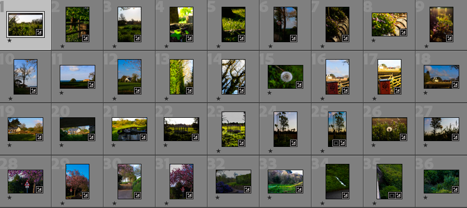
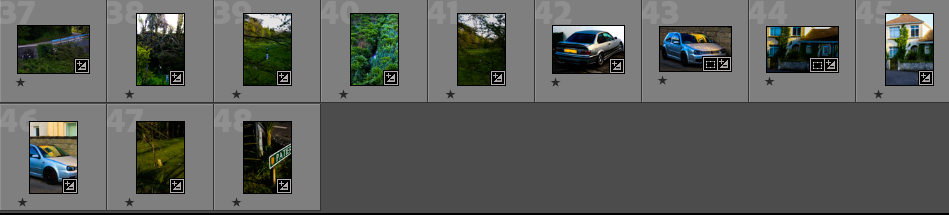
From these images I used the star system to refine them into photos that I liked. I ended up with 48 potential photos out 172 images that I took on this shoot.
These show that I have rated all these images 1 star I will continue to go through refine these images to find the best ones using this star rating system. these are the images where I have used different perspectives, glare/shadow, leading lines and colours in my images to increase the distinctness of my images.
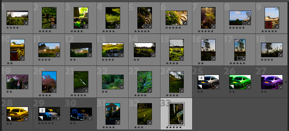
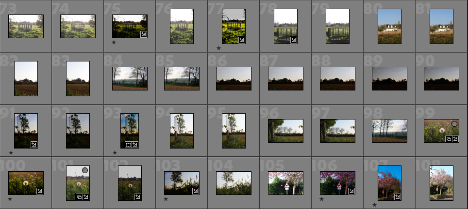
These where the images I selected at 2 star
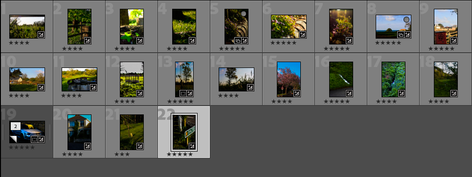
3 star
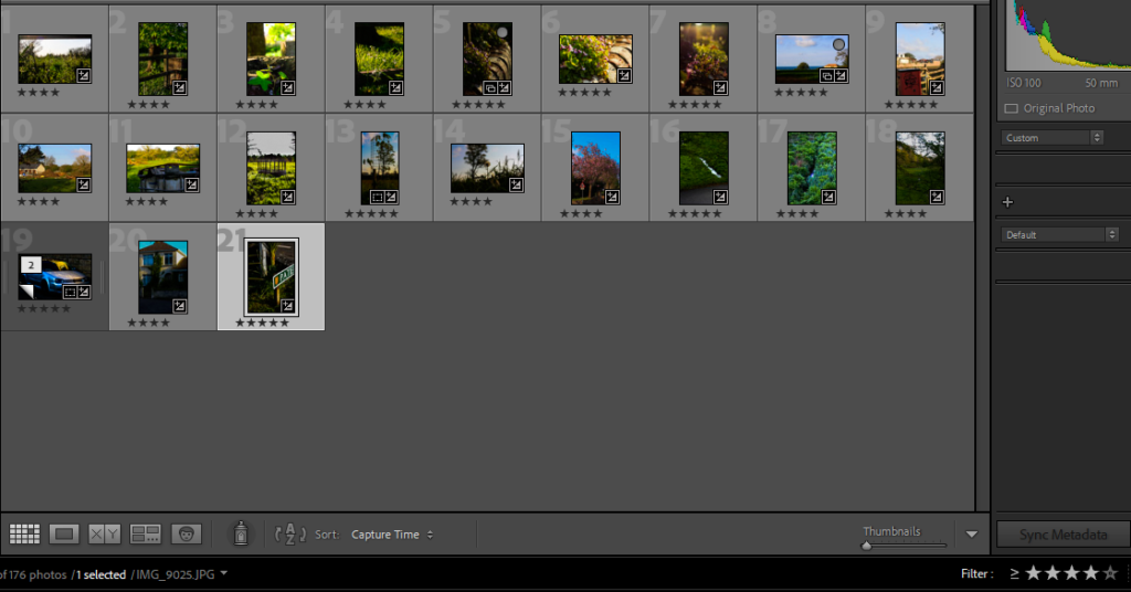
4 star- I believe these to be my successful images from my shoot.
Editing
after i sorted to find the shots that i could then develop further to see how i could increase the eye appeal of my images.
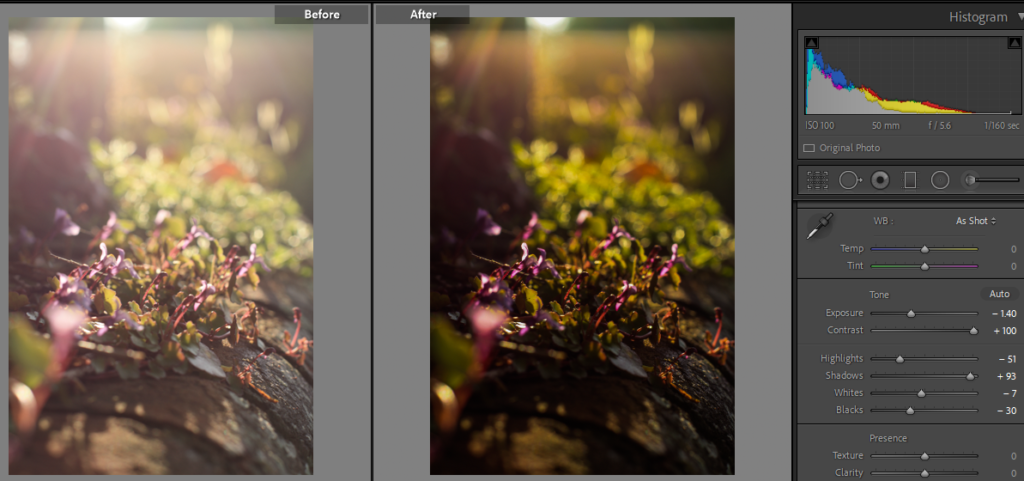
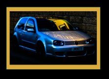
I was first attracted to this plant growing out the wall because of its pink petals, this gave me the idea to create this image around the colour like William Eggleston. I then began to think about how I would frame the image I decide I would like to place the pink petals in the mid ground of the image. then I thought about the perspective, I went in close around the same level as the wall. at this point I noticed the glare down the lens which I chose to include and keep in the image because I was influenced by Henry Wessel. this helps to create an order to the image the bottom is dark then the eye is brought up to the colourful plant then the glare draws the eye in even further. I edited this to decrease the glare slightly so that the subject of the image was more visible. I did this by reducing the exposure of the image which resulted in a darker more dramatic image.
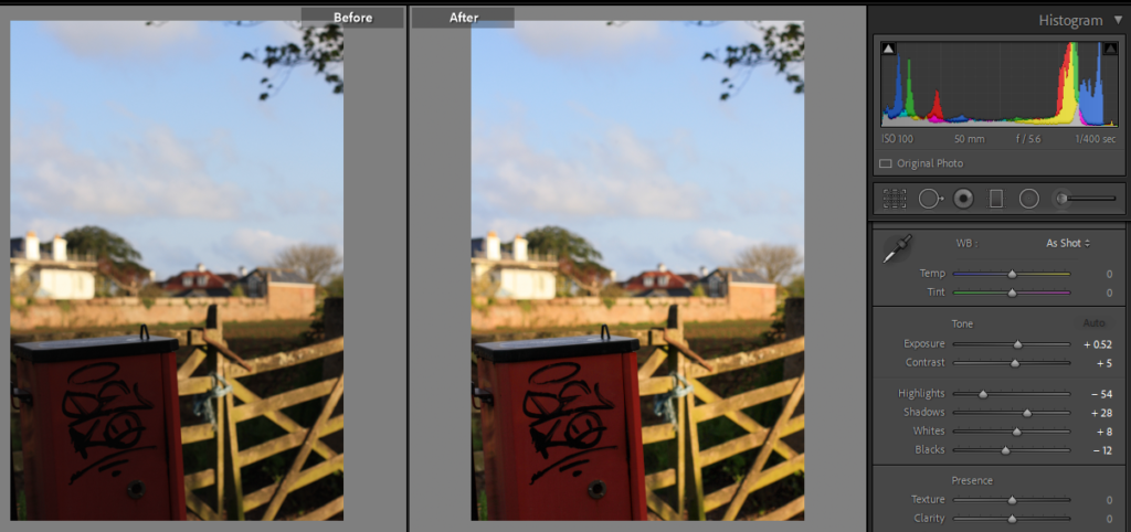
I took this image because I liked the graffiti on the side of this bright red bin. when going through my images I decided to take this image further and edit it because of how the clear brightly coloured bin juxtaposes the unfocused houses in the distant back ground. I believe this image shows how humans have interacted with the environment because it shows a large patch of the natural environment that has been disturbed by humans and now left with out any natural vegetation waiting. even further in the background there is a depiction of scaffolding on a old jersey building made from granite. this relates to Henry Wessel work because he photographed his local vernacular architecture. I increased the whites to emphasise the bright sun beaming Into the fence in the mid ground of the image. this also juxtapose the the bin which is blocked by the the shadow of the surrounding trees. I also increased the vibrance and the saturation of the image slightly to brighten up the bin. in the foreground of the image.
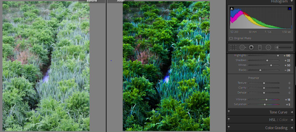
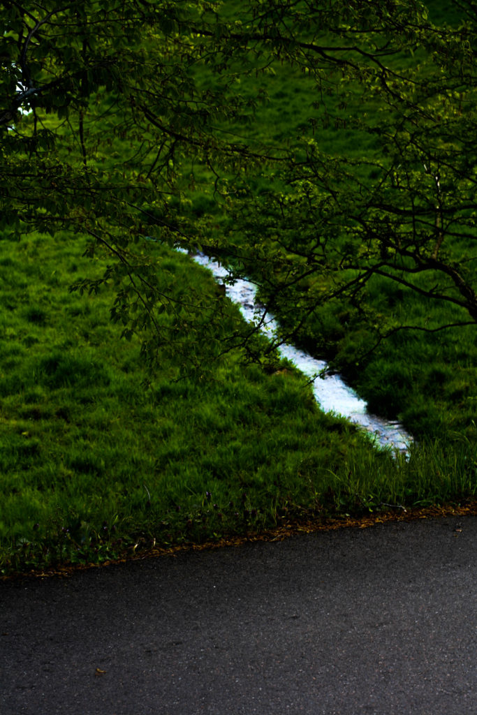
This image shows the a place in my local area less disturbed my human kind. I was first drawn to this image by the stream that creates a line that divides the image in two. I also liked the varieties of bright shades of green in this image. After I decreased the exposure and increased the contrast it created different textures in the image represented by different species of wild plant growing in this place. to me this texture creates a flatter image with more of a deadpan aesthetic which relates to Henry Wessel. like some of his, this image also uses a leading line which breaks up the texture as shown by the glare on the water. I used this glare to create attract they eye because it was in the centre of the image. To make it more appealing I used the adjustment brush tool to create oval around this glare on the surface of the stream, I then increased the exposure of this area to increase the glare slightly with out over exposing the rest of the image. I like how the this image turned out because it almost looks like something shiny and new is hiding underneath a thick layer of over grown nature. this represents me trying to find the “personal poetry” in the “least monumental of subjects”. This links to Henry Wessel Jr as this quote was used to describe his work.
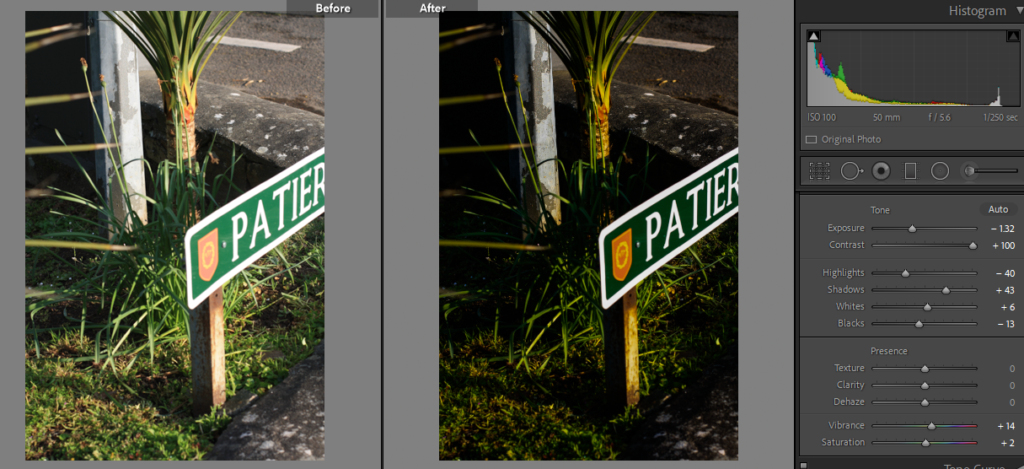
I took this image of a sign, at this point in the shoot I was experimenting with different perspective this image was taken to the side and above the sign. I like this image it is made up from different subject however not one of them is shown in its entirety. there is a lot of straight leading lines however this is disrupted by more hectic lines created by the leaves of the plant in the centre of the image and the leaves creeping in from the left of the frame. I used inspiration from both my artist references for this image I used Henry Hessel to inspire me to try and capture leading lines. William Eggleston who I have also drawn inspiration from his images that use more perspectives to emphasise the subject of the image. when editing this image I was more inspired by Henry Wessels high contrasting images so I reduced the exposure slightly and increased the shadows to make it darker then I increased the contrast a lot. this left an interesting effect created by the warm sunlight hitting the orange rust on the leg of the sign.
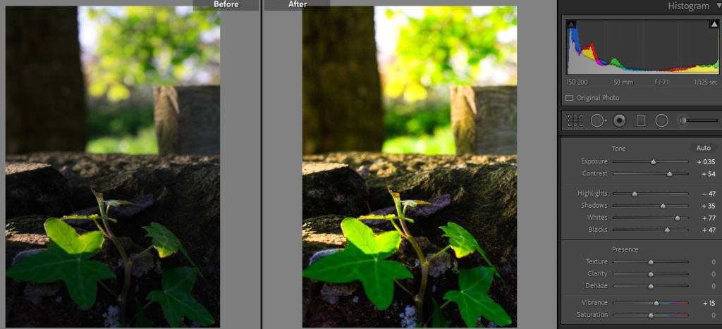
I seen this leaf that looked as if it was stretching into the sun as if it only just woke up. I thought this would be a very interesting close up shot with the trees in the back ground out of focus. I edited this image to create much more vibrant greens in the image as an experiment from Williams work where he uses colour to showcase the main subject of his images. I liked the contrast this created between the lively coloured plant against its harsh granite environment.
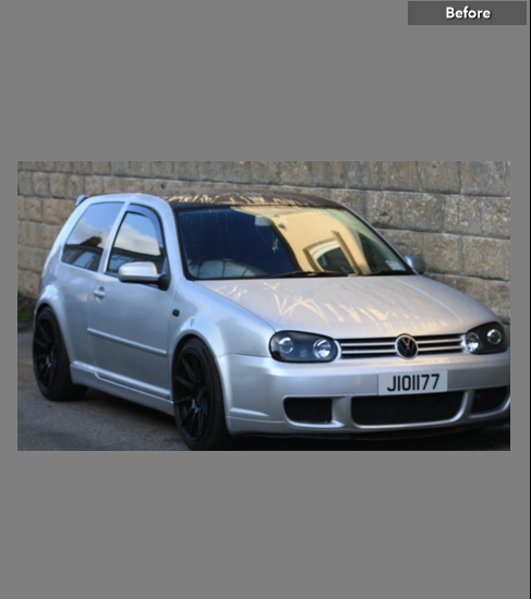
this is one of the images I have taken I took this image because of the juxtaposing light coloured house reflecting of the cold silver car parked in a shaded alley . I used ISO of 100 to increase the brightness of the image to make it clearer.
From the images I have rated to find the best. I chose this one to edit. I started by increasing the contrast and the vibrance of the image I liked how this accentuated the manufactured curves of the body work of the car. by increasing the vibrance this created a clearer reflection of a neighbouring yellow house. the reflection is so clear because I chose to go out in the early hours of the morning so that I could capture this sharp low angled sunlight. I like how the warm colour this added because it juxtaposes the rest of the image, mainly featuring cold undertones. I also like the lines that have been created on the bonnet of the car from the rain dripping off. this provides contrasting textures to the image between the reflecting lines and the matt texture created by the water droplets. the front of the image has leading lines that draw the eyes upwards to the colourful reflection that continues to draw the eye into the image.
Experimentation
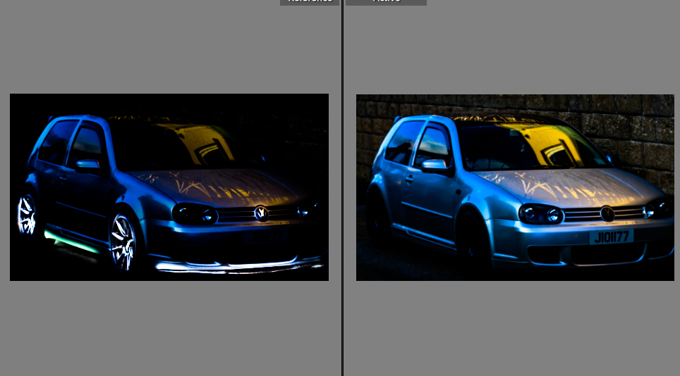

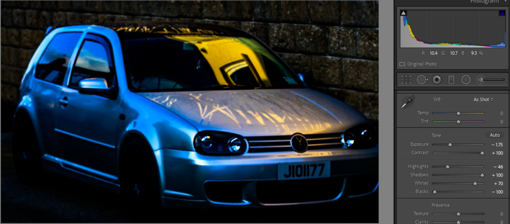
I then used the adjustment brush to increase the increase the exposure and contrast a lot then on certain parts of the image that I thought would better emphasize the shape of the vehicle that photographed on my shoot. I then decreased the exposure and highlights in the image to make the rims and the underneath of the car stand out much more than the rest of the image. this resulted in a very dark image with only reflections of the surface of the car body visible and the glow i added using the adjustment brush in Lightroom.
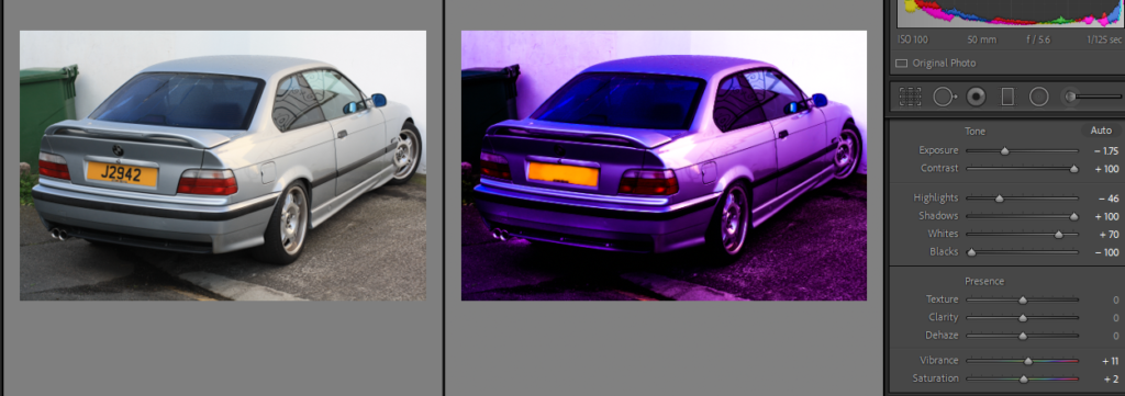
this is one of my less better images however i had the idea to add colour using Lightroom to create a more striking image. after seeing this I then thought of Andy Warhol’s coloured depictions of multiple grids of a repeating image as he also used a lot of colour in his work.
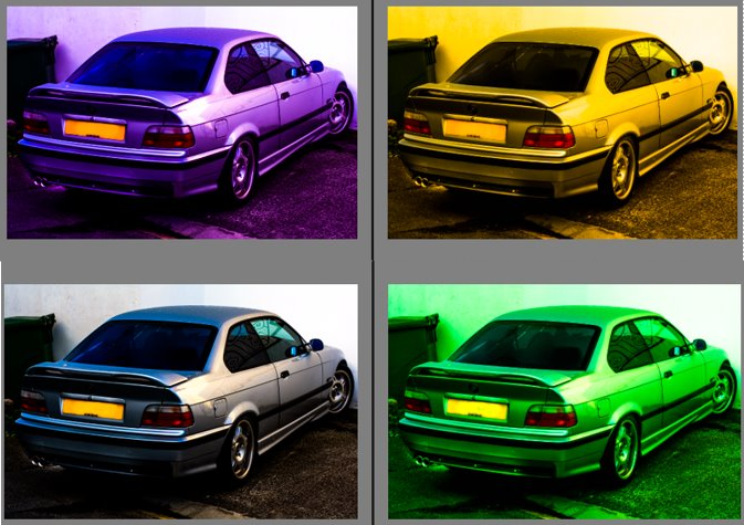
I created multiple virtual copies increased/ decreased the temp and tint in these image to create 3 coloured images that appose the silver original. I thought this could also be an interesting way to display my final images to show colour.
Final selection
After going through every star rating to refine all my images I have ended with 9 images that will become my final prints. I am going to print three images in a3, a4, a5 I aim to create 2 sets of 3 images mounted together
Mock display of images
I added a colour border around this image that matches the reflection in the window. this was an experiment and I am not sure if I like it or not.
I liked this mock up however I feel the black background does not contrast the images enough.
I re mocked up these three images in a different way with white borders to create more contrast in the image. these borders make the images stand out from the back ground making them more eye-catching.
Final outcomes
this image represents how humans have obstructed the natural environment. as shown by the reflective organic reflective line running through the image is then abruptly cut of by the straight edge of the dull man made concrete. I made use of a near by wall to get this above perspective of this scene. I liked the striking change in the image between the textured colour full grass and stream to the flat grey road. this shows simple and complex through the natural intricacies of nature vs the minimalist human designed road.
Virtual gallery
I used Artsteps.com to create a virtual gallery so that I could get a visual representation of what my work would look like professionally displayed in 3d place. I grouped my final images in two 3 image sets. I believe these sets work well together so I decided to keep them separate and spread them across the walls of the gallery.
Photo book research
Henry Wessel Jr has published a book called ‘House Pictures’. in this book he features a large series of high exposure deadpan images of houses. these pictures show how henry has turned the most mundane of views from a Californian neighbourhood in the 90s, into very striking images that entice the viewer to take another closer look at every house in the book.
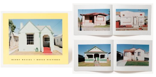
these particular pages I have shown here also show case Henry use of colour which was not shown in his previous work that I have looked at. these images follow a very repetitive pattern with uniform white borders this fits with his deadpan aesthetic as it is very formally and accurately presented.
Photo book
I decided to use some of my best images to create a photo book. I did this by using the book function on Lightroom classic. I used this because it was very easy to drag and drop my images from there collection into a book.
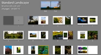
This shows the first order I decided to show case my images in this book. I decided to use a full page spread for the front and back cover because I thought one of my images would suit to be viewed in a 3rd dimension which would be created by the spine of the book. this first rough order of my images shows how I have thought about juxtaposing full bleeds to cropped images, I have also used a double page spread for one of my images I thought would best fit its own page. so that the viewer could fully appreciate it with out there eye being distracted by the next image.
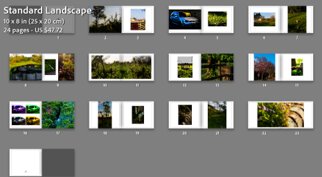
This was my second attempt at ordering these images this shows how I have thought about juxtaposing my images against each other on the page. I changed on of my images into another full page spread. I did this to create a link between the middle and end of the book.
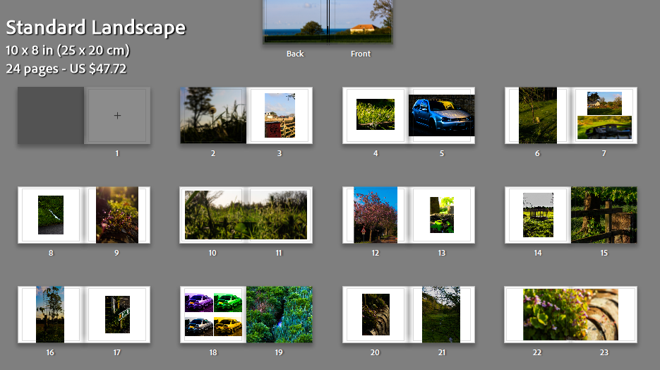
here shows my third and favourite attempt at organising these images to provide the best flow. here I have thought about repeating similar images I also thought page 9 should was a bit over crowded with image so I decided to move the diptych onto two separate pages and moved the other image to create a better diptych in page 7. I have kept a lot of white borders to contrast the image like Henry Wessel has done in his work ‘House Pictures’.
Compare and contrast artist reference
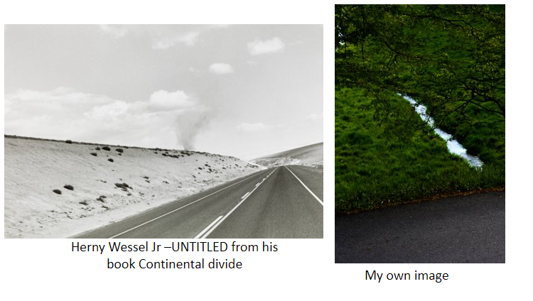
Here I have show cased Henry Wessels work against my own. I originally took inspiration from this image as I liked how the image was cut up by the road. so when is see this scenery in my local area I looked to try and find the best shot, I went for a different perspective to his him. my image is more influenced by William Eggleston and how his perspectives emphasise the subjects of his image. I chose to create a portrait shot instead of his landscape. this means less of my image is cut of by the dull concrete and my image subjects a stream that leads the eye up where as his landscape mainly focuses on the road which the eye leads along his frame instead.
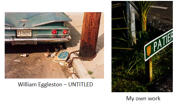
These images are similar because I have tried to recreate downward perspective, both these images feature leading lines. i took inspiration from this image because i would have never thought that there could be such striking depiction hiding at the side of a busy road in a built up environment. my own image is taken on a corner of a main road this links to the image by the lamp post however mine has a galvanized zinc coating because it is more modern this creates a shiny, reflective distinct surface. his image is much more light how ever i have edited mine to create a darker deeper image with more contrast.
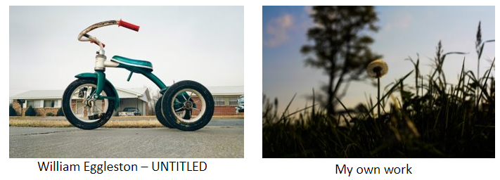
these two images show case very different environments however i was very influenced by how he used perspective to emphasise this man made tricycle. I used this effect to emphasise this dandelion over its surrounding environment. He has made the subject of his image dominate over the back ground. in my image I chose to juxtapose the frail dandelion against a large oak tree in the unfocused background.
EVALUATION
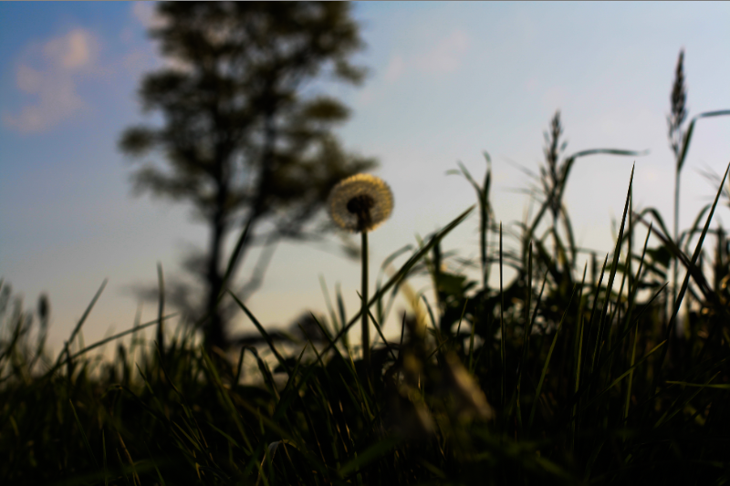
I believe this to be a successful image although not all the image is in focus i like the effect this has with the unfocused background. If I was to take this image again i would take multiple shots varying the focus every shot so i could have more choice of the best image. this image was inspired by Williams Egglestons use of perspectives in his work. I believe this to be a successful use of perspective to emphasise the subject of my work.
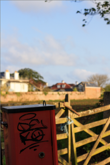
This is also one of my personal favourites from my final images. I especially like the use of vivid colour in this image that juxtapose the rest of the image. I like how I have focused this image to create the blurry foreground and background. If I were to do this again I would have tried to get a shot with both the bin and fence in focus as well. However I like how clear the graffiti is on the bin and i would not like to loose that from the image.