Selected Images

These are my selected images from my 4 photoshoots, to fit into my photobook. I don’t have that many, but I plan to make a simple and minimalistic layout different to my previous photobook in my coursework. As I spoke about in my statement of intent, I’m developing this photobook from my personal study, where I found my photobook to be too complex and ended up with way too many pages for my liking. Therefore, in my photobook design for this project, I’m thinking carefully about the images I include, with a few layouts only, to keep the design minimalistic – like many of my images. This will help me to keep a clear link between the reasons for my design choices and the images themselves.
Specification

I decided to use a standard portrait orientated photobook. I thought of using a layflat hardcover book as well, as I found in my previous project that the fold in the middle of each spread where the spine is ruined the composition of a few of my images. However, in this project my images are completely different, with no portraits and minimal compositions – I thought about using a layflat book for this project, but decided against it and went for a softcover portrait book. I am using a softcover book for these images as I have much less images than my previous project. I feel that using a hard cover for this book would have outshadowed the actual contents of the book and made the quantity of images look smaller also. Furthermore, I am creating a black and white only book. I think that keeping all of my chosen images in black and white was a successful choice – it enabled me to keep the formal elements of the images like light and shape the main focus of the images
Designing my book in Lightroom

After creating a new book within my ‘best images’ folder, I favourites a few simple layouts that I liked to be my principle templates for all of my images – this way I would keep the layout simple and make sure the book stays consistent visually when finally presented.


With a lot of my images, I used heavy cropping in m editing stage. Because of this, a lot of my images had changed size – I had difficulty fitting them into the templates I had picked. I ended up just zooming in /out to fit them in, seen in the imaves above.


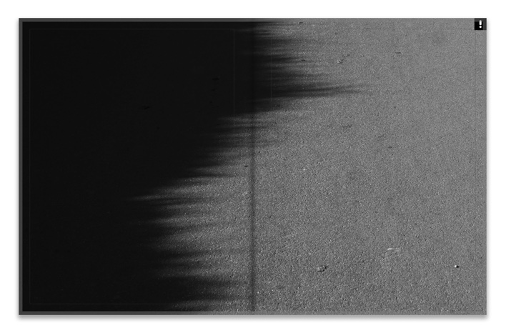
Again here I was experimenting with different spread types for this image. For this image in particular, I struggled with where to place it – It was a much darker, more graphic image than many of my others. I ended up keeping it as a single image spread, as seen on the right, at the start of my book.

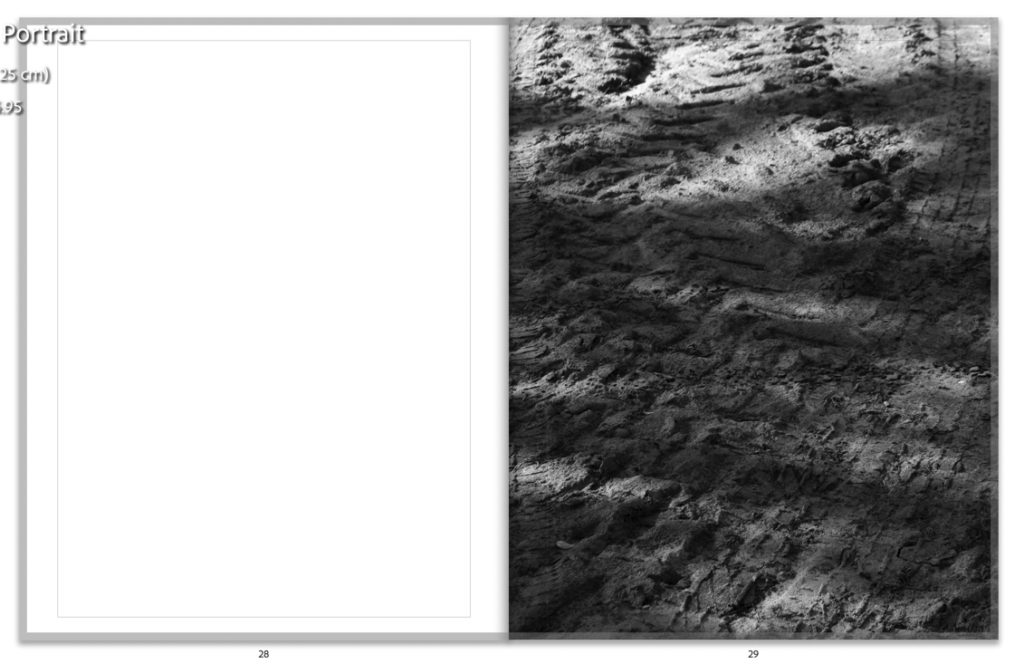
Originally I had placed these two on the same spread next to each other. However, after looking again at my plan and more closely at the minimalistic design I had wanted, I decided to separate the spread. Together, I felt they looked too busy and created a slightly chaotic spread together, which disrupted the rest of the book. I think that the white space helps with isolating each image and helps the viewer to appreciate each image solely, without distraction from the other.


Here I was experimenting with two different types of double page spreads for two of my images which I decided to use for double spreads. I was using a full bleed image on one side, and an image with a border on the right. I think that on the right the image needed a white border and it works well – the white of the border frames the white road marking the strikes across the centre of the image, coming from the top left. This layout kept the composition balanced, and made sure the focal point of the image was still the main focus.


Two different spreads put as full bleed single pages. I previously had these both together, after changing them and fitting them with other images in the book. I wanted to include this step of my experimentation, as it shows the successful outcomes of using different layouts.

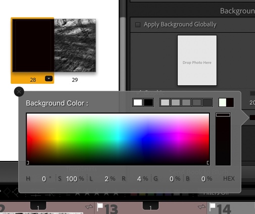
In this screenshot and the others below, I was experimenting with coloured pages in my book. This was informed by one of my artist studies, Siegfried Hansen, who uses coloured pages to make the colours in his own work in his book “Hold the Line”. However, he does this in colour, and my images are in black and white. I attempted to try this style with muted pastels below, but it didnt work with my style.


I then tried this again with black and grey, as these tones are most similar to the tones in my own work. I also chose to try this as I used the same style in my personal study photobook – however this worked better in that project because most of my images were in colour, so the coloured pages toned with the images well.

I ended up realising that this wasn’t working, after reviewing my artists’ work and what my intentions were, and changed all my blank pages back to white. Using the coloured pages took away depth from my images, and took away from the images’ quality, rather than complimenting them. Therefore, I didn’t use them.

An example of one of my spreads after I put them all bqck to white. I like this much better, and through this experiment I learnt that doing many different things in my work isn’t always best – hence why I stuck with the white.


https://members.societe-jersiaise.org/sdllj/vocab.txt – jerriase dictionary I used for inspiration.
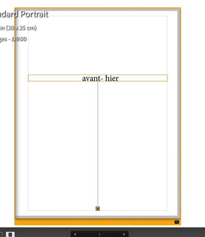
In the above screenshots, I was experimenting with different titles. At first, I brainstormed ideas on a piece of paper for name ideas. I thought of using house names, as my work was directly linked to places where I’d lived, and also Jerriais words. – I used a jerriais vocabulary dictionary from La Societe Jersiaise to help me come up with relevant words. In the end, this led me to think of french words instead – I have links to France in my family, and myself and my grandmother both speak the language. For that reason, I decided to use a french word – ‘Avant – hier’. It means ‘the day before yesterday’ (- I will analyse this fully in my final photobook post. )


Here was my final experiment – I was adding a title page fir my book, using the same font as the cover in order to keep consistency – however I had to obviously change the font to black due to white pages. I like the minimal, and simple look to this front cover.
(Final photobook uploaded and analysed in next blog post – final evaluation)