
I have chosen too create a tryptic for these 3 images as together, they create movement. I experimented on photoshop to make mock-ups too see whether the images look better on a black or a white mount. I have decided I am going to go with the black card simply because I feel the images look much more detailed, however on the white card, I feel certain aspects of the imaged became muted due to the clash of the white sheet in the photos as well as the light grey skin complexion. On the black card the white sheet contrasts the black background nicely and allows us to be able to see the finer details within the images such as: the shadows of her back.


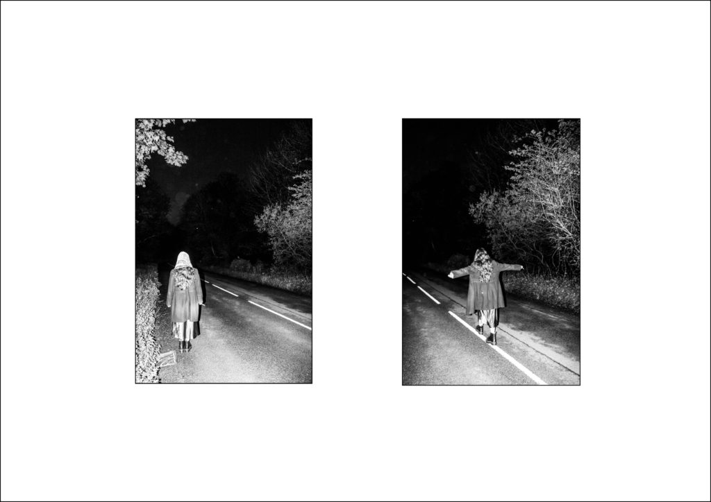
Like I did previously, I made mock ups of these images on both black and white window mounts. I have decided to chose the black mount because the images are of a deep and dark ominous road. I have chosen to do this on a window mount because it creates more physical depth for the images similar to how the images seem as if the road goes on forever, the window mount creates a sort of opening to the image transporting you into the road as if it was a portal.

I have decided to use these 2 images together to create the illusion of a deconstructed body. I have chosen a black background to contrast the heavily white/ light aspects of the images that could become muted on white backing.


