My second idea for a possible final presentation was to make a small zine to showcase my work using InDesign. However, i only chose a select few final images to work with and did not feel like adding more to lengthen the zine, so will probably choose to frame up my images instead and display them on a board. Nonetheless, I still wanted to experiment with a zine to show range within my work and generate possible future presentation ideas for other projects.
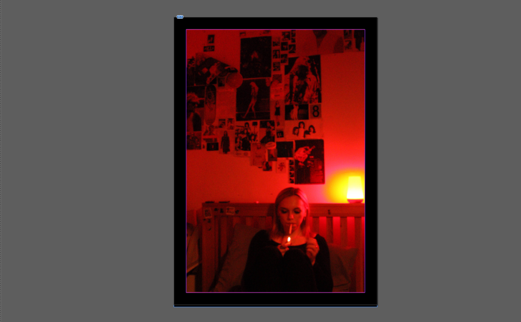
I chose this image as my front cover as it is one of two portrait images i took and I feel this one is the better of the two due to its bolder, more vibrant colours and figure placed in the middle to provide a primary viewpoint. I also made the background of all my pages black as I wanted to mute the background colour and have the focus solely on my images.
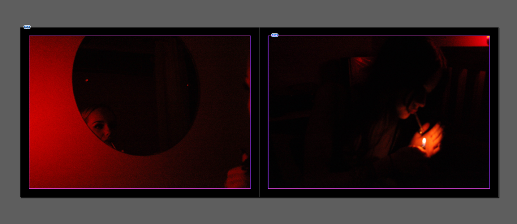
I made the next two pages landscape to better fit their format and placed the two darkest images from this shoot next to each other as their colours complimented each other well.
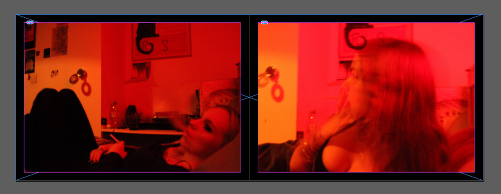
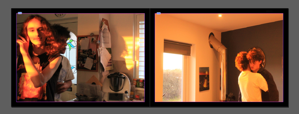
I didn’t want to mix my images from each photoshoot whilst producing the zine as I wanted to show the distinct difference between images taken with artificial vs. natural lighting. I placed these two next to each other as I think the first transitions nicely into the second as the lighting gradually grows lighter and more yellow-toned as the image progresses.
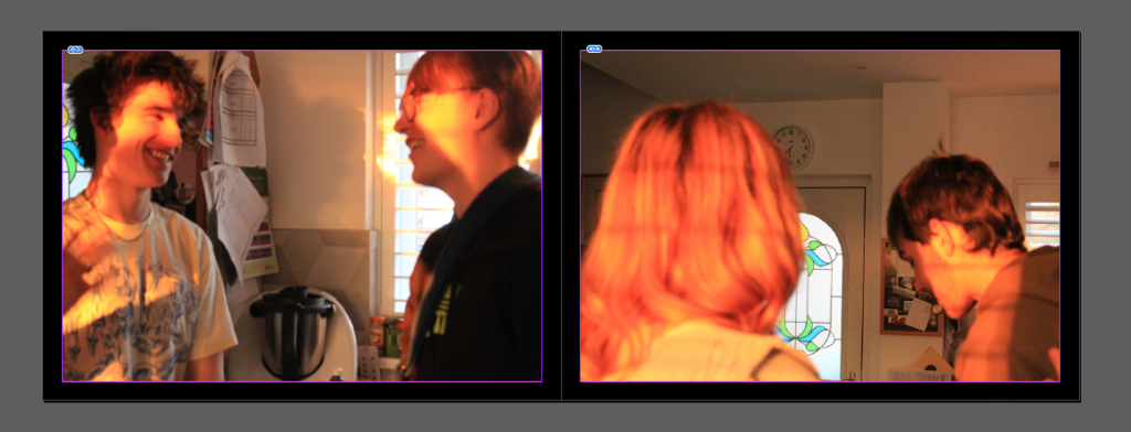
I chose to display these images together as I think they both have a unique perspective and the contrast between the figures in image 1 facing towards the camera vs. the figures in image 2 both turned away show a good contrast between the insider vs. outsider perspective I attempted to convey in my work.
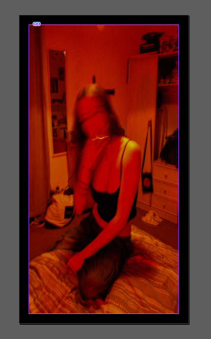
Like the first slide, I chose to present my final image in portrait mode, using a photo from my first shoot to match my front cover. Although I like the final presentation of my zine, I still think I would rather present my images up on a board instead as I feel it is a cleaner presentation and makes each photo more defined and more interesting to look at.