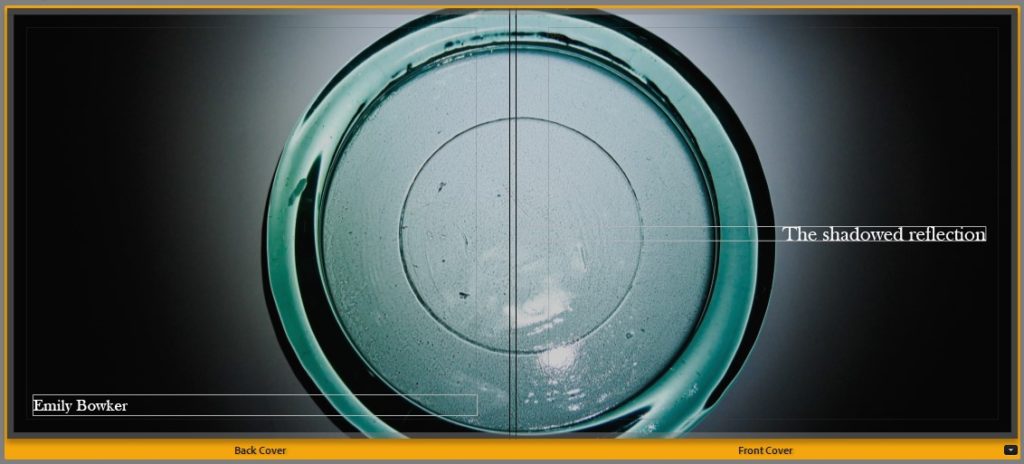


This is the final layout which I have chosen for my photobook, this process involved organising and sequencing my photos by hand which I then inputted in to Adobe Lightroom where i experimented with a range of different layouts for each page and my front/back covers. I am happy with how my photobook turned out because I like how it shows the simplicity of still life through the photobook layout consisting of just photographs with no text as you are able to see the different abstractions of shapes/shadows/reflections/colours/etc which was the main focus of my photoshoots – due to the inspiration of my previous case studies of Andre Kertesz, Paul Outerbrige and Jaroslav Rossler – and this was created through the editing of my photographs afterwards as there is a continued flow of circular and square shapes throughout the book along with different colours such as browns/oranges/reds/pinks/purples and the use of the black and white filter which can be found in many photos taken by my artist references as well. I also think that my title for my book is very unusual as it is ‘The shadowed reflection’ this initiates a lot of mystery in to what the photobook may consist of as shadows don’t typically have reflections and the use of the word ‘shadowed’ indicates that it may be hiding something about the photos, as this is what a shadow typically does. I think that my photobook also represents my photobook references which I used for inspiration well which were the Vagus magazine and ‘Breakfast’ my Niall McDiarmid as they both showed the simplicity of images which had elements of reflections and shadows throughout as well as the incorporation of different colours and how vibrant they may be.