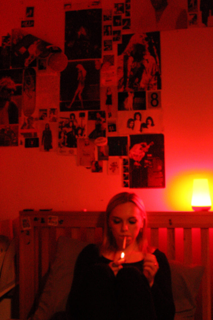
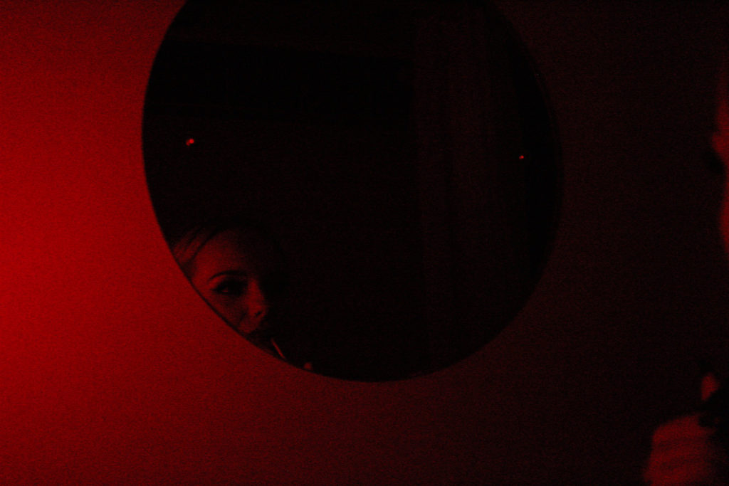
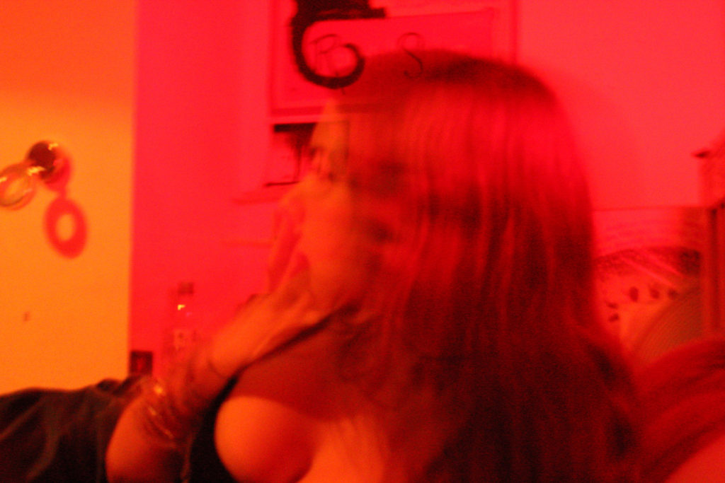
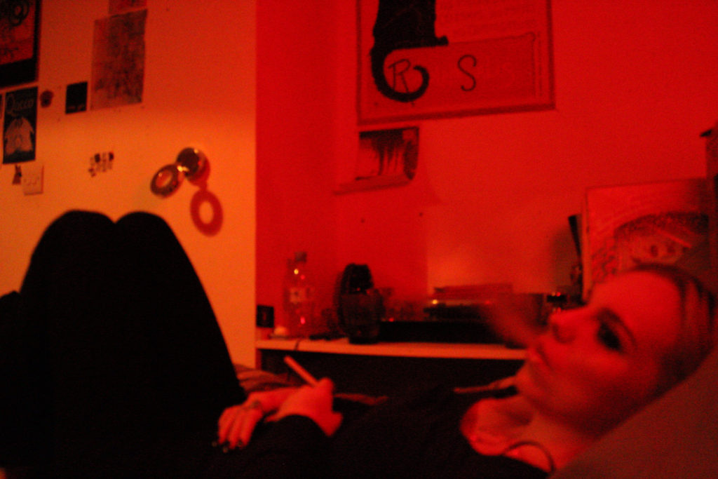
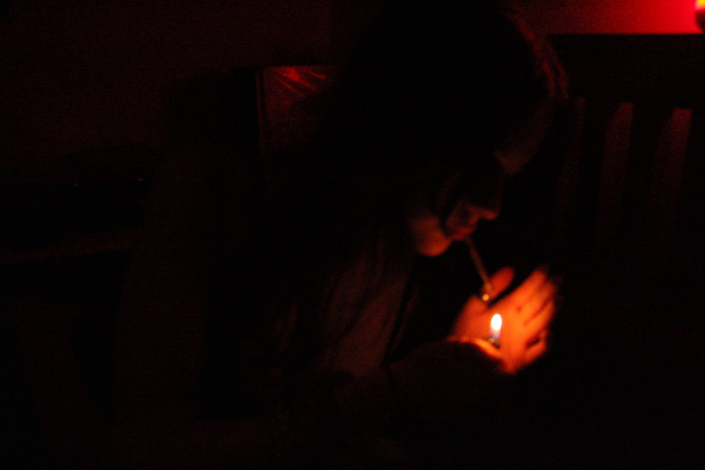
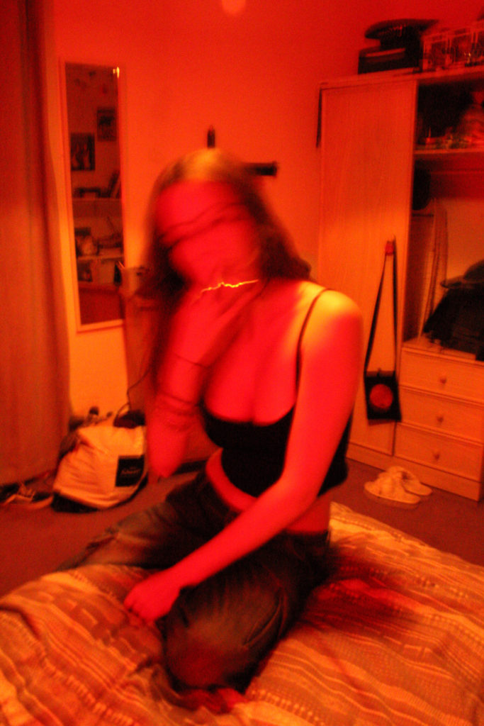
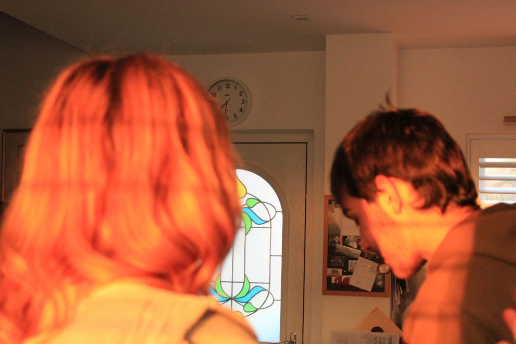
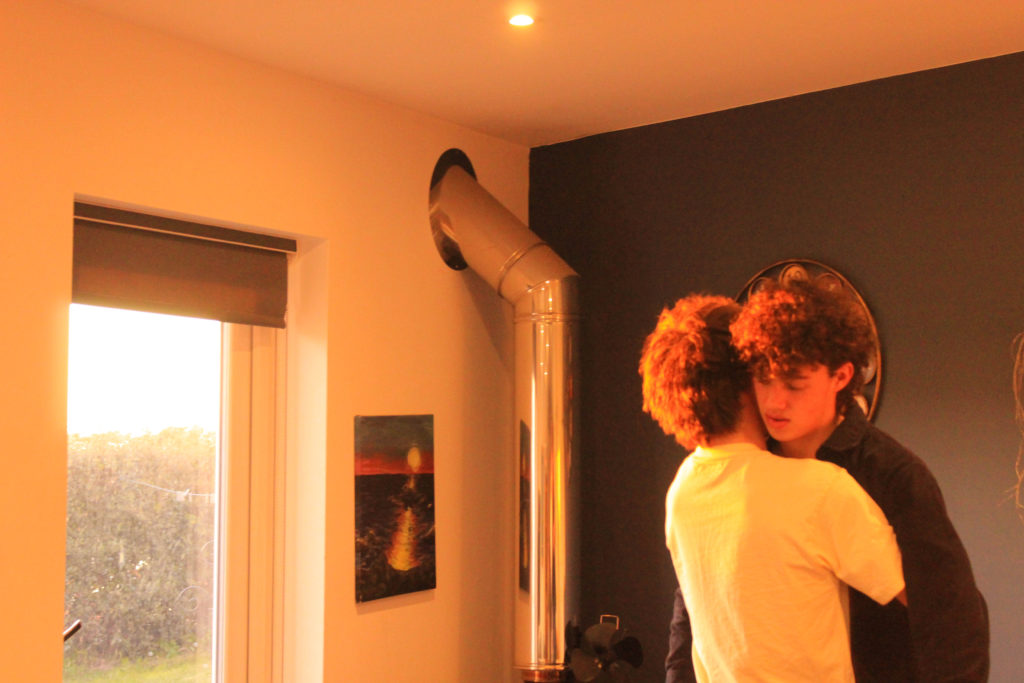
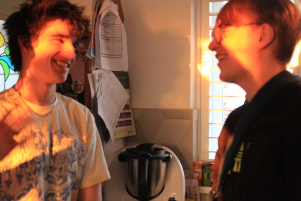
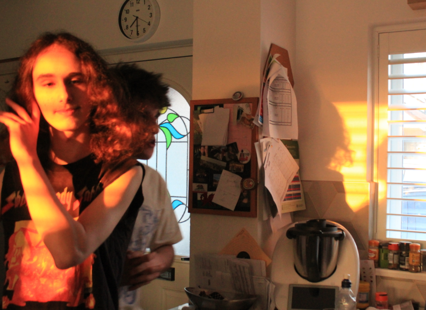
Overall, I feel the images I produced whilst making this project are amongst my best due to the range in colour & lighting that provided unique perspectives for each image – for example in my first photoshoot, all my final images were taken with the same coloured artificial lighting, however all had different outcomes – some darker, some more shaky and some with elements of yellow, pink and orange seeping into the corners of the image, which I really liked as it represents each of my artist references well yet still combines my own idea of photography. I am also really satisfied with the outcome of the second photoshoot – I think the use of natural lighting provides a good contrast from my other photoshoot and shows I have range and flexibility in my work – I also really like how the lighting rests on the figures in my images, whether it is fully covering them like the figure in the image above, or if it only illuminates a section of their face – either way this vibrant burst of golden lighting catches the viewers eye and overall makes the image more interesting to observe. If I could go back and redo this project, my only note would to be to take more photos in different locations with different colours other than red / orange / yellow. Although I did do this in my first photoshoot, my purple & blue images unfortunately did not have the outcome I wanted and were either too blurry or did not have enough areas of different tones whereas the images I did end up using were much more visually pleasing. I would also make more use of the natural lighting element and capture photos on bleaker days where there is less colour, as even though it doesn’t relate to my project idea as well, I still find the idea of bleaker lighting e.g sky on a cloudy day interesting as there is still beauty in the element of natural lighting. I felt in my project i also took note of my artist references well and my inspirations clearly reflected onto my work, for example my ‘shaky’ images from photoshoot 1 show Vinca Petersen’s chaotic style and how it has effected my work, and the red / orange colour scheme shows the inspiration Nan Goldin’s work has had mine, as the use of red in her work represents intimacy and strong emotion and I feel I replicated that to the best of my extent. I conclusion i feel although i could have produced more images with the time I was given, I am still very satisfied with the outcome of my project.