Image Selection
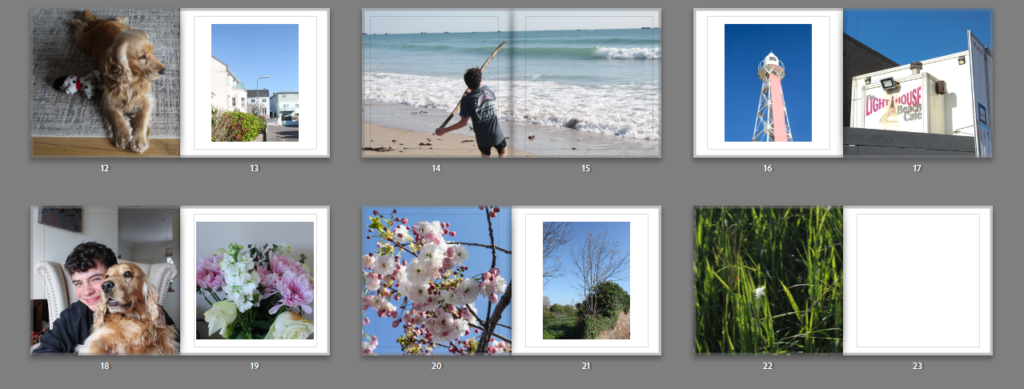
Below I have created a gallery with some of the images I will be using throughout my photobook, this is show all of the different kind of photographs I will be using in my book. I have chosen to use landscapes images (which include flowers, roads and trees), portrait images (of my dog and brother) and a few images from inside my house, including my room and living area. These are from the 2 different photoshoot I conducted, however I didn’t have any successful photographs of my dad to include in this project and this is why he is not featured in my book.
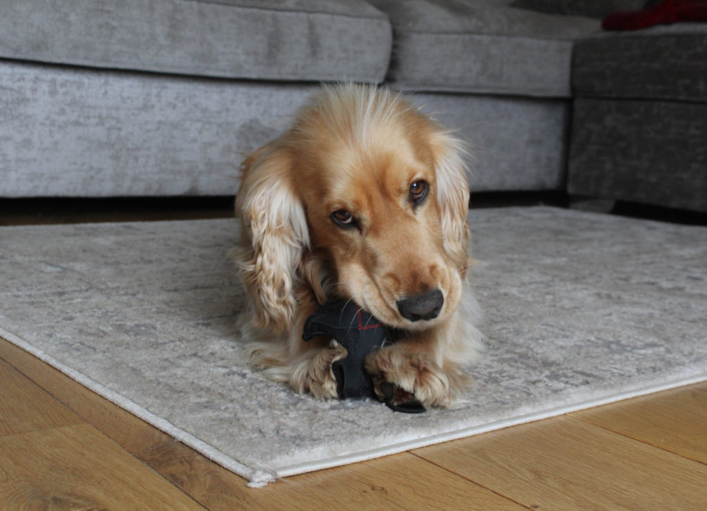
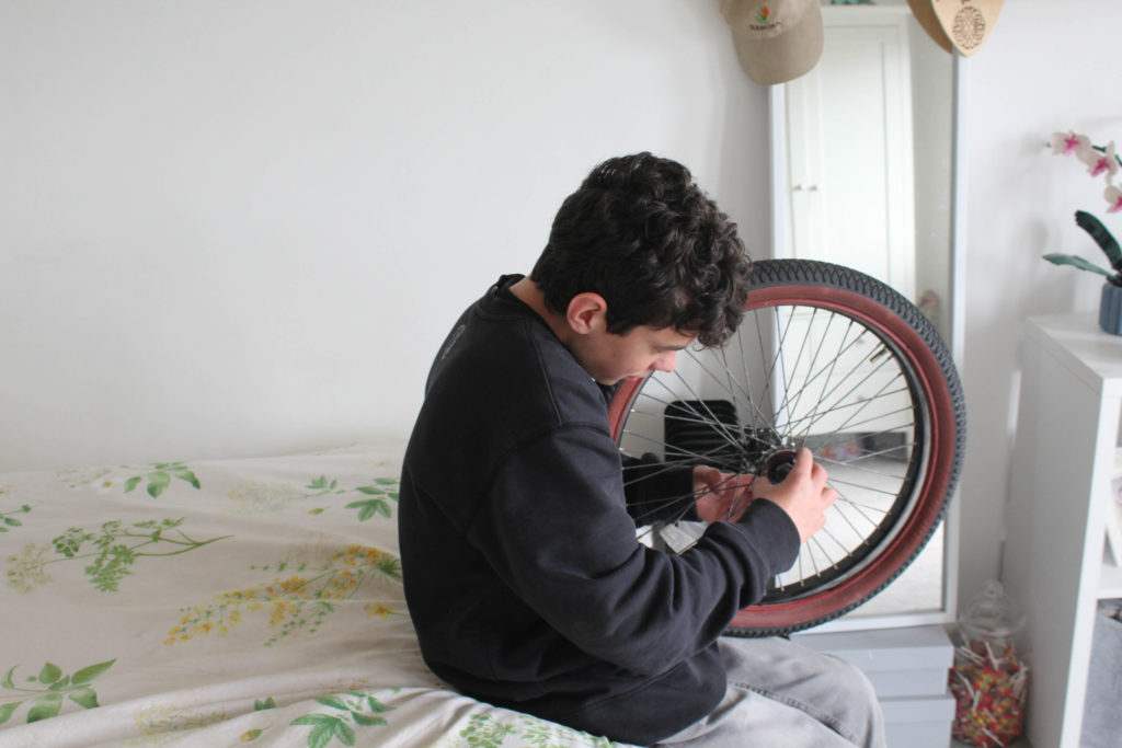
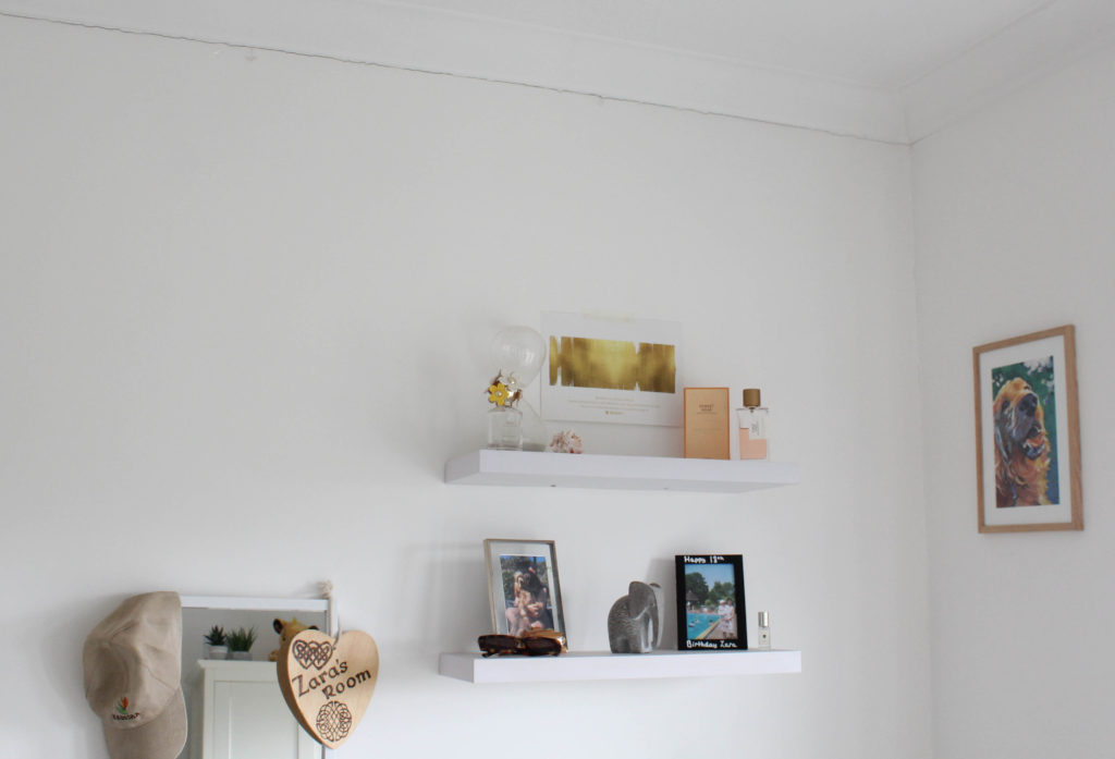
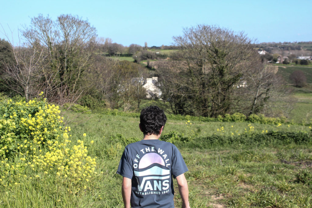
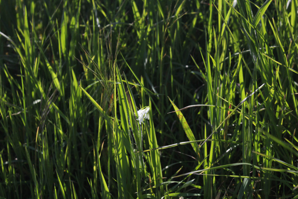
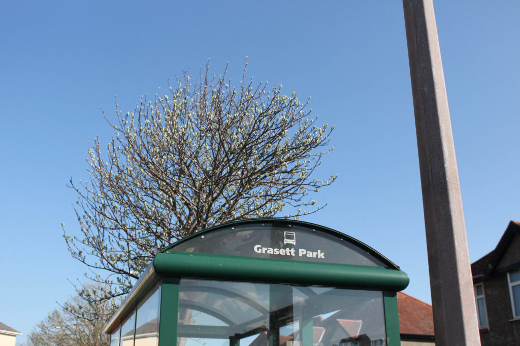
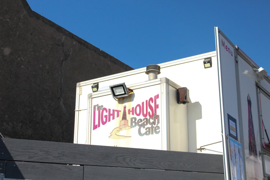
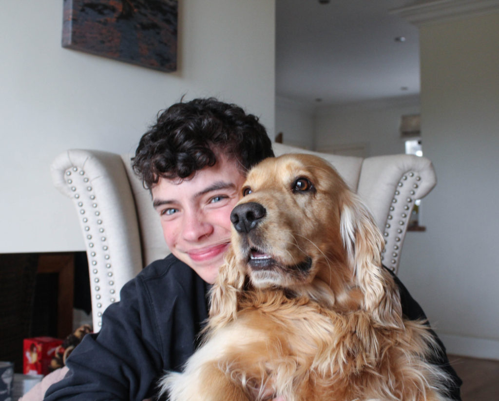
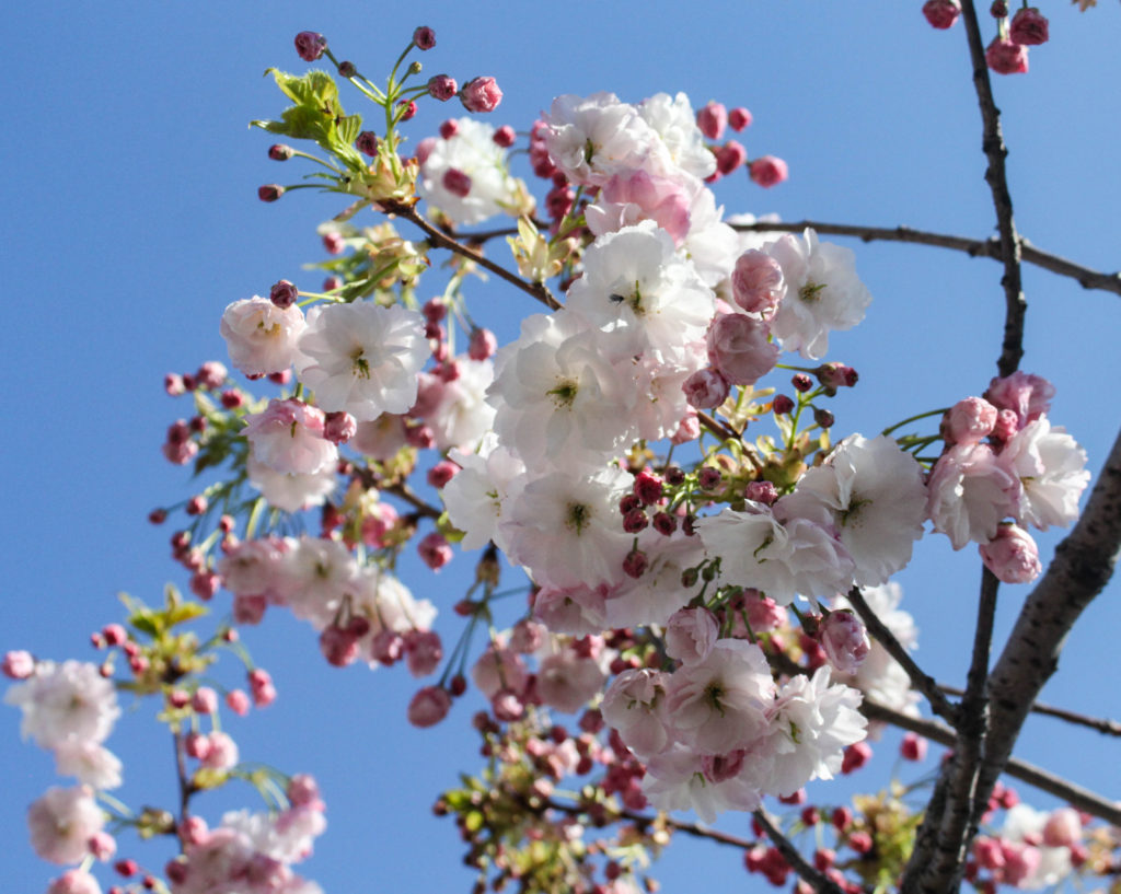
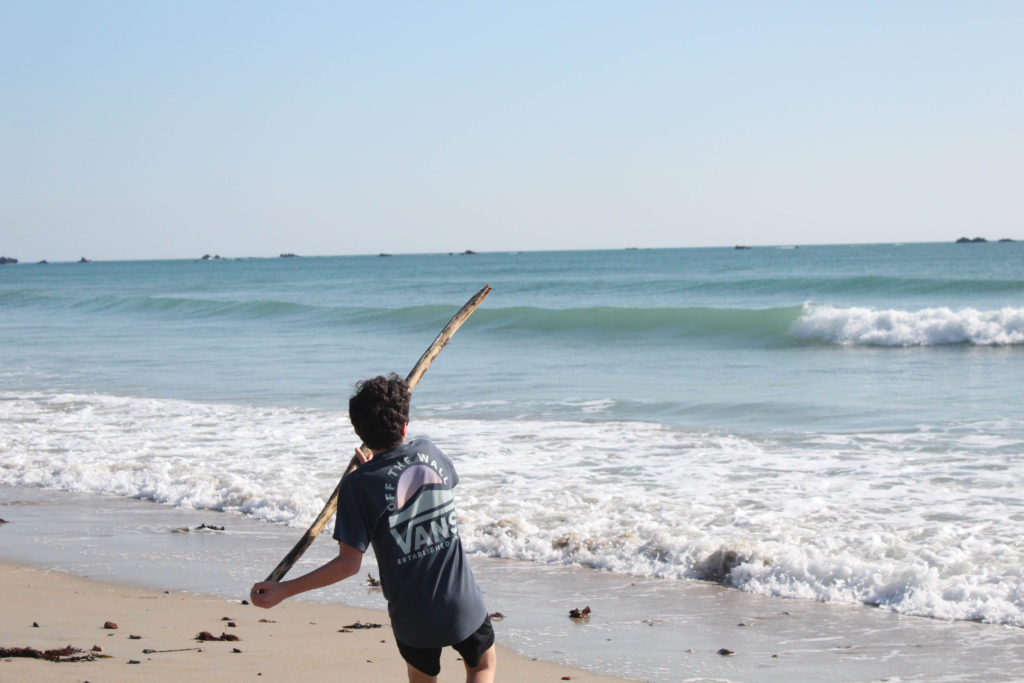
I did struggle with the lack of images I had, as I only selected 30 to use, and only used 18 in my photobook, this was because some of my images just did not link together (too random to link to my project) or were not of high enough quality to be featured in my book, this meant that I hard to consider the layout of my photobook a lot more, as many images were not the correct tones to be placed next to each other.
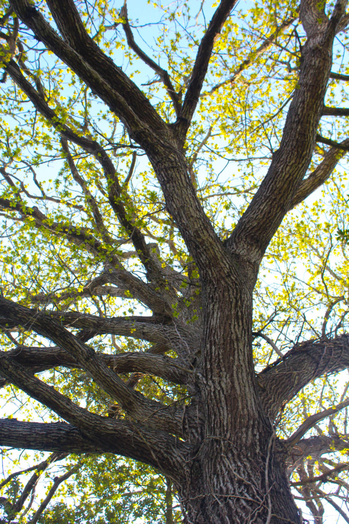
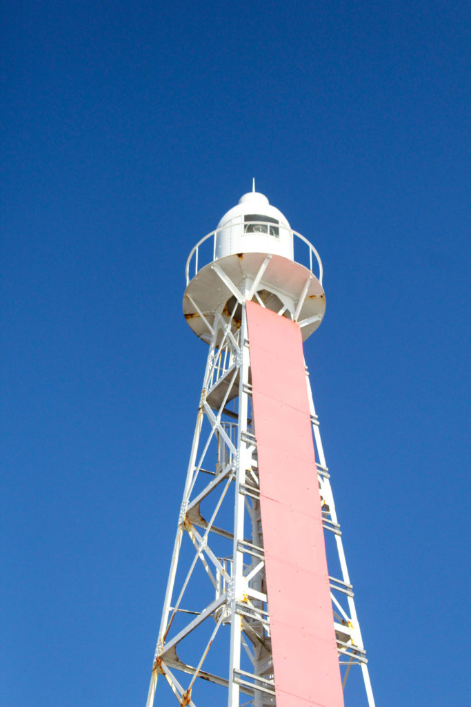
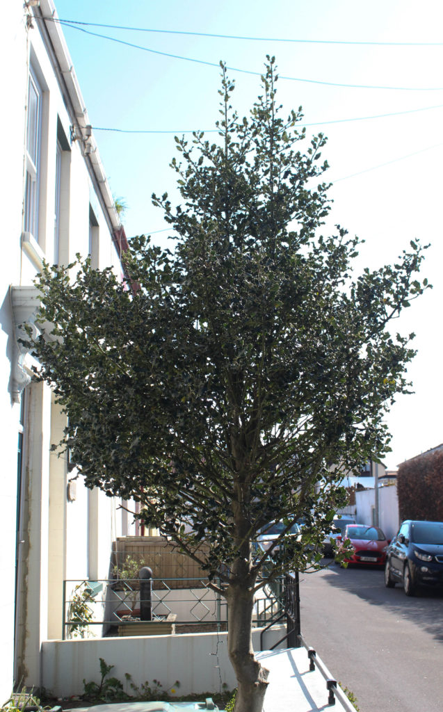
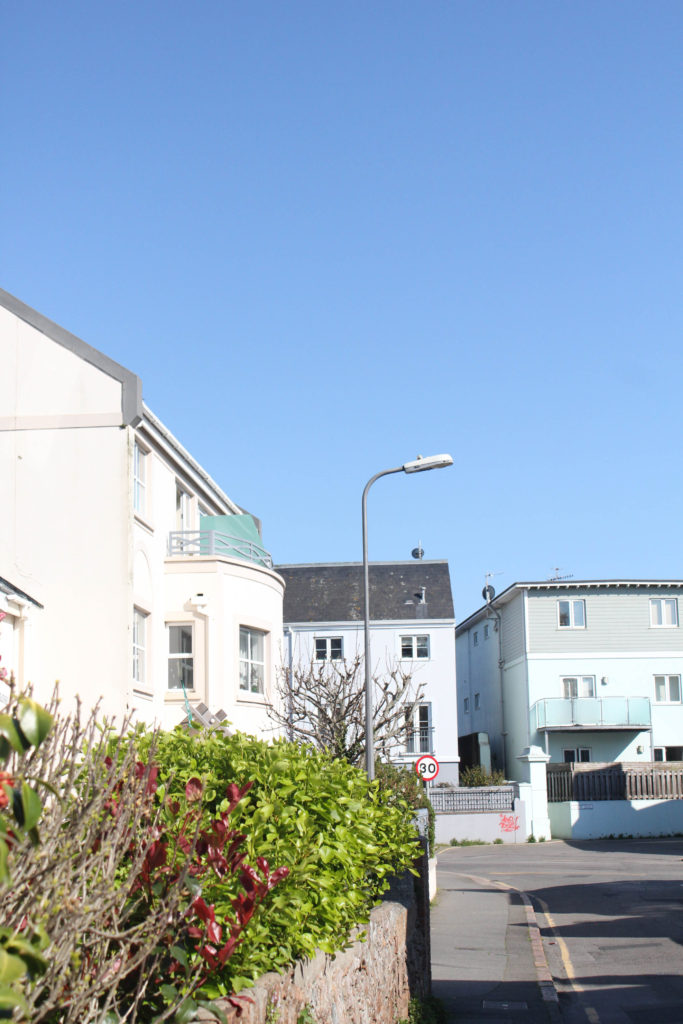
Photobook Specification: Throughout my photobook I will be exploring how the strength of me and my brother’s relationship has growth overtime, and how our parents separating has made us closer, this photobook is very important to me and I would like this to be the best work I have produced so far. I like how this project is so personal to me and how this is so different from my coursework projects.
Process
To create my photobook, I created a collection in Lightroom, which after clicking the ‘Book’ button allows for this setup below to appear, this allows for images that are in your final images collection to simply be dragged up into the spaces, there are also functions which allow for boarders to be larger to appear at all, and for also double page spread to be created, which is best for short and wide images.
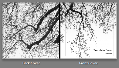
The meaning behind the title ‘Fountain Lane’ is the fact that this is the main road me and my brother used to use frequently to walk to my dads house. This provides the first sight of the book with more meaning, and will make some people ask more questions regarding the relevance of the book title.
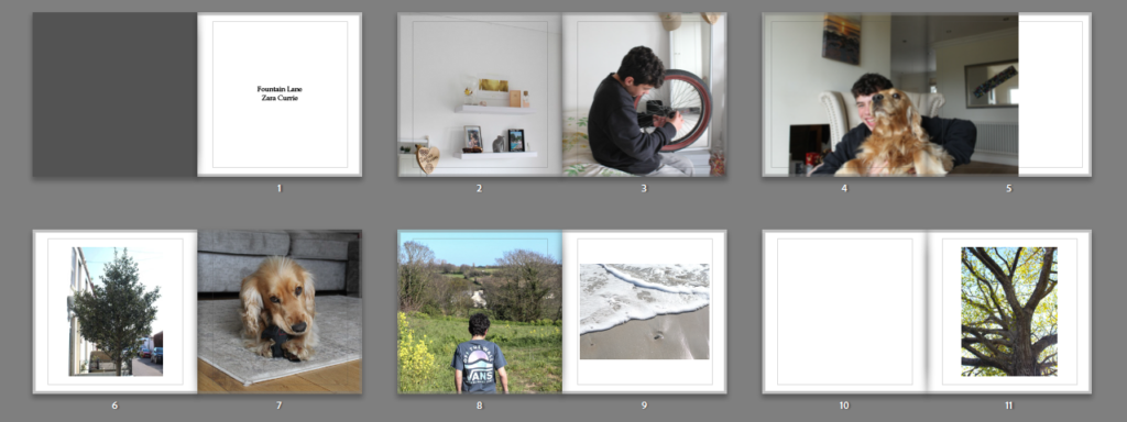
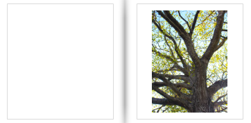
Whilst designing my photobook, I had to create a lot of creative decisions, mostly regarding my images and which would look best next to each other. This meant that the tones within the image had to be similar, for example a yellow toned image could not sit next to a monochromatic one. Overall. I really liked the designing my photobook process as it allowed for me to look through all of my images and establish which of them were the best outcomes I had ever created, this is because this was our final chance to show all the types of work we could produce, this is the reason why I decided to experiment with portraiture; to take a risk with this final/ personal study. In my opinion, not a large amount of my portraits turned out to be really good, however, I did enjoy doing something different to landscapes and showcasing that any kind of photography can be successful.
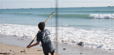
I have tried to create balance within my photobook through using multiple double page spreads, these are normally formatted with the most successful shots from the photoshoots, and I think this action shot above is one of the best I took throughout my second photoshoot. I have placed the image so that when the book comes, the only missing part (because of the fold in the middle of the book) will be the some of the top end of the stick. The problem with many double page spreads is that the middle section of the image is missed out because of the fold in the page, and this can hinder the successfulness of some of the best photos taken in shoots, I really like my photobook overall and believe that it is my best work.
Experimentation with Colour
Below I have changed the background of some pages of my photobook, this is an attempt to create more uniqueness throughout my photobook, in the end I may decide that all backgrounds look better with a white background, however I would like to take time to experiment in order to make sure that my photobook is the most advanced it can get.
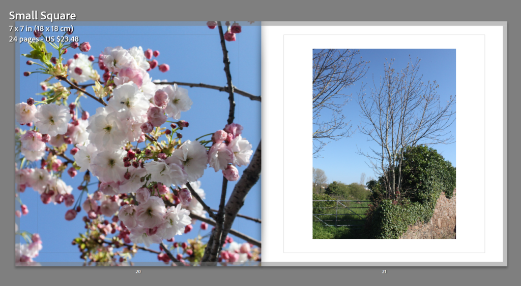
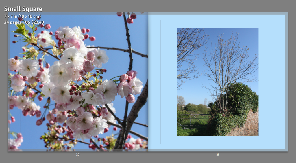
My aim when selecting blue here was to match with the blue background, however, I think this wasn’t very successful as the blue just blends in with the sky on the right side. Additionally, in my opinion blue is too much of a harsh colour to put as a background.
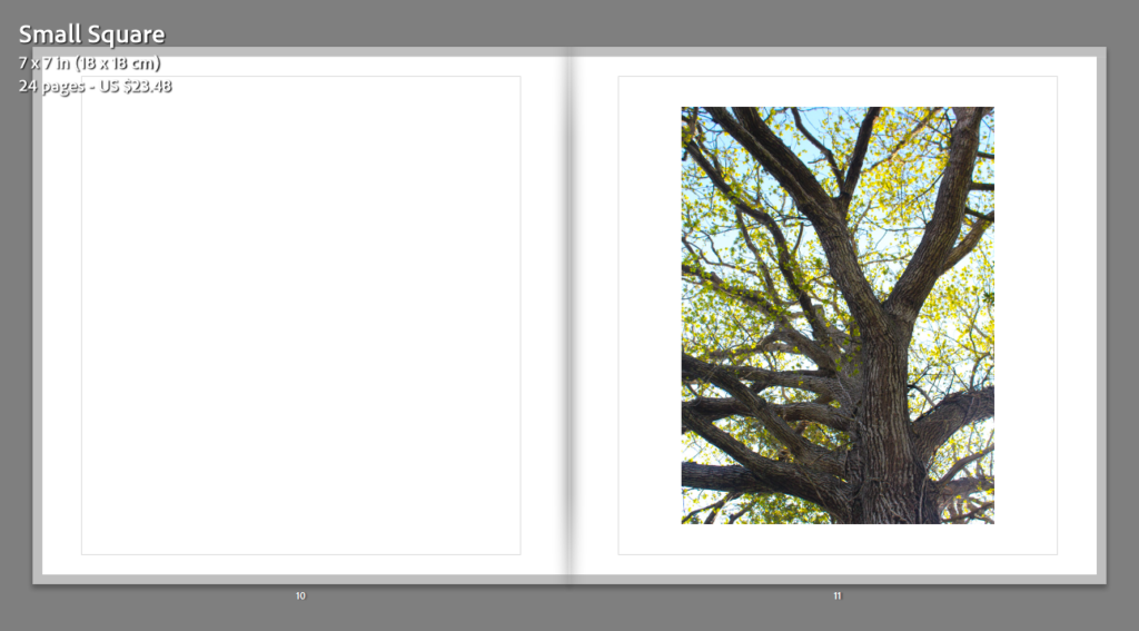
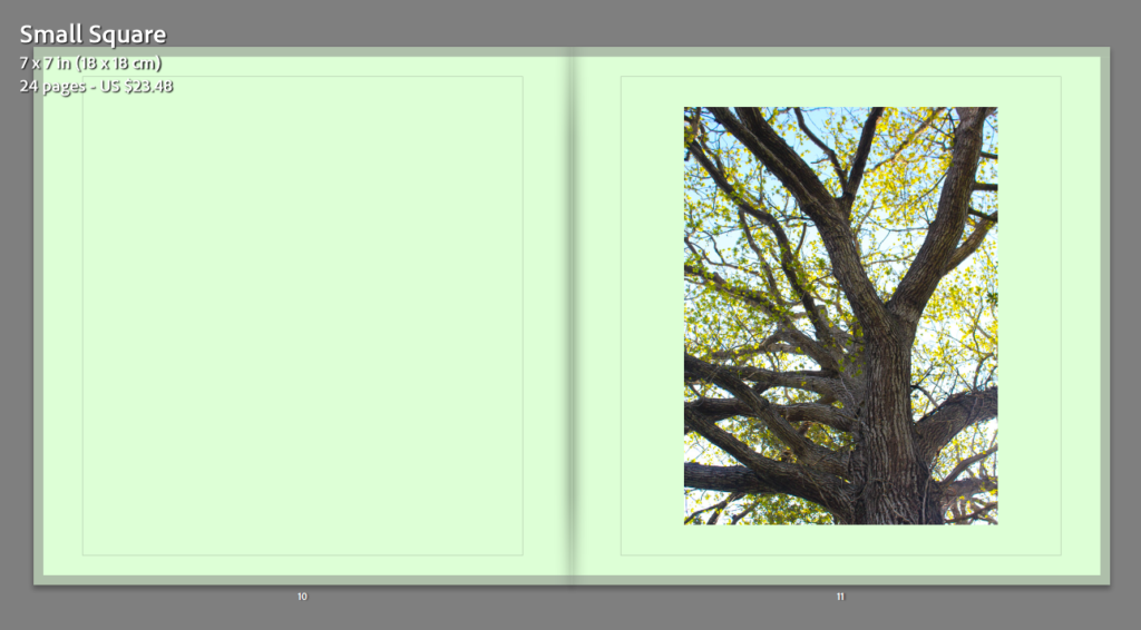
To match with the tree on the right hand side, I thought that green would be the best colour to match with the original image, I do like the green I just think its a bit too much for the photobook as I can appear quite bright.
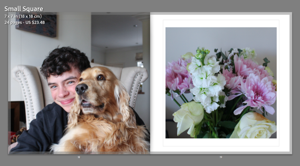
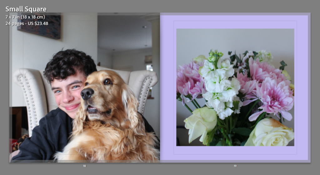
For these pages, I have selected the colour purple as on the right there is an image of my mums flowers, and to link to this I decided that purple was the best idea as this is her favourite colour too. I really like how it matches somewhat with the flowers themselves, however it doesn’t match with the left hand side photograph.
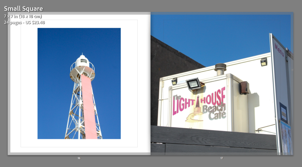
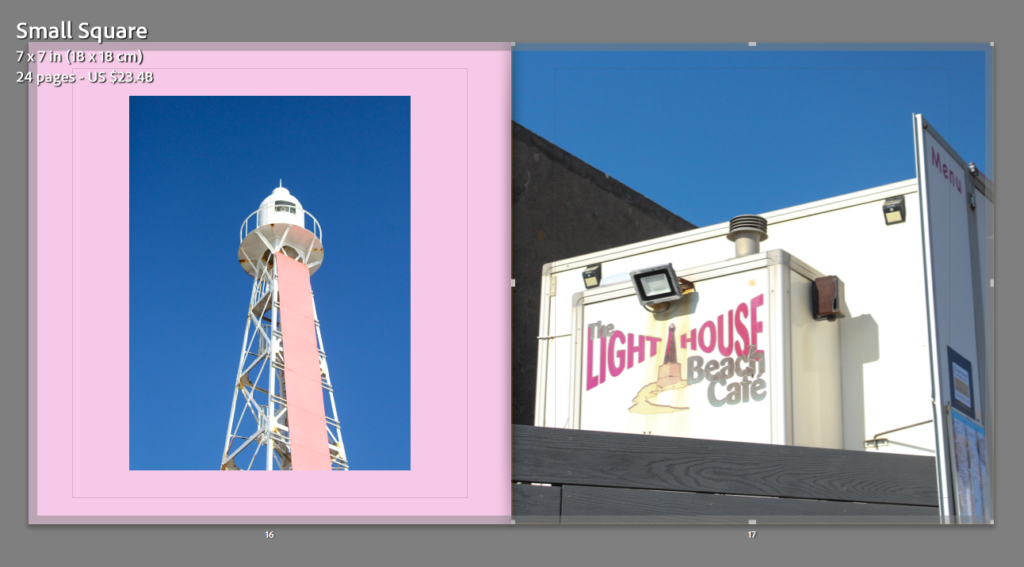
Analysis: The pink colour background above, in my opinion, is my only successful outcome of using colour backgrounds out of every colour I have experimented with, this is because it matches the best with the image on the left itself. For my future photobook I will be only using white pages as I think this helps keeps the balances throughout my whole project.