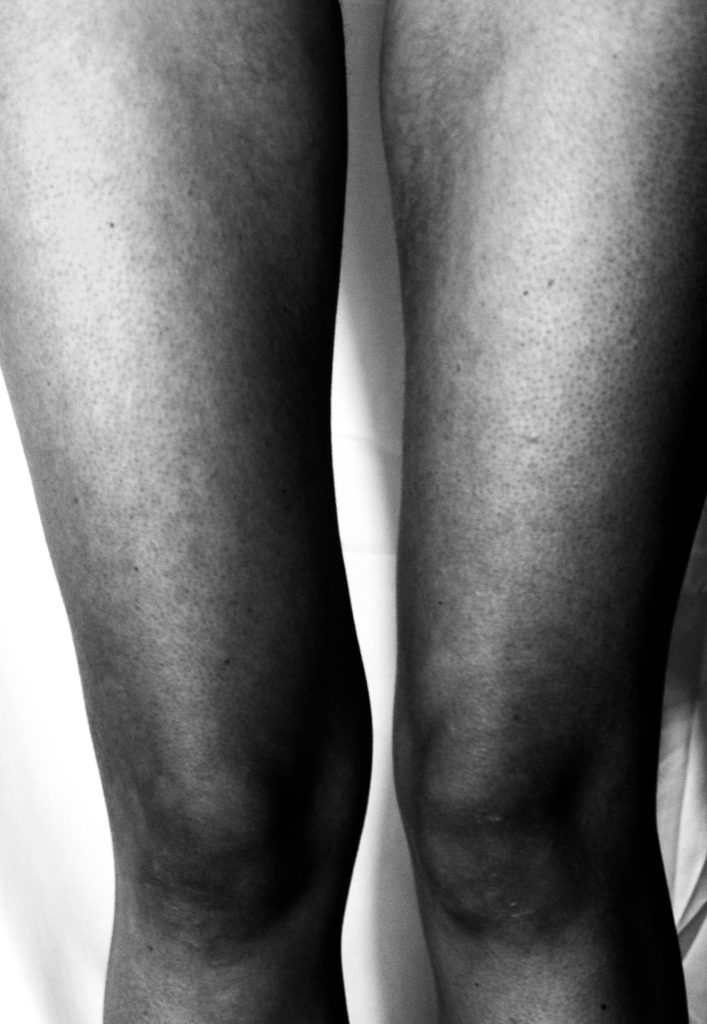
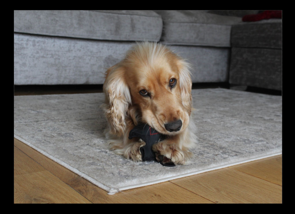
This is my first set of edited images, Within these images, I have gone for an overall black and white theme, focussing on only tone and presence. I have focused on anatomy as a link to my overall theme of the male gaze. In order to take these images, I had guidance from a male which allowed me to take images of a female from a males perspective. After researching photographers such as Kohei Nishiguchi, I felt inspired to focus heavily on lighting in regards to creating a story. this collection of images I believe communicate the light beyond sadness, creating a metaphorical relationship between light and emotions through the use of black and white editing as well as enhanced shadows, in this case, the sadness and darkness that many women are left feeling while living in a patriarchal society, where women are often exploited for their bodies as well as seen as sexualised figures. The use of photographing things such as bones, subverts the dehumanisation struck onto so many women in the media making them alienated and allows them to be seen much more as human beings rather than pleasures for the white heterosexual male.
Second Set
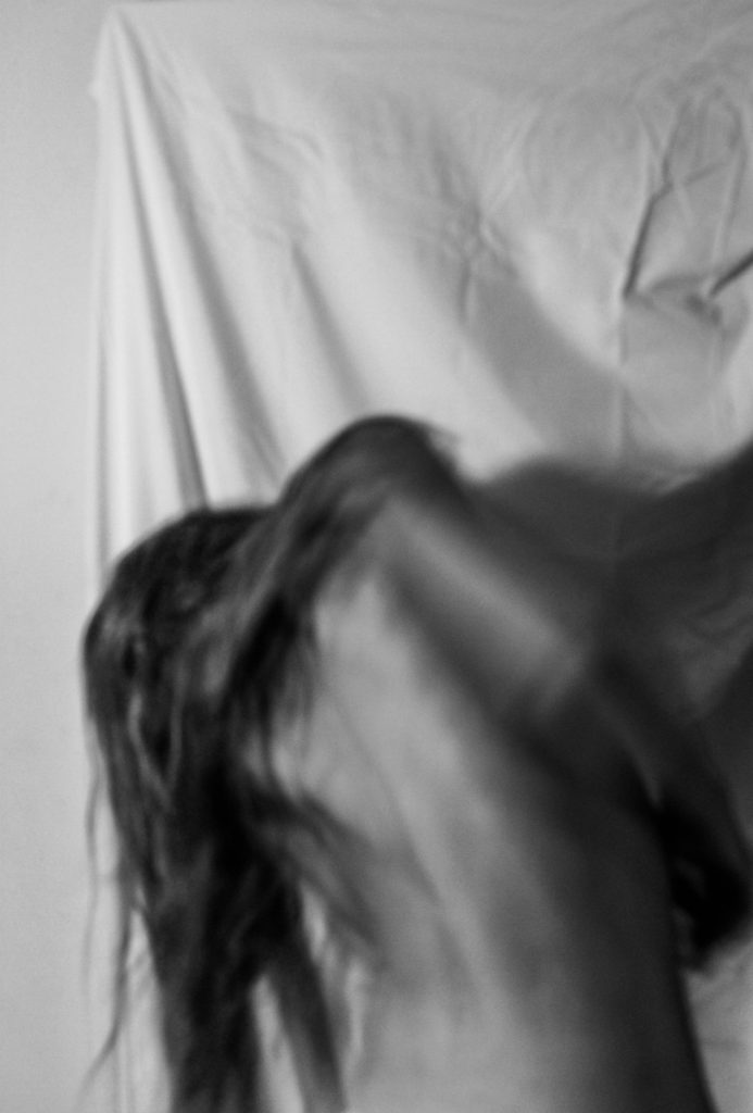
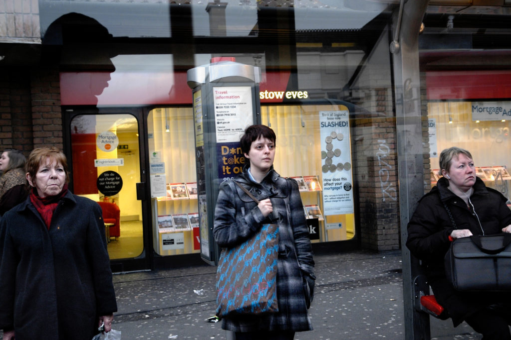
This is my second set of images, I captured these on a long shutter speed in order to capture movement as well as blurriness, blurring the male gaze. I wanted to include movement within my images to create a sense of freedom, and breaking out of a patriarchal society. I included dark shadows within the image to highlight the features which are considered ‘imperfections’ within women.
Third set
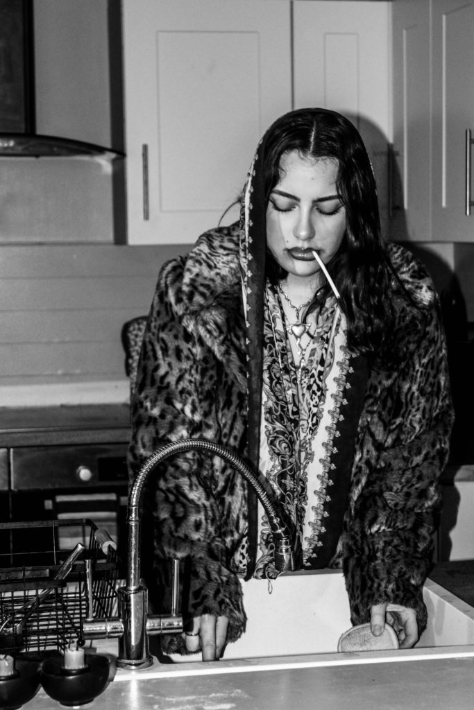
In this set of images, i emulated the style of feminist photographer Cindy Sherman, using an array of costumes, makeup and settings to create stories of characters based off of old Hollywood. These images highlight the ‘female experience’ capturing things such as housework while dressed up in a fur coat and makeup highlighting the need to be presentable at all times.
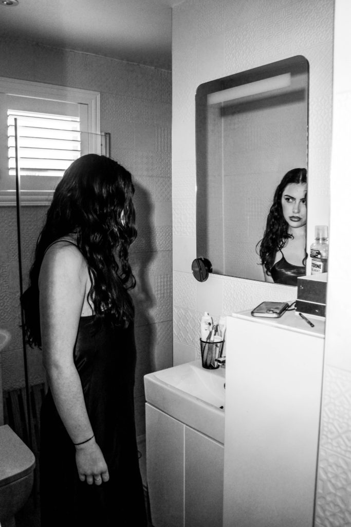
In this image, the subject is seen in a white vail referencing the biblical ‘Madonna’ – a morally pure and chaste woman, also known as ‘The Virgin Mary’, within this image i have placed focus on her over lined dark lips as well as bold eye makeup, i believe this image defeats the traditional expectations held over women and highlights the modern liberating views of sexuality for women and perhaps contrasting to the classic biblical views of women.
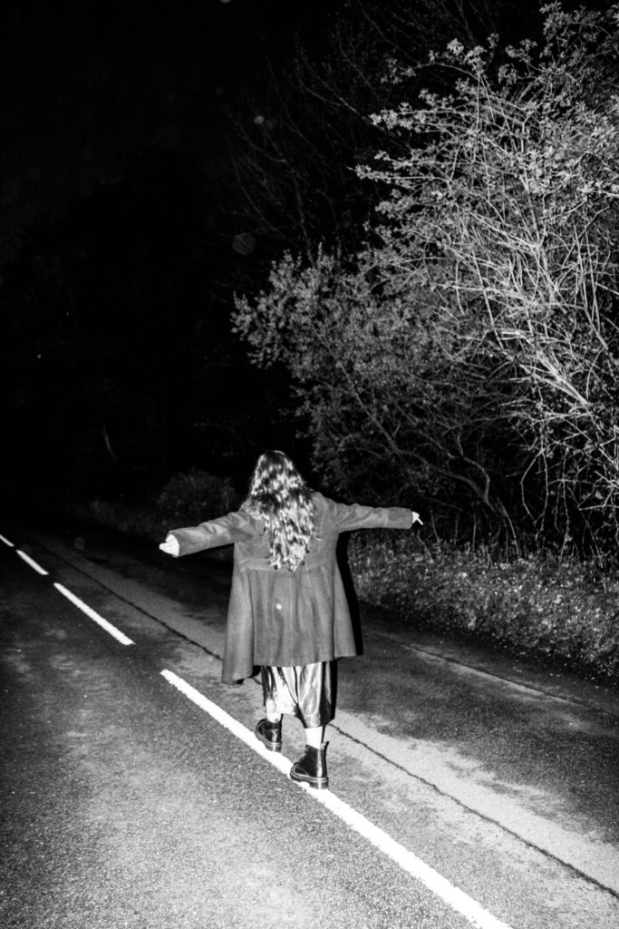
Fourth Set
For these images, I wanted to create a sense of stalking, similar too many of Sherman’s ‘untitled film stills’. Having the subjects back faced to the camera suggests that they aren’t aware they are being watched. The dark never ending road also creates an ominous feel for the images and suggest that whoever is watching poses a threat to the woman, highlighting the threat and damage caused daily by the male gaze on women.
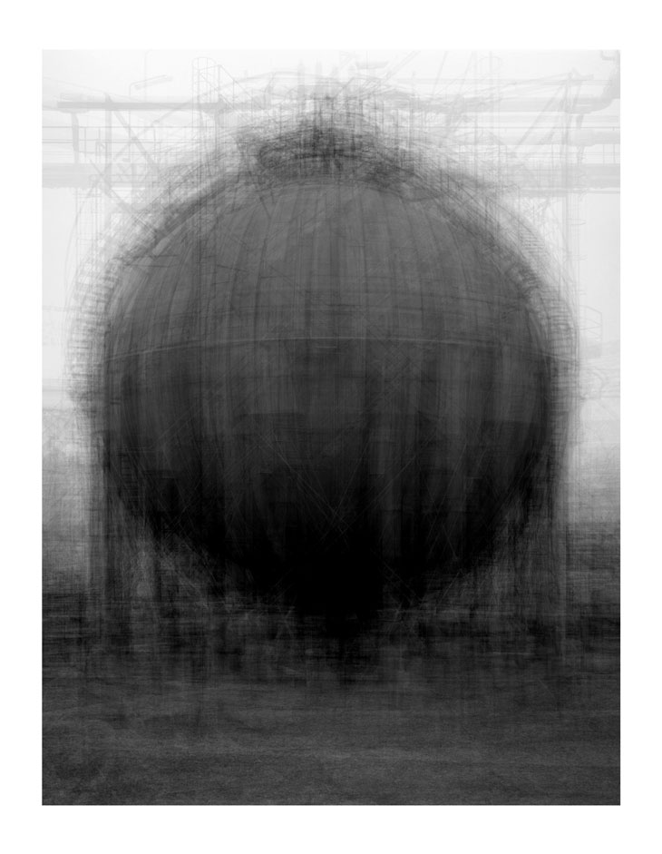
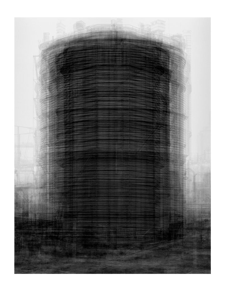
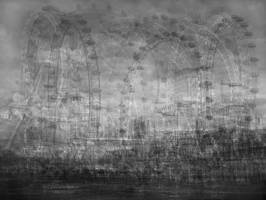
British artist Idris Khan OBE is known for his multi-layered photographs, paintings, and sculptures that take on a variety of source material, ranging from musical scores to theological texts. He has received international acclaim for his minimal, yet emotionally charged photographs, videos and sculptures and is without question one of the most exciting British artists of his generation. Drawing on diverse cultural sources including literature, history, art, music and religion, Khan has developed a unique narrative involving densely layered imagery that inhabits the space between abstraction and figuration and speaks to the themes of history, cumulative experience and the metaphysical collapse of time into single moments. In 2012, Khan was commissioned by the British Museum in London to create a new wall drawing for the exhibition, Hajj: Journey to the Heart of Islam. In addition to the wall drawing, Khan’s stunning floor sculpture, Seven Times, was installed in the museum’s majestic Great Court. In March of the same year, The New York Times Magazine commissioned Khan to create a new body of work that was published in their London issue. Khan’s works – in media including sculpture, painting and photography – rely on a continuous process of creation and erasure, or the adding of new layers while retaining traces of what has gone before. Idris Khan draws inspiration from the history of art, music, philosophy and theology, laying and manipulating images and text in a conversation around memory, experience and society.
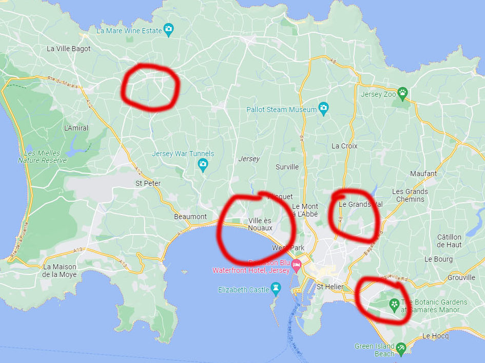
My photoshoots will all mainly take place at each of my friends houses in their personal places, other then that they will take place at Hautlieu school and the near whereabouts/outskirts.
For the images taken inside, i can experiment better with different lighting which can create more effect and show identity better, whereas outside lighting is when you have to work with what you have and base a story around it.
The places circled in red are where my photographs will be taken.
Map of Jersey
Then finally for developing my images after my shoots, i will star rate them out of 5 labelling my best ones, and then flag them green and divide my best ones into a new folder where i will edit in Lightroom and import into photoshop for finishing details.
I am going to explore the simple aspects of portraiture in consideration to Sander and Sanks work. The majority of simple approaches in which appear initially simple at first are conceived from complex concepts that challenge the viewer and raise important issues. I will be acknowledging how this applies and format it in my pictures. My project will be linked in with subtle but meaningful images taken of my close friends in places which represent them as a person, i may include some candid’s to show their true selves off guard and how they feel in a certain location.
Why it matters to you?
This project matters to me as i feel it can also say a lot about who i am as a person with the way i edit and represent my final outcomes. It doesn’t only just matter to me as i can learn more about myself, but also because i can learn more about my friends as individuals as if i was perceiving them from someone elses perspective, having a closer insight on their identities.
How you wish to develop your project?
I wish to develop my project by going out today and tomorrow with my friends taking a range of different shoots experimenting with different angles, lighting, locations and framing to match which fits in with my friends and my own personality creating a better understanding with the meanings behind my final images.
When and where you intend to begin your study?
I intend to start my study preferably where my friends grew up e.g their home, neighbourhood, school just so this is a good starting point as to getting to know them better as an individual and what places feel safe to them so i can capture them at their best. I will be starting today afternoon continuing into tomorrow.
Born in London of Greek Cypriot parents, Georgiou graduated in photography from the Polytechnic of Central London.
Georgiou’s work has focussed on communities split between different cultures. After working for six years in Serbia, Greece and eastern Europe, he was recently based for four years in Istanbul. His work in Turkey led to a series of photographs titled Fault Lines/Turkey/East/West, which has led to several exhibitions and a book. Georgiou has also taught photography at Barnet College in London and a number of workshops in Europe.
Arriving somewhere new, Georgiou’s approach is first to unburden himself of pre-existing images of the place and to try to see through superficial differences with places he knows; he then looks for commonalities and actual differences. He starts by himself and only when well underway hopes to attract commissions and make sales.
Georgiou’s early work was in black-and-white but for Fault Lines and subsequent work he moved to colour, using a compact camera with an articulated LCD that may be viewed from above, like the ground glass screen of a twin-lens reflex camera; this is because he believes it less intimidating for the people photographed than a camera held to the eye.
Georgiou belongs to Pianos Pictures His non-commercial approach has presented challenges; speaking in 2009, he described himself as having large debts but remaining optimistic.
Last stop
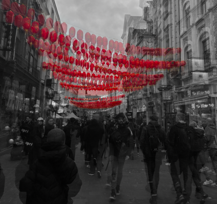
‘In 2008 I returned to London having spent the last nine years living and working in Eastern Europe and Turkey and was surprised by the speed of change that had taken place. I wanted to document the city, its movements and migrations, its landscape and architecture, its diversity and energy. I wanted to understand how so many people from all over the world manage to share the same space.
The double-decker bus allows me to frame the city, to give it sense. The lower level is very close to the street, where I’m almost touching the people in the traditional form of street photography. The upper deck allows me the distance to capture the layers of the urban landscape. Between these two positions everything shifts, along with the movement of the bus.
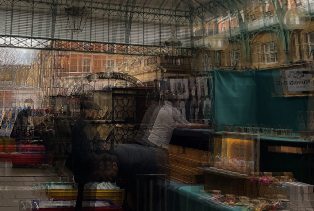
I was also fascinated by how people use public space in a big city, by that sense of shared invisibility. In sitting behind the window, I also became invisible but the bus also gives you the privilege to see and understand the emotional content of London’s everyday movements, rhythms and rituals.
The essence of the project is that you might take the same route every day but what you see, the ebb and flow on the street, takes on a random nature. To capture this flow, the concertina format of the book reflects and mimics the feel of a bus journey, but more importantly it gives the viewer the opportunity to create their own journeys by spreading the book out and combining different images together. This moves the book away from an author-led linear narrative to one of multiple possibilities.
These will be the images that I am going to print out and then mount up, this will allow me to showcase the work that I have done, as I will have the option of placing them onto foamboard or into window mounts, which means they are surrounded by a black board, they are the best way to illustrate monochromatic photographs.
A5A4A3A3A3A4A3A4A5A5A3
Each of these images has an A5, A4 or A3 label in the caption of the image, this is to demonstrate how large I will be printing my images. The images that are not of high qualities are going to be printed onto A5, this is so that the more blurry areas are less visible.
Layout Experimentation
To illustrate how my images will be displayed, I will be placing my photographs into Photoshop, this will allow me to play white or black boarders around them, and place them in a layout in which they will be presented once they have all be mounted up.
I didn’t know whether this photograph would be more successful placed on white foam board or in a black window mount, in the end I thought that it was a the best decision to go with a lighter background as I think that it compliments the white flowers the best, and will make the whole piece look cohesive when it is printed out.
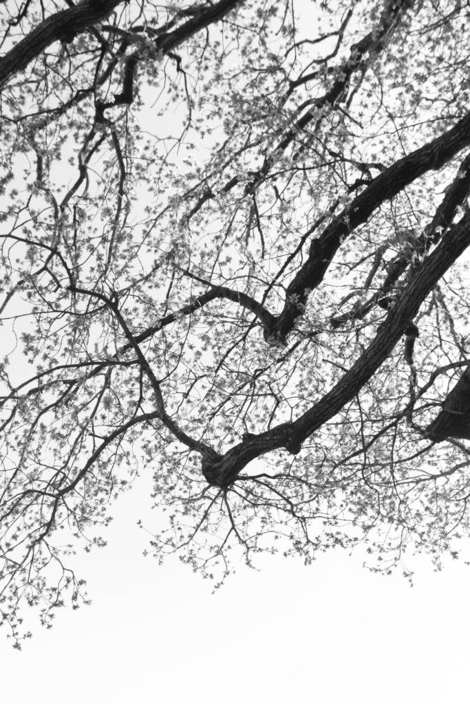
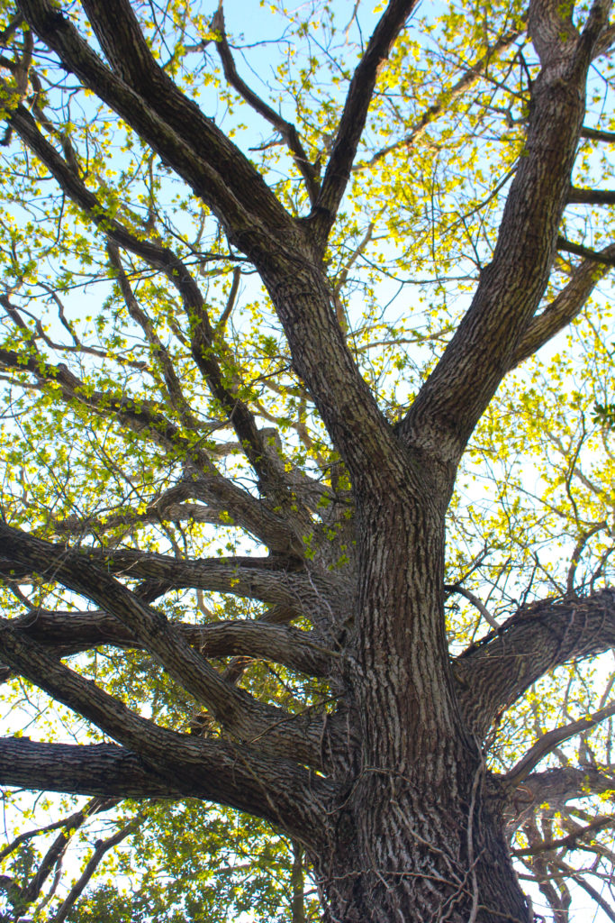
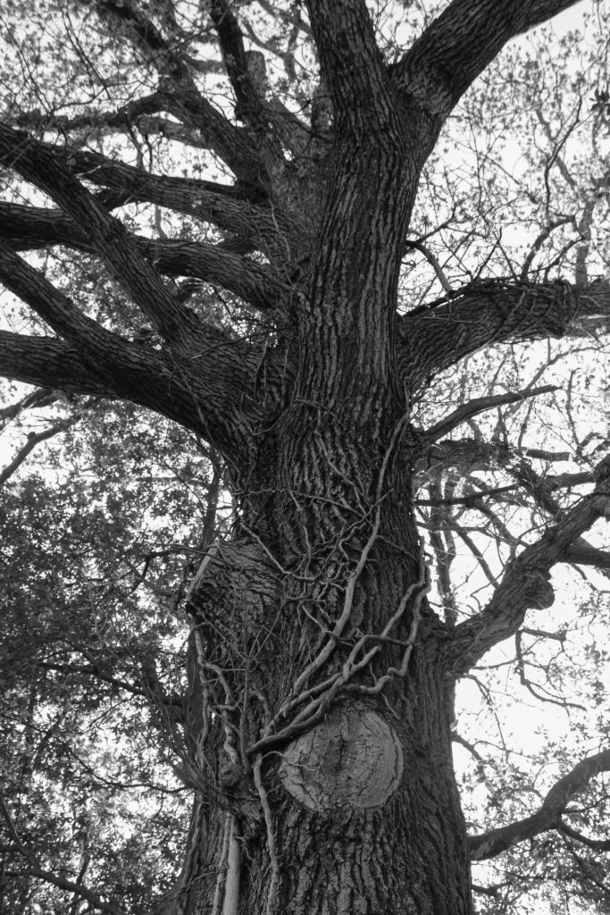
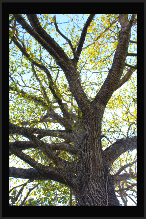
This image is one of my favourite images from both of my photoshoots, I really like that this photograph looks goo with both a black and white background. I think this is because the tree is filled with lots of dark tones, and then the surrounding leaves. I think that this image still looks better with a white background as I think this compliments the leaves and sky within the image more.
This is my favourite layout of all the ones I have created, this is because it has a lot of juxtaposition yet a lot of links. this is because in my opinion, monochromatic images look better on a black background, this is because the lighter points in the image are being highlighted. I think that placing them in a triptych means that they are more aesthetically unique and there more eye-catching, when I mount these images I will attempt to do the most equal window mount as I believe that this piece alone will increase my grade if I do it correctly.
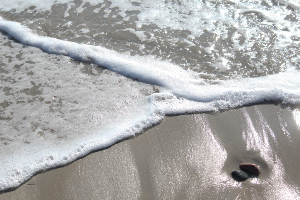
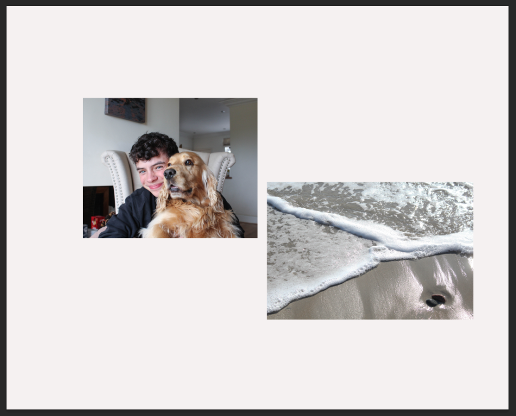
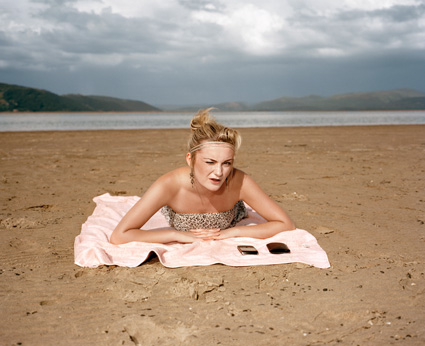
I like that this background is almost more beige than white, I think this creates a smoother affect, along with matching with the tones in the sand and decor in my house. I like how these photographs are not going to be arranged is a perfect horizontal position, as I think this adds more depth to this mounting as I believe that these images match together well, and they additionally link as both my dog and my brother love to spend time on the beach, and this is where we spend a lot of time throughout our childhood.
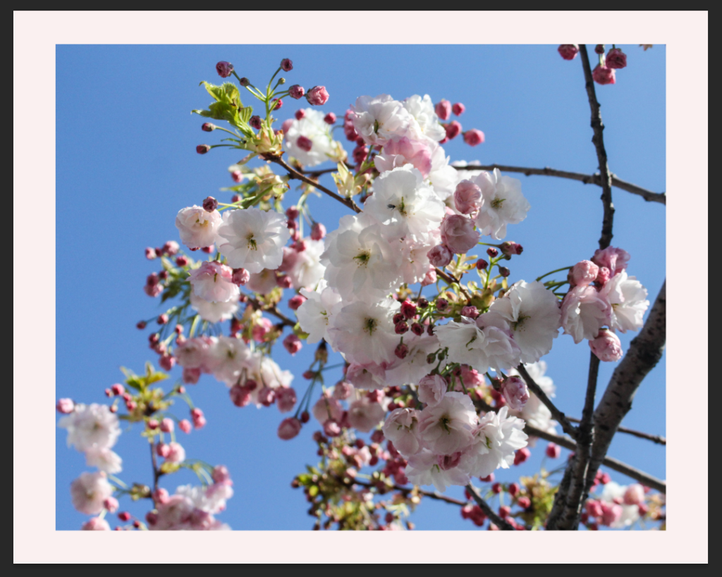
To attempt to create a more interesting background, I have attempted to place pink in the background of these images, I am not a huge fan of this colour, as it appeared a lot lighter in Photoshop. Furthermore, I just think the white looks a lot better and the purpose of the flowers being in the middle was to attempt to split up photographs and I think this works well, the colour within the flowers help give a break from the lack of colourful tones in the other images.
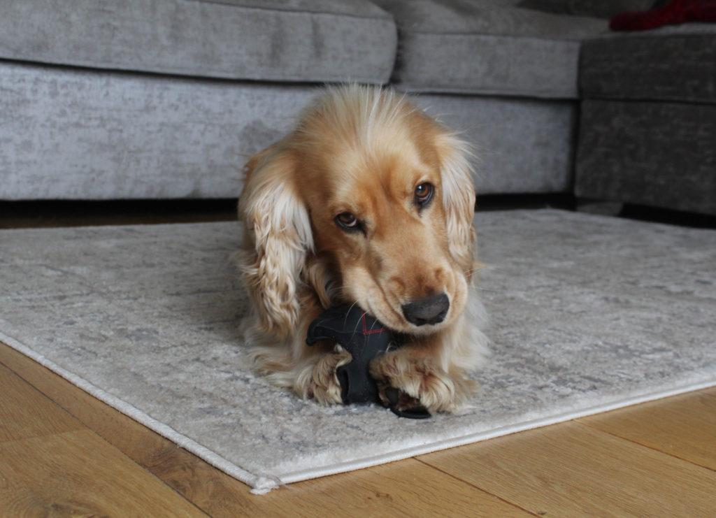
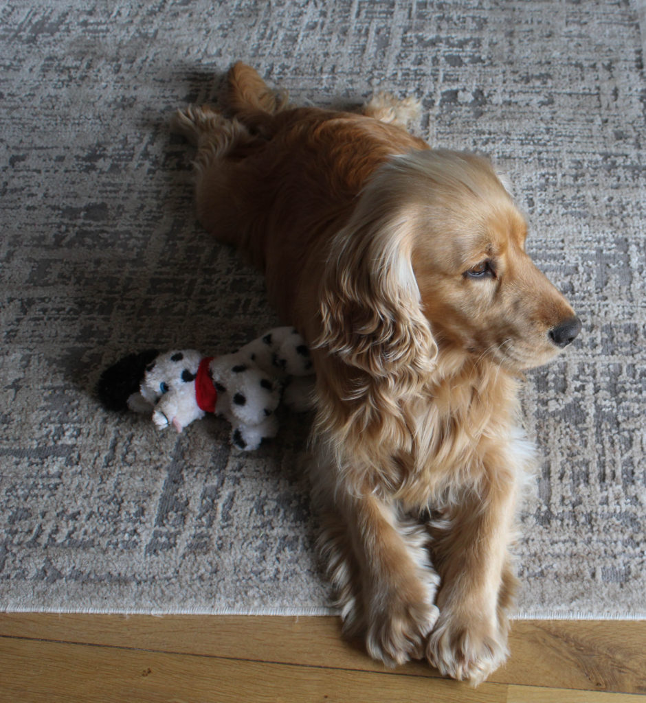
As this photograph is being printed in A3, I think it would be a good idea for it to be placed in window mount alone, this means that the full attention will be placed onto the photograph of my dog, as I think that the grey tones in the image would better suit having a black frame. There is also some darker features in the image such as his eyes, bottom of paws and nose, which will compliment the black frame.
In my opinion, this is one of my most successful mounting experimentations, this is because of the matching colours within both of these images, there is a lot of pink present in the first image within the flowers, then the stripe of pink on the front of the lighthouse. Furthermore, there is a lot of white straight lines and strong blues within the background of both of these images. I think this diptych was a big success.
While looking for inspiration for how I could create a layout for my photo book, I came across two sources the first one was the ‘Vagus’ magazine December 2022 edition which can be available here on blurb for preview. The magazine is only a online version but described as a soft cover, which I wanted to use in my own book, and it experimented with still life in different glassware in some of the images which I will discuss further later on and I liked some of the way that the pages were laid out throughout this book which I thought that I could use within my own work. The second source which I have found for inspiration of my photobook is called ‘Breakfast’ by Niall McDiarmid, which can be found here, this book focussed on different what having breakfast means to him as a person and how it is a natural still life with lighting that changes in different ways to manipulate and change the shadows or reflections that we may see day to day in a space we are always in but never notice. I really liked this book as it experimented with different colours and how vibrant they were along with the simplicity of repeating different page spreads, I also really like the cover of the book as it is a bright yellow colour with a photo taken previously and the has ‘Breakfast’ written on the back in red letters.
Examples of page layouts from the Vagus Magazine –
Vagus Magazine, December 2022 edition –
Book in hand and binding, soft/hard cover: Image wrap/dust jacket/Swiss binding/How does it feel?:
As I can only get the online version of the magazine, it is smaller due to being seen on a computer screen but it described to be softcover just like any normal magazine would have, with an element of flimsiness as it would be used by other people in a setting where they are flipping through the magazine to keep themselves occupied when they are travelling or waiting in a line for something..
Paper/ink and format, size and orientation: Portrait/landscape/square/A5, A4, A3/number of pages/Use of different paper/textures/colour or black and white or both?
The layout is in an A4 portrait for the orientation and size, the paper which is used is white and there is a variety of different bright colours and patterns throughout the book, revolved around a piece of text, there is also other pages that are plain in their appearance or revolved around a certain colour and theme.
The cover is a printed image which has been taken previously, it has bold letters in white for the title and date of publishing with a small description of the right hand side. There is also a small description in black in the left corner of what may be featured in this issue, this stands out well but also works on the cover because there is a feature of black within the front cover on the bottle and text that reads ‘happy birthday’.
Title: Literal or poetic/relevant or intriguing?
The title is literal as it is the name of the magazine which is ‘vagus’ in lowercase letters, it is intriguing to an extent because there is no meaning which I can find in relation to the title which can suggest that it is made up and created just for the purpose of having a title for something.
Narrative: What is the story/subject matter? How is it told?
There is no narrative throughout this magazine as it is used by one specific photographer to discuss their inspirations that they have used in relation to their creation of images such as different glassware photography, plants, still life, etc.
Structure and architecture: Design/specific features/layout of images/grid/fold-outs/inserts/single of double page spread?
Throughout the magazine their are repeats of single and double page spreads, there are also double page spreads which feature an image on one side and text on the other which is discussing what the inspiration was for the pictures and the pictures following. When there is a new subject there is an introductory page which highlights the subject of the photoshoot and some other background context in relation to it, I really like this as it is showing a high level of organisation throughout the magazine. There is also a feature of different quotes from different people throughout the book and they all mostly share the same layout where it is a box in the middle of the page with a title above and the text inside of it.
Editing/sequencing/images and text/Are they linked?/use of captions/Selection of images/how they were juxtaposed/editing process:
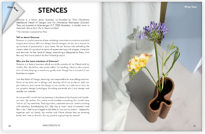
The images for each subject that have been selected are in relation to a specific subject such as candles, people, Stences (a home décor business), other still life objects. The photos all have a title on the top right hand corner of the page which gives more information on what each picture is about specifically. The images also have similarities in the colours, shapes and objects which are being used which I really like.
Examples of page layouts from ‘Breakfast’ –
Breakfast, by Niall McDiarmid –
Book in hand and binding, soft/hard cover: Image wrap/dust jacket/Swiss binding/How does it feel?:
As I only have access to an online preview of the book I am unable to know how it feels in hand but from seeing the book and a description of it, it is described as a ‘cloth covered hard back’ which means that the cover would feel like fabric with a bit of texture to it.
Paper/ink and format, size and orientation: Portrait/landscape/square/A5, A4, A3/number of pages/Use of different paper/textures/colour or black and white or both?
The photobook is orientated in a square format and is of A4 size, it is described to have 56 pages with 26 coloured images as the format of the layout of this photobook follows a uniformed structure of one image on the right hand side of the page.
The cover features a printed image on the front of it, which has been taken previously, and as previously described has a cloth cover. This gives the book texture and the title of the book ‘Breakfast’ is on the back of the book in red letters, this stands out against the yellow cover of the book due to them being contrasting colours.
Title: Literal or poetic/relevant or intriguing?
The title of the book is literal as it is ‘Breakfast’ which means that the photographer has taken these photos every time he has had breakfast in his house from around his breakfast table.
Narrative: What is the story/subject matter? How is it told?
The subject matter of this photobook is to show a story of how breakfast is the most important part of the day and shouldn’t be missed by others as it is where you think about what your day may hold and is shown through a series of images which feature different breakfast table layouts and people.
Structure and architecture: Design/specific features/layout of images/grid/fold-outs/inserts/single of double page spread?
The book features a specific repeated layout of having one image on the right hand side of the page in a square layout, following the formation of the photobook.
Editing/sequencing/images and text/Are they linked?/use of captions/Selection of images/how they were juxtaposed/editing process:
There is no use of captions throughout the book but the images feature the same space in which the photos are taken in but from different perspectives and layouts of the breakfast table each morning as it may be set up or shown to be people in a rush or getting up at different times so they might not be able to sit down formally and have to take their breakfast on the go with them
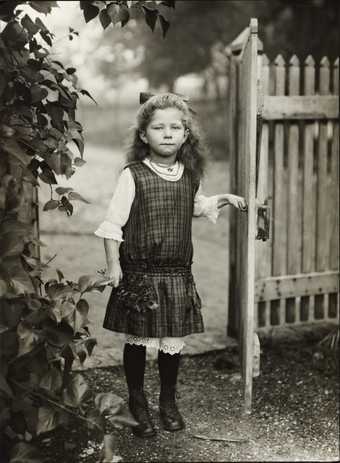
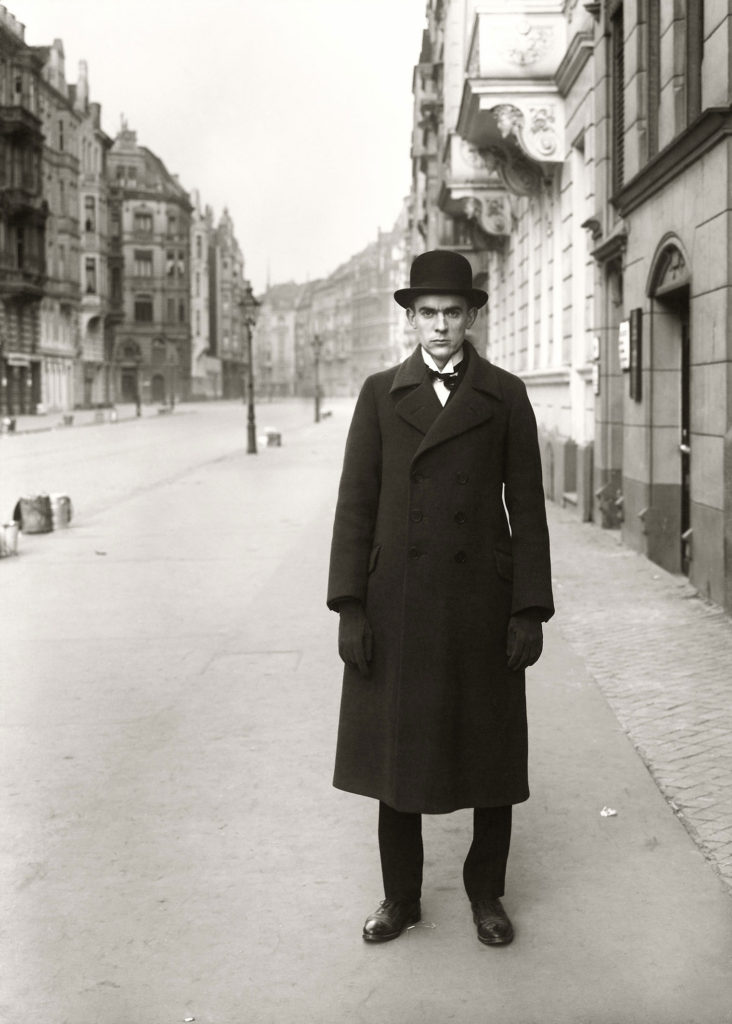
This is a simple and direct approach to portrait photography, you can see with this use of different simple images, he uses different framing, location, environment and poses. The location changes can portray different emotions with the background along with the poses, some more subtle and some more bold.
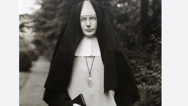
Nonne (Nun) 1921
This image by Sander visualises the Nuns work environment, showing where she is at peace, the framing of this photo reveals her outfit and her holding a Bible, interpreting what she does and what she is like as a person. Her pose is stern indicating she is a strong independent women.
I would like my images to be presented in this way, as the simple approach can still be a very meaningful way of showing emotions and telling story.
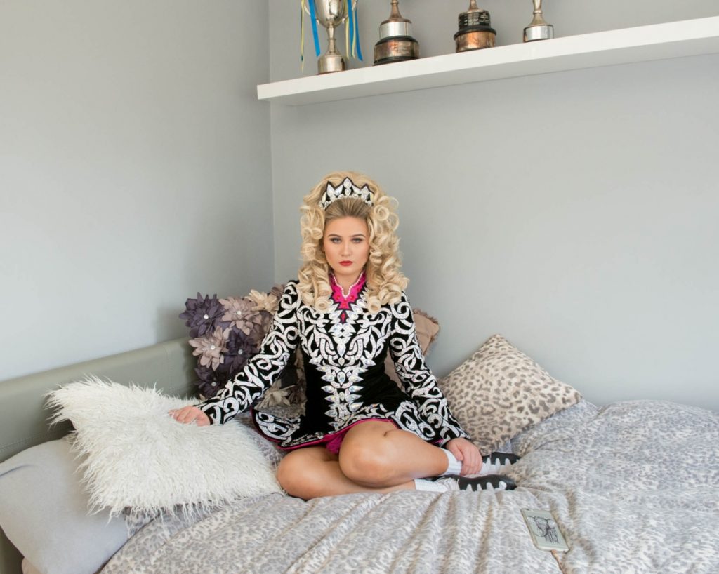
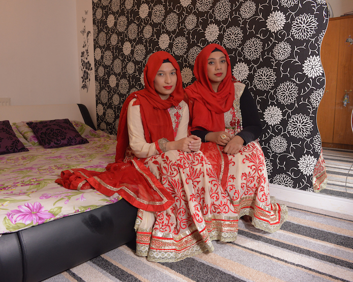
Michelle Sanks images
This is also a simple approach, her work i find would be a simple but effective way of photographing, facial expressions, environment, and framing will play a large role in my use of images i present regarding Sank.
Multistory events
You can clearly depict the culture from the photograph just by the outfit worn and the bedroom (environment), their body language determines they are family or friends.
Sander and Sank, have both similarities and differences. A similarity being their use of different locations representing a contrasting story behind each one. A difference is that Sanks work is more modern and she uses colour, most of her work is used with her photographing women in their bedroom as their own personal space says a lot about how they perceive themselves and how they are as an individual. Their approaches with their images are relatively similar, including only portraiture.