During the exam I decided to go back to my Photobook to work on the final layout as well as decide on the front and back cover design and a name.
I struggled to decide on what I wanted to use for my front cover, and narrowed it down to three options.
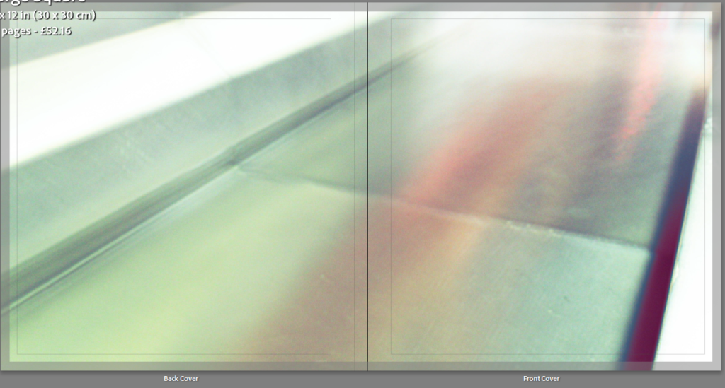
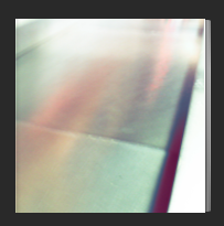
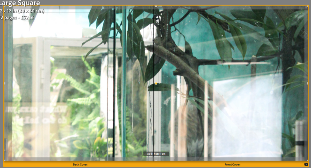
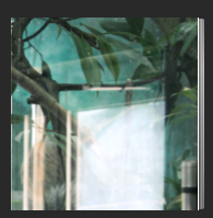
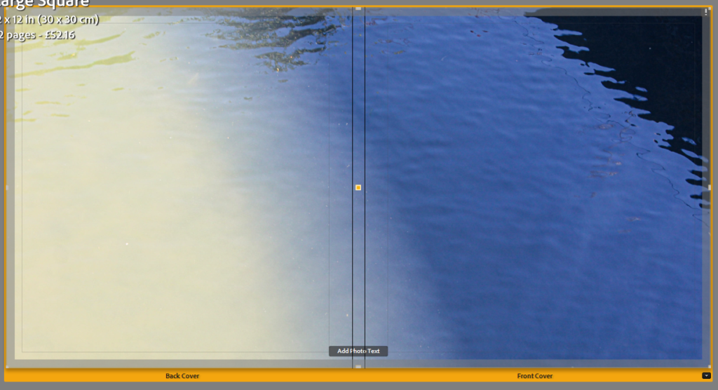
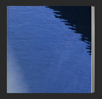
I decided to take screenshots of each and compare how well I felt they looked as covers. In my opinion 1 and 3 were my best options but I still was not entirely sure.
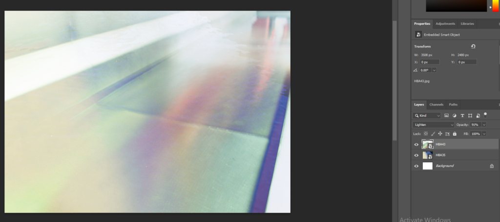
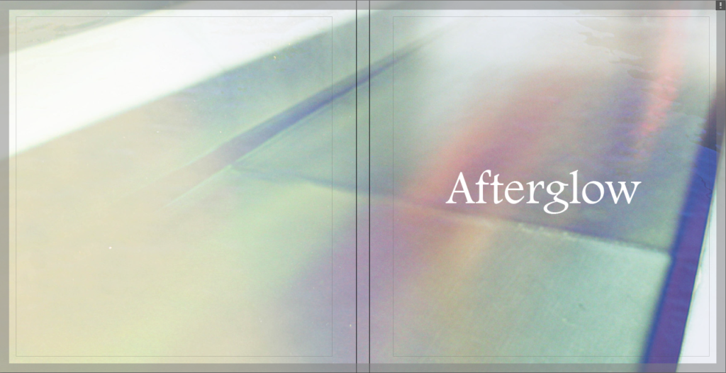
I decided to open up Photoshop and to see what it would look like if I tried to overlay them. I experimented with the layer types, order and opacity but eventually settled on using the Lighten layer mode at almost full opacity. I liked how this combined the image colours while still keeping most of the details.
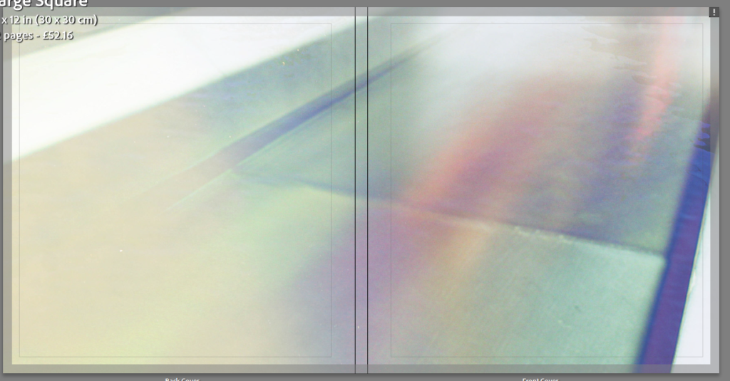
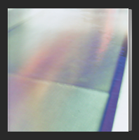
After being satisfied with the cover design, I then moved on to coming up with ideas for the title, as well as experimenting with font choices.
I looked up words associated with light and colour to see if I could find anything interesting-
- Afterglow– a glow remaining (as in the sky after sunsets) where a light has disappeared. : a pleasant feeling that lingers after something is done, experienced, or achieved.
- Chroma– purity or intensity of colour.
- Spectral– of or like a ghost. / Of or concerning spectra or the spectrum.
- Aurora– a natural electrical phenomenon characterized by the appearance of streamers of reddish or greenish light in the sky, especially near the northern or southern magnetic pole. / The dawn.
- Radiant– sending out light; shining or glowing brightly.
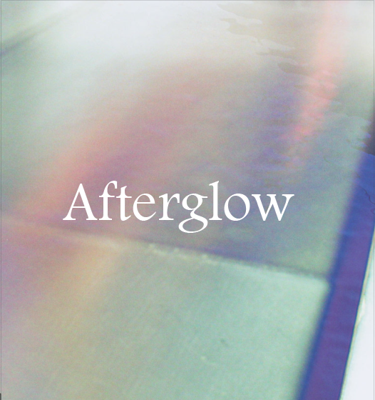

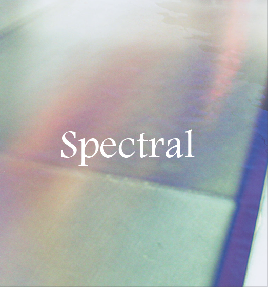
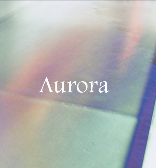
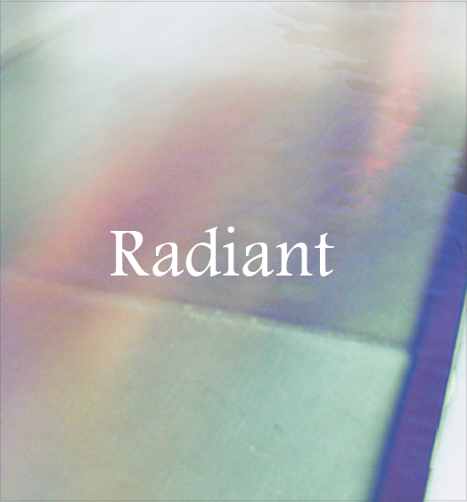
I found a font that I liked and typed out each potential title to see how they would look. I liked the simple layout of just the white text and no other writing. I experimented with having the text in capital letters but I preferred it with lowercase letters.
I then moved on to experimenting with the colour of the pages inside the book. By default they are white but I thought it would be worth seeing how page spreads would look like with a variety of options.
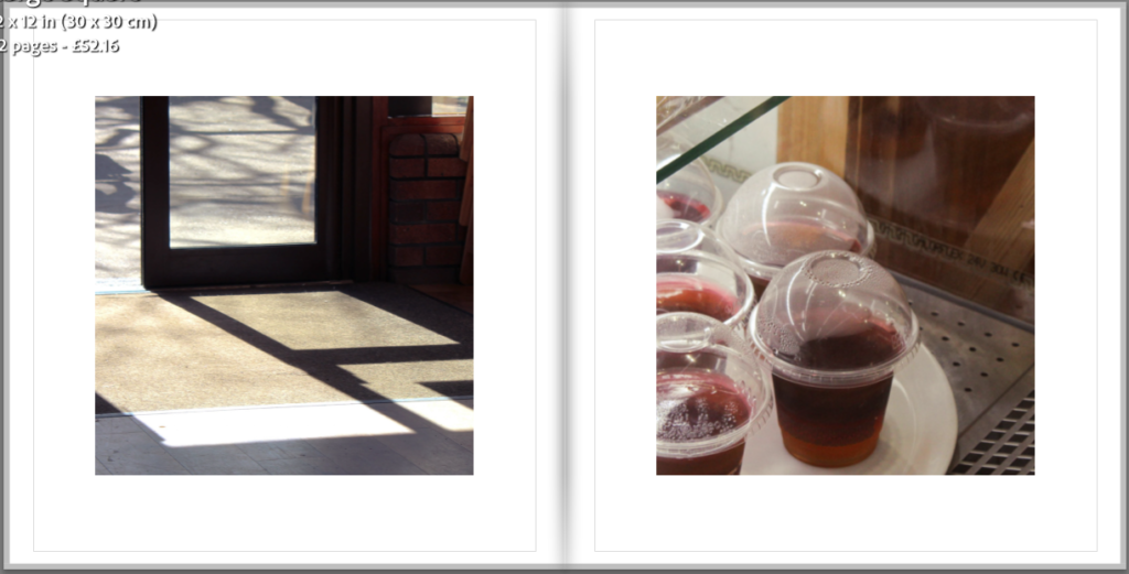
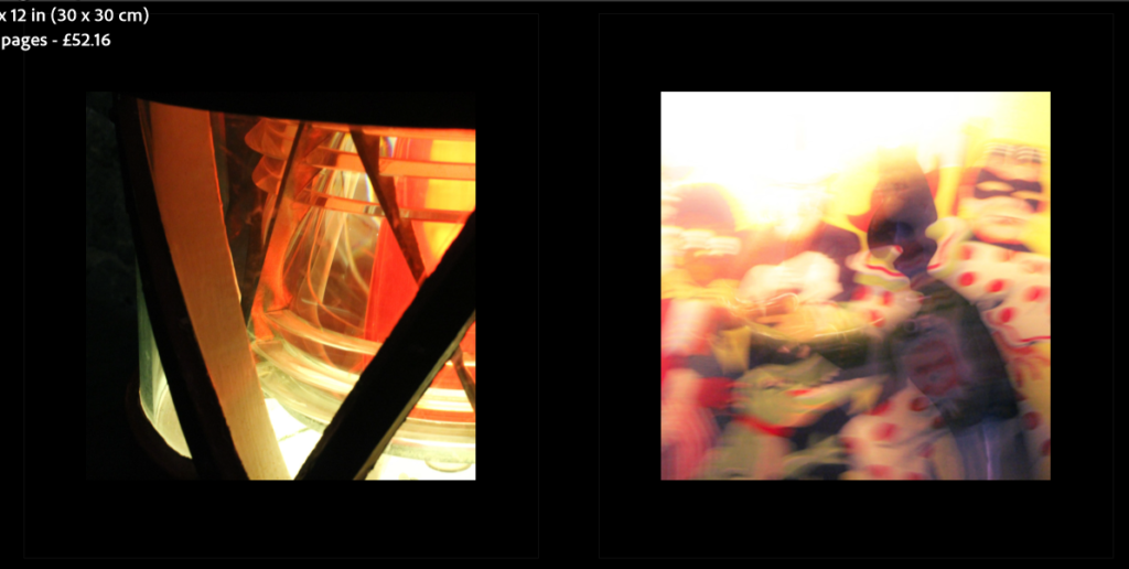
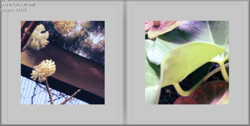
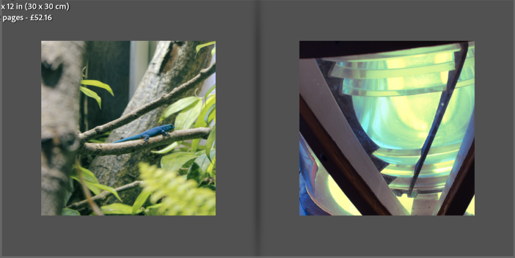
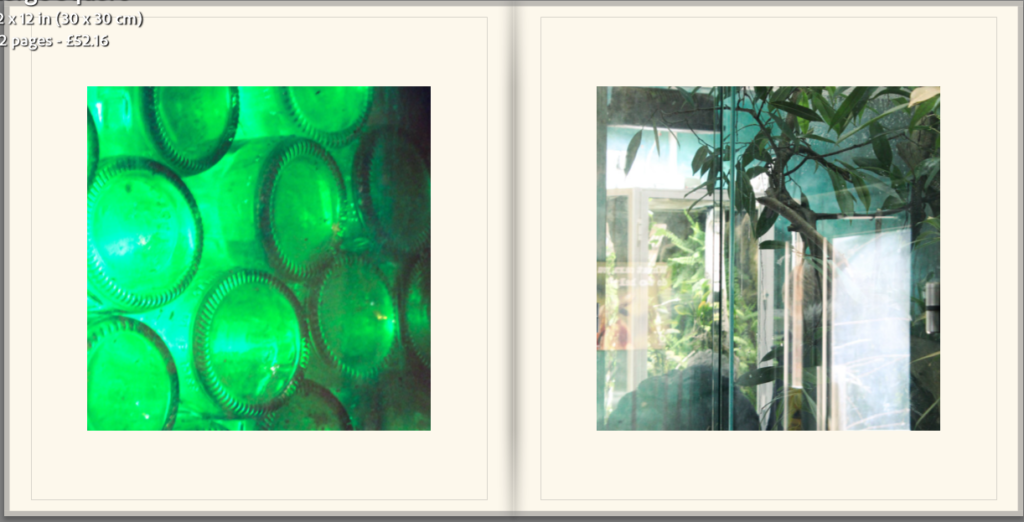
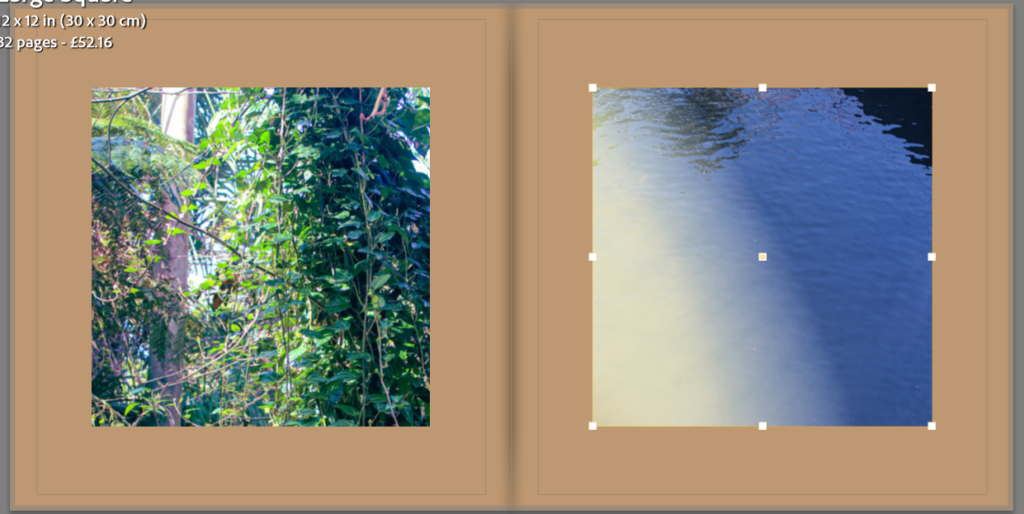
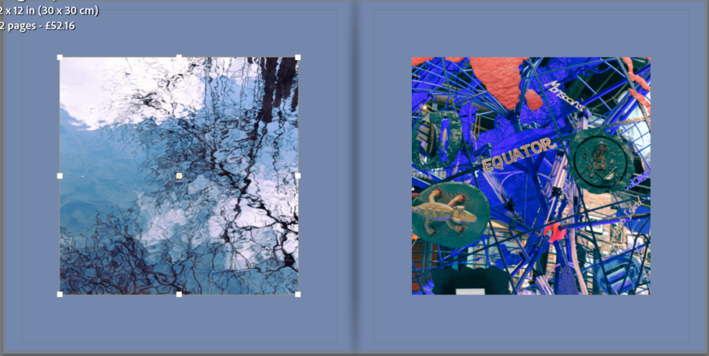
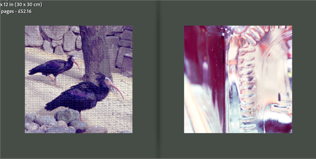
I liked the white and off white the most so decided to compare the two a little more.
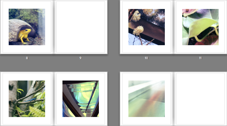
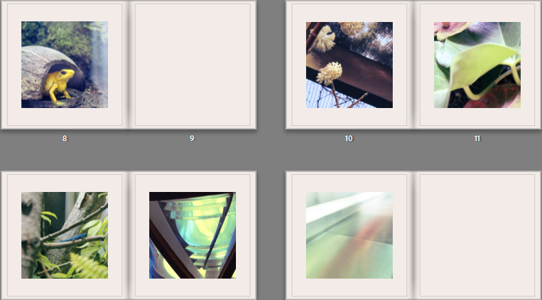
I feel that the pure white has a bigger contrast with the images than the off white, giving the two very different effects. While it was interesting to experiment with, I decided that I wanted to use the pure white, because it draws more attention to the colours in the images.
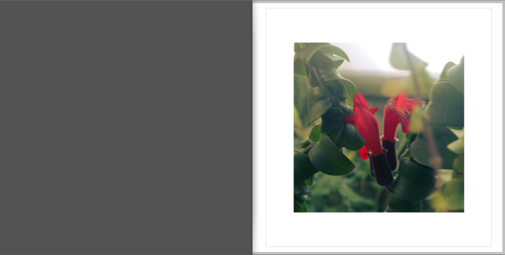
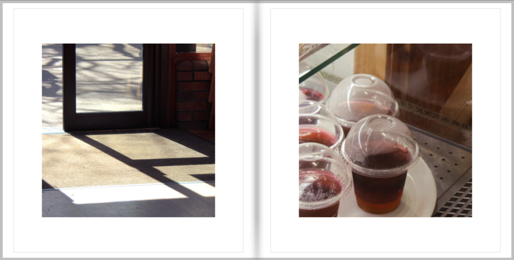
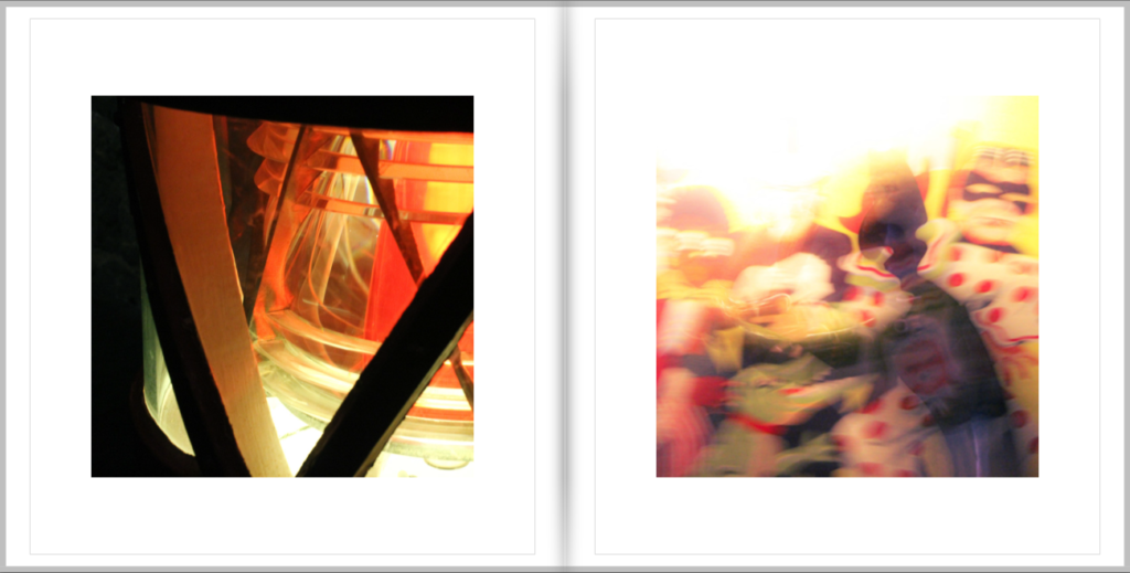
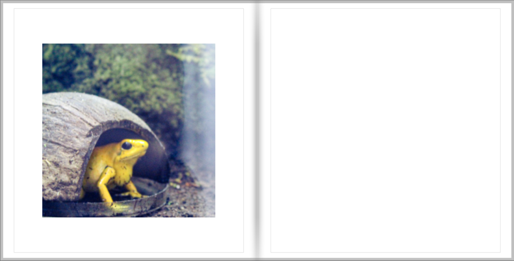
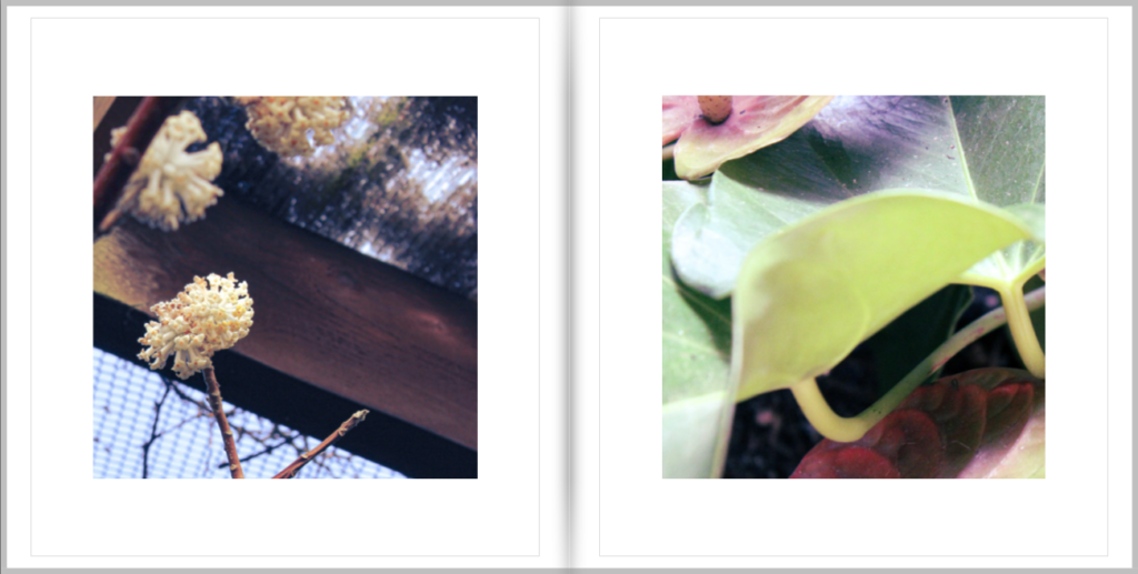
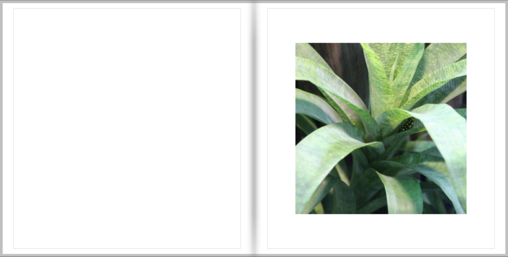
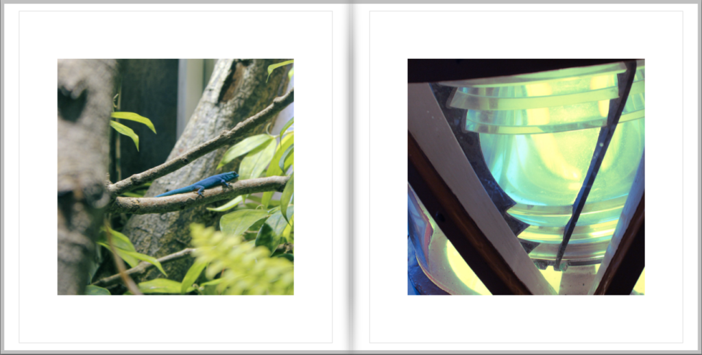
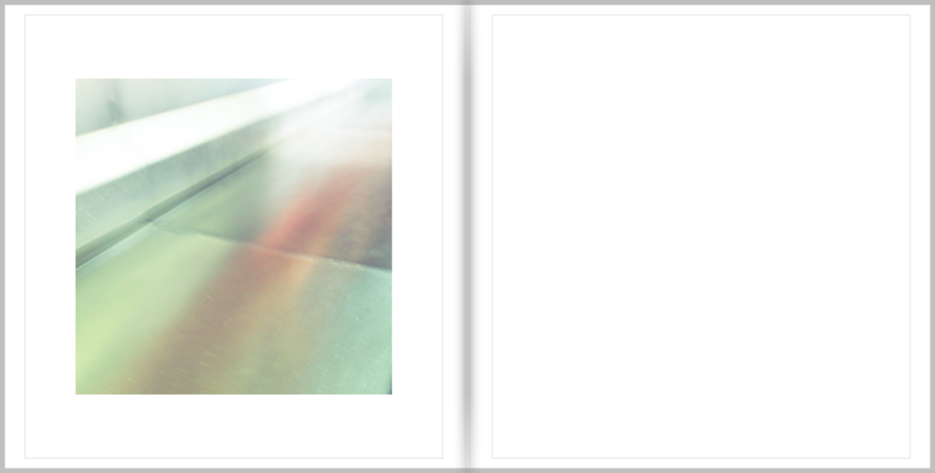
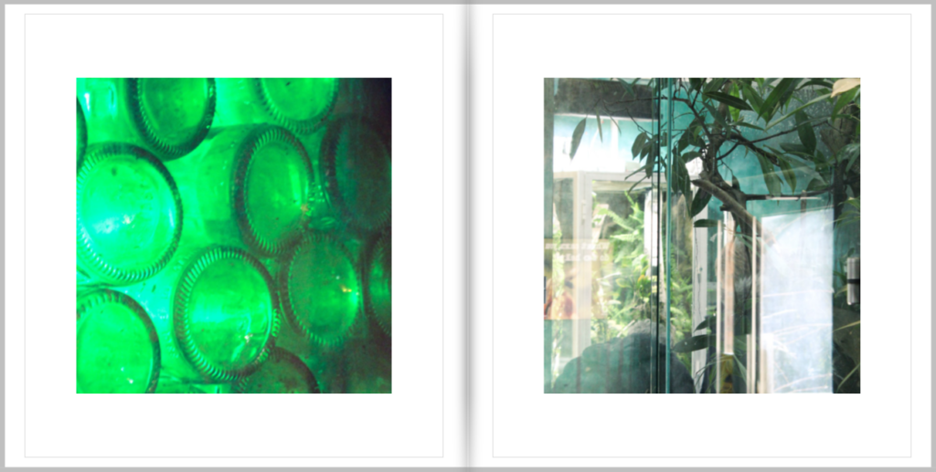
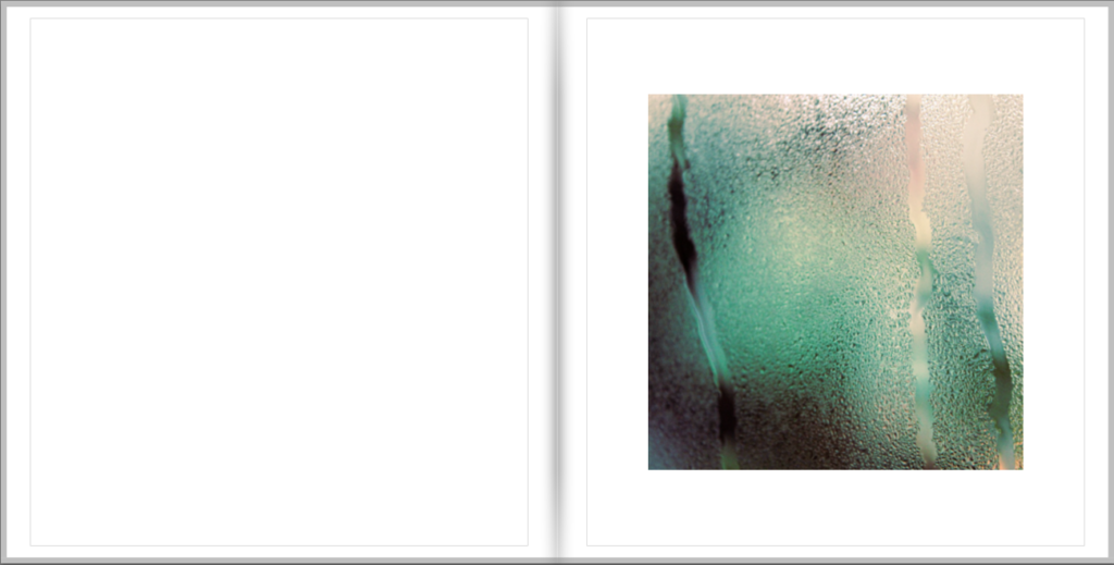
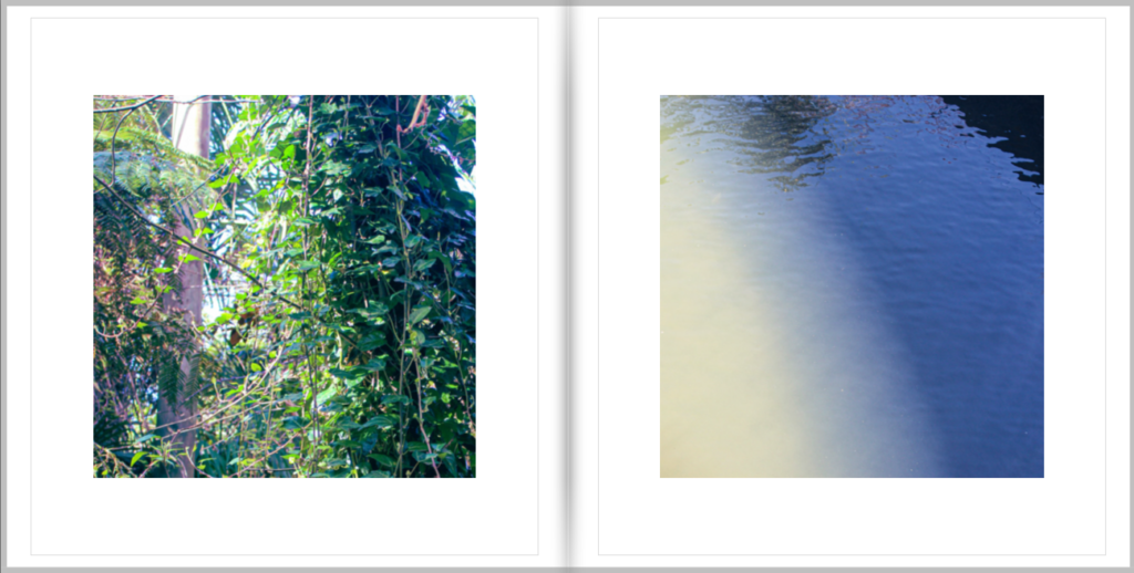
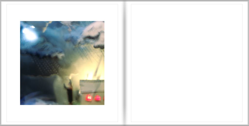
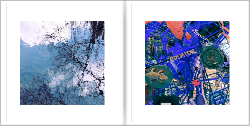
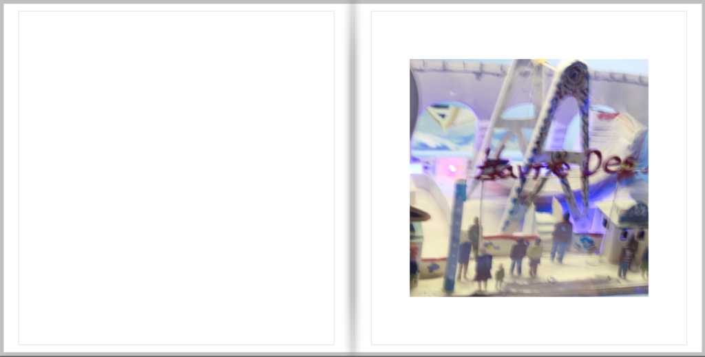
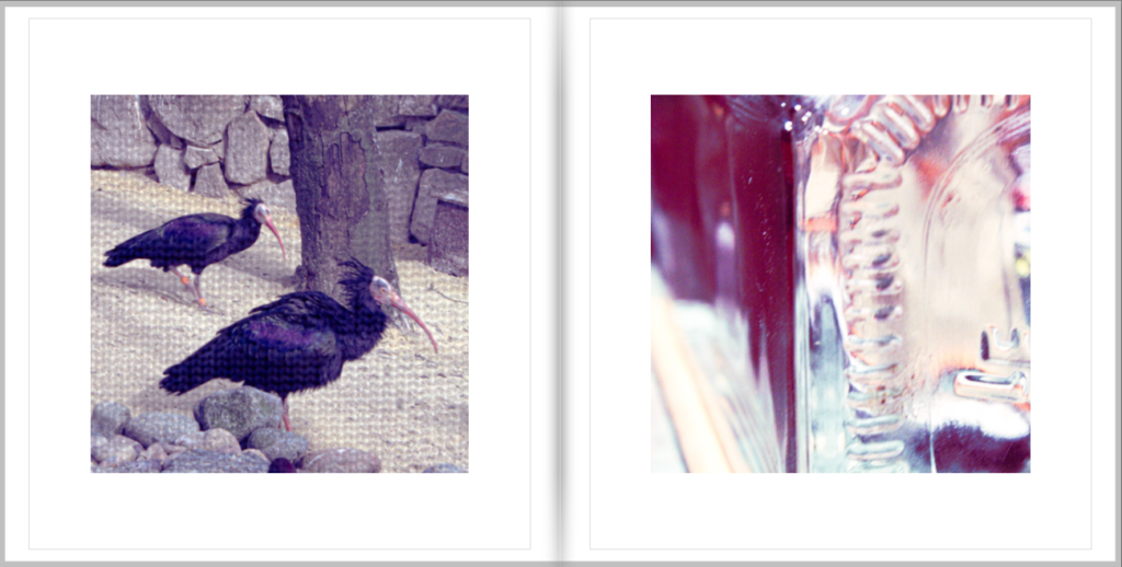
Updated Draft (still undecided on name)-

Hannah, make sure you publish the following blog posts:
1. Mock display of final images
2. Final photobook + evaluation + hyperlink to Blurb book
3. Final prints + virtual gallery + evaluation