Photoshoot 3

For my third photoshoot the circumstances changed from my photoshoot plan due to weather and models not being available.

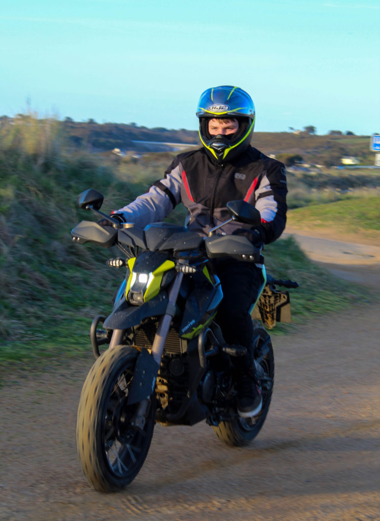
These are my images from my third photoshoot of my exam project. They were inspired by Danny Lyons’ The bike riders.

I used adobe light room classic to go through the images i had taken and pick which ones were the best from the shoot and for my photobook.

Development

I used the tools in adobe light room classic to manipulate my images to make them look better.

I used the crop tool on many of my images to remove some of the background to increase the focus on my models and their motorbikes.

I also edited the tone of the images such as increasing the contrast and the shadows as well as decreasing the exposure due to it being a sunny day and the highlights to reduce the reflection off the shiny panels on the bikes and the visors on the helmets.

Experimentation

I experimented with making the images black and white in order to more closely stick represent Lyons’ style. However, due to the images i took having bright and vibrant colours i think they look much better in colour. Additionally, when in black and white i don’t think that there is enough contrast between the rider, the background, the bike and the floor. For these reasons i am going to present my images in colour.

I also experimented with textures and tints over the image however these modifications took the focus away from the subject of the image.

Final Images

Image Analysis

The subject of this image being the rider and his motorbike are sharp and in focus with a high contrast to the background which is slightly out of focus which ensures the subject is what the viewer focuses on. Both the rider and the motorbike consist of vibrant colours that are opposing on the colour wheel which separates the rider from his bike yet the darker colours in the riders trousers and the bottom of the bike connect my model and his vehicle due to little contrast in the colours. I used a 18-50mm lens set to 18mm for this image. I set the shutter speed to 1/160 sec, the ISO to 100 and f/50. This gave me a sharp and crisp image in the foreground and a slightly blur over the background. These settings were perfect for the weather conditions on the day of the shoot which was sunny. The sun was going down to the west which gave powerful shadows to the east. I positioned the camera low down. This have a new perspective of the scene as well as showing the true shape of the motorbike which is much taller and wider at the front than at the back which is common in the style of the bike it was.
Artist references: case study 2

Nicholas Goodden

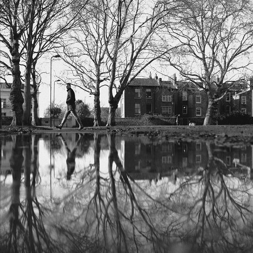
Nicholas is a full time commercial photographer with 15 years of experience. He has had a long list of clients in the past, including Adidas, Peugeot, Amazon and Heineken.

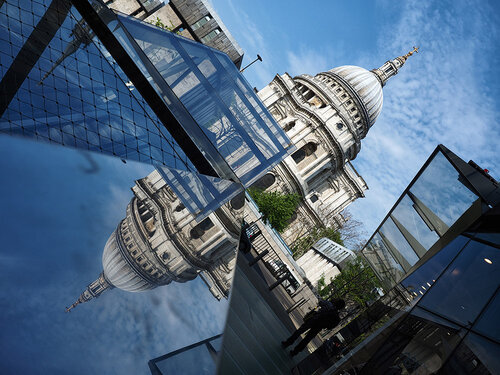
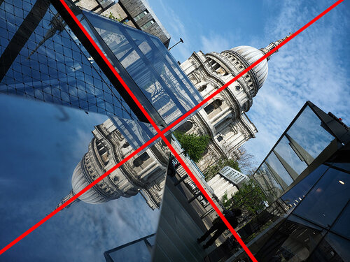
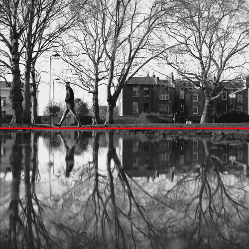
I am focusing on his reflective and symmetrical work:

Taken from his website:

“Now… I cannot speak for others but in my opinion symmetry is key in photography.

Of course it needn’t be present in all photography but it’s hard to deny the strong and positive impact it has on any photograph.

Symmetry seems to satisfy a need within us.”

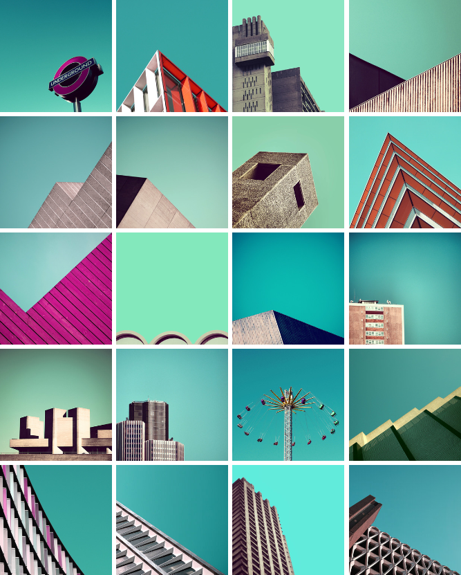
Nicholas also did a minimal photography project in London:

I will be taking photos similar to this kind of style in Jersey,

photoshoot 2 – waterfront apartments

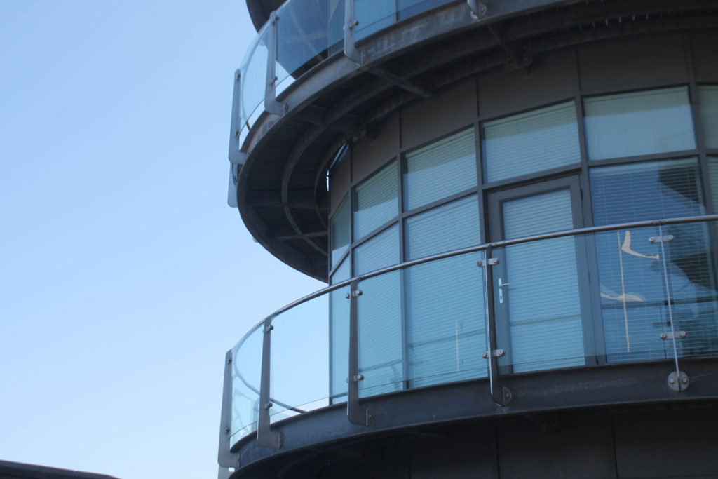
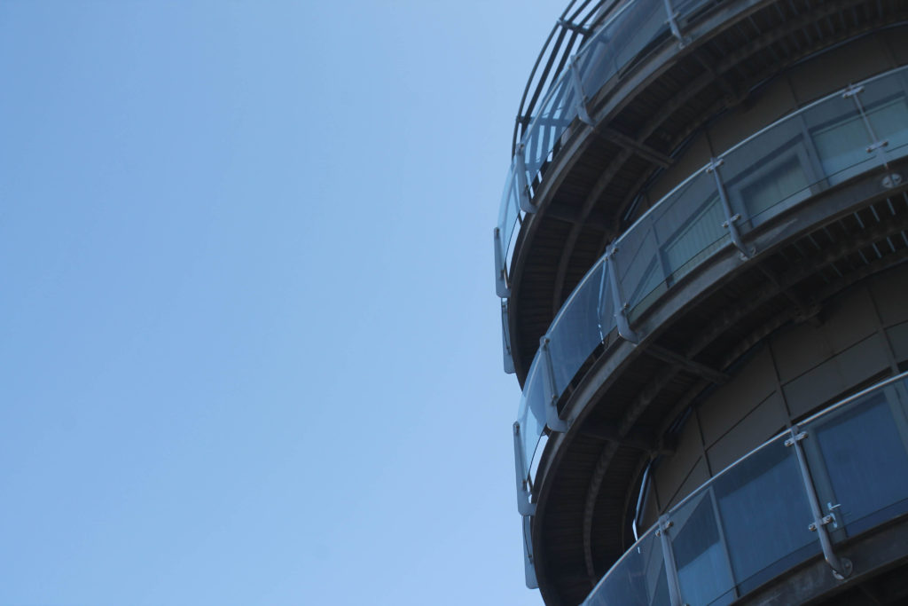
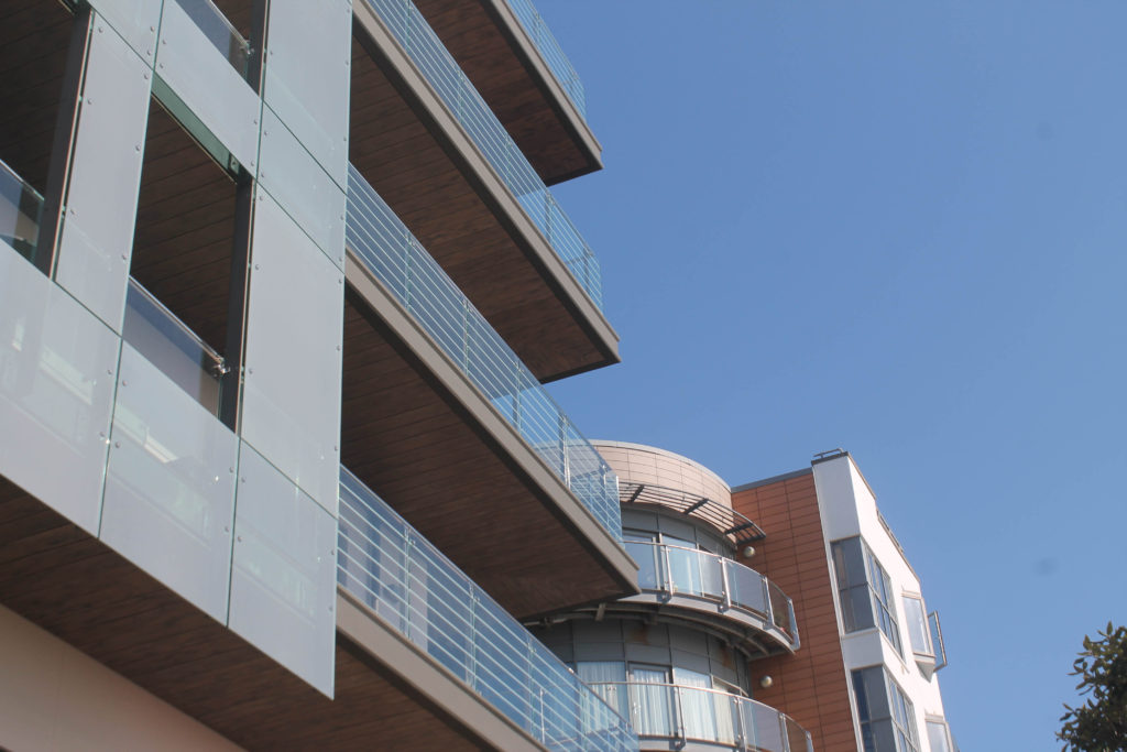
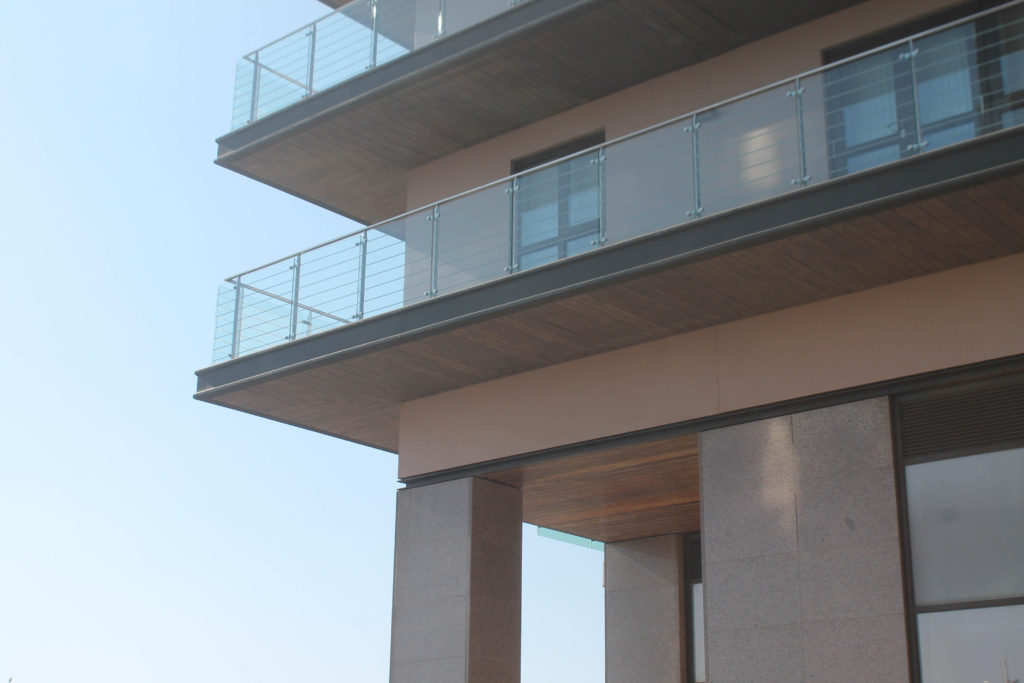
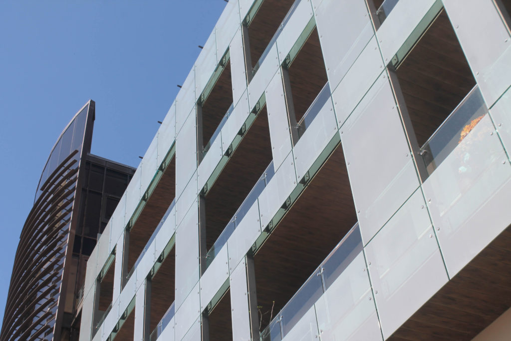
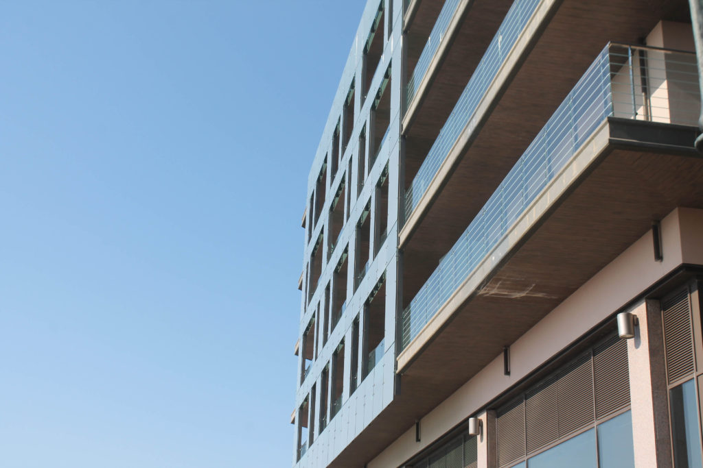
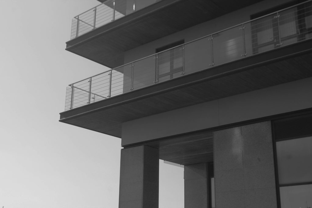
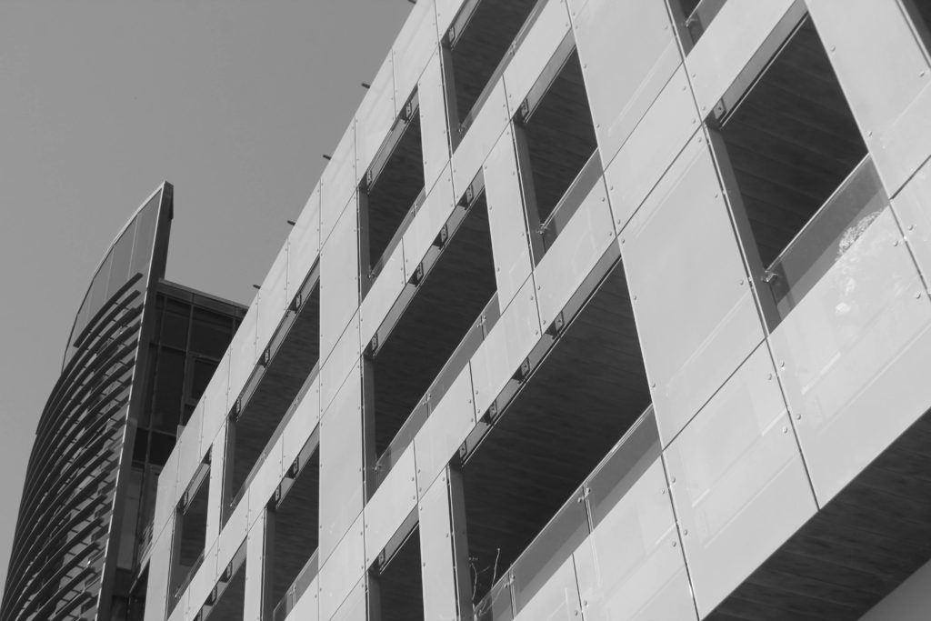
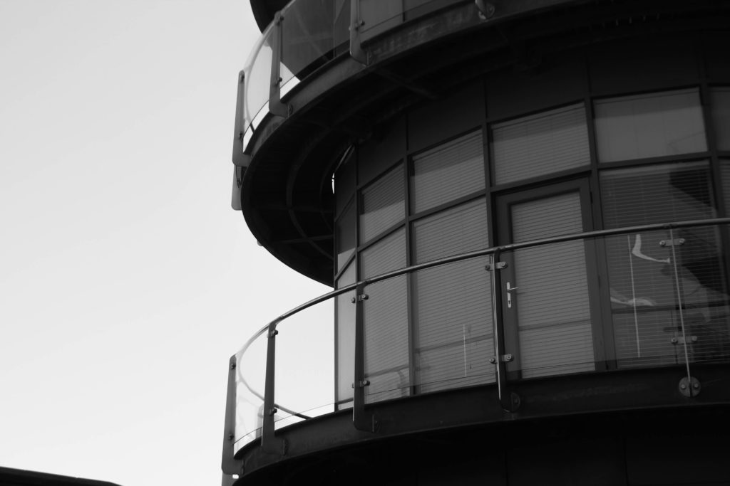
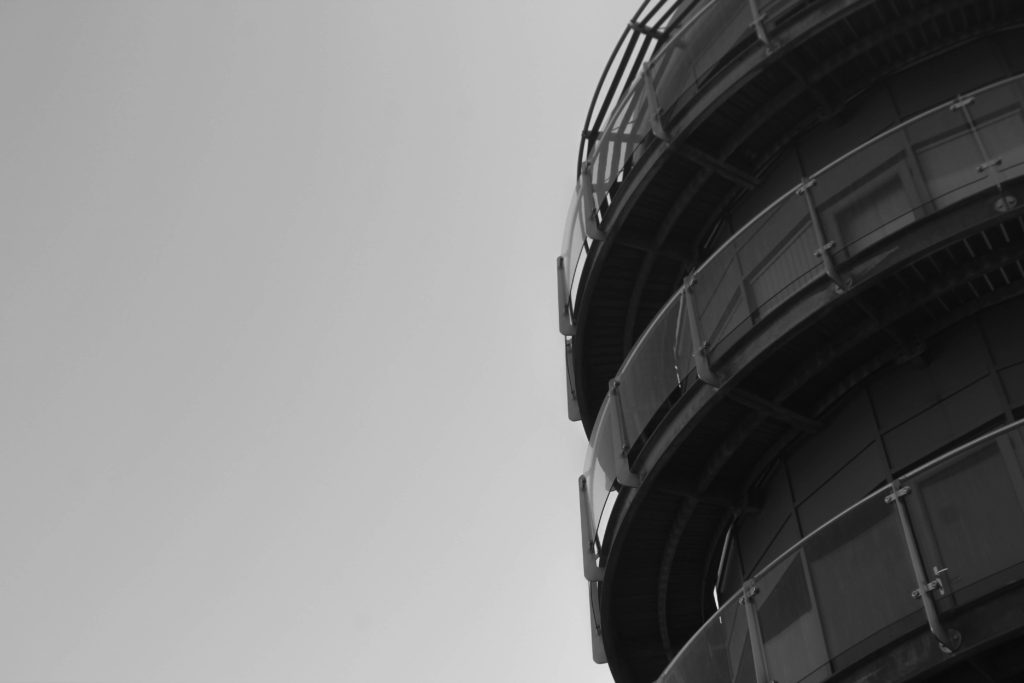
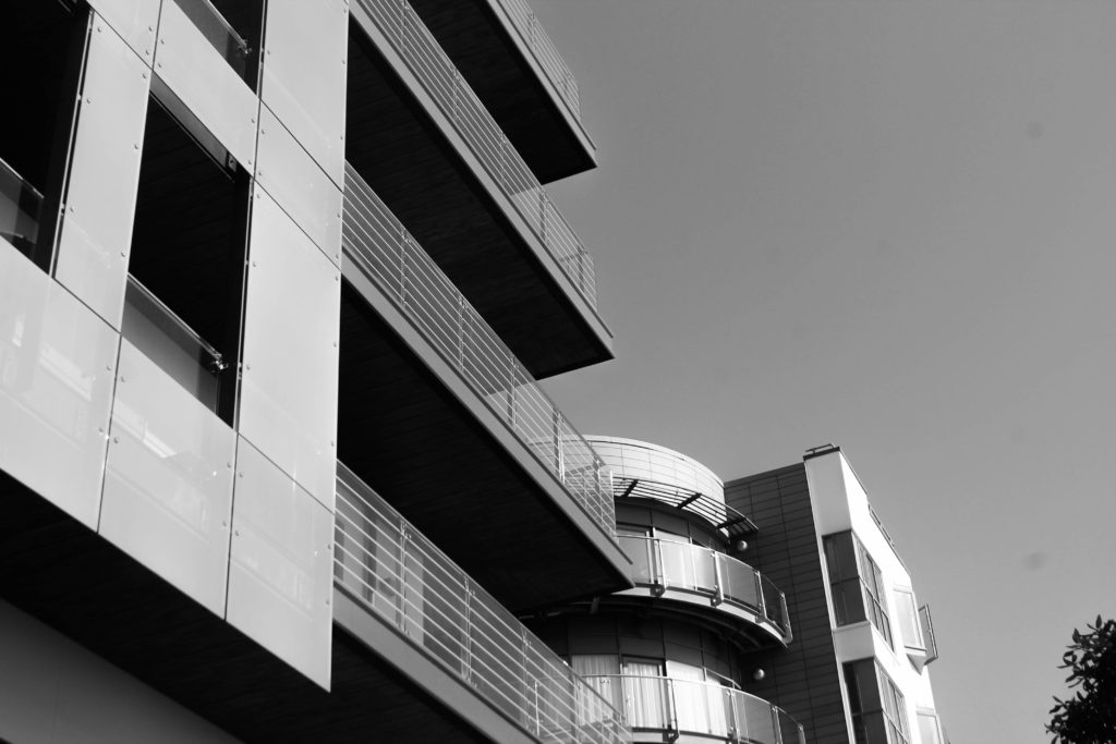
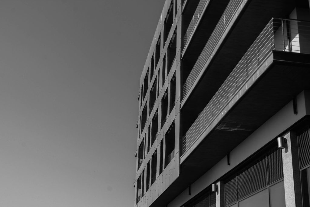
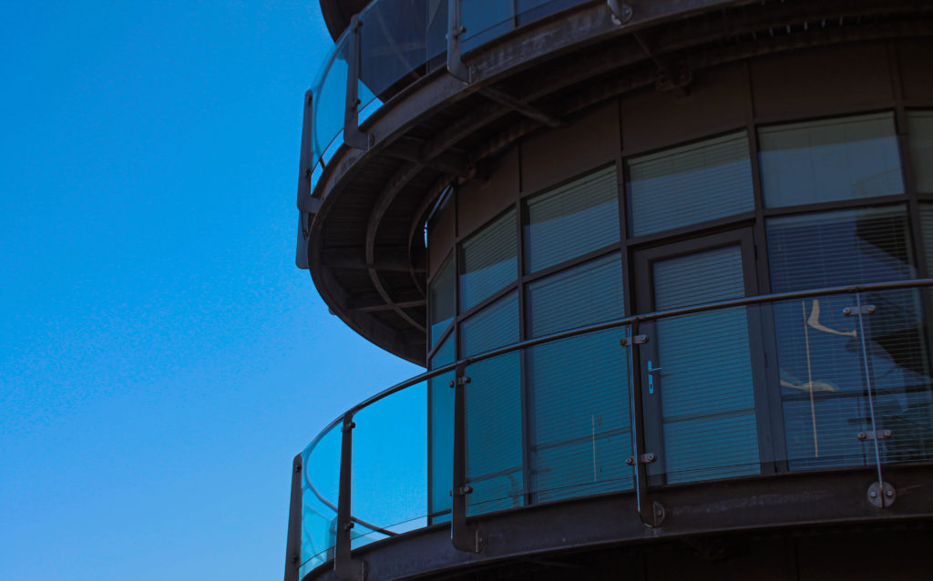
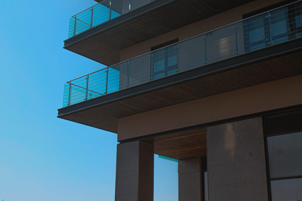
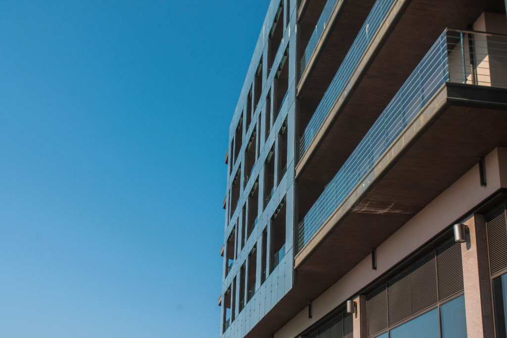
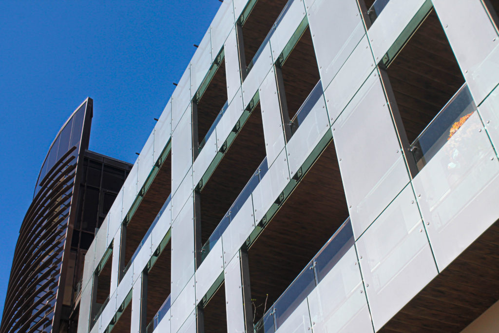
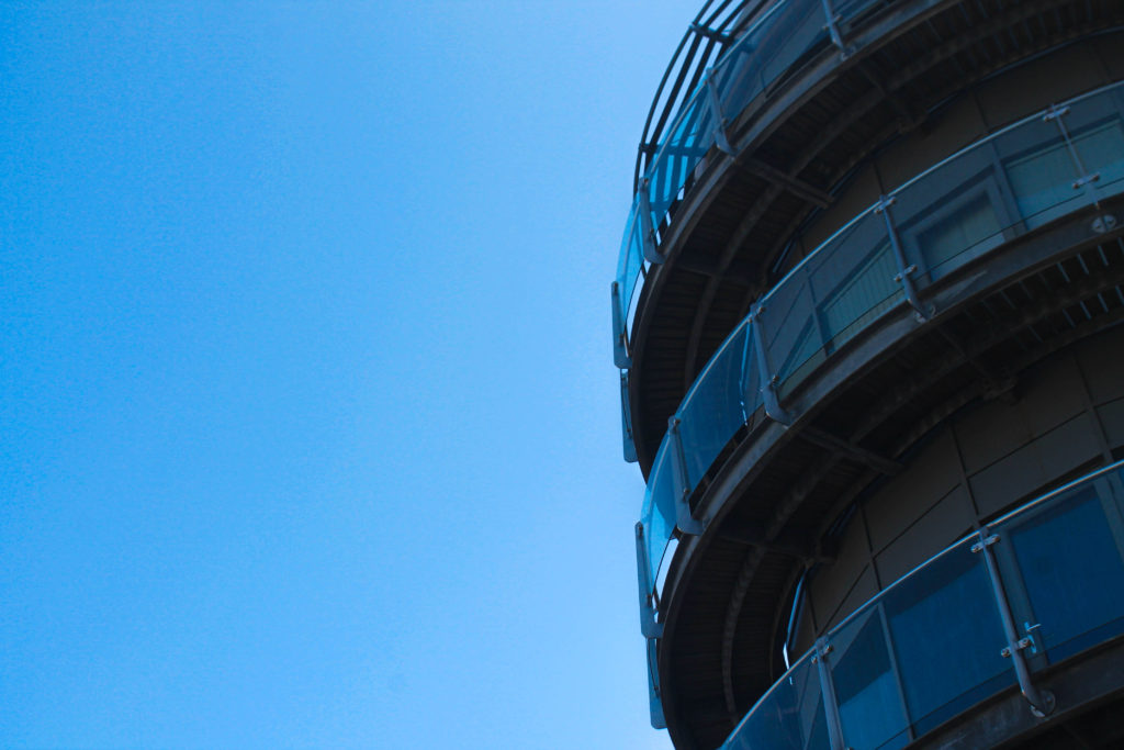
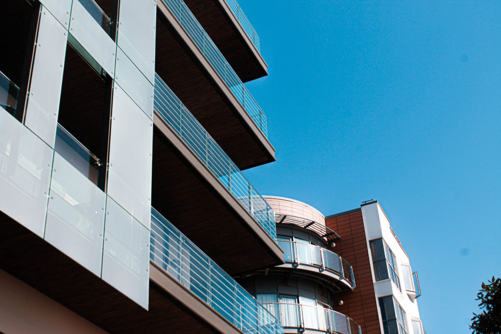
This was my second photoshoot I carried out for my exam project. I took this photos on the 20th of April because of the perfect weather with a bright sun and very clear blue sky, giving the images a nice blue background. I photographed buildings mainly from an angle from underneath the buildings to cast shadows and forecast light on my main focus being the unique features of these apartments. I tried experimenting with close ups and further angles to decide which idea I would like to further carry out. I tried to follow Matthieu Venots style of taking images but with less vibrant colours and more basic coloured structures. Also, the buildings I took photos of contain much more unique and complex features rather than Venots simple structures containing a maximum of 3 colours.
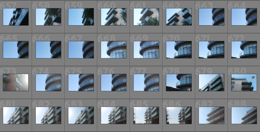
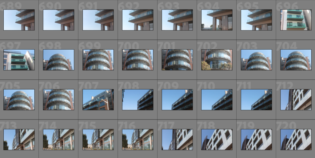
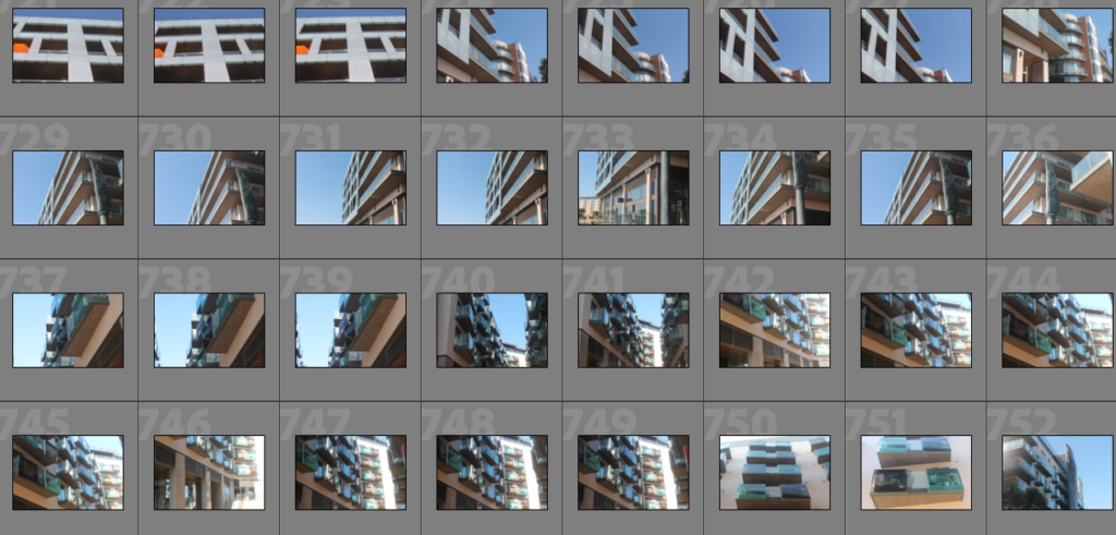
Contact Sheets:

Editing Process:

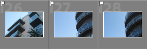
To begin, I used the P and X method (Pick and reject) to decide which images I wanted to further expand in my project and potentially use as my final images. Below shown are the images I chose to Pick:


After using the P and X tool I realised I did not get enough high quality images for my Waterfront shoot and I am going to need to go their again. Next I used the star rating tool to rate my chosen images from 1-5 based on which I like best.

My Best Unedited Images

Black and White

Best Edited Images

With these edited images I attempted to follow Matthieu Venots style of work by increasing the blueness of the sky. In my original images the sky is too bright and was barely seen as blue so I used the calibration tools to develop the vibrancy of the sky to try and respond to Venots images.

Evaluation

Overall, I am not fully confident with these images as I didn’t take enough quality images, however the images that did turn out well I am more than happy with. My images is a slight response towards the work of Matthieu Venot because my images contain the light blue sky but with no vibrant colours. I much prefer the coloured variant of my images compared to the black and white because I think the contrast between the blue sky and the dull coloured building is a nice scene to look at. Also, my inclusion of the shadows create great contrast between the sky and the brown like colours. To improve this photoshoot I am going to go to Waterfront apartments again and try and caputre more quality images and take more time when photographing to try and prevent any motion blur, images out of focus, and images that are too bright.

Presentation Ideas

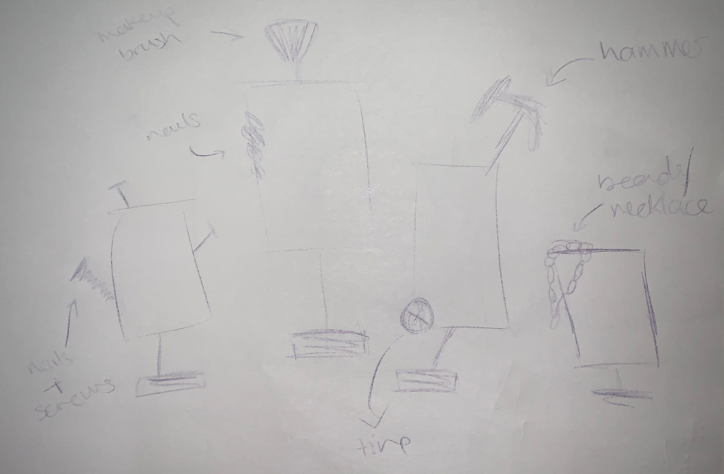
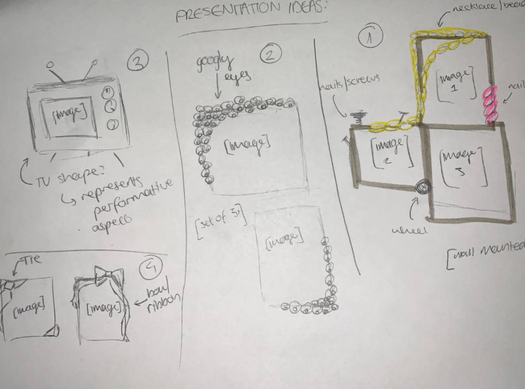
For my presentation/mount up, I wanted to ensure that my framing would enhance the images by being personalised to the images. Due to this, I created some sketches of my ideas and labelled some key elements within each idea.

At first, I wanted to mount the photos so that they would be able to spin – planning to reuse old mirrors and decorate them according to match each image. However, I felt as though the images would look disconnected from one another rather than be viewed as a set due to the differences in decorations which led me to create some more sketches to work around this issue.

Sketch 1

Next, I began to experiment with my ideas, creating 4 new sketches that I began to explore. I was leaning into the idea of creating a small tv [sketch 3] and trying to make my images spin by using the notches to make my final project more interactive. Alongside that, I felt the tv would help to portray the performativity of gender/gender roles as it’d be showing my images on the topic as a fabrication whilst mocking the idea of people imitating what they see on tv. However, I knew that it would take a lot of time to create so I decided on using sketch 2 as a back up plan in case I wouldn’t be able to create sketch 1 as I the eyes around the frames would symbolise how society is constantly watching and judging the actions of those around them and criticising those who stand out/reject conformity.

I decided against using sketches 1 & 4 as they felt too plain for my liking and felt as though they wouldn’t use help elevate my images like sketches 3 & 4 would.

Sketches 1-4

Object Shoot 2: Cyanotypes

The plan for this photoshoot is here: LINK

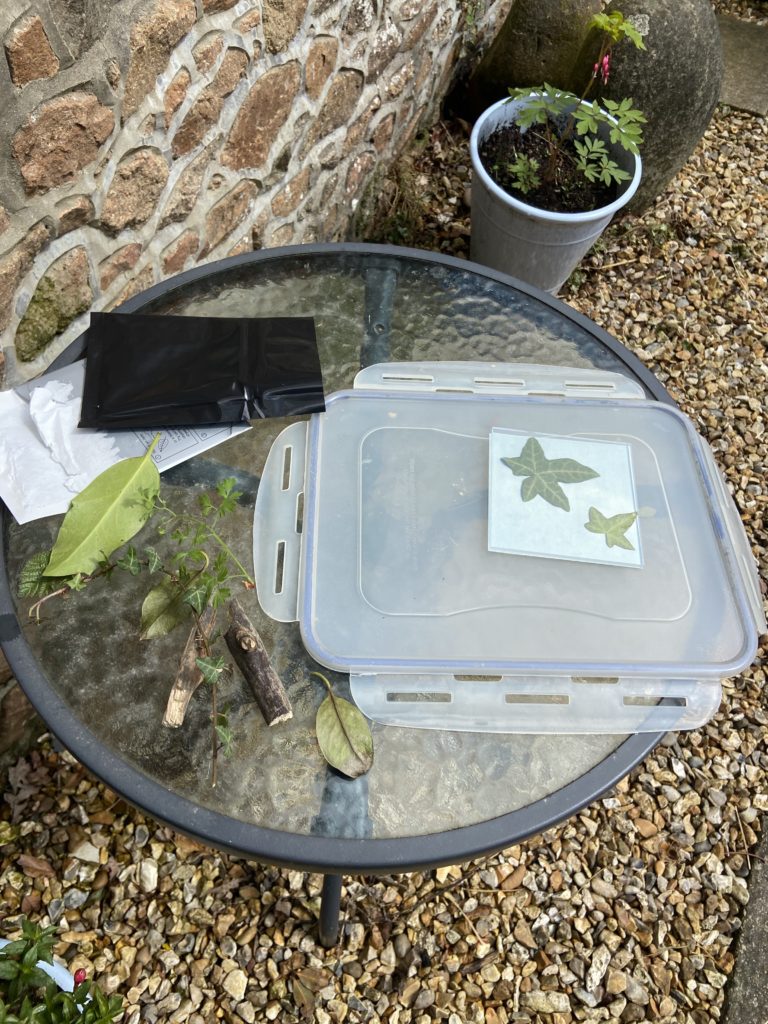
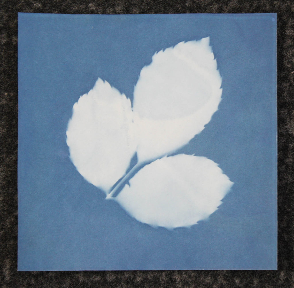
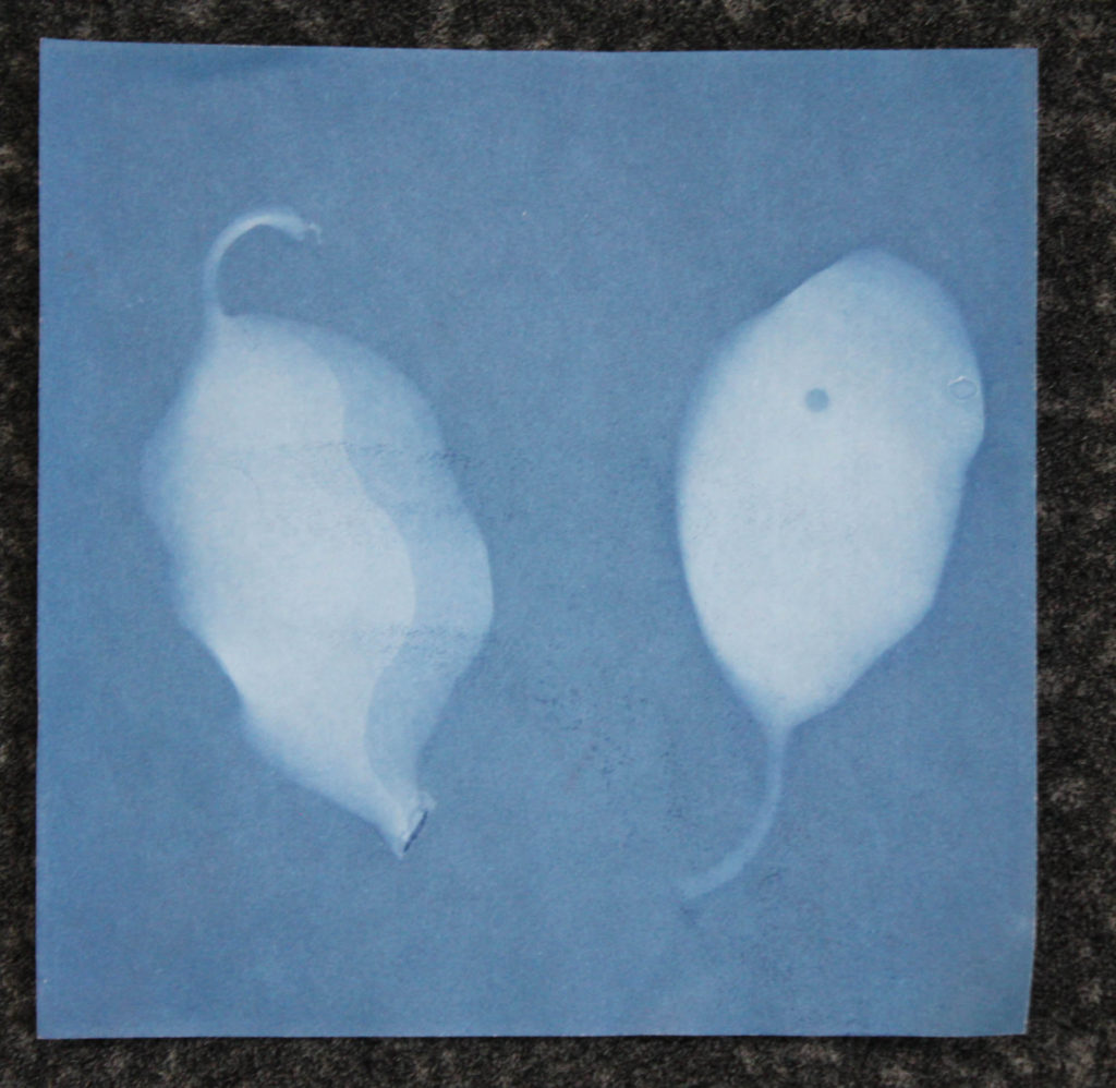
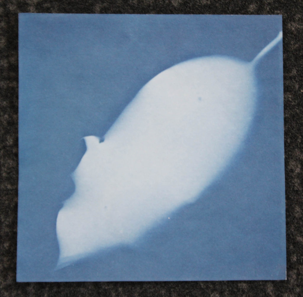
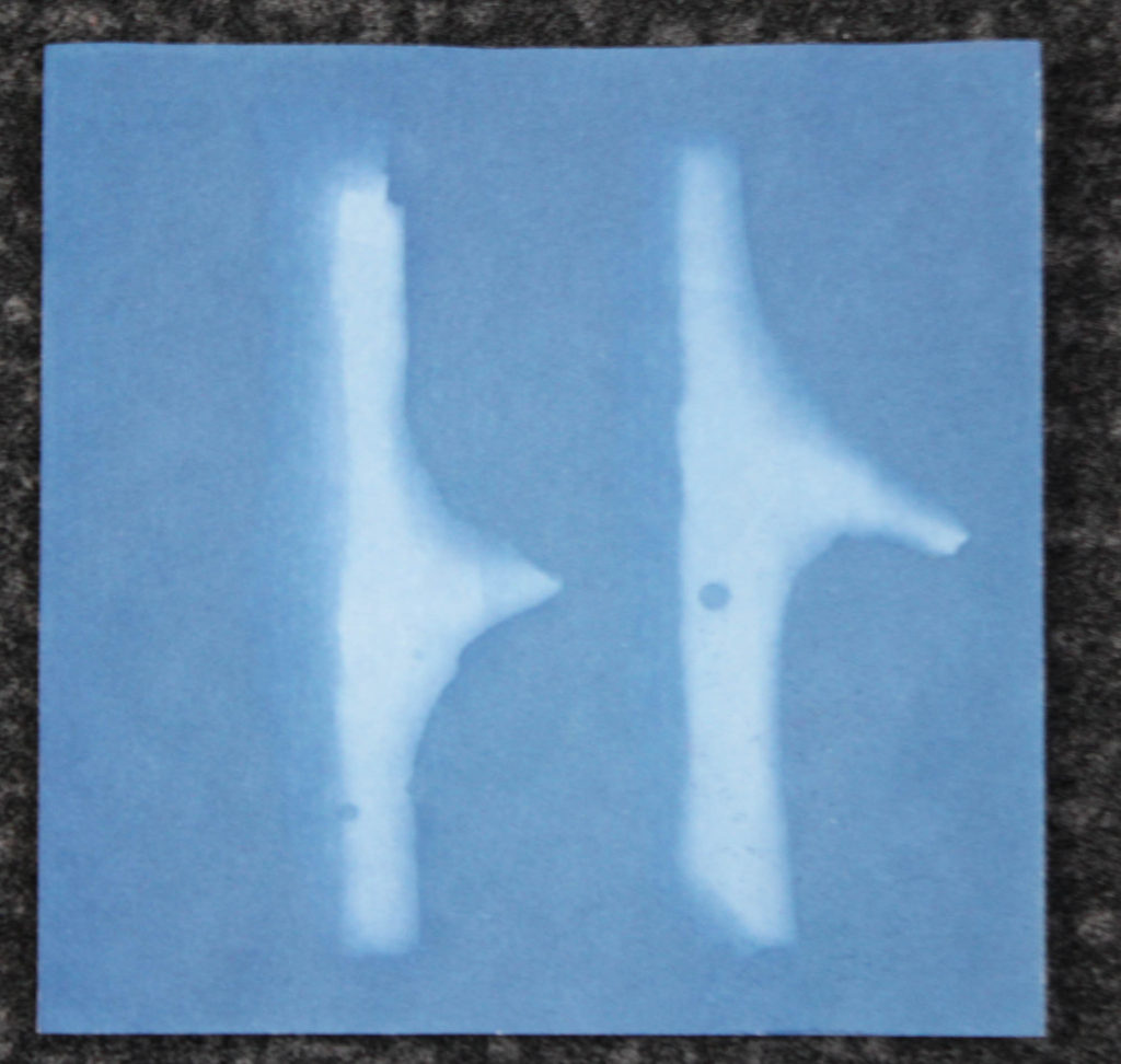
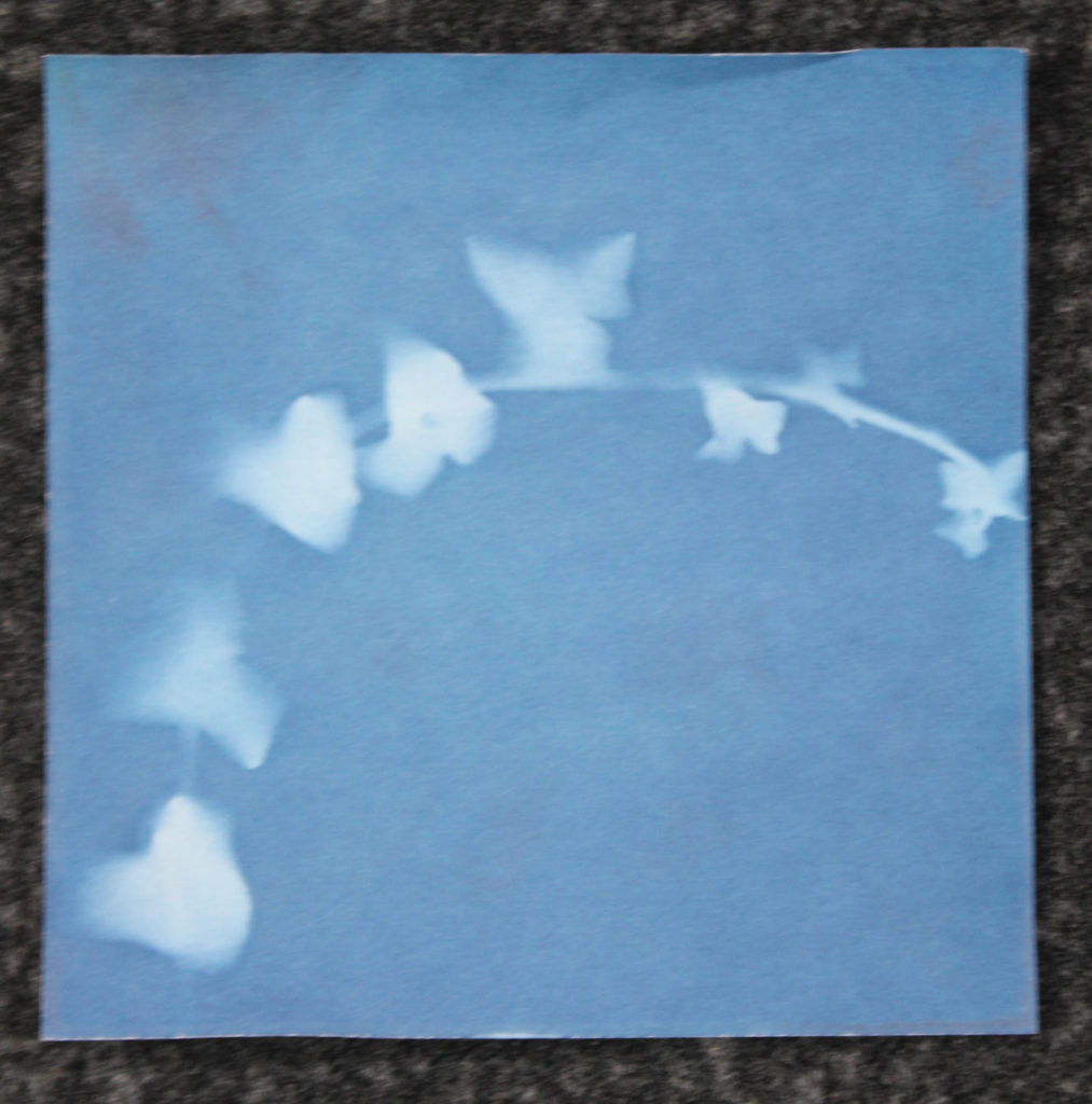
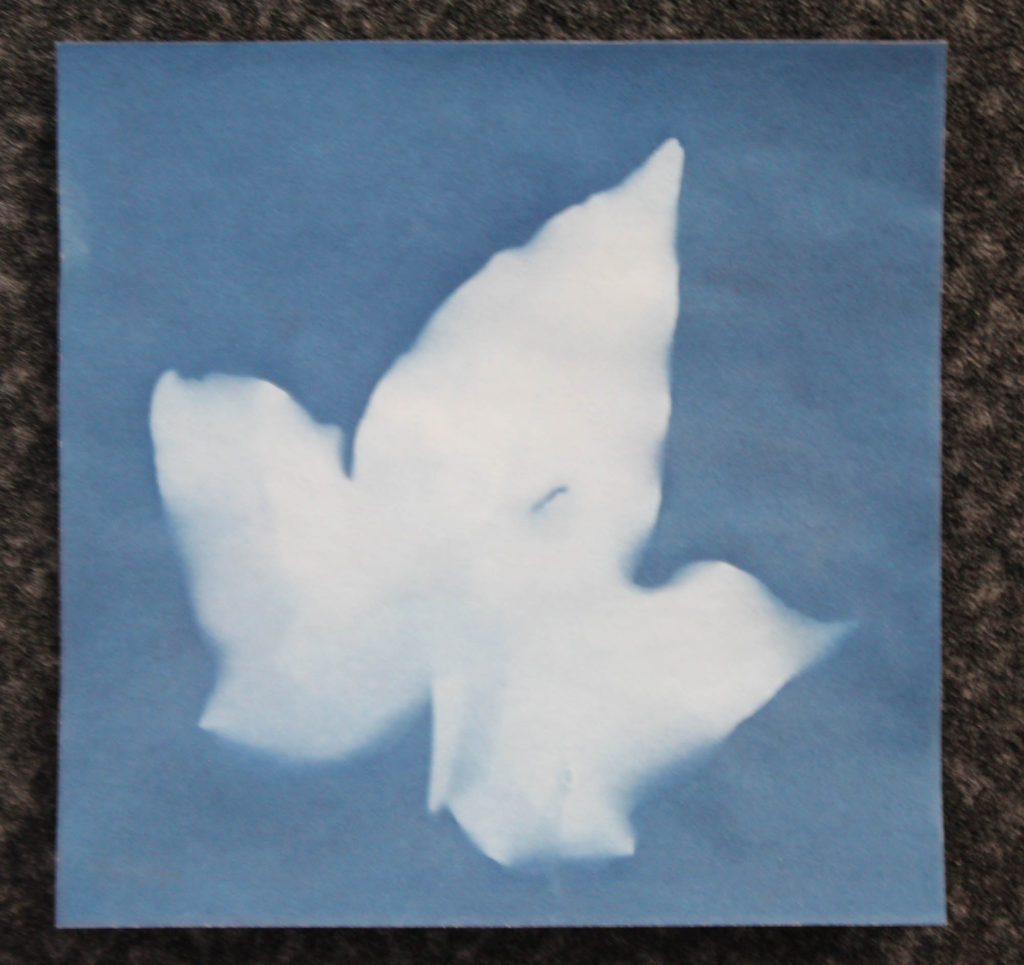
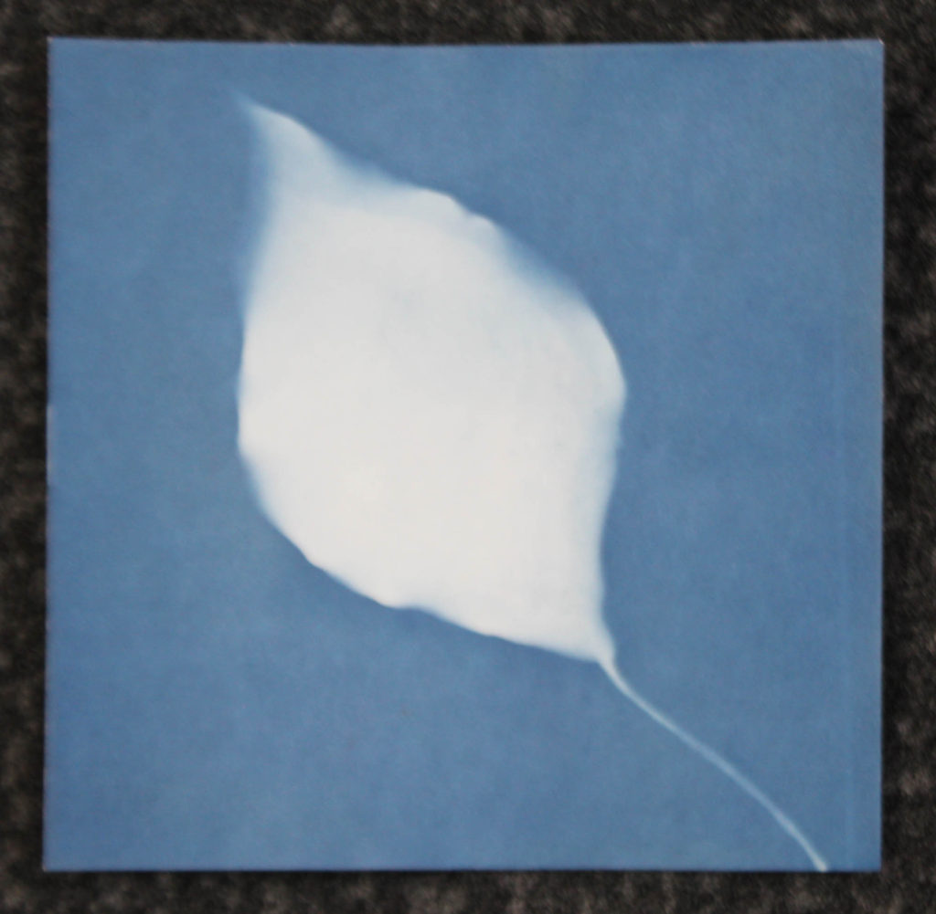
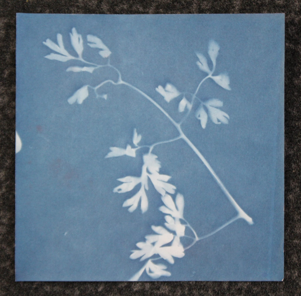
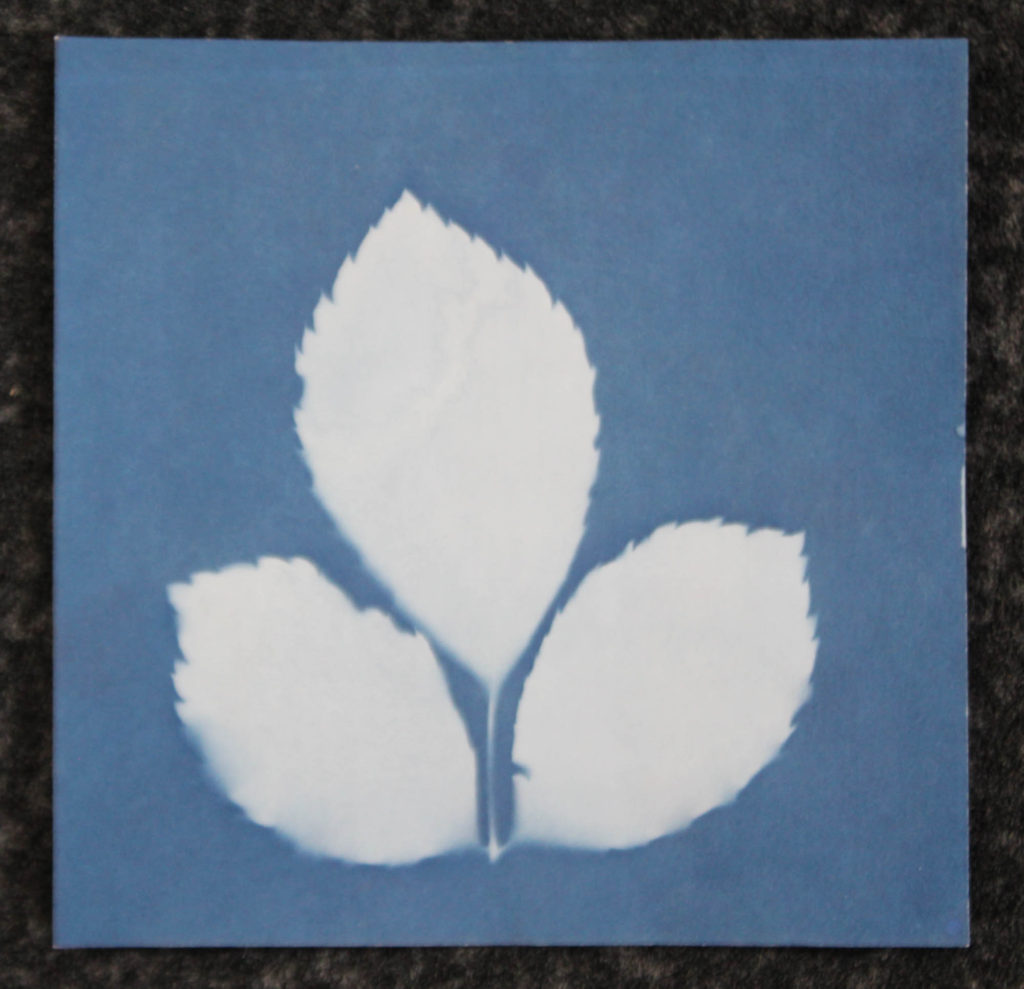
This is the second shoot where I took images of objects, however, for this shoot I used 10 x 10 cyanotype paper to create cyanotype prints using the objects I collected from my woodland photoshoots. This was the first time I used cyanotypes as the main method for a shoot (although I have created a cyanotype image around the start of the course), so some of the images were not perfect, however I feel like I was still able to produce some good images.

The setup I used for this shoot used a base (the plastic lid) the cyanotype paper, the object I was capturing and an acrylic sheet which kept the object in place. Once the exposure was complete, I soaked the paper in water to stop the exposure and left the paper to dry flat.


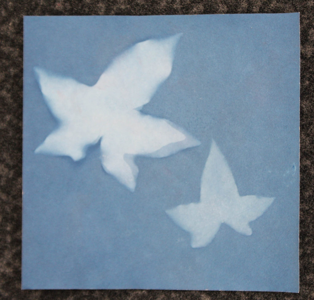
The Images:

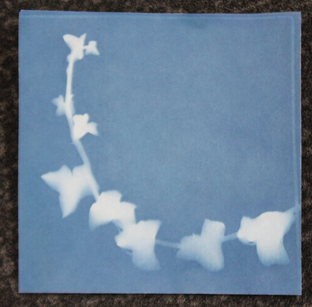
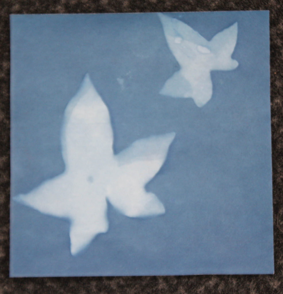
Best images:


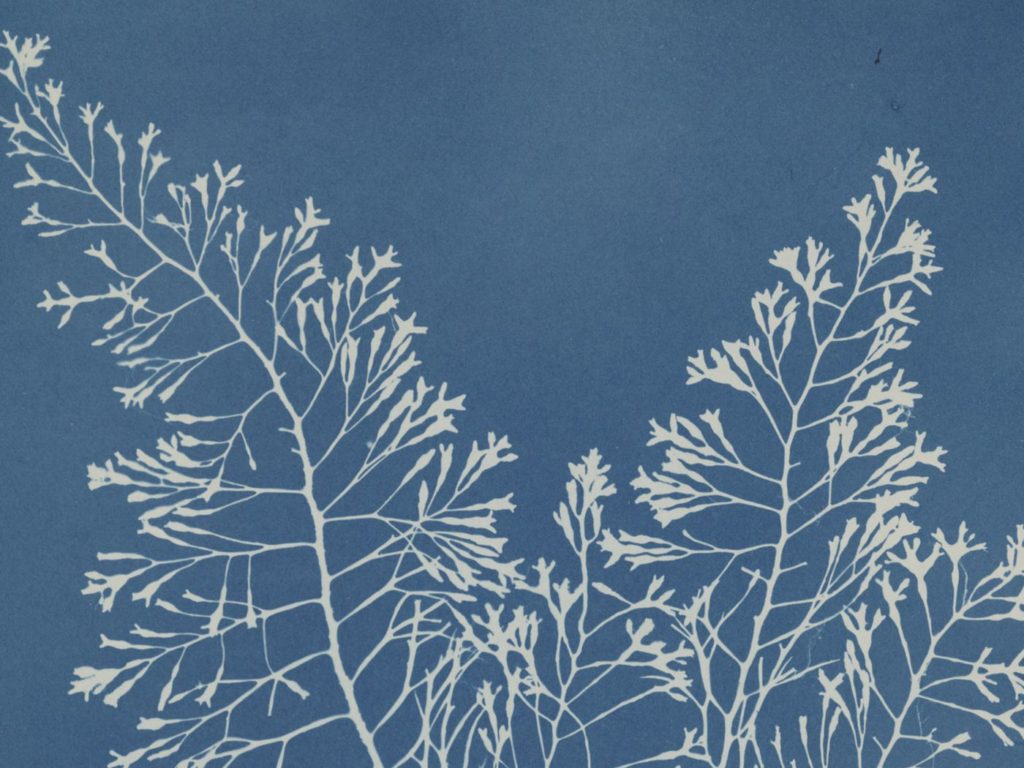
Comparison to Atkins’ work

The objects I chose as subject matter for my cyanotypes (aside from the image on the right) were mainly thicker leaves or twigs, often with a lack of detail due to my inexperience in the medium, however I think this particular image bares resemblance to some of Atkins’ images. A lot of my images are fuzzy around the edges, due to the volatile weather changing the light during the exposure, as well as my own technique in capturing images using this method. However, I think the fuzziness of the images gives them a different aesthetic to Atkins’, capturing the natural changes in light and subtle movements in the objects as opposed to a perfect, scientific representation of the object. During the shoot I tried to capture a sequence of objects like some of Atkins’ images, however due to the thumbnail size of the paper, I was limited in what objects I could use to do this.


Evaluation:

As a first-time attempt, I was happy with the way some of the images came out. It was a very unique experience due to how different the process is to standard digital photography, I enjoyed the process. Due to the volatility of the weather, with the sun peeking in and out behind the clouds, some parts of the images are fuzzier than others. I think the images produced in this shoot will go well with the other object images in the project, and adheres nicely to the ‘simple’ side of the project’s theme (despite being an arguably more complex method of photography than I am used to).

What went well:

I am glad to have experienced this method of photography as by using it, it gave me more experience in the different ways of taking images and knowledge on photography’s history. Some of the more detailed images I took from this shoot are akin to Atkin’s and Talbot’s images in terms of their simplicity, linking with this shoot’s plan.

How I can improve:

Some of the images came out fuzzy or underexposed, this is due to my lack of knowledge and experience of the method, so it was to be expected. Due to the size of the paper, I could only use fairly small leaves and plants as objects to photograph.

Photoshoot #3 + #4 outcomes

Photoshoot #3 and #4 were considerably smaller photoshoots than the other photoshoots, with only about 30 images being taken overall.

PHOTOSHOOT #3

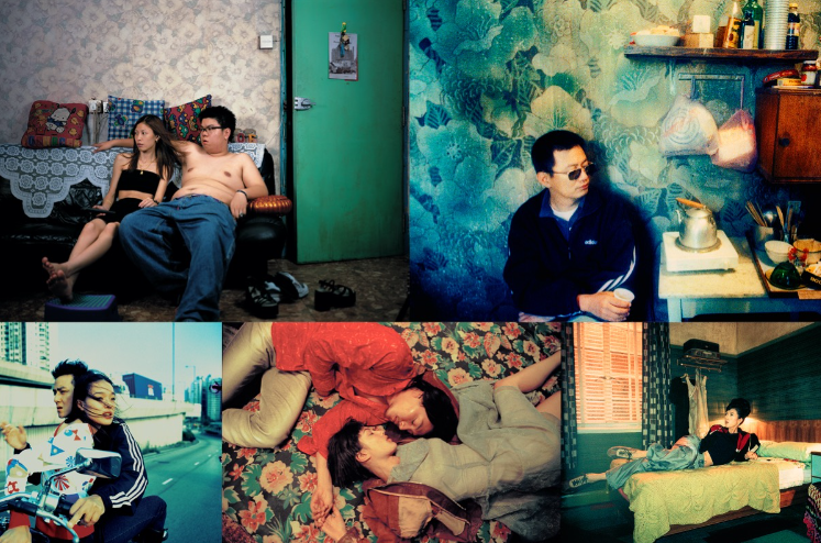
The images which served as inspiration for this shoot

For my third photoshoot I was taking pictures in colourful (monotone) settings- in this instance my images were taken in a room with LED coloured lighting.

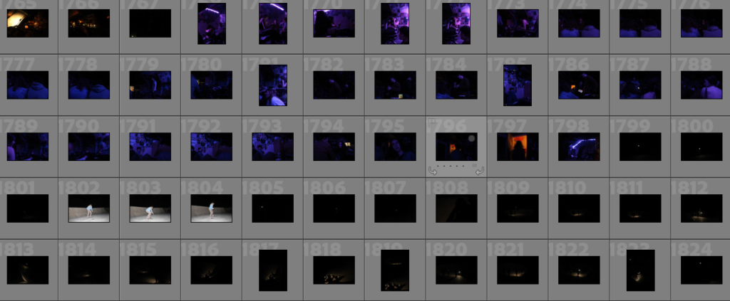
Contact sheets from my photoshoot

My images in this shoot were slightly dark- if turned up the exposure I expect the images would become very grainy. Personally I do not like the images I obtained from this shoot mainly because I do not like LED lighting in photographs, especially in the context of trying to take cinematic images as I struggled to get the correct camera settings to adjust to the lighting.

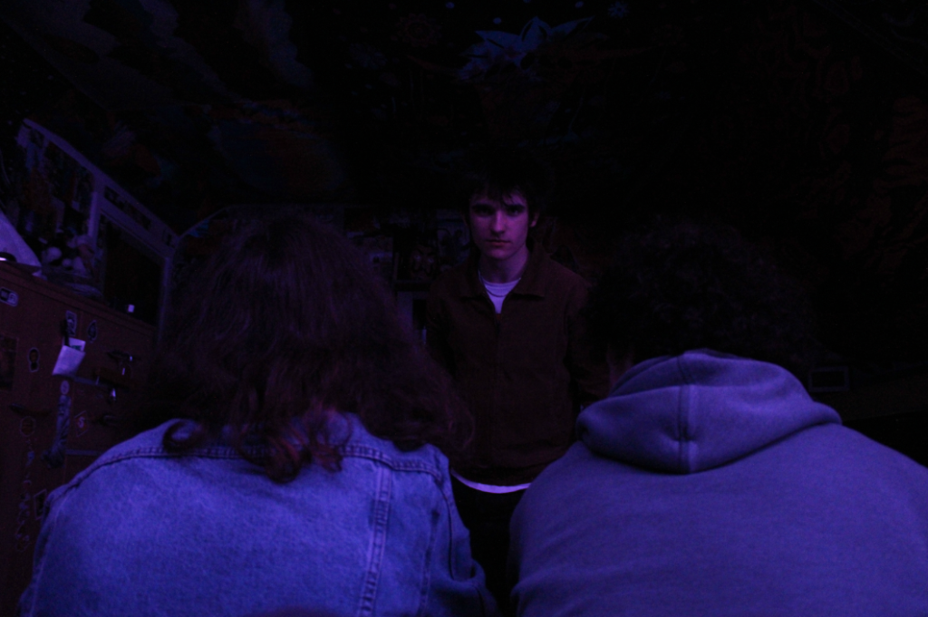
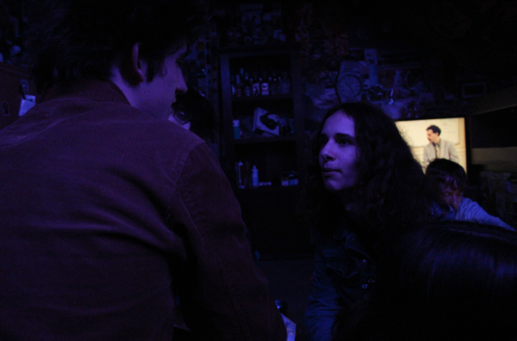
MY BEST IMAGES FROM THIS SHOOT

The image above is one of my best images due to composition, I don’t really like the image itself but the natural framing of the two backs to the camera and the subject in the middle is a good account of cinematic display in photography, with the main subject making direct eye contact with the camera in an almost “breaking the third wall” style.

This image is one which reminds me of Claudia Andujar’s work based off the emotion shown on the main subject’s face and the fact the image looks like a snapshot during a conversation where the subject is emotive.

PHOTOSHOOT #4

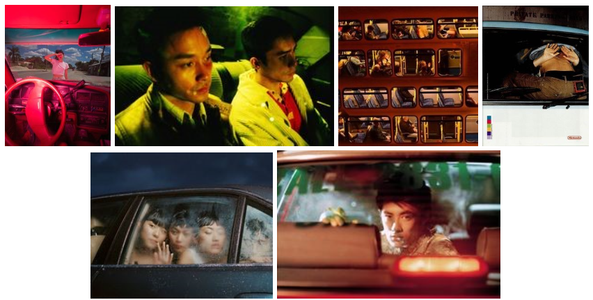
The images which served as inspiration for this shoot

For this photoshoot I was just out with my friends, a lot of the pictures I got ended up being my friends just posing for pictures (with flash- so unusable for what I wanted to accomplish).

Contact sheets from my photoshoot

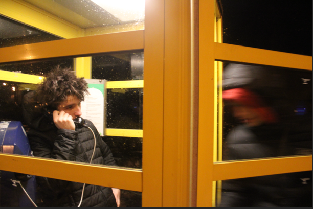
However at one point we had a small photoshoot in a phone box which turned out quite successful with 6 usable images being produced- there was very little blur and my camera setting ensured the subject was in focus, if I had any criticisms for this shoot it would be that I did not take enough images.

I think this image above is one of my best images due to the accidental blur which makes the image more dynamic as the subject on the left is in focus which on the right it seems as if someone is intruding with anonymity due to the blur and what they are wearing. This image also has slight symmetry due to the yellow window frames of the box.

Photoshoot #2 outcomes

The images I used as inspiration, none of my images really came out like this however I concentrated on lighting, using settings with colourful lighting so this is definitely present in my images.

For my second photoshoot I was in friends cars taking photos, on this night in particular the car was parked outside of a bar with neon signs and lighting creating interesting colours.

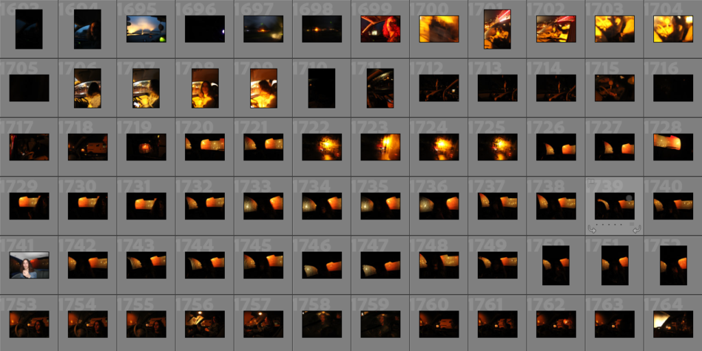
Contact sheets from my photoshoot

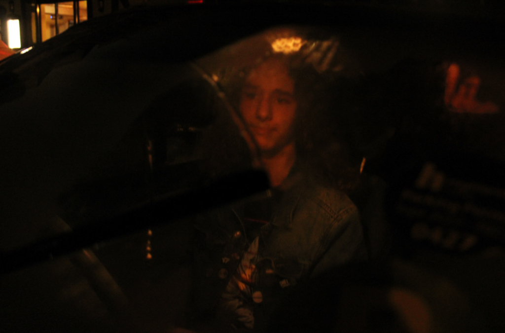
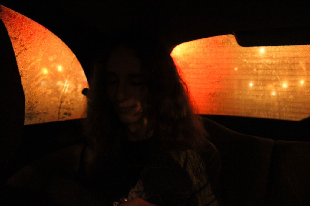
Many of my images from this photoshoot were overexposed and blurry, it was difficult to capture images in the lighting in the car as it was dark and raining inside with the mix of trying to capture the lighting and the subject with equal light balance so the colours of the neon lighting would be prevalent.

MY BEST IMAGES FROM THIS SHOOT

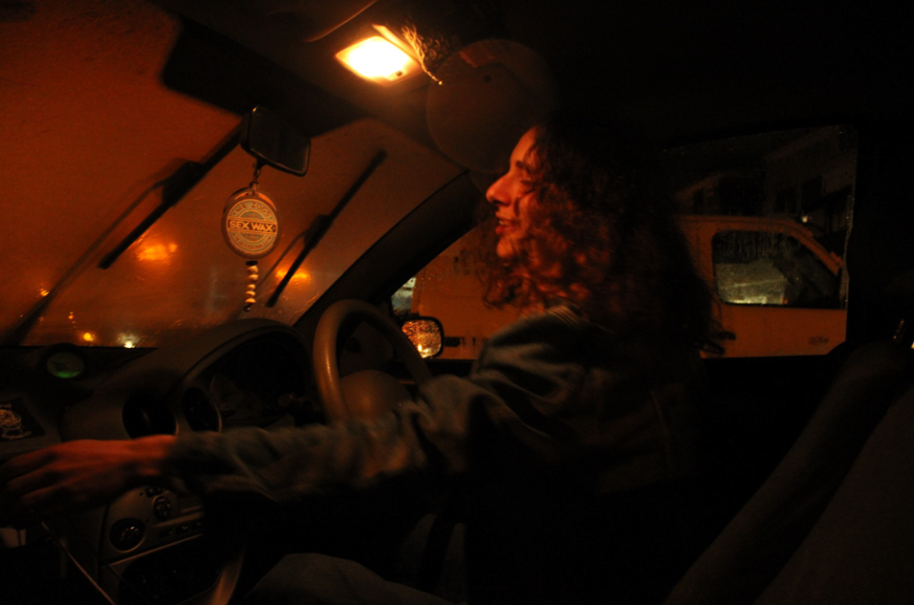
I really like the image above as it reminds me of Claudia Andujar’s set works “They’re Looking For Peace” due to the natural emotions captured- the lighting is also very rich and vibrant. Colour theory is also be apparent in these images with reds and oranges being the colours of passion and excitement while my subject has an excited facial expression.

This is also one of my best images due to the way the lighting frames the subject, almost like a spotlight spilling down. This image was taken outside of the car so the subject also looks a bit blurry due to the rain on the windscreen. I do not think I will use this image as a final piece due to the blurring the rain introduced- making the image look less than cinematic.

I really like the lighting in this image above as the condensation on the windows makes a colour gradient of the lighting outside, with the red being the subject creating a silhouette of the subject. Like the image prior to this one, I probably will not be using this image mainly because the subject is very dark and when editing turning up the exposure would damage the look of the lights and colours in the background, making the background overexposed.