To begin, I wanted to recreate one of my past photoshop edits but with my new images. I am recreating an image from our Anthropocene project which also involved photographs of unique buildings. I first created my edit with Adobe Photoshop by randomly placing cut outs of structures together to form one big building. For this edit I will use around 6 different images of structures and put them together in a random order to respond to my previous edit. However, with this current edit I would like to position the structures in a more neat way to form a real looking building.
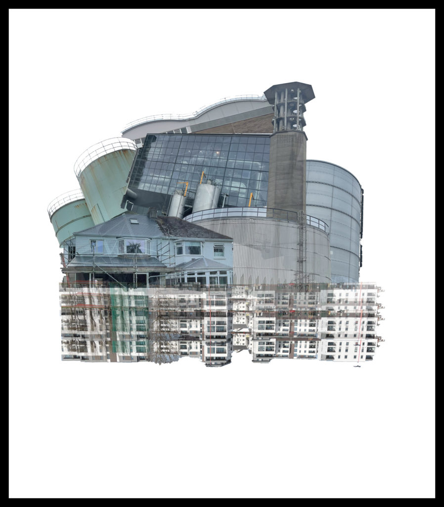
Editing Process
Firstly, I began by creating a new photoshop document with measurements of 2000 x 2000 and a resolution of 250. I wanted the page to be a square so my structure can be positioned dead centre on the page. Like my previous edit I wanted to keep the same style of the thick black border around the edge.

Next I cut out and added many features of buildings I have photographed to see which would be most effective in this edit. Below shown are the images I used in this edit:
Images I used for this edit
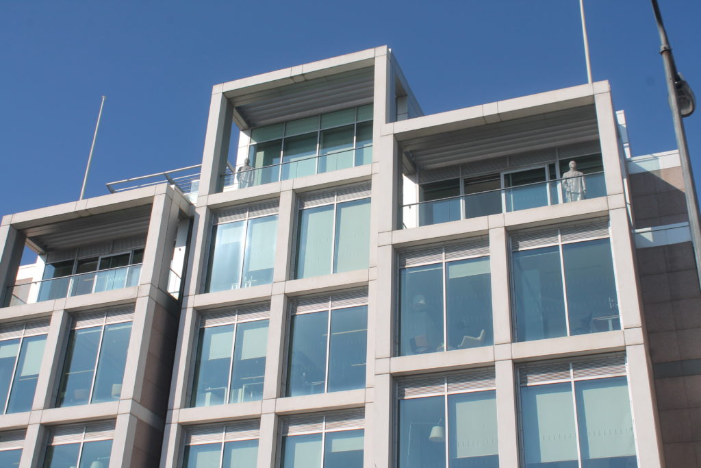

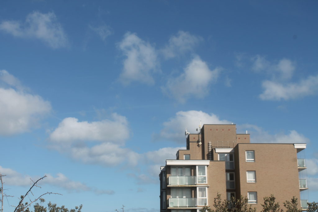
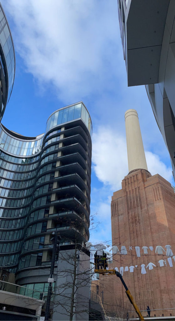
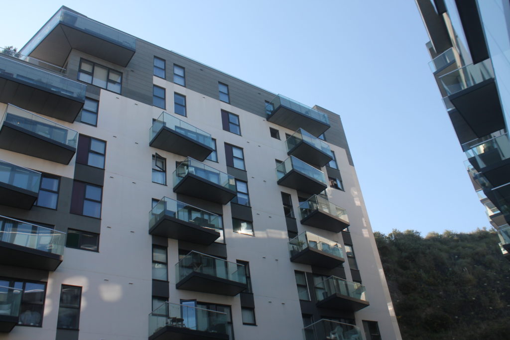
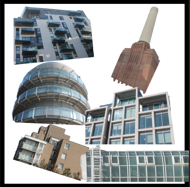
Next, I started by rotating the cut outs to different angles so it isn’t fully positioned at a straight angle. Then I put them together to give me self a slight idea of how this is going to look.
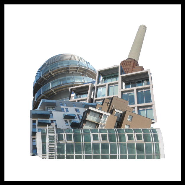
After understanding how this is going to turn out I decided to mess about with the opacity of the cut outs to create a fading effect of the buildings between each other. After finding the right formation of the cut outs I wanted to experiment with the colours of the background to see if it could be any more effective.
Background Colour Experimentation
I decided to experiment with the background colour to see if I could create a contrast between the dull coloured buildings and a bright background. I started off with the more basic colours and then further developed onto the vibrant colours.
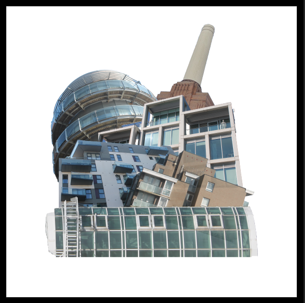
Basic colour background
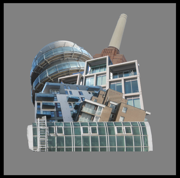
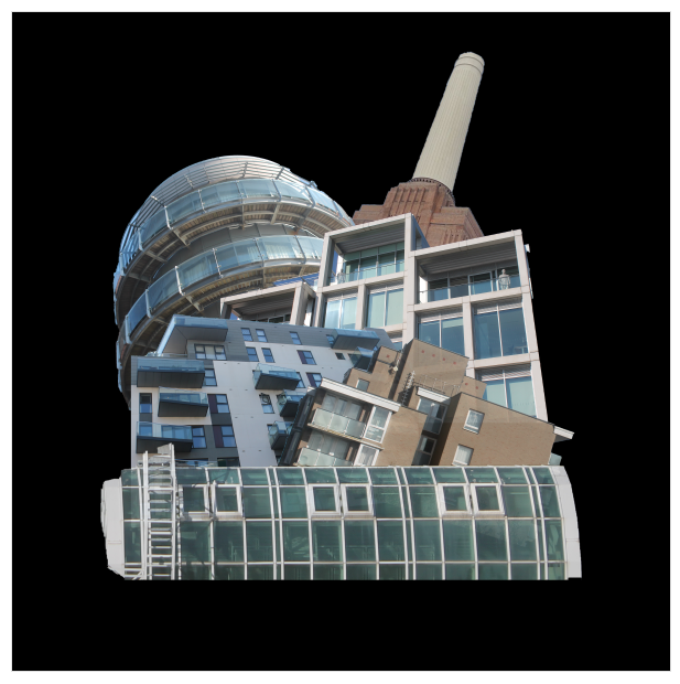
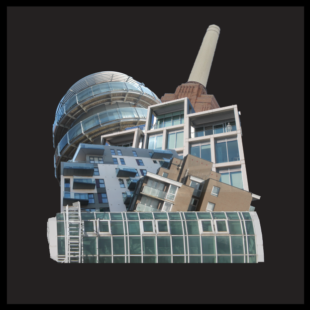
Vibrant colour background
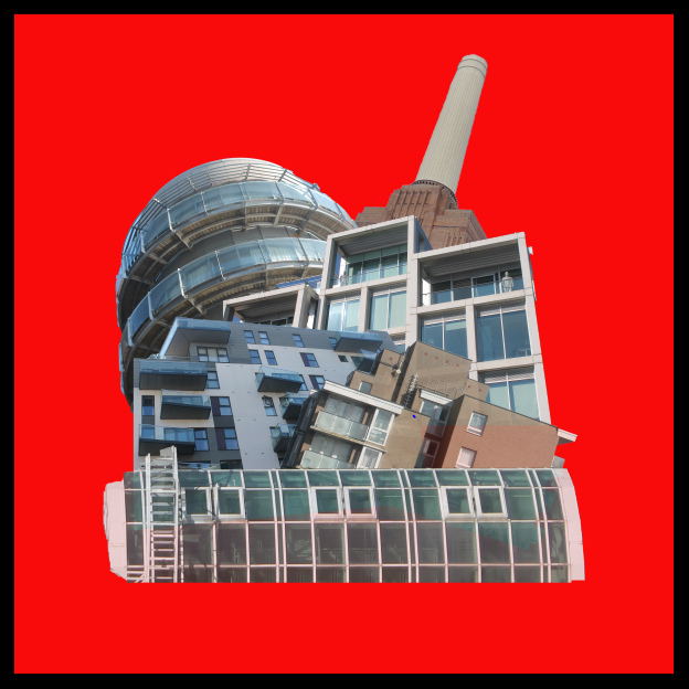
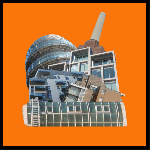
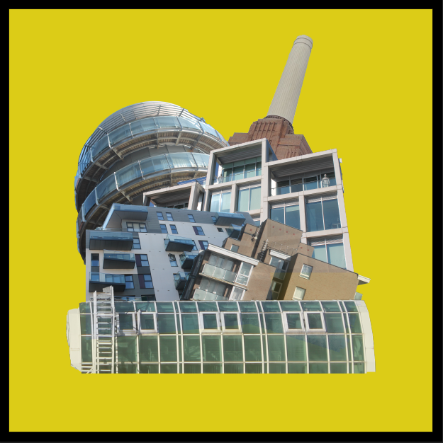
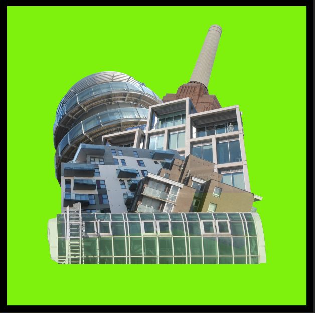
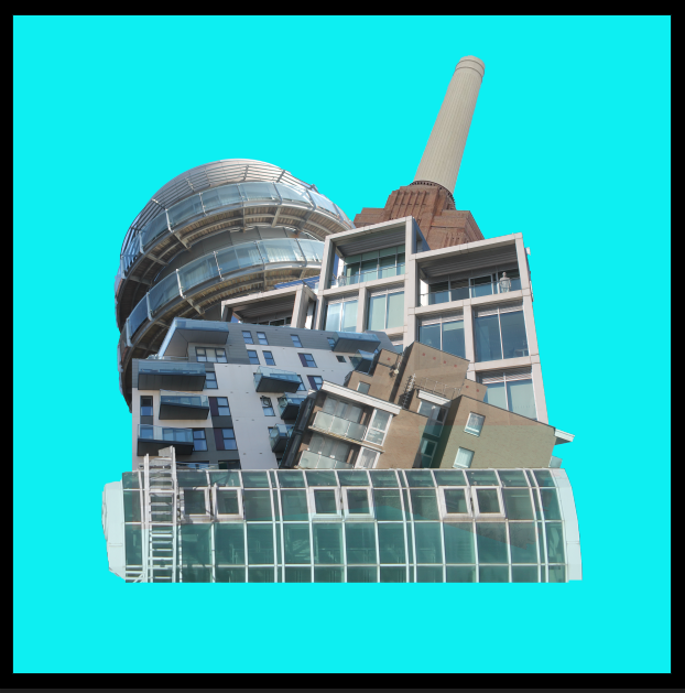
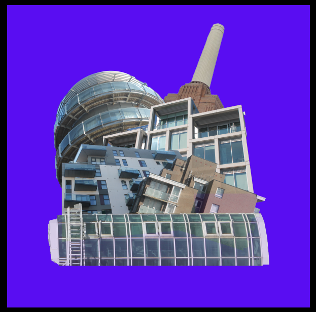
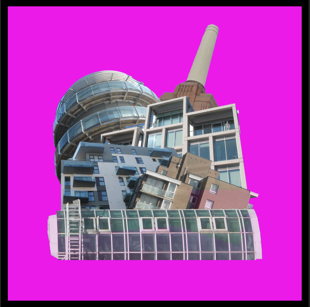
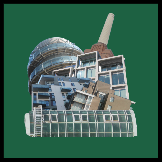
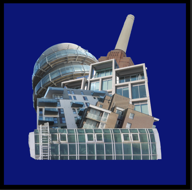
Overall, I much prefer the basic white background with a black border as it matches with colour to the structures used in the edit. Also, I think all bright colours don’t create a good contrast with the structures as most of them are dull colours or white.
Final Image

Evaluation
Overall, I am extremely happy with my final outcome as I think its a very good recreation of my previous edit done in an earlier project. I feel as if the black border brings the image together making the main subject stand out. This image was mainly inspired by artist Laura Romero who makes many similar pieces of work similar to mine. I feel as if all the colours involved contrast between each other in an effective way to not make the image seem awkward. These images I used are from Waterfront, St Helier, Westmount, Fort Regent and a powerplant located in London.
Charlie, make sure you produce the following blog posts:
1. Consider producing a zine or photobook using your images
2. Zine/ photobook research, concept, narrative + design process
3. Final zine/ photobook + evaluation
4. Final prints + virtual gallery + evaluation