Following the same structure as my blog post on editing, I started by flagging all the images I believed were successful green, this turned out 8 images as the rest of my images from this photoshoot were blurry and dark, a common theme in trying to capture images in the dark. I did not have to crop any of these images so I went straight to editing to bring out colours.
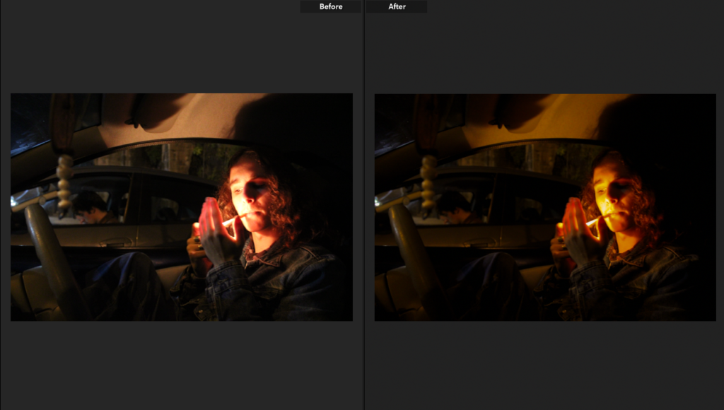
Editing is once again minimal, in this photoshoot many of my images turned out with orange and yellow tones which I have chosen to accentuate- once again my images have grain in hem which suits them however some have turned out too grainy for me to introduce colour without making them look low quality.
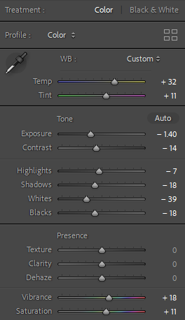
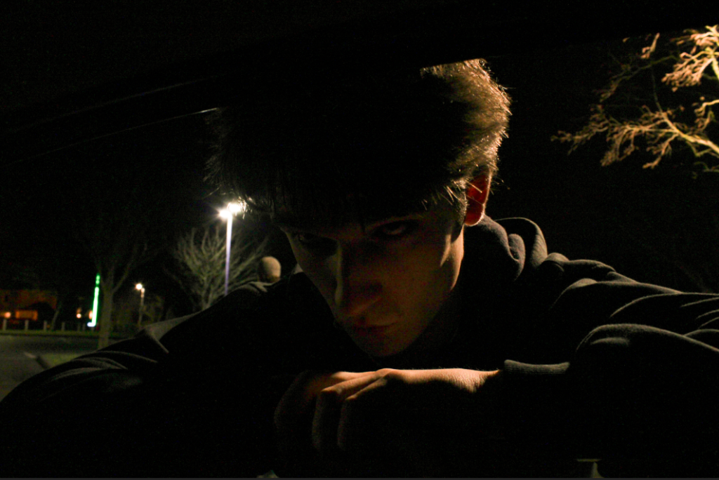
Through editing I was able to make a smaller selection of successful/unsuccessful images, I have changed the images which were less successful to yellow in my coding system.
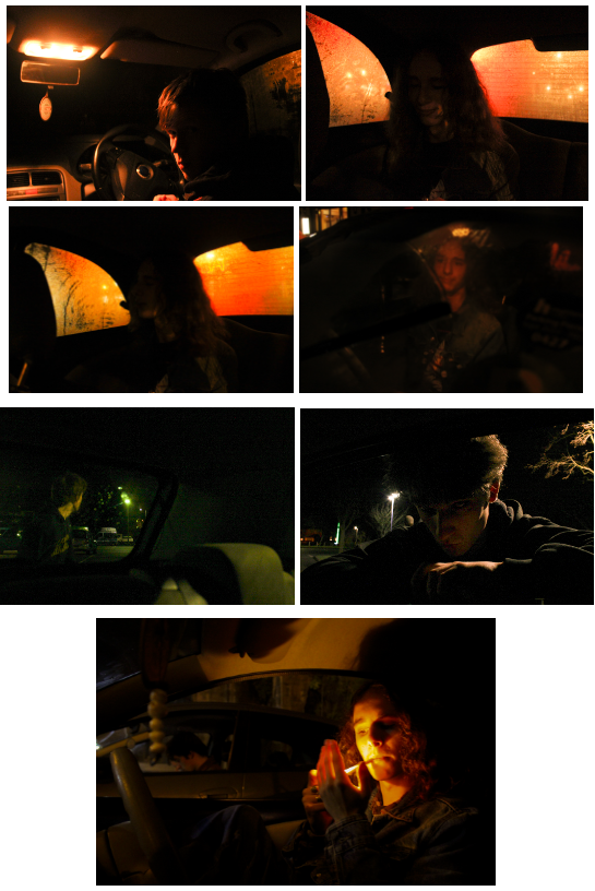
A lot of my images were too grainy after turning up the exposure so this already made them unsuccessful however this was a difficult selection of images I feel did not fit up to the intent I had for them- images I am still not sure about are the first and third images on the left of the grid as well as the bottom image as I like the interaction with the camera (turned towards it- including making eye contact with the camera) and the colours in the images (specifically the highly grainy green image however I feel as if it does not suit the rest of the images).
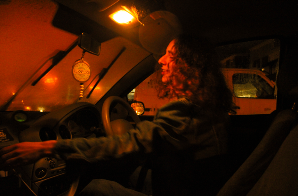
I really like this image as it massively reminds me of Claudia Andujar’s “They’re Looking For Peace” collection which is one of my biggest inspirations for this project, this is due to the sweeping motion my subject has- making him the certain main subject, the colour is also similar to Andujar’s work, she often used oil lamps to keep the colour consistent across the whole image however although I did not use an oil lamp the lighting outside of the car carried throughout the car, keeping the same consistency. Although this image is slightly blurry it is not massively noticeable- I feel as if this blur adds to the image in a positive light as it looks like it was screenshotted from a film- showing motion makes the image more than an image as it implies a further story.
